#1329: Iron Man

IRON MAN

MARVEL LEGENDS (TOY BIZ)

“To the public, Tony Stark is a handsome, jet-setting industrialist and inventor. What they don’t know is that he leads a second life as Iron Man. The armored Avenger gets his fantastic powers from his suit of micro-mesh armor. It gives him superhuman strength, the ability to fly via his jet boots, and a variety of built-in weapons, foremost among these being his devastating repulsor rays! Iron Man is dedicated to defeating those forces that would threaten the security of the nation and the entire world.”

Iron Man is easily one of Marvel’s best known characters these days, but that wasn’t always the case.  Aside from a brief cartoon runs in the ‘60s and ‘90s, he was largely out of the public eye until his 2008 film.  So, in 2002, when Toy Biz launched Marvel Legends as a follow-up to their successful Spider-Man: Classics line, and had Iron Man as one of the headliners of Series 1’s four figure assortment, it was a pretty big deal.  It’s hard to believe now, but when Marvel Legends debuted, the most demanded figure by far was the Iron Man.  Can you even imagine a time when the fanbase didn’t let out a collective groan at the inclusion of an Iron Man figure?

THE FIGURE ITSELF

As noted in the intro, Iron Man was released in the first series of Toy Biz’s Marvel Legends line.  There were actually two Iron Men in the assortment; the regular release reviewed here, and the one-per-case horned-mask variant.  Even later, there was also a Walmart-exclusive release, which decked this guy out in his stealth colors.  This guy is based on Tony’s classic armor from the 60s and 70s, which at this point hadn’t been released in plastic form for almost two decades.  The figure stands about 6 1/2 inches tall and has 38 points of articulation.  Some of the articulation (particularly the neck movement and the mid-torso joint) is a bit antiquated, but it’s mostly pretty workable.  Amusingly, some of the articulation the was more quickly deemed out of date within the line itself has actually become the more standard way of doing things, so in some ways he fits in better with the more recent Hasbro offerings than he does the later TB offerings.  Iron Man sported what was, at the time, an all-new sculpt, which would later be used for the Silver Centurion armor, as well as War Machine and Magneto.  The build is a little bulkier than the usual depictions of the classic Iron Man armor, but it actually makes sense, since it’s supposed to be wrapped around a normal-sized guy; it’d have to be a little heftier in real life.  The proportions are actually pretty solid for a figure of this era.  Compare this guy to his Series-mate Captain America, and you’ll note that he’s got a much more balanced anatomy.  He even avoids the dreaded duck feet!  The articulation is also pretty well worked-in for a Toy Biz offering; sure, there are still some spots where compromise has been made (the waist really sticks out), but it’s generally a good middle-ground.  In terms of detail work, this guy goes a bit more simplistic than later TB fare (another reason he fits in a bit better with the Hasbro stuff), but that’s definitely a plus.  All of the important details are there, they’re all very sharply defined.  The figure has a removable faceplate, which reveals Tony Stark beneath the mask.  I’ve always felt he bore a resemblance to Timothy Dalton, which is a neat little “what-if” casting idea.  The face has some of the best work on the whole figure, which shows real commitment on the sculptor’s part, since it’s largely going un-seen.  The faceplate is molded to fit into the contours of the face, and it actually stays in place really well.  In terms of paint, Iron Man’s handled really well. He’s got the base red and yellow, which are nice and vibrant, and then on top of that, there’s a hint of silver lightly applied to all the armored portions of the figure, which makes him look suitably metallic, while avoiding the issues of blending that plague the Iron Men that use gold in place of the yellow. Iron Man was packed with a display stand designed to look like a Stark Industries satellite and a reprint of Iron Man #149 (which contains “Doomquest,” one of my favorite Iron Man stories).

THE ME HALF OF THE EQUATION

This guy came from my Nana.  Every year, she’d take me and my cousin to Toys R Us at the end of school and let us each pick out one or two things.   Of course, I went through the usual back and forth, having to reassure her that yes I really did want this Iron Man fellow instead of a handful of Attack of the Clones figures like my cousin was getting.  At the time, this guy was still pretty hard to get, so finding him so quickly was pretty sweet.  He was my very first Marvel Legend, and I gotta say, dragging him out for the purpose of this review has reminded me that he’s still very definitely one of my favorites.  As far as classic Iron Men go, this guy really hasn’t been topped.

#1328: The Wolf Man

THE WOLF MAN

VAN HELSING: MONSTER SLAYER (JAKKS PACIFIC)

Hey, remember when Hugh Jackman starred in a Van Helsing movie?  I know, I know, you were trying to forget.  Why’d I have to go and bring it up again?  Well, the reason is very simple: there were toys.  And, big shock, I had a bunch of them.  For the most part I’ve phased them out of my collection, but one item still remains.  It’s the subject of today’s review, The Wolfman, who within the context of the film isn’t the usual “wolfman” Larry Talbot, but is instead Velkan Valerious, brother to…oh who really cares?  He’s a werewolf.  There ends the list of interesting things about him.

THE FIGURE ITSELF

The Wolf Man was released as part of Jakks Pacific’s basic Van Helsing: Monster Slayer line.  There were a couple minor variations on this basic figure; mine’s the one with “magic transformation color change,” which pretty much translates to “the actual Wolf Man bit has this clear patch at the front.”  The figure is just under 4 inches tall and he has 16 points of articulation.  The actual figure is just an un-transformed Velkan figure, which has him sporting the Bruce Banner shredded pants (they never did explain in the movie where those pants when he was the werewolf, by the way).  The sculpt was okay.  None of the figures in this line were particularly noteworthy, and Velkan seems to be the middle-est of the middling sculpts.  The proportions of the sculpt are passable; the hands and feet seem a little small, and the shoulders are definitely set too far apart, but that’s about it.  A lot of the work, especially on the body, definitely seems a bit rudimentary for the time when this was released.  The head bears a passing resemblance to actor Will Kemp, though he’s completely clean shaven here, and he wasn’t in the movie.  There’s some nice detail work on the hair, so that’s cool.  The paint is also pretty basic.  He’s mostly just molded in the appropriate colors.  The only real paint work is on the face, which seems oddly dirty.  He wasn’t exactly squeaky clean in the movie, but it seems a bit odd when compared to the rest of the figure.  The “Wolf Man” part of this Wolf Man figure is actually just a rubber suit that you pull over the Velkan figure.  I’m gonna be honest, it’s not ideal.  The basic sculpt is fine, but since it’s just thick rubber cover, there’s no actual articulation, and since it’s just rubber and not something sturdy, there’s actually no way for the thing to stand, especially with Velkan inside it.  Also, since the “magic transformation color change” bit requires the piece to molded in clear plastic, and paint on rubber is prone to chipping, the figure is invariably left with random clear patches all over.  Why exactly didn’t they just make this a whole separate figure?

THE ME HALF OF THE EQUATION

So, believe it or not, I actually liked Van Helsing when it was released.  In my defense, I was 11.  Anyway, I ended up getting a bunch of the figures for my birthday that year, and the Wolf Man was one of them.  He was always my favorite of the bunch, so when I got rid of the set, he remained.  The figure’s not anything to write home about; he’s a kind of bland figure based on a flat character from a mediocre movie.

The Blaster In Question #0010: Stryfe

STRYFE

N-STRIKE ELITE

If you’re a regular Nerf-er, you probably looked at the title of this weeks review and thought “what could this chuckle-head possibly have to say about the Stryfe that hasn’t already been said?”  The answer is this: the Stryfe is vanilla ice cream.  Feel free to quote me on that. Lost?  That’s ok.  Stick around and I’ll explain it to you.

THE BLASTER ITSELF

The Stryfe was released in 2013 as part of the N-Strike Elite series, which is Nerf’s core product line.  It is an electronic, semi-automatic, magazine-fed, flywheel blaster, much like the Rayven before it.  Really the only functional difference between the Stryfe and the Rayven is the position of the magazine.  Now, allow me to explain the vanilla ice cream.  The Stryfe is really nothing new (especially at time of writing this).  It doesn’t offer any huge breakthroughs in dart blaster tech.  Out of the box, it’s not a game-changer by any stretch of the imagination.  In this sense, it’s kind of plain, vanilla, if you will.  Now, this is not to say it’s bad either.  Vanilla is still a tasty flavor, and as such, the Stryfe is a perfectly fine blaster.  The grip is comfortable in-hand, magazines can be changed out quickly and easily and it only takes a couple seconds to rev up before firing.  Once revved up, darts fly pretty well and hit with some considerable force, just so long as it has fresh batteries.  Simple and mostly functional, but it doesn’t stand out in any real way, in fact, without some light modification, there’s a mechanical lock that prevents the trigger from being pulled if there isn’t a dart loaded and this lock doesn’t always work correctly.  The result can be a fully loaded blaster that refuses to fire, but this starts to get into where the Stryfe really shines.  I would say, tasty as it is, relatively few people eat vanilla ice cream entirely on its own.  This applies to the Stryfe as well.  While the blaster is serviceable out-of-the-box, the potential for modification is monumental and allows just about anyone to get in on it.  The Stryfe features one attachment rail on the top of the blaster and one on the underside of the barrel.  Additionally, the muzzle sports a barrel attachment lug, and there’s a connector to attach a stock as well.  When it was released, there were a handful or so attachments that could be fitted to the Stryfe and that number has increased many fold thanks, in no small part, to the launch of the Modulus line.  Throw some sprinkles on that ice cream.  Of course, these are all external modifications only and don’t really add to the basic performance of the Stryfe, but what if you’re looking for a more serious upgrade?  If you fancy yourself handy with a soldering iron, there’s no shortage of tutorials out there on how to rewire a Stryfe to increase voltage, swap out switches, use rechargeable LiPo batteries and so on.  Now you’re looking at a decent little sundae with hot fudge or whipped cream or whatever, but there’s even more than that.  Thanks to companies like Worker and a slew of others, there is a growing market for 3rd party modification kits, many of which are geared specifically for the Stryfe and they can get pretty in depth.  If you’re looking to dress a Stryfe up like real-steel firearm or replace the flywheels to rifle the darts as you fire them, there are kits for just about anything.  Now you’ve gone and stuck a brownie in with the ice cream.  A regular, unmodified Stryfe requires 4 AA batteries and comes packaged with a 6-round magazine and 6 Elite darts.

THE ME HALF OF THE EQUATION

After all that talking-up of the potential modification options for the Stryfe, it may be a little surprising to know that I’ve only ever modified them to the point of removing that irritating lock.  Maybe if I had more free time and money to spend on kits, I might have gotten more involved, but given the assortment of stuff available, I think it is more a question of when I get into more serious mods rather that if.  And for the record, I totally eat vanilla by itself.


#1327: Princess Leia Organa – Jabba’s Prisoner

PRINCESS LEIA ORGANA — JABBA’S PRISONER

STAR WARS: POWER OF THE FORCE II (KENNER)

“Disguised as the bounty hunter Boussh, Leia infiltrated Jabba’s palace as part of a small rescue team to free Han Solo, Leia was captured and forced to endure the status of Jabba’s slave until the opportunity to escape presented itself.”

My very first Princess Leia figure I reviewed for this site was the one from the second series of Black Series figures.  While I was generally nice to that figure in its proper review (I hadn’t yet become jaded and cynical), I’ve always had some issues with the decision to go with the Slave Leia design, seeing as it was the inaugural Leia in that scale.  I don’t have a huge issue with the costume overall, but I feel it’s not the character’s primary look.  Regardless, the design’s a popular one with the fanbase, which translates to toys.  Interestingly, the look wasn’t a part of the vintage line; it’s first release was in 1997, more than a decade after it appeared on screen.

THE FIGURE ITSELF

Princess Leia Organa as Jabba’s Prisoner was released in the third year of Kenner’s Star Wars: Power of the Force II line.  She was the third single-release of Leia in the line (there were also four Leias in the Princess Leia Collection and another packed with the Endor Speeder Bike, all released the same year as this one; 1997 was a good year for Leia).  The figure stands about 3 3/4 inches tall (which was rather tall for a Leia figure; later figures would go shorter) and has 6 points of articulation.  This is one of those figures where lessened articulation is a plus, since her design is kind of hindered by being broken up for lots of articulation.  Here, she’s got the simplest assortment of articulation, which allows her to avoid having unsightly lines all over her skin.  In addition, since she’s from later in the line’s run, she’s spared a lot of the crazy proportions that plagued earlier POTF2 figures.  Generally speaking, her sculpt is pretty decent; the details are all pretty true the film’s design, and the proportions are among the best we’ve seen on a Slave Leia figure.  The face doesn’t look much like Carrie Fisher, but it’s far from the worst Leia sculpt from this line, and it’s not a terrible sculpt.  The skirt piece is plastic on this figure, which I think looks for a better overall look when compared the cloth used for just about every other Slave Leia figure; it actually allows for a bit of dynamic flow and is unlikely to fray over time, which are both definite plusses.  The paint work on this Leia is pretty decent.  She’s about on par with the rest of the line; the application is clean and the colors match up with the source material.  The gold actually adds a nice bit of vibrance to the figure, and is one of the better gold paints I’ve seen on an action figure.  Leia’s only accessory is a removable collar with a chain attached.  It’s a bit bulky and doesn’t ever seem to sit right, but it’s easily removed of you so desire.

THE ME HALF OF THE EQUATION

Like the Bespin Han Solo, while I didn’t own this figure for myself growing up, it was one of the ones my Grandmother had at her house for my cousin Patrick to play with.  Like that Han figure, she went missing somewhere along the way, so when those figures were absorbed into my collection, she wasn’t one of them.  I finally added this figure to my collection  early this year, picking her up from the Farpoint charity auction alongside several other POTF2 figures.  She’s not my favorite version of Leia or anything, but she’s a decent enough figure, I suppose.

#1326: Cyclops

CYCLOPS

MARVEL COMICS FAMOUS COVERS (TOY BIZ)

“Born with the mutant ability to fire powerful optic blast from his eyes, Cyclops is cursed to forever wear a protective Ruby quarts visor to control his uncanny ability. As one of the founding members of the X-Men, Scott Summers help build the team and eventually became a team leader.”

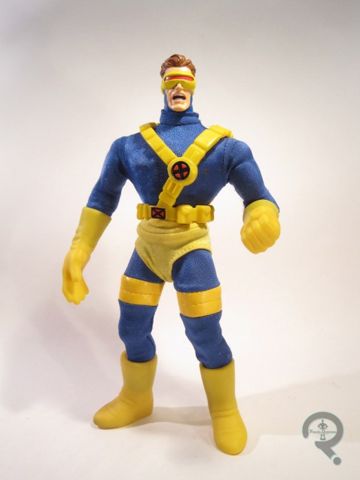
Oh hey, here’s something I haven’t covered before on the site: Famous Covers.  More than a decade before the whole Re-Mego craze started up, Toy Biz attempted their own continuation of Mego’s World’s Greatest Super Heroes line.  The figures were originally meant to be the same scale as Mego’s stuff, but for a number of reasons, they were ultimately scaled up a bit.  Nevertheless, it was certainly an interesting venture, and it gave us a pretty darn fun line of figures, albeit one that was completely independent.  Today, I’ll be looking at one of my favorites from the line, Cyclops!

THE FIGURE ITSELF

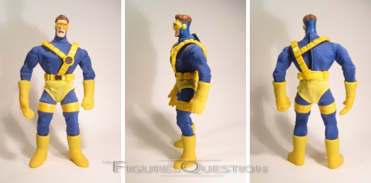
Cyclops was released in the fifth series of the Marvel Comics Famous Covers line, which was titled “X-Men Classics.”  It was the first of the two purely X-Men-themed series for the line.  Scott is seen here in his Jim Lee attire (which was his current look at the time), which the box proclaims as specifically being based on his appearance on the cover of X-Men #1.  The figure stands about 8 3/4 inches tall and he has 23 points of articulation.  Cyclops was built in the medium male body, a decision that I’ve pretty much always questioned.  I know Scott’s classically a little bigger than Spider-Man, but making him the same size as Thor and Captain America seems to be a bit much.  Scott got a brand-new head sculpt, which is nice enough.  For some reason, Toy Biz was really big on the screaming expressions for the Famous Covers figures.  Scott’s no exception, but at least it doesn’t look too out of place for him.  There’s some solid detail work on the hair and the visor, as well, so that’s a plus.  The head does seem a touch under-scaled for the body, which makes you wonder if he was originally supposed to be on the smaller body.  The costume is a mixed-media effort.  There’s the basic blue jumpsuit and the shorts, which are both tailored pieces.  They fit pretty well, and are surprisingly slim given the scale.  The harness and belt are one sculpted piece, and they fit well enough to the body (a little better than the recent Marvel Legend, truth be told) and replicate the pieces from the comics pretty well.  The gloves and boots are standard pieces for the line.  They’re made out of rubber, so they allow for a little bit of movement from the wrists and ankles, though not much.  They’re really bulky and goofy, and in the case of the gloves, wrong for the costume.  To me, it would have made more sense to just mold the base hands in yellow and do a cuff at the edge of the sleeve (which is a method they used several other times over the course of the line), but it’s not the worst thing ever, I guess.  Cyclops’s paint work is limited to his head and a few spots on the harness, but what’s there is really strong.  Definitely some of the best work Toy Biz did on their Marvel stuff.

THE ME HALF OF THE EQUATION

I loved me some Famous Covers growing up.  The timing of this series was such that it made for a perfect Christmas present from my parents, so that’s how I got Cyclops.  I remember being really thrilled to get him (and the rest of the set), and he was one of my favorites for a good while.  The figure’s a bit goofy in retrospect, but I still really like him, and I have very fond memories of the line.

#1325: Hiro Hamada

HIRO HAMADA

BIG HERO 6

Remember two weeks ago when I reviewed Baymax?  And two weeks before that when I reviewed Yokai?  Well, it looks like I’ve got a recurring feature up in here!  I mean, at least until I make my way through this stack of Big Hero 6 figures that I’ve got sitting here.  Big Hero 6 is ostensibly an ensemble piece, but at the forefront of that ensemble is Hiro Hamada, who’s the group’s central figure.  I’ll be looking at his action figure today!

THE FIGURE ITSELF

Hiro was released in the first series of Bandai’s Big Hero 6 line, alongside the rest of the team.  The figure stands about 3 1/4 inches tall and has 15 points of articulation.  Remember when I reviewed Yokai and I noted that he was way too small?  Well, Hiro’s got the opposite issue going on:  he’s way too tall!  Hiro’s not that big a guy.  Going by the scale offered by this line, he’s almost 6 feet tall, since he’s only marginally shorter than the likes of Yokai and Baymax, or even Wasabi.  On the plus side, at least Hiro keeps his internal proportions more or less intact, thus avoiding one of Yokai’s major issues.  In fact, his sculpt is pretty darn solid in general.  He looks like Hiro does in the movie, has solid proportions, decent detail work, and his joints are even worked-in pretty well!  Even the paint work doesn’t let this guy down; he’s got one of the best paint jobs I’ve seen on an item from Bandai America.  The colors all match up nicely with their on-screen counterparts, there’s plenty of small detail work, the application is clean, and there aren’t any overlooked details in the sculpt (like what we saw on the Baymax figure).  It also looks like this paint is a bit less likely to chip over time than some other Bandai America figures, but only time will tell on that one.  Hiro is packed with Baymax in his offline form; the piece is hollowed out, but it’s still a nice enough extra, especially when you consider that a lot of the line is largely un-accessorized.

THE ME HALF OF THE EQUATION

Can you guess where I got Hiro?  If you guessed Ollie’s, the same place that I got the last two Big Hero 6 figures I reviewed, you would be correct.  I almost didn’t find the normal version of this guy and would have settled for his Stealth variant from the second series, but Super Awesome Girlfriend found this one all the way at the back of one of the racks.  Despite the annoying scale issues, Hiro is actually a pretty nice figure, and certainly one of Bandai America’s best offerings.

#1324: Hunter Ja-Kal

HUNTER JA-KAL

MUMMIES ALIVE! (KENNER)

“Hunter Ja-Kal, ancient Egypt’s greatest hunter has been called form the dead to defend the young descendent of an ancient pharaoh and to command his band of Mummy champions. Hunter Ja-Kal wears the armored wings of the falcon-god Horus, giving him the power of flight.”

Like the ‘80s before them, the ‘90s had more than a few cartoons designed purely to sell toys.  One of my personal favorites was 1997’s Mummies Alive!, which followed a band of undead Egyptian warriors, whose job it was to protect the young boy that was the reincarnation of their Pharaoh Rhapses.  The show was decent enough, but the real star was, obviously, the toys.  Kenner* handled the toyline, which was really cool,  but sadly short-lived.  Nevertheless, we did at least get the main Mummies, including their leader Ja-Kal, who I’ll be looking at today!

THE FIGURE ITSELF

Hunter Ja-Kal was released in the basic figure assortment of Kenner’s Mummies Alive! line.  He was one of three Ja-Kals in the line, and is the one of the three that depicts him in his most standard appearance from the show.  The figure stands about 5 1/2 inches tall and he has 5 points of articulation. Ja-Kal’s sculpt was shared with the Nile-Ator Cycle’s pack-in Ja-Kal figure.  It’s otherwise unique to these two figures.  It’s a pretty solid offering for the time.  While it’s not a perfect recreation of the cartoon appearance, it’s pretty close, and most of the discrepancies come from the figure adding in some extra details.  Stylistically, he’s sort of similar to Total Justice, but without the insane expression or over-posing that plagued that line.  It’s sort of a best of both worlds scenario.  The proportions are still very ’90s hero, but there’s some internal consistency, and it matches up pretty well with the aesthetic of the show, so it works out alright.  I suppose an argument could be made that his limbs are rather on the lanky side, but the guy *is* a mummy, so I think it’s excusable.  The detailing on the wrappings is exquisitely handled; this would look good on a modern figure, it’s fantastic on a figure of this vintage.  Accenting the pretty sweet sculpt is an equally sweet paint job.  The base colors make for a nice match to the cartoon, plus there’s some really fun accent work on all of the wrapped areas, which successfully makes them look like they’ve been wrapped around a decaying corps for a few thousand years.  Bet those things smell *amazing*.  Ja-Kal originally included a bunch of snap-on armor pieces, recreating his more battle-ready look from the show.  My figure is sadly without those pieces, but I bet they were pretty cool.

THE ME HALF OF THE EQUATION

I got into Mummies Alive! not too long after it originally aired, but it was long enough that I missed out on most of the toys at retail.  The best I could do were the goofy “Fright Sight” figures, which languished in stores for half a decade after the show was off the air.  Fortunately, I was able to fish this guy out of a loose figure bin at Baltimore ComicCon about a decade ago.  He didn’t have any of his extras, but at least I had a Ja-Kal figure, right?  This line doesn’t get talked about a whole lot, but it was actually really awesome.  I feel like I kinda need to track down the rest of the figures now…

*Interestingly, while Kenner’s name appears on all the packaging, the actual figure’s copyright stamp says Hasbro.  Hasbro of course owned Kenner at this time, but the Hasbro/Kenner products typically only bore the Kenner name.

#1323: Talia

TALIA

BATMAN: THE ANIMATED SERIES (HASBRO)

“Talia is the ‘Daughter of the Demon,’ trained by her father Ra’s Al Ghul to reach the height of her mental and physical capabilities.  Quick witted and lethally skilled, she is a faithful soldier in her father’s mission to save the Earth from environmental destruction–even at the cost of all human life!”

A few years after Kenner’s Batman: The Animated Series line had run its course, Hasbro (who had acquired Kenner in the early ’90s, and officially abandoned the Kenner name in 2000) decided to fill in a few of the line’s holes, offering up an all-new line of boxed sets.  These sets offered up a few repaints of old figures, alongside one or two original figures, generally of characters that would have been hard sells on their own.  Today’s subject, Talia, is one of those figures.

THE FIGURE ITSELF

Talia was actually available two different ways.  She was first offered in the “Shadows of Gotham City” set, alongside her father and variants of Batman and Robin.  She was released again not long after as part of the “Girls of Gotham City” set, alongside Batgirl, Poison Ivy, and Catwoman.  My figure comes from the second set, but the two are essentially identical.  The figure stands about 4 1/2 inches tall and she has 4 points of articulation. Her articulation scheme is kind of odd; she has no movement in her legs, which makes getting her to stand a real pain.  Her sculpt was unique to her, and based on her earlier The Animated Series appearance.  It’s not a bad sculpt.  There are a few inaccuracies; the hair shouldn’t really have the curl at the front of her hair, and the boots should have flat soles, not heels.  That being said, those are pretty minor issues, and about on par with the earlier Kenner figures.  In fact, she fits in with those figures pretty seamlessly, which is the most important thing.  As far as paint goes, she’s got some issues.  The basic application is fine, but most of the colors are just flat out wrong.  The biggest one is the jumpsuit; in the show it’s a very, very dark purple.  Here it’s some sort of lavender shade, which removes some of the menace of her design.  It’s also not particularly striking.  There are some additional inaccuracies, such as the black boots instead of the proper grey, and the really pale color that’s been used for the skin tone.  It all adds up to a figure that doesn’t have much in the way of “pop.”  Talia originally included a pair of pistols, which I lost long ago.

THE ME HALF OF THE EQUATION

These sets were mostly given to me as Christmas and birthday presents.  I didn’t get the “Shadows” set for either of those events the year it was released, meaning I missed out on Talia the first time around.  Due to that, the “Girls” set was at the top of my list the next year.  As much as I wanted the Talia figure, I can’t really say she was ever one of my favorites.  The sculpt’s alright, but the articulation is lackluster and the paint is as bland as plain white toast.

#1322: Pepper Potts, Happy Hogan, & Hammer Drones

PEPPER POTTS, HAPPY HOGAN, & HAMMER DRONES

MARVEL MINIMATES

I haven’t reviewed Minimates in over a month.  That seems slightly odd.  To be fair, I haven’t actually picked up any new sets since the Doctor Strange assortment, so that probably contributed somewhat.  Since I’m leaning pretty heavily on the back catalog at the moment, it’s only fair that I look back at a small sampling of my rather large Minimate collection.  Today, I’ll be going way back to 2010’s Iron Man 2, with Pepper, Happy, and a pair of Hammer Drones!

THE FIGURES THEMSELVES

Pepper, Happy, and the Hammer Drones were released in Series 35 of the main Marvel Minimates line, which tied-in with the previously mentioned Iron Man 2.  They were the two specialty exclusive sets; Pepper and Happy were each packed with a Hammer Drone, with Pepper being the more heavily packed and Happy as the one-per-case “chase” figure.

PEPPER POTTS

“Tasked with running all of Stark Industries as their new CEO, Pepper Potts must balance her personal friendship with Tony Stark against mounting evidence that the armor-clad hero may be unable to control his own demons.”

Definitely the heaviest-hitteriest-character featured here.  This was Pepper’s second time as a Minimate (her first ‘mate came from the first film).  The figure is a little under 2 1/2 inches tall and has the usual 14 points of articulation.  She’s built on the basic ‘mate body, with add-ons for her hair, skirt, and bracelets.  The skirt was a re-use from the Series 18 Gwen Stacy, and the rest of the add-ons were new to this figure.  I’m not sure exactly which part of the movie she’s from, but her general look is captured.  The end result is decent enough.  Not the most thrilling ‘mate of all time, but she gets the job done, I suppose.  As far as paint goes, she’s fairly bland again, but the colors seem appropriate to the movie, the application is pretty clean, and the Gwenyth Paltrow likeness is decent (certainly better then the first Pepper).  Since this series predates the standard inclusion of display stands, Pepper includes no accessories.  I suppose they could have given here, like, a phone or something, but it’s not a huge deal.

HAPPY HOGAN

“Not only Tony Stark’s bodyguard and chauffeur, Happy Hogan is also one of his closest advisors. As events unfold, however, Happy finds himself torn between his friendship with Tony and his feelings for another…”

Holy abandoned plot-lines Batman!  So, in the initial cut of Iron Man 2, Tony’s driver Harold “Happy” Hogan was supposed to at one point confess his romantic feelings towards Pepper, hinting at their pairing up in the comics.  It was ultimately cut for time, which is, honestly, for the best.  Happy got a greatly increased role in the second film (he doesn’t even get named in the first movie), and so he naturally got a Minimate.  This is, to date, the only action figure of Happy Hogan out there, which is pretty nifty.  Like Pepper, he’s built on the standard base body, plus he’s got add-ons for his hair and jacket.  The hair was new (and a decent enough match for Jon Favreau’s), and the jacket was re-used from Back to the Future’s George McFly.  The end result makes for a decent match-up to Happy’s on-sceen appearance.  The paint is pretty solid, but once again, not anything amazing.  He’s mostly molded in black, with some minor detailing for his shirt/tie, and his face.  The face doesn’t look a ton like Favreau to me, but he *does* look like Happy from the comics, so I don’t mind so much.  On his own, Happy’s another figure that’s not super thrilling.  Fortunately for him, he includes some pretty sweet extras.  He has a pair of boxing gloves (calling back to the boxing scene he has with Tony in the movie), as well as the Mark V in its un-deployed briefcase form, and a pair of handcuffs to hook the briefcase to his wrist.  You’ll need to do some very slight modding if you want one of the cuffs to actually go on the handle of the case, but that’s really the only issue.  Otherwise, it’s a really fun little set-up.

HAMMER DRONES

“Created using a fusion of technologies from Stark Industries, Hammer’s own company and Whiplash’s improvisations – the Hammer Drones are immensely powerful and potentially lethal in the wrong hands.”

That’s a great description…of the other Hammer Drones.  You know, the ones that were actually drones and that played a part in the film’s climax.  These guys?  Not those Hammer Drones.  No, these would be the prototype suits that Vanko scraps early into the film, that get no actual fight time, and aren’t even really drones.  I would guess these guys being in the main assortment instead of the ones that actually featured prominently is yet another example of plans changing in a movie after the reference materials have gone out to the licensees.  Worse things have happened.  At least it’s a decent design, right?  The figure uses the base ‘mate body as a starting point, but gets a non-standard head and thighs, as well as add-ons for the chest piece, gloves, belt, and boots.  The pieces actually make for a pretty cool little toy, though it’s rather far removed from the usual ‘mate aesthetic.  In terms of paint, it’s a lot of grey, but there’s nice work, especially on the little caution sections.  There’s a bit of slop and bleed over here, but nothing too terrible.  Like Pepper, the Hammer Drones include no accessories.

THE ME HALF OF THE EQUATION

Cosmic Comix got gipped on his Series 35 orders, which meant that I missed out on my usual way of getting the specialty exclusives.  I was able to get Pepper from Midtown Comics during a trip to New York that year, but they had already sold Happy by that point.  It took a year or so, but my parents eventually got me one as a Christmas present.  Pepper’s kind of bland and generic, and the Hammer Droids are ultimately rather inconsequential, but Happy is actually a pretty sweet figure!

#1321: Mr. Incredible

MR. INCREDIBLE

THE INCREDIBLES (DISNEY)

The Fantastic Four were once Marvel’s premier property, but for some reason, after four feature films (one un-released), Hollywood still can’t figure out how to make them work on the big screen.  Why am I mentioning this at the head of a non-Fantastic Four review?  Because there’s actually a pretty awesome Fantastic Four movie out there, it’s just named The Incredibles.  Why Fox didn’t look at that movie and immediately tap Brad Bird to helm their first FF film is beyond me.  Incredibles had a mass-market line of action figures from Hasbro which were, well, let’s be charitable and say “underwhelming.”  The real cool stuff came from the House of Mouse themselves.  I’ll be looking at one of those figures today!

THE FIGURE ITSELF

Mr. Incredible was one of the six figures offered in the initial assortment of the Disney Store-exclusive The Incredibles line.  This figure depicts Bob in his “modern” costume, which is the one that matches up with the rest of the family (and also looks the most like the classic FF costumes as well).  The figure stands about 7 1/2 inches tall and he has 16 points of articulation.  There aren’t a ton of poses you can get out of him, but he’s certainly more posable than the mass-release equivalent, and you can get a few decent poses out of him.  The real trick is finding a pose where he stays balanced; he falls over a lot, thanks to this tiny little feet.  In the figure’s defense, though, that’s true to the movie’s design.  Any figure that faithfully recreates it’s gonna have this issue.  The sculpt is a really good recreation of the animation models from the movie; there are a few compromises here and there to add articulation and such, but it stays pretty true.  In particular, the head is really spot-on, and even captures his confident, ever so slight grin he sported during many of the film’s action pieces, as well as his slightly receding hairline.  The paint work is pretty solid for the era; it’s mostly pretty basic work, but there’s a some slight accenting on the face, and I really like the super glossy boots and gloves.  The only slight inaccuracy is on the coloring of the insignia, which should really match the belt.  It is instead a dark transparent yellow, in order to facilitate the figure’s one main action feature. When pressed, the insignia lights up.  While part of the insignia lights up in the film when Bob is being tracked, it’s totally different than how it’s handled here.  Not really sure why they went that way, but fair enough.  The figure was packed with a weird Incredibles right, not intended for the actual figure, of course.

THE ME HALF OF THE EQUATION

After seeing The Incredibles, I was fully intending to pick up the Hasbro offerings, as lackluster as they may have been.  Fortunately, my friend Cindy Woods clued me in on the Disney Exclusive offerings and how much better they were.  Mr. Incredible himself was a Christmas gift from my parents (along with several other figures from the line).  He’s actually a pretty awesome figure, and still holds up pretty decently, even after all this time!