GALACTUS
MARVEL LEGENDS (HASBRO)
“A near-omnipotent being who must consume entire planets to survive, Galactus cares not for the lives doomed by his hunger. His is a power beyond mortal understanding…and an appetite without limit.”
Well, it seems “shortly” was pretty short, huh?
A little over a year ago, I took a look at the Sentinel, the first Marvel Legends entry in Hasbro’s HasLab, a crowd-funding platform for larger and otherwise not retail-ready items. By the time I’d received and reviewed that figure, Hasbro had already launched and successfully completed a campaign for a second figure, an even larger and more daunting offering than the first. Yes, this time around, it’s the world devourer, Galactus. First introduced in “The Galactus Trilogy,” a story which spanned Fantastic Four #48-50, Galactus’s presence brought with a whole host of larger cosmic story telling, and he’s remained a constant in the Marvel universe since then. He’s been many things over the years, including a cloud, but we don’t talk about that anymore. He’s also been a toy a handful of times, and was in fact Marvel Legends‘ first Build-A-Figure back during the Toy Biz days. But nothing was ever quite on the level of the figure I’m taking a look at today.
THE FIGURE ITSELF
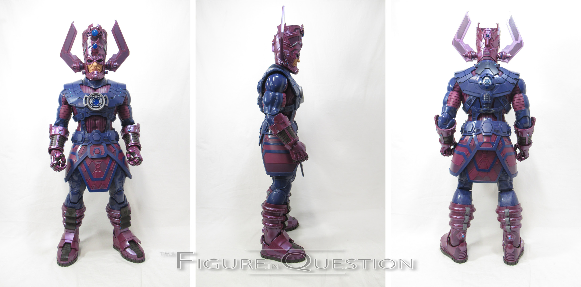
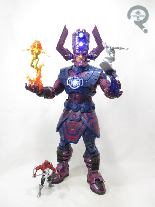
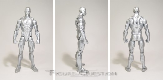
 Galactus is the second Marvel Legends HasLab project, launching in mid-July of 2021 and ending on August 30th. His initial target was 14,000 backers, more than twice that of the Sentinel, and he wound up finishing with over 30,000 backers, which was almost 10,000 more than what the Sentinel got. It began shipping out just last month to backers. The figure stands 30 inches tall (even larger than the Sentinel) and he has 70 points of articulation. Like the Sentinel, about 40 of those points come from the hands, which feature movement at each of the knuckles, which is really impressive. Beyond that, the scheme is a little less crazy, but generally not bad given the chunkiness of the figure. That being said, compared to the Sentinel, Galactus’s articulation isn’t quite as easy to use. In particular, the legs are a lot stiffer. Since there were complaints about the knee joints on the Sentinel, Galactus winds up getting ratchets on his knees. While it does lock the knees in place more securely, I found that on my figure it made getting his legs into that sweet spot for standing was a much trickier prospect. Once he’s there, he stands alright, but it definitely takes a good deal more doing. Galactus’s design over the years has somewhat evolved, but he’s certainly kept a consistent general feel since his debut 56 years ago. He’s a mix of purple and blue, and he’s got that very distinctively shaped helmet. This figure’s design takes his classic elements and modernizes them a bit. He doesn’t appear to have a direct comics equivalent the way that the Sentinel did, but it makes
  him a little bit more all-purpose. I really like this particular design. There’s no denying who he’s meant to be, but there’s a ton of detail work to help fill the larger canvas. As with the Sentinel, this figure’s sculpt is an all-new one (courtesy of sculptor Rene Aldrete), and its got quite a lot of engineering. There’s a ton of smaller pieces, all assembled over a core figure, making him actually look like a properly armored person. The segmented assembly of the figure’s sculpt aids with his color work, since it allows for a lot more molded coloring. That said, there’s still no shortage of paint work on this guy, covering the smaller accent work, which really sells the sculpt work for the design. There’s just a ton going on here. Galactus gets a light up feature, which is actually quite an involved thing itself. Two AAA batteries in his head and two more in the torso allow the chest, eyes, and four spots on the helmet to light up. It stays on for a surprisingly long time, about 7 minutes on mine. It’s got a sort of a fading in and out feature, which looks a bit like it’s pulsating. The button on the chest turns the whole lighting set-up on, but thanks to the batteries in the head, it does actually light itself separately, and there’s even a button on the back of the helmet to allow you to turn the upper lights on by themselves, if you so desire.

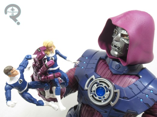
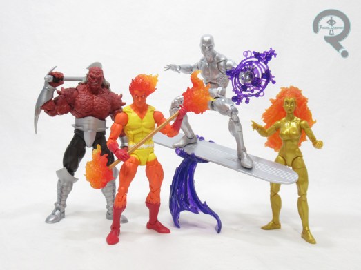
 Galactus is a quite large and impressive figure in his own right, but he also gets a whole host of accessories. At the start of the campaign, Galactus included three different faceplates for the helmet. There’s a standard calm expression, an angrier teeth-gritting expression, and a skeletal one based on his Cancerverse counterpart’s remains from “Thanos Imperative.” The calm expression’s my preferred of the three, but the options are always a plus. Based on the success of the campaign, there were four tiers for more accessories. The first three each added one of Galactus’s Heralds, with Tier 1 adding Frankie Raye, Tier 2 adding Silver Surfer, and Tier 4 adding Morg. The fourth and final tier added one more piece for the core figure, an alternate Dr. Doom head. Doom has taken on the Power Cosmic, or otherwise been enlarged on numerous occasions in the comics, but this one in particular seems to be most clearly based on the alternate universe Doom from Marvel 2-in-One. It’s obviously not going to be anyone’s go to for the figure, but it’s a fun extra piece, and I dig its consistency of design with the smaller Doom figures.
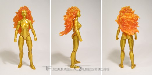
 Remember those three heralds I was talking about? Yeah, let’s discuss. The first one added was Frankie Raye, typically known as Nova, but not billed as such, presumably to avoid confusion with the Richard Rider version of the character. Frankie’s a rather classic design, but one that has as of yet not gotten any sort of Legends treatment, though she did get a figure from Toy Biz’s Silver Surfer line in the ’90s, as well as a Minimate. This figure stands about 6 1/4 inches tall and she has 29 points of articulation…or at least he should. Frankie’s apparently prone to seized joints, and in the case of my copy, that’s on her neck. I’ve not yet tried to free it up, so right now I’m just relying on the ball-joint portion. Frankie is making use of the upgraded female base body we saw on Shriek. It’s a nice, basic body, and with balanced proportions and a decent articulation set-up. And it’s also got the pinless elbow and knees, so that’s cool. Frankie gets a new head sculpt, which is alright. I don’t know, it’s just maybe not my ideal version of Frankie. I’m partial to the pointed crown look for the forehead, which this one doesn’t do. To my eyes, it leaves her a little more generic looking than I’d like. In terms of color work, the paint is confined to the head, largely the hair, but with some minor detailing for the face. She’s using molded plastic for the gold, which is a change-up from what Hasbro had originally said they’d planned. Originally, she was supposed to be painted gold, which honestly would have looked just a little better. That said, this gold plastic is at least not all swirly. Frankie is packed with three sets of hands (fists, gripping, and open gesture), and a flame base that allows her to clip onto Galactus’s right hand.
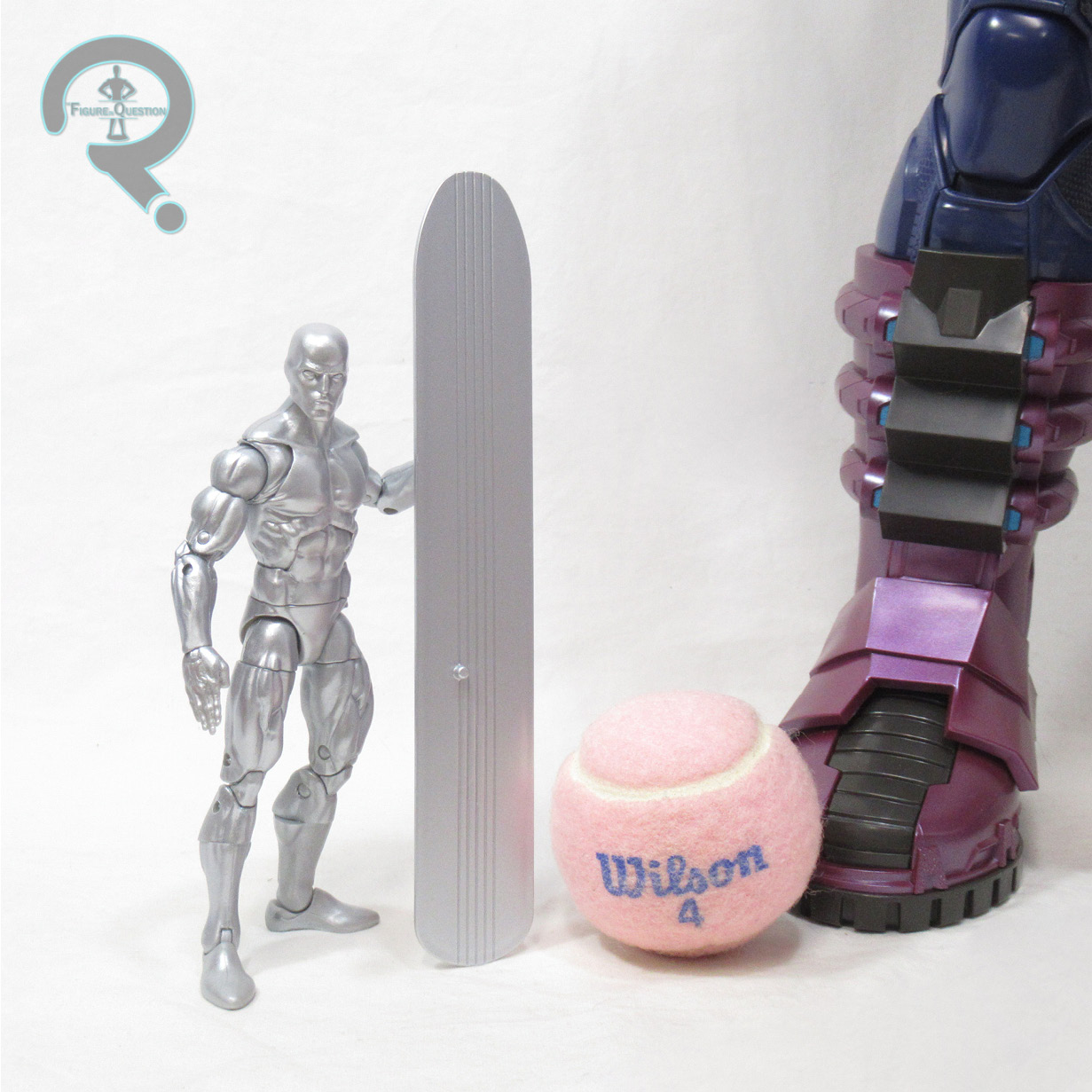
 For the second tier, we got Galactus’s best known herald, Norrin Radd, aka the Silver Surfer. Surfer’s not a stranger to Legends, and was released solo as recently as 2018, as part of the Walgreens-exclusive sub-set of FF-themed Legends. That figure’s gotten pretty pricey on the aftermarket, so rolling him in with Galactus was pretty sensible. The figure stands a little under 6 1/4 inches tall and has 34 points of articulation. He’s using the same basic set-up as the last one, so he’s on the 2099 body again. I felt it was a little small the last time around, but I’ve warmed up to it a bit more in the years since, especially with Johnny moving to the same base, and with Firelord using it too. Rather than re-use the last Surfer head sculpt, this one gets a brand new sculpt courtesy of sculptor Paul Harding. I didn’t hate the previous one, but it still wasn’t one of my favorites. This one, on the other hand, I really, really like. Surfer head sculpts are always the downfall of the figure, but this one’s really strong, and easily the best Surfer sculpt we’ve seen in toy form. His paint work is slightly changed up. He’s still all silver, of course, but it’s a slightly brighter, slightly more matte finish. I honestly kind of dig the change. Surer is packed with three sets of hands (fists, flat, and open gesture), an effects piece (in purple now, contrasting the yellow of the last release), his surfboard, and a flight base designed for Galactus’s left hand.
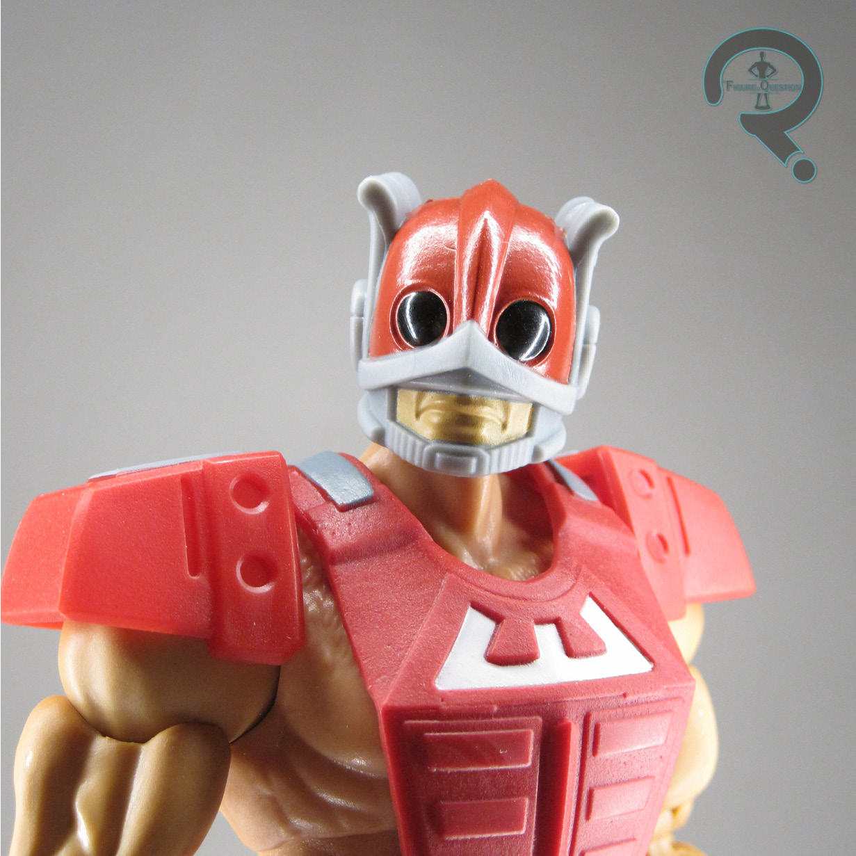
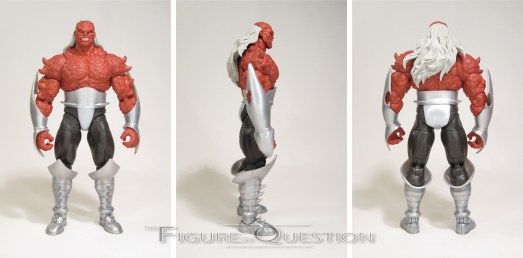
 The final herald in this set, added when the campaign met its third stretch goal, is Morg. After Galactus relieved Frankie Raye of her duties after deeming her too kindhearted for the role of herald, he found Morg, who was very much *not* too kindhearted. In fact, he kind of went too far the other direction, leading him to ultimately turn on Galactus and all of the former heralds. So, Galactus took away the Power Cosmic, and Morg died. And then he came back. And then he died again. And now he’s kind of a minor player, often forgotten. He’s previously had a Minimate, but that’s the extent of his figure coverage up to this point. The figure stands about 7 inches tall and he has 29 points of articulation. Despite his bulkier stature, Morg is actually pretty well articulated, with double elbows and knees, which don’t even wind up breaking up the sculpt too badly either. He’s also making use of the pinless construction, which looks a heck of a lot cleaner. Morg is sporting an all-new sculpt. It’s a pretty respectable match for his comics counterpart, and it’s certainly got a lot going on. I like how the proportions work, and he’s certainly as hideous as he’s supposed to be. The figure’s color work is generally pretty decent. Not a ton of painting, mostly just molded colors, but it works. Interestingly, the pants are black, while initial renders from Hasbro showed them as brown. Both are accurate, and I personally prefer the black, so I’m not upset about it. Morg is packed with his axe. It’s not the bevy of extras that the other two got, and he’s also the only one without a way to directly interact with the main figure, but he’s also a completely new sculpt, rather than a new head on an old body.
THE ME HALF OF THE EQUATION
While I don’t *quite* have the same level of personal love for Galactus that I do for the Sentinel, I do still have quite an attachment, stemming back to my original Toy Biz figure, who I got back in the day from KB Toys (he was actually defective and had to have his electronics repaired by my dad and granddad). My brother Christian was a huge fan, though, and I fondly remember him carrying his Marvel Universe figure everywhere with him back in the day. That Galactus was, of course, bigger than my Galactus, so it goes without saying that I needed to one-up him. Right? Right. This figure still took just a touch more convincing than the Sentinel, but honestly not by much. I backed him pretty early into the campaign, before we even knew about the extra figures. He’s a lot of fun, and so are all the extras. This one’s certainly going to be hard to top.
As with the Sentinel, I got this guy directly through Hasbro. However, I’d still like to give a shout out to my sponsors at All Time Toys, who again allowed me use of the back room photo tent so that I could actually get proper pictures of this guy for the review. It definitely wouldn’t have gone nearly as smoothly without that. If you’re looking for cool toys both old and new, please check out their website.

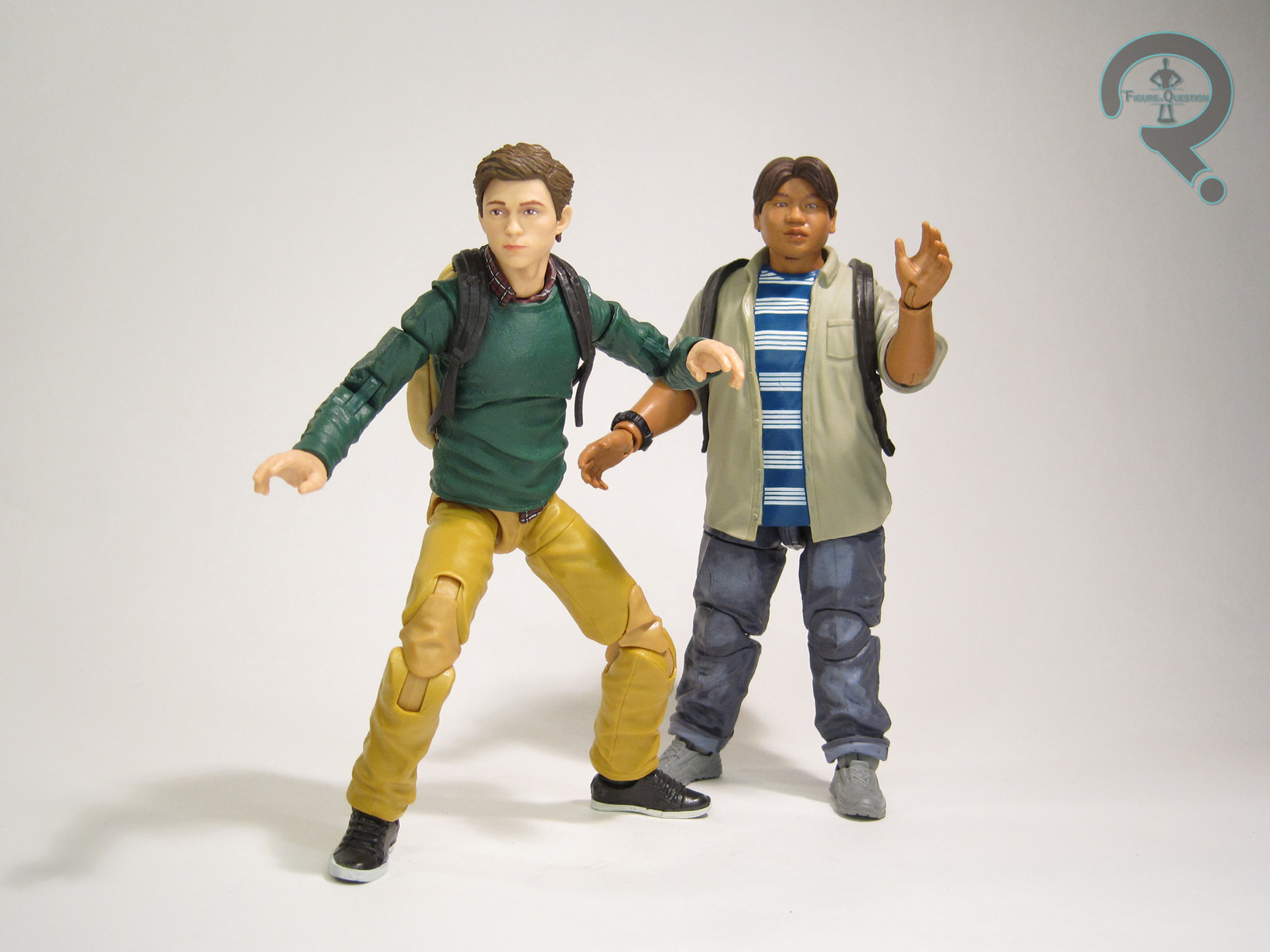
 “Peter Parker is a high school sophomore with a big secret. Instead of rushing home to do homework, he spends his afternoons fighting crime as the Friendly Neighborhood Spider-Man!”
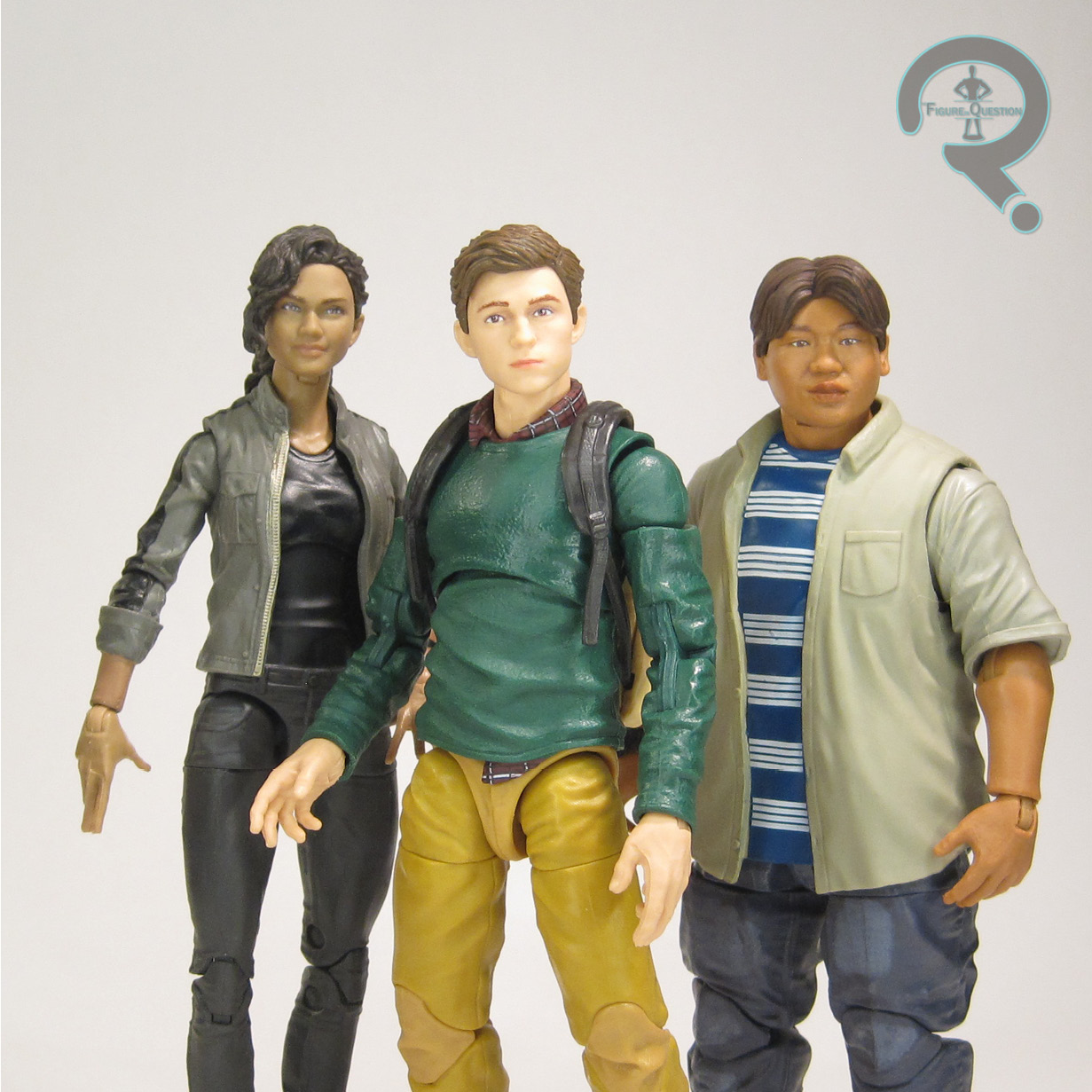
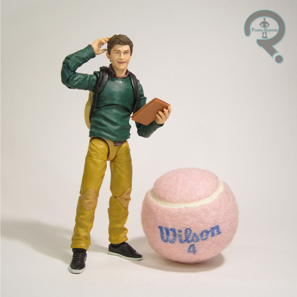
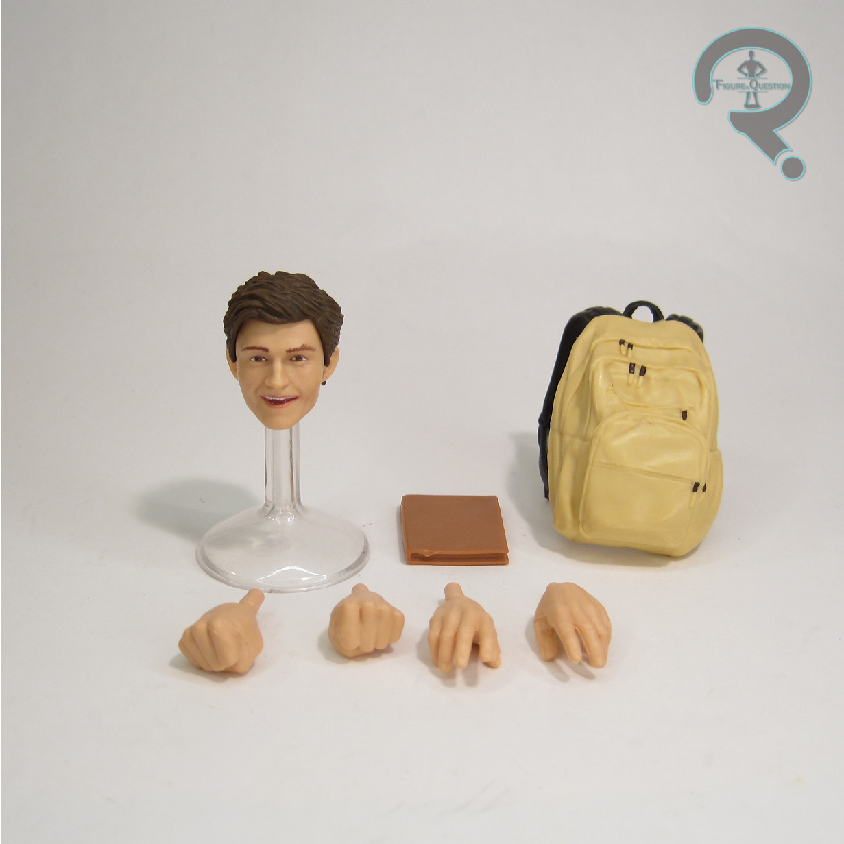 on one of Peter’s sweater wearing looks from one of Homecoming‘s school sequences. It’s a suitably character appropriate look, especially for Holland’s take on the character, and the sculpt does a solid job of capturing the outfit, as well as balancing his proportions in a realistic manner. The color work on the figure is generally pretty basic, with a good chunk of it being molded colors. The face is nice and lifelike in its paint application, and the plaid pattern on what we can see of his shirt under the sweater is quite nice for the scale. Peter is packed with an alternate smiling head, two sets of hands (fists and open gesture), a back pack, and a book. The alternate head is an interesting concept, and I appreciate Hasbro’s attempt at something a little different, but it’s not quite right, especially compared to the standard head. He looks more like Marty Feldman than Tom Holland. The book’s lacking any paint details, and neither set of hands can really hold it, but it’s a decent enough extra anyway. The back pack’s definitely a solid piece, though.
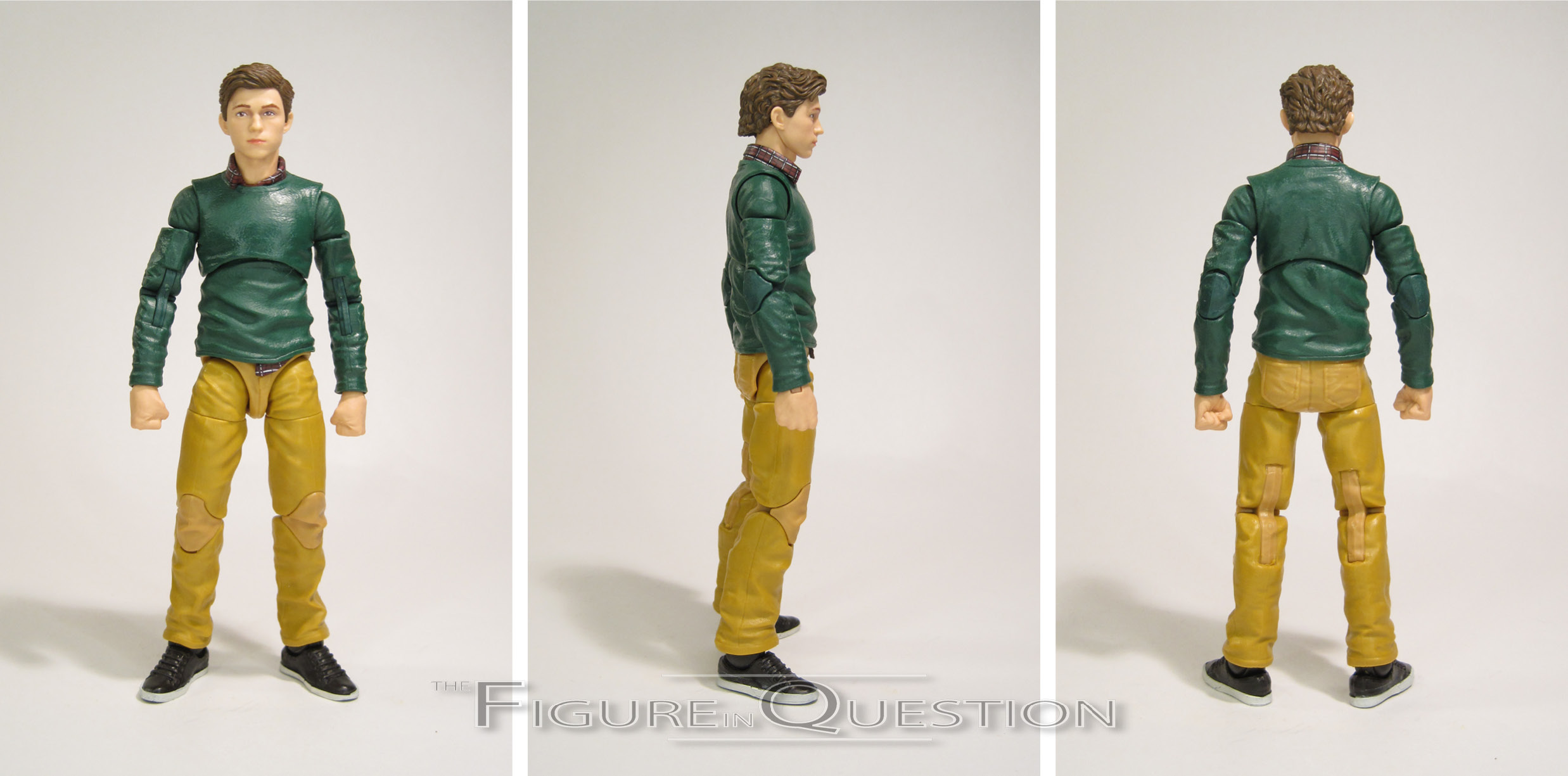
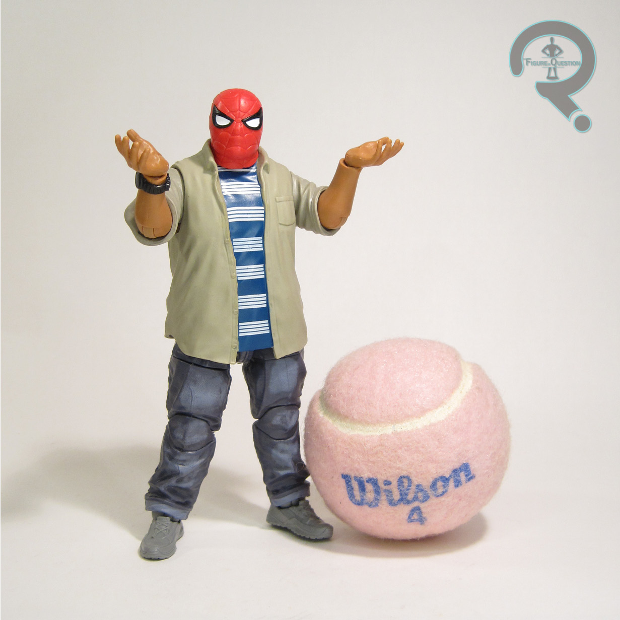 “Classmates and best friends, Ned is the only person at school who knows Peter Parker’s secret.”
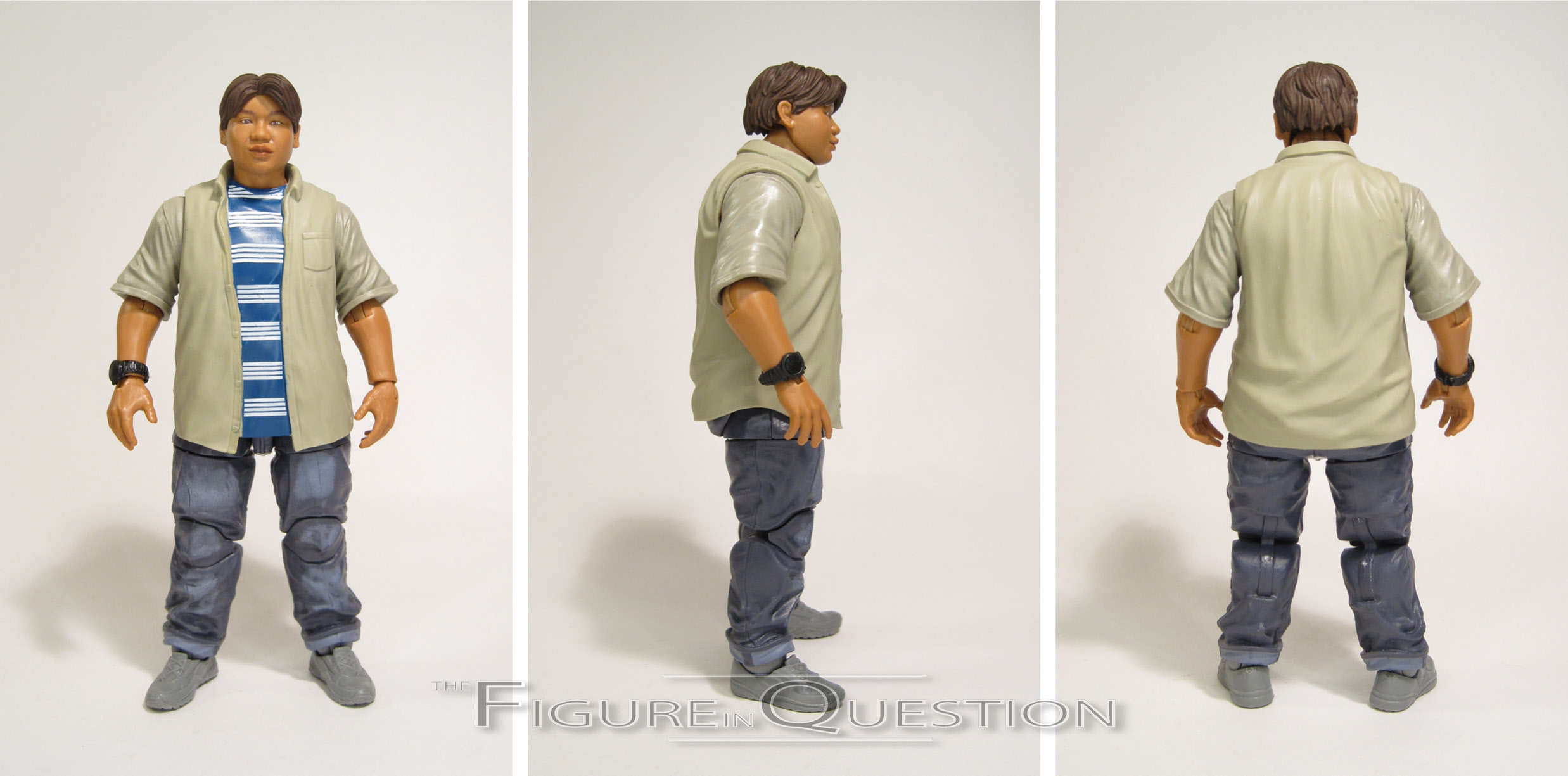
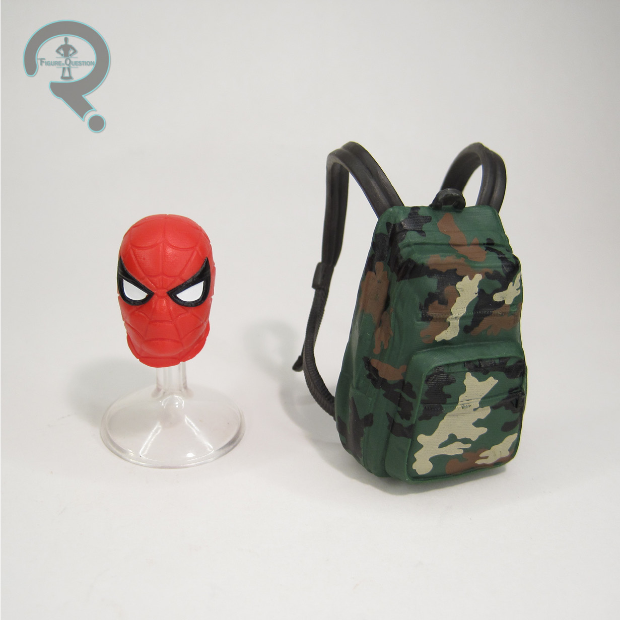 wish he at least had a better range on his elbows. Ah, well, you can still get some decent poses out of him. His sculpt is another all-new set-up, courtesy of sculptor Dennis Chan. The head sculpt has a likeness of Jacob Batalon that’s pretty much on par with the Peter figure’s Holland likeness. I particularly like the small trace of a grin on the face; it feels very on the mark for Ned. The body sculpt puts Ned in an outfit that matches up with Peter, which is definitely nice, and he gets a set of proportions that matches up well with Batalon’s build in the movies. The paint work on Ned is a bit more involved than was the case with Peter, with some wear on the pants, and a decent job with the stripes on the shirt. Ned is packed with an alternate head sporting a Spidey mask (as seen briefly in the movie), and he’s also got his own back pack, unique from Peter’s.