#0756: Cyclops & Mr. Sinister

CYCLOPS VS MR. SINISTER

X-MEN: STEEL MUTANTS

SinisterCyclops1

Last month, I took a look at one of Toy Biz’s many experiments with the Marvel license from the 90s, ­X-Men: Steel Mutants. They were a line of small scale versions of the X-Men, which featured a heavy dose of die-cast metal parts, hence the “Steel” part of the name. Toy Biz actually offered a pretty good selection of the X-Men in this line, including not one, but two versions of founding member Cyclops. Today, we’ll be looking at one of those, along with his pack-mate Mr. Sinister.

THE FIGURES THEMSELVES

Cyclops and Mr. Sinister were released in the second series of X-Men: Steel Mutants. Like all the others in the line, they work both as comic and cartoon versions of the characters.
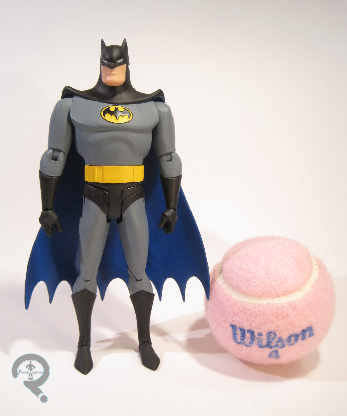
CYCLOPS

SinisterCyclops2
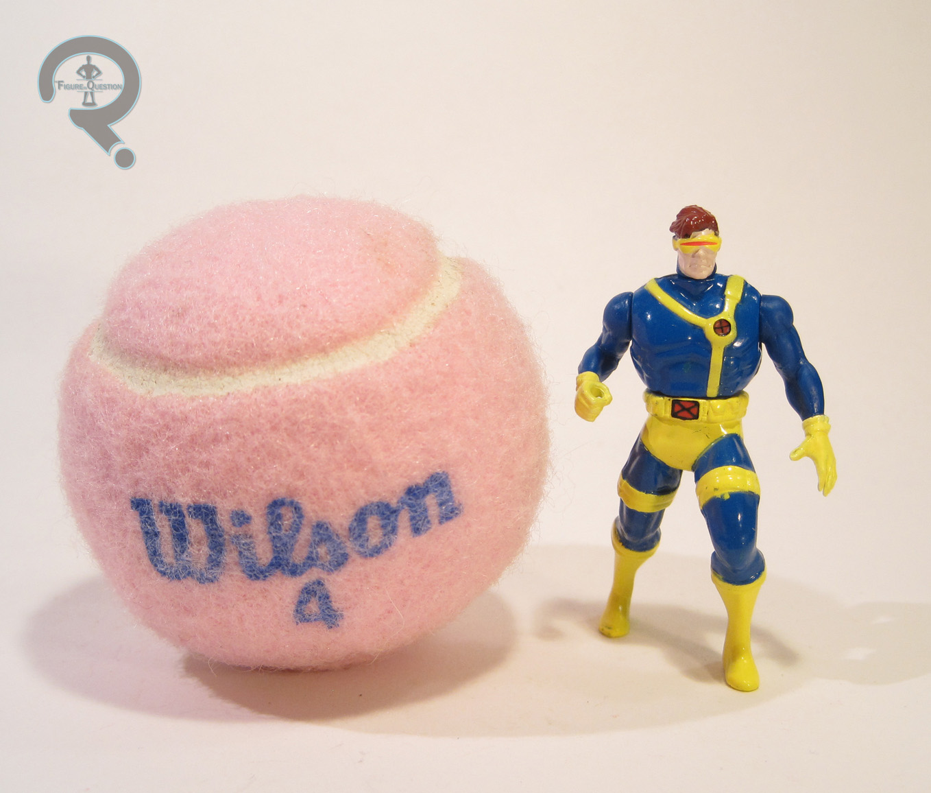
This is the second of the two Cyclopses released in this line. While Wolverine got three totally different looks for his three figures, Cyclops just gets a new pose. As opposed to the straight standing look, this one’s got a bit of a running start sort of a thing going. I guess that’s new and exciting. The figure stands roughly 2 ½ inches tall and has 4 points of articulation. Cyclops’s head and arms are plastic, and the torso and legs are metal, like all the other figures in the line. He uses the same head, torso, and left arm as the first Cyclops, along with a new right arm and legs, showing off that deep lunging thing he’s got going on. His sculpt, like that of the first Cyclops, is really a scaling down of the 5 inch Cyclops II figure. That was Toy Biz’s standard Cyclops, and it was a pretty good summation of the character, so it works. The torso’s a bit on the large side for Scott, but hey, it was the 90s, everybody was juicing. All in all, the figure’s pretty well detailed, and not terrible on the proportions, for the time at least. Cyclops’s deep stance makes him a little bit more difficult to keep standing than, say, Gambit, but not as much as you might think. Toy Biz clearly put a lot of effort into making sure these guys were properly balanced, which is good on their part. Cyclops’s paint work is decent for the scale, though there’s some noticeable slop on the changes from yellow to blue, which is slightly annoying. But, smaller details, such as the “X”s on his belt and chest harness are surprisingly clean, and the figure as a whole looks pretty good when viewed from a far.

MR. SINISTER

SinisterCyclops3
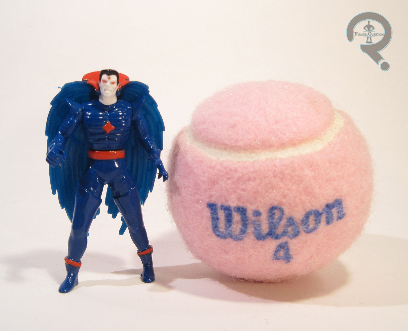
Mr. Sinister is a pretty natural choice for this line, given his prominence in the cartoon, and he certainly makes sense packed with Cyclops, since they interacted a lot in both the comics and the cartoon. And, unlike Cyclops, this figure doesn’t feel redundant to anyone who had the first series of the line. Sinister was a new sculpt for the Steel Mutants line, though he was more or less just a scaled down version of the 5 inch Sinister from the main line, with the articulation scheme changed. Like that figure, this one feels a little on the small side for Sinister, who was usually depicted as being at least a little bigger than the average person. Aside from that, though, he does a pretty good job of capturing the character’s design. The cape is a separate, removable piece, made from plastic. It clips around the figure’s neck, and doesn’t quite sit right, but it’s close enough not to look too off at this scale. As far as paint goes, Sinister’s mostly painted in the same shade of dark blue, which seems to be a little thickly applied. The rest of the paint is pretty good, though he’s totally lacking Sinister’s usual facial hair. The prototype shows him sporting a full goatee, which is still not correct. Maybe the factory could only do goatee or clean shaven, with no in between? I suppose this would be the preferable choice in that case. There was actually a later single release of this figure that had the goatee, but never one with the character’s actual beard.

THE ME HALF OF THE EQUATION

Cyclops and Sinister were purchased for me by Super Awesome Girlfriend, when we visited Yesterday’s Fun this past summer. She recognized them as being from the same line as Gambit and Bishop and insisted on buying them for me. I actually had the later single releases of both of these figures, though I can’t say I know where they ended up. All in all, these are another fun little addition, and I’m happy to have them!

#0755: PZ-4C0

PZ-4C0

STAR WARS: THE FORCE AWAKENS

PZ4CO1

The toys from The Force Awakens were supposed to start out with a bang, but then Force Friday happened and turned out to be more of a fizzle. Since then, there’s been sort of a slow trickle of figures for each of the various lines. The 3 ¾ inch line seems to be getting most of the focus, with a handful of new characters being added with each assortment. Of course, until the movie’s actually released, we won’t know which characters are actually major parts of the film and which ones are background scenery. So, let’s take the gamble and see what we got, starting with one of the brand new droids, PZ-4C0.

THE FIGURE ITSELF

PZ4CO2PZ-4C0 is a constant fixture in Resistance base control rooms, offering tactical data and communications support during important operations.” So, there’s your background on this character. Check out that epic tale. Anyway, PZ-4C0 was released as part of the second round of basic 3 ¾ inch The Force Awakens figures. She’s part of the second assortment of the “Jungle” sub-set of figures. She stands about 4 inches tall and has 5 points of articulation. PZ has an all-new sculpt, based on her design from the movie. The design is a tweaking of the basic protocol droid design introduced with C-3PO, with a slightly more alien set of proportions. I don’t know that it’s a perfect design; the functionality of the neck joint is definitely a bit impaired; but, it’s pretty visually interesting, and definitely fits in well with the other designs we’ve seen so far. The quality of the sculpt is actually pretty good. The armored parts are more smooth, and they have a nice symmetrical balance to them, and the circuitry bits are well detailed and add a lot of depth to the figure. PZ’s color scheme is definitely another unique aspect of the figure. The main blue color is a nice change of pace, and the painted accents and scuffs are all pretty cleanly done, so that’s cool. PZ-4C0 includes no character specific accessories, but she does include two pieces for the weird build-a-thingy. These are a set of rocket attachments, and they can be placed on her legs, which makes for a sort of a nifty look.

THE ME HALF OF THE EQUATION

Whilst on a trip to visit my family in NC, I stopped by the nearby Wal-Mart, which just so happened to have a few of the latest Force Awakens figures, PZ included. I had actually seen shots of PZ online and thought she had a pretty neat design, so I was pretty excited to find the figure in-hand. She’s actually a pretty fun little figure, and one of my favorites of the smaller-scale TFA figures I’ve picked up.

PZ4CO3

#0754: US Agent

US AGENT
IRON MAN (TOY BIZ)

USAgent1

Who’s up for a history lesson? Well, too bad, cuz I’m giving one anyway.

Let’s talk about US Agent. As a member of the West Coast Avengers, he was carried over into the reformation of the team, Force Works. Force Works had the luck of being relevant at the time of the 90s Iron Man cartoon, resulting in the team serving as Tony’s primary supporting cast for the first season of the show. US Agent, while a member in the comics, was never on the show. But, since the cartoon’s toyline was taking just as many cues from the comics as it was the cartoon itself, US Agent was slated to be released in the third series of the line. Unfortunately, he was cut from the line-up at the last minute, due to a change in the case pack-outs. His tooling was shelved, and later re-purposed for the proposed Living Laser figure in Series 5 of the same line. When that figure was also canceled, the body was re-re-purposed into the “Muntant” Armor version of Professor X. Then, in 1997, with no rhyme or reason, a slow trickle of US Agent figures began appearing from overseas. They were dubbed a “Limited Release” courtesy of Elegant Way, and were very quickly discovered to be unsanctioned by Marvel or Toy Biz. Some 10,000 units were produced before Toy Biz could halt production, but they did their best to make sure as few as possible made it to the US, ironically making US Agent exclusive to areas outside of the US, and quite a pricey commodity amongst US-based collectors. What does all this have to do with me? Well, in case you hadn’t figured it out, I got one.

THE FIGURE ITSELF

USAgent2US Agent was, as noted above, supposed to be released as part of Series 3 of the 90s Iron Man line. Ultimately, he ended up being released on his own, as an unsanctioned product, so this is effectively a bootleg. However, unlike most bootlegs, the quality of the figure seems to be about on par with the official figures. The figure stands 5 ¼ inches tall and he has 8 points of articulation. He only has elbow movement on his left arm, due to a spring-loaded feature being implemented on his right. I’ve actually reviewed most of this figure before, when I looked at Astral Projection Professor X. The right arm, upper left arm, and upper legs are identical between the two figures. The torso and lower legs are mostly the same, though the Professor X pieces had ports for armor add-ons, and the US Agent’s torso has an additional sculpted insignia on his torso. The left hand has a tighter grip on this figure, which is odd, since he doesn’t actually have anything to hold, but it looks fine. The end result is a body that is nearly indistinguishable from Professor X’s to the average viewer. The body’s not the greatest sculpt ever; that torso still looks wonky. That said, it does work a lot better for US Agent than it did Xavier, which makes sense, since US Agent was the character for whom it was intended. US Agent does have his own, totally unique head sculpt, which is cool. It’s not exceptional work or anything, but it is pretty nice, and it gives Walker an appropriately sneer-y expression, plus it sits well on the body. US Agent’s paint work is generally pretty good. Unsurprisingly for a guy named “US Agent,” he consists mostly of red, white, and blue. The blue is molded and the rest is painted on; the application is decent enough, though there’s some slop around the edges. The official prototype shots for US Agent showed him with black in place of the blue, but it’s not unlikely that Toy Biz themselves might have made this change before dropping the figure. US Agent included an energy shield (which has trouble staying in place, due to the spring feature), and one of the standard Iron Man line badges, though it does not have the usual character bio, presumably due to Toy Biz never writing one.

THE ME HALF OF THE EQUATION

Back in the 90s, when I was first getting into toy collecting, the Iron Man and Fantastic Four lines from Toy Biz were my jam. I got every figure I could, and I even saved the backs of the packaging so that I could cut out the small thumbnail images of all the other available figures. US Agent was one of the ones I remember having that little thumbnail for, but never being able to find. In those days, you didn’t have many ways of finding out about cancelled figures, so I just assumed he wasn’t out yet. It wasn’t until a little later, after discovering the awesome Iron Man Achive on Raving Toy Maniac, that I found out he never came to be. Then it was another several years or so before I found out he actually had come to be, but not in an easily attainable for a 10 year old sort of way. So, I was excited beyond belief when I came across a dealer at this year’s Baltimore Comic Con selling this guy loose, and not even for a small fortune. I’m really happy to finally have this guy, and to have finally completed my Series 3 collection!

USAgent3

#0753: B.A.T.

B.A.T.

G.I. JOE: A REAL AMERICAN HERO

BATVint1

After being a fairly straightforward military-based line of toys, and then a mostly down to earth adventure series for the first 20 years of its life, in the 80s, G.I. Joe gave up on that whole real world thing and threw caution to the wind. Okay, that’s not true. The first year of the 3 ¾ inch line was actually pretty modest. Then 1983 added Destro and Gung-Ho to the line and all bets were off. Prepare for the neon colors, the wacky specialists, and even the Battle Android Troopers!

THE FIGURE ITSELF

BATVint2The B.A.T. was released in the 1986 series of G.I. Joe: A Real American Hero (which, as I noted in my Lifeline review, was a pretty good year for the line). The figure is 3 ¾ inches tall and has 15 points of articulation. That’s one more point than most of the line! Structurally, the figure was all new at the time, though his pieces would get used for a few other figures (though, none of them were B.A.T.s. It depicts the B.A.T. in its Cobra uniform, but there are actually some nice hints at it being a robot under the clothes, rather than just a normal person. The details are generally pretty sharp, at least for a figure of the time, and the mechanical arms in particular are very nicely detailed. The B.A.T. definitely looks unique from the other Cobra forces, while still fitting in great stylistically. The figure originally had a lenticular piece in the middle of the torso, detailing some of the B.A.T.’s internal mechanics. Sadly, my figure does not have this piece. The paint on the B.A.T. is decent, though not the greatest thing ever. The orange/yellow bits are a bit on the sloppy side, especially around the edges. That said, the overall look is pretty good. The Bat is pretty well accessorized, with four different right hand attachments (normal hand, claw, flame thrower, and gun), as well as a backpack to hold the extra attachments. Also, my figure has a small pistol thrown in, but that isn’t from the original figure.

THE ME HALF OF THE EQUATION

I picked up the B.A.T. loose from local toy store All Time Toys this past summer. I’ve always loved the B.A.T. design, and I’ve had several of the figures over the years, but I never had the original. Now I do! He’s a pretty nifty little figure, though I do think he’s been surpassed by a few of his successors.

BATVint3

#0752: Age of Ultron Minimates Boxed Set

FINAL FORM ULTRON, IRON LEGION 01, TONY STARK, MARK 45, & NICK FURY

MARVEL MINIMATES

AoUMatesBox1

So, Series 61 and 63 of Marvel Minimates, plus the two TRU exclusive sets and the blind bagged figures, did a pretty reasonable job of getting us just about every important character from Age of Ultron. We got the whole Avengers team, plus several Ultrons, a few Iron Legion drones, two minor villains, and the Hulkbuster. However, DST felt that wasn’t quite enough, so we’ve gotten an extra, special five figure (that’s a whole extra figure!) boxed set to fill a few holes in the collection.  Without further ado, let’s have a look at Final Form Ultron, Iron Legion 01, Tony Stark, Iron Man Mark 45, and Nick Fury!

THE FIGURES THEMSELVES

This set was one of the SDCC-exclusive sets offered by DST this year. The sets were then available at various retailers following the show.

FINAL FORM ULTRON

AoUMatesBox3Ultron looks a little….I don’t want to say puffy…  Yeah, so this is Ultron in his Vibranium infused body from the film’s big climactic battle, which is ever so slightly different from his main look for the rest of the movie. The figure is about 2 ½ inches tall and has 14 points of articulation. Ultron uses the base Minimate body, with non-standard pieces for the head, hands, and feet, as well as add-ons for the shoulders and torso extension. All of these pieces are re-used from prior figures; the head is from Ultron Prime, the hands originated on DC Minimates’ Cheetah, the feet are from Nightcrawler, and the add-ons are pieces we’ve seen on numerous prior ‘mates. It’s definitely a hodge-podge of pieces, but the end result actually looks pretty sleek. Also, he amends the issue of size that plagued Ultron Prime; he’s not huge, but he’s certainly got a level of imposing-ness to him. The paintwork on this figure is superb. The silver is nice and cleanly applied, the detail lines are nice and sharp, and he does a pretty great job of replicating the film design. Everything looks really great, and he’s even got a full set of detail lines on the normal arms under the bulked up shoulders. Ultron includes a spare set of normal hands and feet painted silver, for those that don’t want the more unique pieces, as well as a clear display stand.

IRON LEGION 01

AoUMatesBox6Okay, so if there’s one thing this set might have been okay without, it’s another Iron Legion drone. The blind bags ran into a bit of an issue by seriously over-packing drones 02 and 04, which kind of got us all down on the drones in general. That said, there are actually supposed to be five of these guys, and we only had two (three if you count the Ultron Mk 1 as drone 03), so I guess getting another of them isn’t the worst thing. Of course, if I were choosing one more, I’d probably go with 05, since you could include the scepter the drone steals, but DST went with 01. I guess having 01, 02, 03, and 04 is better than having 02, 03, 04, and 05. This figure is virtually identical to the other two drones we got (reviewed here). He’s a vanilla ‘mate, with a fair amount of painted details. Obviously, he’s got “01” in place of the preceding “02” and “04,” and he’s also got grey accents as opposed to the blue and black, respectively, of the other two.

TONY STARK

AoUMatesBox2Hey, it wouldn’t be the Avengers without another Tony Stark, right? The “trying to lift the hammer” sequence from AoU was definitely one of the more popular scenes from the movie, so it’s not a huge surprise to see Tony in his look from that scene. Tony has 5 sculpted add-on pieces for his hair, vest, tie, and rolled up sleeves. These are all pieces we’ve seen numerous times before, and they do a good job of capturing his look from the scene. His paint is pretty simple, with mostly base color work. The facial likeness somewhat resembles RDJ, though I don’t think it’s as good as some of DST’s other versions of the guy. It’s also a little bit too high set. Tony includes one of his Iron Man gauntlets (taken from the Mark 43), which is kind of key to the scene, as well as a spare set of arms and a jacket piece, and a clear display stand. It would have been cool to include Mjolnir here, but I can’t say this guy’s lacking for extras.

MARK 45

AoUMatesBox5We got the Mark 43, we got the Hulkbuster, and we got a basic Tony. What’s left? The Mark 45, Tony’s armor from the last fight scene. It’s only a little bit different from the Mark 43, but it’s still its own armor, and it continues the trend of each model streamlining the basic design just a bit more. Structurally, he’s just a basic ‘mate, with the helmet from the Mark 42/43. It’s not 100% accurate, but at this scale, it’s close enough. The paint is the important part here, and it’s handled quite nicely. The red and gold are distinctly different from each other, and they’re both nice and bright. The details of the suit are rendered pretty nicely on the body, and look pretty accurate to the source material. Under the helmet, there’s another Tony face, which is much angrier looking than the regular Tony. It looks even less like RDJ, but I much prefer a different expression that looks less like the actor than the same expression over and over again. The figure includes the same hairpiece included with the other Tony, as well as a flight stand, and a clear display stand.

NICK FURY

AoUMatesBox7At last! A character who wasn’t released in any of the other AoU assortments! Fury was originally slated to be one of the figures in the blind bagged assortment before being pulled from the lineup, so it’s not a huge shock to see him turn up here. The figure depicts Fury in his somewhat more distinct look from his earlier appearances in the film. He gets two add-on pieces for his hat and coat. The hat comes from the Amazing Spider-Man Vigilante Spider-Man, and the coat is from Punisher War-Zone’s Frank Castle. These parts match up pretty closely with the look from the film, and their well-sculpted in general, so that’s good. Fury’s paint is fairly simple. He’s got a fairly drab color scheme, with a bit of detailing for the belt, shirt, and face. The face doesn’t really look much like SLJ, but he’s a decent looking Fury. Also, I really like that the eye patch’s strap goes all the way around the head, even under the hat, though it’s a little frustrating that the head has a peg hole at the top for the hat. Fury includes a spare head with the eye patch removed, a handgun, and a clear display stand.

THE ME HALF OF THE EQUATION

Since I didn’t go to SDCC, I picked this set after the fact, courtesy of Luke’s Toy Store. This set doesn’t cover a whole lot of new ground, but it’s still a solid addition. Ultron is a significant improvement to Ultron Prime, Fury and Stark are both valid variants, and the Mark 45 and the Legion drone are decent enough. The final AoU line-up is pretty impressive!

AoUMatesBox9

#0751: Batman

BATMAN

BATMAN: ANIMATED (DC COLLECTIBLES)

BatmanTAS4

Hey, do you guys remember how last year DC Collectibles debuted their line of super awesome figures based on Batman: The Animated Series? And do you remember when I reviewed the first figure in the line, which was Batman? And how I noted that he was actually Batman from the second incarnation of the show? And then I pointed out that the original design was slated for release later on in the line? Are you getting tired of these questions? Me too. So, yeah, the original Batman: The Animated Series Batman figure is finally here. Let’s see how it turned out!

THE FIGURE ITSELF

BatmanTAS6Batman is figure #13 in DC Collectibles’ Batman: Animated line. Technically, this makes him the first figure in Series 4 of the line, but it seems DCC has completely given up on releasing these in actual assortments, so Batman shipped out on his own, though a few other figures arrived in the surrounding weeks. The figure is just shy of 6 ½ inches tall and has 24 points of articulation. The figure lacks the usual swivel joint on the lower leg, which is quite a pain when it comes to posing or even just trying to get him to stand, and also leaves him eternally pigeon-toed. The boots are even separate from the rest of the leg, so it looks like there should be movement, but there’s not. Batman’s sculpt has the task of translating a 2D character model into 3D, which is certainly not easy. From the neck down, the figure works pretty well. Everything seems proportioned right, and he’s more or less identical to the guy we saw on the screen. He seems a little on the small side compared to some of the other figures, but not terribly so. What about the head? Well, it’s hard to say. The prototype looked pretty dead on, but this doesn’t seem to have made it to the final figure. The shape of the eyes in particular seems off, and they feel way too small. It’s possible it’s a paint issue, so it’s hard to judge the accuracy of the sculpt. This figure only gets one cape, in contrast to the two included with the last Batman; all we get is the swept back look. To be fair, this is the preferred of the two looks, and the cape is accurate to the source material, but the option BatmanTAS7would have been nice. This figure makes out okay paint-wise. There’s the previously mentioned issue with the eyes, but other than that, the paint is pretty clean, and they seem to have done a pretty good job matching the colors from the show. Batman is packed with a B:TAS accurate batarang, a grappling hook, 7 hands (a pair of fists, a pair of basic grip, a pair for holding the batarang, and one with the grappling hook sculpted in place), and a display stand with his character design sheet printed on it. It’s not quite as much as was included with the last Batman, but it’s still a pretty impressive allotment.

THE ME HALF OF THE EQUATION

Batman was purchased from my local comic store, Cosmic Comix. They had just gotten him and Poison Ivy in and I only had the money for one, so I went with him (I went back for Ivy later). I was pretty eager to get this figure when it was announced, what with it being my Batman and all, but I have to say, I was…disappointed with the final product. It really sucks to have to say that, to be totally honest, but it’s true. He’s not a bad figure, but the issues with the head and lack of movement in the legs hold him back. On any other figure, this might be forgivable, but on the definitive Batman, it’s a pretty big letdown. This figure is supposed to be repackaged with a new head in a two-pack with Phantasm early next year. It would be nice if DCC could fix the issues for that release. Until then, this guy’s certainly serviceable.

BatmanTAS2

#0750: Alien Warrior

ALIEN WARRIOR

S.H. MONSTERARTS

AlienAVP1

What’s this? Another Alien review? On my site? Why, that’s just unheard of! …Or, maybe not. So, what’s different about this review? Well, amongst other things, it’s a figure based on a movie I don’t like. Yeah, this here is one of the Alien Warriors from the first Alien vs. Predator film, a movie that’s only real saving grace is that it’s not as bad as its own sequel. In fact, it’s not a bad movie, just a mediocre one. That doesn’t seem right for Alien vs. Predator, which should really be a “go big or go home” affair. But, alas, we got the film we got, and it’s highly unlikely we’ll ever see another. Sorry, this is actually supposed to be a toy review! Let’s get on to the figure!

THE FIGURE ITSELF

AlienAVP2The Alien Warrior is a part of Bandai’s S.H. MonsterArts line, and was released as a standalone item in early 2014. The figure stands just shy of 6 inches tall (a little taller than Bandai’s Big Chap) and has 63 points of articulation. As noted in the intro, this figure is based on the Alien vs. Predator design for the Alien Warrior. It’s interesting that they opted to release this version of the alien so far after the movie instead of something more iconic, such as the Aliens version, but if I had to guess, I’d say AvP’s probably just the cheapest of the licenses to procure. I find that each successive iteration of the Xenomorph design after Aliens loses a little of what made the first two designs work, and in particular, I found the Xenos in AvP to be too skinny and waaaaay too slimy and goopy. While this figure does strive to be an overall fairly accurate translation of the design, I find it changes a few minor things that result in a much better end product. For one thing, the details and texturing feel much sharper here than in the film, which is definitely a change I appreciate. In addition, it seems they’ve shrunk the size of the head ever so slightly, so that makes the body feel less skinny by comparison. In general, the sculpt has some incredible detail work and there’s some really great touches that they could have gotten away with leaving out, like the fully sculpted head under the dome. That’s something we don’t see in the movie, but they put it there anyway. Also, like the Big Chap, the knees and the tip of the figure’s tail are made from die-cast metal, which is a cool little, easily missed touch. The figure also has the signature Xeno inner-jaw, though the instructions tell you to remove the whole outer jaw to get it out (side note: looks like they got an actual translator for the instructions on this one. It makes for a more professional end product, but I must admit to missing the just slightly off English of the Big Chap’s instructions. Oh well.)  The paintwork on the figure is pretty much what you’d expect on a figure of a Xeno; it’s black with silver highlights. The dark brown transparent dome is definitely a cool look, and I was quite happy to see that the fully sculpted head was also fully painted under there. The Alien Warrior includes an alien egg, a chestburster, two sets of hands in splayed and closed poses, and a display stand, which, like the Big Chap’s, seems a little out of place with this figure.

THE ME HALF OF THE EQUATION

After getting me the Big Chap for Christmas, my boy Tim got me this guy as a birthday present. Though I don’t love the movie, and I’m not a big fan of the Xeno design as it’s presented in the film, I actually really like this figure a lot. He’s a ton of fun to pose, and the tweaks Bandai made to the design make it a lot better looking. Definitely an awesome addition to the collection!

AlienAVP3

#0749: Jetpack ODST

JETPACK ODST

HALO: REACH

ODSTJet1

In addition to making it pretty clear that I’ve gotten quite into the Halo series, I’ve also mentioned once or twice before how the Orbital Drop Shock Troopers, aka the ODSTs, are one of my favorite parts of the series. Since Halo 2, these guys have shown up with a fair bit of regularity, including in the pretty awesome Halo: Reach campaign, where they assist Noble Team for a few levels, which seems to have been enough to warrant one of them getting an action figure in the accompanying toy line. I’ll be looking at that figure today.

THE FIGURE ITSELF

ODSTJet3The Jetpack ODST was released in Series 3 of McFarlane Toys’ Halo: Reach line. His design is based on the working design (though not quite the final design) of the “Bullfrog” ODSTs from Reach, which is really just a merging of the original ODST design with that of the more basic USNC Trooper. The figure stands 4 ¾ inches tall (a little bigger than the other ODSTs) and has 24 points of articulation. He’s missing a few articulation points present on just about every other Halo figure; most notably, he has no bicep movement, which severely hinders his ability to hold stuff. Given that there’s a strap on his bicep that could have easily hidden a cut joint, I can’t imagine why McFarlane opted to leave this joint out. There actually aren’t a whole lot of new parts to this figure. His base body is repurposed from the Reach USNC Medic, with the shoulder pads from the USNC Radio Operator, the head from ODST Mickey, and the basic Reach jetpack. He’s got a few extra pouches glued on in a few spots, and an extra collar piece, which appears to be new. Regardless of whether their new or not, all of the parts used here are pretty nicely sculpted. The details and texturing are superbly handled, and help make this guy look like a real person. The collar piece renders the neck movement almost inert, but it’s easily removed, should you so choose. The hip joints are a bit awkward looking, and there’s the previously mentioned issue with ODSTJet2the arm movement, but the overall look of the figure is pretty cool. Like all of the other Reach figures, the Jetpack ODST’s hands aren’t molded to properly hold a weapon, but they do alright. The paintwork on the Jetpack ODST is overall pretty great, but there’s one major issue: the visor. In Reach, the ODST’s visor gave off a faint glow, which somewhat illuminated the surrounding areas of the helmet. On this figure, McFarlane just painted the visor and all its surrounding areas a straight metallic blue. You can still clearly make out the outline of the visor on the sculpt, but the paint just goes straight over it, which just ends up looking really sloppy. Aside from that, the paint is actually really nicely handled. There are lots of nice smaller details and insignias on the armor, and plenty of washes and dry brushing to help bring out the sculpts details. In addition to the titular jetpack piece (which is removable), the ODST includes a basic Magnum handgun.

THE ME HALF OF THE EQUATION

After picking up Mickey and thoroughly the figure, I decided to take advantage of his seller’s rather substantial selection of well-priced loose Halo figures, which included this guy here. I will admit to being a little letdown by this guy when he first arrived, mostly due to the movement issues and him just not being quite as good a figure as Mickey, but he’s grown on me over time. He’s not my favorite Halo figure, but he’s really not bad.

ODSTJet4

#0748: Darth Vader

DARTH VADER

STAR WARS HERO MASHERS

VaderMasher1

So, hey, there’s like a Star Wars movie or something coming out this year. Did you guys hear about that? With a new Star Wars movie come new merchandising opportunities. That’s why Star Wars is showing up on everything, from kitchen timers to cans of soup. And of course, it wouldn’t be Star Wars merchandise without a healthy helping of toys. Hasbro, the masters of all Star Wars toys, have decided to add the Star Wars characters to their recently launched Hero Mashers brand. They’re starting things off easy, only tackling the pre-Force Awakens characters right now. Let’s have a look at the baddest dude to come out of the Star Wars universe, Darth Vader!

THE FIGURE ITSELF

VaderMasher2Vader is part of the first assortment of Star Wars Hero Mashers. There are three different “levels” of Mashers and he’s one of the basic figures, which seems fair enough. The figure is 6 inches tall and has 18 points of articulation. Unlike previous Mashers figures I’ve looked at, Vader’s shoulder joints are just simple cut joints, rather than the usual disc and pin style joint. The downside is that the joints look virtually the same aesthetically, but these are just lacking a whole range of movement, which is a bummer. And, judging by the Ant-Man figure I recently picked up, this appears to be something that’s happening across all the Mashers lines, which kinda sucks. Structurally, Vader’s very similar to just about every other Mashers figure. He takes the traditional Vader design and tweaks it to fit the line’s style a bit more, so he’s a fair bit chunkier and much more angular. It’s actually a look that works pretty well for Vader. Following the established Mashers gimmick, Vader can be disassembled at his neck, elbows, and knees, and his parts are completely interchangeable with all the other Mashers figures. I noticed that his pieces seemed to swap out a bit easier than previous Mashers, which is nice. Plus, they weren’t so loose as to ruin his integrity as a proper action figure, either, which is also nice. His cape and skirt are both separate add-on pieces; the cape plugs into place, but the skirt just sort of balances on his hips, which can be a bit frustrating. The paint on Vader is pretty simple, but effective. He’s got a few details for his various armor bits, but he’s mostly just black. Fortunately, the black has a multitude of different finishes, which helps to bring a bit of visual flair to the figure. Vader’s one accessory is his signature lightsaber, which has had its proportions tweaked to match him.

THE ME HALF OF THE EQUATION

After passing on the Star Wars Mashers for a few weeks, I finally broke down and got this guy at Target. For whatever reason, he just spoke to me. I don’t know. I do think that he’s the best Mashers figure I’ve gotten. His design just translated very well. Don’t know that I’ll pick up any more characters, but this guy was fun!

VaderMasher3

#0747: Star-Lord & Groot (& Rocket)

STAR-LORD & GROOT (& ROCKET)

MARVEL MINIMATES

StarLordGroot1

Okay, let’s do this animated thing one more time! With the unexpectedly huge success of the Guardians of the Galaxy movie, it’s not exactly a big surprise that Disney fast tracked a cartoon series focusing on the team. It’s also not all that shocking that a few members of the show’s cast made their way into the new animated sub-set of Marvel Minimates. So, let’s have a look at Star-Lord and Groot (and Rocket Raccoon)!

THE FIGURES THEMSELVES

These guys are another set from the first series of Walgreens-exclusive Marvel Minimates. They’re based on their designs from the cartoon, which are, in turn, heavily influenced by the designs from the movie.

STAR-LORD

StarLordGroot2As the central figure of both the Guardians movie and the cartoon, it makes sense for Star-Lord to find himself in the first set of figures. The figure is about 2 ½ inches tall and he has 14 points of articulation. Star-Lord’s design on the show is more or less directly lifted from the movie, but, while almost all the movie merchandise (including the Minimate) was based on his long-jacketed look from the first few minutes of the film, the cartoon and its associated Minimate both depict him in the short-jacketed look he has for the majority of the film. So, it’s actually a new, valid variant of the character. Yay! Star-Lord gets add-ons for his hair/mask, coat, and wrist guard. The mask and wrist piece are both from the last Star-Lord, and the coat has been taken from Knight Rider’s Michael Knight. The coat and wrist thingy are fine, but the helmet still feels a bit too bulky. Maybe it would look better if the hair stood up a bit? The paint on Star-Lord is very nicely handled. The colors are nice and bold, and the line work is really clean. The finer details on the belt and boots are also pretty great, and the muscle detailing on the torso keeps him from being too boring. The mask is much better painted than the movie version, which ends up making it look quite a bit better. Under the mask is a fully detailed face, which fortunately didn’t suffer from the same paint mix-up as the movie version, so his eyebrows are the correct color. He’s definitely the animated Star-Lord, but he can pass for Chris Pratt in a pinch. Star-Lord is packed with a spare hairpiece (still re-used from Tomb Raider’s Roth, but it fits the animated design an bit better), one of his blasters, and a clear display stand. A second blaster would have been cool, but this is a pretty decent allotment overall!

GROOT (& ROCKET)

StarLordGroot3Star-Lord may be the central member of the team, but these two are definitely the fan favorites, so they definitely earned their slot here. Also, they were probably helped by the fact that they are identical to their movie counterparts tooling-wise. As with those figures, only one of these two, Groot, is actually a full-fleged figure. He’s got a specially sculpted head, hands, and feet, all re-used from the movie version, as well as a torso extender piece. The pieces were well done on the first Groot and they’re still well done here. I’m still not sold on the tabs on the back of Groot’s head to stand Rocket on, but they aren’t too noticeable, as long as you aren’t looking right at them. Groot’s paintwork is a lot more simplistic than his movie counterpart, which is much more in keeping with his animated design. He does a good job of capturing that look, though it’s nowhere near as interesting to look at. Still, his paint is nice and clean, so that’s good. Rocket is really just Groot’s accessory here. He’s the exact same unarticulated figure that was included with the movie Groot, with a very (and I mean veeeery) slight paint change. Instead of being yellow and black, he’s orange and black. That’s cool, I guess. The paint’s a little sloppier this time around, but not enormously so.

THE ME HALF OF THE EQUATION

Now, this is the set I was looking forward to when the sets were first announced. The movie Star-Lord was easily the biggest disappointment of that series, so it’s great that we got another shot at him, especially with this look. Groot and Rocket may be somewhat redundant, but Groot’s the most stylized of the animated ‘mates, so at least he’s a little different.