#0394: Tomar Re

TOMAR RE

GREEN LANTERN (MOVIE)

The 2011 Green Lantern was certainly not the greatest thing to be shown on the silver screen. That being said it’s far from the worst, and I personally found it to be about on par with the Tim Burton Batman films, which suited me just fine. One of the nice things about one of your favorite characters getting a movie is all the toys that are bound to be released to coincide. Sadly, while I found the Green Lantern movie to be inoffensive, the same can’t be said for the vast majority of the toys released for it. One of the few figures from the line I didn’t hate is Tomar Re, the subject of today’s review.

THE FIGURE ITSELF

Tomar Re was technically part of the first series of Green Lantern figures, but he was not amongst the initial assortment of figures. I think he came in the second wave of product. The figure is about 3 ¾ inches tall and he features 8 points of articulation. The articulation is one of the most annoying parts of this line, because it was about 10 years out of date at the time of release. It’s completely useless for anything outside of a standing pose, and in some cases it couldn’t even do that. Case in point, Tomar’s right leg is slightly warped, and the articulation is such that standing is not a thing that happens. Tomar’s sculpt is fine. There was a deluxe Tomar in wonky colors that was released first, so technically this one’s a re-use of that one. There’s some okay texture work on the body, which is nice, I suppose. However, the head is rather smooth, and definitely too squat for the character. In fact, the whole body is off when compared to the on screen character. He’s just too bulky. Were this figure 10-15 years older, the scale might be excusable, but come on, Hasbro’s Battle Droids from 1999 looked better than this. The paintwork is rather vaguely handled. In some places, lines are very sharp, but in others, everything just sort of runs together. That’s sort of what they looked like in the movie, but it wasn’t this bad. He just ends up being a bit of a mush of colors. Tomar included a construct of some sort, but I threw all the constructs together, so I don’t remember which was his.

THE ME HALF OF THE EQUATION

I got Tomar from a Walmart near where I was vacationing the year these were released. This was notably two days AFTER I broke down and bought the wonky colored deluxe Tomar because I hadn’t been able to find this one. Yay. It’s hard to say much about this figure that isn’t negative. I honestly don’t hate it, and I really think it was one of the better small scale figures Mattel offered in this line, but that isn’t saying much. There’s a reason this line didn’t sell well, and it wasn’t the poor performance of the movie.

#0393: Psycho Pirate

PSYCHO PIRATE

CRISIS ON INFINITE EARTHS

When DC first came onto the super hero scene (then still known as National Comics), they had no idea what kind of success the concept would have. However, the superhero boom of the Golden Age was relatively short lived. It started just as the 40s did, and it was pretty much done a few years into the 50s. But, in the 60s, they wanted to bring it back. To do this, the re-imagined their characters in new ways, resulting in the Silver Age. The old versions were largely forgotten, until a story called “The Flash of Two Worlds” teamed up the Golden and Silver Age Flashes, explaining that they came from two separate universes. Earth 1 held the contemporary characters, while Earth 2 housed the heroes of old. Over the years, DC added more and more universes, resulting in the Multiverse. In the 80s, they decided this was all too confusing, so they created Crisis on Infinite Earths, which did away with all but one universe. So, what does this have to do with Psycho Pirate? Not a whole lot, to be honest. He has a decently sized role in Crisis, and it got him a toy. So there.

THE FIGURE ITSELF

Psycho Pirate was released in the first series of DC Direct’s Crisis on Infinite Earths line. The Psycho Pirate depicted here is the second version of the character, Roger Hayden. Hayden was created in the 60s, which means he showed up during the Silver Age, but his first appearance is clearly set on Earth 2, making him a Golden Age villain, sort of kind of. Basically, his deal is that he’s got a mask that lets him control emotions. He’s based on his appearance in Crisis, as depicted by George Perez. The figure is about 6 ¼ inches tall and he features 15 points of articulation. DC Direct was pretty big on everybody getting their own sculpt at the time, so Psycho Pirate’s sculpt is 100% unique to him. It’s a pretty great sculpt, too. The proportions are all pretty decent, and the face is undoubtedly a George Perez face. I also love how expressive the hands are. Perhaps the only issue with the sculpt is how flat the upper arms are. The paint work doesn’t quite match up to the sculpt, but it’s not bad. For the most part, things are clean, but there are some issues with bleed over on the sculpted lines. The red also has a tendency to bleed through where it shouldn’t. Also, while I like the boots having a glossy sheen, I’m not quite sure why the inside of the cape has been given the same treatment. It looks fine, but it just seems odd. On the plus side, the colors are nice and bold, and the work on the face is very nice. Psycho Pirate includes his Medusa Mask, which fits very nicely on his face, and a display stand that reads “Crisis on Infinite Earths.”

THE ME HALF OF THE EQUATION

Psycho Pirate is a figure that actually got me to read the source material so that I had a reason for purchasing the figure. I had seen him in the store, and I liked the look of him, so I picked up one of the anniversary trades of Crisis from my library and gave it a read. Then, just a few weeks later, I received the figure as a birthday present from my brother Christian, who had some help from my dad. Looking back at this figure, I was happy to see it had aged as well as it did. It’s really a very nice figure.

#0392: Professor X

PROFESSOR X

MARVEL 10-INCH (TOYBIZ)

Frickin’ Professor X! Dude just keeps showing up on the list of figures to review! I swear I’m not doing this on purpose. Anyway, when Toybiz had the Marvel license in the 90s (when Marvel was at the height of their 90s comic boom), they were milking the license for all they could. They had huge success with their 5-inch figures, and they decided to use the same molds, sized up, to create a line of 10-inch figures. Through use of a number of set parts, they were able to create a lot of characters at a low price. However, this meant some characters had to be tweaked to find their way into the line. Professor X was one such character.

THE FIGURE ITSELF

Professor X was part of the KB exclusive line of 10-inch figures. The line never really had any wave or series structure; figures were just sort of stocked wherever they showed up. Professor X is about 10 inches tall, and he features 9 points of articulation, which was pretty much standard for the line. Obviously, due to the constraints of the line, he’s not a typical Professor X. He’s decidedly more toy-etic. The design’s not totally made up, though; it’s similar to the look he had during the 90s “Fatal Atrractions” story, minus the goofy headgear. The figure makes use of an up-scaled version of the body of Tony Stark from the Iron Man line, with a larger version of the same Professor X head used on the regular and astral projection variants of the character. The body is a pretty decent sculpt, even if it is in the goofy “techno underwear.” The head is rotocast (meaning it’s hollow), which ends up doing the sculpt some serious favors. It just looks a lot cleaner and sharper. Professor X’s paint work is pretty good, especially for the time. The body had a few spots where there is some bleed over, but it’s mostly good. The eyes and eyebrows are surprisingly clean, and they look very nice. Professor X included a recolored version of the helmet included with Weapon X Wolverine, presumably as a stand in for Cerebro.

THE ME HALF OF THE EQUATION

I don’t actually have a whole lot of memories about this one. I think my Dad got it for me, but other than that, it’s kind of a blank. It’s a nice enough figure, and it’s certainly a unique way of handling the limited tooling options available. The 10-Inch line really did a lot to boost Toybiz’s creativity!

#0391: Constable Rick Grimes & Douglas Monroe

CONSTABLE RICK GRIMES & DOUGLAS MONROE

WALKING DEAD MINIMATES

Minimates are sort of like potato chips: you can’t have just one. I mean, for one thing, they don’t tend to be sold in single packs (though it does happen), which definitely limits the possibilities of getting just one. But also, they’re just so darn addicting, that buying one set will often lead to the purchase of at least a few more. Or a few hundred more in my case. Such is the case with the most recent series of The Walking Dead Minimates. I couldn’t just get poor Carl by himself. And who would make a better companion for Carl than his father, Rick? Plus, there’s a random old guy thrown in just cuz!

THE FIGURES THEMSELVES

Rick and Douglas were released as a two-pack in the 6th series of The Walking Dead Minimates. This series is loosely based around the “Alexandria” arc from around issue 75.

CONSTABLE RICK GRIMES

“Arriving with his fellow survivors at the walled compound known as The Community, Rick was offered the role of constable, due to his police experience.” Rick has had his fair share of looks over the courses of the series. Generally, he got more and more haggard as the series progressed. The “Alexandria” arc functioned as a bit of a factory reset for Rick, bringing him (mostly) back to where he’d been at the start of the series. It’s a nice change of pace, but, to no one’s surprise, it doesn’t last long. Still, it’s an important look for a number of reasons, and it makes for a Rick that stands out from the pack. Rick is about 2 ½ inches tall and he has 13 points of articulation. Spoilers if you haven’t made it past the first 20 or so issues of a series that’s well past 100: Rick loses a hand, hence the one missing point of articulation. Rick makes use of the standard body, with a bandaged stump in place of the right hand, as well as sculpted add-ons for the hair, coat, tie, and boot holster. The holster is a new piece, and it works pretty well, though it does lead to an uneven stance. The rest of the pieces a re-used. The coat and hair are from the Series 1 Rick, the bandage is from the TRU exclusive Survivor Rick, and the tie first saw use on the boxed set based on the movie version of The Spirit. Don’t hold its origins against it! All of these are well sculpted pieces that work very nicely for the desired look. Technically, the bandage shouldn’t be over the coat sleeve, but it’s a nice enough piece that I don’t mind. Rick’s paint is pretty good.  Everything is nice and cleanly applied for the most part. There’s a little bit of slop at the top of the tie, and around the coat collar, but other than that it looks really nice. The detail lines are all nice and sharp. I really like that Rick’s face is just a happier, slightly older, clean-shaven version of the Series 1 Rick. Rick includes a small revolver that fits in his ankle holster, and a clear display stand.

DOUGLAS MONROE

“Douglas, a former congressman, was acting leader of The Community when Rick and his fellow survivors arrived, and he welcomed their help.” Douglas was a fairly minor character in the context of the series as a whole, but he was important to the “Alexandria” arc, so it’s nice that they included him. Douglas is a little under 2 ½ inches tall and he features 14 points of articulation. The figure uses the basic Minimate body, with an additional piece for his jacket. The jacket piece is a re-use from the Back to the Future “Enchantment Under the Sea” Marty, which has since been re-used on countless other figures. It’s a good basic suit jacket, so it works well. Everything else on Douglas is done with paint, and it’s done superbly. The basic colors are all nice and clean, and the detail lines are nothing short of amazing. He has pinstripes on his shirt which continue all around the torso, and the shirt and pants have a surprising amount of folds and creases depicted. He also got a belt that goes all the way around, and his face is the spitting image of his comic appearance. Douglas includes a spare set of arms done up to match his torso, with pinstripes and everything, as well as a handgun and a clear display stand.

THE ME HALF OF THE EQUATION

I got Rick and Douglas from Cosmic Comix, my local comicbook store. Initially, I had only planned to pick up Carl to go with the small selection of characters I had from the first two series, but for whatever reason, this Rick figure appealed to me. Actually having the figures and playing around with them, Rick may very well be my favorite version of the character so far, but the biggest surprise for me is how much I like Douglas. He’s not the most exciting character, and the figure had the potential to be rather boring, but Diamond really brought their A game to this figure, resulting in a top quality figure. While I can’t say these have necessarily pulled me back in the line (the next series is supposed to be based on the storyline that got me to stop reading), I will say I’ll probably pick up the occasional set from here out, and I might even go back and get some of the sets I missed.

#0390: Carl Grimes & Burning Zombie

CARL GRIMES & BURNING ZOMBIE

WALKING DEAD MINIMATES

My relationship with The Walking Dead is a strained one. Shortly after discovering Robert Kirkman’s Invincible, I decided to track down a few of the other things he’d worked on. This of course led to The Walking Dead. I quite enjoyed it, for about 99 issues. Then, I read issue 100, and my interest in continuing reading stopped dead. This had the unfortunate side effect of turning me off of the line of comic-based Minimates just two series in, meaning I missed out on a few of the principle characters. But there was one character I knew I couldn’t miss: Carl.

THE FIGURES THEMSELVES

Carl and the Burning Zombie were released in Series 6 of The Walking Dead Minimates. I know that there was originally meant to be a TRU series to go along with this one, but TRU backed out, leading to a bit of consolidation. I can’t remember if Carl was always in the main series or not, but he was released and that’s what counts.

CARL GRIMES

“Rick’s son, Carl had trouble adjusting to life inside The Community, and when their defenses were breached, he lost an eye trying to escape.” Carl is easily the most important character to still be unrepresented in this line. This was an issue that was noted pretty much from the start, though. In the initial 15 or so Minimates DST showed off when they confirmed the license, Carl was nowhere to be seen. As it turns out, Diamond was just waiting til they were certain they could get him right. Carl is around 2 ¼ inches in height and he features 10 points of articulation. Carl uses the standard Minimate body as a starting point, but he features a special set of lower arms and legs to give him a smaller, more childlike appearance, as well as sculpted add-ons for his hat/hair, backpack, and belt/holster. The arms and legs were first used on for the Thunderkittens from Thundercats. They provide a slight change in height and stature, at the expense of the articulation in the wrists and ankles. It’s not a perfect tradeoff, but it’s reasonable enough, and it provides enough of a difference to make it worthwhile. All of Carl’s sculpted pieces are re-use: the hat and holster are from Series 1’s Rick Grimes, and the backpack is from TRU Series 1’s Glenn. Since the hat is meant to actually be Rick’s the reuse is sensible, and the bag and holster are pretty good pieces. Carl’s paintwork is pretty good. All of the basic work is clean and well applied. The detail lines are also pretty great. I love that he’s got a Science Dog t-shirt. The face seems a bit too old for Carl, though. The cheekbone lines age him. Not terribly so, but it doesn’t look quite right. Carl is well accessorized; he includes an extra bandaged head, a hairpiece (re-used from Series 2’s Sailor Zombie), a handkerchief, a coat with an extra set of sleeved arms to match, a rifle, a handgun, a flashlight, and a clear display stand. The bandaged head is actually a bit better than the regular. For some reason, he looks younger. Don’t know why.

BURNING ZOMBIE

“Survival Tip: While not an effective way to kill a walker, fire is a good way to dispose of fallen corpses, a breeding ground for disease.” Burning Zombie is yet another basic zombie. Like the shoulder Zombie, I feel certain this one is based on a specific Zombie from the comics, but I don’t have an extensive enough knowledge of the series to know exactly where it comes from. It’s a pretty standard Zombie, though.  The Burning Zombie is about 2 ½ inches tall and he features 14 points of articulation. The figure is built out of the typical Minimate parts, with an additional piece for the flames. This piece previously saw use on the TRU exclusive Nova Flame Human Torch. It’s a good piece, and it’s well served to what they want to represent. Aside from that one piece, the figure really relies on paint. Fortunately, the paintwork is great on this figure. Everything is nice and clean and all the detail work is really sharp. The little details and texture on the zombie’s skin is outstanding, as is the detail work on the pants. Diamond continues to go the extra mile with their zombies in this line. The Burning Zombie includes a torch (presumably the one it was lit with) and a clear display stand.

THE ME HALF OF THE EQUATION

Carl and the Burning Zombie were acquired from my local comicbook store, Cosmic Comix. I had passed on quite a few series of this line, but Carl proved to be enough to pull me back in, at least for a few sets from this series. It helps that Carl is one of the best figures in the line, and that he was packed with a pretty fantastic Zombie. I had a minor issue or two with Carl, but overall this was a tremendous set, an a fantastic showing for a pivotal character’s introduction into the line!

#0389: Man-Bat

MAN-BAT

BATMAN: THE ANIMATED SERIES

Batman: The Animated Series started off with quite a bang (quite literally; it’s one of the first things in the opening credits). The first episode, “On Leather Wings,” showed the full potential of the series, and to this day remains one of my two favorite episodes of the series. One of the most interesting things about the episode was the choice of foe. They steered clear of any of the major Bat-Rogues, such as Joker or Penguin, or even Riddler, and instead turned their focus on Man-Bat, a character who to date still remains foreign to all but the most die-hard DC fans. When people do know the character, they tend to remember the animated incarnation. Today, I’ll be taking a look at Kenner’s version of the character from the tie-in toyline of the time.

THE FIGURE ITSELF

Man-Bat was released in Series 2 of Kenner’s Batman: The Animated Series. The figure marks Man-Bat’s very first action figure, though Kenner themselves had planned to release a classic comic version of the character had their DC Super Powers line continued past Series 3. Man-Bat is about 5 ½ inches tall and he features 12 points of articulation, which was stellar for the time. Man-Bat had two appearances on the show, and the look was a little different in each. This one is based on the first version, which is the actual MAN-Bat (Kirk Langstrom’s wife ends up being the creature in the second, resulting in a “Woman-Bat”). Standards for figures have changed over the years, but for the time, this figure was quite good. It’s not a spot on recreation of Man-Bat, mind you. The shape of the head is a little off, the arms are a bit too skinny, and the legs are a bit too small when compared to the rest of the figure. But, as a whole, the figure makes a good approximation of the character from the show. It’s certainly as accurate as, say, Kenner’s Joker figure, so the inconsistencies help the figure blend more with the rest of the line. Man-Bat’s paint work is pretty straight forward. He’s mostly molded in an appropriate brown plastic, with paint for his pants, eyes, and mouth. Everything is pretty cleanly applied, so that’s good. Man-Bat originally included a small length of string and a hook so that the figure could be made to look as if he were flying.

THE ME HALF OF THE EQUATION

I missed out on the first few series of BTAS figures, due to not quite being into collecting. So, Man-Bat was a figure I didn’t have while growing up. I went through a period immediately after my freshman year of college where I attempted to fill as many holes in my 90s collections as possible. Man-Bat was a rather pricey figure at the time, so I had to hold off on him. As luck would have it, while visiting that year’s Mego Meet, I come across a loose Man-Bat for $2 or $3. Man-Bat was certainly one of the more unique figures in the line, and his presence in the inaugural episode of the show means he holds a special place in the line. Incidentally, DC Collectibles has announced that a more accurate Man-Bat will be released in the second series of their own BTAS line. Until then, this guy’s still pretty important.

#0388: Alan Scott & Solomon Grundy

ALAN SCOTT & SOLOMON GRUNDY

DC POCKET HEROES

Before Minimates made it onto the scene, minifigures hadn’t yet settled on being “block” figures. In 2002, DC Direct decided to do a line of smaller scale figures, which were inspired by Mego’s Pocket Super Heroes line of the 80s. Instead of dedicated character sculpts like the original figures, DC Direct opted for a basic body with add-on pieces, not unlike Minimates or LEGO Minifigures (or Kubricks, a contemporary of DC Pocket Heroes.) The line never really hit it big, but it was successful enough to get seven assortments of two-packs and four larger boxed sets. It covered characters from all over the DC Universe, but tended to focus more on “classic” characters and looks. Today, I’ll be taking a look at the line’s versions of Alan Scott, the Golden Age Green Lantern, and Solomon Grundy.

THE FIGURES THEMSELVES

Alan and Grundy were released in the third assortment of the first series of DC Pocket Heroes, released in December of 2002.

ALAN SCOTT

Alan Scott isn’t really anybody’s default Green Lantern, but he’s the original, making him very important. His figure is about 3 ½ inches tall and features 6 points of articulation. He’s based on Alan’s original appearance, back when he was THE Green Lantern. Admittedly, it’s a goofy design, and it doesn’t have the sleekness of the Silver Age design, but it’s not bad. He makes use of the standard Pocket Heroes body, with add-ons for the hair and cape/collar. Unlike Minimates, these pieces aren’t removable, making him a more traditional action figure. The hair and cape are both basic pieces for the line, but they suit the character well, so the re-use is certainly warranted. The base Pocket Heroes body is an interesting piece. It’s a lot clumsier in terms of design than other such bodies. It wasn’t as versatile as DC Direct wanted it to be. However, Alan is one of the characters that fits pretty well on it. The only real issue I see is that the sculpted boots don’t line up with Alan’s actual boots. I don’t know why they didn’t just leave the boots off the sculpt, but I guess that’s what they went with. The paint on Alan Scott is serviceable. It’s nothing amazing, and there are definitely some issues, especially on the color overlay of the boots (the green bleeds through the red, and the red bleeds through the yellow). He’s also got a gash of paint missing on his right eye. However, the paint is mostly bold and colorful, and it looks good for the character. Alan Scott included no accessories.

SOLOMON GRUNDY

Solomon Grundy. Born on a Monday. So, yeah… Grundy is technically a zombie, I guess, and he was a recurrent foe for a few of the Golden Age DC heroes. He had more than a few run-ins with Alan Scott, so this pairing is sensible. Grundy is about 3 ½ inches tall and he sports 6 points of articulation. He’s based on Grundy’s classic, more reserved design. Like Alan, he makes use of the standard Pocket Heroes body, with an add-on for his hair. The hair was new to this figure, though it would eventually see re-use on the line’s version of Bizarro. The body doesn’t work as well here as it did for Alan. The body is very clearly meant to be used for characters in tights, wearing boots. Grundy has neither of those, resulting in an odd looking figure. Obviously a generic suit body wouldn’t have really worked either, but this looks silly. The figure’s paint isn’t too bad, given that they had to work around the base body. Everything is relatively clean, and the detail lines are pretty sharp. The face is kind of gooney looking, though. An, to top it all off, my Grundy figure’s …uhh…backside… fell off right out of the package, which makes him look even sillier!

THE ME HALF OF THE EQUATION

I’ve always had a soft spot for the Golden Age Green Lantern. When I was in 2nd grade, I even dressed up as him for Halloween. So, it’s no surprise that I picked up his Pocket Heroes figure. He actually wasn’t as easy for me to get a hold of as some of the others, though. I actually ended up having to special order this set through a local comicbook store because it had sold out. All in all, Pocket Heroes are a sort of a goofy little set of figures. Some of them didn’t really work, but some of them really did. This set includes one of each.

#0387: Professor X

PROFESSOR X

X-MEN

I feel like I’ve been writing a lot of X-Men reviews recently. In particular, I feel like I’ve been reviewing a lot of figures of their founder, Professor Charles Xavier. I think I own most of the figures of this character, which is a decent number, but he seems to have shown up more than characters like Cyclops and Wolverine, who I have literally dozens of. Perhaps my Xavier figures are influencing me a bit… ALL HAIL THE HYPNOTOAD… wait, sorry, that’s not right. Anyway, today I’ll be looking at Xavier’s very first action figure, which didn’t see release until almost 30 years into his career. Guess there wasn’t a huge market for a bald guy in a wheelchair.

THE FIGURE ITSELF

Professor X was released as part of the fourth series of Toybiz’s X-Men line. The figure is about 4 inches in height (due to his seated nature) and he features 8 points of articulation (thanks to the hinged arm-rests on the chair). Xavier is depicted here in his then-current look from the early 90s, which depicts him in his hover chair instead of the traditional wheelchair. It’s admittedly a more toy-etic look, and it was the look he had at the time, so it’s not a bad choice. The figure’s sculpt was previously used for the X-Men Hall of Fame 10-pack, but that was more of a display item, and Xavier was permanently affixed to the stand, making this release a necessity. It’s a pretty good sculpt overall. It’s in keeping with the work of the time, which is good. The right hand is sculpted to hold something, but I’m not sure what it would be, so that’s annoying. Also, the front of his chair has an odd latchkey piece, which I assume was used to affix the original Xavier to the stand. It would have been nice for it to have been removed for this release. Oh well. Xavier’s paint is pretty good for the time. Everything is pretty clean, but some of the details, like the eyes aren’t quite as sharp as they could be. Xavier included no accessories.

THE ME HALF OF THE EQUATION

Xavier was a later addition to my X-Men collection. I got into the line after the figure’s release, and he never saw a re-release like others. I remember my Dad getting one for himself in the early days of ebay, as a part of a lot. I got the other figures and he got Xavier, which honestly didn’t bug me. Professor X wasn’t really in on the action, so I didn’t feel like I needed one. Several years later, I got Xavier along with a bunch of other figures from a friend who was getting rid of his old toys. I was glad to finally have the figure, and he’s been a pretty cool part of my collection since. The figure actually snapped in half at the waist thanks to a fall from the shelf during the minor earthquake we got here on the east coast a few years ago!

#0386: Grey Hulk – Transforming & Iron Man – MK29 Armor

GREY HULK – TRANSFORMING & IRON MAN – MK29 ARMOR

MARVEL MINIMATES

So, one of the cool things about the Best Of sub-line of Marvel Minimates is that it’s a great way for Diamond to fix some issues with previously released figures. Figures that were almost there, but just the slightest bit off. They also can offer some much needed updates to important looks of popular characters. Both of these can be seen in today’s set, Grey Hulk and the Mark 29 Iron Man.

THE FIGURES THEMSELVES

Hulk and Iron Man were released as a two-pack in Series 3 of the Best Of Marvel Minimates line. Like yesterday’s set, both characters featured here have had a previous figure in the Best Of line.

GREY HULK – TRANSFORMING

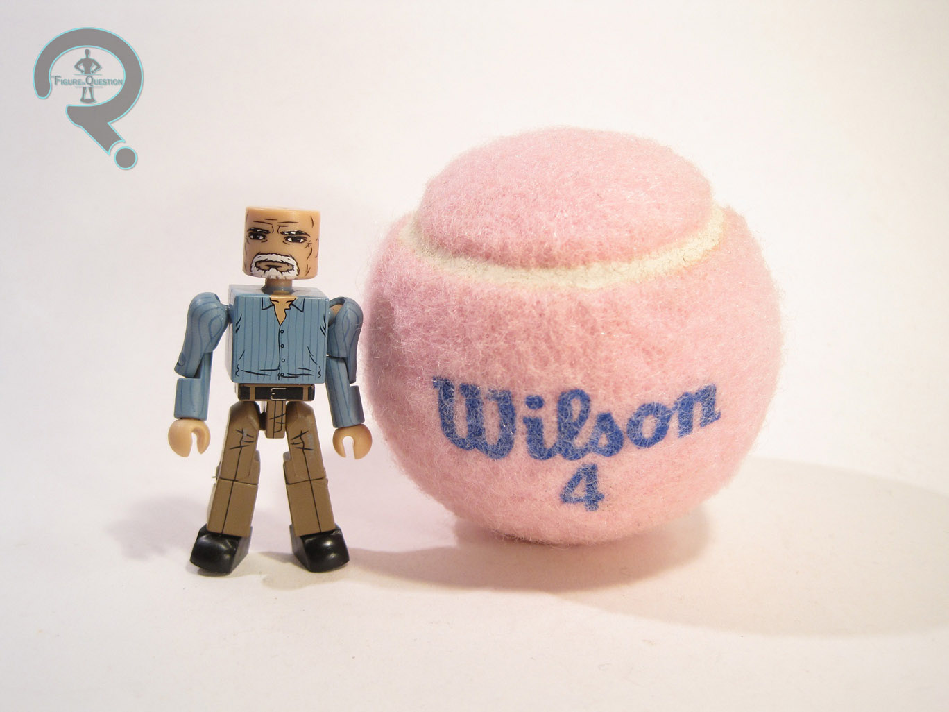
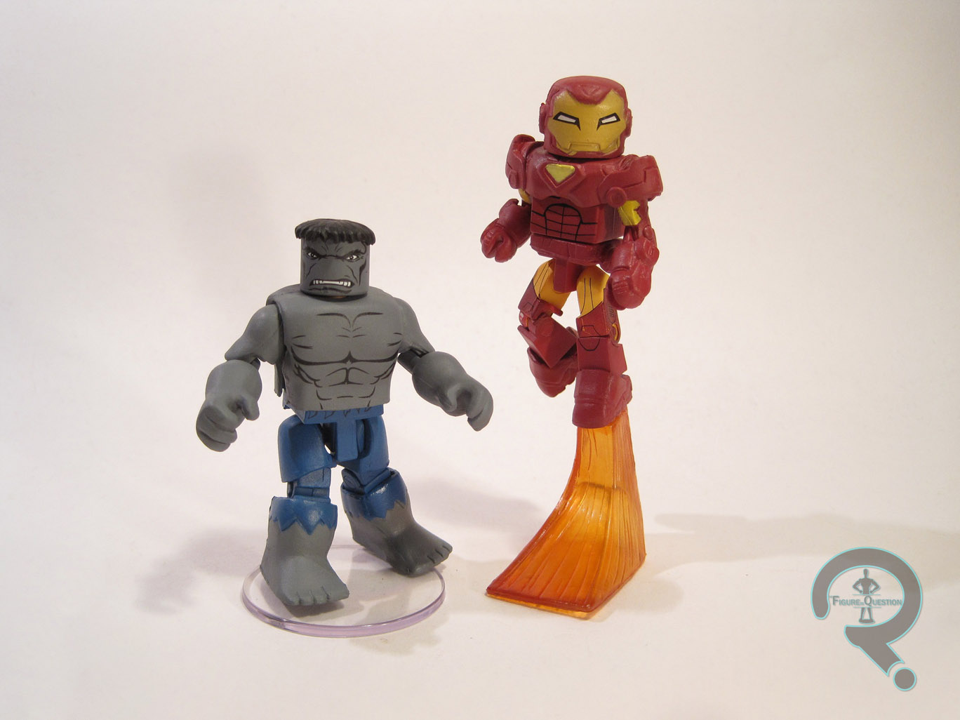
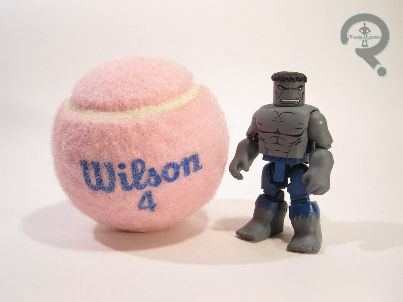
The story of Hulk’s skin color is kind of an interesting one. See, he was originally supposed to be grey (and he is in his first appearance), but the printing standards of 1960s comics weren’t up to the task of consistently printing the color, resulting in Hulk coloring changing a few times in his initial appearance. So, they decided the color had to change, and they went with green, as it was the accidental coloring they liked the best. And so, green became the Hulk’s distinctive color. It’s worth noting that Hulk’s change in palate was never mentioned in the comic itself, but it also came coupled with a slight change in the beast’s personality, which was used by writer Peter David to bring back the original look as a separate personality. As such, Grey Hulk has claimed a place as one of the key looks for the character. The last real Grey Hulk Minimate was released back in Series 7 of the main line (and even then, it was just a rerelease of an exclusive released at the same time as Series 1-4), so he was definitely in need of an update. The figure is a little over 2 ½ inches tall and he sports 12 points of articulation. He makes use of the standard issue Minimate body, with an assortment of “bulk-up” pieces. All of these pieces have seen use on previous Hulks. The torso, upper arms, upper legs, upper legs, and feet are from the series 41 Mega Rage Hulk; the hair is from the TRU exclusive World War Hulk; the torso extender is from Series 27’s Ultimate Hulk; the hands are from Series 45’s Movie Hulk. The torso cover is also a re-use piece, which has seen use on countless figures over the years. This is the best assortment of Hulk pieces available, so DST definitely chose well. The paint on Hulk is pretty great, but perhaps not as exceptional as some of the others in this series. There is a tiny bit of bleed over on the ends of his pants, and the black detail lines seem just the slightest bit muted. Underneath of the torso and waist covers, there are fully detailed pieces, which, with the addition of a spare set of hands and feet, as well as a new head and hair (courtesy of Tomb Raider’s Roth), allow Grey Hulk to be displayed as Bruce Banner, mid-transformation. It doesn’t work quite as well as the previous Series’ fully civilian Bruce, but it still looks pretty cool, and the angry face is a wonderful addition to the range of Banner emotions. In addition to the transformation pieces, Grey Hulk also comes packed with a clear display stand.

IRON MAN – MK29 ARMOR

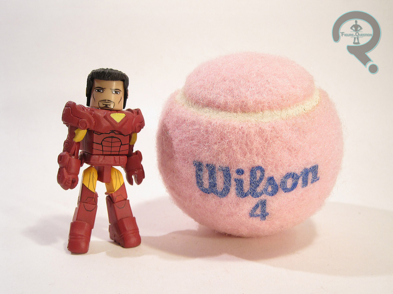
Sometimes, Diamond, for all their efforts, doesn’t get a figure quite right on the first try. Such was the case with the original TRU release of this armor. The figure featured a unique set of upper legs, but the sockets for the hip joints were too shallow, giving the figure an odd look and making it virtually impossible to keep the legs on. Fortunately, Iron Man’s a popular enough character that a second release wasn’t unwarranted. This figure represents Iron Man’s Mark 29 armor, which is one of the iterations of his Extremis armor from the comics. Not one of my favorite looks, but he did sport this general style of armor for a while, and it’s not too far off from his movie look. The figure is about 2 ½ inches tall and he features 14 points of articulation. The figure makes use of the typical body, with character specific upper arms, as well as add-ons for his helmet, upper torso, belt, gloves and boots. The helmet, upper torso, belt, and boots are from the Iron Man in the 14th TRU exclusive series, and the upper arms and gloves from Series 45’s Iron Man Mark 7. These pieces all mesh very well together and present a nice amalgamation of the various Extremis designs. The only real issue is the feet, which are at just the slightest angle, making the figure fall backwards if he’s not posed correctly. The paint is another dividing factor from the previous release. Where the last one used metallic red and gold, this one goes for a more straight red and yellow. This is a bolder look, and it makes the figure pop a bit more. It also does a nicer job of showcasing the sculpted pieces. All of the paintwork is nice and clean, and the detail lines don’t suffer from the washed-out appearance of those on Hulk. Underneath of the helmet is a Tony Stark face. It’s clearly a modern Tony, and it has just the right amount of self-assuredness. Iron Man includes a spare hairpiece (first used on Series 27’s Ultimate Cap), a flight stand molded in clear orange, and a clear display stand.

THE ME HALF OF THE EQUATION

Like the other three sets in this series, I picked up Hulk and Iron Man from my local comicbook store, Cosmic Comix. My primary reason for picking up the set was Hulk; for whatever reason, I never picked up the original Grey Hulk. This figure provides an exceptional update to that figure, and brings Grey Hulk up to the same quality as the Green Hulk offered in the previous series. While this Hulk’s Banner look doesn’t excite me the same way as the earlier version, it’s still a fun extra look, and it adds extra value to an already awesome figure. While I’m not the biggest fan of this particular look for Iron Man, this is still a solid figure, and he offers some much needed fixes to the previous version. The third series of Best Of Marvel Minimates is a solid addition to the Minimates line-up.
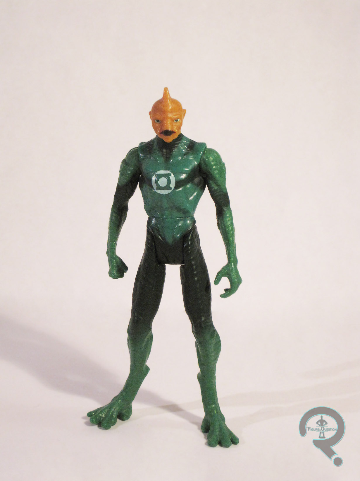
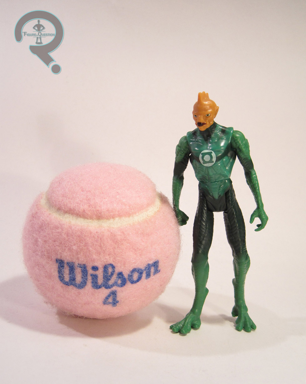
#0385: Spider-Man – Spider Sense & Captain America – Marvel Now

SPIDER-MAN – SPIDER SENSE & CAPTAIN AMERICA – MARVEL NOW

MARVEL MINIMATES

The point of the Best Of Marvel Minimates line is to keep basic versions of Marvel’s heavy hitters in circulation. However, Marvel’s characters, more so than DC’s, have a tendency to change up their designs, leaving a few different options as to what is their “basic” look. So, Diamond Select Toys has decided to take advantage of this to have a few more A-List figures in the line. Today’s set, Spider-Man and Captain America, are a prime example of this.

THE FIGURES THEMSELVES

These two were released as a two-pack in the third series of the Best Of sub-set of Marvel Minimates. Both figures in this set are the second version of their respective characters in the Best Of line.

SPIDER-MAN – SPIDER SENSE

Spider-Man is arguably Marvel’s best known hero, so it’s not surprising to see him pop up again. One of the things about Spider-Man is that, while he’s pretty much had the same costume for most of his career, there’s been a fair number of minor tweaks and stylistic choices by different artists. The Spider-Man released in Best Of Series 1 was based on Spider-Man’s “classic” look, in the vein of artists such as John Buscema and John Romita Sr. This figure is decidedly more modern, taking its influence from Todd McFarlane’s version of the character. The figure is roughly 2 ½ inches tall and features 14 points of articulation. The figure uses the basic Minimate body, with one addition: his spider sense piece. The piece was previously seen on the Spider-Sense Spider-Man in the 13th TRU exclusive series. It’s a decent approximation of the effect used in the comic (though my girlfriend says it makes it look like his head’s on fire), and it’s fairly well sculpted. Unfortunately, once it’s removed, Spidey is left with a hole in the top of his head. Not too much of an issue for long term collectors with dozens of Spider-Man heads to choose from, but certainly an issue for someone who gets this as their first Spidey. Like so many Spider-Man Minimates, this figure is basically a “vanilla ‘mate,” so paint is key. Spidey’s paint is okay, but not quite as good as the rest of the series. The red is a little uneven in places, and the web patterns are out of place and bunched up in a few areas. Also, the web pattern abruptly stops on the sides and backs of the wrists, legs and belt, which, while obviously intentional, is a shame. Spider-Man includes an extra head and hair (first used on Series 51’s Nova), a webline, a jumping stand, and a clear display stand.

CAPTAIN AMERICA – MARVEL NOW

Captain America’s pretty consistently had the same look over the years, but in light of the success of the movies, he’s gotten a little bit of a redesign to bring him a bit more in line with that look. The result is the Marvel Now look, which has gotten a few toys recently. This is the second time this look has been seen in Minimate form, with the first being in the 16th TRU exclusive series. The figure is about 2 ½ inches in height and features 14 points of articulation. Cap uses the standard body, with additional pieces for his helmet, gloves, and belt. All of these pieces are re-used from the first Marvel Now Cap. They were pretty great pieces there, and they’re pretty great pieces here. If there’s one thing to be said about the new costume, it’s that it translates really well to the Minimate style. The figure’s paint is fantastic. Everything is clean and evenly applied. They’ve used a lighter blue than what was used on the TRU 16 figure, and it really helps the figure pop. The detail lines are all really nicely handled, and the design has been translated expertly. The face is interesting; I like it, and I think it’s a great Cap face, but the expression seems like something that would be at home on a more classic version of the character. Still, it’s nice to get a happy expression from time to time. Cap includes his mighty shield (From the Series 40 Cap), an extra non-shield holding hand, a spare hair piece (shared by TRU 16’s Cap and Hulk), and a clear display stand.

THE ME HALF OF THE EQUATION

Spidey and Cap were picked up from Cosmic Comix, my local comicbook store. I hadn’t really planned on getting this set initially. I have plenty of Spider-Men, and I was perfectly content with the TRU 16 version of this Cap costume. However, seeing them in person, they called to me. A more modern Spider-Man’s not a bad thing to have, and the brighter palate on Cap further improves a figure I was already a pretty big fan of. Sure, these aren’t going to be for everyone, and I hope that the Best Of line doesn’t skew to modern, but this is a fun set.