#1015: Iron Man Mark 46

IRON MAN MARK 46

MARVEL LEGENDS SERIES

IMMk461

Giant-Man week continues! Yesterday was a slightly more obscure character. Today’s review goes the other direction, with a character that everyone and their mother knows. Yes, it’s Iron Man! You can’t go too many series of Marvel Legends without another Iron Man! There might be, like, riots or something. This figure in particular is based on his turn as an antagonist (but NOT a villain, because there’s a difference) in this summer’s Captain America: Civil War. Let’s see how he turned out!

THE FIGURE ITSELF

IMMk462
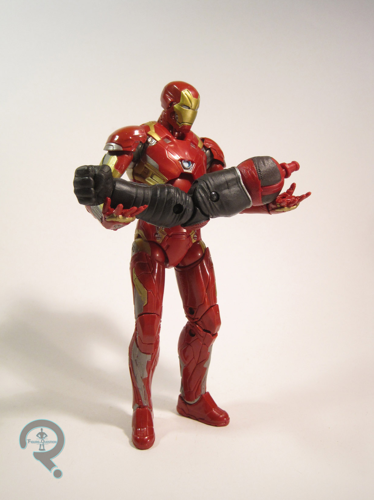
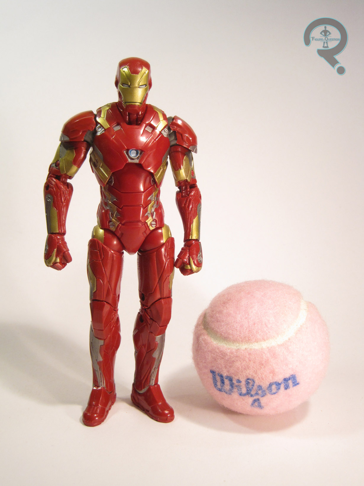
Iron Man Mark 46 is figure 2 in the Giant-Man series of Marvel Legends. He’s the second of the three Civil War-based figures in this set, which is pretty sensible. The figure stands about 6 ½ inches tall and he has 29 points of articulation. Iron Man has an all-new sculpt, which makes this the first Iron Man since the switch-over to Infinite Series to get one. It’s quite nicely handled. All the details seem to match up pretty well to the armor from the movie. What I really like about it is the bulk to it, which makes him pretty convincingly a guy in a suit in armor. That’s nice, because a lot of Iron Man figures don’t quite manage that. The only slight downside to the size is that it makes the already small Captain America look even smaller. But, that’s hardly this figure’s fault. All-in-all a solid sculpt, though. The paintwork on the Mark 46 is actually quite nice. Recently, Hasbro’s Iron Men have been missing some of the painted details on their backs, which is a little frustrating. However, this guy isn’t plagued by this same issue, as he has all of the proper detailing he should. The application could be a little cleaner, but it’s above the usual quality we see from Hasbro. Yay Hasbro! Iron Man was packed with two pairs of hands in both open and closed poses. The open hands also include a pair of removable repulsor blasts (which can also be plugged into the feet, which quite cool) which are a very welcome addition to Hasbro’s Iron Man arsenal. Lastly, he includes the right arm of Giant-Man, which I’ll cover with the rest of figure later this week.

THE ME HALF OF THE EQUATION

So, I found this guy twice before actually buying him. The reason for skipping those two was NOT because I didn’t want the figure. Nope, it was because both of those figures had their build-a-figure piece stolen out of the package by some scumbag. Bleh. Fortunately, my Dad came across this guy at the Walmart right outside of the town where my family vacations. Despite having quite a few Iron Men already, I was actually quite looking forward to this guy. The new sculpt and the extra repulsor pieces make him a definite win. He’s easily Hasbro’s best movie Iron Man.

IMMk463

#1014: Red Guardian

RED GUARDIAN

MARVEL LEGENDS SERIES

RedGuardian1

“In Soviet Russia, Shield throws you!”

Oh great, six words into the review, and I’m already stereotyping. This can’t be a good sign. So, today is the first day of “Giant-Man Week”. A few weeks back, I looked at the first figure from this series, Captain America. Today, I’ll be looking at Red Guardian. If my opening quote hadn’t clued you in, Red Guardian is the Soviet equivalent to Captain America. This is the Red Guardian’s second time as an action figure, though it’s his first time as a Marvel Legend. Let’s see how he turned out!

THE FIGURE ITSELF

RedGuardian2Red Guardian is figure 6 in the Giant-Man series of Marvel Legends. He’s based on Alexei Shostakov, the original Red Guardian and he’s one of the three comic-based figures from the series, though, as a Captain America villain who was once married to Black Widow, he’s the comic figure with the closest ties to the Captain America: Civil War theme. The figure is about 6 ½ inches tall and he has 32 points of articulation. Red Guardian is built on the Grim Reaper body, which is one of Hasbro’s new favorites. The size and musculature are a good fit, so it’s good to see Hasbro’s taking advantage of the new piece. Specifically, he’s a new head on the variation of that body used for the Red Onslaught series’ Classic Cap figure. The re-use is sensible, since Red Guardian is purposefully similar to Cap in design.  Technically, the belt should be circular, but that’s really a minor nit, and with a character like Red Guardian, most people won’t even notice. The new head fits the body well and suitably transitions the look to Red Guardian. I could see an argument that the head’s too big, but I don’t mind. The paintwork on Red Guardian isn’t bad, but I wish they’d fully committed to some of the detailing choices.  He has a nice, subtle shading on his head and upper torso, reminiscent of the creative inking usually seen on Captain America in the ‘60s and ‘70s, which looks really cool. Unfortunately it stops rather abruptly at the shoulders and lower torso, which kind of kills the look. I like what we got, but I wish they’d at least eased in out bit more. The whited out eyes are an interesting choice, seeing as Alexei’s eyes were always visible in the comics. What’s more, the sculpt even has the openings around the eyes for the skin, but it’s just painted black. It’s certainly not a bad look or anything, but it’s a slightly odd choice. Red Guardian was packed with his shield (a repainted version of Cap’s, in keeping with the rest of the figure), and the right leg of Giant-Man.

THE ME HALF OF THE EQUATION

I found Red Guardian at my local Toys R Us. Just walked in, and there he was. That like never happens anymore. Okay, it’s actually happening with increasing frequency, but still. I have only a passing familiarity with Red Guardian, but I’ve always liked the concept and I think he’s got a pretty sweet design. I’m definitely happy to have the figure, and doubly so since I didn’t have to work too hard to get him.

RedGuardian3

#1013: Angel

ANGEL

BUFFY: THE VAMPIRE SLAYER (MAC)

AngelMAC1

While I like Buffy the Vampire Slayer, I can’t say it’s my favorite Joss Whedon show (actually, it’s probably nearer to the bottom of the list).  It’s spin-off series, Angel, however , is one of my favorites.  Angel himself started on Buffy of course.  Early on, he’s not much more than a generic love interest, but when it’s revealed later in the first season that he’s a vampire with a soul, he starts to get a bit more interesting, prompting him to become one of the show’s breakaway characters come the second season (something that turn to villain towards that season’s end all the more shocking).  Angel was popular enough to be amongst the first characters to get an action figure, and I’ll be looking at that figure today.

THE FIGURE ITSELF

AngelMAC2Angel was released in the very first series of Buffy the Vampire Slayer figures from Moore Action Collectibles.  He’s based on his look from most of the second season, which is pretty timeless as far as Angel is concerned (the hair is really the only giveaway that he’s from earlier on).  The figure’s a little over 6 inches tall and he has a resounding 6 points of articulation.  Yes, he’s from before MAC started adding articulation.  His articulation is there, but it’s really only good for slight tweaks to keep him balanced (and oh boy is that a chore).  There’s really only the one pose for this figure.  On the plus side, it’s a decent enough pose.  It’s not too specific, nor is it too rigid.  He looks fairly natural, and that’s what really matters.  The sculpt on Angel is quite nice.  The head features a good David Boreanaz likeness, and the body has some great detail work.  He feels a little on the skinny side, but it is supposed to be a younger Boreanaz, so it’s not far off.  The paint work on Angel is pretty decent overall.  Everything’s cleanly applied, and there’s no real slop to speak of.  However, for some reason, his skin tone is very orange, which isn’t at all appropriate for a character like Angel.  Dude literally gets no sun.  Ever.  He should be pretty pale.  Angel was packed with a sword, a stand, and a life-sized version of his ring.  Not quite as impressive a selection as later figures would get, but it’s not bad.

THE ME HALF OF THE EQUATION

Angel was the first BVS figure I got, but it was a little bit after they were first released.  At the time, the whole first series was on clearance at Toys R Us, so I got Angel, in part because Angel is pretty awesome, and in part because he’s the best figure in the first series.  He’s not the greatest figure ever, but he’s decent enough.


#1012: Buffy Summers

BUFFY SUMMERS – GRADUATION DAY

BUFFY THE VAMPIRE SLAYER (DST)

BuffyGD1

Buffy the Vampire Slayer was a fairly popular show in the ‘90s. Though it hasn’t aged super well, it’s still the show that got Joss Whedon recognized, and it did a lot to shake up how TV shows were handled. It also moved a fair bit of merchandise, which included action figures. The earliest figures were by sculptor Claybourne Moore’s company, Moore Action Collectibles. MAC’s earliest figures were little more than glorified statues, and even when they started adding more articulation, the actual usefulness of said articulation wasn’t superb. When MAC went under, Diamond Select Toys took over the license. Their initial figures were somewhat similar to MAC’s in movement, but they eventually expanded their line to include a few better articulated figures, in order to compete with Toy Biz’s Marvel Legends. They kicked the line off with a few versions of the title character, Buffy Summers.

THE FIGURE ITSELF

BuffyGD2Buffy was released in the first series of Buffy the Vampire Slayer Deluxe Figures, which first hit in 2005. There were three Buffys offered in the series, based on her looks from various points in the show. This figure is based on her appearance in the first half of the Season 3 finale “Graduation Day.” It’s probably the most basic look we got for Buffy. The figure is just shy of 6 inches tall and has 31 points of articulation. With the exception of the shoulders, which were just cut joints (due to the design of the jacket), she was comparable with any Marvel Legends figure of the time, which wasn’t bad for a company that had, at that point, not attempted such an articulated figure. The sculpts of these figures were done by Gentle Giant Studios, who currently handle Star Wars: The Black Series and Funko’s Legacy Collection, so it’s no real shock that Buffy resembles the figures from those lines in terms of quality. The overall sculpt is actually quite good. While the head isn’t a perfect Sarah Michelle Gellar (nor is it the best likeness of her that DST would produce), it’s still got more than a passing resemblance. Perhaps my only real complaint would be the somewhat bland expression, which was a common problem with GG’s earlier figures. The body is a bit on the skinny side, but not horribly proportioned. The clothing all has nice detail work, and she certainly fits in with the rest of DST’s Buffy figures. Buffy’s paintwork is fairly basic, but it’s clean, and all of the colors match up pretty well with what’s seen on screen. Buffy included a spare set of bare arms, which allowed for the jacket to be removed, and even afforded the figure a bit of extra posability. She also had a pair of handcuffs, her diploma, and a Sunnydale High yearbook. Curiously absent is any sort of slaying equipment. They couldn’t even give her a stake?

THE ME HALF OF THE EQUATION

Buffy ended up being one of the last BVS figures I got, despite being the only version of the main character I’ve ever owned. I ended up getting her on clearance from a KB Toys. She’s actually a pretty fun figure, even for just a basic person in basic clothes. It’s a shame that DST didn’t do more figures in this style from some of their other lines.

#1011: Weyland Yutani Commando

WEYLAND YUTANI COMMANDO

ALIENS (NECA)

WYCommando1

Frequent readers of the site will no doubt be familiar with the fact that Aliens is, like, my favorite movie ever, since I think I’ve brought it up once or twice. Now, there’s a lot of contenders out there for my least favorite movie ever, but I’d say one that’s consistently high on that list is Alien3, the direct successor to Aliens. It’s a movie that goes out of its way to bury just about every trace of its predecessor, which kind of doesn’t fly with me. The movie isn’t entirely without merit, though. It does have a sort of cool Xenomorph design, and it also gave us the subject of today’s review, the Weyland Yutani Commando. For those of you with less of the Aliens mythos memorized than me, Weyland Yutani is the universe’s resident evil corporation, who spend the first three movies ruining people’s lives for the sake of capturing an alien specimen. At the end of Alien3, the commandos are sent in to acquire the alien embryo that’s been gestating inside of Ellen Ripley.

THE FIGURE ITSELF

WYCommando2The Weyland Yutani Commando was released in the Alien3-themed eighth series of NECA’s Aliens line. The figure stands 7 ¼ inches tall and he has 26 points of articulation (counting the articulated arms on the backpack). The figure’s look is based on the handful of commandos we see at the end of the movie. They all had more or less the same look, and this figure has been designed to allow some slight tweaks seen on the movie’s commandos. The Commando’s look is certainly a different one. He combines design elements from both of the prior films. The overall design of the suit is similar to the pressure suits from Alien, though this figure shares no pieces with any of the pressure suited figures, which actually surprised me a little. The sculpt does an awesome job capturing all the little details in the quilted patterns of the suit, as well as all of the stitching and wrinkles. It’s very impressive. In addition to the Alien-inspired cloth bits, there’s also a few armored bits. While they’re fairly unique, there’s a few bits that definitely look like the Marines from Aliens (which makes sense, since they’re paid by the same parent company). The shoulder armor in particular looks similar, but even the two grenades on his torso look like beefed up versions of the ones carried by the Marines. The helmet is the figure’s most unique trait. Despite being seen on WYCommando3numerous commandos, the helmet is remarkably hodge-podged-looking. The helmet is done via three separate pieces attached to a fully-sculpted underlying head, which looks quite impressive, and makes the whole thing look quite realistic. It would be nice if the face guard were removable (since I think it looks kind of doofy), but seeing as there’s no on-screen examples of it removed, it’s perfectly excusable. NECA figures are generally very well painted, and this guy is no exception. Not only is the base color work pretty clean, but there’s also a lot of really great accent work, which really makes the details in the sculpt pop. The Commando includes two goggle pieces, for both open and closed configurations, as well as a pulse rifle done in all black, and a knife. To aid in customizing the figure a bit, there’s also a sheet of decals, to give the figure a bit more personality.

THE ME HALF OF THE EQUATION

I wasn’t sure I wanted this figure, what with not being much of a fan of the movie it comes from. However, I came across him at a Toys R Us while I was out and about, and I liked him enough in person to warrant picking him up. He’s got an interesting design, and he ends up making for a pretty awesome figure. I guess I can just pretend he’s some sort of expanded universe character….

#1010: Armored Batman

ARMORED BATMAN

DC COMICS MULTIVERSE (MATTEL)

ArmoredBatman1

You know how I’m always hating on Mattel? And you know how I just reviewed a whole week of Mattel figures? What’s the best thing for me to review the day after an over-a-week run of Mattel figures? Another Mattel figure, of course! Boy do I looooove me some Mattel…

So, today, I’m jumping back over to the DC side of things, with a Batman figure. I know, that’s a very rare occurrence. But this Batman’s special. This one’s a puffy Batman! Okay, actually, he’s from Dark Knight Returns, the Batman story that forever changed the face of comics, whether we like it or not. Now, this isn’t just a generic Batman from the story, but one from his climactic showdown with Superman, making it the perfect accent piece for this guy. Despite there being a number of toys based on DKR and this being both a distinctive and unique look from the story, this is its first appearance in three-dimensional form. Let’s see how it turned out!

THE FIGURE ITSELF

ArmoredBatman2Armored Batman is one of the three DKR-based figures from the latest series of Mattel’s larger scale DC Comics Multiverse. The figure stands roughly 7 inches tall and he has 25 points of articulation. Just about all of Mattel’s DKR figures have been built from pieces that structurally similar to the figures from Masters of the Universe Classics. While this Batman is stylistically very similar to the others, the only pieces he shares with the prior Batman and Superman are the upper and lower torso parts, and even those are completely covered by add-ons. The rest of the figure’s sculpt is all-new, and it’s pretty impressively handled. It does a very good job translating the design from the comics into three dimensions. In fact, it’s probably the most comic-faithful figure so far in this particular sub-set, since the large quantity of new pieces means that none of Miller’s tinier details have been left out. Each piece of armor has little wrinkles, and the face depicts an old, grizzled Bruce Wayne, which we didn’t really see on the last two figures that Mattel did. Really, the only complaint I can raise about this figure is that he falls victim to Mattel’s continued insistence on attaching capes with unnecessarily large chunks of plastic that plug into the figures’ backs. Is there absolutely no way they could make that connector any smaller? Oh well. Batman’s paintwork isn’t bad. It’s certainly better than Superman’s was. There’s a bit of slop, especially around the edges of the belt, but the overall appearance is pretty good. Batman is packed with the rifle he uses with this armor in the story. Unfortunately, he can’t really hold it very well, since neither of his hands is sculpted to hold it. He also includes the head and pelvis of the New 52 Doomsday, for those that care about such things.

THE ME HALF OF THE EQUATION

So, as I noted in my review of Superman, I’m only a moderate fan of The Dark Knight Returns. I do, however, love the issue with the fight between Superman and Batman. Since I already had Superman, I was looking forward to getting this guy. That being said, he wasn’t quite at the top of my list for this particular series. So, when I found this series at Target, this wasn’t the figure I intended to buy. No, I really, really wanted to buy the new Supergirl figure, based on the TV series. Target even had two of her, but I just couldn’t bring myself to buy it, because the figure just looked so terrible. I’m getting off topic. I ended up going with this guy because, while he may be ugly, at least he’s supposed to be. This isn’t a perfect figure, but he’s still pretty fun.

#1009: Castle Grayskull

CASTLE GRAYSKULL

MASTERS OF THE UNIVERSE (2002)

Grayskull1

Playsets for action figures are by and large a thing of the past. They were really big in the ‘70s and ‘80s, and even kept up steam for a good part of the ’90s, but a general trending towards less interest in action figures coupled with rising costs of plastics has made them less than practical. Sure, you still see the occasional set here and there, but they lack the charm of the older sets. Occasionally, an attempt is made at recapturing that charm for a more collector-oriented market. A few years back, Mattel used their online store Matty Collector to get enough backers to fund a high(ish)-end version of Castle Grayskull, an important part of the He-Man mythos. This not a review of that. Nope, this is a review of its direct predecessor. Well, most of it anyway. Let’s get to the review!

THE PLAYSET ITSELF

Grayskull7Castle Grayskull was released as a deluxe playset during the first year of the 2002 Masters of the Universe line. The Castle is designed to fit with the basic 6-inch figures Mattel offered. It’s actually about half-scale. In its defense, even the much larger, much more expensive Castle Grayskull was only three-quarter-scale, and that one wasn’t even vying for valuable retail shelf space. As it is, it’s definitely undersized, but it’s large enough that it suits the purpose it was built for pretty well. The Castle is just about 20 Grayskull2inches tall and 17 inches wide. When the Castle is all folded up, it’s only about 4 inches deep. The exterior of the Castle is pretty impressively detailed, and features a very nice selection of textures, which keep it exciting. Well, for a non-mobile playset anyway. The overall look, though undersized, is a very nice translation of the Castle’s 200x design. As you can probably note from the pictures, the parapets are made up of several Grayskull3different pieces, which clip into place. They were prone to fall off, which is why my set is missing a couple of them. The Castle can unfold, which reveals the interior and increases the depth of the set to 11 inches. The interior of the Castle isn’t quite as nice as the exterior, since it has to fit inside when folded. Still, there are several very nice details, including a spot for weapon storage and even a neat little computer thingy in the corner. I also love the small, easy to overlook details, like the skull and rat on the floor in the prison cell area. For some reason, in the 2000s, toy Grayskull5companies thought that the best way to sell a playset was to work in some weird battery-operated, figure prompted gimmick. Remember the ThunderLynx bit from the Tower of Omens? Well, Castle Grayskull’s got something like that. Each of the figures in the 200x Masters line (well, at least the earlier ones) had a little…thingy imbedded in their foot, which was expressly designed to work with this set. There are several spots on the set where there’s a golden footprint. When a figure’s foot was Grayskull9moved back and forth on this spot, it would release a lever on a door, revealing differing parts of the set or activating traps. Most of them are a little weird and gimmicky, but I do quite like the one on the upper level, which swings open a door revealing a special chrome version of the power sword placed on a nice little pedestal. It’s still really gimmicky, but, c’mon! Chrome! In addition to the aforementioned chrome sword, the Castle included a flag (missing Grayskull6from mine), a big cannon sort of thing, a set of shackles, bars for a cell (also missing), a giant key (because why not?), as well as a large arsenal of weapons, of which I only have the trident. Still, that was a pretty awesome selection of extras, especially given the kind of extras we see nowadays.

THE ME HALF OF THE EQUATION

By the time of the 200x Masters line, I had aged out of playsets. Yeah, I know, it shocks me too. Aging out of toys. I was just about aged back into collecting playsets when Mattel’s collector version was released, but it was just far too hefty a price for a moderate Masters fan such as myself. Of course, this more economical set had also gone up quite a bit in price. As you might have guessed (or just have already known, for those of you who paid attention to my Teela review), the Castle was part of the big Goodwill find from several weeks back. I ended up spotting this particular set first, and upon discovering it was only $4.50, I felt like I couldn’t say no. Sure, it’s not complete, but it was also super cheap, and it’s actually a really fun set. It’s too bad I never got one when they were new!

Side Note: This set was far too large for my usual photo set-up, so this is the first item to be shot in the Auxiliary Photo Studio (aka the dining room). As it turns out, the Auxiliary Photo Studio takes two people to operate, so special thanks goes out to Super Awesome Girlfriend, who aided with most of the photos you see here!

Grayskull8

#1008: Two-Bad

TWO-BAD

MASTERS OF THE UNIVERSE (2002)

TwoBad1

Okay, so yesterday, I wrote about how important the Evil Warriors are to the whole Masters of the Universe brand. But, up until now, I’ve only actually looked at one member of the Evil Warriors. It’s actually kind of amusing that I haven’t looked at any others just yet, since the Evil Warriors were actually my favorites growing up. Today, I’ll be looking at another member of their number. Well, in a way, I’m actually looking at two of them. Yep, today’s figure is the combined forces of Tuvar and Baddrah, better known as Two-Bad!

THE FIGURE IN QUESTION

TwoBad2Two-Bad was released in the 2003 series of Masters of the Universe, as part of the third assortment of Evil Warriors. The figure stands a little under 6 inches tall and has 13 points of articulation. The shoulders both have spring loaded features. When pulled upward, the arms will snap back into place. It’s not the best feature, and it can make posing the arms quite difficult. On the plus side, it doesn’t affect the aesthetics of the sculpt. Two-Bad’s design in the 200x line was one of the least changed. It’s really a pretty straightforward recreation of the original figure in the newer style. What this figure’s sculpt does have to offer is a greater difference between the two halves. Baddrah is shorter, squatter, and all-around stockier than Tuvar, and has some very impressive texturing. Tuvar includes much cleaner lines and stands just a tiny bit taller. Even the armor exhibits different stylings depending on which side it lays on. Very high quality sculpt to be sure. The paintwork isn’t quite as strong as the sculpt, but it’s actually awful. The colors are nice and bold, and the two sides each have their own separate color scheme, and they accent each other pretty well. Two-Bad was packed with a double-headed mace (clever, that one) and a shield. The mace accents Tuvar and the shield goes with Baddrah, which is a nice touch.

THE ME HALF OF THE EQUATION

I always wanted a Two-Bad figure when I was collecting these, but I was never fortunate enough to find one at retail. However, Two-Bad ended up being one of the many figures from my recent Goodwill find. I’m happy I’ve got one after all these years, and the figure’s just as cool as I’d hoped! And look at that, I went the entire review without a single awful pun based on his name! Not Two-Bad if I do say so myself!

#1007: Tri-Klops

TRI-KLOPS

MASTERS OF THE UNIVERSE (2002)

TriKlops200x1

One of the defining traits of Masters of the Universe is its good vs. evil dichotomy. Every release in the line was paired off. One villain for every hero. So far on this site, I’ve only looked at a single evil warrior from the franchise. Today, I’ll be looking at another evil warrior figure. Of course, it’s actually Tri-Klops, the same guy I looked at the last time, so that gets me no points. What can I say? I really like Tri-Klops. But this time, it’s the 200x Tri-Klops, who’s actually a bit different than the original. Let’s see how this one stacks up!

THE FIGURE ITSELF

TriKlops200x2Tri-Klops was released in the 2003 series of Masters of the Universe. He stands just under 6 inches tall (due to his slightly crouched stance) and he has 12 points of articulation, plus the spinning visor that is standard to all Tri-Klops figures. Unlike his last figure, this Tri-Klops has a wholly unique sculpt. The body is lean and sharp, which makes him a more believable swordsman, built for agility, which is a nice change. The pose is also quite unique, and great for the character. The outstretched hand in particular is one of my favorites. While the overall look of Tri-Klops is in keeping with the vintage look, it’s the smaller details that exhibit the most changes. The original Tri-Klops was still pretty firmly planted in the world of sword and sorcery. The 200x version, however plays up the sci-fi aspects pretty heavily. Given that he was the resident tech expert of the Evil Warriors, the look is a fairly sensible one. The largest changes to his design are present on the head, which changes the simple ring with three different eyes from the vintage figure into a quite exquisitely detailed technological device, carefully built onto Tri-Klops’ head. It makes Tri-Klops look quite different from his vintage counterpart, and definitely makes him look a lot cooler. The change to more artificial looking eyes also allows for a bit of light-piping to light up the eyes, which is certainly a cool effect. Tri-Klops’ sculpt is really only marred by one thing: his action feature. He’s got a swinging attack on his left arm, which is triggered by a rather obtrusive button on the figure’s back. It’s not the worst thing ever, but it is a bit annoying that it’s so obvious. The paintwork on Tri-Klops is probably some of the better work from the 200x MotU. The colors are good matches for his original palette, and all of the application is clean and tight. Tri-Klops included his sword (which is a very nice piece), as well as one of his little flyer drones, which were new to the 200x version of the character, and a flight stand for the drone.

THE ME HALF OF THE EQUATION

Tri-Klops was one of the earlier additions to my MotU collection. I think he was the fourth or fifth figure I got. I found him new and in a regular store even, which greatly excited me. Of course, then I took the figure out of the package and made the mistake of dropping him about a foot, which was enough to completely shatter his head into three pieces. He wasn’t the easiest figure to find, so I had to make do with the later repaint figure for a while. Fortunately, Tri-Klops was one of the several figures from the Goodwill find, allowing me to replace my broken Tri-Klops with a proper one, rather than some pants wearing imitation of the real thing. I quite like this figure, and I think he may well be my favorite figure the line had to offer.

#1006: Battle Tank

BATTLE TANK

MASTERS OF THE UNIVERSE (2002)

BattleTank1

Masters of the Universe was one of the pinnacles of ’80s toylines.  It had all the trappings: gimmicky figures, wacky action features, play sets, and, yes, lots of vehicles for the figures to make use of.  The vehicles were a success in the ’80s, so Mattel gave them another try with the 200x relaunch.  They weren’t quite as successful that time around, but they certainly tried.  Today, I’ll be looking at one of those vehicles, the somewhat mediocre Battle Tank.  Let’s have a look at that!

THE VEHICLE ITSELF

BattleTank3The BattleTank was one of the earliest vehicles in the 200x line, released during the line’s first year.  The vehicle measures 9 ¾ inches long and 6 ½ inches tall.  The Battle Tank is somewhat oddly named.  It looks more like some sort of ramming vehicle and less like what I would think of as a tank.  Of course, I suppose that a more conventional tank might look out of place in Masters of the Universe, so there’s that.  Still, I feel like there could have been a more exciting name for this thing.  As far as the actual sculpt goes, I suppose the tank’s not bad.  It’s a bit rudimentary and clunky, but it’s serviceable.  I think the biggest issue I have with it is how it interacts with the BattleTank2figures.  Their limited articulation means that any vehicle meant for them has to do the heavy lifting in terms of helping them sit.  The tank would be difficult for even a Marvel Legend to sit on comfortably.  The MotU figures look rather uncomfortable, and they all have to do this weird sort of lounging lean.  It’s not exactly an imposing look.  The tank has a pop-out feature, which launches the head forward and flips out two little wing things at the sides, which makes it somewhat cooler looking, but also makes it even less tank-like. There’s not really any paint on the tank, but there are a lot of decals which make up for it. They’re kind of basic, but they look okay.  They stay on pretty well, which is the important part with decals.  The Battle Tank was packed with a basic He-Man, who was the same as the standard Series 1 version, which I suppose isn’t a bad thing, but a unique figure might have been a little cooler.

THE ME HALF OF THE EQUATION

I’ve never been much into the MotU vehicles, so I never had any of them.  This one was part of the Goodwill find from a few weeks ago.  I found this last out of the bunch, and I honestly only got it because I felt bad leaving it there by itself.  Island of Misfit toys and all that.  I can’t say it was my favorite piece of the find, but it’s enjoyable enough, and certainly worth what I paid for it.  All in all, not bad.