#4029: Hawkman

HAWKMAN

TOTAL JUSTICE (KENNER)

“Born Katar Hol on the planet Thanagar, Hawkman escaped his oppresssive native world and made his new home on Earth, where he vowed to fight against injustice. He is equipped with an anti-gravity belt and enormous wings that give him the power of flight and allow him to launch aerial attacks against villains, swooping down and snatching them up in massive grip talons.”

Hey, it’s Hawkman.  When did I last talk about Hawkman?  …ah, yes, Black Adam tie-in.  Yikes.  Well it could be worse.  For instance, I could be talking about the absolute nightmare that was Hawkman’s backstory post-Crisis!  See, where most of the overlapping Golden and Silver Age incarnations were either similar enough to merge (Superman, Batman, and Wonder Woman) or distinct enough to co-exist (Flash, Green Lantern, Atom), Hawkman got to be in the weird middle-ground where his two incarnations were far too different to be the same person (or even connected, really), but also way too similar to both exist.  So, there was sort of this grey area for a while, where everyone just pretended not to notice the issues, until Hawkworld came along and revamped the Silver Age incarnation of the character for the ‘90s, establishing along the way that he was new to Earth, making the prior appearances post-Crisis confusing to say the least.  It was quite a mess, eventually leading to DC just outright ditching the character for a bit, because they viewed him as “too confusing.”  (Grant Morison created Zauriel during their tenure on JLA in part because of Hawkman being off limits).  He would eventually get reworked a few more times, ultimately streamlining things a bit and making him more workable, but it was real touch and go there.  In the midst of the touch and go, we did get an action figure of the ill-fated Hawkworld version of the character, for better or for worse.  Let’s look at that now!

THE FIGURE ITSELF

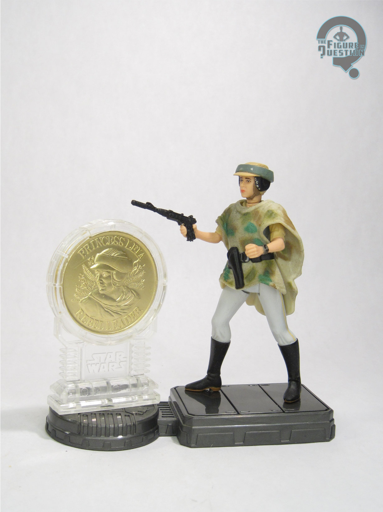
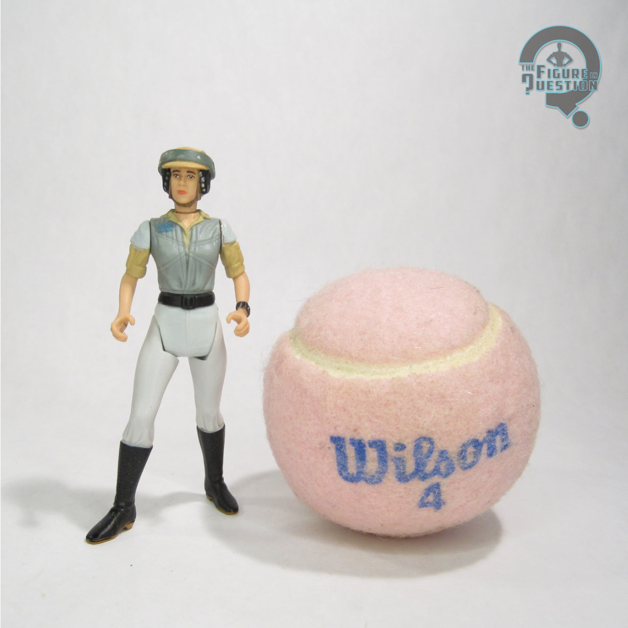
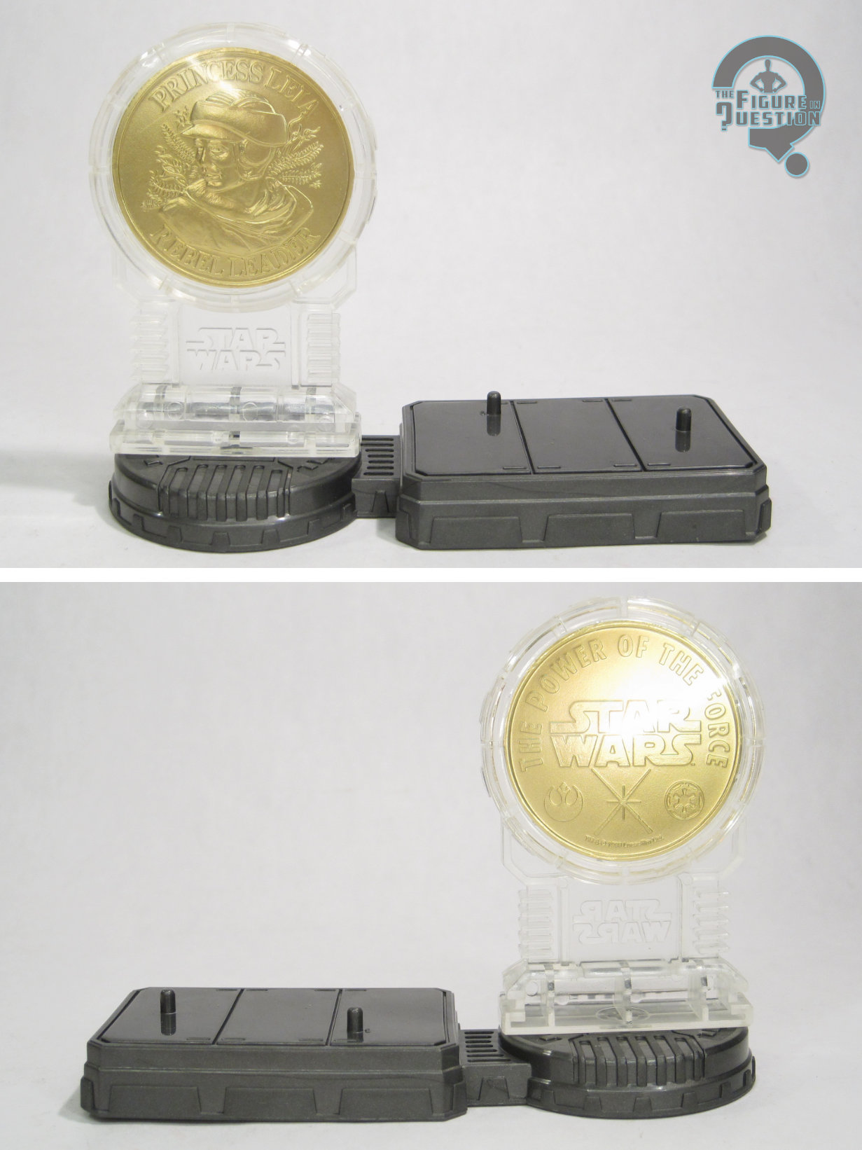
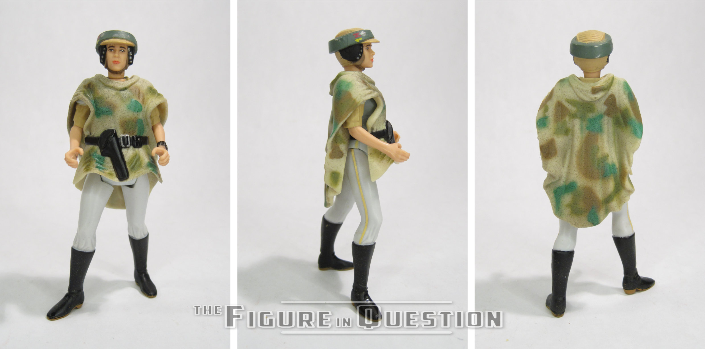
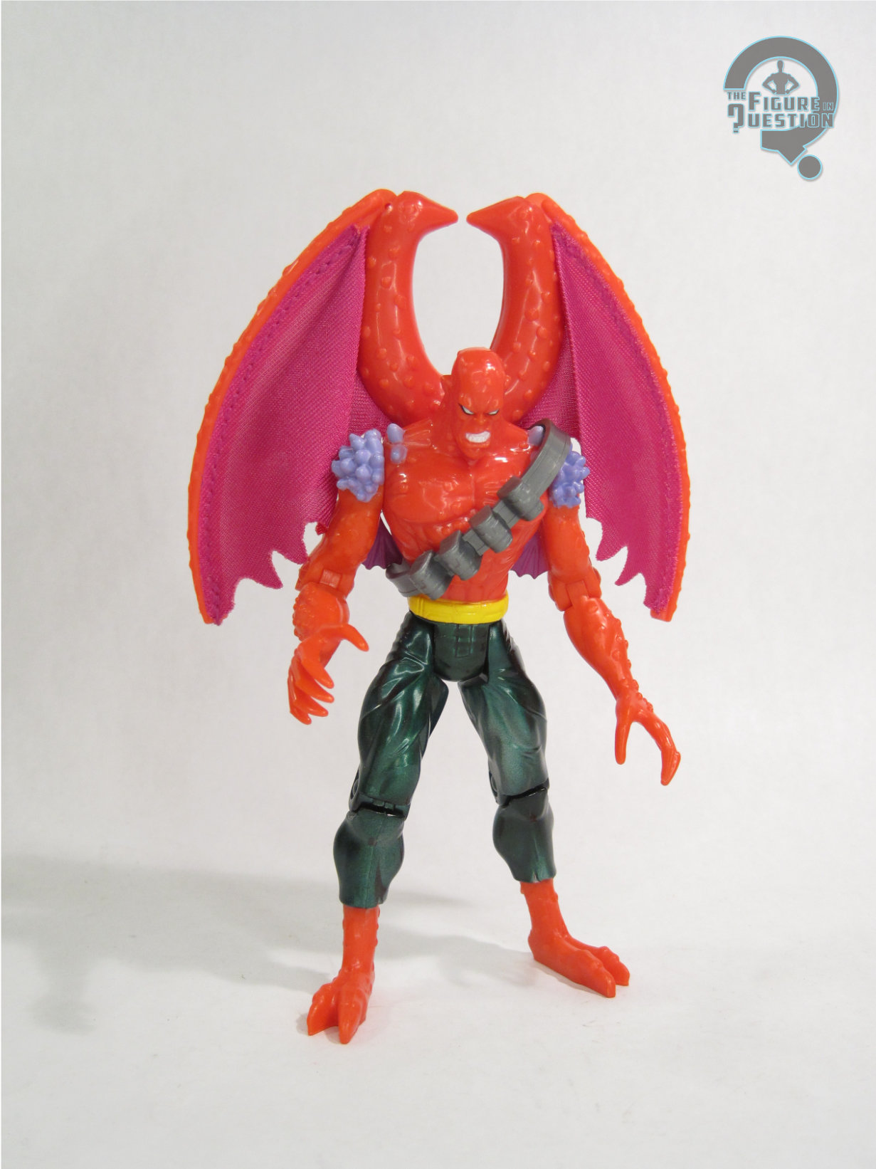
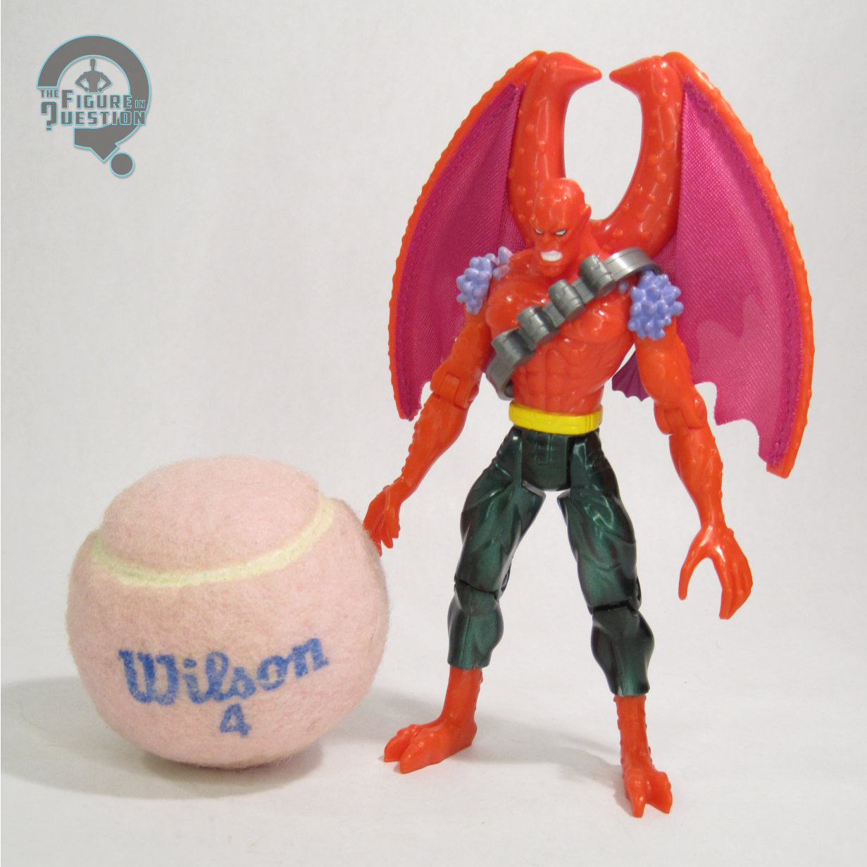
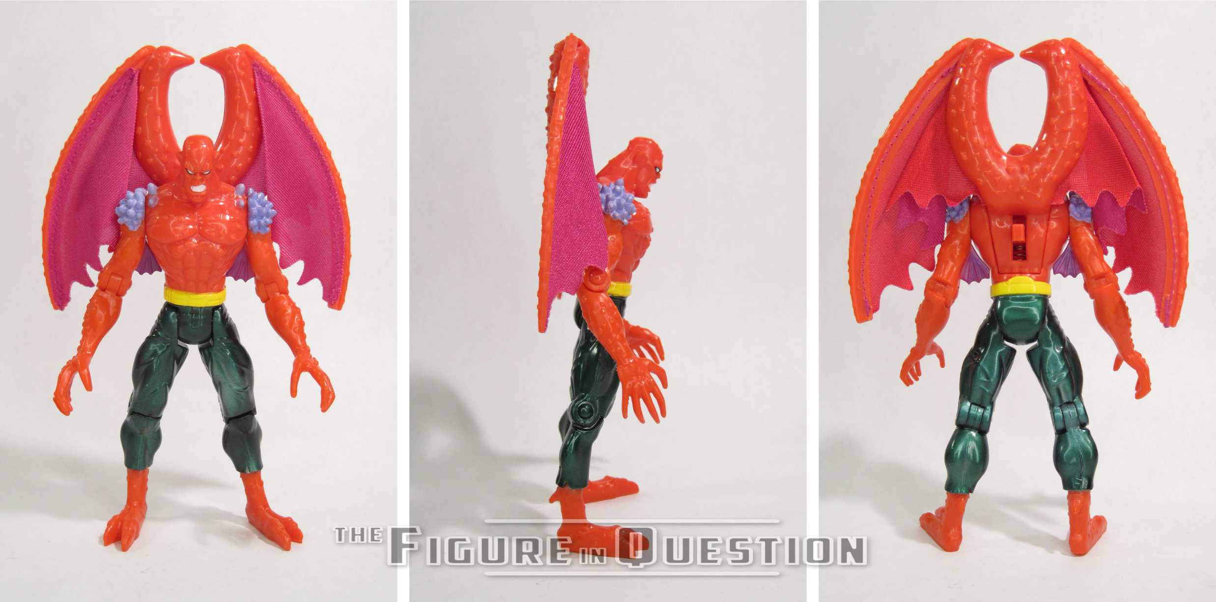
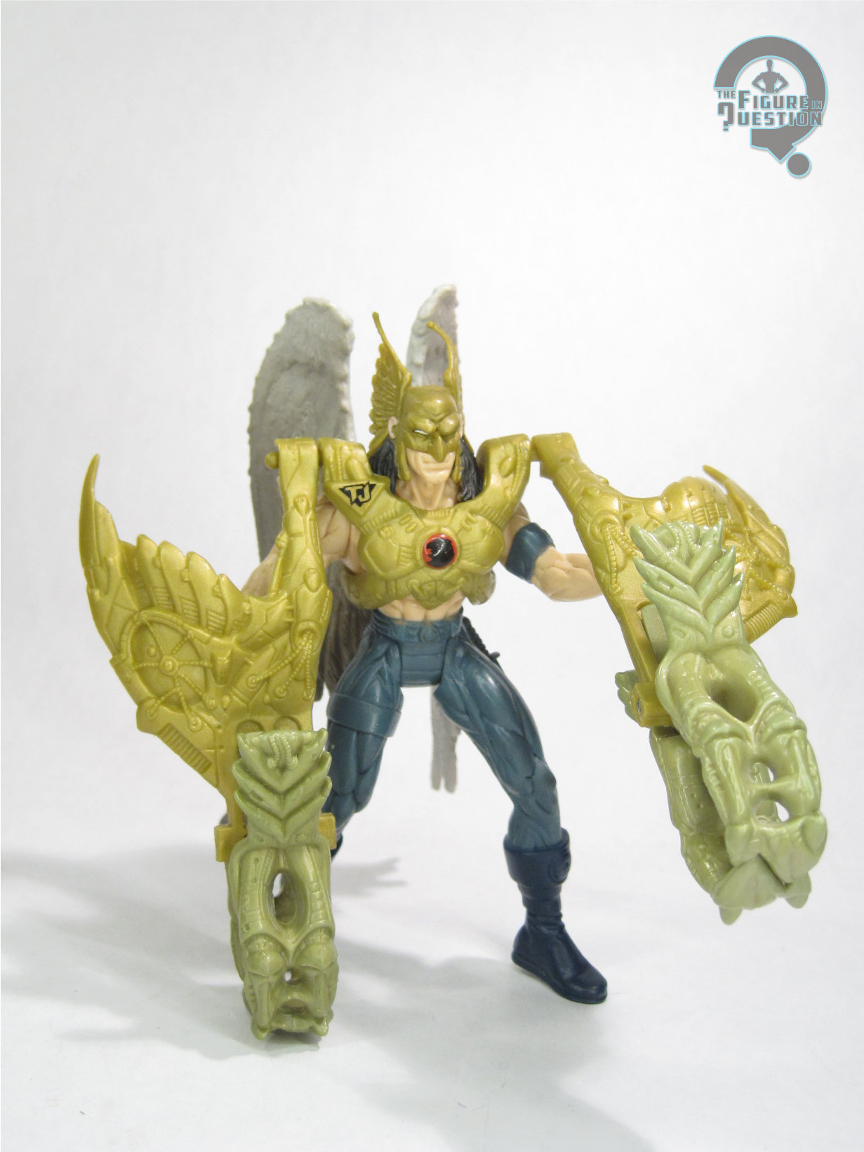
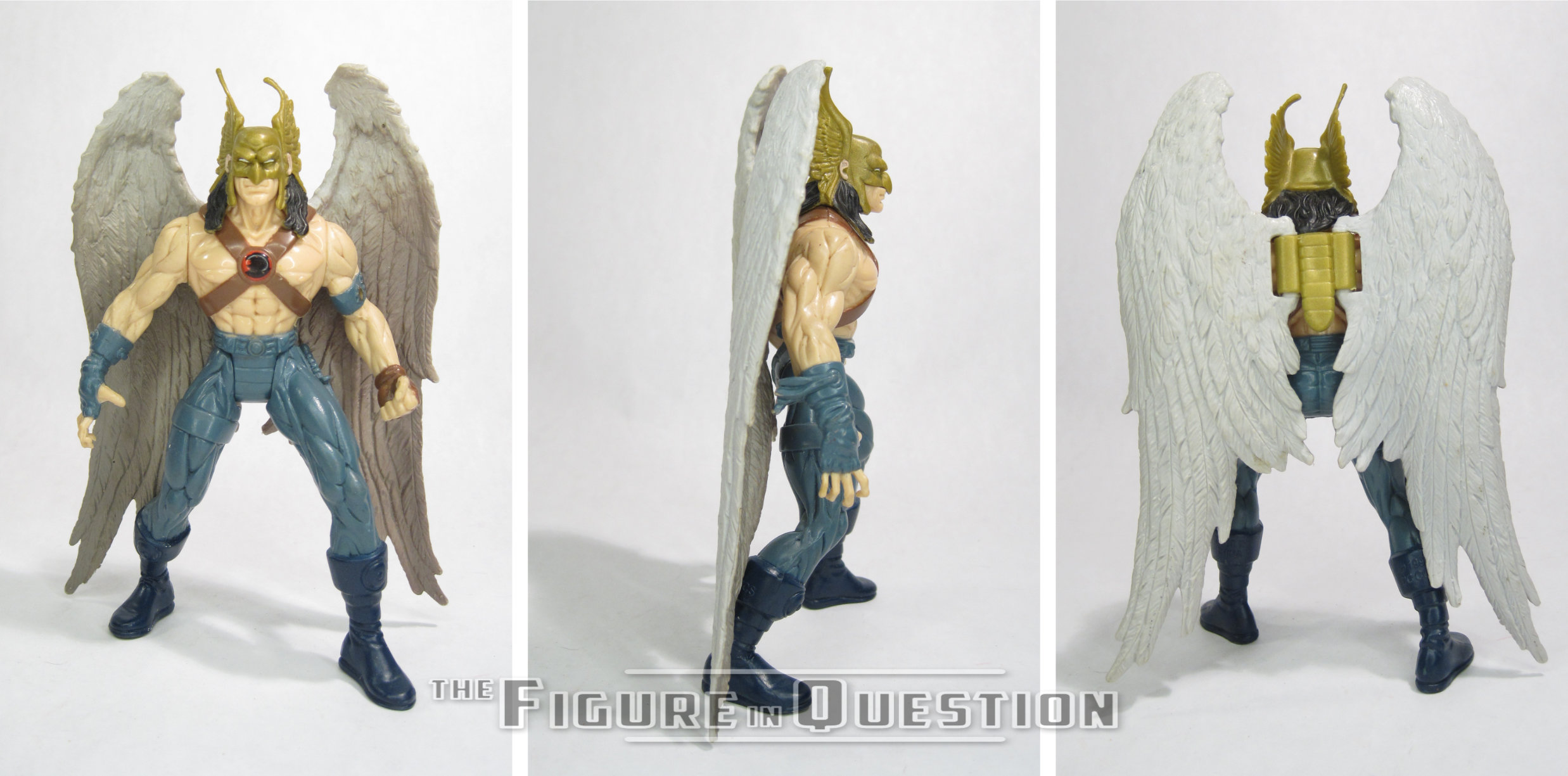
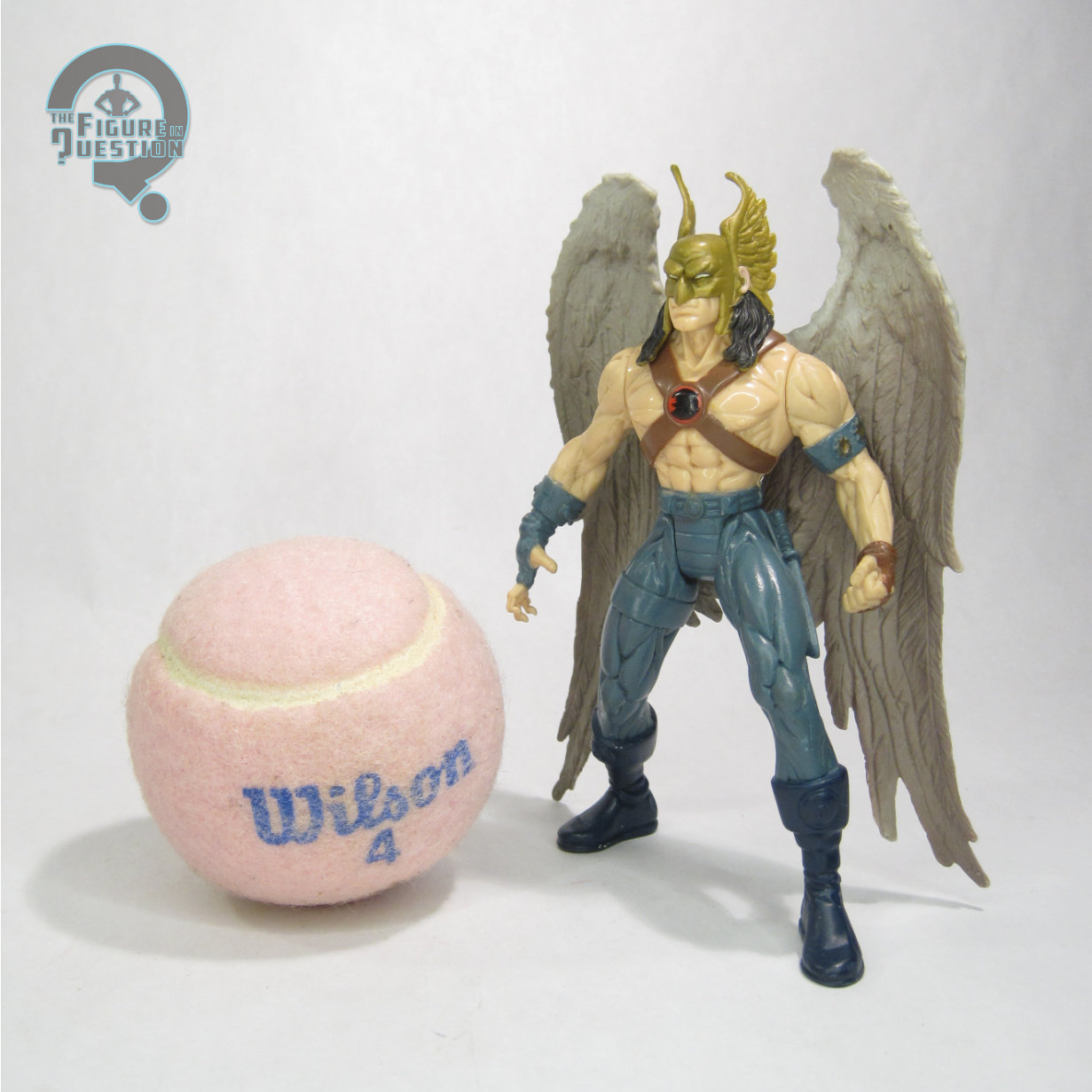
Hawkman was released as part of the second series of Kenner’s Total Justice line.  It was his third figure, after the Super Powers and Toy Biz figures, and the first to be based on something other than his Silver Age design.  The figure stands 5 inches tall and he has 6 points of articulation.  Unlike others in the line, Hawkman lacked neck movement, presumably due to the hair. There’s still a peg, it’s just at the middle of his head, where his mask meets his face, and it’s really odd and definitely not meant to move.  Beyond that, he does get the standard shoulder and hip movement, as well as additional movement for the wings.  Most of his sculpt would remain unique to him, as he was one of the few characters not to have any equal in the JLA line.  The wings got re-used for Zauriel, though, which makes sense, because they’re decent basic wings.  His sculpt is based on Katar’s Earth attire from Hawkworld and the bit of time that followed.  At it’s core, it keeps the general set-up of his original design, but definitely ‘90s-izes it.  There’s extra straps, and fingerless gloves, and, of course, the super long hair.  We had three rounds of that long hair thing in Total Justice, which is a pretty dense packing in of it all.  The sculpt is at least pretty good at what it’s doing.  It’s one of the absolute least pre-posed of the Total Justice sculpts, looking borderline like a normal person.  The musculature is still kind of nuts, but it’s the style, so we’re just finding it charming.  The wings and helmet are definitely the best part.  His paint work is fine enough.  It does a halfway decent job with the colors, but ultimately misses a bunch of details on the legs, which is kind of a bummer.  He gets no actual character-specific accessories, but does get the ever-so-present Fractal armor, which in his case is a big ol’ honking set of talons that mount to the shoulders of his chest plate.  It’s…it’s odd.  But, it’s there.  At least it doesn’t impact the core figure.

THE ME HALF OF THE EQUATION

In the ‘90s, I was still a child, living the simple life of someone who didn’t know anything about the madness going on with Hawkman.  I just knew there was a Hawkman, mostly from Super Friends and old back-issues my Dad read to me.  So, I saw this guy at Another Universe, the comic shop in the mall my Grandmother always took me to, and I wanted him, because he was Hawkman, and Hawkman was a simple, not convoluted character, right?  And I showed him to my dad, who liked Hawkman, and he was…well, it’s not to say he wasn’t glad I had a Hawkman figure, but there was certainly some discussion about *what* Hawkman I’d just brought into the house (in a joking, sort of nurturing manner, of course).  Not so simple anymore.  Well, he remained simple and un-convoluted for me, at least until I had the Super Powers figure to swap in for him, so I consider all that a win.  Over the years, I lost some of his parts, but I slowly rebuilt him, and here he is, all complete.  As messed up as this period of time is for the character, the figure’s cool.  I’m not taking that away from him.

#4028: Breakdown

BREAKDOWN

X-MEN 2099 (TOY BIZ)

“Roaming the world of 2099 are a group of nomads called the Freakshow – men and women used as lab rats in the twisted experiments of corporate America. Breakdown is one of them. Genetically engineered to transmute the molecules of any object he lays hands on, Breakdown’s touch results in destruction. Enraged over being made outcasts in the name of science, Breakdown and the Freakshow are out for revenge.”

The 2099 imprint at Marvel was not shy when it came to world-building, and in the case of X-Men, they were pretty invested in creating equivalents for stuff from the present timeline.  Since the present day X-Men had their own band of “unsightly” mutant outcasts in the form of the Morlocks, X-Men 2099 had their own, the Freakshow.  And, since Callisto wasn’t around for her usual edgy leader duties, instead we got today’s focus, Breakdown!

THE FIGURE ITSELF

Breakdown was part of the second (and ultimately final) series of Toy Biz’s X-Men 2099 toyline.  He’s a non-team member in an assortment that’s sparse on actual team members, which is a bit odd since they didn’t really come anywhere close to an actual team line-up, but hey, it is what it is.  The figure stands just over 5 inches tall and he has 9 points of articulation.  Breakdown’s sculpt is another all-new one, and one that again remained unique to this figure.  It’s very much in keeping with the others in the line, so it looks a fair bit like Ron Lim’s illustrations for the series, and it also fits well with the other figures Toy Biz was doing at the time.  Dig that mullet, which is apparently back in style in 2099.  Or maybe it’s not.  He’s an outcast, after all.  The sculpt is largely basic in its detailing, but there’s a bit more texturing in what you can see of his skin.  You can also see more of that texturing through the magic of his “battle-damage” feature, which allows you to remove a segment of his costume on his torso.  It’s actually a pretty cool little feature, adding a fun little extra, while also staying in place pretty securely, and not being too incredibly obvious when it’s in place.  Breakdown’s color work is a pretty decent match for the character’s admittedly rather oddball colors from the comics.  Things are pretty clean for the most part (though my figure has a touch of wear), but there’s some coverage issues along some of the edges, notably his hairline.  Breakdown is packed with a whole other guy, namely Dominick, who is his sidekick.  At least, according to the box.  I don’t know.  I can’t say I really know Dominick, beyond his presence here.  I will say he’s a pretty neat li’l guy, and I do quite like him.  Like a lot.  Now I want to read all six of his appearances.  I would die for this guy.  Just straight up going all Rosa Diaz with the puppy.

THE ME HALF OF THE EQUATION

I got Breakdown loose with the rest of the line a few years back, but he was missing the Dominick figure, and as I have discovered in the process of writing this review, that’s apparently a deal breaker for me, so I tracked down another just to get Dominick.  Knowing nothing about either character, I gotta say, I really like this pair.  Definitely another solid offering from a line I knew very little about going in.

#4027: Chewbacca

CHEWBACCA

STAR WARS: POWER OF THE FORCE II (KENNER)

Star Waaaaaaars!  Nothing but Star Waaaaaaaaars!  All with the Cooooooiiiiiins!  Every Thurdaaaaaaay!  Welcome to another Thursday here at the Figure in Question, a day for Star Wars stuff.  Not just any Star Wars stuff, though.  No, it’s Star Wars stuff with coins.  And figures.  And collectiblity.  And also things that are exceedingly similar to things that you already have.  Today takes things to almost a new level of “things you already have.”  This should be oodles of fun.  Let’s look at Chewbacca.  Oodles, I tell you!

THE FIGURE ITSELF

Chewbacca was released in the Toys “R” Us-exclusive “Millennium Minted Coins” sub-line of Star Wars: Power of the Force II from 1998.  Chewbacca was still pretty much operating on “technically he’s got the same look in all the movies” principle, so he’s just got the one standard look here, much like elsewhere.  The figure stands about 4 inches tall and he has 6 points of articulation.  While the last two Coin figures had new parts, Chewbacca is a total re-use of the standard Chewbacca mold from the first series of the line.  It’s…well, it’s certainly a distinct sculpt, but also one of the more inaccurate figures from the earlier run of the line.  It was replaced by more accurate figures the same year as this release, but I guess they weren’t on hand for this release.  Alas.  This one gets a radically different paint scheme, though!  ….Nah, I’m just kidding.  What he actually gets is almost the exact same paint scheme, but now there’s some additional grey drybrushing on some of the fur.  Is it worth it?  No, not really.  You’d probably miss it if you didn’t have both versions on hand.  But it’s different?  So, yay?  Chewbacca is packed with the standard bowcaster from the first release (but lacks the wonky blaster rifle), as well as the display stand and Millennium Minted Coin.  That’s where the oodles of fun comes in.

THE ME HALF OF THE EQUATION

If you’ve read my last two Millennium Minted Coins reviews, then you know I didn’t have any of these as a kid.  This one especially wasn’t really on my list because he’s almost exactly the same as the standard one, and I just didn’t know if I needed it.  Clearly I lost that particular battle, huh?  I bought a whole set of these on eBay, so that’s where this guy came from.  Nothing really special, much like the actual figure.  He’s…fine.  I mean, technically better than the original, but that’s not saying much.  Yay for completism!  It’s oodles of fun!

#4026: Speed Racer

SPEED RACER

SPEED RACER (RESAURUS)

In 2014, I wrote reviews for four figures from the short-lived Resaurus Speed Racer toyline from the ‘90s.  In the twelve years since, I have mentioned Speed Racer twice in passing (one of those also being in 2014) and…well, that’s really it.  Bit of a gap there, huh?  Well, I’m bouncing back from the gap!  Oh yeah! And now I’m writing in one long stretch so as to convey very fast so as to properly line all of the words up to the movements of the mouths as they have already been animated and so now I am just saying as much as I can as quickly as I can with no breaks because that’s how you talk about Speed Racer, haha!  Anyway, here’s Speed Racer (haha!).

THE FIGURE ITSELF

Speed Racer was released in the first series of ReSaurus’s Speed Racer line in 1999.  He was the first of two Speed figures in the line, and the one that actually stuck to Speed’s in-show look, functioning as your basic, standard, regular version of the guy, and specifically designed with the line’s accompanying version of the Mach V in mind.  The figure stands about 4 3/4 inches tall and he has 8 points of articulation.  Like the rest of the line, Speed’s articulation is the standard 5, plus wrist and waist swivels, which is a pretty decent little set-up for this scale.  Speed’s sculpt was all-new to him, and remained unique, not sharing any parts even with the Speed variant from the second series.  For this line, ReSaurus took the general designs of the characters as seen in the show, figured out all of the important defining details, and then expanded on that, so they felt like the characters seen in the show, but also had a ton of extra detailing that adds to the overall appearance.  In Speed’s case, that means wrinkles and folds in his outfit, stitching and seams on his pants and shoes, and even a proper pattern on what we can see of his socks.  The first series were a little more pre-posed, and that’s true of Speed, who’s sort of mid-step, with his arms ever so slightly bent (perfect for holding the steering wheel of the Mach V, so it makes sense).  The one area this figure somewhat suffers is paint.  While far from terrible, there’s definitely a fair bit of slop and uneven coverage, especially on his shirt, and its various color changes.  The yellow used for the “G” is very thin, and sort of hard to see.  On the plus side, the head is quite nice, especially the eyes.  These figures were always pretty well accessorized and Speed’s no exception.  He gets his helmet, a handgun, a duffle bag, a trophy, and a display stand.  The helmet is the same one used with the second Speed, minus the extra red stripe.  It’s got a moving visor and fits snuggly on the head.  The rest of the extras are all pretty neat, and are very nicely detailed, much like the main figure.

THE ME HALF OF THE EQUATION

I got this figure after the initial run by a fair bit.  I was in high school, I think the summer that the movie came out, and found him and Trixie at a dealers table at a local con, and the dealer offered me a deal for both, which I was happy to take advantage of.  Admittedly, the Grand Prix Speed was the one I’d wanted more, but after as much time as had passed since I’d seen any version of Speed at all, I was happy just to have one.  This is such a great little line and every figure is really just a fantastic little gem.  Speed’s a great basic version of the character, and just a fun little figure in general.

#4025: Robin

ROBIN

TOTAL JUSTICE (KENNER)

“As the third person to don the guise of Robin, Tim Drake trained under the watchful eye of Bruce Wayne to become Batman’s crimefighting partner. Using finely-honed martial arts and acrobatic skills, along with a razor-sharp intellect, Robin proves himself an even greater threat to villains with his Fractal Techgear spinning razor disc and battle staff.”

Do you ever find yourself settling for less than the amount of Justice you’d prefer?  Why settle, when you could have Total Justice instead!  It’s all the justice you could ever want!  It’s total!  …Right?  Man, I could go for some actual “total” Justice right about now, but I’m just gonna have to hold myself over with the best thing I can approximate, which is a ‘90s Kenner DC line.  Admittedly, that’s still pretty well up my alley, so I can’t say I’m *unhappy*.  Just, you know, I could be happier.  Ah well.  Let’s look at today’s figure, a Robin who could have none more Justice, for his level of Justice is Total.

THE FIGURE ITSELF

Robin was released in Series 1 of Kenner’s Total Justice line in 1996.  Robin was no stranger to action figures at this point, and certainly not from Kenner.  That said, at this point Robin figures that were specifically Tim Drake were still rare, with the only prior one being the odd one from the Batman Returns tie-in line.  He was oddly absent from the Legends of Batman line, despite its mainstream figures all being based on the “Knightfall” storyline, in which Tim was a notable player, so this figure sort of filled in there.  The figure is about 5 inches tall (though a bit shorter depending on how deep you go when posing that lunge) and he’s got 5 points of articulation.  His sculpt is…well it’s a Total Justice sculpt, so it’s kind of intense in every regard.  Posing, expression, musculature.  It’s all very intense.  That’s how we did it in the ‘90s.  I suppose, compared to others in the line, the posing is at least a bit more mild and standard, and he’s without any screaming or major grimacing, so it certainly could be worse.  His costume follows the original Neal Adams design pretty closely, including all of the smaller details, like the ribbing on the sleeves and gloves, and the extra piping on the boot cuffs.  Robin gets a separate piece for his cape (unlike some *other* caped crusader’s in the line), which is…well, it feels a bit like it’s meant for a different figure, if I’m honest.  It doesn’t really have the same flow as the rest of the posing, and it has some trouble staying in place.  Robin’s color work is basic stuff, really, but does alright.  All the standard colors.  The most notable omission is the interior of the cape being black, rather than yellow, as it was in the comics.  That was ultimately fixed when he was rereleased in the JLA line at the end of the decade.  In terms of extras, he gets the standard Total Justice set-up, which is Fractal armor.  In his case, the actual armor is limited to a chest plate, which is honestly a lot less silly than some of the others.  He also gets a rather involved staff with some blades on the edge (making it a spear, I guess?  Or maybe a scythe?), as well as a disc launcher.  The blades could be removed from the staff, allowing for something closer to Tim’s usual collapsible staff from the comics.  The JLA re-release dropped everything but the main staff, and swapped in a display stand.

THE ME HALF OF THE EQUATION

When I was first entering into the world of action figures, I found myself seeking out figures that looked the most like the characters from the source material.  I remember specially wanting a more accurate Robin (notably one with black hair, which was tricky in a post-Chris O’Donnell world), which was a quest I undertook with my Grandmother.  This was attempt number two (Legends of Batman Crusader Robin was attempt the first, but, while cool, just wasn’t quite it) and he pretty much did what he needed to.  He was my main go-to Robin for a while, and lost a bunch of his parts over the years.  Thankfully, I was able to get myself some replacement gear for him, and here he is, in all his Total Justice-y glory once again.

#4024: Skullfire

SKULLFIRE

X-MEN 2099 (TOY BIZ)

“Tim Fitzgerald was living a tough life alone on the streets when he was approached by Shakti and invited to join the X-Men. Able to absorb and store electricity on a cellular level and redirect it with devastating results, Tim is a mutant with extraordinary, as yet untapped, potential. Picking up the reigns after former team leader X’ian’s betrayal, Tim now leads the X-Men against their opponents as the smoldering Skullfire!”

Man, the X-Men 2099 cast is not beating the “drawing two random words out of a hat to make the names” allegations at all, are they?  It was the ‘90s, that’s just how we were.  Admittedly, Skullfire’s got a better claim to his grab-bag sort of name than Bloodhawk did, so I’m less inclined to fight it….from a design standpoint.  Power-wise?  Eh, I’m still iffy, but I’ll let it go. Right, so let’s look tat this here Skullfire figure!

THE FIGURE ITSELF

Skullfire is the final figure in the first series of Toy Biz’s X-Men 2099 toy line.  There were originally two more, but La Lunatica got pushed back to the second series, and Controller 13 was scrapped entirely.  Skullfire himself is a sensible choice, what with being the team’s leader and central character.  The figure stands just over 5 inches tall and he has 9 points of articulation.  He’s got a rather basic articulation scheme for the time, which serves him well enough, and means that, unlike the last three figures I looked at from this line, he can turn his head.  Crazy stuff, right?  His sculpt was new to this figure, and would remain unique to him.  It’s respectable.  Stylistically, it fits right in with the rest of the line, and generally captures the Ron Lim vibes.  That being said, he’s based on the character’s earliest appearances in the series, prior to the addition of the oh-so-90s headband that became standard to his appearance.  His hair is also a little shorter and more contained than it tended to be.  All that said, it looks fine for a guy named Skullfire, so I really can’t fault it.  Perhaps the coolest part of the figure is how they did his forearms; there are “bones” inlaid into the mold, and the outer arm is cast in a clear plastic, so he’s got that neat x-ray effect going on, just like in the comics.  Skullfire has two “action features.”  His forearms are molded in a glow-in-the-dark plastic, so the “glow” (sort of), and his right arm also has a spring-loaded feature, triggered by the lever on his back.  Skullfire’s color work actually had two variations (much like most of the first series figures), where the yellow sections of the costume were either a slightly metallic yellow or a darker gold.  The one seen here is the yellow.  Otherwise, application’s the same, and honestly not bad.  He captures the color scheme of the comics well, and things are generally pretty cleanly handled.  Skullfire is packed with two removable bracer pieces, as well as a flame knife, which is more or less the same as the one included with Brimstone Love, but smaller to better fit on this figure’s wrist.

THE ME HALF OF THE EQUATION

Much like Metalhead and Bloodhawk, I got my initial Skullfire in a larger lot that had pretty much the whole run of these guys, but he was missing his bracers, so I snagged a sealed one later to get a fully complete one.  I rather like this one.  Vibes wise, he very much feels on par with Meanstreak, who is my unquestionable favorite from this line, which serves Skullfire pretty well.  He’s not quite accurate to most of the character’s depictions, but then I don’t have much experience with the character, so that impacts me less.  As it stands, he’s a solid figure with some really fun little details, especially those forearms.  He’s nifty and I like him.

Shoutout to my friends at All Time Toys, from whom I purchased this figure for review!  If you’re looking for cool toys both old and new, please check out their website and their eBay storefront.

#4023: Princess Leia in Endor Gear

PRINCESS LEIA in ENDOR GEAR

STAR WARS: POWER OF THE FORCE II (KENNER)

Remember last week when I reviewed a Star Wars figure and a coin?  Wanna see me do it again?  Well, whether you want it or not, that’s what I’m doing, because I’ve already taken the photos and set up the text file to write the review, so I’m locked in.  Sorry guys, my hands are just really tied here.  You know how it is with management.  I mean, sure, that’s also me, but do you think I can really get me to change my mind?  I’m doubtful.  So, let’s just take a look at this here Star Wars figure.  Last week, I looked at Luke in his Endor Gear, so why not follow up with his sister Leia, in her very similar Endor Gear.  Oh yeah!

THE FIGURE ITSELF

Princess Leia in Endor Gear was released in the Toys “R” Us-exclusive “Millennium Minted Coins” sub-line of Star Wars: Power of the Force II from 1998.  Like her brother Leia was released in her Endor Gear from the Speeder Bike sequence of Return of the Jedi, and she had likewise just gotten a released with her own vehicle the prior year.  The figure stands just shy of 3 3/4 inches tall and she has 6 points of articulation.  The sculpt has a lot of similarities to the prior version included with the vehicle, but actual parts re-use appears to be restricted to the torso, pelvis, and poncho.  The head is quite similar, but the angle of the neck is slightly different, as is the case with the arms.  The legs are all-new, and remove the knee joints because I guess if you’re going to buy Leia without the bike, maybe you don’t want her to be able to properly sit?  I don’t know.  She’s a bit more stable, so I guess that’s good.  The re-use of the pelvis leaves her with a bit of an odd, almost diaper-like look, but it’s hidden by the poncho, so it’s not really an issue.  Much like Luke, Leia’s paint work is notably improved from her prior release.  Detailing is sharper, and there’s a greater variety of shading and gradation to the pattern on the poncho, as well as more accurate coloring to the uniform underneath.  Leia is packed with her distinctive blaster pistol (replacing the Han-style blaster included with the vehicle pack-in), as well as the coin, and the display stand.  The coin and stand are still pretty cool, and honestly not a bad selling point.

THE ME HALF OF THE EQUATION

As I noted in last week’s review, I didn’t have any of these as a kid.  In fact, I didn’t even have the prior version of this look as a kid.  I’ve had Luke sitting on my shelf unopened for a few years now, and finally decided of snag the rest of the set.  I was initially planning to piecemeal them, but found a complete run of them, so I guess that worked out.  The pack-in Leia honestly wasn’t bad, but this one is overall an improvement, and in general just a fun little extra way of getting the look, with the added bonus of a kind of nifty coin!

#4022: Chief Crocker

CHIEF CROCKER

SEAQUEST DSV (PLAYMATES)

“Name: Manilow Crocker

Rank: Cheif Petty Officer

Assignment: Security Chief, seaQuest DSV 4600

UEO Military ID#: TT929-4417-MO1

Security Access: A2A

Date of Birth: October 10, 1968

Character Profile: Tough. “Old Salt.” Proud enlisted man. High regard for seafaring history and custom. Superstitous and cautious. High-tech weapons specialist. Expert diver. Gruff, grizzled exterior masks warmhearted, generous nature. Dives for treasure. Searches for lost ships as hobby.

Personal History: Enlisted in U.S. Navy following high school, 1985. Initial service aboard destroyer as gunnery mate. Served under then Lieutenant Commander Nathan Bridger, 2006. Transferred to Pearl Harbor Base security detail 2010. Planned to retire in 2018, but Admiral Willam Noyce personally requested his assignment to seaQuest as Security Chief.

Mission Specialty: Responsible for all aboard ship and away team safety and security. Knowledgeable in undersea search and rescue.”

Hey, it’s more SeaQuest stuff, and it’s not even nine years later!  Is that allowed? I’m gonna go with “yes”, because it’s my site, and if I wanna talk about SeaQuest, well I guess that’s what I’m gonna do. I do have to say, I somewhat feel like my thunder’s been stolen on this intro, with just how in-depth Playmates went on their bios for the back of the box on these guys.  So, pretty much everything you need to know about today’s focus, Security Chief Crocker, is listed up there.  Like the fact that his first name is Manilow.  I don’t think that even comes up on the show.  But there it is.  All written out.  Let’s check out Crocker!

THE FIGURE ITSELF

Chief Crocker was released in Playmates’ one and only assortment of their SeaQuest DSV tie-in line from 1993.  Crocker’s not the most prominent member of the crew included, but got a decent amount of screen time, and, most importantly, added some variety of design to the show’s cast.  The figure is about 4 3/4 inches tall and he has 14 points of articulation.  Like Bridger, he demonstrates the SeaQuest line’s improved articulation scheme over Playmates’ Star Trek line of the same era, so there’s quite a bit of posing to be had with him.  Crocker’s sculpt is another unique one, which benefits from his stockier build than the rest of the crew, as well as demonstrating the slightly different way Crocker wore his uniform compared to the other crew.  He’s got his proper turned down collar, as well as the weapons belt worn by the security officers, complete with working thigh holster.  Crocker also gets a SeaQuest branded baseball cap, something that most of the crew wore at one point or another during the show’s first season, but which was most frequently worn by Crocker, making it a solid choice for his design.  The head sports a pretty respectable likeness of Royce D. Applegate, and gets a decent amount of detailing especially on the facial hair.  Crocker’s color work is pretty well handled.  It’s cleanly applied, with sharp detailing on the eyes, as well as all of the insignias and markings on the uniform.  Crocker was packed with a Stun Gun, PAL, Away Team Launcher with a Tranquilizer Harpoon, Handcuffs, a small rubber killer whale, and a display stand.  The main launcher is the same one included with Bridger, but with a new missile.  It’s just as gimmicky here, but it’s still fun, so I can’t complain.

THE ME HALF OF THE EQUATION

Crocker is the only figure from the original run that I actually got when he was still new.  My dad was buying himself a set, and offered to get me one, and apparently Crocker was the one I decided I wanted.  I don’t know why exactly, but if I had to hazard a guess, I’d say I liked his hat.  Like Bridger, he spent most of his time mixed in with my Trek figures, which suited him pretty well.  He certainly took a bit of a beating over the years, and I think he’s still pretty fun.  And I’m adding this extra sentence because otherwise I was gonna end on 666 words, and I don’t think that would be kind to Crocker’s superstitious nature, so this one’s for you, Manilow!

#4021: Undercover Bruce Wayne

UNDERCOVER BRUCE WAYNE

THE NEW BATMAN ADVENTURES (KENNER)

Secret identities are a fixture of the traditional super hero set-up, but when it comes to the merchandising fixture of said set-up, they aren’t the most exciting thing to put out there, which can prove a little bit tricky.  But, if the super hero’s popular enough, they might be able to leverage it.  So, Batman’s alter-ego Bruce Wayne?  Pretty safe bet.  Bruce was one of the earliest secret identity figures, as part of the Montgomery Ward-exclusive mail-away set done by Mego.  And, through the magic of media tie-ins, he got quite a few figures under the guidance of Kenner as well.  Here’s the last of those!

THE FIGURE ITSELF

Undercover Bruce Wayne was part of the second run of Kenner’s The New Batman Adventures tie-in line in 1998.  He was the other notable “new” figure alongside last week’s Creeper.  The figure stands 5 inches tall and has 5 points of articulation.  The figure’s sculpt was based on Bruce’s updated, slightly more suave look from TNBA (which was subsequently carried over into Justice League and Justice League Unlimited), so the sculpt was a complete departure from earlier animated Bruce figures.  It was a totally unique offering, though it would be repainted twice, once for the Return of Joker line, and once for one of Hasbro’s four-packs.  The head is a spot-on recreation of Bruce’s show design, and just generally a strong offering.  Below the neck is a different story.  Much like the Superman: The Animated Series Quick Change Superman, the desire for some sort of a quick change feature means that the civilian guise sort of takes on some adjustments.  In Bruce’s case, he gets an overcoat over his standard suit and tie.  It’s generally not a terrible look (sculpturally, at least; I’ll discuss it more in the color work section), though it’s perhaps a bit bulky.  The whole coat piece is an overlay, which can be removed revealing a variation on the Batman suit beneath.  There’s some interesting touches, like the boots having a double cuff thing going on, so that they can look like suit pants when the coat is in place.  In terms of color work, there are some definite choices here.  There’s some more minor stuff, like he’s a bit more pale than on the show, and also lacks his rather distinctive blue eyes from the redesign, but by far the strangest thing is the decision to make the overcoat a bright red color, which feels out of place (Kenner for some reason liked to tie Bruce to red; the original animated line Bruce to Batman and the Mask of the Phantasm Decoy Batman both also use a lot of red), especially because the Batman suit ends up being predominantly red as a result.  The Return of Joker variant made it even worse, shifting it to a neon orange, but the four-pack version swapped it for grey, which was far more appealing shade.  Bruce was packed with a cape/cowl combo, a pair of armored gauntlets, and a weird secret identity shield thing.  The cape and cowl are nice, but the gauntlets are kind of clunky, and I don’t even know what the point of the shield is, but I also kind of like it.  There was even an extra selection of identities printed on the cardback, which you could clip and slide over the standard decal.

THE ME HALF OF THE EQUATION

I had a real want for this figure when he was first released, and I remember putting a lot of effort into getting one.  It was, I believe, after my birthday, and I’d gotten some “Geoffrey Dollars” (Toys “R” Us’ pre-cursor to gift cards), so I remember going to a bunch of TRUs and only finding Creeper, but none of this guy.  I finally ended up finding him at a different store, so I couldn’t use the Geoffrey Dollars, but my parents spotted me the actual cash, and I guess I used the Geoffrey Dollars for something else.  He’s goofy, but also the best version of Bruce that Kenner did during their tenure.  Bright red overcoat aside, he’s honestly not bad.

#4020: Bloodhawk

BLOODHAWK

X-MEN 2099 (TOY BIZ)

“A self-appointed protector of the environment, the savage X-Man Bloodhawk shows no mercy to those who would destroy the eco-system of 2099 – be they corporate stooges or super-powered mutants!”

Right, so we’re back with the X-Men 2099 figures again today, taking a deeper dive into the team, such as it were.  So, we’re looking at this guy they call Bloodhawk.  Bloodhawk.  Bloodhawk?  Bloodhawk.  That’s…we’re going with Bloodhawk.  I…yeah, okay, I guess? At a certain point, you do feel a little bit like they named most of this team by pulling two words out of a hat and going “yeah, now we’re cooking.”  Bloodhawk is the sort of name that *could* apply alright to a red guy with wings, but maybe not *this* red guy with wings.  I mean, yes, I know I’m absolutely overthinking it.  It’s X-Men 2099, so any thought at all is probably overthinking it.  But Bloodhawk?  I’ve workshopped the name with the FiQ writers room (which is really just me pestering Tim, but I’m counting it) and we’ve come up with Boil Bat, X-Zema, Bloodwyng, and Blüdred as potentially better names, for what it’s worth.  But I’m definitely overthinking it.  Right, I’m supposed to be talking about toys or something. Anyway, here’s (sigh) Bloodhawk.

THE FIGURE ITSELF

Bloodhawk (sigh) is part of the first series of Toy Biz’s X-Men 2099 toyline.  Though his bio just identifies him as “X-Man,” Bloodhawk wasn’t actually a full-fledged member in the early issues, just a recurring ally.  But, you gotta have Bloodhawk, right?  The figure stands just over 5 inches tall and he has 8 points of articulation.  An argument could be made for 10, but I’m going with 8 because only 8 of those points can actually hold a pose.  Bloodhawk marks the third figure in a row from this line not to sport neck articulation, and unlike the other two, he doesn’t even have a waist swivel to offset it.  No peripheral vision for Bloodhawk.  There’s two additional points of movement on his wings, but they’re tied into an action feature that moves them up and down, and don’t actually hold any poses beyond the standard when the lever’s not being held.  Bloodhawk got an all-new sculpt, and, like most of this line, it remained unique.  Apart from having a rather stiff pose, I think it’s decent enough at capturing his depiction from the comics.  He’s much leaner than the others in the line, which helps him standout and also feels true to the character, as best as I know him.  There’s some decent texturing on his skin, so that gives him his own sort of feel.  Bloodhawk’s color work is rather on the basic side, but generally gets the idea across as to Bloodhawk’s comic look.  There’s a color variant on this one, where his pants are either metallic or flat green.  Mine is the metallic version, which I dig, because it feels more future-y.  Bloodhawk is light on the extras, but does get a removable bandolier, which is a little awkward to get around the wings, but does help sell the extra ‘90s nature of the character.

THE ME HALF OF THE EQUATION

I’ve actually owned two Bloodhawks.  The first came from the same larger lot that included most of the other X-Men 2099 figures, but was missing his bandolier, so I ended up with a sealed one I found later fr the purposes of completing him.  He’s…fine.  Look, I really don’t like his name.  I think it clashes with a character that could be a perfectly interesting idea.  His figure’s a little stunted on movement, but overall not bad.