TOAD
MARVEL LEGENDS (HASBRO)

“Mortimer Toynbee was a greedy, pathetic little toady when the genetic evil mutant known as Magneto took him in as a member of his original Brotherhood of Evil Mutants. But years of hard knocks toughened the Toad’s hide, and the once-sniveling creature grew a spine. Now, a leaner, meaner Mortimer stands poised to exact revenge on all those who mistreated him.”
When Marvel Legends launched 20 years ago under Toy Biz’s lead, it launched with a four figure assortment sporting some of Marvel’s big names….and Toad. Okay, so, technically, in Toad’s defense, he was actually the only one of the four debut characters to have been in a theatrical film at the time. But that’s not what got him into the line-up. In actuality, it was all sheer luck. Iron Man, Captain America, and Hulk were supposed to debut alongside Dr. Doom, a far more formidable opponent. However, Doom was delayed, and Toy Biz was in need of a quick replacement. So, they grabbed the completed mold they had for the comic-style Toad from their cancelled “Evolution of X” line and stuck him in Doom’s place. To say he was out of place is something of an understatement, and the figure was rather infamous early in the line for how unwanted he was by the fanbase. While the figure would eventually gain a rather hefty aftermarket value, the poor sales early in the line effectively guaranteed no follow-up release for the character. And, that’s why, 20 years later, he’s just now getting his second Legends figure.
THE FIGURE ITSELF
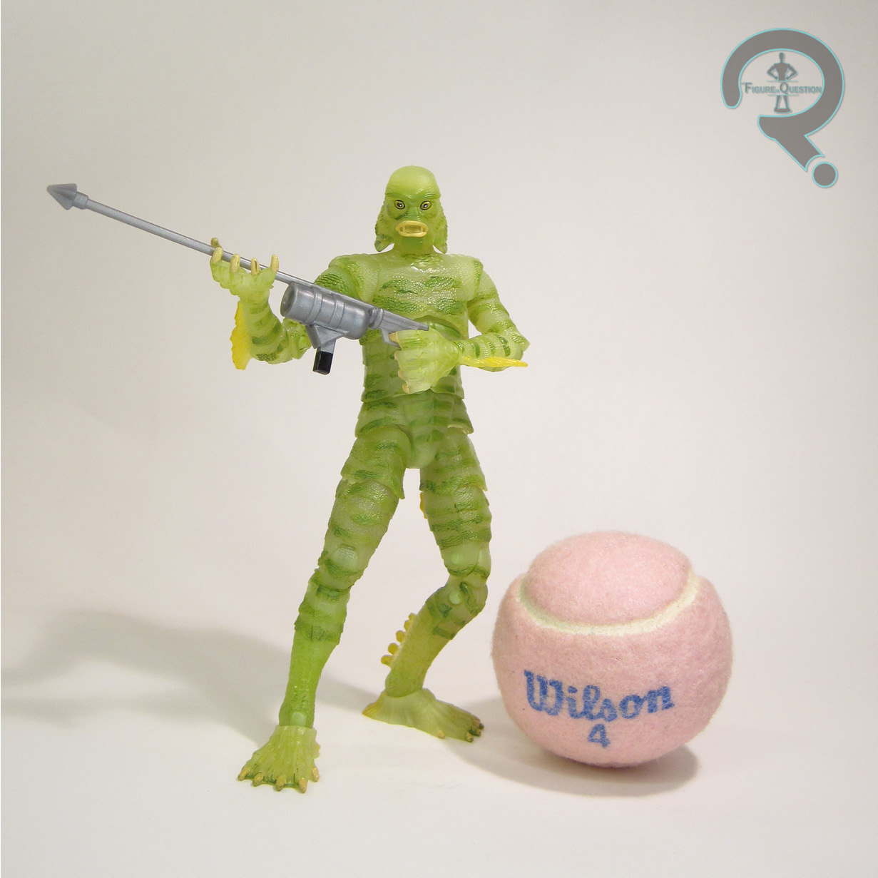
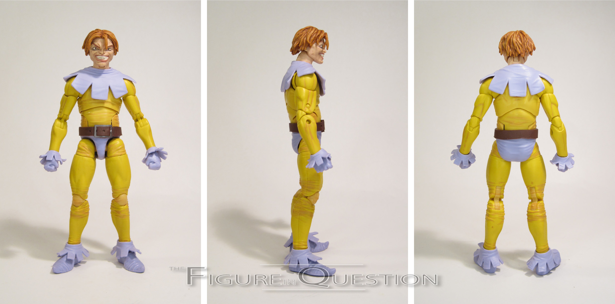
 Toad is the final figure in Series 1 of the “20th Anniversary” sub-line of Marvel Legends. He’s a fair bit removed from the other three, both in terms of when he was shown off and when he arrived at retail, which is all rather fitting, I suppose. The figure stands roughly 6 inches tall and he has 34 points of articulation. The previous Toad was rather infamously under-articulated, since he was a pre-Legends mold being re-purposed. This one, on the other hand, is a fair bit better, and is in fact the most posable of the four figures in this subset. Unlike the prior figure, he can actually crouch and get into generally Toad-like poses. The figure’s sculpt is largely new, though there’s just a touch of re-use. I know that the upper arms at the very least are Pizza Spidey; I’m not sure about the lower arms, because they look just a little bit off. Beyond those pieces, though, the rest of it’s all-new. It’s….a mixed bag. The original Legends Toad was very definitely a ’60s Toad in terms of styling. This one’s something else. He seems to lean a little bit more on the ’90s vibe overall, but even then, it’s kind of non-committal. Given how closely Cap and Hulk both stuck to direct updates on their original figures*, it’s certainly an odd choice to change things up on Toad, especially since he’s still got X-Men #4 as his backdrop piece. Like, he’s not even really in the same costume as the Toy Biz one. You could be forgiven for thinking they’re different characters entirely. I will say, I do at the very least like the way the costume is detailed on the body; Toad’s costume was always somewhat in disarray, and I like all the wrinkles and seams on this sculpt. The part I’m the least fond of, however, is the head, which is the part that really loses the hold on what version of the character they’re going for. It’s just sort of messy. Like, the facial features seem to not really jibe with each other, and it’s kind of large for the body, and then there’s the hair, which makes him look a bit like he’s wearing a wig modeled after Leonardo
 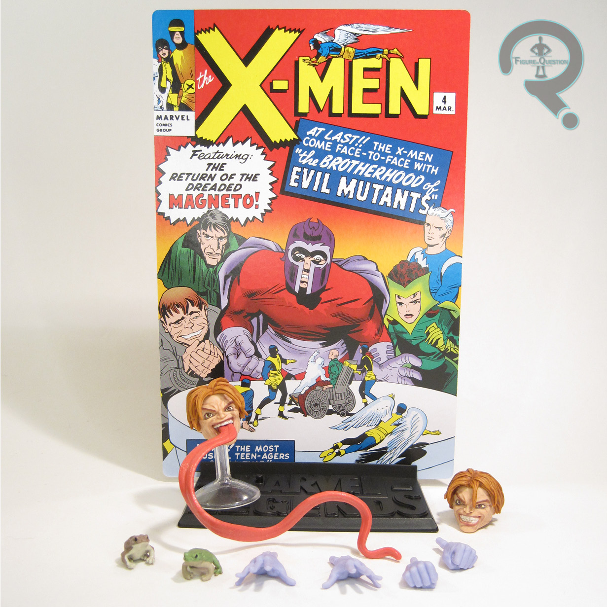 DiCaprio’s ’90s hair. Just a lot of odd choices. In terms of paint work, Toad’s alright. He again removes himself from the first Legends figure by changing up the palette, with the purple in particular being a totally different shade. He’s not nearly as dirty either, though that’s I suppose a change that’s part of the wider line-wide shift under Hasbro. I do like the accenting on the main body suit, though, as it really helps to sell the detail work of the sculpt. Toad is packed with an extra head (with tongue extended), two sets of hands (fists and open gesture), two different toads, and a display stand with a cardboard backdrop. The extra head still has all the same issues as the main one, which is a little disappointing, but it does at least have some more variety to it. The toads are a fun reference to the original figure, and I appreciate that a lot. The stand is the same one included with the other three, and his backdrop has one side with a recreation of the Series 1 figure’s swampy stand, with the other being X-Men #4’s cover. Compared to the other figures, Toad feels a little light, but he’s also the figure with the most new tooling, so I suppose it evens out.
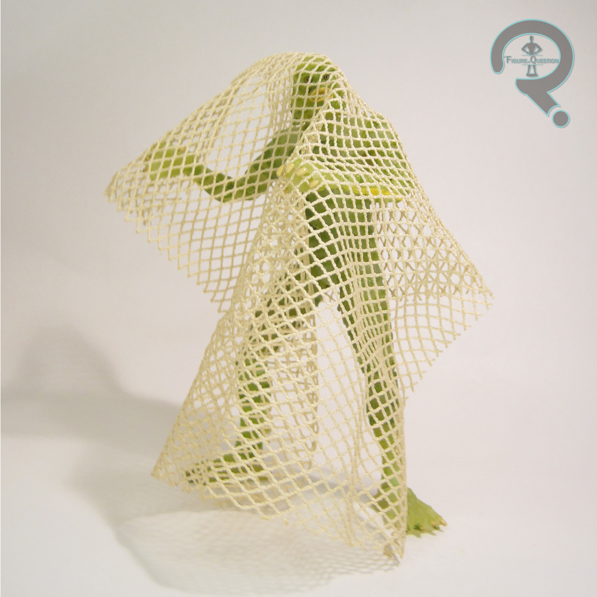
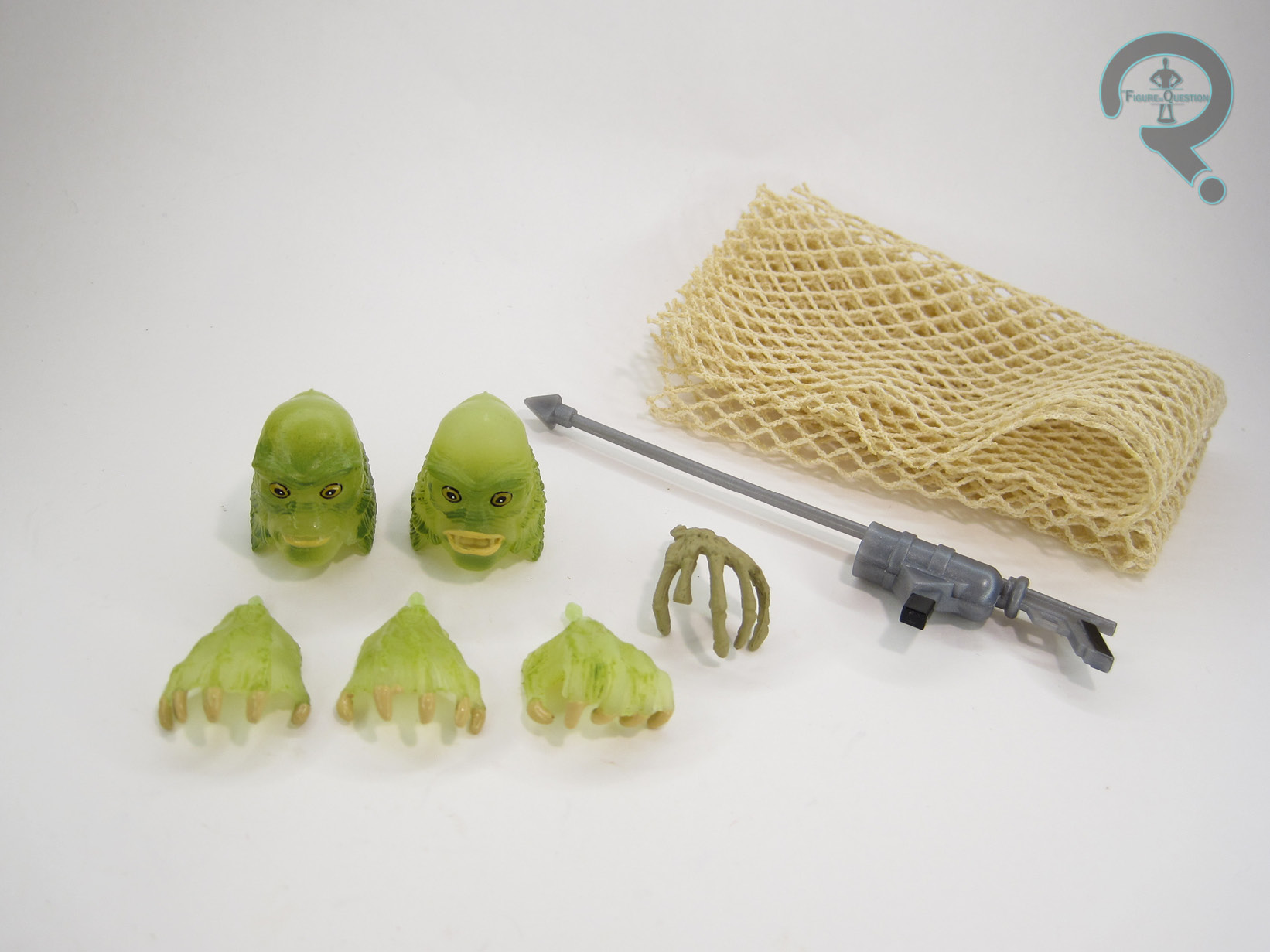
THE ME HALF OF THE EQUATION
I never bought the original Toad figure. I don’t really know why, honestly. It’s not like I dislike the character, and I had a pretty decent X-Men selection going at the time. But, for whatever reason, I didn’t, and then he was expensive, and he just didn’t feel worth it. I did sort of hope for an update, and was kind of looking forward to this one. I had hoped, with him being so far back from the other three, that Hasbro might have been building up to something truly amazing. Sadly, in hand, he doesn’t quite feel that way. In a line-up that gives us definitive takes on Cap and Hulk, as well as a really solid new Iron Man variant, Toad, much like his original release, feels like the odd man out. He feels like a figure we’d have all been very happy with a few years ago, before Hasbro had really gotten to their current level of quality with the line. But, with the other three being very on-point, it’s hard not to see this figure as a little bit confused in its purpose. These figures were billed as proper updates on the Series 1 figures, but Toad’s not really an update or an improvement; he’s just a completely different figure that happens to have the same name. He’s not terrible by any stretch, but he’s not particularly great either.
Thanks to my sponsors over at All Time Toys for setting me up with this figure to review. If you’re looking for cool toys both old and new, please check out their website.
*Iron Man gets a pass, since the 80 Years release had already updated the Series 1 design, and he was serving to properly adapt the variant figure from Series 1.