#1204: Director Krennic

DIRECTOR KRENNIC

STAR WARS: ROGUE ONE (HASBRO)

krennicsmall1

So, now that we’re in February, we’re sort of in that slow time of the year for toy collecting.  It’s been over a month since the onslaught of product pushed out for Christmas, and we’re still a couple of weeks away from all of Toy Fair’s cool reveals.  Of course, that just makes it the perfect time for me to catch up on some overdue reviews of things I got before the new year, now doesn’t it?

Back in December, I took a look at one of the two figures of Director Orson Krennic, the primary antagonist of Rogue One.  Well, I did manage to find the other figure, so now I’ll be taking a look at him too!  Yippee!

THE FIGURE ITSELF

krennicsmall2Krennic was released as part of the second series of Rogue One figures from Hasbro.  He was apparently only one to a case, so he’s been the most difficult of the series to track down at retail (which is why he’s the very last Series 2 figures I’m reviewing.)  His figure stands a little under 4 inches tall and has the usual 5 points of articulation.  For some figures, the lowered articulation can be very limiting, but for a character like Krennic, who seems to spend a lot of his time just standing around, it’s actually not terrible.  The smaller Krennic has another all-new sculpt, but, like his larger counterpart, I wouldn’t be shocked to see this put into use for some other Imperial Officers at some point.  While this figure isn’t packing any ground breaking detail work, the quality of the sculpt is still really solid.  All the important uniform details are there, and the head even has a passing resemblance to Mendelsohn (I actually think it’s a little better than the larger figure in that regard).  The figure is topped off by a plastic cape, which is quite nicely rendered, and easily the highlight of this particular figure.  Krennic’s paintwork is pretty good overall; the colors match the onscreen look and the application is fairly clean.  The eyes are a bit goofy; he looks like someone just told him they don’t like Star Wars; but they’re actually a bit cleaner than this scale usually gets.  Krennic includes his custom blaster pistol, which is sporting a good deal more paint than the average weapon in this line, and he also comes with the requisite giant missile launcher, which is just as silly and goofy as you’re all expecting it to be.

THE ME HALF OF THE EQUATION

Krennic was the source of much searching after I got the rest of Series 2 back on Black Friday.  I ended up finding him while killing some time at a sort of out of the way Target.  He was my consolation prize for not breaking down and buying the AT-ACT while it was on clearance.  Having already gotten the Black Series figure, there’s not a ton of new ground with this guy, but I’m still happy to have found him, if for nothing more than completion’s sake.

#1203: Vixen

VIXEN

JUSTICE LEAGUE OF AMERICA (DC DIRECT)

vixen1

Following the winding down of the well-regarded Satellite Era of the Justice League, DC tried to inject some new life into their flagship super team.  Marvel was having a great deal of success with the Avengers, who had, for about 15 years at that point, been made up predominately of a number of B and C list heroes who didn’t have books of their own (i.e. Hawkeye, Scarlet Witch, Vision, Wonder Man, Captain Marvel, etc).  Enter Justice League Detroit, a smaller scale team.  The only mainstays from the prior era were Aquaman, Martian Manhunter, and Elongated Man, all notably lower tier.  They were joined by a brand new cast of heroes: Steel (no, not the one from Superman), Vibe (no, not the one on The Flash), Gypsy, and Vixen.  The team was…less than successful, and after a short run, they killed two members and rebranded again.  Personally?  I kinda enjoyed the run.  Sure, it had its flaws (Vibe was little more than a walking stereotype), but there was a lot to like.  Perhaps the only new member to make it out of that run unscathed was Vixen, who happened to have one of the more interesting power sets.  She sort of hung around in the background for a while, before being brought in for a recurring role in Justice League Unlimited and subsequently being brought back onto the team in the comics for Brad Meltzer and Ed Benes’ post-Infinite Crisis relaunch of Justice League of America, which just so happened to get her a figure.

THE FIGURE ITSELF

vixen2Vixen was released in 2007 as part of the first series of DC Direct’s Justice League of America line.  The figure stands about 6 1/2 inches tall and has 9 points of articulation.  That articulation’s pretty much good for having her stand there, and that’s about it.  Vixen is sporting her costume from the mid ‘00s which is really just a slight variation of the same basic design she’s been sporting since her first appearance.  I can’t say it’s my favorite design of hers, as it leans pretty heavily on the ‘00s obsession with putting every female character in a catsuit that was three sizes too small.  She, like all of the figures in the line is based on Ed Benes’ artwork.  At this point in their run, DC Direct was pretty much exclusively doing artist-based figures, which was rather a mixed bag, since not every artist’s work translates into three dimensions all that well.  Vixen is kind of weird and lanky for the most part, excepting of course for her breasts, which give an impression not unlike a pair of watermelons strapped to a tree.  It’s an odd look to say the least.  And, as far as posing goes, she looks like she just took a really deep breath and is trying not to let it out, resulting in her chest jutting forward and her shoulders being strangely raised.  She also seems to have had her hips removed at some point, which has had the effect of causing both of her legs to point off to the left in the way that no normal human legs ever would.  Her left foot also appears to have slipped out of place in her boot, since that’s about the only way it could end up that particular shape.  Her arms are probably the best parts of the figure, aside from their intended pose being a little vague; they’re actually shaped like arms, so that’s a plus.  The hands are actually a halfway decent sculpt, but end up being slightly on the large side (and the fingers are also prone to bending out of shape).  The head sculpt is…well, it’s something.  Not sure that something is *good* but it’s something.  The hair’s nice, I guess?  Just try not to look too closely at the face.  Vixen made use of some metal for her bracelets and the pull tag on her zipper.  It’s a nice touch, but the free-floating bracelets can get rather annoying when posing the figure.  Vixen’s paintwork is mostly pretty clean.  The jumpsuit seems a little on the drab side, but it’s not awful.  Once again, try not to look too closely at the face, especially not the lips or eyes.  And that’s not even addressing that super whacky hairline she’s sporting.  Vixen’s only accessory was a display stand with “Justice League of America” painted on it.

THE ME HALF OF THE EQUATION

I actually bought this figure from Cosmic Comix when it was brand new.  I was even excited for it.  At the time, I was really into Brad Meltzer’s run on Justice League of America, and I also really loved Vixen’s recurring role on JLU.  Time has been kinder to the latter of those things, but less so the former.  Also, I believe this was also about the time that I sat down and read the Detroit run, so that probably had something to do with it.  In hindsight, like Meltzer’s run on JLA, time has not been kind to this figure.  She’s rather indicative of this period at DC Direct, which wasn’t a very good one.  It was right about the time I stopped collecting their figures and moved over to DC Universe Classics.  I actually sold off a lot of the other figures from this period, but there hasn’t really been a better Vixen figure, so this one’s stuck around.

Wow, two “bleh” figures in a row.  I swear, I’ll try to review something better tomorrow!

#1202: Cheetara

CHEETARA

THUNDERCATS (2011)

cheetara1

You thought I was done with the Thundercats reviews, didn’t you?  Well, so did I.  But, I really don’t know how to quit buying action figures, and the more figures I have from any given line, the more reason I have to say “one more couldn’t hurt.”  Back in April of last year, I looked at Lion-O, Tygra, and the Tower of Omens from the 2011 re-launch of Thundercats.  Today, I look at yet another member of the team, Cheetara.  No points for guessing what cat she was.

THE FIGURE ITSELF

cheetara2Like Lion-O and Tygra, Cheetara was released as part of the first series of basic small-scale Thundercats figures from Bandai.  The figure is about 4 inches tall and she has 17 points of articulation.  After some genuinely impressive work with the articulation on Lion-O and Tygra, Cheetara is a real step down.  She gains bicep swivels lacked by the other two, but at the cost of wrist and ankle movement, and on top of that, the bicep joints are really ugly.  Also, instead of the nice hinged hips from the prior figures, Cheetara gets v-hips.  Oh goody.  My faaaaaavorite.  They seem to have attempted to make up for the v-hips by adding a pair of swivel joints to each thigh.  The first set of swivels are sort of the reverse ange of the v-hips, and the second is a more straight lateral cut.  In theory, they’re supposed to mimic the movement of a normal t-joint, I guess, but in practice, they’re just sort of a big mess of twisting meat.  And, they’re pretty hideous to boot.  But hey, I’m glad they didn’t ruin the figure by giving her those no good hinged hips from the other two figures; that would have been the worst.  Okay, I’ve ragged on the articulation, but what about the sculpt.  Well, for one thing, it’s pretty much torn apart by all that ugly articulation.  Even on its own merits, though, it seems like a step down.  The head is okay, I guess, and the torso sort of tries to capture her cartoon design, but the arms and legs are just a total mess.  They lack any real organic shape and seem to be out of scale with the head and torso.    Her hands are the same size as her head for pete’s sake!  It’s a sad state of affairs when a figure’s paint being “acceptable” is the high point of the figure, but here we are.  There’s nothing really spectacular about the work, but it’s mostly pretty clean, and the colors match up well enough with the cartoon.  There’s some slop in a few areas, but given the rest of this figure, it could be worse.  Cheetara includes one accessory: her staff.  It’s made out of soft plastic, which makes it look more like a brown spaghetti noodle than anything else.  Also, since she lacks any wrist joints, she can’t really hold it very well.

THE ME HALF OF THE EQUATION

When I picked up Lion-O and Tygra two summers ago, I had also wanted to get a Cheetara, but Yesterday’s Fun didn’t have her.  In the year following, they must have picked her up along the way because I got her from them last summer.  She’s disappointing to say the least.  I mean, I’m glad to have her, I suppose, but after being pleasantly surprised by Lion-O and Tygra, Cheetara was a sad return to form for Bandai America.

#1201: Gorilla Alien

GORILLA ALIEN

ALIENS (KENNER)

gorillaalien1

Due to some adverse reactions to the small quantity of merchandise put out for Alien, its sequel Aliens got no merchandise at all at the time of its release.  Instead, fans of the film would have to wait six years, when a failed pitch for a cartoon based on the property resulted in a line of action figures from legendary action figure makers Kenner.  Sure, they were super goofy, and ‘90s out the wazoo, but they were certainly better than nothing.  And you can hardly debate that the line was entertaining.  One of the more intriguing aspects of the line was that handling of the titular creatures.  Rather than simply release a bunch of generic Alien Warriors, Kenner followed the example of the Dog Alien from Alien3 and created some other, non-human-host-based Aliens.  One of the earliest examples is the figure I’m looking at today, the Gorilla Alien!

THE FIGURE ITSELF

gorillaalien2The Gorilla Alien was released in the first series of Kenner’s Aliens line, as one of the three initial Aliens.  The figure stands roughly 5 inches tall and has 5 points of articulation (7 if you count the extra shoulder movement granted by his action feature).  In terms of design, the Gorilla Alien really doesn’t stray from the classic Xeno look all that much.  Really, it just takes the Aliens design and bulks it up a little bit more, to showcase the slightly larger frame of a Gorilla.  The sculpt on the figure is pretty decent; the proportions are rather exaggerated, but it’s a ‘90s figure, so that’s somewhat expected.  He features a ton of really great detail work on the body, with each little bit of the Xeno being carefully outlined.  They even managed to work in the levers for his arm-swinging action feature by The head is a little less impressive, due to being made out of hollow rubber in order to facilitate the “acid spraying” feature (you dunk the figure under water and squeeze the head to fill it.  Then you take it out and squeeze it again to shoot “acid”).  It’s still a perfectly acceptable sculpt, but it just is a noticeable step down from the rest of the figure.  The paint on the Gorilla Alien is actually pretty neat.  The figure’s molded in black plastic, with a nice metallic blue brushed on to help accent all the sculpted details.  Each of the three aliens in the first series had their own color scheme (the Scorpion was brown, and the Bull was red), and I think the blue was the best by far.  The Xenos just look best in blue.  The Gorilla Alien was packed with a metallic blue facehugger, which my figure is sadly missing.

THE ME HALF OF THE EQUATION

When I first got into the Kenner Aliens line, I was really only focused on the Marines, but over time I’ve really wanted some more Xenos for them to fight.  I got a good helping of the Xenos through the 10th anniversary Aliens Vs. Marine two-packs, but the Gorilla Alien was sadly not one of the chosen aliens for that set.  I ended up finding him at Yesterday’s Fun this past summer, and was quite happy to finally be able to add him to the collection.  He’s not anything revolutionary, but he’s a solid figure, and he fits well with the rest of the line.

#1200: Thor

THOR

THE AVENGERS (HOT TOYS)

thorht1

Well, it looks like I made it another hundred reviews.  That’s cool, I guess.  Admittedly, we’re getting to the point where 100 reviews doesn’t feel like that big a deal anymore.  I mean, I’ve done it 12 times, so, maybe I should up the interval again.  I don’t know.

Anyway, it’s an ’00 review, which means it’s time for another high-end figure review.  Once again, it’s a figure from our friends over at Hot Toys.  More than a few of my Hot Toys figures hail from the MCU, and today’s entry is no exception.  Yes, it’s the God of Thunder himself, Thor Odinson!  Is the last name too much?  It sounds goofy, doesn’t it.  But, well, that’s his name.  So there it is.  Onto the figure!

THE FIGURE ITSELF

thorht2
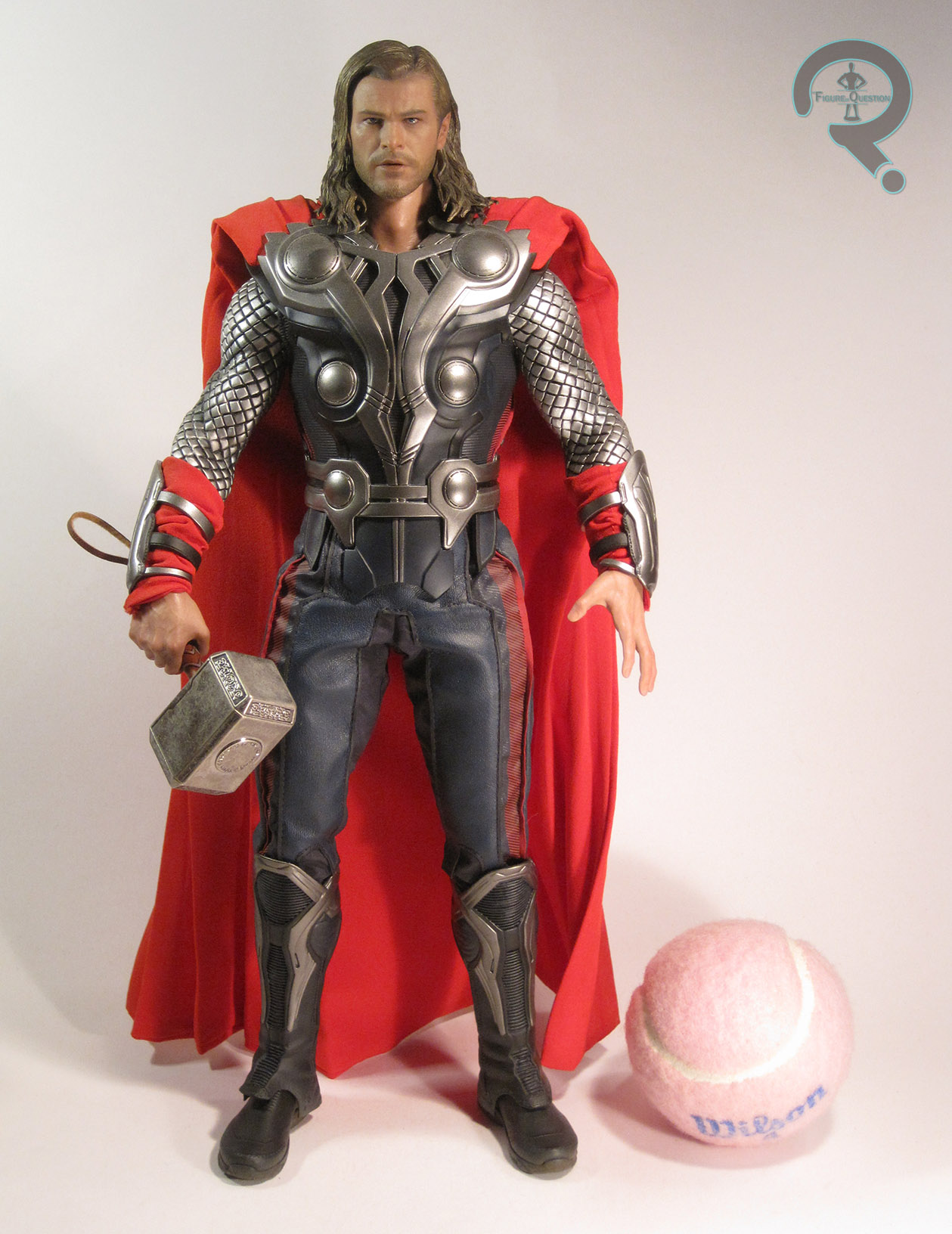
Thor is figure 175 in Hot Toys’ Movie Masterpiece Series, which puts him smack dab between the Avengers versions of Captain America and Loki, which is sensible.  Like those two, he’s based on his appearance in The Avengers, specifically his fully armored up look from the film’s climactic battle.  He hit in early 2013, which was actually pretty good turnaround for a HT figure of the time, arriving less than a year after the movie he was based on.  The figure stands about 12 1/2 inches tall and has “over 30 points of articulation” going by the blurb on the Sideshow website. 

First off, let’s have a look at Thor’s noggin.  When this figure was first shown, there was quite a bit of contention over the likeness on the head, due to the prototype shots looking less than stellar (he looked more like Leonardo DiCaprio than Chris Hemsworth, and those two don’t particularly look similar).  The final product showcased a marked improvement.  The final sculpt isn’t a spot-on Hemsworth likeness, but it’s very, very good.  A lot of it depends on the thorht3angle; when viewed from the right, as seen in the close-up shot, it’s clearly Hemsworth, but flip over to the other side and the likeness gets off pretty quickly.  You can always tell who he’s supposed to be, but it’s not always very convincing.  Likeness aside, the actual detail work is solid regardless; his face has tons of subtle little wrinkles and such, which really make him look like a real person, and the detailing on the stubble of his beard is surprisingly well-rendered.  Thor has long hair, and no matter how you handle that, there are always some compromises.  HT opted to go sculpted for this figure, which I think was the right call.  The hair is decent enough, but there are definitely some section s that are more convincingly hair than others.  Also, there’s a seam running near the front of his head, which is more present than I’d like.  As far as paint for the head, it’s the usual HT standard of insanely lifelike.  Really, it’s quite impressive how well down they have this.  The eyes in particular are what really sells it for me; there’s just so much life behind them.

Thor’s costume more of a mixed media effort than usual for HT.  The vest, pants, cape, and the red sections of the wrist bands are all cloth pieces, and are mostly tailored pretty well to the body.  The pants look a little odd in certain poses, almost looking backwards at times, but they’re not bad.  I like the brightness of the cape, and it’s a good, sturdy material, which is always a plus.  The rest of Thor’s costume pieces (the outer vest, sleeves, wrist guards, and boots) are constructed from various sculpted elements.  By and large, they do a good job capturing the movie’s designs.  The sleeves are a rubber cover for the arms, and do most of the work to give the arms actual shape.  They look good, but end up being very limiting when it comes to posing the arms; the elbows barely have even 45 degrees of movement, and even then, they have a tendency to slowly return to a straighter pose, due to the heaviness and thickness of the material.  Later Thor figures tackled the sleeves/arms by just putting a joint on the outside, but they were still figuring everything out for this guy.  The boots are each two pieces: a foot and a slip-over piece that covers the shin.  This is nice from a movement perspective, but ends up looking a little goofy in practice.

Thor isn’t super heavy on the accessories, but he does have a few fun pieces.  He comes with:

  • 9 hands
  • Mjolnir
  • The Tesseract in its fun little carrying case from the end of the movie
  • Display stand

thorinventoryThe hands come in relaxed (L and R), fists (L and R), tight grip (L and R), loose grip (L), and wide gesture (L and R).  They’re all very nicely sculpted, and look like real hands.  They’re a bit difficult to swap out, but do ad some nice expressiveness to the figure.

Mjolnir is definitely the main highlight here.  It’s made from metal, which gives it some really nice heft, and there’s even a little leather strap at the bottom, just like in the movie.

The Tesseract is definitely the most unique of the pieces. It’s sort of fun, and allows Thor to be posed with the Loki figure, like at the end of the movie.  It also continued the trend of giving us all possible variations of the Tesseract, after the normal one from Red Skull and the one in the metal case from Nick Fury.

Last up is the stand, which is the same basic stand we’ve seen tons of times before.  There’s a logo for Avengers and Thor’s name is on the front.

THE ME HALF OF THE EQUATION

I pretty much have Thor because I was getting the rest of the Avengers line-up from the first movie, but what’s kind of amusing about him is that he was really the lynchpin of me getting the whole set.  Initially, I had just planned to get Black Widow and Hawkeye to put with my Mech Test Tony Stark and First Avenger Captain America.  Then I realized I would have most of the team, so I went ahead and pre-ordered Thor, which eventually led to me picking up both the Mark VII and Hulk, and realizing I might as well get Cap as well.  So really, it’s Thor’s fault.  Silly Thor.
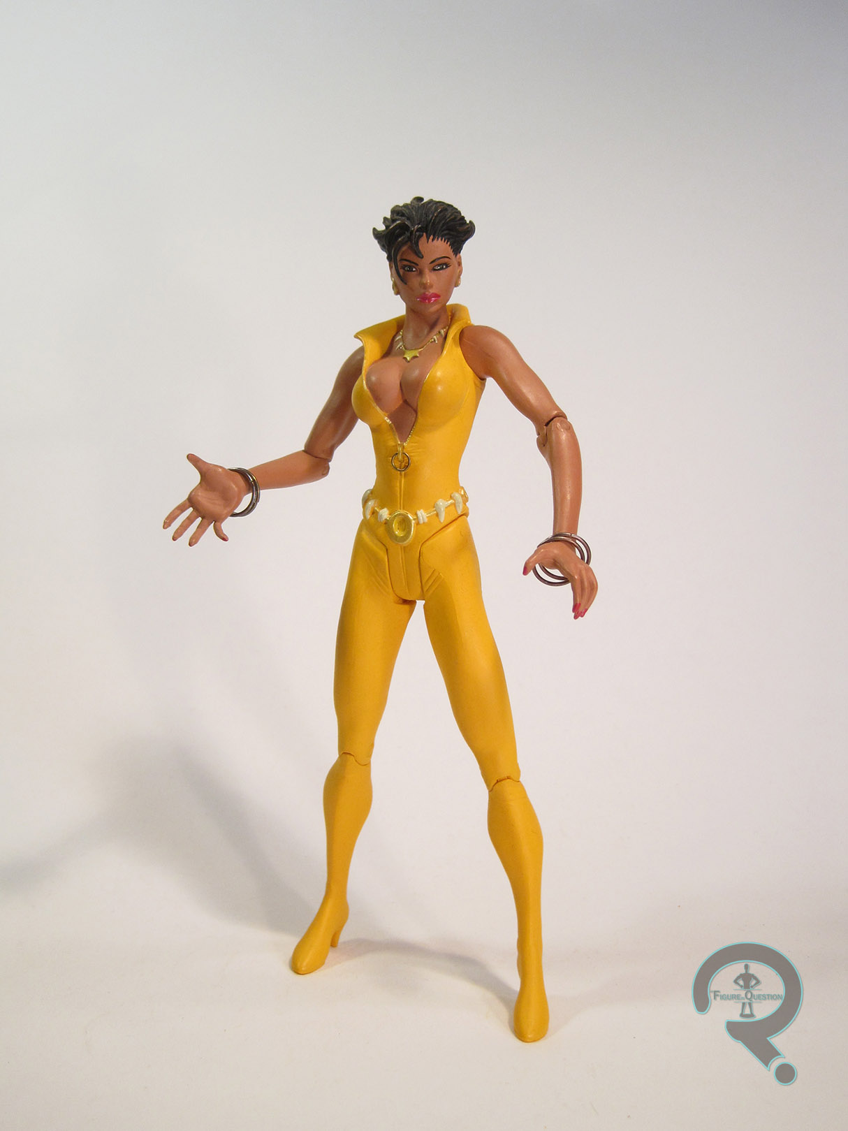
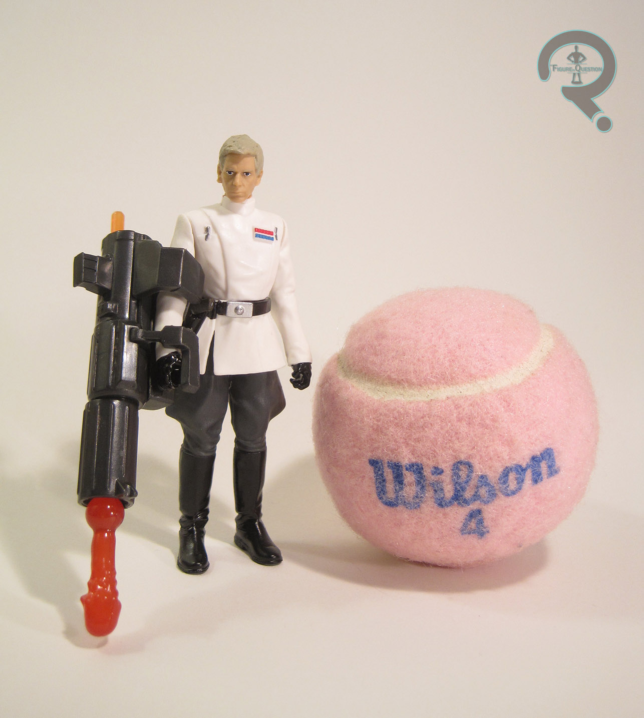
#1199: Mystery Machine (w/ Fred Jones)

MYSTERY MACHINE (W/ FRED JONES)

SCOOBY DOO (CHARACTER OPTIONS)

mysterymachine1

In addition to being a comics geek and a sci-fi geek, I’m also quite a bit of an animation geek.  Obviously, I love the cartoons of the ‘90s, being the ones I grew up with and all, but access to the likes of Boomerang and Cartoon Network also afforded me an appreciation for a number of older cartoons.  Of course, it hardly takes an animation geek to be familiar with today’s subject of review.  Scooby Doo hit the airwaves in 1969 and there’s been at least one new iteration of it every decade since, keeping it pretty squarely in the public eye.  As I noted in my previous Scoobybased review, I actually don’t have a particularly large selection of Scooby Doo items in my collection, but as with just about everything there isn’t enough of in my collection, I’m working on it.  Today, I’ll be looking at one of the fixtures of the franchise, the Mystery Machine, along with perpetual driver of said machine, Fred Jones.

THE VEHICLE ITSELF

mysterymachine5The Myster Machine was released as part of the latest iteration of Character Options’ Scooby Doo line, which hit last year.  While lots of places seemed to have the two-packs featuring the one member of the gang each packed with a ghost, the Mystery Machine seems to be a slightly rarer find (for me anyway).  The vehicle is 6 1/4 inches tall, 5 inches wide, and 9 1/4 inches long.  In terms of design, exactly what version of the Mystery Machine this is supposed to be is a little hard to place.  Near as I can tell, it’s not actually based on any specific design for the MM, but is instead a somewhat stylized take on the classic design.  I think a lot of this may be due to some mold re-use, as it appears this mold initially showed up as the “Goo’busters Mystery Machine,” which was a playset designed to go with a line of Superhero Squad/Galactic Heroes-style line of Scooby characters.  That would mysterymachine6explain the harsher stylization present here.  It doesn’t look awful, provided you aren’t looking for a really faithful recreation of the original vehicle.  The biggest complaint I have is that it’s rather difficult to get the full-sized figures into the front, since it wasn’t designed with them in mind.  Aside from that, it’s actually remarkably well-scaled, to the point that it was only after a considerable amount of digging around that I realized it was originally made for the smaller guys.  It’s worth noting that it’s clearly designed as a playset first and a functioning Mystery Machine second.  There aren’t any functioning doors (the figures are placed in the front through the hatch at the top), there’s no actual seating in the back, and the steering wheel doesn’t turn.  It does at the very least have actual moving wheels on the bottom.  From what I’ve read online, this mysterymachine3is a change from prior releases, so I guess they’re learning.  Yay!  The back of the van folds out into a…thing.  Not really sure what.  I guess it’s supposed to be a crime solving lab or something? The original release had some traps and stuff built in, but this one leaves those out, so we just end up with a lot of flat surfaces with printed on details.  It’s kind of cool, but a little confusing.  Also, the fold-out feature results in some rather ugly hinges running along the middle of the van, which is really unfortunate.  Could those not have been worked into the interior of the design?  The paint on the Mystery Machine is rather on the sloppy side, especially around the edges of the green sections.  Of course, actual paint is minimal; most of the details are decals.  By and large, this is a perfectly fine way of handling the details (since they’re mostly on large, flat surfaces anyway), but there are some peeling edges and, in the case of the flowers on the side, some issues with underlying paint showing through.  There’s a valiant effort to ignore a few of the sculpted elements to bring the design closer to the classic look, which works about as well as anything else on this thing.  For accessories, the Mystery Machine includes one main extra, and that’s….

THE FIGURE ITSELF

mysterymachine8….Fred Jones!  Fred (who, fun fact, was named after CBS executive Fred Silverman, who was a driving force for getting Scooby Doo, Where Are You? on the air) is the leader of Mystery Inc, the owner of the Mystery Machine in at least a few versions of the story, and above all, the guy usually seen driving the Mystery Machine, making him quite the sensible inclusion here.  The figure stands 5 inches tall and has 9 points of articulation.  Fred is based on his slightly updated design from Scooby Doo: Mystery Incorporated, where he was given a slightly more brawny physique and a more pronounced lantern jaw of justice.  I actually quite liked his redesign from that show, so I’m happy it’s the version they went with.  It’s transition into three-dimensions isn’t too terrible; he looks a little off from certain angles, but that’s the sort of thing you expect with action figures of two-dimensional designs.  The legs could stand to be a little longer, and the torso a little less tubular, and his chin should probably be a little less pronounced.  He sort of reminds me of the Kenner Batman: The Animated Series figures, being slightly off-model, but still pretty solid as an action figure.  The paint on Fred is a good deal cleaner than we saw on the Mystery Machine.  While he’s still not devoid of sloppiness, especially around his hairline, the overall appearance is a lot cleaner.  His eyes are also kinda goofy, thanks to no one really being very sure of how exactly this style of eye should be done in 3D.  He looks a bit surprised.  While my figure is pretty decent, I should note that I had to pick through four of this set, and finding a combo of good paint on both Fred and the Mystery Machine was pretty much impossible.

THE ME HALF OF THE EQUATION

Fred’s my favorite character from Scooby Doo.  Prior to picking up this set, he made up half of my Scooby Doo collection (granted, it was a collection of TWO figures, but still).  So, when I spotted the two-packs last year, I immediately flipped through the rack to find the set Fred was in.  Imagine my dismay when I discovered they doubled up on Scooby instead of including him.  Now, all of my issues would have been resolved had there simply been a picture of the Mystery Machine and the included Fred figure somewhere on the packaging for the two-packs, but Character Options didn’t see fit to actually inform their customers what was actually out.  So, instead of tracking this set down early last year, I ended up stumbling upon it at the K-Mart near where my family vacations for Christmas.  It was even marked down to $15.  There’s a whole extra $10 they could have gotten out of me if I’d known this thing existed (to say nothing of me forking over the cash for the rest of the gang).   Ah well, I got my Fred figure, and that’s really what matters.  Ultimately, this is a more toy-etic set than I tend to go for in modern toys, but I can’t say I’m unhappy with the purchase.

mysterymachine2

#1198: Mark V Iron Man & War Machine

MARK V IRON MAN & WAR MACHINE

MARVEL MINIMATES

mkvwm1

Ah, Iron Man 2, the one entry in the MCU we all sort of pretend didn’t happen.  The first chink in the armor, if you will.  Admittedly, it’s not a bad movie, just an okay one, hurt by being the sequel to one of the biggest surprise hits of 2008.  Some of the ideas presented there really weren’t bad, and if nothing else, the toys from the movie were cool.  Two of my favorite parts of the movie (and thus some of my favorite entries from the toy lines) were the suitcase armor and Rhodey taking up the War Machine mantle.  The Mark V and War Machine just so happened to be packed together for their Minimates.  How convenient!

THE FIGURES THEMSELVES

The Mark V and War Machine were part of the Iron Man 2-tie-in assortment of Marvel Minimates.  They were one of the pair of two-packs shared between the TRU-exclusive assortment and specialty Series 35 (the other being Mark IV and Whiplash).

MARK V IRON MAN

mkvwm2Though somewhat short-lived, the Mark V suitcase armor was one of the real highlights of IM2, being a fun concept, a fun design, and getting easily the coolest fight scene in the movie.  The figure is about 2 1/4 inches tall and has 14 points of articulation.  The Mark V has add-ons for his helmet, shoulderpads, gloves, boots, and belt.  The helmet is the same piece used for Marks IV, VI, and VII, but aside from that these pieces were new to this guy.  They match up well enough with his on-screen design, and he doesn’t suffer from being overly bulked up like a lot of the Iron Man armors from this time period.  In addition to the add-on pieces, the IM2 ‘mates also ramped up the use of specialized pieces, especially for arms and legs.  The Mark V gets new upper arms and legs, which, like the add-on pieces follow the movie design quite well, and also help to prevent him for getting too big.  The paint on this guy is particularly nice, with the metallic red in particular really standing out as really sleek and polished.  Under his helmet, there’s a nice, angry/determined Tony Stark, who even shows some damage from his battle with Whiplash, making him a nice departure from the slew of other Tonys with the same basic face.  The Mark V was packed with an extra hairpiece (a recolored version of Kyle Reese’s), as well as a pair of flesh-toned hands.

WAR MACHINE

mkvwm4From the moment Rhodey quipped “Next time, baby” to the Mark II in Iron Man, I was anxiously awaiting War Machine’s introduction in the sequel.  Of course, we lost the first Rhodey in the mean time, so there was no “Next time” for that particular iteration of the character.  That being said, I think Cheadle ultimately brought more to the role, and was especially good for the transition of Rhodey to true super hero.  This was Cheadle’s first of several ‘mates.  This one’s particularly heavy on the extra sculpted pieces, with add-ons for the helmet, chest piece, and gloves/forearm guns, as well as unique legs and upper arms.  Pretty much the whole basic ‘mate body is covered when this guy’s armored up.  The parts are generally pretty well sculpted, but I do feel this guy suffers a bit from that overly bulked up look that I mentioned the Mark V avoided.  It’s not awful, nor is it super out of character for War Machine, but he still looks a little on the pudgy side from some angles.  Rhodey’s paint work is decent enough, if not as exciting or polished as the Mark V.  Under the armor, there’s some nice extra torso detailing, as well as a fully detailed Rodey head.  In lieu of the hair piece from the first movie’s Rhodey, this guy’s hair is painted on, which I think more accurately portrays the close-cropped look from the film.  As far as the likeness, I can’t say I see all that much of Cheadle in the face on this one, but it’s still a pretty nice head.  Rhodey included a large gattling gun and missile launcher to plug into his torso piece, as well as a separate helmet with the faceplate flipped up, and a pair of flesh-toned hands.

THE ME HALF OF THE EQUATION

This was around the time I was faithfully buying my Minimates from Cosmic Comix, but for whatever reason, his shipment of these guys never materialized.  I was hardly going to miss out on this pair, so I ended up grabbing them from TRU along with the two TRU-exclusive sets.  I find that a lot of these ‘mates haven’t aged the best, but these two still hold up pretty well, and I’m happy to still have them!

#1197: K-2SO

K-2SO

STAR WARS: ELITE SERIES

k2diecast1

By now, it shouldn’t surprise anyone to pull up the site at see K-2’s name at the top of the page.  He was by far my favorite part of Rogue One, and one of my favorite parts of the Star Wars universe in general.  I’m steadily working my way to owning every possible action figure version of this guy.  I’ve already gotten the obligatory 3 3/4 inch and Black Series figures, plus the Lego Constraction figure, and even the Pop! figure.  The line I almost always overlook is the Disney’s in-house line of die-cast figures, available exclusively at the Disney Store, but, as with Poe, I did track down the die-cast K-2 figure, which I’ll be looking at today.

THE FIGURE ITSELF

k2diecast2K-2 was part of the assortment of Rogue One-related Star Wars: Elite Series released back on Rogue Friday.  The figure stands about 7 1/2 inches tall and has 19 points of articulation.  If you read my Poe review, you’ll probably remember that he was in a 7-inch scale.  Now, if you reference my Black Series K-2 review, you’ll note that I gave that figure’s height at 7 1/2 inches.  No, I didn’t mess either measurement up; these two figures are the exact same size, which means this guy’s actually 1/12 scale, and thus not actually in scale with the rest of the Elite Series figures.  In Disney’s defense, in order to be in proper scale with the rest of the Elite Series, K-2 would have to be almost 9 inches tall; the materials cost alone would mean he’d have to be in his own unique price point.  At this size, he’s still about a half inch taller than Poe, meaning he won’t look horribly out of place.  The flip side of all this is that this figure is perfectly scaled with The Black Series, so if you aren’t happy with your Black Series K-2 or are unable to find that particular figure, you have a second option.  In terms of construction, K-2 is mostly metal, with plastic being used only for his head and hands.  Like Poe, this means he’s a little more restricted in terms of motion than, say his, Black Series counterpart.  However, unlike Poe, where the there were some issues with looking a little too soft due to the metal parts, K-2 seems to do alright on the details.  If anything, he’s the one figure that it makes total sense to do in die-cast, being a droid and all, and his more geometric stylings lend themselves far more to this style of figure.  Another improvement over Poe: all those pesky screws on the back now have covers.  You can still see where they are, but they stick out a whole lot less.  In terms of accuracy to the source material, I think this figure’s actually a little closer to the movie design than the Black Series figure.  The head’s certainly superior on this figure at least.  The rest you can sort of chalk cup to differences of materials.  About the only real negative is the way the neck articulation has been implemented; rather than sticking with the movie design, there’s now a trench running just above the neck, allowing you to place his head straight up, which is just the most unnatural looking thing.  In terms of paint, this K-2 gets the proper gunmetal grey finish that his other figures have lacked, and also gets the proper grey detailing on the shoulder joints.  Aside from that, though, he’s a bit of a step down from the Black Series figure, loosing out on a lot of that figure’s really cool weathering, and also getting an inaccurate Imperial logo on both shoulders.  K-2’s only accessory is a display stand, which is the same as Poe’s.

THE ME HALF OF THE EQUATION

K-2 was picked up for me by my Super Awesome Girlfriend while we were out at the mall.  I caught sight of him through the window of the Disney Store on the way to another store and made a note to go back for him, but she snuck off later and grabbed him for me.  I’m a little disappointed that he’s not truly in scale with the Elite Series not because scale matters all that much to me, but more because him being the same size as the Black Series figure now leaves me eternally wondering which one I prefer.  If you want posablity and playability, go with the Black Series, but if you just want a cool looking K-2 for the shelf (and something you can possibly fend off home invaders with), you could do a lot worse than this guy.

k2diecast3

#1196: Dr Z – Rubin Zellar

“DR. Z” — RUBIN ZELLAR

SEAQUEST DSV (PLAYMATES)

drz1

Okay, I went slightly ‘90s with yesterday’s Cannonball and Domino review.  I went a little more ‘90s with the Superman Red review.  Today, I’m going full ‘90s.  Yes, today I tackle SeaQuest DSV. SeaQuest, to those of you that don’t know, was a sci-fi series from the early ‘90s set in the futuristic world of 2018, aboard the naval submarine SeaQuest DSV 4600.  It was a little like classic Trek, but in the water.  Its first season was very strong, and heavy on the actual science (each episode ended with Dr. Robert Ballard explaining the science of that week’s plot), and featuring a diverse and fun cast of characters.  There were two seasons after that, but it’s generally in everyone’s best interest not to talk about them.  The series was fortunate enough to get a short-lived line of toys by Playmates (the then current holders of the Trek license, no less), which covered most of the main crew, plus two of the show’s antagonists.  Today, I’ll be looking at one of the antagonists, Biochemical Terrorist Rubin “Dr. Z” Zellar from the episode “Games.”

THE FIGURE ITSELF

drz2Dr. Z was released in 1993 as part of the first and only series of Playmates’ SeaQuest DSV line.  He’s based on his early appearance from “Games,” when he’s first picked up by the SeaQuest and is masquerading as a prison warden.  He probably spends a greater portion of the episode wearing a borrowed SeaQuest science staff uniform, but that might have proved slightly confusing in the toyline, since it would have made him look like an actual member of the crew.  The figure stands about 4 1/2 inches tall (putting him in the same scale as Playmates’ Trek line) and has 14 points of articulation.  While the Trek figures all got saddled with those wonky v-hips, the SeaQuest figures actually got pretty traditional t-hips, and also got thigh swivels too.  Odd that the unproven show got the better treatment.  The sculpt is pretty similar to the Trek stuff in style, which is to say it’s not super ultra realistic, but it’s still a halfway decent recreation of Zellar’s look from the show.  The head sports a passable likeness of Zellar’s actor Alan Scarfe, and the general proportions are actually a little better than the Trek stuff I’ve looked at.  The standout bit of this figure is definitely the fur coat, which is surprisingly well detailed for a figure of this era and scale.  Zellar’s paintwork is pretty solid; it’s not the most exciting work, but what’s there is nice and clean, and the once again the jacket stands out with some detail work to keep it from being too drab.  Zellar was packed with a number of cool accessories, including a pick axe, a display stand, and a ….weird gun thing.  The coolest piece is the T5-6000 Cryo-Chamber, originally meant to carry Zellar, but in actuality carrying the prison warden he replaced.  It’s just a simple plastic shell with a cardboard illustration on top, but I really like it.

THE ME HALF OF THE EQUATION

I picked up Zellar from Yesterday’s Fun this past summer, as he was one of the two SeaQuest figures I didn’t yet have.  There’s no denying he’s a well done figure, but he’s also one of the most frustrating figures from the line.  SeaQuest was hardly defined by its antagonists, so the fact that we got two of them in place of the three missing members of the Season 1 crew, is really annoying.  “Games” is certainly a memorable episode, and Zellar’s a compelling villain, but the success of the episode hinges more on its focus on Dr. Kristin Westphalen, who was absent from the toyline (interestingly enough, she was the only of the three unreleased crew members to get a prototype, but was left unreleased for whatever reason).  Zellar’s presence in the line seems to have come at the expense of the character that would give him an actual reason to be in the line at all, which just feels rather backwards.

#1195: Cannonball & Domino

CANNONBALL & DOMINO

MARVEL LEGENDS (HASBRO)

cannonballdomino1

Hasbro’s early days with the Marvel license were an odd time.  Truth be told, they didn’t really come into their own with the product until somewhere around Iron Man 2, which was a good three years into their run with the license.  Until then, there were some weird experiments, intermixed with just sort of copying a lot of Toy Biz’s stuff, mostly when it came to Marvel Legends.  The first two series of their Legends were almost entirely chosen and designed by Toy Biz, which gave them a bit of time to figure out some of their own stuff for the half-formed Series 3 assortment.  The first two series hit in early 2007, and the third wouldn’t hit until almost the end of the year.  Hasbro filled the gap between two and three with a handful of exclusives.  Today, I look at Cannonball and Domino, one of those exclusives.

THE FIGURES THEMSELVES

Cannonball and Domino were a Walmart-exclusive two-pack.  They were released alongside the similarly exclusive Cable and Marvel Girl two-pack in the summer of 2007, as only the third round of Walmart-exclusive Marvel Legends.  Both characters were at something of a low-point in terms of relevance, but and were actually the first X-Force alumni outside of Cable and Deadpool to join the line.

CANNONBALL

cannonballdomino3Sam Guthrie is one of the more successful characters from his era of comics.  Cannonball started out as a member of the New Mutants and not only make it all the way through that series’ run, heal also transferred into its follow-up X-Force, and then moved onto the main X-Men team, where he was a pretty prominent character for a while.  He fell back into obscurity for a bit, but was recently brought on as one of Jonathan Hickman’s Avengers, which seems to have gone pretty well for him.  This figure is loosely based on his first X-Force design (loosely due to the necessities of parts re-use, which I’ll touch on in a sec).  He stands about 6 1/2 inches tall and has 39 points of articulation.  That’s a lot of movement, but, as you can see, it’s sort of at the cost of the sculpt.  The sculpt, it should be noted, originally hails from Toy Biz’s Johhny Blaze version of Ghost Rider.  It was heralded as a great sculpt at the time, but it’s sort of specifically tailored to Blaze, since it’s skeletally skinny.  It’s not that Cannonball hasn’t frequently been depicted as rail thin (because he was for most of his early career), but this seems a bit extreme even for him.  It probably doesn’t help that when he was with the X-Force he was usually depicted as only being a little smaller than Cable.  The point is, this figure makes Sam look more than a little emaciated.  For what it’s worth, the costume details do match up surprisingly well with his X-Force togs, and there’s a lot of really fun detail sculpted into this figure.  I can get why they wanted to re-use the parts, it’s just a bit questionable, that’s all.  As far as new pieces go, Sam got a new head, which captures his slender mug pretty well, as well as a weird dicky sort of piece that slips over GR’s exposed neck and shoulders.  They do their job well enough, and also fit pretty well with the body (though the neck is a bit jarringly smooth).  One last thing about the sculpt: Sam is a testament to why you should avoid soft rubber on action figures.  There’s rubber for the upper torso, and while mine has held up okay (only two very small tears), I’ve seen others that weren’t so fortunate. The paintwork on Cannonball is decent enough.  It takes his color scheme from the comics and translates it into something a bit more consumable by the human eye.  The application is mostly pretty clean but there’s some slop here and there, especially on the white piping of the jumpsuit.  Cannonball included no accessories.

DOMINO

cannonballdomino2Domino’s not a character I really have that much affinity for, so I don’t know a whole lot about her.  She’s got luck-based powers, but it was the ‘90s so that translated to “carries a gun.”  Everything seemed to translate to “carries a gun” in the ‘90s.  Domino’s had her fair share of looks over the years (mostly because no one can make up their minds about how to draw her), and this figure seems to be based on her look from the early ‘00s.  She stands about 6 1/4 inches tall and has 33 points of articulation.  Despite all that articulation, she still can’t sit, thanks to being built on a body from Toy Biz’s period of useless hip joints.  Bleh.  She uses the body of the X-Treme Rogue from TB’s 2006 X-Men line.  It’s actually a pretty good match for the art I’ve been able to find of Domino in this costume.  The proportions are still quite on the wonky side, and don’t get me started on whatever the heck’s going on with the torso (she moves at the boobs and the abdomen?  That’s odd), but Toy Biz certainly produced worse, and Hasbro put out worse the same year as this figure’s release.  So, this isn’t awful.  The head and hands were unique to this figure.  The head is a pretty decent, no-nonsense head, and looks like the later interpretations of Domino.  The hands are sculpted to hold her guns, which is a nice thing to see on a character whose whole thing is having guns.  Domino also got a new add-on piece for her belt, which is fixed with a holster for each leg.  The holsters would probably limit hip movement, but the actual hip joints beat them to it, so not a huge loss, I guess.  Domino’s paintwork is alright.  There’s some really strong work on the head, but the jumpsuit exhibits a lot of slop, in very obvious places.  Domino was packed with a pair of pistols (I seem to have misplaced one of mine…)

THE ME HALF OF THE EQUATION

When these figures were released, my dad was after the Marvel Girl from the other set.  When he finally found them, our local Walmart was already clearancing them, so he went ahead and grabbed this set as well, on the off chance that I might want it.  As luck would have it, I was still into collecting action figures that particular day, so I did want this set!  Who would have guessed?  Despite not knowing a whole lot about him, I’ve always had a soft spot for Cannonball, and this figure was no exception.  I can point to all the figure’s flaws, but I still really like him.  Domino?  She’s just sort of there.  She’s not a bad figure, but I just feel nothing about her, so she just came along for the ride.  Of course, now that I actually have a Cable, she’s not quite as out of place, so that’s good!

cannonballdomino4