I don’t do a lot of movie reviews here, seeing as I’m running an action figure review site and all, but the Star Wars franchise, more than a lot of franchises, is almost entirely built on the action figures that can be sold to go along with each new film release. As with last year’s The Force Awakens, I’m sure that this next week will see Rogue One reviews galore, but I figured I may as well throw my hat into the ring.
THE ACTUAL REVIEW
Spoiler Free:
Let me start out by saying I did really like the movie. It didn’t have perhaps the same awe-inspiring feel I got out of The Force Awakens, but quite frankly, it was just a very different sort of movie. Where prior entries in the franchise have placed a heavy focus on the “Star” portion of the name, this movie flips over to the “Wars” part. There is no denying that this is a movie about war. A lot of reviews have cited it as a fairly straight war movie. I personally would cite it as having the trappings of both a war movie and a heist movie. It’s a very different feel for the franchise, but it offers a plethora of new ground to be covered in future “stand-alone” movies.
 Felicity Jones’ Jyn Erso presents a slightly different type of lead than we’re used to. Unlike Luke and Rey (and I suppose Anakin) who are unrelated innocents dragged into a grander conflict, Jyn is in it from the start, albeit in reluctant manner. There’s a sort of a drive to Jyn that keeps her going, but at times it seems to just appear out of nowhere. She’s certainly given motivation for each part of the mission, but sometimes her resolve seems stronger than her outward rebelliousness would indicate.
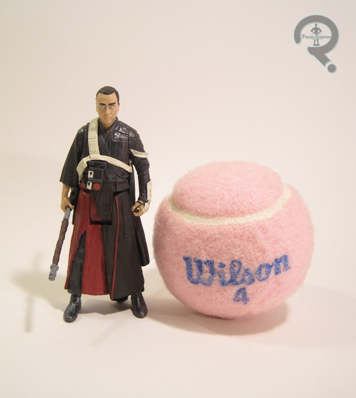
Diego Luna’s Cassian Andor takes the role of dashing rogue in this film. However, where Cassian is still a charmer, he is perhaps one of the more compromised Rebels we’ve seen on screen. Luna does a good job of conveying some of Cassian’s internal struggle, and he’s certainly likable, but he’s not a Han Solo clone; he’s cut from a rougher cloth.
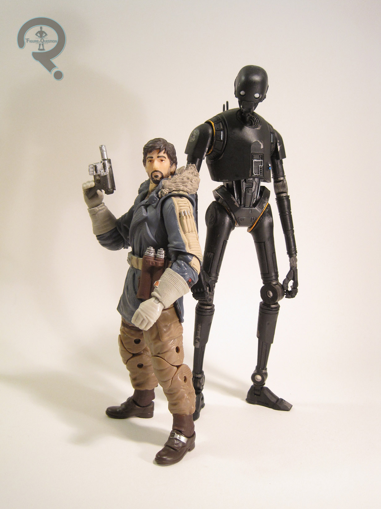 Alan Tudyk as K-2SO delivers what is easily my favorite performance in the film. It’s an interesting commentary on the states of the various characters that he, a reprogrammed Imperial Droid, is the least compromised member of the titular team. K-2 is, of course, CGI, but he’s built on Tudyk’s actual performance, and it really shows through. There is a brief moment where K-2 passes another Security Droid, and just the way the two carry themselves when walking speaks volumes to what sort of a character K-2 is. K-2 is sort of like Chewbacca, if Chewy happened to speak in a posh Brittish accent. He lumbers about in the back of scenes, speaks to all of the characters with brash and blunt sort of innocence that makes him quite amusing and very relatable.
Donnie Yen and Jian Wong as Chirrut Imwe and Baze Malbus add another inseparable pair to the Star Wars universe. The two have a lot of chemistry and feel like they’ve been companions for a good long while before the movie’s start. They also offer up some of the movie’s best action sequences. Chirrut’s careful, plotted take down off the Stormtroopers on Jedha is beautifully choreographed, and then wonderfully contrasted with Baze’s portable lawnmower approach.
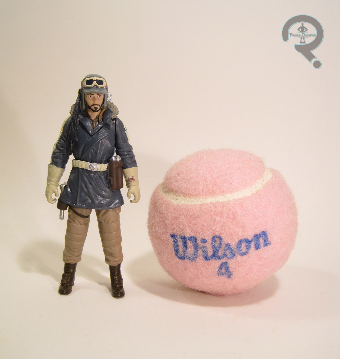
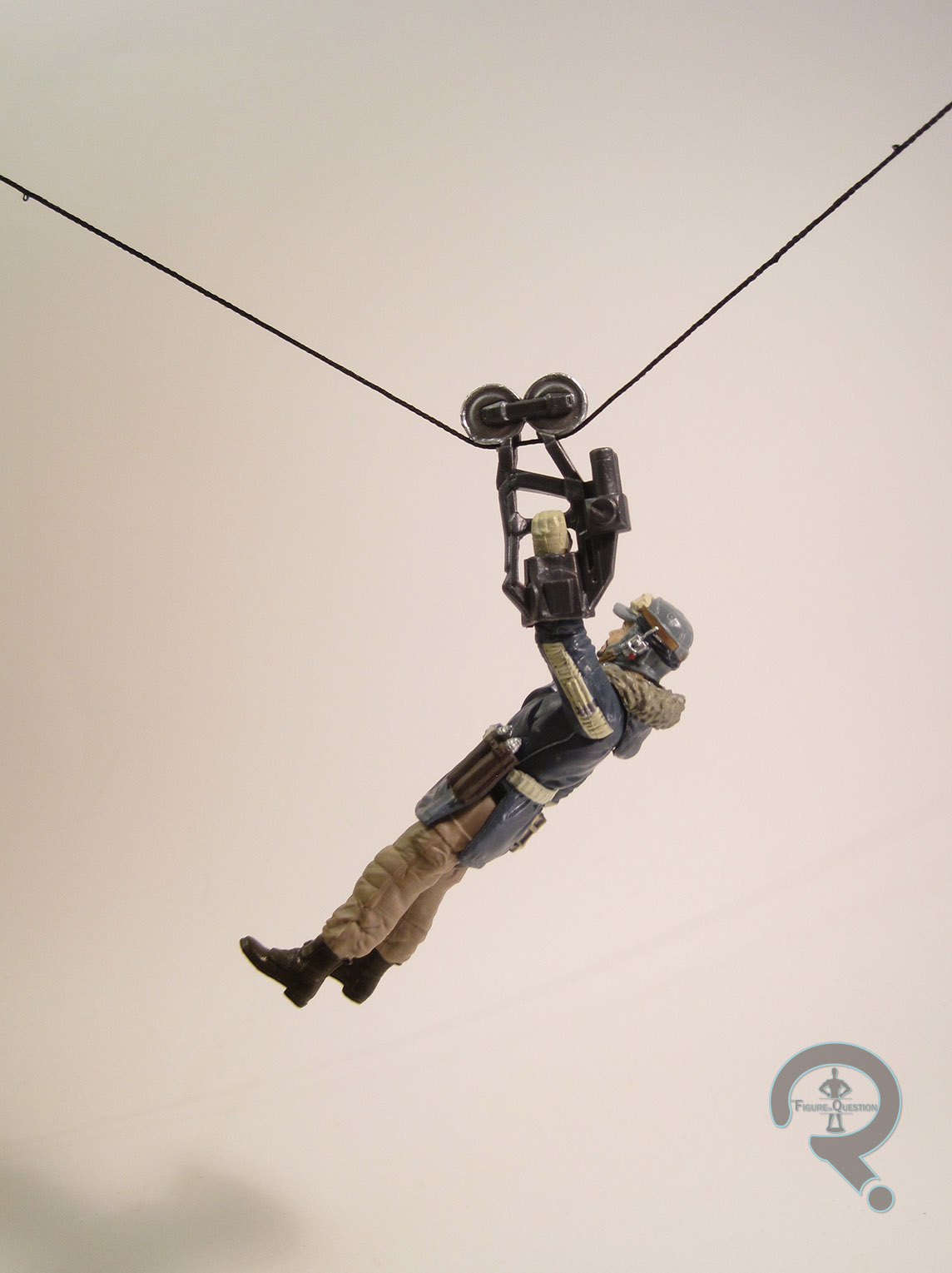
Riz Ahmed’s Bodhi Rook is this sort of sad, well-meaning guy. He’s sort of key in getting the movie’s action going, and is a genuinely likable guy. Perhaps the only oddity to Bodhi is how alone he always seems to be. While the rest of the crew seems to naturally form into these little teams, Bodhi never seems to find his comfort zone. There’s a slight hint of a possible friendship for him and K-2, but the movie’s frantic pace never really allows for it.
Forrest Whitaker’s turn as Saw Gurera is important, because he’s actually the first cartoon character to make the jump to the big screen. It’s a smaller part than I think a lot of us expected. He still leaves quite an impact on the story, and provides us with a well-meaning but misguided extremist, the likes of which we haven’t really had before (in the main movies, anyway). Whitaker gives a very convincing portrayal of a shell-shocked veteran who is just in too far over his head. His interactions with Jyn are an intriguing analysis of the problems with a warrior trying to take on a paternal role.
Speaking of paternal roles, Mads Mikkelson’s Galen Erso continues the franchise’s trend of troubled parent-child relationships, but with with a different twist. Galen is sort of a tragic figure, and his relationship with the Empire calls to mind Wernher Von Braun’s with the Nazis.
What good are heroes without some villains, though? Well, the main villain is Ben Mendlesohn’s Director Krennic. While the Imperial command have always been rather spineless, I don’t think we’ve ever gotten anyone quite as detestable and slimy as Krennic. He’s an opportunist, and a manipulator, and it’s clear that even amongst the other Imperials he’s not very well-liked. What’s interesting is just how separated from the rest of the cast Krennic is. He spends much of his screen time scheming just off to the side of the main heroes, but rarely does he directly interact.

Spoilers after the jump!