CAPTAIN AMERICA — CAPTAIN AMERICA: THE FIRST AVENGER
MOVIE MASTERPIECE SERIES (HOT TOYS)
Today marks my 4000th review here on the site, if you can believe it. I can, because, you know, I’m the one that wrote them all, but also it does feel like rather a strange concept. When I first launched the site, I decided I wanted to mark my “monumental” reviews with looks at some of the higher end figures in my collection, meaning predominantly my Hot Toys figures. It was initially every 50 (which was only every month and a half, so really not significant), before moving to every hundred after 300, then every 250 after 1500, then every 500 after 2000, and then every 1000 after 3000 (though that one was more because I forgot to write a monumental review at 3500 and just decided to roll with it). The thousands are especially notable, since it means that the first numeral on the reviews changes, which is rather significant. The largest sub-set of my Hot Toys figures is my Captain America collection. I’ve actually reviewed *most* of them here, but the only one I haven’t is actually the very first one. So, I’m taking this here 4000th review to amend that!
THE FIGURE ITSELF
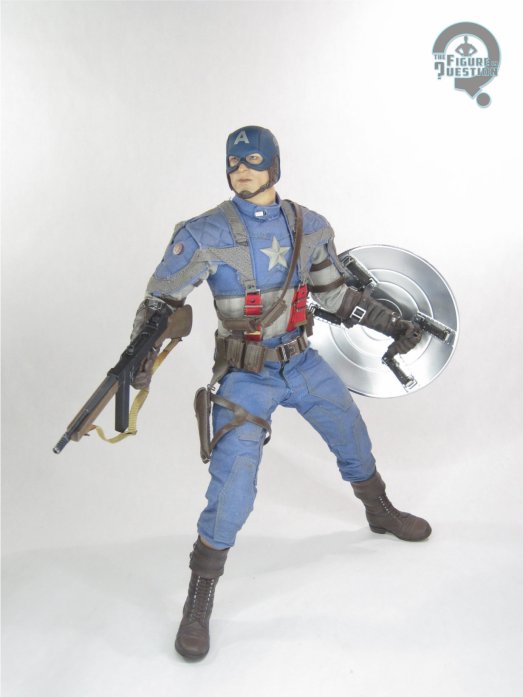
 Captain America is figure MMS 156 in Hot Toys’ Movie Masterpiece Series. Numerically, he’s wedged between the updated Batman Begins Batman and Baby Doll from Sucker Punch, which is one eclectic sort of batch of figures, huh? He’s based on his primary appearance in The First Avenger, and was released domestically in December of 2011, just making it out in the same year as the movie’s release, which was notable for a Hot Toys release at the time. The figure stands just over 12 inches tall and he has over 30 points of articulation.
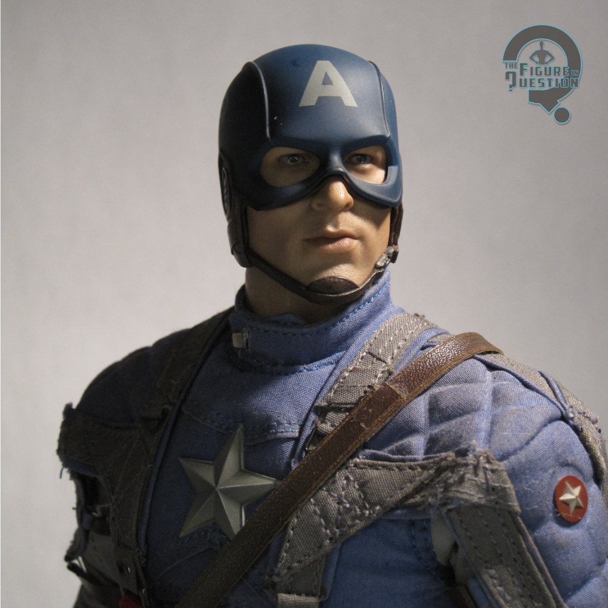
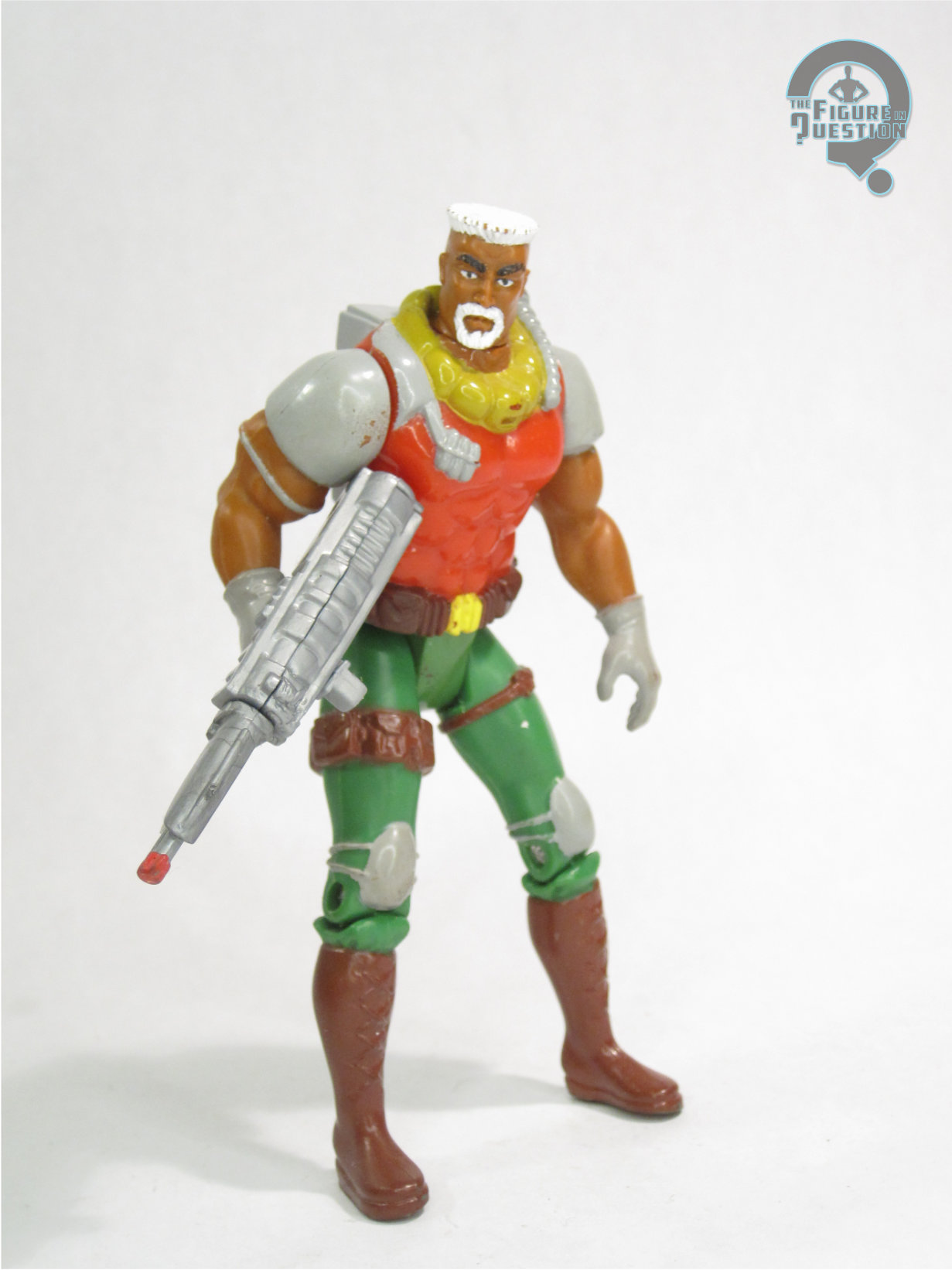
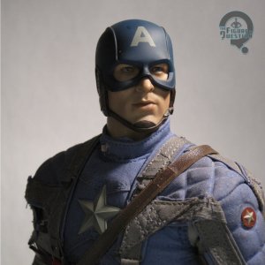 At this point, it’s pretty much a lock that every Hot Toys Captain America comes with multiple heads, but that wasn’t the case for his debut here, which just gives him the one helmeted look. It was a respectable offering for the time, but not without some caveats. The construction, using multiple pieces for the actual head and his helmet, helps add some depth to it, like he’s actually wearing a helmet, which looks very nice. The underlying head is a rather lifelike offering, with plenty of realistic detailing. That said, it’s not really a spot-on Chris Evans, especially not when compared to later sculpts they did for him. I’ve always gotten more of a Tom Cruise vibe, myself. It’s not so far off that it doesn’t work at all, but it’s definitely not as strong as it could be. The paint work is *mostly* up to Hot Toys’ usual standard of incredibly detailed and life-like, with one notable issue: the “A” on the helmet isn’t properly centered. On mine, this is exceedingly minor and pretty much not noticeable in person, but there was a lot of variation across the production, and there are some that were quite a bit worse.
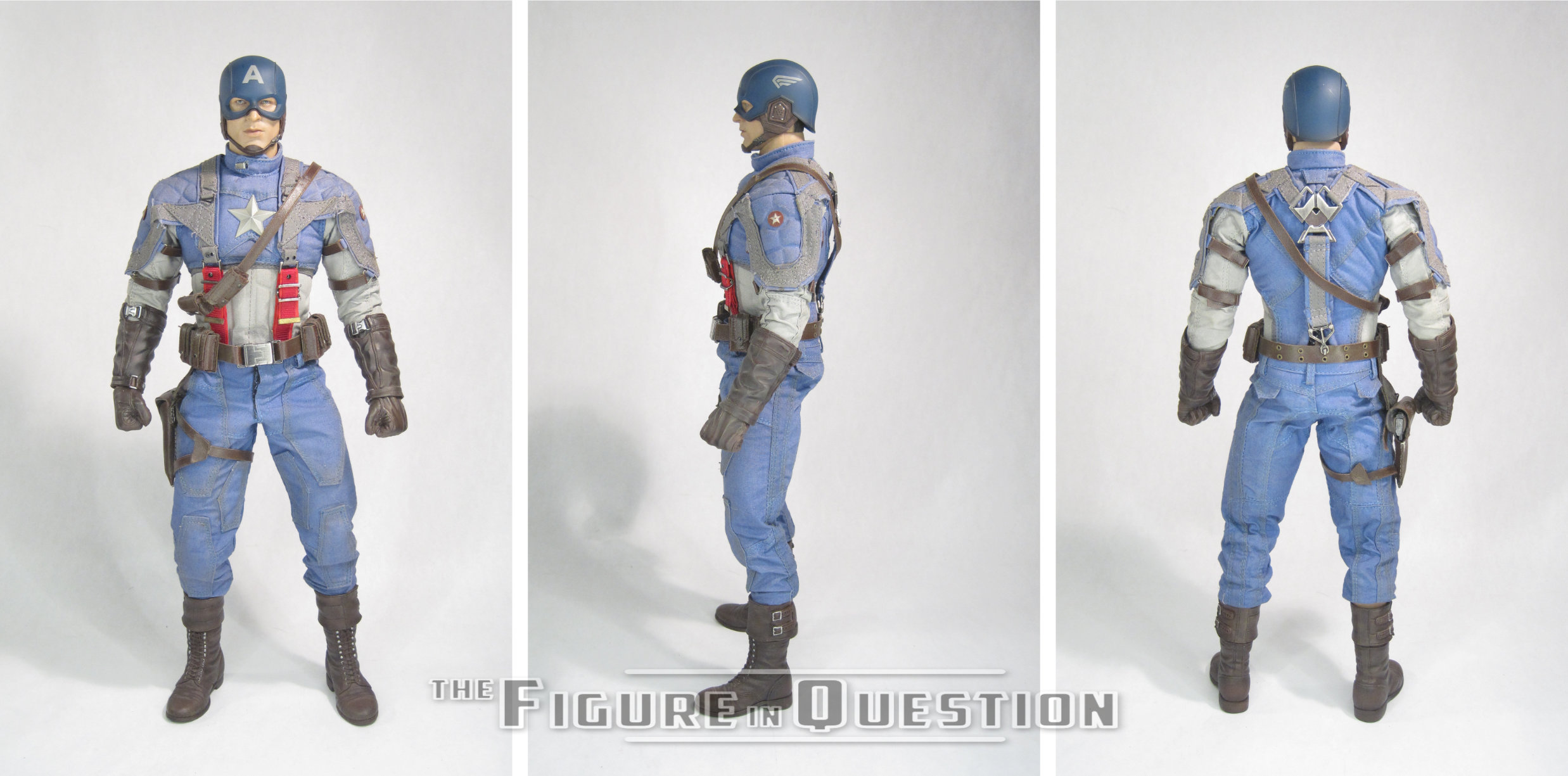
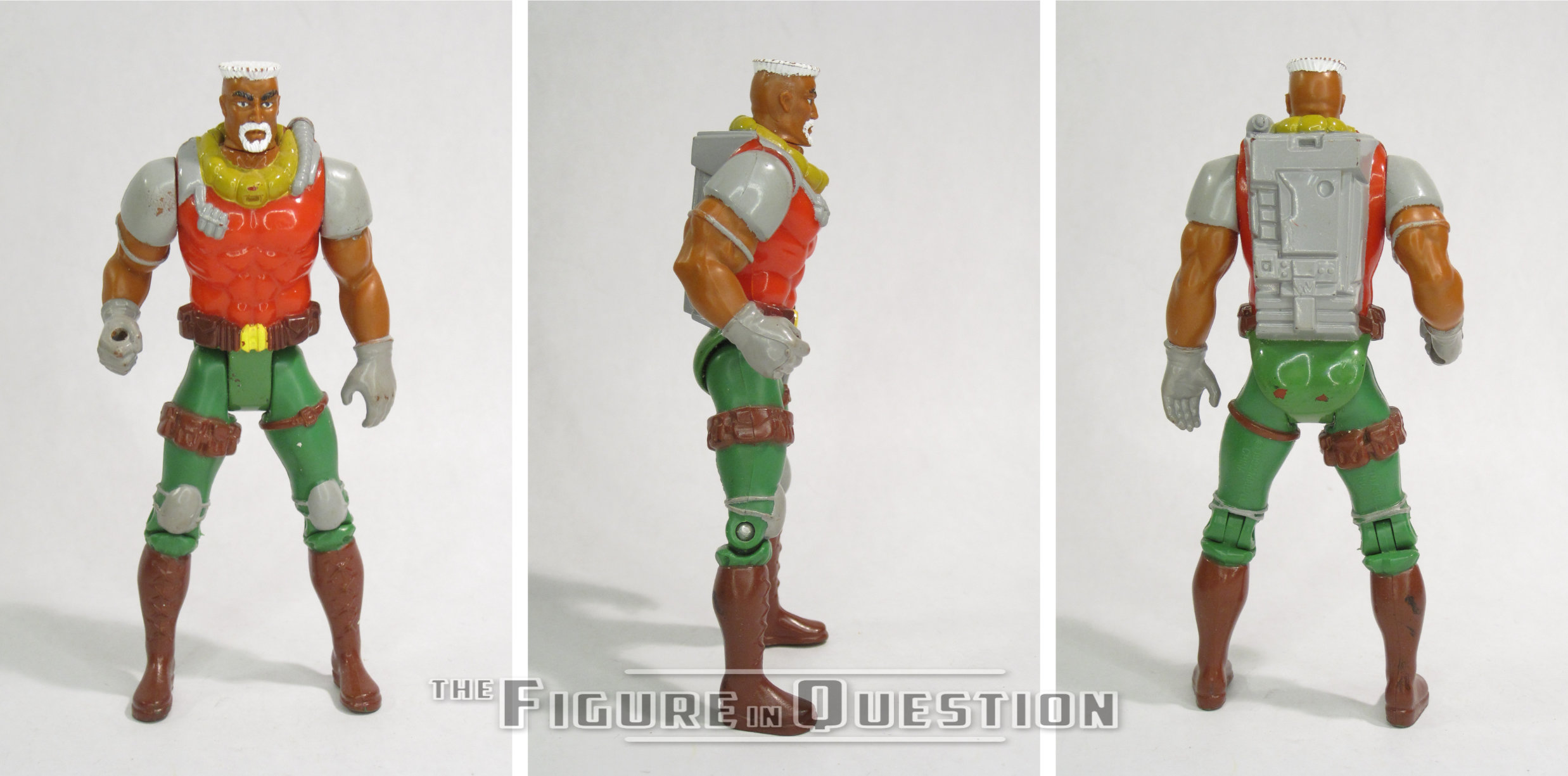
Cap’s outfit is rather involved. Like in the movie, there’s a lot of small little pieces layering on top of each other to create the final appearance. For the figure, pretty much the entire upper half is functionally one piece, and it’s all fixed to the figure’s torso using the star at the center of the chest. Compared to later offerings, the stitching here feels a little bit heavy-handed, but it wasn’t awful for the time. The biggest issue with it is that it ends up looking a little sloppy around the edges of the shoulders. We get some issues with QC again here, this time having to do with the material used for his belt and holster. It’s a simulated leather, and it’s really soft, making parts of it prone to tearing, especially on the clasp for the holster. Additionally, the glue used to hold the holster straps in place didn’t adhere well to the material, so they pull off with relatively minor posing, and you either have to strategically tuck them, or try to glue them back. The glue likewise didn’t hold well on the belt, leading to it releasing from both sides of the buckle on mine. The cuffs of the pants are folded inward, and a little bit too high up, so when you pose his legs, the shins are sometimes visible above the boots, which looks a little silly. There are a number of sculpted elements present, which do look a bit better, and are far less prone to issues.
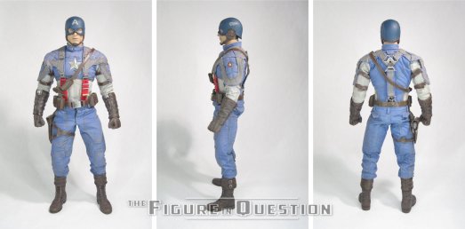
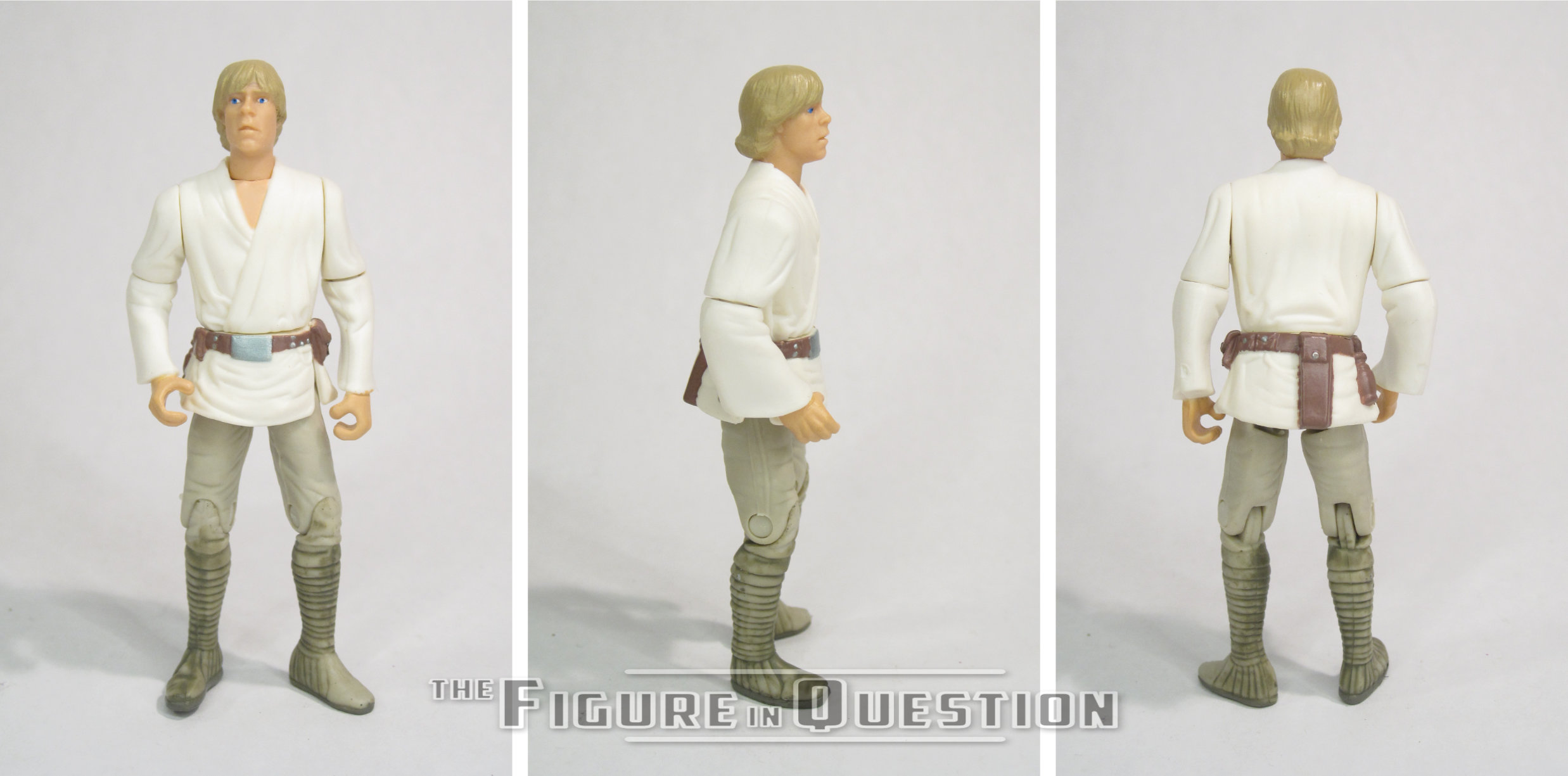
The underlying body is hard to get a total read on, since the costume’s rather attached. The upper portion isn’t incredibly posable, especially when it comes to the arms, so you have to sort of work carefully to do much with it. The lower half is at least a bit better, though it’s worth noting that they determined his legs were too short later in production, and addressed this by swapping in a longer set of ankle pegs to off-set it (the original length pegs were also included for those who wanted the option), which helps in some ways, but ends up odd in others, and also ties into the issue with the exposed shins mentioned in the costume section. Overall, though, the build of the body looks pretty close to Evans in the movie, and stands well on the shelf.

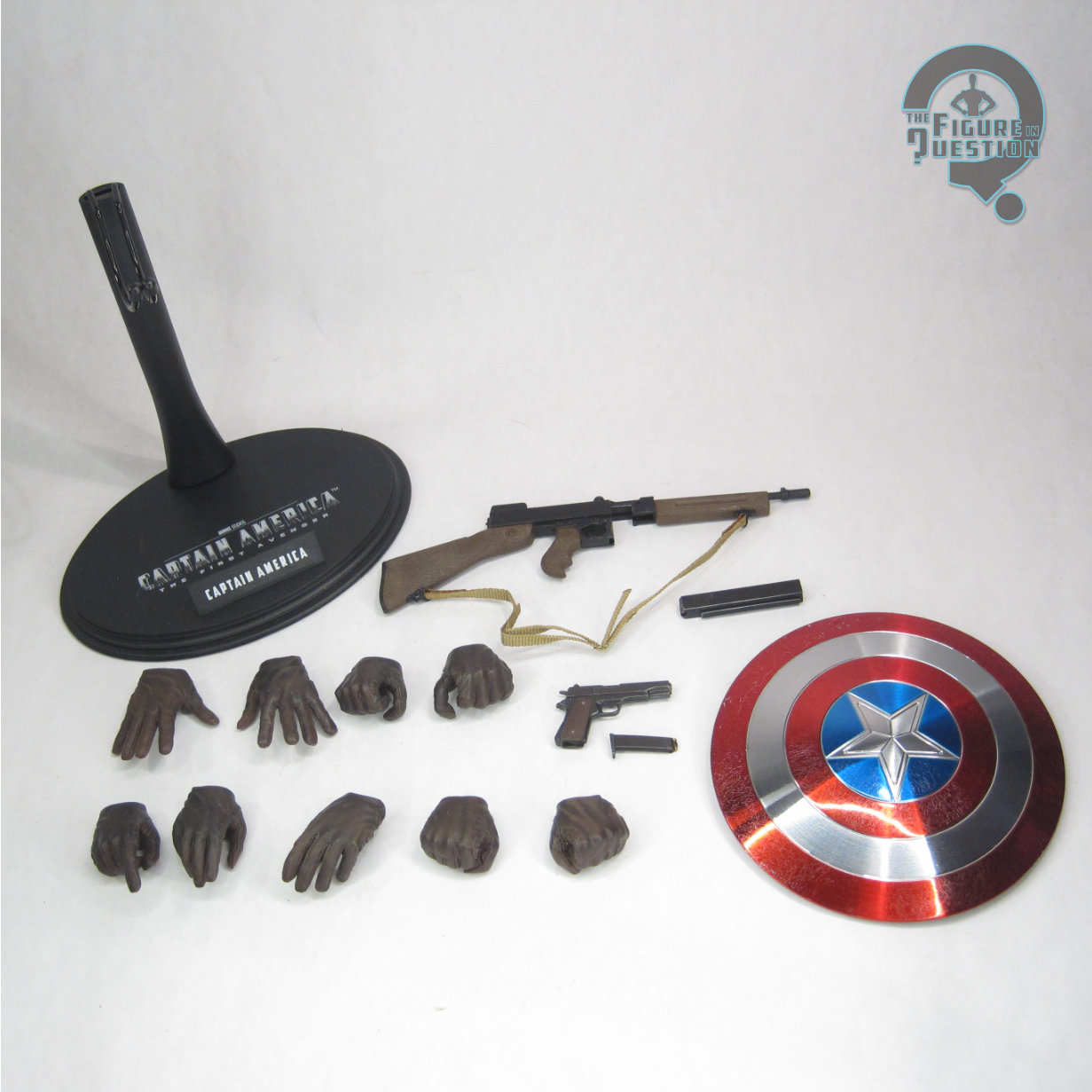
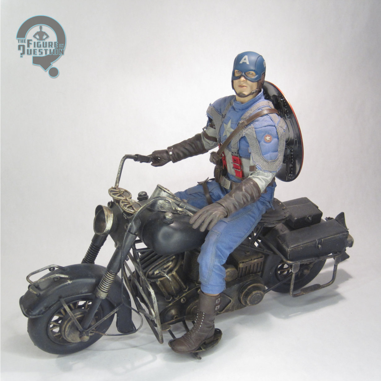
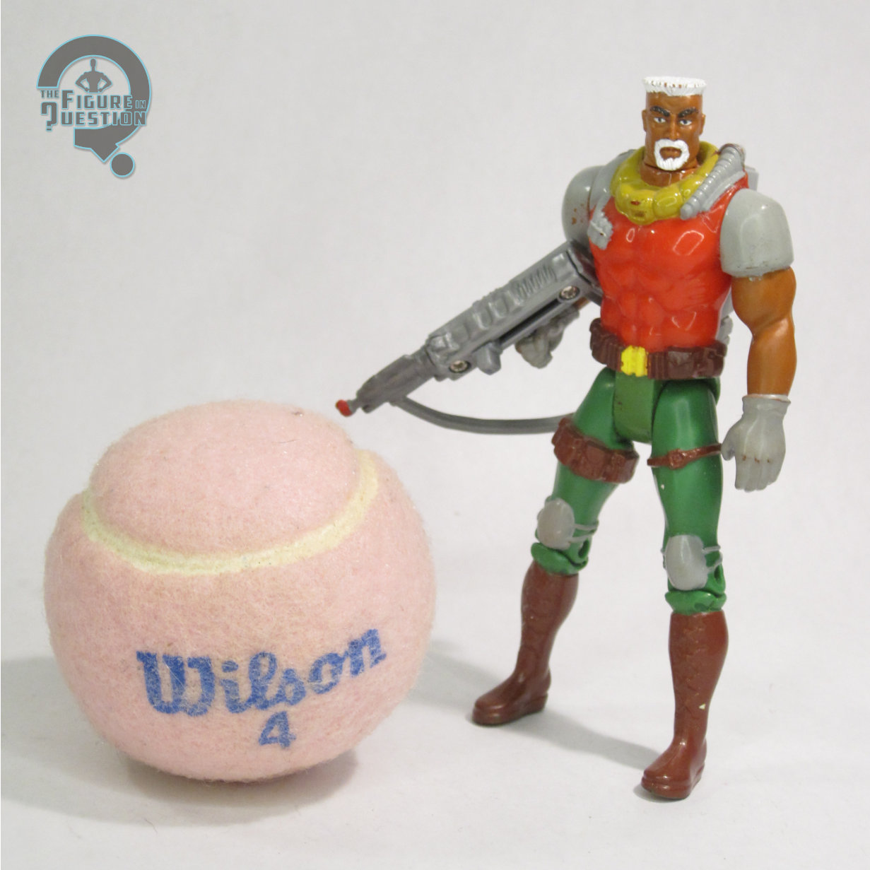
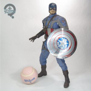
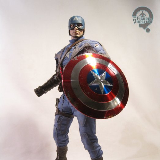
Cap is packed with 9 pairs of hands, his shield, a Thompson 1928a1, a Colt 1911, and a display stand. The hands give him a variety of posing options, though like earlier HT offerings, they can be a bit tricky to swap. The guns were packed pretty much standard across all of the TFA Caps, and they’re as good as any HT small-scale weapon. They’ve got moving and removable parts, and certainly look cool. The stand is a stand, but it does what it needs to. The shield? Well, let’s talk about the shield.
HT opted for a vac-metalized finish on the shields to start, so they’d be shiny and chrome. It’s an odd choice, since the shield’s not that at all in the movie, where it’s actually got more of a brushed steel finish, which would be much easier to replicate. What’s more, because of the vac-metalizing, the red and blue paint on the front of the shield didn’t properly adhere to the surface, meaning that it eventually just started flaking off over time, leaving you with a kind of unpleasant mess of a shield, that just slowly degrades more and more over time. I’ve included a photo I took in 2014 of this one, so you can see just how far it degraded just sitting on a shelf between then and when I packed it up in 2020, at which point it was packed away, and only pulled out for the photos that ran with this review. The “clean” shield from the Avengers release was the same, but we already knew about the issues, so I left that one packed away, so it’s the one seen in the accessories shot here. Even so, it’s surface is completely cracked, so handling it anywhere but the very edges will cause it to flake just like the original. The Avengers release at least got a spare shield with a different finish. This one’s not so lucky.
THE ME HALF OF THE EQUATION
This was my seventh Hot Toys figure, I’m pretty sure? I got him new, as a (ever so slightly late) Christmas present from my parents, back in 2011. I really loved The First Avenger, and while I had some initial misgivings about the costume design, it grew on me, and I knew I needed to own the high-end version of this guy. Little did I know at the time just *how many* high end versions of him I’d end up getting. When he was new, he had some minor issues that I just sort of had to overlook. As he’s gotten older, more issues have cropped up, and better Caps have come along, which has made him a rather unfortunate release. But, I’m still happy I got him. A year after his release, my brother got me a scale bike for him, and he looks pretty fantastic propped on that, with his shield on his back so you can’t see the flaking. Ultimately, he’s a rough release for Hot Toys, but without him, we wouldn’t have all the others, and that’s pretty darn cool by me.
Incidentally, way back in 2014, I mapped out all of my “Monumental” reviews, and built Word documents for them, as was my way at the time. While I’ve moved away from most of those old documents, Cap here was written in his, just for old time’s sake.


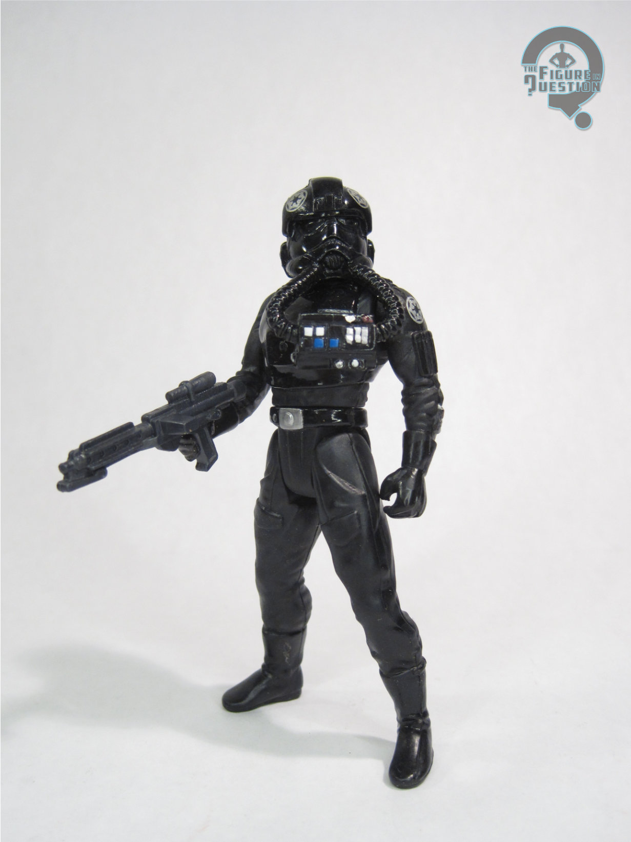
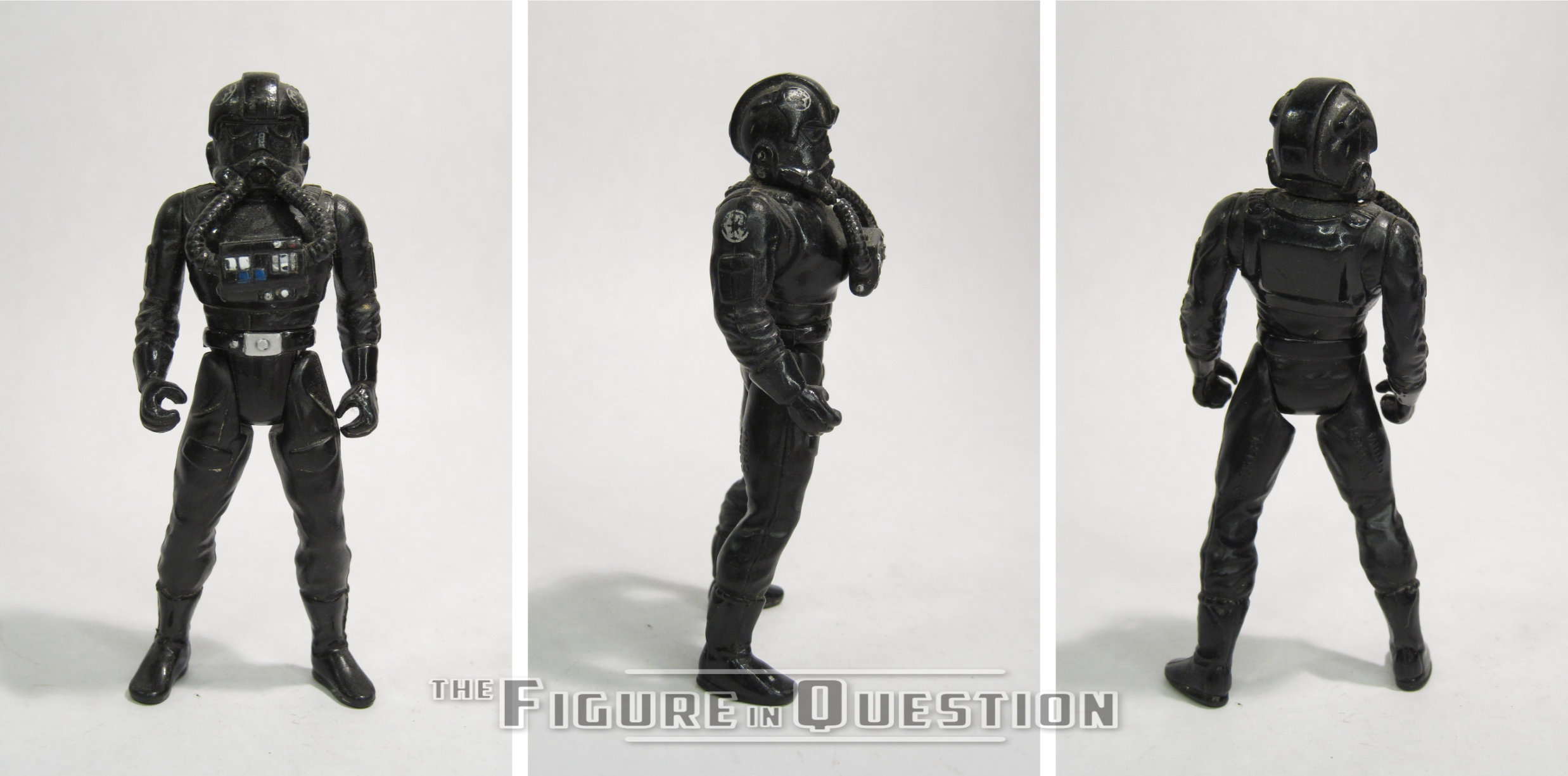
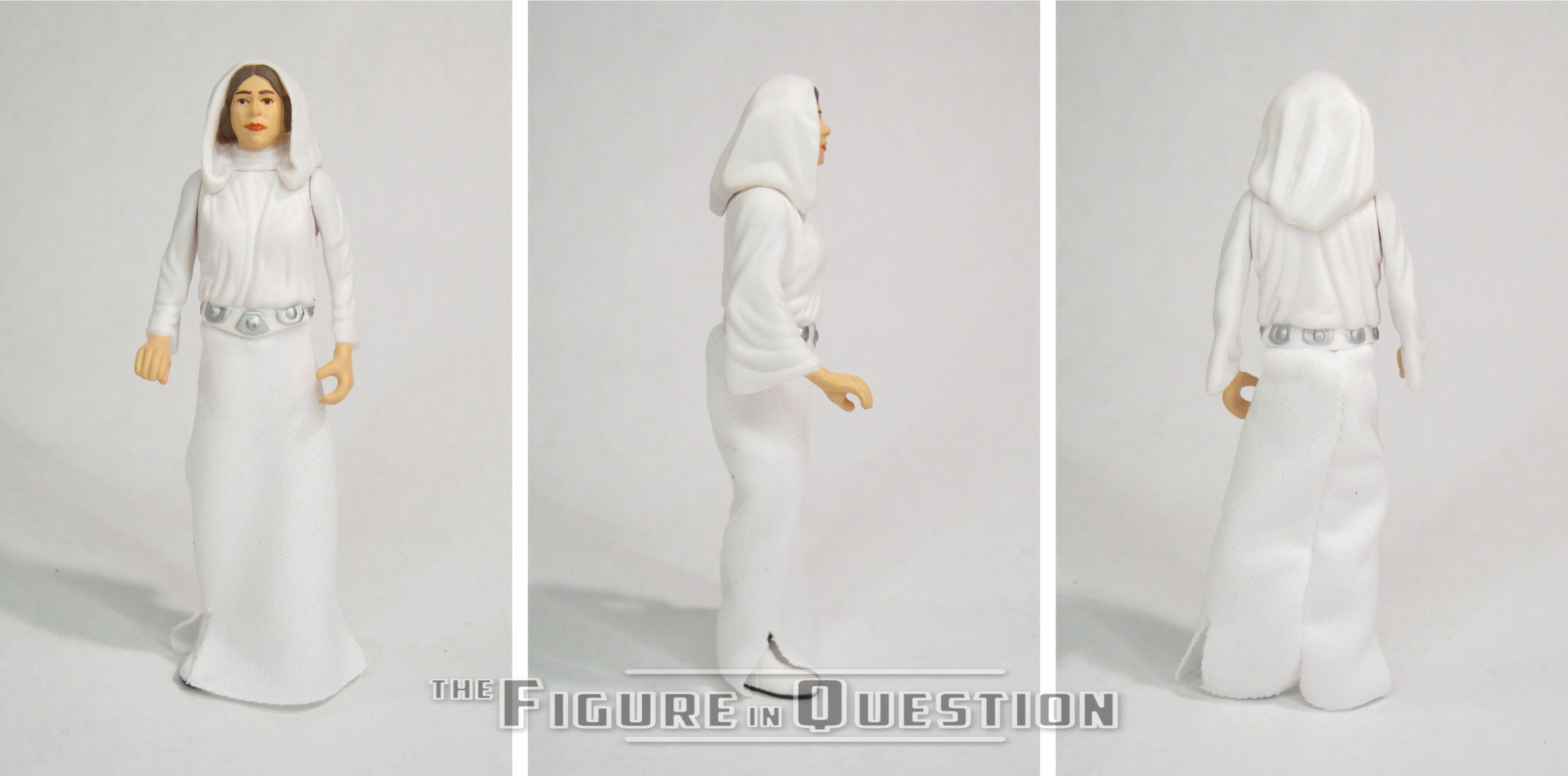
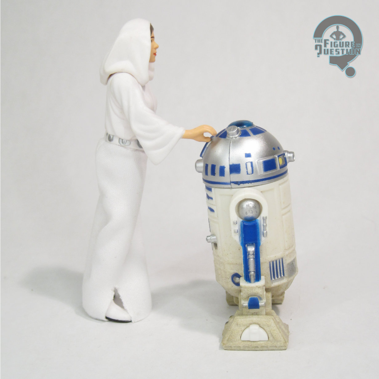
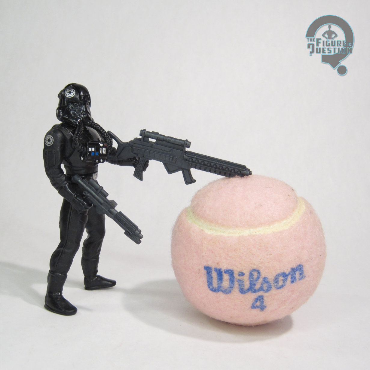 This is another 2017 review, written in the midst of a rather hectic summer of multiple cross-country trips and a coast-line-spanning move. I’d jumped back into Power of the Force with a batch of figures I’d gotten for cheap in February of that year, and moved onto the prior entries already in my collection. In the midst of all the craziness, I’ll admit, I completely forgot the bit about what “TIE” stood for. In one ear and out the other and all that. The actual review covers the basics well-enough, I suppose. He was at the time missing both of blasters, but I’ve since replaced them. The larger one is particular comedic in its sizing, which I find quite amusing.