#1104: Cyclops

CYCLOPS

X-MEN: METALLIC MUTANTS (TOY BIZ)

cyclopsmetallic1

I’ve discussed Toy Biz’s larger 10-inch-scaled Marvel figures in the past.  Essentially, since Toy Biz did the prototypes for their successful 5-inch line as two-ups, they had an easy time re-using those sculpts for a line of slightly cheaper 10-inch figures (though, interestingly, the line was originally billed as a deluxe line of figures.  It was only later, when they decided to focus more on building as many figures as they could out of a limited pool of parts that it became “cheap”).  Toy Biz’s 10-inch X-Men line, like it’s smaller scale counterpart, was the most successful of the initial lines, even managing to get its own spin-off line, Metallic Mutants, where certain figures were re-released with metallic color schemes.  Today, I’ll be looking at the Cyclops figure from that line.

THE FIGURE ITSELF

cyclopsmetallic2Cyclops was from the first series of X-Men: Metallic Mutants. The whole Metallic Mutants line was available exclusively at KB Toys (who would also become the exclusive retailers of the entire 10-inch line a few years later).  The figure is about 10 inches tall and he has 9 points of articulation, which was a whole extra point more than his 5-inch equivalent had.  The figure is a straight repaint of the basic 10-inch Cyclops, who was himself patterned on the sculpt of Cyclops II from Toy Biz’s main X-Men line.  The sculpt is a little bit different.  He lacks the light-up feature of the smaller figure, which results in him getting the neck articulation the smaller figure lacked.  Aside from that, the sculpt is pretty much the same.  It’s okay for the time, but certainly isn’t one of Toy Biz’s stronger sculpts.  Due to the light-up nature of the smaller figure, the torso was made a bit larger to house the battery compartment, and that’s still seen here.  While the legs seem to match up okay with the larger torso, the arms and head feel rather under-sized by comparison, which makes him look rather odd overall.  Each piece of him seems fine on its own, but as a whole he looks a bit patchwork.  I will admit, there’s a certain quaintness to the sculpt that I appreciate, though.  The big deal on the figure, of course was the paint.  It’s certainly metallic, there’s no denying that.  The costume looks cool in the metallic shades, but what sort of throws him off is the decision to do his skin and hair in the same gold as the “yellow” bits of the costume.  Clearly, Toy Biz caught on to this being weird, since the second set of Metallic Mutants just had the metallic colors on the costumes, not the actual faces.  Cyclops included a blaster thing, in the same gold as used on the body, which is cool I guess.

THE ME HALF OF THE EQUATION

As hokey as this guy is, I’ve actually always wanted one.  Growing up, I had the little product booklet that came with the TB Galactus, which had these guys all pictured in it, and I always wanted Cyclops in particular.  I ended up finally getting this guy for my birthday this summer from my parents, who bought him from 2nd Chance Toyz.  Is he weird and goofy and strange?  Yes.  Do I love him? Emphatically yes.

#1096: Green Lantern

GREEN LANTERN

DC SUPER HEROES SILVER AGE COLLECTION (HASBRO)

gl9inch1

Hey guys!  In case you didn’t see earlier, The Figure In Question has made it through another year of reviews, which marks three years of me running this humble little site.  In honor of the occasion, I’ll be taking a look at a figure with some extra meaning to me.

I’ve discussed once or twice here how I’m a pretty big Green Lantern fan (or I was.  It’s complicated).  Well, back in the ‘90s, when I was just getting into the world of action figure collecting, Green Lantern was something of a rarity on toy shelves.  To make matters worse, what Green Lantern figures did exist were all based on Kyle Rayner, not Hal Jordan, who was the Green Lantern I was most familiar with (due to Cartoon Network’s Super Friends re-runs and a healthy diet of bronze-age DC comics provided to me by my Dad).  The first Hal Jordan Green Lantern to be released within my lifetime was part of the DC Super Heroes Silver Age Collection, which was Hasbro’s attempt at copying Toy Biz’s attempt at copying Mego with Famous Covers.  Confused?  You probably still will be after this review.  Sorry.  On to the figure!

THE FIGURE ITSELF

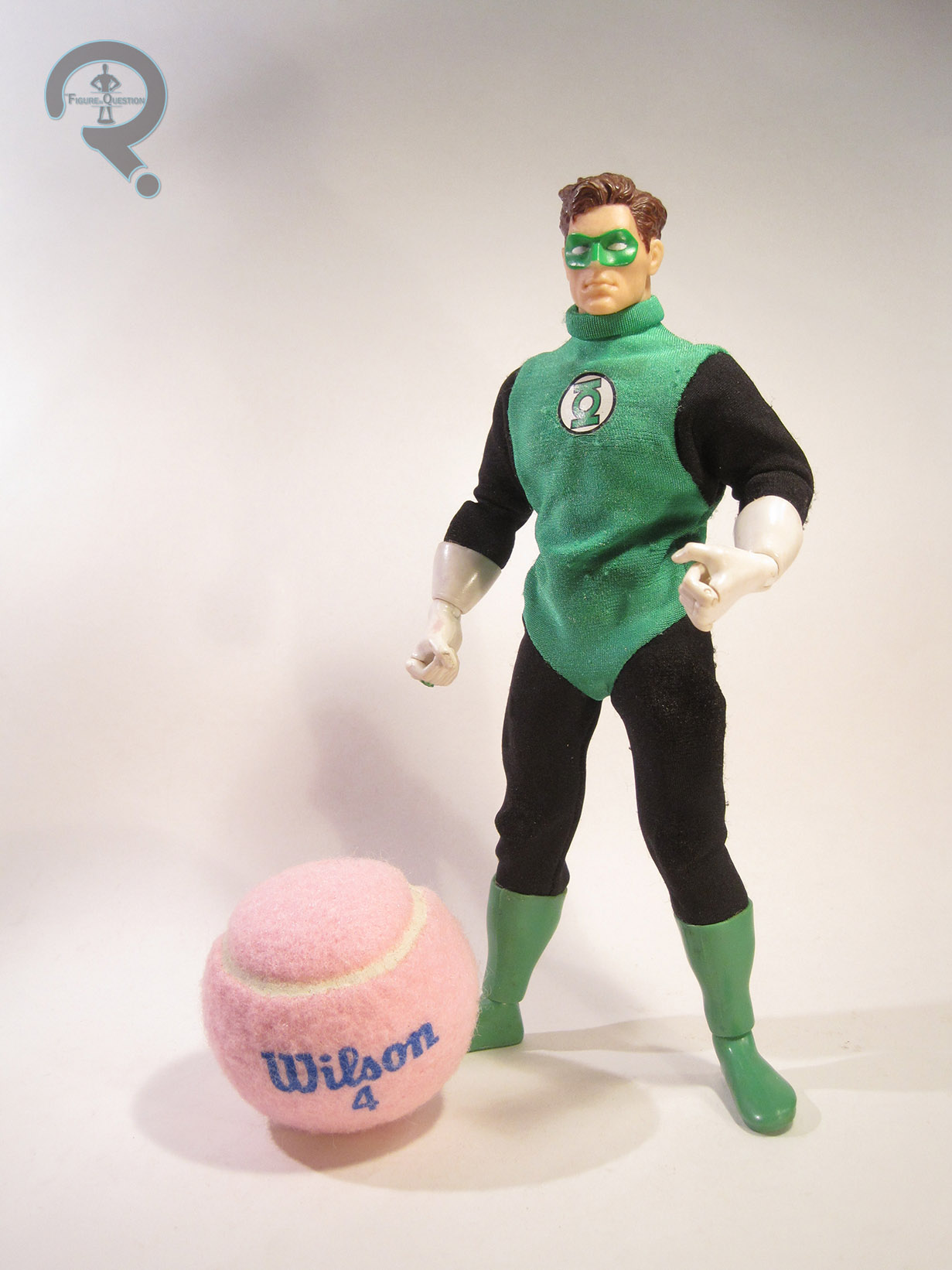
gl9inch2Green Lantern was released as part of the first Series of the Silver Age Collection, alongside Aquaman and Green Arrow.  It was actually a pretty bold selection of characters for the time, since all three were at best second stringers, two of whom had been replaced in their respective roles and the third of whom had undergone a massive redesign a few years prior.  The figure stands 9 inches tall and he has 25 points of articulation. He’s based on Hal’s initial Silver Age costume, defined by the lack of green on the shoulders.  As a throwback to the old Mego figures (which, incidentally, did not include poor GL here), this figure makes use of a cloth costume.  The costume is alright.  It’s a little baggy, and the stitching around the shoulders and hips is a touch bulky.  It’s worth noting that the costume looks far better on this figure in it’s packaged-fresh form; my figure has been beat to heck thanks to 10 years or so of steady play, which stretched his uniform out of shape.  The underlying body on this figure (which is the same one used for the other DC 9-inch figures, as well as the later Marvel-based Signature Series) is actually pretty decent, especially when compared to the ones used by Playmates and Toy Biz for their figures in this same scale.  It posed pretty well, and was actually fairly nicely proportioned.  In addition to the base body and the cloth suit, GL gets a sculpted head, hands, glove cuffs, feet, and boot cuffs.  The head is the standout piece on this figure.  I think this is, to date, the best Hal Jordan sculpt ever made, and it was perhaps the strongest sculpt the line produced.  The detail is sharp, and it’s a very good likeness of how Hal was portrayed in the comics.  The rest of the sculpted pieces are decent, if not quite as stand-out awesome as the head sculpt.  The right hand is cool, what with the power ring and all.  And check out Hasbro using that finger articulation a few years before Toy Biz popularized it with Spider-Man Classics.  That’s pretty cool.  As far as paint goes, Hal here is pretty basic, with the vast majority of it being on the head, and even then only being on the hair and the mask.  What’s there is clean, and, most impressively, the green of the mask actually matches the green of the tunic.  GL’s only accessory was a display stand with the DC logo on it.  Each figure included one, but with a variety of different colors, with GL’s being black (rather than the more obvious green…).  He’s one of the few GL figures not to include his power battery.  I actually had a small Coleman lantern keychain that I used with this figure, which I really wish I still had.

THE ME HALF OF THE EQUATION

So, since this was the first Green Lantern Hal Jordan to be released within my lifetime, you’ve probably gathered that this was, by extension, my first Hal Jordan figure.  Not my first Green Lantern, of course, but still.  I remember first seeing the prototype pictures of this figure and being very excited, and then being even more excited when my parents and I found him at the store (I believe it was Target).  This figure is extra important to me because I got him in 1999, which was the same year my younger brother Christian was born, and this guy came with me to at least a few of the hospital visits to see him, which gives him a whole other dimension of awesome for me (the figure, not my brother.  Though my brother’s awesome too, for what it’s worth).

#1095: Adam Warlock

ADAM WARLOCK

MARVEL OVERPOWER CARD GAME

adamwarlocktb1

Around this time last year, I discussed the interesting case of the US Agent figure from Toy Biz’s ‘90s Iron Man line.  He was slotted for the third series of the line, but dropped at the last minute when Toy Biz cut all of their lines back to six figures per series.  US Agent’s mold would bounce around for a bit, and he was ultimately only available through a difficult to acquire, non-Toy Biz or Marvel sanctioned release. 

Running concurrently with the Iron Man line was a Fantastic Four line, which was also subject to the downsizing of assortments.  US Agent’s equivalent in this line was Adam Warlock, who was presumably dropped from the FF line-up because he, like US Agent, was the only character not to be featured on the cartoon the line was meant to tie-in with.  Adam would prove far more fortunate than poor US Agent in regards to his figure’s release, however, with Toy Biz actually finding a venue to put him out.

THE FIGURE ITSELF

adamwarlocktb2After being dropped from the third series of Toy Biz’s Fantastic Four line in 1995, Adam Warlock was ultimately released in 1996 as part of a small KB Toys-exclusive line of four figures designed to coincide with Fleer’s Marvel: Overpower Card Game. The other three figures were straight forward repaints of earlier figures, and much more popular characters to boot, making Adam seem like an odd choice.  I guess Toy Biz just really wanted to get him out there!  Adam is seen here sporting his early ‘90s design, which was kind of a merging of his two previous looks.  It’s my favorite of his looks, but it’s entirely possible that I like it because it’s the one I saw on all those card backs in the ‘90s.  The figure is just over 5 inches tall and he has 8 points of articulation.  Because of the light-up feature integrated into his eyes and Infinity stone, Adam doesn’t get any neck articulation, which results in him feeling rather stiff, even when placed with this compatriots from the same time period.  Stiffness aside, Adam’s sculpt is pretty good.  It’s certainly on par with the rest of the ‘90s FF figures, which is good, overall.  The proportions are a little weird in some areas (especially the upper arms; those things are huge), and the head’s a little soft in terms of detail, but he generally looks pretty good.  Warlock has a removable cape, which actually a fair bit different from the cape his FF prototype was sporting.  This one is much more dynamic in pose, and fits more with the stuff Toy Biz was starting to put out in 1996.  I kind of prefer the prototype version, if I’m honest.  The flow of this one kind of clashes with the style of the figure proper, since he’s just sort of standing there, and it’s all crazy wind-blown.  It also has some trouble sitting right on his shoulders, which can get very annoying.  Another thing that was changed from Adam’s prototype to thee Overpower figure is the paint scheme.  It’s not terribly different, but the yellow was swapped out for gold, and the red has been made a little less vibrant.  Like the new cape, it’s more in keeping with the sort of work TB was doing in 1996, but it results in him not fitting in quite as well with the FF figures as he should.  The gold paint has also not stood the test of time, meaning some of the details get lost.  Adam included his signature staff, as well as an Adam Warlock  Overpower card.

THE ME HALF OF THE EQUATION

Like US Agent, Adam Warlock is a figure I always wanted, due to his presence on the back of the Iron Man and Fantastic Four card backs, but was never able to find, due to the lack of information on such things at the time (the internet was around, but we toy geeks hadn’t quite migrated to it yet).  I’ve known about the existence of this particular figure for several  years, and I’ve even seen him once or twice in person, but I never got around to picking him up.  I ended up finding Adam while exploring the new area I’m living in, at a very cool shop called Power Comics.  Adam’s not quite as fun as US Agent, mostly due to Toy Biz changing so much from ’95 to ’96, and this guy getting hit with some weird amalgamation of those two years’ styles.  If he’d been a straight recreation of the figure as originally intended (like US Agent was), I think he might have been a bit better.  As it stands, I think he’s still the best version of the guy out there.

adamwarlocktb3

#1069: Future Apocalypse

FUTURE APOCALYPSE

X-MEN (TOY BIZ)

futureapocalypse1

The X-Men were kinda big in the ‘90s.  Not sure if you guys knew that.  They were big enough to serve as a pretty good kick-off for the still fairly new to the market Toy Biz, who made quite an empire out of those merry mutants.  Early on, the figures were pretty straight-forward translations of the comics designs (with one or two Animated designs, such as Morph, thrown in for good measure), but as the decade progressed, they started running out of characters to scrape from the bottom of the X-Men barrel, and headed towards some slightly more gimmicky concepts, which allowed them to rehash some of the previously released characters in different and exciting ways.  One such gimmick was “Missile Flyers,” a series of four wing-ed variants released in 1997.  Today, I’ll be looking at Apocalypse from that series!

THE FIGURE ITSELF

futureapocalypse2As noted in the intro, Apocalypse (or “Future Apocalypse” as the box refers to him) is one of the four figures in the “Missile Flyers” series of Toy Biz’s X-Men line.  The figure is about 7 inches tall and he has 11 points of articulation.  His design is a bit removed from the usual Apocalypse look.  He’s far more exaggerated and mechanized than usual.  I think it’s still a comic-based design, but I honestly don’t know exactly where it hails from.  It’s certainly an interesting look for him, though it does make him look more like a Spawn villain than an X-Men character.  It’s probably all that crazy exaggeration on the proportions.  The actual quality of the sculpt is pretty top notch.  There’s a lot of great detail work throughout, especially on the mechanics of the neck.  That looks pretty darn cool!  He does have a little trouble standing, mostly due to the sheer size of his upper arms, but you can get him to remain fairly sturdy with some careful posing.  While most of the Missile Flyers figures had separate, removable pieces for their missile-firing wings that earned them their name,  Apocalypse actually had his wings worked into the main figure.  Each of the wings is on a rotating hinge, allowing them to either be deployed over his shoulders or brought down over his front to form a sort of a robe type thing.  The two halves even form a cool A symbol, like Apocalypse is prone to sport, which  is a cool touch.  The paintwork on Apocalypse is decent enough.  It’s a lot of blues, greys, and silvers, which is right for the character.  My figure’s a little worse for wear, but still pretty good.  He’s not the most colorful figure ever, but it works for him (and was a good contrast to the other figures in the set).  Apocalypse was packed with a large missile, which can be fired from the hole in the middle of his torso (that’s gotta hurt!).

THE ME HALF OF THE EQUATION

Apocalypse isn’t one of my actual ‘90s purchases.  As a matter of fact, I never got any of the Missile Flyers when they were initially released, despite quite liking them.  I ultimately ended up finding Future Apocalypse at a Goodwill this past Father’s Day (along with the bunch of Masters of the Universe figures I reviewed about a month or two back).  I’ve never been the biggest Apocalypse fan, but I like him well enough that I was urged to pick up this figure, and I have to say, he’s actually pretty cool!

#1064: Punisher

PUNISHER

MARVEL LEGENDS SERIES

punisherhas1

“A ruthless vigilante, Punisher single-handedly takes down crime one bad guy at a time.”

Historically, I’ve never been much of a Punisher fan.  For me, he was one of the prime examples of what went wrong with comics in the late ‘80s on into the ‘90s.  An amoral anti-hero who’s primary gimmick was shooting stuff up, who operated on making other, less extreme heroes look lame and old-fashioned.  When he was announced to be appearing in the second season of Netflix’s Daredevil series, I was a little apprehensive, but Jon Bernthal’s phenomenal turn as the character was one of the best parts of the season, and made me realize that I didn’t hate the character as much as I’d thought, I just hadn’t seen the right interpretation of him.  As it turns out, the timing was just right on me getting into Punisher, since he just got a brand-new Marvel Legend, which I’ll be taking a look at today.

THE FIGURE ITSELF

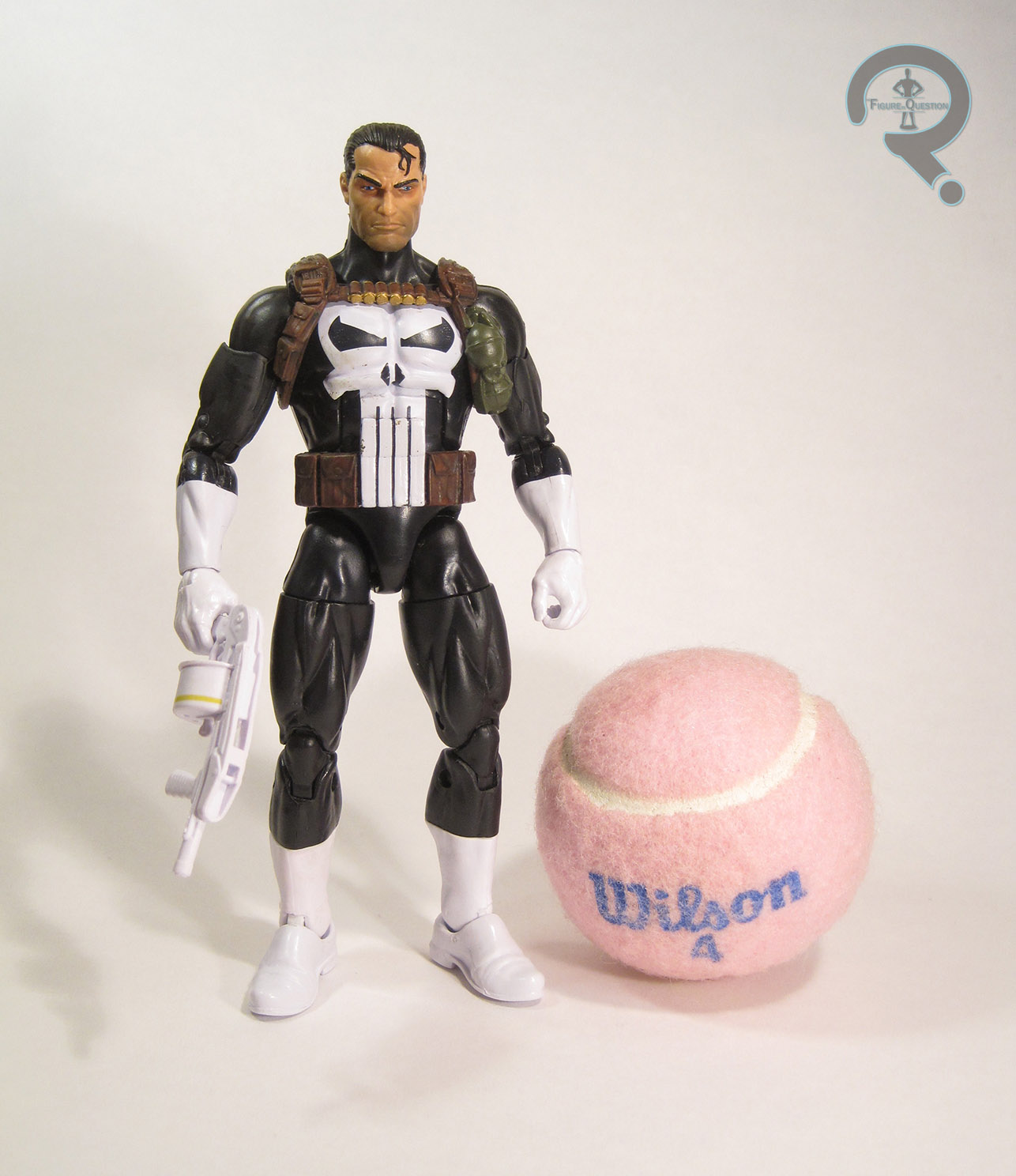
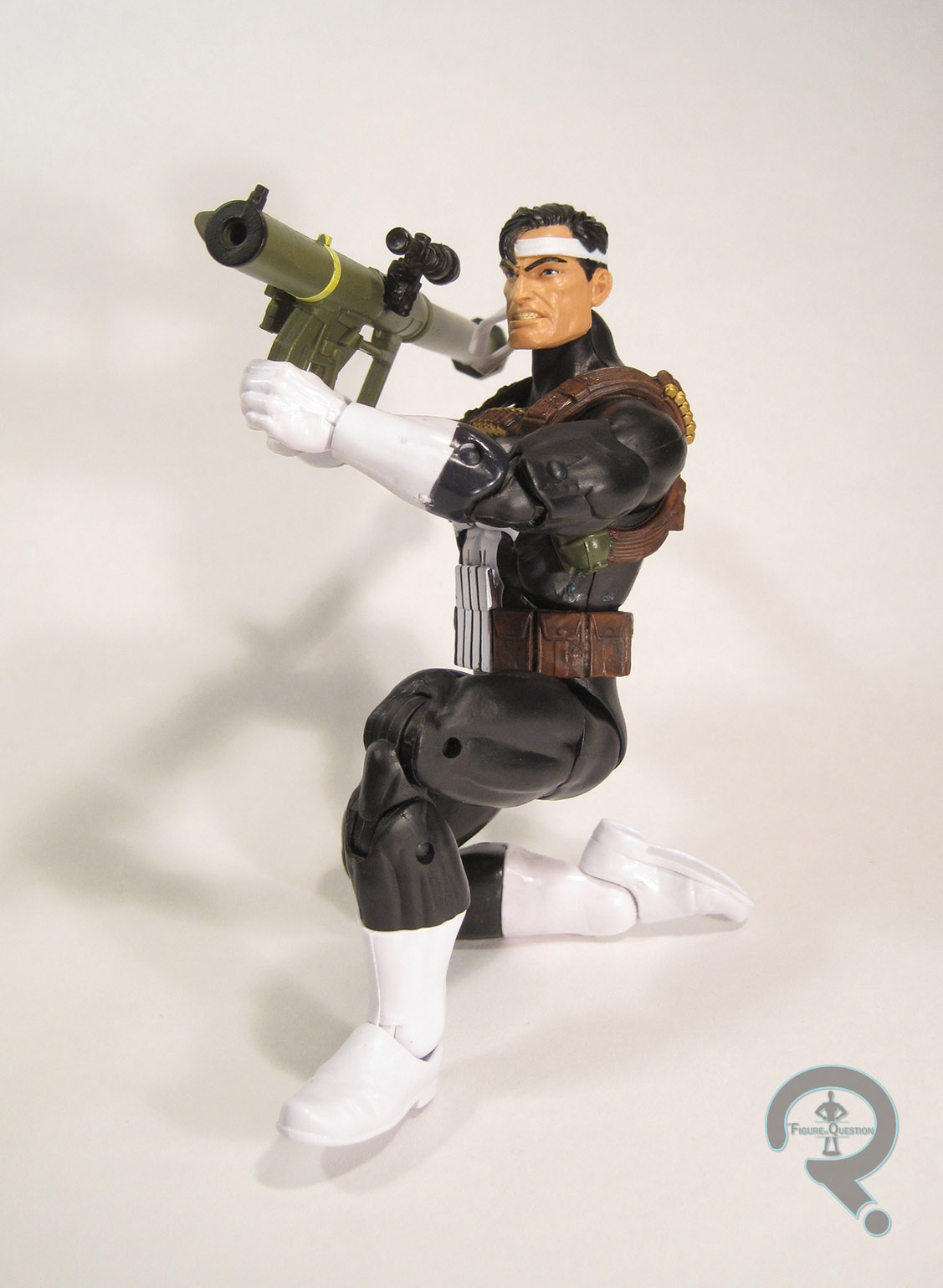
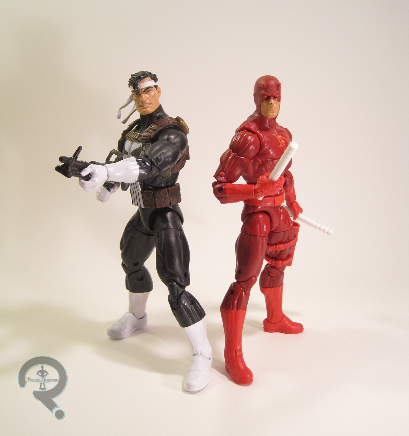
punisherhas2Punisher is the latest Walgreens-exclusive Marvel Legends Series figure.  Going by the back of the box, he’s supposed to be a part of the Absorbing Man series from earlier this year, though he didn’t arrive even close to that series’ release, nor was he intended to.  He ended up hitting stores about a month ago, not long after the Namor figure (making them the two closest released Walgreens-exclusives since they started carrying the figures).  The figure is based on Punisher’s Jim Lee-designed look from the ‘90s, which is a decent choice, since it’s just a slight variation on his classic design.  The figure stands 6 1/2 inches tall and he has 32 points of articulation.  Punisher is built on the Reaper body, which was somewhat surprising at first, but, upon having the figure in hand, feels like a pretty good choice. The only downside to this body is that they have yet to release hands with trigger fingers for it, which is a bit of an issue for a gun user like Punisher, but can fairly easily be remedied with a little minor modification.  Punisher gets a new punisherhas3head, as well as two add-on pieces for his shoulder straps and belt.  The new head is quite a nice piece.  The headband is certainly a unique look, and the whole sculpt captures the Lee take on the character quite well, as well as fitting the base body very nicely.  The add-ons are also very well-rendered pieces, which add a nice extra touch of character to the figure.  Punisher’s paintwork is clean and sharp, and makes the figure look very well put together.  The slightly off-black of the uniform looks really nice, and the details such as the logo and the face are superbly rendered.  The accessories are an area where this figure really shines.  He gets an extra head, sans headband, for a more classic look, an m60 machine gun, a Striker shotgun, and a SMAW rocket launcher.  That’s actually a pretty impressive selection, especially compared to the likes of Winter Soldier or Black Widow from earlier in the Infinite Series line.

THE ME HALF OF THE EQUATION

Wanna guess where I got Punisher?  That’s right, Walgreens!  After tracking down <most of> the latest X-Men series, this guy was at the top of my list.  My dad, who was helping me track down the X-Men figures, actually saw this guy and didn’t realize I hadn’t gotten him yet.  So, we made a trip back to that same Walgreens and I picked him up.  Gotta say, I really like this guy a whole lot, and that’s surprising to me, since I didn’t care about the character a year ago.

punisherhas4

#1062: Flash Gordon – Flight Suit

FLASH GORDON – FLIGHT SUIT

FLASH GORDON (PLAYMATES)

flashspace1

When your name is the same name as the toyline that you’re a part of, it’s pretty much a given that you’ll get at least one more figure than everybody else.  Especially in the ‘90s.  This was the case with Alex “Flash” Gordon of…Flash Gordon.  Yep, in a series of eight total figures, he still managed to get two of them.  He was a whole quarter of the figures released!

THE FIGURE ITSELF

flashspace2Flash is the final figure from the basic assortment of the Playmates’ Flash Gordon line.  He’s the only duplicated character in the set (though, plans were drawn up for a corresponding Dale figure).  Where the last Flash was based on the character’s rather decade-specific main design from the show, this one’s based on his Flight Suit look, which was a bit more, shall we say timeless?  The figure is a little over 5 inches tall and has 6 points of articulation.  Amazingly enough, this figure’s sculpt is 100% unique, sharing no parts with the prior Flash.  Even the head, which looks more or less the same, has a slightly different expression.  I actually prefer this head to the other, just because he looks a little less slack-jawed.  The rest of the body is, obviously, new.  It’s noticeably less pre-posed than the regular Flash, which is both a blessing and a curse.  While the more standard pose is a bit more versatile, when coupled with the articulation, it makes him a bit stiffer looking.  It’s not horrible, but if he could have at least gotten the articulation we saw on Ming, I think he could have been far superior.  The actual design is pretty fun, and it translates well two action figure form.  It’s still a little less detailed than I’d like, but it’s not bad, and at the very least he fits in with the rest of the line.  The paintwork on Flash is pretty good.  As with the Playmates Trek figures, the face stands out from the rest by featuring a surprising amount of detail, especially on the eyes.  The body’s far more basic, but the colors are at the very least pretty exciting.  There’s some bleed over here and there, but nothing truly atrocious.  He’s still really shiny, but doesn’t look quite as glazed as some of the others in the series.  Flash included a helmet, a TriBlaster, a communicator, and an AirSled (in a slightly darker red than the normal Flash’s).

THE ME HALF OF THE EQUATION

This was my third figure from this line.  I got him from Ageless Heroes’ legendary going-out-of-bustiness sale, around the same time as Ming.  I think it was shortly after I got Ming, truth be told, and I know for a fact it was on a school night, as a reward for finishing up my homework early or something like that (I also got a Black Widow figure at the same time.  Score!).  I got a second of this figure in the set of eight that I picked up last summer.  Ultimately, despite some tiny flaws, I think this is the better of the two Flash’s released in this line.  The design is just better overall, and the final execution just barely nudges past the regular version.  All-in-all, the ‘90s Flash Gordon line is kind of an oddity.  It’s based on a cartoon that almost no one remembers, and the figures are at best a mediocre attempt at translating some of the designs.  The thing the line has going for it is that it’s probably the cheapest way to put together a Flash Gordon set-up.  Ultimately, I’m happy to have them all, but I’ll always wish they were just a bit better.

#1061: Kobalt the Mercenary

KOBALT THE MERCENARY

FLASH GORDON (PLAYMATES)

kobalt1

Flash Gordon is, in many ways, the quintessential space opera.  The characters contained therein pretty much all fit the standard archetypes for such a story. As such, when introducing new characters to the franchise, if you don’t want them to stick out like sore thumbs, they kind of need to fit an archetype too.  Today’s focus, Kobalt, is no exception to that line of thought.  He’s very much the standard villainous gun for hire, sent to chase down the heroes, much in same vein as the likes of Boba Fett and Jubal Early.  So, let’s see how his figure turned out!

THE FIGURE ITSELF

kobalt2Kobalt is yet another of the basic Flash Gordon figures from Playmates.  Also worth noting: he’s the last of the three  villains the line produced.  Yeah, for some strange reason, they didn’t go for the obvious 50/50 split.  The figure stands about 5 1/4 inches tall and has 6 points of articulation.  He’s one of the few figures in the line not to get the stupid v-hips, which is always a good thing.  Kobalt’s sculpt is decent enough, though nothing particularly amazing.  He’s about on par with Flash and Dale.  The proportions are fine, and he looks like his cartoon counterpart.  That said, the details are all on the more basic side, which makes him look a little less impressive than the likes of Ming and General Lynch.  As it stands he’s accurate to the show, but feels lacking as a figure.  Kobalt’s paintwork is fairly decent, and certainly on par with the rest of the series.  His colors match up with those from the show, and the overall application is pretty clean.  He’s still exceptionally shiny, but at this point, at least he’s consistent.  Kobalt was packed with a Transrupter (whatever that is), an Imperial TranScanner, and an AirSled in a dark red color.

THE ME HALF OF THE EQUATION

Kobalt is yet another figure from the lot of 8 I picked up at a convention last summer.  Like Lynch, he’s not really a character that jumped out at me.  As a matter of fact, I didn’t really remember this guy until I picked up the set of figures.  This figure’s alright, but not anything particularly impressive.   He’s fairly run of the mill for the line.

fgordonbaddies

#1060: General Lynch

GENERAL LYNCH

FLASH GORDON (PLAYMATES)

generallynch1

Today we get to the character that is perhaps the first wholesale new character from the ‘90s Flash Gordon, General Lynch.  Lynch fulfilled the role of Ming’s main lackey, which was hardly a unique role to the series.  However, he himself didn’t have any direct counterparts in the earlier iterations.  He’s just sort of a typical big-muscled lackey, of course, so he wasn’t really breaking new ground or anything.  On to the figure!

THE FIGURE ITSELF

generallynch2General Lynch is yet another figure from the basic assortment of Playmates’ Flash Gordon line.  The figure is a little under 5 inches tall (due to his slight hunch), and he has 5 points of articulation. He’s one of the shorter figures in the set, but he’s also the widest, so…good for him?  While his articulation’s more in line with the rest of the series, his sculpt actually has a lot in common with his boss Ming.  There’s a lot more texture and detail, and everything as a whole is just a lot sharper than most of the other figures.  The details of his face and the scaly texture of his skin stand out in particular as very cool.  He still bears a resemblance to his show appearance, but also has a certain degree of added realism, which just puts him above the others.  It’s definitely one of the better sculpts the line had to offer, alongside Ming.  Perhaps the only real downside (apart from the articulation) is his tendency to topple over.  The paint on Lynch is pretty decent as well.  It’s not perfect; there are a few spots of slop and bleed over, but the colors match up with his show appearance pretty well.  The General included the usual AirSled (which is a purple very similar in hue to his boss’s sled), as well as strange, ice cream scoop-looking weapon of some sort.

THE ME HALF OF THE EQUATION

Hey, do you want to take a guess where Lynch came from?  Yep, same place as the last few figures: a lot I picked up at a convention last summer.  I can’t say he was one of the figures I was particularly looking forward to, since Lynch on the show is ultimately a bit forgettable.  That said, he’s actually one of the nicest figures in the set.  The detail on that sculpt just can’t be beat!  Now, why couldn’t they put this kind of work in on Talon and Thundarr?  It’s unjust!  Unjust, I tell you!

#1059: Princess Thundar

PRINCESS THUNDAR

FLASH GORDON (PLAYMATES)

princessthundra1

Okay, remember yesterday’s discussion of the characters unique to the various incarnations of Flash Gordon.  Well, today’s focus is technically one of those, but only sort of.  See, Princess Thundarr, of the Leonids was a new addition to the cast of the ‘90s cartoon, but she’s effectively just a gender-swapped version of the original strip’s Prince Thun, leader of the Lion Men (who, it should be noted, weren’t actual lion people, unlike the Leonids).  Yes, of the eight figures released from the cartoon, a whole two of them were female.  That’s pretty good for the time!

THE FIGURE ITSELF

princessthundra2Princess Thundar (that’s how it’s spelled on the packaging, but every other reference I’ve found has the two “r”s, so I’m guessing someone goofed) was another of the basic assortment of figures from Playmates’ Flash Gordon line.  The figure stands a little under 5 inches tall (she’s the shortest figure from the line), and has 6 points of articulation, counting her tail.  Not an amazing selection, but at least she doesn’t have those v-hips!  Thundar’s sculpt is pretty decently handled.  She’s a fair translation of the show design into three dimensions, though she does seem a touch…blander?…than her show appearance.  In fact, bland is probably a apt descriptor of her in general.  From a purely technical standpoint, she’s perfectly fine, but she doesn’t really have the spark of character that Flash, Dale, and Ming all had.  Her expression is rather blank, her pose is little more than a simple standing pose (which isn’t inherently bad, but looks off compared to the others in the line), and she just feels a bit meh.  Even the paint is kind of boring.  Her colors aren’t far removed from how they looked on the show, but they do seem a little more washed out than they should be (in contrast to the overly bright Talon figure).  They’re still handled well technically, but it just feels like there could be more pop.  Princess Thundar included a weird bladed disc thing, a rebel VisiPad, and a purple AirSled.

THE ME HALF OF THE EQUATION

Thundar also came from the lot of eight I picked up last summer.  I can’t say my expectations of her were strongly one way or another.  Ultimately, she feels like something of a counter point to Talon.  Her paint work is sharp, but dull.  Her sculpt is decently detailed and all, but still…dull.  And her pose is very stiff, which seems very contrary to her nature on the show.  Of the two, she’s the superior figure, but that takes her from being bad to being just sort of “meh.”

fgordonheroes

#1058: Prince Talon

PRINCE TALON

FLASH GORDON (PLAYMATES)

princetalon1

Each new iteration of Flash Gordon brings its own unique characters to the table.  The 90s cartoon was no exception.  In some cases, characters were created wholesale, and in others, they were amalgamations or approximations of previously existing characters.  Presumably, after the unforgettable performances of Brian Blessed and Timothy Dalton as Prince Vultan and Prince Barin, respectively, in the 1980 Flash Gordon movie, the makers of the cartoon felt replacing them might be difficult, and instead gave us Prince Talon, who was one of the Hawkmen, just like Vultan, but also was far less antagonistic, and served as a foil to Flash, much like Barin (who would later appear in the cartoon, albeit in a much smaller role).  Today, I’ll be looking at Talon’s one and only action figure.

THE FIGURE ITSELF

princetalon2Talon was one of the basic assortment figures from Playmates’ Flash Gordon line.  The figure is about 5 inches tall and he has 8 points of articulation, counting his wings. After reviewing Ming, Talon feels like quite a step down in terms of movement.  The one pose you see him in for the pictures?  That’s pretty much the only pose you’ll be getting out of him.  Talon is ostensibly based on his cartoon design (well, the second one, since he had a different look in the pilot), but he doesn’t really translate as well as the others in the line did.  On the show he was very angular, classically heroic in built, and had a very rigid stance.  On the figure, he’s round, a little pudgy, and permanently in a weird sort of mid-lunging pose.  Most of the cool details from his costume are just painted on, despite many of them having dimension on the original design, and the others in the set getting all the appropriate details on their sculpts.  And for some reason, they’ve given him a pair of sunglasses.  I guess all black guys in the ‘90s had to have cool shades?  They just end up looking rather hokey, though, since their shape doesn’t fit with anything else about the design.  It feels like the sculptor just got too lazy to actually sculpt his eyes, and did this as a time saver.  The wings can be removed if you so desire (because it was easier to fit him in the package with them off).  They’re rather basic and uninspiring, and once again seem to miss the coolness of his design from the show.  The paint on Talon is also some of the worst the line had to offer.  His colors are rather drab, and don’t really match up with his show design.  The pale green has been replaced by a warm yellow, which just looks even more dorky.  His details are all kind of fuzzy around the edges, and he’s painfully shiny in hue.  He just looks rather fake and cheap.  Talon included a weird bird-shaped blade-gun thing, which has an extending feature, as well as another AirSled, this time in light blue.

THE ME HALF OF THE EQUATION

Talon is one of the last figures I got from the line.  He came from the lot of 8 I picked up at a convention last summer.  He was actually one of my main reasons for picking up the set, because Talon was one of my favorite parts of the show.  Unfortunately, the Talon figure takes a look at the bar set by yesterday’s Ming figure and just sort of face plants just in front of it.  Somehow, they managed to take the coolest of the show’s designs and turn it into the lamest of the 8 figures released.  It’s a real shame.