#1517: Han Solo – Concept

HAN SOLO – CONCEPT

STAR WARS: 30TH ANNIVERSARY COLLECTION (HASBRO)

“The vivid imagination of conceptual artist Ralph McQuarrie brought to life the characters and worlds envisioned by George Lucas. McQuarrie’s paintings and drawings were instrumental in the push to bring Lucas’s saga to the big screen, giving shape and form to a multitude of fantastic individuals, creatures, planets and technology encompassed in this epic tale. Developed in collaboration with McQuarrie himself, this remarkable action figure series pays tribute to the man whose art defined some of the most memorable characters in film history.

McQuarrie’s concept painting of central characters in A New Hope depicts Han Solo as a fierce Jedi Knight rather than a rougish smuggler. Wearing close-fitting battle gear, he is ready for combat with his lightsaber blazing and his face set with stern determination.”

Here, celebrating the 40th Anniversary of the Star Wars franchise, it’s nice to look back at all the possible what-ifs of the franchise.  Ralph McQuarrie’s contributions to the early designs of what was then titled The Star Wars are quite well-known within the fan base.  They’ve spawned comics, animation, and yes, even action figures.  I’ll be looking at one of those figures today!

THE FIGURE ITSELF

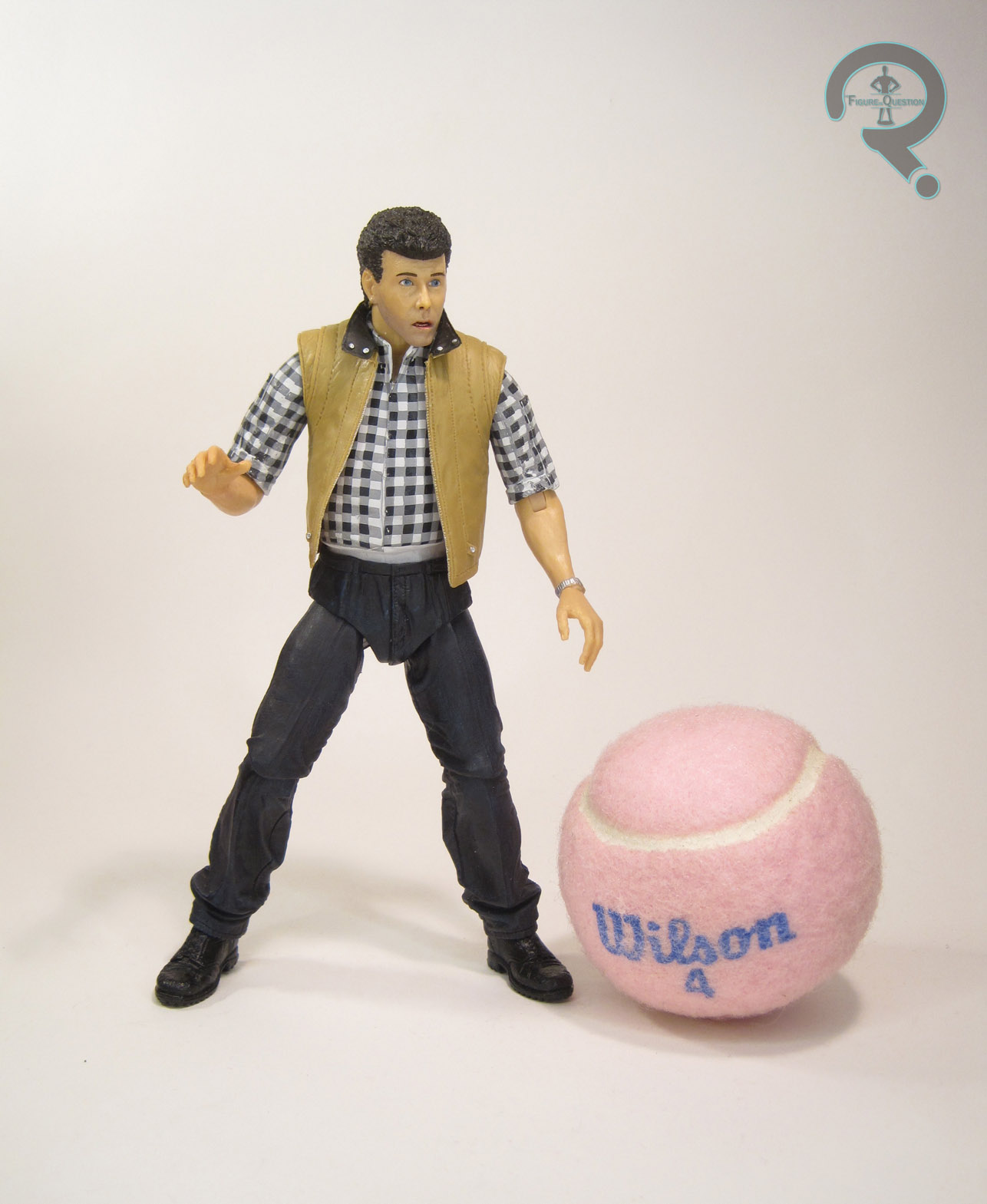
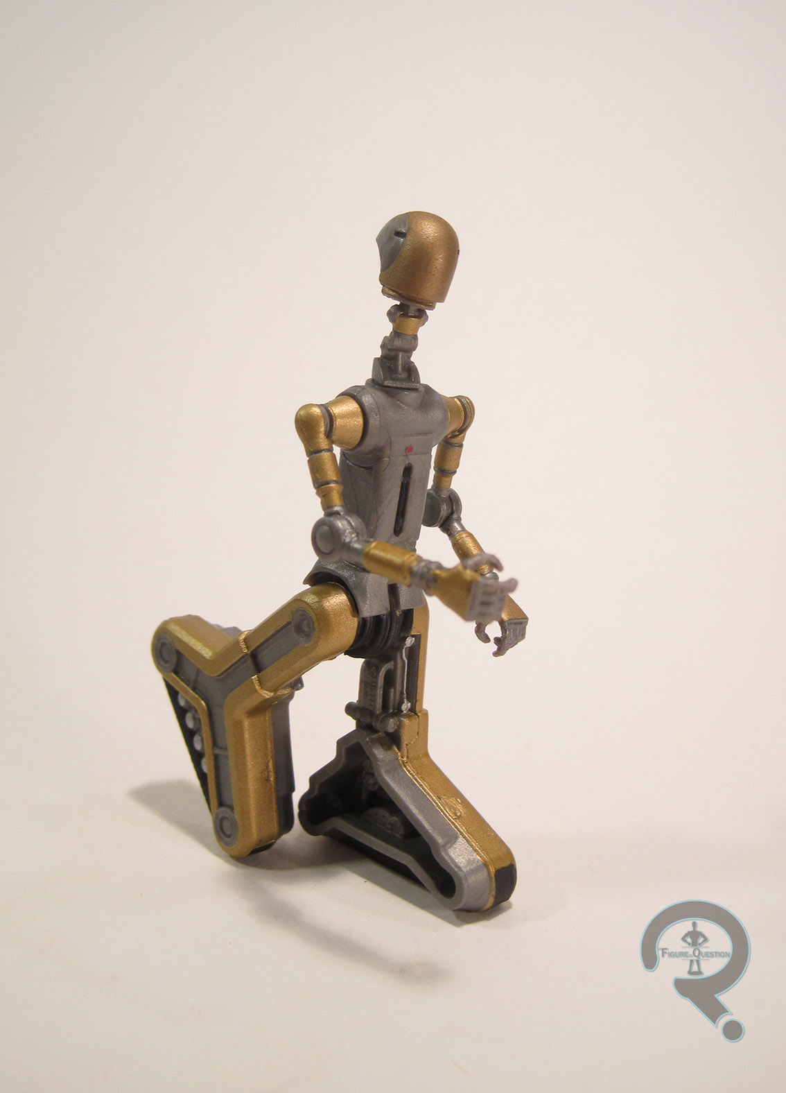
Concept Han Solo was released in the seventh wave of Star Wars: 30th Anniversary Collection, as figure 47 in the line’s overall count.  He was the seventh of the Concept figures (there was one of them per wave), and is a slightly odd-ball figure in an otherwise Return of the Jedi-based assortment of figures.  The figure stands 3 3/4 inches tall and has 18 points of articulation.  Han was sporting an all-new sculpt, obviously based on McQuarrie’s early design of Han.  Ultimately, it;s rather far removed from Han’s final character, and seems to have more in common with Obi-Wan Kenobi’s final character, especially as seen in the Prequel Trilogy.  Still, it’s a pretty solid piece of retro-sci-fi design work, and the figure’s sculpt does a rather admirable job of replicating it in three dimensions.  It keeps a lot of McQuarrie’s style, but adds a touch or realism, so he’ll still fit in with the standard movie figures.  There’s a ton of detail work going on, especially on the various parts of his uniform.  If I have one complaint about this figure, it’s the way his articulation works.  It’s not bad; as a matter of fact, he comes from when Hasbro was really starting to improve the movement on their figures, so he’s got a lot of posablity. With that said, the joints aren’t always worked in so well, and when posed, they can leave him looking a little bit odd.  Han’s paintwork is actually pretty solid, and much more detailed than your average Star Wars figure.  The base colors all match up pretty well with the original concept work, and there’s a ton of accent work, which adds a lot of dimension to this figure that a good number of his contemporaries lacked.  Han was packed with a lightsaber (both on and off) and his blaster pistol.  They resemble the final film’s props, but are definitely more classic sci-fi, especially the saber, which has a cool energy flare effect going on at its base.

THE ME HALF OF THE EQUATION

The McQuarrie Concept figures have always fascinated me, but for one reason or another, I’ve just never tracked them down.  And, honestly, if I was going to get just one of them, it probably wouldn’t be Han.  With that said, I was out with Super Awesome Girlfriend two weeks ago participating in Ellicott City’s Midnight Madness, and I found this guy at All Time Toys.  I wasn’t 100% sure I was going to get him, but she insisted on buying him for me, so here he is.  He’s actually a pretty solid figure, truth be told, and he has a fun bit of history behind him.  Now I definitely feel the need to track down the rest of these guys!

#1510: Apollo

APOLLO

THE AUTHORITY (DC DIRECT)

“Apollo, The Authority’s mightiest member and partner to Midnighter stands ready to turn his super-strength and speed to taking care of the team’s business…no matter what the cost!”

Isn’t it a bit weird when a parody character is owned by the same company that owns the original character?  Because, that’s kind of The Authority.  They’re a dark parody of the Justice League, injecting the more idealistic League with a healthy dose of ‘90s anti-heroism.  To be fair, they weren’t originally owned by DC; they came out of Jim Lee’s Image Comics-borne Wildstorm imprint, which Lee sold to DC when he decided he didn’t want to be a publisher anymore.  The New 52 made them an official part of the main DCU, so now there’s a parody Justice League that exists in the same universe as the actual Justice League.  What a world we live in.  Anyway, today I’m looking at the resident “Superman” of the team, Apollo!

THE FIGURE ITSELF

Apollo was released in the first, and only, series of DC Direct’s The Authority line in 2002, alongside his husband Midnighter, team leader Jenny Sparks, and the Engineer.  The figure stands about 6 1/4 inches tall and has 9 points of articulation.  His prototype had 11 points of articulation, but somewhere along the way, he lost his wrist joints.  While Apollo obviously draws from Bryan Hitch’s take on the character (since I believe he was still the only artist to draw him at this point), it’s not an artist-specific figure like a lot of DCD’s later stuff would be.  Instead, he’s been interpreted into DCD’s house style of the time.  It gave their earlier offerings a more cohesive look, which I suppose isn’t the worst thing.  He’s just a little blander than Apollo usually tends to be.  The pose is also a bit stiff, but that’s just true of this era of DCD figures.  The figure’s also rather scrawny for Apollo, who should ideally be sporting the same basic build as Superman.  Nevertheless, this figure’s got about half the body mass he should; he almost looks more like Kid Apollo from the Authoriteens.  Apollo’s paint is decent enough for what it is.  He does end up looking a bit washed out, but that’s true of the design from the comics.  It’s a bit tricky to do the creative lighting of the comics in three dimensions.  I suppose they could have made the white pearlescent or something, but they weren’t really doing stuff like that at this point.  I do like that they’ve done some accent work on his hair, and the details on his face are pretty sharp, so it’s hardly like they phoned it in or anything.  Apollo included no accessories, not even one of the display stands DCD were so fond of for a while.  That seems a little light given what he cost, but I don’t really know what you could have given him.

THE ME HALF OF THE EQUATION

So, I’ve never actually read any of The Authority or even any non-Authority stories with Apollo in them.  My entire exposure to the character is having seen this particular figure solicited back in 2002, and then reading up on him in preparation for this review.  Why do I own this figure, you ask?  I was at All Time Toys on Small Business Saturday, and I had grabbed a handful of loose figures.  They have a deal on loose figures, where you get a discount if you buy so many.  Long story short, Apollo ended up running me about 50¢.  I can get behind a 50¢ action figure.  Of course, now I’ve got this compulsion to track down the other three Authority members, which is just downright silly, isn’t it?

#1499: Carter J Burke & Xenomorph Warrior

CARTER J BURKE & XENOMORPH WARRIOR

ALIENS (NECA)

It’s been a little while since I’ve given Aliens its proper due.  Even longer since I did it by looking at some sweet NECA figures.  In fact, the last NECA Aliens figures I looked at were the re-releases of Hicks and Hudson.  As awesome as those were, there wasn’t a whole lot new to them.  Today’s review is different.

Though the Alien franchise’s most prominent antagonists are the titular creatures of each film, they’re more of a chaotic, not exclusively evil entity.  The real antagonists of the story are mostly employees of the duplicitous Weyland-Yutani company.  Perhaps their most vile operator is Mr. Carter J. Burke, who serves as a major draw of today’s set of figures.

THE FIGURES THEMSELVES

Burke and the Xenomorph Warrior were released just about a month ago as part of the “Hadley’s Hope” two-pack, which is part of NECA’s overarching Aliens line.  These two join the Marine Two-Pack, as well as Vasquez and Frost under the 30th Anniversary banner.

CARTER J BURKE

“I’m Burke. Carter Burke. I work for the company. But don’t let that fool you, I’m really an okay guy.”

Don’t let the quote above about not being fooled fool you: he’s not really an okay guy.  Fortunately, the same isn’t true of his actor Paul Reiser, which is why we have this figure.  Apparently, after being informed during a Q&A that all it would take to get NECA to make a Burke figure was his sign-off on the likeness rights, Reiser made it a point of contacting them and making sure this figure became a reality.  Good on you Paul!  Burke is seen here in his casual attire he sports on LV-426, which is sensible, since he’s there for most of the movie.  The figure stands 7 inches tall and he has 26 points of articulation.  Burke’s sporting an all-new sculpt, and it’s up to par with the rest of the line’s offerings.  Structurally, he reminds me a little bit of Bishop, although they’ve definitely gotten a bit more comfortable with the use of overlay pieces integrated with articulation.  The head has a pretty solid likeness of Reiser.  They’ve gone with a panic-stricken Burke, which I think really works for the character, in the same way that it worked for the first Hudson.  I know some collectors wanted a more sly expression, but I find I prefer this.  Burke’s paintwork is pretty decent overall, apart from a few small nits.  The biggest flaw is the plaid of the shirt ending just a bit too early, thus leaving some un-painted white exposed.  It’s not the end of the world, and honestly isn’t that noticeable if you’re not looking right at it.  Beyond that, the paint’s pretty solid all-around.

XENOMORPH WARRIOR

Apparently, the humans don’t move so well at retail, so Burke needed an Alien to keep him exciting.  I have a lot of Xenos, so they don’t always thrill me, but I’m okay with it if there’s a good gimmick, which I think this one has.  It’s another concept figure, based on pre-shooting design for the Aliens Xeno Warriors.  It’s really just the same design, but with a dome on the head.  For the actual film, the domes kept breaking due to the more strenuous tasks performed by the aliens, so they were ultimately removed, creating the design we all know now.  It’s a neat little what-if.  The figure stands about 8 inches tall and has 39 points of articulation.  This Xeno makes use of a number of parts from the Series 1 Xeno Warrior, but not as many as you might think.  The head’s been tweaked to add the dome, the torso’s been tweaked to make the back fin a permanent piece, the hands, pelvis, upper arms, and upper legs are new pieces to add articulation.  It all adds up to a figure that looks rather similar to the prior figures, but is much sturdier and a lot easier to pose.  I loved the old figure, but this is definitely an improvement, and I look forward to seeing more Xenos built on this same base body.  The paintwork on figure is rather similar to the black Genocide alien’s.  It works for me, and I’m just happy it’s cleaner than prior Xenos.

Neither figure really comes with any character-specific accessories, but the set does also include the Hadley’s Hope town sign, which is a pretty awesome backdrop piece, and just a fun idea in general.

THE ME HALF OF THE EQUATION

I grabbed this set from my usual go-to for NECA stuff, All Time Toys.  I knew it was hitting, and I made a point of stopping by to grab it.  Burke’s obviously the star here, and he turned out very nicely.  The Xeno’s actually one of my favorites from NECA, and I’m happy to add it to the shelf.  All around, and awesome set, which I’m thrilled to add to my collection.

*Want a Carter J. Burke figure of your very own? Our sponsors over at All Time Toys currently have this set in-stock. Click here to check it out!

#1317: Corporal Dwayne Hicks & Private William Hudson

CORPORAL DWAYNE HICKS & PRIVATE WILLIAM HUDSON

ALIENS (NECA)

“I’m Hudson, sir; he’s Hicks…”

Ever buy something you don’t actually need?  I know, I’m on dubious ground here, seeing as I run a whole site devoted to things I don’t technically need.  I guess in this context, I’m referring to figures that I more or less already own.  In terms of re-releases and the like, I tend to skip them.  Today’s review sort of violates that rule, in that there’s not *technically* anything new about either of the figures I’m reviewing here.  I’ve reviewed every single piece of both figures before (here, here, here, and here).

A little backstory: I got into NECA’s Aliens line on the ground floor, pre-ordering Series 1 a good couple of months before it hit shelves, and then picked up every single release up until Series 6.  This means I had both versions of marines Hicks and Hudson, who were in the first series and then each packed in a two-pack with a Xeno.  However, there are good number of people who didn’t enter the line until around Series 5 or so, when the Aliens version of Ripley was released.  This caused a significant jump in the aftermarket prices on both Hicks and Hudson, especially as more of the marines have been released.  Not wanting to leave fans missing two major characters from the movie, NECA’s taken advantage of the film’s 30th Anniversary to put out a special two-pack, which offers up both characters again at retail.  As I said, technically speaking, there’s nothing new to these guys.  So, why am I reviewing them?  I’ll get to that.

THE FIGURES THEMSELVES

Hicks and Hudson were released as a two-pack within the 30th Anniversary Collection sub-set of NECA’s main Aliens line.  They are meant to compliment Series 9’s Vasquez and Frost figures, and they started hitting in March, wedged between Series 10 and 11.

HICKS

Hicks is perhaps one of my favorite movie characters of all time, so by that grace, he gets to go first.  If you’ve read my two prior Hicks reviews, you’ll know that this figure stands about 7 inches tall and has 30 points of articulation.  You’ll also know that I’m a pretty big fan of the sculpt, particularly the body.  None of that has changed, apart from the body having slightly sturdier joint construction this time.  This figure has both the un-helmeted and helmeted heads of the single and double-pack versions of the character.  Of the two, my favorite is definitely the un-helmeted head.  It’s more calm expression works better for the character, and lends itself to a more recognizable Beihn likeness.  The helmeted head is okay, but I don’t care for the screaming expression, and I feel the helmet sits a bit too high.  The real, important difference on this figure is the paint.  While it’s just cleaner in general, the major deviation is how the skin has been handled.  The Series 1 figures hit at a transition point for NECA, as they moved from painted to molded skin tones, and due to the size of the production and costs associated, the Series 1 Marines had painted skin.  It was far from awful, but later figures, most notably the recent Ripley and Vasquez figures, had the molded skin.  For the re-releases, NECA’s brought Hicks inline with the newer figures.  It’s really just a simple change on their part, but it makes for a major change in the quality of the figure.  The likeness on both heads is greatly improved by the lack of extra paint, and he looks far more lifelike in general, thanks to how the light hits plastic vs. how it hits paint.  In addition to the pair of heads, Hicks has his M41A pulse rifle, his shotgun for “close encounters,” a holster for the shot gun, a motion tracker, and a removable shoulder lamp.  Most of these pieces are identical to the original releases, but the shoulder lamp has been tweaked to make it much easier to get it placed on his back (a huge issue with the original figures).

HUDSON

Okay, I feel a little bad for Hudson, having just proclaimed Hicks one of my favorite characters of all time.  It’s okay Hudson, I still like you too!  When I reviewed the original figures, I had some issues with Hicks, but for the most part I was pretty solidly happy with both versions of Hudson.  This guy is essentially the same: about 7 inches tall, 30 points of articulation, and a pretty kickass sculpt.  Like Hicks, he has both helmeted and un-helmeted heads.  Unlike Hicks, I don’t really have a favorite of the two, since I find the likeness on both to be pretty solid, and the issue with the high sitting helmet is avoided.  He’s got the same tweaks to the paint as Hicks; everything is sharper overall (though there was a bit of errant paint on his un-helmeted head), and he’s got the new molded skin tone.  If I thought the figures were good before, there’s really no topping them here.  Hudson gets one more tweak on the helmeted head; the original helmet detailing was rather generic, and was missing Hudson’s character-specific graffiti.  This figure adds that back in.  It’s one of those things you don’t realize you miss until you see it, and then you really can’t un-see it.  Now the older figure just looks wrong (I mean, he always was, but now it’s a more nagging wrong-ness).  Hudson has the M41A pulse rifle, motion tracker, and removable shoulder lamp.

THE ME HALF OF THE EQUATION

I didn’t originally plan on getting these, since I had the originals.  Seeing them in person at All Time Toys kind of changed my mind, but I didn’t have the money to buy any figures, much less ones that were so similar to ones I already had.  But, then my Dad offered to get me an action figure or two in exchange for helping to put down a carpet at my Grandmother’s house (both a resourceful bribe and a reference to the fact that he bought me an action figure the last time I helped put down carpet.  I was 4 at the time, but the point still stands).  And I also wanted to buy something slightly bigger than the $4 Gambit figure to help support All Time after the Main Street Flood.  And I was killing time in Ellicott City.  So, these two came home with me.  I didn’t really have super high expectations of either figure going in, but I was very surprised to find just how much of an improvement both figures are over the prior releases.  They almost feel like different figures.  If you missed the initial releases, then you’ll be very happy with these.  If you have the originals?  Well, it’s hard to say.  I might have liked to get a few extras that weren’t seen on the prior figures (headset head for Hicks, non-bandaged arm for Hudson), but I understand why they weren’t included; it’s not doubt to avoid forcing those who have the originals into buying them again, just for a new piece or two.  Ultimately, even without any new pieces, I feel this set is different enough to warrant long-time collectors picking it up, but it really comes down to how much of a Hicks/Hudson fan you are.

Aaaand I just wrote over 1200 words about figures I already reviewed.  Wow.

#1312: Gambit

GAMBIT

X-MEN (TOY BIZ)

“Training in the Danger Room, Gambit has his hands full with a holographic Sentinel when he is rushed by a fully-armed Robot Fighter! Caught between a Sentinel and a hard place, Gambit pauses when the Robot Fighter suddenly launches its missiles!  Ducking just in time, Gambit turns to see the missiles destroy the Sentinel behind him, giving him a chance to fire his explosively-charged playing cards at the Robot Fighter and bringing him a hard-earned victory.”

The ‘90s X-Men line initially started as a pretty straight cartoon/comics-influenced, but as it progressed, Toy Biz started running out go authentic variants of the main characters, and had to start creating their own.  There were a number of gimmicky-themed series.  Today’s focus hails from one of those series.  So, let’s have a look at the X-Men’s resident lovable rogue (who also loves Rogue…wait, I’ve done that joke before…), Gambit!

THE FIGURE ITSELF

Gambit was one of the five figures that made up the “Robot Fighters” series of Toy Biz’s X-Men line.  It was Gambit’s third 5-inch figure, following the Light-Up Series release.  The figure stands about 4 inches tall (thanks to the hunch) and has 8 points of articulation.  At this point in the line, they were cutting back on the articulation on most of the figures (likely in an attempt to capture some of the McFarlane Toys style), so Gambit wasn’t unique in this.  The Robot Fighters designs were (largely) unique to the figures; Gambit takes a lot of influence from his main design, sans the coat, albeit with a few more armored bits and such.  I’m not really sure how the Danger Room set-up given in the bio text translates to this new design, but I find the design to be pretty cool, so I’m hardly complaining.  As far as the sculpt goes, the best part is definitely the head, which I think may be my favorite Gambit sculpt out there (Toy Biz seemed to like it too; it was re-used later down the line on a Strike Team Gambit).  It’s just really sharply detailed, and they expression looks really dynamic, and almost Kirby-esque.  I’m not sure what the headset is for, but it looks kinda neat.  This whole series was really hit pretty hard by pre-posing, and Gambit sticks with that.  He’s in this really deep crouching pose, and the articulation doesn’t let him get out of it.  It’s not the worst pose ever (there were some far worse ones in this very series), and you can actually change it up a bit and get some really cool mid-action poses, which works well for the proposed setting.  The detail work on the body is a little varied, which some areas being a little more detailed than others, but it’s pretty solid overall.  I particularly like the molded playing cards; the removable ones always seem to get lost!  The figure’s paint is pretty straightforward; the palette is definitely Gambit-like, and the application is all nice and clean.  Nothing’s been left unpainted, and there’s even some nice accent work on the hair and a few of the torso’s elements.  Gambit was originally packed with the Robot Fighter mentioned in his bio, officially dubbed the “Attack Robot Drone.”  It shots missiles, because it was the late ‘90s and everything had to shoot missiles.  I don’t have that piece, having acquired my Gambit figure second hand.

THE ME HALF OF THE EQUATION

I remember the Robot Fighters Series hitting retail, and I remember seeing them all over the place, but somehow I never ended up with a single one of them.  Gambit amends that.  I fished him out of the loose figures bin at All Time Toys.  This is the first figure I’ve bought from them since they re-opened after Ellicott City’s Main Street flood, so he’s kind of special to me.  The actual figure is honestly not half bad.  I mean, he’s uber-‘90s, but it’s at an enjoyable level.  I’m happy that I finally tracked this guy down.  I guess I should get the rest of them at some point.

#1258: Robotman

ROBOTMAN

DC UNIVERSE CLASSICS (MATTEL)

Wasn’t I just talking about DC Universe Classics a few days ago?  Okay, technically it was only in passing, since Catwoman was actually from one of the spin-off lines.  The main line is particularly noteworthy due to just how deep into the DC Universe it went (something that may have contributed to its downfall in the end, unfortunately).  One of my personal favorite subsets from the line was the Doom Patrol, who are one of my favorite DC teams.  I’ve looked at Negative Man and Elasti-Girl, but now it’s time for me to take a look at the team’s final founding (and most consistently present) member, Cliff Steele, better known as Robotman!

THE FIGURE ITSELF

Robotman was released in Series 10 of DC Universe Classics, which was the second Walmart-exclusive series in the line.  He was the first member of the Doom Patrol to be released, which was rather sensible, as he’s probably the most popular of the main three.  The figure stands about 6 1/2 inches tall and he has 23 points of articulation.  There are a few different Robotman looks to choose from, but Mattel went for his classic ‘60s design.  It’s definitely a wise choice; it’s easily his best design, and it’s one he’s returned to a number of times over the years.  Cliff is built on the medium male body, with his own unique head, hands, and upper torso.  The new pieces all fit pretty seamlessly with the pre-existing stuff, and it all does a really great job of capturing Cliff’s retro-sci-fi design.  The head is a pretty decent piece; it’s not quite as streamlined as Cliff frequently was in his classic appearances, but it’s a pretty close match.  That slightly less streamlined appearance is also there due to the removable scalp, which allows us a view at Cliff’s brain.  It’s a pretty fun little touch, which takes this figure from average to awesome.  The upper those isn’t too far removed from the basic piece, but adds a few of Cliff’s extra robotic bits, as well as the video monitor that allowed the Chief to keep in contact with the team when they were on missions.  Also, since the upper torso includes the ridges above each shoulder, some of the shoulder’s size is masked, thus remedying what I find to be the weakest aspect of the basic DCUC body.  Cliff’s paintwork is some of the cleanest DCUC had to offer.  In the comics, he was always just orange, but here he’s more of a copper sort of color, which looks really slick in person.  The black shorts preserve his robot modesty (and also break up the colors a little bit), and there’s some really sharp detailing on the monitor.  The straps for the monitor are a little rough around the edges, but not horribly so.  Robotman’s only extra was the torso of the series Collect-N-Connect figure Imperiex.  It would have been kind of cool to maybe get an extra robotic Chief head from when he replaced Cliff on one of the missions, since poor Niles was never going to get his own figure.  But, that’s honestly pretty issue-specific, and probably a bit much for a character that was already lucky just to be getting a figure at all.

THE ME HALF OF THE EQUATION

I found most of Series 10 at retail when it was released, but I never had any luck with Robotman.  It was made worse by the fact that I really needed to find a pair of them, since my Dad’s a huge Doom Patrol fan too.  Fortunately, my good friends at All Time Toys came through for me, and I was able to find two Cliff figures for a reasonable price.  Robotman is a great example of the sort of awesome stuff this line could do when they actually put in the effort.  He’s a lower tier character with exceptional execution, and just a really fun figure all around.  As much as I rag on Mattel, this guy is really one of my favorites, and the whole Doom Patrol set is just really fantastic.

#1143: Wonder Man

WONDER MAN

MARVEL LEGENDS (TOY BIZ)

wondermanml3

In a world where death is already meaningless, Simon Williams, aka Wonder Man, is the type of guy who’s still noted for not staying dead.  He’s the male equivalent of Jean Grey in that respect, I suppose.  The guy died at the end of his very first appearance (way back in the *first* Avengers #9) and thanks to a friendly warning from Marvel’s Distinguished Competition on the potential problems with infringing upon established brands, he stayed that way for a while.  But then the Competition didn’t actually follow their own warnings, and Marvel felt comfortable enough bringing Wonder Man back a few years later, ultimately making him full-fledged member of the Avengers for several years.  He’s died at least two more times since then (currently he’s sharing a body with Rogue, which is awkward to say the least, what with her killing him and all), but never been gone for all that long.  Simon’s never been an A-list character, but he’s managed to get his fair share of figures over the years, including three Marvel Legends figures, two of which I’ll be looking at today!

THE FIGURE ITSELF

wondermanml4Wonder Man was part of the eleventh series of Toy Biz’s Marvel Legends, officially dubbed the “Legendary Riders Series.” There were two different versions of Wonder Man available: the regular flesh-and-blood Wonder Man, and the variant Ionic Wonder Man.  Regardless of version, the figure stands 6 inches tall and has 35 points of articulation. Wonder Man has more than a few parts in common with the recently reviewed Captain Britain, being constructed from that same Black Panther body.  As I noted in my Captain Britain review, while the Panther body was certainly fine on it’s own, it was a slightly odd choice for pretty much every other character they used it for.  While it’s not quite as blatantly out of scale for Simon as it was for the good Captain, it’s still rather on the small side.  Also, for whatever reason, while the body looks decent enough on Panther and Captain Britain, it ends up looking kind of misshapen when used for poor Simon.  Not sure what the difference is.  One of the defining  traits of the Panther body was the unique texturing, which showed that it was a full-body costume.  Since Wonder Man’s design shows a fair bit of skin, his arms are all-new, and his torso has been slightly retooled to smooth out his neck a bit.  The weird thing is that they only removed the actual texturing, not all traces of those pieces being clothed, which means that Wonder Man ends up with these strange folds and wrinkles on his arms and neck.  Wonder Man also featured new pieces for his head, forearms, hands, shins, and feet, as well as an add-on piece for his belt.  Independently, all of the new pieces are decent enough.  The face seems a little low on the head, but not terribly so, and the boots, wrist bands, and belt all feature some cool detailing.  Why did I specify “independently?”   Because the pieces aren’t actually in scale with each other.  The head is too wondermanml1small, and the hands and feet are definitely too big.  The end result is a really odd looking guy.  The standard Wonder Man was painted to be sporting Simon’s fourth costume, which is probably his best known.  It’s not my personal favorite, but the odds of the Safari Jacket look ever getting a proper Legends release are probably slim.  The paint work is decent enough.  There’s some room for improvement, especially on the “W” logo, which isn’t quite shaped the right way and could have probably used a second coat.  That being said, the overall quality of the paint is pretty solid.  The variant Wonder Man represents his powered up Ionic look from when Busiek and Perez brought him back in the 90s.  Pretty much, he’s just molded in translucent indigo plastic, with some red for his eyes, logo, and belt.  Like the Hasbro version of this look, the inclusion of the belt on the Ionic form really isn’t accurate, and it’s made even weirder by the decision to paint the belt red.  Why would the belt remain red, but the wristbands and boots turn blue?  That makes no sense!  Ah well.  Each figure in the Legendary Riders Series included a vehicle of some sort.  Wonder Man’s is some weird W-shaped moped-thingy, which seems to exist for the sole purpose of reminding us all that Toy Biz didn’t have the foresight to realize just how few Marvel characters really fit the “Legendary Riders” theme.  He also included a little Yellowjacket figure, which could be plugged into his back, as well as a copy of Avengers #51 (an odd choice to include with this guy, since it doesn’t really explain the character very well, isn’t really anyone’s favorite Wonder Man story, and the look he’s sporting in the story is not the look he’s sporting on either figure).

THE ME HALF OF THE EQUATION

I’m a pretty big Wonder Man fan, so I was pretty anxiously awaiting his addition to the line for most of Toy Biz’s run on Marvel Legends.  Then the prototype was shown, and I was more than a little disappointed.  Then the final product showed up and I was slightly less disappointed.  I ended up getting the regular version as a Christmas present from my parents the year he was released, and I later picked up the variant loose from All Time Toys a few years later.  Ultimately, neither figure is really perfect, and I was always pretty aware of that, but I was happy to have them nonetheless.

wondermanml5

#1054: FA-4

FA-4

STAR WARS: LEGACY

fa42

So, I gave Star Trek its due, why not the other “Star” franchise?  Regular readers of the site will no doubt be aware of my less than stellar opinion of the three Star Wars prequels.  That said, regular readers will also be very likely to know that I don’t hate everything that came out of those movies.  Generally, it’s the stuff at the forefront of the screen that I don’t so much care for.  That stuff in the background?  Usually pretty cool.  Case in point: FA-4, the subject of today’s review.  Most people have no clue who this guy is.  Heck, I had no clue who this was, at least prior to purchasing this figure.  As it turns out, he’s the pilot of Count Dooku’s ship at the end of Attack of the Clones.  Far from a pivotal role, but literally everyone in Star Wars gets an action figure at some point.

THE FIGURE ITSELF

fa43FA-4 was part of the final “Droid Factory” series of the Star Wars: Legacy line.  Due to the move to The Black Series in 2013, the series was put on indefinite hold, until Amazon decided to pick it up as an exclusive item.  FA-4 was originally intended to be one of the Build-A-Droids, but was made into a single release figure instead when a few assortments were combined to form this last series.  The figure stands about 3 inches tall and he has 8 points of articulation, which is pretty good for the design.  The sculpt on this figure looks to be unique.  It’s quite nice, though it appears some liberties have been taken to make the design just a touch sturdier.  While I personally find it enhances the design, sticklers for screen accuracy might be a little letdown.  While FA-4 was a pretty basic design, the sculpt still manages to work in some cool small details, especially around there areas of the joints.  FA-4’s paintwork is quite nicely handled.  He’s molded in a basic gunmetal grey, with bronze accents, which look really sharp.  Despite his duller palette, I think he still manages to stand out.  FA-4’s only accessory is TC-70’s torso piece.  I’m not really planning on finishing him, so it doesn’t do a whole lot for me, but I can’t really think of much else FA-4 could have included.

THE ME HALF OF THE EQUATION

FA-4 was purchased for me by my Super Awesome Girlfriend, back in July.  He has the distinction of being the last figure that I purchased from All Time Toys prior to the Ellicott City Main Street flood, which has closed down them and several other businesses for at least the next few months.  With that in mind, this figure has quite a bit of weight to bear.  Fortunately, I think he delivers.  He’s a really fun, unique figure, who’s been made all the more special for me.

#0948: Cobra Viper

COBRA VIPER

G.I. JOE: 25TH ANNIVERSARY

Viper25th1

To be a successful evil organization, you need to have a few metric tons of faceless goons. Nothing says evil like some faceless goons! Evil terrorist organization Cobra (the ones that fight G.I. Joe, not the ones who sell health insurance) are practically the kings of the faceless goon: they’ve got a squad of them for just about every occasion! When the basic Cobra Troopers aren’t quite enough, then it’s time to send in the *slightly* more advanced Cobra Vipers! Let’s take a look at one of them today!

THE FIGURE ITSELF

Viper25th2The Cobra Viper was released in the 2008 assortment of the G.I. Joe: 25th Anniversary line. It’s the 16th version of the Viper Hasbro’s released, and it’s based on the classic Viper design from way back in 1986. The figure stands a little under 4 inches tall and has 20 points of articulation. While some of the 25th Anniversary figures made tweaks to the original designs, the Viper is a pretty shot-for-shot recreation of the original toy. The only real change is the move to slightly more realistic proportions (though that head’s a bit undersized). The general quality of the sculpt is pretty good, with lots of really nice detail work. They’ve even made his vest and goggles removable, allowing for a bit more customization and detail than the original figures offered. However, the figure isn’t without some rather notable flaws. First and foremost, there’s the hands. The Viper’s wrists are oddly contorted, which I assume is to allow him to hold his weapon, in theory at least. In practice, this doesn’t work, leaving him with very strangely positioned hands that can barely hold the included gun. Also, the separate goggles, while cool, are incredibly hard to keep in place, due to being just a touch too small for the head. On the plus side, the paint work here is pretty solid. The colors are all nice and vibrant and everything is applied very cleanly. They’ve even added some detail not present on the original, to help add a bit more depth to the design. The Viper includes his standard issue rifle and a Cobra-insignia-ed display stand with his code name printed on it. I do wish the rifle was molded in something other than that weird off-white, but it’s a fairly nice recreation of his original gun.

THE ME HALF OF THE EQUATION

I actually own three Vipers, all gotten at different times. I picked up the first one loose from All Time Toys, when I was on my first 25th Anniversary buying spree. The second came from Amazon so that I could get free shipping on another order. The final one was added much later, and I believe it also came from All Time Toys, though it was packaged. Is this Viper a perfect figure? No. The hands are pretty annoying, and there’s no real fix. The goggles, however, can be fixed with a small dab of superglue, so there’s that. The Viper’s my favorite human Cobra trooper, and this figure’s definitely serviceable. Hasbro’s produced far worse.

Viper25th3

#0861: Sarah Connor

SARAH CONNOR

TERMINATOR 2 (NECA)

SarahConner1

The first time I really noticed NECA was when they kicked off their pretty awesome T2 line several years back. The line actually had a pretty decent run of figures, but, aside from a single Kyle Reese figure towards the end of the line, they mostly stuck to the killer robots from the future. That meant that one of the franchise’s key characters, Sarah Connor, was sadly missing. Recently, under their “Ultimate” heading, NECA’s gone back to some of their older lines, making some slight adjustments to prior figures to make them fit with current offerings. For a first in the Ultimate sub-set, they’ve released a totally new figure, offering a Sarah figure to go with the recent Ultimate T-800.

THE FIGURE ITSELF

SarahConner2Sarah Connor is the second “Ultimate” figure in the Terminator 2 line. She’s a single release, though she shipped right around the same time as the second version of the Terminator Genisys T-800. The figure stands 6 ¾ inches tall and she’s got 24 points of articulation. Technically, she should be little shorter to be in scale with the T-800(Linda Hamilton’s 8 inches shorter than Arnold in real line), but she’s really not that far off. As noted in the intro, Sarah is not a re-tooling like prior Ultimate releases; she is instead an all-new sculpt, handled by Adrienne Smith. Her basic look is her black tactical gear from the mid-point to climax of the film. It’s easily the character at her most distinctive, so it’s well-chosen. The proportions on the body are pretty much spot-on, including Linda Hamiliton’s impressively toned arms. Seriously, she was jacked, and so is this figure. Her clothes are incredibly well detailed, with tremendous texturing, and just the right amount of weight. To ensure the best poseablity for the torso, the webgear is a separate (non-removable) add-on piece. It has the same great work seen on the rest of the body, and some amazing little touches, such as the unfastened buckle at the top of the vest, which looks like it’s really a separate piece. She also has a separate belt piece (also non-removable), SarahConner3complete with a sheath for her knife. Like the Ultimate T-800, Sarah includes three different heads: Ponytailed with hat and sunglasses, ponytailed without hat and sunglasses, and hair untied (once again without the hat and sunglasses). Some people have complained about not getting another head with the ponytail and sunglasses, like she’s shown on the front of the box. While it’s a shame that look isn’t represented, if we could only have three heads, these are the three I want. The hat and sunglasses head is my favorite of the three. The likeness is the best here, the hat is fantastically detailed, and while the sunglasses aren’t quite as clean as the T-800s, they still look pretty cool. The other two heads are no slouches either, doing a nice job of capturing Sarah as she progresses through the movie. Sarah’s paintwork is pretty solidly handled; all the base colors are where they should be, and there’s some nice work differentiating the blacks of the various parts of her outfit. The heads show a bit of slop around the hairlines, but the overall paint looks quite nice, and I was especially impressed by how well the eyes turned out on the two non-sunglassed heads. In addition to the extra heads, Sarah includes an m4 carbine, a colt 1911, and a knife (complete with a sculpted tassel at the end) that fits perfectly in the sheath on her belt.

THE ME HALF OF THE EQUATION

I got Sarah at the same time I got Chopper, though she was more of an impulse buy than a planned purchase. I was a little underwhelmed by this figure when viewing her in the packaging, but once I had her out and posed her a bit, I really came to enjoy the figure a whole lot. She’s a worthy companion piece to the T-800 to be sure, and I’m happy she finally got made.

SarahConner4