#1297: Yokai

YOKAI

BIG HERO 6 (BANDAI)

Hey, remember waaaaaay back in 2014 when Big Hero 6 was released?  And I picked up exactly one of the action figures?  Well, I got more.  Because that’s what I do, I guess.  Today, I’ll be looking not at one of the members of the titular team, but rather at their foe from the film, the kabuki masked dude whose name was apparently Yokai.  Who knew?  Well, Bandai knew, and I guess Disney also probably knew.  But I didn’t know, mostly because he’s not ever referred to as Yokai in the movie.  But, I guess putting the name of his alter ego on the package would be a bit of a spoiler, wouldn’t it?

THE FIGURE ITSELF

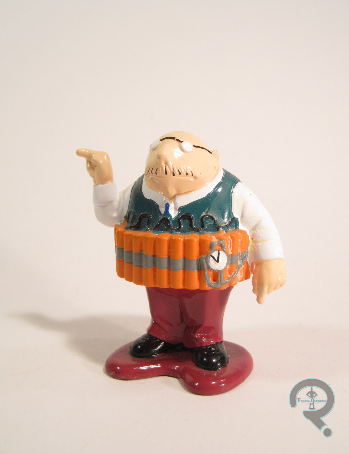
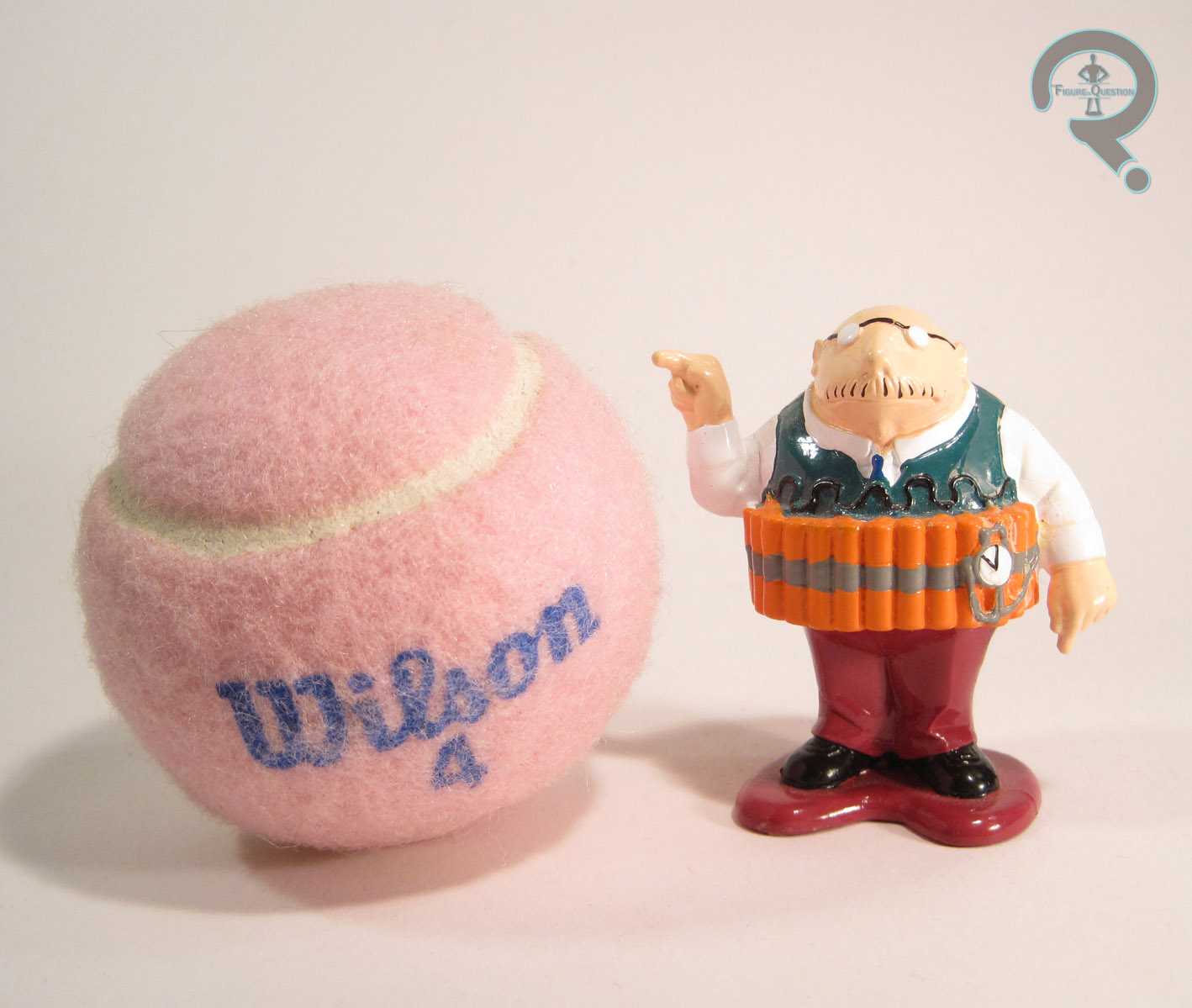
Yokai was released in the first series of Big Hero 6 figures from Bandai, alongside the six members of the team.  The figure stands a little over 3 1/2 inches tall and he has 13 points of articulation.  Yokai falls victim to the same problem that a lot of Bandai America’s output does: terrible relative scale in terms of the line as a whole.  As a full-grown adult, he should be pretty tall in comparison to the adolescent characters that make up the rest of the line, but due to Bandai’s very odd views on scaling, he’s at most a quarter of an inch taller than Hiro, a character he should tower over.  The way it’s done, Yokai feels like he’s from an entirely different line than the rest of the figures, barring maybe Baymax.  This is the same issue that plagued every version of Slade back when they were doing the Teen Titans figures, and it’s a shame they’re making the same mistakes a decade later.  Scaling issues aside, the sculpt isn’t terrible.  It’s hardly a perfect recreation of his on-screen design (which would be a good deal thinner), but he’s a passable recreation, I suppose.  There’s some pretty solid work on the various details of his costume, and it’s clear who he’s supposed to be.  I wish his coat was a bit less floaty, but it’s the sort of thing I’ve come to expect from Bandai America.  The paint work on the figure isn’t anything amazing, but it’s certainly passable.  The colors all match up with the character’s film design, and the application is all pretty clean.  The best work is on the mask, which is nice and bold, and helps him stand out.  Yokai is packed with a attachment for the hand that’s designed to simulate the nanobots Yokai uses in the movie.

THE ME HALF OF THE EQUATION

I had totally planned to grab a few more of the Big Hero 6 figures after I got Wasabi back in 2014, but I got kind of distracted by other lines of figures.  Back in March, I stumbled across most of the line for a deep discount at the nearest Ollie’s, which was enough to prod me into grabbing a set.  Yokai’s…okay.  After being pleasantly surprised by Wasabi, this guy feels more like an unfortunate return to form for Bandai America.  He’s still better than vast majority of the Teen Titans figures, and a perfectly enjoyable figure in his own right, but in the context  of the line as a whole, he’s got some definite issues.

#1227: Red Space Ranger

RED SPACE RANGER

POWER RANGERS: LEGACY (BANDAI)

redspacerangerlegacy1

When most people think “Power Rangers,” they think of the Mighty Morphin’ incarnation, which launched the show.  That’s pretty fair, as it’s by far the most distinctive, and represents the franchise at its highest point in terms of popularity.  I was born in ’92, so, while I still remember a little of Mighty Morphin’s original run, it’s not what I consider *my* Power Rangers.  That would be the show’s fourth incarnation, Power Rangers In Space, which is actually pretty well-regarded in the community, and is widely considered the season that saved the show, following the less than stellar performance of Turbo.  Unfortunately, nowadays, there’s very little product for any Power Rangers that aren’t either the current incarnation or the Mighty Morphin’ Rangers, meaning I’m mostly reliant on my old figures from the show’s original run.  I’d love some Figuarts, but those are little more than a dream.  Lucky for me, Bandai America is offering the next best thing, courtesy of their Legacy line.  I picked up Andros, the Red Space Ranger, which I’ll be looking at today.

THE FIGURE ITSELF

redspacerangerlegacy2The Red Ranger is part of the second series of Power Rangers: Legacy.  He’s one of the two In Space Rangers included in this set, with the other three figures hailing from Mighty Morphin’ (the  rest of the main In Space Rangers are in Series 3, and the Silver Ranger is as of yet unannounced).  Though the line has been touted as being about 6-inch scale and the figures are clearly designed to mimic Hasbro’s Marvel Legends, the Red Ranger stands 7 inches tall, placing these figures more in scale with the Masters of the Universe Classics or something from NECA.  There’s no commingling with the Figuarts Rangers, that’s for sure.  The figure sports 36 points of articulation, which is certainly an impressive count.  The movement on the joints isn’t terrible, but there are some slight oddities on a few of the joints, which means it can take a fair bit of careful posing to make sure he doesn’t look a little mangled.  Still, it’s a pretty major step-up from the last Banda America Ranger I looked at.  In terms of sculpt, the US Rangers figures have always skewed the proportions a bit more to the side of super-heroic.  This guy does some of that, but reigns it in a bit, resulting in a final product that is somewhere between the old figures and the actors in the suits.  I don’t mind the look, and it’s consistent with all the others from the line so far.  The sculpt is of varying quality.  The helmet is by far the best work on the figure, and it’s a pretty much pitch-perfect recreation of the helmet from the show.  The redspacerangerlegacy4body is decent, but the articulation sticks out more than a little bit, especially on the hips and shoulders.  The shoulders in particular feel like they’re set too far out from the torso, as if they got the length of the pegs off or something.  Also, it would appear that the forearms have been reversed, which makes them look rather strange.  By and large, he’s pretty solid, but there’s still some of that Bandai America flavor of “why would you do this?”  In terms of paint, the Red Ranger is pretty straight forward.  Everything is pretty basic color work; all the lines are nice and crisp and the colors are pretty much on point.  For extras, Andros includes his trusty Galaxy Blaster, as well as the torso and head of the In Space Megazord.  Bandai’s doing something slightly different with these figures and only packing corresponding Zord pieces with each Ranger (i.e. the Mighty Morphin’ Zord is only packed with those Rangers and so forth), meaning each Zord is spread over a minimum of two series. Time will tell how this works out for them, but the fandom seems rather split.

THE ME HALF OF THE EQUATION

I caught the first series of this line several times, but I don’t really have any attachment to Ninja Storm and I’ve already invested in the Figuarts versions of the original team, so I passed.  As soon as I learned the In Space figures would be part of the Series 2 line-up, I started looking out for this guy.  He seems to have been the hottest figure in the set, at least initially.  I finally tracked him down at my closest Toys R Us, back in January.  Ultimately, the figure’s okay.  I can’t say he’s fantastic, but he’s better than the usual Bandai America product.  I’m holding out to hear if there’s going to be a Silver Ranger before committing to the rest of the In Space team, but I can see myself picking up the occasional figure from this line (especially the Series 4 Gold Ranger).  If you don’t have the Figuarts stuff, I’d definitely recommend checking this line out.  I think lack of comparison may do these guys some favors.

redspacerangerlegacy3

#1202: Cheetara

CHEETARA

THUNDERCATS (2011)

cheetara1

You thought I was done with the Thundercats reviews, didn’t you?  Well, so did I.  But, I really don’t know how to quit buying action figures, and the more figures I have from any given line, the more reason I have to say “one more couldn’t hurt.”  Back in April of last year, I looked at Lion-O, Tygra, and the Tower of Omens from the 2011 re-launch of Thundercats.  Today, I look at yet another member of the team, Cheetara.  No points for guessing what cat she was.

THE FIGURE ITSELF

cheetara2Like Lion-O and Tygra, Cheetara was released as part of the first series of basic small-scale Thundercats figures from Bandai.  The figure is about 4 inches tall and she has 17 points of articulation.  After some genuinely impressive work with the articulation on Lion-O and Tygra, Cheetara is a real step down.  She gains bicep swivels lacked by the other two, but at the cost of wrist and ankle movement, and on top of that, the bicep joints are really ugly.  Also, instead of the nice hinged hips from the prior figures, Cheetara gets v-hips.  Oh goody.  My faaaaaavorite.  They seem to have attempted to make up for the v-hips by adding a pair of swivel joints to each thigh.  The first set of swivels are sort of the reverse ange of the v-hips, and the second is a more straight lateral cut.  In theory, they’re supposed to mimic the movement of a normal t-joint, I guess, but in practice, they’re just sort of a big mess of twisting meat.  And, they’re pretty hideous to boot.  But hey, I’m glad they didn’t ruin the figure by giving her those no good hinged hips from the other two figures; that would have been the worst.  Okay, I’ve ragged on the articulation, but what about the sculpt.  Well, for one thing, it’s pretty much torn apart by all that ugly articulation.  Even on its own merits, though, it seems like a step down.  The head is okay, I guess, and the torso sort of tries to capture her cartoon design, but the arms and legs are just a total mess.  They lack any real organic shape and seem to be out of scale with the head and torso.    Her hands are the same size as her head for pete’s sake!  It’s a sad state of affairs when a figure’s paint being “acceptable” is the high point of the figure, but here we are.  There’s nothing really spectacular about the work, but it’s mostly pretty clean, and the colors match up well enough with the cartoon.  There’s some slop in a few areas, but given the rest of this figure, it could be worse.  Cheetara includes one accessory: her staff.  It’s made out of soft plastic, which makes it look more like a brown spaghetti noodle than anything else.  Also, since she lacks any wrist joints, she can’t really hold it very well.

THE ME HALF OF THE EQUATION

When I picked up Lion-O and Tygra two summers ago, I had also wanted to get a Cheetara, but Yesterday’s Fun didn’t have her.  In the year following, they must have picked her up along the way because I got her from them last summer.  She’s disappointing to say the least.  I mean, I’m glad to have her, I suppose, but after being pleasantly surprised by Lion-O and Tygra, Cheetara was a sad return to form for Bandai America.

#1170: Trunks

TRUNKS (PREMIUM COLOR)

S.H. FIGUARTS

trunks1

For day 4 of my post-Christmas reviews, I’ll be taking at something slightly different. Not totally different, since it’s Dragon Ball Z, from which I’ve already looked at three figures from that ‘verse.  It’s just been over a year and a half since my last one of those. There’s a definite theme to my DBZ collection, with all of them being key players in “The Android Saga,” which happens to be the one arc of the series I really followed from start to finish.  Today’s figure, Trunks, follows that theme, being one of two major protagonists introduced during said arc.  Let’s take a look at him!

THE FIGURE ITSELF

trunks2Trunks was initially released as one of the earlier figures in the DBZ-subset of S.H. Figuarts.  He proved to be one of the most popular figures in the line (not surprising, since Trunks has long had a sizable fanbase), giving quite the hefty aftermarket value.  To make it a bit easier for fans to get some of the earlier, more prominent characters, Bandai’s started putting out “Premium Color” variants, which  tweak the paint jobs of the figures ever so slightly, but otherwise serve as pretty straight re-releases.  The re-released Trunks hit early last year.  The figure stands about 5 1/2 inches tall and he has 43 points of articulation.  Trunks went through a number of different looks on the show, but this figure is based on Future Trunks’ initial appearance during “The Android Saga,” which is of course prior to the appearance of Present Trunks, who started off as a baby…it’s a little confusing, so don’t try to think about it too much.  The trunks3point is, this is Trunks’ original look, and in many ways his best look.  It’s certainly the most definitive.  His sculpt does an admirable job of translating his animated appearance into three-dimensions.  It’s not a pitch-perfect recreation of him, but seems more like an idealized sort of “what he would look like if the animation could always be totally consistent” sort of version of him.  As an animated figure, he’s a lot more stylized and has less fine detail work than, say, one of the Super Sentai figures.  That being said, there’s still a lot of really sharp detailing to be found on this guy, especially on the hair and jacket.  In his default, packaged form, Trunks is sporting his non-Super-Saiyan hair and a basic face with an intense stare, which are definitely solid pieces, and a very good choice for the default version of the character.  He also includes a second non-Super-Saiyan face, this time sporting trunks5gritted teeth, which can be swapped out in a similar fashion to what was seen with Androids 17 and 18.  There’s also a separate Super-Saiyan head, which has three faces of its own (intense stare, gritted teeth, and screaming).  All of them swap out with relative ease (though they’re a little difficult to get popped in place the first time; be careful of all those points on the hair, they really hurt!).  Trunks’ paintwork is all pretty solid.  The earlier version had more variation in some of the colors, but I find this one is a bit sharper overall, which just looks all around better to me.  The colors look to match up pretty well to his onscreen counterpart, and fit well with the other figures I’ve gotten.  In addition to the previously mentioned extra head and faces, Trunks also includes five pairs of hands (fists, gripping, flat, wide-spread, and gesturing), his sword, a scabbard to go with it, and a “dummy” hilt to go in the scabbard so that you don’t risk breaking the sword.  The extras are all a lot of fun, though my figure did wind up with a broken peg where the scabbard plugs into the shoulder.  Make sure to be extra careful when removing that!

THE ME HALF OF THE EQUATION

I almost bought Trunks’ original release way back when he was still new.  I was in NYC with my family, and Midtown Comics had one.  However, at that point I had yet to get into the import game and just couldn’t conceive of paying a whole $35 for one figure.  How foolish I was.  Obviously, by the time I picked up the Androids, Trunks was going for a lot more than $35, so I wasn’t getting him then.  I knew he was getting a re-issue, but somehow its actual release slipped under my radar.  I ended up spotting him at Barnes & Noble around Thanksgiving while out with my family.  I offhandedly mentioned wanting the figure but not having the money and thought nothing more of it.  A few weeks later, I went back to the store to buy a gift for my brother and Trunks was gone, and I just figured he wasn’t meant for me.  Cut to Christmas morning, opening my first gift from my parents, and there this guy is.  As it turns out, my mom took note of my interest, and while I was grabbing something from the B&N cafe, she went back and purchased this guy.  She’s a crafty one!  I’ve quite pleased with this guy, and happy to have finally gotten him.  Of course, now my resolve to hold off on getting more of these guys is being worn down…

trunks6

#1169: Akazonae Royal Guard

AKAZONAE ROYAL GUARD

MEISHO MOVIE REALIZATION (BANDAI)

royalguardmr1

Alright, we got the Aliens, we got the Super Heroes, so for Day 3 of the post-Christmas reviews, why not look at another cornerstone of my collecting habits: Star Wars!  In fact, this one is a double whammy, being both Star Wars *and* a high-end Bandia figure.  Huzzah!  The main Star Wars toy license for North America is held by Hasbro, who are pretty big into exclusivity and no-competition deals.  Because of this, no other toy company can release Star Wars figures under a certain price in the US, which is why the Star Wars Pop!s are bobble heads, and the Star Wars Sideshow figures carry a hefty price tag.  There are a few workarounds, however.  Bandai’s recently been putting out a line of concept figures, envisioning certain Star Wars characters as they might appear were they in a Samurai film, rather than a Sci-Fi one.  They’ve done a handful of the various Imperial Troopers and today I’ll be looking at my personal favorite, the Akazanae Royal Guard.

THE FIGURE ITSELF

royalguardmr2The Akazonae Royal Guard was released as the sixth figure in Bandai’s Star Wars: Meisho Movie Realization line.  He was originally slated as the fourth release, but was pushed back to follow variants of the Trooper and Darth Vader, and he ultimately hit just this past summer.  The figure stands about 7 inches tall (which was actually a bit larger than I was expecting, but I’m certainly not complaining) and he has 43 points of articulation.  The articulation has a bit of a learning curve to it.  It seems rather stiff at first, but once you get the hang of it, he’s actually a lot of fun to mess around with.  His sculpt is mostly unique to him, but it does appear that he shares at least some parts of the legs with the Storm and Sandtroopers, which is certainly reasonable from a consistency standpoint.  As far as the sculpt goes, he’s a bit tricky to review, what with not actually being based on any specific design.  With that being said, the sculpt is definitely a top-notch piece of work, and it does a good job of combining the Royal Guard’s film design with actual, functioning Samurai armor.  He’s a touch more ornate than previous figures (barring maybe Darth Vader), as he well should be, being an elite royal guard and all.  There’s lots of fun, little details sprinkled throughout the figure, and he incorporates some really nice layer work.  Also, I appreciate that, when configured certain ways, this figure can almost pass for just a slightly more armored version of the standard Royal Guard.  Were he not just a bit larger-royalguardmr3scaled, I’d probably just throw this guy in with my Black Series figures.  You might think that the paint work on this guy might be lax, being pretty much entirely red and all, but he’s actually got some pretty incredible work.  The actual hard armored parts have a nice, semi-gloss sheen, which contrasts nicely with the duller finish of the rest of the figure.  He’s also got a few different shades of red, which keep the whole look interesting.  He’s also got some really great accent work; there’s a black wash on a lot of the armored pieces, giving it a nice worn-in sort of feel.  There’s also some blue/indigo piping on a few sections, which adds a nice bit of flair, and really helps to break up all the red.  All around, this is just a very vibrant, very bold figure, especially when compared to the other figures in the line.  The Royal Guard includes a Katana, a scabbard, a large staff, three pairs of hands (in fists, loose, and tight grip), and a tabard that can be swapped out with the insignia on the front of his armor, thus creating a more classic Royal Guard look.  It’s a fun assortment of pieces, and provides a number of cool different looks.

THE ME HALF OF THE EQUATION

The Royal Guard was a Christmas present from my boy Tim.  I’d actually checked the figure out a few times, and it was the first of the Movie Realization figures to really speak to me.  Tim and I had a few conversations about the figure back when it was solicited, and it seems he took note of that.  I really like this figure, a whole lot.  There’s just so much about the design that really works, and I definitely feel he’s the strongest of the Movie Realization line, despite being one of the more minor designs presented therein.  There’s just so many fun ways to pose him and have him interact with others, and now I’m seriously considering picking up one or two of the others in the line at some point (a very dangerous venture indeed).  Thanks, Tim…

royalguardmr4

#1028: Freddie Mercury

FREDDIE MERCURY

S.H. FIGUARTS

Freddie1

“…I’m just a poor boy, I need no sympathy. Because I’m easy come, easy go, little high, little low. Anyway the wind blows doesn’t really matter to me, to me….”

So, hey, how about something different? Up to this point, I’ve looked at figures based on super heroes, science fiction, fantasy, horror, comics, movies, and video games. That’s all well and good, because that’s a pretty diverse selection. But you know what’s missing? Music. Yeah, this site could stand to have a little bit of music! If we’re going to do the whole music thing, why not start with one of the greatest frontmen of all-time from one of the greatest bands of all time? Yes, it’s Freddie Mercury, lead-vocalist of Queen!

THE FIGURE ITSELF

Freddie2Freddie was released as part of Bandai’s S.H. Figuarts line earlier this year. It’s not the first time Freddie’s had a figure; NECA put out a couple of figures of him about 10 years ago. However, those were back before NECA really got into the articulation thing, so they were little more than glorified statues. This figure goes completely the other direction in that regard, with 30 points of articulation. The range of motion on those joints is also pretty killer; though the elbows and knees are technically just single joints, they have the same range as double joints. What’s Freddie4more, the articulation is worked into the sculpt very nicely, so none of the joints really stick out or anything. Freddie stands about 5 ¾ inches tall, which puts him in proper 1/12 scale. Obviously, he fits in pretty well with the rest of the S.H. Figuarts line (though maybe not quite stylistically), but he also fits in pretty decently with the likes of Star Wars: The Black Series and Funko’s various Legacy Collection lines. Freddie is based on his appearance from his 1986 performance at Wembley Stadium, which is a pretty good choice, since it’s definitely one of his most recognizable. It’s also pretty visually interesting, which is always paramount when it comes to action figures. The sculpt on Freddie is quite nicely handled. He’s a bit more realistically proportioned and detailed than some Figuarts figures, which I definitely appreciate. The likeness is quite good on the basic head, which is impressive, since likenesses aren’t typically a Figuarts thing. While the general details are more on the realistic side, there’s definitely still a bit of a stylization to the overall look of the figure, mostly in the harsh creases on the clothing. It’s not so stylized that he looks artificial, but it’s enough to add just a bit of dynamism to the figure. The paintwork on Freddie is some of the best I’ve seen on a Figuarts figure. It’s not that previous figures had bad paint (because they didn’t), but more that they never attempted to be an actual, real life person, which this one does. And it does it rather well. Sure, it’s not Hot Toys or anything, but it’s also half the size and a quarter of the Freddie7price. The paint on the clothes is nice and bold, and makes him stand out nicely, while the paint on the face is subtle and lifelike, so he doesn’t just look like a cartoon version of Freddie. They even added a little of paint to represent his chest hairs. That’s attention to detail. Part of the appeal of Figuarts is the amount of extras included with each figure. Freddie is no exception. He includes two extra singing heads, four pairs of hands (fists, tight grip, loose grip, and open), a microphone on a stand, and a mic on its own. The heads are definitely the star attraction here, and they offer a ton of fun when it comes to posing. The extra hands allow for a number different looks as well, and the mics are very good recreations of the real thing.

THE ME HALF OF THE EQUATION

Freddie was a birthday present from my parents. He’s one of the ones I specifically requested, as I’ve actually been eyeing up this figure since it was announced back in October. He’s definitely outside my usual arena of collecting, but you’ve got to go outside your comfort zone sometimes, right? Especially when it comes to a figure this good. Freddie is definitely the best Figurarts figure I’ve gotten, which is no easy feat, let me tell you. This is certainly one of my favorite figures of the year!

Freddie6

#0987: Dynamole

DYNAMOLE

THE TICK

Dynamole1

SPOOOOOON!!!!!!!!

Does anyone else love The Tick?  Because, let me tell you something: I love The Tick.  I super-duper love The Tick.  I love the comics, I love the cartoon, and I even love the short-lived live action show.  Through his many adaptations over the years, the Tick and his supporting cast have been privy to a number of different styles of toys and action figures over the years.  None of them have quite lived up to the awesomeness of the source material, but I think they’ve all at least tried.  In the 90s, when the cartoon was on the air, Bandai America tried their hand at a few different lines, including a smaller scale line of figurines that covered a large number of cast members, both major and minor.  On the more minor side of things is Dynamole, a minion of the villainous Chairface Chippendale.  Not necessarily one of the most exciting characters from the show (or even the most interesting bomber on the show.  That would be the Evil Midnight Bomber What Bombs At Midnight!), but he was part of the ensemble none the less.

THE FIGURE ITSELF

Dynamole2Dynamole was part of the first (and only) series of Bandai’s small-scale The Tick line.  He stands about 3 inches tall (making him to be too large to be in scale with most of the other figures in the line, a common issue with Bandai America’s products) and zero, count ‘em, zero, points of articulation.  This guy and all the figures in this particular line were deliberately designed as figurines, not as full functioning action figures, so none of them got any movement.  The pose you see here is the pose that you get…for eternity.  He’s also permanently attached to a stand, one would assume for additional stability.  Dynamole’s pose is fairly generic, standing straight up and down sort of look, with his right arm bent outwards and his index figure pointing out as if he’s about to press a button or something.  Presumably, it’s a detonator of some sort.  The actual quality of the sculpt is overall pretty decent, if nothing particularly noteworthy.  He looks like the character from the show, which is the important thing.  The details could stand to be a little more defined in several spots, but it’s hard to tell if that’s truly an issue with the sculpt or if it’s to do with the paint.  Speaking of the paint, while the colors are pretty decent, the actual application is incredibly thick, and the details only tend to be in the same approximate area as the sculpted elements.  The paint is also incredibly glossy, which is a slightly odd choice, since I don’t believe Dynamole is supposed to be slimey or shiny or anything.  Kinda weird.

THE ME HALF OF THE EQUATION

Somehow, I managed to miss out on most of the cartoon-based Tick merchandise when it was still new.  I ended up finding Dynamole and most of the other figures from this particular line at a nearby antique store a few years back.  I mostly got Dynamole because I was buying the set, and I mostly bought the set because it was the most expansive selection of characters from the show that was readily available.  Ultimately, Dynamole isn’t a super exciting figure, but he’s interesting enough, and looks decent with the rest of the set.

#0974: Chojin Sentai Jetman Black Condor

CHOJIN SENTAI JETMAN BLACK CONDOR

S.H. FIGUARTS (BANDAI)

BlackCondor5

“Jeto-jeto-jetoman! Danananana!”

Chojin Sentai Jetman Theme Song (paraphrased)

So, here’s a figure with a pretty cool backstory. Back in 1993, when Saban was looking at importing a Super Sentai series to the US, they had two possible options:  Kyoryu Sentai Zyuranger or Chojin Sentai Jetman. Zyuranger was chosen for a number of reasons (the inclusion of a sixth ranger and the popularity of dinosaurs at the time being the most commonly cited) and eventually became Mighty Morphin’ Power Rangers. However, Jetman was a pretty serious contender, thanks to it being one of the most popular incarnations of the Super Sentai franchise. It was also inspired by Gatchaman (better known as G-Force or Battle of the Planets in the US), which gives it some pretty awesome pedigree. Today, I’ll be looking at the guy who was almost the first Black Power Ranger, Black Condor (who is under no circumstances to be confused with DC Comics’ Freedom Fighter Black Condor).

THE FIGURE ITSELF

BlackCondor3Black Condor was released as part of the Super Sentai sub-set of Bandai’s S.H. Figuarts, towards the end of 2012. He’s the second of the two Jetman figures Bandai released in the line, with the first being Red Hawk. The figure is about 5 ¾ inches tall and he has 38 points of articulation. Zyuranger and Jetman’s designs weren’t too far removed from each other, and as such, this figure feels pretty similar to the Mighty Morphin’ figures I looked at a ways back. The Jetman designs are a bit sleeker, and a bit stronger, if I’m honest, and definitely feel right at home with some of the earlier Ultraman designs. This figure’s sculpt does a very nice job of capturing the look of Black Condor from the show. Like other Figuarts, the proportions have been skewed ever so slightly BlackCondor2to fit in with the rest of the line stylistically, but this guy’s not particularly far off. The overall appearance is very faithful, and the helmet in particular is the spitting image of what was seen on the show. I especially like all the little seams in the costume, as it really sells the realism of the show, and adds a nice bit of depth to a figure that could otherwise be far too simple. I also feel it’s worth noting that this particular design works a bit better with the usual Figuarts articulation scheme than the Zyuranger designs did, so he doesn’t have any compromises in terms of his design for the sake of movement. Black Condor’s paintwork is nice and crisp. The BlackCondor4color choices are bold, and the application is quite sharp. The difference between the finish of the helmet and the rest of the suit is especially cool. This is probably the best paintwork I’ve seen on one of these figures, and that’s saying something, because these guys all have some pretty top-notch paint. Black Condor includes quite an impressive array of accessories. He’s got his Bird Blaster and Bringer Sword (in both compact and extended forms), plus the combined form of those two, the Jet Hand Cannon. He also has BlackCondor7holsters for both weapons, as well as his Wing Gauntlet (with open and closed wing pieces), an alternate backplate with a set of wings attached, and five pairs of interchangeable hands in fist, trigger finger, gripping, quotation fingers, and flat-handed positions. These pieces are all pretty fun extras. I think the Wing Gauntlet’s my favorite piece included, even if the wing pieces are the wrong color (they should be black).

THE ME HALF OF THE EQUATION

Remember Bio Rider? Remember how that was Tim’s fault? Yeah, well I’m blaming him for this one too. Okay, maybe that’s not fair. I’ve actually had my eye on this figure since back when I got the Figuarts Mighty Morphin’ figures. His design just really speaks to me. Since I had some gift card money, I finally got him. In the meantime, I’ve actually watched some of the source material and found it to be quite entertaining, and Black Condor in particular is super cool. I’m definitely happy to have this figure, and I wouldn’t mind if Bandai got around to releasing the missing members of the team.

BlackCondor6

#0967: Bio Rider

BIO RIDER

S.H. FIGUARTS (BANDAI)

BioRider1

The term “Tokusatsu” refers to Japanese live-action films or TV dramas that make use of considerable amounts of special effects. The term includes things such as Godzilla and Ultraman, as well as Super Sentai (more commonly known in the U.S. as Power Rangers). It also includes Kamen Rider, which is the source of the subject of today’s review. This marks the second time I’ve looked at a Kamen Rider figure on this site, so hey, it’s still kind of new and exciting! I’ll admit up front: my knowledge of Kamen Rider stuff is passing at best, so I’m counting on what I’ve read online to fill in the blanks. So, without further ado, here’s Bio Rider!

THE FIGURE ITSELF

BioRider2Bio Rider is part of the rather extensive Kamen Rider sub-set of Bandai’s S.H. Figuarts line. He was released in the latter part of 2014. Bio Rider hails from the Kamen Rider Black RX show (which was the show that was adapted into Saban’s Masked Rider in the mid-90s), where he was a power-up ability for the title character, referred to as “Bio Rider” in Japan, but “Masked Rider Super Blue” in the U.S. I feel like Japan kind of won on the naming front. The figure stands about 5 ½ inches tall and has 45 points of articulation. While Bio Rider and RX share some common design themes, the two designs were actually pretty divergent from each other. Bio Rider is by and large a much sleeker design, and he sort of has an almost art deco air about him. It’s a much stronger design than the basic RX look, but I suppose an argument could be made that it loses some of more signature Kamen Rider elements. The figure’s sculpt does a pretty good job of capturing Bio Rider’s design from the show. He’s not a pitch-perfect recreation: the helmet’s a little squatter, especially in the face, and the eyes are more round. But, it’s still pretty darn close. The details on his suit are pretty amazingly done. He actually looks like he’s wearing a rubber suit, just like on the show. There are even small creases on the thighs to show that they crumple when he moves his legs. That’s quite an attention to detail! Bio Rider has quite a unique color scheme for a Kamen Rider. They tend to be predominantly green and black, but Bio Rider is a nice blue and silver combo, which looks pretty sweet. The actual paint application is some of the sharpest work I’ve seen on just about any figure. There’s no bleed over or slop that I can tell, and the color choices really pop. Also, not paint, but the lenses and buckle of the belt are both molded in translucent red, which works in conjunction with the sculpted texture on the underside, giving him a cool bit of depth. In terms of accessories, Bio Rider includes his Bio Blade weapon, as well as hands in fist, tight grip, loose grip, relaxed, open gesture, and karate chop positions. That’s a bit lighter than some of the Figuarts figures I’ve reviewed, but Bio Rider was actually a slightly less expensive figure, and it’s still not a bad assortment.

THE ME HALF OF THE EQUATION

This is Tim’s fault. See, I’ve looked at some of the Figuarts Kamen Riders before, but managed to steer clear of them. But, then Tim went and bought himself a Kamen Rider, and suddenly I found lacking. So, using an Amazon gift card (given to me by Tim’s parents! That’s strike two for Tim!), I ordered this guy. I’m not 100% sure what called me to this guy. Maybe it was the color scheme, or perhaps the sleek design. I must admit, I was amused to find out that he was actually from the one incarnation of Kamen Rider I’ve actually seen, given that wasn’t a purposeful decision. This is a really fun figure, and I’m definitely glad I got him. I foresee more Kamen Riders in my future.

BioRider4

#0932: Masked Rider

MASKED RIDER

SABAN’S MASKED RIDER (BANDAI)

MaskedRider1

The success of Mighty Morphin’ Power Rangers was somewhat of a shock to most. Like just about any unexpected success, it spawned a legion of knock-offs, all dedicated to aping the formula and capturing as much of that success as possible. Saban, the producers of Power Rangers, got in on the game themselves. They licensed the popular Japanese series Kamen Rider (specifically Kamen Rider Black RX) and, using pretty much the same formula they’d used with Power Rangers, created the somewhat blandly-named Masked Rider. It was not the breakaway-hit that Power Rangers had been, but it did get one 40-episode season, which isn’t so bad. It also got a line of toys from Bandai America, one of which is the subject of today’s review.

THE FIGURE ITSELF

MaskedRider2Masked Rider was released in 1996 as part of Bandai’s Saban’s Masked Rider line (Man, I wish I could get a few more possessives in there…) He was part of the smaller, 5-inch scale line, and is just the basic Masked Rider figure; no fancy gimmick or adjectives for this guy. The figure stands 5 ½ inches tall and has 12 points of articulation. While it might look like he’s got a neck joint, he actually doesn’t; the head is forever stuck staring straight-ahead. Now, why they gave his neck what looks like a super obvious joint where there in fact isn’t one is anyone’s guess. My personal guess is that it’s Bandai America, and they’ve never been particularly concerned with making particularly good action figures, but I could be wrong. The rest of the sculpt seems to support my theory there; it’s not that it’s a bad sculpt, but it doesn’t really look all that much like Masked Rider’s on-screen look, especially not in terms of proportions. His head, shoulders, and hands are way oversized, and the rest of his body quite undersized. His torso is also too squat and his legs too long. Overall, he looks like no human being ever should. In addition, none of the joints are particularly well worked-in, meaning the sculpt has a lot of stop and start going on, and he as a whole looks as if he’s been assembled from several different people. At the very least, the figure’s paint isn’t terrible. All the colors match his show-appearance, and everything is mostly pretty clean. There are a few spots with slop, but they’re mostly minor.  Masked Rider’s only accessory was his sword.

THE ME HALF OF THE EQUATION

When I was younger, I watched pretty much the entirety of the “Fox Kids” lineup, which included the original run of Masked Rider. I enjoyed the show at the time (since I was rather into Power Rangers as well, and this show wasn’t all that different), so I got this guy while on a mall trip with my Grandmother. Neither the show nor this figure has held up very well. Still, he’s sort of a neat artifact of a time when I was a bit less discerning in my collecting habits, and if nothing else, the figure still amuses me.