#1178: Robin

ROBIN

POP! HEROES

robinbtaspop1

On the twelfth day of post-Christmas reviews…I decided to review another Pop.  That’s a lyric from the slightly less popular version of the song.  Amazing how the songwriter predicted the Pop craze, though.  For today’s Pop-centric review, I’m taking a look at the first Pop line, Pop! Heroes, which began it’s life as a DC-themed line, but has expanded to include a few other heroes as it’s gone on.  I’m sticking to the DC side, though, and taking a look at the newest release of Batman’s old chum, Robin!

THE FIGURE ITSELF

robinbtaspop2Robin is figure #153 in the Pop! Heroes line.  He’s the second figure in the Batman: The Animated Series subset and the fourth version of Robin (not counting variants).  The figure stands about 4 inches tall and has an articulated neck (not being limited by the licensing restrictions that affect the Star Wars and Marvel lines).  Robin is sporting an all-new sculpt, which does its best to merge the stylings of B:TAS and the Pop! line.  It’s admittedly, not the easiest venture for Robin here, since the real differences between his comics and animated designs is one of simplicity.  Since all Pop! figures simplify the designs a bit, he has to rely more heavily on his other defining trait, his wacky hair, to make him notably different from the first Robin Pop!  Sadly, while the control art shown on the box gets the hair down perfectly, there’s something lost in translation on the final figure.  The hair ends up a lot rounder than it should be, and his spit curl is mashed into his forehead, giving it rather a different shape and eliminating his v-shaped hairline almost entirely.  It’s still a pretty solid Robin, but falls shy of being an Animated Robin.  On the plus side, the body fixes my major issue with the original Robin Pop!, which was the pose.  This one goes for a nice basic standing pose, full of heroic confidence, in contrast to the “argh, my back” pose of the original.  Paint on Robin is decent by Pop! standards, which is to say the colors are nice and bright, and the basic application is okay, but there are a lot of fuzzy lines and some slight bleed over here and there.  Nothing terrible or bad enough to ruin the figure, though. 

THE ME HALF OF THE EQUATION

Robin is the other of the two figures I got from my totally cool-tastic brother for Christmas.  It’s no secret that Loren Lester’s portrayal of Robin is my definitive take on the character and a large part of why I love Robin so much, and Christian’s no doubt heard me drone on about that more than once.  While this figure doesn’t quite live up to the control art on the box, I do still really like him, and I’m more than a little tempted to get the animated-style Batman to go with him!

#1154: Firefly

FIREFLY

BATMAN: ANIMATED (DC COLLECTIBLES)

firefly1

Batman has perhaps the most memorable rogue’s gallery in comics.  It’s colorful, diverse, and has produced several of comics’ greatest villains.  But, when you’ve got a 75+ year old character with two to three appearances a month, you need a lot of villains, and they aren’t always going to be the most thrilling.  When it came to Batman: The Animated Series, the creators rather quickly realized that there were only so many top tier villains that could be used, so they started picking up some of the more minor foes and trying to inject a bit more life into them.  One of their less successful attempts was Firefly.  Oh, they gave it their best try, believe me.  He got a pretty sweet design and he was even voiced by Mark Rolston (Drake from Aliens), but he amounted to little more than a villain of the week.  He was also one of the characters totally left out of Kenner’s The New Batman Adventures line.  But, it seems DCC is determined to cover just about everyone they can, so he’s got a figure now!

THE FIGURE ITSELF

firefly2Firefly is part of DCC’s Batman: Animated line.  He’s figure 28, which places his in Series 7 of the line.  The figure stands about 6 1/2 inches tall and he has 24 points of articulation.  Firefly was a TNBA-exclusive character, so there’s just the one design to choose from.  This figure is listed as specifically being based on Firefly’s first appearance “Torchsong,” but he could just as easily be based on “Legends of the Dark Knight” or even his brief Justice League appearance.  As I noted in the intro, it’s a design I quite like.  It’s fairly simple, but that gives it a sort of sleekness, which makes it really fit with the rest of the animated series designs.  The sculpt on this figure does a pretty reasonable job of capturing the design and translating it into three dimensions.  There are some liberties here and there.  The most obvious is the antenna on the right side of his head, which is about ten times larger than it should be, presumably so it would be less likely to break.  Apart from that, he stays pretty close.  One area where he takes a bit of a hit accuracy wise is the paint.  In every appearance, Firefly’s suit was depicted as having a definite metallic sheen.  Here, it’s just flat grey.  It sort of robs him of any sort of pop, since grey isn’t the most exciting color.  Even if silver was too much, at leas a slightly shinier finish to the grey would have gone a long way, making him not only more visually interesting, but also much more accurate.  Also, in the show, his lenses were black with a red highlight, which they still are here, but the highlights aren’t angled the same way, which makes them look less like highlights and more like really askew pupils. It’s mostly the left sense; if it were just a smidgen to the right, the whole thing would look much better.  Firefly is packed with four sets of hands (fists, relaxed, gripping, and trigger finger), his flamethrower gun, and a display stand.  It would have been nice to also get his flame sword that he uses in both of his TNBA appearances, but I guess what we got here is nice.

THE ME HALF OF THE EQUATION

Firefly came from Cosmic Comix, specifically their Biggest Sale of the Year (TM).  I wasn’t actually able to be there in person this year, so he was picked up by proxy (i.e. my dad).  The figure is decent enough, but for a line that initially prided itself on remaining accurate to the source material, I’m finding more and more of the figures have had severe liberties taken, which can get a little frustrating.

firefly3

#1123: Bola Trap Robin

BOLA TRAP ROBIN

BATMAN: THE ANIMATED SERIES (KENNER)

bolatraprobin1

Growing up, there were a handful of characters that I was pretty much guaranteed to by in action figure form every time I saw them (it’s not a practice I’ve completely abandoned.  Note my Havok, Wonder Man, and Poe Dameron collections).  One of these characters was Robin (specifically Dick Grayson.  When he switched to Nightwing, those were the figures I wanted), resulting in my collection tending to have more Robins than Batmen at any given point.  A good portion of the Robins in my collection are goofy variants, including today’s entry, “Bola Trap Robin.”

THE FIGURE ITSELF

bolatraprobin2Bola Trap Robin was released in the fifth series of Kenner’s Batman: The Animated Series line.  He would also see a rerelease later on when the line was re-formatted under the Adventures of Batman & Robin banner, but mine’s the original.  The figure is about 4 1/2 inches tall and he has 5 points of articulation that were standard for the line.  At this point in the line, Kenner had moved away from focussing on show accurate stuff and had instead delved headfirst into the wacky variants that would define the Dynamic Duo’s toy presence for the next two decades.  That being the case, Robin is seen here in a costume he never sported in the cartoon, its tie-in comic, or any of the comics it was based on.  The design isn’t really in keeping with the designs on the show, mostly due to being a bit busier than they tended to be.  That being said, it’s not a bad design, per se, especially in regards to being on a toy, where business isn’t the worst thing.  It has some of the typical Robin costume elements, but also mixes in a little bit of the 1989 Batman design, and even a little bit of the ‘90s Nightwing look around the tops of the boots and gloves.  The quilted elements are interesting.  They’re well sculpted, but I do sort of wonder why he’s got them.  Are they to protect him from the titular “Bola Trap”?  Robin has a sort of a preposed nature to him, and is probably one of the earliest examples of this trend occurring in Kenner/Hasbro’s DC figures.  Fortunately, he’s nowhere near the level of something like Total Justice.  Rather, I’d guess that the pose on this guy is so that the figure can still stand while holding the big gimmicky weapon.  Robin’s head is the same basic piece that Kenner used on pretty much all of their animated Robins.  It’s hardly on the level of the DCC version in terms of accuracy, but it’s still a decent enough piece, and it fits with the slightly off styling of the whole Kenner line.  The cape, like all of the capes at this point in the line, is cloth.  This means it doesn’t get the proper yellow lining, but other than that, it’s not terrible.  Robin’s paintwork is decent enough.  There’s a clear effort to making him different from the basic Robin, giving him a yellow and black color scheme.  I’d say he was more of a stealth Robin, were it not for all the bright yellow.  Maybe he’s trying to blend into the same place where Night Hunter Batman’s hiding?  The application’s pretty clean overall.  There are a few fuzzy edges, and some slop here and there, but he’s more or less pretty good.  The main gimmick of this guy is, of course, the bola trap, which seems to translate to big…spinny…thingy.  I’m not sure what it is.  I don’t know that bola is an apt descriptor.  At least it’s not a missile launcher, right?

THE ME HALF OF THE EQUATION

Remember in the intro, where I talked about collecting every figure of certain characters?  Well, I didn’t get this guy growing up.  Instead, in an event similar to the acquisition of the Talking Cyclops figure from earlier this summer, my family found this guy in an antique store about a month ago, and got me this on the pretense of there only being so many chances for them to pick me up a Robin that I didn’t have.  They gave me Robin, alongside a whole bag of things they’d gotten me, when I went up to visit over Halloween.  Also in the bag?  The complete soundtrack to Batman: The Animated Series, which served as my motivational music during this review!  Alright!

#1073: Etrigan & Klarion

ETRIGAN & KLARION

BATMAN: ANIMATED (DCC)

klarionetrigan1

For the most part, Batman: The Animated Series stuck to the more…grounded (?) side of the DCU.  Sure, there were some slightly more out there concepts (Man-Bat is in the very first episode, and R’as shows up a few times), but they at least mostly stuck by things with more plausible explanations.  Superman: The Animated Series was really the first to bridge those more out there concepts, so, when Batman came back, I guess the creators were just a little more comfortable with the stranger side of things.  “The Demon Within” doesn’t even try to ease people into it or anything, throwing the viewer right into the thick of things, and just sort of hoping they won’t get too lost in the DCU’s supernatural side.  Today, I’ll be taking a look at that episode’s two focus characters, Etrigan & Klarion.

THE FIGURES THEMSELVES

Etrigan and Klarion collectively are entry 26 in DCC’s Batman: Animated line.  They’re the deluxe item for the latest series of figures, and, along with R’as Al Ghul and Zatanna, make for a rather supernatural-themed series.  Both figures are based on the appearances of the characters in the episode “The Demon Within.”

ETRIGAN

klarionetrigan2
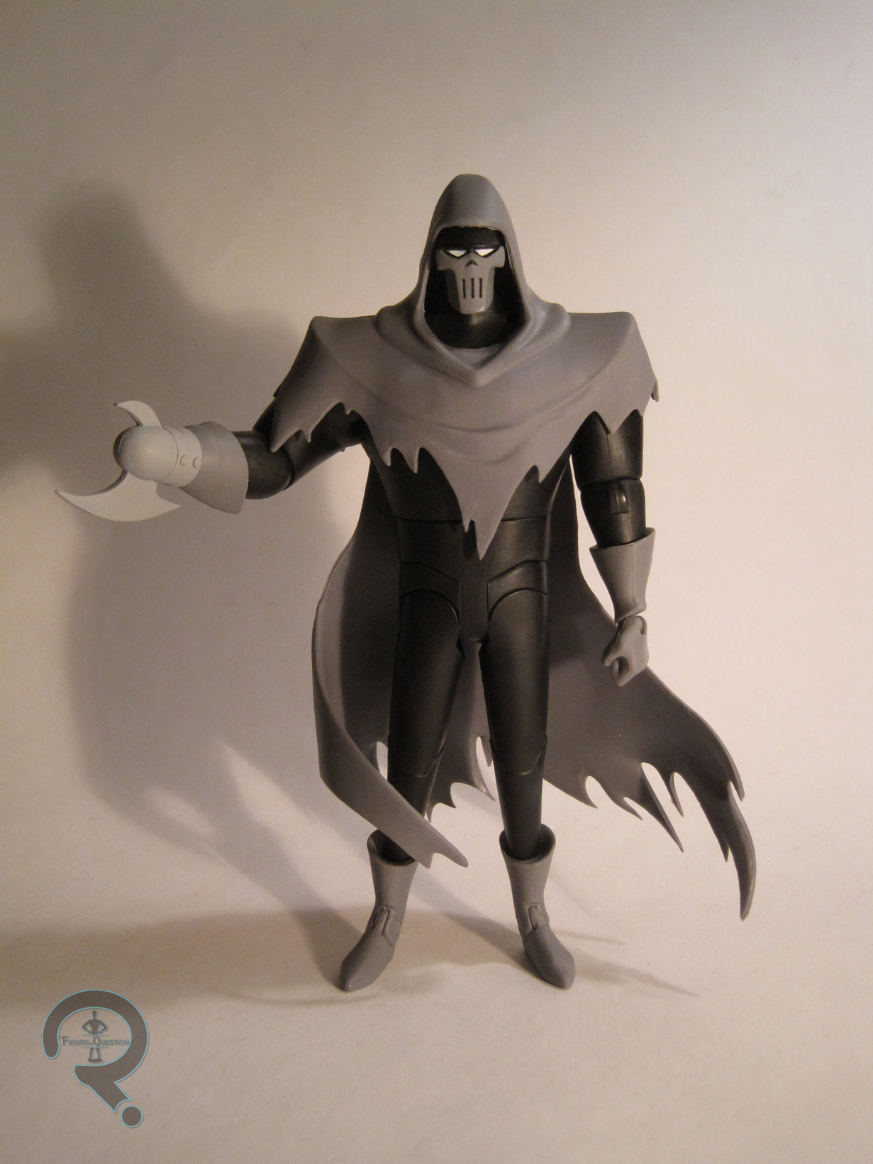
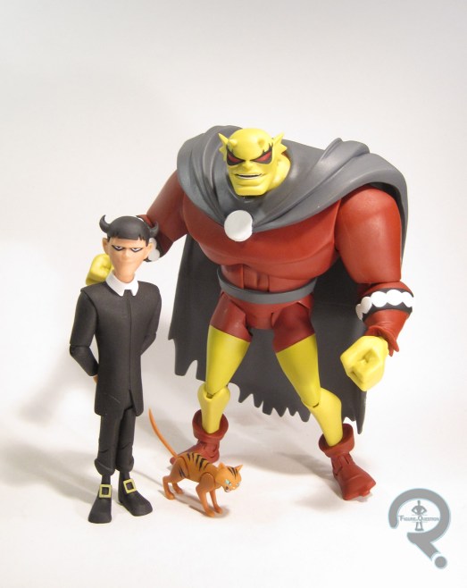
There’s no denying that Etrigan’s supposed to be this set’s star figure.  He is the episode’s titular character after all.  Etrigan comes from a pretty nice pedigree, being one of Jack Kirby’s early creations for DC.  He’s never been much more than a fringe character, but he’s always pretty cool.  The figure stands about 6 1/2 inches tall and he has 23 points of articulation.  Like Bane, Etrigan features the mid-torso joint, which I really like, and hope we continue to see on future figures.  I do wish he had rocker joints in his ankles, as it can be a little difficult to keep him standing without having his feet flat.  As far as Etrigan’s sculpt goes, I’m of mixed emotions.  Let’s talk about the good first.  Pretty much everything below the neck s pretty much spot on.  The sizing is good, and I really like the overall proportions of the figure.  The legs could maybe stand to be a little less simplistic, and the feet seem a little goofier here than they were on the show, but those are rather minor issues.  Etrigan’s cape is certainly well sculpted, but as with Phantasm, I’m worried about the integrity of the rubber over time.  Mine is already showing some signs of wear, especially on the one painted spot.  That’s concerning.  What really drags this figure down is the head.  Simply put, it’s just wrong.  It’s too big compared to the rest of the body, it’s too wide, the mouth is too small, the ears are too detached from the sides, his  forehead lacks the always present worry lines, and above all his eyes are at least twice as large as they should be and they’re the wrong klarionetrigan4shape to boot.  Any one of these issues would have been okay on its own.  Heck, all them but the eyes could have looked okay too.  But as it stands, the head isn’t even close.  The problems were present on the prototype, and I’d hoped they would fix them prior to release, but it actually looks like they just got worse on the final figure.  I’m really not sure how there was no one at any step of the process to look at this and say “that ain’t right.”  It wouldn’t be so glaring if it weren’t for the rest of the line being so accurate.  Paint is another area where I’m a little iffy.  The prototype showed him with a more vibrant color scheme, which seemed more closely matched to the episode.  The final product is rather dull by comparison.  I suppose that it could be seen as matching the episode’s darker lighting a little better, but it just seems a little bland.  Etrigan includes three sets of hands (fists, gripping, and open) and a display stand with his design sheet on it (which just further showcases how off the sculpt is).  Given Etrigan only appeared in one episode of the show, it would have been nice to get an extra head with the brand on it, since he spends a fair portion of the episode looking that way.  Perhaps they could put that in with another figure down the line and use it as an opportunity to give us a more accurate sculpt…

KLARION

klarionetrigan3Klarion the Witch Boy is a bit less known than Etrigan, but is also a Jack Kirby creation, who’s been Etrigan-related since his creation.  The show made him a little more mundane than his initial incarnation, but maybe teenager from another dimension was a bit too much for a Batman show.  The figure stands 4 3/4 inches tall and he has 20 points of articulation, which is pretty impressive for a figure of his stature, especially in this line.  Klarion’s sculpt is far more consistent than Etrigan’s.  By and large, he’s just a lot closer to his design on the show, which is a definite plus.  His sculpt is nice and sharp, and he gets a lot of the smaller details right.  For a more klarionetrigan5minor character like Klarion, accuracy is really key, and DCC’s really got this guy spot on.  Klarion’s paintwork is pretty straight forward, mostly being blacks and whites.  The application is all nice and clean, and the shades are all a pretty good match for what’s on the show.  Klarion includes three sets of hands (same configurations as Etrigan’s), his cat Teekl (who is fully articulation), a display stand, and the branding iron from “Demon Within”….which I somehow managed to leave out of the photos, and now can’t locate.  Sorry guys, Ethan’s a doofus…

THE ME HALF OF THE EQUATION

“The Demon Within” is the first episode of The New Batman Adventures I remember watching.  At the time, I didn’t know anything about Etrigan, so it was a pretty great introduction, and it’s one of my favorite episodes of the show to this day.  So, I was pretty pumped when this set was announced and snapped it up as soon as it arrived at Cosmic Comix.  There’s no getting around the inaccuracies on Etrigan.  They really hold the figure back, and I was really let down by the final product.  He’s not awful, and I do really hope DCC does that extra head thing somewhere down the line.  On the plus side, Klarion’s pretty awesome, which is good, since he’s far less likely to get re-released.

#1071: Commissioner Gordon

COMMISSIONER GORDON

BATMAN: ANIMATED (DCC)

comgordon1

Batman: The Animated Series is in many ways a defining take on the Batman mythos, with a particular definitive trait being the voice actors portraying the characters.  Of course, everyone knows and loves Kevin Conroy and Mark Hamill’s Batman and Joker, but it goes beyond the two of them.  I’ve written before about how Lorren Lester is the only voice I hear when I read Dick Grayson’s dialogue in a comic, but beyond him, there’s one actor who epitomized my view on the character he portrayed: the late Bob Hastings* as Commissioner Gordon.  Hastings got down both sides of Gordon perfectly, playing him as a strict and confident leader, who was still capable of being a warm, fatherly figure to his men (and his daughter…and Batman.  He was very fatherly), something Hastings’ predecessors never quite got.  As a rather normal looking guy in a trench coat and tie, Gordon wasn’t privy to many action figures. He got exactly one during the run of the Kenner/Hasbro Batman: The Animated Series lines, and even then it was based on his later New Adventures look, of which I was never a huge fan.  Fortunately, DC Collectibles’ ongoing line of Animated figures is proving to be far more complete than earlier attempts, meaning we finally got a proper B:TAS Gordon figure!

THE FIGURE ITSELF

comgordon2Commissioner Gordon is figure 23 in DCC’s Batman: Animated line.  The numbering places him in Series 6, I believe, alongside Zatanna, Ra’s Al Ghul, and the Etrigan/Klarion two-pack.  It’s a little hard to keep track, especially since DCC doesn’t solicit them with Series numbers.  He’s new.  That’s the point.  The figure stands 6 1/4 inches tall and has 22 points of articulation.  One of the more notable features of the early Batman: The Animated Series designs is the certain level of fluidity they all possessed.  Sure, Batman was fairly consistent, but a lot of the other characters would have little changes in design from one shot to the next.  This was especially true of Gordon, which makes this figure sort of an amalgam of his best looks so to speak.  His body was always pretty consistent, so the sculpt has a pretty easy time capturing it.  He’s appropriately stocky, which is a nice  change of pace when compared to the others in the line.  Gordon actually looks like a pretty normal dude (well, by Bruce Timm standards, anyway).  The area with the most artistic license is definitely the head.  While the face is a pretty good recreation (it varies depending on the angle you’re viewing from), the hair is where things are really off.  In the show, Gordon had this pretty crazy cowlick at the front of his hair, which had a tendency to move around in relation to the rest of his face depending on how he was angled in any given shot (it was allegedly hard to work with, which is why his redesign removed it entirely).  Here, rather than pick a definite side for the hair, they just kind of put it roughly center and scaled it down.  It’s alright, but it means that no matter the angle, he never looks quite right.  The glasses are also a bit off, mostly due to the scale of the figure, and them needing to be permanently attached to his face.  That being said, on comgordon3the show the lenses were very definitely rectangular, and they aren’t at all rectangular here.  How did that happen?  The paintwork on Gordon isn’t anything spectacular or amazing.  It’s actually rather drab, truth be told, but that’s accurate, so kudos to them on that one.  There is one issue in regards to the chosen colors: his pants are sort of a pale beige here, when they really should be a slightly darker warm tan.  The prototype actually had a much more accurate coloring, so I’m not really sure what happened.  It’s hardly enough to ruin the figure (and, quite frankly, it’s the sort of thing that 99% of people will never, ever notice), but it’s just a little weird. Gordon is packed with three sets of hands (fists, trigger  finger, and normal grip), a revolver, a megaphone, and a display stand with his design sheet on it.  It would have been nice to get something specific to one of his episodes, but what’s there is pretty reasonable. 

THE ME HALF OF THE EQUATION

Gordon was purchased from Cosmic Comix, making use of a pretty nice coupon.  Of the three regular figures in this set, Gordon was the one that jumped out at me, which is kind of a bit surprising, since he’s really rather average looking.  As it stands, he’s really one of my favorite figures from this line, even with his slight inaccuracies.  Here’s to more figures like this!

*Fun fact: back in the 60s, one of Hastings’ earliest roles was as Superboy on Filmation’s cartoon of the same name, so he was with DC for the long-haul.

#0985: Mr. Freeze

MR. FREEZE

BATMAN: THE ANIMATED SERIES (KENNER)

FreezeBTAS1

There’s no denying that Batman: The Animated Series is probably the greatest comic book adaptation in the history of comic book adaptations, and it’s also one of the greatest things to come out of the ‘90s. While the show as a whole was always very high quality, there are definitely some episodes that stand out above the rest. My two favorite episodes of the show’s run are “On Leather Wings” and “Heart of Ice” (which, no small coincidence, were both animated by Spectrum Animation, a sadly short-lived studio that produced some of the best animation ever seen on Saturday morning TV). “On Leather Wings” was the debut episode, which perfectly set the tone of the show. “Heart of Ice” comes later in the first season, but is just as defining an episode, taking a second-string Batman villain and turning him into one of the mythos’ greatest characters. I speak, of course, of Mr. Freeze, who is the subject of today’s review.

THE FIGURE ITSELF

FreezeBTAS2Mr. Freeze was released in Series 3 of Kenner’s Batman: The Animated Series line, based on his appearance in the above noted episode, “Heart of Ice.” Despite that being the story that elevated Mr. Freeze to the public eye, this is actually the third Mr. Freeze figure to be released, following the Super Powers and DC Super Heroes versions (though, if you want to get technical, those two are almost the same figure). The figure stands 5 inches tall and he has 4 points of articulation (it’s possible there’s an articulated neck, but since the dome isn’t removable, it’s not ever moving). He’s based on Freeze’s initial animated appearance, which, in my opinion, is the superior of the two. Kenner was known for tending to approximate the animated looks, without getting them dead-on. Freeze actually fairs quite a bit better than most of the figures Kenner put out. The head’s a little on the large side, but it’s a pretty much perfect recreation otherwise. Likewise, the body is overall quite solid, with the only real downside being the very skinny arms featured. That being said, they don’t look terrible, and the figure as a whole recreates the look very nicely. Freeze’s paint is pretty straight forward, but that’s to be expected with the animated designs. The colors are a very good match for the show, and the application is generally pretty clean. Freeze was packed with his freeze gun, which was connected to an over-sized version of his cold-tank.  The tank could be filled with water, and when squeezed, the water would shoot out of the freeze gun. Not a perfect effect, but not bad.

THE ME HALF OF THE EQUATION

Okay, I don’t know for sure, but I’m fairly certain that this Mr. Freeze was the first Batman rogue I ever owned. My dad got him for me not long after I saw “Heart of Ice” for the first time. This figure went a lot of places with me, including a trip to Gettysburg with my dad and Mr. Freeze himself, Michael Ansara. He also got stuck on the roof of my house once, through no fault of my own.  This is probably one of my favorite figures I own, mostly for sentimental value.

#0955: Bane

BANE

BATMAN: THE ANIMATED SERIES (KENNER)

BaneBTAS1

One of Batman: The Animated Series’ greatest successes was condensing Batman’s rich, 50-year history into one easy to follow, cohesive show. This involved taking characters from all eras of Batman’s history and making them all fit with the show’s art deco style. For the most part, they managed this task pretty well. However, there were a few that slipped through the cracks. At the time of the series’ debut, Bane was a very new addition to the comics, but he was a fairly popular one, so he made his way into the show. Unfortunately, the producers had a bit of trouble working Bane into the show’s style, resulting in a rather goofy interpretation of the character, true to neither the original character nor the show itself. Nevertheless, that version of Bane got a toy in Kenner’s tie-in line, resulting in Bane’s very first action figure, which I’ll be looking at today!

THE FIGURE ITSELF

BaneBTAS2Bane was released in Series 5 of Kenner’s Batman: The Animated Series line. He was one of two new villains in the line, alongside Killer Croc, which is actually kind of appropriate, seeing as Croc featured prominently in Bane’s first appearance. The figure is 5 ½ inches tall and has 5 points of articulation. Due to his swinging action feature, the shoulders move as one, however, with careful posing, they can be moved independently from each other. This figure is based on Bane’s single B:TAS appearance, in the episode “Bane.” It’s similar to his original comics appearance, but the luchador themes have been played waaaaay up, which severely reduces his intimidation factor. The sculpt does, at the very least, do a nice job of translating the show design into three dimensions. In fact, it’s probably one of the most faithful sculpts that Kenner ever produced. His arms are a bit pre-posed in order to facilitate his throwing feature, so they’re slightly out of whack when he isn’t holding anything. That being said, it’s not awful looking. He just looks a bit like he’s sorry for interrupting somebody’s conversation. His legs also seem a bit on the short side, especially when compared to the arms. However, this was somewhat common for the line, so Bane doesn’t really look super out of place. Bane’s paint is actually pretty solid. The colors are pretty bold, so he really pops, and the application is pretty solid. Bane originally included a bent section of girder, which he could “throw,” but mine doesn’t have his.

THE ME HALF OF THE EQUATION

Bane is a recent addition to my collection. At Balticon last weekend, one of the dealers had a large box full of loose figures. I believe they had purchased someone’s collection. Anyway, they were $2 each, so I ended up fishing out 15 of them to purchase. Bane was the only DC figure in the lot. Since I never got one back in the ‘90s, I was actually pretty happy to find him. Yeah, it’s a goofy design, and yeah, it’s a rather goofy figure. But I still really like this guy. He’s really not bad.

#0942: Batman

BATMAN

BATMAN: THE ANIMATED SERIES (McDONALD’S)

BatmanMcD1

I’ve looked a number of different types of action figures over the course of my over-900 reviews for this site, but the one type of figure I haven’t looked at so far is the “Happy Meal” figure. More often than not (and increasingly in recent years), toys included with happy meals and the like are kind of lame and in no way compare to anything you might actually buy in a store. However, every so often, there’s one or two of these guys that doesn’t totally suck. Today, I’ll be looking one of the ones that doesn’t suck: Batman!

THE FIGURE ITSELF

BatmanMcD2Batman was part of a set of 1993 McDonald’s Happy Meal toys, which were used as a promotion for Batman: The Animated Series. There were 8 toys offered; half were proper figures and half were weird car things. The figure is roughly 3 inches tall and he has 4 points of articulation. He had a unique sculpt, technically based on the appearance of Batman in the initial seasons of Batman: The Animated Series, though a few liberties have been taken. Mostly, it’s proportional stuff. For instance, his arms are about the same length as his legs, which is, you know, a bit off. His head is also a bit on the large side, and rather oddly shaped. Honestly, he looks more like a weirdly shaped child in a Batman costume than he does the actual Batman. He’s definitely sporting a slightly off build. As far as details go, Batman’s fairly simple, but that’s not far off from the show design, so that’s good, I guess. Also, the cape is a separate piece, and it’s worth noting that it doesn’t have the usual scallops. His paintwork is actually not bad, especially given the source of the figure. The colors are a decent enough match to the show, and all of the appropriate details are there (which is better than can be said of some much more expensive figures). Batman had no accessories, but that’s not hugely surprising, given the figure himself is more or less an accessory for fast food.

THE ME HALF OF THE EQUATION

I actually didn’t get this guy from a Happy Meal (well, not one of my own, anyway). My dad brought this guy home with him one day. Presumably, he got one during lunch that day. Anyway, I know he got him for me and I’ve held onto him for all this time. He’s not a super great figure, but he’s also not bad, especially given his origins.

#0863: Batman & Phantasm

BATMAN & PHANTASM

BATMAN: ANIMATED (DCC)

Batman&Phantasm1

Batman definitely holds the record for number of theatrical films based on a single superhero. It’s not a huge surprise, given the character’s mass appeal. There have been a whole lot of tries at doing the character justice on the big screen, and exactly which one is the “best” is very much up for debate. I must admit, I cheat a bit when asked what my favorite theatrical Batman movie is, my answer is always Batman: Mask of the Phantasm. A lot of people forget about this one (due to lots of people writing it off based solely on its animated nature), but for me it’s the best Batman movie by far. Seriously, if you haven’t seen it, you really should. Like right now. Go watch it. No seriously, Imma spoil stuff and I don’t wanna ruin it for you. I’ll wait. Anyway, as an extension of Batman: The Animated Series, the film’s been privy to a few figures here and there, including getting a two-pack courtesy of DC Collectibles’ current line.

THE FIGURES THEMSELVES

Batman and the Phantasm were released as part of the Batman: Animated line in mid-December of last year. Both figures are exclusive to this particular set.

BATMAN

Batman&Phantasm2Faithful readers will no doubt find this figure somewhat familiar. Yep, I’ve taken a look at most of this figure before, back when I looked at the single-packed Batman from Series 4 of the main line. Since Batman’s design from the movie is identical to that of the show, it’s a sensible re-use, though it’s a bit frustrating to people who picked up the earlier figure and still want the Phantasm (like me). From the neck down, this figure is 100% the same as that figure. The proportions are still more or less spot-on, but he’s greatly hindered by the lack of swivel joints at the tops of his boots. The main difference between the two figures is the head. This version is a bit more expressive, with gritted teeth and eyes opened wider. It’s also a much better attempt at the design. The head’s a little wider, the eyes are bigger, and the jaw’s squarer, which all results in a generally better looking end-product. The paint is more or less the same. I did find the general application to be a bit cleaner this time around, but your mileage may vary. Another change between the two figures is the accessory complement. This figure only gets the batarang, a pair of hands for holding the batarang, a pair of fists, and a display stand. The stand is mostly the same as the prior one, but trades the B:TAS logo for a Mask of the Phantasm one.

PHANTASM

Batman&Phantasm3Now we get to the real draw of the set. The Phantasm was actually not a wholly original creation of the film, but was instead a retooled version of the villain Reaper from the “Batman: Year Two” storyline from the comics. The less said about the original story the better. The figure stands just over 6 ½ inches tall and has 23 points of articulation. This marks only the second time the Phantasm has appeared in plastic form. The first time, the figure was given a removable hood and scythe, allowing for (20 YEAR OLD SPOILER!!!!!!) her to double as an Andrea Beaumont figure. Since the two designs in the film are purposefully dissimilar, this meant compromising the appearance of the Phantasm in order to have a decent Andrea. This figure foregoes any sort of Andrea connection, and instead opts to present the Phantasm in as screen accurate a manner as possible. Well, in theory, anyway. The end result is pretty good but a bit shy of perfect. Let’s talk about what works first. The underlying head is great, are both hands/gloves. The body is generally decent. It’s not a perfect match, but Phantasm’s proportions changed a bit in the movie, so it’s forgivable. Even the base of the cape isn’t too bad. What hold’s this figure back is the hood. In the film, it has a very distinct, very sharp look about it. Here, it’s a soft rubber piece, attached to the rest of the cape. It ends up being kind of shapeless and too soft. I think it would have looked much better had it been separate from the cape and attached to the head, ala the smaller scale Kylo Rens that Hasbro’s released. As it stands, this doesn’t look atrocious (especially if viewed from a slight angle) but it could have been a lot better. Also, the quality of the rubber used for the cape/hood is a bit questionable, and it feels like it’s already starting to deteriorate, which isn’t super comforting. The paint on the Phantasm is pretty simple, but not bad. The various details are all pretty clean, and she’s appropriately mono-chromatic, so that’s good. The figure includes two hands, one in a fist and one in an open gesture, as well as a display stand. That seems a little light, and I certainly wouldn’t have minded some sort of piece to show off her ghostly gas cloud thingy.

Batman&Phantasm4

THE ME HALF OF THE EQUATION

I picked this set up from my local comic book store, Cosmic Comix, in early January. I had actually seen it at another store in December, but passed on it for a number of reasons. While I don’t feel the set is as strong as it could have been, I’m glad I have it. Batman’s a definite improvement over the single-release, and the Phantasm is a sound addition to the line. Now, how about a follow up set with an unmasked Phantasm and a battle-damaged Joker?

#0816: Batman & Two-Face

BATMAN & TWO-FACE

BATMAN (MATTEL)

BatsTwoFaceMatt1

For day 15 of the Post-Christmas reviews, I’ll be taking a step back to a few years, and actually looking at a Mattel product. Weird, right? In 2002, the DC license moved to Mattel from Hasbro (who had inherited it via their buyout of former holder Kenner), marking the first time in over a decade that the license had formally changed hands. It was something of a quick change, resulting in Hasbro being unable to release some of the product they had designed beforehand. When Mattel took over, they ended up making use of some of these already existing designs (which were all Batman-related), releasing them as a quick, one and done line of two-packs, each containing Batman and a supporting player. That wasn’t enough, apparently, as they also occasionally trotted the figures out for re-release over the years, usually single-packed and with wonky color schemes. Today, I’ll be looking at a pair of figures from one of those re-releases.

THE FIGURES THEMSELVES

Batman and Two-Face were released in 2008, in a line simply branded Batman. I should specify here that they were both single releases, which I’m just reviewing as a pair here for my own convenience. There was also a Joker figure in the set, which I don’t have.

BATMAN

BatsTwoFaceMatt3First up is Batman. Not just any Batman, though! No, this here is a wacky variant Batman! The figure stands just shy of 5 inches tall and has 5 points of articulation. The sculpt is based on the New Batman Adventures version of Batman. It’s not a terrible recreation of the design, but I don’t think it’s quite as good as the prior Kenner version of the design, and it’s definitely not as good as the recent DCC version. However, it’s still a pretty decent sculpt, and it’s clear which version of Batman this is supposed to be. Plus, it’s got a much more natural pose than the Kenner version, which is a nice change. Wait, didn’t I say this was a wacky variant Batman? Why, yes I did! That all comes from the paint. Instead of the traditional grey for the body, he has this odd orange/silver thing. It’s not based on any particular look or anything, just random orange and silver Batman. How ‘bout that? The paint is decently applied, for what it’s worth, so there’s that. Batman included no accessories, just like all of the other Batmen who used this same exact mold.

TWO-FACE

BatsTwoFaceMatt2So, Batman was a wacky variant, but Two-Face is an actual adapted design, right? Not really, no. But that’s okay! Because toys! Like Batman, this figure stands about 5 inches tall and has 5 points of articulation. It’s worth noting that this guy feels like he’s just a bit smaller-scaled than Batman, which is especially notable when you compare head sizes. The sculpt is also based on his New Batman Adventures design, and it’s not quite as strong as Batman’s. It’s not terrible, and the body in particular is a pretty decent Timm-style suit sculpt (which is probably why Mattel ended up using a tweaked version of it several times in their JLU line). The head is pretty off, and it has a really obvious mold line running along the chin, which looks pretty bad. The paintwork is kind of interesting. It’s definitely not show-accurate, but it’s also not quite as out there as Batman, since it isn’t all that far-removed from some of his classic color-schemes from the comics. That actual application is reasonable enough. The colors are pretty vibrant, and most of the paint stays in the lines, which is nice. Two-Face also doesn’t include any accessories, but he does have his coin sculpted in his hand, so at least he isn’t totally lacking.

THE ME HALF OF THE EQUATION

Batman and Two-Face were given to me for Christmas by my Super Awesome Girlfriend. And where did she find these 8 year old action figures? Some second hand store? Nope, it was CVS of all places. I was genuinely shocked by that. Neither of them are particularly standout figures, but they kind of a nifty throwback to the wacky variants of old, and I was happy to receive them.