#3641: Superman – Man of Steel

SUPERMAN — MAN OF STEEL

ONE:12 COLLECTIVE (MEZCO)

Fun FiQ Fact #0120:  Justice League Unlimited‘s adaptation of “For The Man Who Has Everything” is a rare instance of Alan more actually liking an adaptation of his work, even allowing his name to be credited in the episode.

In a world where I’ve got plenty of options for solid 6-inch figures of Marvel characters, it’s still a little baffling at times how hard it is to find similar quality DC figures in the same scale.  It’s largely locked in on the higher price-point stuff, and even then, you’re dealing with very specific looks.  I love Superman, but I’ve struggled to find a solid Superman figure, honestly at any scale.  I keep trying them out, and I keep being kind of let down.  But…I’m trying again.  With Mezco, even.  It’s an odd day for me, I won’t lie.  Let’s see where it goes.

THE FIGURE ITSELF

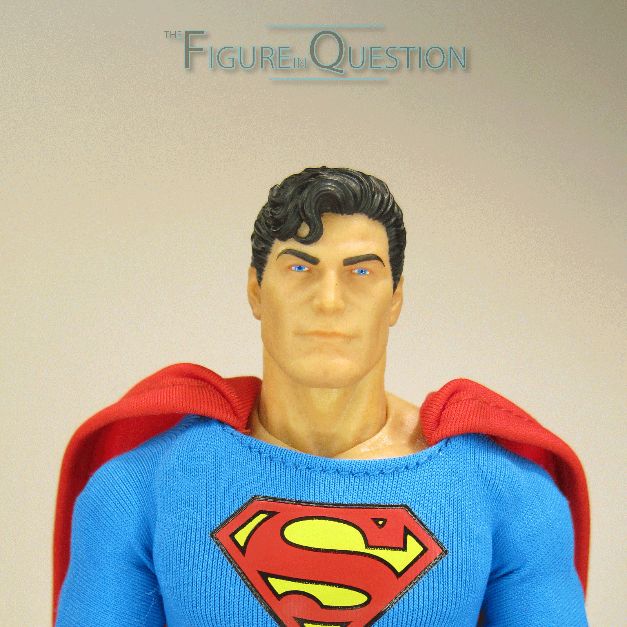
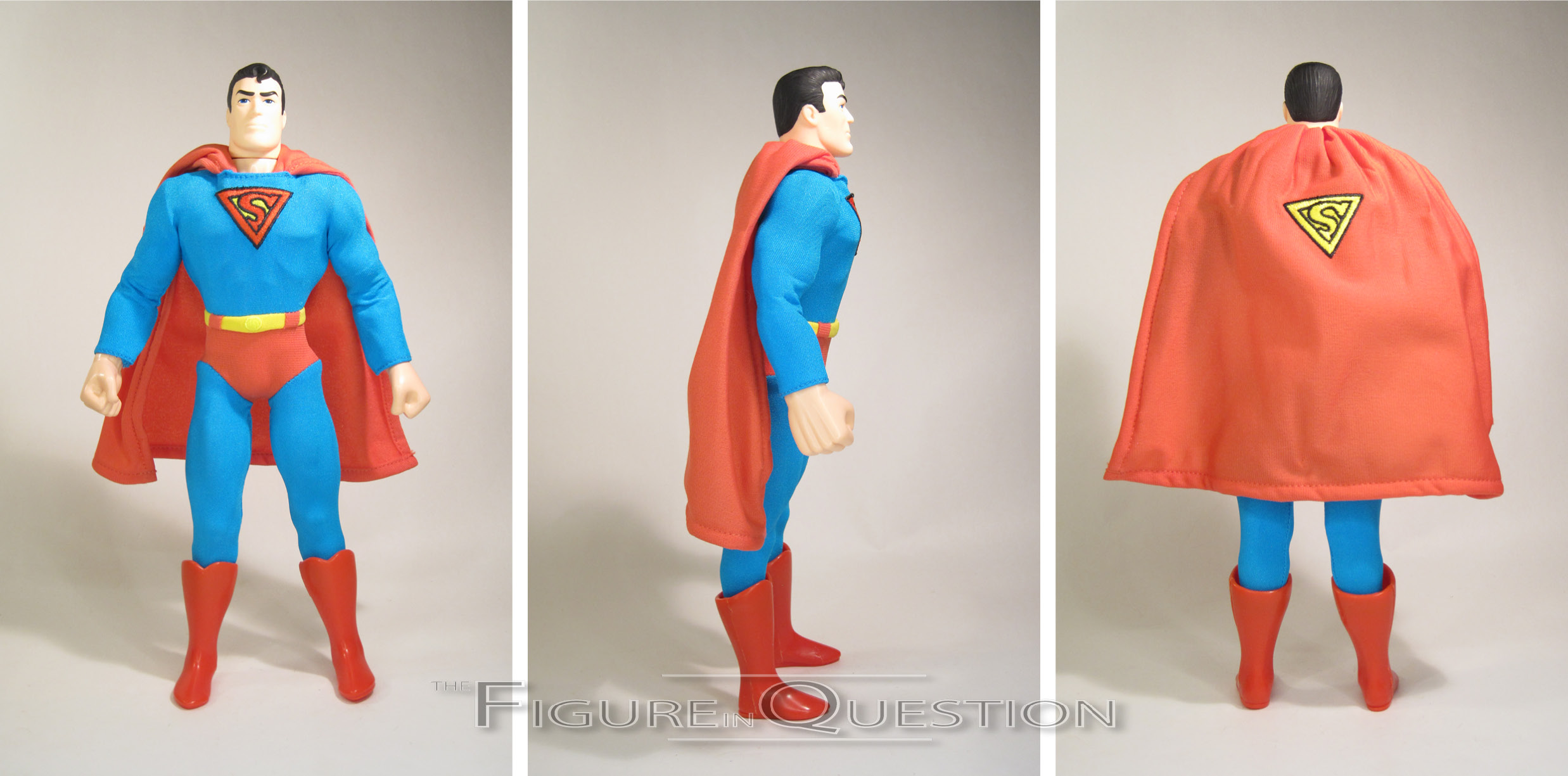
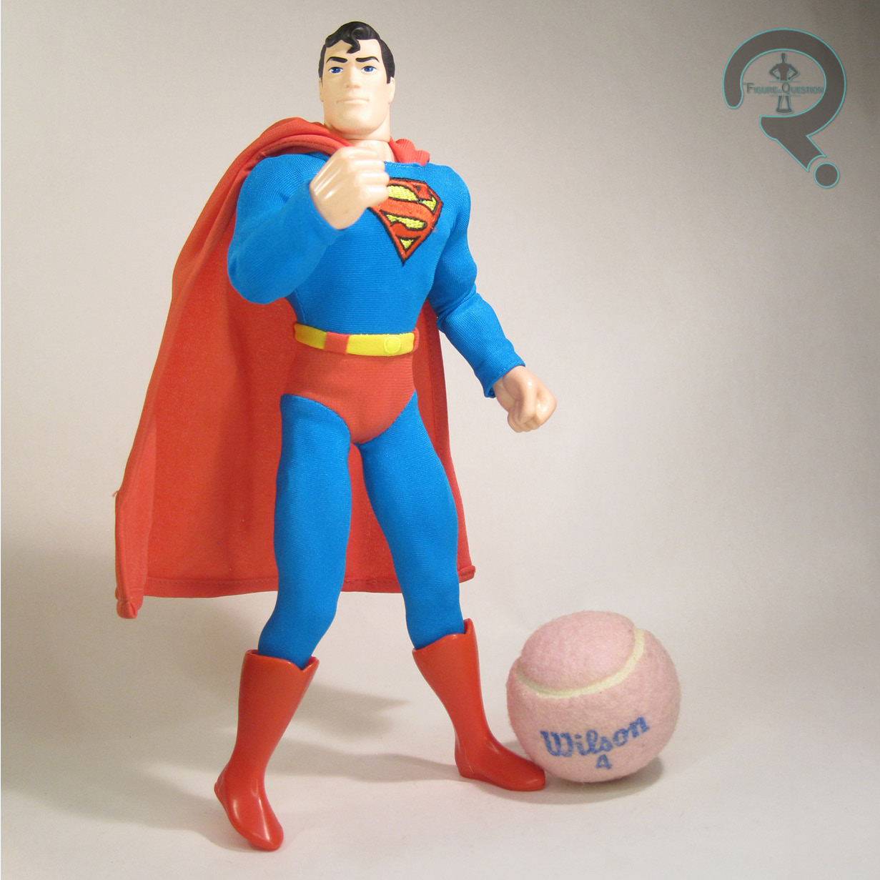
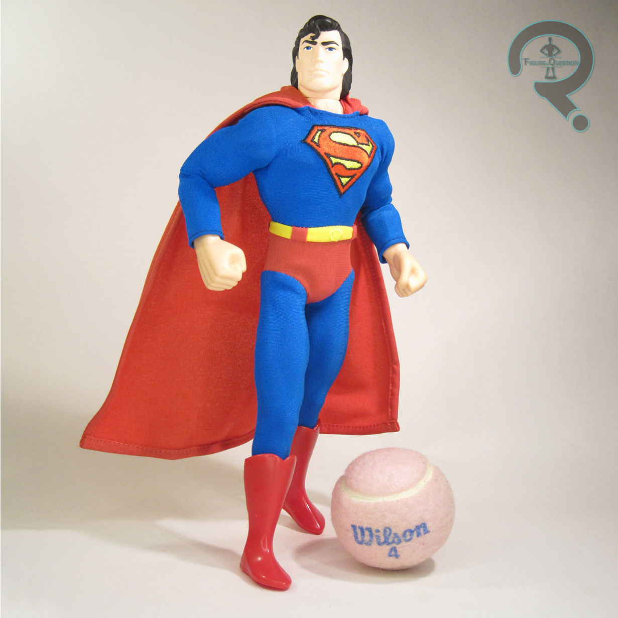
Superman – Man of Steel is part of Mezco’s One:12 Collective line, offered as a one-off steel-boxed release last year.  He’s their second classic comics Superman.  The first one was more general purpose, while also being adapted to Mezco’s in-house style (more in line with earlier One:12 offerigns), but this one is a little more specifically based on Superman circa John Byrne’s Man of Steel reboot of the character.  It’s not an exact match, though, for reasons I’ll touch on further down.  The figure stands just under 6 1/2 inches tall and he has over 30 points of articulation.

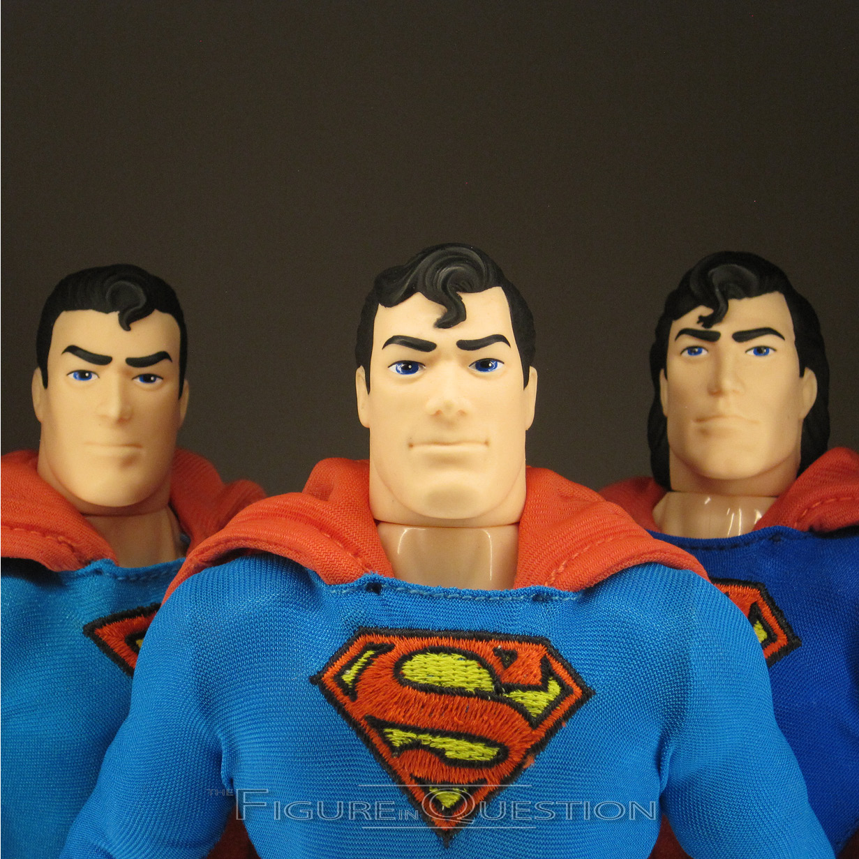
Mezco figures tend to get more than one head, and that’s maintained here…and then sort of shifted into overdrive, because the figure gets not one, not two, but seven different heads.  It’s…it’s a lot of heads.  Possibly too many heads.  I mean, I don’t want to seem ungrateful for the options, but, like, wow.  All of them are pretty clearly inspired by Byrne’s version of Clark.  I may have my issues with what Byrne did for the character from a story standpoint, but there’s no denying that his illustrations of Clark are always solid, and a pretty definitive take.  Of course, Byrne’s style is one the more cartoony side, whereas Mezco’s aiming for something more real-world.  The translation works okay…for some of the heads.  In particular, the friendliest of the heads really works, and feels like a proper Superman through and through.  The angrier heads aren’t bad either, albeit sort of out of character.  It’s the in-between ones that I feel just slightly miss the mark, making him look downright crazed; there’s some real uncanny valley stuff going on there.  But, of course, there’s so many heads that even if a bunch of them are iffy, there’s still plenty to work with.

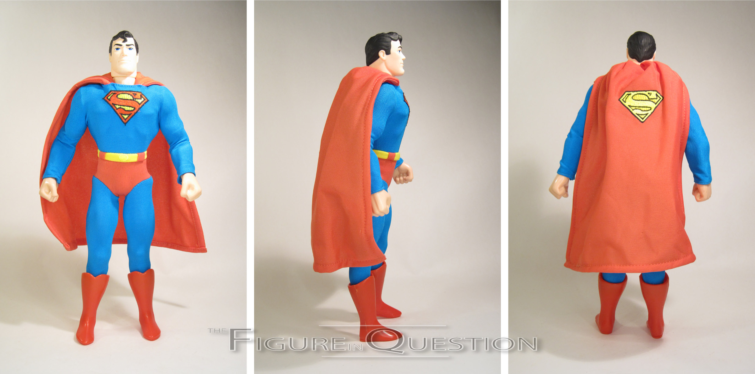
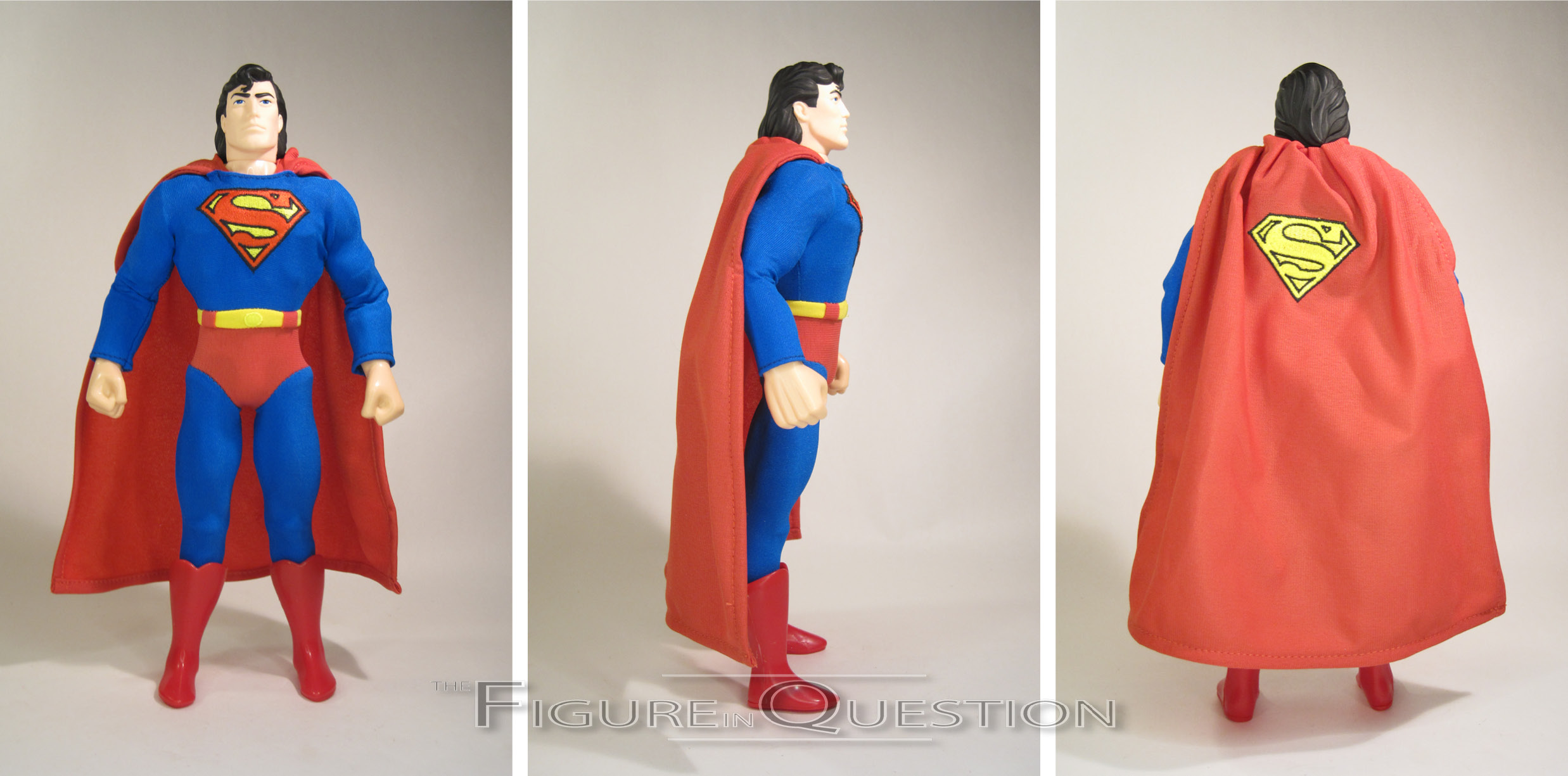
Superman’s base body is a slightly bulked up one, but with slightly more balanced proportions than, say, the earlier Captain Americas.  It still looks a little squat from certain angles, but it’s generally a solid match for Clark’s usual build.  The outfit makes use of a jumpsuit with an attached cape, red briefs, a sculpted belt, and sculpted two-piece boots.  The coloring on the suit is really nice, and I dig the exact shades they’ve gone for.  His chest emblem is one notable deviation from the “Man of Steel” set-up, being a basic classic Superman logo, rather than Byrne’s larger version.  He’s got a matching one in all yellow on the back of the cape, which, it’s worth noting, gets wires for posing.  I’m glad they moved away from the weird armature pieces for the capes.

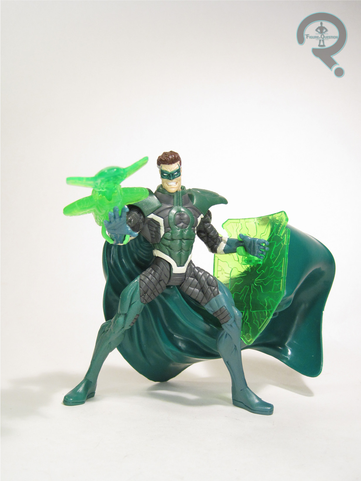
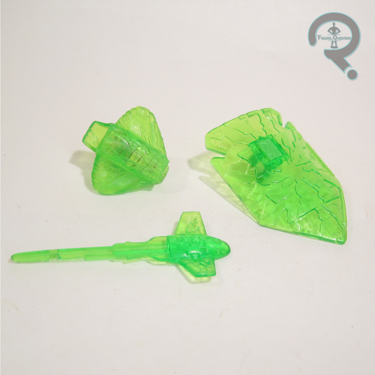
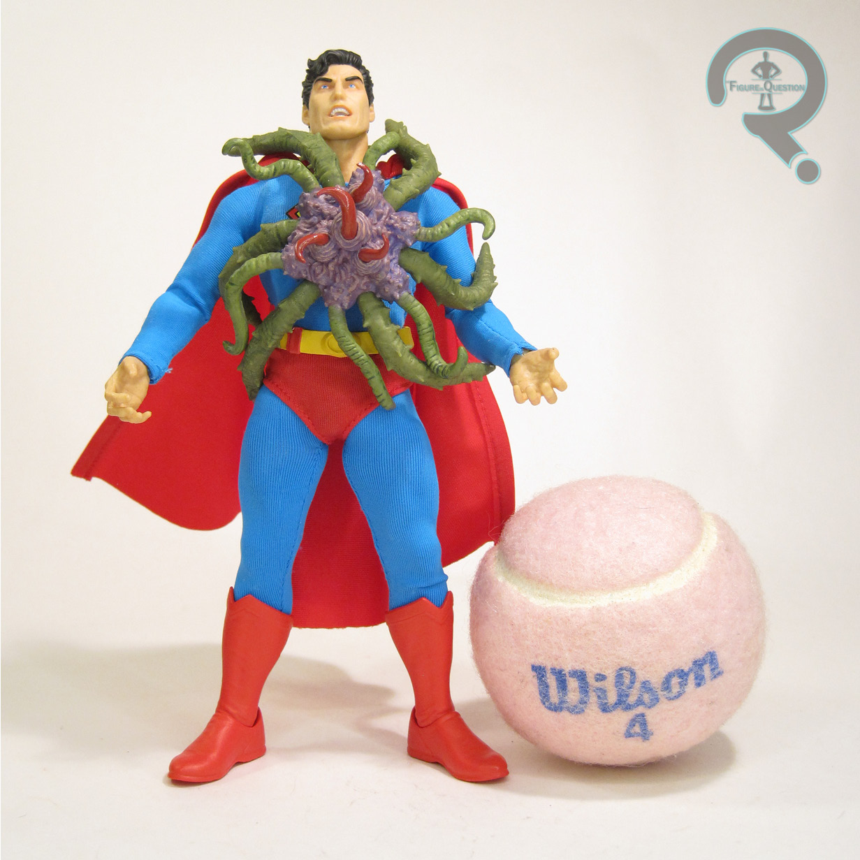
In addition to all seven heads, Superman still gets a huge selection of extras, including five pairs of hands (fists, gripping, flat, and two different styles of open gesture), two different styles of heat vision attachments, a Starro spore, the Black Mercy, three bullet ricochets (which attach to the torso via magnets), a container of all the different colors of Kryptonite, two punching effects, a Phantom Zone projector, and a display stand.  Despite the “Man of Steel” influences of design, a lot of the accessories included are notable Pre-Crisis elements, which makes for an interesting mix.  It’s a lot of cool stuff, though.

THE ME REMAINDER OF THE EQUATION

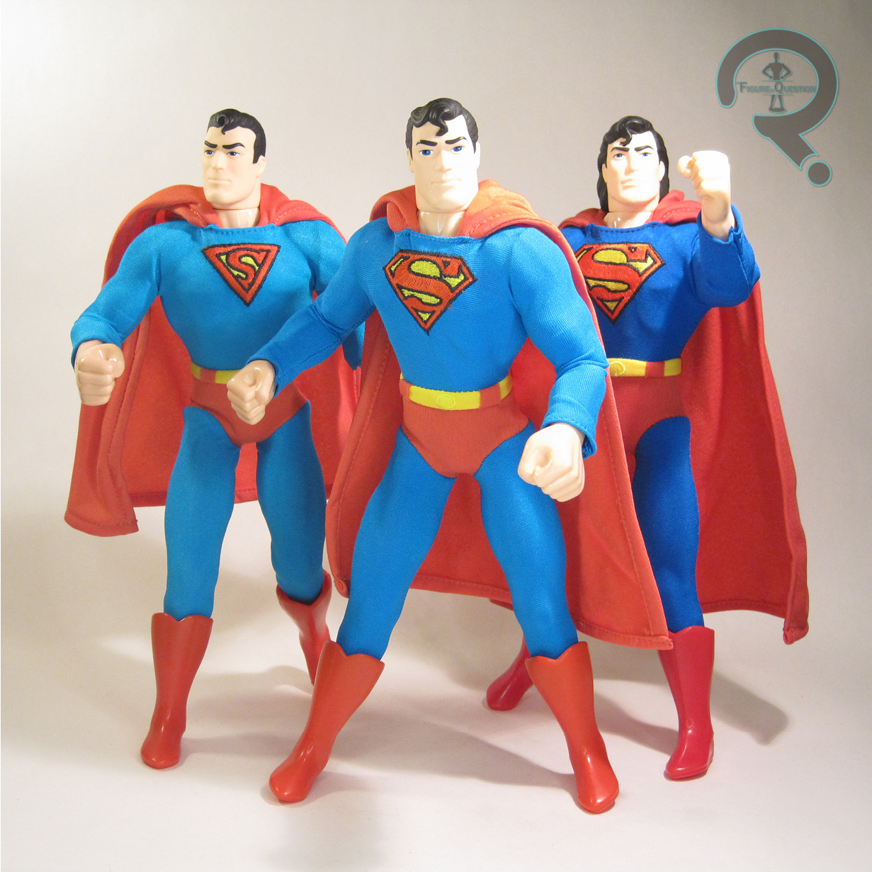
In my search for a solid Superman in this scale, I’ve largely overlooked Mezco, because I’d kind of moved away from them.  When this one was shown off, I was intrigued, but not enough to jump on it right away.  Then All Time got three of them traded in over a three month span, and I took that as something of a sign.  The middle one was loose, so I got to actually mess with him in hand, and I honestly just couldn’t say no at that point.  He’s got some minor things off, and the sheer number of heads is downright silly, but I generally really, really like this guy, and I’m glad I decided to snag one.

Thanks to my sponsors over at All Time Toys for setting me up with this figure to review.  If you’re looking for cool toys both old and new, please check out their website and their eBay storefront.

#3636: Parallax

PARALLAX

TOTAL JUSTICE (KENNER)

Fun FiQ Fact #0115: According to Wikipedia, a parallax is “the difference in the apparent position of an object viewed along two different lines of sight,” which is honestly not a terrible name to attach to a former hero driven to extremism.

Growing up, thanks to my dad’s old comics and re-runs of Challenge of the Super Friends, I became rather attached to Hal Jordan, despite his having been replaced by Kyle Rayner in the role before I started reading comics.  Options for Hal figures were, admittedly, a little limited in the ’90s, with the only option in 5-inch scale being not a Green Lantern figure, but Parallax, Hal’s villainous turn from the comics.  Of course, in my collection, he was never *really* villainous.

THE FIGURE ITSELF

Parallax was released in Series 3 of Kenner’s Total Justice, which wound up being the line’s last series.  Each set got one “villain”, which was Parallax…I guess.  Like I said, never so much to my eyes.  The figure stands just under 5 inches tall and he has 5 points of articulation.  Total Justice‘s sculpts were always very heavy on the pre-posing, and Hal’s no exception.  This one’s definitely one of the better ones; Hal’s flair for the dramatic during this era translates well into the sculpt, and he’s got a pose that reads as dynamic, without being too absurd. The sculpted elements of the costume are a pretty good match for the source material (certainly a closer match than McFarlane’s attempt from two decades later), and there’s a nice sharpness to them. The head’s my favorite part of the whole thing, capturing Hal’s likeness, while also getting the crazed expression he was so wont to have during this period of time. The last set of Total Justice got a lot of its paint budget slashed, resulting in a lot of unpainted elements. For his part, Parallax was pretty fortunate, getting all of the base details he was supposed to, and really only missing out on a few metallic details. The end result still looks totally fine, and you’d be unlikely to guess what was cut if you didn’t know it was supposed to be there. Another notable change-up for the last round was making the accessories into things that made a little more sense for the characters. Rather than “fractal armor”, Parallax gets a missile launcher and a shield, both molded in clear green.

THE ME REMAINDER OF THE EQUATION

I had a few Total Justice figures when they came out, but Series 3 was pretty rare at the time. I wanted a Parallax, of course, since he was the only option for Hal, but it took a bit for me to find one. I wound up getting him just a few years after his release, at a toy show my dad took me to, I think for my birthday. He’s a solid figure, even now, and remains my favorite of the Total Justice line-up.

#3631: Condiment King

CONDIMENT KING

BATMAN: ANIMATED (DC DIRECT)

Fun FiQ Fact #0110: In his original Batman: The Animated Series appearance, Condiment King was one of three new “villains” who turned out to be stand-up comedians brainwashed into villainy by the Joker.  The other two, Packrat and Mighty Mom, didn’t have the same staying power as the King, though.

As a kid of the ’90s, I of course experienced a great deal of Batman: The Animated Series in its…well, maybe not first run, but early run.  Syndication run?  Something like that.  However, I hardly saw the whole run of episodes.  For a good portion of the episodes, I actually saw them for the first time when the DVD collections came out.  I quite proudly had the whole run of Batman, and I watched those DVDs religiously in my teen years.  It was through those religious watchings that I gained my appreciation for characters like Condiment King, a one-off throw-away character from the episode “Make ‘Em Laugh.”  As in depth as Kenner/Hasbro’s Batman: The Animated Series tie-in lines were, we never got anything that deep.  But, McFarlane’s DC Direct-branded relaunch of the DC Collectibles/Direct Batman: Animated line has been doing sets of re-paints that have new figures done as Build-A-Fogures, and, well, where else am I going to get a Condiment King, right?

THE FIGURE ITSELF

Condiment King is the Build-A-Figure for the first “new” assortment of Batman: Animated under McFarlane (previous releases have just been straight reissues of DCC/DCD figures), assembled by purchasing re-decoed versions of Batman, Robin, Mr. Freeze, & Scarecrow.  The figure stands about 6 1/2 inches tall and he has 26 point of articulation.  In terms of movement, he’s pretty much on par with the later run stuff from DCC/DCD, which is a good thing, since that’s when they started actually giving the figures consistently useful articulation.  Unfortunately, McFarlane’s spottier QC hits a bit here, though, and pretty much every copy has incredibly loose hip joints, which make him quite tricky to keep standing.  Other than that, though, the articulation works quite well.  Condiment King’s sculpt was an all-new one, and a pretty good one.  Condiment King comes from the pre-design change years of the show, which is when the characters had a tendency to be more inconsistent from shot to shot.  This guy seems to be aiming for a “best approximation” look, rather than going for one specific frame from the show.  The general feel is there, and the only real inaccuracy that sticks out to me is the lack of ears visible under his cowl.  The most important aspect of the sculpt, of course, is that he fits in with the pre-existing figures, and that he definitely does.  In terms of color work, Condiment King does run into the one notable downside of the McFarlane Animated figures: cel shading.  DCC/DCD experimented with some shading later in their run, but only for characters that already had figures, and in a fairly minor fashion.  While Condiment King isn’t as intense as the others in the set that builds him, but it’s still a little…off looking, especially because it doesn’t really follow a logical path, and there are just a bunch of spots it outright skips.  It’s weird.  Not ruin him weird, but worth noting it weird.  Also, there’s one notable error: the packets on his right arm should be red, not white.  It’s small, but still important.  Condiment King includes his backpack and attached ketchup and mustard guns.  The backpack doesn’t sit *quite* right on his back, but it’s close enough.  I like that they used actual string for the tubes going to the guns, so as to avoid issues of breakage.

THE ME REMAINDER OF THE EQUATION

You know whose fault this is?  I’ll tell you: Max.  See, I wanted this figure, sure.  It’s Condiment King, and he’s great.  However, I’d already walked away from and unloaded a large portion of my DCC Batman: Animated figures, and I certainly wasn’t looking to re-buy four of them for a single new figure.  So, no Condiment King for me.  But, Max wouldn’t stand for that, so when a complete one came into All Time, he purchased it for me.  So, Condiment King for me.  He’s got his issues, but he’s still fun, and I’m glad to have him.

#3612: Green Lantern – The Silver Age

GREEN LANTERN — THE SILVER AGE

DC MULTIVERSE (MCFARLANE TOYS)

Fun FiQ Fact #0091: Hal Jordan’s original appearance was patterned on actor Paul Newman.  Does that mean that Hal should have his own line of salad dressings?

What?  DC Multiverse?  Haven’t I kicked the McFarlane habit?  Well, as it turns out, no.  I keep trying.  I keep getting very close, but then there just keeps being *one* more figure that pulls me right back in.  In this case, I’m falling back into my earlier love of Green Lantern, especially when there’s even a semi-decent figure on hand.  In particular, I’ve got quite a love for a good, solid classic Hal Jordan.  McFarlane’s done two Hal Jordans, neither of which are *terrible*, but it mostly got by on “McFarlane” standards, and neither of which were classic versions.  So, how about a third?

THE FIGURE ITSELF

Green Lantern — The Silver Age is part of the “Digital” assortment of DC Multiverse, which also sports a classic Aquaman and a less classic Batman.  The figures are all officially under the “DC Direct” banner, but they’re effectively indistinguishable from the ones without the banner, so…there it is, I guess?  The figure stands 7 inches tall and he has 35 points of articulation.  For the most part, GL is re-using the standard male build base body introduced in the Blue Beetle/Booster Gold set.  It’s a solid super hero body, with reasonable proportions, a not atrocious articulation scheme, and minimal detailing to throw off a clean look.  He’s still got the ridge at the top of his boots, but it at least flows with his costume design, and it’s a far cry from the excessive extra detailing that prior GLs have gotten on their suits.  He gets a new head, which is…I don’t know how to say this: it’s really good.  Like, just genuinely a really strong sculpt.  No “for a McFarlane figure” caveat or anything.  It aims to be a Silver Age Hal Jordon, and that’s where it lands, pretty cleanly.  His hair’s got that right flippy quality, the expression has that right level of cockiness, and the mask is crisp and sharp in its detailing.  He’s got a new right hand sculpt as well, which is in a fist and sporting his ring, you know, as it should be.  GL’s paint work is minimal, but what’s there is pretty sharply handled.  I also feel that the shade of green is a more appropriately Green Lantern-y shade, though that’s most certainly a personal thing.  GL is packed with three different left hands (in fist, flat, and gripping), as well as the power battery and two hand effects pieces from Parallax (why he’s got an effect for his left hand is beyond me, but I won’t complain about getting something extra), and a display stand with “McFarlane Toys Digital” on it.  He’s also got a collector’s card and a card with the information for whatever digital totally-not-an-NFT-with-a-different-name thing McFarlane packed with all three of these figures.  I have no idea what the thing is, because I’ve got no interest in downloading the app or setting up an account.

THE ME REMAINDER OF THE EQUATION

One of my favorite Hal Jordan figures growing up was the DC Direct Silver Age Hal.  He’s older now, but I still really like him, and I hold pretty much every other Hal up to that figure.  McFarlane has done a few Hals, and they’ve all been fine but not quite right.  This one?  He’s like an update to that DCD figure I loved so much.  He’s that, but with more modern toy making sensibilities.  I can’t believe I like a McFarlane figure this much, but I really, really do.  Shout out to Max for helping me out with snagging this one, by the way!

#3606: Mr. Miracle

MR MIRACLE

JUSTICE LEAGUE UNLIMITED (MATTEL)

Fun FiQ Fact #0085: Mr. Miracle is voiced in Justice League Unlimited by Ioan Gruffud, who that same year played another super-heroic “Mr” as Mr. Fantastic in Marvel’s Fantastic Four.

The New Gods play a rather pivotal role in the DC Animated Universe, with each of the pivotal players getting their own focus.  Though largely in the background, Mr. Miracle gets his one focus episode, “The Ties That Bind,” which is a fun little summation of Scott’s comics background.  The comics adaptations were even kinder to Scott, as he got several appearances in Superman Adventures, which actually served as my introduction to the character, and which cemented my love of him.  How thankful I was that his JLU appearance got him a figure in the animated style!

THE FIGURE ITSELF

Mr. Miracle was released as part of Mattel’s Justice League Unlimited line, first arriving in 2007 as part of a three-pack with Orion and Darkseid, and then again in 2008 in a larger New Gods-themed six-pack, and once more in 2009 in a pack with Plastic Man and Cyborg.  None of them were super easy to find, so he remained a tricky one for most of the line’s run.  The figure stands 4 3/4 inches tall and he has 5 points of articulation.  Mr. Miracle is built on the larger male base body (retooled from the original Superman mold), which seems a little too large for Scott, honestly.  I feel like the medium/GL-retool body might have been better, especially since it would have kept him shorter, thus working a bit better with the line’s take on Barda.  Perhaps they felt that base was getting a little over-used?  I don’t know.  It’s not terrible, so I won’t harp too much.  He gets a new head and a cape add-on piece, which work well.  The head’s a little larger, which keeps the internal scaling better, but looks a little strange next to the rest of the figures.  It’s a good rendition of his animation model, though, which is a plus.  The cape is thick and stiff, but it’s a solid sculpt, and it’s got a nice flow about it.  Mr. Miracle’s paint work is doing the heavy lifting, as was the case for most of this line.  It’s generally decent, with the proper colors and the like.  The application’s a little fuzzy on some of the edges, especially on the greens.  Also, the paint is rather susceptible to chipping, hence the missing chunk of green on his foot.

THE ME REMAINDER OF THE EQUATION

Despite my love of Mr. Miracle, this was one of those figures I was unable to get during the original run of the line.  He just never landed in front of me, I guess.  You know, until it did, and, well, I bought it.  Yeah, there was one at the bottom of a shopping bag of otherwise junk that got traded into All Time, and, when you get a sign, you take it.  He’s not the best Mr. Miracle figure, or the best JLU figure, but at least I have him, right?

Thanks to my sponsors over at All Time Toys for setting me up with this figure to review.  If you’re looking for cool toys both old and new, please check out their website and their eBay storefront.

#3601: S.T.R.I.P.E.

STRIPE

DC UNIVERSE CLASSICS (MATTEL)

Fun FiQ Fact #0080: The Star-Spangled Kid and Stripesy are a unique instance of a kid superhero having an adult sidekick, with Pat “Stripesy” Duggan serving as sidekick to both Sylvester Pemberton and Courtney Whitmore during their turns in the role.

When I was a kid, I got my first introduction to the “modern” incarnation of Stars and STRIPE via their guest appearance in Impulse, an issue I got as a free give away at an early Baltimore Comic Con I attended (which was also my introduction to Impulse himself). I had known of their golden age incarnation thanks to reading my dad’s copy of the JLA/JSA team-up featuring the Seven Soldiers of Victory, but I felt kind of like I got in on the ground floor with the new ones. They haven’t been excessively blessed with action figures over the years, especially not as a pair, but they did both at the very least make it into DC Universe Classics. I reviewed the Stars part of the team a while back, so now I’m looking at STRIPE!

THE FIGURE ITSELF

STRIPE was the Collect-N-Connect for the 19th Series of DC Universe Classics. The assortment was JSA-themed, and while Pat was never directly affiliated with the JSA himself, he’s been pretty closely tied to them enough for his inclusion to make sense.  The figure stands 9 1/2 inches tall and he has 23 points of articulation.  His movement isn’t terrible for a figure of his build, with the only notable hang-up being that his mid-torso joint is effectively useless.  Beyond that, it’s not bad.  The sculpt, handled by the Four Horsemen, was built from a number of the same parts as the Stel CnC.  The legs are entirely shared, as well as the upper arms and the pelvis.  The rest of it was unique to this figure, and it all meshes together pretty well into one cohesive piece.  Said cohesive piece is interesting, because STRIPE’s design is not actually based on any pre-existing look for the character.  He’d had two notable comics looks and another design for JLU, and while there are certainly elements of all those looks here, it’s still something largely unique.  Certainly some of this comes from the ability to share parts with Stel (who got an upscaling of his own to also be able to share these parts), but there seems to have been a degree of letting the Four Horsemen go wild a bit with it.  While I’d have liked to get something more in line with his original look from the comics, I can’t deny that this is a pretty cool design in its own right, and it still works well for the character.   STRIPE’s paint work is pretty basic looking, but there’s a bit more to it.  He’s entirely painted, and the bulk of him is a pearlescent white, which is very fun.  The accent colors really pop, and he’s even got a light blue wash to help bring out more of the sculpted elements.

THE ME REMAINDER OF THE EQUATION

I tried to actually build this guy when he was new, but I never succeeded.  I wound up with half of him and just never got more.  I kept hoping I might find the missing pieces, but it didn’t happen.  However, as luck would have it, just as I was giving up on the whole endeavor, a mere decade after starting on him, a complete one got traded into All Time, and, boom, here he is.  Fun times.  He’s nifty.  Still would love a more comics accurate one too, but this one holds up nicely.

Thanks to my sponsors over at All Time Toys for setting me up with this figure to review.  If you’re looking for cool toys both old and new, please check out their website and their eBay storefront.

#3596: Batgirl

BATGIRL

DC: THE NEW 52 (DC COLLECTIBLES)

Fun FiQ Fact #0075:  Barbra Gordon, the second Batgirl, was introduced into the comics in 1967 as a prelude to the character’s introduction in the third season of the live action Batman.

Barbara Gordon’s victimization at the hands of the Joker in Alan Moore’s “The Killing Joke” is a pretty messy story for a lot of different reasons.  Ultimately, DC’s decision not to quickly reverse Barbara’s paralyzation, and in fact embrace it and make her a stronger character *because* of it worked in her favor, with her Oracle role becoming quite a defining turn for her.  That said, it was still definitely a bummer the way they ended her time as Batgirl.  So, honestly, one of the New 52’s biggest selling points for me was its reversal of Barbara paralysis, allowing her to return to the role.  And return she did!  She’s even maintained it through several reboots, which is cool, and now she’s a major supporting player in Nightwing, which continues to be a favorite book of mine.  But we’re not talking about that right now.  No, we’re jumping back to the New 52 days right now.  Oh yeah.

THE FIGURE ITSELF

Batgirl was released in DC Collectibles’ DC: The New 52 line in September of 2014, with a second run in February of the following year.  She was released alongside Supergirl both times, and Nightwing the second time.  The figure stands about 6 3/4 inches tall and she has 19 points of articulation.  She’s down the two thigh swivels that Nightwing got, but swaps them for shin swivels at the top of the boots.  Beyond that, the articulation scheme remains more or less the same.  It’s not a fantastic range of motion or anything, but it’s alright for some more basic posing.  Again, it’s biggest hold-up is the lack of mid-torso joint.  Still, it’s not awful.  She has a totally unique sculpt, based on her New 52-era design.  Her re-work is one of the ones that was a lot more “just add ridges to the classic look” oriented.  Honestly, it’s one of the more passable looks.  I think the ridges on the yellow sections are a little much, but it generally still works okay.  The sculpt translates it well, and generally makes some of the parts I like less work a little better.  My figure has a slightly warped right ear, which was caused by how she was packaged, but beyond that, the sculpt holds up.  I quite like the head sculpt in particular; while the Nightwing sculpt didn’t quite feel like Dick Grayson to me, this one definitely feels like Barbra Gordon.  The color work on Batgirl is decently handled.  She’s technically using a slightly later color scheme for the design, since her earliest appearances had a purple lining to the cape.  That said, I like this scheme a little more.  I do wish the paint used an actual black for the bulk of the costume, rather than the very dark grey, but it’s at least a clean application.  Batgirl is packed with a grapple gun, which there is no way for her to hold without snapping the thumb off her hand.  Gotta love that DCC quality.

THE ME REMAINDER OF THE EQUATION

After breaking on the Nightwing figure I reviewed last week, I felt a need for a corresponding Batgirl.  I was in luck, because this one came into All Time fairly shortly thereafter, allowing for me to stick to my usual Nightwing/Batgirl pairing.  She’s actually a little better than the Nightwing figure, I think.  Not the best Batgirl ever or anything, but certainly still very cool.

Thanks to my sponsors over at All Time Toys for setting me up with this figure to review.  If you’re looking for cool toys both old and new, please check out their website and their eBay storefront.

#3591: Nightwing

NIGHTWING

DC: THE NEW 52 (DC COLLECTIBLES)

Fun FiQ Fact #0070: Though he had an early lead on the Fun FiQ Facts, Nightwing’s been stuck on two since January.  Now he’s up to three!

When the New 52 launched, everybody got a new costume design.  For his part, Nightwing, who has classically been very blue-skewed for coloring, was swapped to red accenting, calling more to mind his days as Robin, especially his Batman & Robin design from 1997.  His initial costume was one of the more short-lived ones, but his initial redesign still stuck to the red…for better or for worse.  I’m not big on the red for Nightwing myself, and I never really have been, but that doesn’t stop me from being on board for a good enough Nightwing figure.  So, here we are.

THE FIGURE ITSELF

Nightwing was released as part of DC Collectibles’ The New 52 line.  He was initially slated to arrive in September of 2014, alongside Supergirl and Batgirl, but he was delayed until February of 2015 (and Supergirl and Batgirl got second runs to accompany him).  The figure stands about 6 3/4 inches tall and he has 19 points of articulation.  The articulation showcases DCC’s odd back and forth approach to movement on these figures.  When The New 52 line launched, they were using a very basic set-up for articulation, but they attempted to improve it pretty quickly.  That said, there’s an odd path of advancement for different lines.  So, while the Greg Capullo artist version of Nightwing was released first, he has a much better articulation scheme when compared to this one.  Ultimately, the biggest downfall is how restricted the torso is, since there’s no waist or mid-torso movement.  But, for a DC Direct/Collectibles figure, he’s not terrible overall.  The figure got a brand new sculpt.  He’s based on the character’s second New 52 era design, which wasn’t *drastically* different from the first.  That said, it feels more New 52-y than the first, since got more of the tech lines and ridges that were signature to the whole redesign.  Honestly, I don’t hate it for the most part.  I don’t like the red “belt” because I just think it breaks things up too much, but the extra smaller lines and ridges aren’t as offensive on a figure that’s predominantly darker colors.  The sculpts for the New 52 line weren’t designed to be as artist-specific as other lines, so Nightwing’s a bit more “house style” here.  He’s pretty skinny for Nightwing, though I don’t actually mind the build.  I like the head sculpt overall, but it does honestly give me more of a Tim Drake vibe than a Dick Grayson one.  I’m not entirely sure why.  The color work on this figure is accurate to the source, so I can’t knock it in that regard.  I still don’t really vibe on the red, but I’ve made my piece with it.  The application’s a little sloppier on my figure, especially on the belt piece.  Nightwing is packed with his eskrima sticks, which are very tiny for this release, and go more for the nightstick design.  They can also be stored in the holsters on his thighs.

THE ME REMAINDER OF THE EQUATION

I remember this figure’s release, but at the time I had just gotten the Capullo version, and I was still very much not a New 52 guy.  One red Nightwing was enough for me.  But was it really?  It turns out not so much.  This figure actually rattled around the back room at All Time for a good while before I finally snagged him, which I did mostly on the basis that he was cheap and he was a Nightwing I didn’t have.  He’s okay.  Nothing amazing, but certainly far from terrible.  He’d be better if he was blue, though.

Thanks to my sponsors over at All Time Toys for setting me up with this figure to review.  If you’re looking for cool toys both old and new, please check out their website and their eBay storefront.

#3586: The History of Superman

SUPERMAN (GOLDEN AGE, SILVER AGE, & MODERN AGE)

THE HISTORY OF SUPERMAN COLLECTION (KENNER)

Fun FiQ Fact #0065:  On April 1st, 2016, Superman was the subject of my third April Fools Day gag.  Neat, huh?  Anyway…

I don’t talk a *ton* about 1/6 scale figures here.  I mean, sure, I’ve looked at a lot of higher end figures, but for base level 1/6, it’s not really hip and happening.  That’s not to say that I don’t own any of them.  Back in the day, I had a whole bin of 12-inch G.I. Joes, and a handful of other characters as well.  Even some DC stuff.  Today’s figures *weren’t* actually in my collection as a kid, but they did exist, so I suppose they could have been…theoretically.  Isn’t that wild and crazy?  No, not really.  More just a factoid.  Anyway…

THE FIGURES THEMSELVES

“The History of Superman Collection” was released by Kenner exclusively through FAO Schwarz in 1996.  There was also a similarly-themed “History of Batman Collection” also released via FAO Schwarz that same year.  The set included three versions of Superman, as well as four trading cards produced by Fleer/Skybox.  Three of the four cards each give a cover that lines up with one of the figures, and the last one’s a holographic, chrome thing.  Weird, but fun, I guess.

GOLDEN AGE SUPERMAN

The purpose of this set was to cover the major bases for Superman’s looks over the years, so they start, as you might expect, with some of his earlier appearances.  Not his *earliest* appearances, as he had a slightly more drastically different look at the beginning, but more after his look had refined just a touch.  This figure is clearly a ’40s Superman, which is really the heart of the Golden Age, so it’s sensible.  The figure stands about 12 inches tall and he has 14 points of articulation.  The construction here is…well, it’s very much a product of its time.  The head sculpt is undoubtedly the strongest part here, doing a pretty strong job of capturing the essence of the early appearances of Superman, without getting too artist-specific.  Obviously, this isn’t meant to be anything even close to Hot Toys quality, and it’s definitely on the softer side, but it works.  His base body is definitely the most dated part of the whole thing; the articulation is a bit stiff and restricted, and those hands are just humungous.  It does mean he fits right in with Hasbro’s very short-lived JLA line in the same scale, though, so that’s all pretty cool.  The outfit is permanently attached to the figure, with a jumpsuit and cape, as well as a sculpted pair of boots/feet.  He’s got an embroidered logo, which is the proper Golden Age one, and there’s a matching one on his cape.

SILVER AGE SUPERMAN

Our next Superman moves to the “Silver Age”, which is generally late ’50s into the ’60s, though for this one, we’re definitely angling more towards the later end of the Silver Age, if not early Bronze Age.  Ultimately, “classic” would probably be a more accurate description for the figure, but that wouldn’t really fit the set’s naming scheme, so I get it.  He’s using the same basic set-up as Golden Age, so he’s the same height and has the same articulation set-up.  He does get a new head, though.  It’s not *drastically* different from the first sculpt, but the eyes are wider and the spit-curl is far more pronounced.  I dig the subtle changes, and they really work to sell the later look.  His outfit remains pretty similar as well, keeping more or less the same coloring.  The cape is a little longer here, and his logos have been updated to the more standard S-logo.

MODERN AGE SUPERMAN

Last up, it’s the most mullet-tastic and least exclusive member of the set, Modern Age Superman….or at least as modern as you got in 1996.  This one would actually get his own single release at mass retail, under Kenner’s Man of Steel banner.  He’s using the same base body again, with another new head sculpt.  This one’s all mullet-y, as it should be.  It’s still got the same general features, though his chin is a little narrower, and he’s got the extra locks.  His outfit adjusts the design even further, giving him an even longer cape than the Silver Age version, and his blue and red have been switched to much deeper hues.  The single release had a silk-screened logo, but this one keeps the properly embroidered one to match the rest of the set.

THE ME REMAINDER OF THE EQUATION

I didn’t step foot into FAO Schwarz until I was a teenager, more than a decade after this set’s release, so I didn’t have one growing up.  I did know of its existence, though, thanks to Raving Toy Maniac’s archives, and it’s one I’ve always been fascinated by.  It’s not something I felt the need to track down, but when one landed in front of me last summer through a trade-in at All Time, it was hard to say no.  So, umm, I didn’t?  It’s hokey and goofy, and I probably didn’t need it, but that doesn’t mean I didn’t enjoy it.

Thanks to my sponsors over at All Time Toys for setting me up with this figure to review.  If you’re looking for cool toys both old and new, please check out their website and their eBay storefront.

….oh, you guys weren’t expecting something April Fools-related, were you?  Well, maybe this year the gag is the lack of a gag.  Yeah, that’s totally it…

#3562: Freestyle Skate Batman

FREESTYLE SKATE BATMAN

BATMAN: MISSION MASTERS (HASBRO)

Fun FiQ Fact #0041: Terry McGuinness is never seen skateboard in or out of the Batman costume in Batman Beyond, but that didn’t stop Hasbro from making a figure based on that very concept.

My relationship with Hasbro’s run with the DC license was a particularly good one.  While Kenner had managed an alright balance of accurate to the source figures and goofy variants during their run with the DC license, Hasbro honed in on the wackiness, especially narrowing in on Batman, and ignoring most of the DCU for…well, a bunch of rather silly Bat-variants.  The end of the animated Batman tie-ins was an all-encompassing line, Mission Masters, where the express purpose was just doing nothing but baseless variants.  As the line progressed, even Batman Beyond, whose own line was never super to begin with, got in on the action.  One time they made him a skater, because it was 2000, and that was what they decided the kids like.  Full disclosue: I wasn’t one of those kids.

THE FIGURE ITSELF

Freestyle Skate Batman was part of the third round of Mission Masters, dubbed Mission Masters 3, and he was a deluxe-sized release.  The figure stands about 5 inches tall and he has 7 points of articulation.  He was noteworthy for getting a disc and peg set-up on the shoulders, in contrast to the simple cut joint that almost every Hasbro/Kenner DC figure got.  Why did he get the extra movement?  No clue.  It’s cool, though.  His sculpt was all-new, and it’s…well, it’s a Batman variant.  The head sculpt is very much consistent with Hasbro’s other BB head sculpts, which is to say it’s not exactly an accurate recreation of the animation model, but it’s not terribly far off.  The rest of the sculpt is definitely on the goofier side.  He’s quite pre-posed, and his design maintains elements from his standard look, but adds a bunch of extra ones, because I guess that’s what you do when you’re skating?  His color work is again pretty close to the standard, though he’s a metallic blue, rather than black.  He’s accented with some slightly bronzed silver.  I particularly dig the tech detailing on the wings.  Batman wouldn’t be much of a “Freestyle Skate” guy without some form of skateboard, so he gets just that.  It’s big, silly, strange, and it launches a big missile.  So, there it is.

THE ME REMAINDER OF THE EQUATION

I didn’t buy this new.  I saw it a good many times, as I did most of the Mission Masters figures.  I generally disliked Mission Masters when it was at retail, because it never really felt authentic.  I wanted other characters, and I didn’t dig the switch to purely odd Batmen.  But, I’ve mellowed over the years a bit, so when I got the opportunity to pick up a loose one a few years back, I jumped on it.  He’s pretty fun.  Silly, but fun.

Thanks to my sponsors over at All Time Toys for setting me up with this figure to review.  If you’re looking for cool toys both old and new, please check out their website and their eBay storefront.