SHINING KNIGHT
JUSTICE LEAGUE UNLIMITED (MATTEL)
In the 1940s, DC’s premiere team of super heroes was the Justice Society of America. They weren’t the only grouping of heroes under DC at the time, however. Some of their lower-tier heroes were banded together in 1941’s Leading Comics as the “Seven Soldiers of Victory.” Though they never got far beyond obscurity, Justice League Unlimited‘s “Patriot Act” brought the team into the DCAU, as a deployment of Justice Leaguers handed parade duty. The episode serves as a particular focus for Sir Justin of Camelot, aka the Shining Knight, who had been a background character throughout the show’s run. He also got a figure from the tie-in line, because why not?
THE FIGURE ITSELF
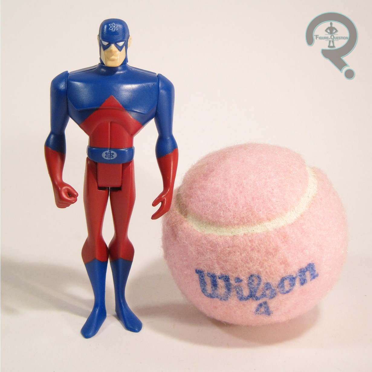
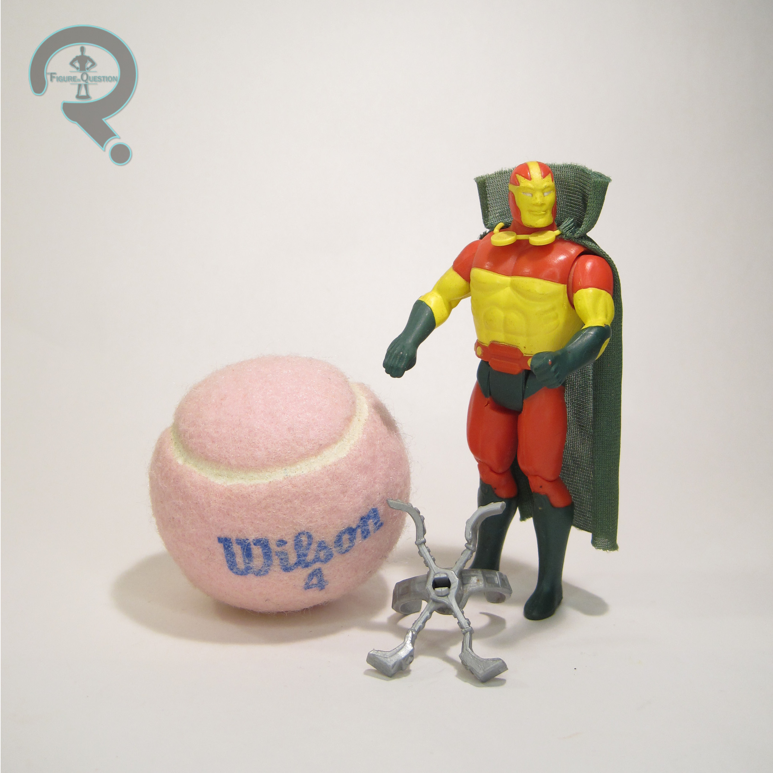
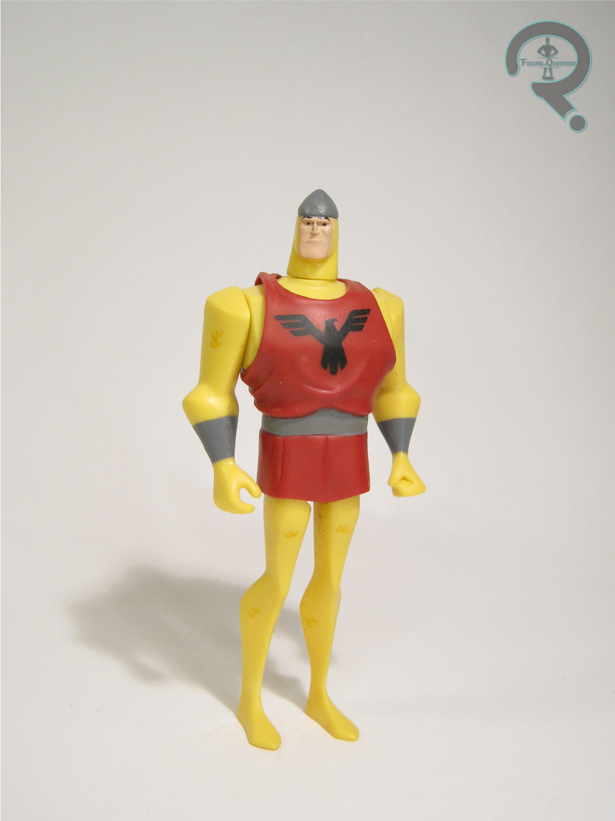
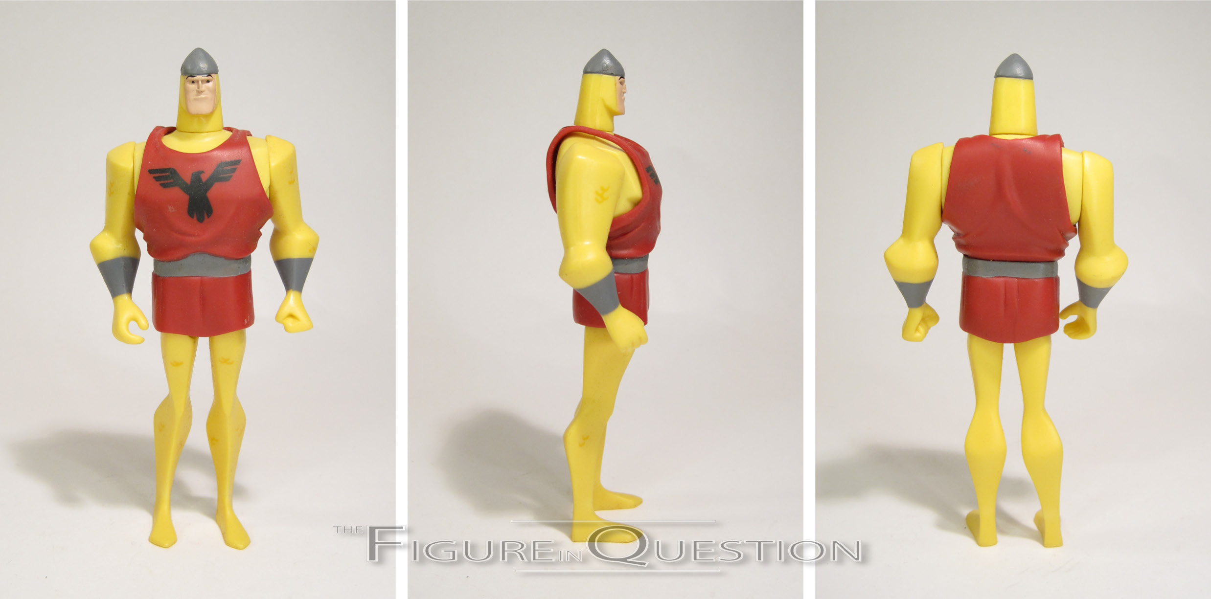
 Shining Knight was released in 2006, under the second iteration of Mattel’s Justice League Unlimited line. He was in the third series following the moving of the line under the larger “DC Universe” banner, and was packed in a three-pack with Zatanna and a repackaged Batman. He was then re-packed on his own the following year. The figure stands 4 1/2 inches tall and he has 5 points of articulation. Shining Knight is built on the slightly larger mid-size male base body, patterned on the original Batman mold. While a lot of the figures that used this base were in a weird spot, but it honestly works pretty well for Shining Knight in regards to how his build was portrayed on the show. Shining Knight gets a new head, as well as an add-on piece for his tunic. It’s not really the best parts selection the line had to offer. The head is plain and simply just too small for the base body, in addition to not being a particularly good sculpt, no matter it’s sculpting. He just looks kind of goony and off-model. Not helping things is the tunic piece, which is rather bulky. It just makes the head look even smaller. Its actual sculpt isn’t bad, though; the folds are nicely rendered, and it hands pretty believably. The color work on Shining Knight hits this weird spot that all the metallic characters hit, which is which direction do you go with the coloring. In contrast to most of the other gold-clad characters, Shining Knight gets a flat yellow, which is honestly not a bad call. There’s even a little bit of detailing on the arms and legs to do the scales, which is pretty cool. The rest of the paint is pretty basic, but gets the job done. Shining Knight was packed with no accessories for the three-pack release, while the single-pack added his sword to the mix.
THE ME HALF OF THE EQUATION
At the time Shining Knight was added to the line, the figures had gotten pretty hard to find, and I wasn’t actively searching. Adding to that, I just didn’t really like the figure’s look, so I didn’t go out of my way. Christian wound up getting one for his collection one way or another, so I ultimately wound up getting his when he got out of action figure collecting. It’s not a great figure. It’s not even a particularly good figure. It’s the only Shining Knight figure, though, so there’s that.