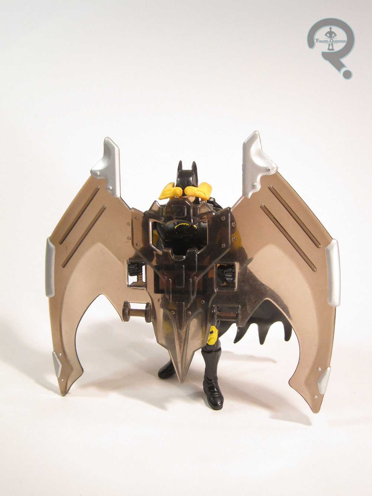
BANE – DETECTIVE MODE
DC COMICS MULTIVERSE (MATTEL)

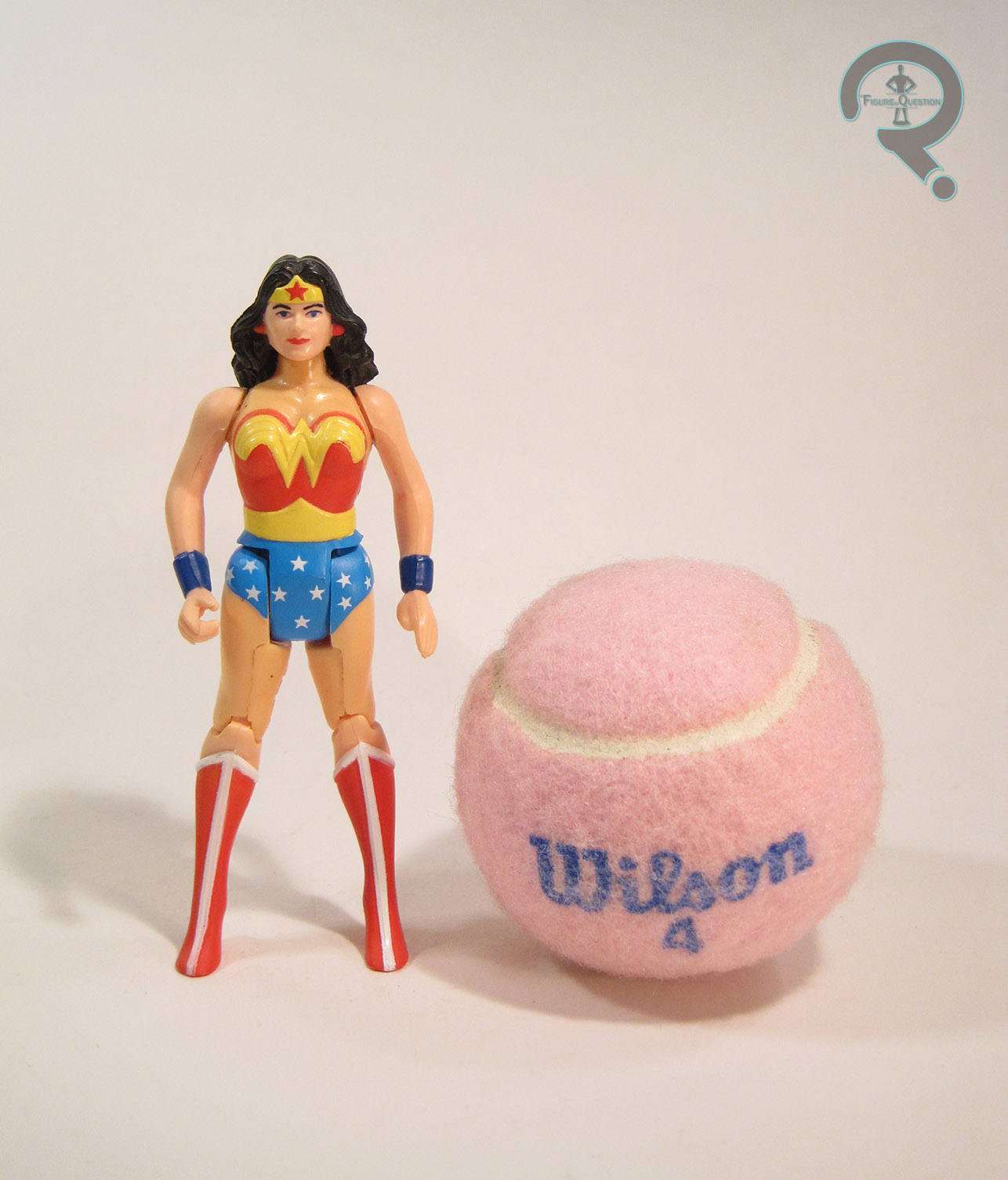
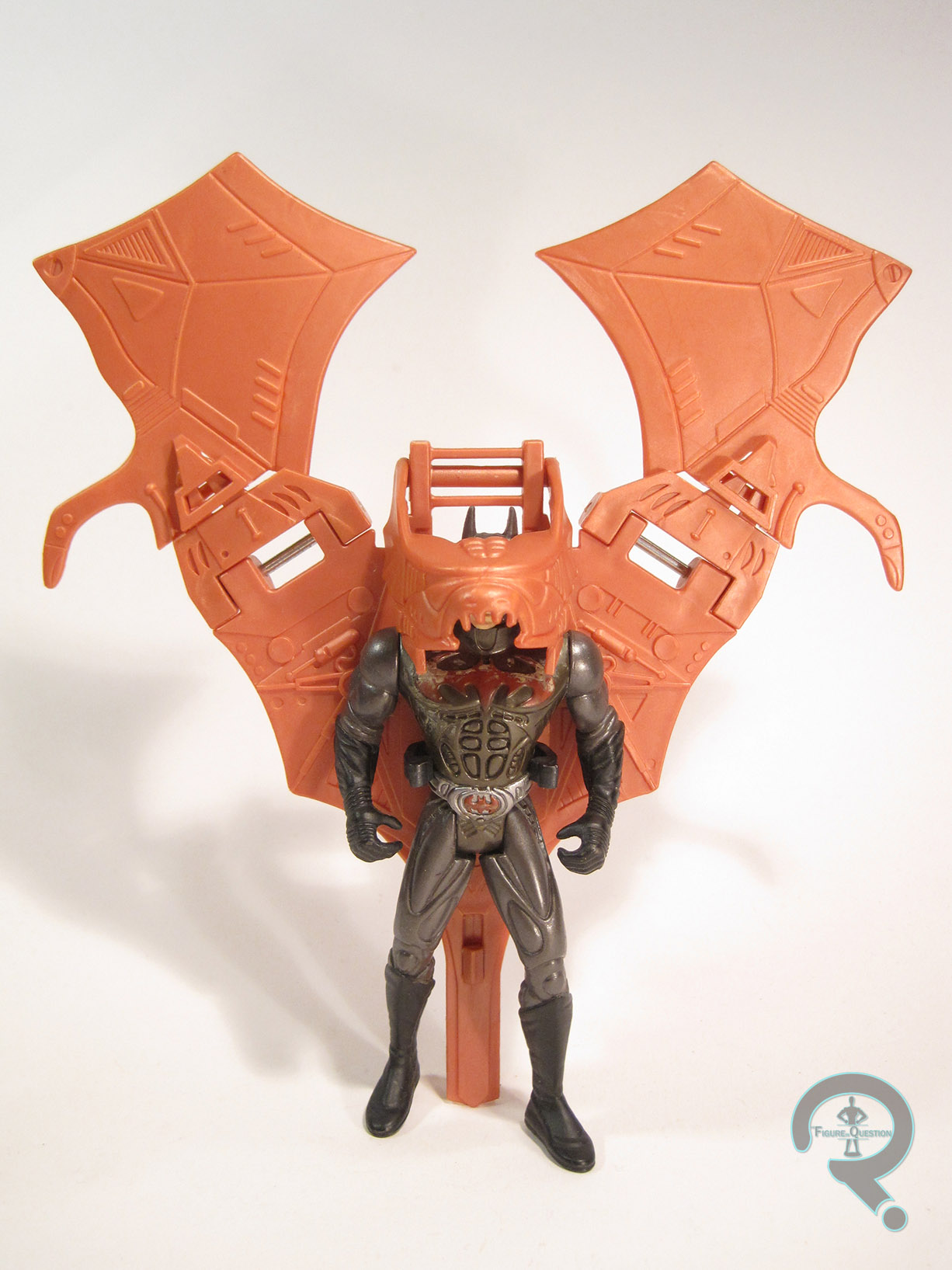
Hey look, another DC Comics Multiverse figure. These figures are always sooooooooooo great, right? While the line switched over to the 6-inch scale last year, there are still quite a few entries from its earlier, 3 3/4-inch scale, based primarily on Arkham Origins and Arkham Knight. I watched my brother play through Knight, so I’m familiar with that one, but I don’t really know Origins all that well. Amusingly enough, I actually own more Origins merch than any of the other games. There were just a lot of toys from that one, I guess. Anyway, I’ll be looking at one of the smaller Origins figures, Bane. Of course, it’s not a basic Bane. No, no, this is a wacky variant Bane. Let’s do this.
THE FIGURE ITSELF
 Detective Mode Bane was released in Mattel’s small-scale DC Comics Multiverse line. I couldn’t begin to tell you what series. I didn’t follow the line super closely, and from what I can tell online, no one else did either. The back of his box shows Arkham Knight, Arkham Origin Joker, and some sort of Batman derivation. I’m guessing he hit around the time of Arkham Knight’s release? The figure stands a little over four inches tall and he has 16 points of articulation. He’s built on the same mold as the standard Arkham Origin Bane figure. It’s okay, I guess. Not the worst thing Mattel’s put out. I guess he sort of looks like Bane from the game. It’s hardly the most exciting Bane look, and the figure suffers from the same clumsy articulation issues that plagued pretty much this entire line. The paint’s what makes this figure “unique.” As his name denotes, he’s based on how Bane looks when he’s viewed by the player using Batman’s Detective Vision in the game. In the game, this means the foes are seen through an x-ray filter, showing off their skeletons and what not. For the figure, it means he’s molded in clear blue plastic, with a skeleton pattern hastily painted on the front of the figure. He ends up looking like one of the Skeleton Men from Scooby Doo, Where Are You?. I don’t think that was quite what they were going for, but that’s what they got. An x-ray figure is really the sort of thing you have to fully commit to, not just a quick repaint (for instance, every “Emperor’s Wrath” Darth Vader has at the very least an actual skull imbedded in the middle of his helmet), so this ends up looking more like a guy wearing goofy makeup than anything else. Bane included no accessories, because why offer anything new with this figure, right?
THE ME HALF OF THE EQUATION
Like the Knightfall Batman I reviewed two weeks ago, this guy was another figure given to me by my Super Awesome Girlfriend, picked up during one of her stress buys. The fact that he was a gift from her is probably the best that can be said about him. I mean, I’ve still owned worse figures, but this one’s not offering a whole lot of positives. The gimmick is cool in theory, but as usual, Mattel was lazy about it, and that makes him kind of a pointless figure. I can’t really imagine what the market for this figure is supposed to be. People who like failed concepts?