BATMAN BEYOND
DC COMICS MULTIVERSE (MATTEL)

Uh oh. It’s a Mattel figure. This can’t be good. Okay, that’s not entirely true or fair. Mattel figures have the potential to be good, or even on the rare occasion great. In fact, most are at least passable, but some aren’t. And also, I don’t like Mattel as a company, for a whole slew of reasons, chief among them being that a whole lot of their products just feel so lazy. In fact, in the last year, I believe I’ve bought a whole four Mattel figures, mostly due to the vast majority of their output being rather dull. One of those four figures is today’s entry, Batman Beyond. Let’s see how he turned out.
THE FIGURE ITSELF
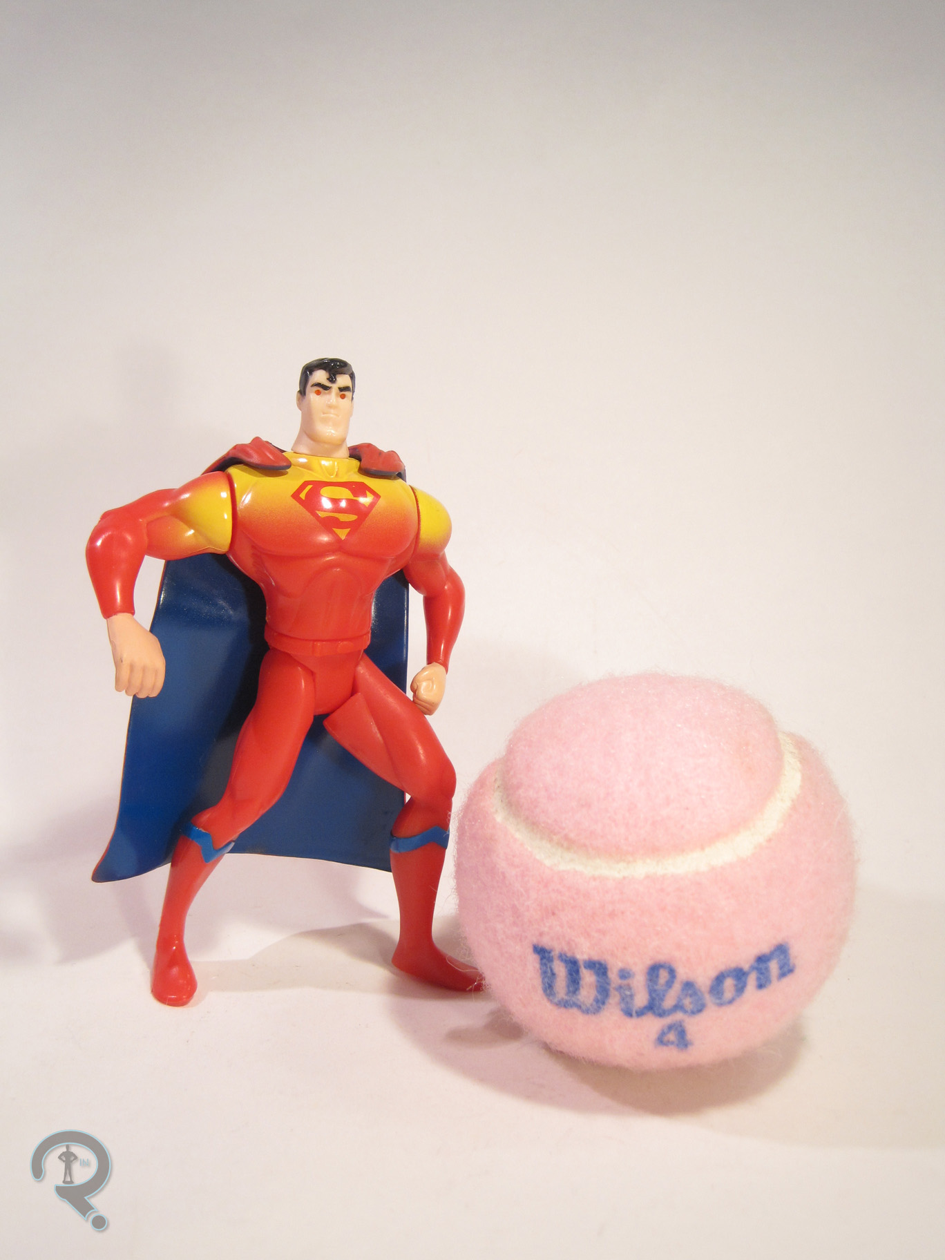
 Batman Beyond is part of Mattel’s DC Comics Multiverse line. The line doesn’t really have traditional series to speak of, but BB was released in the last year of the line. He’s part of the Arkham City sub-set, and is based on one of the alt looks for Batman from the game, rather than being an actual Terry McGuinness Batman Beyond. The figure stands 3 ¾ inches tall and has 18 points of articulation. The layout of the articulation is the same as both the Christopher Reeve Superman and Arkham Knight Robin figures. It’s not the worst articulation ever, but it could really, really use some sort of upper arm swivel and a mid-torso joint. The current layout leaves him a little stiff looking. In general, the sculpt of this figure feels pretty stiff and somewhat oddly proportioned. Some of that, such as the small head and larger hands, are at least partly present in the game design, but some of it’s just weird sculpting. Like Robin and Superman before him, the figure’s waist just sits too low, which looks really odd. Also, it looks like BB’s got at least a few parts in common with several of the previous Batmen. Because of this, he still has the usual Batman boots, which aren’t accurate to the design, as well as a weird shoulder piece that looks like it should have a cape or something attached, but it doesn’t, which is reasonable, since BB’s not supposed to have a cape anyway. Since one of the draws of Batman Beyond is his sleek design, these issues with the re-used pieces jump out a lot more than they would otherwise. BB does get his own head, belt, and forearms, which all do a pretty great job of capturing those parts of his design, and blend pretty decently with the rest of the sculpt. BB’s paint is one of his stronger suits. Everything is pretty cleanly handled, and his emblem in particular is nice and crisp, and really stands out well from the rest of the figure. BB has no accessories, which isn’t out of the ordinary for a Multiverse figure, but remains annoying given the price of the figure and the fact that he re-uses quite a few pieces.
THE ME HALF OF THE EQUATION
Remember how I was done with DC Comics Multiverse? Yeah, that seems increasingly incorrect. When I was down in North Carolina visiting family, I ended up finding this guy on a grocery run. I’ve always had a soft spot for the Batman Beyond design, and Super Awesome Girlfriend was there with me, so there really wasn’t a chance I was saying no to this one. He’s a flawed figure to be sure, and definitely reminds me of why I don’t really do Mattel figures anymore, but he’s Batman Beyond, which does a lot to outweigh some of the cons.