#0751: Batman

BATMAN

BATMAN: ANIMATED (DC COLLECTIBLES)

BatmanTAS4

Hey, do you guys remember how last year DC Collectibles debuted their line of super awesome figures based on Batman: The Animated Series? And do you remember when I reviewed the first figure in the line, which was Batman? And how I noted that he was actually Batman from the second incarnation of the show? And then I pointed out that the original design was slated for release later on in the line? Are you getting tired of these questions? Me too. So, yeah, the original Batman: The Animated Series Batman figure is finally here. Let’s see how it turned out!

THE FIGURE ITSELF

BatmanTAS6
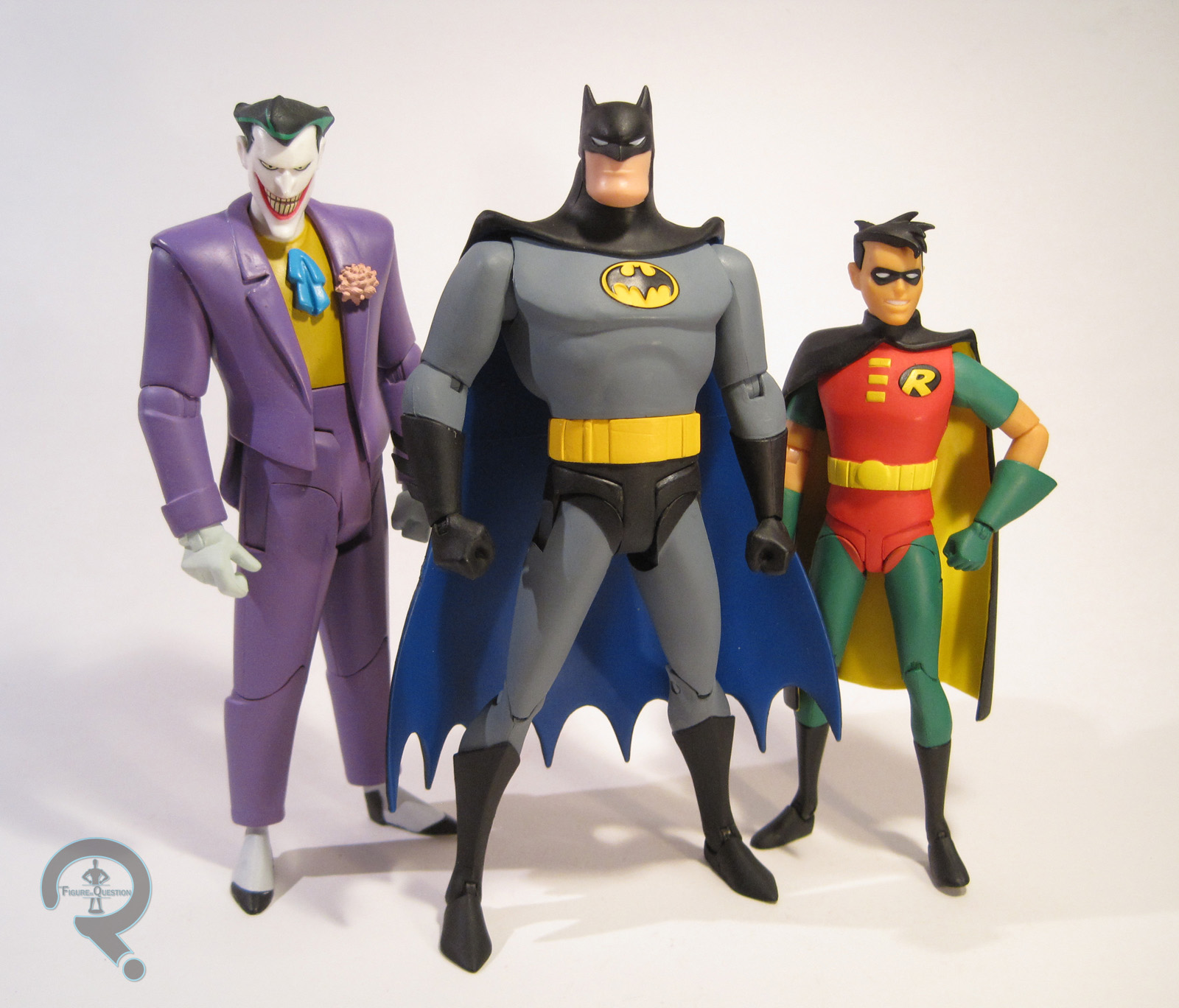
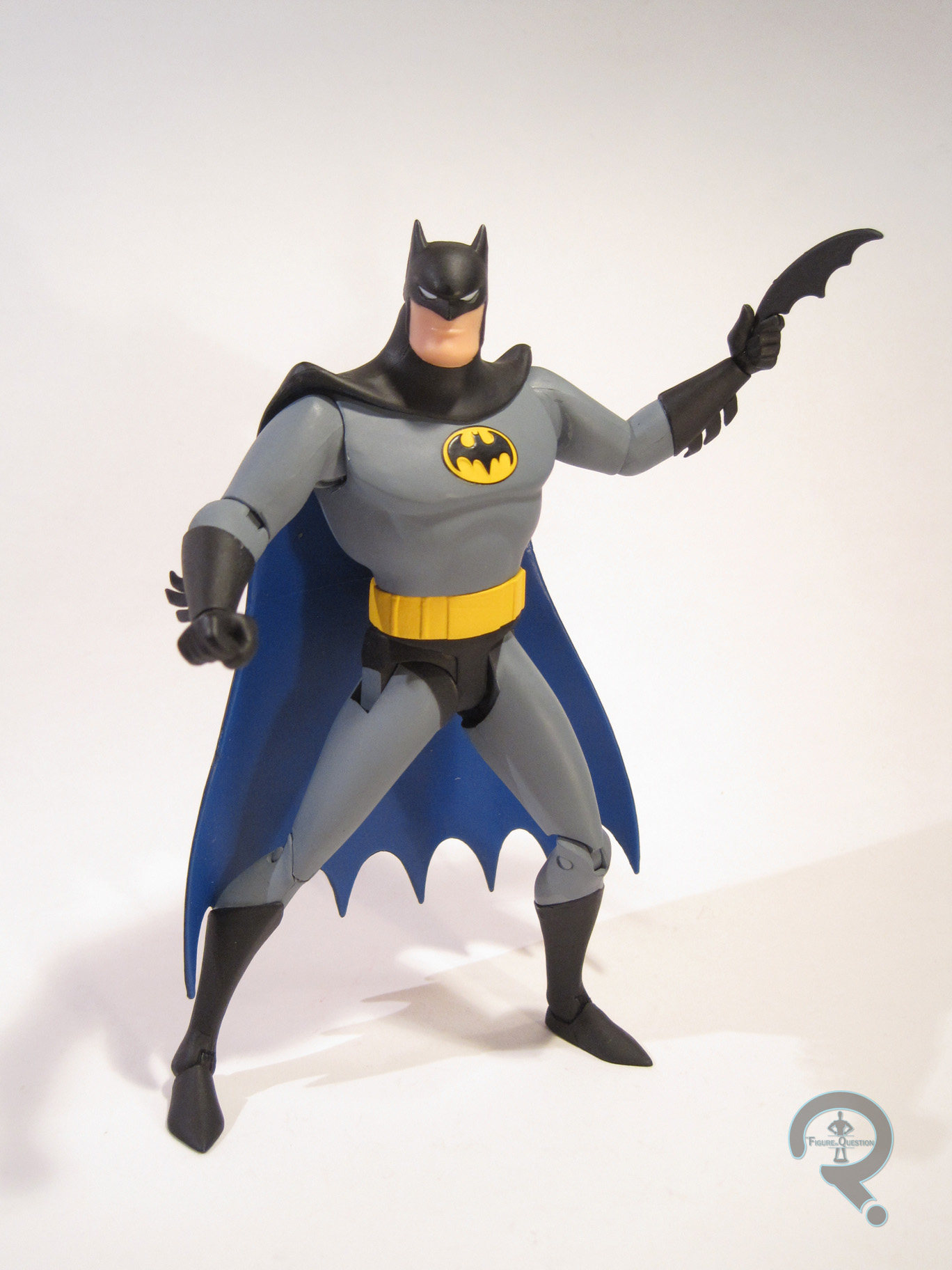
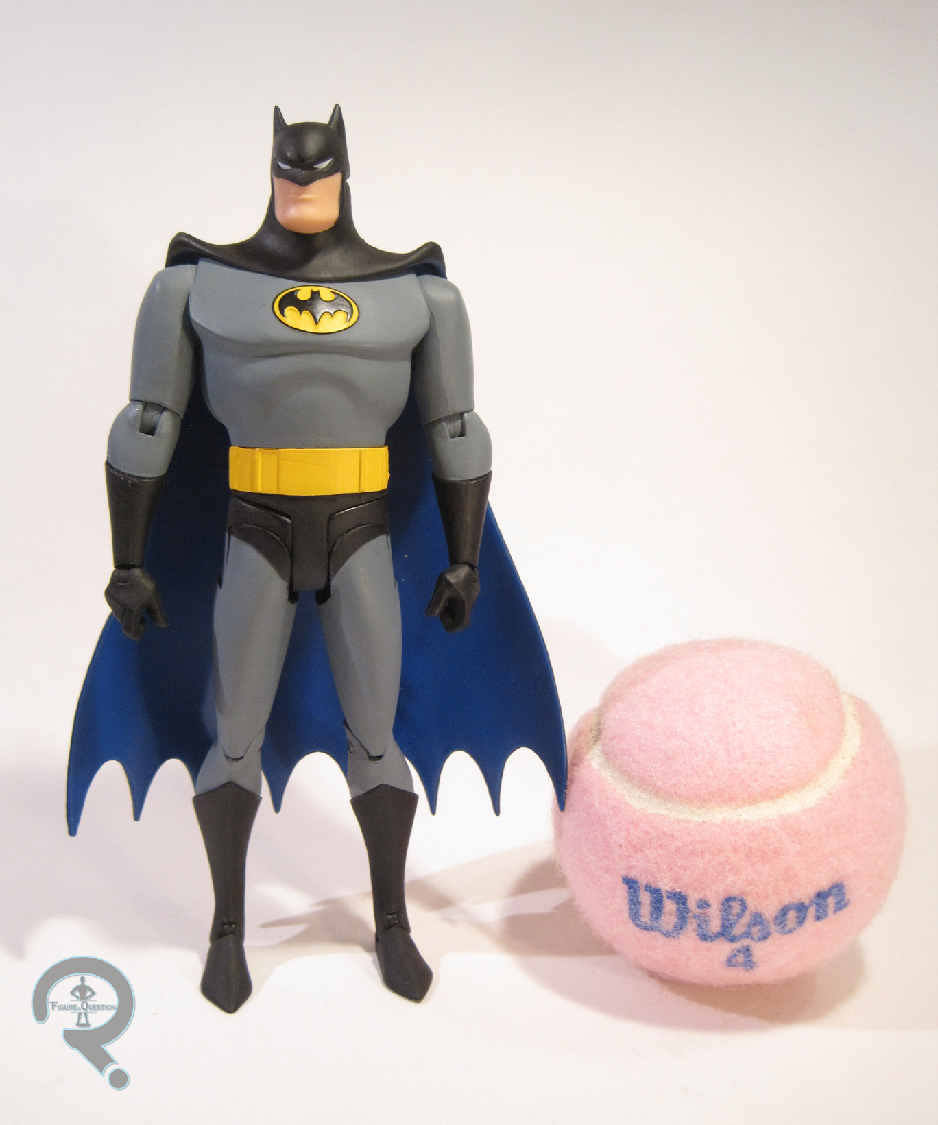
Batman is figure #13 in DC Collectibles’ Batman: Animated line. Technically, this makes him the first figure in Series 4 of the line, but it seems DCC has completely given up on releasing these in actual assortments, so Batman shipped out on his own, though a few other figures arrived in the surrounding weeks. The figure is just shy of 6 ½ inches tall and has 24 points of articulation. The figure lacks the usual swivel joint on the lower leg, which is quite a pain when it comes to posing or even just trying to get him to stand, and also leaves him eternally pigeon-toed. The boots are even separate from the rest of the leg, so it looks like there should be movement, but there’s not. Batman’s sculpt has the task of translating a 2D character model into 3D, which is certainly not easy. From the neck down, the figure works pretty well. Everything seems proportioned right, and he’s more or less identical to the guy we saw on the screen. He seems a little on the small side compared to some of the other figures, but not terribly so. What about the head? Well, it’s hard to say. The prototype looked pretty dead on, but this doesn’t seem to have made it to the final figure. The shape of the eyes in particular seems off, and they feel way too small. It’s possible it’s a paint issue, so it’s hard to judge the accuracy of the sculpt. This figure only gets one cape, in contrast to the two included with the last Batman; all we get is the swept back look. To be fair, this is the preferred of the two looks, and the cape is accurate to the source material, but the option BatmanTAS7would have been nice. This figure makes out okay paint-wise. There’s the previously mentioned issue with the eyes, but other than that, the paint is pretty clean, and they seem to have done a pretty good job matching the colors from the show. Batman is packed with a B:TAS accurate batarang, a grappling hook, 7 hands (a pair of fists, a pair of basic grip, a pair for holding the batarang, and one with the grappling hook sculpted in place), and a display stand with his character design sheet printed on it. It’s not quite as much as was included with the last Batman, but it’s still a pretty impressive allotment.

THE ME HALF OF THE EQUATION

Batman was purchased from my local comic store, Cosmic Comix. They had just gotten him and Poison Ivy in and I only had the money for one, so I went with him (I went back for Ivy later). I was pretty eager to get this figure when it was announced, what with it being my Batman and all, but I have to say, I was…disappointed with the final product. It really sucks to have to say that, to be totally honest, but it’s true. He’s not a bad figure, but the issues with the head and lack of movement in the legs hold him back. On any other figure, this might be forgivable, but on the definitive Batman, it’s a pretty big letdown. This figure is supposed to be repackaged with a new head in a two-pack with Phantasm early next year. It would be nice if DCC could fix the issues for that release. Until then, this guy’s certainly serviceable.

BatmanTAS2

#0728: Atom

ATOM

DC UNIVERSE CLASSICS

AtomGADCUC1

Sometimes, there are really, really cool figures of characters you like, that are held back by one tiny but hard to overlook flaw. Today, I’ll be looking at such a figure. I’ll get to the “why” of it in just a bit.

So, in the second season premier for The Flash, Barry fought a guy called Atom Smasher, aka Albert Rothstein. Rothstein comes from Earth 2, which was the home of the original 40s DC Comics characters. He’s also the godson of the original Atom, aka Al Pratt, who is the focus of today’s review. Unlike the later versions of Atom, who possessed the ability to shrink down to sub-atomic size (not unlike Marvel’s Ant-Man), Al was just a kind of short guy who was a good fighter. He was eventually given an assortment of powers after the fact, but those were kind of a retcon. Amongst other things, he served as a prototype for Justice Guild member Tom Turbine, from the Justice League episode “Legends.” And, he got a figure as part of one of the last series of DC Universe Classics. Yay for him!

THE FIGURE ITSELF

AtomGADCUC2Atom was released as part of Series 19 of Mattel’s DC Universe Classics, which was a whole series themed around the Justice Society of America, of which ol’ Al here was a member. Atom is presented here in his original costume from the 40s, which is definitely his more definitive of his two main looks. The figure stands about 6 ¼ inches tall and has 23 points of articulation. See that height? Remember when I mentioned he was a short guy? Yeah, Al’s listed height is 5’ 1”, which, in DCUC terms, should make this guy about 5 ½ inches tall. So, he’s about an inch too tall. This is because Atom is built on the larger male body (the same one used on the water-camo Aquaman from Series 7). Proportionally, it’s the best body Mattel had on hand; Al’s a pretty stacked guy; but it’s just too tall. It’s kind of a no-win scenario. A character like Al isn’t really privy to an all-new body sculpt, especially in a buck-based line like DCUC, so Mattel had to make due. Moving away from the size thing, Atom has a brand new head, forearms, abdomen, and shins. These are all nicely sculpted parts, and the buckles on the arms and abdomen are an especially nice touch, since they could have easily been painted on. The shins are a little bit shorter than previous pieces, so Mattel was clearly trying a little, but it’s not really a very noticeable difference. The cape is from Series 12’s Dr. Mid-Nite figure; it’s not a perfect match, but it’s close enough, and it’s a well-sculpted piece, so I can’t complain. For some reason, it sits out a bit from his back, which is a tad frustrating.  The paintwork on Atom is some of the best from this line. Some of the line work is fuzzy, but it’s pretty clean overall. The color work is really nice; everything is bold and vibrant, and he really just pops. The brown parts are meant to be leather, and so they’ve been given a slightly darker brown dry brushing, which is actually really effective in conveying the different texturing. Atom didn’t include any of his own accessories, but he did include the head and pelvis of STRIPE, the Collect-N-Connect figure for this series.

THE ME HALF OF THE EQUATION

The golden age Atom has long been one of my favorite JSA members. I was always a bit disappointed by DC Direct’s less than stellar attempt at the character, so I was intrigued by the DC Universe Classics version. I ended up finding this guy not long after he was released, while on a run to a nearby Target with my Dad. His size put me off at first, but the realization that this was probably the best version of the character I’d ever see in plastic, I went for it. I’m really happy I decided to get him, because, size issues aside, he’s actually a really nice figure.

#0709: Starman

STARMAN

JUSTICE LEAGUE UNLIMITED

StarmanJLU1

Growing up, I was much more a DC fan than a Marvel fan*. This was due in no small part to my primary exposure to the DC Universe being at the hands of the various animated series, courtesy of Bruce Timm and company. For many (though not necessarily for me), the high point of the DCAU was Justice League Unlimited, which offered tales staring characters from every corner of the DC Universe, barring the more mature Vertigo stuff. Tons of characters appeared on the show in its two seasons, with some taking on actual roles in the story, but most ending up as little more than scenery. Today’s focus, Starman, was part of that second group. Also, he has absolutely nothing to do with the Jeff Bridges film, just to be clear.

THE FIGURE ITSELF

StarmanJLU2Starman was actually one of the earliest figures in Mattel’s JLU line, being part of the first assortment of figures. He was available two ways: on his own with a cosmic staff accessory or packed with Superman and Amazo, in a set based around the episode “The Return.” My figure comes from the set with Amazo and Superman. Starman doesn’t figure into the plot of “The Return” in any prominent way, but he is one of the many characters who gets a brief focus during the initial fight with Amazo. There have been many versions of Starman over the years, and this one’s based on the Prince Gavin version of the character, who starred in Adventure Comics during the 70s. The figure stands roughly 4 ½ inches tall and has 5 points of articulation. Starting with the first series of JLU, Mattel implemented one of their signature buck systems, in order to make producing the multitudes of characters appearing on screen just a little bit easier. Starman is built on the medium-sized body, which was a retooled version of the Justice League line’s Green Lantern body. It’s a good translation of the body style from the show, and it’s a good fit for Starman. One small drawback of this particular body is that one of the legs is shorter than the other, meaning he stands with a slight tilt. It’s a minor issue, but it’s one that affected every figure that used this body. Starman gets his own unique head sculpt, which is probably one of my favorites from the line. It replicates his wacky hair pretty well and features a lot of really sharp line work on the facial features. It’s a great translation of the animation model for the character. The paint takes up the bulk of the work in conveying his costume, which it does pretty nicely. The colors are nice and bold, and the line work is all pretty clean. The multi-pack version of Starman didn’t have accessories, unless you want to count Superman and Amazo.

THE ME HALF OF THE EQUATION

The three-pack that contained Starman was my second item from the JLU line. The line was still pretty hard to find, so I ended up trading the Doombot from Marvel Legends of all things to get it. Perhaps not the greatest trade in the long run, but I already had a Doombot, so I didn’t mind. Starman remains one of my favorite figures from the line. I’ve always liked Gavin’s design, and it’s not like he’s got an excess of figures. This one captures the design quite nicely, which is awesome!

*Okay, that’s not entirely true. I was a pretty big Marvel fan during the back half of the 90s. It was the early 00s that turned me away from the company, before the Marvel Studios movies brought me back.

#0684: Catwoman

CATWOMAN

BATMAN: THE LONG HALLOWEEN

CatwomanLH

A few of Batman’s foes have a tendency to go back and forth across the line of friend or foe, but none more so than Selina Kyle, aka Catwoman. She’s one of the Bat’s oldest enemies (debuting in the same issue as the Joker), but she rarely stays on his bad side for too long. In addition to switching sides a lot, she also gives the Wasp a run for her money in terms of number of costumes. She’s been in the leather catsuit for a while, but before that she seemed to be changing costumes just about every week. She did manage to keep roughly the same look for most of the 90s, and that look’s gotten a handful of figures (including my very first Catwoman figure). Let’s look at one of those figures, shall we?

THE FIGURE ITSELF

CatwomanLHWilsonCatwoman was released in the first series of DC Direct’s Batman: The Long Halloween. The series was based on the comic of the same name, which featured the work of artist Tim Sale (who’s one of my favorite Batman artists). It follows that Catwoman is based on Sale’s interpretation of the character, as she appeared in that series. She’s essentially wearing her purple bodysuit costume from the 90s, with a few tweaks. The figure is just shy of 6 inches tall and has 13 points of articulation. That’s not a lot of movement, but it was above average at the time of this figure’s release. Still, she’s not going to get into any poses more creative than a basic standing look. Catwoman featured an all-new sculpt, which has remained unique to this particular figure. DC Direct definitely had some trouble translating Sale’s artwork into three dimensions on several of the figures in this line, but Catwoman actually ended up with a pretty great sculpt. She manages to capture Sale’s style without being too cartoony or odd looking. The head is probably the most stylized part of the figure. Sale had a fairly distinctive take on Selina’s mask, and it’s been translated very nicely here. She’s missing her whiskers, but those probably would have looked silly in three dimensions, and they were absent from a lot of the silhouettes. That face is definitely a Sale face. The proportions of the body are pretty decently handled; she’s still somewhat stylized, but not absurdly so. The boots and gloves exhibit some of the best work on the figure, with some of the best sculpted wrinkles I’ve ever seen. Seriously, those wrinkles are fantastic. It’s a weird element to focus on, but it really impresses me. The bracelets on the wrists are actual, metal rings, which is a cool touch (though, I seriously have to question the practicality of such accessories on a burglar…). The tail is really the only part of the figure that’s just “ehh,” and that’s really just because it’s not in any way posable. Catwoman’s paintwork is pretty straight forward, but it’s nicely handled. The face paint does a nice job of accenting the “Sale-ness” of the sculpt. The glossy paint on the gloves and boots is also a nice way of breaking up those parts from the rest of the body, so that’s cool. Catwoman was packed with a pair of night vision goggles, a whip, a calendar page (February 14th, for those who are curious), and a display stand that looks like a section of pavement. Of course, I’ve misplaced all of those over time.

THE ME HALF OF THE EQUATION

When this figure was first announced, I didn’t want it. The prototype shots looked really odd, especially the head. Then my comic book store was running a sale on DC Direct figures, and she was marked down to like $5, at which point I realized I didn’t yet own a Catwoman in this scale and figured I could do a lot worse for five bucks. Oh boy could I have done worse. In hand, this is probably one of the best Catwoman figures out there. Sure, the articulation could be better, but the figure is just a great looking figure.

#0681: Mercury

MERCURY

DC UNIVERSE CLASSICS

MercuryDCUC1

It’s been 160 reviews since my last DC Universe Classics review. Guess I’ll fix that then. So, one of the coolest things about DC Universe Classics was just how obscure they went with the line. For all the crap I give Mattel about their various practices, they built a successful line that ran for 21 series and gave us the likes of Kamandi and Cyclotron. That’s downright impressive. It is also the only DC line to date to give us a full line-up of the Metal Men, who are one of DC’s cooler off-kilter teams from the 60s. So, let’s look at the team’s resident jerk with a heart of jerk, Mercury. He’s the only metal who’s liquid at room temperature!

THE FIGURE ITSELF

MercuryDCUC2Mercury was released as part of the 16th Series of DC Universe Classics. He was the third member of the Metal Men to be released, and the last member to be released at retail. Way to go Mercury, you ruined it for everybody. The figure is 6 ¼ inches tall and has 29 points of articulation. Mercury was another figure built on the skinny buck. I know that the first “skinny” character was Deadman in Series 11, but I think 16 was the first series to use this slightly improved iteration of the body. While he uses the base as a starting point, Mercury actually has a fair number of non-standard parts. The best piece if the figure is definitely the head, which does a fantastic job of capturing the character. His expression is just perfect for Mercury, and they’ve really nailed the exaggerated proportions. The extended nose is a separate piece from the face, so there’s a noticeable seam if you look closely, but from a normal viewing distance, it’s unnoticeable. The rest of the body works pretty well for Mercury; a lot of the wackier proportions that looked out of place on other characters look perfect here. Mercury’s paintwork is somewhat deceptive. The previous two Metal Men were just straight metallic colors, so when I first saw Mercury, I was disappointed that he was just a flat red. But, after taking him out of the package, I realized the red was actually pearlescent, which is actually really impressive looking, and gives him a nice unique feel. Mercury included an extra hand made to look like it’s morphing into a giant pair of scissors, which is a pretty awesome way of showcasing his powers (they’re even articulated!). He also included the torso of Bane, the Collect-N-Connect for Series 16.

THE ME HALF OF THE EQUATION

Series 16 was one of the few series of DC Universe Classics that I found mostly in one shot at retail. However, I didn’t get the first Mercury I found; it went to my Dad, who’s a bigger Metal Men fan then I. Fortunately, I came across another Mercury not long after, and here he is. For me, Mercury represents some of the best work DCUC had to offer. He’s a fun, obscure character, on the right body, with a superb head sculpt, solid paintwork, and a well-executed accessory.

#0670: X-Ray Vision Superman

X-RAY VISION SUPERMAN

SUPERMAN: THE ANIMATED SERIES

XRaySupes1

Remeber last week when I looked at one of the wacky Superman variants from Kenner’s tie in line for the 90s cartoon?  Well, that one wasn’t even the tip of the iceberg.  At least he was somewhat passable as a basic Superman.  Today’s figure? Less so.  Without further ado, here’s X-Ray Vision Superman.

THE FIGURE ITSELF

XRaySupes2X-Ray Vision Superman was released as part of the fourth series of Kenner’s Superman: The Animated Series, the story of which I covered in Power Swing Superman’s review.  He’s another of the frivolous Superman variants designed to showcase Superman’s less obvious power set.  Yay?  The figure is 5 inches tall and he features 6 points of articulation.  He sports a unique sculpt.  It’s not quite show accurate, but it’s in line with the all of the other Animated Series figures, so at least it’s consistent.  It’s nowhere near as extreme in pose as Power Swing Superman, but he’s still a bit removed from a standard standing pose.  The most out there part is definitely the throwing arm, which is permanently outstretched and at a 90 degree angle.  That’s a bit on the awkward side, but it works okay with the accessories.  The rest of the sculpt is more standard fare: fairly simple musculature and decent enough proportions.  The head sculpt isn’t as good as the PS Superman, but that’s mostly due to the “action feature.”   What is this action feature?  Well, he’s got light piping, so as to light up his eyes and simulate his…X-Ray vision.  I think they may have gotten confused with his heat vision.  The paintwork is where the figure really gets wonky.  In lieu of the traditional Superman colors, this figure is primarily a red-orange-yellow gradient.  It’s a very warm look, which once again makes me think someone at Kenner kept mixing up heat vision and X-Ray vision when designing this guy.  That said, it’s a unique look, so I actually can’t complain.  The cape has been swapped to blue, I guess to break up the reds a bit.  Overall, the paint is pretty decently applied, with no real slop or anything and lots of nice, bold colors.  Superman is packed with a bundle of dynamite, as well as a safe to hide it in.  The safe is partially translucent, so as to demonstrate Superman’s power.

THE ME HALF OF THE EQUATION

Like his series-mate, I picked this Superman up from Yesterday’s Fun. He was another one of the wacky Supermen that had intrigued me all those years ago.  In fact, he has the notoriety of being the very last thing I bought on vacation.  He’s not quite as much fun as Power Swing, but he’s not too bad.  And, as an added bonus , paired up with Power Swing, you get a pretty decent Silver Age Superman Blue and Red.

XRaySupes3

#0668: Batgirl

BATGIRL

BATMAN’66 (MATTEL)

Batgirl66a

I’m sure that a fair portion of my readership has heard about the passing of Yvonne Craig on Wednesday.  For those unaware, she was the actress who played Barbra Gordon/Batgirl on the live action Batman show from the 60s, along with plenty of other roles.  In honor of her, I’ll be taking a look at the Batgirl figure from Mattel’s Batman ’66 line, who was just recently released, almost two years after the rest of the line, due to rights issues.

THE FIGURE ITSELF

Batgirl66bBatgirl was released two ways, both through Toys R Us.  She was released solo as a SDCC 2015 exclusive and more widely as part of a three pack with Batman and Robin from the 60s show.  This particular version is the one from the three pack, though the differences in the actual figure are negligible.  The figure is just shy of 6 inches tall and has 23 points of articulation.  The articulation on this figure feels a little outmoded and rudimentary, but, in Mattel’s defense, it keeps her stylistically the same as the rest of the Batman ’66 line.  Take of that what you will.  The Batman ’66 line was mostly without re-use for sculpts, but it’s a Mattel line, so some was bound to show up eventually.  Batgirl uses the upper arms and upper legs of the line’s take on Catwoman. They’re basic enough that it’s not immediately evident that they’re re-used, so that’s good.  The rest of the sculpt is new to this figure.  It’s decent, if not jaw dropping.  The head’s the best piece for sure.  It’s a pretty great likeness of Yvonne Craig, and it fits in really nicely with the other sculpts in the line.  The body sculpt is a little lower quality than the head.  It’s not bad, and there are some really great bits of texture on the gloves and the body suit stitching.  However, the proportions are a little bit off; the arms and legs are really long and lanky and the torso seems oddly long.  Also, the articulation isn’t really worked in very well, so it stands out pretty badly in certain areas.  On the plus side, it seems that Mattel has stepped up to the plate on paintwork in the lull between figures.  Batgirl’s paint is a fair bit nicer than what we saw on the first round of ’66 figures, and it avoids the gloppy-ness that plagued a lot of them.  Batgirl’s accessories are a display stand with “Sock!” written on it and a card with a pretty cool Batgirl illustration.  Depending on how you look at it, one could also count Batman and Robin as “accessories” as well, since it’s unlikely that anyone was buying this set purely for them.

THE ME HALF OF THE EQUATION

Confession time: this isn’t my figure.  It’s actually my Dad’s.  You know, I’ve reviewed four Batman ’66 figures on this site and three of them have been owned by other people.  I swear I have my own Batman ’66 collection!  In fact, that’s actually why I don’t have this figure.  Since I’ve already got the Batman and Robin included in this set, they add no value for me, and $55 is a bit steep for a single figure.  If I’m honest, Batgirl’s probably the best figure to come out of this line.  Sadly, she’s still a Mattel figure, which means there’s some definite room for improvement.

Batgirl66c

#0663: Power Swing Superman

POWER SWING SUPERMAN

SUPERMAN: THE ANIMATED SERIES

PowerSwingSM1

When you are creating an entire line of action figures based on a property with one defined look for your main character, the only way to keep the main character at the forefront, logically, is to release a bunch of variants of that character. Sometimes, they’ll be authentic designs from the source material (such as many of Hasbro’s recent ML Spider-Men) or a practical extension of their basic look (like Iron Man). Other times, they’ll just be completely made up. Enter Power Swing Superman.

THE FIGURE ITSELF

PowerSwingSM2Power Swing Superman was part of the fourth series of Kenner’s Superman: The Animated Series line. This series is significant because it wasn’t carried by conventional US retailers. Instead, it hit in Europe first. The series didn’t make it to the States until it was offered by Diamond Distributers a few months later. So, there’s that story. The figure stands 5 inches in height and has 6 points of articulation (though his waist swivel is limited by the action feature). Now, where, you might ask, did this figure’s costume originate? Some one episode look, or perhaps an obscure Elseworlds story? Nope, it came straight from the minds of the toy designers. Yes, this costume is totally made up for the figure, though it is notable that this figure removed the signature red shorts over a decade before the New 52 redesign made it canon. The line never really stuck to the show’s style when it came to sculpts, but this figure actually takes it even further, with more defined musculature and an exaggerated pose that wouldn’t look out of place on the dance floor of a disco. While many of the wacky Supermen were sculpted in his traditional garb and painted funky after the fact, this figure’s sculpt actually has details that correspond specifically to this design, which is kinda neat. The best part of the figure is easily the head sculpt, which actually manages to be the most show-accurate sculpt the line ever produced. It’s spot on! The paintwork on the figure is alright, but not great. It sticks to his traditional colors, though placed a bit differently. The colors are nice and vibrant, but the application is spotty. The costume has a lot of bleed over, and the red areas in particular feel like they could use another coat of paint. The head manages to be the best piece once again, avoiding the bleed over and actually doing a very nice job on the eyes. The figure included a large piece of pipe for him to hold, as well as a miniaturized version of Luthor’s exo-suit from the pilot episode. Also, his waist is spring-loaded, allowing him to “swing” the pipe at the exo-suit and “demolish” it. It’s not high-end or anything, but it’s amusing.

THE ME HALF OF THE EQUATION

Power Swing Superman was one of my many purchases from Yesterday’s Fun whilst on vacation this year. I had actually always been intrigued by this guy, but I’d never seen him in person. So, when I came across him, I snatched him up quickly. He’s definitely goofy, but I really enjoy him.

PowerSwingSM3

#0649: Ninja Talon

NINJA TALON

BATMAN VS. ROBIN (DCC)

Talon1

When DC Comics did their New 52 changeover in the comics, they also decided to do a similar restructuring with their line of animated movies. I’ve seen several of the new continuity movies, and, while I like them more than the comics they’re based on, they still leave me cold. Their most recent animated Batman film was Batman vs. Robin, which was (loosely) based on the New 52 storyline The Court of Owls. It’s hardly my favorite animated Batman movie, but it was at the very least an improvement on its predecessor Son of Batman, so that’s good. DC Collectibles is still handling the toys for these movies, and they released one of the film’s faceless baddies, Ninja Talon.

THE FIGURE ITSELF

Talon2Ninja Talon was released as part of DC Collectibles’ Batman vs. Robin line. Actually, he’s the entirety of the line. Seriously, he’s the only figure they released from the movie. He doesn’t even get his own packaging! The back of the card is just the Justice League: Throne of Atlantis backing! He’s not even pictured! Poor guy’s so lonely. So, it’s worth noting that there are a few Talons in the movie. There’s a main guy named Talon and then an army of voiceless, personality void Talons. This is one of the latter. The figure stands roughly 6 ½ inches tall and has 15 points of articulation. The figure is built on the basic smaller animated male body, like we saw on Green Lantern, along with a new head and forearms, and add-ons for the belt/knives. The basic body does a pretty decent job of translating the animated style into three dimensions, and it helps to keep all of the figures consistent. The head and hands are very nicely sculpted parts. They fit seamlessly onto the rest of the body and do a great job of replicating the design from the movie. Ninja Talon’s paintwork isn’t perfect, but it’s pretty good. The switches between gold and grey are somewhat prone to bleed over, but nothing too terrible. I really like the shade of gold used, and the two-toned grey looks very sharp. The figure’s paint looks much better as a whole than Green Lantern and Wonder Woman. It’s nice to see DCC improving on that front. Ninja Talon includes no accessories.

THE ME HALF OF THE EQUATION

So, I wasn’t really sure I was going to get this figure. The movie was just alright and I don’t exactly have a lot of attachment to Talon as a character. But, then I saw at a comic store in Bethany Beach and he actually looked pretty cool. I had just bought a bunch of stuff earlier that day, so I figured I’d hold off, and I put him back on the rack. And then he was placed back in my hand. So, I put him back again. And he was placed in my hand again. Seems Super Awesome Girlfriend didn’t want me to put him back, nor did Tim and Jill. So, now I have him. Truth be told, I’m glad they didn’t let me put him back. He’s a pretty fun figure.

#0619: Superman – Red

SUPERMAN – RED

JLA: CLASSIFIED

SupermanRed1

Hey, do you remember back about two weeks, when I took a look at Superman Blue? That weird changeup to Superman to help keep him “hip?” Yeah, well, umm, long story short, he got split into two separate beings, and the second one was today’s focus, Superman Red. See, cuz it’s clever, cuz Superman is usually just one guy, who wears red AND blue, but now he’s two guys who each only wear one color. Isn’t that smart? But, of course, they also had slightly different personalities. Can you guess what was Superman Red’s defining trait? If you guessed the incredibly obvious answer of hot-headedness, you win a special no-prize! Good for you! Now, onto the figure!

THE FIGURE ITSELF

SupermanRed2Superman Red was released in the third series of DC Direct’s JLA: Classified line. He directly followed Blue in Series 2. While 2 had a more defined “looks of the 90s” theme to it, Series 3 was a little bit more free-form. The figure is about 6 ½ inches tall and has 13 points of articulation. Like just about every other McGuinness-styled figure, the articulation is mostly pointless, and he’s really only good for a basic standing pose. Superman Red is, completely unsurprisingly, a head to toe repaint of Series 2’s Superman Blue. Seeing as they’re essentially just palate swaps of each other in the comics, you can’t exactly blame DC Direct for just using the same mold. I guess they could have given this one a more emotive face (like Mattel did when they released these two) but it’s hardly a requirement. The head still feels too big for the body, and the arms are still too stubby, but it’s not a terrible sculpt. The paint is the real difference here, though even then it’s pretty much the same, but with red swapped in for blue. The paint does feel a little sharper this time around, and the white details are more properly aligned. Like his blue counterpart, Superman Red’s single accessory is a black display stand with the JLA: Classified logo in blue. Would have been cool to get it in red, just for the heck of it, but I guess they wanted it to be the same as the rest of the line.

THE ME HALF OF THE EQUATION

Like Superman Blue, Superman Red was from the assortment of figures I picked up during an action figure sale at Cosmic Comix. He was $3. That was most of my reasoning for getting him. Well, that and I was getting Superman Blue. Having both seemed like a good idea. I think Blue is my favorite of the pair, but I like both, and I certainly don’t regret buying them.

SupermanRed3