LOBO
SUPER POWERS (McFARLANE)
“Lobo is crude, rude and nearly impossible to kill. The super-tough bounty hunter wanders the cosmos on his space bike, flying from one assignment to another, with plenty of pit stops at local alien bars along the way!”
When I find myself in times of trouble, Todd McFarlane comes to me, speaking words of wisdom, “Super Powers”…. No? Not working for you guys? Yeah, I was iffy on it myself. But, I decided to go with it, and here we are. Congrats on getting here with me. Today’s Super Powers focus goes a bit more modern…sort of. Well, post-original run…sort of. It’s a bit of a wibbly-wobbly thing. See, it’s Lobo, who, in the form most people know, didn’t exist until the end of the ’80s. But, he was introduced, albeit in a rather different form, in 1983. So, you know, there’s something there, I guess. Anyway, here’s Lobo.
THE FIGURE ITSELF
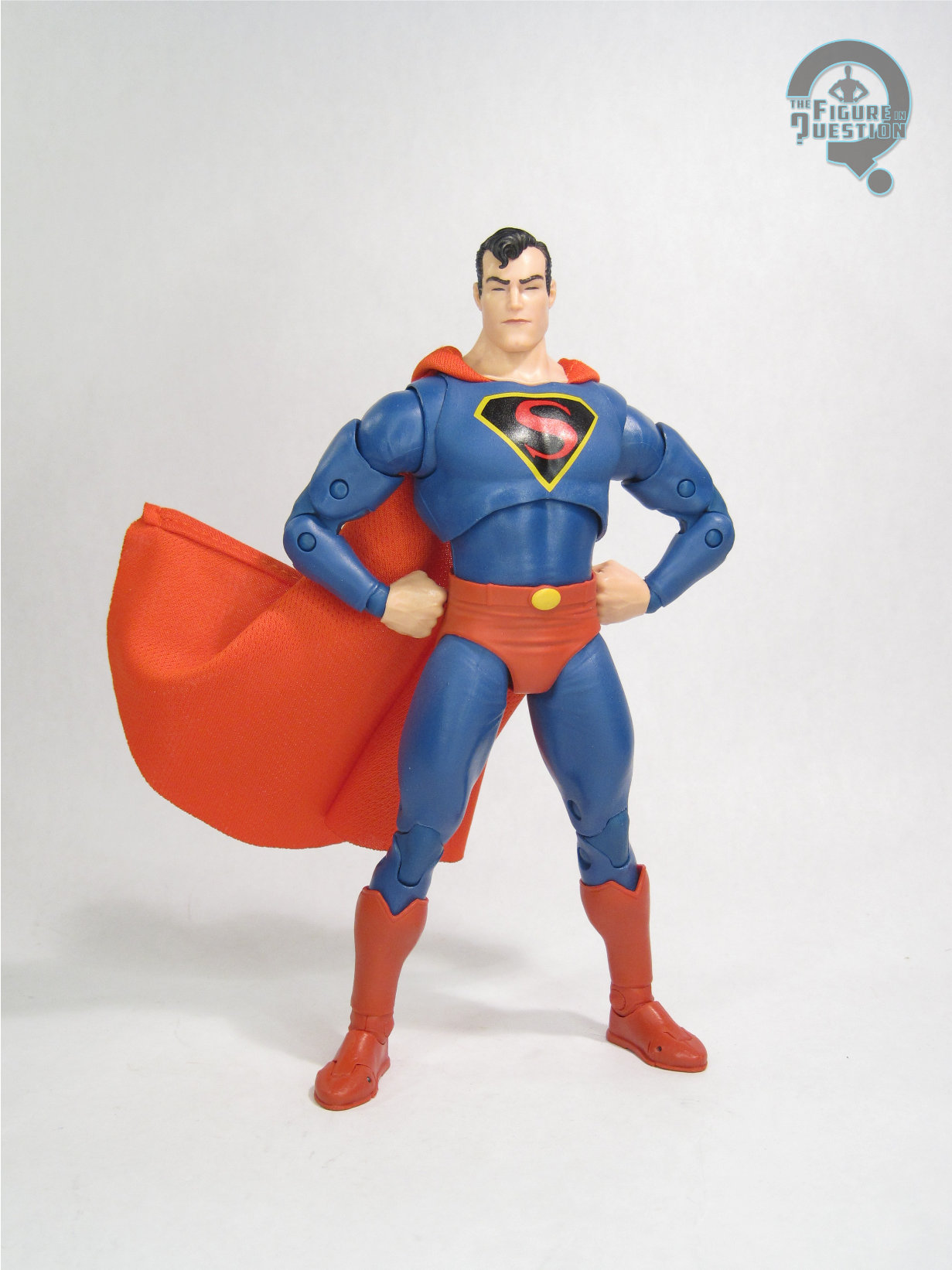
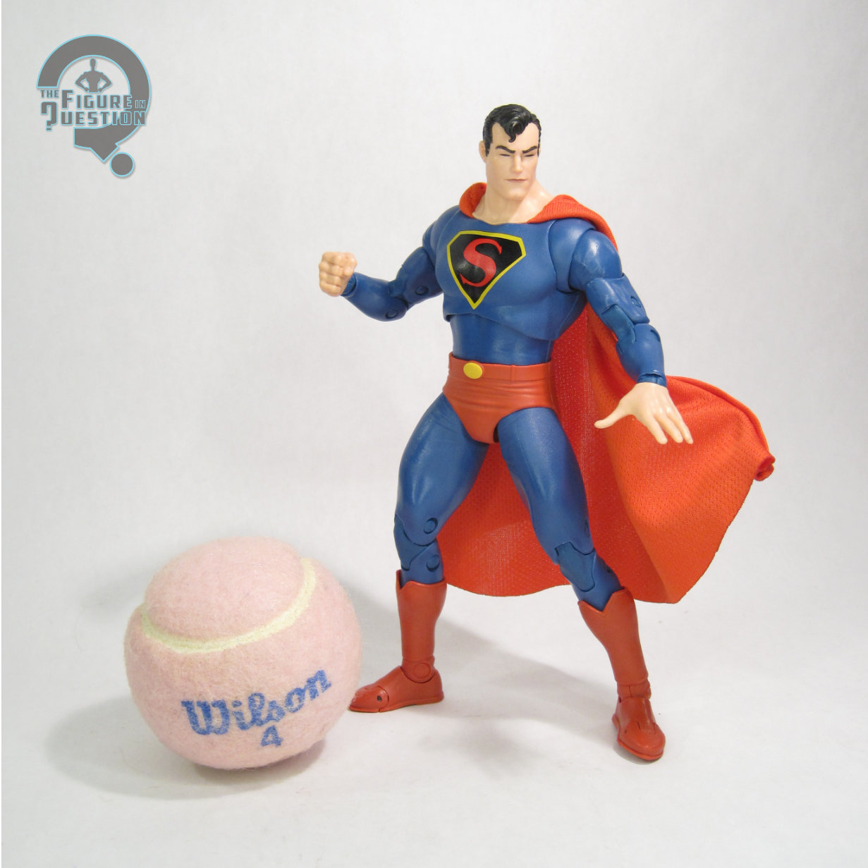
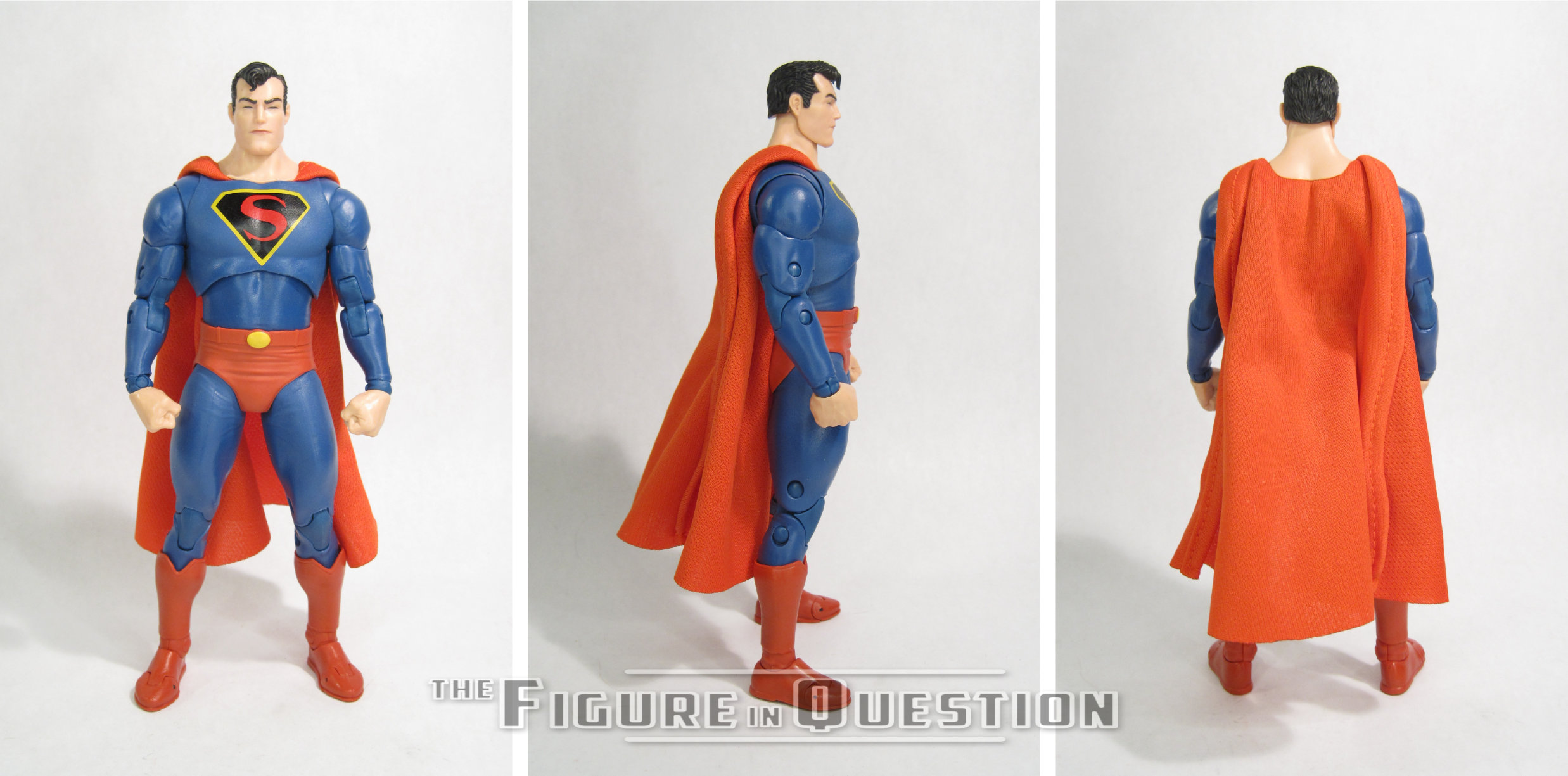
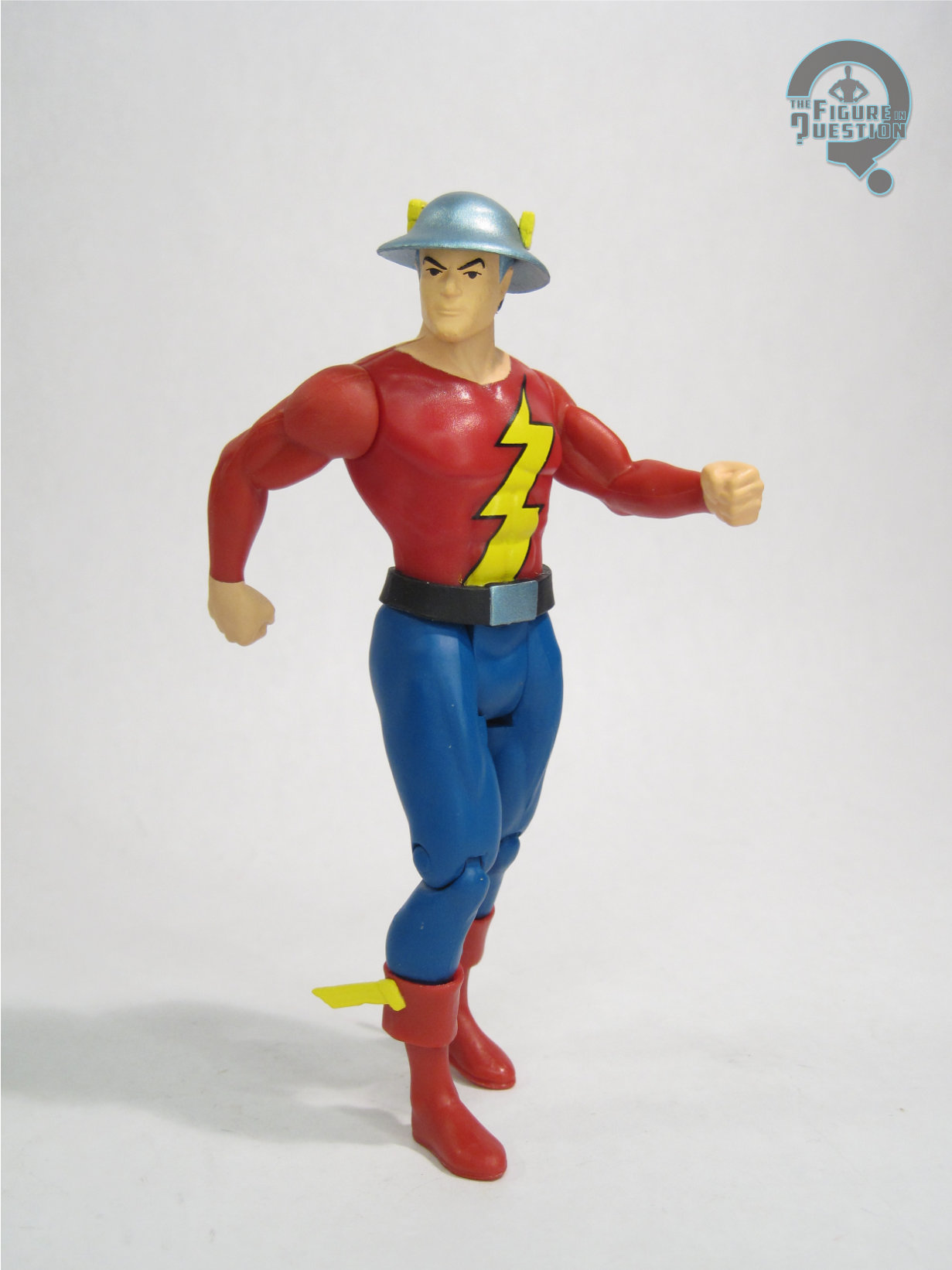
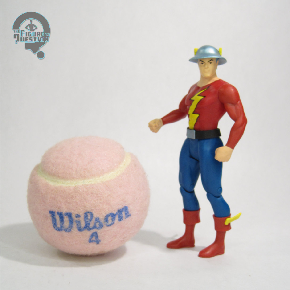
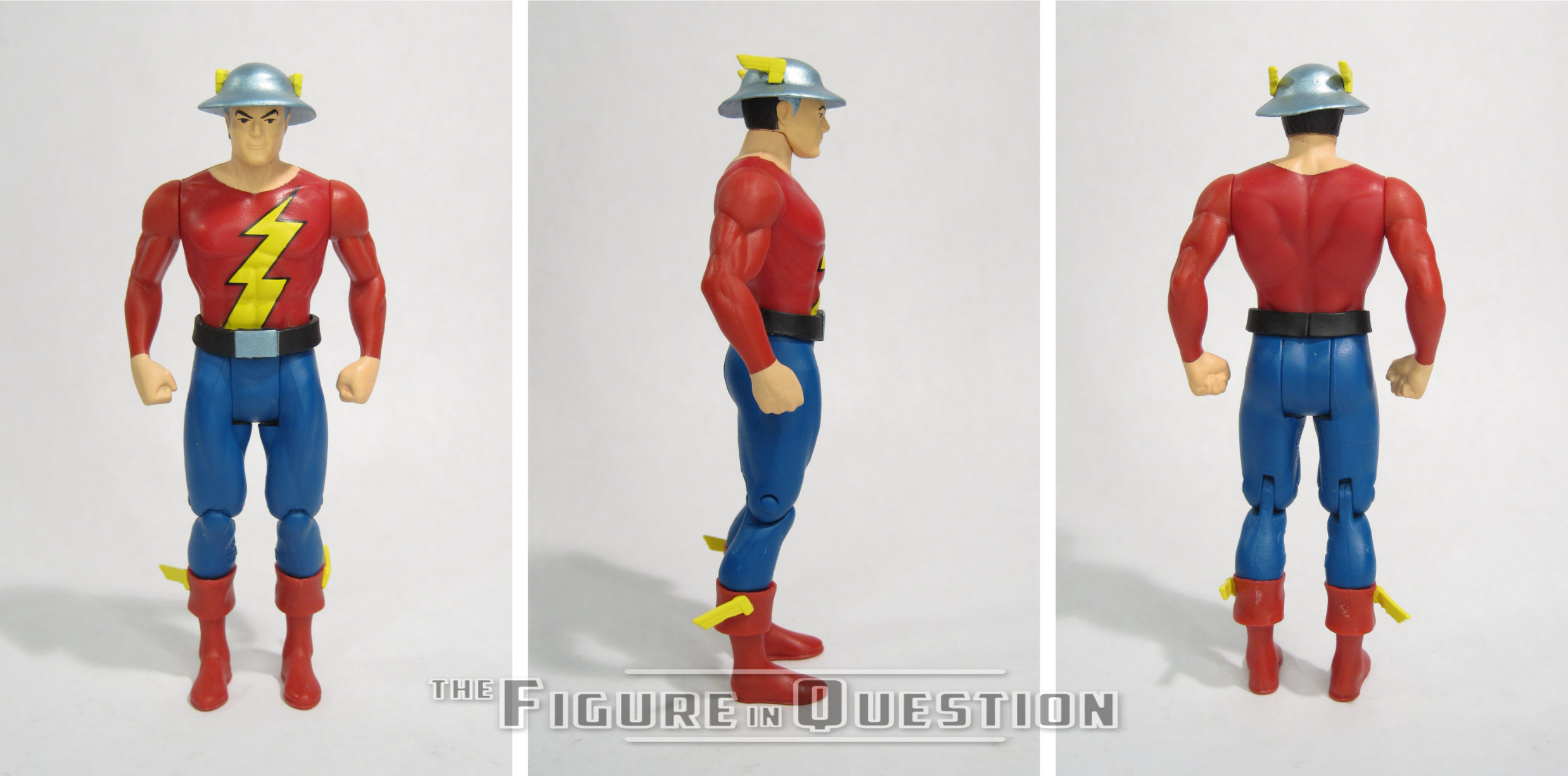
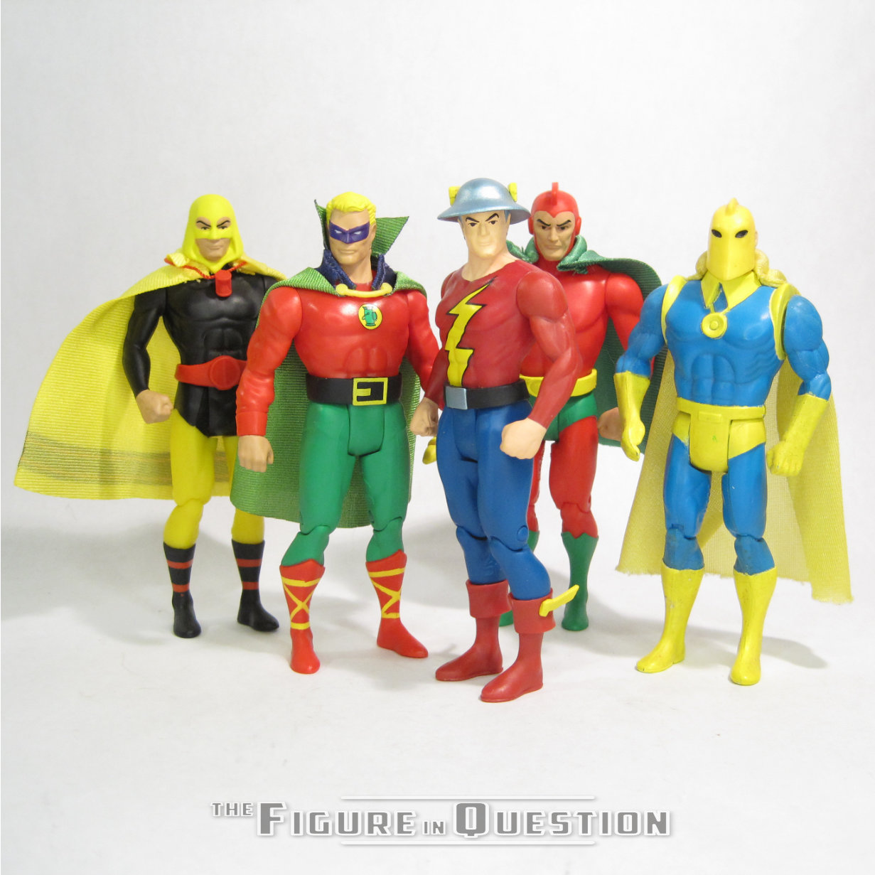
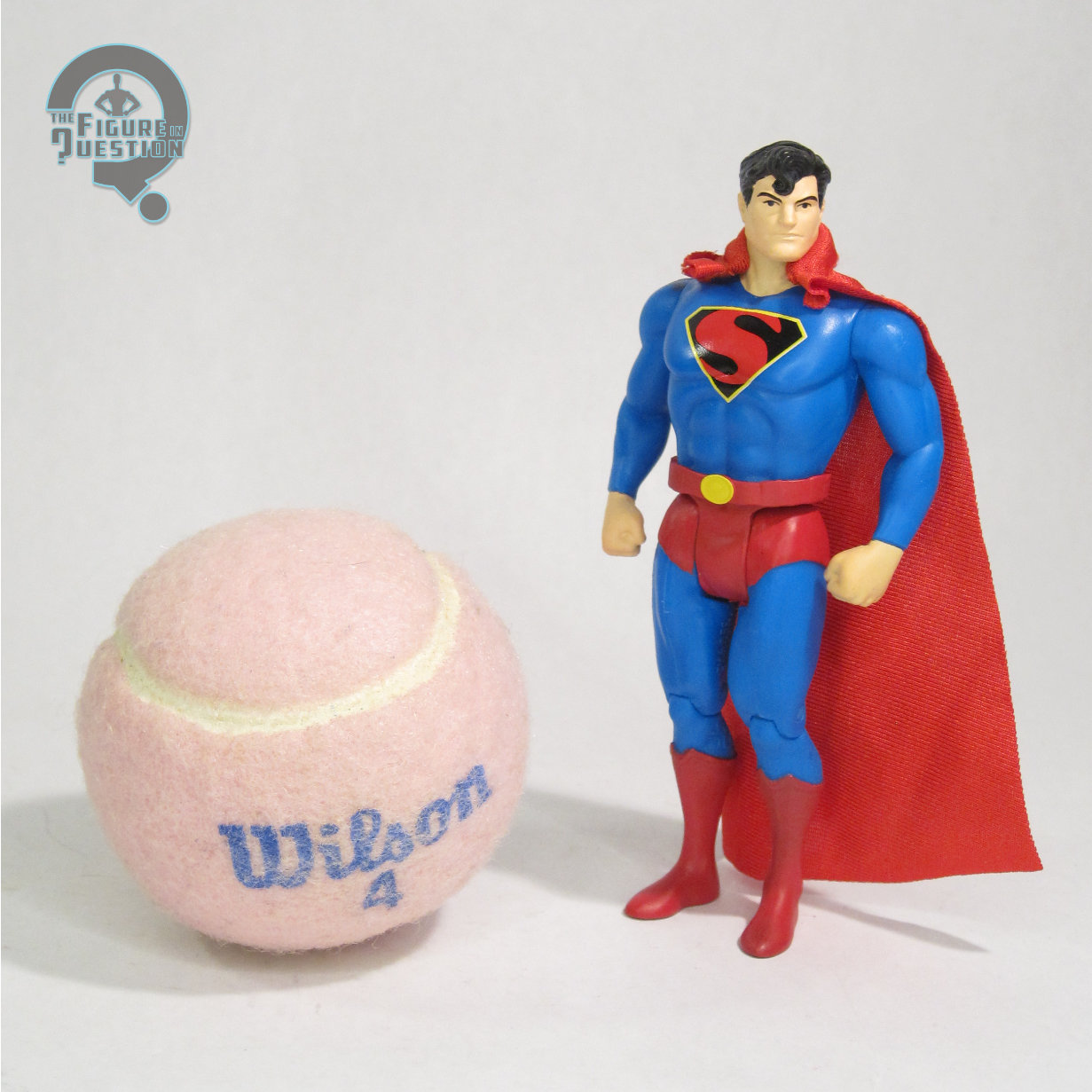
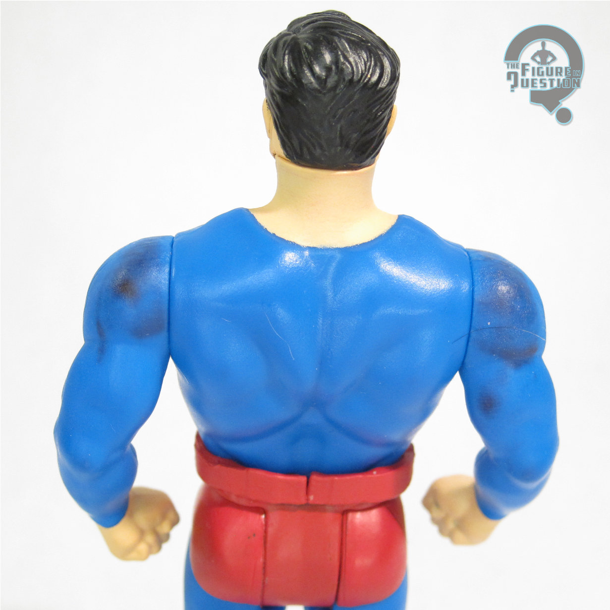
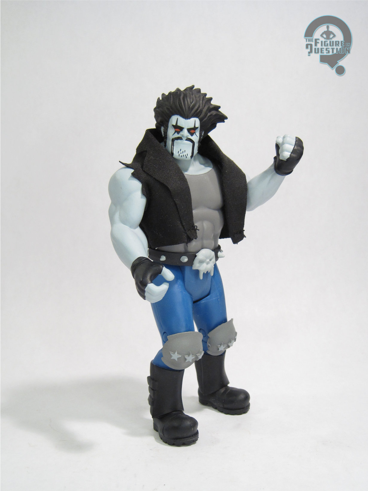
 Lobo is the final of the “standard” release figures from Series 10 of McFarlane’s Super Powers. He’s another new character for the style, and honestly, on the rather short list of proper Lobo figures. The figure stands 6 1/4 inches tall and he has 7 points of articulation. First and foremost, this figure is *huge*. Like, the largest Super Powers figure thus far. Lobo is traditionally a larger character, but not usually to this level. I mean, he towers over Darkseid. That feels a bit off. But, hardly terrible. Lobo re-uses the torso from Kilowog, along with an all-new head, arms, and legs. It’s not a bad sculpt, and it certainly looks the part, but it doesn’t really feel like it matches the usual Super Powers aesthetic. So, he sort of just exists a bit as his own thing. I don’t hate it, but it’s different. The vest is cloth, which is a nifty touch, and is the one thing that definitely feels like it’s trying for the Super Powers aesthetic. Lobo’s color work is respectable enough. He’s definitely got some DCAU vibes on the palette, which I definitely don’t mind. The paint application’s basic and clean, and does generally what it needs to.

THE ME HALF OF THE EQUATION
I’ve never been a *huge* Lobo fan. To date, the only figure I’ve ever owned of him was the Minimate, and that was largely because he came with Ambush Bug. I do like his DCAU appearances well enough, so I don’t hate him outright. I wasn’t sure I was gonna get this guy when he was announced, because he doesn’t quite feel like he fits the general vibe of the line. But, I ultimately decided I’d rather get him and not potentially regret missing him later. He’s decidedly a different vibe than the rest of the line, but I think it works okay, and he’s still a very fun figure.