#3962: Superman – Hush Version

SUPERMAN — HUSH VERSION

MAFEX (MEDICOM)

My last MAFEX review kept running with my general investment in the DC theme, but broke from the otherwise Batman: Hush-ness of the reviews up to that point, instead jumping over to the Superman side of things.  Today, I present what I can best describe as a happy medium, because it’s a Superman, but he’s from “Hush!’  Ha-hahh!  Bet you didn’t see that coming!  Because, you know, I’m the only one who knows what I buy and when I’m gonna review it, but that’s not really the point here.  What *is* the point, is that I’ve got another Superman figure to review, and I’m gonna go ahead and do that now.  Let’s jump in!

THE FIGURE ITSELF

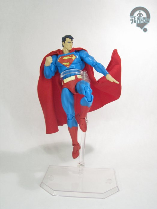
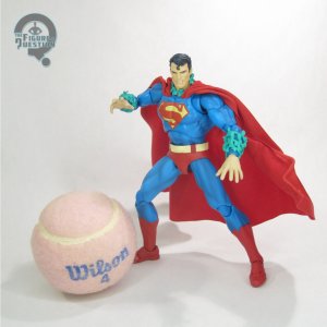
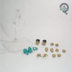
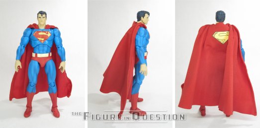
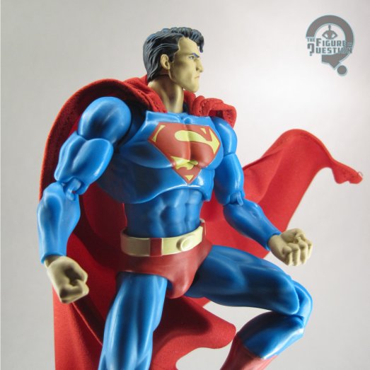
Superman is figure 117 in Medicom’s MAFEX line, where he was the second figure under the “Hush” banner.  The figure stands just over 6 1/4 inches tall and he has 43 points of articulation.  While Superboy was rather up-scaled compared to the others in the line, this Superman feels maybe a touch on the small side.  Not terribly so, but just a little.  He keeps the same general articulation scheme as the other MAFEX figures I’ve looked at, which is to say it’s a generally nice range of motion and movement is pretty smooth.  Since this is explicitly a “Hush” figure, this Superman is based on Jim Lee’s illustrations of the character seen in the book.  It’s hardly a bad thing, since Lee’s take on Superman is a pretty solid “classic” Superman, who is generally pretty multi-purpose.  There is sort of a humor to the only two standard costume Superman figures in the MAFEX line both being in Batman-themed packaging, but such is Superman’s lot in life…at least a few years ago.  The sculpt does a respectable job of capturing Lee’s art, and specifically his take on Clark.  The standard head is a nice, generic calm head, but he’s also got an angrier head, meant to emulate Clark while under Ivy’s control.  Like Huntress, he’s got a cloth cape, which has a wire running through it for posing options. Superman’s color work is fine.  The paint work is clean, and all, but he’s also, like, really washed out.  I guess it’s not inaccurate to the look and palette of “Hush,” but on its own it does feel a little bit desaturated, slightly hindering his generic Superman-ness.  Superman is packed with the two heads previously mentioned, as well as five pairs of hands (in two styles of fists, flat, relaxed, and open gesture), neck and arm attachments for Ivy’s possession of him, and a flight display stand.  He also included an alternate hand for the first Batman, which had the Kryptonite ring on it, which I don’t have with my figure.

THE ME HALF OF THE EQUATION

I wasn’t really up on MAFEX when this guy hit, so, despite the original DC Direct line’s Superman being one of my favorite figures from their line for the story, I didn’t get him when he was first released.  As they got further into the line, I kept regretting that more and more, but I also kept missing every re-release, because they kept selling out so very quickly.  I was sort of hoping we might get a more standard Superman from the Return line, but that’s not yet happened.  So, after getting Superboy as a gift over the summer, I finally decided to bite the bullet and just pay what I felt was a fair price on a used version of this guy.  He’s very cool, and I certainly get why he’s so in demand, because he’s just a good basic Superman.  That said, I’d still be game for Jurgens Superman with a slightly more classic color scheme, because I’m a sucker for such things.

#3947: Magne Arthur

MAGNE ARTHUR

MICROMAN MAGNE POWER (TAKARA)

In the ‘90s, teams of colorful heroes imbued with weird fantasy powers were all the rage.  Well, Power Rangers was all the rage, and a lot of other people wanted that success for themselves, so other stuff became very Power Rangers-like.  Takara’s Microman, descendant of G.I. Joe and progenitor to Transformers, decided to give the whole thing a try, as well as throwing in a bit of a scale shift.  The result was Microman Magne Power, a brief run on the line at the tail end of the decade.  Today, I’m looking at the central member of this incarnation’s core team, Magne Arthur!

THE FIGURE ITSELF

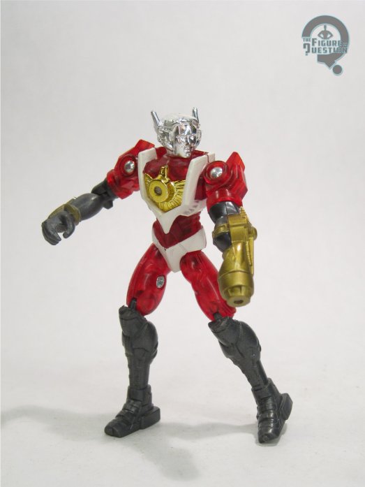
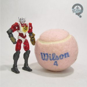
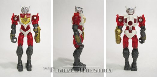
Magne Arthur was figure 001 in Takara’s Microman Magne Power series.  He was the first of the figures that debuted the line at the very end of 1998, and helped to establish the line’s new style.  The figure stands abut 3 inches tall and he has 12 points of articulation.  As with the rest of the figures in this line, Arthur was scaled down from Microman’s usual 3 3/4-inch set-up, with the in-universe explanation being that these guys came from a  different Micro Earth than the original line’s figures, following up on the slightly smaller vintage Micro Hoodmen, who shrank themselves further to conserve resources.  His sculpt is largely the same as the other four core figures from the line, albeit with a unique head.  Arthur’s head was especially unique amongst the launch figures, as he didn’t have a helmet like the other four, instead just getting a set of funky headphones.  It’s ultimately a sculpt that’s a bit more in keeping with the earlier Microman figures in that regard.  From the neck down, he’s the same as the others, with the same kind of dated, bulky and boxy sort of body sculpt.  As the leader guy of a team of chromatically themed heroes in the ‘90s, Arthur was obviously predominantly red, which is done in a nice translucent plastic.  He’s also got white and dark grey accenting, and of course the usual chromed head.  As with all the basic figures, he had no accessories, but did have magnets in his torso, right arm, and feet, so you can stick him to all manner of metal surfaces.

THE ME HALF OF THE EQUATION

After discovering this line’s existence from the Micronauts guy at Mego Meet in 2011, I jumped pretty quickly on finding what I could of the line domestically.  Thankfully, Big Bad Toy Store had a rather nice selection of figures for pretty cheap at the time, so I was able to get the whole core set without much trouble.  Arthur is the most standard of the set, and that makes him the easiest for taking in the whole of what the line meant to be.  It’s not quite the success that Takara was hoping for, but it’s still a fun little set to look back at, and Arthur is a nice central piece.

#3932: Ultraman Trigger Truth

ULTRAMAN TRIGGER TRUTH

SH FIGUARTS (BANDAI)

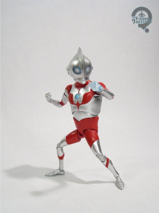
When I last reviewed an Ultraman figure here on the site, it was in fact an Ultraman completely unrelated to the usual Ultramen I review around here, what with being from Superman and all.  That said, I did have a proper Ultraman related review back in the spring.  Last year, though, I had a heck of a run of Figuarts Ultramen, and that was super fun.  Here’s a little more of that.  Ultraman Trigger: New Generation Tiga was released in 2021, corresponding with the 25th anniversary of Ultraman Tiga, to which it serves as a spiritual and thematic successor.  Much like Tiga, Trigger has a number of different forms he can use for different situations, which adds more possibilities for action figure releases.  Today, I’m looking at Trigger Truth, which is Trigger’s ultimate final form.  Yaaaaay!

THE FIGURE ITSELF

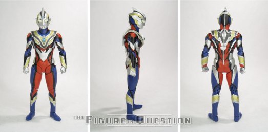
Ultraman Trigger Truth was added to Bandai’s SH Figuarts line in the summer of 2023.  It’s a Tamashii Nations Store-exclusive.  The figure stands about 6 inches tall and he has 44 points of articulation.  Trigger’s articulation scheme is really strong, moving further away from the more fiddly nature of earlier Ultras.  I was also quite pleased to see how much range he had on the shoulders, even with all the extra armoring.  Trigger’s designs are meant to emulate Tiga in terms of vibe and style.  His standard look equating to Tiga’s, and Trigger Truth is a bit of a build on that general look, working in elements of some of his earlier forms.  It’s a fun amalgamation of various elements, and it certainly gives the sculpt a lot of more ornamental detailing to work with, an it does it really well.  The detailing is very clean, and captures his design quite nicely.  Like Tiga, Trigger’s main color scheme is a balance of silver, purple, and red, with a bit of gold accenting worked in.  Truth keeps that general set-up, but adds some additional black accenting, showing the elements he’s gained from his “Dark” form that figure into Truth.  It adds a nice pop to the design, which helps the other elements stand out even better.  Trigger Truth was packed with five pairs of hands (in fists, relaxed, two styles of flat, and open gesture), an additional hand with a True Zeperion Beam effect attached, and his True Timer in two different colors.

THE ME HALF OF THE EQUATION

My last run of Figuarts Ultramen kind of all fell into my lap, but since then it’s been a bit slower, since I don’t have as easy a time finding them, what with them all being imports and all.  But, as luck would have it, my wife was going on a trip to New York with her siblings, and invited me along, giving me the opportunity to swing by the Tamashii Nations Store in NYC, which of course calls for an Ultraman purchase.  This guy was the one that jumped out at me, so he was the one I snagged.  He’s a lot of fun.  I knew pretty much exactly what to expect, but that doesn’t make a new Ultraman any less awesome to get.

#3908: Peter B. Parker & Mayday Parker

PETER B. PARKER & MAYDAY PARKER — ACROSS THE SPIDER-VERSE

S.H. FIGUARTS (BANDAI)

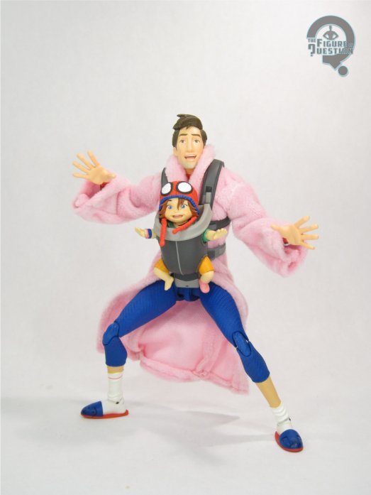
The two Spider-Verse films we’ve gotten thus far have both had a lot of importance placed on growth of characters and definitively moving them forward in their own narratives.  In a world of super hero movies that change the main heroes’ costumes purely for the sake of change, it’s nice to see an approach that works those changes more into the story, and how it affects the characters.  Into the Spider-Verse showcases a Peter Parker at his lowest point.  He’s alone, out of shape, and disheveled, and spends a good portion of the film in a makeshift outfit that further emphasizes that.  Across re-introduces us to Peter as he’s well into his way of recovering, and he’s so not alone that he’s literally got another person strapped to his chest for most of his screen time!  Despite him being more on the mark and put together this time around, Peter B. Parker was surprisingly absent from the toy coverage for Across, with most of his figures actually being repurposed looks from the first movie.  He got a Pop, which is great if you like Pops, but then it was a rather long wait for a proper figure.  Bandai ultimately took the lead this time, with a figure from their SH Figurarts line, which I’m taking a look at today!

THE FIGURE ITSELF

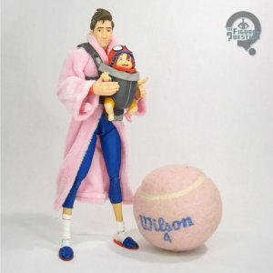
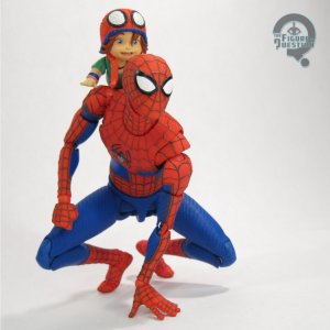
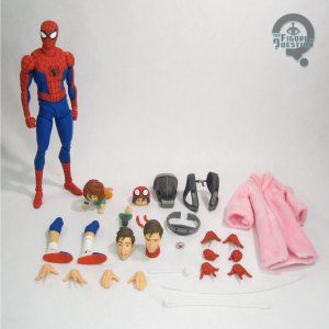
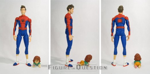
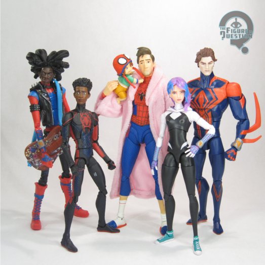
Peter B. Parker & Mayday Parker are part of the larger sub-line of Across the Spider-Verse figures in the SH Figuarts line-up.  This is the latest of the figures to hit, and it’s the seventh in the set.  Certainly a more in-depth line-up than the prior movie.  Though billed as a two-pack, the set is really a Peter B with a Mayday accessory, so I’ll be treating it that way for the purposes of the review set-up.  Peter stands just over 7 inches tall and he has 40 points of articulation.  Figuarts has always occupied a sort of nebulous “1/12 scale” space, which can make scaling with other nebulous “1/12 scale” lines sometimes hit or miss.  What’s curious about the Across figures is that they land on the opposite end of the nebulous range than usual.  Relative to, say, Marvel Legends, Figuarts tend to run a bit on the smaller side, but Peter here winds up taller than all of the standard sized Legends for the movie.  Not so much so that you can’t fudge things a bit, but it’s a little funny to see him end up taller than Miguel.  Also, it’s not like they’re designed to scale with each other in the first place, but I did find it amusing.  Peter’s articulation is generally decent for a Figuarts release.  They’re definitely less floppy and sort of weird in their articulation schemes these days, so he feels a bit more naturally flowing and intuitive.  I still had some slight issues with stability, especially in the more intense Spidey-style poses, but it generally works okay.  The sculpt is totally new, and it’s doing a few different things at once.  Right out of the box, he’s just a standard Spider-Man in the movie style.  It’s a good match for the film design in terms of proportions and stylization.  The texturing is quite impressive, and there’s a lot of neat visual filler that keeps him interesting.  His build shows that he’s certainly working on getting into better shape then he was in Into, but he’s not quite back to Peter A levels, and I like that.  But, that’s just standard Spidey, and nobody’s really buying this one for a standard Spidey, right?  No, we want the goofy, more put-together, but still disheveled look.  To that end, this figure gets two alternate unmasked heads (with a corresponding neck piece with a lower collar), ungloved hands, and an alternate set of lower legs with socks and slippers instead of boots.  The unmasked heads give us Peter with a more neutral slight smile and with a more intense opened mouth laugh.  Both are very much on model and keep things nice and internally consistent.  The legs are goofy, and fun, and I like them a lot.  And it’s all topped off with the most important part of the whole ensemble: the pink bathrobe.  It’s quite a statement piece and neat counterpoint to his green jacket from Into.  Here, it’s a soft goods piece, which makes a lot of sense.  It’s very soft and fuzzy, and there’s a wire in it for dynamic posing.  Peter’s paint work is all pretty top-notch.  The work on the unmasked heads is by far the best, but even the suit is clean and well-rendered.  As mentioned above, Peter gets all the parts for both of his looks, as well as six pairs of hands (four gloved in fists, thwipping, gripping, and open gesture, two ungloved in open gesture and relaxed), the wrist bracelet goober thingy, and three different weblines.  The weblines are ultimately a bit unimpressive compared to others we’ve seen, but I don’t see myself using them anyway.  The most important selection of extras is Mayday and her associated parts.  The main Mayday is done up in a crawling pose, and is jointed at the neck and waist.  While the arms and legs are separate, they have rectangular pegs, so they can’t be posed, which is kind of a shame.  She does get two heads, so you can do with or without the hat.  Why you’d leave off the hat is anyone’s guess, but the option’s there.  Also included is the carrier for Mayday, which can be attached to the main Peter figure.  There’s a special neck piece that goes in that one of the two heads can be attached to (the hat fits better than the one without), and you can move the arms and legs over as well.  It stays on pretty securely, and scales well to the other figure.  It’s also relentlessly adorable.
THE ME HALF OF THE EQUATION

Across the Spider-Verse was a well-timed movie for me, because I also had a daughter in the spring of 2023, and Mayday reminded me very, very much of her.  For Halloween that year, my mom knitted Aubrey a spidey hat, and I stole my wife’s pink bathrobe, so that we could be Peter and Mayday, and I assure you, we were also relentlessly adorable.  As we have become rather linked to the look, getting a figure of it was kind of important.  I have the Pop, but it’s just not the same, so I realized I was going to have to make the jump to Figuarts.  But, Rachel and Aubrey got ahead of me on that one, and this was my birthday gift from the two of them this year.  It’s awesome.  I’ve got some quibbles, but they’re minor, and this figure just does so much right.  Just a ton of fun.

#3907: Superboy

SUPERBOY

MAFEX (MEDICOM)

I’ve touched on Medicom’s MAFEX line a few times here on the site.  While my most recent review kind of broke the mold a bit, my reviews have otherwise been DC-based, all of them hailing from the running sub-line of figures based on Batman: Hush.  Hush is a pretty solid way of doing a large swath of Batman-related characters in one cohesive style, but it does limit you mostly to just Batman.  For a focus on DC’s original super hero, Medicom also started up a based around the “Death” and “Return of Superman” storylines from the ‘90s.  Their primary focus has been the Superman replacements from “Reign of the Superman,” who each took over one of Supes’ four books running at the time. Taking over Adventures of Superman was “the Metropolis Kid,” Superboy!

THE FIGURE ITSELF

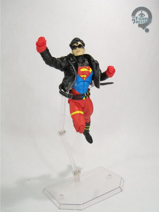
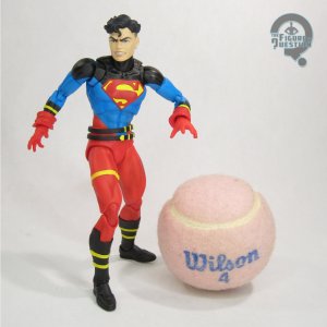
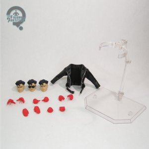
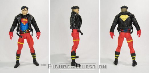
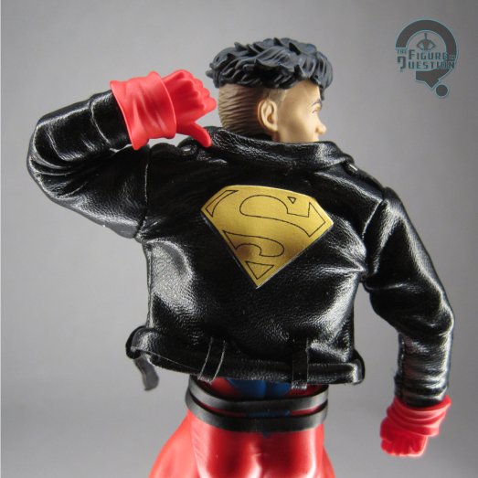
Superboy is figure 232 in the MAFEX line-up.  He’s the fifth figure in the Return of Superman set-up, and the last of the four replacement Supermen to join the line.  The figure stands a hair over 6 inches tall and he has 42 points of articulation.  In terms of scaling, Superboy feels a touch too large for the other MAFEX figures I’ve picked up.  Not crazy levels of out of scale, but he definitely feels like he should maybe be a little shorter.  His articulation scheme is pretty much the same as the others I’ve looked at, which is to say it’s quite good, and allows for a lot of solid posing.  Nothing’s too overly loose or anything, and he can hold a pose quite well.  The figure’s sculpt is based on Tom Grummett’s initial design for the character, which is by far his best, and really his most enduring design.  It’s also the one that matches all the other figures, so it’s got that going for it too.  It translates quite nicely into figure form, and the little raised and recessed elements of the costume design all make it stand out quite well.  There are three included heads, all based on Grummett’s depictions of Kon-El.  There’s a neutral expression, an angry expression, and one with sunglasses affixed.  Of the three, I think I lean towards the sunglasses head the most, but I really like all three, and it’s great how consistent his look is between all of them.  Rather than being a sculpted element, like Hush’s trench coat was, Superboy’s distinctive leather jacket is a softgoods piece.  It’s good.  It’s well-tailored, not too limiting on the posability, and there’s a wire running through the belt for extra dynamic posing options.  I do worry about how well it will hold up in the long run, but I guess I’ll just enjoy it for what it is now.  The color work here is really bright and colorful, and feels very true to his early appearances.  The paint is all really clean, and there’s some especially strong work on the heads.  Superboy is packed with five different pairs of hands (fists, flat, thumbs up, open gesture, and relaxed), and a display stand.  It’s a little light, but he’s also got the three heads and the jacket, so it makes up for it, I feel.  The hands swap easily, but I’d be careful with them, because the glove cuffs have a real tendency to go flying during the swaps.

THE ME HALF OF THE EQUATION

I got in relatively close to the ground floor with this incarnation of Superboy, getting the Man of Steel figure when it was new, and following his comic from an early point until it was cancelled.  I’ve always liked the character, and I’ve never been much of a fan of the jeans and t-shirt direction they took him under the Johns era.  It feels like something of how he was supposed to work kind of got lost there.  Thus far, I’ve just stuck to the Hush figures, and I even missed the standard Superman from that line, so I avoided the Return figures.  Superboy made that a lot harder to stick to, especially in light of my seriously renewed investment in Superman as a whole, post movie release.  This guy wound up being a birthday gift from my parents this year, and he’s super, super cool, and a great reminder that, no matter how far I progress from the decade that birthed me, I’ll never really be able to kick the need to own characters wearing leather jackets over their spandex.

#3844: VF-1S Veritech – Roy Fokker

VF-1S VERITECH — ROY FOKKER

ROBO DOU (THREE ZERO)

Before today, you could count the Robotech reviews here on the site on one hand.  But now, you can’t!  …you know, because there were five, and this brings it up to six.  Do you get it?  Do you get the joke?  Well, I do, and that’s the most important thing.  As I’ve brought up in, I think, all of my Robotech reviews, I’m rather a late convert to the show, only actually watching it within the last decade.  So, there’s a fair bit of catching up to do, but also I try not to go to crazy and space it out a bit.  Given it’s been three years since my last review, I guess I’m doing alright with that spacing out, huh?  Three Zero has started doing some Robotech stuff in their Robo Dou line, and I do like Three Zero’s work, so I’m checking one of those out today!

THE FIGURE ITSELF

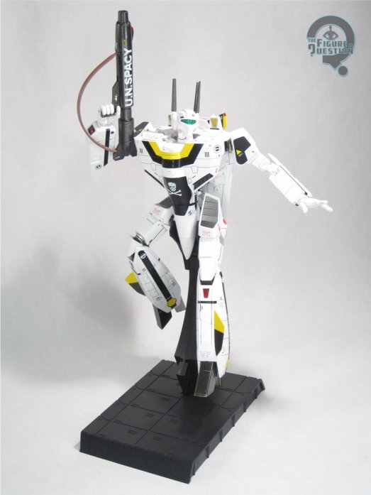
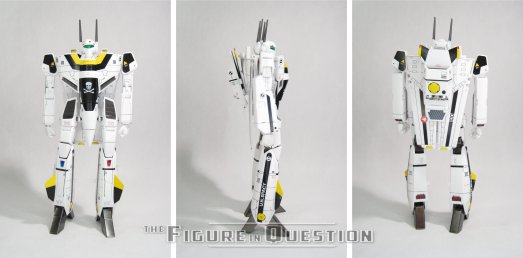
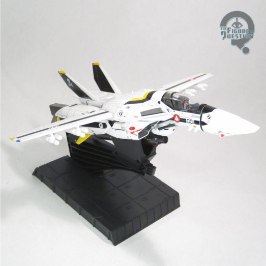
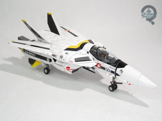
The VF-1S Veritech — Roy Fokker is part of Three Zero’s Robo Dou line, which handles mechas and robots from a number of different anime properties.  This one follows up on the release of Rick’s Veritech from….2023, I think?  There was a bit of a gap.  Roy’s Veritech just started hitting in the last month or so.  The figure ships in Battloid mode, which is the main look that everyone actually likes.  Well, it’s the main look that *I* actually like, and for the purposes of this site, I’m everyone.  In said mode, the figure is about 8 3/4 inches tall and has 29 workable points of articulation.  It compares well to other Three Zero mech stuff I’ve messed with in terms of articulation and build.  You can get good poses out of him without too much trouble.  The hips can be a little bit finicky, especially the first time you use them.  On my figure, I wound up hitting the folded up wings, and it popped some parts of the torso out of place, which was a bit tricky to get back in order.  But, once I did, everything stayed pretty securely together.  Like the other Three Zero mechs I’ve looked at, this figure is a mix of plastic and die-cast construction.  He’s got quite a bit of heft to him, while also still maintaining a sharp level of detailing.  The color work here is quite impressively handled.  All the base work is very clean, and he’s also got panel lining to really help sell the sharpness of the sculpt.  There’s also a ton of smaller printed details, which show a tremendous attention to detail.  The Veritech is packed with four pairs of hands (weapon holding, flat, open gesture, and fists), a GU11 rifle, and a display stand.  It also includes four sets of missiles, an antenna, and an alternate mount for the base, all meant to work with the figure’s alternate modes.

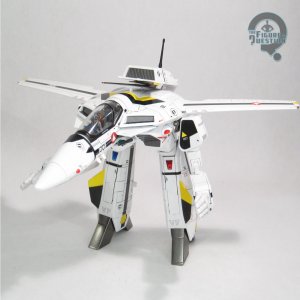
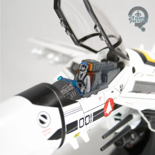
Let’s talk about said alternate modes!  As with all transforming Veritechs, you get the main Battloid mode, the Guardian mode, and the Fighter mode.  To get from Battloid to Fighter (robot to jet), you stop in the middle for Guardian, which is…well, it’s kind of silly, and it’s not really so much a mode as it is just stopping midway.  Of course, given how nerve-racking the actual transformation process is, a break at the halfway point isn’t so bad an idea.  Even following the instructions, I was left to throw my hands up a slightly improvise a few times, and I had at least one point where I very seriously considered running this review without photos of the alternate modes.  Thankfully, the rest of the transformation to full Fighter mode isn’t quite as bad, nor is the reverse transformation back to Battloid (apart from the one pin that fell out during the transformation back.  It’s okay, it’s not entirely structural…).  The Fighter mode is actually pretty nice, and I do really like the little teeny, tiny Roy figure in the cockpit.

THE ME HALF OF THE EQUATION

Since getting into Robotech, I’ve been looking for solid figure coverage of Roy’s Veritech, since Roy’s my favorite pilot, and his Veritech is particularly cool.  I looked at the rather elaborate transforming one that All Time loaned me back in 2018, and I really liked that one, but its price point was a bit scary, so I backed off.  I’ve messed with a few of the smaller ones since, and they’re cool, but always a bit too spindly for me.  I’ve been impressed with Three Zero’s other work, so once I saw they were doing them, I was onboard for this guy here.  He’s fun, in a sort of don’t really want to mess with him all the time, but he’s still really cool to look at way.  I’m glad I got to experience the transforming, and now he can remain purely in Battloid mode for the rest of the time I own him.

Thanks to my sponsors over at All Time Toys for setting me up with this figure to review.  If you’re looking for cool toys both old and new, please check out their website and their eBay storefront.

#3836: Ultra Dad

ULTRA DAD — ULTRAMAN: RISING

S.H. FIGUARTS (BANDAI)

I feel like every time I review an Ultraman, I remark that I don’t review Ultraman stuff enough.  And, seeing as it’s been seven months since my last review, I suppose it still holds true.  When last I spoke of Ultramen, I talked a bit about Ultraman: Rising, Netflix’s animated Ultraman movie from last summer.  This builds a bit on that.  The central theme of the movie is parenthood, with the main character’s respective relationships with his adoptive “daughter” Emi and his own father playing parallel with each other.  One of the film’s neat surprise twists is the reveal that Ken’s father, the previous holder of the Ultra mantle, can still harness the abilities, granting him a modified version of the classic design, affectionately dubbed “Ultra Dad.”

THE FIGURE ITSELF

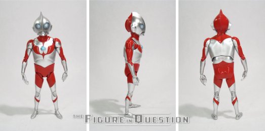
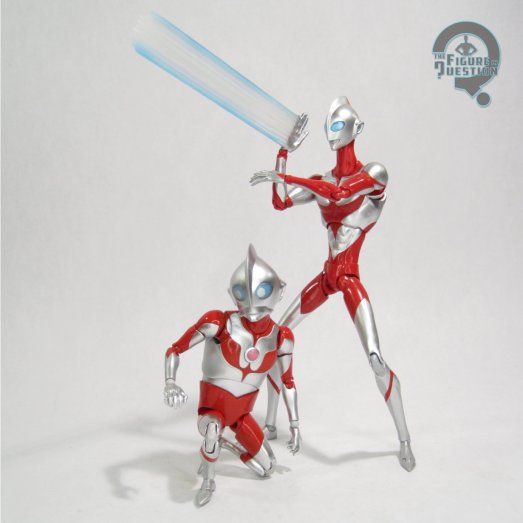
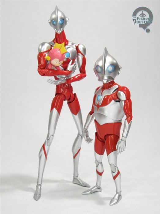
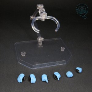
Ultra Dad is a 2025 online-exclusive S.H. Figuarts release, designed to follow-up on the main Ultraman release for the film from last year.  The figure stands about 4 3/4 inches and he has 38 points of articulation.  Ultra Dad’s articulation scheme is pretty much what you’d expect from a Figuarts release at this point.  The range of motion is all pretty solid, especially given his smaller stature.  Speaking of smaller stature, this guy’s an inch and a half shorter than the main Ultraman, which is a bit surprising when you see it, but also accurate to the depictions of the characters in the movie.  He’s got a new sculpt, and it’s a solid, clean recreation of Hayao’s Ultra Dad design from the movie.  Like Ken, it’s very stylized, and in a way that lines up very well with the Ken figure from last year.  Ultra Dad’s color work is likewise a good match for the prior figure.  The silver is a little on the flat side compared to the film’s very reflective take, but it ultimately works okay.  I do really like the extra shiny finish on the red sections.  The only slight downside is that the ankles, wrists, and knees are more of a flat grey, which doesn’t quite match.  Ultra Dad is packed with three different eye plates, 13 different hands (L and R fists, L and R relaxed, L and R open gesture, L and R open-er gesture, L and R powered up, L and R flat, and a left flat that’s different than the pair?), two different color timers, and an extra effect piece hand meant to go with the prior Ken figure.  Generally, it’s decent spread, covering most of the bases.  The one issue I did run into with this one is that his outer faceplate doesn’t sit as securely as it did on the Ken figure.

THE ME HALF OF THE EQUATION

Given how much I enjoyed Rising, I’ve been really on board for all of the figure coverage too.  When this look showed up in the movie, I immediately wanted a figure of it.  I was very happy to see it get announced so quickly after the fact.  He’s certainly a fun figure.  He’s not as much his own standalone piece as he is an accent piece for the main Ultraman release, but that’s what I wanted him to be, so that works out well for me.

Thanks to my sponsors over at All Time Toys for setting me up with this figure to review.  If you’re looking for cool toys both old and new, please check out their website and their eBay storefront.

#3762: Space Suit – Light Blue Version

SPACE SUIT — LIGHT BLUE VERSION

2001: A SPACE ODYSSEY MAFEX (MEDICOM TOY)

Welcome back, everybody!  I hope you guys enjoyed…my holiday break?  Well, I did, so there’s that.  We’re officially post-Christmas, so that means I get to kick off the year with some Christmas-gift-related reviews.  I kicked things off last year with a MAFEX review, and I’m duplicating that effort this year.  Not exactly by design, but here we are nonetheless.  It is, however, quite a different direction in terms of branding.  Rather than DC Comics, we are instead turning to 2001…not the year, mind you, but the movie.  I can understand your confusion.  Kubrick films are generally a rarity in merchandising, especially action figures, but we’ve had a few goes at 2001.  Medicom released a small selection of the film’s distinctive space suits in a variety of colors under the MAFEX banner, and I’m looking at one of those today.

THE FIGURE ITSELF

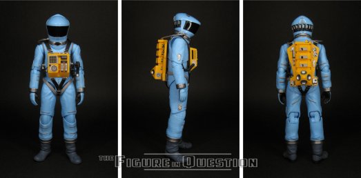
The Light Blue Space Suit is figure 090 in Medicom’s MAFEX line-up.  It is numerically the last of the four colored suits to be released, hitting in 2019.  The blue suit is a unique oddity amongst the four, as it is the only suit not to be used at all within the film’s run.  The orange and yellow get used by Bowman and Poole respectively, and the helmet and gloves from the green suit are used by Bowman following his space walk.  The blue suit simply hangs next to Bowman and Poole’s suits.  Waiting.  Watching.  Plotting.  Reading lips.  No, wait, that’s HAL.  My mistake.  The figure stands 6 1/2 inches tall and he has 34 points of articulation.  As these are 1/12 scale figures, the suit is about an inch shorter than the Super 7 Bowman.  Its mold is shared with the other three suits, which is sensible.  The sculpt is crisp and clean, and the figure is easy to pose, and doesn’t feel too fragile.  The helmet is affixed with no movement of its own, which initially surprised me, but is true to the design, so it makes sense.  The color work is pretty solid for the most part.  The blue is a good match for what’s seen on screen, and the smaller detail work on the instruments and patches is quite impressive.  The visor is completely blacked out, as was the case for all of these.  It hides the face, or in the case of this figure the lack of a face, allowing all four to share the same mold more easily, and simplifying the construction somewhat.  The figure is packed with three sets of hands and a display stand.  While the suit just sits there and really just needs the relaxed hands, the additional ones are fun for theoretical posing, and the display stand assists with that.

THE ME HALF OF THE EQUATION

With a lot of the Kubrick stuff, there winds up being something of a back and forth on licensing, and I seem to recall that being the case with these guys, I think?  I don’t know, but I do know that they all wound up going under the radar for me when they hit, so I didn’t snag any of them.  I honestly wasn’t super picky on color, but I did sort of pull for the blue, thanks to its aforementioned uniqueness.  So, it was rather lucky for me that this was the one that ended up coming through work, and even more lucky for me that it wound up being my Christmas gift from the company.  It’s a very nice piece.  Certainly a different breed of figure from the Super 7 stuff, but I still like both offerings for what they are.  Ultimately, this one is quite fun.  Now I just need to resist the urge to own all of the different colors.

#3646: Captain America – Fighting Armor

CAPTAIN AMERICA

MARVEL FIGHTING ARMOR (SENTINEL)

Isn’t it funny that so very many of the import figures I look at here on the site are Captain Americas?  I mean, a notable swath of the Figuarts here on the site are Cap, but I didn’t want to just leave it all to Bandai.  There’s plenty of other companies out there, looking to get in on the action, right?  A company  I haven’t yet looked into here on the site is Sentinel, who have gotten into the Marvel license with a couple of lines in the last few years.  Their more wide-reaching line is their Fighting Armor one, which asks that oh so rarely asked question of “what if the Marvel heroes had armor?”  That never comes up, right?  Okay, it does, but on the plus side, the answer is usually something along the lines of “it would be very awesome”.  I’ve explored this question twice before on Captain America, but I certainly won’t let that stop me from giving it yet another shot!

THE FIGURE ITSELF

Captain America is figure 3 in the Marvel Fighting Armor line from Sentinel.  The figure stands 6 3/4 inches tall and he has 42 points of articulation.  Compared to, say, a Figuart, the articulation is certainly a lot more straight forward.  It’s not quite as simple as a Legends figure, though; it sort of falls in between.  There’s a degree of moving panels around for proper range of motion, but it feels like it has a good flow about it.  Cap’s sculpt appears to be unique, at least for the most part.  I don’t have any of the others, of course, so I can’t say for certain.  It’s a solid set-up.  He’s got a new design, made to fit in with the rest of Sentinel’s in-house looks for the Fighting Armor figures.  It takes the classic Cap design, with a bit of the Marvel Now design thrown in, and armorizes it, but notably in a different fashion than, say, the Tech-On Cap.  The whole thing is very sleek and clean, which I love.  It also just feels very intrinsically Captain America, which I also love.  His construction uses a little bit of die-cast metal.  It appears to be largely confined to the core of the figure, and mostly serves to give him a reasonable heft when you pick him up.  I don’t mind that so much.  Cap’s color work is dialed into the traditional Cap fare, being very heavy on the red, white, and blue, albeit mostly metallic.  He’s got a flat shade in place of the white, though, which breaks things up pretty well.  Cap is packed with three sets of hands, in fists, gripping, and open gesture, as well as an armorized version of his Shield, and a standard display stand.  The shield’s got a kind of interesting way of attaching; there’s like this whole arm on it, which swings in and out relative to how you want it to be attached, be it his back, or either of his hands.  It’s an interesting idea, but the joints are a little loose on mine, so it flaps down a lot.

THE ME HALF OF THE EQUATION

I was aware of the Fighting Armor figures, but I hadn’t jumped in just because the figures are all pretty pricey, and I just wasn’t sure.  But, when a bunch of them landed in front of me, and there was a Cap in the mix, it felt like the best time to jump in.  And also I was weak.  Look, cool Captain America, okay?  I’m just a man!  I’m glad I got the chance to snag him, because he’s an immensely fun figure, and a neat alternate take on the armored Cap idea!

Thanks to my sponsors over at All Time Toys for setting me up with this figure to review.  If you’re looking for cool toys both old and new, please check out their website and their eBay storefront.

#3598: Ultraman Geed Primitive

ULTRAMAN GEED PRIMITIVE

S.H. FIGUARTS (BANDAI)

Fun FiQ Fact #0077:  Ultraman Geed is one of the few Ultramen whose name is also a valid word in Scrabble!

You can’t keep me away from the Ultras for too long! …unless you’re my pending review pile following today’s review, I guess.  You know, ’cause there’s no more Ultramen in it.  Not yet anyway.  Well, I guess I’ll just have to really make this one count?  I don’t know, let’s give it a try.  While my primary exposure to Ultraman remains the dubbed version of the original series, I do still dabble in some of the newer entries.  I watched a fair bit of Mebius, as well as stray episodes of a few others, which did include the first few episodes of today’s focus Geed, which is noteworthy for being the only Ultra series I’ve watched while it was still coming out.  That’s pretty cool, right?

THE FIGURE ITSELF

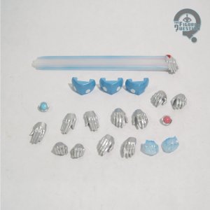
Ultraman Geed Primitive was released as part of Bandai’s SH Figuarts line in February of 2018, just two months after the first run of the show wrapped up. The figure stands 6 inches tall and he has 43 points of articulation. As his name implies, Geed is seen here in his “Primitive” form, which is his standardized look for the bulk of the. It’s purposefully designed to merge the classic Ultraman and Belial designs together, making it slightly more unique amongst the standard Ultras. The sculpt does a good job of recreating the look. It’s very sharply defined and clean, as well as being very accurate to the show. I was also really impressed by how the articulation was worked into the sculpt, as it’s pretty natural looking, while still maintaining a range of motion that’s better than many of the other Ultras. Geed’s color scheme sticks with the typical red and silver, with an extra dash of black thrown in. The application of the paint is all pretty clean; there’s some minor bleed over in some spots, but it’s generally solid. Geed is packed with four pairs of hands (fists, open gesture, relaxed, and flat), an hand with the Wrecking Burst effect attached, and a swappable color timer.
,

THE ME REMAINDER OF THE EQUATION

Since Ginga broke on me, I went back to the Ultra well that was the massive collection still being processed at All Time.  I knew I wanted Orb, so I was initially just planning to grab him, but Geed here was also hanging around, and I felt myself called to him as well. He was just an along for the ride figure, but I find myself really liking this one a lot. He’s simple, but works very well.

Thanks to my sponsors over at All Time Toys for setting me up with this figure to review.  If you’re looking for cool toys both old and new, please check out their website and their eBay storefront.