#1047: Kitty Pryde

KITTY PRYDE

MARVEL LEGENDS (TOY BIZ)

KittyTB1

Kitty Pryde is really a marker for change in the X-Men comics. She was the first new mutant to be added to the team following the All-New, All-Different change-up, and represents perhaps the only hopeful note to come out of the Dark Phienix Saga. Almost as soon as she joined, she became a focus point for the series. She’s also noteworthy for being one those rare instances of a comic character who was allowed to grow up, as her quest to become a full-fledged X-Man was one of her major story points. And, above all, she’s pretty consistently a fun character. Unfortunately, she’s had some rotten luck with action figures (if you don’t believe me just look at the last Kitty I reviewed). Toy Biz tried their hand at making her twice, with mixed results. I’ll be looking at that second attempt today.

THE FIGURE ITSELF

KittyTB2Kitty Pryde was released in the Walmart-Exclusive Giant-Man series of Toy Biz’s run with Marvel Legends. She was based on Kitty’s then current Astonishing X-Men design. The figure stands a little over 6 inches tall and has 38 points of articulation. For the most part she’s the same figure as the Jessica Alba Invisible Woman that I reviewed a few months ago. That’s not great, because that body had some major issues, including, but not limited to: incredibly obvious joints, an impossibly small waist, and super fragile arms and legs. It’s not a particularly strong body. What’s worse, the details on the body don’t quite line-up with Kitty’s Astonishing design. It’s a weird body choice all around. I’m not really sure why they went with it, but I’m not Toy Biz. I’m also not out of business, so I think that I won this one! Kitty got a new head sculpt, which is okay, but hardly one of Toy Biz’s best.  Like Hasbro’s smaller attempt, she feels a bit old for Kitty, and the total lack of ears weirds me out a bit. Also, her hair is pretty much completely wrong for this interpretation of Kitty, being all around too long and just too bushy. Were it not supposed to be this specific Kitty, that would be fine, but it stands out here. The paint work on Kitty is probably some of the weakest on any of the Toy Biz Legends.  The face is alright, but the eyebrows are slightly off from the sculpt, which throws her whole look off. Also, the color scheme of the costume is totally off. In the comics, her costume was black and a warm shade of yellow. Here, it’s a dark grey/pale yellow combo that looks incredibly boring and drab. It’s not a fun look, and means she’ll tend to get lost in a group. Kitty included her pet dragon Lockheed, as well as the upper torso and head of Giant-Man.

THE ME HALF OF THE EQUATION

I didn’t find this figure at retail, due to the all-around difficultness of finding this series at Walmart. My dad bought her for me from a reasonably priced eBay auction. At the time, I was really excited to get this figure. I mean, she was my first Kitty Pryde figure, and I’ve always loved the character. That being said, I very quickly found the flaws in this figure, and she’s never been one of my favorites. She’s probably one of the older Legends most in need of an update.

KittyTB3

#0980: Arkham Origins Boxed Set

BATMAN, JOKER, DEATHSTROKE, & BLACK MASK

ARKHAM ORIGINS (DC COLLECTIBLES)

ArkhamOrigin1

Video game adaptations of comic book characters have a somewhat rocky history. For every — there’s a Superman 64; for every Spider-Man 2, there’s an Aquaman: Battle for Atlantis. The Batman: Arkham series is probably one of the best adaptations out there, though even it hasn’t been totally immune from criticism. Perhaps the most criticized game in the series is Arkham Origins, a prequel game that wasn’t even developed by the same group as the others. Today, I’ll be looking at several figures based on that game.

THE FIGURES THEMSELVES

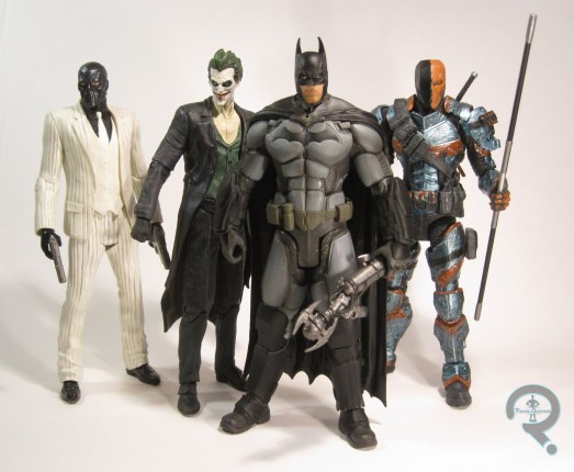
Batman, Joker, Deathstroke, and Black Mask were all released as a big boxed set as part of DC Collectible’s Batman: Arkham Origins line. They were all also available individually, with Batman, Joker and Black Mask being in Series 1 and Deathstroke being in Series 2. The figures are pretty much identical in both releases.

BATMAN

ArkhamOrigin3Batman manages to get a slight tweak to his design for each Arkham game. Oddly, the Arkham Origins design was even more advanced than the Asylum and City designs, despite this design supposedly predating those looks. Maybe looks are deceiving? The figure is about 7 inches tall and he has 31 points of articulation, which is quite impressive for a DC Direct/Collectibles figure. The sculpt on this figure is pretty solid. It does a pretty great job of capturing Batman’s Origins look. One of my issues with a lot of the Arkham-based Batman figures is that they all seem to be stuck with pinheads, which this figure manages to mostly avoid. I mean, his head is still smaller than his biceps, but it’s fairly true to the game and, it’s also not as drastic as some of the others.  The rest of the sculpt is quite beefy (seriously, this is a beefy, beefy Batman. He has all the beef), but he has very sharp detail work, and just all-around pretty cool looking. I especially appreciate the choice of a straight hanging cape, since Batmen have a tendency to go for absurdly flowy capes. The paintwork on this figure is rather subdued, and very well carried out. Everything is nice and clean, and he’s got some really great accent work, especially on the stubble and the shadows on the grey parts. Batman included a weird gun thing that I feel certain someone more familiar with the game than me could ID. His elbows hinder him from really holding the thingy in any truly believable way, but hey, he’s a cool Batman. Who cares if he can hold some weird gizmo the right way?

JOKER

ArkhamOrigin2
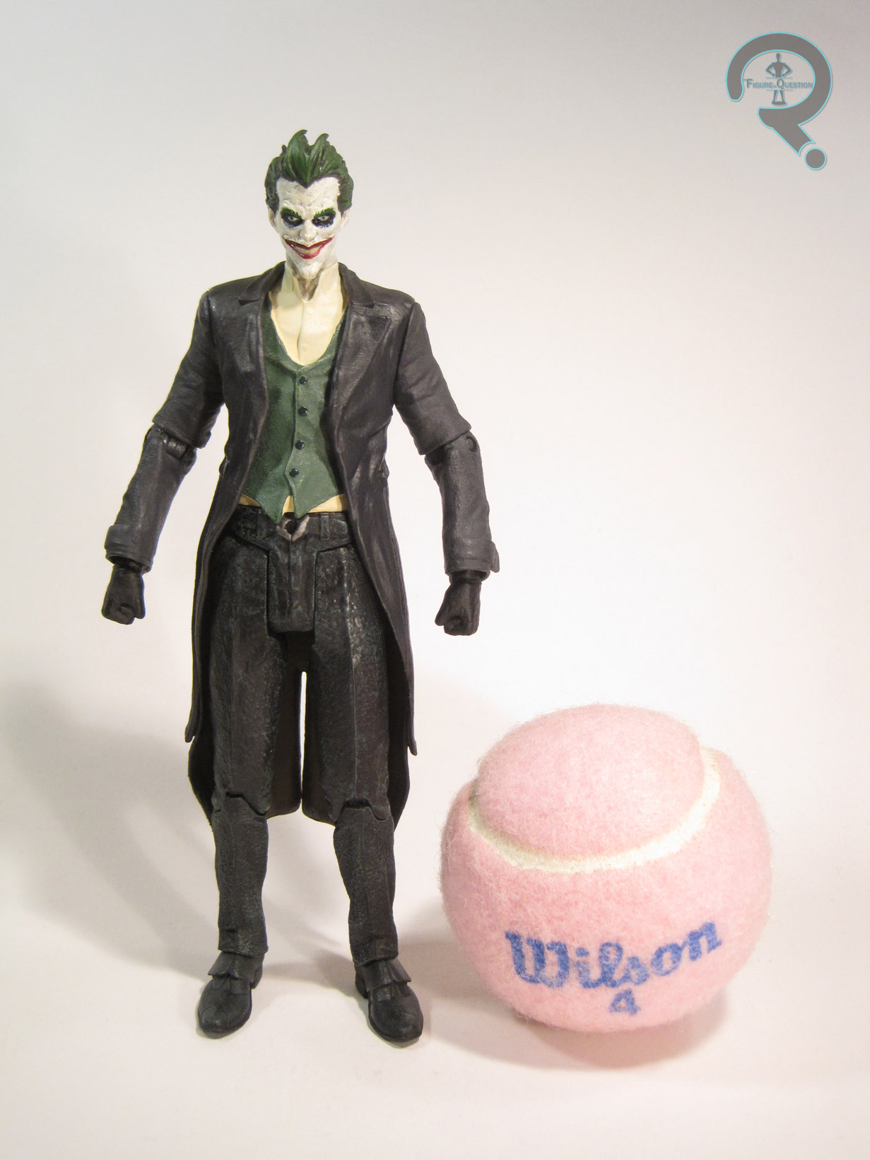
Joker serves as a primary antagonist in (most of) the Arkham games. Seeing as he’s Batman’s greatest foe, I guess that’s not too strange a concept. While other Arkham Jokers stuck more closely to the classic Joker design, this one goes for a more subdued “real world” look. Well, for the clothes, anyway. The face is pretty standard, and clearly made to look like a slightly younger version of the guy from the prior games. The figure is about the same height as Batman and has 16 points of articulation. He’s got about half the articulation of Batman, but he’s got even more restricted movement than you’d expect. He’s not going to be doing much more than just stand there. That wouldn’t be terrible, but he’s also got some weird issues, like his arms sticking out at weird angles. Also, while the sculpt looks okay on its own, it doesn’t do a particularly good job of capturing the in-game design. Like, his whole face is just kind of the wrong shape. And his body just feels kind of soft and lumpy, especially when compared to the much sharper Batman sculpt. The paint doesn’t really help matters. The basic work isn’t terribly, but there’s a lot of bleed over. Also, they tried to vary the look of his skin with some grey accents, but it ends up just making him look splotchy and unwell. Joker includes no accessories, making him the only figure in the set not to have any extras.

DEATHSTROKE

ArkhamOrigin4Do you guys remember when Deathstroke wasn’t over-exposed and annoyingly shoved into tons of stories where he didn’t belong? Because I do. I actually kind of used to like him, even. Somewhere along the way to being overexposed, he also seems to have become inexplicably linked to Batman, which is a little odd, but I guess it isn’t a horrible fit. Deathstroke made his debut Arkham-verse appearance in Arkham Origins, sporting a look that was a pretty decent tactically-based update of his original comics appearance. This figure stands the same height as the other two figures and has 27 points of articulation. His overall movement is comparable to that of Batman, though he does get a different articulation scheme on the hips, which seem a little flimsy by comparison. I think Deathstroke’s sculpt is probably my favorite in the set. Not only is he a great recreation of the in-game look, but the sculpt is also loaded with lots of really cool texture work, which makes him truly look like a battle-worn gun-for-hire. My only real complaint is that the articulation could have probably been worked into the sculpt in a smoother way. The paint on this figure is also pretty solidly handled. He’s by far the most colorful and exciting figure in the lot, and the metallic used for his armored pieces is really sleek. Deathstroke has the most accessories of all the figures in the set, with a katana, a pistol, and a staff.
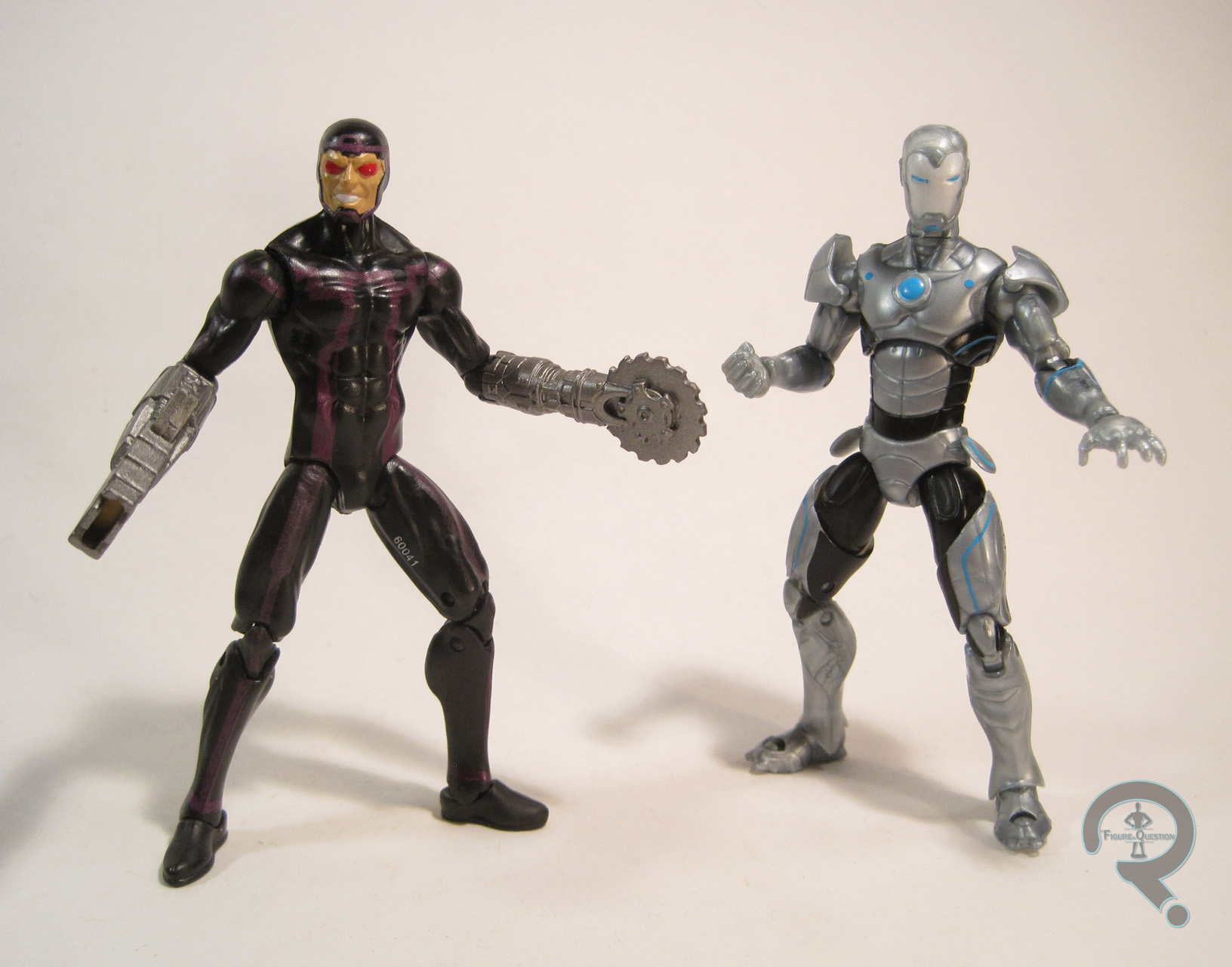
BLACK MASK

ArkhamOrigin5Oh great. Black Mask. He’s my faaaaaaaaaavrite. Okay, actually I don’t always hate Black Mask, as long as he gets a good story. He just doesn’t tend to get good stories, like, ever. Ah well. So, here’s Black Mask! The figure is 7 inches tall and he has an oh-so-exciting 7 points of articulation. He can like, turn his head and move his elbows less than 45 degrees, and move his legs at the hips, but not at the knees! Awesome, right? Okay, maybe not. This figure’s even worse than Joker on this front, which is just really weak. But his sculpt can still save him, right? Yeah, not so much. The head sculpt is admittedly not bad. I like that he looks like he’s actually wearing a mask, and I like the details of said mask. The rest of the figure is really just lame. The sculpt is incredibly soft and his pinstripes on is suit are so deep that he ends up looking like he’s wearing corduroy or something. Plus, his arms are stuck at a slight enough angle to make the fact that they don’t go back any further incredibly annoying. Black Mask’s paint is mostly off-black and off-white, which could be kind of striking if done right, but…it’s not quite there. I mean, it’s not bad, but it’s also not super interesting. It’s just there. Black Mask includes a pair of pistols, which are oddly chunky. Maybe they’ve been juicing.

THE ME HALF OF THE EQUATION

I’ve never played any of the Arkham games. I’ve gotten a couple of the figures before, but mostly because I liked the characters the figures represented, which isn’t really the true here. That being case, why would I buy this set? Because its box was damaged and Cosmic Comix was selling it for $20. Deathstroke is definitely the best that the set has to offer, and Batman’s no slouch either. Of course, on the flipside, both Joker and Black Mask are very, very weak figures, with little in the way of redeeming qualities. So, half the set’s great, and half the set’s pretty bad. At full price (which is $60-$70), this set is a pretty terrible value. At $20? Sure, Joker and Black Mask may be a waste of plastic, but Batman and Deathstroke are easily worth $10 each.
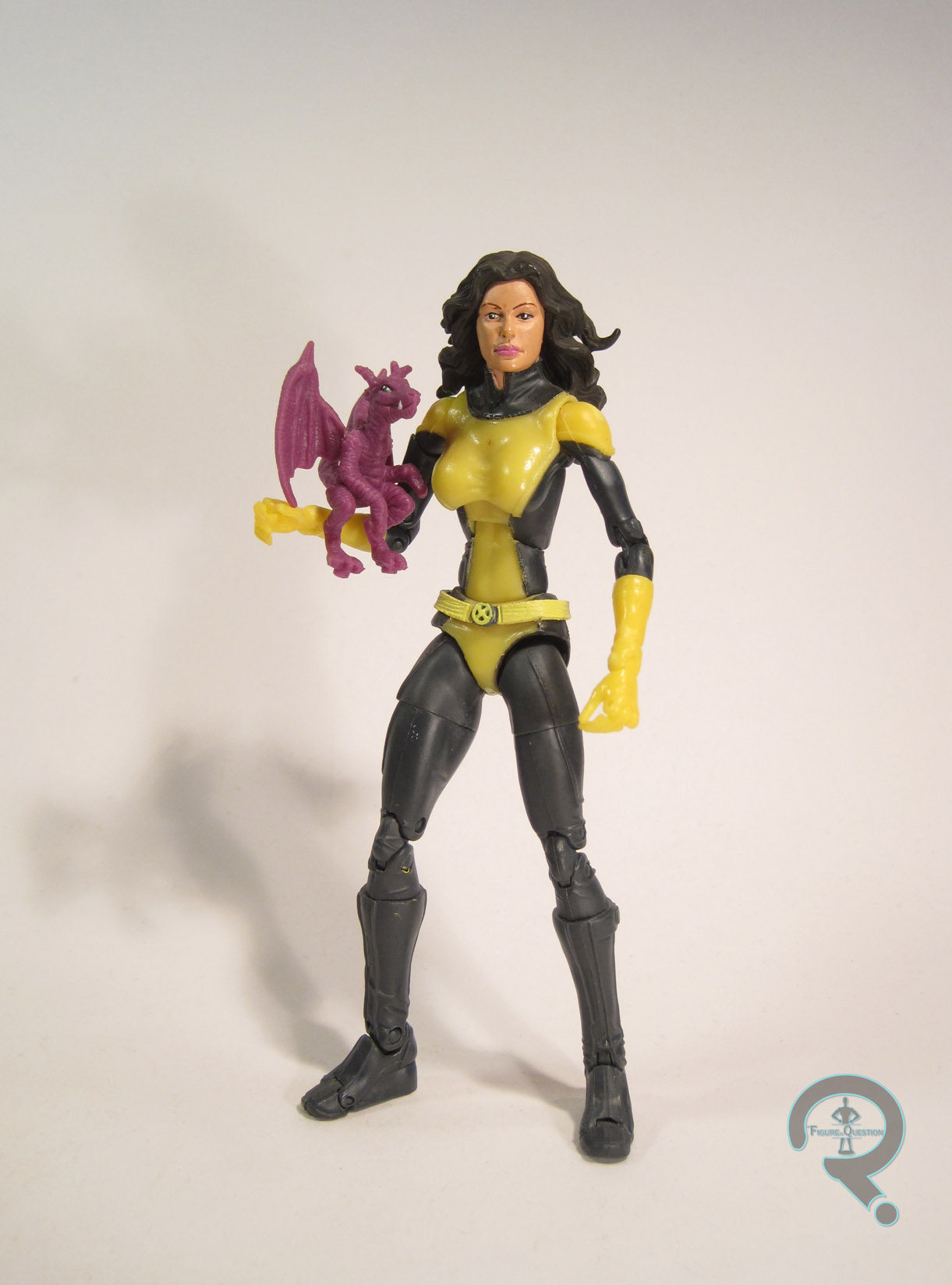
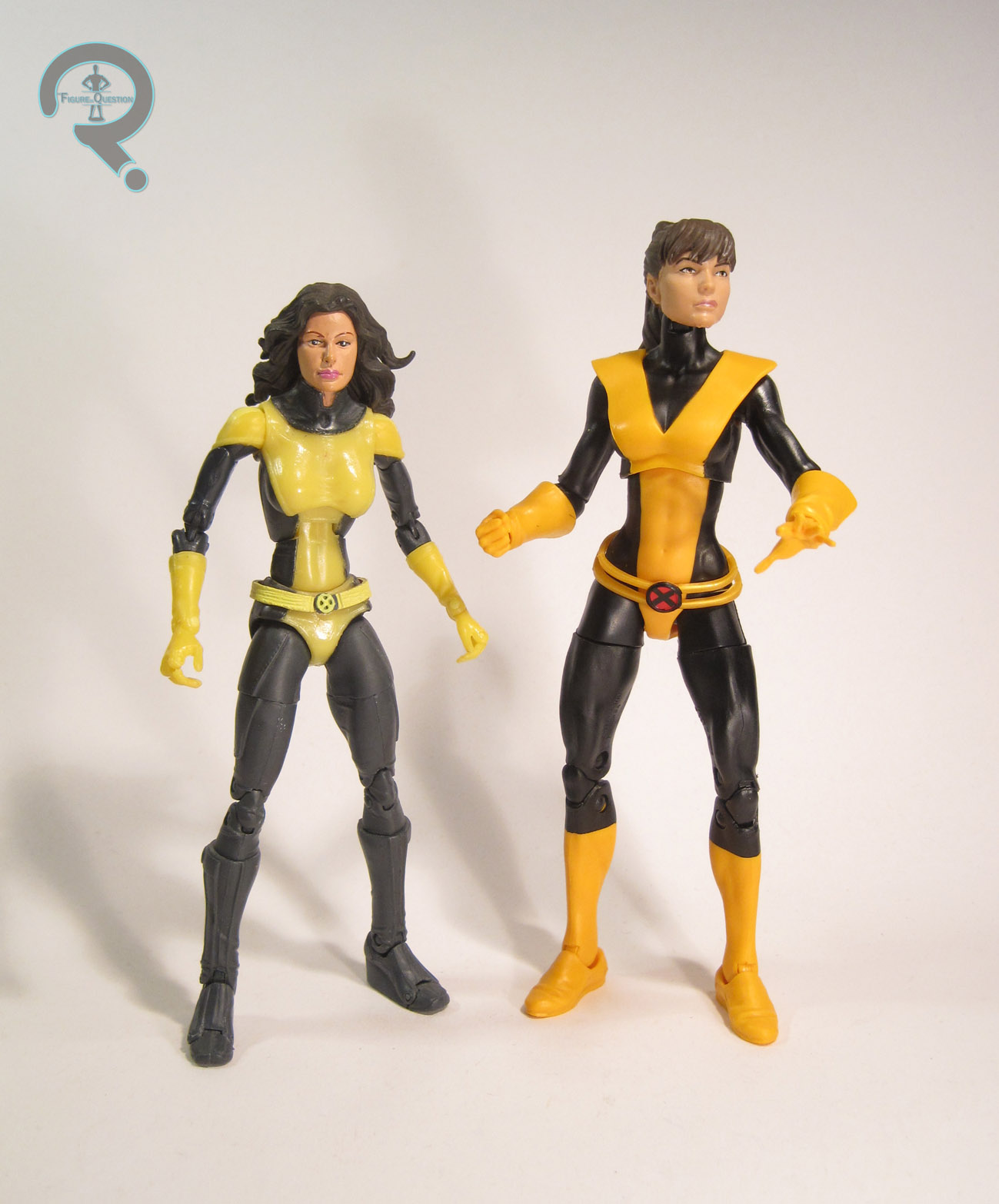
#0970: Silver Surfer

SILVER SURFER

MARVEL SUPER HEROES (TOY BIZ)

Though they were best known for their 15 year run with the Marvel license, Toy Biz’s first work of note was actual doing toys based on Marvel’s Distinguished Competition. Toy Biz’s DC action figures were little more than knock-offs of Kenner’s Super Powers line. When Toy Biz was granted the Marvel license, their initial offerings were rather similar to what they had done for DC. They offered a rather broadly ranging line, covering the major corners of the Marvel Universe (barring the X-Men, who got their own line). Today, I’ll be taking a look at one of that line’s versions of the Silver Surfer!

THE FIGURE ITSELF

Silver Surfer was released in the third series of Toy Biz’s Marvel Super Heroes line. The figure stands about 5 inches tall and has 6 points of articulation. That’s actually a pretty low articulation count for a Toy Biz figure, and it’s even a bit low for this particular line. This figure is mostly the same sculpt as his Series 1 counterpart. The only difference between the two is the lack of neck articulation. It’s an odd choice, and it definitely limits what can be done with the figure, but I’d guess it had something to do with the vac metalizing. The sculpt isn’t terrible, but it’s not particularly great either. He’s similar in style to the Toy Biz Green Lantern, in that his proportions feel rather off, and the level of detail is very low. Also, his head is just very oddly shaped. It’s definitely too small, and the face (which is very ill-defined) sits too high. In fact, the head in general sits too high on the neck, and the whole construction there just looks weird. As far as paint goes, this particular Surfer doesn’t really have any, he’s just vac metalized. Later Surfer’s would at least get detailing on the eyes, but that’s not the case with this guy. Just the straight up and down silver for him. Silver Surfer originally included his surfboard, done up to match him. Unlike other versions of the board, this one was really thick, and it had wheels on the bottom. So, he’s not actually the Silver Surfer, he’s the Silver Skateboarder. Radical.

THE ME HALF OF THE EQUATION

The Surfer is the eighth of the 15 figures that I picked up from a vendor at this past Balticon. I…I’m not really sure how I feel about him. I mean, the chrome look is certainly cool, but the actual figure’s kind of a bit lame. Toy Biz definitely improved in leaps and bounds over the years, but this guy’s a disappointment even compared to the figures from the same line. I hate to be this down on a figure, but this guy, well, he’s not great.

#0932: Masked Rider

MASKED RIDER

SABAN’S MASKED RIDER (BANDAI)

MaskedRider1

The success of Mighty Morphin’ Power Rangers was somewhat of a shock to most. Like just about any unexpected success, it spawned a legion of knock-offs, all dedicated to aping the formula and capturing as much of that success as possible. Saban, the producers of Power Rangers, got in on the game themselves. They licensed the popular Japanese series Kamen Rider (specifically Kamen Rider Black RX) and, using pretty much the same formula they’d used with Power Rangers, created the somewhat blandly-named Masked Rider. It was not the breakaway-hit that Power Rangers had been, but it did get one 40-episode season, which isn’t so bad. It also got a line of toys from Bandai America, one of which is the subject of today’s review.

THE FIGURE ITSELF

MaskedRider2Masked Rider was released in 1996 as part of Bandai’s Saban’s Masked Rider line (Man, I wish I could get a few more possessives in there…) He was part of the smaller, 5-inch scale line, and is just the basic Masked Rider figure; no fancy gimmick or adjectives for this guy. The figure stands 5 ½ inches tall and has 12 points of articulation. While it might look like he’s got a neck joint, he actually doesn’t; the head is forever stuck staring straight-ahead. Now, why they gave his neck what looks like a super obvious joint where there in fact isn’t one is anyone’s guess. My personal guess is that it’s Bandai America, and they’ve never been particularly concerned with making particularly good action figures, but I could be wrong. The rest of the sculpt seems to support my theory there; it’s not that it’s a bad sculpt, but it doesn’t really look all that much like Masked Rider’s on-screen look, especially not in terms of proportions. His head, shoulders, and hands are way oversized, and the rest of his body quite undersized. His torso is also too squat and his legs too long. Overall, he looks like no human being ever should. In addition, none of the joints are particularly well worked-in, meaning the sculpt has a lot of stop and start going on, and he as a whole looks as if he’s been assembled from several different people. At the very least, the figure’s paint isn’t terrible. All the colors match his show-appearance, and everything is mostly pretty clean. There are a few spots with slop, but they’re mostly minor.  Masked Rider’s only accessory was his sword.

THE ME HALF OF THE EQUATION

When I was younger, I watched pretty much the entirety of the “Fox Kids” lineup, which included the original run of Masked Rider. I enjoyed the show at the time (since I was rather into Power Rangers as well, and this show wasn’t all that different), so I got this guy while on a mall trip with my Grandmother. Neither the show nor this figure has held up very well. Still, he’s sort of a neat artifact of a time when I was a bit less discerning in my collecting habits, and if nothing else, the figure still amuses me.

#0928: Black Panther & Hawkeye

BLACK PANTHER & HAWKEYE

CAPTAIN AMERICA: CIVIL WAR MINIVERSE

PantherHawkeye1

Civil War was released yesterday, so now I get to write review all the associated merchandise in light of actually knowing what happened in the movie (which was seriously awesome, by the way). I’ve been steadily making my way through Hasbro’s small-scale line of figures; of the four characters I’ve looked at, three have pretty sizable parts. The two characters I’m looking at today, MCU-mainstay Hawkeye and newcomer Black Panther, both get decently sized roles, though one of them is definitely more pivotal to the plot than the other.

THE FIGURES THEMSELVES

These two are part of the first series of the Captain America: Civil War Miniverse line. Their pairing together isn’t the weirdest pairing the series has given us (that’s definitely Winter Soldier and Vision, who I don’t believe so much as glanced at each other in the final film), since the two have a brief bit of interaction. Still, Bucky would kinda seem like the more natural partner for Panther. But hey, I’m gonna wind up with the whole set anyway, so does it really matter?

BLACK PANTHER

PantherHawkeye3Early reviews of the movie were all very complimentary of Chadwick Boseman’s performance as the Black Panther, and man, they weren’t kidding. Guy just about steals the show! His figure stands 2 ¾ inches tall and he has the same 5 points of articulation as the rest of the line. The overall quality of the Panther’s sculpt is pretty good, but he seems to be suffering from a phenomenon similar to Crossbones, where the upper half of the sculpt is quite good and the lower half is less so. It’s not quite as pronounced on Panther, though, so it’s not too bad. He exhibits some tremendous texture work, replicating his rather distinctively patterned suit from the movie very nicely. I do wish his legs were a little less weirdly posed, as they make it very hard to keep him standing, but that’s really it. Paint is quite minimal on Panther, with detailing only on the eyes and collar. However, that’s appropriate to the movie, and the texture on the sculpt does the heavy lifting here. Panther is the figure in this pairing who gets the weird armor pieces. T’Challa’s is a little cooler than the others, since it at least fits well with him thematically. Still goofy as heck, but it is what it is.

HAWKEYE

PantherHawkeye2Hawkeye’s Civil War appearance is, to me, the closest he’s come to that super awesome comics version of Hawkeye that I always loved.  And that makes me very happy. You know what doesn’t make me very happy? This figure. That sounds harsh; I don’t hate him, but he’s far from what I wanted. He’s supposed to be based on Hawkeye’s new look from Civil War, but, um, that’s not what he’s wearing. He lacks the asymmetrical sleeves, and has two gloves instead of one. That’s not the biggest issue though. See, Hawkeye’s gun is holstered on his right leg, which isn’t correct, since Movie Hawkeye’s a lefty. A closer look shows that, not only is the holster on the wrong side, but his whole quiver set-up is totally reversed. Now, a quick Google search shows that the promo shots of Hawkeye had a tendency to get mirrored, so maybe that’s where the confusion came from. He’s still sculpted to hold his bow in his right hand, though, which would make the placement of his quiver on his right shoulder more than a little impractical. It seems to me that this should have dawned on at least one person during the development process. His paint’s not much better. In the movie, his costume has a number of different purples, but none of them are the garish shade that is used for the majority of this figure. Also, whatever you do, don’t look directly into those soulless black holes that have taken the place of his eyes. That’s the stuff of nightmares. Cap got actual eyes, so I’m not sure what happened to Hawkeye. Hawkeye is packed with one accessory: his bow. It’s got no drawstring, but at this scale, that’s a minor issue.

THE ME HALF OF THE EQUATION

I picked up this set at the same time as Cap and Crossbones. I was a bit more interested in Hawkeye when I bought it, though I certainly didn’t mind getting Panther. After opening it up, neither figure is perfect. That said, Panther’s the real winner here, even with the leg issues. Hawkeye’s a little disappointing, because he’s just not the figure I was expecting.

#0917: Corporal Hicks

CORPORAL HICKS

MOVIE MANIACS (MCFARLANE)

HicksMM1

Do you guys know what day it is? It’s Alien Day! Yes, in celebration of the 30th Anniversary of Aliens, today, April 26th (it’s 4-26, as in LV-426. Clever girl…) is officially Alien Day. There’s some cool contests and such, plus a whole ton of awesome Alien-themed merchandise, and even some showings of the first two films on the big screen. Obviously, I’d be remiss if I didn’t do something to celebrate. I’ve actually reviewed the vast majority of my Aliens collection, but have no fear; I’ve still got a few aces up my sleeve. Today, I’ll be looking back at one of the earliest examples of a figure based on Aliens’ human characters, with McFarlane Toys’ figure of Corporal Hicks. Buckle up guys; this might be a slightly bumpy ride.

THE FIGURE ITSELF

HicksMM2Hicks was released in Series 7 of McFarlane’s Movie Maniacs line. By this point, they had more or less given up on keeping true to the “Maniacs” half of the title, but that was a trend that started in Series 4, so no one was super shocked. Corporal Hicks was available two different ways: there was a basic release with a pulse rifle and un-helmeted head, and there was also a McFarlane Collector’s Club version that included a helmeted head, a motion tracker, a face hugger and egg, and a shotgun. My figure is the regular release, so I don’t get all the fun extras. He stands about 7 inches tall and has 9 points of articulation. Those 9 points don’t really amount to much of anything, though, since the figure is sculpted in this odd sort of leaning back/lunging forward pose (also, thanks to the fragility of McFarlane figures, my Hicks’ right shoulder broke sometime between me putting him in storage and taking him out to write this review). The best you can really do is turn his head and slightly change the pose of the arms. But, hey, the lack of movement’s okay, because the sculpt is really great, right? Well, not exactly. The sculpt definitely has its highlights, to be sure; the general level of detail on his uniform is quite good. There are a few inaccuracies, such as the ridges at the center of his chest armor, where it should be smooth, the fitting of the back of his armor to his shoulder blades, and the lack of one of his two belt pouches, but those are small. The main issue? The body that the uniform is resting on. Looking past the weird pose, the arms and legs are huge, way too huge for the torso. The arms in particular are super massive, and almost look misshapen. On top of that the head is a bit too small. Also, while I guess the face sort of looks like Hicks, it’s far from spot on (in fact, I don’t believe they ever officially got Biehn’s likeness rights; they weren’t very good about doing that sort of thing). He’s wearing his headset from later in the film, which makes him different from the NECA figure, but it also creates a slight continuity error, since he’s still got his shoulder lamp, which he’s ditched by the time he gets the headset. If there’s one area that’s pretty solid on this figure, it’s the paint (well, provided you aren’t comparing him to the NECA version). There’s the glaring issue of him being way too pale. He also lacks Hicks’ name at the top of his chest armor. The armored pieces are nice overall, but the camo is slightly off, and lacks the white elements. The camo on his uniform is pretty well-executed, though, and all of the small detail work is nice and tight, if a bit more basic than the NECA figure. Hicks includes his M41A Pulse Rifle (not quite as good as the NECA version, but not bad for the time), a locator, a knife, and a display stand that looks like the flooring of one of the Hadley’s Hope facilities. Later shipments of the figure also included the motion tracker included with the Collector’s Club version, but mine isn’t one of them.

THE ME HALF OF THE EQUATION

I’d actually seen Aliens when this figure was released, and I saw it at retail a few times, but for whatever reason, I didn’t pick it up (I think I was holding out for a Ripley to go with him). A few years later, I ended up getting him as a Christmas gift from my parents. This isn’t a figure that’s aged particularly well, especially in light of the far superior NECA version. Even when he was new, he felt sort of unfinished, due to neither the regular or exclusive versions offering a complete set of accessories. That said, taking him back out to review has reminded me of a lot of the more endearing qualities of the figure. There was a time when he was the best Hicks figure I owned, and I do still have some very fond memories of that.

HicksMM3

#0910: Shade

SHADE

JUSTICE LEAGUE UNLIMITED

Shade1

While DC’s Golden Age heroes have all more or less managed to stay in the spot light over the years, the foes that those heroes faced haven’t been quite so lucky. Even hardcore DC fans will struggle to name more than a handful. One of the few to not totally get lost in the shuffle between the various “ages” was the Shade, thanks in no small part to being included in James Robinson’s run on Starman. Shade’s had three action figures over the years. Today, I’ll be looking at the one based on his appearance in the Justice League cartoon.

THE FIGURE ITSELF

Shade2Shade was part of Mattel’s Justice League Unlimited line. He was initially released as a solo figure in 2007, but he was also re-released later in a three-pack with Cheetah and Lex Luthor. The figure stands 5 ¼ inches tall counting the hat, and he has 5 points of articulation. JLU was Mattel’s first instance of applying the buck system to a DC line, and Shade was no exception. He was built on the skinny male body (a re-tooled version of the Flash). It’s a decent fit for Shade, though he should probably be a little taller and skinnier. He has a new head, which does a pretty awesome job of translating Shade’s look from the show. There’s no mistaking him for anyone else. Shade also has an add-on piece on his chest, to represent his jacket from the show, but it doesn’t work very well. It’s ill-fitting and overly bulky, and lacks any really defined details. A newly sculpted torso, or even just proper application of paint on the basic torso would have been much better. As it stands, the look of the figure is really off, which is a shame, given the quality of the head sculpt. The paint on Shade is pretty straight forward: white on the face, black everywhere else. It’s not particularly exciting, and it’s also not accurate; Shade on the show had a few different finishes on his outfit, and at least part of it was a dark grey. The single packed Shade included his cane (which he’s unable to hold), while the three-pack version was without any extras.

THE ME HALF OF THE EQUATION

Shade was a rather rare figure back when he was new, so I never got one. Last November, while participating in Small Business Saturday, my brother and I were in a small nick-knack shop, where he happened upon a Secret Wars Wolverine in a small bin on a low-sitting shelf. A quick look through the rest of the surrounding bins found me this guy, for $1.99. This figure is a bit of a mixed bag, but for 2 bucks, I’m willing to let him slide.

#0904: Major Chip Hazard

MAJOR CHIP HAZARD

SMALL SOLDIERS (HASBRO)

ChipHazard1

Small Soldiers does a fair bit of subverting people’s expectations. The title, the marketing, and the casting of the typically heroic Tommy Lee Jones as Major Chip Hazard (countering the usually villainous Frank Langella as Archer) all point to the Commando Elite as the assumed heroes of the piece. Heck, they even brought in Hasbro, who made their name with the “Real American Hero” G.I. Joe, to help design the figures seen in the movie. Their foes, the Gorgonites, are all grotesque monsters, clearly designed to make the Commando Elite look extra heroic by comparison. But the movie wastes no time showing the audience how wrong their perceptions were, and the Commando Elite quickly prove themselves a perfect antithesis to the noble Gorgonites; they’re cold, calculating, and with a desire to win their battle at all costs. Tommy Lee Jones’ Hazard is the worst of the bunch, a perverted, twisted version of the classic heroic soldier archetype.

THE FIGURE ITSELF

ChipHazard2Chip Hazard was released in the first assortment of Small Soldiers figures. Hazard would go on to get the most variants of anyone other than Archer, but this one presents him in his actual look from the movie. Well, more or less. The figure is about 6 ½ inches tall and he has 5 points of articulation. Yep, he loses the waist articulation, making him even less articulated than Archer. Wrong direction, guys! I’ve already harped on the articulation issues in my review of Archer, so I won’t get into it again. It should have been better, but that just wasn’t the case. Hazard’s sculpt is a bit more stylized than Archer’s; he still more or less resembles his on-screen counterpart, but his proportions have been made more “90s heroic” (smaller head, larger arms/hands). The likeness on the head is close, but not as close as Archer’s. Hazard still has sculpted, faux joints, but his are a bit less visible than those on Archer, which kind of hurts his representation of the toy in the movie. In addition, there are a few details that are missing or changed from the movie to this figure. He lacks the dog tags sported by his on-screen counterpart, as well as his customized belt buckle, and he has two smaller grenades in place of the single larger grenade he had in the movie.  Lastly, he his left forearm has protrusion (meant to attach to his accessory) which sticks out as being just sort of tacked on. Hazard’s paintwork is generally okay. The colors match up closely enough, which is good. The camo patterns are, understandably, not quite as detailed as the one’s movie Hazard had. The arms and legs make out perfectly alright in this respect, but the vest doesn’t work as well, with the pattern looking more like cheetah’s spots than a standard camo pattern. The grenades end up being the wrong color (they should be roughly the same color as the belt), and his belt buckle remains the same color as the rest of the belt, despite being red and silver in the movie. Hazard included a big missile launcher thing, which attached to his left arm. My figure doesn’t have this piece, but that’s just as well.

THE ME HALF OF THE EQUATION

As I noted in my Archer review, I didn’t really have any of the Small Soldiers figures growing up. I think my cousin may have had a Chip Hazard (I know for sure that he had a Brick Bazooka) but I never did. I ended up finding Hazard at 2nd Chance Toyz last October, at the same time I got Archer. Of the two, Hazard’s the weaker figure. He’s less accurate to the source material, has less articulation, and generally just a less entertaining figure. However, being less entertaining than Archer doesn’t mean he’s not entertaining, and having the pair of them does inherently make both a bit more awesome.

ChipHazard3

#0903: Archer

ARCHER

SMALL SOLDIERS (HASBRO)

Archer1

When it comes to 90s movies about toys that are actually alive, most people remember Toy Story. Or, on the more horrific side, Child’s Play. I’m not knocking either of those (well, maybe Child’s Play; not really my thing) but my go-to movie of this odd sub-genre is hands down Small Soldiers. The movie was, at best, a modest success, but it had some pretty awesome people involved. It was directed by Joe Dante (of Gremlins fame), featured the vocal talents of Tommy Lee Jones and Frank Langella (to say nothing of featuring the likes of Kirsten Dunst, David Cross, and Phil Hartman in live action roles), had visual effects by industry legend Stan Winston, a score by Jerry Goldsmith, and is one of the earliest examples of a film making use of a Led Zeppelin song. It’s an awesome movie. Toy makers Hasbro were brought on as consultants for the designs of the film’s lively action figures, and in return were given the rights to produce the film’s tie-in toys. Sadly, they weren’t quite as successful as they were in the film. Today, I’ll be looking at Archer, emissary of the Gorgonites, the heroic faction of action figures.

THE FIGURE ITSELF

Archer2Archer was released in the initial 1998 assortment of Small Soldiers figures from Hasbro. The figure stands 6 ¾ inches tall and has 6 points of articulation. Here’s where we encounter the primary issue with these figures: articulation. The toys seen in the movie had a lot of articulation (they had to be able to move around in a fairly humanistic manner). The real life toys had 6 points, all cut joints. Letdown doesn’t begin to describe the articulation here. It’s made worse by the fact that the sculpt clearly emulates the articulation seen in the movie, but leaves it motionless. Clearly, they wanted the figures to be cost-effective, and that didn’t allow for the proper articulation. I’m not sure what the best fix would have been (short of charging more per figure), but there’s no denying that this is a major failing of these figures. With that out of the way, how does the rest of the figure fair? Not badly, actually. The sculpt does a pretty good job of capturing the toy design from the movie, especially the upper half. The proportions have been tweaked ever so slightly, making him a bit more squat than his movie counterpart, but it’s not that far off. One thing that is a bit off is the pose, which has Archer’s back totally straight, despite the character in the movie always having a slight hunch. It definitely throws off the appearance of the figure, which is a shame. On the plus side, the detail work on the sculpt is pretty great, and captures a lot of the smaller details seen in the movie. The paint on Archer is definitely a step down from what was seen in the movie, but that’s fair, since the one in the movie was a professionally painted prop, and this is a mass-produced figure. Given the circumstances, he’s not bad. The best work is on the head, which exhibits some surprisingly subtle work in a few spots. The rest of the figure is reasonable enough, especially for the time. There are a few details that go unpainted, but the general application is pretty solid. Archer was packed with a crossbow (with launch-able missile) and a knife. Mine, however, does not have those pieces.

THE ME HALF OF THE EQUATION

By the time I saw Small Soldiers (on VHS; I didn’t see it in theatres) the first assortment of figures had pretty much totally sold through. So, I had to settle for a weird variant version of Archer, which was the only Small Soldiers figure I owned for a good long while. When I finally had the resources to go pack and find some of the others, most of the figures had rather high after-market prices. Last October, at the suggestion of my friend Cindy Woods, I checked out 2nd Chance Toyz, a cool nearby shop that carry all sorts of older toys. They had Archer for an exceptionally reasonable price, so I picked him up. Sure, he’s not as cool as the figure in the movie, but he’s still a pretty fun toy in his own right. And that’s the important part!

#0896: Machine Man & Iron Man

MACHINE MAN & SUPERIOR IRON MAN – MECHANICAL MASTERS

MARVEL LEGENDS (3.75)

MechanicalMasters1

As much as I love what Hasbro’s been doing with the Marvel and Star Wars lines, I do have to admit to being baffled by their recurring choice to give multiple lines of figures the exact same title. When they first started doing Marvel figures in both 6 inch and 3 ¾ inch scales, the larger figures were Marvel Legends and the smaller were Marvel Universe. They also offered some 12 inch figures, under the heading Icons. Well, by the end of this year, all three of those scales will be titled Marvel Legends. I’m sure that won’t be at all confusing. The 3 ¾ inch line has officially switched its title over, and the first product to hit is a series of two-packs. Today, I’ll be looking Machine Man and Iron Man from that particular series.

THE FIGURES THEMSELVES

This pair was released in the first series of two-packs in the new 3 ¾ inch Marvel Legends line, under the name “Mechanical Masters.” When these figures were shown off at last year, the assumption was that they would be single figures with a shared name, since that’s a pretty common practice for Hasbro. Then they just kind of showed up in two packs, which certainly caught me off guard. In addition to the figures, the set is also packed with a reprint of Superior Iron Man #1, which makes sense for one of the two figures, but not the other.

MACHINE MAN

MechanicalMasters2If you had told me five years ago that I would own two figures of Machine Man, I would have had a long hard laugh. Seems pretty out there to think that such a minor, low-tier character would warrant multiple figures, within a year of each other, but hey, here we are. The figure stands roughly 4 inches tall and has 19 points of articulation. This Machine Man is decidedly more modern take on the character than the larger figure. He’s based on his Tron-styled post-Nextwave design, which I believe is still his current look. More specifically, the character-unique parts (his head and forearms) are directly based on Daniel Acuna’s Avengers 50th Anniversary poster. The real tell here is the forearm configuration; he’s got a buzzsaw and a Sci-fi blaster sort of thing, which are lifted right from the poster. The sculpts are all pretty solid work; the technical stuff on the arms is particularly sharp. The head’s details are a little soft, but they stand out well enough for the scale. All in all, the parts look good, and match up with the mid-sized body that the figure is built on. Machine Man’s paintwork is passable; the general application is pretty clean, though the face is a bit sloppy. The metallic purple is pretty cool, but it probably would have looked a bit better if it were a little brighter, so as to stand out more from the black base color. Machine Man includes no accessories, not even an extra set of normal forearms, which ends up being a little bit limiting.

SUPERIOR IRON MAN

MechanicalMasters3This figure is the required heavy hitter of the set, and…yeah, that’s really all I got. I can’t really figure why this guy got packed with Aaron, since the two don’t really have any history. Retailers just like Iron Man, I guess. The figure is a little over 4 inches tall and has 24 points of articulation. This figure is based on the “Superior Iron Man” design, from the comic of the same name, after Tony became more of a jerk than usual. This figure gets a new head sculpt and uni-beam and re-uses the body of the Marvel Universe line’s Extremis Iron Man (which was also used for Iron Patriot). That was a decent Iron Man, but it wasn’t even the strongest of Hasbro’s Iron Man sculpt when it was new, and it feels really dated now, especially in terms of poseability. It was also pretty under-sized, and that’s made even worse by the fact that the new head is larger than the original. What’s more, the Extremis armor had a number of major deviations in design from the Superior armor, so it’s not even a particularly clever re-use. The paint is really what the figure hinges on to sell it as Superior Iron Man. Unfortunately, even that’s not really great. In the comics, the suit is bright white and sleek (it’s kind of similar to something produced by Apple), but here it’s mostly a dull silver. Also, while the design in the comics has the black sections, they seem to stand out way more here. With the base colors being darker, the light blue details also tend to be easily lost, which is a shame, because they could have helped to sell the differences in the armor a bit more.

THE ME HALF OF THE EQUATION

I was obviously planning on getting this set as soon as they showed it, though I didn’t initially realize I’d be getting both figures. I got the set from my Dad, who found them while running an errand at Target. Machine Man is definitely the selling point; he’s got some really cool new parts and he’s a really fun version of the character. I do still hold out hope that we might see a Nextwave version down the road, but this one is definitely a welcome addition. Iron Man is kind of a waste of space, if I’m honest. His body is inaccurate and out of date, and I wasn’t much of a fan of the concept to begin with. But who cares? I got another Machine Man!