The Blaster In Question #0003: Ravager

RAVAGER

ALIEN MENACE

If you follow nerf even a little bit, you’ve probably noticed the trend of blasters moving toward the “tacti-cool” militaristic types of designs with scopes and magazines and attachments out the wazoo, and thats great for when you wanna play that way, but sometimes you don’t wanna get to serious about it.  That’s when you need a big goofy, gimmicky blaster.  That’s where the Ravager comes in.  Ok, ok, the name sounds intimidating and all, but don’t let that fool you.  This blaster has goofiness for days, so let’s take a look.

THE BLASTER ITSELF

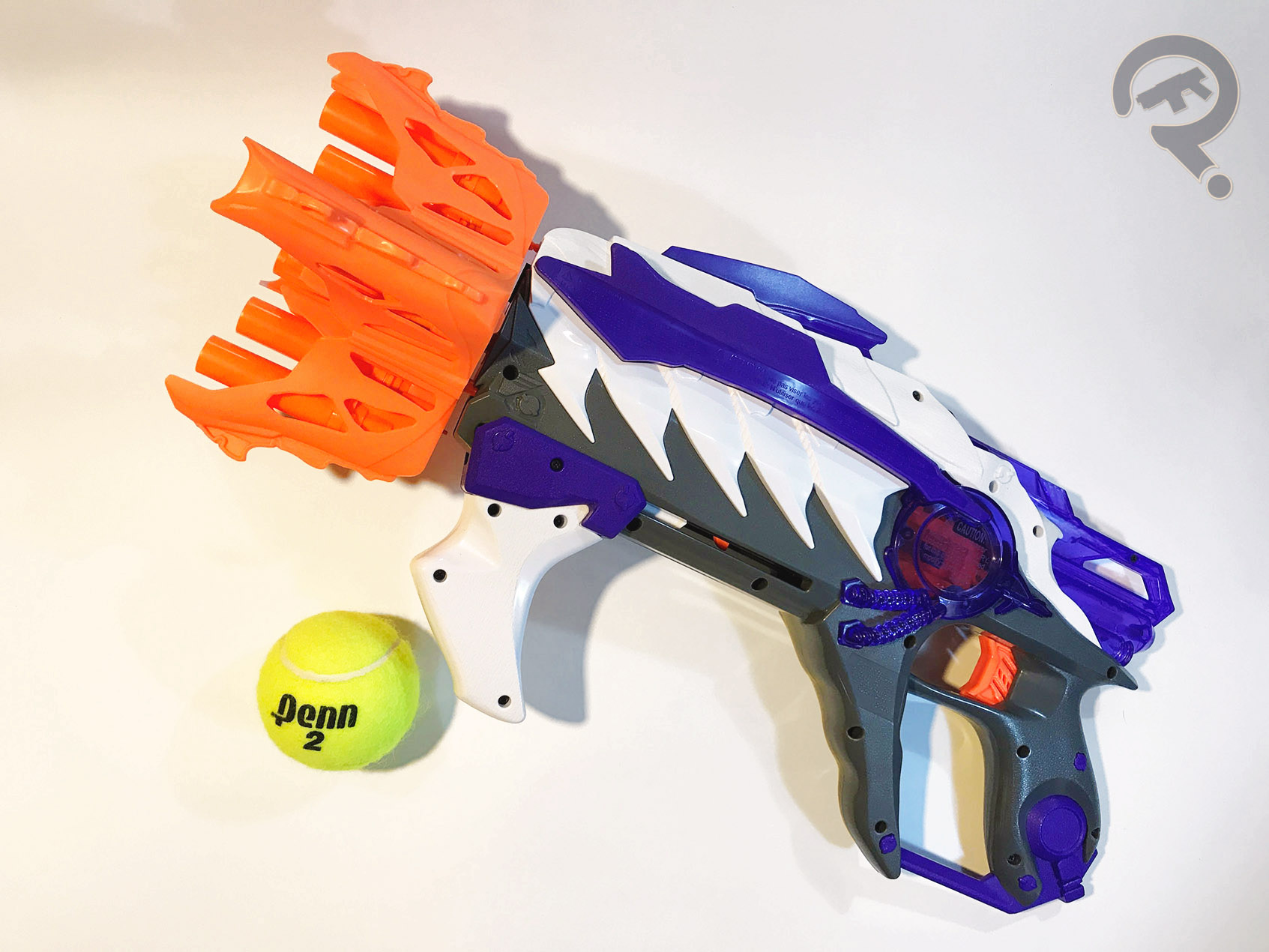
The ravager was released in Fall 2016 as the secondary blaster in the first wave of the Alien Menace series (again with the super serious names).  As far as I can tell, the Ravager is mostly original in terms of mechanics.  The forward fang/claw-type handle primes the blaster like just about any pump-action blaster with the added distinction of being absolutely buttery smooth.  This may be an odd point to harp on about, but I’m serious.  This blaster has one of the smoothest most satisfying pump-actions I’ve ever felt.  I wish every Nerf blaster felt this good to prime, but thats enough about that.  Firing, the blaster works like a big revolver, however, it’s unique in that the big goofy claw cylinder (which is far from cylindrical) holds 2 shots on each claw arm, releasing only one dart at a time via smart air-restrictor.  Effectively, what this means is that the cylinder has to complete 2 full rotations to fire all 8 darts.  On a side note, I’ve seen other people firing the Ravager and I believe mine might have a slight defect with one of the catches which are supposed to stop the claw cylinder in the right place to fire another round.  The blaster is still useable, it just has a tendency to rotate the cylinder back to the previous position if I try to fire it too quickly.  That might just be mine, but let’s move onto where the Ravager really shines.  My god, the design of this blaster is just something else.  At first glance, yes, its a funky shape, but looking closer, there’s a ton of really nice texture work.  The grey areas have a bumpy, pseudo-rayskin feel, whereas the purple and white have a grain to them, kind of like bone or chitin.  Where there isn’t texture, theres cool transparent purple on the back section of the blaster.  All together, the design makes the Ravager feel like a proper alien weapon.  Someone on the Nerf design team was having a good day when they were working on this.  The blaster feels pretty good in hand, though the aforementioned forward grip takes a little getting used to.  There aren’t any sights to speak of, but then again, maybe aliens don’t have conventional eyes, or like, use the Force or something.  The Ravager hits a little on the softer side, but nothing deal-breaking.  It’s probably slightly better suited for indoor play for that reason and because the 8 Elite darts that come packaged are a dark grey and purple, making them much easier to lose in grass and such.

THE ME HALF OF THE EQUATION

The Ravager was actually a birthday present from the infamous Enabler (some call her the “Super Awesome Girlfriend”) while on a ToysRUs run with my boy Ethan.  Funnily enough, it was a TRU run for his birthday whereupon I bought him the Marvel Legends Black Panther.  The Enabler, upon realizing that my own birthday was several months past, forcibly grabbed the Ravager from my stack of Nerf purchases-to-be and bought it herself.  I mean, she did, then, give it back as a belated gift, but still, the nerve of some people.  I am glad to have it, and though mine might be a bit of a lemon, it’s still plenty of fun to run around the house with, making pew pew noises.

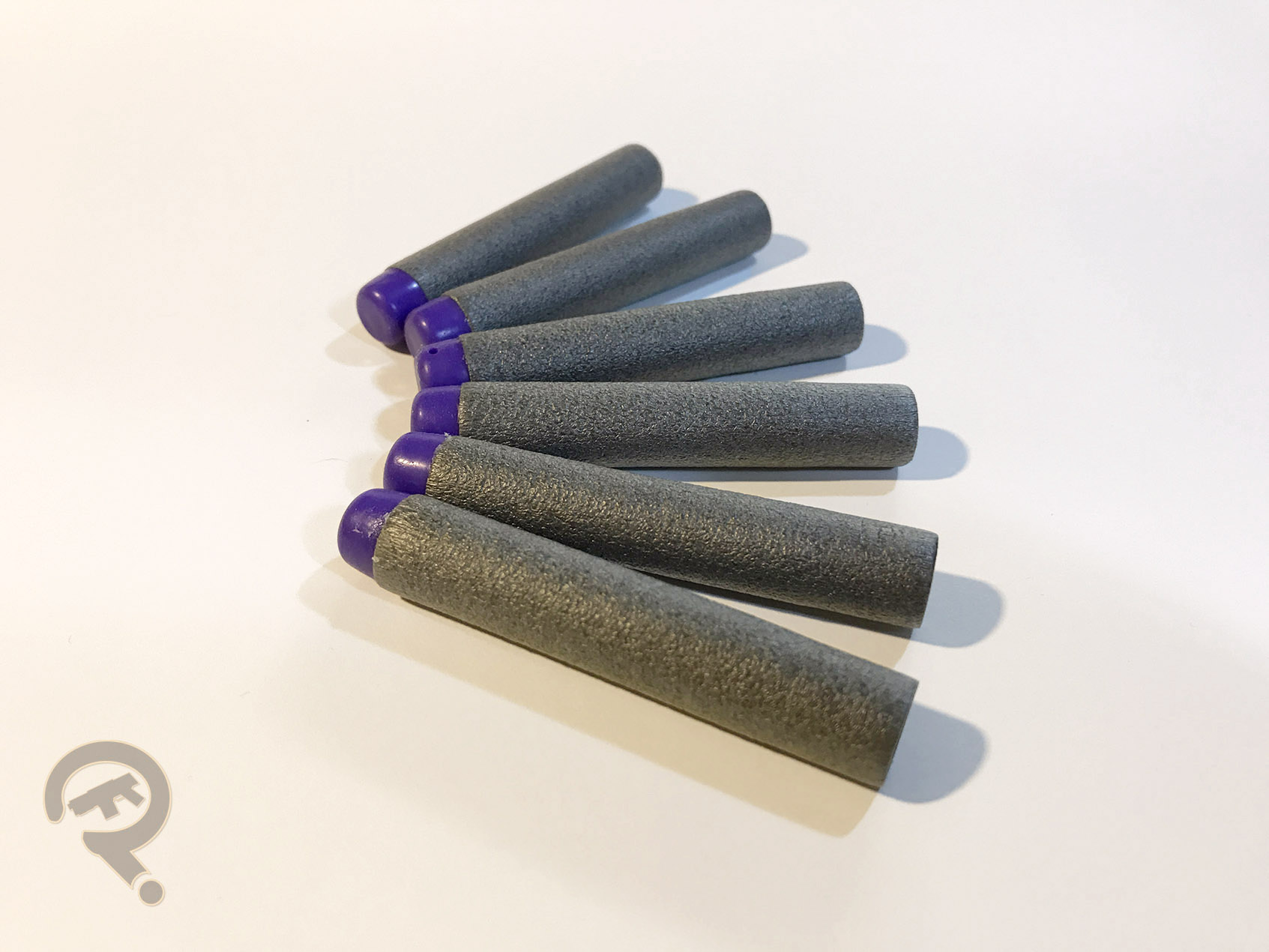
*All kidding aside, Jess is pretty cool, but “Super Awesome Platonic Friend” didn’t quite roll off the tongue.

#1278: Jean Grey

JEAN GREY

MARVEL UNIVERSE 10-INCH (TOY BIZ)

“When the X-Men investigate a rash of mutant disappearances, they find that crime fighter Daredevil is working on the same case. Tracking down clues connected to the crimes takes Daredevil and Wolverine to an abandoned chemical factory while Jean Grey and Professor X use their incredible psi-talents to locate the kidnapped mutants inside. Battling and defeating their captors, the X-Men and Daredevil are able to give the kidnapped mutants back their freedom.”

I know I just got through reviewing a ton of X-Men figures but I’m gonna review another one.  Why?  Because this is my site and I do what I want.  Also because this figure was the next on the randomized list that tells me what figures to review.  Don’t let that undermine my previous statement.  Anyway, today I’ll be looking at founding X-Men member, Jean Grey!

THE FIGURE ITSELF

Jean Grey was released in 1997 as part of Toy Biz’s 10-Inch-scaled Marvel Universe line.  As the bio might have clued you in, she was released alongside Daredevil and Professor X (the both had matching bios).  Wolverine is also mentioned, but I wasn’t able to find any reference to a specific Wolverine that had this matching bio, so it’s possible they were just counting on kids to already have a Wolverine.  Jean is based on her Jim Lee-designed look from the ‘90s, which was an oddly rare design to see at the time. Not exactly her most attractive design, but it was the one on the cartoon (more or less). This figure stands about 9 1/2 inches tall and has 9 points of articulation.  Jean, like all but one of the female figures from this line, is a repaint of the X-Men line’s Rogue figure (which was a larger scale version of the 5-inch figure I just reviewed).  It wasn’t an ideal set-up, since Rogue and Jean aren’t *that* similar in design, especially in their Jim Lee costumes.  That being said, I suppose it could have been worse.  Jean’s aided by the fact that she ditches the belt and coat from Rogue (which is better than can be said for Polaris or Mystique), which at least gives her a different silhouette than Rogue.  The proportions on this figure are passable.  Obviously, they’re rather off, but in the context of the rest of the line, they don’t look too bad.  The paint carries most of the weight of turing this figure into Jean Grey.  It’s okay, I guess.  They try to use the paint to make her costume look more appropriate.  It’s not awful on the head, where the only real issue is the texture of the headband not matching the rest.  The shoulders should technically be raised shoulder pads, but even that doesn’t look so bad.  It really starts to fall apart with the wrist bands, which not only paint over the cuffs of the gloves as if they aren’t there, they also don’t even try to follow the shaping of the wrists from the comic design.  There is similarly do nothing to hide the tops of Rogue’s boots; I get that new tooling was out of the option, but at least the other figures to use this body did some slight tweaking to try and include the boots organically.  They look really weird totally unpainted.  Jean’s one accessory was a….big…bazooka?  You know, that bazooka thing that Jean always hauled around in the ‘90s!

THE ME HALF OF THE EQUATION

When I was growing up, my Dad had his own small collection of 10-inch figures (in retrospect, three of them were Jean, Professor X, and Yellow Daredevil, all of whom were part of this same subset).  Eventually, they were passed on to me.  Even as a kid, I always found Jean to be one of the weaker 10-inch figures that Toy Biz released.  Making an important character like Jean nothing more than a cheap repaint was seriously messed up.  She’s alright, I guess, but really, really, really, really disappointing.

Flashback Friday #0012: Green Goblin

Hello and welcome to another Friday at the Figure in Question!  It’s time for another Flashback Friday Figure Addendum!  Today, I’m taking a look at another Green Goblin figure, specifically the one from the ‘90s Spider-Man line.  This is from back *before* he was Willem Dafoe.

Alright guys, after a brief stop over into the strange bizzaro world of The Stapler in Question, we are back at home with the action figures. Yay! So, back in the 90s, the 5-inch scale Marvel figures, produced by the very much at the height of their game ToyBiz were totally my jam. The figures were (at least loosely) based on the then current cartoons. Amongst those cartoons was Spider-Man: The Animated Series, which ended up with a fairly nice toyline of its own, at least for a few series. So, let’s have a look at one of Spidey’s greatest foes, the Green Goblin, as he was presented in said line.

THE FIGURE ITSELF

Green Goblin was released as part of Series 3 of ToyBiz’s Spider-Man line. The cartoon did this odd thing where Hobgoblin preceded Green Goblin, which resulted in Hobs taking the Goblin slot in Series 1. And Goblins never go for even numbered series. That’s just not how they roll. The figure is about 5 inches tall, with 9 points of articulation. He’s pretty much standard for a ToyBiz figure of the time. He’s based on the character’s animated appearance, which itself was a fairly faithful recreation of the comics design. Mostly, it just comes down to style cues, resulting in a slightly “friendlier” looking Goblin. Surprisingly, Green Goblin got his own sculpt, which shared no pieces with Series 1’s Hobgoblin. I think that may be the only time these two have both appeared in a line with no re-use at all. Impressive. The sculpt itself ends up being quite impressive, with not only some pretty good proportions, but also some killer texturing, especially on the scaly arms and legs. They aren’t super-detailed like some of the sculpts that followed, but they are a great example of using just enough detail to suggest the rest (which, incidentally, is how Goblin was drawn for most of his classic appearances). Also, it’s an odd thing to point out, but this figure has some of the best hand sculpts of any figure from this time. Most were molded in a generic clasping positon, but Goblin has one splayed as if it’s just thrown a pumpkin bomb and one in a pointing position. I don’t know what he’s pointing at, but at least it’s different. Goblin’s paintwork isn’t quite up to the same level as the sculpt, but it’s pretty much on par with just about everything else being offered at the time. The colors match up pretty well to the show’s design. The colors don’t so much match up to themselves, however. The purple ends up changing a few times over the course of the figure, which is rather distracting. There is also some rather noticeable bleed over around the edges of the gloves and boots, and the edges on the shorts aren’t even close to being even. Green Goblin included his faithful goblin glider (which even launched missiles) and a pumpkin, but pesky child-Ethan lost them!

THE ME HALF OF THE EQUATION

As into the ToyBiz Marvel stuff as I was as a kid, I actually ended up avoiding a lot of the Spider-Man line. The cartoon never really gripped me like the others, so I just never really had the connection. So, Goblin here wasn’t part of my “initial collection.” He was a later acquisition, fished out of a bin of low priced figures at a nearby comic book store sometime around the mid-00s. I don’t know exactly why I picked him up, but I imagine I was just filling in some gaps in the collection at low prices. Going back to review this guy, he surprised me. With most of the 5-inch figures, the nostalgia filter is firmly in place, but not for this one, and yet he still impressed me. That really says something.

Ah yes, this was the first review following 2015’s “Stapler In Question” gag, which was my second April Fools Day post.  I had originally pegged this figure as the subject of that year’s gag post, but I couldn’t come up with any good gimmicks, so he was pushed back a day, and the Stapler replaced him.

My review for this guy was pretty on point.  I had thoroughly shaken the off slump that plagued a chunk of my 2014 reviews, and was back to having some more fun with the writing again.  It probably helps that he immediately followed my SiQ review, which really reignited my writing spirit.  It should be noted that this was my second-to-last review to be published using one of my old catalogue shots.  He still had a Wilson photo I’d shot later, but I apparently deemed the original lead photo as “good enough.”  Not something I’d do nowadays, or even a month after for that matter.

Missing from my original review were his Goblin Glider and pumpkin bomb.  They cropped up during The Find.  Still don’t have the glider’s missiles, and technically there should be a second bomb, but I’m calling this close enough.   The glider is a little on the flat side, but not a bad piece for the time, and it’s honestly not noticeably worse than any of the other pack-in gliders we’ve gotten (barring the Famous Covers one, because that thing is goddamned perfection).  The pumpkin bomb could actually plug into the base of GG’s right hand, allowing for some pretty sweet posing options.  Nice forethought on that guys!

I was pleasantly surprised by this guy when I reviewed him the first time, and I’m still surprised by how much I like him now.  And, as an added bonus, he’s even more complete!

#1277: Pirate Two-Face & Pirate Batman

PIRATE TWO-FACE & PIRATE BATMAN

LEGENDS OF BATMAN (KENNER)

Remember when I reviewed Buccaneer Batman, the inexplicable pirate-themed Batman variant from super wacky ‘90s Legends of Batman line?  Well, he wasn’t the only inexplicable pirate-themed variant in the line.  Not by a long shot!  Today, I’m looking at the *other* pirate-themed Batman from the line, dubbed “Pirate Batman” (real original on that one, guys), alongside one of his pirate-themed foes, Pirate Two-Face (again, great job on the name, guys…).  Let’s have a look!

THE FIGURES THEMSELVES

Pirate Two-Face and Pirate Batman were released in 1996 as one of the two two-packs from Kenner’s Legends of Batman.  These two wrapped up the Pirate subset that was started in Series 3 of the main line.

TWO-FACE

“After a tragic accident left half his body hideously scarred and half his mind horribly insane, the once promising ship’s captain Pirate Two-Face sailed the seven seas as the most ruthless pirate leader in the annals of history.  Upon boarding captured ships laden with treasures, Pirate Two-Face would decide the fate of the crew and passengers with the flip of a coin.  His unpredictability, unchecked greed, and sword fighting skills could be challenged by just one man, Pirate Batman, who he eluded at every port of call.”

So, in this pirate scenario, Two-Face is more or less unchanged, it seems.  Mostly, they just threw the word “pirate” in there a lot.  Fair enough.  It’s worth noting that this was Two-Face’s only figure in this line; Joker, Catwoman, and Riddler all had standard comic figures, but Harvey was stuck as a pirate all the time.  I mean, at least he got a figure at all, right?  The figure stands about 5 inches tall and he has 7 points of articulation.  Pirate Two-Face was a unique sculpt, and it’s actually a pretty solid one.  His design plays up the “good vs evil” dichotomy, but in true pirate style.  Rather than his usual suit, Pirate Two-Face is half naval officer, half dastardly pirate captain.  His naval officer side is clean and pressed while the pirate side is disheveled and wrinkled like crazy.  His collar on the pirate side is even slightly popped, before settling back down on the “good” side.  The pirate side gets the usual facial scarring (which is surprisingly gruesome for a kid’s toyline), and he also seems to have lost an arm and a leg along the way, replacing them with a peg-leg and some sort of swiss army knife-sword-hook combo replacing them.  As a whole, he really sells the pirate angle pretty well, while still sticking close to the Two-Face side of things as well.  For paint, Pirate Two-Face is generally pretty good for the time; his colors are obviously split down the middle, with blue on the right and red on the left.  The changeover works pretty well, though there’s a bit of slop right on the line, where some of the primer coat under the red shows through.  Most annoyingly, the paint for his belt doesn’t continue all the way around, so it’s just flat blue and red back there.  It looks kind of sloppy.  Pirate Two-Face included no accessories, which is slightly odd, since his hand seems to be begging for something to hold.  He does have a “sword-fighting action”; when you turn the wheel in his back, his sword hand spins.  Woooooooooo!

BATMAN

“Taking it upon himself to make the world’s waterways safe from marauding bands and looters, Pirate Batman relentlessly scoured the seas in pursuit of the most villainous of them all—Pirate Two-Face.  Armed with a razor sharp sword and dagger, Pirate Batman was renowned for his extraordinary dueling ability and courage in the face of danger.  He ceaselessly hunted his evil foe with the split-personality, hoping to rid the seas of his maniacal menace once and for all!”

There was already a Buccaneer Batman in Series 3 of Legends of Batman, but I guess Kenner felt a second one was needed to be made.  The bios for the two indicate they actually might be two different people, which is a somewhat interesting idea.  The figure stands about 4 1/2 inches tall and has 6 points of articulation.  Of course, one of those points is on his right shoulder, which does jack-all in terms of posing, thanks to the outstretched arm.  The figure is actually a complete re-hash of Series 1’s Power Guardian Batman.  Admittedly, the Zorro stylings of that figure lend themselves to a pirate-theme as well, so it’s not a terrible re-use in theory.  Unfortunately, it wasn’t one of the stronger sculpts when it was new, and two years later, it felt even more out of place with the rest of the line, especially the pirate subset it belonged to.  He’s more pre-posed than even the worst of the Total Justice figures, in this really deep lunge.  Remember when I said Buccaneer Batman had the widest stance I’d seen?  Well, this guy’s topped him on that, which has the added bonus of making him virtually impossible to keep standing.  Also, I’m not really sure what’s going on with the left arm; it’s just at an odd angle, and the hand’s doing…something.  Not really sure what.  And it’s at least half an inch too long and isn’t attached to the shoulder in a natural way at all.  In general, the proportions are just super wacky on this guy.  The cape is a removable piece, and while it looks okay, it never really seems to sit right and it falls off a lot.  Pirate Batman’s paint is decent enough.  His scheme is actually somewhat reminiscent of the “Gotham By Gaslight” design, albeit slightly bluer.  I personally find this design to be a bit more exciting than the Power Guardian look, so I guess that’s a plus.  The figure is packed with the sword and dagger mentioned in the bio (they’re the same pieces included with the PG version).  He’s also got his own sword-fighting action, which works fairly similarly to Pirate Two-Face’s.  Honestly, it’s probably the best thing about the figure.

THE ME HALF OF THE EQUATION

I don’t actually recall seeing this set when it was new.  It wasn’t until years later that I even knew that it existed.  When I dug out my Buccaneer Batman to write his review, my interest in completing the set was piqued.  A few months back, while picking up Super Awesome Girlfriend’s comics, I noted that the store had this set in stock.  Super Awesome Girlfriend, being who she is, insisted on getting them for me.  Pirate Two-Face is pretty cool.  Goofy, but cool.  Pirate Batman is…well, he’s the other figure in the set.  And that’s about it for him.  He just feels really tacked on, and almost as if he’s from another line entirely.  Still, the set’s more than worth it for Two-Face!

#1276: Shoretrooper

SHORETROOPER

STAR WARS: ROGUE ONE (HASBRO)

“Specialist Stormtroopers stationed at the top-secret Imperial military headquarters on Scarif, these Shoretroopers patrol the beaches and bunkers of the planetary facility.”

Okay, is it “Shoretrooper” or “Scarif Stormtrooper?”  Make up your minds already!  I mean, at least before it was a company to company thing, but now Hasbro, who have up to this point labeled every other version of this squad as “Scarif Stormtrooper,” jumping on the “Shoretrooper” bandwagon.  Why just this one figure? Why!?!  I NEED TO KNOW!!!!

Okay, actually it doesn’t really matter all that much.  It’s really neither here nor there.  Figures have names on the package, and then the package gets thrown away.  The name on the box could have been Throat Warbler Mangrove, and I’d still buy it.  Because its the Scarif Trooper, and that’s, like, my new favorite Imperial design!

THE FIGURE ITSELF

Okay, so the *Shoretrooper* was released in Series 3 of the Rogue One line.  There are a number of different variations of this armor, denoting ranks and the like.  This guy here is the most basic of the bunch; he’s the real cannon fodder.  He’s also the same design as the Walmart-exclusive 6” Scarif Stormtrooper.  The figure stands about 4 inches tall and has the usual 5 points of articulation.  It appears that this figure uses the same mold as the AT-ACT Driver, which I never actually got (because $300 is a lot of money).  It’s worth noting that this mold does *not* share any parts with the Squad Leader figure.  That’s probably a good thing, because, while I like that figure, his sculpt does have some issues.  This one improves the shaping of the helmet, and adds a few details that were missing at the top.  It also adds some nice texturing to the pants, and gives the overall figure a less stiff posture.  All of those things are definite positives.  Also, we’ve flipped back to a separate attachment piece for the “skirt,” as opposed to one that’s stuck to the legs.  It’s my preferred way of handing it to be sure, but it just seems a little odd that they go back and forth.  The paint on this guy is pretty much what we’ve come to expect from this line.  All of the basic details are there, and the colors match up well enough with the on-screen stuff.  The application is mostly pretty clean, with some slight bleed here and there, especially at the edges at the pants.  He lacks the weathering on the larger figures, but that’s the difference between the two lines.  The Shoretrooper is packed with the same larger blaster rifle included with the Squad Leader, as well as…wait for it…a zipline.  Oh yeah, those ziplines!  This one’s got a retracting feature, which is different, I guess.  Yay?

THE ME HALF OF THE EQUATION

As I’ve noted numerous times in the past, the Shore/Scarif Trooper is a favorite design of mine, so I’m down for pretty much every figure they release of it.  Of course, like I said in yesterday’s Bodhi review, Series 3 hasn’t been very prominent much of anywhere at retail, so I didn’t really have any chances to pick this one up.  I ended up finding him at the same time as Bodhi, and certainly wasn’t going to pass him up.  He’s a decent enough figure for the basic line.  If you like this design, you could do worse than this figure.

#1275: Bodhi Rook

BODHI ROOK

STAR WARS: ROGUE ONE

“A former Imperial pilot, Bodhi has strong piloting and technical skills that he will put to use for the Rebellion.  Ever practical, highly anxious, Bodhi must gather his courage to bring the battle to the Empire.”

Since about November of last year, there’s been one major hole in my Rogue One collection:  Bodhi Rook.  Everybody else from the main team found their way into one of Hasbro’s two scales, but not poor Bodhi (to be fair, he did get a figure in Disney’s Elite series, but I didn’t want to get another scale just for him).  Fortunately, he’s finally gotten a small-scale figure, so yay, completed team!  Let’s see how this guy turned out!

THE FIGURE ITSELF

Bodhi Rook is part of Series 3 of Hasbro’s Star Wars: Rogue One line.  In a series of mostly variants on previous releases (even Thrawn’s gotten two figures before), Bodhi is the one wholly unique figure.  He doesn’t seem to be noticeably harder to find than any of the others in this series, but seeing as the series as a whole still hasn’t shown up a lot of places, that’s not saying a ton.  The figure stands just shy of 4 inches tall and has the standard 5 points of articulation.  He’s an all-new sculpt.  While Bodhi may be wearing an Imperial uniform, he’s not built like the typical imperial.  He’s a bit on the scrawny side (as he was in the movie), and he’s even got Bodhi’s slightly bad posture and slouched shoulders.  I like that Hasbro isn’t just going with the “stiff as a board”, “at attention” posture for all of the smaller figures.  His detailing is a little soft in some spots (it’s most noticeable on the torso, where you can only barely make out the flap for his jumpsuit), but by and large, things look pretty good.  The likeness is about as good as any of the likenesses from this line have been; the face is a little gaunt for Riz Ahmed, but you can more or less tell who it is.  The vest piece is removable, if that’s your prerogative; it’s a pretty solid sculpt, and does a good job of covering up the soft sculpt of the actual torso.  Bodhi’s paintwork is decently handled.  It’s nothing amazing, but the application’s all pretty clean.  The goggles were clear in the movie, but aside from molding the whole head in clear plastic and painting the rest of it, I’m not sure what they could have done.  The off-white they went with looks fine in person.  There’s one notable inaccuracy: the Imperial insignia on his shoulders is the inverse color scheme of what it should be.  Super minor, and only really noticeable if you go looking for it, but there it is.  There was some concern when the prototype was shown that Bodhi’s jumpsuit would be too bright a blue, but it looks like it’s been changed to the more appropriate blue-grey for the final figure.  It could perhaps be a little duller, but if I’m totally honest, I’m not one for making these figures any duller in color than they already are.  Bodhi gets a fairly standard issue blaster, as well as the requisite gimmicky thingy.  In a rather smart move, Hasbro’s actually managed to make said gimmicky thingy (which is yet another zipline gadget, by the way; they sure do love those ziplines) resemble the cable pack that Bodhi is carrying during the film’s big climactic battle.  It’s actually a pretty key piece for Bodhi, and the zipline feature isn’t really that obtrusive at all.  This is by far the most sensible gimmick accessory in the line so far.

THE ME HALF OF THE EQUATION

Picking my favorite Rogue One member is a bit like picking my favorite Serenity crew member: it’s really hard.  Okay, no, it’s actually not.  In both cases, it’s the sassy pilot played by Alan Tudyk.  So, I guess it’s really picking my second favorite that’s hard.  Bodhi’s a pretty good contender for that spot, though.  So, the fact that he was the only major member of the team left unreleased when I got out of seeing the movie was really eating at me.  As of today, I have still yet to see a single Series 3 figure at any of the retail stores near me.  Fortunately, a few weeks ago, Super Awesome Girlfriend and I went up to visit her Dad, who lives in a small town in the middle of nowhere.  You know what’s cool about small towns in the middle of nowhere?  Well, most of them have at the very least a nearby Walmart, and there’s virtually no demand for Star Wars toys.  So, when they get something, it sits for a while.  Such was the case with Rogue One Series 3, allowing me to get the esteemed Mr. Rook.  Bodhi’s not going to be anyone’s figure of the year, but he’s a solid addition to the Rogue One line, and he fits right in with the rest of the team.  Now, play the waiting game on him getting a Black Series figure…

#1274: Cobra Commander

COBRA COMMANDER

G.I. JOE: PURSUIT OF COBRA (HASBRO)

“The deviously brilliant leader of Cobra has created the Cobra H.I.S.S. Tank, a dangerous weapon that will help him expand his empire. He is prepared for battle in a mask that uses sunlight to power his cybernetic armor. As the showdown with the G.I. Joe Team begins in the desert, he sends in his new tanks for the final attack.”

When G.I. Joe: Rise of Cobra was released in 2009, the whole G.I. Joe line was reformatted to tie in with the movie, bringing an official end to the widely popular 25th Anniversary line.  When Hasbro returned back to the non-movie based stuff in 2010, the sort of merged the two, offering a modernized take on the G.I. Joe mythos that used some elements from the movies, but was largely a continuation of the same Joe story from 1982.  Quite frankly, it’s probably my favorite era of the line.  The line offered new takes on a lot of the classic characters, including Cobra’s shrill leader, Cobra Commander!

THE FIGURE ITSELF

Cobra Commander was part of the first series of Pursuit of Cobra.  He was officially classified as the “chase figure,” but I don’t actually know what the logistics of that were.  It may have just been that he was short packed.  Whatever the case, he’s not noticeably rarer than any of the other figures from that same assortment.  This figure actually began his life as a proposed mail-away figure for the Rise of Cobra line.  When that line was ended, Hasbro cut one of his accessories (the PoC figures were packed in smaller blisters than the RoC ones), and moved him into this line*.  The figure stands just shy of 4 inches tall and he has 22 points of articulation.  This figure is largely a parts re-use from the main RoC Commander figure, which was loosely based on his movie design.  While the movie look wasn’t my favorite thing, there’s no denying that the figure had a pretty cool sculpt.  The jacket’s probably my favorite part; there’s an air of elegance to it, which seems perfectly in character for the Commander, and between the awesome texture work and the slightly windblown look to it, it really adds a lot to the figure.  The rest of the figure is pretty solid too; the torso has some really sharp detailing on the armor, and I love that this guys got wingtips.  The figure does get a new head sculpt; it’s not too far removed from the RoC head, but it’s a solid piece this time, instead of being pseudo removable, which makes it a bit sleeker.  I’m still not as much of a fan of this design as I am the classic featureless faceplate, but it’s not awful.  The paintwork on this guy is pretty top-notch; it’s super sleek, if nothing else.  The faceplate of the mask has been vac-metalized, and there’s even some slight accenting on top of that to help bring out the details.  The chest is a deep red, a departure for the Commander, who’s usually blue.  Still, it’s a really nice, metallic red, and there’s a black wash over it to make it really pop.  This figure moves the previous Commander’s logo from just to the left of his left lapel to the back of his jacket.  It’s certainly more visible now, and looks a bit less out of place.  With that said, it’s abundantly clear that this sculpt wasn’t intended to have a logo on the jacket.  The interior of the jacket has been lined with a dark burgundy, which is easy to miss if you aren’t looking closely.  Cobra Commander is packed with a small pistol, a weird grey machine gun thing, a Gonfalon (thanks yojoe.com for helping me ID that), and a display stand with his name and the Cobra logo on it.

THE ME HALF OF THE EQUATION

I’ve always gone through phases of buying G.I. Joe, but despite hitting smack dab of one of those phases, I didn’t pick up this guy when he was new.  I thought about it, but his design was divorced enough from what I consider Cobra Commander to give me pause.  Then, between the Resolute version, the later (more classic Commander-inspired) PoC version, and finding the RoC figure for a discount, this guy just felt sort of redundant.  Back in February, I ended up spotting him as one of the silent auction items in Farpoint’s charity auction.  Like the previously reviewed Kaylee figure, the money going to a good cause was enough to get me to finally buy him.  I’m really happy I did.  He may not be your conventional Cobra Commander, but he’s a really, really fun figure.

*In 2011, they also offered the figure in his original packaging and with the missing mini H.I.S.S. Tank accessory, as a G.I. Joe Collectors Club exclusive.  This has probably contributed to the relative ease of acquiring the standard release.

#1273: Green Lantern

GREEN LANTERN

SUPER FRIENDS (FIGURES TOY COMPANY)

Okay, I just had eight solid days of Marvel, how about something else?  It seems only fair to give DC a shot at a review, right?  DC doesn’t really show up here as often as Marvel.  It’s not that I don’t like DC; in fact, I used to be more of a DC guy than a Marvel guy, largely due to DC’s far superior animation presence.  Back in the day, my very favorite super hero was Green Lantern—Hal Jordan, specifically.  And, if I wanted to see him in animation, my only real option was Challenge of the Superfriends.  Not exactly high art, but it still influenced everything that came after (and I’ll take it over the DCEU any day).  While Super Friends got no direct tie-in toys when the show was still on the air, the old Mego figures were a pretty good substitute.  More recently, someone had the absolutely brilliant idea of tying those two styles together officially, offering some of the show’s characters that never got official Mego figures.  A few months ago, I looked at show-original characters the Wonder Twins, and today I’ll be looking at my main man Hal today!

THE FIGURE ITSELF

Green Lantern was released in Series 4 of Figures Toy Company’s Super Friends line, alongside the Super Friends versions of Cheetah, Bizarro, and Toyman.  As with the previously reviewed Wonder Twins, Hal is a merging of his Super Friends design and the ‘70s Mego aesthetic.  The figure stands about 8 inches tall and he has 14 points of articulation.  He’s built on the Type 2 male body, with modified arms to allow for the attachment of gloved hands.  The quality of this body is more or less the same as Zan’s, but with less issues on the shoulder movement, which is a plus.  Hal makes use of a unique head and hands.  The head isn’t quite as accurate as the ones on Zan and Jayna, but it’s still pretty good.  The face is actually pretty accurate; it’s mostly the hair that throws it off.  It seems a little too close to the head; Super Friends Hal’s hair was pretty bouncy.  That being said, it fits in quite nicely with the old Mego stuff, which is really the point.  The hands are very similar to the ones seen on Zan, albeit with the gestures swapped.  They’re not technically the right style of gloves, but they’re close enough to work.  And, they’re very nicely sculpted, and that’s the important thing.  They also stay on better than Zan’s did, a definite plus.  Hal’s costume is made up of a cloth jumpsuit and a pair of rubber boots.  The tailoring on the costume is quite nice, and the velcro is a lot better than it usually is at this scale.  The boots are a little clunky, but not horribly so; it’s mostly just at the tops.   The figure’s got some paintwork on the head, which is pretty decent overall.  There’s a bit of slight bleed over, especially on the edges of the mask, however it’s mostly pretty minor.  Also, it’s not exclusively paint, but the color scheme on this figure is a really good match for Hal’s colors on the show; one of the problems with DC Direct’s (otherwise pretty cool) Super Friends figures was that they largely just painted the figures like their normal comics counterparts.  FTC has given Hal the proper slightly greyed-out green he always had on the show.

THE ME HALF OF THE EQUATION

As a kid, I used to play with my Dad’s old Mego figures when I would spend the day at my grandparents’ house.  It gave me an appreciation of the style that most collectors my age wouldn’t have.  However, the one big hole in the collection for me (and every other DC fan) was Green Lantern.  Back before the whole return of Mego craze, I actually assembled my own custom GL Mego using report parts.  I also picked up Mattel’s Retro Action figure when he was released.  I like both of them, but they’re sort of their own thing, removed from the actual Megos.  My parents picked this guy up for me from Midtown Comics while they were there for a trip a couple of months ago.  He feels a lot more like an authentic Mego than the prior figures, which I really dig.  He’s definitely aimed at a very particular demographic, but if that’s you, this is a pretty nifty figure!

#1272: Wolverine – Old Man Logan

WOLVERINE — OLD MAN LOGAN

MARVEL LEGENDS (HASBRO)

“With incredible powers of strength and healing, Wolverine reveals his claws and uses them to slash down opponents.”

Okay, I know I’m trying not to critique the bios, but shouldn’t there be at least some mention of this being Old Man Logan in there?  Just seems a touch generic.  Oh well.

So, back in March, Logan was released, and met with near unanimous praise.  I gotta say, I didn’t really get it.  I mean, it was far from the worst comic movie I’ve seen, but I felt it had a lot of the same problems of the last two Wolverine films, but without Origins’ fun cameos or The Wolverine’s slightly more cohesive story to make up for it.  All it really had going for it was the R-rating, and I’ll be honest, there’s only so many times you can see people getting stabbed in the face before it loses its edge.  On the plus side, it did inspire an action figure, so that’s good.  Since Disney is discouraging licensees from releasing any direct tie-ins to the Fox movies, we didn’t get a Hugh Jackman Logan, but rather a Logan based on “Old Man Logan,” the Wolverine from the bad-future story that Logan the movie drew some inspiration from.  Yay?

THE FIGURE ITSELF

Wolverine is part of the Warlock Series of Marvel Legends.  He’s the one figure in the set not to include a Build-A-Figure piece, taking the the loosely movie-themed figure slot from last year’s Deadpool figure.  The package just calls him “Wolverine”; no denotation of the storyline he comes from or anything.  There’s a part of me that wonders if they were initially planning for this to be a more standard civilian Wolverine figure at some point and that’s why the name and bio are more generic.  Who knows?  Anyway, the figure stands about 6 inches tall (just a smidge taller than the Juggernaut Series Wolverine), and he has 32 points of articulation.  Logan is based on OML’s look after he was integrated into the main Marvel universe.  It’s not wildly different from his prior appearances, but this way he fits in a bit better with the main X-Men figures.  He sports an all-new sculpt, which depicts him in his usual civilian garb.  I feel almost certain we’ll be seeing the body again for a 616 Logan at some point, just to get some more milage out of it.  The body is pretty solid; his general build is a pretty close match for the last Wolverine, so it looks more or less like the same guy.  The level of detail on the various bits of clothing is quite nice; not quite Star-Lord level, but given this is supposed to be a comic figure, that’s excusable.  The head is a pretty nice piece of work, and sells Logan as being as old and cranky as he should be.  Once again, the features on the face line up pretty well with his younger counterpart, or at least what we could see of his face.  He loses the wacky Wolverine hair, which makes him look a bit more average, but is also accurate to this take on the character.  The paintwork on this figure is pretty subdued; there’s a whole lot of brown going on here.  That’s pretty accurate, I guess.  The paint is all pretty cleanly done, and there’s even a touch of accent work on his face, to bring out all of those extra wrinkles.  Some of the rest of him could do with a little accenting work as well, but he’s on par with the rest of the line as of late, so I’m not really going to complain.  What I am going to complain about, however, is the complete lack of accessories.  When this figure was first shown, a lot of people were hoping there would be an extra 616 Logan head included.  Not only does he not get that, he also doesn’t even get extra non-claw bearing hands, which wouldn’t have even required any new tooling.  And on top of that, he’s the only figure in the set not to get a Build-A-Figure piece, leaving him feeling very empty for the $20 most places are charging.  Compared to last series’ Deadpool, who lacked the BAF piece but made up for it in spades with all the other extras he included, this is incredibly disappointing.

THE ME HALF OF THE EQUATION

Logan was the third of the figures I found from this series, alongside Sunfire.  I wasn’t sure I was going to pick him up at first, but I sort of got caught up in the thrill of the hunt, and thus he was purchased.  He’s not a bad figure, but the lack of any extras really hurts him when he’s compared to the rest of the series, which makes him the weakest in the set, in my opinion.  Still, weakest in this particular set isn’t the worst thing ever, since the Warlock Series is probably my favorite Legends line-up in recent history.  And with that, my reviews of this series come to a close!

*Want an Old Man Logan figure of your own?  He’s currently in-stock with our sponsors over at All Time Toys!  Click here to check him out!

The Blaster in Question #0002: Disruptor

DISRUPTOR

N-STRIKE ELITE

I don’t know what I expected when I heard the name of an upcoming Nerf blaster was the Disruptor. What I definitely did not expect was a revision of the classic 6-shot revolver, a staple in the average toy blaster arsenal, but that’s exactly what we got. It’s not uncommon for Nerf to reuse designs and make a few tweaks here and there (jolt reskins, anbody?), so if you’re a fan of the Maverick or the Strongarm, then you’ll be fine with Disruptor, I guess. So let’s take a look at it.

THE BLASTER ITSELF

The Disruptor was released in January of 2017 as part of the core N-Strike Elite line. It measures 12 1/2 inches long, 6 inches tall, and 2 1/2 inches wide. As I mentioned earlier, the blaster works in much the same way as the Strongarm, the other elite series revolver, with one main difference. The Disrtuptor’s rotating cylinder does not pop out the side of the blaster. Instead, the front of the blaster has been redesigned to be more open, allowing easier access to the cylinder for reloading. While it does make the overall blaster smaller and somewhat more solid than the Strongarm, it does sacrifice the ability to spin the cylinder by hand, Russian roulette style. It sits comfortably in the hand, although it does feel like the upper part of the grip, near the trigger, is a little wider than at the bottom. It’s not a big deal but it might make the blaster a bit more prone to slipping out of your hand if you’re a crazy person who plays Nerf in a rainstorm or something. Along the top of the blaster are a set of sights which almost certainly don’t help with aiming but are appreciated nonetheless, and an attachment rail for accessories. If you’ve read my review of the Falconfire, you’ll know that standard Nerf Elite darts are plagued by inaccuracy and that’s true of the darts packed with the Disruptor as well. The blaster shoots pretty hard, as to be expected with the Elite series, suitable for indoor and outdoor play. As with most revolvers, reliability isn’t much of a concern as jams are rare even when using slam fire. I suspect the design of the grip and the priming slide are intended to facilitate dual weilding, similar to the Firestrike, but I can’t easily test this as I only have the one blaster for now. The Disruptor comes packaged with 6 Elite darts and instructions.

THE ME HALF OF THE EQUATION

I purchased the Disruptor from Target on the same visit to Ethan when I got the Falconfire. Initially I hadn’t planned on getting it but after spending enough time setting up the BIQ, I figured I should get more material to review while I was there. Never mind the fact that the action figure guy and the Nerf guy tend to wind up buying toys when we hang out. As far as the blaster goes, if you’re not a completionist Nerf collector and you already have the Strongarm, you can probably give this one a pass. On the other hand, if your arsenal is missing a trusty sidearm, this is a good candidate.