#2206: Soranik Natu

SORANIK NATU

GREEN LANTERN (DC DIRECT)

Coming out of Green Lantern: Rebirth we saw not just the return of classic silver age Green Lantern Hal Jordan, but also the return of the Green Lantern Corps as a whole, for the first time following its destruction during “Emerald Twilight.”  While a number of the GL mainstays were brought out of retirement for the new Corps, a good number of the prior members were dead or missing, meaning there was a need to fill their spots with some new characters who fit the same basic archetypes.  In some cases, they were pretty much just the same characters with a new name (B’dg for C’hp, for instance), but not every new inductee was this way.  Soranik Natu, taking the role of purple-skinned love interest to an Earth Lantern over from Katma Tui, got a pretty decent arc of her own over the course of the Green Lantern Corps focus series, coming to terms with her own resentment of the Corps and of her father, former rogue GL Sinestro.  She also get herself an action figure in the process.  Yay!

THE FIGURE ITSELF

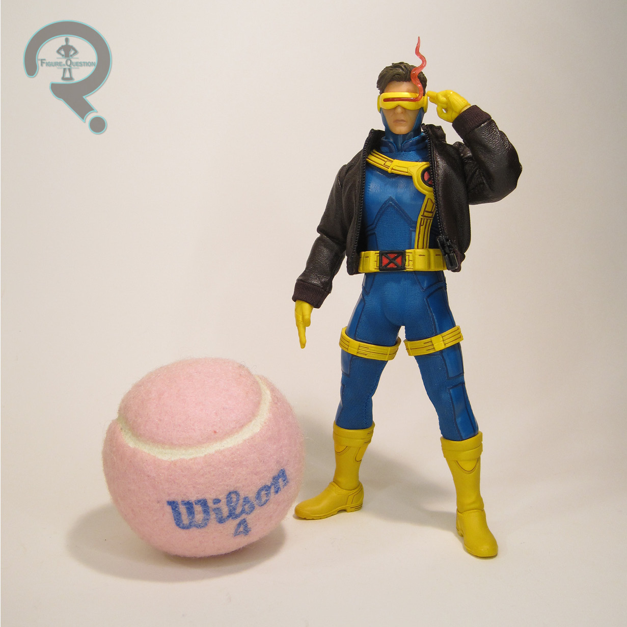
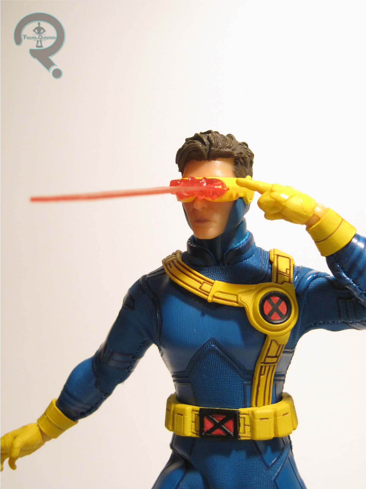
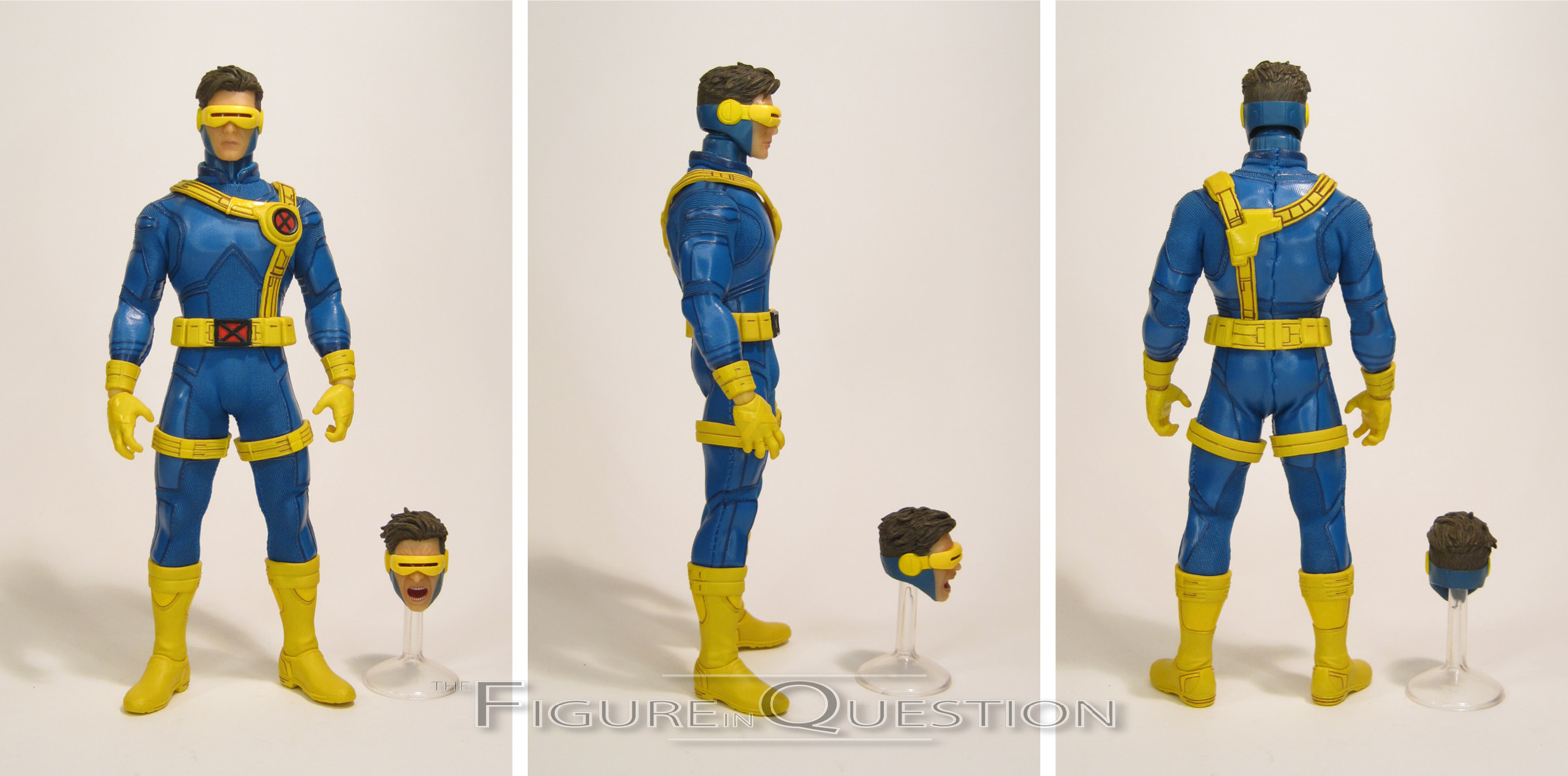
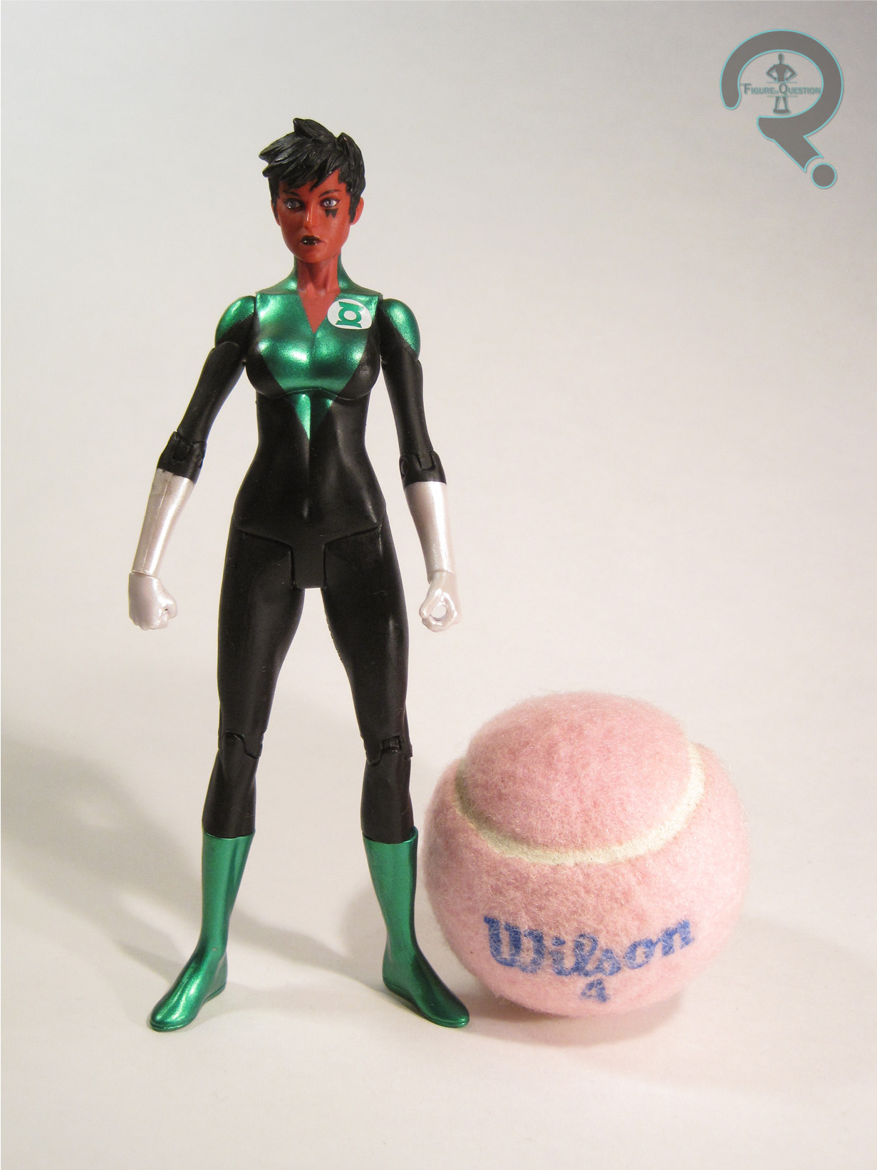
Soranik Natu was released in Series 5 of DC Direct’s Green Lantern line, which would prove to be the final series of the line under their tenure.  It joined Series 4 as a bit of a wrap up the the GL stuff following the rather lengthy run of Blackest Night figures.  It was honestly a little surprising that it took Soranik quite as long to get a figure as it did, but at least she got one, I guess.  The figure stands just shy of 7 inches tall (the creeping DCD scale was on the verge of topping out at this particular point), and she has 15 points of articulation.  At this point, you can kind of sense that DCD was feeling the pressure from DCUC and trying to make their figures a little bit more than plastic statues.  Soranik has more articulation than the typical release to be sure, but ultimately there’s not a ton you can do with it beyond putting her into basic standing poses.  There’s some decent range on the arms, particularly the shoulders, but even areas that had previously been pretty easy for the to articulate, like the elbows, are rather restricted here.  Also showing the DCUC influence is the figure’s construction.  DCD was trying their hand at some base bodies around this time, so Soranik uses the same body as Dove and Jade from their Brightest Day line of figures.  To be fair, it’s not a bad sculpt, and it’s got fairly balanced proportions overall, which is more than can be said for a good number of DCD’s later run figures.  It’s also not horribly preposed, and doesn’t have lots of un-needed detailing, making it look rather clean.  Soranik got a new head and hands to complete her look.  They’re fairly basic pieces, but they get the job done.  The stern expression on the face works well for Natu’s usual demeanor.  Soranik’s paintwork is fairly crisp and clean.  She uses the metallic coloring that DCD liked so much for the Lanterns, which honestly looks pretty good here, and I still really dig how those pearlescent white gloves look on all of these guys.  Soranik was packed with her power batter and a display stand with the Green Lantern emblem on it.

THE ME HALF OF THE EQUATION

At the time that Soranik was released, my brother Christian and I were working on our respective 6-inch Lantern collections (his was Yellow, mine was Green), so he was pretty adamant about having my parents take him out to get me Soranik as soon as she was released so that he could give her to me as birthday present.  While I don’t have a ton of attachment to the character, she was a fairly prominent piece of the Corps for a good while, and I was definitely happy to had her to the roster.  It helps that she’s a fairly decent looking figure, even if she’s not the most playable thing.

#2205: Imperial Scanning Crew

IMPERIAL SCANNING CREW

STAR WARS: POWER OF THE FORCE II (KENNER)

In 1997, we got our very first Wedge Antilles figure, available exclusively as a pack-in with a figure carrying case shaped like the Millenium Falcon.  Wedge’s placement in a case shaped like a ship that he never so much as stepped foot on during the original trilogy’s run was definitely an odd choice, so in 1998, when Kenner re-issued the case again, I guess they kind of took that to heart, and instead gave us someone who *had* actually stepped foot on the ship…like that’s literally the only thing he did.  Yes, it was the Imperial Scanning Crew, one of those non-even-a-Stormtrooper guys who goes and checks the Falcon when it gets pulled onto the Death Star in the first film.  Admittedly, not the biggest role, but he *did* interact with the Falcon!

THE FIGURE ITSELF

As touched on the intro, the Imperial Scanning Crew replaced Wedge Antilles as the pack-in figure for the Power of the Force II Millenium Falcon Carrying Case in 1998.  There’s just the single version of the figure to keep track of this time around, though, which is honestly a little amusing, given the there’s room for multiple purchases on a figure like this.  The figure stands 3 3/4 inches tall and he has 6 points of articulation.  Like Wedge, the Scanning Crew figure makes use of some reused parts, with his torso, pelvis, and legs all being shared with the AT-ST Driver figure from 1997.  There’s not really a lot you can do to mix up the basic grey jumpsuit, so the re-use is honestly pretty sensible here.  He gets a new head and arms, which remove the gloves and helmet and give him that officers’ style cap that the crew sports in the movie.  The whole sculpt would eventually see re-use again for a single carded Scanning Crew figure in the Original Trilogy Collection, so obviously Hasbro liked it.  It’s not terrible, though it certainly shows all of the hallmarks of the mid-line PotF2 figures, with proportions that aren’t totally crazy, but are certainly a bit off, and some slightly softer sculpted elements.  His paint work is rather on the bland side, but then that’s pretty accurate to the source material.  Application’s still pretty clean, though, and there’s not obviously missing details.  The Scanning Crew figure was packed with a blaster pistol and a scanning trunk, both of which are missing from my copy of the figure.  The trunk is actually a nice, unique piece, and a sensible choice.

THE ME HALF OF THE EQUATION

After finally picking up a Wedge, I felt compelled to own this guy as well.  Not really sure why, probably just that completist strain that runs through me.  I ended up finding him loose last winter during a vacation, courtesy of my usual vacation stop Yesterday’s Fun.  He’s not super exciting, and really anything to write home about, but he was unique, and honestly a decent choice for this sort of a pack-in figure, being non-essential, but still a nice background filler for a kid who bought the case.

#2204: Snake Eyes

SNAKE EYES

G.I. JOE: A REAL AMERICAN HERO (HASBRO)

“SNAKE EYES honed his combat skills as a Long Range Recon Patrol trooper in Southeast Asia and perfected his mystical martial arts techniques with the same Ninja clan that produced STORM SHADOW. Although he is as equally adept with submachine guns as he is with swords, Snake Eyes is most dangerous and unpredictable when he’s armed and cornered. When HAWK went to Snake Eyes’ cabin to recruit him for duty with G.I. Joe, the silent Ninja was out hunting rabbits – bare handed!”

After around 1988, there’s something of a downward shift for G.I. Joe.  They really hit their groove in ’85, but the movie really through them for a loop.  Despite gimmicks and really far out concepts largely being the thing that people deride the movie and its associated characters for, Hasbro would nevertheless double down on such concepts as they embarked into the ’90s.  Interspersed with the likes of Super Sonic Fighters and Eco Warriors, they did manage to have some slightly less gimmicky Joes, I suppose, including a rather surprising go at returning Snake Eyes back to his pre-ninja roots, going back to his original backstory as a commando, albeit one in bright 90s-esque neon colors.

THE FIGURE ITSELF

Snake Eyes was released in the main 1991 assortment of G.I. Joe, as the fourth version of the character to grace the line.  The figure stands 3 3/4 inches tall and has the usual 14 points of articulation.  By the ’90s, the sculpts were definitely changing again, morphing into a style that would more closely match the rest of the stuff that would come out of the decade.  Snake Eyes showcases a lot of these changes, being way more bulked up and exaggerated in his proportions than the character’s prior incarnations.  Poor Snake looks like he barely fits into his gear this time around.  Maybe it’s time to put down the weights?  Or lay off the steroids?  Something.  Well, it’s gonna get worse before it gets better.  Snake Eyes sculpted design is perhaps not the most radical departure from prior designs, although the artful nature of prior looks is largely lost, with everything adding up to a design that doesn’t quite have that same cool factor as prior versions.  All of the elements to make a Snake Eyes are certainly there, but they come together like some sort of off-brand product.  The goggles in particular just seem…goofy and unimposing.  More like safety goggles than anything combat ready.  The artwork for the figure honestly doesn’t make them look that bad; there was something lost in translation.  Of course, the biggest thing against this figure’s probably the paint, where he departs the most from every other version of Snake Eyes.  Previous Snake Eyes figures all were very heavy on black, and very light on pretty much anything else.  This figure’s still got some black, but it’s interspersed with a lot of light blue, grey, and even some red.  While he’s hardly the most garish figure his year produced, by Snake Eyes standards, he was pretty obnoxious.  Also, inexplicably in Cobra colors, for whatever reason.  More than anything about the sculpt, these colors are the thing that remove this figure the most from being Snake Eyes.  Repaints of this figure in more Snake Eyes-esque colors aren’t perfect, but do at least make him more recognizable.  My guess would be that the sculpter and the person who chose the colors were not one and the same on this figure.  Snake Eyes was packed with two swords, a submachine gun, a backpack with a built-in missile launcher, and a display stand.  With the exception of the pack and stand, the accessories are all a vibrant red, again removing the usual Snake Eyes brand a bit.

THE ME HALF OF THE EQUATION

When the very large Joe collection that came into All Time over the summer came in, this figure’s file card was in the mix, but he was nowhere to be seen.  Unlike Falcon, he did not miraculously appear out of one of the vehicles, however.  Instead, he miraculously appeared out of a small bag brought into the store by the person who sold us the rest of the collection, who had apparently found Snake Eyes and another figure while cleaning.  As an unabashed Snake Eyes fan, I have this weird desire to own all of his vintage figures, no matter how goofy, lame, or off-brand they may be.  This guy’s not great, but I honestly love him anyway.

As noted above, Snake Eyes came from All Time Toys, who got in a rather sizable vintage Joe collection, the remnants of which can be checked out the Joe section of their eBay page here.  If you’re looking for other toys both old and new, please check out their website and their eBay storefront.

#2203: Spectral Ghostbusters

PETER VENKMAN, EGON SPENGLER, WINSTON ZEDDEMORE, & RAY STANZ

GHOSTBUSTERS MINIMATES

“The Real Ghostbusters follows the continuing adventures of The Ghostbusters, secretary Janine, accountant Louis, and their mascot Slimer, as they chase and capture rogue spirits around New York and various other areas of the world.”

Happy Halloween dear readers!  For this year’s spooky-themed entry, I had intended to keep up with the running theme of looking back at DST’s ill-fated Universal Monsters Minimates, but they continued with the ill-fated bit, so I wasn’t able to get that particular set ready to go.  I guess there’s always next year.  So, I’ll be jumping over to one of DST’s other somewhat spooky lines of Minimates, the Ghostbusters, a far less ill-fated line.  After doing a rather successful run of movie-based ‘mates, DST picked up the license to the cartoon and rebranded the line under the Real Ghostbusters heading, producing another three boxed sets, plus a whole bunch more two-packs.  The first two sets covered the ‘busters and their supporting cast, but the third went the variant route, giving us all four ‘busters together, albeit in a slightly askew form.

THE FIGURES THEMSELVES

The Spectral Ghostbusters were released in December of 2011, as the third and final boxed set in the Real Ghostbusters off-shoot of Ghostbusters Minimates, based on their appearance in the cartoon episode “Citizen Ghost”, the 11th episode of the show, which sees the ‘busters’ uniforms from the night they fought Gozer reainimated by spectral approximations of themselves.

PETER VENKMAN

It’s Peter’s fault that the Spectral Ghostbusters come into existence in the first place, so I guess he’s the defacto leader of this particular bunch.  He was also, at the time of this figure’s release, the only Spectral Buster with a prior figure, courtesy of Mattel’s Retro Action line.  The figure stands 2 1/4 inches tall and he has 14 points of articulation.  He’s built on the basic ‘mate body, with add-ons for the hair, shoulder pads, and torso piece.  The hair was re-used from the basic RGB Venkman figure, with the torso piece being a re-use of Wintson’s piece from set two, with a slight adjustment to the proton pack’s left side to allow for storage of the ghost trap.  The torso pieces were still rather bulky at this point, an issue that wouldn’t properly be addressed until the “I love this town” boxed set, but I do have to say that they looked better here, probably because they were molded plastic, rather than painted, which slimmed them down ever so slightly.  The paint on these was also somewhat notable for being the first ‘busters to be in the tan color that more closely resembles the color of the uniforms seen on-screen in the films.  Of course, Venkman was also notable for being green and translucent, which was something he usually wasn’t.  The spectral effect on the face works quite well, and like all of the RGB ‘mates, he has a fully detailed torso under the chest piece, which I was always happy to see crop up.  Peter is packed with a ghost trap and a proton wand effect in green.

EGON SPENGLER

Egon is pretty similar to Venkman, but obviously swaps out a few of the add-on parts to make things slightly more unique.  The hair is from the RGB Egon, and has that distinctive swirl, while the torso is from the Venkman/Egon figures of set one, meaning he gets that extra strap at the front.  It’s safer that way I guess?  It does mean that he’s got a plug on the right side of his belt, which is missing anything to plug into it (prior Egons had his PKE), but I guess it’s not terribly noticeable.  The paint work changes up a little bit to match the new pieces and to change up the face for the likeness.  Again, the spectral effect is pretty cool, and the glasses make it look even cooler.  Egon is packed with the same trap and effect piece as Peter; shame they couldn’t throw the PKE in there.

WINSTON ZEDDEMORE

Wintson is even less different from Peter than Egon was.  From the neck down, the two are completely identical figures.  It’s just that head that changes things up, with the proper Winston hair piece and an adjusted likeness on the face.  Beyond that, same figure, right down to the same pair of accessories.  Fortunately, that means he doesn’t look like he’s missing anything the way Egon did, so I guess it works out alright for him.

RAY STANZ

Last up, there’s Ray, and what a surprise, he’s really similar to the other three.  I know, what a shock.  He does mix things up ever so slightly, getting the animated Ray hair and the Box 2 Ray torso piece (interestingly, Ray is the only ‘buster who never had to share his torso piece with any one else), but like Egon that leaves him with a peg that goes unused for this particular release, where the trap would have gone on the original release.  At least he and Egon have each other?  Beyond that, it’s all pretty much business as usual.  The paint’s pretty much the same, with the expected adjustments, and the accessories are again the same.

THE ME HALF OF THE EQUATION

Though I mostly skipped the RGB line, I nevertheless ended up with this set.  Why?  Do I have some sort of undying devotion to the Spectral Ghostbusters?  Nope, I bought them because they were cheap.  Cosmic Comix got the set in, and the glue on the backing card was faulty, so it fell off.  To save themselves some trouble, they marked it down to half price and boom, there I was, buying me some half-price Minimates.  While perhaps not the most unique or individually thrilling ‘mates, I actually do dig this group, especially as a set.  They aren’t perfect, but they’re goofy, and gimmicky, and actually rather fun.

#2202: Spider-Man Symbiote

SPIDER-MAN — SYMBIOTE

MARVEL MIGHTY MUGGS (HASBRO)

It’s been almost a year since I last reviewed one, but I want to remain on the record about not having forgotten Mighty Muggs.  Everyone else may have, but I’ll be damned if I will.  Launching in 2007, Muggs pre-dated the Funko’s Pop! craze by a few years, and really just missed the earlier designer vinyl push from the early ’00s, making them sort of an odd duck in terms of success.  They definitely had their supporters, and the licensed properties in particular did well for Hasbro.  Though not quite the smash success that Star Wars was, the Marvel line got a decent run, with six main series plus a bunch of exclusives.  There was enough space for a few variants of the heavy hitters, and who’s a heavier hitter than Spider-Man?  Not only did he get his basic costume, but he also got that suite symbiote treatment…wait, that sounds wrong….

THE FIGURE ITSELF

Spider-Man in his Symbiote Costume was released in the third series of Marvel Mighty Muggs, alongside Ghost Rider, Doc Ock, and Thor, hitting shelves at the end of 2007.  The figure stands 5 3/4 inches tall and he has movement at the neck and shoulders (the legs are separate pieces, but do not move).  From a sculptural standpoint, there’s not a thing that’s unique about this figure.  He’s just the basic classic Mugg body, with no add-ons or alternations.  To be totally fair, that’s really the best way to handle this particular design, and works for that whole sleekness angle.  The heavy lifting is handled by the paint, which in this case is itself pretty basic and straight forward.  The base coat is black, and there’s white accenting.  That’s it, and what more would you want.  Sure, there’s all sorts of highlighting or creative shading you could try, and Muggs were known for being somewhat experimental with simulating lighting styles, but I’ve always found that such tactics just really muddy up the clean look of the Symbiote’s design.  I also appreciate that the design on the logo has been changed from Series 1’s Venom, who was lopsided and monstrous looking.  This one is much more symmetrical, and makes sense for the comparatively far more balanced Peter.  Spidey included no accessories, which wasn’t very out of the ordinary for this incarnation of the line.  I suppose he could have gotten a webline or something.

THE ME HALF OF THE EQUATION

Mighty Muggs were sort of tricky to judge when they first hit, and so there was a lot of speculation.  That made getting a hold of a figure like Symbiote Spidey a little difficult when the line was still new, and I myself never did get one at the time.  Fortunately for me (but unfortunately for the line as a whole), as people forget about Muggs, whole collections appear and pretty much go for next to nothing.  I got Spidey over the summer, courtesy of Yesterday’s Fun, and I was pretty happy to find him.  There’s not a ton to say about him, but it’s worth noting that he’s an example of a design that worked great for this style, and one that wouldn’t have really worked for the updated Muggs, which I guess is why they didn’t make one.

#2201: Red Hood

RED HOOD

DC ESSENTIALS (DC COLLECTIBLES)

“The vigilante outlaw who was once a Robin, the man under the hood is extremely proficient in both weapons and hand-to-hand combat.”

Originally conceived as a potential former alias for the man that would eventually become the Joker, the monicker of Red Hood is one that’s been passed around a little bit, but ultimately it’s stuck a pretty darn long time with the un-deceased Jason Todd.  I suppose there’s something poetic about one of the Joker’s victims laying claim to his old name.  Despite being well-established in the role for a good long time now, as well as being introduced in a rather well-known modern era Batman story, Jason’s comics version of his Red Hood gear has been surprisingly absent from toys, or at least was for the first decade of his existence.  There was a New 52 figure which kind of worked in a pinch, but it wasn’t until just this year that we got a whole two Jason Red Hoods, one from DCC, and the other from Mattel.  Today, I’m taking a look at DC Collectibles’ version!

THE FIGURE ITSELF

Red Hood is figure 18 in DCC’s DC Essentials line.  After doing a fair bit of retreading, Red Hood is finally a taste of more new stuff…though it looks like we’re going back to the retreading after this.  Oh, DCC, how predictible of you.  This figure represents Jason in the biker-styled Red Hood gear, though it’s not quite his first appearance attire.  Instead, he’s technically the most modern take on the design, from the post New 52/Rebirth era.  It’s a little more costume-y than the original look, but also has lost some of the over-designed elements that the initial New 52 stuff brought about, making for an overall pretty clean looking design for the character.  The figure 7 inches tall and he has 34 points of articulation.  The Essentials line has been fairly heavy on the re-use side, but Red Hood actually does inject a fair number of new pieces into it.  He uses the torso, pelvis, and upper legs of the standard male body, but gets an all-new head, arms, hands, shins, and feet, as well as add-ons for his jacket and belt/holsters.  The new pieces really work out in this figure’s favor.  The head, is definitely sleek and very cool, living up to the really solid heads we’ve gotten so far from the line.   The new arms are great because, in addition to adding the coat sleeves, they are also ever so slightly shorter than the standard arms, thereby fixing the monkey arms problem of prior figures.  The jacket add-on also hides those exposed pegs on the torso joint, fixing my other major complaint.  As a whole, the new parts really sell this figure as his own figure, rather than leaving him really tied to the rest of the Essentials line like the prior figures have been.  The paint work on Red Hood is also really strong, with the metallic red on the helmet being my favorite aspect by far.  The rest of the application is actually cleanly handled, and lacks the fuzzy edges that a lot of DCC stuff sports.  Red Hood is packed with a pair of pistols (which can actually be removed from the holsters and held, giving him a leg up on the Mattel release), as well as two sets of hands in both gripping and fist poses.  It’s nice to see the extra hands cropping up again, as the lack of them with the earliest figures was a real drag.

THE ME HALF OF THE EQUATION

Red Hood was something of an impulse buy, truth be told.  He came in at Cosmic Comix, and I just really, really liked the look of him on the shelf, so I just ended up grabbing him.  I actually haven’t done that with a single Essentials figure since Reverse Flash, and I wasn’t sure it was going to pay off.  Then I opened the figure up, and oh boy did it.  Essentials has been really spotty for it’s run, but Red Hood is genuinely a solid figure, and by far the best figure this line’s put out.  I’d say here’s to hoping for more like him, but unfortunately DCC’s just shown off a bunch of stuff that goes firmly the other direction…alas.

#2200: Shrikethorn

SHRIKETHORN

PACIFIC RIM: UPRISING — SOVI SPIRITS (BANDAI)

Though not the smash critical success of its predecessor, Pacific Rim: Uprising was if nothing else a nice run through the world of the original, even if under some slightly different confines.  Had Pacific Rim been made in the ’70s, Uprising would have no doubt made a solid pilot movie for the inevitable TV adaptation.  It also did wonders for the very strong collectibles market associated with the franchise, giving us a whole new pool of Jaegers and Kaiju to give cool new toys.  Back around the movie’s release, I looked at a bunch of the Jeagers, but never did get around to looking at any of the Kaiju.  Let’s switch that up today, with a look at one of the three final battle Kaiju, Shrikethorn!

THE FIGURE ITSELF

Shrikethorn was part of Bandai’s Sofvi Spirits line, as one of three Uprising-themed figures in the line.  The Jaegers were covered by the more conventional action figure stylings of the Robot Spirits line, but for the much larger designs of the various Kaiju, it’s not really quite as cost effective to produce solid, fully articulated figures.  So, these figures take a page out of the same book as the likes of the Ultra Hero 500 and Ultra Monster 500 lines, crafting the figure from a soft (and hollow) vinyl and cutting back on the articulation.  It makes for a much lighter, and slightly less detailed figure, but it also means that getting the Kaiju in the same scale as the Jeagers is attainable without dropping rather insane amounts of money.  The figure is about 6 inches tall (with a bit of a hunch, of course), about just as wide, and has 7 points of articulation.  The articulation’s really not meant for getting much variance of poses; it mostly is there to help add more balance when getting the figure standing.  For a big monstrous thing like Shrikethorn, it’s not really like there are going to be a ton of poses needed.  He’s good for looking rather menacingly at your Jeagers, which is kind of the main point here.  Being made from a softer material, his sculpt is understandably a little softer when compared to the likes of the Robot Spirits figures, and especially when compared to the NECA figures.  That said, all of the important details are there, capturing the broadstrokes idea of Shrikethorn’s design quite well.  Most importantly, they get the silhouette down, and that’s really were this figure’s success lies.  Shrikethorn’s paintwork is respectable enough for what it is.  Again, when compared to something like NECA, it’s a little soft, a little cartoony, and a little simplified, but the slightly more cartoony designs from Uprising do the figure some favors here, and the end result is a pretty solid offering.

THE ME HALF OF THE EQUATION

Since all of the Uprising stuff was hitting right as Toys R Us was going under, these guys showed up there at full price, quickly got discounted, and quickly disappeared.  I recall looking at Shrikethorn when he first hit, but just never got around to tracking one down.  So, where did this one come from?  Well, from my Super Awesome Fiancee Wife (yes, you read that right), of course!  She found him all alone in the clearance aisle of the Barnes & Noble right next to her new job, and decided to bring him home for me.  As a piece on his own, Shrikethorn is perhaps not the most impressive offering, but he’s a really fun accent piece to the Jeagers, and I’m honestly just happy to finally have one.

#2199: Morph

MORPH

X-MEN (TOY BIZ)

“Once a member of the uncanny X-Men, Morph sacrificed his life to save his teammates from the mutant-hunting Sentinels. Resurrected by the evil Mister Sinister and set against his one-time allies, Morph now uses his shape-shifting abilities in an attempt to put an end to his former friends!”

When launching X-Men: The Animated Series, the makers of the cartoon wanted to demonstrate the serious nature of the situations the team faced by presenting the audience with an ill-fated mission that would end with one member of the team killed in battle.  Of course, they weren’t exactly looking to throw out any of the highly profitable a-list characters in the initial starting line-up, meaning they needed to build a character specifically for the purpose of sacrificing.  Combing through the back catalog of X-Men characters, they came across Changeling, a rather minor foe-turned-teammate from the ’60s, who died in Xavier’s place at one point.  The character was updated and renamed “Morph” and boom, sacrificial offering for the TV gods.  What they didn’t count on, however, was the character being as popular in his debut appearance as he was, leading to a whole assortment of shenanigans to bring him back during the show’s second season, and enough prominence to get this boy an action figure!

THE FIGURE ITSELF

Morph was released in Series 6 of the Toy Biz X-Men line, and is notable for being pretty much the only figure in the line to be completely based on the show.  Others were clearly using the show for inspiration of character and costume choice, but Morph was the one true instance of something only from the show making its way into the line.  Morph would also see a subsequent re-release not too long after the release of the X-Men movie in 2000, as part of a KB Toys-exclusive line of reissues and repaints.  The two releases are more or less identical, though the reissue his a slightly darker skintone.  The figure stands 5 inches tall and he has 11 points of articulation.  He’s honestly one of the most practical implementations of articulation this era of the line offered, with elbows, knees, and a waist joint.  None of those were strictly standard at this point.  His sculpt was an all-new affair, and is a pretty decent offering.  He remains faithful to the cartoon’s design while still adapting the character to better fit the design of toys as a whole.  For the purposes of Morph himself, there are two heads included: good Morph and evil Morph.  Both are conceivably the same guy, and capture the cartoon’s versions of the looks nicely, making him an easy match for his show appearances.  In terms of paint, Morph is pretty basic, but still pretty cleanly done.  The application is sharp, and the colors are all nice and eye-catching.  It’s worth noting that they changed his default hair from black to brown, presumably so that he would match Changeling in the comics (it’s also worth noting that the show would change his hair color to match in his later appearances).  In addition to his own extra head, Morph also included two additional heads to demonstrate his changing ability.  There’s a Wolverine and a Cyclops, which both work reasonably well in conjunction with the body to sell them as the “real” character, while still showing that there’s something a little off about them.

THE ME HALF OF THE EQUATION

Morph was pretty much gone from shelves when I really started collecting, so my first figure of him was actually the ToyFare-exclusive AoA version.  I then picked up the KB Toys re-release when he came out, and I was always very fond of him, as I quite like the character.  That figure ended up going missing (along with a bunch of my other X-Men figures), and I eventually ended up replacing him with a proper Series 6 release.  Of course, then I found my original, so I’ve got them both again.  Cool!

#2198: Buzz-Off

BUZZ-OFF

MASTERS OF THE UNIVERSE (MATTEL)

“Heroic Spy in the Sky!”

As a child of the decade post-80s (more commonly referred to as the ’90s, I suppose), I missed out on the initial run of a lot of the top ’80s toys.  Fortunately for me, there was something of an ’80s resurgence that began right around 2002, and it was this wave of psuedo-nostalgia which gave me my first proper taste of things such as G.I. Joe and Masters of the Universe.  For the Joes, it did eventually lead me to a proper appreciation for the true vintage stuff, but in the case of Masters, something about that early ’00s branch really stuck with me, thereby making it the 2002 line that I get nostalgic for, not the old ’80s stuff.  As a matter of fact, there are a good number of Masters characters whose vintage designs do nothing for me.  Good example?  Today’s figure, Buzz-Off!

THE FIGURE ITSELF

Buzz-Off was added to the re-launched Masters of the Universe toyline in 2003, as part of the fifth assortment of heroic warriors in the line, alongside three He-Man variants, Ram-Man, Man-E-Faces, and Roboto.  The figure is roughly 6 1/2 inches tall and he has 17 points of articulation, thanks to the inclusion of ball-joints on the wings and little arms on his back.  That makes him one of this line’s most articulated figures.  The vintage Buzz-Off figure was designed to share parts with the villainous Whiplash.  I know, when I think of bees and reptiles, I see the similarities too.  For the 2002 relaunch, both characters got starkly divergent treatments, which was probably for the best on both counts.  While swollen and muscle bound was the only way to go for the vintage line, Buzz-Off’s recreation was now svelte and angular, easily one of the most slimmed down designs of this whole iteration of the brand.  It’s a quite unique look, and much like Roboto from the same assortment, it takes a much goofier design and makes it a little bit more palatable in the context of the wider story and the type of character than Buzz-Off is supposed to be.  When it came time to adapt the character to the new cartoon, Buzz-Off received a noticeably drab color scheme, drastically different from his old look.  For the figure proper, he more meets in the middle.  The basics of the old design are definitely still there, but he looks less like “wrestler in a bee” costume this time around.  Buzz-Off was packed with an axe (with launching, because that’s how axes work) and a pair of goggles for protecting his eyes while flying, I guess.

THE ME HALF OF THE EQUATION

The thing about the 200x Masters line is that as cool as the redesigns were, and as much as I liked the look of the figures, they were our first real taste of how badly Mattel could screw up case packouts and distribution.  Remember how I mentioned the three He-Man variants in this set?  Well, they were heavier packed than the the three new heroes, and for Buzz-Off and Roboto in particular, that made them very, very hard to find when they were new.  No Buzz-Off for me.  In fact, since coming into that big GoodWill find several years ago, there have been just a few figures left to check off on my list of Masters I still really wanted.  Buzz-Off was at the top of that list.  Fortunately for me, All Time got in a whole bunch of 200x Masters figures a couple of months ago, and Buzz-Off was right there with them, meaning I was finally able to add him to my collection!

As touched on above, I picked this guy up from my friends All Time Toys.  If you’re looking for cool toys both old and new, please check out their website and their eBay Store.

#2197: Cyclops

CYCLOPS

ONE:12 COLLECTIVE (MEZCO)

Cyclops sure does seem to be getting a good bit of love these days, with a headlining role in the latest X-Men relaunch, plus all sorts of toys.  I mean, he’s had no less than two Marvel Legends in one single year.  That’s a pretty big deal for him, especially after the less than stellar treatment he’s gotten for the better part of the last decade.  Riding in on the Cyclops-hype train as well is Mezco, who are finally expanding the X-Men portion of their One:12 Collective line to more than just variants of Wolverine, and adding both long-time foe Magneto and old-school leaderman Cyclops to the docket.  I’m an unabashed Cyclops fan, so it’s not much of a surprise who I’m looking at today!

THE FIGURE ITSELF

Cyclops is a Fall 2019 release for Mezco’s One:12 Collective line.  He took his sweet time getting onto shelves, but he started arriving just within the last month.  This is the standard Cyclops offering, which depicts him in a ’90s Jim Lee-inspired get-up.  There’s also a more Cockrum/Byrne-inspired variant, which should be arriving at retail shortly.  The figure stands 6 inches tall and he has over 30 points of articulation.

Cyclops is another figure on the multiple heads band-wagon.  There are two included here, each with the same basic design, but each with a different expression.  The standard is the more classic calm Cyclops, fit for the more usual standing poses, while the alternate is sporting an intense scream, just right for all that…screaming that Cyclops is wont to do.  It means that you’ve got some decent options for posing, to be sure.  Both sculpts do a respectable job for capturing that classic Cyclops likeness.  While I’m still more partial to the Legends ’90 Cyclops head sculpt as a whole, I can definitely respect these heads for what they do, and there’s a more real world quality to them.  Both heads are designed to work with the light-up feature built into the body.  It’s not a super complex system or anything, but the battery is built into a compartment which is housed in the neck joint.  The ball-joint contains a small LED, the desired head pops onto the ball-joint, the switch on the housing is turned on, and the whole housing is slid back down into the main neck and turned to lock into place for posing.  It’s not a bad design, and it’s a rare light-up feature for a Cyclops that doesn’t completely hinder his neck joint.  However, I found the actual lighting to be a little unreliable and tempermental, making it difficult to keep it illuminated during posing.  I don’t know if this is just my figure or an across the board thing.

Cyclops is built on a smaller male body than a lot of the line, but it seems suitably sized to the character.  He’s a mixed-media affair, with a slightly rubberized jumpsuit, plus hard plastic add-ons for his belt/shoulder strap, wrist cuffs, leg straps, and boots.   There have been a few adjustments made to the design, such as removing the yellow shorts (which the classic-styled figure will be adding back), adding a proper collar, and adding some piping and panelling lines to the main body suit.  It’s really not terribly different from how they updated, say, Iron Man’s design, and is generally in pretty good keeping with the line’s stylings as a while.  It also keeps all of the major points for selling this as a Jim Lee Cyclops, so they seem to have done a pretty respectable job of boiling things down.

Cyclops has a decent selection of accessories included.  In addition to the previously mentioned extra head, he’s also got a selection of five extra visors to swap out between the two, which includes a few duplicates, presumably in case you accidentally lose one.  The “smoking eye” piece is great for subtle poses, and the two extremes of the blasts pair well with the two different expressions on the heads.  There are also three included pairs of hands in fists, open gesture, and a flat/visor operating pose combo.  He also includes the usual display stand, this time with a big ol’ X on it.  Lastly, and most impressively by my count, is the removable (faux) leather jacket, which is pretty much essential to completing a proper ’90s Cyclops, and was the only notable thing missing from Hasbro’s first release (although they’re going to be amending that very soon).  The accessories for Cyclops are definitely an improvement over the comparatively rather light Vigilante Daredevil figure, which is a pretty good thing, even if Cyclops technically retails for $10 more.

THE ME HALF OF THE EQUATION

I waffled a lot on this figure, truth be told.  At it’s core, I love the idea, and honestly, I’m very happy with the execution.  The problem I run into with most of the One:12 stuff is the cost relative to other lines in the same scale, and I won’t lie that Hasbro’s announcement of the reissue of the Jim Lee Cyclops with an added jacket did knock this one down ever so slightly in my book.  I get *why* these figures are more expensive, but that doesn’t make it easy for me to justify.  And Cyclops even retails for $20 higher than the previous base price point on these figures, making him an even harder justification.  That said, when I saw this guy in person, he really spoke to me, and I decided that a good figure of Cyclops was the sort of thing I could invest in.  Well, I’m glad I did.  Despite being the most I’ve paid for a One:12 figure, I’d say this one’s the one I’m the most satisfied with at the end of the day.  He’s a very nice piece on his own, and I think stands apart enough from the likes of Legends to be worth the additional investment.

I got this guy from my friends All Time Toys, where he is currently in stock here.  If you’re looking for cool toys both old and new, please check out their website and their eBay Store.