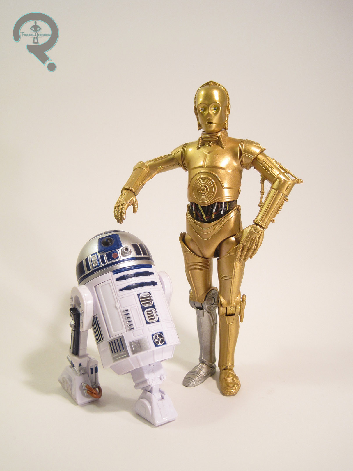
#1210: C-3PO

C-3PO

STAR WARS: THE BLACK SERIES

c3pobs1

Hasbro’s Star Wars: The Black Series has been running almost 5 years now, and over the course of that 5 years, we’ve gotten the main look for just about every major character from the Original Trilogy.  However, one major character has been pretty consistently absent: C-3PO.  Now, obviously, with a character like Threepio, it’s not a question of if he’s going to be made, but rather when he’s going to be made.  You don’t just willy nilly leave out one of two characters to appear in every film in the franchise.  So, when his name popped up as one of 2016’s upcoming figures, no one was really surprised.  Well, that is, not until they saw the figure, standing there in all his red-armed, The Force Awakens-glory.  Why would the first release of this much anticipated character be what is undoubtedly a one-off look?  It turns out Hasbro had more up their sleeve, and a regular Threepio found its way to release.  I’ll be looking at that figure today.

THE FIGURE ITSELF

c3pobs2
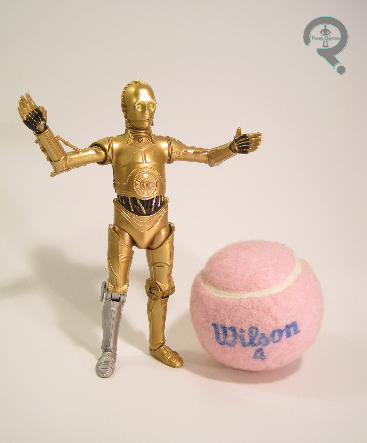
This C-3PO figure is Walgreens’ 2016 Star Wars: The Black Series exclusive.  This has been a point of contention for a lot of fans, since many of them think this Threepio should have had the main retail slot, and the Force Awakens figure should have been made the exclusive, citing the second version as a less necessary variant.  While I can’t argue with that, I can sort of understand why the figures ended up the way they did.  In 2015, Walgreens got stuck in the Emperor’s Wrath Darth Vader as their exclusive, and sales on him were pretty soft.  With that in mind, I can easily see Walgreens pushing for a higher profile exclusive.  On Hasbro’s side, I can see them feeling that Threepio might be more easily acquired for some fans as an exclusive item shipped in solid cases of himself, as opposed to being stuck in a revision assortment of the main line, which may or may not get put out (I can attest to having seen more of this guy out in the wild than I’ve seen of his red-armed counterpart).  In addition, Threepio has traditionally been a slower seller than the rest of the main characters, a fact Hasbro is likely banking on.  Ultimately, it’s not the ideal solution, but it’s workable.  The figure stands 5 1/2 inches tall and has 21 points of articulation.  Early reports had me worried that this guy wouldn’t be very posable.  The final figure lacks any elbow joints, but this ends up having little effect on the posability, and the rest of the joints offer a more than serviceable range of motion.  Threepio’s sculpt is shared with his Force Awakens version, but is otherwise totally new.  It’s a very strong sculpt, and does a really solid job of capturing Threepio’s basic design.  There’s a lot of really sharp detail work, and he’s definitely one of the best figures in the line in terms of working in the articulation.  The arms do seem a touch long when compared to the legs, but it’s only barely noticeable, and far from the worst case of this in the line.  Threepio’s paint is pretty decently handled; Hasbro let fans know from the get-go that this figure wasn’t going to be vac-metalized like many of the smaller Threepios have been.  Some fans were a bit let-down by this, but I find myself not minding that much.  While the process is fine on smaller figures, it can rob a sculpt of a lot of its best details, and on larger, more articulated items, it can also be rather susceptible to damage.  I was happy to see they opted for gold paint instead of gold plastic, as it allows for a brighter sheen and a more consistent application of the color.  The only part that seems a bit odd to me is the eyes; rather than the usual flat yellow, they’ve been done with three white dots on each eye.  It’s not terrible looking from far away, but looks quite strange up close.  Threepio includes no accessories, which is a real letdown, especially since there are technically no new sculpted pieces here.  The communicator from the Death Star would have been nice, especially since they already have the tooling for it. Oh well.

THE ME HALF OF THE EQUATION

News broke on this guy back around Rogue Friday, and I pretty much immediately started looking for him.  I didn’t have much luck, but on a hunch, I stopped at a slightly out of the way Walgreens on the way home from grabbing some dinner last month.  He wasn’t in the proper action figure aisle, but I remembered that a lot of Walgreens stores had a separate Star Wars end display, and, sure enough, there he was.  Odd choice of distribution aside, this is a really good figure, easily the best Threepio that Hasbro’s put out.  Hopefully everyone that wants one can get one!

c3pobs3

#1209: The Flash

THE FLASH

JUSTICE (DC DIRECT)

flashjust1

A quick glance around the internet tells me that this may be a slightly controversial opinion, but I really love the work of Alex Ross.  Marvels and Kingdom Come are obviously the standouts, but in the late ‘90s/early ‘00s, his work was the best source of classic DC Comics material out there, which was something of a godsend for me, a classic comics fan born into the wrong era. In that regard, his 12-issue maxi-series Justice, which was effectively Challenge of the Superfriends on an even more epic scale, was right up my alley.  The fact that it got a whole line of figures courtesy of DC Direct?  Icing on the cake.  Today, I’ll be looking at my first figure from the line, Barry Allen, aka the Flash!

THE FIGURE ITSELF

flashjust2The Flash was released in the first series of Justice figures from DCD.  This was only the second Barry Allen Flash we’d gotten from them, and the first time he’d been released solo.  The figure stands about 6 1/2 inches tall and has 9 points of articulation.  Not a ton of movement, but it was an incredible step up from the prior Kingdom Come figures, which had what can be described as “minimal” movement at best.  He’s based, of course, on Alex Ross’s depiction of Barry from not just Justice, but also the tabloid-sized specials DC put in the early ‘00s.  It’s really just Barry’s classic costume styled as if it were made from real fabrics and worn by a real person, but that’s a pretty good look.  The sculpt on this guy was handled by DCD’s main sculptor at the time, Tim Bruckner, and it’s not a bad stab at this particular design.  The main issues I would cite with this figure come from its desire to be two different things simultaneously.  They wanted him to be in a sort of a running pose (something no Flash figure they’d released up to that point was capable of pulling off), but also be able to stand up relatively straight, like the rest of the line.  The end result is a figure with a rather static and stiff upper half, and a lower half that looks to be mid-lunge.  With a bit of careful posing, you can get him to look fine (which is more than can be said for some of DCD’s later output), but he always seems ever so slightly off.  On the plus side, there’s a lot of fun detail work on the sculpt.  The costume sports plenty of wrinkles and stretched fabric, to make it more convincing that he’s not just sporting body paint, and there’s even a seam running down the front, showing how he gets the costume on and off.  The boots are heavily wrinkled and very obviously a different material than the rest of the costume, and there’s even the appropriate treading on the soles.  The head is some pretty solid work as well; the face under the mask displays Barry’s goofy charm pretty well, and the mask has a seam running across the forehead, much like Adam West’s Batman Cowl.  The paintwork on Flash is pretty good, but I have one small complaint: they used gold in place of yellow.  It’s not an uncommon practice, and this is far from the first Flash to do so, but when companies do this, they almost always use this dark and rather dull gold.  In the case of the Flash, this robs him of some of his costume’s boldness and clash, and on this particular figure, it has the unintended effect of sort of reversing the dynamic of his costume and making the red the lighter color in most lighting.  A more vibrant gold would have looked a bit better.  Apart from that, the application is all pretty clean, and I do really like the slightly pearlescent red they’ve gone with.  Barry’s only accessory was a rather large and unruly display stand, which was the same one included with every figure in this line.

THE ME HALF OF THE EQUATION

Despite getting most of my DC Direct figures from Cosmic Comix, I actually got Flash from a Suncoast.  I think CCX had sold out of Flash by the time I got there, so I ended up finding him while on a mall outing with my Grandmother and my cousins.  I think he may have even been on sale.  I was quite excited to get him, since I didn’t yet have a Barry Allen in this scale.  He remained my go-to Flash figure until he was eventually supplanted by the Darwyn Cooke-styled Flash from New Frontier.  He’s not a perfect figure, but he’s a pretty solid one, and he definitely brings back some fond memories.

#1208: Colossus

COLOSSUS

MARVEL SELECT

colossusms1

Wow, it’s been a really long time since I’ve reviewed a Marvel Select figure. <Looks back at reviews>  Holy crap, it’s been 506 reviews since I last looked at a Marvel Select figure.  That’s quite a while.  Well, why not pull something out of the archives, then?  Today, I’ll be jumping over into the world of Marvel’s merry mutants, the X-Men, and looking at one of my personal favorite members of the team, Piotr Rasputin, aka Colossus.

THE FIGURE ITSELF

colossusmswilsonColossus is the 75th figure in Diamond Select Toys’ Marvel Select line, released in 2012.  He’s one of only two figures to hit that year, largely due to the focus on a certain team of Earth’s Mightiest Heroes who happened to have a movie released that year.  He continued the trend of X-Men based upon the early ‘80s line-up of the team (the other X-Man from 2012, Storm, also followed this trend).  The figure stands almost 9 inches tall (he’s a big guy) and he has 30 points of articulation.  He’s one of the earlier instances of near-Marvel-Legends levels of articulation for a Select figure, and it’s genuinely impressive just how much movement they were able to get into this guy, given his mass.  Colossus sported an all-new sculpt.  It doesn’t appear to be based on any particular artist’s rendition of Piotr, but it does lean a little more modern in terms of design sensibilities than a lot of Colossus figures do.  This is most notable in the face, which lacks the usual rounded features in favor of something more sharp and angular.  While I can’t say it’s my go-to Colossus look, it’s certainly not a bad looking rendition of the character.  The body continues some of the stylization present in the face; earlier renditions of Colossus tended to be more consistent in build, but this guy’s definitely favoring his upper body.  He’s almost sporting Bruce Timm anatomy (though he’s definitely not Bruce Timm styled).  There’s one oddity about the body sculpt, specifically the upper body: the upper portion of his tunic is separate from his actual torso.  While it’s not out of the ordinary for such an element to be a separate piece, the fact that it’s not actual fixed in place in any way is slightly odd.  There’s a fully sculpted torso under there, which leads me to wonder if there was a scrapped variant of this figure sporting his outback costume.  Regardless, you’ll only really notice the separate tunic piece when picking the figure up, and it stays in place well enough.  It also adds an extra dimension to the figure, which is always cool.  In terms of paint, Colossus is very nicely rendered.  The colors are all nice and very vibrant, and everything is very cleanly applied.  There’s a nice subtle accenting to the yellow portion of the tunic, which keeps it from being too plans.  I also quite like the metallic work, especially on the arm bracers.  A lot of the X-Men Select figures included a section of the Danger Room as a display base, and Colossus was no exception.  Well, generally speaking.  He comes with a spike wall, clearly meant to be from the Danger Room, but it’s not exactly a stand, since it doesn’t really support him.  Still, it’s a cool piece, and a nice addition to the armory.

THE ME HALF OF THE EQUATION

Colossus was my second Marvel Select figure, picked up during Cosmic Comix’s Biggest Sale of the Year in 2012.  I had initially been planning to pick up Ultron during that year’s sale, but I got a subscriber coupon a week prior and got him then.  I still wanted to take advantage of the sale, and I’ve always liked Colossus, so this guy was my next choice.  The old Marvel Legends figure has always been one of my favorites, so this guy had quite a bit to live up to, and I think he did just that.  He’s really just a very fun figure.

#1207: Lando Calrissian as Skiff Guard

LANDO CALRISSIAN AS SKIFF GUARD

STAR WARS: THE POWER OF THE FORCE II (KENNER)

landoskiff1

Man, the Star Wars characters sure do like disguising themselves, don’t they?  At some point in the franchise, just about every main character has gone incognito (even Chewbacca).  And, of course, toy companies love this, since it’s a pretty easy way of milking another variation of the main characters to make into an action figure.  Lando Calrissian was actually the very first character to get such a figure (well, technically.  He and Leia as Boush were released at the same time, but Lando’s date stamp is from ’82, while hers is from ’83).  That’s not actually the figure I’m looking at today, though.  It seems Lando’s disguised look is more enduring than some of the others, seeing as it makes up roughly a third of all of his figures.  Today, I’m looking at Kenner’s second stab at this particular look.

THE FIGURE ITSELF

landoskiff2Lando was released in the first assortment of the 1997 series of Kenner’s Staw Wars: Power of the Force II.  It was the second version of Lando in the line and his fifth figure overall.  As touched on in the intro, this figure is based on Lando’s Skiff Guard disguise from the opening of Return of the Jedi.  Honestly, even as a disguised look, this is the most action-oriented design we saw Lando in, and I think that’s where a lot of its appeal comes from.  The figure stands about 3 3/4 inches tall and he has 6 points of articulation.  Lando comes from later in the POTF2 line, which was after the sculpts has calmed down a bit and worked out some of the ‘90s over-stylization.  He’s still a fair bit more jacked than Billy Dee Williams ever was, but that was on par with the rest of the line.  His head sculpt was the same one used for the Bespin version of Lando (and later the General version as well).  It’s not a spot-on Billy Dee Williams, but it’s still closer than most of the likenesses at the time.  And at least it was consistent, right?  The body sculpt was all-new to this figure.  Apart from the aforementioned “jacked” nature of the build, it’s a decent enough translation of the onscreen design.  He also ditches a lot of the pre-posing from earlier in the line, instead getting a more natural pose, and thereby offering a bit more versatility.  Lando’s paintwork is generally pretty solid.  Nothing spectacular, or particularly noteworthy, but it’s certainly well-done.  The colors are all well matched to the costume from the movie, and all the application is pretty clean.  There are some slight mismatches between some of the paint and molded elements, but nothing super awful.  Lando originally included a removable mask and vibro-axe, but my figure hasn’t had either in well over a decade.

THE ME HALF OF THE EQUATION

This is my very first Lando action figure, though he didn’t technically start out as mine.  He was one of a handful of Star Wars figures that I helped my Grandmother pick out at KB Toys back in the day so that my cousin Patrick and I would both have some figures at her house to play with (since we spent at least one day of the week there).  Eventually, Patrick grew out of his Star Wars phase and neither of us was spending as much time there, so Lando and the others eventually came home with me.  He’s the only one that made it through all of my various collection purges, mostly due to being the only Lando figure I owned for a good long while.  He’s actually not a bad figure, and he’s probably aged better than most of the others in this line.

#1206: Daphne Blake

DAPHNE BLAKE

SCOOBY DOO (CHARACTER OPTIONS)

daphneblake1

Hey, remember last week when I reviewed Freddy and the Mystery Machine?  Yeah, well, I bet it’s not a huge surprise to find out that wasn’t the only Scooby Doo purchase I’d made in recent history.  Scooby Doo has always operated by pairing characters off; Scooby and Shaggy, Fred and Daphne, Velma and…one of the other pairs, you get the point.  Anyway, since I had Fred, it just seemed wrong to not at least pick up his better half, Daphne Blake!

THE FIGURE ITSELF

daphneblake2Daphne was released a few different ways.  She was included in a five-pack of just Mystery Inc, a ten-pack with five classic ghosts, and in one of two two-packs, with either the Skeleton Man or the Witch-Doctor.  Since my figure was picked up loose, I can’t actually say which particular release it is.  Regardless, the figure stands about 4 1/2 inches tall and has 10 points of articulation (though the hair makes her neck joint essentially useless).  Like Fred, Daphne is based on her design from Scooby Doo: Mystery Incorporated.  It’s not a huge departure from her classic look; essentially, the main difference is some sharper angles here and there.  The figure’s sculpt does an okay job of capturing her design, though I’d say she’s definitely got a look that just doesn’t translate so well into three dimensions.  The head (especially the face) seems rather on the large side, as do the hands and feet, and her limbs just seem a bit stubby.  Where Fred’s design is a lot of hard angles, and is therefore a bit more forgiving of some slight slip-ups, Daphne’s is a bit more of a careful balance, which causes her to look a bit more off when one or two things are out of whack.  With all that said, her sculpt is certainly passable, and you can very easily tell who this is supposed to be and even which iteration of the show she’s based on without too much trouble.  In terms of paint, Daphne’s decent enough.  There’s a bit of slop here and there (and my figure’s exhibiting a bit of wear), but the application is pretty solid overall.  The purple on her skirt doesn’t quite match the rest of the figure (purple is a really hard color to work with), but aside from that, the colors look quite nice; she’s quite vibrant, which is always a plus.  Daphne included no accessories, but aside from her own ransom note, what exactly would you give her?

THE ME HALF OF THE EQUATION

After picking up Fred and the Mystery Machine, I knew I at least wanted a Daphne figure to go with him.  I was planning to track down one of the two-packs, but I was at Yesterday’s Fun and they had her loose for $3, which was good enough for me.  She’s not going to be winning any awards or anything, but for the price point we’re looking at here, she’s more than acceptable.  Now, I just need to resist the urge to finish the gang…

daphneblake3

#1205: Greg Universe & Watermelon Steven

GREG UNIVERSE & WATERMELON STEVEN

STEVEN UNIVERSE: PINT SIZE HEROES (FUNKO)

watermelonsteven3

Hey, let’s mix things up a bit and look at something a little different from the usual.  A few months back, Super Awesome Girlfriend introduced me to Steven Universe, and I’m almost all the way caught up now.  I gotta say, I’ve really enjoyed the show quite a bit, and I really like a lot of the character designs.  As of right now, there aren’t any proper action figures from the show (which is a shame, because I would buy a good number of them).  However, Funko has the license (because why wouldn’t they?  It’s a license that *exists*, so that falls under their usual category of coverage), and they’ve done the characters from the show in a few of their in-house styles/line.  One of they more recent lines is Pint Size Heroes, which just so happens to be the source of my first Steven Universe merch.  Today I’ll be looking at Steven’s dad Greg, as well as one of the Watermelon Stevens from the episodes “Watermelon Steven” and “Super Watermelon Island.”

THE FIGURES THEMSELVES

watermelonsteven4These two are both part of the first series of Funko’s Steven Universe: Pint Size Heroes, and they come blind-bagged.  There are a few store-exclusive figures in the set, but Greg and Melon Steven are both regular releases.  Greg is packed 1/12 and Steven is 1/24.  The two figures stand about an inch and a half tall (Steven’s got a little extra height, thanks to the hair) and the each have a cut joint at the neck.  They share the same body piece; it’s pretty simple, and looks a bit like a Russian nesting doll.  The only real discernible detail is the presence of arms on either side.  The two are topped off by unique head sculpts (well, unique in terms of this review; Steven’s head is shared with all the other Stevens in the set).  Steven’s head is the stronger, since his design is already a bit closer to the style, but Greg’s sculpt watermelonsteven2certainly captures the important parts of the character.  The rest of the details are rendered via paint.  Greg’s is the slightly more complex paint job.  It’s pretty decent overall; you can make out his tank top and cut-off jeans, and even his slight farmer’s tan (side note: how does he keep that going?  We almost never see him in anything but this exact outfit, and yet he’s perpetually got the outline of a t-shirt we’ve never seen him in).  The mouth is a little weird, and the eyes seem just a bit too far apart to me, but it’s clear who he’s supposed to be.  Steven’s paint is a bit more simplistic, but I also think it’s the stronger work.  The greens go well together, and they’re pretty evenly applied, so that’s good.  Also, the eyes work better on this figure, since the Watermelon Stevens just had black dots for eyes anyway, thus requiring less translation.  The mouth is a cool touch, and I really like the little spots inside to indicate the texture.  Neither of these two came with any extras (nor do any of the other figures in the line, for what it’s worth).

THE ME HALF OF THE EQUATION

So, back on our anniversary, I got Super Awesome Girlfriend a stuffed Lion and grabbed one of these Pint Size Heroes at random.  They all come with a little foldout showing the rest of the figures in the set, and she’s spent the last month dead-set on collecting them all (I’ve created a mooooonnnnsterrrrr!).  Of course, with them being blind-bagged, that means a good deal of extras.  While most of the extras have gone to another friend of hers, I got dibs on Greg and Watermelon Steven, since Greg’s my favorite character and “Super Watermelon Island” is one of my favorite episodes.  They’re not my usual thing, but they’re still a lot of fun.  Now, if I could just get some proper action figures, that’d be great.

#1204: Director Krennic

DIRECTOR KRENNIC

STAR WARS: ROGUE ONE (HASBRO)

krennicsmall1

So, now that we’re in February, we’re sort of in that slow time of the year for toy collecting.  It’s been over a month since the onslaught of product pushed out for Christmas, and we’re still a couple of weeks away from all of Toy Fair’s cool reveals.  Of course, that just makes it the perfect time for me to catch up on some overdue reviews of things I got before the new year, now doesn’t it?

Back in December, I took a look at one of the two figures of Director Orson Krennic, the primary antagonist of Rogue One.  Well, I did manage to find the other figure, so now I’ll be taking a look at him too!  Yippee!

THE FIGURE ITSELF

krennicsmall2Krennic was released as part of the second series of Rogue One figures from Hasbro.  He was apparently only one to a case, so he’s been the most difficult of the series to track down at retail (which is why he’s the very last Series 2 figures I’m reviewing.)  His figure stands a little under 4 inches tall and has the usual 5 points of articulation.  For some figures, the lowered articulation can be very limiting, but for a character like Krennic, who seems to spend a lot of his time just standing around, it’s actually not terrible.  The smaller Krennic has another all-new sculpt, but, like his larger counterpart, I wouldn’t be shocked to see this put into use for some other Imperial Officers at some point.  While this figure isn’t packing any ground breaking detail work, the quality of the sculpt is still really solid.  All the important uniform details are there, and the head even has a passing resemblance to Mendelsohn (I actually think it’s a little better than the larger figure in that regard).  The figure is topped off by a plastic cape, which is quite nicely rendered, and easily the highlight of this particular figure.  Krennic’s paintwork is pretty good overall; the colors match the onscreen look and the application is fairly clean.  The eyes are a bit goofy; he looks like someone just told him they don’t like Star Wars; but they’re actually a bit cleaner than this scale usually gets.  Krennic includes his custom blaster pistol, which is sporting a good deal more paint than the average weapon in this line, and he also comes with the requisite giant missile launcher, which is just as silly and goofy as you’re all expecting it to be.

THE ME HALF OF THE EQUATION

Krennic was the source of much searching after I got the rest of Series 2 back on Black Friday.  I ended up finding him while killing some time at a sort of out of the way Target.  He was my consolation prize for not breaking down and buying the AT-ACT while it was on clearance.  Having already gotten the Black Series figure, there’s not a ton of new ground with this guy, but I’m still happy to have found him, if for nothing more than completion’s sake.

#1203: Vixen

VIXEN

JUSTICE LEAGUE OF AMERICA (DC DIRECT)

vixen1

Following the winding down of the well-regarded Satellite Era of the Justice League, DC tried to inject some new life into their flagship super team.  Marvel was having a great deal of success with the Avengers, who had, for about 15 years at that point, been made up predominately of a number of B and C list heroes who didn’t have books of their own (i.e. Hawkeye, Scarlet Witch, Vision, Wonder Man, Captain Marvel, etc).  Enter Justice League Detroit, a smaller scale team.  The only mainstays from the prior era were Aquaman, Martian Manhunter, and Elongated Man, all notably lower tier.  They were joined by a brand new cast of heroes: Steel (no, not the one from Superman), Vibe (no, not the one on The Flash), Gypsy, and Vixen.  The team was…less than successful, and after a short run, they killed two members and rebranded again.  Personally?  I kinda enjoyed the run.  Sure, it had its flaws (Vibe was little more than a walking stereotype), but there was a lot to like.  Perhaps the only new member to make it out of that run unscathed was Vixen, who happened to have one of the more interesting power sets.  She sort of hung around in the background for a while, before being brought in for a recurring role in Justice League Unlimited and subsequently being brought back onto the team in the comics for Brad Meltzer and Ed Benes’ post-Infinite Crisis relaunch of Justice League of America, which just so happened to get her a figure.

THE FIGURE ITSELF

vixen2Vixen was released in 2007 as part of the first series of DC Direct’s Justice League of America line.  The figure stands about 6 1/2 inches tall and has 9 points of articulation.  That articulation’s pretty much good for having her stand there, and that’s about it.  Vixen is sporting her costume from the mid ‘00s which is really just a slight variation of the same basic design she’s been sporting since her first appearance.  I can’t say it’s my favorite design of hers, as it leans pretty heavily on the ‘00s obsession with putting every female character in a catsuit that was three sizes too small.  She, like all of the figures in the line is based on Ed Benes’ artwork.  At this point in their run, DC Direct was pretty much exclusively doing artist-based figures, which was rather a mixed bag, since not every artist’s work translates into three dimensions all that well.  Vixen is kind of weird and lanky for the most part, excepting of course for her breasts, which give an impression not unlike a pair of watermelons strapped to a tree.  It’s an odd look to say the least.  And, as far as posing goes, she looks like she just took a really deep breath and is trying not to let it out, resulting in her chest jutting forward and her shoulders being strangely raised.  She also seems to have had her hips removed at some point, which has had the effect of causing both of her legs to point off to the left in the way that no normal human legs ever would.  Her left foot also appears to have slipped out of place in her boot, since that’s about the only way it could end up that particular shape.  Her arms are probably the best parts of the figure, aside from their intended pose being a little vague; they’re actually shaped like arms, so that’s a plus.  The hands are actually a halfway decent sculpt, but end up being slightly on the large side (and the fingers are also prone to bending out of shape).  The head sculpt is…well, it’s something.  Not sure that something is *good* but it’s something.  The hair’s nice, I guess?  Just try not to look too closely at the face.  Vixen made use of some metal for her bracelets and the pull tag on her zipper.  It’s a nice touch, but the free-floating bracelets can get rather annoying when posing the figure.  Vixen’s paintwork is mostly pretty clean.  The jumpsuit seems a little on the drab side, but it’s not awful.  Once again, try not to look too closely at the face, especially not the lips or eyes.  And that’s not even addressing that super whacky hairline she’s sporting.  Vixen’s only accessory was a display stand with “Justice League of America” painted on it.

THE ME HALF OF THE EQUATION

I actually bought this figure from Cosmic Comix when it was brand new.  I was even excited for it.  At the time, I was really into Brad Meltzer’s run on Justice League of America, and I also really loved Vixen’s recurring role on JLU.  Time has been kinder to the latter of those things, but less so the former.  Also, I believe this was also about the time that I sat down and read the Detroit run, so that probably had something to do with it.  In hindsight, like Meltzer’s run on JLA, time has not been kind to this figure.  She’s rather indicative of this period at DC Direct, which wasn’t a very good one.  It was right about the time I stopped collecting their figures and moved over to DC Universe Classics.  I actually sold off a lot of the other figures from this period, but there hasn’t really been a better Vixen figure, so this one’s stuck around.

Wow, two “bleh” figures in a row.  I swear, I’ll try to review something better tomorrow!

#1202: Cheetara

CHEETARA

THUNDERCATS (2011)

cheetara1

You thought I was done with the Thundercats reviews, didn’t you?  Well, so did I.  But, I really don’t know how to quit buying action figures, and the more figures I have from any given line, the more reason I have to say “one more couldn’t hurt.”  Back in April of last year, I looked at Lion-O, Tygra, and the Tower of Omens from the 2011 re-launch of Thundercats.  Today, I look at yet another member of the team, Cheetara.  No points for guessing what cat she was.

THE FIGURE ITSELF

cheetara2Like Lion-O and Tygra, Cheetara was released as part of the first series of basic small-scale Thundercats figures from Bandai.  The figure is about 4 inches tall and she has 17 points of articulation.  After some genuinely impressive work with the articulation on Lion-O and Tygra, Cheetara is a real step down.  She gains bicep swivels lacked by the other two, but at the cost of wrist and ankle movement, and on top of that, the bicep joints are really ugly.  Also, instead of the nice hinged hips from the prior figures, Cheetara gets v-hips.  Oh goody.  My faaaaaavorite.  They seem to have attempted to make up for the v-hips by adding a pair of swivel joints to each thigh.  The first set of swivels are sort of the reverse ange of the v-hips, and the second is a more straight lateral cut.  In theory, they’re supposed to mimic the movement of a normal t-joint, I guess, but in practice, they’re just sort of a big mess of twisting meat.  And, they’re pretty hideous to boot.  But hey, I’m glad they didn’t ruin the figure by giving her those no good hinged hips from the other two figures; that would have been the worst.  Okay, I’ve ragged on the articulation, but what about the sculpt.  Well, for one thing, it’s pretty much torn apart by all that ugly articulation.  Even on its own merits, though, it seems like a step down.  The head is okay, I guess, and the torso sort of tries to capture her cartoon design, but the arms and legs are just a total mess.  They lack any real organic shape and seem to be out of scale with the head and torso.    Her hands are the same size as her head for pete’s sake!  It’s a sad state of affairs when a figure’s paint being “acceptable” is the high point of the figure, but here we are.  There’s nothing really spectacular about the work, but it’s mostly pretty clean, and the colors match up well enough with the cartoon.  There’s some slop in a few areas, but given the rest of this figure, it could be worse.  Cheetara includes one accessory: her staff.  It’s made out of soft plastic, which makes it look more like a brown spaghetti noodle than anything else.  Also, since she lacks any wrist joints, she can’t really hold it very well.

THE ME HALF OF THE EQUATION

When I picked up Lion-O and Tygra two summers ago, I had also wanted to get a Cheetara, but Yesterday’s Fun didn’t have her.  In the year following, they must have picked her up along the way because I got her from them last summer.  She’s disappointing to say the least.  I mean, I’m glad to have her, I suppose, but after being pleasantly surprised by Lion-O and Tygra, Cheetara was a sad return to form for Bandai America.

#1201: Gorilla Alien

GORILLA ALIEN

ALIENS (KENNER)

gorillaalien1

Due to some adverse reactions to the small quantity of merchandise put out for Alien, its sequel Aliens got no merchandise at all at the time of its release.  Instead, fans of the film would have to wait six years, when a failed pitch for a cartoon based on the property resulted in a line of action figures from legendary action figure makers Kenner.  Sure, they were super goofy, and ‘90s out the wazoo, but they were certainly better than nothing.  And you can hardly debate that the line was entertaining.  One of the more intriguing aspects of the line was that handling of the titular creatures.  Rather than simply release a bunch of generic Alien Warriors, Kenner followed the example of the Dog Alien from Alien3 and created some other, non-human-host-based Aliens.  One of the earliest examples is the figure I’m looking at today, the Gorilla Alien!

THE FIGURE ITSELF

gorillaalien2The Gorilla Alien was released in the first series of Kenner’s Aliens line, as one of the three initial Aliens.  The figure stands roughly 5 inches tall and has 5 points of articulation (7 if you count the extra shoulder movement granted by his action feature).  In terms of design, the Gorilla Alien really doesn’t stray from the classic Xeno look all that much.  Really, it just takes the Aliens design and bulks it up a little bit more, to showcase the slightly larger frame of a Gorilla.  The sculpt on the figure is pretty decent; the proportions are rather exaggerated, but it’s a ‘90s figure, so that’s somewhat expected.  He features a ton of really great detail work on the body, with each little bit of the Xeno being carefully outlined.  They even managed to work in the levers for his arm-swinging action feature by The head is a little less impressive, due to being made out of hollow rubber in order to facilitate the “acid spraying” feature (you dunk the figure under water and squeeze the head to fill it.  Then you take it out and squeeze it again to shoot “acid”).  It’s still a perfectly acceptable sculpt, but it just is a noticeable step down from the rest of the figure.  The paint on the Gorilla Alien is actually pretty neat.  The figure’s molded in black plastic, with a nice metallic blue brushed on to help accent all the sculpted details.  Each of the three aliens in the first series had their own color scheme (the Scorpion was brown, and the Bull was red), and I think the blue was the best by far.  The Xenos just look best in blue.  The Gorilla Alien was packed with a metallic blue facehugger, which my figure is sadly missing.

THE ME HALF OF THE EQUATION

When I first got into the Kenner Aliens line, I was really only focused on the Marines, but over time I’ve really wanted some more Xenos for them to fight.  I got a good helping of the Xenos through the 10th anniversary Aliens Vs. Marine two-packs, but the Gorilla Alien was sadly not one of the chosen aliens for that set.  I ended up finding him at Yesterday’s Fun this past summer, and was quite happy to finally be able to add him to the collection.  He’s not anything revolutionary, but he’s a solid figure, and he fits well with the rest of the line.