#0978: Venom

VENOM

MARVEL SUPER HEROES (TOY BIZ)

VenomMSH1

Venom, Venom, Venom. For as many Venom figures as I’ve reviewed on this site, there’s not actually a whole lot to this guy. He’s a pretty simple concept, taking the main hero and creating a “dark reflection” of said hero to serve as a villain. Of course, it was the late ‘80s, so he was also super huge (and he got huger as time went on). In the early ‘90s, when Toy Biz started up with the Marvel license, Venom was, amazingly enough, not in their first assortment of figures. Clearly they felt bad about that, because they then turned around and released three of him in the space of a year. Today, I’ll be looking at the last of those.

THE FIGURE ITSELF

VenomMSH2
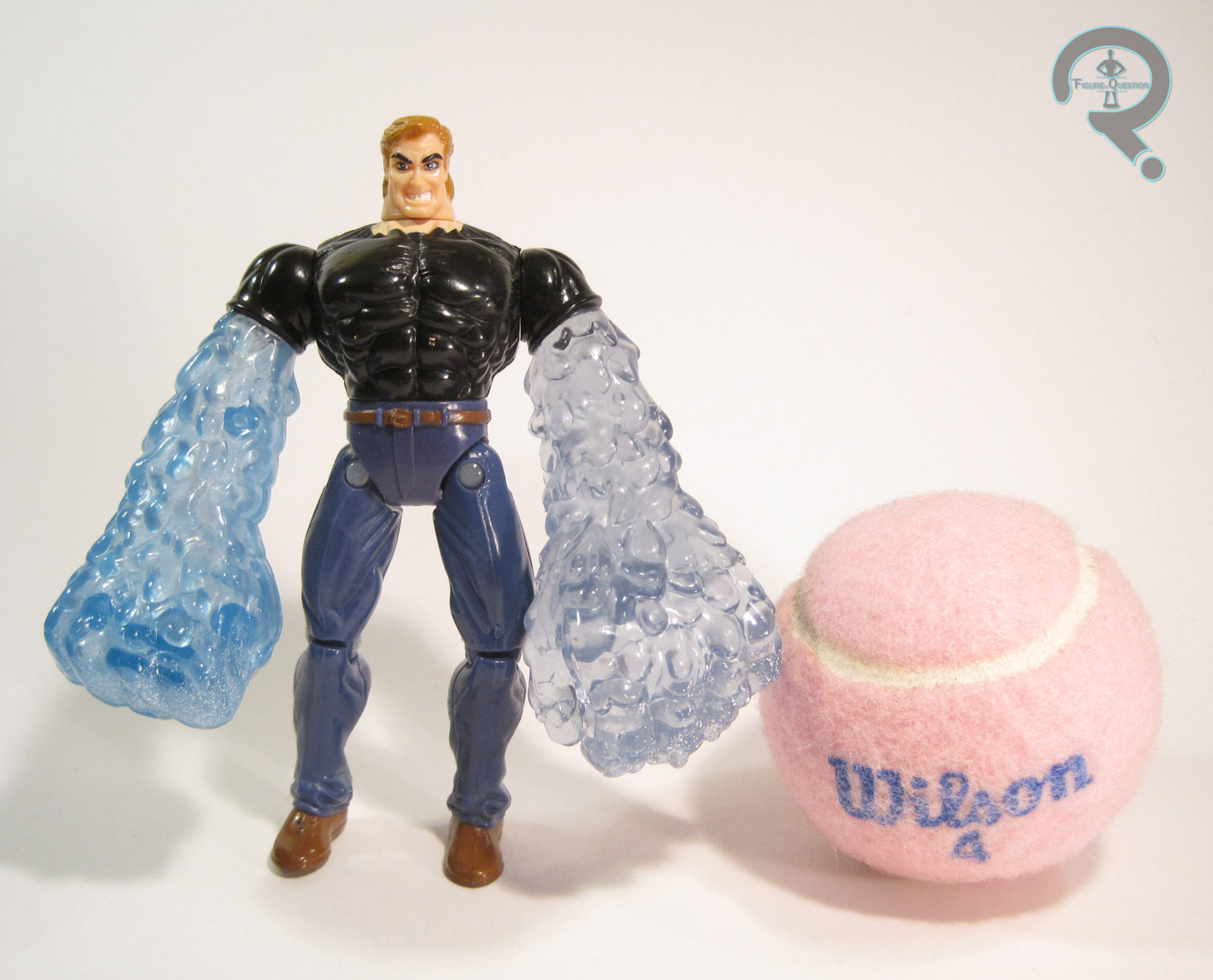
Venom was released in Series 3 of Toy Biz’s Marvel Super Heroes line. He was the second version of the character released in the main line (after the one released in Series 2) and the third in the overall scheme of things (following the Talking Heroes version). The figure stands just shy of 5 ½ inches tall and he has 8 points of articulation. He has no neck movement due to his action feature, which is quite limiting, but he is otherwise decently posable. The prior Venom figures had focused on bulk over all else. This figure, on the other hand, focused on making Venom tall (he’s a good ¾ of an inch taller than the Spider-Man from the same line), but not quite as bulky. The end result is a figure that looks not unlike Venom in his earliest appearances, before he had become quite as monstrous. The sculpt us actually pretty decent. It’s somewhat stylized, but not incredibly so, and he has a nice, subdued look about him, which is refreshing to see in a Venom figure. Venom’s paint is rather simple: it’s exclusively white paint on black plastic. The detailing doesn’t look too bad, though, as you can see from my figure, the paint wasn’t the most durable. Still, the pure black and white has a nice stark contrast about it, something that a lot of later Venom figures would miss out on by adding unnecessary blue highlights. Venom originally included a clip on torso piece, simulating the symbiote wrapping around him. He also had the previously mentioned action feature, which allowed for Venom to stick his tongue out when the lever on his back was pulled. It’s rather a goofy feature, but it’s also really in keeping with the character, so I guess it made sense.

THE ME HALF OF THE EQUATION

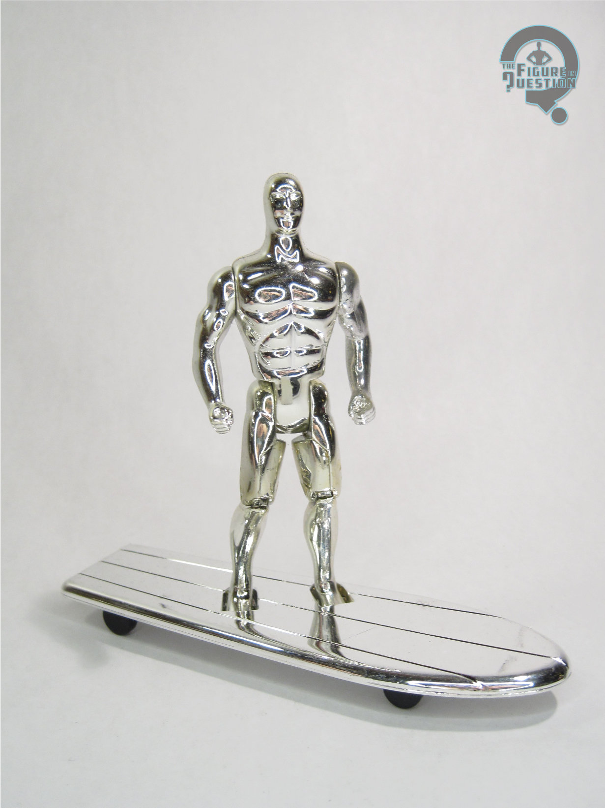
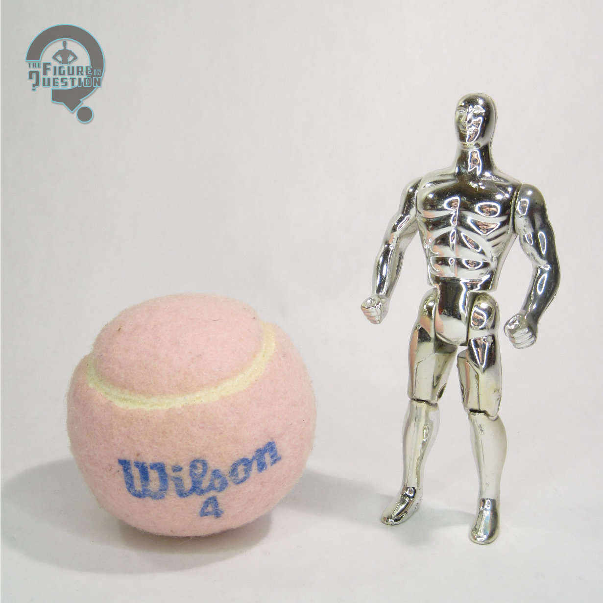
Venom is the 11th of the 15 figures I got at Balticon this year. Amazingly enough, prior to this figure I did not own a single 5-inch Venom figure. This one’s not bad, and the quality of his sculpt, especially when compared to last week’s Silver Surfer figure, shows how incredibly fast Toy Biz was taking steps forward in that department.

Also, not related to me, but worth noting: this figure has become one of Super Awesome Girlfriend’s favorites. She constantly picks it up so that she can make it stick its tongue out at me. I’ve ensnared another action figure geek!

VenomMSH3

#0977: Flash

FLASH

JUSTICE LEAGUE (MATTEL)

FlashJLU1

Yeah, so I’m kinda running out of things to say about the DCAU. It was really good. Far better than anything else DC’s done in a very long time. There, I got that out of the way. When the DCAU’s fourth series, Justice League, premiered most of the cast were not household names. While the Flash was decently well-known, the show undoubtedly contributed to character’s current state of popularity. During Hasbro’s run with the DC license, they only released three Flash figures over the course of a decade (and two of them were the same figure with a slight change in paint). Thanks to Justice League , when Mattel took over, Flash was amongst the earliest figures they released. I’ll be looking at that particular figure today.

THE FIGURE ITSELF

FlashJLU2Flash was released in the first half of the first series of Mattel’s Justice League line, alongside Superman, Batman, and Green Lantern. Both he and Green Lantern were short packed to two per case in initial shipments, so they were initially quite scarce. However, this basic Flash figure was released numerous times over the course of Mattel’s later Justice League line with virtually no changes. The figure stands 4 ½ inches tall and has 5 points of articulation. That articulation count was low even in 2002 (heck, ESPECIALLY in 2002, since that’s when Marvel Legends was started), but it both kept the figures somewhat consistent with the Kenner/Hasbro animated figures that preceded, and also preserved the figure’s overall aesthetic. The sculpt for Flash (and all of the other initial Justice League figures) was done not by anyone at Mattel, but rather by DC Direct (prior to Mattel’s holding of the DC license), who down-scaled their larger scale animation maquettes for the first seven figures. The end result is a figure that is quite faithful to Flash’s depiction on the show…mostly. Something’s always bugged me about the head, and I’ve never been quite able to put my finger on it. Other than that, the figure’s spot-on though. Flash’s paint is fairly simple. He’s molded in red, with painted details for the various yellow and white bits, as well as his face. The application is generally pretty clean, though he does have a bit of slop around the edge of his mask. In his initial release, Flash was packed with one of the light blue connecting stands that the first seven figures all came with, as well as a lenticular trading card.

THE ME HALF OF THE EQUATION

Boy were the Justice League figures a long wait. Even after they finally made it to shelves (a year after the show’s premier), getting a hold of them, especially the short-packed Flash and Green Lantern, was no easy feat. I ended up lucking into Flash: there was a comic book store near the church where my aunt was getting married. My dad and I went there to kill some time and the store had just gotten in their case of these figures and had one each of the short-packs. He’s not a perfect figure, but he was the figure I wanted, and he was one of my favorite Flash figures for a few years. Even with the lessened articulation, he still looks pretty good.

#0976: Commander Gree

COMMANDER GREE

STAR WARS: CLONE WARS

GreeCW1

The Star Wars prequels are almost universally loathed. However, as bad as the movies as a whole may be, there are definitely some ideas and concepts present that were actually kind of cool, if under-explored. On the plus side, the animated Clone Wars show, was able to take a lot of those concepts and apply them to a narrative that didn’t totally suck. Possibly my favorite part of the prequels was the Clone army, who were actually given a ton of development and individualized treatment in Clone Wars. While many of the clones used in the show were new characters, the cartoon also took the chance to flesh out almost all of the named clones from Revenge of the Sith, including my personal favorite, Clone Commander Gree.

THE FIGURE ITSELF

GreeCW2Commander Gree was released in the 2009 assortment of Hasbro’s Star Wars: The Clone Wars tie-in line. The figure stands about 3 ¾ inches tall and has 24 points of articulation. He represents Gree as he appears in the earlier part of the show, prior to the time skip. He’s seen here wearing his standard Phase I trooper armor, and as such, he uses the same basic parts as all the other basic clones in the line. The body isn’t a spot-on recreation of the cartoon design: the lower torso and the limbs are noticeably a little thicker, presumably to offer more stability. That said, it’s very close to what was seen in the show. Like most of the Clone commanders in the line, Gree features a removeable helmet. The helmet itself is nicely handled, and looks more or less the same as the second iteration of the non-removeable clone helmet. Under the helmet is Gree’s head, which is sporting his rather goody twin mohawked look. It’s a decent enough recreation of his look from the show, though it does look a little older than his on-screen counterpart. It’s also slightly on the small side, but that kind of comes with the removeable helmet territory. Gree gets a unique belt piece with a holster, as well as a bandolier add-on piece. These two pieces help to add a nice flair of uniqueness to him, which is certainly cool. Gree’s paintwork is handled pretty well. Early in the show’s run, the animation models were a bit less advanced. This affected Gree more than most, since his rather complex camo design was far too much to handle. So, his Clone Wars design is just the basic clone look, but with extensive green accents. The figure replicates this pretty well, and the overall application is nice and clean. Gree included a large blaster rifle, a blaster pistol, and a large missile missile launcher. Because Hasbro.

THE ME HALF OF THE EQUATION

So, I don’t recall exactly where I got Gree. I’m pretty sure it was a Target. I know I got him while he was still a relatively new figure.  The Clone Wars line was definitely a fun one, and Gree is a pretty strong showing.

GreeCW3

#0975: Scarlet Witch

SCARLET WITCH

AVENGERS: EARTH’S MIGHTIEST HEROES (TOY BIZ)

ScarletWitchAR1

I’ve been tackling a lot of characters’ first action figures as of late. Oddly enough, it’s not really been an intentional choice, just sort of something that’s cropped up. Today, I’ll be looking at the first figure of one of the quintessential Avengers, the Scarlet Witch. Though she’s been with the team since the mid-60s, and was also a recurring character in the ‘90s Iron Man cartoon (she was actually the only member of Force Works not to get a figure from that show’s tie-in line), Scarlet Witch’s first figure wouldn’t be released until 1996, when the Avengers got their own dedicated series of figures.

THE FIGURE ITSELF

ScarletWitchAR2Scarlet Witch was released in the first (and only) series of Avengers: Earth’s Mightiest Heroes, a line which was designed to roughly tie-in with the Heroes Return event. The figure stands about 5 ½ inches tall and she has 7 points of articulation. The articulation isn’t particularly useful, sadly. You can get a bit of decent posing out of the shoulders, but even then, the arms have a tendency to pop off if you move them too much. Also, did you catch that height? Yeah, at 5 ½ inches, this figure is 6-inch scale. While that’s a prevalent scale now, at the time of her release, it made her too tall to go with couple hundred 5-inch scale Marvel figures that Toy Biz had put out. The first Scarlet Witch figure ever made, and she was out of scale with just about every one of her teammates. That’s a bit frustrating. On the plus side, the sculpt actually isn’t horrid, especially when compared to Toy Biz’s next attempt. The head is probably the best part. The hair a little thick and hard to work with, but the face is still probably the most attractive take on the character in sculpted form. The rest of the body isn’t bad, but some of the proportions seem a little out of whack. Her waist is definitely too small, but her whole torso in general feels a bit tiny when compared to the arms.  To be fair, the slightly oversized nature of the arms is preferable to the stick arms many female figures are saddled with. I do wish they were a bit less tubular, but the gloves and hands are certainly nicely detailed. Originally, this figure also had a cloth cape, which my figure no longer has. It wasn’t anything especially impressive, though. The paintwork on this figure is pretty straightforward, but also pretty good overall. My only real complaint is the nose: like McFarlane’s Carol from Walking Dead, Wanda has painted nostrils, and she would definitely look much better if they had been left unpainted. Wanda was packed with two “magic orbs” and a hex bolt.

THE ME HALF OF THE EQUATION

Scarlet Witch is yet another figure from the 15 figures I picked up at this year’s Balticon. Despite how much I liked the character, I never got one of these when it was new (I had actually been holding out for the United They Stand version, which didn’t even make it to the prototype stage…). While this isn’t a perfect figure, it’s certainly better than the one that followed, and it was the best Scarlet Witch figure available for over a decade. Which is honestly kinda sad, but there it is.

#0974: Chojin Sentai Jetman Black Condor

CHOJIN SENTAI JETMAN BLACK CONDOR

S.H. FIGUARTS (BANDAI)

BlackCondor5

“Jeto-jeto-jetoman! Danananana!”

Chojin Sentai Jetman Theme Song (paraphrased)

So, here’s a figure with a pretty cool backstory. Back in 1993, when Saban was looking at importing a Super Sentai series to the US, they had two possible options:  Kyoryu Sentai Zyuranger or Chojin Sentai Jetman. Zyuranger was chosen for a number of reasons (the inclusion of a sixth ranger and the popularity of dinosaurs at the time being the most commonly cited) and eventually became Mighty Morphin’ Power Rangers. However, Jetman was a pretty serious contender, thanks to it being one of the most popular incarnations of the Super Sentai franchise. It was also inspired by Gatchaman (better known as G-Force or Battle of the Planets in the US), which gives it some pretty awesome pedigree. Today, I’ll be looking at the guy who was almost the first Black Power Ranger, Black Condor (who is under no circumstances to be confused with DC Comics’ Freedom Fighter Black Condor).

THE FIGURE ITSELF

BlackCondor3Black Condor was released as part of the Super Sentai sub-set of Bandai’s S.H. Figuarts, towards the end of 2012. He’s the second of the two Jetman figures Bandai released in the line, with the first being Red Hawk. The figure is about 5 ¾ inches tall and he has 38 points of articulation. Zyuranger and Jetman’s designs weren’t too far removed from each other, and as such, this figure feels pretty similar to the Mighty Morphin’ figures I looked at a ways back. The Jetman designs are a bit sleeker, and a bit stronger, if I’m honest, and definitely feel right at home with some of the earlier Ultraman designs. This figure’s sculpt does a very nice job of capturing the look of Black Condor from the show. Like other Figuarts, the proportions have been skewed ever so slightly BlackCondor2to fit in with the rest of the line stylistically, but this guy’s not particularly far off. The overall appearance is very faithful, and the helmet in particular is the spitting image of what was seen on the show. I especially like all the little seams in the costume, as it really sells the realism of the show, and adds a nice bit of depth to a figure that could otherwise be far too simple. I also feel it’s worth noting that this particular design works a bit better with the usual Figuarts articulation scheme than the Zyuranger designs did, so he doesn’t have any compromises in terms of his design for the sake of movement. Black Condor’s paintwork is nice and crisp. The BlackCondor4color choices are bold, and the application is quite sharp. The difference between the finish of the helmet and the rest of the suit is especially cool. This is probably the best paintwork I’ve seen on one of these figures, and that’s saying something, because these guys all have some pretty top-notch paint. Black Condor includes quite an impressive array of accessories. He’s got his Bird Blaster and Bringer Sword (in both compact and extended forms), plus the combined form of those two, the Jet Hand Cannon. He also has BlackCondor7holsters for both weapons, as well as his Wing Gauntlet (with open and closed wing pieces), an alternate backplate with a set of wings attached, and five pairs of interchangeable hands in fist, trigger finger, gripping, quotation fingers, and flat-handed positions. These pieces are all pretty fun extras. I think the Wing Gauntlet’s my favorite piece included, even if the wing pieces are the wrong color (they should be black).

THE ME HALF OF THE EQUATION

Remember Bio Rider? Remember how that was Tim’s fault? Yeah, well I’m blaming him for this one too. Okay, maybe that’s not fair. I’ve actually had my eye on this figure since back when I got the Figuarts Mighty Morphin’ figures. His design just really speaks to me. Since I had some gift card money, I finally got him. In the meantime, I’ve actually watched some of the source material and found it to be quite entertaining, and Black Condor in particular is super cool. I’m definitely happy to have this figure, and I wouldn’t mind if Bandai got around to releasing the missing members of the team.

BlackCondor6

#0973: Arya Stark

ARYA STARK

GAME OF THRONES: LEGACY COLLECTION

Arya1

A reviewer believes it is time to right a review of a figure of a girl. Wait, that doesn’t sound quite right. Sorry, I was trying to be clever and topical, but I’m not sure it worked. Anyway, I’m continuing the Game of Thrones bit from yesterday, looking at another figure from Funko’s Legacy Collection. Today, I’ll looking at No One. Wait, scratch that, I’m actually looking at Arya Stark, the youngest Stark daughter. Thought she was No One, but I just got the notification of the change! Sorry, it’s hard enough keeping up with everyone’s initial names, and that’s without throwing name changes into the mix. Let’s just look at the Arya figure!

THE FIGURE ITSELF

Arya2Like her brother Robb, Arya was released in the second series of the Game of Thrones: Legacy Collection. She’s figure #9, which puts her right in the middle of the second series. The figure stands about 5 ¼ inches tall and has 26 points of articulation. She seems a bit tall when compared to Robb. There’s only about a half-inch difference between the two, which going by the actor’s heights isn’t incredibly off, but it’s enough off that it bugs me slightly. I found the articulation on Arya to be a bit stiffer than on Robb, but I still haven’t run into any impossibly tight joints or breakage just yet. That being said, I’m a bit leery of the wrist joints; they seem a bit spongey on my figure. I also really wish she could get her knees into a straighter position.  As it is, she’s always got a slight crouch going on. Arya is depicted here in the look she started sporting following her father’s death, when she was attempting to pass herself off as a boy (not that she fooled that many people). It’s a good look for the character, and it was pretty much her only look for a good three seasons of the show’s run, so it was pretty well chosen. Though it appears Gentle Giant Studios put a lot of effort into this figure’s sculpt, Arya didn’t turn out quite as well as her brother. Her head definitely feels a bit too big, and the proportions of the body seem a bit too elongated for Arya. The likeness on the head is also a bit weird. From a head-on view, it’s a pretty good Maisie Williams likeness. However, from certain angles, the sculpt becomes rather cartoony, and begins to look more like a caricature than a real person. The hair doesn’t really help matters, being far thicker than it should be, and sitting rather far back on the head. On the plus side, the level of detailing on the rest of the figure is superb. I especially love the texture and stitching of the vest, which genuinely looks like a real piece of clothing.  Arya’s paintwork isn’t bad, but there are a few issues. Like Robb, the best work is one the clothing, which has some very nice accent work, and it looks appropriately grimy. The same can’t be said of her face and hands, which are surprisingly un-grimed. The paint on those bits isn’t awful, but there are some spots (most notably the eyebrows) which could have been handled a bit better, and end up hiding some of the strengths of the sculpts. I’d be remiss if I didn’t mention the big chunk of oddly misapplied paint on the left side of Arya’s neck. Obviously, this is a one off issue with my figure, but it’s definitely very annoying and makes poor Arya look like she’s got the plague or something. Arya’s one accessory is her sword Needle (given to her by her half-brother Jon Snow). It’s a pretty good recreation of the prop on the show (some people have complained about the color of the handle; it’s a bit bright, but it doesn’t bug me). On the show, Arya is left-handed, and that’s definitely the hand that’s meant to hold the sword. It’s not as easy to get her to hold it as it was to get Robb holding his, but I managed alright.

THE ME HALF OF THE EQUATION

I picked up Arya at the same time as Robb. Arya’s been one of my favorite characters since the very first episode of the show, and I definitely wanted her in action figure form (the uncertainty of her inclusion in the upcoming 3 ¾ inch line is a big part of why I’m still not sold on those figures). Arya’s not quite as strong a figure as Robb. That said, Robb was a fantastic figure, which not every figure can be. Even with her flaws, Arya is still a pretty good figure, and she’s a nice representation of one of the show’s best characters.

Starks

#0972: Robb Stark

ROBB STARK

GAME OF THRONES: LEGACY COLLECTION

Robb1

Hey guys! Ethan’s found a new thing! Yep, after hemming and hawing and doing my best to steer clear of the Game of Thrones craze for the last six years, I finally gave in and started watching the show two months ago. It’s been a bumpy ride, but I’m all caught up, and I’ve overall really enjoyed the show. Now, if you’re even slightly familiar with this site, you probably already know what that means: I had to have action figures. Fortunately for me, there are a few different options. I opted to go for a couple of figures from Funko’s Legacy Collection. By far, my favorite corner of the Game of Thrones mythos is the Stark house (it’s probably the familiarity of the name. Hard to break out of old habits, right?). Today, I’ll be looking at the sadly ill-fated King of the North, Robb Stark!

THE FIGURE ITSELF

Robb2Robb Stark was released as part of the second (and it would appear final) series of the Game of Thrones: Legacy Collection. He’s figure #11, making him the second to last figure in the line chronologically. The figure stands just shy of 6 inches tall (making him just about the right height to be a 1:12 version of the 5’10” Richard Madden) and he has 26 points of articulation. The Legacy Collection was somewhat notorious for stuck joints, but I seem to have lucked out with my Robb. None of his joints were stuck out of the package, and the range of motion on all of his various joints is pretty decent. This figure depicts Robb in his battlefield garb from after he becomes the King of the North. While it’s far from Robb’s only look from the show, it’s probably the one he spent the most time in, and it’s certainly his coolest.  The sculpts for all of the Legacy figures were handled by the fine folks at Gentle Giant Studios, who are known for producing some high-quality work. Robb is no exception, sporting a pretty phenomenal sculpt. The level of detail on the clothing is particularly amazing. Every article is full of a whole tone of texture work, and the cape, straps, belt, and several pieces of his armor are all (non-removable) add-on parts, which allow the figure to have a really great sense of depth. The head is probably the weakest point of the sculpt. Not that it’s bad, but the details aren’t quite as sharp as the rest of the figure, and there’s something just slightly off about the likeness. He definitely resembles Madden, but he’s not spot-on. The paintwork on Robb kind of matches up with what we saw on the sculpt. The work on the body is really strong, with lots of really cool small detail work to help accent the sculpt. In particular, I really love the splattering of mud along the bottom of Robb’s cape; it really adds a fun touch of realism. The head is where things fall down again. Once again, it’s not horrible. There’s some pretty decent accent work on the hair, which is certainly nice. However, the skin tone is a little flat, the eyes are just the slightest bit off, and his beard and lips are incredibly sloppy. None of it’s enough to ruin the figure, but it is a bit frustrating. Robb was packed with his sword (which, unlike some of the swords on the show, is nameless). It fits very nicely in either of his hands, and can also be stored in his scabbard, though the fit is a bit loose.

THE ME HALF OF THE EQUATION

Robb was ordered from Amazon, making use of a gift card I got for graduation (hey, he’s a sound investment. Dude was the King of the North. The whole cardinal direction!) I actually almost picked up Robb a few weeks ago at a Walmart, but ended up talking myself out of it. Good thing too, since I ended up getting him for half of his original price. Given the quality of this figure, that’s a pretty fantastic deal. When I started watching Game of Thrones, I was already aware of Robb’s fate. As such, I swore I wouldn’t get attached to him. That didn’t really work, because he was just too cool not to like. In fact, he became one of my favorites, which is why he was one of the first figures I picked up. This figure does a great job of capturing the coolness of the character, and he’s just a really fun figure all-around.

#0971: Hydro-Man

HYDRO-MAN

SPIDER-MAN (TOY BIZ)

Hydroman1

You know what the absolute best reason to create a new character is? To replace another character you can’t use at the moment. Seriously, that always results in a fully formed, exciting character, who’s just as exciting as the previous character. That’s why everyone’s favorite Red Ranger is Rocky, Heavy Duty is hands down the best heavy gunner G.I. Joe’s ever had, Chachi was the coolest guy on Happy Days, and Coy and Vance Duke were universally loved by all. What’s that? I’m wrong on every single count? Oh, my bad. Apparently, substitute characters aren’t a good thing.

So, speaking of substitute characters, let’s talk about Hydro-Man. Strictly speaking, he didn’t start out as a substitute, though he’s always been rather similar in concept to Sandman. When James Cameron was working on putting together a Spider-Man movie in the ‘90s (yeah, it was a weird time), he wanted to use Sandman as one of the main villains, and an embargo was placed that prevented using Sandman in any media outside of the comics. So, when Spider-Man: The Animated Series wanted to use him, they had to settle for Hydro-Man (the same thing happened when the Fantastic Four cartoon did the Frightful Four, but Hydro-Man had been a part of that team before). This meant that Hydro-Man also got his first shot at an action figure, courtesy of the Spider-Man tie-in line. I’ll be looking at that figure today.

THE FIGURE ITSELF

Hydroman2Hydro-Man was released in the “Spider-Wars” series of Toy Biz’s 5-inch Spider-Man line. The figure stands just over 5 inches tall and he has 9 points of articulation. Though he lacks any sort of elbow movement, he makes up for it with a disc-and-pin style joint for his hips. This makes him a bit imbalanced in terms of posability, but I’ve certainly dealt with worse. Hydro-Man is based on his look from Spider-Man: The Animated Series, which was a fairly faithful recreation of Hydro-Man’s look from the comics. The figure does an…interesting job translating his look to three-dimensions. Hydro-Man has always been depicted as being a pretty beefy guy, and this figure tries to convey that. He’s certainly big, but perhaps a bit too big. Well, in some areas, anyway. In other areas (such as the head), he’s too small. Hydro-Man’s been saddled with some pretty serious man-boobs. I think there was an attempt to make him muscular, but they missed the mark and he just ended up lumpy instead. Also, check out the mom jeans. Not exactly the sort of thing that makes for an imposing villain, there. On the positive side, the head sculpt, while a bit weird-looking, certainly has quite a bit of expressiveness. The arms are also pretty good. While I might like a pose other than straight-armed, the water effect is pretty believable and the overall sculpt is pretty cool. Hydro-Man’s paintwork is fairly straightforward, but also pretty solid. The application is nice and clean, and the translucent arms even have a few flecks of white paint to emulate the impurities in the water. Hydro-Man originally included a base to make it look like his lower half was also water, as well as a “water gun” for his left hand to hold. He also came with a small pump, which was used for his right arm’s water shooting feature. The pump could be filled with water and plugged into his back, and when squeezed, the water would shoot out of his right middle finger. It’s a rather gimmicky feature, and the removal of the pump results in a rather large, gaping hole in his back, which is slightly annoying.

THE ME HALF OF THE EQUATION

Hydro-Man is the ninth figure of the 15 figures I picked up at this past Balticon. I never had Hydro-Man growing up, but I did have the Sandman that was a repaint of this guy. This figure is super, super goofy, and probably not one of the better figures from Toy Biz’s run. But, you know what? I kinda love this guy. I can’t really say why, but I do.

#0970: Silver Surfer

SILVER SURFER

MARVEL SUPER HEROES (TOY BIZ)

Though they were best known for their 15 year run with the Marvel license, Toy Biz’s first work of note was actual doing toys based on Marvel’s Distinguished Competition. Toy Biz’s DC action figures were little more than knock-offs of Kenner’s Super Powers line. When Toy Biz was granted the Marvel license, their initial offerings were rather similar to what they had done for DC. They offered a rather broadly ranging line, covering the major corners of the Marvel Universe (barring the X-Men, who got their own line). Today, I’ll be taking a look at one of that line’s versions of the Silver Surfer!

THE FIGURE ITSELF

Silver Surfer was released in the third series of Toy Biz’s Marvel Super Heroes line. The figure stands about 5 inches tall and has 6 points of articulation. That’s actually a pretty low articulation count for a Toy Biz figure, and it’s even a bit low for this particular line. This figure is mostly the same sculpt as his Series 1 counterpart. The only difference between the two is the lack of neck articulation. It’s an odd choice, and it definitely limits what can be done with the figure, but I’d guess it had something to do with the vac metalizing. The sculpt isn’t terrible, but it’s not particularly great either. He’s similar in style to the Toy Biz Green Lantern, in that his proportions feel rather off, and the level of detail is very low. Also, his head is just very oddly shaped. It’s definitely too small, and the face (which is very ill-defined) sits too high. In fact, the head in general sits too high on the neck, and the whole construction there just looks weird. As far as paint goes, this particular Surfer doesn’t really have any, he’s just vac metalized. Later Surfer’s would at least get detailing on the eyes, but that’s not the case with this guy. Just the straight up and down silver for him. Silver Surfer originally included his surfboard, done up to match him. Unlike other versions of the board, this one was really thick, and it had wheels on the bottom. So, he’s not actually the Silver Surfer, he’s the Silver Skateboarder. Radical.

THE ME HALF OF THE EQUATION

The Surfer is the eighth of the 15 figures that I picked up from a vendor at this past Balticon. I…I’m not really sure how I feel about him. I mean, the chrome look is certainly cool, but the actual figure’s kind of a bit lame. Toy Biz definitely improved in leaps and bounds over the years, but this guy’s a disappointment even compared to the figures from the same line. I hate to be this down on a figure, but this guy, well, he’s not great.

#0969: Cyclops

CYCLOPS

X-MEN: AGE OF APOCALYPSE (TOY BIZ)

CyclopsAoA1

Man, I feel like I was just talking about Age of Apocalypse not that long ago. Oh, that’s right, I was! Back in May, I looked at the AoA version of the most popular X-Man, Wolverine. Today, I’ll be dipping back into that universe, to look at an X-Man who’s almost as popular, Cyclops! One of the things that the event liked to play with was which side of the battle certain characters were on. While classically villainous characters like Magneto and Sabertooth ended up firmly on the side of good, some of the more traditionally heroic characters found themselves on the side of bad. Such was the case with both Cyclops and his brother Havok. At the time, Cyclops as a villain was supposed to be really shocking, but it’s since become a rather predictable story beat (and Cyclops doesn’t stay evil in the story anyway, so…). Ah well. How about the figure?

THE FIGURE ITSELF

CyclopsAoA2Cyclops was released in the 12th Series of Toy Biz’s 5-inch X-Men line, which was entirely based around Age of Apocalypse. The figure is about 5 ½ inches tall and he has 10 points of articulation. Obviously, he’s based on Cyclops’ design from the Age of Apocalypse event. While Wolverine/Weapon X got a rather extensive redesign, Cyclops actually didn’t change all that much from his standard look of the time. Sure, there are plenty of minor changes, but the overall look is still pretty much the same. The biggest change is all the asymmetry. In the comics, Scott had lost his left eye in a battle with Logan, making him an actual cyclops. Isn’t that clever? Anyway, his visor has been tweaked so the eye slit is just on the right side, and they just kind of went nuts to play up the imbalance. With the asymmetrical armor, the pouches, the long hair, and the five o’clock shadow, the whole thing is very ‘90s. It’s almost quaint. The figure does a decent job of replicating this design, but holy crap is it stylized! His muscles are bulging all over the place, and his hands are huge, yet his head and waist still manage to be impossibly small. His head’s smaller than his bicep. That’s the kind of thing you might want to have checked! Also worth noting is that the structure and pose of this figure’s legs make him virtually impossible to keep standing for any length of time. On the plus side, the sculpt does have some pretty cool detail work, especially on the armored bits. He’s even got little sculpted scars across his eye! Cyclops’ paintwork is decent enough. The application is pretty clean,many the slightly metallic blue and yellow work really nicely. The hair’s a bit of a mess, but more or less gets the job done. The scars lose some of their subtlety with the huge red lines that have been placed on them, which is a slight letdown. Still, they aren’t terrible. Cyclops was originally packed with a weird gun thing and a brain in a jar. Classic Cyclops accessories! Mine, however, does not have these pieces.

THE ME HALF OF THE EQUATION

Cyclops is another figure from the rather large assortment of figures I picked up at this year’s Balticon. Given that I was a huge Cyclops geek as a kid, it’s a little surprising that I didn’t get this guy when he was new, but I don’t recall ever seeing any of the Age of Apocalypse figures in stores. Honestly, this isn’t one of my favorite incarnations of the character. However, he’s not a terrible figure, and his ramped up 90s-ness does make him a bit of fun!