#1446: Shiro

SHIRO

VOLTRON: LEGENDARY DEFENDER (PLAYMATES)

“Captured by the Galra, Shiro was experimented upon before he was able to escape to Earth.  He returned with vital information to lead Team Voltron against his former captors.  Calm, thoughtful and wise beyond his 25 years, it takes more than a fleet of Galra cruisers to get a rise out of Shiro.”

Hey, more Voltron!  Alrighty then!  So, in the original Voltron and most off-shoots, the main five pilots are Keith, Lance, Hunk, Pidge, and Allura.  Allura, of course, is actually a replacement for the Blue Lion’s original pilot, Sven.  For the reboot, they’ve decided to mix things up a bit, changing Sven’s name back to Shiro (as it was in the original Go-Lion) and placing him as the team’s leader….at least at the start.  It’s complicated.  As Sven, he’s only had one figure before, and I missed that one, so this one’s actually a pretty big deal.  So, let’s have a look at the latest figure of Shiro, the Black Paladin!

THE FIGURE ITSELF

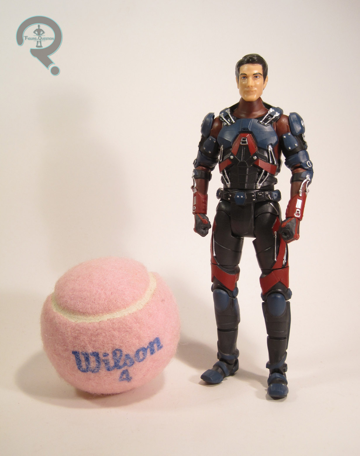
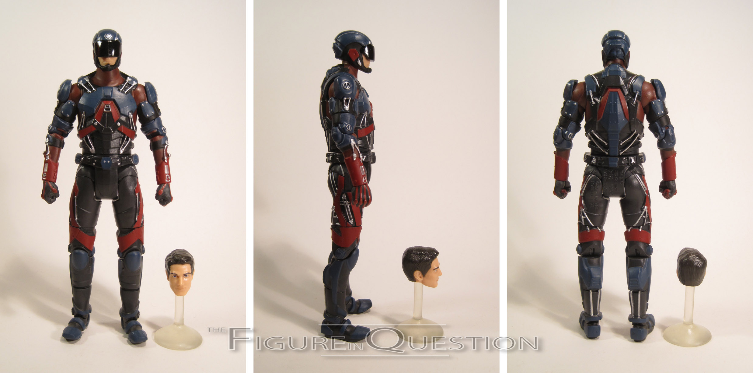
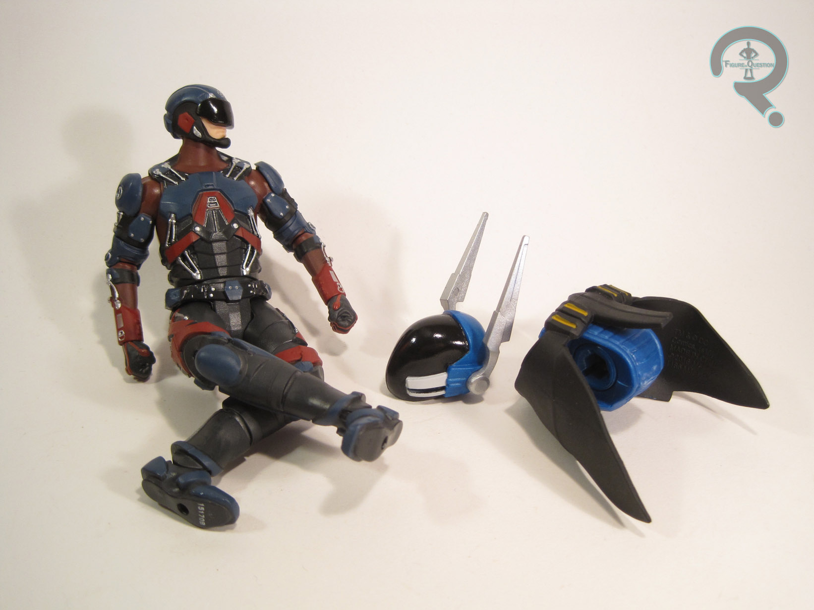
Shiro is another figure from the second series of basic Voltron: Legendary Defender figures, as Paladin two of three.  The figure stands a little taller than Lance at 4 3/4 inches tall and he’s got 20 points of articulation.  Shiro is sporting an all-new sculpt.  It’s totally unique from Lance, but definitely shares a common ancestry.  It looks about the same, just at a larger scale.  He’s got a totally different head, of course.  It’s okay, but I don’t think I like it quite as much as Lance’s.  It’s not entirely Playmates’ fault, though; Shiro’s design is more subtle and less exaggerated than Lance’s, which means it takes less flaws to throw off the whole look.  It’s also not helped by the really thin neck on the torso, which just sort of throws things off.  Still, it’s not an awful attempt.  Shiro’s paintwork isn’t that much different from Lance’s, just swapping in black for the blue.  This makes it a little less vibrant than Lance, and by extension a little less exciting.  He’s got a touch more slop, with an especially notable blob of flesh tone on the back of his hair.  I’m also not 100% sold on how the eyes and eyebrows have been placed; they don’t quite look like they line up with the sculpt.  Shiro includes his helmet and shield, which are the same as the ones included with Lance.  The shield is fine, but the helmet doesn’t sit quite as well as it does on Lance’s head, so it’s not getting much use from me.  Since the Black Paladin Bayard wasn’t available to Shiro, he instead gets a swappable right hand, showcasing his bionic hand’s energy ability.  I would have liked the hand to be transparent, but it’s still cool enough.

THE ME HALF OF THE EQUATION

Shiro came from the same trip to Walmart that got me Lance.  I had high hopes for this figure, since I missed out on the Mattel Sven figure.  He was the first figure I opened, and I will admit, I was a tad disappointed with him.  He just wasn’t quite what I was expecting.  That being said, after messing around with him and Lance for a week or so, my opinion of both figures definitely improved.  Sure, they could be a bit better, but I’m still very happy with these figures.

#1448: Lance

LANCE

VOLTRON: LEGENDARY DEFENDER (PLAYMATES)

“Lance is all about having fun, even a million miles away from Earth’s comforts and distractions.  Full of confidence and even more full of himself, Lance thinks he’s everyone’s best friend, especially if they’re cute and female.  And while his cockiness often gets the better of him, he always comes through a fire fight.”

Netflix’s Voltron: Legendary Defender has steadily become one of my favorite shows to watch.  Its third season dropped a month or so back, and was rather brief, but contained some of my favorite moments from the show to date.  Season 4 is supposed to hit at the end of this month, and I’m pretty excited to sit down and watch it.  Playmates picked up the license to Voltron back at the beginning of the year, and they’re finally get around to releasing the show’s five main Paladin heroes…well, some of them anyway.  Today, I’m taking a look at Lance, the Blue Paladin!

THE FIGURE ITSELF

Lance is part of the second series of basic Voltron: Legendary Defender figures.  He’s the first of the three Paladins offered this time around.  The figure stands about 4 1/2 inches tall and he has 19 points of articulation.  As far as scaling, these guys certainly won’t be fitting in with any of the prior Voltron lines, but I can’t say I mind the size.  They should look okay with stuff like Playmates’ TMNT line and similarly scaled items.  The sculpt is all-new to this figure, and it’s a fairly decent one.  The articulation could perhaps stand to be worked in a little bit better, but it’s far from the most archaic configuration I’ve seen on a modern day figure.  Lance’s design has been tweaked ever so slightly to make it work a little bit better in three dimensions.  The head maintains the most accuracy, and does a fairly respectable job of capturing Lance’s likeness.  The body is decent enough. The major details are all there and pretty accurate.  It’s mostly the proportions that are different; they’re a little on the clunkier side than in the show.  Still, it’s a solid piece of work, and definitely shows improvement over the Series 1 figures.  In terms of paint, Lance is overall pretty decent.  There’s some slight slop here and there, and the whites of his eyes in particular seem to be a lot bigger than they really should be going by the sculpt.  That being said, all of the colors are rather vibrant, and he looks quite spiffy.  Lance is packed with his bayard in blaster form, his energy shield, and his helmet.  Both the blaster and shield are nice pieces, and he hand hold them well enough.  The helmet sits alright, but is definitely too bulky; I feel an alternate head might have been the better way of handling it.  Still, it’s better than I’d expected.

THE ME HALF OF THE EQUATION

I’ve been patiently waiting for the Paladins ever since Series 1 hit back in January.  They’ve sure taken their sweet time getting here.  I ended up coming across Lance, Shiro, and Keith almost entirely by accident at my local Walmart.  They only had one of each, and Keith’s face was all messed up, so only Lance and Shiro got brought home.  I’m quite happy with this figure.  Sure, there are a few things they could probably change, but for $10, this is a solid toy.

#1446: Captain Kirk & Spock – Dress Uniform

CAPTAIN JAMES T. KIRK & MR. SPOCK – DRESS UNIFORM

STAR TREK (PLAYMATES)

“Teamwork has always been an important aspect of  Federation policy.  In that tradition, collected here together, for the first time ever, are the finest examples of Starfleet collaboration.”

There’s a new Star Trek show running.  It’s getting a lot of praise, which I suppose is good.  Personally?  I couldn’t get into it.  It contributes to this long-running theory I have about how I’m not a real Trek fan because I like the wrong half of the franchise.  I like TOS and four of it’s associated movies (I, II, II, and VI, if you’re curious), and I actually don’t mind Enterprise (though I acknowledge its flaws).  Next Gen mostly puts me to sleep (though First Contact is one of my favorite movies ever), I couldn’t make it through more than the first hour of Voyager, and I tapped out of DS9 about 20 minutes in.  And worst of all?  I enjoyed all of the JJ Abrams-reboot Trek films.  That’s points for disqualification alone, right?  Anyway, to remind myself that I actually *do* like some Star Trek, I’ve been watching through TOS, which is the show I’ll be focusing on today!

THE FIGURES THEMSELVES

Kirk and Spock were released by Playmates in 1994, as part of their over-arching Star Trek line.  They were part of the “Starfleet Officers Collectors Set,” which offered the captains and first officers from the three Trek shows in existence at the time.  As noted above, I don’t have much attachment to Next Gen or DS9, so all I have are these two.

CAPTAIN JAMES T. KIRK

Kirk was absolutely no stranger to Playmates’ Trek line, but this figure was, at the very least, a valid variant of the character.  Kirk is seen here in his dress uniform from the show, as seen in episodes such as “Court Martial” and “The Menagerie.”  The captain’s dress uniform was actually a bit further removed from the others, since it dispensed with the usual yellow tunic color and instead went with green, similar to his casual attire.  The figure stands about 4 1/2 inches tall and he has 12 points of articulation.  Once again, we’ve got those goofy, essentially useless v-hips, but it’s not like they were ever going to change.  Structurally, this Kirk is very similar to the standard Kirk from the Bridge Set.  The head and legs are the same pieces, which is good from a consistency stand point, I guess.  Still not the best likeness of Shatner, but it could be worse.  The torso and arms are new, and do a nice job of capturing his slightly more ornate dress design.  The paint on this figure is fairly decent.  The colors match alright with the show, and the application is all pretty clean.  He’s not quite as glossy as the standard Kirk either, which certainly helps him look a bit more lifelike.  Kirk was packed with a phaser and communicator, which mine doesn’t have.  It’s just as well, since he wasn’t exactly going on missions dressed like this.

MR. SPOCK

What good is Kirk without Spock, right?  Spock was also no stranger to Playmates’ line, second only to his captain in that respect.  Like Kirk, this figure is sporting his dress uniform, which is slightly less distinctively different from his standard look.  Nevertheless, it’s a fairly prominent look for Spock, especially since it’s what he’s wearing during most of the “present day” sequences in “The Menagerie.”  He’s the same basic height as Kirk (a touch taller), and has the same articulation scheme.  It’s not amazing, but it works.  Like Kirk, Spock gets the same head and legs as his Bridge Crew counterpart, which is reasonable.  The torso and arms are new again, and are unique from the ones used on Kirk.  The details match up pretty well with Kirk’s, but he’s got the same build as the prior Spock.  He loses the unique Vulcan salute hand, which is a bit of a letdown, but not the worst thing ever.  Spock’s paint is okay; there’s a little more slop here than I’ve seen on other Playmates Trek offerings, but it’s also a bit flatter, which I quite like.  It really helps the likeness on the head, and makes it a little sad that we didn’t see more of these guys with this finish.  It might have really aided the sculpts.

THE ME HALF OF THE EQUATION

My Dad had a fairly complete set of TOS figures from Playmates back in the day, but never got these two, largely due to the fact that they were only available as part of the larger set.  I found them over the summer, in a bin of loose figures at Lost In Time Toys.  They’re not essential figures, but they’re solid offerings, and a nice addition to the overall collection.  Now I need a McCoy to go with them.

The Blaster In Question #0027: Zeus MXV-1200

ZEUS MXV-1200

RIVAL

You know what this page needs?  It needs more balls.  Like, just a little pile over there, like 2 cubic tons.  Ok, maybe not that many, more like just a few ounces.  And obviously, I’m talking about the Nerf Rival High-Impact Rounds.  What else could it be, you weirdo.  Yes, it’s another Rival review, and this time we’re looking at part 2 of the line’s debut release, named for the king of the gods himself, the Zeus MXV-1200.  Let’s check it out.

THE BLASTER ITSELF

Here’s a fun fact, the names of the Rival blasters are actually quite informative.  Let me break it down for you.  So far they all are named for a deity from the ancient Greek pantheon and that’s just to sound cool.  After that, if the first letter is an M, that stands for “motorized.”  If there’s no M, you can assume it’s spring powered.  The next letters are the Roman numerals for the last 2 digits of the blaster’s release year.  XV is 15, hence, the Zeus and Apollo came out in 2015.  Lastly, the number after the hyphen is the blaster’s initial magazine capacity multiplied by 100.  All clear?  Good, let’s move on.  As the name suggests, the Zeus is a semi-automatic flywheel powered blaster with a 12 round capacity using the included magazine.  The flywheel mechanism itself is nothing new, though it has been substantially beefed up to deliver the expected Rival performance.  The shell of the Zeus is completely original and features a unique in-line side loaded orientation for the magazine, using the magazine spring itself to feed rounds into the flywheels rather than some other pusher mechanism.  Exchanging magazines is a little tricky at first because of how unconventional the layout is, but with a little time you get used to it.  Something worth noting is that the Rival 12 round magazines are the only ones that will work with the Zeus.  The Zeus’s handling is pretty good, though I do have some minor gripes.  The blaster feels solid and rather hefty in the hand, but the housing for the motors sticks out kind of abruptly from the left side and can dig into your palm if you’re not holding it just right.  Also, the pistol grip feels a little slim and I might have preferred just a bit more there to hold onto.  There is a lever safety above the trigger that prevents the rev switch from being pressed when it’s engaged, but it’s got a lot of play before it actually clicks into place and feels like it was probably a last minute addition.  The Zeus sports 3 Rival attachment rails (not the standard Nerf rail, these are specific to Rival), one on each side and a longer one along the top of the blaster.  It also has flip-up sights to help with aiming but they sit a little low compared to the back end of the blaster so you have to really mash your face into the cheek rest to get a decent sight picture.  Functionally, the only complaint I have is that I wish inserting a magazine didn’t automatically make it push a round into the blaster.  Again, these are minor issues that I have and don’t affect my overall opinion of the blaster that much.  That’s because actually shooting the Zeus is a joy.  Unlike other flywheel dart blasters, the Zeus revs up with a sound I’ve often described as a bag of angry hornets, and that sound is very much understandable once you pull the trigger a few times.  It launches rounds on more or less a straight line trajectory for a good 50 feet before they exhibit any noticeable drop.  Rounds also hit hard, making indoor shooting kind of a bad idea if you don’t want to risk breaking anything.  The plus side of this is that usually, you don’t even need to shoot anything to freak out your sibling when you bust into their room.  Just rev the darn thing like a mother-something chainsaw (what?) and that’ll get your point across. The Zeus MXV-1200 requires 6 C batteries and comes packaged with 12 High-Impact Rounds and a 12 round magazine.

THE ME HALF OF THE EQUATION

The Zeus isn’t perfect.  Almost no blasters out there are, but it’s easily in the top 10% and very much a force to be reckoned with.  It sounds like thunder when it revs up, buzzy, high pitched thunder.  It hits like lightning.  There might be some hyperbole in there but you get the point.  It seems “Zeus” is an appropriate name for this blaster.  It’s not much of a womanizer though, so I guess that’s probably a point in it’s favor.

#1446: Darth Vader

DARTH VADER

STAR WARS: POWER OF THE FORCE II (KENNER)

“Once known as Anakin Skywalker, expert pilot and hero, Vader studied the ways of the Force under young Jedi Knight Obi-Wan Kenobi. His impatience with the Jedi training made him susceptible to the dark side, which corrupted him as he gave in to his anger and aggression. Vader was almost killed in a confrontation with Kenobi, and was forced to adopt his current life support systems and fearsome body armor.”

You know, it’s been two weeks since I reviewed a Star Wars figure. That’s a long time.  I could go into withdrawal.  Or worse yet, I could get a huge backlog of Star Wars figures to review!  Oh…right…too late.  Well, let’s take another stab at getting through that backlog, shall we?  Let’s have a look at my man Vader here.

THE FIGURE ITSELF

Darth Vader was part of the very first series of the Power of the Force II line.  Believe it or not, this was only the second small-scale Vader ever released.  That’s kind of crazy in this day and age where you can’t go anywhere without tripping over like 50 of this guy.  This was long before the trend of 100% movie accuracy, so this figure ends up as a rather indeterminate version of Vader.  I suppose he’s technically an Empire/Jedi Vader, since his robes go under his shoulder armor.  Of course, even the original Vader, who was released to coincide with the first movie, had the robes under the armor, so I think it’s less an accuracy thing and more a “they just never really noticed” thing.  The figure stands 4 inches tall and has 6 points of articulation.  Vader’s not only taller than his compatriots, he’s also just generally larger.  This is Vader if Star Wars had been made in the ‘90s and he’d been played by Jeep Swenson…the ‘90s were a strange time.  Apart from the overall Swenson-ness, the sculpt isn’t terrible.  The quilted pattern on his undersuit is nice, and most of the important details are there.  The helmet’s a little off, but it was a marked improvement on the vintage version, and it’s not like anyone would ever confuse it for anything but Darth Vader’s helmet. The one notable omission on this guy is his lack of the bottom section of his robe.  However, as with the handling of the shoulder armor, this is something consistent with the vintage release, so maybe Kenner/Hasbro just hadn’t learned yet.  The figure’s topped off with a plastic cape, which makes the already bulky Vader even bulkier.  It’s not a bad piece, but it definitely has a flair for the dramatic.   Vader’s paint is fairly straightforward stuff.  Mostly, he’s just molded in black, with a few little spots of detail work.  Nothing spectacular, but it’s fair enough fore the time.  Vader’s one accessory was his lightsaber, which, like all of the early figures, came in short and long variants.  Mine no longer has his, but I’m fairly certain it was one of the short ones, given the basic time period of when I would have gotten this. [EDIT 01/30/26 — I’ve since replaced it, and talked about it in my Addendum!]

THE ME HALF OF THE EQUATION

I don’t know 100% how this guy came into my collection.  I know how he *didn’t* come into my collection.  Let me ‘splain: the first time I saw this figure, it was just after seeing The Hunchback of Notre Dame in the theatre.  After the movie, my parents took me to the KB Toys in the same mall so I could get one figure.  It came down to this guy or Phoebus from Hunchback.  Having just seen the movie, it was Phoebus, and not Vader, who went home with me that day.  I know that Vader was given to me by my parents shortly after.  Now, if I had to guess, using my much more fully-formed and adult investigative skills, I’d say my parents more than likely bought me both of these figures that day and just gave me Vader a little later.  I can’t know for certain, of course, but that’s certainly the type of thing they’re prone to do.

#1445: Supergirl

SUPERGIRL

DC ICONS (DC COLLECTIBLES)

Remember DC Icons, DC Collectibles’ attempt at creating a DC line to compete with Marvel Legends?   The line was met with praise initially, but the slightly smaller scale DCC chose to go with didn’t sit all that well with a number of fans.  I myself wasn’t too put off by the scale, and picked up a handful of figures from the first two series, but sort of lost touch with the line over the last year and a half.  Too much stuff competing for my money, I suppose.  I’ve finally found my way back, though, and today I’m taking a look at the release that grabbed my attention, Supergirl!

THE FIGURE ITSELF

Supergirl is part of Series 5 of DC Icons, figure 25 in the line.  She’s designed by Ivan Reis, and is based on the character’s Rebirth design.  I’m definitely fan of the look; it’s a fairly classic look, with just a few slight variations to give it a bit more polish.  It’s also rather similar to what she’s wearing in the TV show, which I’m sure is no coincidence.  What I like most about this design is that, while it’s a recent look, it still hits all the iconic notes, so we aren’t left with a slightly odd variant that looks out of place, as was the case with Mr. Miracle.  The figure is just over 6 inches tall and she has 29 points of articulation.  Since Series 2, DCC’s been doing a slight creep on the scale, to help bring the line a little closer to the likes of Legends.  Supergirl stands just a touch taller than Flash and GL, who are the tallest Icons currently in my collection.  That means she’s a little out of scale, since Kara’s usually shorter than those two, but she’s close enough that she’ll still fit in alright.  As with Mr. Miracle, Supergirl doesn’t get any shin or thigh swivels, which initially put me off, but I’m happy to see that DCC’s done an overhaul on the way the hip joints work, and has used drop hips similar to those seen on Figuarts releases.  It adds a bit more playability to the figure, and means she isn’t completely without lateral movement on her legs.  Supergirl’s sculpt is quite nicely handled.  She’s clearly inspired by the art in her Rebirth series, but the stylization’s been downplayed a bit so as to help her fit in a little better with the rest of the line.  She looks a little bit older than I tend to think of this incarnation of the character being, but it’s not like she looks decrepit or anything.  The proportions are all fairly nicely balanced, and the details are all clean and sharp.  The articulation is mostly worked in pretty well, though I do find the torso joints stick out a little bit more than I’d like.  The cape is made from a softer rubber and affixed to her shoulders.  It’s not a perfect fit, but it looks fairly decent.  I wouldn’t have minded a second cape that went back over the shoulders, similar to what we’ve seen on some of the Batman Animated figures, since the shoulders are a bit restricted as-is.  The paintwork on Supergirl is pretty solid.  There’s a bit of slop on a few of the transitions, but it’s mostly clean.  The colors are fairly bright, which certainly helps her pop.  Supergirl is packed with an alternate heat-vision head, three pairs of hands, and a flight stand.  The extra head is an interesting idea, though the heat beams look a little bit like Twizzlers, and she’s more than a little frightening with them removed.    The flight stand is a nice thought, but rather a strange execution.  It’s just this big cylinder.  It’s not particularly discrete, and it unfortunately requires you to place all of her weight on her right leg, which causes some balance issues.  I feel something that hooked around her waist would have been slightly more practical.

THE ME HALF OF THE EQUATION

I grabbed Kara from Cosmic Comix, taking advantage of a 40% off coupon to get her at a more reasonable price.  I’ve been looking for a solid Supergirl figure for quite some time, and she’s a character that companies seem to have some difficulties getting right.  I quite like this figure.  She’s not breaking any records or setting a new bar for action figures, but she’s pretty decent, and a marked improvement on some of the line’s earlier figures.  I think this is going to be my go-to Supergirl from now on.

#1444: Aliens Mega Construx

COLONIAL MARINE & XENOMORPH

MEGA CONSTRUX HEROES

You know, there was a time when being an Aliens fan wasn’t so easy.  Back when I first saw the film (in the early ‘00s), the only real action figure options were courtesy of Kenner’s hardly film-accurate line from the ‘90s.  As late as 2012, I was excited beyond belief that we were getting things like Pulse Rifles included with some of Hasbro’s Pursuit of Cobra figures.  What a difference 5 years makes.  Of course, even with NECA’s plethora of product, I didn’t really expect to be finding new Aliens toys in the building sets aisle of my local Walmart.  And yet, here we are.

THE FIGURES THEMSELVES

The Xenomorph and the Colonial Marine are both part of the first series of Mega Bloks Construx Heroes.  The line is taking the basic concept put forward by the Halo Heroes line and applying it to a handful of other licenses.  Also featured in this first series are Picard and a Borg Drone from Star Trek: The Next Generation, as well as He-Man and Skeletor from Masters of the Universe.  But those are hardly as cool as Aliens, right?

COLONIAL MARINE

Rather than focusing on one particular member of the Colonial Marines, Mega Construx has instead gone for a more generic Marine…sort of.  In actuality, he’s this odd amalgam of Hicks and Hudson.  He’s got Hudson’s armor graffiti, but Hicks’ shotgun shells and lack of sleeves.  In a pinch, he works as either.  The figure stands about 2 inches tall and he has 16 points of articulation.  This guy uses the same standard construction as all of the ODSTs I looked at, but with more Colonial Marine specific parts, of course.  The lower legs are new, as is the head, and then he’s got removable chest armor and a helmet, which is pretty fun.  The detail work on the armor is pretty solid for the size and style.  It definitely looks the part.  I appreciate the removable nature of the helmet, though I doubt anyone will be displaying him without it.  This will at least make it easier to make other specific Marines should you want to do that.  The paint on this guy is pretty simple, but gets all of the important details down.  There are a few things left unpainted (like the helmet cam), but it’s pretty decent work as a whole.  The Marine includes his standard issue pulse rifle (which is super, super awesome), his shoulder lamp, a knife, and a display stand.

XENOMORPH

Like the Colonial Marine, the Xeno here goes generic army builder.  Of course, I’m hardly going to complain about that.  I don’t need named Xenos (I’m looking at you, Grid!).  The Xeno is a little taller than the Marine, at about 2 1/4 inches tall, and even gets an extra point of articulation at the base of its tail.  The Xeno uses largely new construction, rather than relying on clip-on pieces.  As with most Xenos these days, this one’s based on the Xeno Warrior as seen in the second film.  It looks pretty awesome, actually.  The Xeno definitely translates really well to the style.  The level of detail work seen here is definielt higher than I’m used to seeing on Mega Bloks, and I’m really impressed.  Also impressive is the paint.  They could have just left the figure solid black, but there’s a nice silver airbrushing, which further highlights the awesomeness of the sculpt.  The Xeno includes a pair of clip-on claw pieces, as well as two different face huggers, one crawling, and one that fits over the face of the Marine. That last one is seriously cool, by the way.  There’s also a display stand, so that’s cool.

THE ME HALF OF THE EQUATION

These totally snuck up on me.  I genuinely found out about their existence about an hour before I got them.  They were actually my consolation prize from the day I tried and failed at buying the Force Friday figures early.  I gotta say, these two are pretty darn awesome.  I’d like to see a Ripley and maybe a few more specific Marines.

#1443: Moon Knight

MOON KNIGHT

MARVEL’S GOLD (TOY BIZ)

“Moon Knight possesses superhuman strength. His strength varies with the phases of the moon, being the strongest at full moon.  Moon Knight is an experienced fighter (used to be a boxer, marine and mercenary). He’s also skilled in the use of a great variety of weapons.”

Another Moon Knight for you, Konshu!!!

Hey, look at that, it’s another Moon Knight figure.  It’s been just over a month since the last Moon Knight figure, so why not have another one, right?  Three years of reviews without a single Moon Knight, and I’ve gotten three of them in the last four months.  What are the odds?  Ah, who cares?  Let’s just move onto the figure!

THE FIGURE ITSELF

Moon Knight was part of Toy Biz’s 11 figure Marvel’s Gold line, which was a sub-set of their 5-inch Marvel line available exclusively through specialty retailers.  The line made use of entirely re-used parts, and was notable for giving figure debuts to several cult favorite Marvel characters, including the esteemed Mr. Knight here.  This figure stands about 5 1/4 inches tall and he has 9 points of articulation.  Moon Knight was built on one of Toy Biz’s Hercules figures from their Legendary Journeys tie-in line, which was itself a slight re-tooling of X-Men’s Gladiator.  It’s a slightly odd choice for Moon Knight, truth be told, and makes him a fair bit bigger than he’s usually depicted.  I personally would have preferred the Daredevil or Archangel bodies, both of which were frequently used pieces in this line, and I feel would have better summed up Moon Knight’s usual look.  Not helping matters on the oversized body front is the head, which is just a standard Spider-Man head.  There’s really nothing wrong with the head itself, but it’s really small when compared to the body, which only emphasizes the puffiness of the base.  To aid in fully transforming this figure into Moon Knight, there are also two cloth add-on pieces, for the cloak and the belt.  The pieces are slightly goofy looking, but the cloak does at the very least help to sort of mask the size differences between the head and the body.  It takes a little bit of work, but you can actually get the cloak to look pretty nice if you try.  In terms of paint, Moon Knight is actually pretty solid.  He’s largely done up in this great pearlescent white, which looks super slick, and then there’s black line work for his costume details.  It’s all pretty sharp and looks pretty polished for a straight re-paint.  Moon Knight included no accessories, which is a slight bummer.  At the very least, his staff would have been nice.

THE ME HALF OF THE EQUATION

I always wanted this figure growing up, but the Gold Series’s distribution was rather spotty, resulting in lots and lots of certain figures, and next to none of others.  Moon Knight was one of the ones I never saw.  I’ve kept an eye out over the years and ended up finding him at the Factory Antique Mall (America’s Largest Antique Mall!…in case you didn’t know) just this past summer.  Amusingly, I found him while I was still desperately searching for the new Legends figure.  In light of more recent Moon Knight figures, this one maybe hasn’t aged so great, but the 5-inch scale is kind of my jam and I’m super pumped to finally have this guy in my collection.  You can never have too many Moon Knights, right?

#1442: Spawn

SPAWN

SPAWN (TODD TOYS)

“The kids like chains.”

-Todd McFarlane

SPWAAAAAAAWWWWN!  He’s X-TREEEEEEME! He’s the hippest dude on the block!  He’s fliggity-fly!  Other goofy and dated phrases as well.  In the ‘90s, Spawn was just like Raymond: everybody loved him.  And why wouldn’t they?  He had all the best stuff.  He was like Batman and Spider-Man and Venom all rolled into one.  And he even had the one thing so heinously lacking from those three: chains!  Kids love those things!  Todd McFarlane used Spawn as one of the main launching points for Image Comics, with the hopes of building a merchandising empire to rival his old employers at Marvel.  He initially shopped Spawn and all associated characters around to various established toy makers, including Mattel, who almost took Todd up.  Ultimately, Todd decided the process was just taking too long, cut out the middle man, and founded Todd Toys* to release the Spawn figures on his own.  I’m looking at one of those early figures today.

THE FIGURE ITSELF

Spawn was released as part of Spawn Series 1.  He was the main Spawn of that particular series (there was also a Medieval Spawn released), based on Spawn’s standard look at the time, which is more or less the same look he’s had for all the years since.  The figure stands about 6 inches tall and he has 7 points of articulation.  His sculpt was new to him (though pieces of it were used elsewhere later).  For all of Todd’s insistence that his toys were the next step, this figure feels very much like a slightly dumbed down Toy Biz release.  This dude would look right at home with the Spider-Man figures of the same era.  The detail work is all rather on the simplistic side, and the details are a little soft, especially as when compared to Todd’s rather sketchy illustrations from the book.  I mean, admittedly, I sort of like this look a little bit more than Todd’s stuff, since it’s a little bolder this way.  Hands down, the most awkward feature is that damned sentient cape.  It’s big, and it’s floppy, and the “hinges” on the sides don’t really work at all.  Also, unlike every other cape on every other caped figure ever, there’s this weird extra attachment piece that plugs it into his lower back and keeps it elevated above his shoulders in a really awkward way.  When a character whose whole gimmick is his cape looks better without the cape, you may have made a wrong turn at some point.  The paint work on Spawn is okay, but not top notch or anything.  It gets all the basic work down, but most of it’s pretty fuzzy around the edges, and there’s not really anything beyond the very standard color work.  In addition to his removable cape, Spawn also included a….wooden board…with a nail…sticking out of it?  I don’t know Spawn that well, but I don’t recall this being one of his signature items.

THE ME HALF OF THE EQUATION

I went almost 25 years of my life without a single Spawn figure.  Which…seemed wrong somehow.  I found the standard Spawn at Lost in Time Toys over the summer, and figured why not, right?  He’s okay.  Nothing particularly special or noteworthy.  But this launched a toy company, and had quite an impact on the industry as a whole in the long-run, so it’s a nice piece of history.  And now it’s in my collection.  Woooeeee.

*Todd Toys is now known as McFarlane Toys, due to pressuring from Mattel, who wanted to avoid confusion with Barbie’s younger brother Todd…who they then abandoned.

#1441: The Atom

THE ATOM – DC’s LEGENDS OF TOMORROW

DC COMICS MULTIVERSE (MATTEL)

Oh dear.  It’s a Mattel review.  DC Comics Multiverse even.  This don’t look good….

In effort to at least try to get off to a good start, I’m going to talk about some more pleasant things.  Just over a week ago, I was mentioning that DC’s actually got a pretty good slate of live action TV shows running right now.  Flash and Supergirl are solid straight super hero shows, but over in the eclectic odd-ball corner, there’s Legends of Tomorrow, which is pretty consistently fun.  Part of its success lies in spinning off some of the breakout characters from The Flash and Arrow, including today’s focus, Ray Palmer, aka the Atom.  I’ve been a fan of the character for quite some time, and Brandon Routh’s portrayal of him in Arrow and Legends is always enjoyable.  I’ve been patiently waiting for him to get a figure from *someone* and it looks like Mattel was first up to the bat.  I really like this character and his design, so I’m going to try very hard to like this figure.

THE FIGURE ITSELF

The Atom (or should I say “FGC12,” since that’s how he’s listed on  the back of the box.  Yes, it looks like Mattel forgot to swap out the actual character names for the assortment numbers when the box went to print.  I can’t wait for kids to try and beg their parents to buy them DWM60 figure to go with their Robin) was released in the “Rookie” series of DC Comics Multiverse figures, which started hitting towards the end of the summer.  Atom is based on his slightly upgraded design from the second season of Legends, which I think is a slightly stronger look than the earlier design.  The figure stands about 6 1/4 inches tall and he has 22 points of articulation.  As with the last few Multiverse figures I’ve looked at, the articulation count is largely theoretical.  This figure hasn’t met a joint it couldn’t limit.  The neck is a balljoint that operates as a simple swivel.  The shoulders, elbows, hips, and knees all get less than 45 degrees of movement, so sitting poses and any real flying pose are out of the question.  There are ankle joints present, but they don’t seem to actually do anything, so I’m not sure what they’re supposed to be accomplishing.  They’ve foregone the ab-crunch completely this time, which I suppose is better than the essentially useless one found on the Suicide Squad figures.  At least this way the sculpt isn’t needlessly broken up.  Well, in that one place, anyway.  Despite it’s lack of actual effectiveness, most all of the articulation is out there, naked, on display.  Noticeable gaps in the sculpt somehow still leave the joints insanely restricted.  How do you do that? You be Mattel, that’s how.  The figure’s sculpt is all new, and it’s not atrocious.  The details are certainly sharper than on a lot of the TV/Movie figures that Mattel’s offered in the line.  The suit pieces certainly don’t look terrible.  That said, the underlying body is definitely off, though.  The neck’s really skinny and leaves the head sitting too high, the forearms almost look backwards, and the legs are very tube-shaped and inorganic.  He’s also got that hideous hip construction that Mattel seems dead-set on saddling every one of their live-action figures with.  The best I can say about this sculpt is that the whole is the slightest bit better than the sum of its parts; the complete figure looks okay.  The paintwork on this figure is a bit better than some of Mattel’s other offerings.  There aren’t any glaringly missing applications, and the work seems to be overall pretty clean.  If you want to get nitpicky, the visor shouldn’t be solid black like it is, but it’s not terribly far off from the Season 2 design.  Atom is packed with a smaller version of himself, which is a pretty standard extra for Atom figures.  It’s decent enough, but it’s rather hard to keep standing.  There’s also an unmasked Ray Palmer head, which is cool in theory, but not so much in practice.  It doesn’t really look like Routh at all, it’s too large for the body, and it’s really, really shiny.  Of course, seeing as it’s a Mattel accessory, I suppose we should just be glad he doesn’t have “CHINA” stamped right across his forehead.  Lastly, Atom has both the head and pelvis of the Rookie Collect-N-Connect.  Apparently Rookie is the name they assigned to Commissioner Gordon’s big Batman suit.  Was that really a name associated with that suit? Because I don’t believe I ever heard it referred to as such.  Bleh, I’m getting side-tracked again.

THE ME HALF OF THE EQUATION

Okay, I’ve been burned by Multiverse before.  I don’t really like this line.  Why did I buy another one?  Honestly, I just really wanted a TV Atom figure.  I found this guy at Walmart while I was moving in August, and he just sort of called to me.  I wanted to like him, I really did, but as soon as I took him out of his packaging, I found myself immediately let-down.  Mattel’s articulation has been weak before, but I think this figure may be a new low on that front.  The best you’ll be able to get from him is a semi-decent standing pose.  That’s it.  And, unfortunately, unlike the DCC TV Supergirl, who was also articulation-challenged, Atom’s sculpt isn’t high enough caliber for me to feel his lack of movement is justified.  Instead, he’s just another below average figure.  And that kind of sucks.  I was really rooting for this figure.  I don’t entirely hate him.  He looks okay in that standing pose.  But he’s hardly fun.  For what may be the first time ever, I wish I’d left a toy in its packaging.  At least that way I wouldn’t know just how disappointing he is, right?  DCC’s releasing their own take on Atom in a month or so.  I guess I’ll see how that one turns out.