#1213: Falcon

FALCON

MARVEL LEGENDS (TOY BIZ)

falconml1

I’ve been a Falcon fan for quite some time, and while that’s really easy nowadays when you can walk into just about any store and have your pick of *multiple* Sam Wilson figures, that was hardly the case a decade ago.  That being said, even as a minor character, Sam’s actually been pretty lucky when it comes to action figures, finding his way into the relatively compressed line-ups of Mego’s World’s Greatest Superheroes and Mattel’s Marvel Superheroes: Secret Wars, as well as getting five different figures during Toy Biz’s tenure with the Marvel license.  Today, I’ll be looking at Toy Biz’s last stab at the character, courtesy of Marvel Legends!

THE FIGURE ITSELF

falconml2
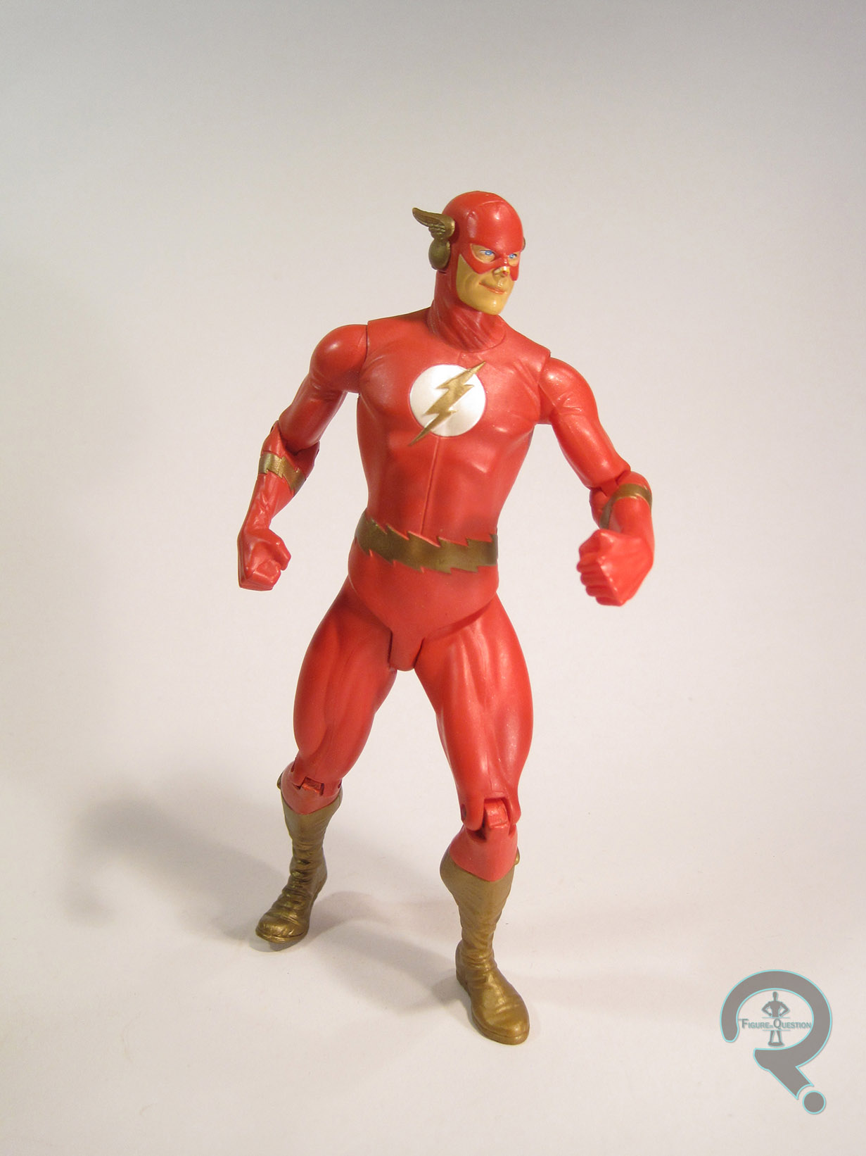
Falcon was released in Series 14 of Toy Biz’s Marvel Legends, which was their penultimate series for the line.  There were two versions of Falcon available: classic and modern.  The one seen here is the more common classic version, based on Falcon’s second costume.  The figure stands a little over 6 inches tall and has 40 points of articulation.  Falcon was built on the body from the first ML Iron Fist, which is an interesting choice to say the least.  While the Iron Fist body looked great in the prototype stage, it suffered from some real issues on the final figure, and a lot of that was passed on to Falcon.  The biggest issue is the shoulders, which jut way too far out.  Also, the under the shoulder joint fails to go all the way into the torso, leaving his arms forever slightly out to the side.  He looks like his arms are connected to his torso by a weird tube thing.  In addition to the arms, the exposed portion of the torso looks more like a grill rack than an actual person’s pecs, which makes Falcon look rather frightening.  Beyond that?  I guess the rest of the sculpt is decent enough.  The body was a lot less gangly than a lot of the TB Legends so that’s good, and the legs are actually not badly done (well, apart from those crazy nonexistent muscles).  In addition to the Iron Fist pieces, Falcon got a new head, forearms, hands, and feet, as well as slightly tweaked upper arms and shins.  The head’s always been one of my favorites from this era of Legends; it just really seems to capture the character well, and just has a nice heroic quality about it in general.  The hands are probably some of the most convincing hands TB ever put on one of their Legends, but also serve to showcase just how stupid the finger articulation was most of the time; what good does that joint do the figure?  The forearms and biceps have the wings attached.  The segmentation of the design allows for much more natural posing than was exhibited in the MU Falcon, and the wings are quite nicely detailed, with each feather being carefully defined and textured.  In terms of paint, Falcon is about what you’d expect from a TB-era Legends figure; lots of washes and airbrushing that vernally looked much better on the prototype than on the mass produced figure.  For some reason, all of the joint pins have been done in bright red plastic.  In the case of the elbows and gloves, this means there’s paint somewhat sloppily thrown over them to cover this up, but for the discs in the shoulders and the neck, this means a bright red stripe running across his skin.  Also, this figure seems to be exhibiting an issue similar to the Young Avengers Patriot figure where the pieces molded in white are slowly soaking up the color from the much darker joint pins, which is a slightly disturbing thing to see.  Both versions of Falcon were also plagued by a mix-up in the assemble process, causing the paint on the pelvises to actually correspond with the other version of the figure.  Amusingly, a similar issue showed up on the prototypes, only it was the forearms/hands that were mixed up that time.  Falcon included his trusty bird sidekick Redwing, who can be plugged into Sam’s back, as well as the lower torso of Series 14’s BaF Mojo.

THE ME HALF OF THE EQUATION

Series 14 is one of the few series of Legends where I wanted every figure in the line-up, and Falcon here was no exception.  While I actually got most of this particular series for Christmas the year they were released, I didn’t get Falcon as a gift.  I ended up getting him from Cosmic Comix, who were getting a pretty steady stream of Legends at that point.  The figure hasn’t aged very well at all, but I was very happy with him back in the day.  I’d love to see Hasbro redo this guy at some point.

#1212: Dr. Gero

DR. GERO

DRAGON BALL Z (IRWIN TOYS)

gero1

In the four prior Dragon Ball Z-related reviews on this site, I’ve made it no secret that the Android Saga is my favorite era of the show.  That’s been fairly evident in the choices of characters I’ve collected.  Today’s figure, Dr. Gero (aka Android 20), is no different.  Of course, so far, the figures have also all been from Bandai’s SH Figuarts line.  That’s where today’s figure differs, instead hailing from Irwin Toys’ Dragon Ball Z line that ran concurrent with the US-run of the show.  Let’s have a look!

THE FIGURE ITSELF

gero2Dr. Gero was released in the fifth series of Irwin’s Dragon Ball Z line, which hit in 2001.  At that point, the show had moved onto the Cell Saga, and most of this series reflects that, with Gero being the only Android Saga figure in the set.  The figure stands a little over 5 inches tall and he has 11 points of articulation.  Not a lot of movement there, but it was actually pretty good for the time.  Gero sported a totally unique sculpt, patterned after his appearance on the show.  It’s not quite as accurate as the Figuarts, but still a surprisingly solid recreation.  The basic look is definitely there, and there’s plenty of detail work, especially on the shirt.  I do sort of wish areas such as the pants had a little more detailing to them, and the face is a touch too wide and squat (Gero was quite gaunt), but it’s not horribly off.  I appreciate that they even sculpted in his brain under the dome, since that’s the sort of thing that can get overlooked.  Like the sculpt, the paint isn’t perfect, but is still more than serviceable.  The colors are all a pretty good match for the onscreen appearance, and most of the application is pretty clean.  He doesn’t really have any sort of accent work, which certainly would have helped the sculpt shine a bit more, but for the period, he’s not bad.  Gero was originally packed with his hat to cover his brain dome and a trio of dragon balls, however, my figure did not have them.  Still, that’s a pretty cool assortment of extras, especially for a more minor character like Gero.

THE ME HALF OF THE EQUATION

I never got into DBZ figures when the show was still on.  Almost bought a few of them numerous times, but just never did.  So, I got Gero second hand.  He’s another 2nd Avenue find, actually.  He was in with a bunch of fast food toys and such, for like $2.  Since I had the Figuarts Androids and the likelihood of a Figuarts Gero is rather slim, I figured he was worth it.  He didn’t come with any of the extras and he’s rather beaten up (he’s actually missing part of his right thumb; I carefully shot around that), but he cost me $2 and he scales well enough with the Figuarts stuff that I feel he was worth my time.

#1211: Lt. Cmdr. Geordi LaForge

LT. CMDR. GEORDI LaFORGE

STAR TREK: FIRST CONTACT (PLAYMATES)

geordifc1

While I’ve been exposed to Star Trek pretty much my whole life, my only real solid memories of the franchise from my childhood are seeing Star Trek: First Contact in the theatre when it was released (and subsequently getting it on Laserdisc when it came to home video.  For over a decade, that was literally the only way we owned it.  I’d have to fire up the laserdisc player anytime I wanted to watch it.  I’m not joking).  By extension, my first real memories of Star Trek toys are the figures from that movie, which are still some of my favorites.  Today, I’ll be looking at that line’s version of  Enterprise-E’s chief engineer Geordi LaForge!

THE FIGURE ITSELF

geordifc2Geordi was released as part of Playmates’ Star Trek: First Contact line, which hit shelves in early 1996.  The line was noteworthy at the time for abandoning the scale used by all of the prior Playmates Trek figures, opting instead for a larger size.  As such, the figure stands just shy of 6 inches tall.  He sports 14 points of articulation; he and all the other main crew members were given additional thigh swivels, which greatly improved their ability to sit. Of course, the larger scale meant they weren’t compatible with any of the prior vehicles or playsets, so he doesn’t actually have anywhere to sit, but that’s neither here nor there.  Movement is movement.  Prior Trek lines had done their best to give each crew member their own unique body sculpt, but the First Contact figures went for the more obvious shared body idea.  Geordi shares his body with both Data and Picard.  It’s a decent enough sculpt.  The details of the uniform are rather on the simplified side, and they’ve cut down on some things, such as the number of ridges on the grey part, and the seam at the front of the collar.  All of the key details are there, which is good I guess.  Honestly, it’s not that much of a departure from the smaller figures, so I guess the consistency is good.  The build on the body works well enough for Burton (and the other three actors mentioned).  The head sculpt is really big, definitely a bit out of scale with the body.  I don’t think its really any more out of scale than any of the smaller figures, but it’s definitely more noticeable here.  There’s a passable likeness in there, but I can’t say its one of their best (which is kind of a shame, because the First Contact figures overall had some of the best likenesses Playmates produced).  Still, it’s not a bad sculpt, and has some decent texture work, which Playmates didn’t always put on their figures.  The paintwork on Geordi is serviceable.  The body is fairly basic, but it’s clean and the colors are right, so that’s good.  The head has some more in-depth work, and the eyes in particular look really good (Playmates was really good at eyes).  Geordi was packed with an assortment of various gadgets, all molded in black, as well as a display stand shaped like a communicator badge.

THE ME HALF OF THE EQUATION

Geordi was my second figure from First Contact.  I got him on a day out with my dad, who took me to Toys R Us to get him (and then I think we got lunch and he read me some Norse mythology.  It was a cool day).  I know I specifically requested this figure, because my cousin Noah had one and I really wanted my own.  I remember being surprised that he didn’t include his visor (despite having already seen the movie and knowing he didn’t have it anymore).  He’s not the most thrilling figure, but I have fond memories of getting him, and that certainly goes a long way!

#1210: C-3PO

C-3PO

STAR WARS: THE BLACK SERIES

c3pobs1

Hasbro’s Star Wars: The Black Series has been running almost 5 years now, and over the course of that 5 years, we’ve gotten the main look for just about every major character from the Original Trilogy.  However, one major character has been pretty consistently absent: C-3PO.  Now, obviously, with a character like Threepio, it’s not a question of if he’s going to be made, but rather when he’s going to be made.  You don’t just willy nilly leave out one of two characters to appear in every film in the franchise.  So, when his name popped up as one of 2016’s upcoming figures, no one was really surprised.  Well, that is, not until they saw the figure, standing there in all his red-armed, The Force Awakens-glory.  Why would the first release of this much anticipated character be what is undoubtedly a one-off look?  It turns out Hasbro had more up their sleeve, and a regular Threepio found its way to release.  I’ll be looking at that figure today.

THE FIGURE ITSELF

c3pobs2This C-3PO figure is Walgreens’ 2016 Star Wars: The Black Series exclusive.  This has been a point of contention for a lot of fans, since many of them think this Threepio should have had the main retail slot, and the Force Awakens figure should have been made the exclusive, citing the second version as a less necessary variant.  While I can’t argue with that, I can sort of understand why the figures ended up the way they did.  In 2015, Walgreens got stuck in the Emperor’s Wrath Darth Vader as their exclusive, and sales on him were pretty soft.  With that in mind, I can easily see Walgreens pushing for a higher profile exclusive.  On Hasbro’s side, I can see them feeling that Threepio might be more easily acquired for some fans as an exclusive item shipped in solid cases of himself, as opposed to being stuck in a revision assortment of the main line, which may or may not get put out (I can attest to having seen more of this guy out in the wild than I’ve seen of his red-armed counterpart).  In addition, Threepio has traditionally been a slower seller than the rest of the main characters, a fact Hasbro is likely banking on.  Ultimately, it’s not the ideal solution, but it’s workable.  The figure stands 5 1/2 inches tall and has 21 points of articulation.  Early reports had me worried that this guy wouldn’t be very posable.  The final figure lacks any elbow joints, but this ends up having little effect on the posability, and the rest of the joints offer a more than serviceable range of motion.  Threepio’s sculpt is shared with his Force Awakens version, but is otherwise totally new.  It’s a very strong sculpt, and does a really solid job of capturing Threepio’s basic design.  There’s a lot of really sharp detail work, and he’s definitely one of the best figures in the line in terms of working in the articulation.  The arms do seem a touch long when compared to the legs, but it’s only barely noticeable, and far from the worst case of this in the line.  Threepio’s paint is pretty decently handled; Hasbro let fans know from the get-go that this figure wasn’t going to be vac-metalized like many of the smaller Threepios have been.  Some fans were a bit let-down by this, but I find myself not minding that much.  While the process is fine on smaller figures, it can rob a sculpt of a lot of its best details, and on larger, more articulated items, it can also be rather susceptible to damage.  I was happy to see they opted for gold paint instead of gold plastic, as it allows for a brighter sheen and a more consistent application of the color.  The only part that seems a bit odd to me is the eyes; rather than the usual flat yellow, they’ve been done with three white dots on each eye.  It’s not terrible looking from far away, but looks quite strange up close.  Threepio includes no accessories, which is a real letdown, especially since there are technically no new sculpted pieces here.  The communicator from the Death Star would have been nice, especially since they already have the tooling for it. Oh well.

THE ME HALF OF THE EQUATION

News broke on this guy back around Rogue Friday, and I pretty much immediately started looking for him.  I didn’t have much luck, but on a hunch, I stopped at a slightly out of the way Walgreens on the way home from grabbing some dinner last month.  He wasn’t in the proper action figure aisle, but I remembered that a lot of Walgreens stores had a separate Star Wars end display, and, sure enough, there he was.  Odd choice of distribution aside, this is a really good figure, easily the best Threepio that Hasbro’s put out.  Hopefully everyone that wants one can get one!

c3pobs3

#1209: The Flash

THE FLASH

JUSTICE (DC DIRECT)

flashjust1

A quick glance around the internet tells me that this may be a slightly controversial opinion, but I really love the work of Alex Ross.  Marvels and Kingdom Come are obviously the standouts, but in the late ‘90s/early ‘00s, his work was the best source of classic DC Comics material out there, which was something of a godsend for me, a classic comics fan born into the wrong era. In that regard, his 12-issue maxi-series Justice, which was effectively Challenge of the Superfriends on an even more epic scale, was right up my alley.  The fact that it got a whole line of figures courtesy of DC Direct?  Icing on the cake.  Today, I’ll be looking at my first figure from the line, Barry Allen, aka the Flash!

THE FIGURE ITSELF

flashjust2The Flash was released in the first series of Justice figures from DCD.  This was only the second Barry Allen Flash we’d gotten from them, and the first time he’d been released solo.  The figure stands about 6 1/2 inches tall and has 9 points of articulation.  Not a ton of movement, but it was an incredible step up from the prior Kingdom Come figures, which had what can be described as “minimal” movement at best.  He’s based, of course, on Alex Ross’s depiction of Barry from not just Justice, but also the tabloid-sized specials DC put in the early ‘00s.  It’s really just Barry’s classic costume styled as if it were made from real fabrics and worn by a real person, but that’s a pretty good look.  The sculpt on this guy was handled by DCD’s main sculptor at the time, Tim Bruckner, and it’s not a bad stab at this particular design.  The main issues I would cite with this figure come from its desire to be two different things simultaneously.  They wanted him to be in a sort of a running pose (something no Flash figure they’d released up to that point was capable of pulling off), but also be able to stand up relatively straight, like the rest of the line.  The end result is a figure with a rather static and stiff upper half, and a lower half that looks to be mid-lunge.  With a bit of careful posing, you can get him to look fine (which is more than can be said for some of DCD’s later output), but he always seems ever so slightly off.  On the plus side, there’s a lot of fun detail work on the sculpt.  The costume sports plenty of wrinkles and stretched fabric, to make it more convincing that he’s not just sporting body paint, and there’s even a seam running down the front, showing how he gets the costume on and off.  The boots are heavily wrinkled and very obviously a different material than the rest of the costume, and there’s even the appropriate treading on the soles.  The head is some pretty solid work as well; the face under the mask displays Barry’s goofy charm pretty well, and the mask has a seam running across the forehead, much like Adam West’s Batman Cowl.  The paintwork on Flash is pretty good, but I have one small complaint: they used gold in place of yellow.  It’s not an uncommon practice, and this is far from the first Flash to do so, but when companies do this, they almost always use this dark and rather dull gold.  In the case of the Flash, this robs him of some of his costume’s boldness and clash, and on this particular figure, it has the unintended effect of sort of reversing the dynamic of his costume and making the red the lighter color in most lighting.  A more vibrant gold would have looked a bit better.  Apart from that, the application is all pretty clean, and I do really like the slightly pearlescent red they’ve gone with.  Barry’s only accessory was a rather large and unruly display stand, which was the same one included with every figure in this line.

THE ME HALF OF THE EQUATION

Despite getting most of my DC Direct figures from Cosmic Comix, I actually got Flash from a Suncoast.  I think CCX had sold out of Flash by the time I got there, so I ended up finding him while on a mall outing with my Grandmother and my cousins.  I think he may have even been on sale.  I was quite excited to get him, since I didn’t yet have a Barry Allen in this scale.  He remained my go-to Flash figure until he was eventually supplanted by the Darwyn Cooke-styled Flash from New Frontier.  He’s not a perfect figure, but he’s a pretty solid one, and he definitely brings back some fond memories.

#1208: Colossus

COLOSSUS

MARVEL SELECT

colossusms1

Wow, it’s been a really long time since I’ve reviewed a Marvel Select figure. <Looks back at reviews>  Holy crap, it’s been 506 reviews since I last looked at a Marvel Select figure.  That’s quite a while.  Well, why not pull something out of the archives, then?  Today, I’ll be jumping over into the world of Marvel’s merry mutants, the X-Men, and looking at one of my personal favorite members of the team, Piotr Rasputin, aka Colossus.

THE FIGURE ITSELF

colossusmswilsonColossus is the 75th figure in Diamond Select Toys’ Marvel Select line, released in 2012.  He’s one of only two figures to hit that year, largely due to the focus on a certain team of Earth’s Mightiest Heroes who happened to have a movie released that year.  He continued the trend of X-Men based upon the early ‘80s line-up of the team (the other X-Man from 2012, Storm, also followed this trend).  The figure stands almost 9 inches tall (he’s a big guy) and he has 30 points of articulation.  He’s one of the earlier instances of near-Marvel-Legends levels of articulation for a Select figure, and it’s genuinely impressive just how much movement they were able to get into this guy, given his mass.  Colossus sported an all-new sculpt.  It doesn’t appear to be based on any particular artist’s rendition of Piotr, but it does lean a little more modern in terms of design sensibilities than a lot of Colossus figures do.  This is most notable in the face, which lacks the usual rounded features in favor of something more sharp and angular.  While I can’t say it’s my go-to Colossus look, it’s certainly not a bad looking rendition of the character.  The body continues some of the stylization present in the face; earlier renditions of Colossus tended to be more consistent in build, but this guy’s definitely favoring his upper body.  He’s almost sporting Bruce Timm anatomy (though he’s definitely not Bruce Timm styled).  There’s one oddity about the body sculpt, specifically the upper body: the upper portion of his tunic is separate from his actual torso.  While it’s not out of the ordinary for such an element to be a separate piece, the fact that it’s not actual fixed in place in any way is slightly odd.  There’s a fully sculpted torso under there, which leads me to wonder if there was a scrapped variant of this figure sporting his outback costume.  Regardless, you’ll only really notice the separate tunic piece when picking the figure up, and it stays in place well enough.  It also adds an extra dimension to the figure, which is always cool.  In terms of paint, Colossus is very nicely rendered.  The colors are all nice and very vibrant, and everything is very cleanly applied.  There’s a nice subtle accenting to the yellow portion of the tunic, which keeps it from being too plans.  I also quite like the metallic work, especially on the arm bracers.  A lot of the X-Men Select figures included a section of the Danger Room as a display base, and Colossus was no exception.  Well, generally speaking.  He comes with a spike wall, clearly meant to be from the Danger Room, but it’s not exactly a stand, since it doesn’t really support him.  Still, it’s a cool piece, and a nice addition to the armory.

THE ME HALF OF THE EQUATION

Colossus was my second Marvel Select figure, picked up during Cosmic Comix’s Biggest Sale of the Year in 2012.  I had initially been planning to pick up Ultron during that year’s sale, but I got a subscriber coupon a week prior and got him then.  I still wanted to take advantage of the sale, and I’ve always liked Colossus, so this guy was my next choice.  The old Marvel Legends figure has always been one of my favorites, so this guy had quite a bit to live up to, and I think he did just that.  He’s really just a very fun figure.

Flashback Friday Figure Addendum #0003: Sonar Sensor Batman

0003aDid you guys notice I missed a Flashback Friday Figure Addendum?  Because I did, but not until last Saturday afternoon.  Lotta good that did me.  Well, I’m just gonna pretend like I didn’t miss a week.  Today, I’m continuing my chronological look at my earliest reviews with Sonar Sensor Batman!

Continuing the trend of my last two posts, I’m looking at another figure from 1995’s Batman Forever Line.  This guy isn’t quite as significant as the last two, so he’ll be a bit more brief.

THE FIGURE ITSELF

So, like I said above, Sonar Sensor Batman is another Batman Variant from the Batman Forever line.  This one’s a slightly more conventional Batman, though, like Robin, not THE conventional Batman of the line.  This one’s still got the cape because it’s permanently affixed, which was a good move on Kenner’s part.  And he’s got what appears to be a….nipple gun?  I mean, that’s what it looks like(And this is Scumacher we’re talking about here).  It’s right on his right pectoral, and it’s even got those red dots on it.  When you push the yellow button on his belt, the gun flips down, only emphasizing the nipple gun-ness of it.  And I have no idea what any of this has to do with sonar, or sensing for that matter.

THE ME HALF OF THE EQUATION

Not a whole lot on this one.  I remember having it.  I remember thinking he had a nipple gun as a child.  I actually don’t know where I got this one, so I’m going to assume it was a gift.  Regardless, it didn’t really get much play-time as my go to Batman.

Nipple gun.  Heh!

So, this is yet another very brief review.  I really can’t even conceive of talking about a figure in so little words nowadays.

No articulation or height noted either; he’s another 5 and 5 for those that are curious.  Missing from my original review was his super sick neon orange shield.  Still have no clue where the “sonar” part of his name comes in, but he’s certainly well defended.  The center of the shield is a removable disc, which served as ammo for the disc launcher he also included (mine is, sadly, still missing).  It definitely ups the goof factor.  He can’t really stand very well while holding it, either; I had to do some very strategic posing for the photo.

I mentioned in the original review how this guy didn’t get much playtime as my go-to Batman, which is true, but a re-watch of the Batman: The Animated Series episode “His Silicon Soul” reminded me what he did get a lot of use as: Batman’s robotic duplicate.  …Who has a nipple gun.

#1207: Lando Calrissian as Skiff Guard

LANDO CALRISSIAN AS SKIFF GUARD

STAR WARS: THE POWER OF THE FORCE II (KENNER)

landoskiff1

Man, the Star Wars characters sure do like disguising themselves, don’t they?  At some point in the franchise, just about every main character has gone incognito (even Chewbacca).  And, of course, toy companies love this, since it’s a pretty easy way of milking another variation of the main characters to make into an action figure.  Lando Calrissian was actually the very first character to get such a figure (well, technically.  He and Leia as Boush were released at the same time, but Lando’s date stamp is from ’82, while hers is from ’83).  That’s not actually the figure I’m looking at today, though.  It seems Lando’s disguised look is more enduring than some of the others, seeing as it makes up roughly a third of all of his figures.  Today, I’m looking at Kenner’s second stab at this particular look.

THE FIGURE ITSELF

landoskiff2Lando was released in the first assortment of the 1997 series of Kenner’s Staw Wars: Power of the Force II.  It was the second version of Lando in the line and his fifth figure overall.  As touched on in the intro, this figure is based on Lando’s Skiff Guard disguise from the opening of Return of the Jedi.  Honestly, even as a disguised look, this is the most action-oriented design we saw Lando in, and I think that’s where a lot of its appeal comes from.  The figure stands about 3 3/4 inches tall and he has 6 points of articulation.  Lando comes from later in the POTF2 line, which was after the sculpts has calmed down a bit and worked out some of the ‘90s over-stylization.  He’s still a fair bit more jacked than Billy Dee Williams ever was, but that was on par with the rest of the line.  His head sculpt was the same one used for the Bespin version of Lando (and later the General version as well).  It’s not a spot-on Billy Dee Williams, but it’s still closer than most of the likenesses at the time.  And at least it was consistent, right?  The body sculpt was all-new to this figure.  Apart from the aforementioned “jacked” nature of the build, it’s a decent enough translation of the onscreen design.  He also ditches a lot of the pre-posing from earlier in the line, instead getting a more natural pose, and thereby offering a bit more versatility.  Lando’s paintwork is generally pretty solid.  Nothing spectacular, or particularly noteworthy, but it’s certainly well-done.  The colors are all well matched to the costume from the movie, and all the application is pretty clean.  There are some slight mismatches between some of the paint and molded elements, but nothing super awful.  Lando originally included a removable mask and vibro-axe, but my figure hasn’t had either in well over a decade.

THE ME HALF OF THE EQUATION

This is my very first Lando action figure, though he didn’t technically start out as mine.  He was one of a handful of Star Wars figures that I helped my Grandmother pick out at KB Toys back in the day so that my cousin Patrick and I would both have some figures at her house to play with (since we spent at least one day of the week there).  Eventually, Patrick grew out of his Star Wars phase and neither of us was spending as much time there, so Lando and the others eventually came home with me.  He’s the only one that made it through all of my various collection purges, mostly due to being the only Lando figure I owned for a good long while.  He’s actually not a bad figure, and he’s probably aged better than most of the others in this line.

#1206: Daphne Blake

DAPHNE BLAKE

SCOOBY DOO (CHARACTER OPTIONS)

daphneblake1

Hey, remember last week when I reviewed Freddy and the Mystery Machine?  Yeah, well, I bet it’s not a huge surprise to find out that wasn’t the only Scooby Doo purchase I’d made in recent history.  Scooby Doo has always operated by pairing characters off; Scooby and Shaggy, Fred and Daphne, Velma and…one of the other pairs, you get the point.  Anyway, since I had Fred, it just seemed wrong to not at least pick up his better half, Daphne Blake!

THE FIGURE ITSELF

daphneblake2Daphne was released a few different ways.  She was included in a five-pack of just Mystery Inc, a ten-pack with five classic ghosts, and in one of two two-packs, with either the Skeleton Man or the Witch-Doctor.  Since my figure was picked up loose, I can’t actually say which particular release it is.  Regardless, the figure stands about 4 1/2 inches tall and has 10 points of articulation (though the hair makes her neck joint essentially useless).  Like Fred, Daphne is based on her design from Scooby Doo: Mystery Incorporated.  It’s not a huge departure from her classic look; essentially, the main difference is some sharper angles here and there.  The figure’s sculpt does an okay job of capturing her design, though I’d say she’s definitely got a look that just doesn’t translate so well into three dimensions.  The head (especially the face) seems rather on the large side, as do the hands and feet, and her limbs just seem a bit stubby.  Where Fred’s design is a lot of hard angles, and is therefore a bit more forgiving of some slight slip-ups, Daphne’s is a bit more of a careful balance, which causes her to look a bit more off when one or two things are out of whack.  With all that said, her sculpt is certainly passable, and you can very easily tell who this is supposed to be and even which iteration of the show she’s based on without too much trouble.  In terms of paint, Daphne’s decent enough.  There’s a bit of slop here and there (and my figure’s exhibiting a bit of wear), but the application is pretty solid overall.  The purple on her skirt doesn’t quite match the rest of the figure (purple is a really hard color to work with), but aside from that, the colors look quite nice; she’s quite vibrant, which is always a plus.  Daphne included no accessories, but aside from her own ransom note, what exactly would you give her?

THE ME HALF OF THE EQUATION

After picking up Fred and the Mystery Machine, I knew I at least wanted a Daphne figure to go with him.  I was planning to track down one of the two-packs, but I was at Yesterday’s Fun and they had her loose for $3, which was good enough for me.  She’s not going to be winning any awards or anything, but for the price point we’re looking at here, she’s more than acceptable.  Now, I just need to resist the urge to finish the gang…

daphneblake3

#1205: Greg Universe & Watermelon Steven

GREG UNIVERSE & WATERMELON STEVEN

STEVEN UNIVERSE: PINT SIZE HEROES (FUNKO)

watermelonsteven3

Hey, let’s mix things up a bit and look at something a little different from the usual.  A few months back, Super Awesome Girlfriend introduced me to Steven Universe, and I’m almost all the way caught up now.  I gotta say, I’ve really enjoyed the show quite a bit, and I really like a lot of the character designs.  As of right now, there aren’t any proper action figures from the show (which is a shame, because I would buy a good number of them).  However, Funko has the license (because why wouldn’t they?  It’s a license that *exists*, so that falls under their usual category of coverage), and they’ve done the characters from the show in a few of their in-house styles/line.  One of they more recent lines is Pint Size Heroes, which just so happens to be the source of my first Steven Universe merch.  Today I’ll be looking at Steven’s dad Greg, as well as one of the Watermelon Stevens from the episodes “Watermelon Steven” and “Super Watermelon Island.”

THE FIGURES THEMSELVES

watermelonsteven4These two are both part of the first series of Funko’s Steven Universe: Pint Size Heroes, and they come blind-bagged.  There are a few store-exclusive figures in the set, but Greg and Melon Steven are both regular releases.  Greg is packed 1/12 and Steven is 1/24.  The two figures stand about an inch and a half tall (Steven’s got a little extra height, thanks to the hair) and the each have a cut joint at the neck.  They share the same body piece; it’s pretty simple, and looks a bit like a Russian nesting doll.  The only real discernible detail is the presence of arms on either side.  The two are topped off by unique head sculpts (well, unique in terms of this review; Steven’s head is shared with all the other Stevens in the set).  Steven’s head is the stronger, since his design is already a bit closer to the style, but Greg’s sculpt watermelonsteven2certainly captures the important parts of the character.  The rest of the details are rendered via paint.  Greg’s is the slightly more complex paint job.  It’s pretty decent overall; you can make out his tank top and cut-off jeans, and even his slight farmer’s tan (side note: how does he keep that going?  We almost never see him in anything but this exact outfit, and yet he’s perpetually got the outline of a t-shirt we’ve never seen him in).  The mouth is a little weird, and the eyes seem just a bit too far apart to me, but it’s clear who he’s supposed to be.  Steven’s paint is a bit more simplistic, but I also think it’s the stronger work.  The greens go well together, and they’re pretty evenly applied, so that’s good.  Also, the eyes work better on this figure, since the Watermelon Stevens just had black dots for eyes anyway, thus requiring less translation.  The mouth is a cool touch, and I really like the little spots inside to indicate the texture.  Neither of these two came with any extras (nor do any of the other figures in the line, for what it’s worth).

THE ME HALF OF THE EQUATION

So, back on our anniversary, I got Super Awesome Girlfriend a stuffed Lion and grabbed one of these Pint Size Heroes at random.  They all come with a little foldout showing the rest of the figures in the set, and she’s spent the last month dead-set on collecting them all (I’ve created a mooooonnnnsterrrrr!).  Of course, with them being blind-bagged, that means a good deal of extras.  While most of the extras have gone to another friend of hers, I got dibs on Greg and Watermelon Steven, since Greg’s my favorite character and “Super Watermelon Island” is one of my favorite episodes.  They’re not my usual thing, but they’re still a lot of fun.  Now, if I could just get some proper action figures, that’d be great.