#0517: Boba Fett

BOBA FETT

FUNKO POP! 

BobaFettPop1

You know who has the license to everything? Funko. And when I say everything, I mean literally everything. That includes mega-toy-selling license Star Wars. What’s kind of funny is that Funko has separate deals for Star Wars, Marvel, and Disney, due to getting them before Disney bought the former two. Which means that Funko actually had the “full” Disney license before Disney did! Isn’t that kind of wacky? No? Maybe just vaguely interesting? I’ll settle for a solid “not boring.” Anyway, one of the earliest licenses to appear in Funko’s popular Pop! form was Star Wars. Today, I’ll be taking a look at the line’s version of everyone’s favorite bounty hunter who never actually does anything, Boba Fett.

THE FIGURE ITSELF

BobaFettPop2
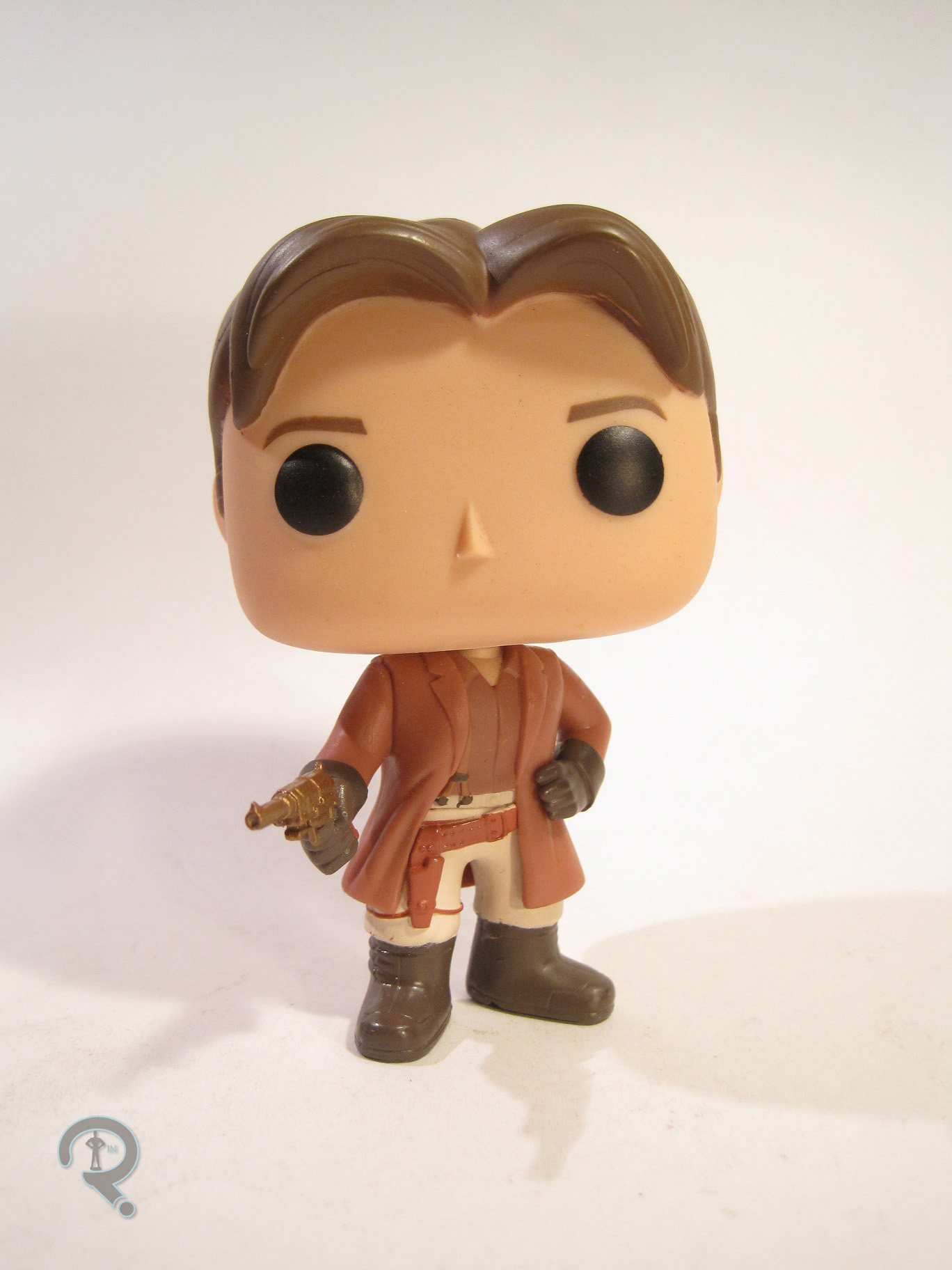
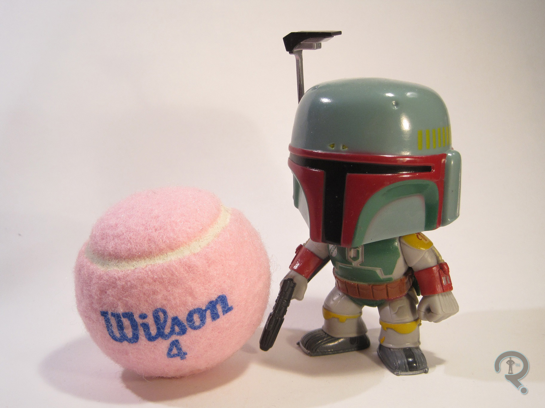
Boba Fett was figure #08 in Funko’s Pop! Star Wars line. He was one of the initial assortment of figures in the line, which isn’t all that surprising, given the character’s popularity. The figure is about 3 ½ inches tall. Like the Marvel Pop! figures, contractual issues meant that the Star Wars Pop!s couldn’t actually be “figures.” So, Boba here is actually a bobble head, with no real articulation. Like just about every other Pop! figure, Boba features a unique sculpt. The sculpt features some of the usual Pop! trademarks, such as the larger, slightly more squared-off head, and the more squat body. However, the helmet means he doesn’t have the usual Pop! face. The sculpt is fairly nicely detailed, though some of the details are a little on the soft side. It’s a bit more forgivable on Boba, since the bobble heads are made from slightly thinner plastic than regular Pop!s. All of the necessary elements of Boba’s design are present, simplified down a bit, but they’re all there. There’s no denying who this guy is meant to be. Boba’s paintwork is pretty decent work. Like most of Funko’s efforts, there are a few spots with bleed over, and one or two fuzzy lines. The colors are all pretty well chosen and well applied, so that’s cool. It’s worth noting that he’s based on Boba’s appearance in Return of the Jedi, which is indicated by his gauntlets being colored red. In a rare move for a Pop! figure, Boba included one accessory: a black display stand with the Star Wars logo. The figure doesn’t have any issues standing on his own, but it’s a cool touch nonetheless.

THE ME HALF OF THE EQUATION

So, umm, I’m pretty sure that I bought Boba from Target when these guys were first released. Amazingly, I don’t have a direct recollection of getting him. I think that I picked him up shortly after moving into my first college dorm room, so I may have been looking for stuff to populate my desk. I believe the last of the Robot Chicken: Star Wars specials had aired around that time, so I was on a little bit of a Boba Fett high. Anyway, Boba’s actually a pretty decent Pop! and ended up encouraging me to keep up with the style after I had been a little disappointed by the DC Pop!s. To date, he’s actually the only Pop! Star Wars figure I own (though I really do need to get that Biker Scout…).

#0516: Katma Tui

KATMA TUI

DC UNIVERSE CLASSICS

KatmaTuiDCUC1

Occasionally, the randomized list from which I pick the next review doesn’t seem quite as random as it should be. Right now, it seems like it’s in a DC Universe Classics sort of a mood. Which is alright, I guess. This does, however, mean that my typical re-hash of my issues with Mattel seems more than a little redundant. So, yay for the readers! No “Ethan hates Mattel” rant.  One of the things that the line definitely had a focus on (outside of re-creating Super Powers) was the Green Lantern side of the DC Universe. Since I’m a pretty big GL fan, I really didn’t have a problem with that. So, what do you get when you combine DCUC’s penchant for making somewhat obscure characters with a focus on Green Lantern stuff? You get Katma Tui, (gesundheit!) one of the earliest non-earth Green Lanterns. Katma was somewhat prominent in the GL books into the mid-80s, where she was paired up quite nicely with Earth GL John Stewart. Then she was killed off rather stupidly, and, in a rarity for comics characters, she actually stayed dead. Hence the obscurity. But, here she is, so let’s review the figure!

THE FIGURE ITSELF

KatmaTuiDCUC2Katma was released in the 11th Series of DC Universe Classics. The series marked the first real entrance of GL stuff; John Stewart was the anchor figure, Kilowog was the Collect-n-Connect, and there were also two GL villains (Shark and Cyborg Superman) featured. Katma mostly squeaked in by association. The figure is about 6 inches tall, with 25 points of articulation. Katma is based on her late 70s look, from when she was one of the main characters in Green Lantern Corps. It’s the way the character looked when she was at her best, and it’s more distinctive than the generic GL uniform she had before, so it’s a good choice of design. Sculpturally, Katma’s rather straight-forward, especially for a DCUC figure. She was built on the first female buck (the only one at the time) with a new head and right hand. The buck isn’t a bad body, though it isn’t without issues. The most glaring is how small the arms are in comparison with the rest of the figure. If they were just a little bulkier, they’d look a lot better. Other than that, the body’s pretty decently proportioned (an argument could be made that the legs are a touch too long. I’m a rather long-legged person, so I don’t notice that kind of thing very often). No insanely large breasts or impossibly small waist, which is always nice to see. The new pieces fair better than the re-use here. He hand is pretty standard, but still well sculpted. The head is easily the best piece of the figure. It’s a pretty much pitch-perfect recreation of how Katma’s been depicted in the comics. To a fan of the character, it’s pretty clear who it’s meant to be. The hair in particular is spot-on, both in shape and in the level of texture and detail present. The figure’s paintwork is decent, if maybe not outstanding. The work on the head is generally pretty clean, and they managed not to make her eyes look too wonky, so that’s good. The costume isn’t quite as good. The logo looks pretty sharp at least, but most of the transitions between the green and black areas of the figure are really soft, which doesn’t grant her the sharp look she should have. Also, this is probably more of a personal preference thing, but the green just feels too dark. Katma came armed with sword and shield constructs, as well as the torso of Kilowog.

THE ME HALF OF THE EQUATION

Like Green Arrow from the other day, Katma was a DCUC figure I was actually able to find at retail. My dad and I ended up coming across a pair of Katmas at our local TRU, which was pretty cool. If I’m honest, Katma’s not one of the most thrilling DCUCs produced. That said, she’s still a pretty solid figure, and I’m happy that the character was given the chance to get an action figure. My GL collection wouldn’t have been the same without her!

#0515: Hellboy

HELLBOY

HELLBOY: ANIMATED

HellboyAnimated1

Back in the days before every comic book property under the sun was getting a movie or TV deal, it was a pretty huge accomplishment for anything that wasn’t Batman or Spider-Man to make it to the big screen. Such was the case with Hellboy, which surprised everyone by not only making it to the big screen, but also managing to do so without fundamentally changing everything about the series. That said, getting one movie made is one thing. Getting a sequel? Even less likely. In the years that followed the first Hellboy film, the film’s director, writers, and principle cast members decided to continue their fun through a series of direct-to-DVD animated movies. They produced two, Hellboy: Sword of Storms and Hellboy: Blood and Iron, before eventually returning with the live action Hellboy 2. While Mezco Toyz held the licenses for the comic and film incarnations of Hellboy, the animated license was picked up by Gentle Giant, at the time known for their statue and bust work (now they’re the ones responsible for the sculpts in Hasbro’s Star Wars: The Black Series and Marvel Legends Infinite Series). They produced HB and his teammate Abe Sapien. Today, I’ll be taking a look at Big Red himself.

THE FIGURE ITSELF

HellboyAnimated2Hellboy was released in two different ways, though the figure is the same both places. He was available as a single figure, or packed in a set with the two movies. My figure comes from the set with the movies. The figure is about 6 ½ inches tall, with 30 points of articulation. The figure is based on the standard Hellboy design used in both animated films. He’s done here in his sans-coat look. One has to wonder if there might have been plans to do a coated version later down the line. The figure’s sculpt was original to him, and it’s really quite well done. In the films, HB’s proportions are rather exaggerated. The figure does a nice job of translating them, resulting in an (overall) sturdy figure, to a level that’s pleasantly surprising. From his head to his hooves, HB’s sculpt is very carefully handled, resulting in something that not only replicates the cartoon look, but also looks pretty great in three dimensions. Something that sets this figure apart from the vast majority of animation-based figures is texture. Many animation figures attempt to replicate the totally smooth look of the animated character, which can be rather problematic if not done right, and can also end up a little boring. HB, on the other hand, is pretty much coated in unique textures. The best work is definitely on the Right Hand of Doom, which is appropriately rocky looking, but he also has a rather neat orange peel-style texture on his skin, which is strangely appropriate for the character. The texture really catches the light just right and ends up making the figure quite interesting to look at. My only issue with the sculpt is that the shins are so thin that one of them snapped on my figure. However, this is less the sculpt’s fault and more an inevitability of the character design. Still, it’s something that warrants caution. The paint on this figure could have been rather flat, but it’s actually not, which is pretty cool to see. The base paint work is pretty much par for the course. There are a few spots of bleed over and missed lines, but nothing too bad. The strength of the paint really lies in the accent work, which does a lot to bring out the best of the sculpted work. The musculature is all outlined by some nicely handled dark red airbrushing, the RHoD has a black wash to bring out the cracks in the rocky surface, and the belt/pouches/holster have all been given a sufficiently worn looking paint job. All of this is above what is generally expected for an animation figure, which just makes it that much better. Hellboy included his signature gun, The Samaritan, an extra left hand to properly hold it, the Sword of Storms, and a display stand with the Hellboy Animated logo on it.

THE ME HALF OF THE EQUATION

I kinda missed these figures when they were first released, mostly due them being in scale with pretty much nothing I owned. I ended up finding a slightly damaged HB along with the DVDs at this record store called Music for a Song. They were selling it for less than the price of one of the DVDs by itself, so I figured it was probably worth it. I’m glad I found it and decided to go for it, because it’s probably the best Hellboy figure ever made. The articulation’s great, the sculpt is great, the paint’s great. The only thing (at the time) that wasn’t great was that he really didn’t fit with anything else I owned. And then DC Collectibles started doing Bruce Timm-styled figures in the 6 inch scale. Batman/Hellboy team-up FTW!

Hellboy&BatmanAnimated

#0514: Sgt. Flash

SGT FLASH

GI JOE: 25TH ANNIVERSARY

SgtFlash1

YO JOOOOOOOOOOOE!!!! If you’re gonna review action figures, every so often, it’s important to take a look at something from the original action figure line, GI Joe. And, while the original 12 inch Joe was the one who created the whole freaking industry, when you mention GI Joe, most people are probably going to think of the A Real American Hero incarnation that first appeared in 1982. In ’82, Hasbro was looking for a way to revitalize their brand. Instead of selling one large figure, why not a bunch of smaller ones? Each of them could have their own specialty, and if done properly, they could make use of a lot of the same parts, keeping costs down. Thus, the line started off with a group of figures affectionately known as the “Original 13.” The figures offered a mix of more realistic soldiers and some that were a bit more sci-fi inspired. Today’s figure is one of the latter, a laser trooper by the name of Sgt. Flash!

THE FIGURE ITSELF

SgtFlash2Sgt. Flash (originally just Flash, but I don’t think a certain Distinguished Competition was too happy about that name) was released in the 2008 assortment of the GI Joe: 25th Anniversary line. He was part of that year’s first wave of single-packed figures. The figure is about 3 ¾ inches in height, with 22 points of articulation. Flash is obviously based on his original 1982 figure, though a few liberties have been take here and there with the sculpt. The original Flash figure shared more than a few parts with his teammates, but that’s not the case here. The good Sergeant has been fitted with an all-new sculpt. It’s not one of the greatest sculpts the line had to offer. The head is easily the figure’s weakest point. The original was sort of plain and generic, but here he’s kind of a little dopey looking. Something about him really makes me not want to trust this guy with the lasers. Another problem with the sculpt is something that actually affected a lot of the initial 25th figures. The nature of how the lower/upper arm pieces were sculpted seriously inhibits the range of motion on the elbow joints, which ends up being quite limiting on a figure like Flash, who needs to hold stuff. There’s also the issue of his chest armor being divided in half, but that’s a more minor thing. The articulation is actually pretty nice to have there. The rest of the figure’s sculpt is actually pretty great. His jumpsuit has lots of great work on the folds and such, and being able to see the collar of the knit shirt underneath is a cool touch. The quilted pattern of the armor and the etched patterns on the gloves are also very well handled, and add some character to the figure. The paint ends up being the weakest part of the figure. The red, in particular, is pretty bad. It’s uneven, it frequently bleeds over, and there’s a rather noticeable spot on his chest where something got stuck to it while it was drying. The paint on the head does an already lackluster sculpt no favors. The eyebrows are really thick, and just a tad too high, and his eyes look rather lifeless. At the very least, the boots and gloves are well painted, so there’s that. Sgt. Flash includes a helmet with a flip up visor, his trusty laser rifle, a backpack that it can plug into, and a GI Joe logo-stand with his name written on the front.

THE ME HALF OF THE EQUATION

Sgt. Flash was picked up for me by my Dad and my brother. I had just gotten my wisdom teeth out at the time, and I was sitting at home watching my DVDs of the cartoon. They felt kinda sorry for me, so they bought me Flash (as well as General Hawk, who was the real winner of the two). The original Flash figure is one I’ve always wanted, but never gotten. This one’s not quite the same thing, and he’s certainly not one of the best figures this line had to offer, but he does make for a decent stand-in, and he really isn’t that bad.

#0513: City Hunter

CITY HUNTER

PREDATORS (NECA)

CityHunter

For me, my NECA collecting is widely due to their current, super-awesome, handling of Aliens. That line is definitely one of their signature lines, but the line that really, truly defines NECA is their fantastic Predators line. The line first began as a tie-in to 2010’s Predators film, before gradually moving on to the designs of the creatures from the other films in the series. Like a lot of properties from the ‘80s, the Predator franchise has a really strong, really distinctive first film, before switching to films that are of a noticeably lower quality. Predator 2 definitely isn’t up to the first film by any stretch of the imagination, but it’s really not the worst thing ever, and, more importantly, the main Predator design is really cool. So, let’s have a look at one of NECA’s versions of that character!

THE FIGURE ITSELF

CityHunterWilsonThe City Hunter, as he is officially named, was released in the 4th Series of NECA’s Predators line. As noted in the intro, he’s based on the primary Predator featured in Predator 2 (there were actually quite a few secondary Predators featured.) The figure is just shy of 8 inches in height, with 24 points of articulation. City Hunter is appears here sans-bio-mask, meaning it’s after his first run-in with Harrigan, however, he still has both hands, so it’s before they do significant battle. Structurally, the figure shares a number of pieces with the Predators that preceded him, however, he has a character specific head, as well as some unique armor pieces. He also has a brand new pelvis, hips, and upper legs, as the figure is one of the first in the NECA line to sport the ball-and-disc-style hip joints that would eventually become standard for the line. Probably the best part of the sculpt is the figure’s head, which gives a great look at what lies beneath that Predator mask. The mandibles have been sculpted as a separate piece and glued in place, which not only gives the figure a great bit of dimension, but also allows for the mouth to be really detailed. Beyond just the head, every piece of this figure’s sculpt is covered with some sort of texturing or detailing, just like the prop-suit from the movie would have been, and it all looks pretty fantastic. City Hunter’s paintwork isn’t quite as good as his sculpt, but it’s not terrible. The colors all match up pretty well with the colors from the movie, and for the most part the paint stays where it’s supposed to be. The figure also has the appropriate sheens on his skin and armor, to help differentiate them, which is definitely cool. However, there’re a few areas with a bunch of slop, and, most notably, the painting of the fishnets is, at best, erratic. It results in an overall decent effect, but it doesn’t stand up to close scrutiny. The City Hunter is armed with one accessory: the smart disc. While it’s not as cool as the Combi-Staff, the piece is significant in the movie, and it’s nice to see it here. He has a little trouble holding it, but it can be stowed in his side holster quite nicely.

THE ME HALF OF THE EQUATION

After getting pulled into NECA’s Predators line with Dutch and the Jungle Hunter from the first movie, I hadn’t really planned on getting any of the other Predators. But, a re-watch of Predator 2 reminded me of how much I really liked the City Hunter design, so I ended up tracking this guy down on Amazon. He’s a really great figure, and he shows of the best qualities of the line very well. Now, if only there were a Harrigan to go with him!

#0512: Green Arrow

GREEN ARROW

DC UNIVERSE CLASSICS

GreenArrowDCUC1

In a lot of ways, Mattel’s DC Universe Classics was really the true successor to ToyBiz’s run on Marvel Legends. Now, before you grab the pitchforks and the torches, hear me out. Both lines were the hottest action figure line around at the time of release, both offered a surprisingly expansive look at their respective universes, and both were renowned for their representations of obscure characters. They’ve also both begun to show their age, and they were both a pain in the butt to collect. And of course, they both have their fanbases, who don’t tend to like being compared to each other. If I go missing, you know where to look. In the moment, I think I enjoyed collecting DCUC a bit more, just because I gained more of a mastery of tracking stuff down online, which made getting the figures I wanted a whole lot easier. So, why not have a look at one of my favorite figures from that line, Green Arrow.

THE FIGURE ITSELF

GreenArrowDCUC2Green Arrow saw release in the 9th Series of DC Universe Classics. He served as the “anchor figure” of the series. With shows such as Arrow on the air, Green Arrow being an anchor figure nowadays wouldn’t be a huge shock, but at the time, it was actually a pretty bold move. However, given the presence of another 11 series of the line after this one, it’s safe to say it paid off okay. The figure is about 6 ½ inches tall and he has 27 points of articulation. He gets an extra two points of articulation compared to others in the line thanks to some hinge joints at the wrist, in addition to the usual swivel joints. It’s a nice addition, although it would have been nice if they’d made it standard to the line. Green Arrow is based on Oliver Queen’s Bronze Age (read: 70s-80s) appearance. It’s easily the character’s most distinctive look, and it’s one he’s returned to many times over the years. Also of note, it’s the look he had in the DC Super Powers line in the 80s, which was what Mattel was working to recreate.  DCUC generally operated on the buck system, but characters such as Green Arrow tend to need more unique pieces than others, resulting in him being more new than re-use. The waist, upper legs, and shoulders are re-used from the medium sized buck, but I believe everything else on the figure is new. Ollie ended up with one of the best sculpts DCUC had to offer in that regard. All of the little details of the costume are sculpted, and they are done with the necessary precision. They are also spot on to design from the comics, right down to those weird draw string things on the front of his costume. The pointed shoulders of his costume also help to mask the slightly large shoulders that were an issue with the line, and the rest of the pieces being new meant that Ollie ended up with a build that was appropriate to him. The figure’s hands are both sculpted to work well with the accessories, and they really turned out great. The head sculpt really makes this figure, perfectly capturing the Neal Adams Green Arrow of the 70s. He’s got just the right “charming rogue” look, which sells the character really well. In addition, they’ve managed to render his hat in three dimensions without it looking the slightest bit silly, which is really great. Where the figure ends up falling down just a bit is the paintwork. The paint certainly isn’t bad. In fact, the colors are well chosen, and it’s overall pretty clean. However, there’s a little bit of slop and bleed over. The worst thing on my figure is the airbrushing, particularly on the face. What was clearly meant to be a little bit of color on his cheeks ended up looking rather ridiculous, almost to a clownish level. The figure included his signature bow, a few different arrows, and a clear blue display stand. The bow ends up being another point of contention. There’s an arrow molded to it, meaning not only can the other arrows included not be used at all, but he also can’t draw the bow back any further, and he looks silly when just holding the bow one handed. Why Mattel decided to handle it this way (and to continue to handle it so on all the archers that followed) is baffling.

THE ME HALF OF THE EQUATION

Amazingly enough, Green Arrow is one of the DCUC figures I ended up finding at retail with no real issues. I stumbled across him (as well as Black Canary) at my local Target and happily purchased him. Issues with the bow aside, this was one of the best figures that DCUC had to offer, and he still holds up, even while the rest of the line begins to look dated. It’s a shame that Mattel couldn’t keep up the effort they put into this figure.

#0511: Gorn Captain

GORN CAPTAIN

STAR TREK (PLAYMATES)

Gorn1

When people think of Star Trek, more often than not, they’ll think of the show’s main crew members, or perhaps the scantily clad green alien woman. What tends to get overlooked, especially in the case of the original series, is the plethora of alien creatures that appeared on the show. In terms of toys, the aliens tend to get no respect. Often, they’ll be needlessly changed, or under produced, or even replaced by aliens made up by the toymakers. However, under the helm of Playmates in the 90s, the aliens actually did get a little bit of respect. Since the line was so big and they had to keep it interesting somehow, they turned to the aliens to liven things up. One such figure is today’s focus, the Gorn Captain.

THE FIGURE ITSELF

Gorn2The Gorn Captain was part of the Classic Trek 30th Anniversary assortment, released by Playmates in 1996. The assortment was released in waves of 2-3 figures each. The Gorn was from one of the later waves, along with Environmental Suit Kirk and the Mugato. The Gorn Captain is based on the character’s lone appearance in the Classic Trek episode “Arena.” The figure is just shy of 5 inches in height and he features 9 points of articulation. He has less articulation than what was standard for the line, which, sadly, was true for quite a few of the aliens in the Classic Trek line. The removal of the bicep swivels and waist movement are both rather annoying. The figure manages okay without them, but their absence is just baffling. On the plus side, this figure actually ends up making the v joint on the hips work pretty well, which can’t be said for the rest of the line. The Gorn Captain’s sculpt is wholly original to him, and generally speaking, it’s actually very well handled. While Playmates was known to have trouble with proportions on the human figures, creature figures played to their strengths. Aside from the torso being a little bit flat, the figure’s proportions are a close match for the Gorn’s appearance on the show. The sculpt exhibits some stand-out texture work on the skin, something not often seen on a figure from this time. It really helps set him apart from the other figures in the line, and other figures from the time in general. The Gorn had a rather distinctive facial design, and the figure’s head sculpt is a spot-on recreation of the mask from the show. The figure’s paint is generally pretty straight forward, but it’s rather good for the time. Most of the base paintwork is cleanly applied, and there’s even a light application of brown on the figure’s shoulders, which helps to sell the reptilian look of the character quite nicely. The Gorn Captain was packaged with a stone spike, the cannon constructed by Kirk in the episode, three projectiles, a display stand, and a trading card.

THE ME HALF OF THE EQUATION

Back in the 90s, when my dad was collecting the Playmates line, I vividly remember the purchase of the Gorn.  I was fixated on the figure, and have loved the character ever since. According to my dad, he actually went out and bought me a Gorn figure, with the intent to give it to me as a gift. However, it ended up going missing somewhere, so I never ended up getting one. In the years that followed, the Gorn figure always seemed to evade me. Fortunately, one of the dealers at this year’s Farpoint had one amongst a large selection of other Playmates Trek figures. So, I finally have my Gorn figure! Sure, he may not be the greatest figure of all time, but he’s definitely fun, and I’m just super thrilled to own one.

Gorn3


EDIT: Wow, I certainly lucked out in posting a mostly green figure for St Patrick’s Day, didn’t I?  I swear it wasn’t at all planned!

#0510: Hoban Washburne

HOBAN WASHBURNE

FUNKO POP! TELEVISION

WashPop1

Alright, I looked at the Pop! take on Captain Malcolm Reynolds. But, a captain’s only as good as his crew. So, today, let’s look at the line’s take on my personal favorite Firefly character, Hoban Washburne, or Wash for short, faithful pilot of the Serenity. Let’s see how he turned out!

THE FIGURE ITSELF

WashPop2Wash is figure #137 in the Funko Pop! Television line. He’s roughly 3 ½ inches tall and he has the usual single point of articulation at the neck. Wash is sporting a Hawaiian shirt and a flight suit, both of which are signature to the character. Like Mal, I’m fairly certain this particular combo shows up in the series’ pilot episode. It sums up the character really well, so it’s a well-chosen look. He’s been fitted into the style of the rest of the line. He’s got the typical large, square head and big circle eyes, and a smaller, slightly rounder body. Whereas Mal’s head looked rather generic, Wash’s head manages to sum up Alan Tudyk’s likeness perfectly in just a few scant details. The hair, in particular, really helps to sell it. It’s cleanly sculpted, and well-shaped, and it manages to be pretty decently textured. The body is pretty well done too. He’s in a more generic pose than Mal, but he still avoids the crouching pose of earlier Pop! figures. The details of the clothes are nicely sculpted, and pretty well-defined. And, of course, what kind of a Wash figure would it be if he didn’t have a dinosaur? That’s probably the piece of the sculpt that best sells the figure as the character it’s meant to represent, so it’s really great that they threw it in there. Paint typically isn’t Funko’s strong suit, and while that’s still sort of present here, Wash is actually pretty decent. There’s still a few issues with some fuzzy lines here and there, but the work on the shirt is quite nicely done, and it certainly adds some uniqueness to the figure.

THE ME HALF OF THE EQUATION

This was actually the figure that my Super Awesome Girlfriend wanted to get me for Valentine’s Day, but he wasn’t readily available, meaning she got me Mal instead. However, while we were at Farpoint this year, my friends Tim and Jill found Wash in the Dealer’s Room and were nice enough to pick him up for me (Seriously, nothing makes me feel better when I’m sick more than people bringing me action figures. Just in case anyone was wondering…). Wash is a really great figure, and I’d say he’s one of the best Pop!s I’ve gotten.

#0509: Malcolm Reynolds

MALCOLM REYNOLDS

FUNKO POP! TELEVISION

MalPop1

For years, cult favorite show Firefly went pretty much untouched by the toy-world. There were a few figures from the movie, Serenity, but that was it. No one seemed to be able to get the license. Enter Funko, masters of possessing the licenses to literally everything ever (seriously, they must know where all of the bodies are buried), who picked up the Firefly license and quickly pumped out an assortment of merchandise in all of their various styles, including their ever-popular Pop! Vinyl line. Today, I’ll be looking at that line’s take on Captain Malcolm Reynolds.

THE FIGURE ITSELF

MalPop2Mal is the 135th figure in the Funko Pop! Television line. The figure is about 3 ½ inches in height, with the standard one point of articulation at the neck. It’s not a lot, but that one point of movement does add a fair bit to what can be done with the figure. Mal is based on his standard coated look from the show, though it’s worth noting that he’s sporting a pair of gloves, which he only wore from time to time on the show. I think this might be meant to more represent his look in the pilot episode. Regardless of exactly where it’s from, it works as a decent summation of the character. The look has, of course, been reworked into the Pop! style, so he’s got the usual big square head, circle eyes, and no mouth. While some Pop!s are pretty good at conveying an actor’s likeness in these limited features, this one’s a little more on the generic side. It could still certainly be Mal/Fillion, but it doesn’t jump out immediately. Fortunately, the rest of the figure does a pretty great job of conveying the character. All the details of the clothing are nice and sharp, which is good to see. Furthermore, the figure moves away from the usual Pop! semi-crouch pose, instead opting for a much more character-appropriate look. It really sells this as Mal, and it’s refreshing to see Funko moving away from the more generic poses they were doing for so long. The weakest point of any Funko figure is typically the paintwork, and Mal is no exception. That said, the work here isn’t terrible. There’s a few missed spots and some occasional bleed over, but most things are pretty clean.

THE ME HALF OF THE EQUATION

Mal here was a Valentine’s Day gift from my Super Awesome Girlfriend. I know, it’s not the usual Doctor Who! She actually wanted to get me Wash, who’s my favorite character, but she was unable to find him. Mal’s definitely a good second choice, and this figure’s certainly a lot of fun!

#0508: Cyberman

CYBERMAN

DOCTOR WHO (3.75)

Cyberman1

Hey look! Another Doctor Who review. It hasn’t been that long since the last one, and here’s another one. Well, most of my Doctor Who stuff has been the 5-ich scale stuff, which is the scale that Underground Toys really stuck with for a while (and still hasn’t completely let go of, either). But, nowadays, the line’s made a transition to a smaller 3 ¾ inch scale. A while back, I picked up the Tenth Doctor from that line, and he was getting a little lonely by himself. So, how about a Cyberman? Yeah, let’s have a look at that one.

THE FIGURE ITSELF

Cyberman2The Cyberman was released in the first series of the 3 ¾ inch Doctor Who line. He’s about 3 ¾ inches tall (surprising no one) and he has 13 points of articulation. That’s a bit of a step down from the Cyberman’s larger counterpart, but it’s in line with the rest of the 3 ¾ inch Who stuff. I just wish he had some waist articulation. The figure is based on the second Cyberman design from the new Who series, which premiered in Matt Smith’s last season on the show. This is the first time this design has shown up in the toyline. While it’s not quite as strong as the previous Cyberman design, it’s not bad. And, as the new standard look, it’s gonna show up some time. The sculpt does a pretty good job of replicating the show design. The details are all nice and sharp, and everything looks appropriately machined. The only nit with the sculpt is that the head is just a little bit too large, and by extension, slightly less detailed than the rest of the sculpt. Paintwork on the Cyberman is simply superb. It starts out with just a simple base level of silver paint, which is covered with a wash to bring out the details of the sculpt and then a fair bit of dry brushing to give the armor the appropriate worn-in look. The Cyberman’s loan accessory here is a DW logo base, which is the same as the one included with Ten, but in a dark blue. Which actually makes a lot more sense, color-wise.

THE ME HALF OF THE EQUATION

Three guesses as to who got this figure for me. Yep, this one’s from my Super Awesome Girlfriend. It was the last day of Farpoint, and I was rather sick and sleeping on the Con Suite (which I was totally supposed to be running). In came Super Awesome Girlfriend, who brought me two of my favorite things: Food and Action Figures! Remember how I said that Ten was lonely? Well, Super Awesome Girlfriend agreed! Ultimately, the Cyberman’s not quite as good as Ten, or even as good as the larger version, but it’s a neat little figure.