#1374: Roboto

ROBOTO

MASTERS OF THE UNIVERSE (2002)

One year ago exactly, I wrapped up a two-week stretch of Masters of the Universe reviews with a review of the Castle Grayskull playset from the 2002 line.  In what I guess is going to become a birthday tradition on the site, I’m looking at yet another MotU figure today.  It’s one of my favorite characters from the franchise, Roboto, Heroic Mechanical Warrior!  I’ve actually looked at Roboto once before, having looked at his vintage counterpart, but today I look at his super awesome 2002 version!

THE FIGURE ITSELF

Roboto was added to the re-launched Masters of the Universe series in 2003, as part of the fifth assortment of Heroic Warriors.  The figure stands about 6 1/2 inches tall and he has 12 points of articulation (13 if you count the very slight mobility of his jaw).  Where the vintage Roboto made use of a couple of pieces from Trap-Jaw, this Roboto was a totally unique sculpt.  This figure takes Roboto’s admittedly rather goofy vintage design, and does its very best to make him look, you know, actually pretty cool.  Unlike a lot of things that Mattel tries at, this figure succeeds.  In fact, this is easily one of my favorite designs from the 2002 line, and really Masters of the Universe in general.  He keeps all of the important details from the original Roboto, so you can clearly tell it’s the same character, but all of these details have been made much sharper, more robotic, and more in line with other cool robots of the last few decades.  The head in particular ditches the duck-billed knight looking design of the vintage figure in favor of a more futuristic warrior look, which made more sense in the setting of the updated cartoon.  Like his vintage counterpart, this guy takes advantage of the usual hollow torso of these figures, and has molded it in clear plastic and placed an assortment of gears inside, representing his inner workings.  In terms of paintwork, this guy is pretty great; the application is all very clean, and I really like the metallic re-working of his classic color scheme.  It really pops.  The figure is packed with two arm attachments for his right arm: a claw and a blaster.  Both are updates of the same pieces included with the vintage figures, updated to match the new figure’s style.  He loses the third attachment (the axe) but gains an extra armored piece for his torso, as well as a missile for his blaster arm.  Not a bad assortment of extras at all!

THE ME HALF OF THE EQUATION

Roboto’s debut episode was one of my favorites of the 2002 show, so I always wanted this figure.  Remember how I mentioned that his re-design was one of my favorites?  Well, I wasn’t alone in this thought.  That, coupled with Mattel’s incredibly stupid methods of packing cases and distribution, meant that I never once saw this figure at retail.  It also meant he was one of the figures to hold onto his aftermarket value, even well after most of the line had fallen way down in price.  Honestly, I’d never even seen this guy in person.  So, when I found him at Lost In Time Toys a few weeks ago, I was pretty excited.  I was even more excited when I found out that he was half-off his given price, allowing me to get him for a more than reasonable price.  I’m thrilled to finally have this guy, and for all the ragging I do on Mattel, there’s no denying that this is a cool toy.

*As an added bonus, Roboto was also the 4000th unique figure to be added to my collection!  Wow, that’s a lot of figures!

#1345: Star Trek Minimates

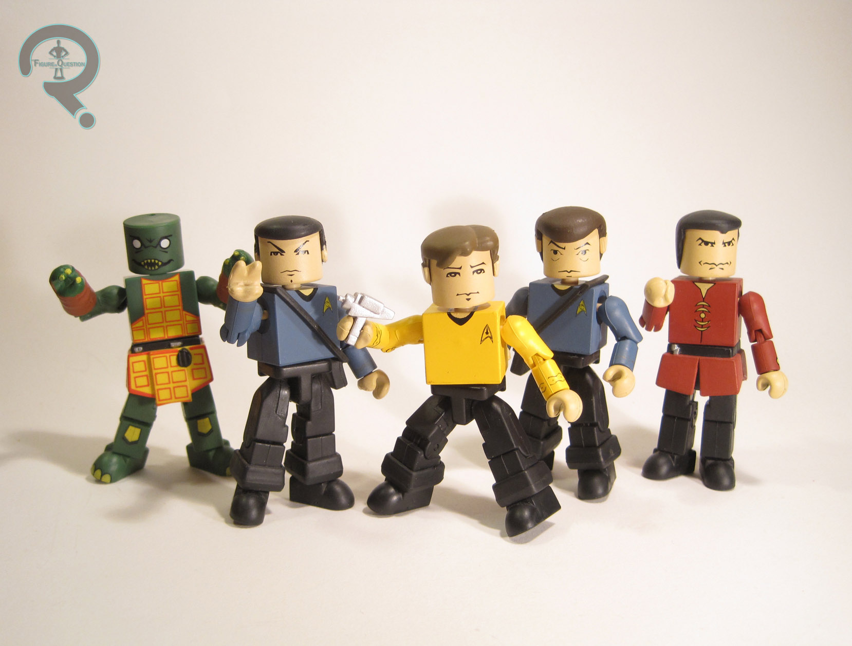
CAPTAIN KIRK, SPOCK, DR. McCOY, KHAN, & GORN

STAR TREK MINIMATES (ART ASYLUM)

I’ve spoken twice before about the original, larger-sized Minimates, the important stepping stone on the way to getting us the licensing behemoth that we now have.  Today, I’ll be touching on them yet again, this time looking at the one property to have graced both styles of Minimate: Star Trek.   After doing ‘mates from Crouching Tiger and some music ‘mates, and even some Bruce Lee ‘mates, Art Asylum turned their sights onto Trek mostly because they already had the license (they produced a Dark Angel Minimate for the same reason, but with less success).  Anyway, I’ve got a bunch of them, and I’ll be looking at them today.

THE FIGURES THEMSELVES

These five were released in the first (and only) series* of the larger-scale Star Trek Minimates from Art Asylum.  There was also a Mugato in the series, as well as an accompanying ToyFare-exclusive “Trouble With Tribbles” Kirk, but I don’t yet have those two.  Maybe some day.

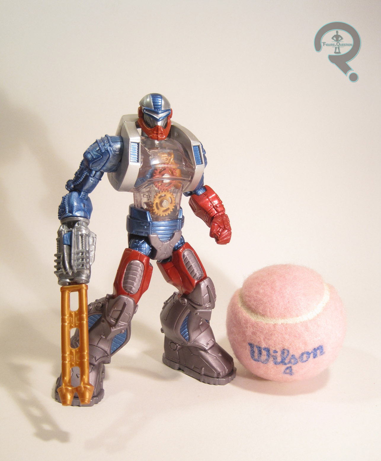
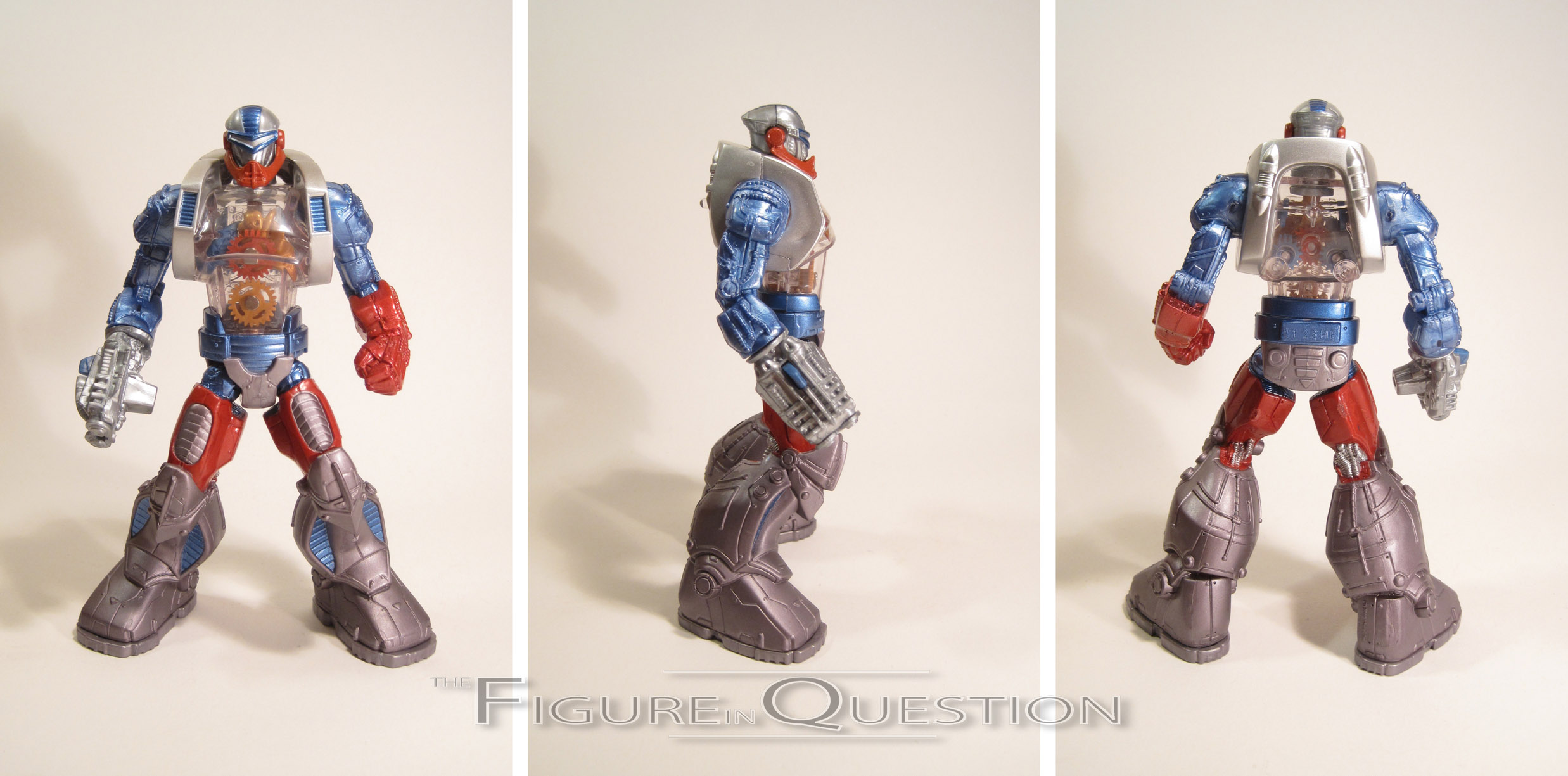
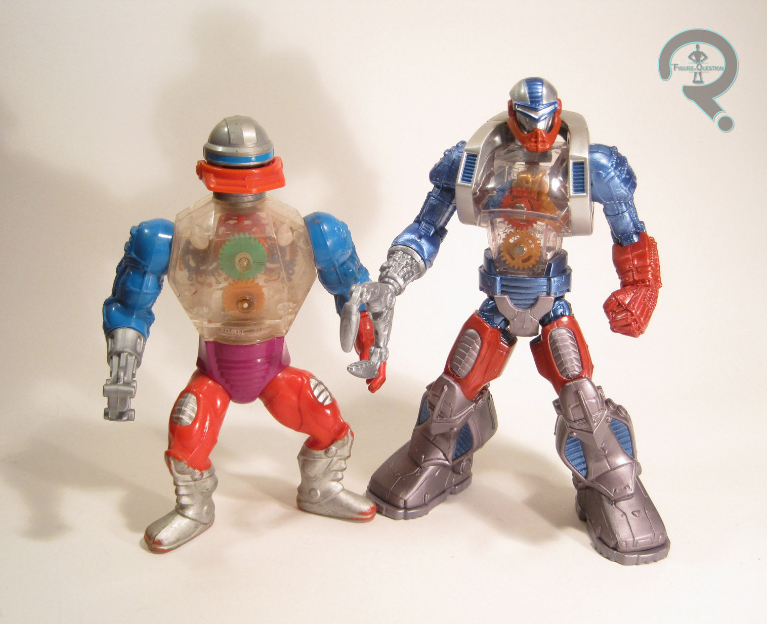
All of the figures featured here are built on the 3-inch Minimate body, which is a little different from the smaller body in terms of construction, mostly around the elbows and knees.  The assembly can afford to be just a touch more complex at the larger scale, and that’s really the source of most of the changes.  Nevertheless, it works the same as the smaller body from a basic functioning stand-point, and it has the same 14 points of articulation.

CAPTAIN KIRK

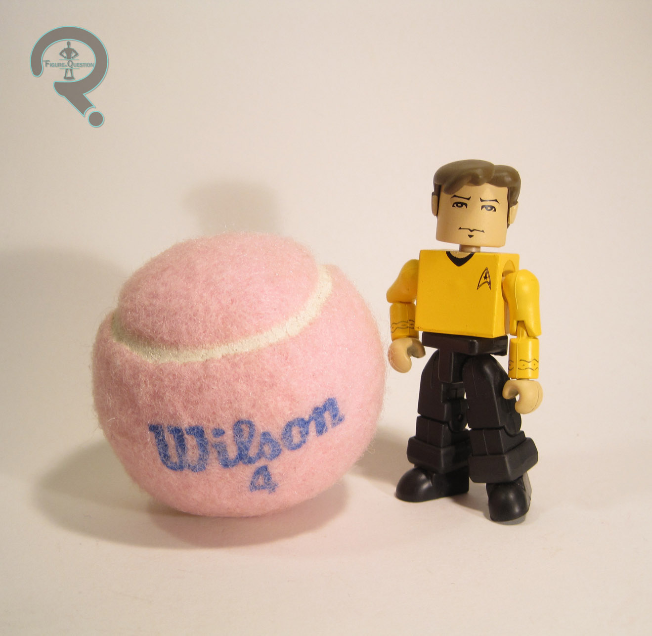
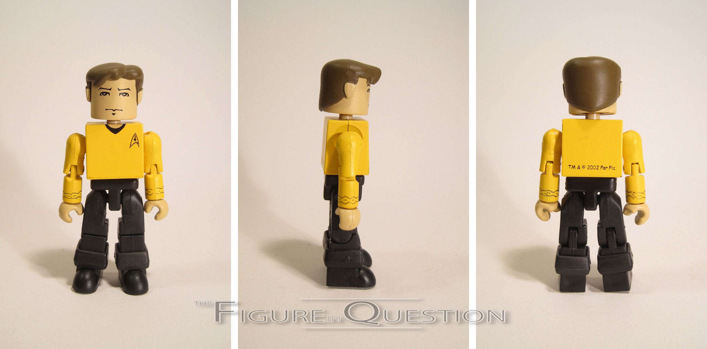
This was the first of the 14 MInimates of James T. Kirk.  He’s most prevalent of the Trek characters by far, though he’s got nothing on the likes of Spider-Man and Iron Man.  Anyway, this is the one that started it all.  This figure has three add-on pieces: hair, and both pants cuffs.  The hair was new to this guy (though it was also shared with the ToyFare variant, and would have presumably been used for the Mirror Universe version in Series 2).  I gotta say, I like this piece a lot more than the initial smaller Kirk ‘mates.  It’s still a bit more simplistic than more recent ‘mates, but that’s certainly not a point against it, and it’s definitely in keeping with the other ‘mates of this time period.  The paint work on Kirk is about on par with the rest of the earlier ‘mates.  It’s all pretty clean, but also rather on the simple side.  All of the important things, like the face and various uniform elements are there.  The face has a pretty decent likeness of Shatner (honestly, I think it was a bit better than later attempts), and the uniform details seem to be pretty accurate.  The colors are generally pretty decent, but once again, far more basic than later ‘mates would be.  Kirk was packed with a phaser (painted in all silver, rather than the proper silver and black), as well as one of the goofy puzzle pieces that they threw in with all of the early guys.

MR. SPOCK

Spock’s not too far behind Kirk on the variant front, with a whole 8 Minimates under his belt.  There does seem to be a little less variation to his, though.  Like Kirk, this figure has add-ons for his hair and pant cuffs.  Spock’s hair piece is fine, but I find his style of hair doesn’t translate quite as well to this sort of figure.  Later pieces worked a fair bit better, I feel.  I think his hair just needs more detail to it, otherwise it just ends up looking like a skullcap or something.  The paint on Spock is rather similar to Kirk’s, but once again, I don’t think it works quite as well.  The face definitely tries for a Nimoy likeness and, while it isn’t horribly off, I think the lack of any sort of line work for the cheekbones is really holding it back.  Most characters can get by alright without the cheekbones, but not those played by Leonard Nimoy.  In addition, the shade of blue chosen for the shirt is several shades too dark and far too greyed out for the blue shirts from Classic Trek.  This shade almost looks like something from the JJ Abrams films, which wouldn’t be released for 7 years after this.  Spock includes an extra right hand, doing the Vulcan salute, as well as a tricorder and the puzzle piece.

DR. McCOY

McCoy’s important because he finished out the show’s core trio.  Sadly, he always seems to be the one who gets overlooked.  It’s a shame, really.  But hey, he got this ‘mate and a few others, so that’s pretty good for him, right?  This guy is very similar to the other two, with the exact same cuffs on the legs and then a unique hair piece.  The hair falls somewhere between the other two, being not quite as strong as Kirk’s, but a fair bit more recognizable as hair than Spock’s.  It’s definitely not bad.  In terms of paint, he’s almost identical to Spock, overly dark blue and all.  On the plus side, the likeness on the face is the spitting image of DeForrest Kelly, surly country wisdom and all.  He includes the same tricorder and puzzle piece as Spock, but obviously loses the saluting hand.  It would have been nice to get one of his medical gadgets or something, but the tricorder’s enough, I suppose.

KHAN

Khan’s pretty popular for a guy who was only in a single episode of the show.  Oh, right, and there was that movie thing, I guess.  That might have helped.  Khan’s had a few Minimates, and not a single one of them has been in the same outfit.  This is one of his red outfits, likely chosen for it’s contrast with the rest of Series’ color schemes.  He’s got a hair piece and a skirt for the bottom of his tunic.  Both pieces are pretty solid, so that’s good.  Khan has one of the more complex paint schemes in the set (though not *the* most.  That comes later), and it’s generally pretty nicely handled.  My only real complaint is that his face is slightly off-center, which is a problem that occasionally cropped up with these early ‘mates, due to the hair peg being near the back of the head.  On the plus side, the likeness on the face is pretty decent.  Khan’s only accessory is the puzzle piece.
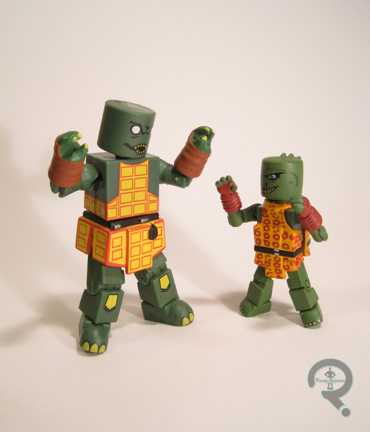
GORN

Okay, so I freaking love the Gorn, and this is like my whole reason for buying this set.  Because I desire to own every Gorn figure in existence.  I’m actually pretty close on that, so, yaaaaaay.  Gorn FTW!  This guy uses add-ons for his hands and his skirt.  There’s no piece for the head, which leaves the peg hole exposed, but it’s not huge issue, given the placement.  The add-ons are nicely sculpted and pretty cool looking overall.  The skirt piece is a little thick, so he splits at the middle a lot, but it’s a minor issue.  Gorn gets the most complicated of the paint jobs.  It’s still pretty simplified, but I actually really like it.  The face is pretty neat, and I like how they’ve translated his design onto the basic head block.  They’ve also done a nice job with the pattern on his tunic, so that’s cool.  He was packed with a spike, a translator, and that freaking puzzle piece.  Mine is lacking these, sadly.

THE ME HALF OF THE EQUATION

I always wanted to pick up a set of these back when they were still new, back when they would have been my first Minimates, but for whatever reason, I never got any of them.  I’m the reason the line failed, you guys.  I’m sorry about that.  I’ve been on the lookout for a set for a little while now, and I ended up finding these guys at Amazing Heroes, which was a cool toys, comics, and games store that my brother found just outside of Seattle.  I was actually pretty happy to find an almost complete set in one go.  I kinda dig these guys.  Kirk and the Gorn are the definite stars, and translate really well to the more simplistic style.  The others are pretty solid as well, if not quite as stand out.  Now, I gotta get that second Kirk and a Mugato….

*There was a proposed second series, which would have rounded out the main crew and given us a Klingon, but, like all of the 3-inch lines, Trek never made it past Series 1.

#1338: Vampire Buffy

VAMPIRE BUFFY

BUFFY: THE VAMPIRE SLAYER PALZ (PALISADES)

Wow, two Palisades reviews in a row.  Isn’t that upbeat?  Wanna hear about another failed line?  It’s okay, this one was marginally less of a failure.  Back when they were in the swing of things, Palisades was grabbing the license to all the cool cult-followed properties that they could.  While the master license for Buffy action figures was elsewhere, they managed to snag the rights to produce a line of block figures.  Initially, they had attempted to strike up a deal with Diamond Select in order to produce some Buffy Minimates.  For whatever reason, the plans fell through, so Palisades decided to tweak the design sheets ever so slightly and create their own line of block figures, dubbed “Palz.”  They were actually pretty darn awesome, and ended up introducing some nice ideas that would later be adopted by Minimates proper.  Today, I’ll be looking at one of the variants of the line’s title character, Buffy Summers.

THE FIGURE ITSELF

Vampire Buffy was released as an exclusive through ToyFare magazine, and she hit around the same time as Series 1 of the main line.  She’s based on Buffy’s appearance during the first season episode “Nightmares.”  It was actually pretty nice, because Willow’s alt look was from that episode, and there was even a club-exclusive Xander, so the main trio were all represented.  The figure stands about 3 inches tall and has 14 points of articulation.  Like the previously reviewed Willow, she’s built on the female body (because Palz actually had gender specific bodies), with an add-on for her hair.  The hair is somewhat reflective of her look from the show, though it’s not quite spot on for Season 1.  It’s still a nice piece, though.  The paintwork on her is decent enough; it’s certainly vibrant, and I always appreciated how Palisades added depth to the faces, with shading and the like.  It works particularly well for the vampire design.  As was common with these figures, she’s got a second face on the back of the head; this one gives us a standard Buffy face, for those that just wanted a basic Buffy out of this figure.  Buffy is lighter than a lot of Palz when it comes to accessories, but she still has her fair share.  There’s a tombstone (the same as the standard Series 1 Buffy, but this time with writing on it), two books, a purse, and a jacket with a pair of sleeved arms.  The jacket’s cool in theory, but due to the fragile nature of the plastic used for the figure, I wasn’t willing to risk putting it on her, lest I break one of the shoulder joints (this was actually my second of this figure; the first broke in several places).

THE ME HALF OF THE EQUATION

As I mentioned in my review of Willow, a sizable chunk of my Palz collection was courtesy of a very, very nice member of the Minimate Multiverse forum.  Both Vampire Buffys I own are from that chunk.  I wasn’t really dying to track her down on her own, since there are plenty of other Buffy Palz to be had, but it’s nice to have her to round out the set.  She’s okay, but does suffer from being one of the more lackluster entries in the line.  She’s decent enough, but the other Buffys all had a little extra to offer, which makes this one a little more “meh.”

#1337: Battle Acroyear

BATTLE ACROYEAR

MICRONAUTS (PALISADES)

“Described as an ‘Enemy of the Micronauts’, this stalwart warrior is surely still a hero among his people and a formidable knight to his allies. Clad in his distinctive crimson and white armor, and possessing the strength to wield his massive Power Sword against the powerful intergalactic foes of his people, what childhood imagination couldn’t give Acroyear the chance to be a ‘good guy’?”

Poor Palisades and their poor cursed Micronauts line.  Though its parent line, Microman, has been a pretty strong seller in Japan, the American-ized adaptation never quite took off the same way.  Mego saw decent success into the ‘80s, but it quickly dwindled under the juggernaut that was Star Wars.  20 years later, fan favorite company Palisades did their very best to bring new life to the line, but they ran into roadblocks at every turn.  The worst of it really hit right at the beginning. The factory producing Series 1 of the relaunched line pulled a fast one on Palisades, by sending them sub-contracted “production samples” which in no way represented the actual quality of the product being produced.  When the Series 1 figures arrived, Palisades was left with a stock that was subpar, with pretty much no funds to replace them.  Worse, stores were already getting the stock, so there was little they could do.  They quickly shifted production to another factory, and put into production a Series 1.5, which offered slightly fixed figures built on the Series 1 molds, with the hopes of tiding collectors over until proper corrected Series 1 figures could be produced later down the line (this, sadly, never happened).  Each Series 1 figure was given a new deco, with some sort of neat backstory to it.  My personal favorite was Battle Acroyear, the redressing of (you guessed it) Acroyear!

THE FIGURE ITSELF

As noted, Battle Acroyear was part of the Series 1.5 assortment of Palisades’ Micronauts line.  The Series 1 Acroyears were perhaps the most negatively effected by the poor quality; the heavy metal torsos would cause the plastic around the joints of the limbs to disintegrate into dust almost immediately after opening, leaving collectors with little more than a pile of wobbly plastic bits.  That’s hardly going to do justice to one of the greatest warriors of all time, so the replacement was necessary.  The figure stands about 4 inches tall and he has 13 points of articulation.  Unlike most of the rest of the line, which used an internal band construction similar to vintage G.I. Joes, Acroyear uses a solid construction.  Like I said above, the figure has a die-cast metal toros, with plastic limbs and head.  Fortunately, unlike his predecessors, this guy’s legs can actually hold his wait, pretty well I might add.  Really, the construction on this guy is really solid; he feels like he could survive most things (and mine’s made it through a few shelf dives, so I know from experience).  The details of the sculpt are nice and clean, and appropriately reto-sci-fi.  While all of the Palisades Micronauts had minor deviations from their Mego counterparts, Acroyear’s were even more minor than most; there’s some slight tweaking to the shape of the head, but it’s the sort of thing that you can really only tell if you’re looking right at both figures.  Paint schemes were a defining factor for the Series 1.5 figures.  While the Series 1 Acroyears had deviated pretty wildly from the classic Acroyear colors, this one brings it back a bit, albeit with a twist.  The original Acroyears were all the same basic colors, with three different accent colors: blue, green, and pink.  This figure gives us a fourth accent color: red.  This is actually a pretty cool reference, as red was the color used for the heroic Prince Acroyear, the main Acroyear from the Marvel Comics adaptation from the ‘80s.*  It’s a color scheme that really works well with the design, and he certainly stands out on the shelf.  Acroyear includes a battle sword (a much larger replacement for the original figure’s smaller dagger), a spy drone, his extra large wing pack, and clear display stand.  The sword is suitably awesome, and the wings are cool, even if they aren’t quite as nifty as Space Glider’s.  The spy drone is interesting enough, and serves a secondary function: Acroyear can be “transformed” into a tank-like thing, using the drone as a turret of sorts.  Not as advanced as later Transformers, but cool nonetheless.

THE ME HALF OF THE EQUATION

I actually had one of the Series 1 Acroyears back in the day.  Fell to pieces in like a day.  One of the more depressing action figure interludes of my childhood.  This figure ended up in my collection a fair bit later, after the secondary market prices on most of the line had shot pretty far up.  Cosmic Comix bought someone’s toy collection, and there were a handful of Micronauts in it, which I ended up getting for a steal.  Battle Acroyear was among them, and he’s easily my favorite of the bunch.  In fact, I think he’s my favorite Palisades Micronaut period.  He’s just a really fun toy.

*Since the team already had plenty of blue and green, Acroyear’s third color was chosen for his primary look.  However, due to the limitations of printing in comics, pink would have been nearly impossible to render consistently, so he was shifted to a straight red.

#1336: Astonishing Wolverine

ASTONISHING WOLVERINE

MARVEL LEGENDS (TOY BIZ)

“Little is known about the man known as Logan whose past remains shrouded in mystery. The feral warrior, code-named Wolverine, possesses genetically endowed animal-keen senses of smell, sight, and hearing, as well as a mutant healing factor that can mend almost any wound. His deadliest weapons are his razor-sharp claws and skeleton both made of unbreakable metal alloy called Adamantium. However, with these abilities comes a curse, a bezerker rage that he must forever struggle to control. Now Logan must contain the beast raging within while he battles to protect a world that fears and hates him.”

Though my opinion of it has waned in recent years, at the time of its release, Joss Whedon’s Astonishing X-Men was a serious breath of fresh air.  I was never much impressed by Morrison’s “let’s put everyone in black leather and completely disregard prior character interpretation” New X-Men run that immediately preceded it, so taking the X-Men a bit more back to basics was pretty cool.  I also really liked John Cassidy’s art for the series, as well as his returning of several of the cast to more classically inspired costumes.  While most of the team eventually made it into toy form, it took quite a while.  Unsurprisingly, the first team member to make it into plastic was Wolverine, who I’ll be looking at today.

THE FIGURE ITSELF

Astonishing Wolverine was released in the 12th Series of Toy Biz’s Marvel Legends, also known as the “Apocalypse Series.”  It was the fourth Wolverine in the line, and was at the time his current look. There were both masked and unmasked versions of this guy; the one I’m looking at today is the masked version, obviously.  This figure also served as the inspiration for the larger Marvel Legends Icons version of the character, although he was slightly tweaked to offer an alternate version of this costume.  The figure stands 5 1/2 inches tall (it’s one of the first times they actually got his scale right) and he has 40 points of articulation.  In terms of sculpt, this figure was all-new, and he’s based on Cassidy’s work from the comics, albeit somewhat loosely, since Cassidy’s style doesn’t quite lend itself to super-articulated action figures.  The head’s definitely the best work; there’s a lot of smaller detail work that looks really nice, without being too over-done like a lot of Legends Wolverines.  The rest of the body was good for the time, but doesn’t as much hold up to scrutiny these days.  Once again, there’s a lot detail work that’s really nice on the stitching and the piping.  However, he’s really, really scrawny, which removes some of his intimidation factor.  It’s the worst in the legs, where the precedence clearly went to the joints, resulting in an almost skeletal set of limbs.  And of course, they split the belt in two for the waist articulation.  Why did they do that?  Beats me.  Seems it would have made a lot more sense to go either above or below.  Worst case scenario, you could do the joint where it is currently and have the belt be an add-on.  But splitting it right down the middle just seems lazy to me, like the base body was already sculpted and they added the details later without taking placement into account.  On the plus side of things, he’s probably got the best claws we got on a TB ML Wolverine; they’re well-shaped, unlikely to break off, and resistant to heavy warping.  In terms of paint work, the figure’s decent enough.  The base colors match up pretty well with what was being used on the comics, and most of the application is fairly clean.  The only part that’s a little odd is the arm hair, which really just looks like a bunch of brown tally marks that someone’s drawn on him.  Wolverine included no accessories of his own, but he did come packed with one of the legs of Apocalypse.  So, that’s cool, I guess.

THE ME HALF OF THE EQUATION

This guy was a Christmas present from my friend Charlie.  He and I shared a love of Marvel Legends, and in particular, we were both on the lookout for the perfect Wolverine.  So, when this series hit, he made sure that I got this guy, which was very nice of him (I repaid the favor a year later when I made sure he got a completed Mojo Build-A-Figure).  He’s definitely got some flaws, but I really do think he was Toy Biz’s best take on Wolverine, and the best Legends version  of the character until Hasbro’s recent Brown Costume figure.  It’s honestly a little surprising that TB never retooled him into a more conventional Wolverine.

#1329: Iron Man

IRON MAN

MARVEL LEGENDS (TOY BIZ)

“To the public, Tony Stark is a handsome, jet-setting industrialist and inventor. What they don’t know is that he leads a second life as Iron Man. The armored Avenger gets his fantastic powers from his suit of micro-mesh armor. It gives him superhuman strength, the ability to fly via his jet boots, and a variety of built-in weapons, foremost among these being his devastating repulsor rays! Iron Man is dedicated to defeating those forces that would threaten the security of the nation and the entire world.”

Iron Man is easily one of Marvel’s best known characters these days, but that wasn’t always the case.  Aside from a brief cartoon runs in the ‘60s and ‘90s, he was largely out of the public eye until his 2008 film.  So, in 2002, when Toy Biz launched Marvel Legends as a follow-up to their successful Spider-Man: Classics line, and had Iron Man as one of the headliners of Series 1’s four figure assortment, it was a pretty big deal.  It’s hard to believe now, but when Marvel Legends debuted, the most demanded figure by far was the Iron Man.  Can you even imagine a time when the fanbase didn’t let out a collective groan at the inclusion of an Iron Man figure?

THE FIGURE ITSELF

As noted in the intro, Iron Man was released in the first series of Toy Biz’s Marvel Legends line.  There were actually two Iron Men in the assortment; the regular release reviewed here, and the one-per-case horned-mask variant.  Even later, there was also a Walmart-exclusive release, which decked this guy out in his stealth colors.  This guy is based on Tony’s classic armor from the 60s and 70s, which at this point hadn’t been released in plastic form for almost two decades.  The figure stands about 6 1/2 inches tall and has 38 points of articulation.  Some of the articulation (particularly the neck movement and the mid-torso joint) is a bit antiquated, but it’s mostly pretty workable.  Amusingly, some of the articulation the was more quickly deemed out of date within the line itself has actually become the more standard way of doing things, so in some ways he fits in better with the more recent Hasbro offerings than he does the later TB offerings.  Iron Man sported what was, at the time, an all-new sculpt, which would later be used for the Silver Centurion armor, as well as War Machine and Magneto.  The build is a little bulkier than the usual depictions of the classic Iron Man armor, but it actually makes sense, since it’s supposed to be wrapped around a normal-sized guy; it’d have to be a little heftier in real life.  The proportions are actually pretty solid for a figure of this era.  Compare this guy to his Series-mate Captain America, and you’ll note that he’s got a much more balanced anatomy.  He even avoids the dreaded duck feet!  The articulation is also pretty well worked-in for a Toy Biz offering; sure, there are still some spots where compromise has been made (the waist really sticks out), but it’s generally a good middle-ground.  In terms of detail work, this guy goes a bit more simplistic than later TB fare (another reason he fits in a bit better with the Hasbro stuff), but that’s definitely a plus.  All of the important details are there, they’re all very sharply defined.  The figure has a removable faceplate, which reveals Tony Stark beneath the mask.  I’ve always felt he bore a resemblance to Timothy Dalton, which is a neat little “what-if” casting idea.  The face has some of the best work on the whole figure, which shows real commitment on the sculptor’s part, since it’s largely going un-seen.  The faceplate is molded to fit into the contours of the face, and it actually stays in place really well.  In terms of paint, Iron Man’s handled really well. He’s got the base red and yellow, which are nice and vibrant, and then on top of that, there’s a hint of silver lightly applied to all the armored portions of the figure, which makes him look suitably metallic, while avoiding the issues of blending that plague the Iron Men that use gold in place of the yellow. Iron Man was packed with a display stand designed to look like a Stark Industries satellite and a reprint of Iron Man #149 (which contains “Doomquest,” one of my favorite Iron Man stories).

THE ME HALF OF THE EQUATION

This guy came from my Nana.  Every year, she’d take me and my cousin to Toys R Us at the end of school and let us each pick out one or two things.   Of course, I went through the usual back and forth, having to reassure her that yes I really did want this Iron Man fellow instead of a handful of Attack of the Clones figures like my cousin was getting.  At the time, this guy was still pretty hard to get, so finding him so quickly was pretty sweet.  He was my very first Marvel Legend, and I gotta say, dragging him out for the purpose of this review has reminded me that he’s still very definitely one of my favorites.  As far as classic Iron Men go, this guy really hasn’t been topped.

#1328: The Wolf Man

THE WOLF MAN

VAN HELSING: MONSTER SLAYER (JAKKS PACIFIC)

Hey, remember when Hugh Jackman starred in a Van Helsing movie?  I know, I know, you were trying to forget.  Why’d I have to go and bring it up again?  Well, the reason is very simple: there were toys.  And, big shock, I had a bunch of them.  For the most part I’ve phased them out of my collection, but one item still remains.  It’s the subject of today’s review, The Wolfman, who within the context of the film isn’t the usual “wolfman” Larry Talbot, but is instead Velkan Valerious, brother to…oh who really cares?  He’s a werewolf.  There ends the list of interesting things about him.

THE FIGURE ITSELF

The Wolf Man was released as part of Jakks Pacific’s basic Van Helsing: Monster Slayer line.  There were a couple minor variations on this basic figure; mine’s the one with “magic transformation color change,” which pretty much translates to “the actual Wolf Man bit has this clear patch at the front.”  The figure is just under 4 inches tall and he has 16 points of articulation.  The actual figure is just an un-transformed Velkan figure, which has him sporting the Bruce Banner shredded pants (they never did explain in the movie where those pants when he was the werewolf, by the way).  The sculpt was okay.  None of the figures in this line were particularly noteworthy, and Velkan seems to be the middle-est of the middling sculpts.  The proportions of the sculpt are passable; the hands and feet seem a little small, and the shoulders are definitely set too far apart, but that’s about it.  A lot of the work, especially on the body, definitely seems a bit rudimentary for the time when this was released.  The head bears a passing resemblance to actor Will Kemp, though he’s completely clean shaven here, and he wasn’t in the movie.  There’s some nice detail work on the hair, so that’s cool.  The paint is also pretty basic.  He’s mostly just molded in the appropriate colors.  The only real paint work is on the face, which seems oddly dirty.  He wasn’t exactly squeaky clean in the movie, but it seems a bit odd when compared to the rest of the figure.  The “Wolf Man” part of this Wolf Man figure is actually just a rubber suit that you pull over the Velkan figure.  I’m gonna be honest, it’s not ideal.  The basic sculpt is fine, but since it’s just thick rubber cover, there’s no actual articulation, and since it’s just rubber and not something sturdy, there’s actually no way for the thing to stand, especially with Velkan inside it.  Also, since the “magic transformation color change” bit requires the piece to molded in clear plastic, and paint on rubber is prone to chipping, the figure is invariably left with random clear patches all over.  Why exactly didn’t they just make this a whole separate figure?

THE ME HALF OF THE EQUATION

So, believe it or not, I actually liked Van Helsing when it was released.  In my defense, I was 11.  Anyway, I ended up getting a bunch of the figures for my birthday that year, and the Wolf Man was one of them.  He was always my favorite of the bunch, so when I got rid of the set, he remained.  The figure’s not anything to write home about; he’s a kind of bland figure based on a flat character from a mediocre movie.

#1319: Joker

THE JOKER

DC UNIVERSE CLASSICS

“The Clown Prince of Crime is Batman’s deadliest and most unpredictable foe. Rumored to be a failed stand-up comedian turned petty criminal who fell into a vat of chemical waste while escaping from the scene of a crime – that incident turned his skin white and his hair green. Batman knows the Joker is certifiably insane, which makes the end result of his action  that much more deadly.”

A common complaint of DC Universe Classics was about its over-reliance on oddball, C and D-list characters that most of the general public hadn’t heard of, and the subsequent delaying of heavy hitter characters until too far into the line’s run.  Case in point: the Joker.  Batman’s greatest foe, and we had to wait more than a year to get him (made especially egregious by Harley Quinn’s presence in Series freaking 2).  Obviously, in a line like this, you want to hold some heavy hitters back, but 10 series seems like a bit much.  But, with the line wrapped and gone, at least he got a figure.  I’ll be looking at that figure today.

THE FIGURE ITSELF

Joker was released in Series 10 of DC Universe Classics.  I’ve been reviewing a lot of this particular series lately.  Not for any particular reason, or anything; just luck of the draw I suppose.  As I’ve noted in prior reviews, the series was the line’s second Walmart-exclusive series.  While it was far less scarce than the first, it still seems a little odd that DC’s most recognizable villain was relegated to a store-exclusive release.  There’s a reason this guy has one of the heftier aftermarket prices in the line.  Anyway, the figure stands about 6 1/2 inches tall and he has 23 points of articulation.  Joker is seen here in an appearance that’s about as classic as he can get (specifically, he’s modeled after his Super Powers figure as this was really when the line was leaning hard into the recreation of Super Powers).  He’s built on the body that was introduced with Gentleman Ghost, which was designed with Joker in mind.  In that effect, the cut of the suit matches up pretty well with classic depictions of Joker.  The body showcases a lot of Mattel’s troubles with working articulation into a sculpt naturally.  It’s nowhere near as bad as some of their more recent work, but it’s definitely not the strongest showing from DCUC.  On the plus side, it’s not awful to look at, especially if you chose a decent pose.  He had a unique head and neck, which are definitely the star pieces of this figure.  He also has a tweaked jacket, which removes the cape from Gentleman Ghost and adds a flower to his lapel.  It’s an okay piece, but slightly marred by the weird panel in the back where the cape was originally attached.  Why does Mattel insist on attaching capes with that huge rectangular peg?  I don’t think I’ll ever know.  The paint work on the figure’s actually pretty good.  The colors are nice and bold, and there’s some really well-executed accenting, especially on the hair and the vest.  The pinstripes on the legs could probably stand to be a little straighter, but they look decent enough.  Joker was actually pretty well accessorized.  He includes a joker-head cane, some playing card, a laughing fish, and a large green mallet (deliberately pattered after the one included with the Super Powers figure).  They were all pretty solid extras, among the best in the line.  He also included the right leg of Imperiex, the Series’ CnC.

THE ME HALF OF THE EQUATION

Joker came from the same assortment of trips to Walmart with my Dad that netted me the previously reviewed Beast Boy.  I don’t recall the exact circumstances, but he was definitely a later find, since he was the most sought after initially.  He’s not one of my favorite DCUC figures, but that’s hardly because he’s bad.  He’s actually very well executed, apart from the slightly lackluster handling of the articulation.  For me, he just suffered from being “yet another Joker” in a series full of brand-new characters, but I suppose I’m a bit counter to most fans in that respect.

#1318: Logan

LOGAN

X-MEN: THE MOVIE (TOY BIZ)

“Logan is a loner by nature and a hunter by trade.  Dressed in civilian gear of jeans, leather jacket, and flannel shirt, no one would ever know this ordinary looking man possesses the untamed savagery of a wild beast combined with the battle-skills of an international secret agent.  His power to heal virtually any wound in minutes combined with his superhumanly keen animal senses and razor sharp adamantium claws and skeleton make him the perfect fighting machine called Wolverine”

Who wrote this bio?  And did they have any idea who the character was going in?  Or what figure this bio would be going with?  I enjoy that the bio describes a completely different set of civilian clothes than this figure is actually wearing, but I think my favorite part may be “battle-skills of an international secret agent.”  That’s one specific descriptor, let me tell you.

THE FIGURE ITSELF

Logan was released in Series 3* of Toy Biz’s X-Men: The Movie line, which tied in with (big surprise here) 2000’s X-Men film.  The figure stands a whopping 7 inches tall and has 14 points of articulation.  The X-Men: The Movie figures were already pretty out of scale at the time of their release (being Toy Biz’s very first 6-inch figures), but Wolverine takes this to ridiculous levels, being about an inch out of scale with even the figures from his own line.  He’s larger than Sabertooth for pete’s sake!  Why is he so freaking huge?  Because of re-use, that’s why.  He’s built on the body of the Power Slam WCW Wrestlers Hak figure.  The WCW stuff was always much larger than the Marvel stuff Toy Biz did, and Hak was even pretty sizable for his own line.  I’m not entirely sure why Toy Biz opted to re-use this particular body.  I guess they felt they just had to have another Wolverine in there?  Completely divorced from the line that spawned him, I guess Logan’s sculpt isn’t terrible.  He got a new set of lower arms and feet, and what appears to be the Series 1 Wolverine head sculpt scaled up.  The pieces all mesh okay together.  The head definitely resembles Jackman as Wolverine, though it’s not quite as good as later figures would be.  The build seems rather on the bulky side for Wolverine as seen in the movies, and his proportions in some spots look like he’s trying to smuggle meat in his clothes or something. You’ll note that my figure is missing three of his claws; this isn’t by design, they just fell off, because this figure had some of the most easy to tear claws of any Wolverine figure.  In addition to the sculpted parts, Logan also has a cloth jacket.  It’s kind of thick and oddly shaped, and makes him look even puffier than he already was.  Paint on this guy was okay, but nothing tremendously exciting.  The colors are well chosen, and the jeans in particular have some nice accent work.  This Logan is from post movie release, so he’s after Toy Biz started adding the goofy painted on sideburns to all the movie Wolverines in an effort to make them more accurate.  It looks really goofy.  Super goofy.  Crazy goofy.  The figure was packed with a small dog tag that isn’t even remotely close to proper scale.  He’s also got the “action feature” which I think is supposed to swing his arms back and forth when the torso is turned, but it never looks like anything more than panicked flailing.

THE ME HALF OF THE EQUATION

The Series 3 X-Men: The Movie figures were rather hard to come by at first, even Logan.  He was one of the last ones I got, courtesy of my parents, who bought him for me while they were on a weekend trip to the beach.  I know I really wanted one at the time, but boy is this figure odd in retrospect.  Not only does he feel rather redundant (he was the fourth civilian version of the character in the line), but he’s also just laden with strange design choices.

*Though this series was dubbed “Series 3” by Toy Biz, it was effectively Series 2 of the line, as the first 2 series were released simultaneously in order to have all of the main characters on shelves for the film’s release.

#1314: Nightwing

NIGHTWING

BATMAN: KNIGHTFALL (DC DIRECT)

“As Batman’s former ward, Nightwing returns to Gotham City to fight crime during the absence of his mentor.”

I’ve touched very briefly on “Knightfall,” the huge cross-over series that introduced Bane, broke Batman’s back, and gave us the new Batman Jean Paul Valley (formerly Azrael).  It’s actually one of the better regarded big cross-over stories of the ‘90s, largely due to DC consciously using common story elements for the time, and addressing some of the issues behind them. The story got some figures as part of the then running Legends of Batman line from Kenner, but no truly devoted line, until 2005, when the story was given a dedicated line of figures, courtesy of DC Direct.  I’ll be looking at one of those figures, Nightwing, today.

THE FIGURE ITSELF

Nightwing was released as one of the five figures in DCD’s Batman: Knightfall series, which, as I noted above, hit comic stores in 2005.  The figure stands 6 3/4 inches tall (he’s from the period where the DCD scale creep was really kicking into overdrive, so he was a good half an inch taller then the two prior Nightwings) and he has 11 points of articulation.  He’s sporting his early ’90s costume, which generally isn’t one of my favorites.  It’s largely to do with the particularly egregious mullet that always accompanied it, but also due to the way he tended to be depicted as super bulky in this outfit.  I really have to commend this figure’s sculpt, because it  makes a lot of those issues less present.  In particular, his build is more svelte and similar to DCD’s prior Nightwings, and they’ve also gone with what’s probably the least dated interpretation of the mullet.  The sculpt isn’t perfect, mind you.  There are some slight oddities to the posing; his feet seem a bit wide spread, and I’m not entirely sure what’s going on with the left hand.  Also, his thighs seem oddly…flat.  Still, it’s remarkably well done, given how badly it could have turned out, depending on the iteration of the source material they followed.  One of the coolest things about this guy is the paint work.  The application is all pretty clean, and the colors just really pop.  I particularly love the metallic blue color that makes up the majority of the bodysuit.  It’s a good base color, and it really helps accentuate the brighter colors that have been placed on top of it.  Nightwing included a little…disc thing?  I guess it’s some sort of throwing weapon or something?  Mine’s missing his, but he could hold it in his right hand.  He also had a circular display stand with the “Knightfall” logo printed on it.

THE ME HALF OF THE EQUATION

I’m hard-pressed to come up with all that much interesting about this guy.  I know I bought him from Cosmic Comix, because that’s where I was getting all of my DC Direct figures at the time, but the exact nature of when or why I got him doesn’t seem to be coming to me.  I know I haven’t traditionally been a fan of this look, but this figure changed my mind on that.  While he’s not my favorite DCD Nightwing, but he’s still a very solid entry.  Also, one of only two figure versions of this particular design, for what it’s worth.