#1821: Cobra Viper

COBRA VIPER

G.I. JOE: SPY TROOPS (HASBRO)

“Ripping up the roads on their COBRA VENOM CYCLE vehicles, COBRA VIPER members like to think of themselves as a biker gang with the most technologically advanced hogs on the planet”

Here we are at the finish line.  Just one more entry in my insane 6-in-1 Day of the Vipers reviews!  Oh yeah, I did it!

In 2003, the G.I. Joe line once again rebranded, taking on the heading “Spy Troops.”  Joes and Cobras were given infiltration gear and disguises, and it was all very spy-y.  Well, it was mostly spy-y.  Some of it was not at all spy-y at all.  The the Viper’s one release during the line’s run fell into that non-spy area.

THE FIGURE ITSELF

The Cobra Viper was released as a pack-in figure with the Cobra Venom Cycle, a small-scale vehicle from the Spy Troops line.  The cycle was undoubtedly the selling point, but I don’t have it, I just have the Viper.  For I am a mad man.  He’s the same basic figure I’ve looked at three previous times today, the tweaked V5 Viper mold that Hasbro would continue to use for another three years after this.  Hey, they had a good formula down, right?  The big difference, of course, was the paint scheme.  He’s got this olive sort of thing going on, which is right in line with the overall look of most of the Spy Troops figures.  At first glance, he looks a little bit like the Turquoise Viper from ’02, but if he’d been left out in the sun.  That being said, I do actually quite like this color scheme, and have generally found myself kind of drawn to this figure.  Since he was just a pack-in with a vehicle, the Viper didn’t come with any accessories of his own.  Maybe he’s like the pacifist of the group, or something?

THE ME HALF OF THE EQUATION

This was the last figure I dug out of the collection at All Time.  I had just about called it on getting any more Vipers, and I looked down and saw this guy staring at me.  With no accessories of his own, he was an easier grab than some of the others, and I’ll admit, I was just thoroughly broken at that point.  There’s not really anything to distinguish him from the rest, but he’s a Viper, and a kinda neat one at that.  He rounds out the set nicely.

So, there you have it: nine new Vipers, courtesy of my friends at All Time Toys.  If you’re looking for old Joes (provided that you don’t want Vipers, because seriously, I’ve cleaned them out) or if you’re looking for other cool toys both old and new, please check out their website and their eBay Store.

#1820: Cobra Vipers

COBRA VIPERS

G.I. JOE VS COBRA (HASBRO)

“COBRA VIPERS are the grunts of the COBRA legions.  If there’s a dirty job that needs doing, these guys are first in line.  They wear multi-layered body armor and wrap-around helmets with built-in radio telecommunications gear, and carry multi-burst laser pistols, commando rifles and grenade launchers.  They know that they’re looked down upon by the more elite COBRA groups, but that just makes them fight harder so they can prove to everyone that plain rottenness gets the job done as well as fancy training.  They’re ready at a moment’s notice to cause harm and do damage anywhere that COBRA COMMANDER sends them.”

For part 5 of The Day the Vipers, we move to 2002.  An important year for G.I. Joe, as it returned fully to mass retail, relaunched under the G.I. Joe vs Cobra banner.  The first assortment of vs Cobra figures sported all-new sculpts, of a radically different styling than the vintage line.  However, when the initial line-up proved successful, Hasbro wanted to follow-up as soon as they could, and re-purposed a number of vintage-styled sculpts for a quickly thrown together second assortment.  Included amongst those figures, was the Cobra Viper, who had been absent since 1997.

THE FIGURES THEMSELVES

The three Vipers here were available in two different ways.  Turquoise was available at mass retail, with Indigo as his color variant, both of them packaged with Mirage.  The Crimson Viper, on the other hand, was packed with 11 identical Vipers, a Tomax, a Xamot, and a Baroness, as part of the 2002 Joe Con-exclusive Crimson Strike Team boxed set.  All three figures were built on the V5 Viper mold, but now used a slightly higher quality of plastic than V5 and the Officer/Trooper did, resulting in figures that not showcase the sculpted details better, but also stand up a little better to play.  All three are sporting wholly unique paint schemes.  Turquoise and Indigo are the more similar two, mostly just palette-swapping from each other.  Turquoise’s overall lighter coloring means the handful of details that have gone unpainted are a little more obvious than they are on the much darker Indigo.  Both of them leave the hands unpainted, which don’t hate, but I do which they’d have at leas painted the edge of the glove to make it look like a strap, rather than some weird skin tag, but that’s quite minor.  I dig Indigo’s blue visor, as well as the swirly, molded camo on the fatigues portions of their uniforms. Crimson rivals only the V1 Viper in terms of quantity of painted details.  Just about every sculpted element is properly painted, and very sharply handled at that.  He’s definitely a very good looking figure.  In terms of accessories, Indigo and Turquoise are each packed with a sniper rifle and a back pack, both different from the originals.  Crimson gets the same backpack as prior Vipers, but yet another rifle, which is probably one of the best when it comes to his ability to actually hold it.

THE ME HALF OF THE EQUATION

After finding the original Viper in the collection that All Time Toys bought, it was actually the 2002 bunch that really grabbed my interest.  2002 was the year that got me into the small-scale Joes, and though I never actually owned these figures, I’ve still got a soft spot for them.  In particular, I’ve wanted at least one of the Crimson ones for quite some time.  All three figures here are a lot of fun, and while the original Viper might be objectively the best Viper I got, these three are my favorites.

Thanks goes to All Time for helping me out with these.  If you’re looking for old Joes or if you’re looking for other cool toys both old and new, please check out their website and their eBay Store.

#1813: Hawk & Dove

HAWK & DOVE

JUSTICE LEAGUE UNLIMITED (MATTEL)

Jeez, when are the Teen Titans going to stop masquerading as the Justice League?  First Cyborg, now these guys?  Okay, actually, first these guys, by a little bit…unless we’re going to count Super Friends…but then it’s actually first Robin….I’m getting sidetracked.

For Justice League Unlimited’s expansive roster, the creators actually searched just about every corner of the DC Universe for characters not otherwise tied up.  While most of the Titans characters were tied up in their show, for whatever reason, Hawk and Dove weren’t, so they got tapped for Unlimited, getting their main focus in the appropriately titled “Hawk and Dove.”  They also got some figures out of it, which would end up being the very first figures of the pair.  Not too shabby at all!

THE FIGURES THEMSELVES

Hawk and Dove were released in the second round of Justice League Unlimited figures, in a three pack that was rounded out by a re-issue of Wonder Woman.  Given her prominent role in the duo’s eponymous episode, she was a decent choice to pair off.  But, she was just a slight tweak on a character I already had, so I’ve subsequently gotten rid of her.

HAWK

First up, it’s Hank Hall, aka Hawk.  The older and gruffer of the two, he’s also voiced by Fred Savage, of Wonder Years and Princess Bride fame.  Pretty nifty!  The figure stands 4 3/4 inches tall and has 5 points of articulation.  Hawk was built on JLU’s larger male body, which was a retooling of the Superman base.  It’s a decent fit for Hawk, especially as he’s depicted in the show.  It’s worth noting that, the way the pieces work out, Hawk actually ends up with more new parts than most in this line.  He’s got a unique head, of course, but also has a slightly tweaked torso and arms, which allow for the attachment of his “cape” and gloves.  The cape piece I get needing a unique piece for, but the arms are a little surprising, given this line’s penitent for just painting details on.  Of course, I’m certainly not complaining.  Hawk’s paintwork is pretty straightforward and clean.  The red matches the show, and pairs well with the white, presenting an all-around nice looking figure.

DOVE

Hank’s younger brother Don took up the mantle of Dove…at least he was replaced by Dawn Granger following Don’s death during Crisis.  Convenient that they were able to find someone with such a similar name, huh?  On the show, Don was played by Jason Hervey, Fred Savage’s on-screen brother in The Wonder Years.  Family reunion!  Dove is built on the skinny male body, retooled from the Flash body.  It’s definitely a perfect match for Dove’s build from the show.  While Hawk got a bunch of new parts, Dove only gets a new head sculpt.  Fortunately, it’s a really strong sculpt—a pitch-perfect match for his animation model.  Dove’s paintwork is similar to Hawk’s, as you would expect.  It’s also cleanly applied, and the white is thick enough to not have any bleed-through from the blue plastic, which definitely shows some quality work on Mattel’s part.

THE ME HALF OF THE EQUATION

“Hawk and Dove” is one of my favorites amongst the earliest episodes of Unlimited, so I was slightly bummed when they were absent from the first assortment.  Their presence in the second series was definitely a plus.  As luck would have it, they were the first set I found, at a Walmart on the way back from a family vacation.  Both of the figures included are pretty strong, definitely amongst the best Mattel produced in this line.

#1760: Endor Rebel Commando Infantryman

ENDOR REBEL COMMANDO INFANTRYMAN

MILITARIES OF STAR WARS (SIDESHOW)

“The men and women of the Rebel Alliance were fiercely dedicated to the principle of freedom, and would lay down their lives to win their objectives. Some were Imperials disillusioned with their government’s tyranny. Some were from worlds subjugated by the Empire. In stark contrast to the faceless anonymity of the stormtrooper ranks or the precision drilling of Imperial Academy training, Alliance troops were aggressively individualistic and much more rag-tag.”

Back in the day, Sideshow Toys was a much smaller company, whose primary focus was largely horror.  Their first big break came along in the form of Star Wars, a property that had previously been confined pretty much exclusively to mass retail.  They were granted a special license (no small feat when you take all of Hasbro’s exclusivity deals), and got right to work producing characters from all throughout the saga.  The line’s still running (though they’ve started partnering with Hot Toys for a lot of releases), but today I’ll be jumping back to the line’s earliest days, and having a look at one of my favorite “characters” from Star Wars, the Endor Rebel Commando!

THE FIGURE ITSELF

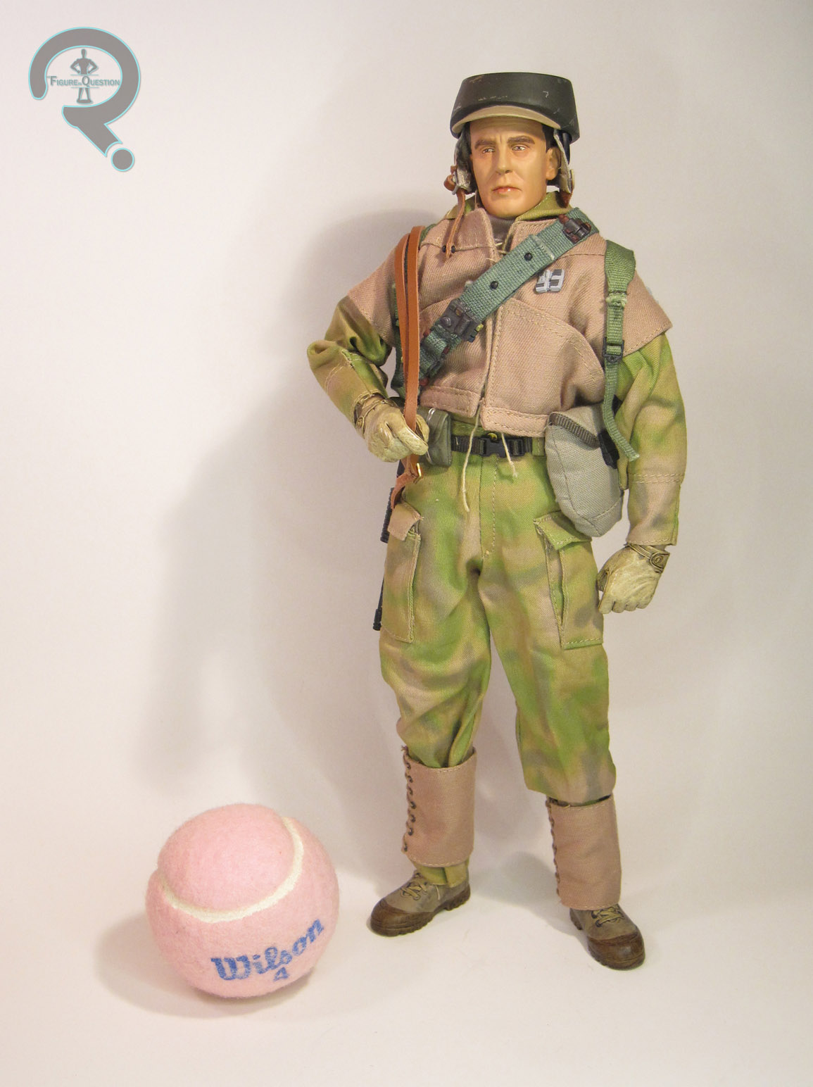
The Endor Rebel Commando was released by Sideshow in 2007, as the debut offering in their Militaries of Star Wars line.  The Rebel was no doubt chosen for the relative ease of creation, especially when compared to the likes of the Stormtroopers.  There were three versions of the Commando available: the Infantryman, the Pathfinder, and the Sergeant.  The figure seen here is the Infantryman, the most widely available of the three, and the one meant to represent the most basic “army builder.”  It’s the same basic design as the Endor Rebel Soldier I looked at from the PotF2 line, though he’s obviously aiming for a more screen accurate appearance.  The figure stands 12 inches tall and has over 30 points of articulation.

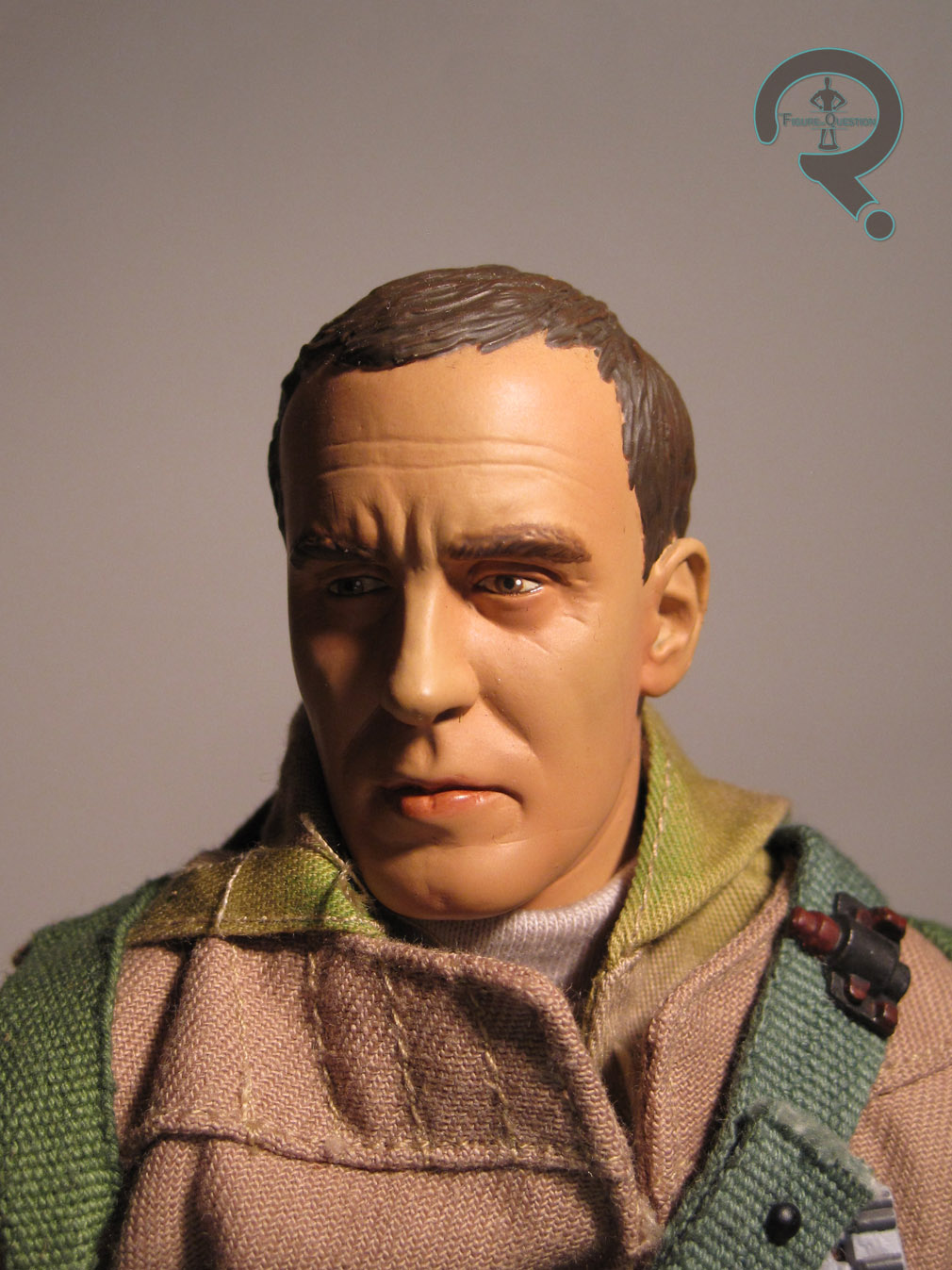
The headsculpt was a slight change of pace for Sideshow’s Star Wars stuff, since he’s not meant to be based on one particular actor or character.  However, he’d look kind of odd if he were too generic. So, what Sideshow did was create a sculpt that was realistic, and clearly one individual, but still generic enough that if you have a few of them standing around, it’s not going to look too odd.  While I don’t know that the sculpt they gave us is my ideal head for a Rebel Soldier, there’s no denying it’s a very well crafted sculpt, which looks quite lifelike given the period of time in which it was released.  He’s perhaps a little cartoonish by modern 1/6 standards, but he’s right on par with the rest of Sideshow’s stuff at the time, and a marked improvement over the types of sculpts we were getting from Hasbro just a few years prior.  The paint work is somewhat thickly applied and a little basic by modern sculpts, but once again was very good for the time, and, admittedly, not bad even by modern standards.   The eyes in particular showcase some incredibly lifelike work.

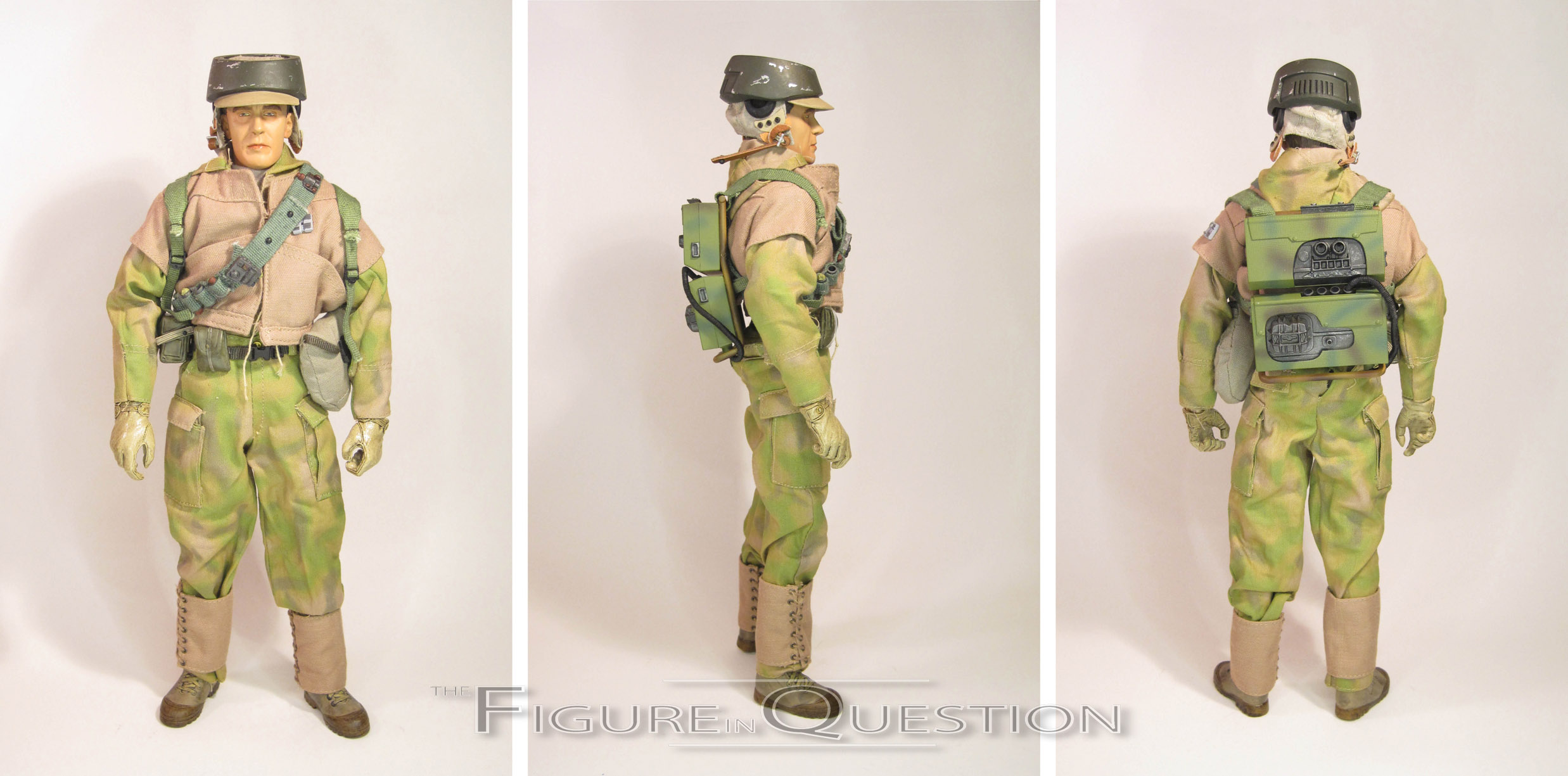
The figure’s outfit showcases another area where the industry really changed following this figure’s release.  It’s a mixed media affair, as you’d expect.  He’s got a vest, jacket, undershirt, and pants that are all tailored pieces.  Though by today’s standards, they may be somewhat bulky, loose-fitting, and sport some rather sizable seems, they were decent work for the time, and again an improvement over similar figures from other companies.  With a little bit of careful posing, you can get them to look pretty great.  He also gets a belt with number of sculpted pouches (and one cloth one) and a bandolier, which both match the other offerings in style, and replicate the gear the Rebels were carrying in the movie.  His boots and gloves are sculpted.  The gloves are actually just hands, and they’re very nicely detailed, and quite well scaled to the body.  Sideshow at this time was always very good with the gloves.  The boots are, unlike with later figures, actually boots that slip over the figure’s feet.  Due to being made from a softer material, their detailing isn’t quite as sharp, but they’re still very good.  Lastly, and most importantly, the Infantryman has his helmet.  The Endor helmets are my favorite aspect of this design, and while this one isn’t a 100% match for the ones from the movie (it’s a little flat at the top, and sits a little high on his head), it’s still a very nice piece, and really pulls the whole figure together.

The primary failing of this, and really all of the early Sideshow Star Wars offerings, is the base body he’s built on.  He uses Sideshow’s Buck body, which was decent when they first started using it, but was almost a decade old by the time of this figure’s release.  It’s a rather stiff body, and clothes have trouble hanging the right way on it.  It’s also very skinny and suffers from some very odd internal proportions.  It’s this body that makes the uniform look a bit more off than it should, despite how it looks when not on this body.

The Infantryman’s uniform was more involved than some of the line’s other figures, so by comparison, he’s a little lighter on accessories.  He includes a Blastech A-295 blaster rifle, his hard-pack survival pack, and a display stand with the Star Wars logo on it.  He doesn’t get some of the more interesting smaller extras, but what he gets all of the basics.

THE ME HALF OF THE EQUATION

It took me quite a while to actually break into the Sideshow Star Wars line, and it was a ways after this figure’s release.  I remember being very interested in possibly getting this figure, but I just never did.  He’s not a bad figure at all, especially when you look at when he was released.  What’s more, this is still the only time that the Endor Rebels have been released in this scale.

The item reviewed here is not from my personal collection, but was instead loaned to me for review by my friends over at All Time Toys.  If you are interested in owning the figure from this review, he’s available through All Time’s eBay page.  And, if you’re looking for other toys, both old and new, please also check out All Time’s full eBay store front, and take a look at their webstore at alltimetoys.com.
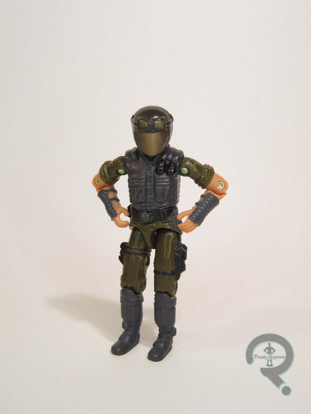
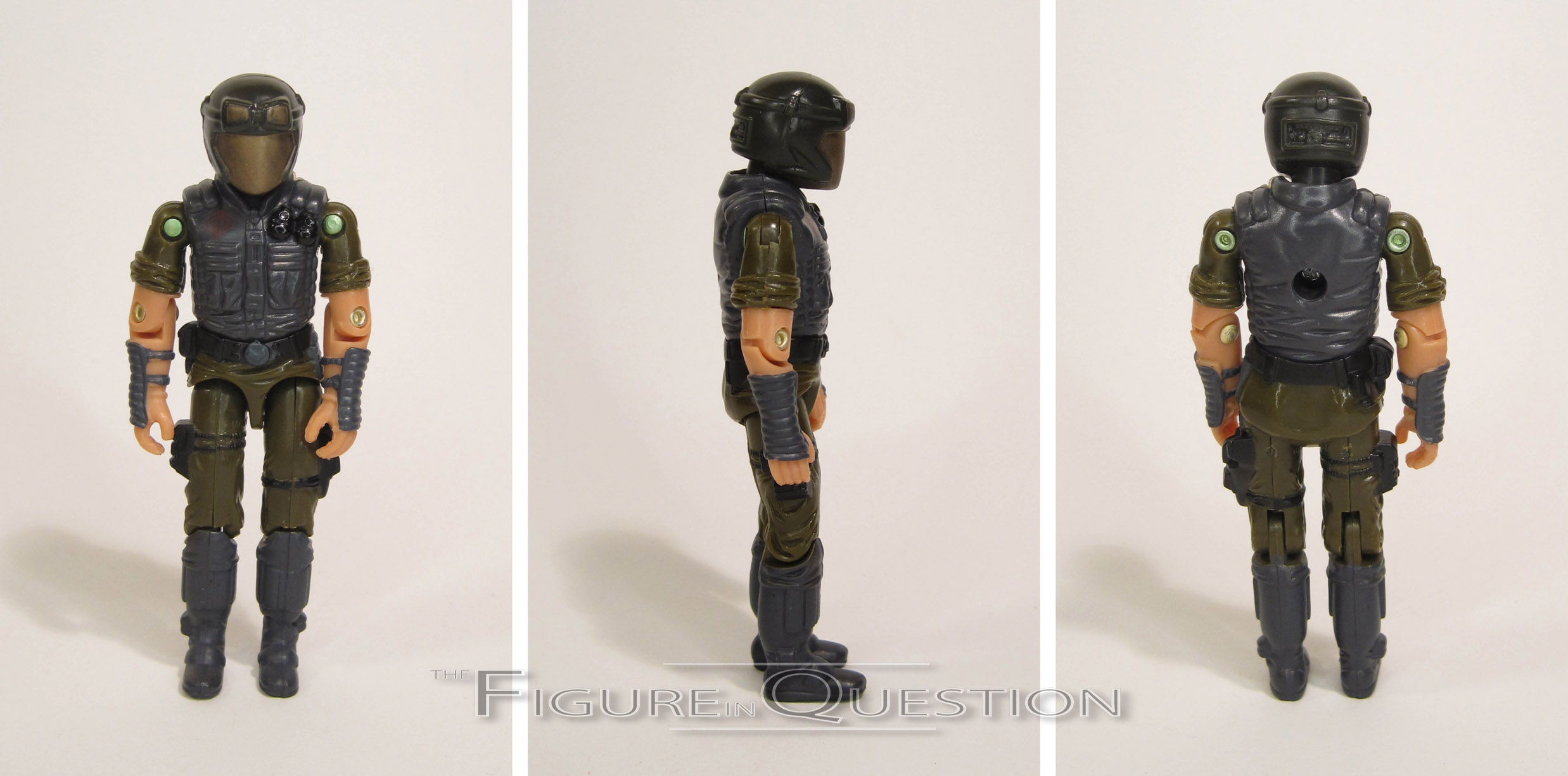
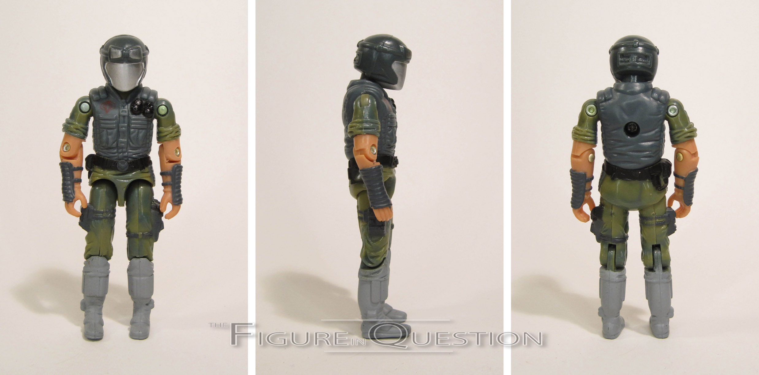
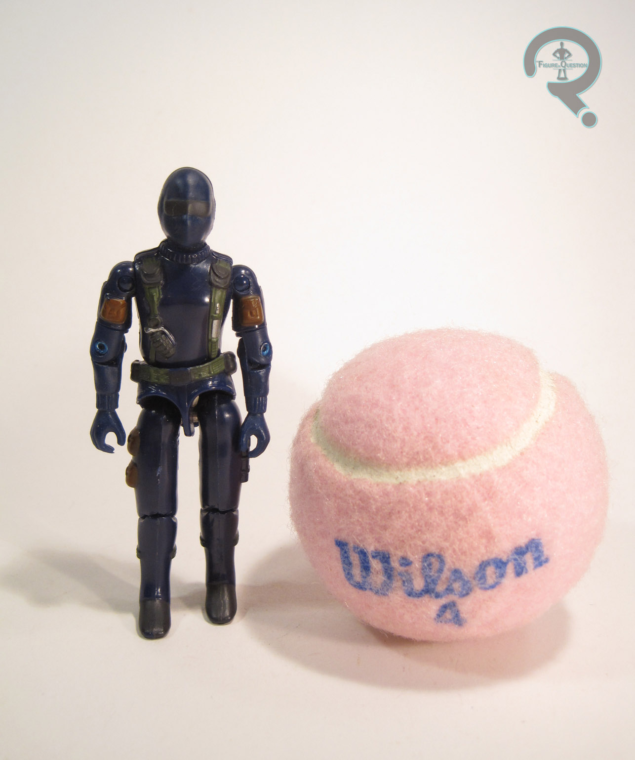
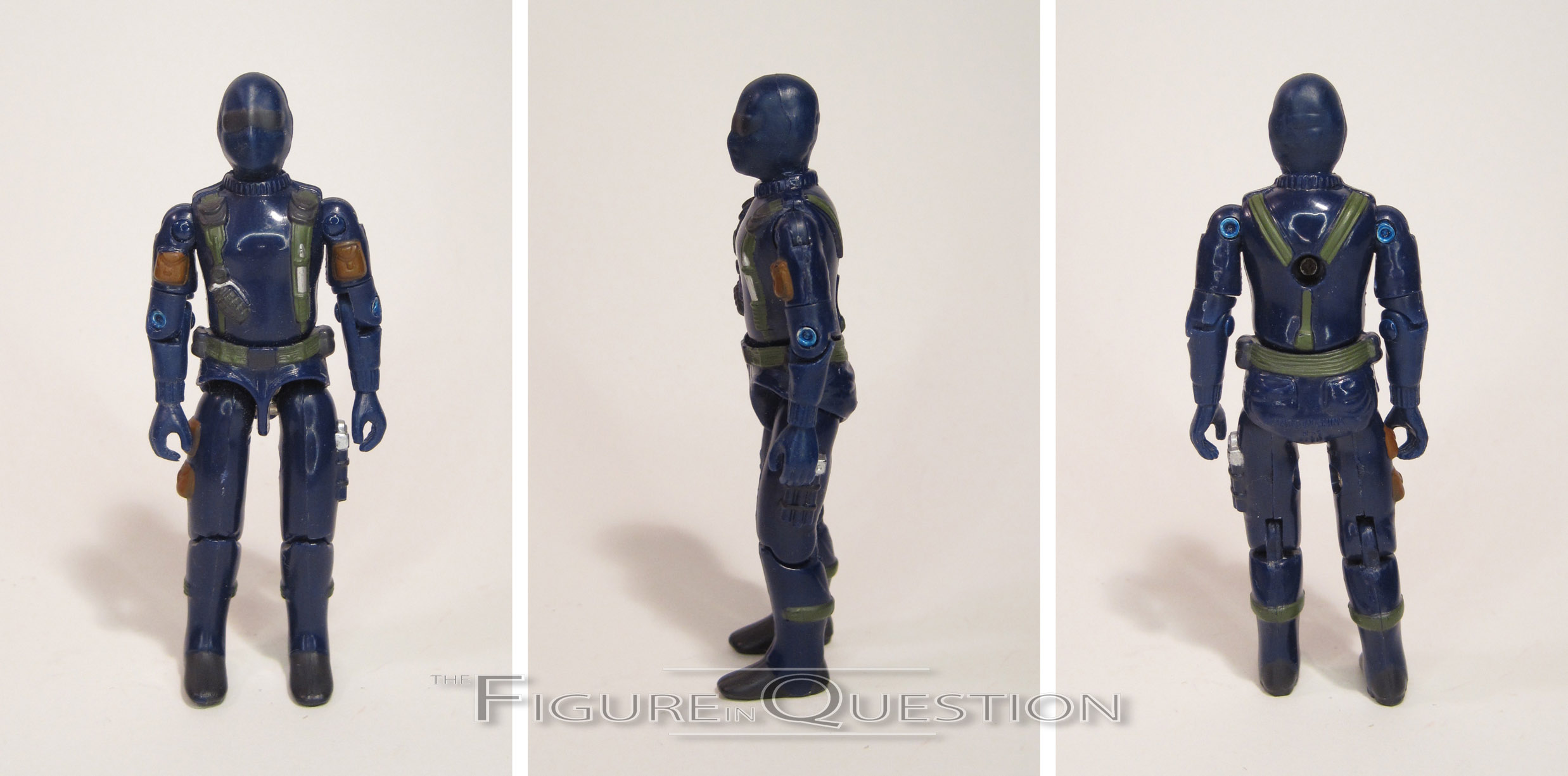
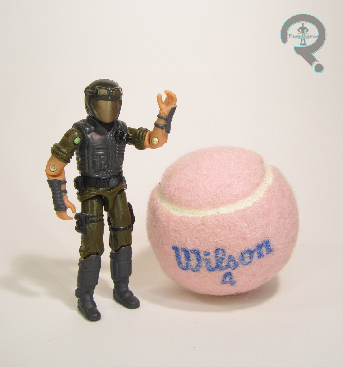
#1636: Johnny Quick

JOHNNY QUICK

CRIME SYNDICATE (DC DIRECT)

The Crime Syndicate is a fairly simple concept.  They’re just an evil version of the Justice League.  Pretty straight-forward stuff.  That’s probably why, even after multiple attempts by DC to abandon the whole Multiverse concept, this group is always pretty quick to turn back up.  They’re actually a bit less frequent than you might think when it comes to toys, though.  Despite first appearing in 1964, it wasn’t until 2003 that they got their first action figures.  I’ll be looking at the first figure of Flash-equivalent Johnny Quick* today.

THE FIGURE ITSELF

Johnny Quick was released in the one series Crime Syndicate line from DC Direct.  He’s based on Johnny’s classic design, which is a pretty straight forward take off of the Flash’s design (though not as straight-forward as the *other* evil Flash equivalent, the Reverse Flash, who pre-dated Johnny by a year).  The figure stands 6 inches tall and has 9 points of articulation.  Not a lot of movement, and he’s really only good for a basic standing pose, but this was pretty standard for DCD figures of the time.  Johnny pre-dates DCD’s move to artist-specific figures, so he’s instead patterned on DCD’s then current house style.  It’s a style that works especially well with silver age characters like Johnny.  The figure’s sculpt is basic and clean.  He’s not too bulky or too skinny.  Most of his costume details are painted, rather than sculpted, so his head is where most of the important work is.  It’s a decent enough sculpt, but I do wish his expression was a bit less bland.  Johnny was prone to his maniacal laughing and the like, so an evil grin really would have really hit the spot.  The others in this assortment were a bit more emotive, so poor Johnny was just left out in the cold.  The paint work on Johnny is clean, and the colors are bold.  His red/yellow were well-matched to the Flashes that DCD had available at the time, which was a plus.  Nothing particularly notable or exciting beyond that, but hey, passable is still passable.  Johnny’s only accessory was a Crime Syndicate logo-emblazoned display stand.

THE ME HALF OF THE EQUATION

Acquiring the Crime Syndicate figures was a rather slow process for me, despite my excitement for them when they were announced.  Johnny was the fourth one I picked up, actually a few years after his release.  Despite having long since sold out of their initial quantity, Cosmic Comix had gotten in another of this guy, and I ended up grabbing him during a sale (I think it was for Free Comic Book day, but I could be wrong).  He’s an okay figure.  Not perfect, but he’s definitely a solid offering, especially for the time.

*not to be confused with DC’s heroic speedster, John “Johnny Quick” Chambers, an Earth-2-based hero from the ‘40s.

#1610: Klingon Borg

KLINGON BORG

BORG: ASSIMILATION (ART ASYLUM)

Today’s post is brought to you by Super Awesome Girlfriend.  No, she didn’t buy me this figure, but she did point to this spot on my calendar of upcoming reviews, hold up today’s figure and say “you should do this one on that day.”  Who am I to argue?  Well, the owner and head writer of the site, I guess, but I’m really not going to push this one.

In the early ’00s, after Playmates had held the Star Trek license for over a decade, the reins were passed to up-and-coming company Art Asylum.  Poor AA ended up with some of the worst Trek properties to merch (Enterprise and Nemesis), but still put out a solid selection of figures.  They weren’t afraid to experiment a little bit with things.  One of those experiments was their Borg: Assimilation line, which toyed with what non-human races would look like when assimilated by the Borg.  Today, I’m looking at the Klingon.

THE FIGURE ITSELF

The Klingon Borg, officially designated 1 of 3, was part of the first, and only, series of Art Asylum’s Borg: Assimilation line.  The figure stands a whopping 8 inches tall and has 16 points of articulation.  He’s a little restricted in terms of movement, but he was fairly decent for the time.  The big claim to fame of any Art Asylum figure was sculpting.  The Klingon Borg had an all-new sculpt, featuring a tremendous amount of detail work.  Every surfaced is covered with some sort of texture or small detail, from the ridges on his forehead, to the machinery of his Borg components.  This guy lives up to the Borg’s penchant for asymmetry, with one cybernetic eye, two differently shaped shoulder-pads, and one big honking claw arm to replace his right limb.  He loses the usual Klingon dreads, which impacts his design a bit; originally, he was designed with a bevy of cables that would replace the hair, but apparently this made him look too Klingon.  As it stands, he’s got just the one big wire, which is a decent halfway point.  His face is a good mix of Klingon and Borg sensibilities, with a determined, but still somewhat lifeless stare to his eyes.  It’s worth noting that this figure is a fair bit more stylized than many of AA’s Trek offerings, with a more pronounced set of features on his face, slightly exaggerated proportions, and a decidedly slouched pre-posed nature.  But, as a concept figure, this guy is more about what could be, outside of the limitations of a live-action sci-fi show’s budget.  Though his paint is somewhat monochromatic, it is no less carefully detailed than the sculpt.  His cybernetic sections in particular are rife with small detail work, showcasing a variance in silvers, greys, and brasses that keep him from looking too bland, and give him that nice “used future” feel.  For accessories, all this guy had was the weird themed coin thing that all of the AA Trek figures got.  This one’s red and has the Borg symbol on one side.  Not really much to do with the figure, but given the effort that went into the figure’s design and sculpt, the lack of real extras doesn’t hinder him.

THE ME HALF OF THE EQUATION

I remember seeing this guy when he was new.  He seemed to hang around KB Toys for a little while.  I almost got him on several occasions, but kept passing for other things.  He and the rest of this series ended up being part of this year’s Farpoint charity auction, and it was that wonderful mix of being something I’d been looking for and also being for a good cause, so I went for it.  Though I’m hardly the world’s largest Trek fan, I can’t deny this is one cool figure.

#1600: Snake Eyes

SNAKE EYES

G.I. JOE: A REAL AMERICAN HERO

“SNAKE EYES served in Long Range Recon Patrols in Southeast Asia. He left the service to study mystic martial arts with the same Ninja family that produced STORM SHADOW. SNAKE EYES was living an ascetic existence alone in the High Sierras with his pet timber wolf when he was recruited for the GI JOE team. He is a qualified expert in all NATO and Warsaw Pact small arms, has a black belt in 12 different fighting systems, and is highly skilled in the use of edged weapons.”

Ah, look at that.  Another hundred reviews.  That means it’s time for—wait, sorry, hadn’t updated the script.  Right.  Hi there dear readers!  Welcome to the Figure in Question’s 1600th review.  Usually on the hundred mark I do a special high-end deluxe review, but I like to mix things up occasionally and space those particular reviews out a bit more as I go along.  So, the deluxe reviews are new going to be every 250 reviews from now on.  So, in honor of this not at all monumental review, I’ll be taking a look at a Snake Eyes figure.  Wooo-eee.

THE FIGURE ITSELF

This particular Snake Eyes figure was packed with the Kid Rhino DVD release of the first two mini-series of the G.I. Joe: A Real American Hero cartoon, which hit in 2003.  It’s the 16th version of the character released, and is actually just a slight re-working of his very first figure.  This figure stands 3 3/4 inches tall and he has 14 points of articulation.  Sculpturally, he’s the exact same figure as the ToyFare-exclusive Snake Eyes figure from the same year (already reviewed here).  It’s the original Snake Eyes mold, with the version 1.5 swivel arms, and Roadblock’s pelvis piece.  It’s a sculpt that shows its age, but one I still very much like.  The main difference with this figure and that one is coloring (though not paint, as the actual paint applications on these two are identical).  Rather than Snake Eyes’ usual all black palette, this figure is molded in a dark blue, which mimics how he was colored in the cartoon.  Given how this figure was released, it’s certainly a reasonable change, and makes for a somewhat unique looking figure.  Snake Eyes was packed with a pretty decent accessories complement, given his nature as a pack-in.  He included a sword, an Uzi, a pack of explosives, a back pack, and his trusty canine sidekick Timber.  Sadly, I lost Timber at some point, something I still kick myself about.

THE ME HALF OF THE EQUATION

I got the DVD set that included this guy as a Christmas present from my parents some years back.  I know I’d seen it somewhere and expressed interest in it, and they took note of this and got it for me.  Of course, I certainly didn’t ask for the set just for the figure included with it.  That would be preposterous, right?  Who would do something like that?  Not me.  Not me at all.  Despite essentially having reviewed this figure before, there’s just something about this particular variant that I really like. 

#1587: Green Lantern

GREEN LANTERN

JUSTICE LEAGUE (MATTEL)

When assembling the final line-up for the Justice League animated series, the creators were faced with two slight issues.  First, the traditional roster of seven members was, apart from one woman and one alien, all white guys, which isn’t particularly diverse.  Second, the traditional roster was made up of characters with very set roles in the public eye, which doesn’t necessarily allow for lots of creative freedom in storytelling.  They solved both of these problems with a minor line-up tweak.  Founding member Aquaman was replaced with the lesser known Hawkgirl, and Green Lantern Hal Jordan was replaced with his less explored successor John Stewart.  It proved a success not just for the creators, but also for the two characters chosen.  For John Stewart in particular, it took him from being probably the least known of the Earth-based Lanterns to being THE Green Lantern for an generation of DC fans.  Sadly, he’s somewhat fallen out of fashion again, but let’s remember back to the times when he was at the top, shall we?

THE FIGURE ITSELF

Green Lantern was part of the first series of Mattel’s Justice League line.  Alongside Superman and Batman, he and Flash were definitely the lesser knowns, and as such was the short packs of the lot, which made GL a little hard to track down at first.  Fortunately, the popularity of both the show and the character saw this particular figure getting more than a few re-releases over the years.  The figure stands just shy of 4 1/2 inches tall (GL was the shortest of the founding 7 members, so this was accurately depicted here), and he has 5 points of articulation.  His sculpt was, like all of the Series 1 and 2 figures, done by DC Direct, and then handed over to Mattel when they won the DC license.  It’s really just a shrinking down of DCD’s GL Maquette from the time of the show’s premier, but that was a solid rendition of the character, and it still is on this figure.  The articulation’s not really good for a whole lot, and was certainly a low count, even at the time.  Nevertheless, it was consistent with the prior Kenner/Hasbro animated offerings, and it was really the best that could be hoped for in terms of preserving the aesthetics of the animated design.  As far as paintwork went, GL was pretty straightforward.  I always felt the main green could have stood to be a little lighter (and, going by its shading on the show, it probably should have been metallic), but it’s ultimately a decent offering.  One minor flaw?  His eyes have black pupils.  In the show, they were green, showing the effects of the power ring.  Future figures had this corrected, but this guy just has green irises instead.  Green Lantern was packed with a blue stand, which connected with those of the other main League-ers, to spell out the team’s name.  Lantern gets “JU” so he’s meant to go at the front.  It’s a decent piece, but a bit cumbersome for display purposes.  Sadly, that was all he had; no power battery or constructs for this release.

THE ME HALF OF THE EQUATION

While I was able to score a Flash figure pretty quickly when these figures first hit, GL proved to be slightly more difficult to find.  Fortunately, I was able to get some assistance from my friend Cindy Woods, who tracked down a GL for me in fairly short order.  He’s not the greatest John Stewart figure (though he’s certainly a large improvement over the last one I looked at on this site), but he was good for the time, and has remained a favorite of mine.

#1585: Spider-Man – Battle Ravaged

SPIDER-MAN – BATTLE RAVAGED

SPIDER-MAN CLASSICS (TOY BIZ)

“The amazing Spider-Man uses his sensational spider-powers to protect society from the world’s most dangerous super villains.  It takes all of his super-human strength, speed, and agility to fight the forces of evil.  He often faces insurmountable odds and is forced to combat numerous opponents at the same time.  Not even his amazing early warning “spider-sense” can always keep him from being hurt in battle.  However, Spidey’s incredible determination and will to win lets him triumph in battles against impossible odds.  In the process, his world famous red and blue costume is often torn to shreds.  It’s a good thing our hero created his own costume and knows how to sew up a replacement.  Where else can a superhero bring their costume to be mended?”

Man, Toy Biz’s bios sure were in-depth, weren’t they?  I dig that they got all of Spidey’s usual descriptors in there.  Someone was having a good time with that one.

Spider-Man Classics marked Toy Biz’s first move towards the style that would define the industry for the next decade or so.  The first series was a smash success, and happened to feature both the basic and black-costumed variations of Spider-Man.  When it came time for the follow-up, they had to get a little more inventive for the necessary Spider-variants.  Hence, the Battle Ravaged Spider-Man, a figure I’ll be looking at today!

THE FIGURE ITSELF

Battle Ravaged was one of the two Spider-Man variants in Series 2 of Spider-Man Classics (the other was First Appearance Spider-Man).  This would mark Toy Biz’s second Battle-Ravaged Spider-Man, following the one from their 5-inch line years earlier.  This figure stands 6 inches tall and he has 30 points of articulation.  Rather than just going for a sort of generic battle-damaged look, this figure actually goes for a very specific look, namely Spidey’s damaged appearance from the Todd McFarlane-drawn “Torment” storyline.  It was a fairly pivotal storyline at the time of its release, and it helps the figure blend in well with the rest of the Classics figures, which had all followed a decidedly McFarlane Spider-Man aesthetic.  Obviously, this figure made use of a lot of pieces from the Series 1 standard Spidey.  That figure was very good for its time, and while some aspects of it haven’t aged the best, it’s still a solid offering.  He also gets a new head, right hand and forearm, left upper arm, thighs, and left shin.  These new pieces fit in seamlessly with the old parts, and the battle damaged parts look pretty impressive.  The head’s really the star part of the sculpt, being a pretty spot-on recreation of McFarlane’s battered Peter Parker.  The paintwork on this guy is pretty solid overall.  The colors are well chosen, and the black wash used all throughout the figure helps to really accentuate the detail in the sculpt.  There are some issues with some bleed over, especially on the parts showing the damage, but the overall look is good.  Spider-Man was packed with a wall-mountable display stand, depicting Lizard trapped under debris.  It’s actually really well-detailed, and he even has a jointed neck, jaw, and shoulder.  Very impressive.  Also included is a reprint of Spider-Man #5, which is part 5 of “Torment” and features a beaten down Spider-Man battling the Lizard.

THE ME HALF OF THE EQUATION

Battle-Ravaged Spider-Man was actually my first Spider-Man Classics figure.  On a particularly rainy day, my Dad and Grandmother had taken me out.  We stopped by a nearby comic book store (which I, sadly, cannot remember the name of) which had this guy and no one else from the series, so he was kind of my only option.  Nevertheless, I thought he was really cool, so my Grandmother picked him up for me.  It’s a figure that shows its age, but I still really like this guy!

#1584: Red Falcon

RED FALCON

MICRONAUTS (PALISADES)

“The most fantastic and elaborate of the original Micronauts figure line, this winged warrior was dubbed “The Prince of the Micronauts” and – like Emperor – plays a mysterious role in the Microverse.  Red Falcon transforms as occasions or battles require, becoming an avenging angel or transforming into a stellar warbird with Hypersonic Missile Launchers.  The prize of the classic Magna-Powered Micronaut series, he returns to a new century with a new weapon and fantastic new colors.”

I’ve delved into the sad tale of Palisades’ Micronauts line twice before, with one figure from the first series and one from the first and a half series (just go with it).  Today, I jump forward one more series, looking into one of Palisades’ final offerings from the line, Red Falcon.  Red Falcon?  Wait, isn’t that the Marvel comics character?  No, wait, that’s just the Falcon, and he’s mostly red.  This guy’s blue.  Does that make him Blue Falcon?  No, because then Hannah Barbera’s gonna be all mad and poor Dyno-Mutt will be confused.  This is RED FALCON, the Micronauts character.  Who, inexplicably, doesn’t actually have much red going on.  Try not to think about it too much, okay?

THE FIGURE ITSELF

Red Falcon was part of Series 2 of Palisades’ Micronauts, which, thanks to some rough circumstances surrounding the line, actually ended up as the third assortment of figures to hit retail.  Unlike his vintage counterpart, which only had one color scheme, this Red Falcon was available in three different color schemes: the classic primary colored scheme (seen in this review), a green and bronze scheme, and a translucent red/yellow scheme.  The classic scheme was the heaviest packed, followed by the green, and finally the red.  Yes, that’s right, the red Red Falcon was the chase.  Good times.  The figure stands 6 inches tall and he has 11 points of articulation (you could add two more points to that for the wings, but when plugged into his back, they don’t really move).  Red Falcon was one of the lager Magna-Powered Micronauts, in the same style established by the likes of Baron Karza and Force Commander.  In addition to his larger size, he also featured a magnetically attached head and limbs.  It’s an interesting gimmick, but has the unintended side-effect of causing him to fall apart a lot.  He also had rocket fists, which, while cool, also means his hands pop out a lot.  What I’m getting at here is that he falls apart a lot.  But, the important thing here is that he also goes back together, which was more than could be said about the Series 1 figures.  Palisades made tweaks to their Micronauts to distinguish them from their Mego counterparts, but Red Falcon was probably one of the least changed, I’m sure largely due to how rare the original figure was in the States.  Red Falcon’s sculpt is definitlet one of my favorites from the line.  Though he still keeps much of the Micronauts aesthetic, there’s no denying that Red Falcon showed a lot more Japanese influence than many of the line’s offerings.  His head in particular brings to mind a lot of classic anime, and even a little bit of a super sentai vibe.  This is a guy wouldn’t look out of place fighting the likes of Ultraman or the Power Rangers, or helping out Astro Boy.  As with all Micronauts, this sculpt is definitely a product of the time it came from, but there’s a definite charm to the clean, smooth, line work of this guy.  of course, there are still a lot of small details that are a lot of fun, especially the fully detailed mechanics under his clear torso.  Paint is at a minimum on this guy; he’s mostly just molded in the appropriate colors.  He’s definitely very vibrant, though, and the chrome on the torso does a great job of tying him back to the rest of the line.  In terms of extras, Red Falcon was pretty well-off.  He gets his big-ass sword (which is chrome and oh-so-cool), as well as the new cannon piece that matches it.  Also included are the pieces to turn him into his actual bird form.  Yes, Red Falcon was one of the earliest examples of a transformer.  Of course, it’s really rudimentary.  Essentially, you just pop off the head and limbs and put on the bird pieces in their place.  The only shared piece is the torso, and if you’re clever, you can even assemble the pieces without that, giving Red Falcon a cool companion.

THE ME HALF OF THE EQUATION

Red Falcon was one of my earlier Micronauts.  I was fascinated with the original, but obviously he wasn’t available to me.  So, the re-release was at the top of my list, and he was my second purchase (after a Series 1 Time Traveler, and at the same time as Series 1.5’s Time Medic).  But here’s the thing: remember how I mentioned he fell apart really easily?  Well, I was twelve when I got him, and not quite so careful with my figures as I am now.  Needless to say, my original figure is no doubt scattered throughout various sections of my parents’ house.  During my collecting renaissance the summer after my first year of college, I decided I ordered a replacement, though I assumed I’d be getting the green variant.  Instead, this guy showed up, and I wasn’t even mad.  In fact, I was quite the opposite.  This figure remains one of my favorite Micronauts, challenged only by Battle Acroyear.