#1192: Superman Red

SUPERMAN RED

JLA (KENNER)

supermanredjla1

A ways back, almost 600 reviews ago now, I tackled the wonderfully ‘90s concept of the electrically powered Superman Blue, DC’s second bid at re-inventing Superman in that particular decade.  Not long after that, I also tackled Superman Red, who was the end result of Superman Blue getting split into two different entities.  The whole thing was ultimately pretty short-lived, but it was timed just perfectly enough that both versions were still the official status quo take on Superman when Kenner launched their JLA line in the ‘90s, thus placing them in the line instead of the more conventional take on the character, and giving us the first of a handful of figures based on the designs.  Today, I’ll be looking at the hot-headed Superman Red!

THE FIGURE ITSELF

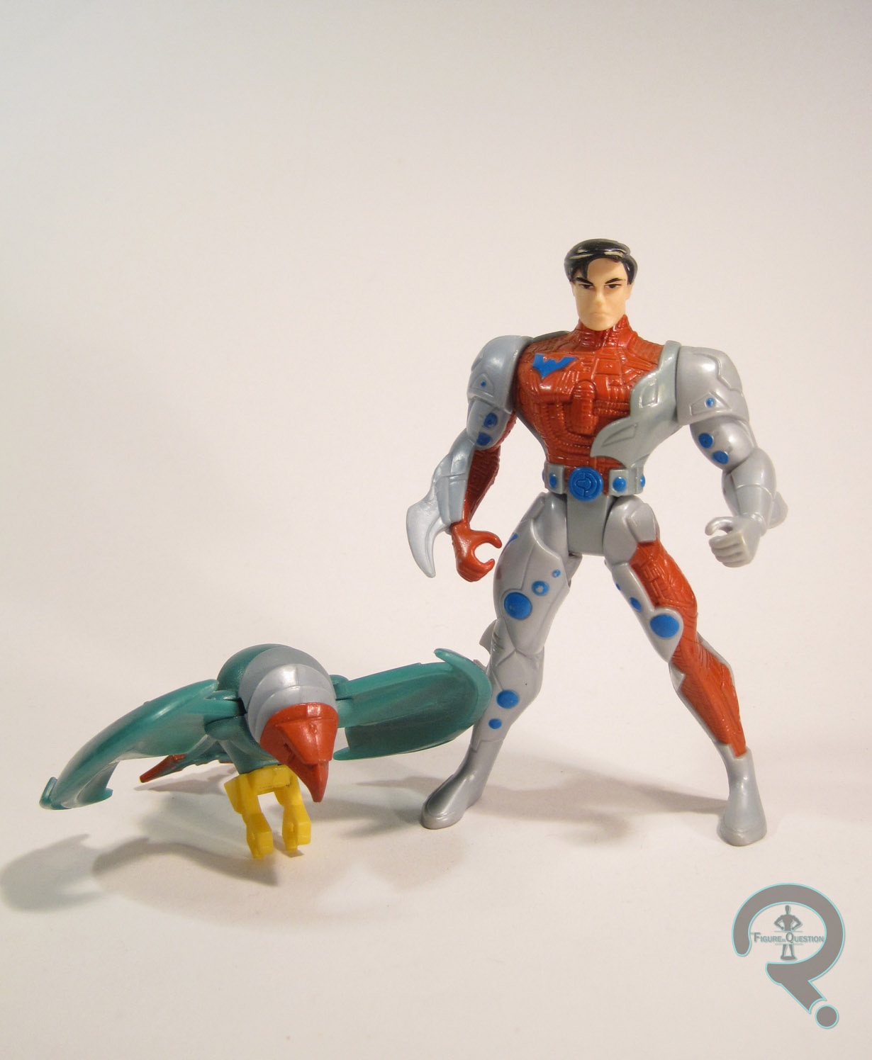
supermanredjla2Both Superman Blue and Red were released in the first series of single-carded JLA figures.  However, while Blue was also available in the first boxed set of figures, Red was exclusive to the singles (and is the only figure from Series 1 to be so).  The figure stands about 5 inches tall and has the standard 5 points of articulation for the time.  JLA was largely a way for Kenner to reuse their old Total Justice molds another time (though later assortments would steadily add more and more unique pieces to get a few more characters not released in Total Justice), so it’s not really a surprise that Superman Red was a total re-use.  That being said, he was certainly a more uneventful re-use than some of the other figures.  Most of the first series were just simple repaints of their TJ counterparts, but since Superman’s design had changed more than a little, they had to Frankenstein him a bit to get as close as possible.  He (along with Superman Blue and the evil Hardlight Superman from the second boxed set) uses the torso, arms, and legs of the Total Justice Superman, with the head from Man of Steel’s Hunter Prey Superman (the one packed with Doomsday).  The result is close enough…if you squint.  The body still has the belt, shorts, and boots of the original figure, just painted over as if they aren’t there, which is certainly odd, but not too horribly distracting.  What is distracting is the head’s painting over the clearly defined edges of the head gear, giving him these obvious lines running down his cheeks and across his forehead. Sure, the paint application’s clean for what it is, but what it is is a flagrant disregarding of the actual sculpted material.  On the plus side, he’s a nice, bright red, which means he really pops on the shelf.  So, that sorta makes up for it, right?  JLA figures were usually pretty light on the accessories, but Superman, like the rest of them, includes a display stand.  It’s even in red.   There’s also a cover on the back of his box which can be cut out and placed on the back of his stand.  It’s JLA #7, which is kind of an odd choice, since not only is Superman Red not on the cover, he’s not in the issue.

THE ME HALF OF THE EQUATION

I was never much of a fan of Superman Red or Blue growing up.  It was sort of a weird period of time, and all the Superman merchandise was one of these two, and it felt wrong to me.  So, I didn’t have this figure or his blue counterpart (I did have the Hardlight one, though), and instead waited for the proper classic Superman later on in the line.  As time as gone by, I’ve gotten lots of classic Supermen, and now I have this weird nostalgic twinge for these designs.  I found this guy in the bargain bin at this nearby comics and games store called Player’s Choice, and he called to me.  He’s sort of a goofy figure, but it was a goofy concept to begin with.

Flashback Friday Figure Addendum #0001: Night Hunter Batman

0001a

Hey everyone!  Back in October, I made mention of finding a bunch of missing figure accessories and doing a bunch of photo reshoots and how that would mean the occasional addendum here and there in order to make older reviews as complete as possible.  Well, I’m finally getting off my butt and actually doing something with it.  Every Friday from now until I run out of updates, I’ll be linking to an old post, updating the images contained therein, and adding a few new comments about the figure or my review.  Without further ado, I present my first Flashback Friday Figure Addendum!

For today’s FFFA, I’m going back to my very first review of my very first action figure, Night Hunter Batman!

The first post in my humble little blog is a review of the very first (well, technically second, but I’ll get to that in a minute) action figure in my not-so-small collection.  Yep, this is the one that started it all, and 2400 figures later, he does seem to be a bit of an odd choice.

THE FIGURE ITSELF

Night Hunter Batman is a Batman variant from the tie-in line to 1995’s Batman Forever.  He’s black with some bright yellow accents, the obvious choice for creatures of the night.  He once had a cape with a pretty nifty windswept look to it, but I’ve long since lost it.  He also used to have an actual bat symbol on his chest, but if I recall correctly, he lost that fairly shortly after I acquired him.  I feel the true highlight (aside from the actual yellow HIGHLIGHTS) of the figure is the pop-up goggle feature.  There’s a button on his back that, when pushed, extends and rotates the goggles in front of old Bruce’s eyes.  You know, for detective-stuff.  Or going by the name of the figure, hunting stuff.

THE ME HALF OF THE EQUATION

Why, of all the action figures out there, was this my very first action figure?  I honestly can’t say.  I know I liked Batman, though I watched the TV series and in fact didn’t see Batman Forever until I was almost 20.  Maybe I liked the colors.  Most likely, it was the goggles.  I like goggles, and the whole focus of this little guy was those really neat goggles he had.

Remember when I pointed out above that this was technically my second action figure?  Yeah, funny story:  this particular Night Hunter Batman is a replacement for the first Night Hunter Batman, that by all accounts I gave to a girl at a restaurant.  Yes, even at 3, I was quite the charmer.  So, my parents drove me over to Toys R Us (Side-Note: Remember when Toys R Us didn’t suck?  I miss those days…) and purchased me this lovely replacement (EDIT: I stand corrected.  It wasn’t Toys R Us, it was Service Merchandise.  Man, there’s a blast from the past!) .  While there, my dad happened to wander down the aisle and find the Iron Man animated series toys, leading him to a) start his own collection up again b)introduce me to the wonders of Marvel Comics and c) even more directly lead me to my current state of being.  And it’s all because I was trying to impress a girl!  Silly girls!”

Wow, that was surprisingly brief, and left out a lot of the details I would now consider “standard.” It’s so quaint! 

It’s worth noting that Night Hunter Batman is about 5 inches tall and has 5 points of articulation.  Also worth noting are his accessories, missing from the original review.  He had a removable cape, which has a nice windswept look to it, as well as this big…shield thing.  I don’t know.  It’s shaped like a bat. Sorta.  It’s a little hard to get him to hold it properly, and I’m not sure what purpose it would serve whist one hunts…at night…but it’s an entertaining enough piece.  There were also these claw attachments, which hooked onto those two bottom rungs of the shield, but those I truly have lost.

Since writing this review, discussing with my dad about why this was my first Batman, it came up that this was apparently the closest we could come to a standard Batman figure when I went to pick one out.  It would appear this guy got to be number one by sheer luck.  Good for him!

#1123: Bola Trap Robin

BOLA TRAP ROBIN

BATMAN: THE ANIMATED SERIES (KENNER)

bolatraprobin1

Growing up, there were a handful of characters that I was pretty much guaranteed to by in action figure form every time I saw them (it’s not a practice I’ve completely abandoned.  Note my Havok, Wonder Man, and Poe Dameron collections).  One of these characters was Robin (specifically Dick Grayson.  When he switched to Nightwing, those were the figures I wanted), resulting in my collection tending to have more Robins than Batmen at any given point.  A good portion of the Robins in my collection are goofy variants, including today’s entry, “Bola Trap Robin.”

THE FIGURE ITSELF

bolatraprobin2Bola Trap Robin was released in the fifth series of Kenner’s Batman: The Animated Series line.  He would also see a rerelease later on when the line was re-formatted under the Adventures of Batman & Robin banner, but mine’s the original.  The figure is about 4 1/2 inches tall and he has 5 points of articulation that were standard for the line.  At this point in the line, Kenner had moved away from focussing on show accurate stuff and had instead delved headfirst into the wacky variants that would define the Dynamic Duo’s toy presence for the next two decades.  That being the case, Robin is seen here in a costume he never sported in the cartoon, its tie-in comic, or any of the comics it was based on.  The design isn’t really in keeping with the designs on the show, mostly due to being a bit busier than they tended to be.  That being said, it’s not a bad design, per se, especially in regards to being on a toy, where business isn’t the worst thing.  It has some of the typical Robin costume elements, but also mixes in a little bit of the 1989 Batman design, and even a little bit of the ‘90s Nightwing look around the tops of the boots and gloves.  The quilted elements are interesting.  They’re well sculpted, but I do sort of wonder why he’s got them.  Are they to protect him from the titular “Bola Trap”?  Robin has a sort of a preposed nature to him, and is probably one of the earliest examples of this trend occurring in Kenner/Hasbro’s DC figures.  Fortunately, he’s nowhere near the level of something like Total Justice.  Rather, I’d guess that the pose on this guy is so that the figure can still stand while holding the big gimmicky weapon.  Robin’s head is the same basic piece that Kenner used on pretty much all of their animated Robins.  It’s hardly on the level of the DCC version in terms of accuracy, but it’s still a decent enough piece, and it fits with the slightly off styling of the whole Kenner line.  The cape, like all of the capes at this point in the line, is cloth.  This means it doesn’t get the proper yellow lining, but other than that, it’s not terrible.  Robin’s paintwork is decent enough.  There’s a clear effort to making him different from the basic Robin, giving him a yellow and black color scheme.  I’d say he was more of a stealth Robin, were it not for all the bright yellow.  Maybe he’s trying to blend into the same place where Night Hunter Batman’s hiding?  The application’s pretty clean overall.  There are a few fuzzy edges, and some slop here and there, but he’s more or less pretty good.  The main gimmick of this guy is, of course, the bola trap, which seems to translate to big…spinny…thingy.  I’m not sure what it is.  I don’t know that bola is an apt descriptor.  At least it’s not a missile launcher, right?

THE ME HALF OF THE EQUATION

Remember in the intro, where I talked about collecting every figure of certain characters?  Well, I didn’t get this guy growing up.  Instead, in an event similar to the acquisition of the Talking Cyclops figure from earlier this summer, my family found this guy in an antique store about a month ago, and got me this on the pretense of there only being so many chances for them to pick me up a Robin that I didn’t have.  They gave me Robin, alongside a whole bag of things they’d gotten me, when I went up to visit over Halloween.  Also in the bag?  The complete soundtrack to Batman: The Animated Series, which served as my motivational music during this review!  Alright!

#1111: Punch It

PUNCH IT

SMALL SOLDIERS (HASBRO)

punchit1

I feel it would be unfair tor review a member of the Commando Elite without also giving the Gorgonites their proper due, so today I’ll be looking at yet another Small Soldiers figure.  Fun Fact: the supporting Gorgonites in the movie are all voiced by the members of Spinal Tap (likewise, the Commando Elite are voiced by the cast of The Dirty Dozen).  Harry Shearer, also known for his work on The Simpsons, voiced Gorgonite Punch It, whose figure I’m taking a look at today.

THE FIGURE ITSELF

punchit2Punch It was part of Hasbro’s Small Soldiers line from 1998, but he wasn’t a standard release.  Due to his size, Punch It was his own, special deluxe release.  It’s actually a bit surprising that he was just a solo release, and not packed with Scratch It, his perpetual companion from the movie (who you had to buy a large vehicle to acquire).  Anyway, the figure stands a little under 8 inches tall and he has 6 points of articulation.  The articulation issue is still present here, but amusingly enough, Punch It has more articulation than a lot of the figures in the line, despite his on-screen figure actually having less movement than the other figures.  The only real frustrating part for me is that the hands and legs, which are separate pieces, are glued in place, rather than being articulated.  Punch It’s sculpt is actually one of the better sculpts to come out of this line.  It captures the movie design pretty solidly, and there’s a lot of really tight small detail and texture work.  He’s appropriately chunky and solid, and all of the extra details make him one of the most visually interesting figures Hasbro put out.  Possibly the only downside to the sculpt is the fact that if you remove his big missile launcher on his back, there’s a big obvious post sticking out.  Of course, it’s not like it’s anywhere near as obvious as the huge freaking gun thing on Brick Bazooka’s back, so that’s a plus.  Punch It also gets one of the cooler paint jobs from the line.  The basic work is all pretty solid and clean, and the colors match up nicely with his design, but I think the coolest part is the marbleized plastic for his skin, which plays up the texturing very nicely.  Punch It included a back-mounted missile launcher and a clip-on claw for his right arm.  My figure doesn’t have those pieces, sadly, so I can’t expose you guys to the awesomeness therein.

THE ME HALF OF THE EQUATION

I’m always on the prowl for Small Soldiers figures, so when I found Punch It at Yesterday’s Fun over the summer, I was pretty psyched.  Sure, he was loose and missing the accessories, but there’s no denying the sheer coolness of this design.  If I’m totally honest, I think that Punch It’s design was the one that best translated to the actual toyline.  This guy is just really, really cool, and I’m very happy that I got one.

#1110: Sgt. Brick Bazooka

SGT BRICK BAZOOKA

SMALL SOLDIERS (HASBRO)

bazooka1

Back in April, I looked at a pair of figures from Small Soldiers, which is probably one of my favorite movies (I know, Ethan likes the movie about the action figures.  What a shock).  The figures in the movie, built by the legendary Stan Winston Studios, are really, really cool.  There was a tie-in toyline from Hasbro (who also helped design the on-screen figures), which don’t quite capture the awesomeness of their onscreen counterparts, and was sadly short-lived.  That being said, something is better than nothing, right.  Today, I’m taking a look at one of the villainous Commando Elite, Sgt. Brick Bazooka!

THE FIGURE ITSELF

bazooka2Brick Bazooka was released in the first series of Small Soldiers figures from Hasbro.  Unlike Archer and Chip Hazard, this was Brick’s only figure in the line.  This figure is more or less captures his basic look from the film.  He’s about 6 1/2 inches tall and he has 5 points of articulation (well, technically he’s got 6, but one of those is tied directly into his action feature).  As I noted in the last two Small Soldiers reviews, the articulation on these guys is by far the most disappointing aspect. That we couldn’t even get elbows and knees is the worst part.  But, three figures in, I can kind of move on from it.  There’s two aspects of the sculpt: one good, and one sort of weird.  One the good side, from the front, the figure’s a pretty good representation of the “sculpt” from the movie.  He’s got the buzzcut and the super creepy grin down pat, and while he’s not a pitch-perfect recreation of the film design, he fits in well with the other figures in the line, which is really the most important thing.  So, about the weird.  You know how his name has Bazooka in it?  Well, apparently, that means he needs to actually turn into a really big gun.  Because toys or something.  Anyway, the gun swings forward from his back, with his head flipping through the torso, and…stuff.  It’s kinda weird.  I can’t say it adds much to the figure, and it means that he’s got this huge gun sticking off of his back even in normal mode.  It looks rather strange.  The paint work is pretty much on par with the other figures I’ve looked at.  It’s clean, it matches pretty well with the colors on the screen, and all-around looks like what you see in the movie.  There are a few missing details here and there (which was true with the others as well), and mine sort of beat up, but that’s understandable.  Brick was packed with two large guns and a missile for his chest-gun-thingy.

THE ME HALF OF THE EQUATION

When I was growing up, I didn’t have a Brick Bazooka figure, but my cousin Rusty did, and I was always a bit envious of that, because I thought he was a really cool figure.  For whatever reason, Bazooka’s one of the rarer Small Soldiers on the after market, so I didn’t see one for a good long while.  Brick ended up being a birthday gift from my parents, who picked him up for me from 2nd Chance Toyz.  This guy’s really goofy, and totally a product of the ‘90s, but that’s kind of what I’m about.

#1108: Rage

MARVEL’S RAGE

MARVEL LEGENDS SERIES (3.75)

rage1

There are a lot of rather obscure characters in comics.  It sort of comes with the territory, since you can’t expect every single character who appears in a monthly installment of serialized fiction to be beloved by the masses.  What’s interesting with some of these characters is how close to high profile they get.  Take today’s entry, Rage, for instance.  Rage was a member of the Avengers, for over a year no-less, but most people would be completely unable to ID the guy if they saw him.  He did get something of a cult following from his stint with the New Warriors, and now he’s even got an action figure, so maybe things are looking up for him!

THE FIGURE ITSELF

rage2Rage is from the second series of the 3 3/4 inch scale Marvel Legends line by Hasbro.  Thanks to Living Laser’s presence in the set, he may not even be the most obscure character from the series, which is kinda saying something.  The figure stands a little over 4 inches tall and he has 19 points of articulation.  The reduced articulation of this line is something I’ve addressed a few times, and mostly I don’t find it ruins or holds back the figures too badly.  However, Rage seems far stiffer in terms of range than prior figures, and on top of that, his head can’t actually turn more than a few degrees before popping off, which is really annoying.  Rage is seen here in his original costume.  It’s not a particularly attractive design, but let me tell you, he’s had far, far worse during his career.  Rage is built on one of the larger male bodies, with character specific pieces for the head, lower arms, and lower legs, and add-ons for his jacket and belt.  The jacket and belt are definitely very strong pieces, and the hands and feet are pretty good too.  Something about the body and the head seems a little too smooth for me.  Like he’s unfinished or something.  It’s hard to say, but it really feels evident on the torso.  It’s on par with a lot of the other stuff from this particular line, so I can’t really say he’s an outlier in that regard, but I also can’t say that’s much of a point in his favor.  I just sort of wish the whole sculpt matched the quality on the vest.  Rage’s paintwork is generally pretty straight forward.  It’s mostly just solid color work, which works fine for the character.  There’s a little bit of accenting on the vest and pants, which goes a long way, and gives him some much needed pop.  Rage has no accessories, but I can’t really think of what you’d give him anyway.

THE ME HALF OF THE EQUATION

Rage here was picked up for me by totally rad brother, who got him for me while I was away with Super Awesome Girlfriend and her family.  Back when the Marvel Universe line was in full-swing, I put a lot of effort into tracking down as many Avengers in that scale as I could get ahold of, so from that perspective, Rage is pretty cool to finally have.  Could he be better? Probably, but this is quite possibly the only Rage we’re ever going to see, and he’s far from the worst thing ever.

#1104: Cyclops

CYCLOPS

X-MEN: METALLIC MUTANTS (TOY BIZ)

cyclopsmetallic1

I’ve discussed Toy Biz’s larger 10-inch-scaled Marvel figures in the past.  Essentially, since Toy Biz did the prototypes for their successful 5-inch line as two-ups, they had an easy time re-using those sculpts for a line of slightly cheaper 10-inch figures (though, interestingly, the line was originally billed as a deluxe line of figures.  It was only later, when they decided to focus more on building as many figures as they could out of a limited pool of parts that it became “cheap”).  Toy Biz’s 10-inch X-Men line, like it’s smaller scale counterpart, was the most successful of the initial lines, even managing to get its own spin-off line, Metallic Mutants, where certain figures were re-released with metallic color schemes.  Today, I’ll be looking at the Cyclops figure from that line.

THE FIGURE ITSELF

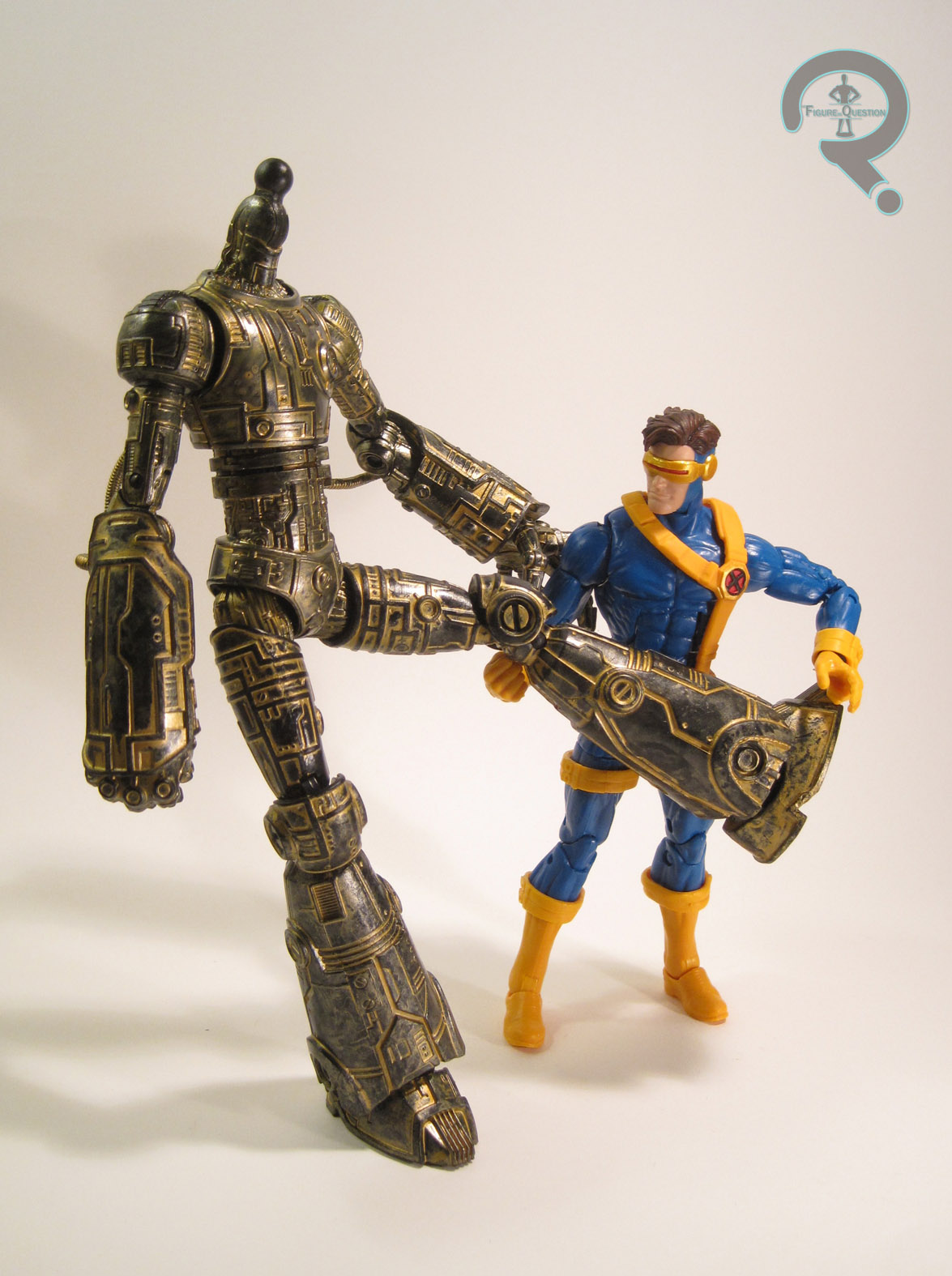
cyclopsmetallic2Cyclops was from the first series of X-Men: Metallic Mutants. The whole Metallic Mutants line was available exclusively at KB Toys (who would also become the exclusive retailers of the entire 10-inch line a few years later).  The figure is about 10 inches tall and he has 9 points of articulation, which was a whole extra point more than his 5-inch equivalent had.  The figure is a straight repaint of the basic 10-inch Cyclops, who was himself patterned on the sculpt of Cyclops II from Toy Biz’s main X-Men line.  The sculpt is a little bit different.  He lacks the light-up feature of the smaller figure, which results in him getting the neck articulation the smaller figure lacked.  Aside from that, the sculpt is pretty much the same.  It’s okay for the time, but certainly isn’t one of Toy Biz’s stronger sculpts.  Due to the light-up nature of the smaller figure, the torso was made a bit larger to house the battery compartment, and that’s still seen here.  While the legs seem to match up okay with the larger torso, the arms and head feel rather under-sized by comparison, which makes him look rather odd overall.  Each piece of him seems fine on its own, but as a whole he looks a bit patchwork.  I will admit, there’s a certain quaintness to the sculpt that I appreciate, though.  The big deal on the figure, of course was the paint.  It’s certainly metallic, there’s no denying that.  The costume looks cool in the metallic shades, but what sort of throws him off is the decision to do his skin and hair in the same gold as the “yellow” bits of the costume.  Clearly, Toy Biz caught on to this being weird, since the second set of Metallic Mutants just had the metallic colors on the costumes, not the actual faces.  Cyclops included a blaster thing, in the same gold as used on the body, which is cool I guess.

THE ME HALF OF THE EQUATION

As hokey as this guy is, I’ve actually always wanted one.  Growing up, I had the little product booklet that came with the TB Galactus, which had these guys all pictured in it, and I always wanted Cyclops in particular.  I ended up finally getting this guy for my birthday this summer from my parents, who bought him from 2nd Chance Toyz.  Is he weird and goofy and strange?  Yes.  Do I love him? Emphatically yes.

#1096: Green Lantern

GREEN LANTERN

DC SUPER HEROES SILVER AGE COLLECTION (HASBRO)

gl9inch1

Hey guys!  In case you didn’t see earlier, The Figure In Question has made it through another year of reviews, which marks three years of me running this humble little site.  In honor of the occasion, I’ll be taking a look at a figure with some extra meaning to me.

I’ve discussed once or twice here how I’m a pretty big Green Lantern fan (or I was.  It’s complicated).  Well, back in the ‘90s, when I was just getting into the world of action figure collecting, Green Lantern was something of a rarity on toy shelves.  To make matters worse, what Green Lantern figures did exist were all based on Kyle Rayner, not Hal Jordan, who was the Green Lantern I was most familiar with (due to Cartoon Network’s Super Friends re-runs and a healthy diet of bronze-age DC comics provided to me by my Dad).  The first Hal Jordan Green Lantern to be released within my lifetime was part of the DC Super Heroes Silver Age Collection, which was Hasbro’s attempt at copying Toy Biz’s attempt at copying Mego with Famous Covers.  Confused?  You probably still will be after this review.  Sorry.  On to the figure!

THE FIGURE ITSELF

gl9inch2Green Lantern was released as part of the first Series of the Silver Age Collection, alongside Aquaman and Green Arrow.  It was actually a pretty bold selection of characters for the time, since all three were at best second stringers, two of whom had been replaced in their respective roles and the third of whom had undergone a massive redesign a few years prior.  The figure stands 9 inches tall and he has 25 points of articulation. He’s based on Hal’s initial Silver Age costume, defined by the lack of green on the shoulders.  As a throwback to the old Mego figures (which, incidentally, did not include poor GL here), this figure makes use of a cloth costume.  The costume is alright.  It’s a little baggy, and the stitching around the shoulders and hips is a touch bulky.  It’s worth noting that the costume looks far better on this figure in it’s packaged-fresh form; my figure has been beat to heck thanks to 10 years or so of steady play, which stretched his uniform out of shape.  The underlying body on this figure (which is the same one used for the other DC 9-inch figures, as well as the later Marvel-based Signature Series) is actually pretty decent, especially when compared to the ones used by Playmates and Toy Biz for their figures in this same scale.  It posed pretty well, and was actually fairly nicely proportioned.  In addition to the base body and the cloth suit, GL gets a sculpted head, hands, glove cuffs, feet, and boot cuffs.  The head is the standout piece on this figure.  I think this is, to date, the best Hal Jordan sculpt ever made, and it was perhaps the strongest sculpt the line produced.  The detail is sharp, and it’s a very good likeness of how Hal was portrayed in the comics.  The rest of the sculpted pieces are decent, if not quite as stand-out awesome as the head sculpt.  The right hand is cool, what with the power ring and all.  And check out Hasbro using that finger articulation a few years before Toy Biz popularized it with Spider-Man Classics.  That’s pretty cool.  As far as paint goes, Hal here is pretty basic, with the vast majority of it being on the head, and even then only being on the hair and the mask.  What’s there is clean, and, most impressively, the green of the mask actually matches the green of the tunic.  GL’s only accessory was a display stand with the DC logo on it.  Each figure included one, but with a variety of different colors, with GL’s being black (rather than the more obvious green…).  He’s one of the few GL figures not to include his power battery.  I actually had a small Coleman lantern keychain that I used with this figure, which I really wish I still had.

THE ME HALF OF THE EQUATION

So, since this was the first Green Lantern Hal Jordan to be released within my lifetime, you’ve probably gathered that this was, by extension, my first Hal Jordan figure.  Not my first Green Lantern, of course, but still.  I remember first seeing the prototype pictures of this figure and being very excited, and then being even more excited when my parents and I found him at the store (I believe it was Target).  This figure is extra important to me because I got him in 1999, which was the same year my younger brother Christian was born, and this guy came with me to at least a few of the hospital visits to see him, which gives him a whole other dimension of awesome for me (the figure, not my brother.  Though my brother’s awesome too, for what it’s worth).

#1095: Adam Warlock

ADAM WARLOCK

MARVEL OVERPOWER CARD GAME

adamwarlocktb1

Around this time last year, I discussed the interesting case of the US Agent figure from Toy Biz’s ‘90s Iron Man line.  He was slotted for the third series of the line, but dropped at the last minute when Toy Biz cut all of their lines back to six figures per series.  US Agent’s mold would bounce around for a bit, and he was ultimately only available through a difficult to acquire, non-Toy Biz or Marvel sanctioned release. 

Running concurrently with the Iron Man line was a Fantastic Four line, which was also subject to the downsizing of assortments.  US Agent’s equivalent in this line was Adam Warlock, who was presumably dropped from the FF line-up because he, like US Agent, was the only character not to be featured on the cartoon the line was meant to tie-in with.  Adam would prove far more fortunate than poor US Agent in regards to his figure’s release, however, with Toy Biz actually finding a venue to put him out.

THE FIGURE ITSELF

adamwarlocktb2After being dropped from the third series of Toy Biz’s Fantastic Four line in 1995, Adam Warlock was ultimately released in 1996 as part of a small KB Toys-exclusive line of four figures designed to coincide with Fleer’s Marvel: Overpower Card Game. The other three figures were straight forward repaints of earlier figures, and much more popular characters to boot, making Adam seem like an odd choice.  I guess Toy Biz just really wanted to get him out there!  Adam is seen here sporting his early ‘90s design, which was kind of a merging of his two previous looks.  It’s my favorite of his looks, but it’s entirely possible that I like it because it’s the one I saw on all those card backs in the ‘90s.  The figure is just over 5 inches tall and he has 8 points of articulation.  Because of the light-up feature integrated into his eyes and Infinity stone, Adam doesn’t get any neck articulation, which results in him feeling rather stiff, even when placed with this compatriots from the same time period.  Stiffness aside, Adam’s sculpt is pretty good.  It’s certainly on par with the rest of the ‘90s FF figures, which is good, overall.  The proportions are a little weird in some areas (especially the upper arms; those things are huge), and the head’s a little soft in terms of detail, but he generally looks pretty good.  Warlock has a removable cape, which actually a fair bit different from the cape his FF prototype was sporting.  This one is much more dynamic in pose, and fits more with the stuff Toy Biz was starting to put out in 1996.  I kind of prefer the prototype version, if I’m honest.  The flow of this one kind of clashes with the style of the figure proper, since he’s just sort of standing there, and it’s all crazy wind-blown.  It also has some trouble sitting right on his shoulders, which can get very annoying.  Another thing that was changed from Adam’s prototype to thee Overpower figure is the paint scheme.  It’s not terribly different, but the yellow was swapped out for gold, and the red has been made a little less vibrant.  Like the new cape, it’s more in keeping with the sort of work TB was doing in 1996, but it results in him not fitting in quite as well with the FF figures as he should.  The gold paint has also not stood the test of time, meaning some of the details get lost.  Adam included his signature staff, as well as an Adam Warlock  Overpower card.

THE ME HALF OF THE EQUATION

Like US Agent, Adam Warlock is a figure I always wanted, due to his presence on the back of the Iron Man and Fantastic Four card backs, but was never able to find, due to the lack of information on such things at the time (the internet was around, but we toy geeks hadn’t quite migrated to it yet).  I’ve known about the existence of this particular figure for several  years, and I’ve even seen him once or twice in person, but I never got around to picking him up.  I ended up finding Adam while exploring the new area I’m living in, at a very cool shop called Power Comics.  Adam’s not quite as fun as US Agent, mostly due to Toy Biz changing so much from ’95 to ’96, and this guy getting hit with some weird amalgamation of those two years’ styles.  If he’d been a straight recreation of the figure as originally intended (like US Agent was), I think he might have been a bit better.  As it stands, I think he’s still the best version of the guy out there.

adamwarlocktb3

#1069: Future Apocalypse

FUTURE APOCALYPSE

X-MEN (TOY BIZ)

futureapocalypse1

The X-Men were kinda big in the ‘90s.  Not sure if you guys knew that.  They were big enough to serve as a pretty good kick-off for the still fairly new to the market Toy Biz, who made quite an empire out of those merry mutants.  Early on, the figures were pretty straight-forward translations of the comics designs (with one or two Animated designs, such as Morph, thrown in for good measure), but as the decade progressed, they started running out of characters to scrape from the bottom of the X-Men barrel, and headed towards some slightly more gimmicky concepts, which allowed them to rehash some of the previously released characters in different and exciting ways.  One such gimmick was “Missile Flyers,” a series of four wing-ed variants released in 1997.  Today, I’ll be looking at Apocalypse from that series!

THE FIGURE ITSELF

futureapocalypse2As noted in the intro, Apocalypse (or “Future Apocalypse” as the box refers to him) is one of the four figures in the “Missile Flyers” series of Toy Biz’s X-Men line.  The figure is about 7 inches tall and he has 11 points of articulation.  His design is a bit removed from the usual Apocalypse look.  He’s far more exaggerated and mechanized than usual.  I think it’s still a comic-based design, but I honestly don’t know exactly where it hails from.  It’s certainly an interesting look for him, though it does make him look more like a Spawn villain than an X-Men character.  It’s probably all that crazy exaggeration on the proportions.  The actual quality of the sculpt is pretty top notch.  There’s a lot of great detail work throughout, especially on the mechanics of the neck.  That looks pretty darn cool!  He does have a little trouble standing, mostly due to the sheer size of his upper arms, but you can get him to remain fairly sturdy with some careful posing.  While most of the Missile Flyers figures had separate, removable pieces for their missile-firing wings that earned them their name,  Apocalypse actually had his wings worked into the main figure.  Each of the wings is on a rotating hinge, allowing them to either be deployed over his shoulders or brought down over his front to form a sort of a robe type thing.  The two halves even form a cool A symbol, like Apocalypse is prone to sport, which  is a cool touch.  The paintwork on Apocalypse is decent enough.  It’s a lot of blues, greys, and silvers, which is right for the character.  My figure’s a little worse for wear, but still pretty good.  He’s not the most colorful figure ever, but it works for him (and was a good contrast to the other figures in the set).  Apocalypse was packed with a large missile, which can be fired from the hole in the middle of his torso (that’s gotta hurt!).

THE ME HALF OF THE EQUATION

Apocalypse isn’t one of my actual ‘90s purchases.  As a matter of fact, I never got any of the Missile Flyers when they were initially released, despite quite liking them.  I ultimately ended up finding Future Apocalypse at a Goodwill this past Father’s Day (along with the bunch of Masters of the Universe figures I reviewed about a month or two back).  I’ve never been the biggest Apocalypse fan, but I like him well enough that I was urged to pick up this figure, and I have to say, he’s actually pretty cool!