STORM, COLOSSUS, NIGHTCRAWLER, SUNFIRE, BANSHEE, & THUNDERBIRD
MARVEL COLLECTOR EDITIONS (TOY BIZ)
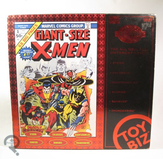
In the 1960s, when Marvel Comics was on fire with all sorts of new ideas, the X-Men were created. The team was Cyclops, Marvel Girl, Iceman, Beast, and Angel. While the series was a moderate success, it wasn’t as big as other titles of the time, and so the book eventually became solely a reprint series, before ending entirely. But, as anyone who has so much as thought about a Marvel comic in the last 30 years can tell you, that was far from the end of the X-Men. In 1975, the series was relaunched with Giant-Size X-Men #1, which featured an all-new, all-different cast of characters. This new cast proved far more successful than their predecessors, and the series went on to become one of Marvel’s most popular. In the 1990s, the X-Men were no strangers to toys, but most were based on the contemporary designs. To appease older fans, Toy Biz launched a line of special boxed sets, based on more classic incarnations of teams, including the All-New, All-Different X-Men, which I’ll be looking at today!
THE FIGURES THEMSELVES

These six figures were released as one of the three sets in the Marvel Collector Editions line. All six are based on their appearances in Giant-Size X-Men #1.
STORM
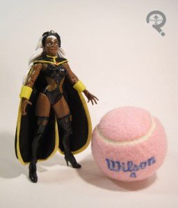 Though she’s by far the most well-known of the figures in this set, this was the first time Storm’s original costume had seen plastic form, and only the second sculpt the figure had gotten in the expansive 5-inch scale. The figure stands 5 ¼ inches tall and has 13 points of articulation. Her sculpt is generally pretty good, and certainly much better than the Marvel Girl sculpt from this set’s X-Men #1 companion piece. The head is definitely the nicest piece here, as it captures Cockrum’s take on Storm quite well. The body is decently sculpted, but suffers from a few issues. First off, she seems to lack Storm’s usual imposing stature, which is sadly common with her figures. She’s also got these odd, claw-like hands, which are definitely too big for the rest of her body. To top it all off, she’s nearly impossible to keep standing for very long. I do like the way they’ve handled the cape, though; it’s cloth, but it’s multiple layers, which give it enough weight to keep it from hanging oddly, and it avoids cutting off articulation as well. Her paintwork is pretty much on par with the rest of what Toy Biz was doing at the time. The colors are nice and vibrant, and everything is pretty clean, if perhaps lacking in subtlety. The edge of her collar is missing some yellow in a couple of spots, but other than that, everything looks pretty good.
COLOSSUS
 This marked the third time Toy Biz made a Colossus figure. They had a bit of a Goldilocks thing going on with them, though. The first one was too small, the second one was too big, but this one was juuuuust right. The figure stands 6 inches tall and has 14 points of articulation. The decision not to give him any wrist movement is a little baffling, especially since he’s got a built-in way to mask the joints, but the rest of the movement is all pretty good. Colossus is probably my favorite sculpt in the set. He’s not saddled with any real pre-posing, and his proportions don’t get too wonky, apart from his hands being maybe a touch on the large side. The details here, especially on the exposed metal parts of his body are really stand-out, and he just looks really sharp. His head has an expression that’s intense, but not so intense as to make him look villainous. The paint on Colossus is pretty sharp too. He’s got no noticeable slop, and the details on his costume really look great. The red and yellow really just pop on this guy.
NIGHTCRAWER
 Nightcrawler received probably the best of the initial figures from Toy Biz’s X-Men line, but that didn’t mean there wasn’t room for improvement, especially since the original had sported odd suction cups on his hand and leg. It was also hard to get him into any of Nightcrawler’s distinctive crouching poses, which was the main thing this figure set to fix. The figure is 5 ¼ inches tall and has 16 points of articulation, as well as a bendable tail. If there’s one major issue with this figure, it’s that he’s just too tall. Nightcrawler should really be noticeably shorter than the rest of the team, but were the figure not crouching, he’d be taller than half the figures in the set. That’s kind of off. Aside from that glaring issue, the sculpt is generally pretty passable, though he’s more of an Excalibur-era Alan Davis-styled Nightcrawler than a GSXM Cockrum-styled one. The general quality of the sculpt is definitely nice, and he has some pretty sharp detailing. The shoulder pads are rather obviously separate pieces, which is frustrating, but not the worst thing. Paint is definitely this figure’s strongest suit, and he’s definitely got the strongest paint in the set. The colors of his costume are nice and bold, and everything is very sharp. What’s really cool is that his costume is all matte finish, while his skin/hair is much glossier, making an instant distinction between the two.
SUNFIRE
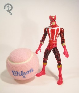 The shortest-lasting (but not shortest-lived) member of the ANAD team was definitely Sunfire, who quit after just one issue. In addition, as he was not new to X-Men the series at the time of Giant-Size X-Men #1, having previously appeared as a “foe,” so he wasn’t even on the cover of that issue. This all ends up making him one of the least-remembered members of this team. Amazingly enough, it wasn’t his first 5-inch figure from Toy Biz (though it was his second of two, so he didn’t get anymore), but it is, to date, the only figure of his classic costume ever made. The figure stands 5 ¼ inches tall and has 16 points of articulation. Sunfire’s sculpt is kind of complicated. There are some really great parts, such as the brilliant texture work on the scaled part of his costume, and a very nice translation of his somewhat goofy-looking mask, but it’s all placed on an almost comically skinny body. Sunfire certainly wasn’t a body-builder, but he wasn’t scrawny either. Then there are his feet, which look to have been sized for the body he should have had, which creates this sort of clown shoe effect. The sculpt isn’t terrible, but it’s also not great either. The paint is good in theory, and decent in practice. The application is pretty solid, and aside from one tiny inaccuracy (having his neckline go all the way up to the mask when it should end just north of the collar bone) it looks pretty good. The only issue is the black wash they’ve used to bring out the details of the scaled parts. It works overall, and is especially good on the arms, but the coverage is inconsistent, and the top of the right leg on my figure is totally missing any painted detail, which sticks out quite a bit.
BANSHEE
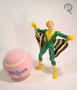 Banshee was the other “not new to the series” character, though he had shown up more than once before. He also stuck with the team a bit longer than Sunfire, and hung around as a supporting character even after leaving the team, which resulted in him being a fair bit more memorable than Sunfire (of course, one of them spent the last decade dead, and it wasn’t Sunfire, so maybe popularity isn’t always a great thing). This was his third figure from Toy Biz, but his first to sport his classic green and yellow, which is definitely my favorite of his looks. The figure stands 5 ¼ inches tall and has 16 points of articulation, just like the last two figures. Like Sunfire, his sculpt is a mix of good and bad. The general build isn’t bad, and he isn’t quite as scrawny as Sunfire. However, he’s fairly pre-posed, and the “wings” limit his posability a bit. Also, I get that his main thing is screaming, but I’m not sure how well it turned out on this head sculpt, where he looks like he’s just sort of opening his mouth kind of wide. I feel like an extra, non-screaming head should kind of be a requirement for all Banshee figures, but none of them have ever done such a thing. Banshee’s paint is pretty decently handled; the costume definitely fairs best, with some nice, subtle airbrushing to help highlight some of the sculpted musculature. The head has a passable paintjob, though I feel the colors end up looking a bit too muted.
THUNDERBIRD
 Now, here’s a short-lived X-Man. See, cuz he died. Get it? Yeah, you get it. Yes, Thunderbird was officially the first X-Man to die in action, just to prove a point. According to writer Chris Claremont, it was actually a toss-up as to whether it would be him or Wolverine who died during the X-Men’s second mission. Thunderbird got the axe because his powers were more non-descript than the others, and also because he was just a tiny bit on the stereotype side of things, but could you imagine how different X-Men would be without Wolverine? Seeing as he was dead for most of the team’s run, this was actually the first Thunderbird figure ever made, though it wouldn’t be the last. The figure is 5 ½ inches tall and has 14 points of articulation. His sculpt is actually pretty good, overall. The head has some very nice detail work, and is probably the most realistic looking of all those in the set. The body is less realistic, with some slightly out-there proportions, but it’s not too bad, overall. The right hand is sculpt to hold something; I don’t know what it was supposed to be, since he included no accessories, and I can’t really think of anything Thunderbird would need to hold, but whatever. The paintwork on this figure is quite nicely done. Everything is nice an clean, and I love the slight accenting on the various parts of the costume.
THE ME HALF OF THE EQUATION
After getting the other two sets in this line as a kid, I bet you think I got this alongside them, don’t you. Well, you’d be wrong. My dad did have this set, and he even offered to buy me one of my own, at a discounted price, when the now defunct Ageless Heroes Comics was going out of business. I was feeling particularly silly that day and turned the set down, a decision I proceeded to regret for the next 18 years, after the set’s price jumped on the aftermarket. This past November, while attending Philcon, I stopped by the House of Fun, and pulled this set out from underneath several boxes. It was actually less than I would have paid for it back in the day, which made me doubly happy. This is by no means a perfect set, but there are some definite gems within, and I’m happy to have it at last.

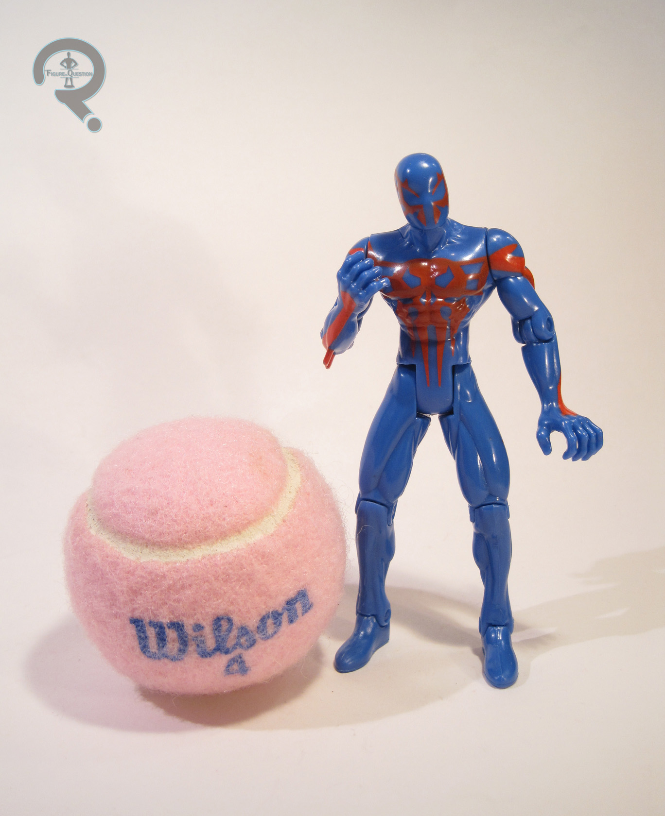 Spider-Man 2099 was released in Series 7 of Toy Biz’s 90s Spider-Man line. The figure is just over 5 inches tall and has 11 points of articulation. Structurally, he uses one of Toy Biz’s favorite 5 inch bodies, which was first introduced with the Octo-Spider-Man from Series 6. It’s a decent enough sculpt, with fairly balanced proportions. My biggest issue with this base body, which was the scrawny forearms, is not an issue with this particular figure, as he has a new set of forearms/hands, specially sculpted to reflect 2099’s clawed hands. These new pieces actually seem a touch on the large side for the body, though not to insane levels. 2099’s cape was handled via a cloth piece, which attached to the figure at the neck and wrists. It’s much more solid than it was in the comics, and it actually looks a bit better if you unhook it from the wrists. There were actually two different color variations available for this figure: dark and light blue. Mine is the lighter one, but the difference is fairly minor. The red detailing is handled via paint, and it’s applied pretty nicely. The red is a touch inconsistent, but it’s not bad. 2099 is packed with a big giant fiery axe (which came in both red and white variations), and a big giant gun thing. He’s never used either of those things, but it was the 90s, so…