SUPERMAN, BATMAN, WONDER WOMAN, FLASH, GREEN LANTERN, AQUAMAN, & CYBORG
DC ICONS (DCC)
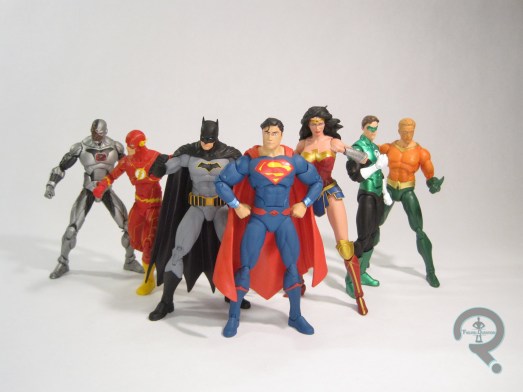
It’s Friday, which means it’s time for another entry in my latest recurring feature…F-DC F-icons Fridays? Yeah, there’s a name that’s catchy and rolls right off the tongue. Not content to just review one DC Icons figure a week, I’ve decided to continue my descent into madness and review seven of them in one day. And you all get to be here for that descent. Don’t you just feel so special? Without further ado, let’s look at the Justice League!
THE FIGURES THEMSELVES
Superman, Batman, Wonder Woman, Flash, Green Lantern, Aquaman, and Cyborg were released in March of this year in the “Justice League Rebirth” boxed set, as part of the DC Icons line. The set’s actually been in progress since mid-2016, when it was initially shown as a New 52-themed set, before being updated to reflect the characters in their most recent looks (for the most part), and tying it into the DC Rebirth relaunch.
SUPERMAN
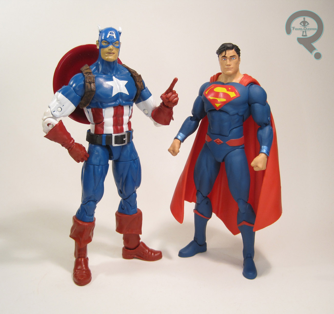
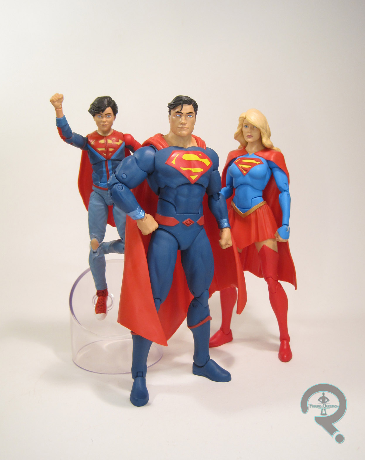
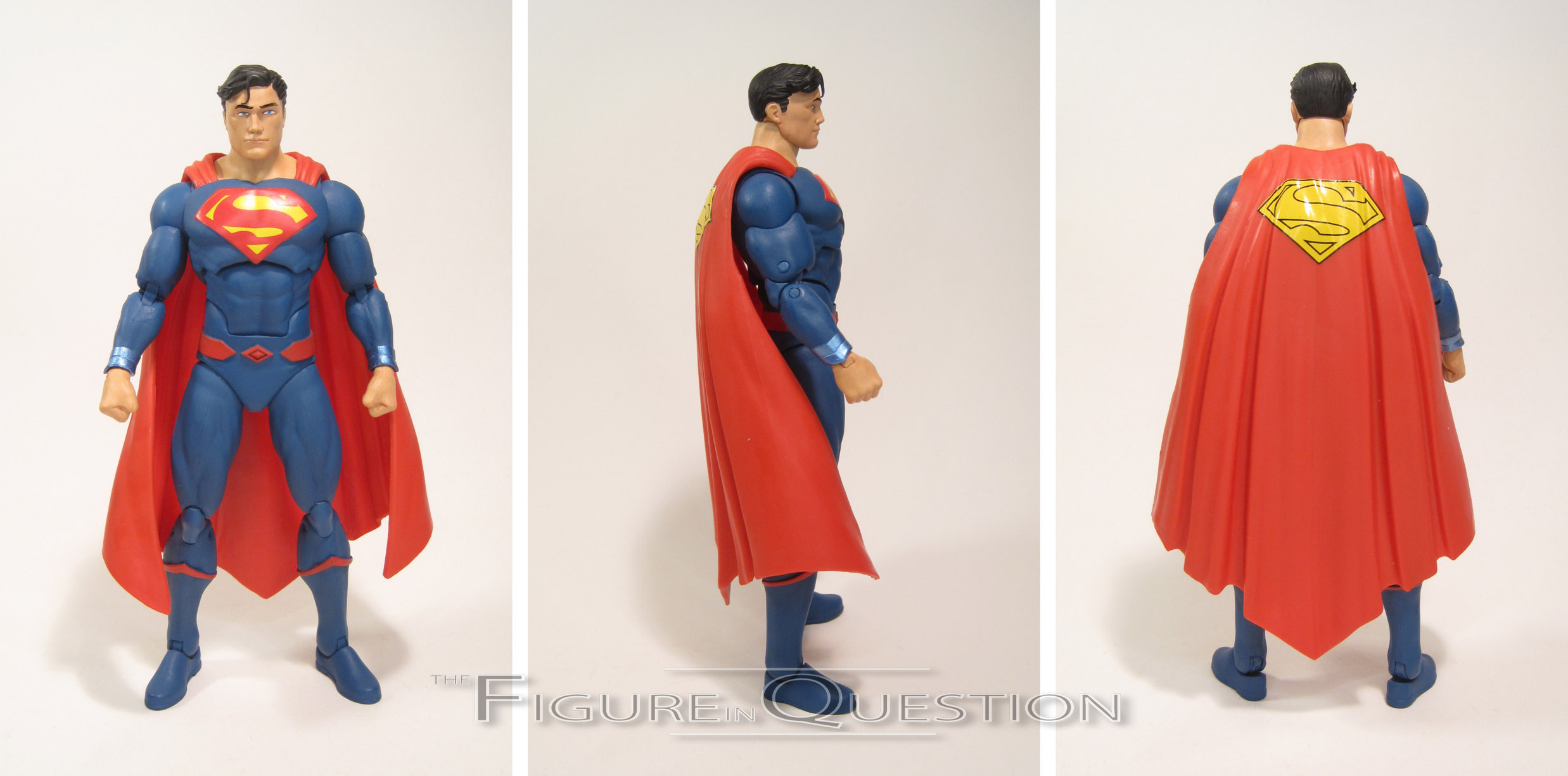
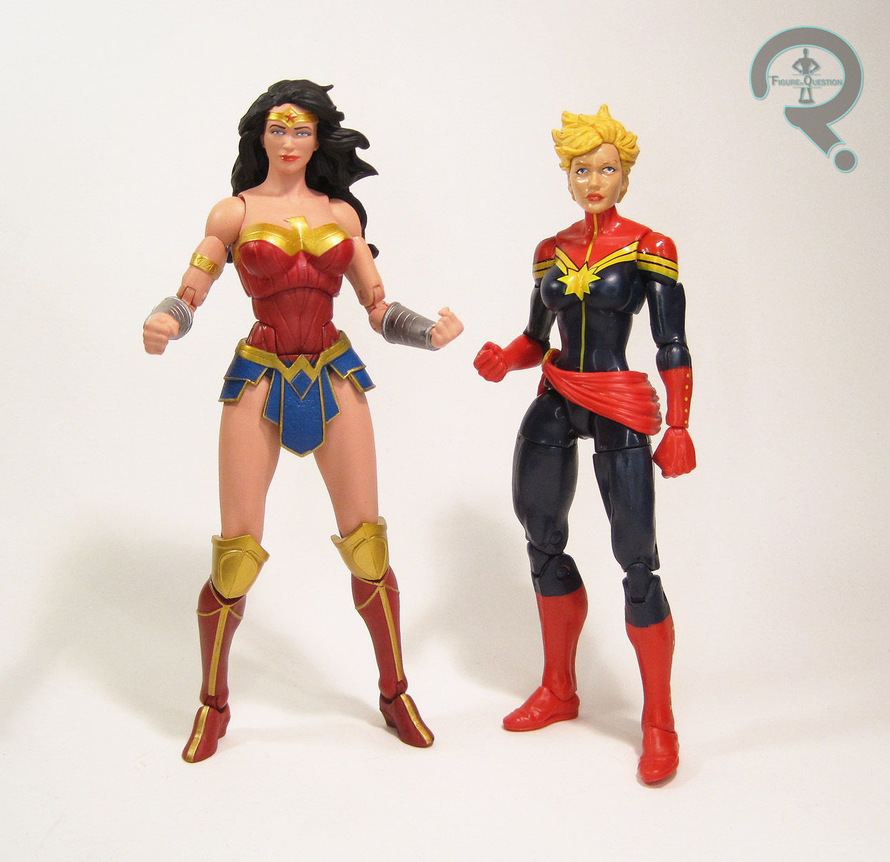
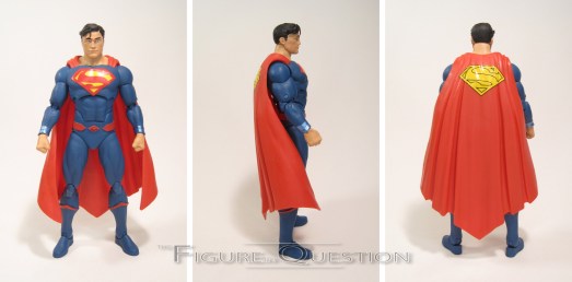
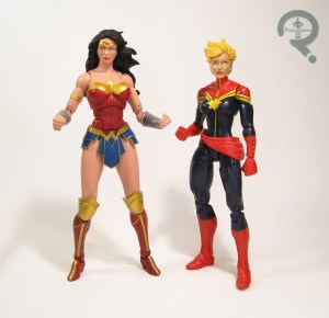
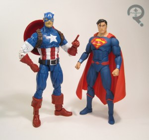 This figure’s my primary reason for grabbing this set, since Rebirth actually got me reading Superman and Action again. This figure actually just saw a single release a few weeks ago, which looks to be identical, apart from the packaging. The design of this figure comes from the initial Rebirth books, after the older Post-Crisis Clark took over the identity again. It’s already been replaced by a tweaked design, but it’s not too far off. I actually quite like this design; it’s not the classic look, but it’s way ahead of the other post-New 52 looks. It’s still weird to see a Superman without the red shorts, but I think making his boots blue helps to alleviate some of the color imbalances caused by that. The figure stands 6 1/4 inches tall and has 29 points of articulation. Superman follows the “new” scale for Icons, meaning he’ll fit in best with figures from later in the line’s run. He’ll also fit with some Marvel Legends depending on how much of a stickler you are for inter-character scaling. He’s a little smaller than a Legends figure built on the Reaper body (as seen in the comparison pic with Cap). Since he’s so sized up, he can’t really use any pieces from the first Icons Superman, making this
 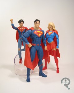 figure an all-new sculpt. It’s not bad work at all. The build of the figure seems about right for Supes, and the proportions are all pretty balanced. Detailing is all pretty clean and bold as well. The head is pretty solid too; it’s got a nice friendly expression that seems right for Clark. It feels maybe a touch wide, and perhaps a bit young for the more experienced Clark Kent this figure is meant to represent, but by and large I find myself really liking it. The cape is made from a soft plastic, and it’s very nicely done. After years of Mattel capes that have to be attached with a huge brick that utterly ruins the flow, this is a very refreshing piece. In terms of paint, Superman is decent, if perhaps not fantastic. The basic colors are all good matches for the source (the blue is a touch dark for my taste, but that’s accurate) and he looks pretty slick overall. My only real issue is with the face, which just seems a little bit lopsided. It’s the sort of thing that looks totally fine from most angles, but really goofy if you catch it the wrong way. Still, good work overall. Superman includes no accessories. Of course, that’s true of the entire set. At least Supes doesn’t feel too light without the extras.
BATMAN
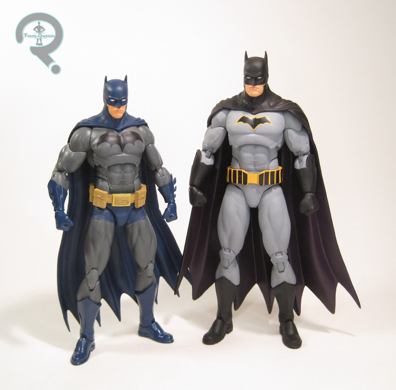
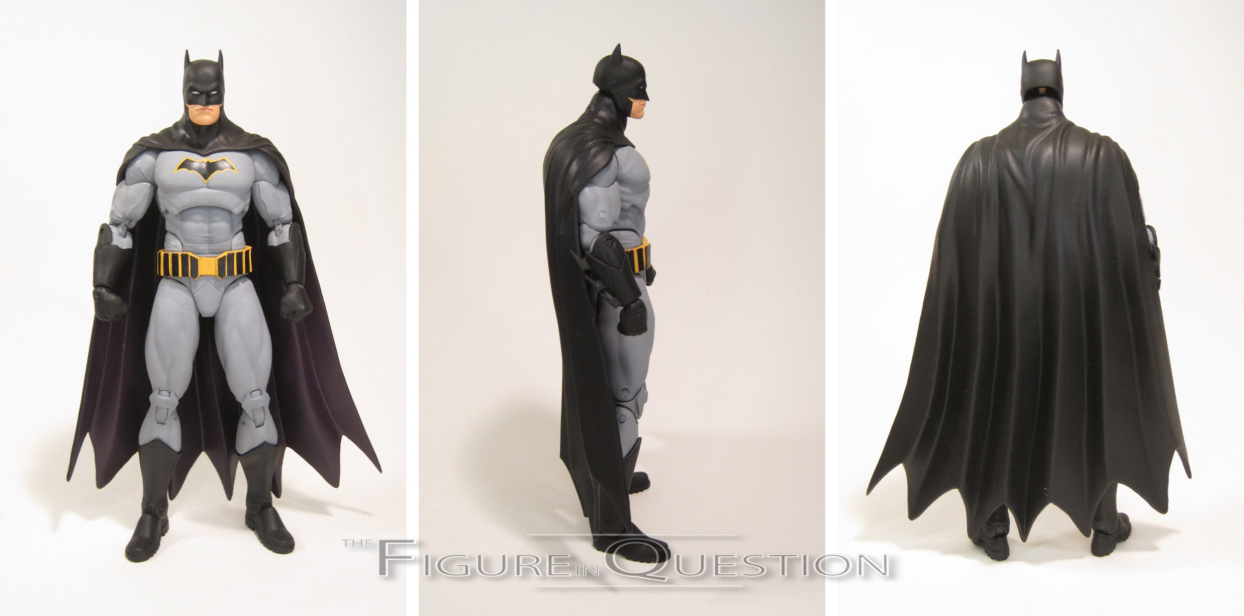
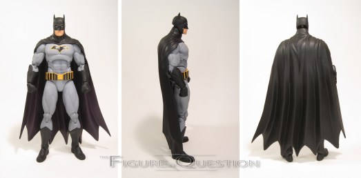
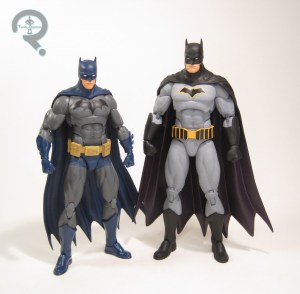 This guy also saw a single release, at the same time as the Superman figure. It’s hardly a shock, what with it being Batman and all. Batman is also sporting his look from Rebirth, but he’s been fortunate enough not to have it already change on him. It’s another decent design. It doesn’t speak to me quite as much as the Superman design, but that’s less about any particular element pulling me out, and more about it not being too terribly different from all the other Batman designs in recent years. I can point out what’s different between this and the New 52 design if put on the spot, but they’re fundamentally the same. Well, this one has less tactical-tech lines, which is certainly a plus. The figure is 6 1/4 inches tall and he has 29 points of articulation. Batman’s maybe a smidge taller than Superman, depending on posing. I generally like for Bruce to be a little shorter, but it’s easy enough to have Clark standing straight and Bruce slightly hunching. The important thing is that this Batman is taller than the Icons Nightwing, which can’t be
 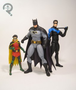 said of the first Icons Batman (which is absolutely dwarfed by this release). The very first prototypes of this set showed Batman using quite a few pieces from the older figure, but this guy ended up as a totally new sculpt. It has its pluses and minuses, to be sure. As a whole, I think it’s a strong sculpt, and it does a good job of conveying a modern era Batman. He’s got a good, solid build, and the details on the costume appear to be more or less accurate to his new design. The mouth seems ridiculously pouty, but Batman is the king of brood, so I guess that just goes with the territory. His head is set a little higher on the barbel than other Icons figures, which can look a little off in straight standing poses, but actually affords him a good deal more range on his neck joint, which is pretty nice for a guy who does a lot of hunching. The figure’s topped off with another nicely rendered cape, which has a flow to it that is just as well-crafted as, but completely unique from, Superman’s. Paint on Batman is very solid work. Nothing seems out of place like on Superman, and everything’s very bold and clean. Perhaps the purple could be a little more noticeably different from the black on the cape, but that’s a very minor complaint. Batman feels a little more hurt by the lack of extras; at the very least a batarang or something would have been nice.
WONDER WOMAN
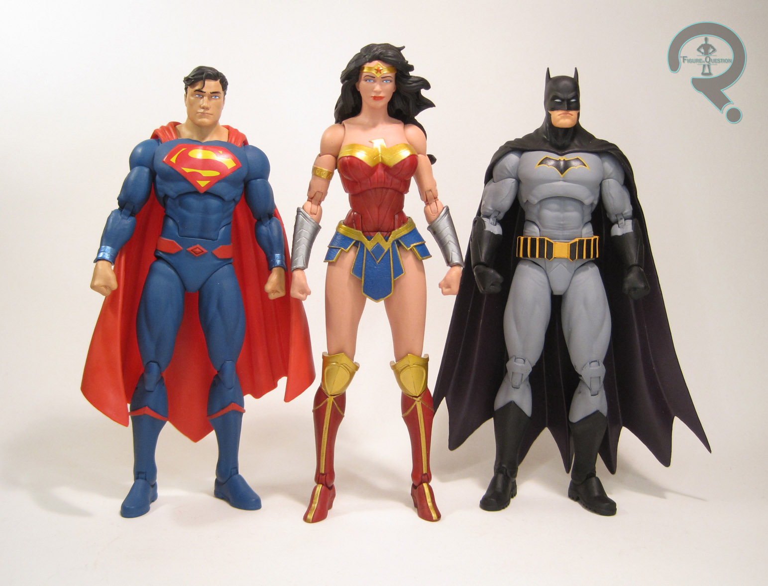
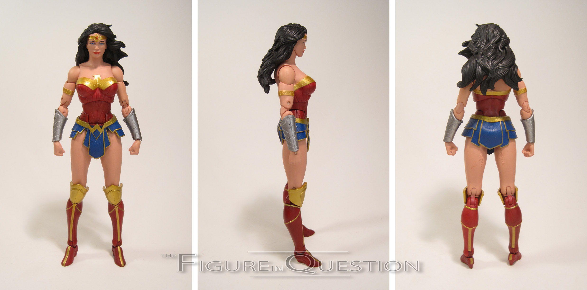
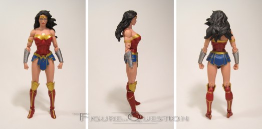
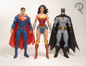 This set’s Wonder Woman was actually the first in the line, though her single release wasn’t far behind. Unlike the last two, Wonder Woman’s single release was quite a bit different, leaving this one still exclusive to the larger set. Wonder Woman was another big motivator for me buying this set since, like Superman, Rebirth got me reading her title again. She’s sporting her first Rebirth look, which was sort of an update on her classic look, with a dash of the movie design thrown in. She’s switched to something even more movie inspired since, but as with Superman, I sort of prefer this one. The figure stands almost 6 3/4 inches tall and she has 29 points of articulation. Yes, you read that height correctly; Wonder Woman really is almost a half an inch taller than Superman and Batman. I’m not inherently opposed to her being taller than the other two (my favorite take on Diana is most certainly Darwyn Cooke’s, and he drew her as an inch or so taller than Clark), but this feels like a little much. I think my issues ultimately stem from how the height is distributed; her proportions are a little out of whack, so her legs, specifically her thighs, end up taking most of the height and looking
  a bit longer than they should. There’s a similar issue with the arms, where the forearms and biceps look really long relative to the shoulders and torso. If you look at the comparison between her and the other two, you can see that despite her pelvis being a good half-inch higher than the other two, the hands all end in the same spot. It’s not awful, but it does look a little off, at least in comparison to the other figures in the set. On the plus side, it does make her the one figure in this set that fits in with Legends without any fudging. Regarding the quality of the sculpt on its own, this figure’s a bit tricky. Based on photos online and my initial reaction right out of the box, I was all ready to hate on the sculpt. But then I took her out, and was messing with her for the photos and such and I realized it’s actually not a bad sculpt at all; it’s just an exceptionally hard to photograph one. This figure looks very different based on the angle you catch her from, and she really doesn’t look great viewed from above. But, head-on, she actually looks rather nice. Yes, the proportions are still a little off, there’s no denying that, but I like more about this sculpt than I dislike. Given the right pose, she actually looks pretty great, and given just how bad a lot of prior Wonder Woman figures have been, that’s very much a compliment. Wonder Woman’s paint work is definitely on the better end of things. From what I’ve seen, there’s a bit of variance on the face, but mine seems to have turned out alright, and I really dig how bright all the colors are. I didn’t know colors were allowed to go that bright on a DC figure. Wonder Woman gets hit pretty hard by this set’s lack of accessories, because it means she loses her defining weapon: a big ol’ sword! I jest, of course. Who would ever think her defining weapon was a sword? That’s just silly. She’s actually missing her lasso, which is a real staple of the character, and a rather glaring omission. It would have been nice to at the very least have it coiled up hanging from her belt.
THE FLASH
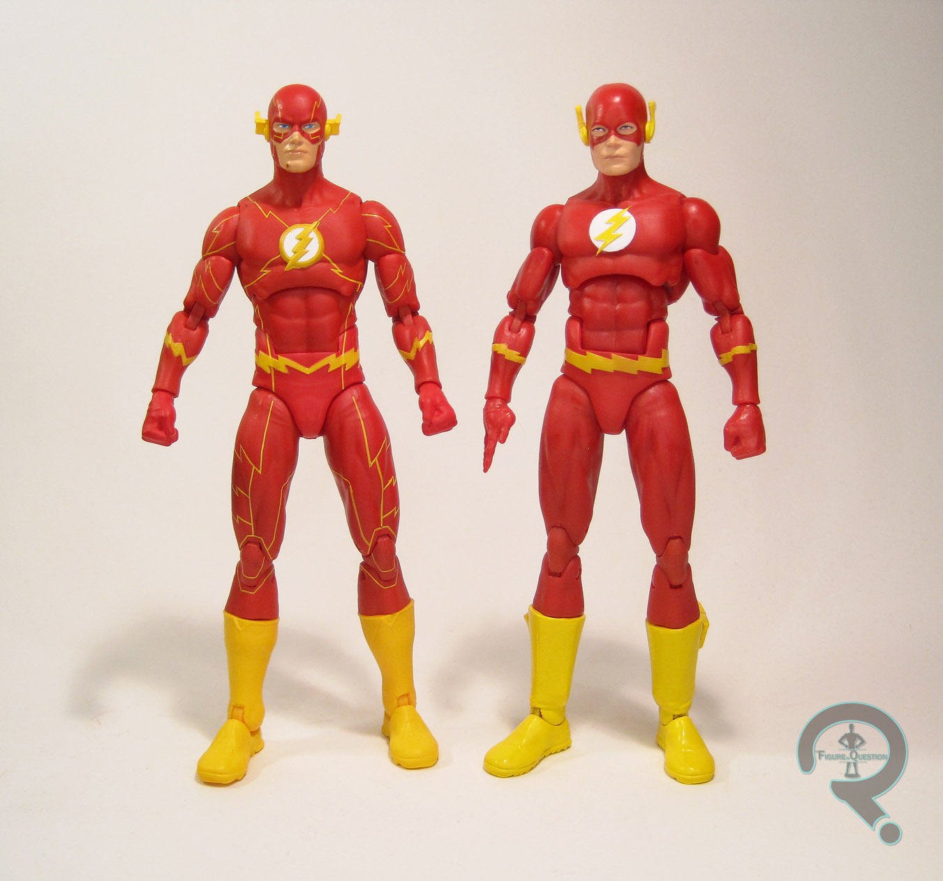
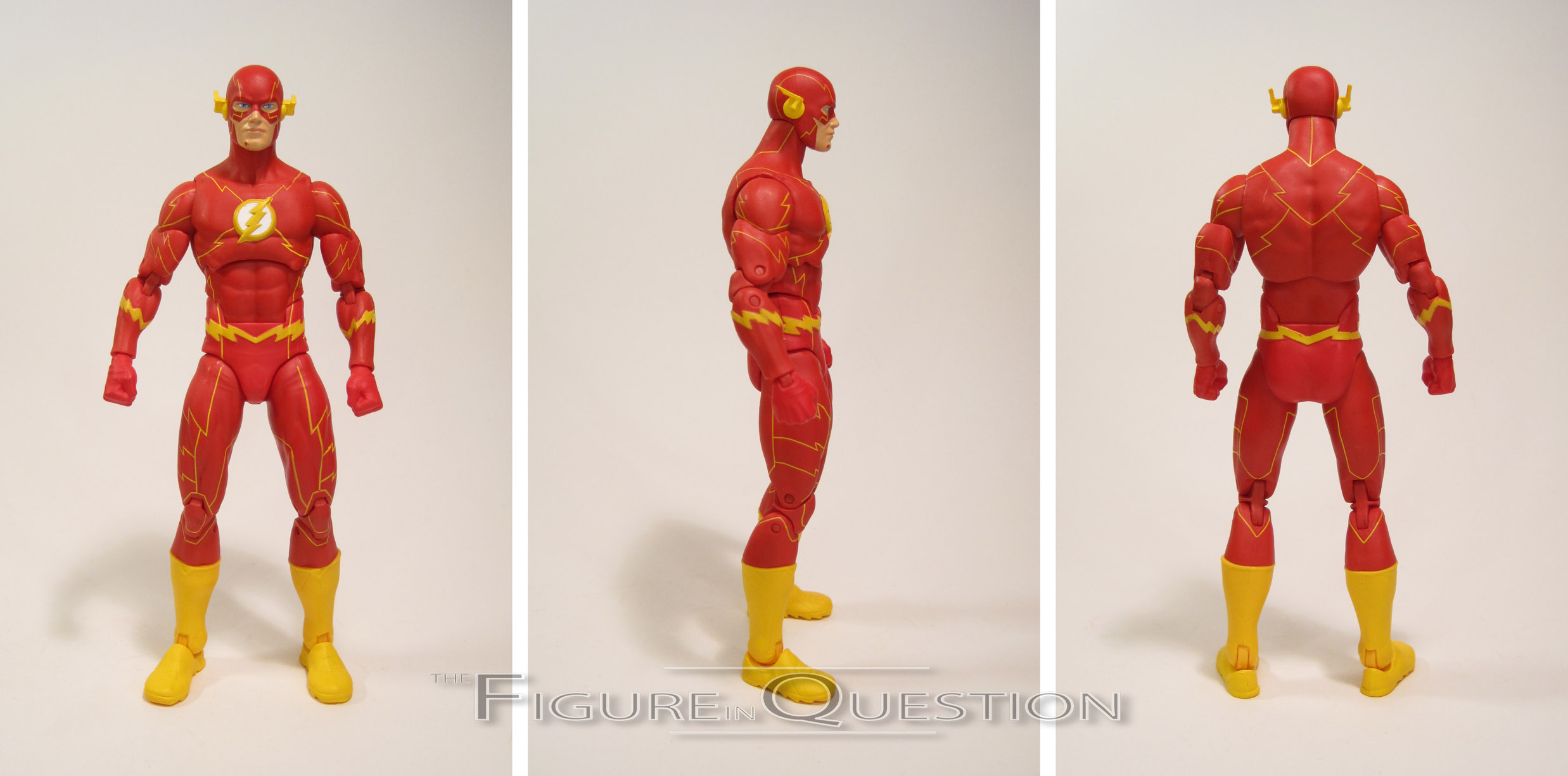
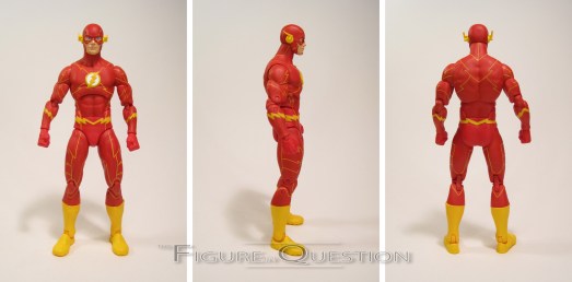
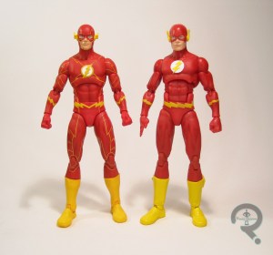 Flash is one of the two figures in this set who I’ve looked at an Icons figure of before. I was overall impressed by the Series 2 figure, so I wasn’t really in the market for another, especially not one based on his super line-y New 52/Rebirth design. And yet, here we are. Flash’s design was essentially unchanged for Rebirth; the only noticeable difference here is the lack of chin strap, but a quick Google search shows that totally varies from artist to artist. The figure stands 6 1/4 inches tall and has 31 points of articulation. Flash’s sculpt is all-new to this figure, but looks to have used the prior figure as a starting point at the very least; the musculature and sizing are all about the same, but the specifics of the costume have changed. All of the yellow lines are etched into place, and there’s added details on the boots. The head is a completely original piece, totally different from the Series 2 figure. Since the head was the only part of that figure I had an issue with, I was intrigued by this one. I’m happy to say, I find this one to be a serious improvement over the original. The yellow lines aren’t etched into the head, so there’s a part of me that’s tempted to try and remove them so I can put this head on the old body, because I like it that much. The paint work on Flash is mostly good, aside from one glaring issue: he’s got a big spot of missing paint on the right side of his chin. It’s a pretty noticeable flaw, and I’m definitely going to have to break out my paints to fix it. Not the sort of thing I like having to do right out of the box, but I feel confident this is a one-off. The lack of accessories for Flash is a bit less of an issue, but I do wish his default hands were flat running hands instead of fists.
GREEN LANTERN
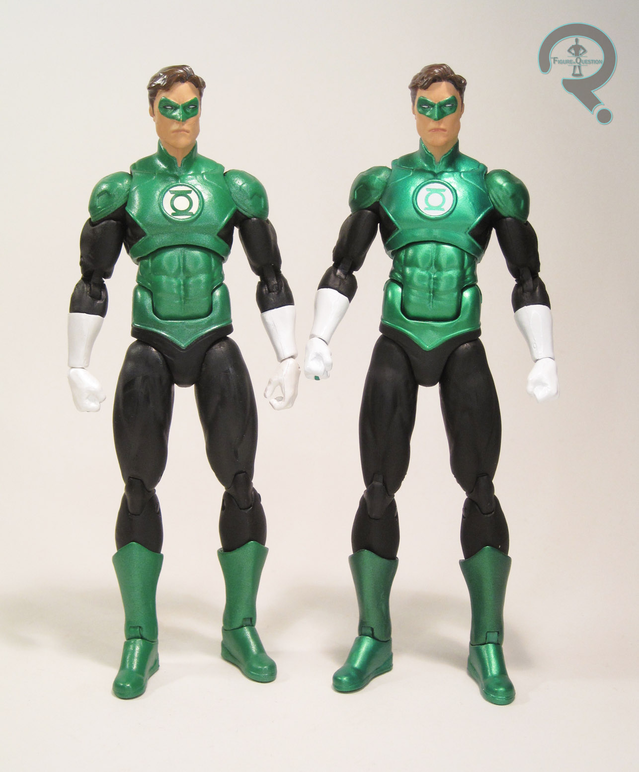
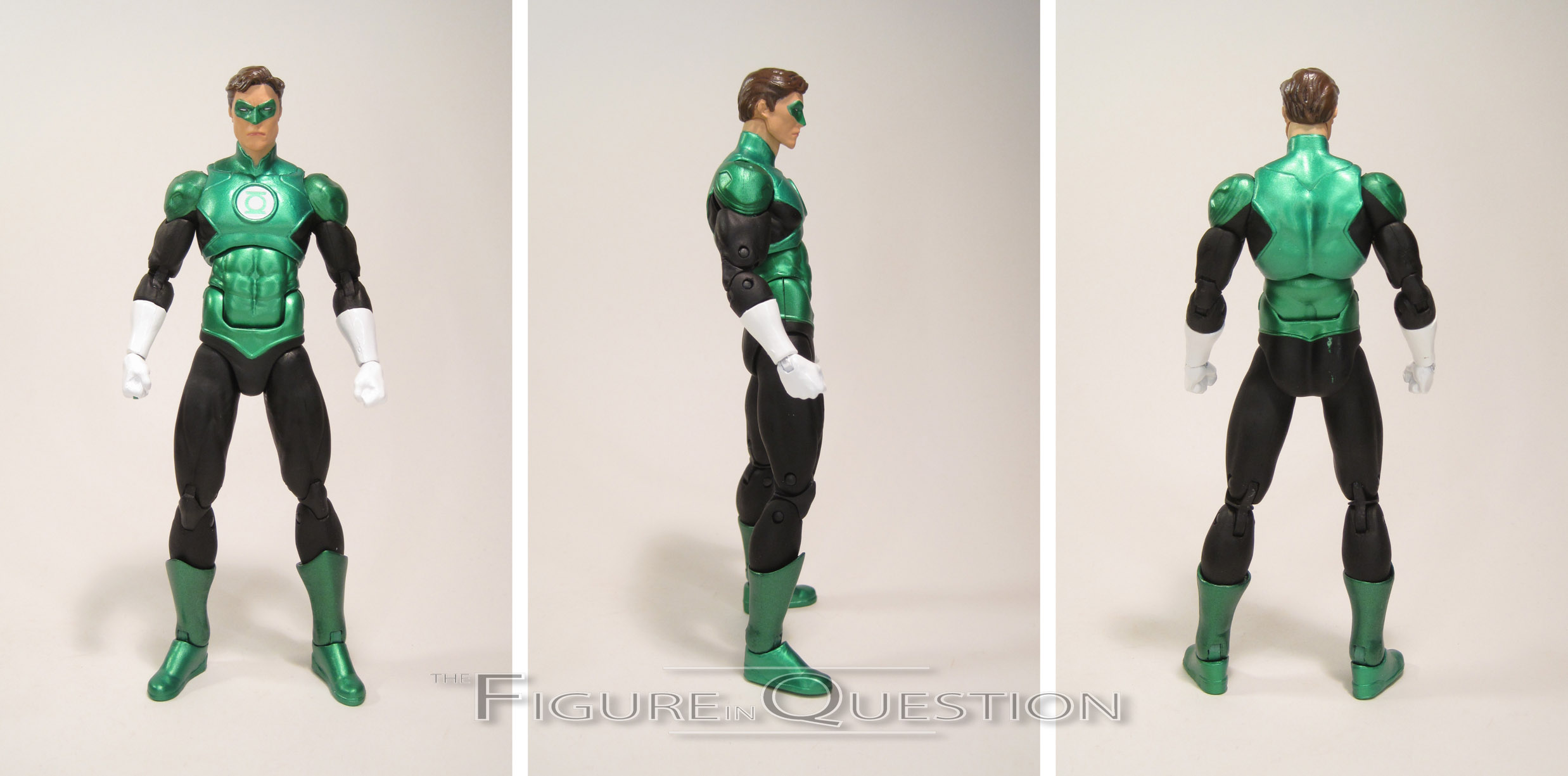
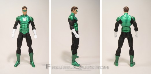
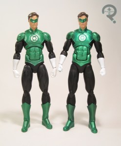 GL is the other character for whom I’ve already reviewed an Icons release, and this figure’s even less different than Flash. At first glance, this is a straight re-release of the deluxe Hal Jordan figure from Series 2. However, that’s not quite the case. You see, that figure was 6 inches tall, but this one is 6 1/4. He’s also got tweaked hips to add the drop-hips that the rest of the set feature, so my first thought was that they’d simply sculpted new thighs with added height. Upon closer examination, I found that the entire figure has actually been ever so slightly enlarged, in order to bring him into scale with the rest of the set. What’s more, the details of this figure’s sculpt are a lot crisper than those of the earlier figure, and the green has been changed to a more metallic sheen. I loved this figure the first time I got it, and I still love it here. Of course, I’m also frustrated by it, because it’s just different enough that it’s not a straight duplicate, so now I have to keep it.
AQUAMAN
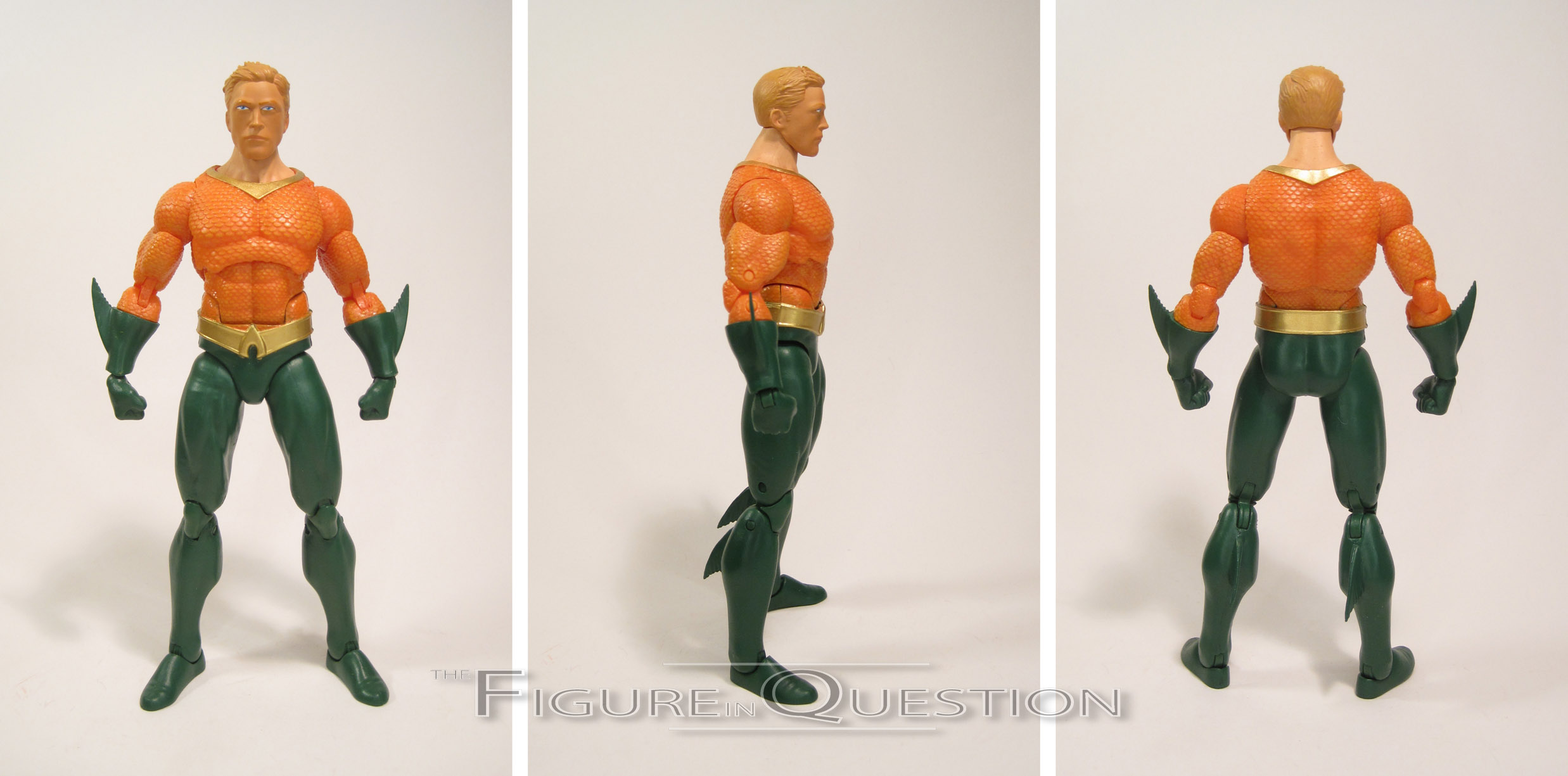
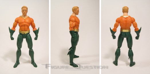
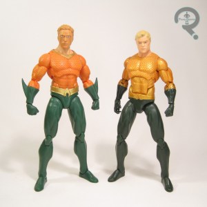 You know the old saying: “if an Aquaman figure is released without a trident, does he make a sound?” …Maybe that’s not quite it. Regardless, here’s this Aquaman figure. He’s based on the Rebirth design, which isn’t that much different from his classic look, apart from the gold around the collar and the lack of black shorts. This figure stands about the same height as all of the other figures in the set, and has 29 points of articulation. He’s really just a reworking of the single-release Aquaman, though, like with GL, he seems to have been scaled up ever so slightly. The real difference between the two Aquamen is the head. I can’t say I’m much of a fan of this one. It looks fine on the prototype and all, but something was definitely lost in translation, leaving him looking rather goony. It’s possible it’s just the paint making it look that way, though. The rest of the sculpt is pretty top-notch. The build is appropriate for him, and I really like the detailing on the scales of his shirt. His paint is fairly decent; the colors are bright, and, apart from the odd placement of his eyes and a little bit of bleed over from his belt, it’s fairly well applied. Aquaman’s lack of accessories here means that he doesn’t include his trident. And I’m okay with that, because despite what pretty much every Aquaman figure ever would have you believe, he doesn’t really use a trident all that often.
CYBORG
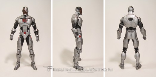
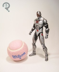 This figure’s presence in this set frustrates me, because it sort of continues a persistent problem I’ve had with DC for several years now. They keep shoving Cyborg into the Justice League, and it just upsets me. I like Cyborg. I like the Justice League. I don’t really like Cyborg in the Justice League. Especially when it’s at the cost of Martian Manhunter as a member, which it almost always is. And that’s what the case is here. In a seven figure Justice League set, I kind of expect a Martian Manhunter. But noooooo. No, in this set, we got Cyborg. Cyborg who also got a single release with accessories. Instead of Martian Manhunter, who was completely left out of the line, leaving my Icons Justice League sadly incomplete. And of course, now I have a Cyborg, but not Titans to go with him, meaning that’s another incomplete team. Bleh. I’m sorry, all that ranting is largely to do with the fact that I *actually like* this figure. Quite a bit, in fact. His sculpt, even though it’s based on a more modern Cyborg than I tend to go for, is top-notch. It’s sleek, well put together, and just plain cool looking. He’s got 31 points of articulation, and it all works really, really well. The joints are smooth, and the mobility is pretty sound. He’s probably one of the best in the set, posability-wise. Perhaps the only drawback to the figure proper is his lack of extras, since his forearms have clearly been designed to swap out for other arm attachments. Just one of those would have been really cool.
THE ME HALF OF THE EQUATION
After picking up Nightwing and Supergirl, and finding out that just about everything I wanted from Icons was cancelled, I was admittedly a little bummed. That being said, I recalled that this set had been released, and I had checked it out a few times, before ultimately deciding it was a little bit on the pricey side for me. I still really wanted that Superman, though, so I was excited to hear he was getting a single release. I was less excited to hear that he was going to run me almost $30 and feature no additional accessories. It was around this time that I discovered that Barnes & Noble’s website had marked this set down to half of it’s original value, and were also offering free shipping and $5 off orders over $25. The final cost was $45, which is $6.43 a figure. And that’s an amazing deal. Superman’s awesome, as is Batman. Wonder Woman’s better than I expected, if not perfect. Flash isn’t my ideal costume choice, and has that one annoying paint flaw, but is a very good figure. Green Lantern’s not the total repeat I expected, and fixes a few minor issues with the original. Aquaman’s head sucks, but the single release has a spare head I can toss on the otherwise solid figure. And I ranted a bit about Cyborg’s spot in the set, but he’s still a very, very well crafted figure. If you want to give Icons a chance, I heartily recommend this set, and feel obligated to inform all of my readers that it’s still available at the discounted price on barnesandnoble.com.

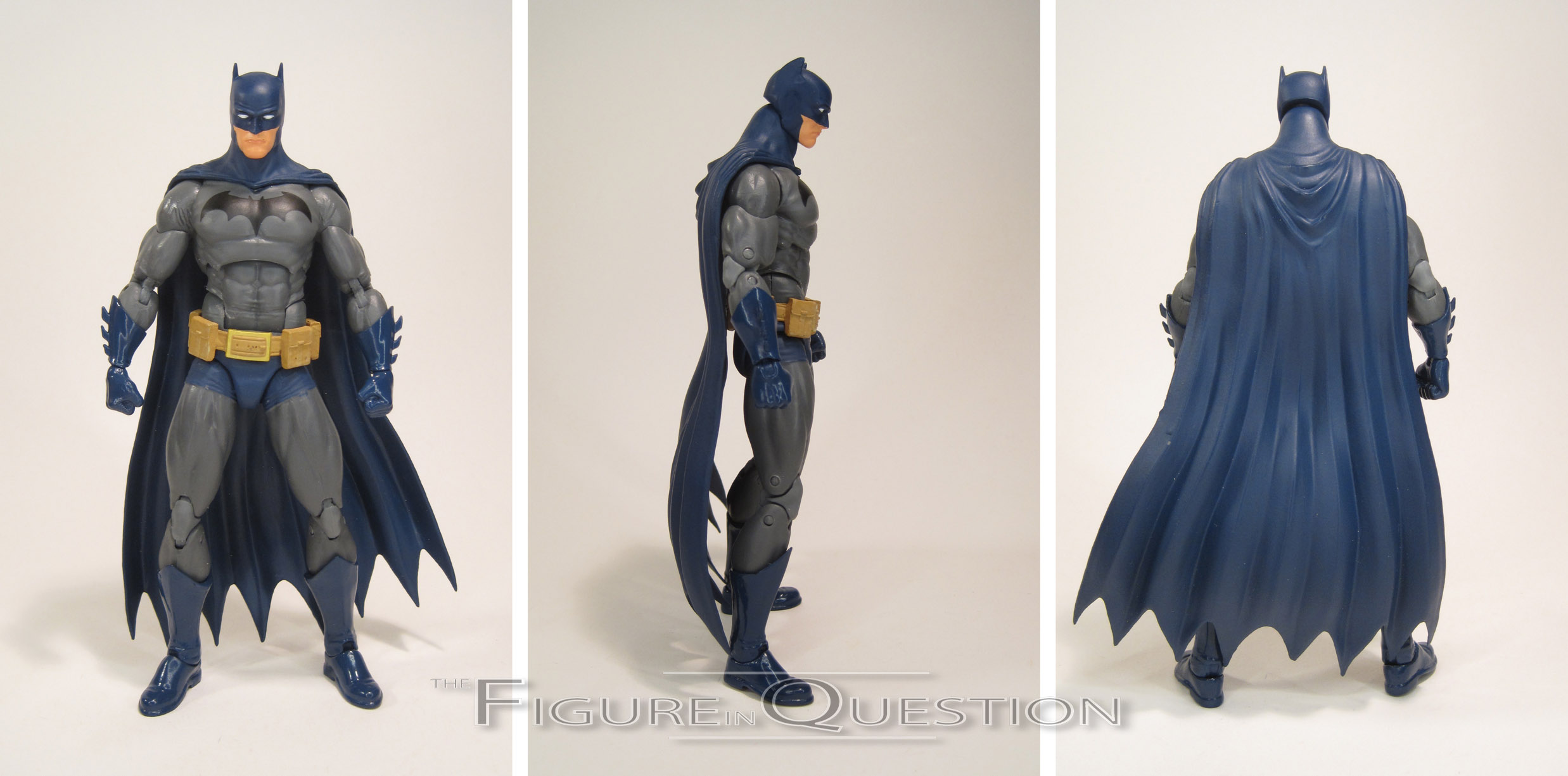
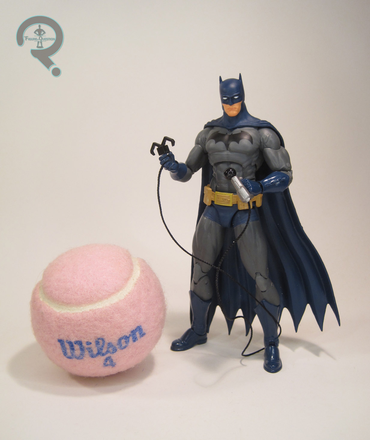 Batman is figure 01 in the first series of DC Icons figures. Interestingly, though he’s numerically the first, he ended up hitting a week after the other three Series 1 figures, for unknown reasons. Batman’s packaging lists that he’s based on the “Last Rights” storyline, which was the follow-up to the “Batman R.I.P.” that deals with the various Bat-cast’s reactions to the death of Bruce Wayne. It’s an odd choice for a Batman figure, since, as you might have guessed, he spends the story…well, dead…ish (it’s a long, convoluted, complicated story. Best not to ask further questions). I think there’s a flashback with Bruce in costume at some point, but it’s brief. Odd choice of storyline aside, it’s really just a pretty standard pre-Final Crisis Batman, which is generally a good thing, since that’s a rather definitive take on the character. The figure stands a little under 6 inches tall…yeah, you read that right. Here’s what its hands down the greatest flaw of this figure: he’s too short. He’s one of the shortest Icons figures produced. And that just doesn’t quite work out, since he’s Batman, and he really shouldn’t be that short. And it’s not like he just missed a little height in his legs or torso or something; he’s actually just a smaller scaled figure, so he looks out of place next to most contemporary 6-inch lines, including the line he’s actually a part of. Looking at the positives, he’s got 29 points of articulation, and is without a doubt one of the best articulated Batman figures ever to be produced. Only the later Rebirth Batman really surpasses him. Some of the articulation could still be better, of course. The lack of any joints on his thighs continues to be the biggest flaw of any Icons release, and his neck joint is rather limited (and his head has an annoying tendency to pop right off the joint at a moment’s notice). Still, there’s a lot of great poses that this guy can pull off that no other Batman really can. This Batman figure has a unique sculpt, which is definitely one of the better Batman sculpts out there. Like the other figures in the line, it’s based on Ivan Reis’s work, and makes for a very satisfying Batman, at least from a design front. He’s less pouty than his Rebirth compatriot, which I like, and is in general one of the more realistically built figures in the line. I like the small details like the wrinkles in his costume, and I love how well the belt turned out. Even the cape is well done, and I’m the sort of guy that’s hard to please when it comes to capes. The only real issue I have is the gauntlets of his gloves, which have the “spikes” placed on the sides, when they actually should be running on the backs of his forearms. It’s a symptom of the gloves originally having a swivel joint above them that was later removed; they were just affixed in the wrong position. Paintwork on this figure is pretty decent overall. The colors match up well with the usual look of a mid-00s Batman, and the application is mostly pretty clean, aside from a few very minor spots of slop. There’s one slight oddity with the paint; for some reason he’s got a pair of black eyebrows painted on his cowl. Now, eyebrows aren’t uncommon on Batman designs, but the modern look mostly dispensed with them, so they can look a little goofy. Fortunately, they’re effectively invisible to the naked eye. Batman is packed with two sets of hands in fists and gripping poses, as well as an additional left hand holding a grapple, and a pair of batarangs. It’s a decent selection of extras, though I can’t say any of it’s terribly exciting.