HAL JORDAN — ARMOR SUIT
DC MULTIVERSE (McFARLANE)
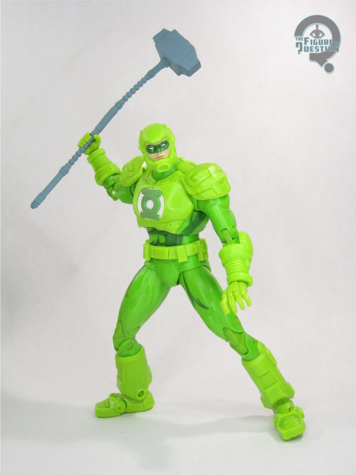
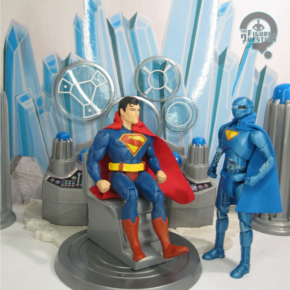
“After years of faithful service, Hal rebelled against the Guardians when they refused to let him change history and restore Coast City after Mongol destroyed it. Unbeknown to anyone, Jordan was infected by the fear parasite Parallax, which had been imprisoned for eons in the Central Power Battery on Oa. It drove Hal to attack hundreds of his comrades, stealing their power rings as he stormed across the universe to a titanic confrontation with the Guardians’ last hope—a freed and restored Sinestro.”
If nothing else, McFarlane’s run with the DC license has certainly gotten us a lot of looks that have never seen toys before. After exhausting pretty much every Batman variant possible early in their run, they then started doing this with other DC characters. We got a whole plethora of Green Lanterns, and Hal Jordan in particular got some decent coverage of a lot of his major looks. And also some not so major ones, too. How about that? Well, let’s look at one of those not particularly major ones, shall we?
THE FIGURE ITSELF
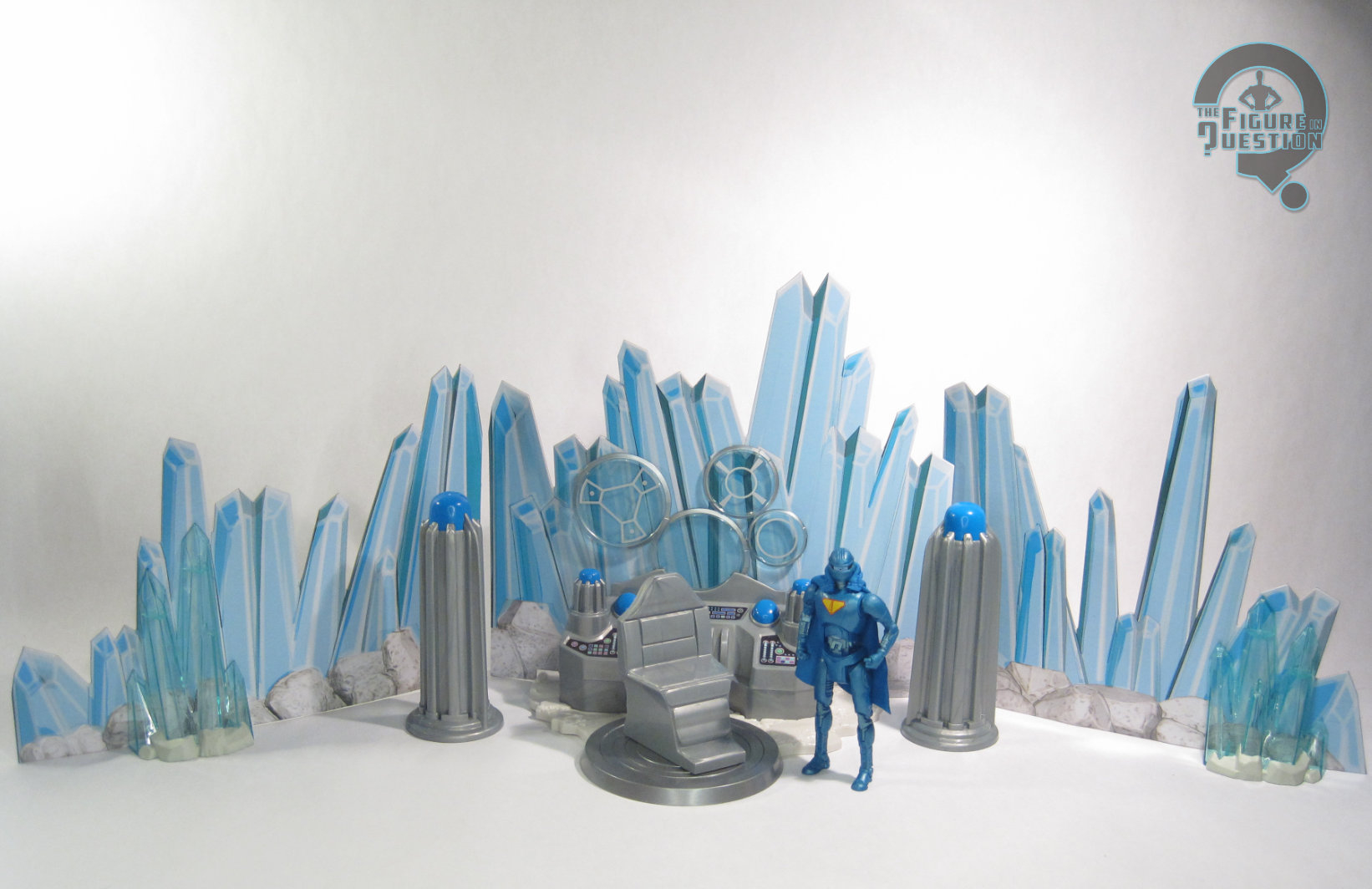
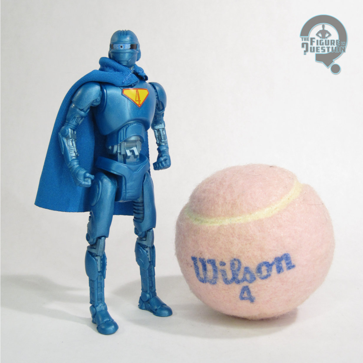
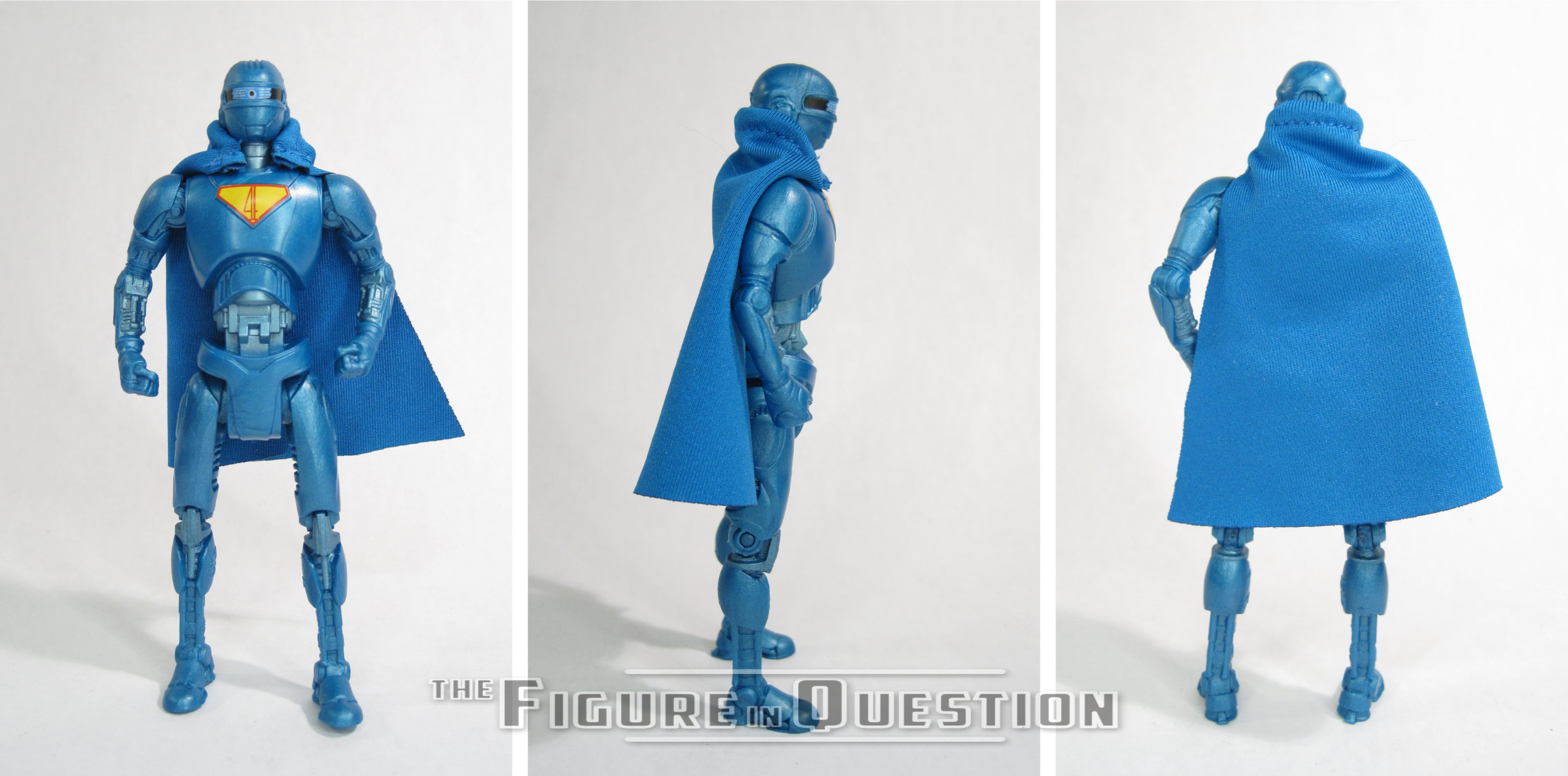
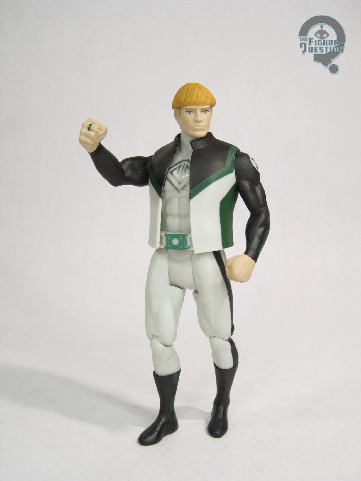
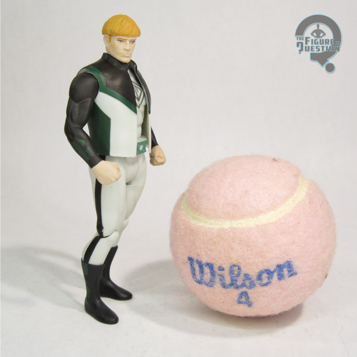
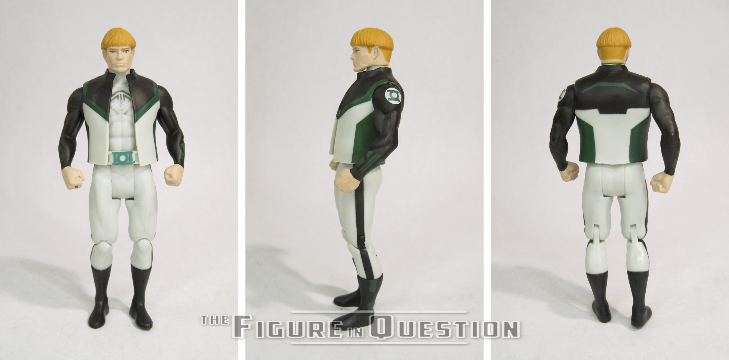
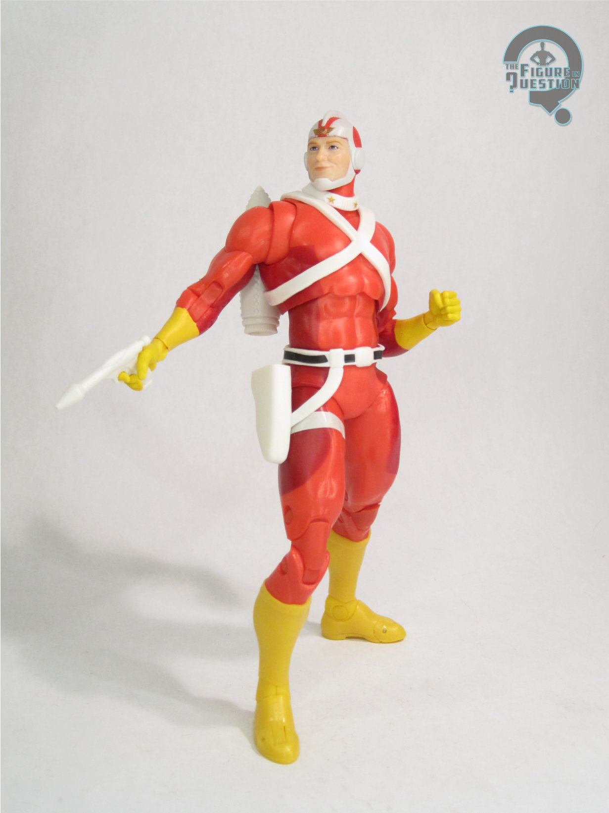
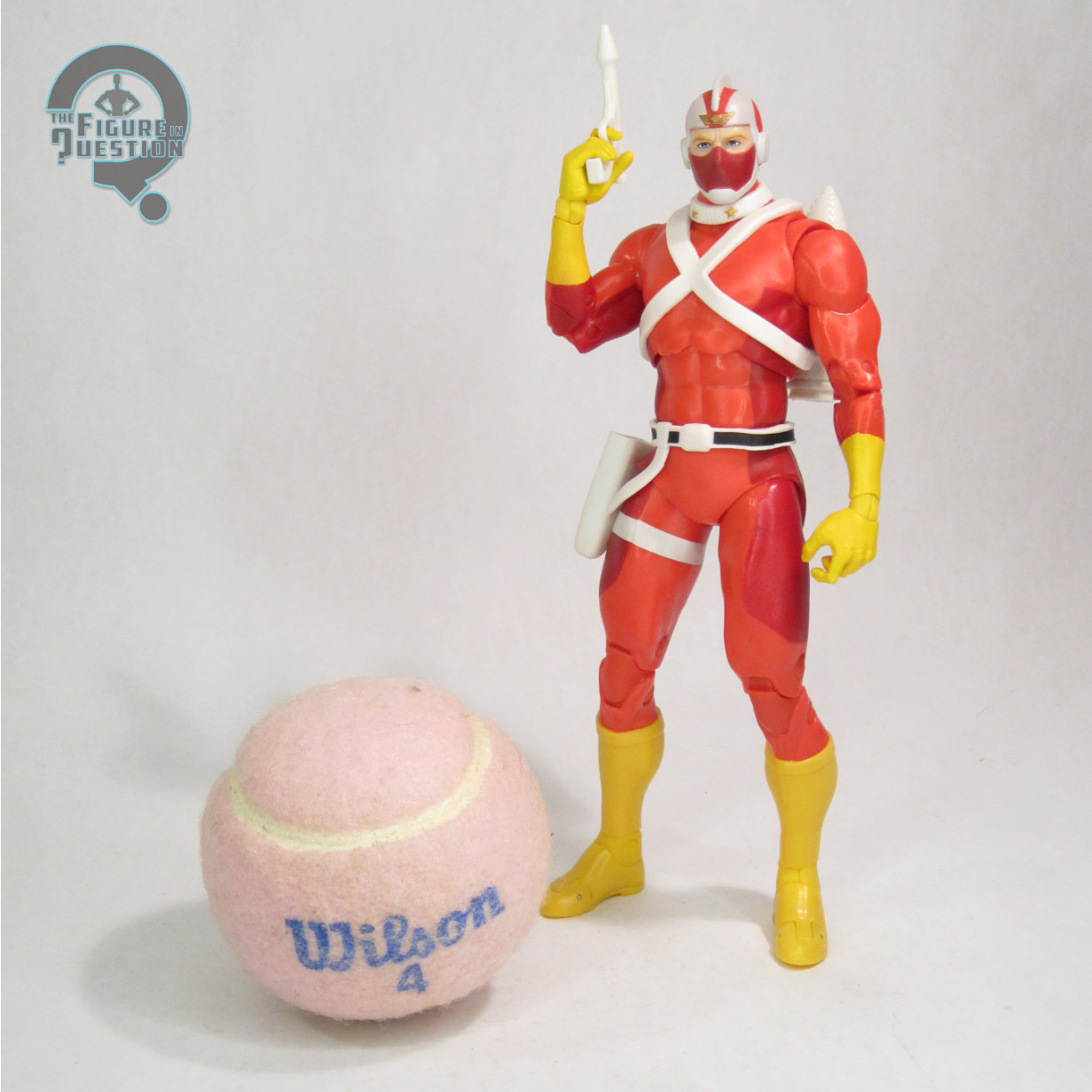
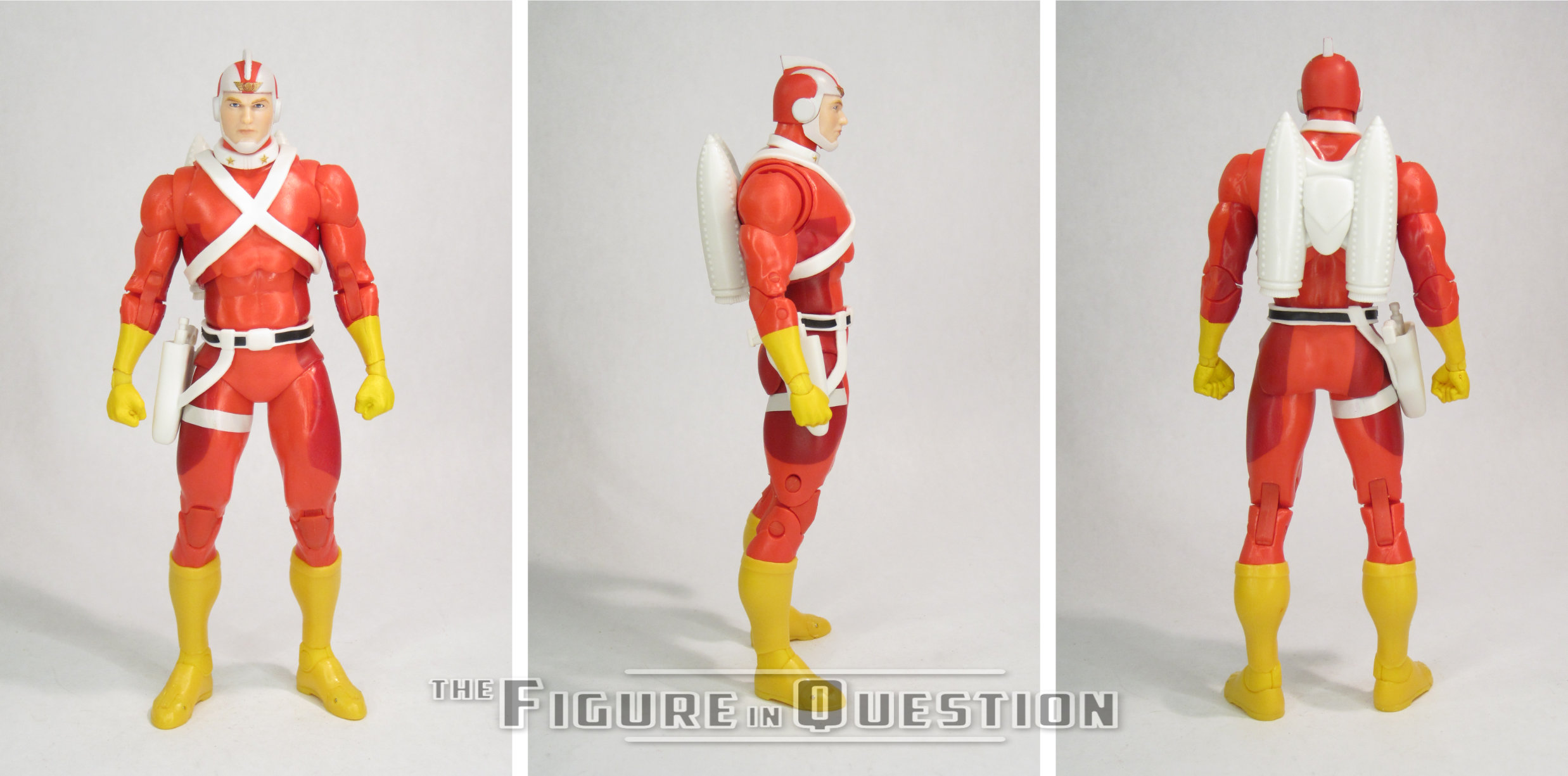
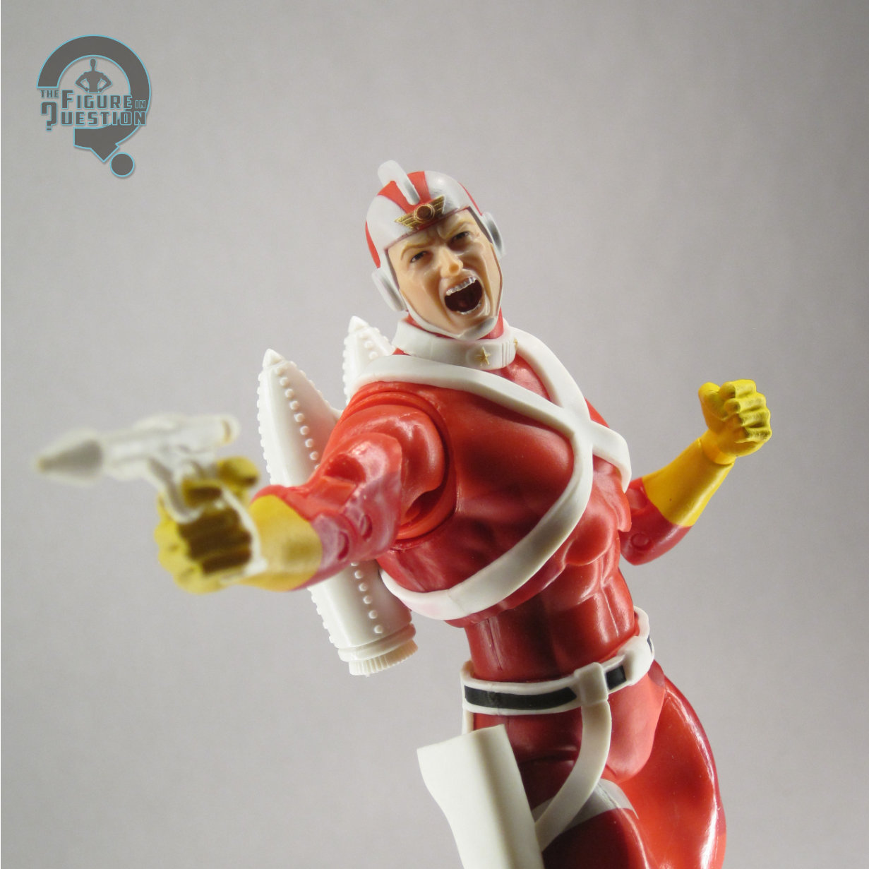
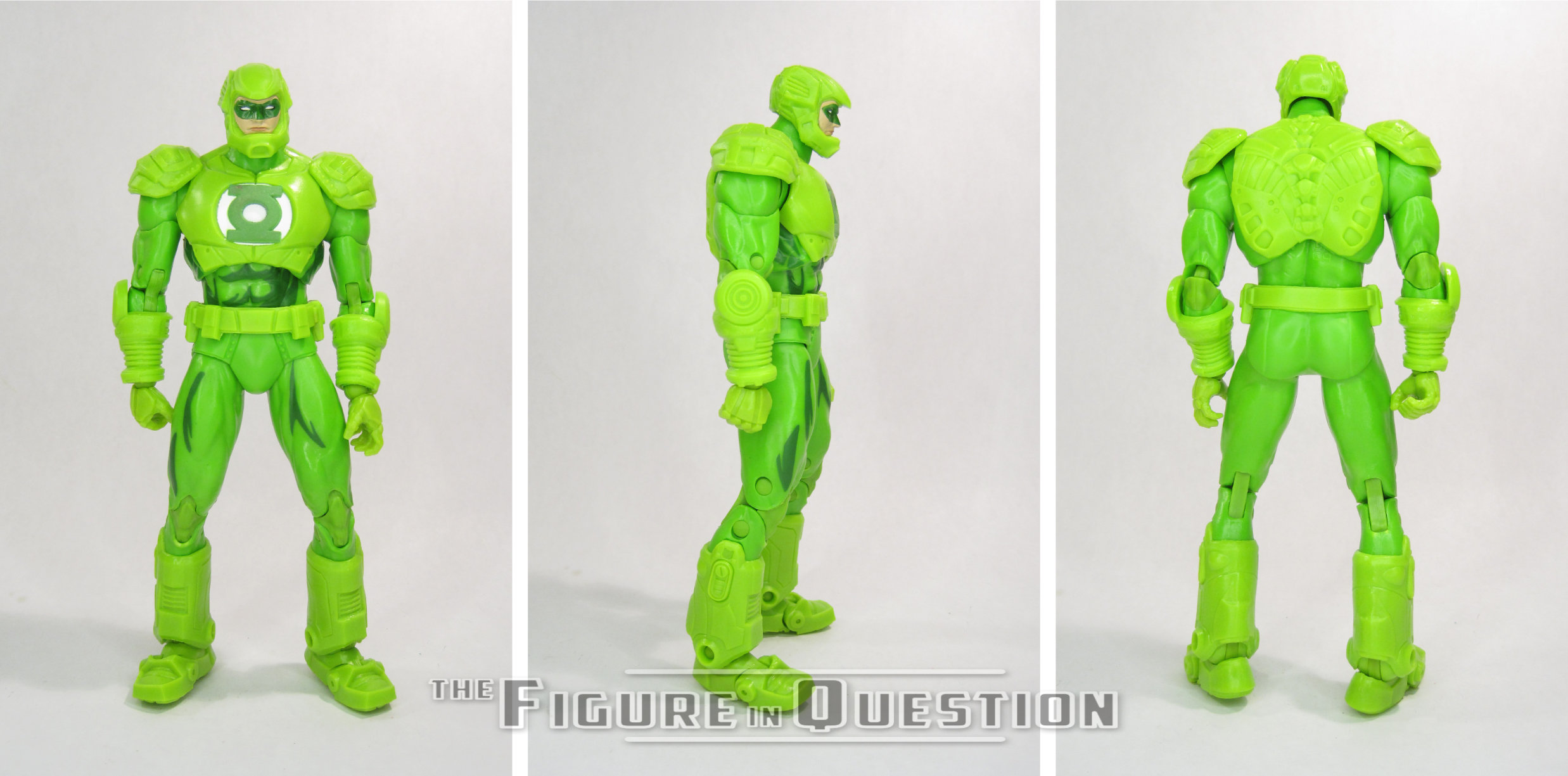
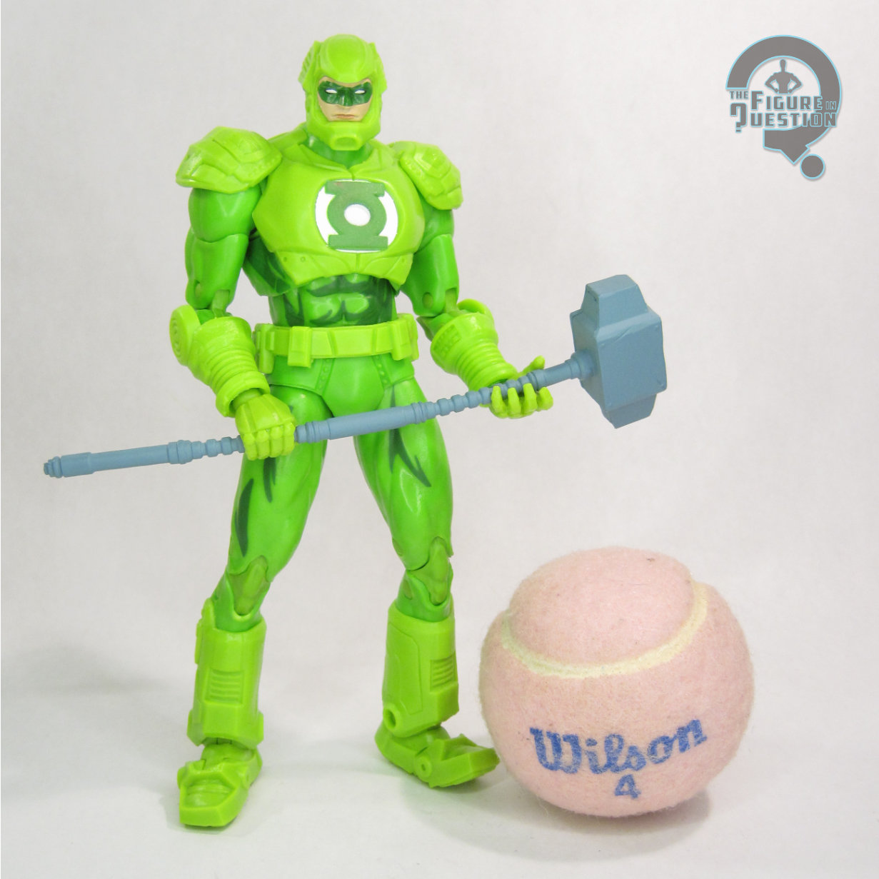 Hal Jordan in Armor Suit is a 2025 release for DC Multiverse. He shipped alongside Eradicator and Western Batman. He and Eradicator are both from the “Return of Superman” story. Crazy that we got a white-streaks in his hair Hal and you’ll never know it. Hal’s seen here in his armored up look from his fight with Mongul after the destruction of Coast City. It’s a rather minor look, but also kind of a cool one, since it serves as something of a precursor to his eventual Parallax costume upgrade. The figure stands just shy of 7 1/2 inches tall and he has 35 points of articulation. This figure’s entire existence more or less relies on one thing: parts re-use. As such, he is almost entirely re-used from the Steel figure released last year. He gets a new head and a modified torso to sell it all. As with other instances of McFarlane doing this sort of re-use, it relies on half-stepping between both looks, and as a result neither is truly accurate to the source material. In Hal’s case, that’s ultimately kind of forgivable. The armor was a construct of his ring, and that allows a little more room for interpretation and imagination, I feel. The new parts are pretty decent. I like that the head keeps the same general facial structure as the Silver Age Hal from last year. I also appreciate the decision to keep the helmet consistent with the body
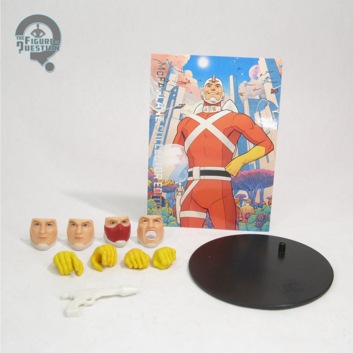
 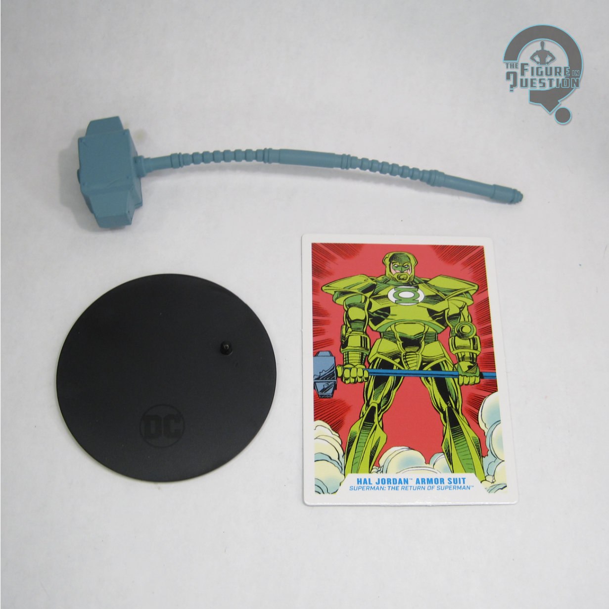 armor, rather than making it specifically comic accurate and risking it not really matching. Hal’s color work is a lot of molded greens, of differing shades. For the most part, they’re supposed to be different, but the elbows and knees notably don’t match the rest of the arms/legs around them, which looks a bit off. The symbol on his chest is painted with a textured paint that made me think it was supposed to glow, but it appears it doesn’t. He’s also got a tiny bit of painted shading on his lower torso and upper legs, which seems a little out of place. It’s not awful, just strange that there’s not more of it, honestly. Hal is packed with Steel’s hammer, a display stand, and a collector’s card. The hammer’s a pretty essential part of the scene, so it’s good it’s here, though it’s really kind of floppy and prone to bending under its own weight.
THE ME HALF OF THE EQUATION
While I’ve cooled somewhat in more recent years, there’s very definitely a part of my ape brain that if there’s a neat Green Lantern figure, especially Hal Jordan, then I need to own it. This figure was definitely activating that part of my ape brain. Thankfully, I ended up getting him as a birthday present from my parents this year, so, hey, ape brain needs fulfilled. He’s not accurate, and the droopy hammer is silly, but I do think he’s quite fun.