SUPERMAN
DC COMICS MULTIVERSE (MATTEL)
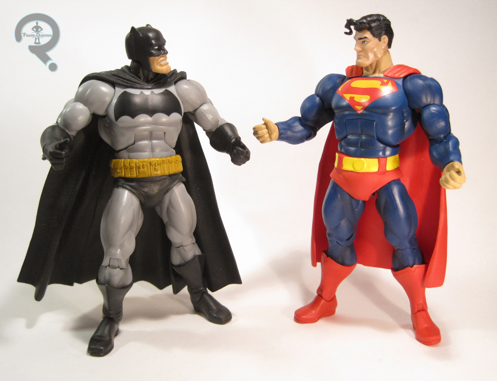
Batman V Superman: Dawn of Justice was released last week to reviews that were…well, I’ll be generous and say “middling.” Though they tend to be presented as a more friendly pair, Superman vs Batman is not a new idea for the film. They’ve done battle a few times over the years. One of the better handled face-offs is in Frank Miller’s The Dark Knight Returns. In the story, Batman’s gotten pretty far removed from his usual self, and becomes rather unhinged, prompting the US government to send Superman in to take him down if need be. Though Batman is technically the story’s hero, Superman isn’t portrayed as being in the wrong, just a guy looking for a glimpse of hope in the bleak, nihilistic future of DKR. Anyway, the story is celebrating its 30th Anniversary this year, and Mattel has done a small sub-set of figures based on it, including Superman.
THE FIGURE ITSELF
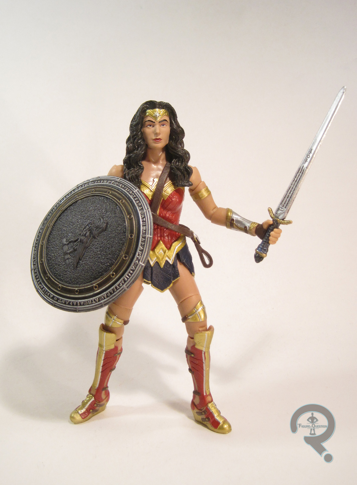
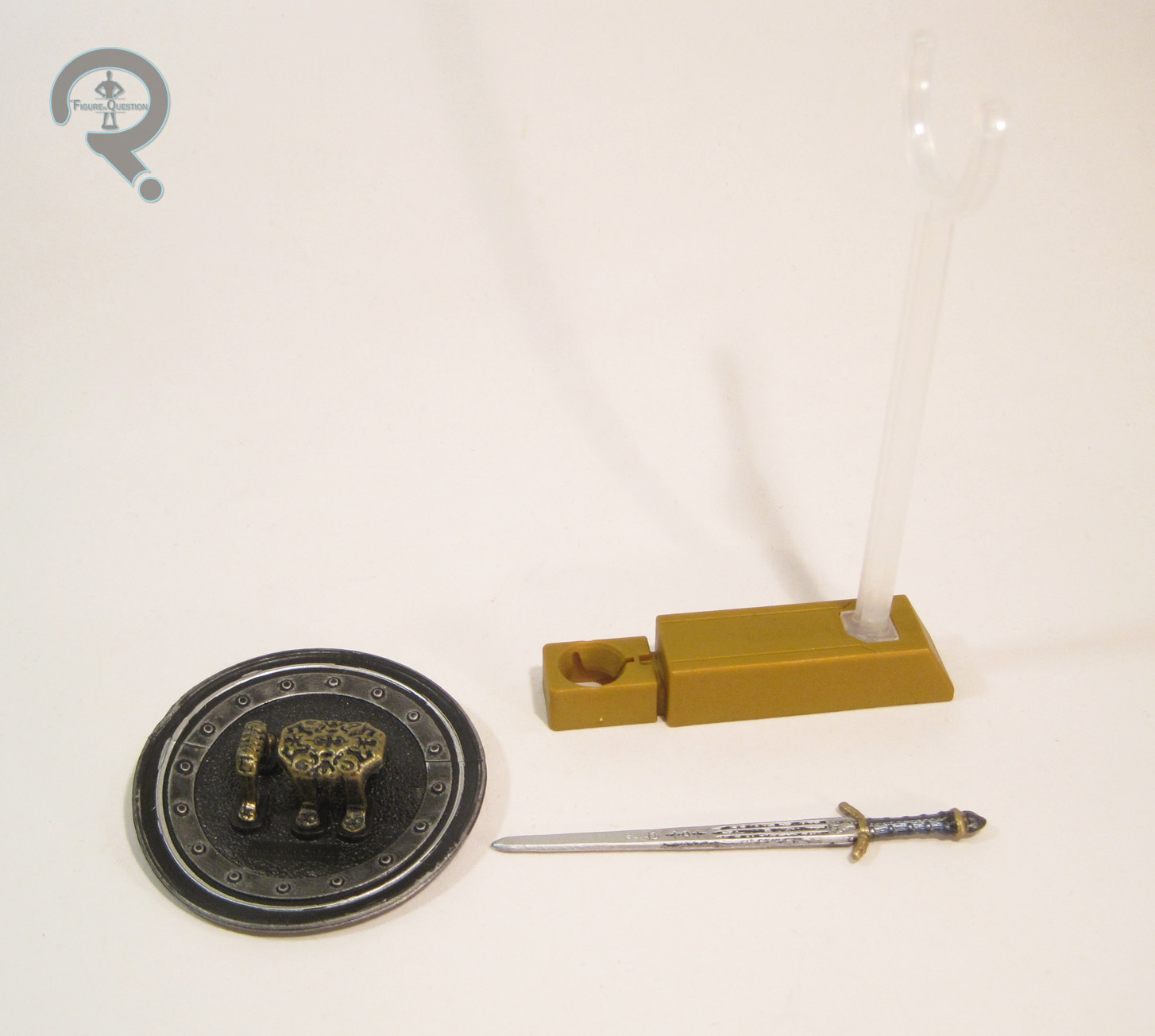
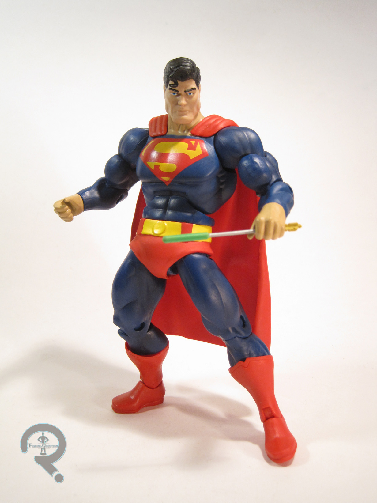
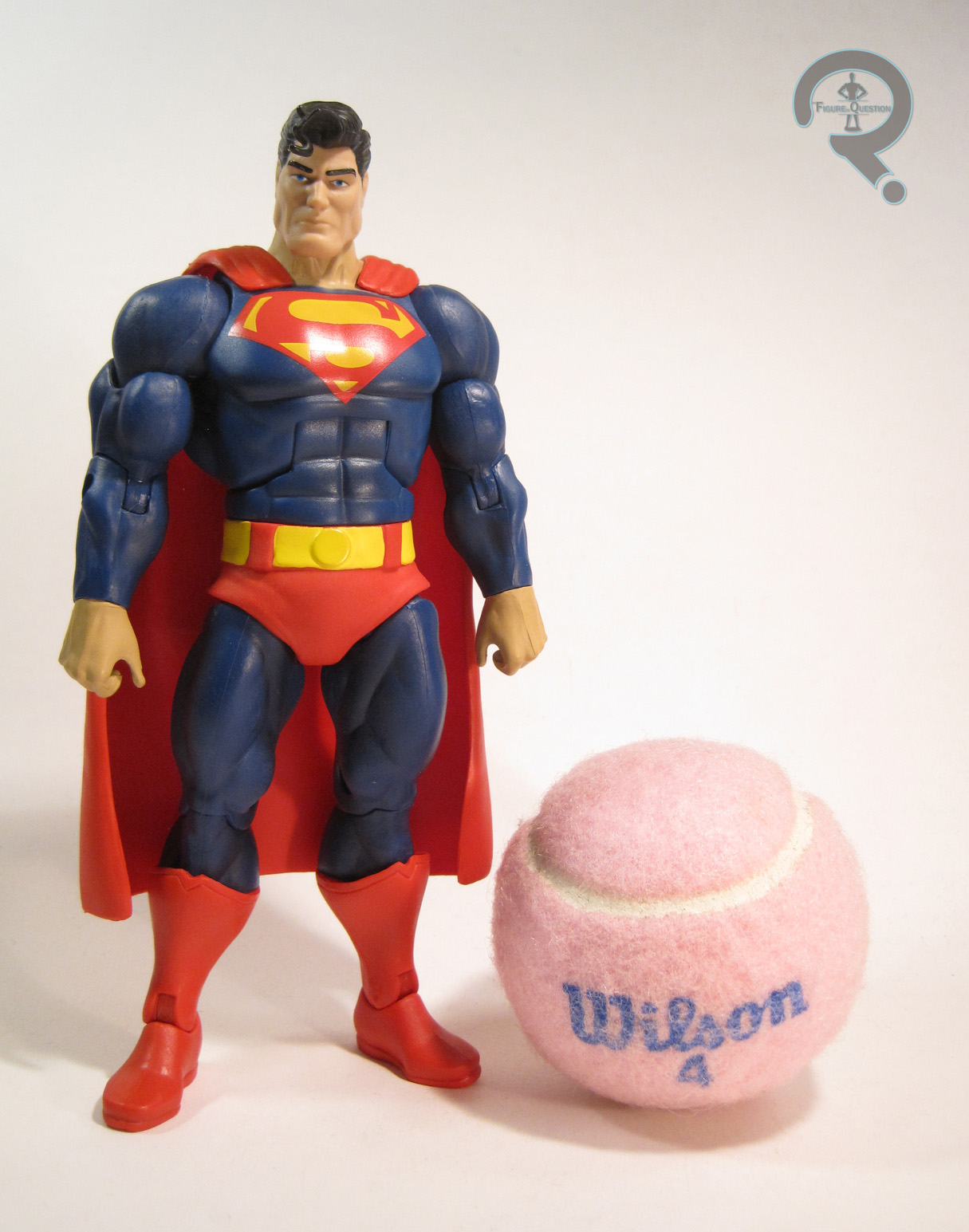 Superman is one of the three figures that make up the Walmart-exclusive Batman: The Dark Knight Returns series of the main DC Comics Multiverse line. The figure stands just shy of 7 inches tall and he has 25 points of articulation. Structurally, he has a very similar build to the figures in Mattel’s Masters of the Universe Classics line. He re-uses a lot of pieces from the prior DKR Batman released in the Batman Unlimited line. Mattel insists that the only pieces these two share with the MotUC figures are the shoulders. I can’t say that they have much incentive to lie about something like this, so I guess I’ll believe them, even if the parts do look really similar. Anyway, Superman uses the majority of the aforementioned Batman figure, with a unique head, forearms, shins, pelvis cover, and cape. The piece make him sufficiently different, while also keeping the similar build of the two characters, which makes sense, since Batman and Superman were portrayed as about the same size in the story. While he’s definitely put on some muscle mass in the story, Superman has aged far more gracefully than Batman. The figure does a pretty good job of replicating that in the head sculpt; he’s obviously a little older when you look at him closely, but he can pretty easily pass for a normal Superman, should you want him to. The rest of the new pieces are all pretty basic, but they capture the look of the character nicely, and they’re all pretty sharp sculpts. The paintwork on Superman is kind of a mix of good and bad. The overall look is definitely very good. The colors are nice and bold, and I absolutely love the larger “S” logo on his chest. He’s noticeably missing the symbol on the back of his cape, though, which is a bit of a shame. Also, the actual application of the paint is quite sloppy. In the store, I had to choose between sloppy belt and decent neckline or decent belt and atrocious neckline. That’s not a fun choice (I went with the former). Superman includes one of Green Arrow’s…uh, arrows, which has a kryptonite tip. It’s a nice piece, even if he does have a little trouble holding it. It sure would be nice if we got an Ollie to go with that arrow, though.
THE ME HALF OF THE EQUATION
I’m at best a moderate fan of The Dark Knight Returns. I own exactly one issue of the series. Care to guess which one? Yeah, it’s the one where he fights Superman. I picked up the first DKR Batman when Mattel released him a few years back in hopes that it would eventually lead to this particular figure, and in a roundabout way, it did. Of course, actually finding him was no easy feat. I stopped at several Walmarts and was never able to find anything more than the Batman re-paint that accompanies this guy. However, at the last Walmart, after I admitted defeat, my good friend Jill noted a few items had been placed on the top shelf at the far end of the aisle. Sure enough, I spotted two Multiverse packages, and when I pulled them down, they were both Superman. Someone was hiding figures! I’m really happy to have this guy, and I think he turned out incredibly well. Were it not for the NECA Christopher Reeve Superman, this one would probably be my favorite Superman in my collection.
Well, here was the real review, but this was my April Fools day post for 2016. Read the altered version here.