TWO-FACE/ HARVEY DENT
THE DARK KNIGHT (HOT TOYS)
Wow, it’s kind of a big day here. I’ve actually managed to write 800 of these things, AND it’s the last day of 2015. How about that. Well, let’s close out the year in style, with another Figure In Question “deluxe review!”
I’ve got quite a large selection of Hot Toys figures, and the vast majority are based on various Marvel Studios properties. However, the property that actually got me into the realm of high-end collecting was their rather impressive selection of figures from The Dark Knight. Wait, didn’t I just talk about how I only thought Dark Knight was okay, not great? Why, then, would I start shelling out the big bucks on figures from said movie? What can I say? My buying habits are an enigma! While everyone always praises Heath Ledger’s performance as the Joker, I’ve always found that one of the unsung parts of the film is Aaron Eckhart’s turn as Gotham District Attorney Harvey Dent, known in the comics as Two-Face.
THE FIGURE ITSELF
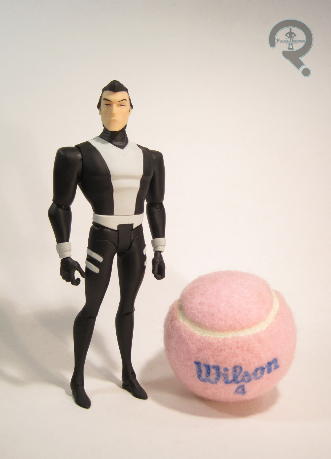
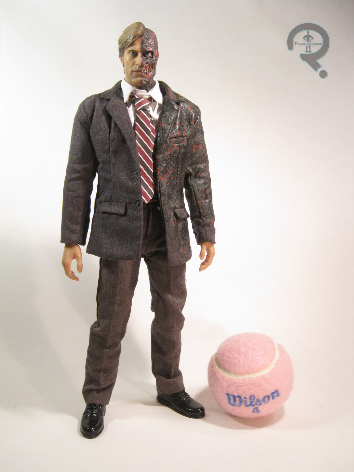
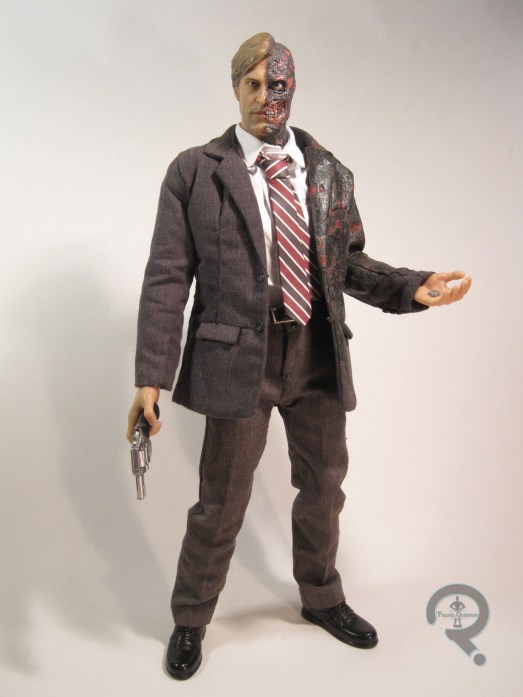
 Harvey Dent/Two-Face was released as part of HT’s Movie Masterpiece Series, as number 81 in the line. He’s the fifth figure from the Dark Knight sub-set, after Begins-style Batman, Joker, Dark Knight Batman, and Bank Robber Joker (and, if you count the Tumbler and the Bat-Pod, he’s the seventh Dark Knight item to carry the MMS label). Two-Face stands about 11 ½ inches tall, placing him at a height just below Batman and Joker. Going by the actor’s heights, this isn’t too far off. Going by the solicitation for the figure, he has “over 30 points of articulation,” which is the best count you’ll get barring actually stripping the figure down to count the joints (which I won’t be doing). Harvey is based on his appearance in the last half or so of the film, from right before his capture by the Joker, up through the end of the film.
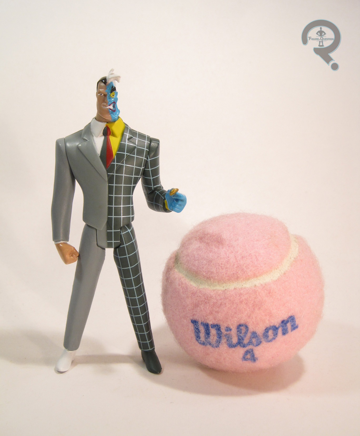
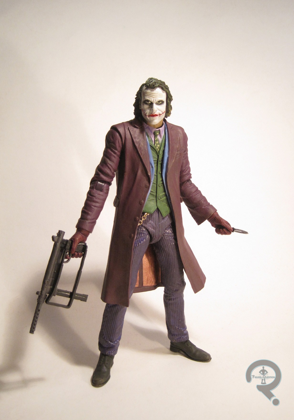
Appropriately for a character such as Two-Face, this figure includes a pair of head sculpts. The first is based on his scarred look from the last third of the film, which is his more distinctive “Two-Face” look. The right half of the face is a very good likeness of Eckhart, looking rather intense and angry. The texturing on the face is a little softer than a  lot of other HT figures, but it’s actually fairly realistic, and helps to further highlight the differences between the two sides. The hair is very finely detailed, and a pretty good match for the look from the film, if perhaps a bit too neat and tidy. The left side of the face is a fairly impressive sculpt purely from an aesthetic stand point, however it has a number of inaccuracies, particularly around the nose and chin. Given how closely the figure was released to the film, one assumes a certain degree of this has to do with the final look from the film changing from preliminary designs. The overall effect really isn’t bad, though, and the sculpt truly is a nice piece of work. The second head presents a pre-accident Harvey. While you might think that the two sculpts would be more or less the same on the right side, this doesn’t appear to be the case. They’re certainly similar, but there are a few differences. The hair is (unsurprisingly) parted a slightly different way, and the general demeanor of the face is less intense. While this is in keeping with the character from this point in the film, the end result is a sculpt that I don’t feel has as strong a likeness as the scarred head. Nevertheless, the sculpt is still a very nice piece. Both heads sport some excellent paintwork, in keeping with the usual work from Hot Toys, and they both showcase incredible realism.
Harvey’s outfit is made up of seven different pieces. He has a jacket and dress pants, a tie, button down shirt, belt, and sculpted shoes. The jacket is probably the weakest piece here. The tailoring isn’t terrible, but it’s a little bunchy and oversized. To replicate the burnt nature of the left side of the jacket, it’s been coated in a rubbery sort of material. While this is nice in theory, and perhaps the most plausible way of creating the look in a mass- produced sense, it only further bulks up the jacket, and makes Two-Face look a little flabby. The tie is oddly plastic-y, but it looks reasonable enough and does a pretty fair job of replicating the look. The shirt, pants, and belt are all pretty nicely tailored and serve their purposes pretty well. The shoes are a fairly often used piece, but they fit the part and are quite well sculpted.
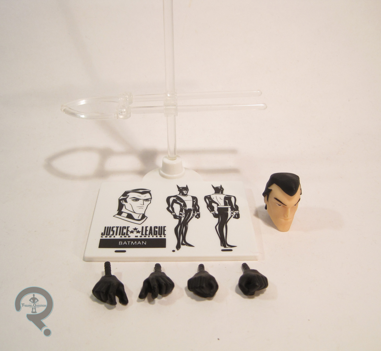
Harvey is an older HT figure, so he has less extras than some other figures, but he does still have a few. He includes:
- 2 pairs of hands
- An extra jacket
- 2 coins
- Campaign button
- Revolver
- Display stand
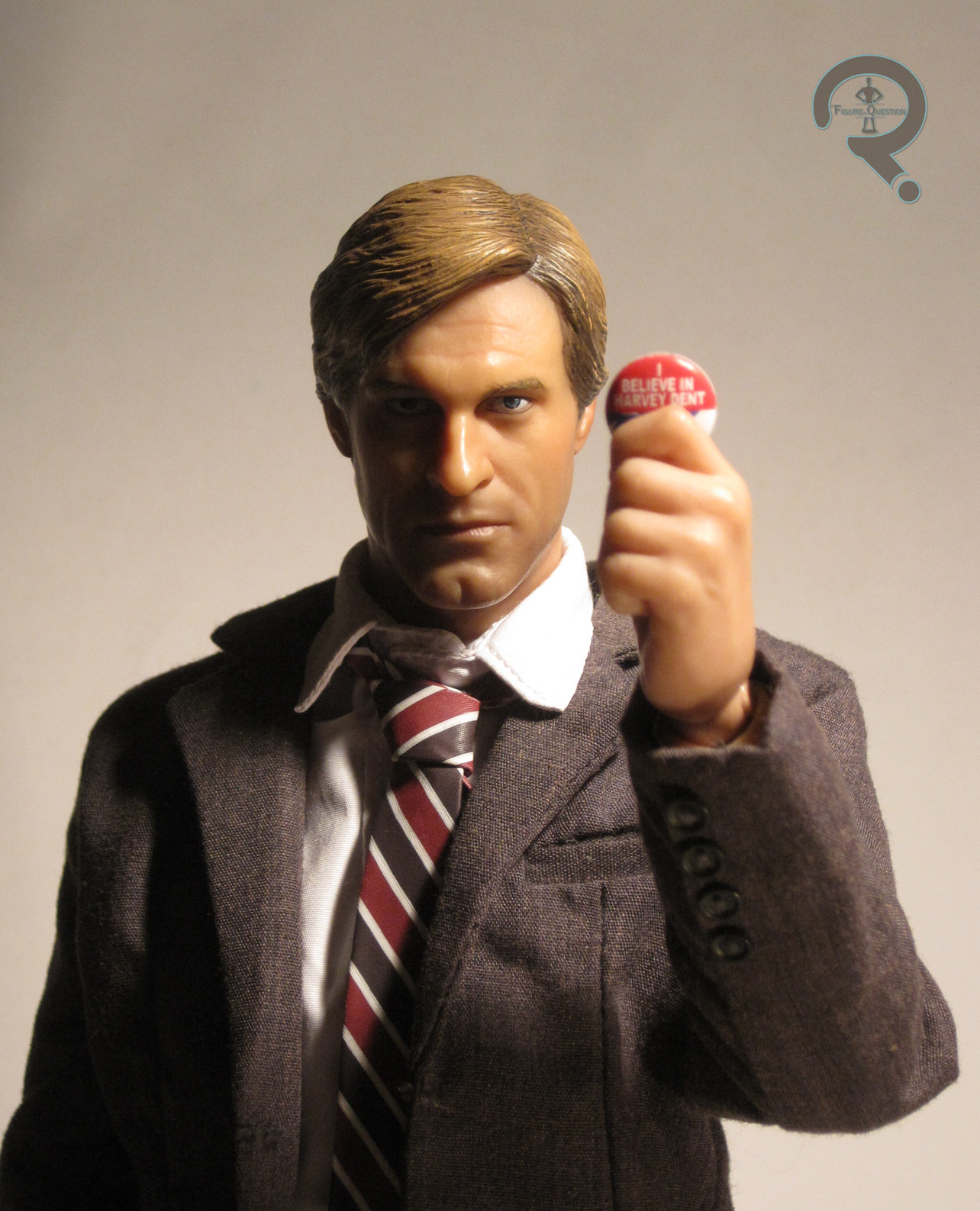
The hands come with one relaxed pair, plus a right hand for holding the gun and a left hand for holding either a coin or the campaign button. Both sets of hands are pretty well sculpted, and decently sculpted, though the thumb on the left hand has a somewhat visible seam on it.
The extra jacket is the same as the regular jacket, but without the rubber coating for the burnt side. The tailoring could still use a bit of work, but it’s a better piece overall than the other coat.
 The two coins are actually the same piece twice. It’s supposed to represent Harvey’s lucky double-sided coin. In the film, the piece is scarred in the accident that scars Harvey’s face. The coin here is small enough that it’s not really clear which version of the coin it’s supposed to be.
The campaign button is one of the ones worn by various characters in the film, which says “I believe in Harvey Dent.” It’s well scaled and well painted, resulting in a very faithful piece.
The revolver is a fairly standard piece. It’s nicely sculpted and scaled. The cartridge swings out and can be removed, which is a nice touch.
Last up is the display stand, which is just the standard piece, which “Two-Face/Harvey Dent” printed on the front, as well as the logo from Dark Knight at the center.
THE ME HALF OF THE EQUATION
Two-Face was my second Hot Toys figure. After getting Joker, I wanted to have a companion figure, so my parents offered to chip in half the price of the figure as part of my Christmas gift for that year. Though the figure might be worth a small fortune now, I actually got him for well below retail, since nobody seemed to want him at the time. While he’s not the greatest offering HT ever put out, and I don’t really think he warrants the high prices he goes for now, he’s a pretty solid figure, and I’m certainly glad to have him.


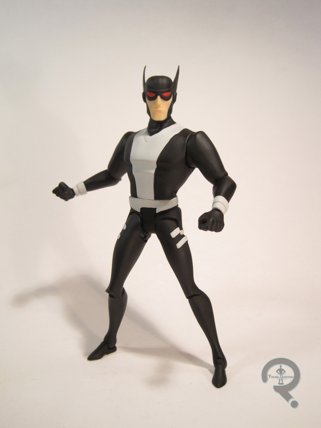
 Batman (and Batman) were part of the “Basic Series” of Mattel’s small-scale The Dark Knight Rises line. These were the cheapest figures available, as they were mostly just recolors of the basic Batman figure. The figures stand 3 ¾ inches tall and have 7 points of articulation. The articulation is kind of odd; the figures lack any sort of elbow movement, which is incredibly limiting. The knees, hips, and shoulders are rather simplistic, but the neck joint is inexplicably a ball joint. Moving past the articulation, the sculpt actually isn’t that bad. It does a pretty good job of capturing the design of the bat-suit from TDK and TDKR, and it actually features a pretty great depth of fine detail work. The head, specifically his exposed mouth, does look a bit weird, like the mask doesn’t fit right, but that’s the only real “down” to the sculpt. The capes are both cloth; they’re just simple scraps of black cloth, cut into vaguely the right shape. Cloth very rarely works well at this scale, and these two show why. The capes are fairly rigid looking, and don’t do anything but hang there awkwardly. The paint is the dividing point for these two. The black one is a fairly standard Batman, looking more or less as he does in the film. He’s not really painted as much as he is molded in the proper colors. The parts that actually use paint are fairly basic, but well applied. The other one has a strange aqua sort of coloring to him, which is, of course, totally made up for the toy. It looks a bit more vibrant than the black one, and it has a few more paint apps, but some areas, such as the face, are a bit sloppier on this one. Neither of these two includes any sort of accessories.