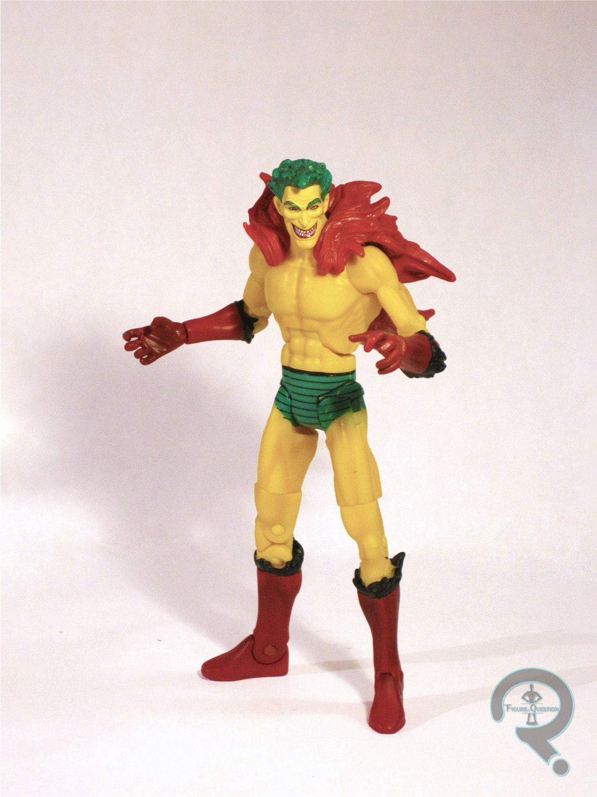
#0148: Green Lantern

GREEN LANTERN

DC TOTAL HEROES


For someone who tries not to talk about the current state of DC Comics, I sure do seem to review a lot of modern DC lines, don’t I?

I’ve talked before about DC Universe Classics and how much of a success it was, for a while.  Then, for a number of reasons, it was pulled from retail and ultimately died.  Since then, Mattel has been attempting to find a new DC line to succeed with the general public.  Total Heroes is the most recent attempt.

It’s a line of fairly stylized versions of DC’s heavy hitters, in a roughly 6 inch scale.  The line just started hitting stores recently, and being the addict I am, I had to buy the Green Lantern figure.  So, let’s see what I think of the new line.

THE FIGURE ITSELF

Green Lantern was released as part of the second assortment of Total Heroes figures as far as I can tell.  They don’t have defined waves anymore, and I know he wasn’t amongst the very first set of figures, so I think he and Sinestro are both later releases.  He’s the Hal Jordan version of the character, and he’s sporting Hal’s New 52 look.  Of all the New 52 redesigns, I find Hal’s redesign least offensive.  Still not my favorite, but it could be worse.  The figure stands about 6 inches tall and features 20 points of articulation.  Most of the articulation is pretty good, but some sort of swivel somewhere on the legs would be appreciated.  As it is, the leg articulation is a bit limited.  The sculpt is done to match the angular style of the rest of the line.  Not having any of the other figures, I’m not sure how much of the figure is reused from others, but I imagine that all of the more generic bits are.  I do really like the ring hand’s slightly angled sculpt.  It allows for some cool poses and really adds a bit of personality to the figure.  I’m iffy on the head sculpt.  It’s certainly not bad, and I really do like the face, but the hair seems off.  They’ve given Hal a very close-cropped cut, which doesn’t really fit the character, who is often depicted with a more loose hair style.  It looks okay, it’s probably just more of a personal preference thing.  The paint work is basic, but pretty good.  There’s a spot or two of misapplied paint, and mine has a black spot on his right glove, but nothing too noticeable.  GL includes one accessory: a clear green axe construct.  It looks fine, though the double blade thing is a bit weird.  I would have preferred if he had something that could clip onto his ring hand.

THE ME HALF OF THE EQUATION

I found this figure while killing time at a local Toys R Us during my brother’s chorus practice.  I decided to give the line a try.  The figure is a pretty fun figure, but I can’t really say that it’s swayed me on buying any of the other figures in the line.  I think it will continue to be a figure by figure basis with these guys.

#0144: The Creeper

CREEPER

DC UNIVERSE CLASSICS

Hey, look!  Something that’s not Minimates!  Yeah, don’t get used to it.  There’s another Minimate review scheduled for tomorrow.  You can’t escape the Minimates!

This figure comes from DC Universe Classics, a line I’ve looked at a few times before.  I feel I’ve said my piece on the line as a whole, so I’ll just jump straight into the figure itself.

Today’s review focuses on the Creeper.  For those of you who don’t know:  The Creeper was a character created by comics legend Steve Ditko (of Spider-Man fame) in 1968.  The Creeper was talk show host Jack Ryder, who got fired and took a job in security.  He’s sent to rescue a scientist being held hostage at a costume party, so he improvises the costume seen above.  Ryder is injured in the rescue, so the scientist injects him with a healing serum, and plants a device that allows the costume to disappear in the wound.  So, now he had enhanced physical abilities, but he’d be cursed to look like this whenever he used them.  How ‘bout that?  The character’s origin was revised numerous times, most prominently in the “Beware the Creeper” episode of Batman: The New Adventures, where he was given a connection to the Joker.

THE FIGURE ITSELF

Creeper was released as part of the 16th wave of DCUC.  He’s obviously based on the character’s comic book appearance overall, but it appears that the figure took a few cues from the animated version.  He stands just shy of 6 ½ inches and features 27 points of articulation.  Creeper was based on the tall-skinny buck, which was released in the line a bit later.  I don’t remember for sure whether Creeper was the first figure to use this body or not.  I have to say, it’s a bit of an odd choice for him in my opinion.  I’m not saying Jack Ryder was a huge guy or anything, but he was usually depicted being a bit stockier than this.  He’s got character specific lower arms and lower legs to show off his distinctive feather trimmed boots and gloves, which look pretty good.  Mattel opted to sculpt Creeper’s feather boa, which is a fair choice I think, but does end up being the slightest bit restrictive.  The head is probably my least favorite part of the figure, which has a lot to do with the animated influence, I feel.  I would have preferred to have a more Ditko inspired sculpt, Beatles hair and all.  It also doesn’t help that the sculpt doesn’t look to have translated very well from the prototype stage, making Creeper look more like a yellow Joker, and less like his own character.  A lot of this has to do with the paint.  The paint work on the body is up to the usual standards of the line, but the head is just a bit off, particularly on the eyes and very definitely on the teeth.  Creeper’s only accessory was a piece of the wave C-n-C figure, Bane.

THE ME HALF OF THE EQUATION

I actually kind of like the Creeper, and I was looking forward to this figure when it was announced.  It’s not a perfect figure, and I remember being a bit disappointed at the time, but I’ve grown to really like the figure over time.  Wave 16 was actually one of the few waves that I found almost all in one shot, except for one figure that I eventually paid too much for.  Fortunately, Creeper was not that figure, so I can enjoy he him for what he is.

#0141: Power Girl & Doctor Fate

POWER GIRL & DOCTOR FATE

DC MINIMATES

So, I know in my review of Thor and Absorbing Man I said that it was the last of my “New” Minimate reviews for a while.  I’m not deviating from this.  However, I have lots of old Minimates.  And I have a randomized list from which I draw the order of my reviews.  And I dare not deviate from the list.  So, I’m gonna be totally up font here:  There’s a lot of Minimate reviews on the horizon.

Now that that’s out of the way, let’s jump to what I’m looking at today.  This is my third look at the tragically short DC Minimates.  I was a big fan of these guys, and they are actually the line that officially got me hooked on Minimates in general.  But, they were one of the few Minimates lines to be outsourced, being handled by DC Direct instead of Diamond.  DC decided to pull the plug and then they were gone.  Today’s focus is two of the slightly more obscure characters in the line, though they were both a bit higher profile at the time: Power Girl and Doctor Fate.

THE FIGURES THEMSELVES

These two figures were part of the 2nd series of DC Minimates.

POWER GIRL

First, it’s a character that was really big for a few years there, but seems to have fallen back into the background, Power Girl.  Power Girl is present here in her look from the early 2000s, when she was a prominent member of the Justice Society and was at the height of her popularity.  She doesn’t look too different from her earliest incarnation, but her costume does noticeably have the seams that were very present at that time.  She’s built on the typical Minimate body, so she stands about 2 ½ inches tall and features 14 points of articulation.  She has 4 sculpted add-ons: hair, gloves, and a torso/cape combo.  All of these were new to the figure, though the gloves were shared with two other figures in the wave.  The hair is well done, and really looks like her hair at the time.  The torso is…odd.  Power Girl is commonly depicted as having large…assets, which is difficult to show on a block figure.  So they gave her a sculpted torso piece, I guess to make her torso larger.  It doesn’t really work the way they were hoping, and she just ends up looking too bulky.  The painted details are all pretty good and everything is cleanly applied.  The figure included no accessories.

DOCTOR FATE

Next, it’s Doctor Fate, who is a guy who does stuff with magic.  And is a doctor, I guess.  Maybe he has a doctorate in magic?  I know the original Fate was a doctor of archeology, but this is the third version of the character, and I don’t believe he had any legit claims to “doctor-hood.”  Anyway, as I mentioned, this is the third version of the character, which is the version that was running around at about the time this figure was released.  The figure is built on the standard body, so he’s got the usual stats.  Fate’s got 4 sculpted add-ons: Helmet, cape, and gloves.  The gloves are shared with Power Girl, but the helmet and cape are unique to this figure.  They both look really cool, and help to make this figure one of my favorites in the line.  The paint detailing is really sharp on this figure, with lots of really bold lines that really help with that “comic book” feel.  Fate includes a spare hairpiece, so he can be displayed without his helmet.

THE ME HALF OF THE EQUATION

Like with all of the DC Minimates, I picked this set up from my local comic book store when it was released.  This is an interesting set because it includes Power Girl, one of the few DC Minimates I don’t really think is all that, and Doctor Fate, one of my absolute favorites in the line and one of my favorite Minimates in general.  What a dilemma!

*By the way, you’ll notice that this review doesn’t feature separate shots of each minimate with it’s different looks to accomany it’s personal reveiw block like my recent round of Minimates did.  To keep up with the daily posting schedule, most of my shots of figures that I use in reviews were taken months or even a year ago.  Initially, I had planned on shooting all of my Minimates in the sets they were released in, so there were no solo shots.  Recently, given the structure of  my reviews, I’ve found that I actually prefer having the solo shots, so I’ve started taking them.  But, I don’t really have the time to go back and retake all of the Minimates photos, so the older stuff will just have the group photos.  Sorry everybody!

#0140: The Penguin

PENGUIN

DC: SUPER POWERS

Alright, I’m going back to my list of figures I already own for reviews.  This time it presented me with a figure from my modestly-sized DC: Super Powers collection.  For those of you unfamiliar with Super Powers, it was the first really intensive DC Comics toyline, and still is considered to be the best by a fair number of people.  I missed it in its initial run, but got into it because it was the only source of a Hal Jordan Green Lantern, Barry Allen Flash, or even a Wonder Woman when I was growing up.  I’m not reviewing any of those today, though.  Nope, I’m reviewing the Penguin.

In the entirety of my 2500 piece action figure collection, I own THREE Penguin figures, on yet somehow I’ve looked at two of the three before looking at a single version of characters of which I own dozens of figures.  I don’t even like the Penguin!

THE FIGURE ITSELF

Penguin was released in the first wave of Super Powers figures.  He’s based on the classic Penguin look, before he was tweaked to more resemble the Danny Devito version of the character.  The figure stands a bit over 4 inches tall and has 7 points of articulation.  The sculpt is pretty good, with all of Penguin’s features carefully laid out.  He’s a simplistic figure, but the figure still has some decent folds and such, just everything is very smooth in texture.  The paint on the figure isn’t anything astounding, but it looks pretty good for the time, and everything is clean and within the lines. There’s pretty much no bleed-over or anything.  Each figure in the Super Powers line features some sort of action feature, usually activated by squeezing the arms or legs.  In Penguin’s case, when the legs are squeezed, his right arm lunges upward, which is dubbed his “Power Action Umbrella Arm.”  Penguin included a two piece umbrella, of which I only own the top piece.

THE ME HALF OF THE EQUATION

This is a pretty cool figure, I guess, even if I’m not the biggest fan of the character.  He’s certainly not the greatest that the line had to offer, and I doubt any one would bring him up as one of the reasons the line is well remembered, but it’s a decent entry in the line.  Not the best, not the worst.

I actually ended up with two of this figure, believe it or not.  I swear I don’t like the Penguin!  Anyway, I got the first one for like $3 at my local Comicon, I think, but he was missing the coat tails and umbrella, and just had an “okay” paint job.  A few years later, I found a pretty decent Super Powers Batmobile for $40 and it included Batman, Robin, Joker, and Penguin.  I bought the lot solely for the Batmobile, but the Penguin included part of the umbrella and had the coat tails piece, plus he had a better paint job to boot.  Unfortunately, the figures stank to high heavens of cigarette smoke, so Penguin had to be quarantined in a bag of cat litter for 24 hours.  In case you were wondering, cat litter absorbs the smell of smoke, I don’t just willy-nilly place action figures into bags of it!

#0135: John Stewart – Green Lantern

JOHN STEWART – GREEN LANTERN

DC: INFINITE HEROES

So, I’m taking a short break from all the Minimate-y goodness I’ve just gotten and looking at a few other figures in my collection.  This one’s not a new figure, nor is it one of my favorites.  But I own it, and it’s on the list of random figure choices from which I dare not deviate.

Mattel is a company I’ve mentioned a few times before on this site.  They aren’t really my favorite topic, as I have a tendency to go off on rants when I bring them up.  They just recently started up a new 3 ¾ inch scale line of figures.  This is actually their second venture into this scale.  Their first was called DC Infinite Heroes, and was widely seen as a pretty big failure on their part.  It didn’t last as long as some of their other lines, but it went a few years, and did release a fair number of figures.  I’ll be looking at one today.

THE FIGURE ITSELF

So, it’s John Stewart.  Earth’s 3rd or 4th Green Lantern, depending on how you look at it.  Not the host of The Daily Show.  Sorry if it’s confusing.  John was released as part of a Green Lantern themed 6 pack.  The set was released relatively early on in the life of the Infinite Heroes line.  The figure stands about 3 ¾ inches tall and has 10 points of articulation.  Like most of Mattel’s DC toy lines, DCIH operated on the buck system, meaning every figure was built on one of the few stock bodies.  Unfortunately, the stock bodies for DCIH aren’t anywhere near as nice as those used for DCUC or even Justice League Unlimited.  John was built on the slightly larger male body.  This is okay, since John tends to be depicted a little bigger than Guy and Hal, but the body itself is probably one of the worst of the stocks.  The waist is super tiny, the arms are bulky and stubby, and the hands are GARGANTUAN.  The only new piece here was the head, and it doesn’t do much to improve the figure.  I’m not really sure what look they were going for, but John looks sort of like he was kicked in the crotch while eating a whole pack of Sour Patch Kids.  I’d love to say the paint helps the figure, but it just makes things worse.  For some reason, they gave John brown hair and eyebrows, which makes his whole heal look a bit…mushy.  Plus, his eyebrows kinda give off a weird Vulcan vibe.  The paint is particularly sloppy on the wrists, and for some reason his boots are an entirely different shade of green than the rest of his uniform.  John includes no accessories, which is a shame because they might have added some value to this figure.

THE ME HALF OF THE EQUATION

I don’t remember where I got this figure exactly.  I know at one point I had the whole set, but I think I sold most of the others off.  I don’t know why I kept him.  I think I just wanted to have John represented in this scale.  Infinite Heroes wasn’t a very good line, but there were a few figures that didn’t totally suck.  John is not one of those figures.

#0128: Superman

SUPERMAN

JUSTICE LEAGUE (MATTEL)

A large portion of my appreciation for DC characters comes from the DC Animated Universe, created back in the early 90s by Bruce Timm and Paul Dini, when they first started Batman: The Animated series.  Batman led to Superman and Batman Beyond, and eventually, they moved on to what many see as the greatest entry on the list: Justice League and Justice League Unlimited.
Kenner offered the initial figures for BTAS, and when they were bought out by Hasbro, Hasbro continued.  By the time of JL, Hasbro was interested solely in Batman and Superman variants, so they had no plans to release the team from the show.  Eventually, the license was moved to Mattel, and Mattel quickly released a set of the seven main characters.  Today, I’ll be looking at the Superman from that line.

THE FIGURE ITSELF

Superman was modeled after his design on the show, specifically his look from the first season, although the differences are minor.  He stands just shy of 5 inches tall and features 5 points of articulation.  The sculpt is really sharp, and  very accurately represents the design on the show.  The design doesn’t really translate well to articulation, so Mattel seemed to go for the looks over movement, and I actually greatly prefer it this way.  I do wish that he had a little less of a hunched look on his neck, but overall, it doesn’t look too bad.  For the most part, Superman is molded in the appropriate colors where necessary, but what paint is there is fairly cleanly applied, and has no real issues.

THE ME HALF OF THE EQUATION

While I rushed to get the rest of the members of the team, I had plenty of Batmen and Supermen, so the two of them kinda had to wait.  Superman was actually not picked up individually, but actually was included with the Javelin 7, which I believe my brother and I bought a few years ago from a local toystore.  My brother kept the Javelin 7 to himself, and I got the Superman.  It’s probably one of the best animated Superman figures released, and fits nicely with the rest of the line.

#0108: Martin Jordan

MARTIN JORDAN

GREEN LANTERN (MOVIE)

If you’ve been following the site, you’ve probably picked up that I’m a pretty big fan of all things Green Lantern.  A little while back, I reviewed the basic Hal Jordan figure from 2011’s Green Lantern movie, where I noted that pretty much my only reasoning for purchasing the figure was because it was Green Lantern related.  Well, today I’ll be looking at yet another entry from that line, which I purchased for pretty much the same reason.  It’s the titular hero and his father Martin.

THE FIGURE ITSELF

The Green Lantern included in this set is identical to the one I reviewed previously, so I’ll just be looking at Martin this time around.  Martin was released as part of a two-pack exclusive to K-Mart at the time of the movie’s release.  The figure is based on Martins flight suit look from the movie.  He stands about 4 inches tall and has 6 points of articulation.  The sculpt is pretty much in line with the rest of the figures from the series.  The likeness on the head sculpt is actually pretty good.  The body isn’t terrible, although it is entirely inaccurate to the flight suit Martin wore in the movie, since they just reused the test-pilot Hal Jordan body.  The paint has no slop or anything, but it’s incredibly basic, and quite drab.  Which I guess is good because it fits right in with all of Mattel’s other offerings from the movie.  He included a Ferris Air parachute, which was just kind of a cheap piece of plastic that I didn’t feel the need to hang onto for any particular reason.

THE ME HALF OF THE EQUATION

Like the Hal Jordan figure, this figure is a decent offering…if it had been released about 10 years prior.  Mattel really phoned this line in, and it’s incredibly obvious.  Plus, we got Martin Jordan in the 4 inch line, but not Hector Hammond, Carol Ferris, or Amanda Waller?  Martin had less than 5 minutes of screen time, and it’s not like he had a particularly interesting look.  I wish I had more positive things to say, but I really can’t think of any.

#0106: Black Hand

BLACK HAND

GREEN LANTERN: REBIRTH (DC DIRECT)

I’ve mentioned before that I’m quite the Green Lantern fan.  Well, I’ll be frank, that doesn’t really extend to his villains.  Sure, I’m a fan of characters like Sinestro and the original Star Sapphire, and heck I’m even a pretty decent fan of characters like Sonar, Evil Star and Goldface.  But there are some Green Lantern villains I just plain don’t like.  Like, for instance, Hector Hammond, star villain of the 2011 Green Lantern movie.  My opinion of today’s character, Black Hand, is not as simple as the previously mentioned opinions.  No, he’s much more complex, and today’s figure just plays right into those mixed feelings.

THE FIGURE ITSELF

Black Hand was released as part of the first wave of DC Direct’s Green Lantern: Rebirth line, done to coincide with the comic event of the same name.  Hand himself only has a minor appearance in the actual Rebirth series, and he doesn’t look like this.  The figure here is actually based on Hand’s look in the re-launch GL book shortly after Rebirth.  While this is the look that would gain notoriety in Blackest Night and the like, it’s presence here seems to be solely because it was what Hand was wearing at the time, as the character would remain relatively obscure for a few more years.  Anyway, the figure stands a little over 6 inches tall, and features 11 points of articulation.  He looks to be built on a similar under-lying structure to that of the Hal Jordan figure released in this line.  The outer details are different, with Black Hand featuring a lot more details on his costume.  In particular, he’s got lots of wrinkles all over his costume.  What, does this guy not have an iron?  On his left arm, he’s got straps and buckles, I guess to “modernize” the character’s look.  The Right hand is the titular “black hand”, and is exposed in all its veiny goodness.  This guy also has a lot of rivets, which begs the question:  is his cosume actually riveted on to him?  That might explain the figure’s surly facial expression.  Black Hand is topped off by a non-removable rubber cape.  It’s a decent sculpt, but it can make the figure a bit top heavy.

THE ME HALF OF THE EQUATION

So, I’ve done my (mostly) non-biased review of the figure itself.  Now, onto the nitty-gritty, me part:  I absolutely, without a doubt in my mind, hate the modern Black Hand, and pretty much everything he’s been involved with.  I know, that’s a strong opinion, but I just haven’t liked what he’s been involved with.  Classic Black Hand had a pretty neat design, and while he was hokey as hell, that was a lot of fun.  A decent character.  But, hokey characters can’t be hokey anymore, so we wound up with this redo of the character, where he’s got leather straps, and wrinkles, a random lines all over the place, and looks like a zombie.  And, hey, “Black Hand” makes no sense, unless you spell it out for people by giving him a BLACK HAND!  Hey, MGM, I’ve got an idea for a Goldfinger remake.  Here’s the twist:  Goldfinger loses one of his fingers, and he has to replace it with one MADE OF GOLD!

I know what you’re thinking: If you hate the design so much, why do you have the figure?  Because I got him for a dollar.  And for a dollar I guess he’s alright.

#0098: Negative Man

NEGATIVE MAN

DC UNIVERSE CLASSICS

Ah, DC Universe Classics.  A line that left me with so much confusion.  The line led me to steadily hate everything Mattel did.  But on the same hand, it was the DC toy line I’d wanted since I was 4 or 5.  Not only did it have great versions of the big name characters and their supporting casts, but it also gave us characters we never thought we’d see released in a retail toy line in a million years.  I’ll be looking at Negative Man, one of those characters, today.

Negative Man, or more specifically Larry Trainor because Negative Man wasn’t actually his name, was a member of the wacky 60s super hero team the Doom Patrol.  The Doom Patrol weren’t your conventional super heroes, no, they were freaks and outcasts that the public had shunned.  They were led by a wheelchair bound man and they fought the Brotherhood of Evil.  No, I didn’t make that up.  They were totally the X-Men, only at DC.  Not a rip off, mind you.  They debuted the same year, and neither one was really a best seller.  But eventually X-Men became one of the bestselling comicbooks ever, and the Doom Patrol were mostly forgotten.  Sure they’ve had a few reboots, but none of them ever really captured the fun of the original series, and none of them ever really lasted all that long.

Anyway, Larry was a test pilot who was exposed to some strange energy that turned out to be the sentient being N-Man.  N-Man was trapped inside of Larry’s body, and could only be released in 60 second intervals, or Larry would die.  When N-Man was present in Larry’s body, Larry was radioactive, so he had to be wrapped in specially treated bandages to keep the radiation contained.  I’m gonna be honest, it was a pretty sweet concept!

THE FIGURE ITSELF

Larry was released as part of the 13th wave of DC Universe Classics.  Believe it or not, Larry’s actually had a few looks over the years.  Mattel has chosen to go with what is probably the character’s best known look, his red and purple number that he sported for the majority of the original series.  While I’m partial to his original green uniform, I think they picked the right costume.  He stands just shy of 6 ½ inches tall and he has 24 points of articulation.  DC Universe Classics operated on the buck system, meaning they had a set of differently sized bodies and the picked the one that best suited the character in order to save on tooling.  Larry is based on the medium build male buck, which works fine, since he’s not supposed to be a powerhouse.  I’ve heard arguments that he should have been on a skinnier body, but I think the medium build looks just fine.  In addition to the buck body, Larry has specially sculpted parts for his head, neck, hands, belt and boots.  The head, neck and hands are all bandaged, and they all look pretty cool.  They found a decent way of handling showing a face, without it looking too silly, which is a good thing.  The belt has a cool leather texture to it, which is one of those things that could have easily been left out, but I’m really glad wasn’t.  The boots are actually a reuse from the line’s Green Arrow figure, but if it’s a good part, use it.  The paint on Larry is all well applied, with no slop or bleed over.  There are several washes present to bring out the details in the sculpt.  In one area of disappointment, Larry includes no accessories apart from the requisite C-n-C piece.  It’s Trigon’s staff for those who care.  But, Larry himself gets nothing, not even a cool snap on Negative Man effect!  I guess they had to draw the line somewhere.

THE ME HALF OF THE EQUATION

In spite of DCUC’s spotty distribution, I actually found Larry in store with relative ease.  I was greatly excited by that, as he’s one of my favorite characters, and I’ve always wanted a figure of him.  This one did not disappoint.  Larry shows the DC Universe Classics line at its best.  Well distributed, well sculpted, cool obscure character.  He was just full of win!

#0095: Green Lantern & Sinestro

GREEN LANTERN & SINESTRO

SUPER FRIENDS (DC DIRECT)

Today, I’ll be looking at another piece of my extensive Green Lantern collection, though unlike the last time, this is a set I acquired because I actually wanted it, not just because it said “Green Lantern” on the box.  This time around, it’s a 2-pack from DC Direct’s Super Friends line released a while back.  In particular, it’s Green Lantern and his nemesis Sinestro based on their appearance from the 70s TV show Challenge of the Superfriends.

THE FIGURES THEMSELVES

This pair was released as part of the 3rd wave of 2-packs from DC Direct’s Super Friends line.

GREEN LANTERN

Up first, it’s the hero of the set, Green Lantern.  Unsurprisingly, he’s based on the character’s appearance from the show.  He stands a bit over 6 inches tall and has 9 points of articulation.  The articulation can be a bit tricky, as the ball joints on the arm have a tendency to pop out, leaving poor Hal armless.  The sculpt on the figure is very smooth, and all the lines are very clean, which is appropriate for the design they were trying to capture.  In particular, the head sculpt really got the character design from the show down.  The paint is also clean and basic, but that’s no surprise, given the look they wanted.  The pupils seen through the mask can be a bit unnerving, but that’s in line with his design.  The figure included a lifesize version of his ring from the show, a display stand with the Super Friends logo, and a miniature version of the hall of justice.

SINESTRO

Next, Green Lantern’s arch-nemesis, Sinestro!  Sinestro is, of course, based on his appearance in the show.  He stands just shy of 7 inches tall and has the same 9 points of articulation as his pack mate.  Unlike GL, Sinestro doesn’t seem to be plagued by the arm issue, which makes him a bit easier to pose and such.  Sinestro’s sculpt is a bit more detailed than GL’s, since his character design was a bit more intricate.  A lot of the musculature of the sculpt is very similar, just stretched out to convey Sinestro’s tall, lean build.  Like with GL, the head sculpt is really the shinig point of this figure, giving Sinestro the perfect sinister grin.  Sinestro also includes a lifesize model of his ring from the show and a display stand with the show’s logo.

THE ME HALF OF THE EQUATION

Green Lantern and Sinestro were a birthday gift from some family friends who were aware of my intense Green Lantern fandom.  I greatly appreciated it, and it was actually my only figure of Sinestro for a good long while.  I still really like this set, as it’s a great representation of a popular take on the characters.  I can’t look at them without the Challenge of the Super Friends theme starting up in my head.