#3912: Roboto

ROBOTO

MASTERS OF THE UNIVERSE CLASSICS (MATTEL)

It’s been a year and a half since I’ve talked at all about Masters of the Universe Classics.  There’s….reasons?  I mean, the big one is that the line’s been dead for the better part of a decade, so it’s not like there’s a lot of updates.  Also, I’m only a moderate MOTU fan at best, so it’s not like I’ve even got a huge backlog of them.  And discussion of how the line was run is tricky at best, and I’ll just leave it at that.  But, I do have some parts of the franchise that I enjoy no matter the surrounding situation, and one of the core characters for that is Roboto.  He’s just so neat and nifty and retro, and that’s very fun.  So, let’s look at another one of those!

THE FIGURE ITSELF

Roboto was the October release for Masters of the Universe Classics 2010 run of figures, making him the tenth standard figure of the line’s third year.  By 2010, the line was pretty much in full-swing, and they’d gotten the subscriptions set up, so Roboto was around for a leisurely 2 hours and some change before selling out, which I guess was pretty nice.  The figure stands 7 inches tall and he has 23 points of articulation.  While he loses the mid-torso joint that most figures in the line sported, he does gain an articulated jaw, so it winds up as an even trade.  Roboto’s sculpt was a mix of new and re-used, which was pretty par for the course.  Like his vintage counterpart, he shares his legs with Trap-Jaw (who also shared his legs with Optikk, all three the same year), but his upper half is all-new.  Roboto was very definitely based directly on his vintage counterpart, rather than his 200x version.  At the time, it was the most sensible choice.  There was an alternate head made available later, but that wasn’t present with the initial release.  The sculpt does a pretty respectable job of capturing that vintage look.  The head and torso are very cleanly detailed, and I love the working jaw and turning gears inside the torso.  I also really dig the little heart sculpted around the central gear, in reference to his mini comic appearance.  The arms are fine, but the elbows are notably rather restricted in their motion, which was a recurring issue for the line.  QC was unfortunately a notable issue for this guy.  Thankfully, mine isn’t plagued by the torso cracking, but there was no avoiding the reversed shoulders.  They aren’t the end of the world, but it’s pretty obvious they’re not the way they’re supposed to be.  The color work was actually pretty nice for this guy; he’s really bright and bold, so it makes him very eye-catching.  He’s also got a wash on the silver sections, to help bring out the sculpted details a little better.  Roboto was packed with his classic claw, axe, and blaster attachments, as well as a standard hand.  The weapons are a bit soft and prone to warping, but generally they look okay, and the standard hand is a nice addition.

THE ME HALF OF THE EQUATION

I had only *just* picked up my first MOTUC figure when Roboto dropped, and I wasn’t up on keeping current, so I missed his day-of.  I contemplated getting him a number of times early in the run, but he was always just a little over what I wanted to pay, and then I ended up sort of falling out of it all.  I’ve been keeping an eye out for a bit, though, since he was the only of my regular line-up of characters I didn’t have for Classics.  While on family vacation, Matty wanted to go to the toy store, and they just so happened to have one of this guy for for a price I was willing to pay, so, huzzah, I have one!  Admittedly, in light of the Origins and Masterverse figures, he feels kind of quaint and a little outmatched, but I’m glad to have him nevertheless, and I’ll never complain abut more Roboto figures.

#3876: Orko

ORKO — HEROIC COURT MAGICIAN!

MASTERS OF THE UNIVERSE ORIGINS (MATTEL)

I am veritably swimming in Masters of the Universe reviews these days, aren’t I?  Okay, maybe not, but two of them in one month is something of a crazy step up compared to more recent set-ups.  I’m continuing to stick to my guns on only following specific characters, but Mattel keeps getting my by doing additional variants of said characters.  It’s like the *know*.  Or, you know, they’re trying to keep the line fresh.  The last couple of years, Mattel’s been revisiting a lot of the Origins figures to do more specifically Filmation-inspired takes, and the latest of those includes one of my go-to guys, Orko!

THE FIGURE ITSELF

Orko is part of the 25th series of Masters of the Universe Origins, which is a completely Cartoon Collection-branded assortment (simply “Cartoon” since they can’t actually use “Filmation” on the packaging).  The figure is about 3 inches tall (without his flight stand) and he has 14 points of articulation.  As with all Orkos, he’s without any legs, so he doesn’t get any articulation on that front, but he’s got a decent selection of movement in the arms, and even gets an extra point of movement from the last Origins Orko, thanks to his hat being on a balljoint, so you can move it back and forth.  His sculpt is an entirely new one from the last figure.  While there was certainly a cartoon inspiration on the last one, he was also serving two masters in a sense, also replicating the vintage figure.  One of the biggest areas was actually how big he was; he was about an inch too tall for proper scaling with the other figures.  This one addresses that, so he’ll fit in better with the others.  Otherwise, his sculpt isn’t *drastically* different from the last one.  It’s more of a death by paper cuts sort of thing where the small changes all add up to a different looking figure.  In terms of color work, the two figures remain fairly consistent, however.  The one notable change is, at least on my copy, that this guy’s application is a lot cleaner.   Orko gets a pretty nice selection of extras, with a flight stand, his “Hero” medal from “Creatures From the Tar Swamp”, and an extra head and scarf so that Orko can be turned into his Uncle Mortok.  Apart from the beard not totally covering Orko’s “O”, it’s a very cool set-up, and I like getting an extra character out of it.

THE ME HALF OF THE EQUATION

When I bought my Classics Orko, I really thought that was gonna be it.  The Origins one was cool, but I didn’t need it….until I saw it in hand and I caved, because I’m an easy mark.  I didn’t think I’d need *another* one, though, especially since he was more directly cartoon based than other Origins figures.  But, by the time this one was announced, I knew it wasn’t a battle I was going to win, so I’ve actually been rather looking forward to his release.  I think he’s really cool, and does a lot more than the last one, which makes him feel really worth it.

Thanks to my sponsors over at All Time Toys for setting me up with this figure to review.  If you’re looking for cool toys both old and new, please check out their website and their eBay storefront.

#3780: Superman

SUPERMAN

DC UNIVERSE CLASSICS (MATTEL)

It’s time for more of the review subject gift that keeps on giving, DC Universe Classics.  I’m taking a break from this month’s general theme with DCUC of Hal Jordans and Green Lanterns, because why not.  Also, because it’s Superman, and I realized all this time in I hadn’t reviewed the basic DCUC Superman, which seems like something of an oversight.  So, let’s fix that particular oversight and get him done now!

THE FIGURE ITSELF

There was a strange path of release to this particular figure, and I’m gonna break that down here.  Since DC Universe Classics spun out of the somewhat similarly designed DC Super Heroes line, Mattel didn’t immediately put out a new classic Superman.  The first Supes was in Series 2, and it was Superman Blue, with a Superman Red variant.  Eradicator got released in the exceptionally hard to get Walmart-exclusive Series 5, and had some more classic Supes vibes, but his classic Supes head had red eyes.  Series 6 was set to have regeneration suit Superman as the standard and classic suit with the long hair as the variant, but those got swapped before release, so we had something slightly approximating a classic Superman.  Then we got a two pack release with the standard costume and the short haired head from Eradicator, but the eyes were still red, so still not classic.  Classic costume with classic hair and classic eyes would finally get its release in the first Walmart Exclusive five-pack in 2009.  That same figure later got a single “World’s Greatest Super Heroes” release and two-pack releases with a repack of the DCSH Parasite and a recolored MOTUC He-Man, all in 2010.  So, finally a standard Superman, and four ways to get him.  I bought mine loose, so I couldn’t tell you which particular release it was, but they’re all effectively the same.  The figure stands 6 1/2 inches tall and he has 23 points of articulation.  He used a variation of the standard-most male body, with the Eradicator head, and the Superman specific cape, belt, and calves.  Generally, they’re pretty good parts.  The head’s maybe a touch long, and the cape sits a little odd on the shoulders, but that’s really all I’ve got on those fronts.  He certainly reads well as a classic Superman.  The color work is okay.  The paint gets a little sloppy, especially on the yellow/red change-overs.  The logo is a little thin, I feel, and the blue always struck me as the slightest bit too dark.  I believe the WGSH release gave this guy one of the blue oval stands, but otherwise, he was never given any extras that I know of.  Mine’s got nothing, but it’s Superman, so I guess your options are a bit more limited.

THE ME HALF OF THE EQUATION

I wanted this figure, but I didn’t really want a multipack to get him, and I managed to never see the single release at retail.  I ended up finally getting a loose one off eBay, back in 2011 I believe.  I was trying to fill out my JLA roster, and being as close as I was the the Satellite era roster, I really needed this guy.  Ultimately, he’s not a crazy good, defining piece for the character or the line, but it was a solid version of an essential character, filling out the roster of a pretty solid line.

#3775: Hal Jordan vs Thaal Sinestro

HAL JORDAN VS THAAL SINESTRO

DC UNIVERSE CLASSICS (MATTEL)

Hey, hey, hey, it’s another DC Universe Classics review!  I’m enjoying the weekly rhythm on these, so I’m keeping it going for a bit.  I’m also keeping the Hal Jordan theme going, because why not?  Last week, I brought up how there were no Hals in 2009, but there were three of him in 2010.  Well, he’s another one of the 2010 ones, facing down his arch enemy, Thaal Sinestro, in exclusive two-pack form!  Who doesn’t love that?  Well, a few people, for, admittedly, valid reasons.  But let’s not dwell on that here.  Onto the review!

THE FIGURES THEMSELVES

Hal Jordan and Thaal Sinestro were released as a Toys “R” Us-exclusive DC Universe Classics two-pack, which hit towards the later part of 2010.  It was one of six two-packs released in 2010, and one of the two released at TRU.  The pack contains the two figures, accessories for each of them, and a split color yellow and green power battery for them to fight over.

HAL JORDAN

This was Hal’s fifth entry into DCUC, and it was sort of an amalgam of some ideas that had come before.  Structurally, he’s the same as the last two Hals I looked at.  The figure stands 6 1/2 inches tall and has 23 points of articulation.  He’s using the medium base body and the standard Hal head sculpt.  They were good the first few times, and they were still good.  In fact, on my figure at least, he’s got even better plastic quality than the prior two.  The main change-up here is the paint work, which is pretty drastic this time.  This one is a glossy, metallic finish, which I actually really like.  It’s very sleek, and an intriguing contrast to the flatter colors.  He also takes some inspiration directly from his Super Friends appearance, with a slightly adjusted logo (something that not even the officially Super Friends based figure got right), and visible pupils.  The eyes got him labeled as “creepy eyes Hal” by a lot of the fanbase, but I’ve never been quite as bugged by them myself.  While prior Hals were without any constructs, this one gave him a few options: a gun attachment (from John Stewart), buzzsaw (from Gold), and a mace (from Iron).  It’s crazy that they went into the John Stewart molds for a construct and didn’t give him the giant fist that always felt tailor made for Hal.  It’s even crazier that they *never* gave that attachment to Hal in the whole of the line.  But, at least he got something.

THAAL SINESTRO

What, didn’t you know Sinestro was his last name?  Yeah, he’s actually Thaal.  I *totally* knew that before this pack came out and didn’t totally discover it when the set was announced.  I’m a proper GL fan.  I couldn’t miss a detail like that, right?  Right.  Last week, I discussed the height issues of the original DCUC Sinestro.  The 5-Pack didn’t really come up with a good solution, but this pack aimed for something a little better.  Generally, it succeeds, but there’s certainly some Frankensteining involved.  He starts with the skinnier base body of Deadman, and adds on the forearms, head, collar, and belt of the Series 3 release.  Honestly, it’s not terrible.  His forearms are perhaps a little short, and the neck joint is rather tight, but otherwise, it goes together alright, and is certainly a better end product than his original diminutive showing or the 5-pack version.  Sinestro’s paint work is basic and clean, and generally a good match for the stuff that came before.  Sinestro gets his own assortment of constructs in yellow, including Gold’s pickaxe, Iron’s wrench, and Hawkman’s mace.  The mace is handheld, which is weird, but it’s just one of the three, at least.

THE ME HALF OF THE EQUATION

I remember this set’s release, and I remember the frustration around it at the time.  It was kind of pricey for an ultimately unneeded repaint of Hal and the Sinestro we should have gotten in the first place.  I, being a college freshman, with not a ton of money, didn’t go out to get one right away.  I did, however, find a loose pair not too long after the fact, while trying to build back up my GL collection.  Honestly, this set’s not a bad one.  It gets a bad rap, but Sinestro’s the best one Mattel offered, and I do like the Hal a lot more than I’d initially expected.  There were certainly worse offerings from the line.

#3773: Orko & Gwildor

ORKO & GWILDOR

MASTERS OF THE UNIVERSE: MASTERVERSE (MATTEL)

Looking back on my reviews, I haven’t just done a straight Masters of the Universe review in a fair bit.  I looked at some of the TMNT crossover figures, but I stuck to the Turtles characters, so, you know, it’s not really there.  It’s been since all the way back in March.  It was at least a Mekaneck, so that’s a good leave-off.  As always, I do tend to gravitate to a specific selection of characters in any given style.  One such character is Orko.  I’ve *technically* already got him in the Masterverse set-up, but the first one was more of an accessory than a figure himself.  But now there’s a new one, and he’s even bringing a Gwildor along for the fun!

THE FIGURES THEMSELVES

Orko and Gwildor were released last year in the Masterverse line-up as an Amazon exclusive, though that information didn’t seem particularly well advertised….which might have contributed to the deep discounting of the set.  The pair are both based on their appearances together in Revolution.

ORKO

Hey, it’s Orko the Unnamed Power-Up!  His lack of subtitle here certainly frustrated his actor Griffin Newman, if his Dad-At-Arms interview is anything to go by (also, I really do recommend that interview if you’ve got the time; it’s quite entertaining and Newman is incredibly insightful about his character).  Maybe he’s Orko the Great?  I like that.  Seems solid.  We already got the weakened Orko from Revelation, which was okay, but not great.  This one’s more put together, in terms of both design and final product.  The figure’s about 3 inches tall and he has 9 points of articulation.  He’s decently posable for an Orko, and I certainly appreciate that he’s at least got elbow movement, something the last one was lacking.  The neck joint is a lot tighter this time as well, so no bobble-head Orko.  The sculpt’s a nice offering.  It’s clean and show accurate, with a good flow to the robes.  The paint work’s a little iffier on this guy.  Some of it’s pretty clean, but his notably got a lot of slop on the gold trim, especially on the hat, where it’s quite uneven.  He does get a nice selection of accessories.  He’s got a pretty sizable stand, with a larger magic effect that surrounds him, as well as a long flowing train for the robe, and two smaller magic effects to go over the hands.  It makes for a nice display, but I do sort of wish there was a smaller option on the stand.  I suppose you could always steal it from the prior one.

GWILDOR

After being sort of a shoddy replacement for Orko in the live action movie, Revolution does a pretty neat and compelling turn at weaving Gwildor into the main lore, and in fact giving him some fun interplay with Orko, making his replacement somewhat of a meta joke.  The figure stands about 4 inches tall and he has 24 points of articulation.  Gwildor’s a more conventional figure for the line, just a bit shorter than usual.  The articulation works more or less the same.  Some of them are a little more limited on range, but honestly, he’s not bad considering.  The only real issue for me is the elbows.  The sculpt’s pretty decent.  There’s more going on with it than Orko, with a lot more texturing and layering.  It makes for a contrast.  The sculpt is definitely more of an animated twinge, as expected given the source, but also he should work okay with the movie He-Man too.  His color work is rather on the bright side, again matching the animation.  In general, the application is cleaner than Orko’s, which is a plus.  Gwildor is packed with the Cosmic Key, which is solid, but also does feel maybe a touch light.

THE ME HALF OF THE EQUATION

I was all prepped to buy this set, but then they were an exclusive, and it wasn’t initially clear where, and then I didn’t wind up tracking them down after the fact.  It ended up working in my favor, because I was able to catch them on a particularly good discount.  And yes, that makes me part of the problem, and I am sorry about that.  I would not that it came in an exceptionally jacked up box, but the figures inside were fine, and given the price, I can’t really complain much.  Orko was my main reason in getting this set, but I also didn’t mind having a Gwildor, since I’m one of those people that actually kind of likes the live action movie.  Both of them are pretty solid, and I’m glad I finally managed to snag them.

#3770: Green Lantern’s Light

HAL JORDAN, GUY GARDNER, JOHN STEWART, SINESTRO, & TOMAR RE

DC UNIVERSE CLASSICS (MATTEL)

Last week, I did my first dive back in to DC Universe Classics since early last year, because that’s the space I’m deciding to occupy right about now.  I kicked things off by looking at the very first Green Lantern from the line, so I guess I’ll keep that particular theme running.  Green Lantern was at something of a high point for the property while DCUC was running, with the main comic being consistently at the top of DC’s list, plus multiple events building out of it, and, of course, the movie on the horizon.  In 201, there was quite a bit of lead-up to the film tie-ins, which included not just a whole GL-sub-line, but also a fair bit in the main line as well, such as today’s big ol’ boxed set!

THE FIGURES THEMSELVES

Officially titled “Green Lantern’s Light,” this 5-pack was a Walmart-exclusive DC Universe Classics offering, which hit retail in 2010.  It was the second of three such 5-packs offered up by Walmart during the line’s run.  In contrast to the prior year’s set, all of the figures included here were unique in someway, and would remain so going forward (though that doesn’t mean the set didn’t have a lot of re-hash).  In addition to the five figures, the set also included 5 power batteries, this time in a more sensible color than the first release.

HAL JORDAN

While training in a flight simulator, test pilot Hal Jordan was suddenly transported to the crash site of an alien spacecraft. The injured pilot passed on to Jordan his green ring and uniform. The ring allowed him to make real anything that he could imagine, from flying unaided through space to lifting mountains. With it, Jordan, chosen by the ring itself because of his fearlessness, must fight evil as a member of the Green Lantern Corps.”

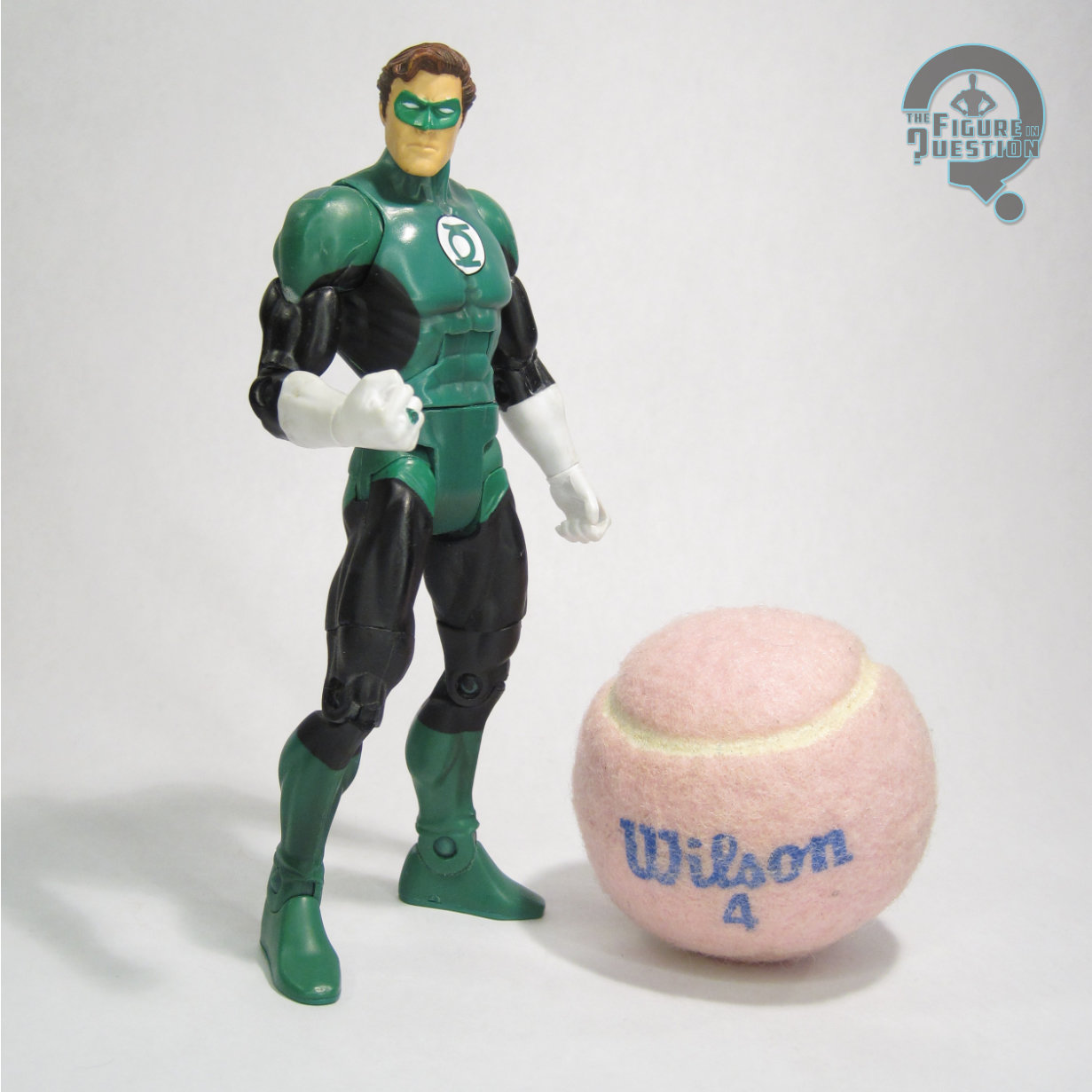
After kicking off the GL-theme in 2007 and getting a two-pack release in 2008, there were notably no Hal Jordans to be had in 2009.  It’s okay, because 2010 made up for it by putting out three of them.  Like his standard Series 3 release, this one stands about 6 1/2 inches tall and he has 23 points of articulation.  He’s the same exact mold as that one, which was pretty much expected.  It’s a solid starting point, since it’s a pretty nice sculpt in the first place.  In order to mark a little more change, this guy was specifically based on Hal’s post-Crisis appearances, when they gave him the graying temples to signify his status as one of the last hold-outs from the Silver Age.  It actually works pretty well, and differentiates the figure more than you might think.  In addition to the hair change, this Hal gets the same iridescent green for the uniform as the rest of the set, which works a touch better than the flat green used previously.  I also find the paint to be generally cleaner and sharper than on the earlier figure.

GUY GARDNER

“When Abin Sur crash-landed on Earth, his power ring detected two equally suitable replacements: Hal Jordan and Guy Gardner. Jordan got the ring because he was closer to the crash. Later, Guy received a second chance to join the Green Lantern Corps, but he often clashed with Jordan. Still, the Guardians sensed great potential in him. After proving himself, Guy Gardner was promoted to ‘honor lantern,’ one of the highest ranks in the Corps.”

Hey look, it’s Nathan Fillion!  That’s a joke I could have done above, as well, I suppose.  It’s funny that he’s played two different Earth Lanterns, though.  With Man of Tomorrow hitting this year, Guy is set to get some focus, which is good for him, I suppose.  Personally, I never resonated much with guy, and he was always my least favorite Earth Lantern (at least until Baz showed up, but there’s a lot of layers to that one).  I’ve grown to appreciate him more in recent years, though.  Guy represented he heaviest allotment of new tooling in this set, given his more unique design.  He got a new head, forearms, and lower legs, as well as a new overlay piece for his vest.  Generally, it’s an okay set-up.  Certainly different.  The head’s notably very cartoonish, and I was never a huge fan of that.  He’s seems especially out of place with the other Lanterns, even just in this set.  Something just a little more refined might have worked a bit better. The rest of the new parts work out alright, though, and I do like the vest piece. The paint is also a little bit sloppier on this one, especially on his vest.  The white detailing seems to have given them difficulty in particular.

JOHN STEWART

“When Green Lantern Hal Jordan was incapacitated en route to a JLA adventure, Hal’s power ring selected John Stewart to be Hal’s ‘alternate’ peacekeeper of Space Sector 2814. Honest and utterly without fear, John was eventually awarded his own power ring and full-time status as a Green Lantern in his own right. He continues battling evil as a Green Lantern, his dedication earning him full membership in the JLA.”

John Stewart had been added to DCUC the previous year, with a pretty fantastic figure at that.  This one takes that one and sort of tweaks it and it sort of works but it sort of doesn’t.  Since he’s re-using parts from the last John, that places him on a different base body than the other four figures in this set.  He’s still got the same basic articulation set-up, and he’s only fractionally taller, but the upper torso in particular is a bit more bulky.  In general, the initial John sculpt is a very good one, on par with the initial Hal Jordan.  The issue it runs into here is that it’s clearly a modern John Stewart…and his costume isn’t.  The paint attempts to place him in one of his earlier suits, earlier in the Mosaic run…more or less.  It’s a bit of an amalgam of sorts.  It’s not a bad one, mind you, but the hair on the sculpt doesn’t really match, nor do the raised edges on what were originally wrist bands on the first figure, now supposedly gloves.  Overall, it’s not terrible, but he’s certainly off.  The application of the paint is at the very least pretty clean; not quite as sharp as Hal, but a little better than Guy.

SINESTRO

“Sinestro was chosen to patrol space sector 1417 as its Green Lantern, but instead he ruled Korugar with an emerald fist. While he trained fledgling GL Hal Jordan, the Korugarians freed themselves and exposed Sinestro’s abuse of power. The Guardians of the Universe stripped Sinestro of his mantle and power ring, subsequently banishing him to the anti-matter universe of Qward.”

Ooooooooh, every party has a pooper, that’s why we invited Thaal!  In short, this figure is not good and by far the worst in the set.  In long?  Well, the original Series 3 Sinestro wound up too short during production.  Something about his skinny stature just got sort of lost, and they made him just  a little guy.  People weren’t thrilled.  This one, which was originally shown on a skinnier body, overcorrects the problem by moving Sinestro over to the medium base body, which is just too big for him.  He’s still using the original head, though, which was sized for a much smaller body, and therefore looks way too small.  And to top it all off, he doesn’t get his mask, which is somewhat understandable, but also still rather annoying.  I just don’t care for this one.
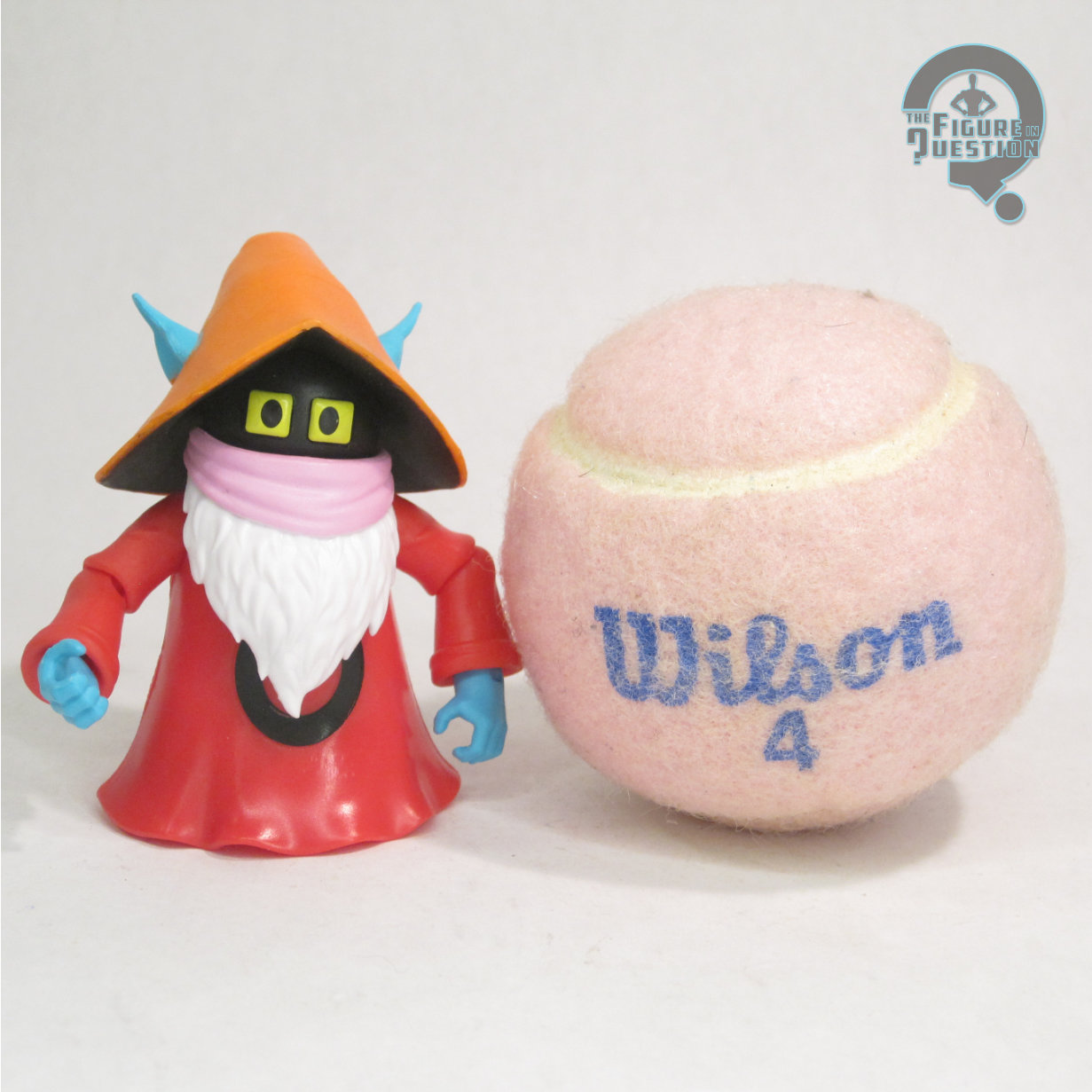
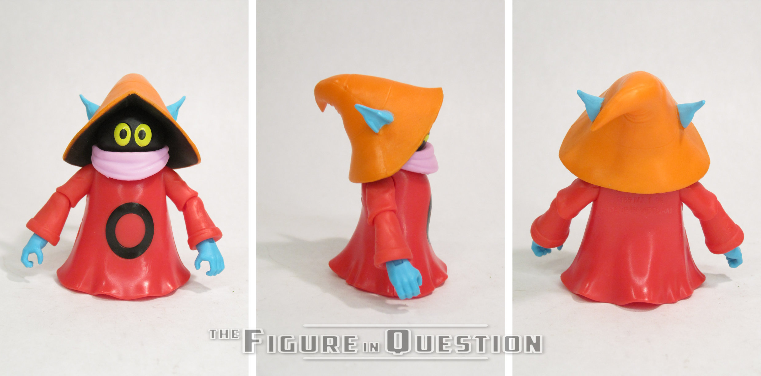
TOMAR RE

“An ordinary scientist from an obscure planet named Xudar, Tomar-Re never dreamed he would be chosen to serve in the Green Lantern Corps, much less that his name would one day stand for courage and integrity, assigned to protect Space Sector 2813, Tomar-Re distinguished himself so thoroughly in the line of duty that the Guardians of the Universe promoted him to their elite honor guard.”

Ha-ha!  I’ve already reviewed this one, way back in #0422!  All by his lonesome.  Really, I’m just putting him here from the turnarounds, since I wasn’t doing those yet in 2014.  Also, to reassert that even with the other four around, this one’s still my favorite, so there.

THE ME HALF OF THE EQUATION

I never saw this set at retail.  Not a huge shock, since I wasn’t doing much hunting, and I almost never went to Walmart at the time.  I recall being sort of “meh” on most of the set, so I ultimately settled for Tomar on his own, because he was the main one I wanted anyway.  But, the other four landed in front of me just before the end of last year, and I felt compelled to finish the set.  I’m glad I did.  Sure, Sinestro sucks, but I knew that up front.  Guy and John aren’t perfect, but they’re both still decent.  I really do like this version of Hal, though.  In general, I think it’s a set that’s better as a whole than as individual figures.
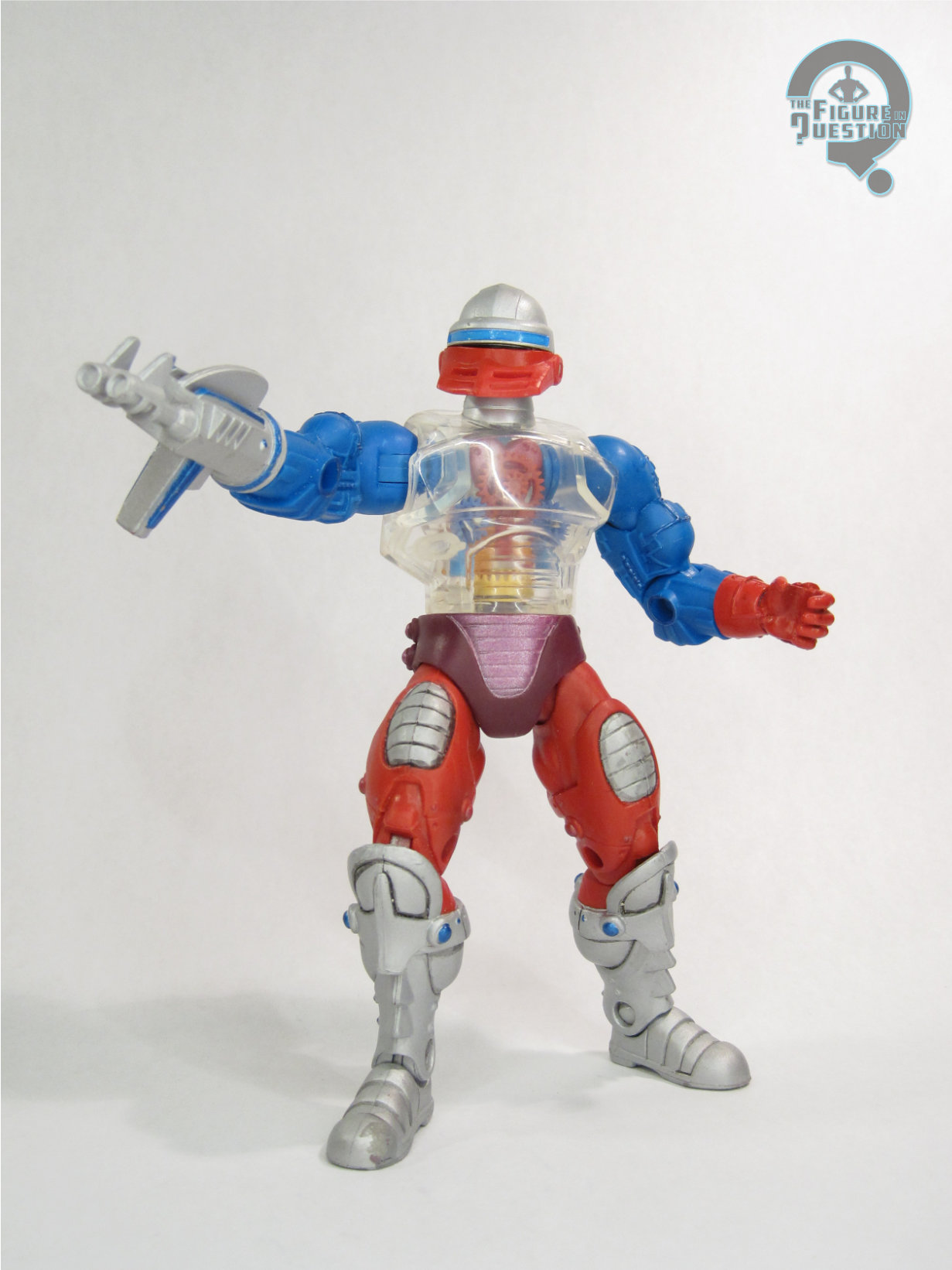
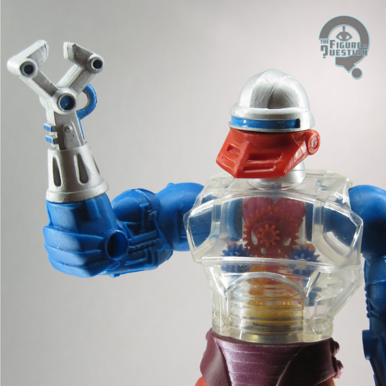
#3765: Green Lantern

GREEN LANTERN

DC UNIVERSE CLASSICS (MATTEL)

“While training in a flight simulator, test pilot Hal ‘Highball’ Jordan was suddenly transported to the crash site of an alien spacecraft. Recognizing Jordan as a man without fear, the injured alien passed to Jordan his green power ring and energy battery or ‘lantern’ which charged the ring. Jordan has since used the ring’s fantastic powers for good, distinguishing himself as one of the finest members of the elite intergalactic police force known as the Green Lantern Corps.”

Well, it hasn’t been a *whole* year since my last venture into DC Universe Classics, but it’s still been since April, which is a fair bit.  But, I’m feeling the need to dive back into it for a little bit.  Perhaps it’s some residual nostalgia from Friday’s Super Powers review, perhaps its that I snagged a stack of loose DCUC figures just before the end of the year.  Whatever the case, DCUC is a line that well and truly gripped me for most of its run, so I do have quite a good number of them.  Today, I’m delving into the earlier days of the line, with Earth’s second Green Lantern, Hal Jordan!

THE FIGURE ITSELF

Green Lantern was released in Series 3 of Mattel’s DC Universe Classics, which hit in the fall of 2007.  While this wasn’t Mattel’s first Hal Jordan (the infamous Holiday Hal from JLU hit in 2005), it was the first to go to retail.  He was the assortment’s heavy hitter, and was paired off with Sinestro for the hero/villain dynamic that headlined the first few assortments.  The figure stands 6 1/2 inches tall and has 23 points of articulation.  Hal was built on the medium male base body, which was first used by Black Manta in the prior series, along with a new head and right hand, all of them supplied by the Four Horsemen.  The head’s the real star piece, as it has to do the heavy lifting.  It’s a really strong, sort of quintessential Bronze Age Hal.  It’s not *exactly* Jose Garcia-Lopez, but the vibe is certainly quite similar, and it just reads well for the character.  It’s also very sharply defined, and avoids being too reliant on paint to sell it.  That said, the paint does alright selling it, and does do more of the heavy lifting on the rest of the figure.  GL’s one of those character’s where a fully painted suit isn’t too distracting, since it’s supposed to be sleek and one-piece anyway.  Application’s generally pretty clean, and there’s even som slight accenting on the green sections to highlight the sculpt.  At this point, I do have to address the one major oddity of this figure: the residue.  Yes, the first batch of Hals, which my copy hails from, have some sort of issue with the interaction of the plastic and the mold release, and when exposed to air for long periods of time, they develop a white filmy substance over the arms and legs.  Said substance wipes off with a damp cloth, with not notable harm to the figure, but it will re-appear over time, and he’ll have to be wiped again.  So, just remember to wipe your Hals periodically.  It’s not weird.  Don’t make it weird.  Mattel did a later re-release of Hal under the “All-Star” banner, which fixed this issue, as well as tweaking some of the paint/color choices.  Both versions included Hal’s power battery, which seems to be an oddly bright green; I’ve always envisioned it being more on par with the color of his suit, but it’s more of a lime green here.  The Series 3 release also got a piece to the Solomon Grundy Collect-N-Connect, while the “All-Star” version got a stand.

THE ME HALF OF THE EQUATION

Hal’s the figure that sold me on DCUC as a while.  I’d been a solid DC Direct devotee, and had been buying pretty much every Hal they’d put out, looking for that perfect version.  This one came along and blew them all away.  I was so excited by the prototype shots of this guy, that I bought what I could find of the first two series solely based on the fact that he was coming.  This set hit right around Baltimore Comic Con in 2007, so he was at the very top of my list of things to look out for.  I snagged him almost immediately after making it through the door, and was very happy and content.  Almost 20 years later, I’m still quite happy and content, even if it does involve the periodic wiping of the Hal.  I did manage to snag the later release as well, so I’ve got one without need of wiping, which is well enough.  In general, though, this Hal is a figure that makes me quite happy.

#3739: Mutiny in the Ranks

LEX LUTHOR, TALA, DEVIL RAY, DR POLARIS, GENTLEMAN GHOST, & PSYCHO PIRATE

JUSTICE LEAGUE UNLIMITED (MATTEL)

Hey, ho, it’s off to more JLU reviews I go!  And, you guys didn’t have to even wait all that long for another one this time around.  Wasn’t that so very nice of me?  Heck, I’m gonna go the extra mile, and just review a whole pile of them all at once.  I mean, for a reason; I’m not just arbitrarily reviewing a bunch of them.  They’re, like, a set.  But what set?  I’ll tell you, but first, a bit of a side track!  I just finished a watch through of Justice League and Justice League Unlimited with my son Matty, which was a fun trek through memory lane.  The run notably has three effective finales, two of which were followed by there being more show.  “Starcrossed” leads into the Unlimited revamp, of course, which builds up to the finale of the Cadmus arc, a rather grounded and quite series look into the League, its enemies, and who gets caught in the crossfire.  How do you top that?  Well, you don’t even try, honestly.  Instead, the show revamped into something more akin to Challenge of the Super Friends for its final season (albeit still being more serious and thought out than anything Super Friends ever tackled), giving the expanded League roster a Legion of Doom to face off against.  The toyline ran with this as justification for doing more villains, who had been a rarity for most of the line’s run.

THE FIGURE ITSELF

The “Mutiny in the Ranks” set was released as part of Mattel’s larger Justice League Unlimited line in the fall of 2009.  The pack was after the switch to the DC Universe banner, in the orange style packaging, and was part of the fourth wave of product in this packaging style.  There was a corresponding pack of heroes released at the same time, with both sets being based on the show’s final season.  All six figures included are exclusive to this set, which was quite rare for one of these bigger sets.

LEX LUTHOR

Luthor figures prominently into most of JLU, and is the central figure in the Legion of Doom storyline on the show, so he’s kind of a lock for this set, and also the real heavy hitter of the bunch.  He was no stranger to the line, being the first villain Mattel introduced into the animated style, and getting a few variants along the way.  This one…well, this one’s a bit odd.  I guess he’s meant to be based on the recolored version of Luthor’s tactical gear seen in the show’s final season, but there’s definitely been some *choices* made in the interpretation of that design.  I’ll get to that.  The figure is about 4 1/2 inches tall and he has 5 points of articulation.  His sculpt is the same as the standard line release of the “Injustice For All” Luthor, so he’s the medium GL-based body, with a new head, harness, and legs with boots.  It’s not one of the line’s finer offerings.  The head’s a bit large, and just too bulbous for Luthor on the show.  His expression is also just too classically evil looking, and lacks the suave nature of the DCAU Luthor.  The harness is fine enough, though, and the booted legs do at least remove the odd uneven leg problem of the medium base mold.  The paint work is sort of there, I guess.  Like, the general colors are okay for the show design, but the layout doesn’t match at all, and ends up looking downright goofy.

TALA

Tala is a rather minor character in the comics, who initially appeared as part of Cadmus on the show, seemingly to just fill in the roster for table shots.  In the final season, she got an upgrade to full villain for unrevealed reasons in show, but in the real world seemed to be kept on because the producers liked Juliet Landau’s performance in the role.  No complaints from me on that.  The figure uses the standard female base body, which certainly has its issues.  Notably, it does feel a little short for Tala, who always appeared to be a bit on the taller side in the show.  Also, she was always barefoot, which the base is not, so it means she’s got shoes for whatever reason.  She does get a new head and skirt at least.  The head’s alright.  It’s a little too wide at the jaw, but there were certainly worse offerings in the line.  The skirt has the benefit of hiding her legs, which is a good thing when it comes to this mold.  Paint is minimal and basic.  There’s some definite slop on the edges, but it generally does what it’s supposed to.  She’s the only figure in the set to get an accessory, as she gets a display stand.

DEVIL RAY

With the Aquaman-centered Mercy Reef pilot floating around, JLU‘s final season was unable to use any Aqua-related characters, because of Warner Brothers’ rather reductive embargo set-up.  As such, the character intended to be Black Manta became “Devil Ray”, who is…well, he’s Black Manta with a different name.  Even his design works perfectly fine as an update to Manta.  Not being Manta, though, the writers didn’t need to get approval on what they did with him, so he’s a notable casualty within the show, which does up the ante a bit.  Devil Ray uses the medium male body again, with a new head and harness.  The new parts are quite nice, with the head in particular being a strong match for his show design.  He’s a little tricky to keep standing, but by this point in the line, all of the molds, especially the medium male, were degrading a bit, so weak ankles weren’t uncommon.  He relies on paint for a lot of his details, and it generally works, but the guns on his wrists do look a little silly just being flat painted on details.

DR POLARIS

Dr. Polaris continued the trend started by Star Sapphire of being a GL villain on the show who never got any real connection to GL or even any notable interactions.  He does get some decent focus after Luthor kicks Grodd out of the Legion, so good for him.  The show used the character’s original design, which is pretty goofy, but I suppose fits the tone alright.  The figure uses the medium base body, with a new head and overlay for the torso piece.  The head feels a little small, but it’s a solid, sharp sculpt that’s accurate to the show model.  The chest overlay is rather bulky and winds up making the whole figure look a little overstuffed.  There’s a weird mold error on mine that makes it look like one of his legs has snapped in half and been reglued, but beyond that, the color work is decent enough.

GENTLEMAN GHOST

Gentleman Ghost’s most notable turn on the show’s not actually with the Legion of Doom, and is instead in one of the Hawkman episodes.  However, by facing off against one of his actual foes, he does somewhat get a leg up on Dr. Polaris, so good for him.  He’s got a rather unique design, and this might have been his first figure?  I know the DCUC version came out right around the same time, so it’s a bit of a toss-up.  Still, pretty cool.  The figure uses a modified version of the two suited bodies, with a new cape piece that also had his hat and monocle mounted to the collar.  It’s not an exact science, and is only convincing from certain angles, but it’s about the best you’re going to get for ways to sell the “floating hat” look he had in the comics.  He’s got very minor paint work, since he’s largely just molded in white, but the light grey accenting’s pretty nice.

PSYCHO PIRATE

Psycho Pirate doesn’t get any focus on the show, serving just as background filler.  It does seem slightly odd for a character who’s had some very pivotal moments in the comics, but I suppose Crisis was a bit much for the show to handle.  I mean, they dedicated those three whole movies to it, and look how that turned out.  Or don’t.  Actually don’t, you guys.  It’s six hours you won’t get back.  Anyway, this guy uses the medium male body for the fourth time in this six figure set.  It seems rather bulky for Psycho Pirate, if I’m honest.  That said, it seems like parts re-use is really selling him, because he’s got Red Tornado’s cape, which they couldn’t do if he were on a different body.  He gets a new head, which is alright.  It’s got an odd shape, though, and seems too large, presumably to offset the size of the body.  It’s a shame there’s no medusa mask, but he never had it on the show, so that’s not really on Mattel.  The paint work is at least pretty nice, though.

THE ME HALF OF THE EQUATION

I bought this set and the corresponding Heroes set at the same time, when they were still rather new.  I want to say they were on clearance post-2009 holidays, and I had some gift cards to spend.  Honestly, I was more invested in the heroes set at the time, and I don’t know that’s changed much in the years since.  It’s not all bad mind you.  While Luthor’s a definite weak point, the Devil Ray figure is quite cool, as is Gentleman Ghost.  And the others are decent middle of the road figures.  The set’s not super focused beyond “villains”, but that’s also not terrible focus.

#3734: The Riddler

THE RIDDLER

BATMAN: THE CLASSIC TV SERIES (MATTEL)

Okay, so let’s play a little game called “this makes Ethan feel old.”  In prep for writing today’s review of a Mattel Batman ’66 figure, I went back through the archives to see what other Mattel Batman ’66 figures I’d already reviewed, and discovered I’ve reviewed three.  The only one from the standard releases was the Catwoman figure I reviewed just over a month into the site, when she was a brand-new figure…over a decade ago.  My retro throwback reviews are now of items released the same year I started the site.  For reference, if I were reviewing a figure at the start of this site that were as old then as this figure is now, I’d have been looking at a figure from 2002.  That would be a figure that predates Mattel having the DC license.  Oh boy am I getting side tracked here.  Okay, so, yeah, let’s embrace the throwback and look at the 1966 Batman, which, amongst other things, really invigorated Batman’s rogues gallery.  Frank Gorshin’s turn as The Riddler in particular took the character from just one of the pack to one of the heavy hitters, and remains one of the show’s stand out villains.  Here’s an action figure of him!

THE FIGURE ITSELF

Riddler was released in Series 1 of Mattel’s Batman: Classic TV Series line, alongside a standard Batman and the Penguin.  They hit in the late-summer/early-fall of 2013, right as all the ’66 licensing started hitting in full force.  The figure stands right at 6 inches tall and he has 23 points of articulation.  The line as a whole was a bit under-sized compared to other offerings, with it being closer to a true 1/12 scale than anything else Mattel offered, which made these guys all at least a half-inch shorter than all of the DCUC figures, and also so very much scrawnier.  Like, I know Gorshin was a skinny guy, but I feel this is excessive, to almost cartoonish levels, especially around the legs and hips.  The head sculpt doesn’t look *unlike* Gorshin, but neither is it a spot on likeness.  It’s certainly on the weaker end for this line, and I honestly get Matthew Lillard vibes off of it.  I think part of it’s the expression seeming too reserved for Gorshin; he brought a manic energy to the character that doesn’t really feel like it’s captured here.  It’s also kind of soft on the detailing.  The body, aside from it’s odd proportions, does at least get a little more detailing, especially with the wrinkles on the suit, which do at least set him apart from the painted on suits of the main DC line at the time.  His paint work was largely pretty basic, with the only notable shift being the accenting on his suit, which keeps it from being too much of a stretch of the same colors.  He was packed with a display stand with “Ka-Pow” written on it, as well as a card with part of the batcave on one side, and an illustration of the Riddler on the other.  Unfortunately, the Riddler illustration is landscape orientation, and the spot in the stand that holds the card only works for portrait orientation, so…not so much working for that set-up.  And, that’s all he got for extras.  No hat, or cane, or alternate unmasked head.  Not even some sound effects.  It’s exceedingly light.

THE ME HALF OF THE EQUATION

I was very, very excited for this line, and Gorshin’s Riddler in particular was very high on my list.  I went to the trouble of pre-ordering him and everything, and got him when he was brand new.  He’s actually in one of the last batches of figures I bought before new stuff was getting reviewed on the site as “new stuff.”  This line always so very greatly disappointed me.  I wanted to love it, but I couldn’t, and Riddler is kind of one of the worst offenders.  Ultimately, looking back on him, he’s fine, but not really any better than I’d remembered him being.

#3729: Darkseid

DARKSEID

JUSTICE LEAGUE (MATTEL)

Oh man, reviewing Justice League figures gives me major flashbacks to the months of pre-prepped reviews I worked on in advance of Aubrey being born.  I sure did write *a lot* of JLU reviews during that time.  And only a single one since.  That being said, the single one since the big batch of them was New Gods-themed, which is a solid theme that I’m jumping back into today.  I’m actually going back to the pre-JLU line, which I’ve not majorly explored here.  No time like the present, I suppose.  So, let’s look at a wacky-colored Darkseid, shall we?

THE FIGURE ITSELF

Darkseid was released in the “Rise of Apokolips” four-pack from Mattel’s Justice League tie-in line. The set was released exclusively through Toys “R” Us in 2004, and also included metallic-colored variants of Superman, Green Lantern, and Wonder Woman.  The figure stands 5 1/4 inches tall and he has 10 points of articulation.  Darkseid uses the same mold as his initial Series 5 “Mission Vision” release from earlier that same year, which was one of Mattel’s internal sculpts, rather than being provided by DCD sculptor Karen Palinko like the core seven.  It’s…well, it’s odd.  It’s a very stiff mold, with articulation not doing much for actually posing it; elbows and knees get less than a 90 degree bend, the shoulders only swivel at an angle, and the hips are greatly restricted by the skirt piece.  The proportions are very strange, and not really all that good a match for the Timm-aesthetic of the show’s design.  He’s broad across the shoulders, but pretty much nowhere else, and his head seems very narrow.  And, while he’s bigger than the other figures, he still feels a bit small for the character.  Just, generally, not one of Mattel’s best.  His color work marks the big change-up for this release.  Rather than his show colors, he’s now sporting a bright metallic blue for most of his outfit, making him a bit more in line with his earlier Kirby and Super Powers depictions.  He also appears to have no pants.  So, there’s that.  His only accessory was a lenticular card, which I no longer have.

THE ME HALF OF THE EQUATION

Back in 2004, my brother Christian got the Mattel Watchtower playset for his birthday, and had wanted figures to go with it.  We decided to split the “Rise” four-pack, with him taking the three Leaguers, and me taking this guy.  I never did get the standard release version, so this remains to this day, my only JLU Darkseid.  He’s not really great, but that’s true of any release on this mold.  I do think the colors, while off-model and goofy, do give him a little more value than other versions, though, so that’s pretty nifty.