#0816: Batman & Two-Face

BATMAN & TWO-FACE

BATMAN (MATTEL)

BatsTwoFaceMatt1

For day 15 of the Post-Christmas reviews, I’ll be taking a step back to a few years, and actually looking at a Mattel product. Weird, right? In 2002, the DC license moved to Mattel from Hasbro (who had inherited it via their buyout of former holder Kenner), marking the first time in over a decade that the license had formally changed hands. It was something of a quick change, resulting in Hasbro being unable to release some of the product they had designed beforehand. When Mattel took over, they ended up making use of some of these already existing designs (which were all Batman-related), releasing them as a quick, one and done line of two-packs, each containing Batman and a supporting player. That wasn’t enough, apparently, as they also occasionally trotted the figures out for re-release over the years, usually single-packed and with wonky color schemes. Today, I’ll be looking at a pair of figures from one of those re-releases.

THE FIGURES THEMSELVES

Batman and Two-Face were released in 2008, in a line simply branded Batman. I should specify here that they were both single releases, which I’m just reviewing as a pair here for my own convenience. There was also a Joker figure in the set, which I don’t have.

BATMAN

BatsTwoFaceMatt3
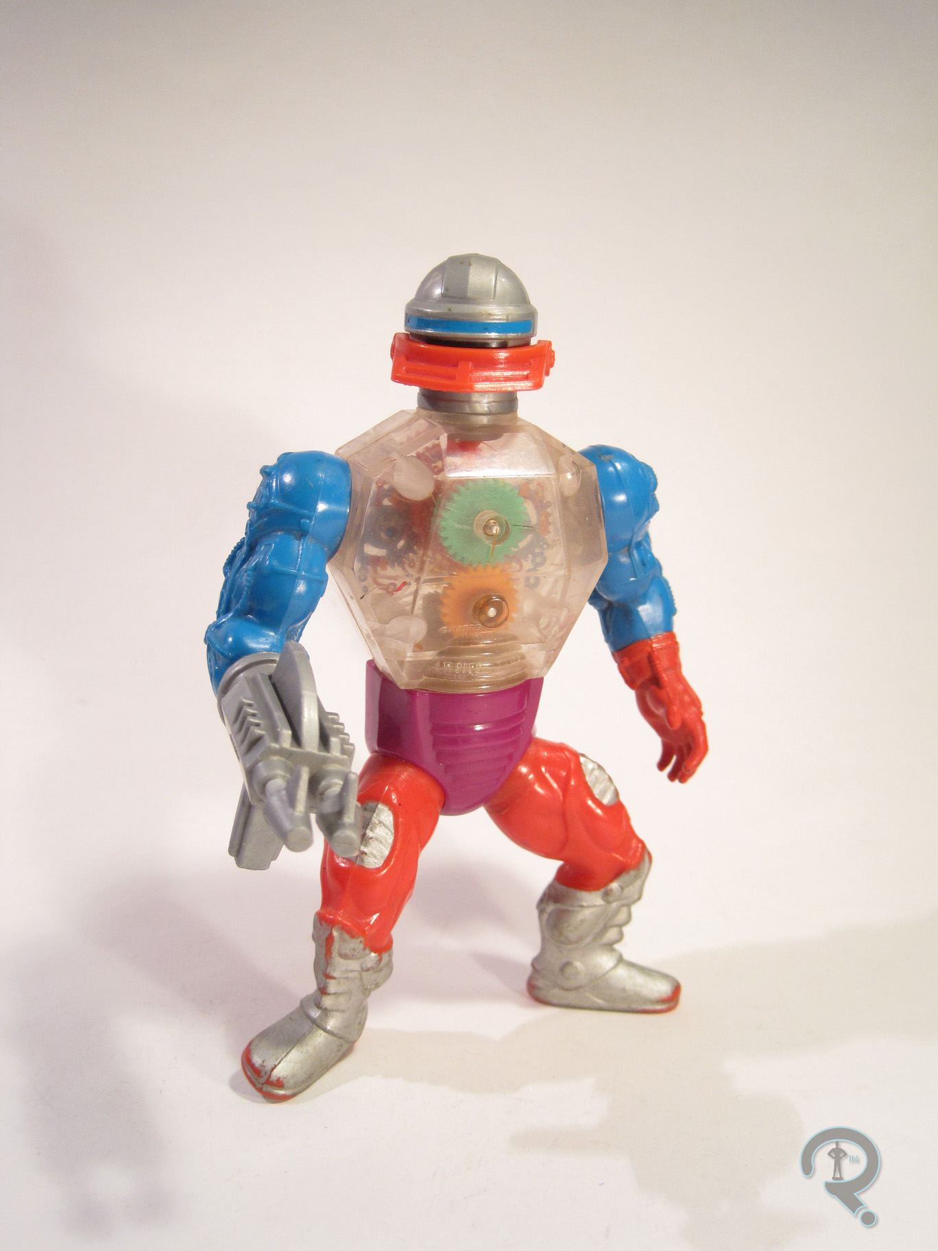
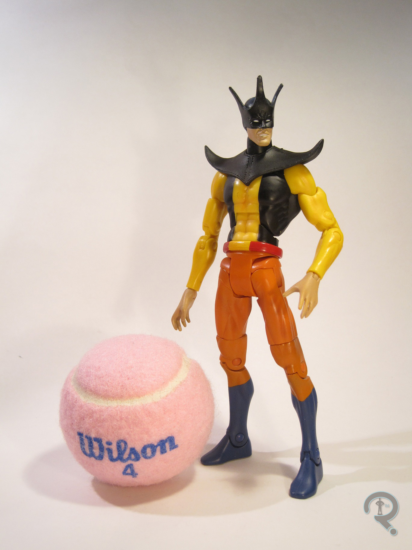
First up is Batman. Not just any Batman, though! No, this here is a wacky variant Batman! The figure stands just shy of 5 inches tall and has 5 points of articulation. The sculpt is based on the New Batman Adventures version of Batman. It’s not a terrible recreation of the design, but I don’t think it’s quite as good as the prior Kenner version of the design, and it’s definitely not as good as the recent DCC version. However, it’s still a pretty decent sculpt, and it’s clear which version of Batman this is supposed to be. Plus, it’s got a much more natural pose than the Kenner version, which is a nice change. Wait, didn’t I say this was a wacky variant Batman? Why, yes I did! That all comes from the paint. Instead of the traditional grey for the body, he has this odd orange/silver thing. It’s not based on any particular look or anything, just random orange and silver Batman. How ‘bout that? The paint is decently applied, for what it’s worth, so there’s that. Batman included no accessories, just like all of the other Batmen who used this same exact mold.

TWO-FACE

BatsTwoFaceMatt2
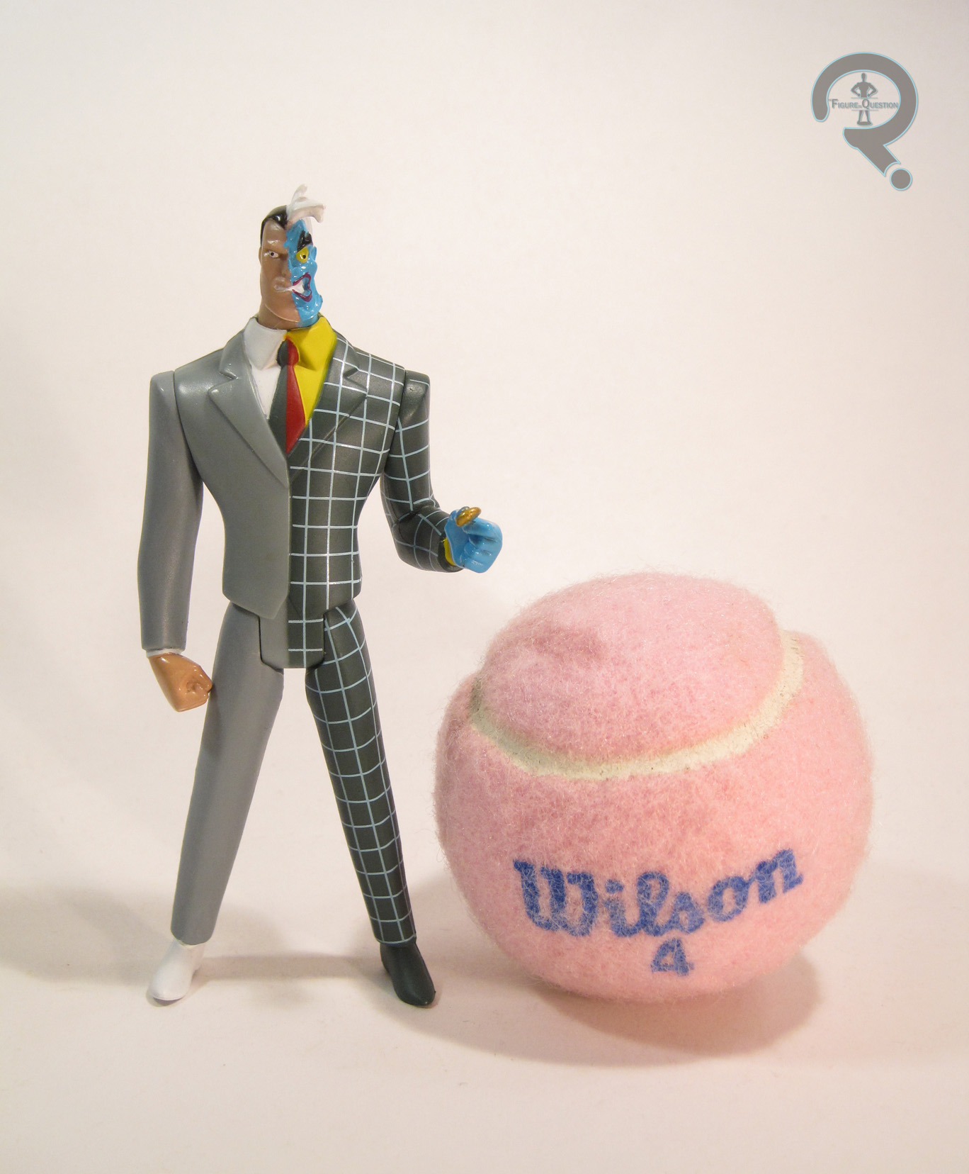
So, Batman was a wacky variant, but Two-Face is an actual adapted design, right? Not really, no. But that’s okay! Because toys! Like Batman, this figure stands about 5 inches tall and has 5 points of articulation. It’s worth noting that this guy feels like he’s just a bit smaller-scaled than Batman, which is especially notable when you compare head sizes. The sculpt is also based on his New Batman Adventures design, and it’s not quite as strong as Batman’s. It’s not terrible, and the body in particular is a pretty decent Timm-style suit sculpt (which is probably why Mattel ended up using a tweaked version of it several times in their JLU line). The head is pretty off, and it has a really obvious mold line running along the chin, which looks pretty bad. The paintwork is kind of interesting. It’s definitely not show-accurate, but it’s also not quite as out there as Batman, since it isn’t all that far-removed from some of his classic color-schemes from the comics. That actual application is reasonable enough. The colors are pretty vibrant, and most of the paint stays in the lines, which is nice. Two-Face also doesn’t include any accessories, but he does have his coin sculpted in his hand, so at least he isn’t totally lacking.

THE ME HALF OF THE EQUATION

Batman and Two-Face were given to me for Christmas by my Super Awesome Girlfriend. And where did she find these 8 year old action figures? Some second hand store? Nope, it was CVS of all places. I was genuinely shocked by that. Neither of them are particularly standout figures, but they kind of a nifty throwback to the wacky variants of old, and I was happy to receive them.

#0767: Batman Beyond

BATMAN BEYOND

DC COMICS MULTIVERSE (MATTEL)

BatBeyondDCM1

Uh oh. It’s a Mattel figure. This can’t be good. Okay, that’s not entirely true or fair. Mattel figures have the potential to be good, or even on the rare occasion great. In fact, most are at least passable, but some aren’t. And also, I don’t like Mattel as a company, for a whole slew of reasons, chief among them being that a whole lot of their products just feel so lazy. In fact, in the last year, I believe I’ve bought a whole four Mattel figures, mostly due to the vast majority of their output being rather dull. One of those four figures is today’s entry, Batman Beyond. Let’s see how he turned out.

THE FIGURE ITSELF

BatBeyondDCM2Batman Beyond is part of Mattel’s DC Comics Multiverse line. The line doesn’t really have traditional series to speak of, but BB was released in the last year of the line. He’s part of the Arkham City sub-set, and is based on one of the alt looks for Batman from the game, rather than being an actual Terry McGuinness Batman Beyond. The figure stands 3 ¾ inches tall and has 18 points of articulation. The layout of the articulation is the same as both the Christopher Reeve Superman and Arkham Knight Robin figures. It’s not the worst articulation ever, but it could really, really use some sort of upper arm swivel and a mid-torso joint. The current layout leaves him a little stiff looking. In general, the sculpt of this figure feels pretty stiff and somewhat oddly proportioned. Some of that, such as the small head and larger hands, are at least partly present in the game design, but some of it’s just weird sculpting. Like Robin and Superman before him, the figure’s waist just sits too low, which looks really odd. Also, it looks like BB’s got at least a few parts in common with several of the previous Batmen. Because of this, he still has the usual Batman boots, which aren’t accurate to the design, as well as a weird shoulder piece that looks like it should have a cape or something attached, but it doesn’t, which is reasonable, since BB’s not supposed to have a cape anyway. Since one of the draws of Batman Beyond is his sleek design, these issues with the re-used pieces jump out a lot more than they would otherwise. BB does get his own head, belt, and forearms, which all do a pretty great job of capturing those parts of his design, and blend pretty decently with the rest of the sculpt. BB’s paint is one of his stronger suits. Everything is pretty cleanly handled, and his emblem in particular is nice and crisp, and really stands out well from the rest of the figure. BB has no accessories, which isn’t out of the ordinary for a Multiverse figure, but remains annoying given the price of the figure and the fact that he re-uses quite a few pieces.

THE ME HALF OF THE EQUATION

Remember how I was done with DC Comics Multiverse? Yeah, that seems increasingly incorrect. When I was down in North Carolina visiting family, I ended up finding this guy on a grocery run. I’ve always had a soft spot for the Batman Beyond design, and Super Awesome Girlfriend was there with me, so there really wasn’t a chance I was saying no to this one. He’s a flawed figure to be sure, and definitely reminds me of why I don’t really do Mattel figures anymore, but he’s Batman Beyond, which does a lot to outweigh some of the cons.

#0728: Atom

ATOM

DC UNIVERSE CLASSICS

AtomGADCUC1

Sometimes, there are really, really cool figures of characters you like, that are held back by one tiny but hard to overlook flaw. Today, I’ll be looking at such a figure. I’ll get to the “why” of it in just a bit.

So, in the second season premier for The Flash, Barry fought a guy called Atom Smasher, aka Albert Rothstein. Rothstein comes from Earth 2, which was the home of the original 40s DC Comics characters. He’s also the godson of the original Atom, aka Al Pratt, who is the focus of today’s review. Unlike the later versions of Atom, who possessed the ability to shrink down to sub-atomic size (not unlike Marvel’s Ant-Man), Al was just a kind of short guy who was a good fighter. He was eventually given an assortment of powers after the fact, but those were kind of a retcon. Amongst other things, he served as a prototype for Justice Guild member Tom Turbine, from the Justice League episode “Legends.” And, he got a figure as part of one of the last series of DC Universe Classics. Yay for him!

THE FIGURE ITSELF

AtomGADCUC2Atom was released as part of Series 19 of Mattel’s DC Universe Classics, which was a whole series themed around the Justice Society of America, of which ol’ Al here was a member. Atom is presented here in his original costume from the 40s, which is definitely his more definitive of his two main looks. The figure stands about 6 ¼ inches tall and has 23 points of articulation. See that height? Remember when I mentioned he was a short guy? Yeah, Al’s listed height is 5’ 1”, which, in DCUC terms, should make this guy about 5 ½ inches tall. So, he’s about an inch too tall. This is because Atom is built on the larger male body (the same one used on the water-camo Aquaman from Series 7). Proportionally, it’s the best body Mattel had on hand; Al’s a pretty stacked guy; but it’s just too tall. It’s kind of a no-win scenario. A character like Al isn’t really privy to an all-new body sculpt, especially in a buck-based line like DCUC, so Mattel had to make due. Moving away from the size thing, Atom has a brand new head, forearms, abdomen, and shins. These are all nicely sculpted parts, and the buckles on the arms and abdomen are an especially nice touch, since they could have easily been painted on. The shins are a little bit shorter than previous pieces, so Mattel was clearly trying a little, but it’s not really a very noticeable difference. The cape is from Series 12’s Dr. Mid-Nite figure; it’s not a perfect match, but it’s close enough, and it’s a well-sculpted piece, so I can’t complain. For some reason, it sits out a bit from his back, which is a tad frustrating.  The paintwork on Atom is some of the best from this line. Some of the line work is fuzzy, but it’s pretty clean overall. The color work is really nice; everything is bold and vibrant, and he really just pops. The brown parts are meant to be leather, and so they’ve been given a slightly darker brown dry brushing, which is actually really effective in conveying the different texturing. Atom didn’t include any of his own accessories, but he did include the head and pelvis of STRIPE, the Collect-N-Connect figure for this series.

THE ME HALF OF THE EQUATION

The golden age Atom has long been one of my favorite JSA members. I was always a bit disappointed by DC Direct’s less than stellar attempt at the character, so I was intrigued by the DC Universe Classics version. I ended up finding this guy not long after he was released, while on a run to a nearby Target with my Dad. His size put me off at first, but the realization that this was probably the best version of the character I’d ever see in plastic, I went for it. I’m really happy I decided to get him, because, size issues aside, he’s actually a really nice figure.

#0709: Starman

STARMAN

JUSTICE LEAGUE UNLIMITED

StarmanJLU1

Growing up, I was much more a DC fan than a Marvel fan*. This was due in no small part to my primary exposure to the DC Universe being at the hands of the various animated series, courtesy of Bruce Timm and company. For many (though not necessarily for me), the high point of the DCAU was Justice League Unlimited, which offered tales staring characters from every corner of the DC Universe, barring the more mature Vertigo stuff. Tons of characters appeared on the show in its two seasons, with some taking on actual roles in the story, but most ending up as little more than scenery. Today’s focus, Starman, was part of that second group. Also, he has absolutely nothing to do with the Jeff Bridges film, just to be clear.

THE FIGURE ITSELF

StarmanJLU2Starman was actually one of the earliest figures in Mattel’s JLU line, being part of the first assortment of figures. He was available two ways: on his own with a cosmic staff accessory or packed with Superman and Amazo, in a set based around the episode “The Return.” My figure comes from the set with Amazo and Superman. Starman doesn’t figure into the plot of “The Return” in any prominent way, but he is one of the many characters who gets a brief focus during the initial fight with Amazo. There have been many versions of Starman over the years, and this one’s based on the Prince Gavin version of the character, who starred in Adventure Comics during the 70s. The figure stands roughly 4 ½ inches tall and has 5 points of articulation. Starting with the first series of JLU, Mattel implemented one of their signature buck systems, in order to make producing the multitudes of characters appearing on screen just a little bit easier. Starman is built on the medium-sized body, which was a retooled version of the Justice League line’s Green Lantern body. It’s a good translation of the body style from the show, and it’s a good fit for Starman. One small drawback of this particular body is that one of the legs is shorter than the other, meaning he stands with a slight tilt. It’s a minor issue, but it’s one that affected every figure that used this body. Starman gets his own unique head sculpt, which is probably one of my favorites from the line. It replicates his wacky hair pretty well and features a lot of really sharp line work on the facial features. It’s a great translation of the animation model for the character. The paint takes up the bulk of the work in conveying his costume, which it does pretty nicely. The colors are nice and bold, and the line work is all pretty clean. The multi-pack version of Starman didn’t have accessories, unless you want to count Superman and Amazo.

THE ME HALF OF THE EQUATION

The three-pack that contained Starman was my second item from the JLU line. The line was still pretty hard to find, so I ended up trading the Doombot from Marvel Legends of all things to get it. Perhaps not the greatest trade in the long run, but I already had a Doombot, so I didn’t mind. Starman remains one of my favorite figures from the line. I’ve always liked Gavin’s design, and it’s not like he’s got an excess of figures. This one captures the design quite nicely, which is awesome!

*Okay, that’s not entirely true. I was a pretty big Marvel fan during the back half of the 90s. It was the early 00s that turned me away from the company, before the Marvel Studios movies brought me back.

#0681: Mercury

MERCURY

DC UNIVERSE CLASSICS

MercuryDCUC1

It’s been 160 reviews since my last DC Universe Classics review. Guess I’ll fix that then. So, one of the coolest things about DC Universe Classics was just how obscure they went with the line. For all the crap I give Mattel about their various practices, they built a successful line that ran for 21 series and gave us the likes of Kamandi and Cyclotron. That’s downright impressive. It is also the only DC line to date to give us a full line-up of the Metal Men, who are one of DC’s cooler off-kilter teams from the 60s. So, let’s look at the team’s resident jerk with a heart of jerk, Mercury. He’s the only metal who’s liquid at room temperature!

THE FIGURE ITSELF

MercuryDCUC2Mercury was released as part of the 16th Series of DC Universe Classics. He was the third member of the Metal Men to be released, and the last member to be released at retail. Way to go Mercury, you ruined it for everybody. The figure is 6 ¼ inches tall and has 29 points of articulation. Mercury was another figure built on the skinny buck. I know that the first “skinny” character was Deadman in Series 11, but I think 16 was the first series to use this slightly improved iteration of the body. While he uses the base as a starting point, Mercury actually has a fair number of non-standard parts. The best piece if the figure is definitely the head, which does a fantastic job of capturing the character. His expression is just perfect for Mercury, and they’ve really nailed the exaggerated proportions. The extended nose is a separate piece from the face, so there’s a noticeable seam if you look closely, but from a normal viewing distance, it’s unnoticeable. The rest of the body works pretty well for Mercury; a lot of the wackier proportions that looked out of place on other characters look perfect here. Mercury’s paintwork is somewhat deceptive. The previous two Metal Men were just straight metallic colors, so when I first saw Mercury, I was disappointed that he was just a flat red. But, after taking him out of the package, I realized the red was actually pearlescent, which is actually really impressive looking, and gives him a nice unique feel. Mercury included an extra hand made to look like it’s morphing into a giant pair of scissors, which is a pretty awesome way of showcasing his powers (they’re even articulated!). He also included the torso of Bane, the Collect-N-Connect for Series 16.

THE ME HALF OF THE EQUATION

Series 16 was one of the few series of DC Universe Classics that I found mostly in one shot at retail. However, I didn’t get the first Mercury I found; it went to my Dad, who’s a bigger Metal Men fan then I. Fortunately, I came across another Mercury not long after, and here he is. For me, Mercury represents some of the best work DCUC had to offer. He’s a fun, obscure character, on the right body, with a superb head sculpt, solid paintwork, and a well-executed accessory.

#0674: The Putties

PUTTIES

IMAGINEXT POWER RANGERS

Putties1

Minions. Minions are what make the world go ‘round. No, not the little yellow guys in overalls (though they do seem to have infiltrated every facet of our lives…), just minions in general. All the best villains have a legion of near identical followers, who can do their bidding and serve as cannon fodder for our charming heroes. Darth Vader has the Stormtroopers; Shredder has the Foot Clan; Dr. Doom has the Doombots. Almost every iteration of Power Rangers has had its own set of faceless minions, starting way back in Mighty Morphing Power Rangers, with the clay warriors The Putties.

THE FIGURE ITSELF

Putties2The Putties were released in a pack of three figures as part of the first assortment of Imaginext Power Rangers figure packs. The pack is made up of three identical Putty figures. They’re based on the Putties’ Season 1 appearance, before they were retooled by Lord Zedd. The design is a little more streamlined than future designs would be, and it’s when the characters were the most prominent. The figures each stand 3 inches tall and feature 8 points of articulation. The sculpt is fairly basic, which is fitting for the Putties. The body sculpt is pretty standard; the proportions are on par with the rest of the Imaginext line, and the basic parts are nice and cleanly sculpted. The heads are more detail filled than the body; on the show, the putties faces were a bit slap-dash, so replicating them can be a bit of an issue. Imaginext has opted to refine them a bit, which looks decent enough. I only wish they’d done up their hands to match, as they did in the show. The paintwork on the figures is pretty simple, but done well enough. The figures are molded in a slightly metallic grey, which replicates the spandex costumes from the show pretty decently. They’ve got painted details for their belts and eyes, as well as the black marks on their chests. The paint is pretty clean overall, though there’s some variance to the chest markings between the three. The Putty pack includes no accessories, but three Putties cost the same as two Rangers, so I guess, in theory, one of the Putties is an accessory to the other two.

THE ME HALF OF THE EQUATION

The Putties are really what sold me on the Imaginext Power Rangers. The Figuarts versions of the Rangers are the be-all-end-all versions of the heroes, but Bandai has yet to make any movies toward Putties in that scale. So, for someone who wants a few Putties to bat around, there aren’t many options. Add in the rather low price-point of the Imaginext stuff and I’m definitely sold, at least on a few of the figures.

Putties3

#0673: Green Ranger & Pink Ranger

GREEN RANGER & PINK RANGER

IMAGINEXT POWER RANGERS

PinK&Green1

Man, I really didn’t think Power Rangers was a thing I’d ever get back into. Then all these toy companies had to go and start making all these cool Power Rangers toys, and I had to go and have no self-control when it comes to cool toys. What are you gonna do, right? I can definitely tell you that a few years ago I would have never imagined that I’d be buying Imaginext stuff. They’ve really stepped up their game, and, more importantly, they’ve started making a lot of things I want to buy. Like Mighty Morphin’ Power Rangers. They’ve just released a bunch of Rangers merchandise, including several of the Rangers’ individual Zords, a really cool combined Megazord, and several smaller figure packs, for those who aren’t quite ready to dive all in. I just picked up Green and Pink Rangers, so let’s see how they turned out.

THE FIGURES THEMSELVES

Green and Pink were released as a two-pack in the first assortment of Imaginext Power Rangers figure packs. They’re probably the most sensible pairing of the bunch (given that they were a couple in the show), and it looks like they’re both currently exclusive to this particular pack, though Kimberly’s already been slated for a release with her Zord, and I’m sure Tommy won’t be far behind.

GREEN RANGER

Pink&Green2The Green Ranger is the first identity of Tommy Oliver, the original Sixth Ranger, who would take on another four Ranger identities over the course of the various Ranger series. He was also portrayed by Jason David Frank, an actor of near legendary status in the Power Rangers community. So, the Green Ranger’s kind of a big deal. The figure stands 3 inches tall and has 8 points of articulation. Aside from the legs both being on the same joint (which still kinda baffles me) the movement is all pretty good, especially for a figure of this size and style. Tommy’s technically based on his appearance in Mighty Morphin’ Power Rangers, but there are a few changes, aside from the obvious stylistic ones. The Rangers in this set all appear to be an amalgam of sorts of their show and movie designs, taking the general design cues from the show, but also possessing the movie’s armored bodysuits and more detailed gloves and boots. It’s an interesting choice, doubly so on the Green Ranger, who was not in the movie. Also, there’s one glaring thing missing from this guy: his Dragon Shield! Yeah, he doesn’t have the extra armored bit that set him apart from the others, which is, admittedly, a bit odd. Sculpturally, Tommy uses the same body shared by all of the male Rangers in the line (so far, anyway). The proportions are slightly tweaked, so as to bring him in line with the rest of the Imaginext figures. The body has a lot more fine detail work than what I’ve seen before from Imaginext, and it’s certainly very impressive. Tommy also gets a unique head sculpt, which is a pretty good translation of his dragon-styled helmet, with the same level of detail as the body. The mouth is painted, rather than sculpted, but that keeps him more or less in line with the un-helmeted characters. As far as paint goes, the Green Ranger is handled pretty well, though he does make a few more deviations from the source material. For one thing, the gloves and boots are just straight white, as is the belt. One presumes this was done as a way of simplifying the designs just a bit. Interestingly, the other big change is not a simplification. For whatever reason, they’ve painted the ridges on the top of the helmet grey, presumably to set them apart from the rest of the helmet. However, on the show, that part of the helmet was just straight green. I’m not sure why they changed that particular thing, but it certainly doesn’t look bad, so I can’t really complain. The Green Ranger includes his Dragon Dagger, up-scaled a fair bit to meet safety standards. It’s nicely sculpted and pretty well painted, though it’s worth noting that the details on the blade are sculpted on the opposite side of the one they were painted onto, which is kinda funny.

PINK RANGER

Pink&Green3The Pink Ranger was actually one of the set’s main draws, at least initially, since it’s the only way to get her in the initial product release, and she is one of the original five, after all. Unlike Tommy, Kimberly would only be the Pink Ranger for one incarnation of the show, but she’s still the original, and that’s kind of important. The figure is a little under 3 inches tall and has the same 8 points of articulation as Tommy. She too is an amalgam of her show and movie designs, keeping the basic layout and the skirt from the show design, but still adding the stitching and armoring of the movie design. Due to the presence of the skirt (which the Yellow Ranger does not have), the Pink Ranger gets a mostly unique sculpt, apart from a re-used set of arms. Once again, the proportions have been slightly tweaked, so as to make her fit stylistically with the rest of the Imaginext line. I must admit, it’s refreshing to see one of these “kid-ified” lines not horribly under-sizing the female characters. It’s especially great when it comes to the Power Rangers, who should all be similarly sized. I’m not 100% sold on the head sculpt. It’s not bad, but it seems her helmet just didn’t translate as well to the style as the others. She kinda looks like one of those stereotypical aliens. Kimberly’s paintwork isn’t all that different from Tommy’s; it still lacks some of the extra details on the gloves, boots, and belt. She’s also missing the patch of white on the back of her helmet, which might actually be what’s throwing her head sculpt off for me. Also, the mouth on this one is mis-aligned, which makes her look a little wonky. She includes her Power Bow, which is once again up-scaled a bit for safety. She can’t really hold it, but it’s decently sculpted, and it includes clips so that you can assemble the Power Blaster if you get the other Rangers.

THE ME HALF OF THE EQUATION

I saw the various Imaginext Power Rangers stuff a few times before picking this set up, mostly due to this seemingly being the most difficult to obtain set. I wound up finding at a Target near a convention I was attending, and these two just really drew me in. The Green Ranger’s definitely the star here, even with his handful of inaccuracies, but both of these figures are just a lot of fun!

Pink&Green4

#0668: Batgirl

BATGIRL

BATMAN’66 (MATTEL)

Batgirl66a

I’m sure that a fair portion of my readership has heard about the passing of Yvonne Craig on Wednesday.  For those unaware, she was the actress who played Barbra Gordon/Batgirl on the live action Batman show from the 60s, along with plenty of other roles.  In honor of her, I’ll be taking a look at the Batgirl figure from Mattel’s Batman ’66 line, who was just recently released, almost two years after the rest of the line, due to rights issues.

THE FIGURE ITSELF

Batgirl66bBatgirl was released two ways, both through Toys R Us.  She was released solo as a SDCC 2015 exclusive and more widely as part of a three pack with Batman and Robin from the 60s show.  This particular version is the one from the three pack, though the differences in the actual figure are negligible.  The figure is just shy of 6 inches tall and has 23 points of articulation.  The articulation on this figure feels a little outmoded and rudimentary, but, in Mattel’s defense, it keeps her stylistically the same as the rest of the Batman ’66 line.  Take of that what you will.  The Batman ’66 line was mostly without re-use for sculpts, but it’s a Mattel line, so some was bound to show up eventually.  Batgirl uses the upper arms and upper legs of the line’s take on Catwoman. They’re basic enough that it’s not immediately evident that they’re re-used, so that’s good.  The rest of the sculpt is new to this figure.  It’s decent, if not jaw dropping.  The head’s the best piece for sure.  It’s a pretty great likeness of Yvonne Craig, and it fits in really nicely with the other sculpts in the line.  The body sculpt is a little lower quality than the head.  It’s not bad, and there are some really great bits of texture on the gloves and the body suit stitching.  However, the proportions are a little bit off; the arms and legs are really long and lanky and the torso seems oddly long.  Also, the articulation isn’t really worked in very well, so it stands out pretty badly in certain areas.  On the plus side, it seems that Mattel has stepped up to the plate on paintwork in the lull between figures.  Batgirl’s paint is a fair bit nicer than what we saw on the first round of ’66 figures, and it avoids the gloppy-ness that plagued a lot of them.  Batgirl’s accessories are a display stand with “Sock!” written on it and a card with a pretty cool Batgirl illustration.  Depending on how you look at it, one could also count Batman and Robin as “accessories” as well, since it’s unlikely that anyone was buying this set purely for them.

THE ME HALF OF THE EQUATION

Confession time: this isn’t my figure.  It’s actually my Dad’s.  You know, I’ve reviewed four Batman ’66 figures on this site and three of them have been owned by other people.  I swear I have my own Batman ’66 collection!  In fact, that’s actually why I don’t have this figure.  Since I’ve already got the Batman and Robin included in this set, they add no value for me, and $55 is a bit steep for a single figure.  If I’m honest, Batgirl’s probably the best figure to come out of this line.  Sadly, she’s still a Mattel figure, which means there’s some definite room for improvement.

Batgirl66c

#0644: Roboto

ROBOTO

MASTERS OF THE UNIVERSE

Roboto1

I am, at best, a moderate fan of Masters of the Universe. That’s mostly a timing thing. It was really big in the 80s, but it was completely gone by the time I started collecting in the 90s. My first real exposure to the line was the 2002 relaunch, which I quite enjoyed at the time. I have a handful of characters I really like, but beyond that, I’ve never gotten super hooked on any iteration of the line. Still, I really enjoy the various iterations of the line for what they are, and I do pick up the occasional figure here and there, including today’s focus, Roboto, Heroic Mechanical Warrior.

THE FIGURE ITSELF

Roboto3Roboto was released as part of the 1985 assortment of Mattel’s Masters of the Universe line. He stands roughly 5 ½ inches tall and has 7 points of articulation. That’s actually one more point of articulation than the average MOTU figure, so that’s cool. MOTU figures were generally pretty big on parts re-use, and, while Roboto isn’t completely exempt from that, he has a surprising amount that is exclusive to him. The legs are the same as those used on Trap-Jaw, but the rest of the figure is unique. He’s admittedly a little on the goofy side, but that’s hardly a bad thing. The sculpt features lots of cool hard angles and the “tech-y” details, which gives him a distinctive look. The head is probably one of the goofier aspects of the sculpt, but it does actually present a nice melding of MOTU’s contrasting barbaric and futuristic styles. It’s got a sort of a knight’s helmet look, but also maintains a more classic robot look. The figure takes advantage of the usually empty torso of action figures, and adds some cool gears to represent Roboto’s inner workings. Roboto is somewhat light in paint, being mostly molded in the appropriate colors (the clear plastic on the torso is super cool, by the way), but there’s some minor paintwork for his left hand and boots, as well as a few of the details on his head. The figure is packed with three possible attachments for his right arm: blaster, axe, and claw. All three snap in and out pretty easily, and offer a nice selection of variety. In addition, Roboto features a pretty nifty little action feature; when the figure’s waist is turned, the gears in the torso spin and the mouth guard opens and closes. It’s nothing big, but it’s something.

THE ME HALF OF THE EQUATION

Roboto is another of the figures I got from the Rehoboth Beach branch of Yesterday’s Fun. Like I said, I don’t usually go for MOTU stuff, but I saw Roboto sitting in their glass case and he just called to me. It doesn’t help that I’m a sucker for robots. So, I bought him. He’s cheesy as hell, but I really dig it. He’s a really fun figure! Oh, and I went a whole review without a single Mr. Roboto joke. You’re welcome.

Roboto2

#0519: Toyman

TOYMAN

DC UNIVERSE CLASSICS

ToymanDCUC1

And here we have another DC Universe Classics review. Watch as the reviewer sets in on the figure. He first starts with the photograph, taking care not to frighten it away. Then, he sets out to write the review, making sure to avoid the dreaded “Mattel sucks” rant, for fear of scaring of the one or two viewers till reading after this, admittedly, very strange introduction. What does this have to do with toys? Not a thing! Okay, so for today’s review, let’s have a look at Toyman, a Superman foe who, ironically, hasn’t had many figures. How about that?

THE FIGURE ITSELF

ToymanDCUC2Toyman was released in the 18th Series of DC Universe Classics, a series commonly referred to as the “Super Friends” series. The line-up of the series featured four of the Super Friends-original “ethnic heroes,” as well as two unrelated figures, and Toyman here, who is based on the character’s rather unique appearance from the show. The figure stands about 6 ½ inches tall, and he sports 25 points of articulation. Toyman makes use of the tall skinny buck that Mattel implemented in the last five series of the line (after failing to do so several times before). It’s mostly the same body used on Creeper (reviewed here) though it’s a better fit for Toyman, who should be tall and thin, than it was for Creeper. The body is overall a pretty decent sculpt, but the arms and legs are a bit on the long side. The pelvic area is also really boxy, which looks odd in comparison to the rest of the sculpt. Also, the articulation is kind of a mixed bag. He’s one of the few figures to get double joints, but they’re only on his arms, not his legs, which feels odd. Adding to that the stiffness of the torso and the legs, and the arms just seem strange. In addition to the base body, Toyman has a brand-new head and an add-on for his shoulder piece. Both of these are pretty decent sculpts. I have to commend them on making the mask work in three dimensions, as I’m sure that wasn’t super easy. The face is really well done too; he looks pretty much exactly like the character did on the show, but done in such a way that he still fits very well with the rest of the line. Toyman’s paintwork is about par for the line. Everything is pretty much clean; there’s not really any slop to speak of. The line work is all pretty sharp, and the colors are all pretty bold. Best of all, the yellow doesn’t suck, which is always a good thing. Toyman included a spinning top, a yo-yo, and a piece of the Apache Chief Collect-N-Connect.

THE ME HALF OF THE EQUATION

I kinda passed on Series 18 when it was initially in stores. Not intentionally, or anything. It just kind of happened. I ended up finding Toyman, along with a fair number of other later series DCUCs, at Baltimore Comic Con. The dealer was offering a bulk deal, so my brother and I picked up 5 figures between us. Toyman was one of mine, and he was the one I wanted the most. I actually really like the goofy Super Friends design, and it’s the one I most associate with the character. I was bummed when DCD’s Super Friends line didn’t get to him, so I’m happy that he showed up here. The base body isn’t without it’s issues.