PARALLAX
DC MULTIVERSE (MCFARLANE TOYS)
“As a Green Lantern, Hal Jordan served the Guardians of the Universe and saved all of existence from great peril countless times. But, when Hal was unable to save him hometown, Coast City, from obliteration because he was off-world, he was shattered. He flew straight to Oa, the Guardian’s home planet, and asked for their help to resurrect Coast City. When the Guardians refused, Hal absorbed the energy of Oa’s Central Power Battery, along with Parallax, a yellow entity made of living fear that was imprisoned within the battery for millennia. Parallax then drove Hal mad and fueled him to decimate the entire Green Lantern Corps!”
Hey, did you guys like seeing me tear into McFarlane for a bit yesterday? Well, I guess I’m gonna do it again. I swear, I keep meaning to be done with McFarlane DC, but, you know, then I keep not being…done…with..McFarlane DC. Look, I just get weak sometimes. Anyway, recently, McFarlane has been slightly breaking away from the heavy Batman-focus, and there’s been some Green Lantern stuff coming through, which certainly appeals to me. Amongst those GL-related releases is today’s focus, Parallax, a character of whom my opinions are almost as conflicted as those of McFarlane’s handling of the DC license. Let’s see how this goes.
THE FIGURE ITSELF
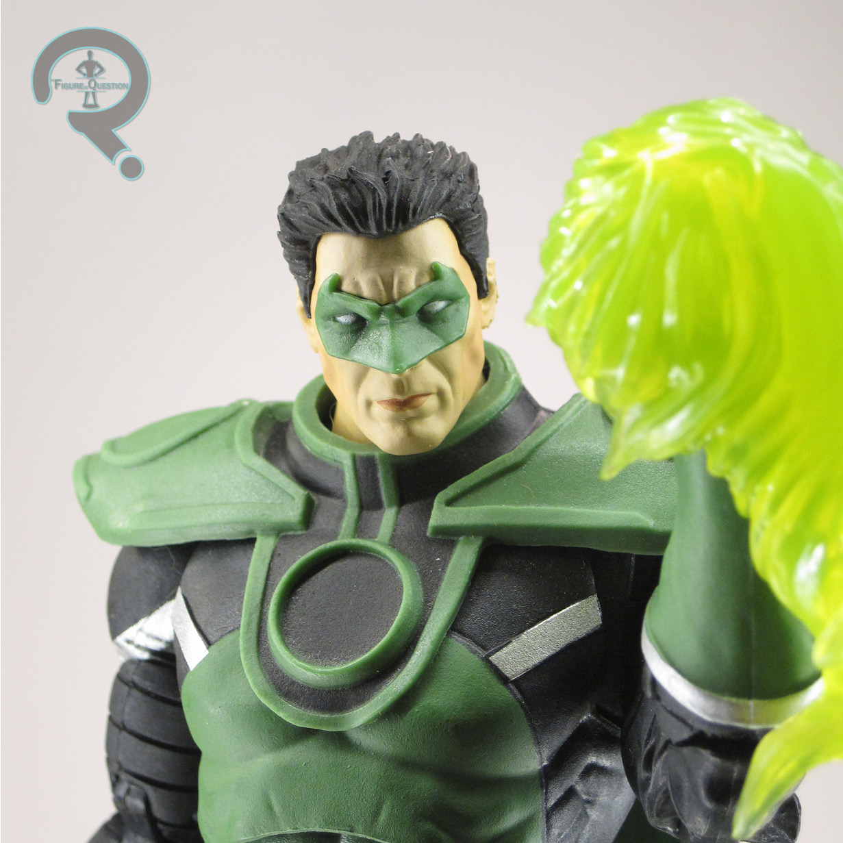
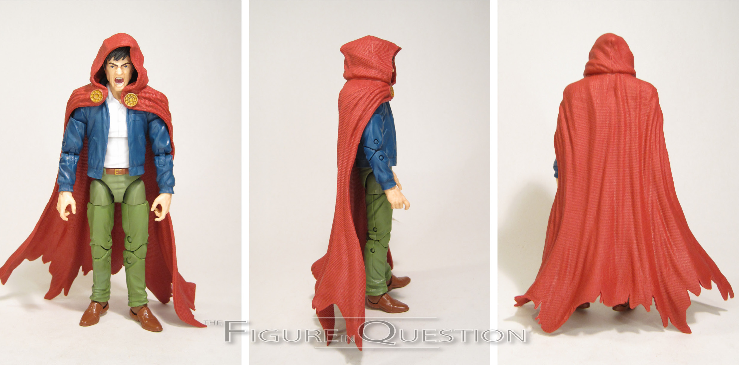
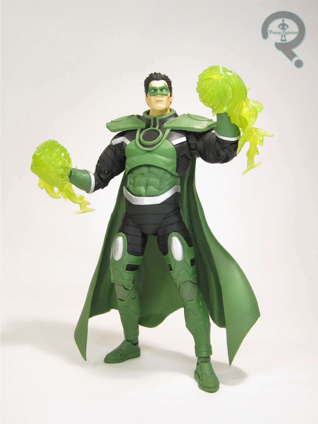
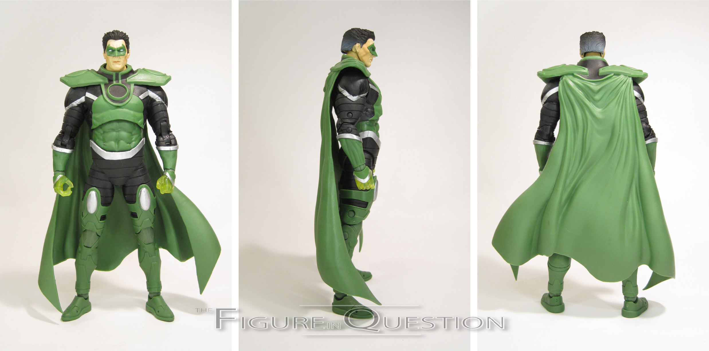
 Parallax is another “Platinum Edition” figure in McFarlane’s DC Multiverse line. As I noted yesterday, exactly what “Platinum Edition” means varies from figure to figure, but in the case of Parallax, it means that he’s a Walmart-exclusive, alongside fellow ’90s-themed “Platinum Edition” release Azrael Batman. This is Parallax’s first figure under McFarlane, and in fact the first Hal Jordan Parallax figure we’ve gotten since DCD’s old Rebirth release. That’s quite a gap in figures there. Sure is fun that it’s a Walmart exclusive. That certainly won’t be a frustrating turn of events for most people. The figure stands 7 1/4 inches tall and he has 37 points of articulation. On the topic of sizing, McFarlane’s difficulties with consistent scaling across their figures kicks in here, as Hal stands 1/4 inch taller than yesterday’s Martian Manhunter, which is definitely off, as J’onn has consistently been depicted as one of the tallest DC heroes, and Hal is usually middle of the pack. The sculpt for Parallax is an all-new one, and…well, it’s got its ups and its downs. First and foremost, the box specifically cites this figure as being from “Emerald Twilight,” and it’s just not. Heck, not even the illustration on the back of the box is from “Emerald Twilight.” It’s actually from the Convergence crossover series, some two decades later. The figure proper is a decent enough sculpt from a technical stand point, aside from some slight oddities this the back of the head having a slightly odd
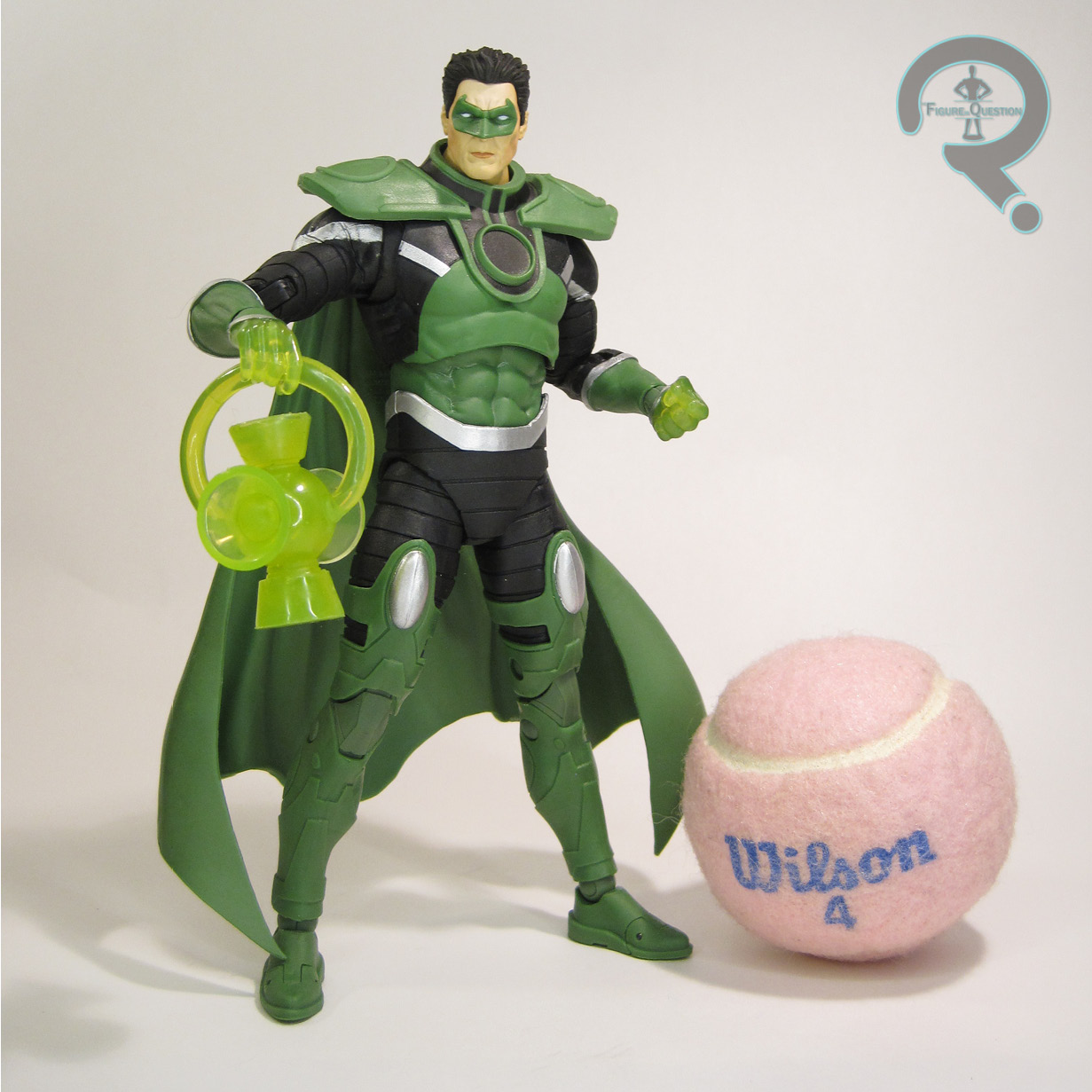
 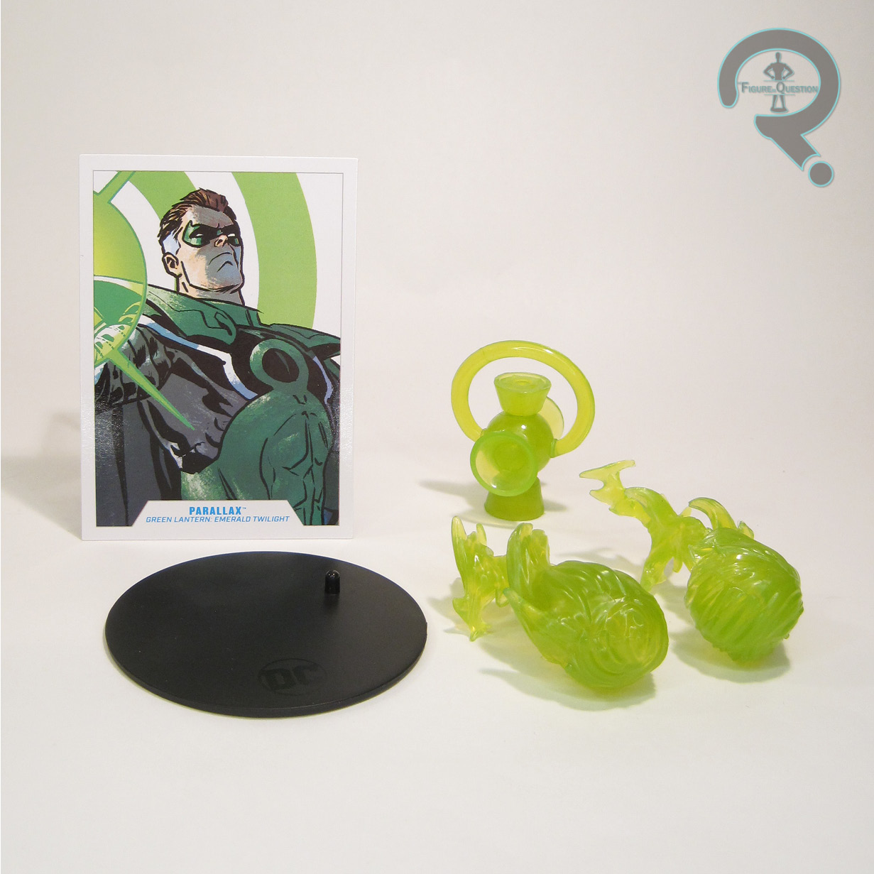 shape. Beyond that, the issues largely stem from a multitude of inaccuracies. The hair’s short and spiky, rather than the more classically parted hair that Hal usually has. The arms don’t have the stripes running down the sides, instead having the shoulders come to a point, the way they do on Hal’s classic costume. The torso, specifically the circle on the chest, is three dimensional, and the surrounding elements are totally different in their shaping than what’s shown on the page. The tops of the boots are also totally different in their shaping, and there are a ton of extra details on the boots that aren’t there either. Why all the differences? Your guess is as good as mine. Todd’s gotta Todd, maybe? It’s been a recurring issue with the DC line, but on this one in particular, it sticks out because he’s specifically called out as being based on a specific story. Parallax’s color work is also notably off. The most glaring issue is the total lack of the white steaks on his temples, but his hair is also generally too dark, with almost no brown at all. There’s a slight hint of grey, but it’s far too subtle, and also almost entirely at the back of the head. The greens are also rather drab, and generally too light. Beyond that, the application is at least clean, and I do quite like how the clear green hands look. Parallax is packed with a collector card, two energy effects for the hands, a power battery, and a display stand. The accessories are at least pretty cool, so he’s got that going for him.
THE ME HALF OF THE EQUATION
While I’ve always had my issues with the story that spawned him, I also have this odd soft spot for Parallax, going back to the Total Justice figure being my only way to get a Hal Jordan figure back when I was a kid. I loved that figure, and it’s resulted in me really growing to like the Parallax design. I had the DCD figure back when it was new, but it was always a rather fragile figure, which isn’t very fun. I had hoped Mattel might get to him during DC Universe Classics, but they never did. Then the pictures of this guy surfaced, and I realized he was really my best bet at getting a halfway decent Parallax. I wasn’t looking forward to the difficulties of getting a Walmart-exclusive, but as luck would have it, someone traded one into All Time, making getting one super easy. Ultimately, my feelings on this figure, much like the actual character, and the overall toyline he’s part of, are very conflicted. He’s not a bad figure from a technical standpoint, but there’s a lot of issues in terms of accuracy, with lots of changes seemingly being made purely for the sake of change. It’s an issue I’ve run into before with the line, and I’m sure it’ll crop up again, but you just keep getting this sense that Todd thinks his designs are just better, and, well, he’s wrong, and it gets in the way of figures being as good as they could be, which is a real shame.
Thanks to my sponsors over at All Time Toys for setting me up with this figure to review. If you’re looking for cool toys both old and new, please check out their website.