#0970: Silver Surfer

SILVER SURFER

MARVEL SUPER HEROES (TOY BIZ)

SilverSurferMSH1

Though they were best known for their 15 year run with the Marvel license, Toy Biz’s first work of note was actual doing toys based on Marvel’s Distinguished Competition. Toy Biz’s DC action figures were little more than knock-offs of Kenner’s Super Powers line. When Toy Biz was granted the Marvel license, their initial offerings were rather similar to what they had done for DC. They offered a rather broadly ranging line, covering the major corners of the Marvel Universe (barring the X-Men, who got their own line). Today, I’ll be taking a look at one of that line’s versions of the Silver Surfer!

THE FIGURE ITSELF

SilverSurferMSH2
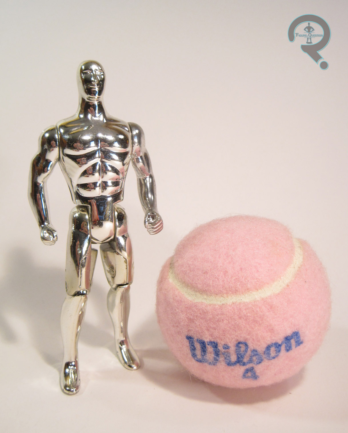
Silver Surfer was released in the third series of Toy Biz’s Marvel Super Heroes line. The figure stands about 5 inches tall and has 6 points of articulation. That’s actually a pretty low articulation count for a Toy Biz figure, and it’s even a bit low for this particular line. This figure is mostly the same sculpt as his Series 1 counterpart. The only difference between the two is the lack of neck articulation. It’s an odd choice, and it definitely limits what can be done with the figure, but I’d guess it had something to do with the vac metalizing. The sculpt isn’t terrible, but it’s not particularly great either. He’s similar in style to the Toy Biz Green Lantern, in that his proportions feel rather off, and the level of detail is very low. Also, his head is just very oddly shaped. It’s definitely too small, and the face (which is very ill-defined) sits too high. In fact, the head in general sits too high on the neck, and the whole construction there just looks weird. As far as paint goes, this particular Surfer doesn’t really have any, he’s just vac metalized. Later Surfer’s would at least get detailing on the eyes, but that’s not the case with this guy. Just the straight up and down silver for him. Silver Surfer originally included his surfboard, done up to match him. Unlike other versions of the board, this one was really thick, and it had wheels on the bottom. So, he’s not actually the Silver Surfer, he’s the Silver Skateboarder. Radical.

THE ME HALF OF THE EQUATION

The Surfer is the eighth of the 15 figures that I picked up from a vendor at this past Balticon. I…I’m not really sure how I feel about him. I mean, the chrome look is certainly cool, but the actual figure’s kind of a bit lame. Toy Biz definitely improved in leaps and bounds over the years, but this guy’s a disappointment even compared to the figures from the same line. I hate to be this down on a figure, but this guy, well, he’s not great.

#0969: Cyclops

CYCLOPS

X-MEN: AGE OF APOCALYPSE (TOY BIZ)

CyclopsAoA1

Man, I feel like I was just talking about Age of Apocalypse not that long ago. Oh, that’s right, I was! Back in May, I looked at the AoA version of the most popular X-Man, Wolverine. Today, I’ll be dipping back into that universe, to look at an X-Man who’s almost as popular, Cyclops! One of the things that the event liked to play with was which side of the battle certain characters were on. While classically villainous characters like Magneto and Sabertooth ended up firmly on the side of good, some of the more traditionally heroic characters found themselves on the side of bad. Such was the case with both Cyclops and his brother Havok. At the time, Cyclops as a villain was supposed to be really shocking, but it’s since become a rather predictable story beat (and Cyclops doesn’t stay evil in the story anyway, so…). Ah well. How about the figure?

THE FIGURE ITSELF

CyclopsAoA2Cyclops was released in the 12th Series of Toy Biz’s 5-inch X-Men line, which was entirely based around Age of Apocalypse. The figure is about 5 ½ inches tall and he has 10 points of articulation. Obviously, he’s based on Cyclops’ design from the Age of Apocalypse event. While Wolverine/Weapon X got a rather extensive redesign, Cyclops actually didn’t change all that much from his standard look of the time. Sure, there are plenty of minor changes, but the overall look is still pretty much the same. The biggest change is all the asymmetry. In the comics, Scott had lost his left eye in a battle with Logan, making him an actual cyclops. Isn’t that clever? Anyway, his visor has been tweaked so the eye slit is just on the right side, and they just kind of went nuts to play up the imbalance. With the asymmetrical armor, the pouches, the long hair, and the five o’clock shadow, the whole thing is very ‘90s. It’s almost quaint. The figure does a decent job of replicating this design, but holy crap is it stylized! His muscles are bulging all over the place, and his hands are huge, yet his head and waist still manage to be impossibly small. His head’s smaller than his bicep. That’s the kind of thing you might want to have checked! Also worth noting is that the structure and pose of this figure’s legs make him virtually impossible to keep standing for any length of time. On the plus side, the sculpt does have some pretty cool detail work, especially on the armored bits. He’s even got little sculpted scars across his eye! Cyclops’ paintwork is decent enough. The application is pretty clean,many the slightly metallic blue and yellow work really nicely. The hair’s a bit of a mess, but more or less gets the job done. The scars lose some of their subtlety with the huge red lines that have been placed on them, which is a slight letdown. Still, they aren’t terrible. Cyclops was originally packed with a weird gun thing and a brain in a jar. Classic Cyclops accessories! Mine, however, does not have these pieces.

THE ME HALF OF THE EQUATION

Cyclops is another figure from the rather large assortment of figures I picked up at this year’s Balticon. Given that I was a huge Cyclops geek as a kid, it’s a little surprising that I didn’t get this guy when he was new, but I don’t recall ever seeing any of the Age of Apocalypse figures in stores. Honestly, this isn’t one of my favorite incarnations of the character. However, he’s not a terrible figure, and his ramped up 90s-ness does make him a bit of fun!

#0968: Marvel’s Vision

MARVEL’S VISION

MARVEL LEGENDS – 3.75 (HASBRO)

VisionJonas1

One of the few good things to come out of the storytelling travesty that was “Avengers Disassembled” was the creation of Young Avengers, a pretty fantastic tribute to the various legacies from throughout Avengers history. During the events of “Disassembled,” the Vision, who is himself a legacy in a few ways, was killed. Young Avengers brought him back…sort of. The original Vision remained dead, but through a combination of remnants of his programming, and Iron Lad/Kang the Conqueror’s armor (and just a dash of his pre-Kang personality thrown in for good measure), Vision 2.0 was created. He served as an interesting take on the concept of the Vision, at times even more human than his predecessor. Jonas (Vision 2.0’s preferred name) has gotten a figure before, courtesy of DST’s Marvel Minimates, but Hasbro’s seen fit to give him another, although only die-hard Young Avengers might recognize it at first.

THE FIGURE ITSELF

VisionJonas2Jonas was released in the second series of Hasbro’s 3 ¾ inch scale Marvel Legends line (formerly Marvel Universe, then Avengers Infinite, then Marvel Infinite). Though he is clearly meant to be Vision 2.0, the packaging simply lists him as “Marvel’s Vision.” Given that the two Visions aren’t far off from each other in design, and the fact that the general public is still getting used to the first Vision, I can’t say it was a bad move to leave off the “2.0.” The figure stands about 4 inches tall and has 19 points of articulation. The figure is built on the new medium male body (the same one used on Machine Man and Yondu), which is actually a pretty good fit for Vision. It’s certainly better than the body used by the last 3 ¾ version of the character. I suppose you could argue that Jonas should perhaps be a little smaller than the original Vision, but different artists drew him different ways, so I can’t really find fault with it. The figure uses the cape from the prior Vision, which was probably the best part of that figure, along with a new head sculpt. The head is a fairly generic Vision head. I might have liked something with a bit more resemblance to Jim Cheung’s art, but this works just fine. The paint work on Vision is passable, but it could be better. There’s quite a bit of slop, especially in the face, which is rather annoying. The metallic yellow looks cool, but I do wish they’d done something more exciting than flat green for the rest of the costume. The Minimate was partially translucent, which was fun, but even just making the green metallic would have been something. Vision includes no accessories, which isn’t too shocking, since I can’t really think of any extras that could be included. That being said, given the rising costs of these figures, anything to help offset the price would certainly be appreciated.

THE ME HALF OF THE EQUATION

I picked up Vision from my local Toys R Us, while out and about with Super Awesome Girlfriend. It’s not often I find a figure I’m looking for so quickly after its release, so that was nice. I was actually a bit surprised when this figure was announced. The Young Avengers book’s been done for a couple of years, and Jonas was dead and forgotten even before that. Of course I’ll hardly complain about getting another Young Avenger, even if he’s only the second member in this scale. Hey, Kate, Wiccan, and Hulkling are still kicking around, maybe we might get 3 ¾ inch versions of them too!

VisionJonas3

#0967: Bio Rider

BIO RIDER

S.H. FIGUARTS (BANDAI)

BioRider1

The term “Tokusatsu” refers to Japanese live-action films or TV dramas that make use of considerable amounts of special effects. The term includes things such as Godzilla and Ultraman, as well as Super Sentai (more commonly known in the U.S. as Power Rangers). It also includes Kamen Rider, which is the source of the subject of today’s review. This marks the second time I’ve looked at a Kamen Rider figure on this site, so hey, it’s still kind of new and exciting! I’ll admit up front: my knowledge of Kamen Rider stuff is passing at best, so I’m counting on what I’ve read online to fill in the blanks. So, without further ado, here’s Bio Rider!

THE FIGURE ITSELF

BioRider2Bio Rider is part of the rather extensive Kamen Rider sub-set of Bandai’s S.H. Figuarts line. He was released in the latter part of 2014. Bio Rider hails from the Kamen Rider Black RX show (which was the show that was adapted into Saban’s Masked Rider in the mid-90s), where he was a power-up ability for the title character, referred to as “Bio Rider” in Japan, but “Masked Rider Super Blue” in the U.S. I feel like Japan kind of won on the naming front. The figure stands about 5 ½ inches tall and has 45 points of articulation. While Bio Rider and RX share some common design themes, the two designs were actually pretty divergent from each other. Bio Rider is by and large a much sleeker design, and he sort of has an almost art deco air about him. It’s a much stronger design than the basic RX look, but I suppose an argument could be made that it loses some of more signature Kamen Rider elements. The figure’s sculpt does a pretty good job of capturing Bio Rider’s design from the show. He’s not a pitch-perfect recreation: the helmet’s a little squatter, especially in the face, and the eyes are more round. But, it’s still pretty darn close. The details on his suit are pretty amazingly done. He actually looks like he’s wearing a rubber suit, just like on the show. There are even small creases on the thighs to show that they crumple when he moves his legs. That’s quite an attention to detail! Bio Rider has quite a unique color scheme for a Kamen Rider. They tend to be predominantly green and black, but Bio Rider is a nice blue and silver combo, which looks pretty sweet. The actual paint application is some of the sharpest work I’ve seen on just about any figure. There’s no bleed over or slop that I can tell, and the color choices really pop. Also, not paint, but the lenses and buckle of the belt are both molded in translucent red, which works in conjunction with the sculpted texture on the underside, giving him a cool bit of depth. In terms of accessories, Bio Rider includes his Bio Blade weapon, as well as hands in fist, tight grip, loose grip, relaxed, open gesture, and karate chop positions. That’s a bit lighter than some of the Figuarts figures I’ve reviewed, but Bio Rider was actually a slightly less expensive figure, and it’s still not a bad assortment.

THE ME HALF OF THE EQUATION

This is Tim’s fault. See, I’ve looked at some of the Figuarts Kamen Riders before, but managed to steer clear of them. But, then Tim went and bought himself a Kamen Rider, and suddenly I found lacking. So, using an Amazon gift card (given to me by Tim’s parents! That’s strike two for Tim!), I ordered this guy. I’m not 100% sure what called me to this guy. Maybe it was the color scheme, or perhaps the sleek design. I must admit, I was amused to find out that he was actually from the one incarnation of Kamen Rider I’ve actually seen, given that wasn’t a purposeful decision. This is a really fun figure, and I’m definitely glad I got him. I foresee more Kamen Riders in my future.

BioRider4

#0966: Buccaneer Batman

BATMAN – BUCCANEER

LEGENDS OF BATMAN (KENNER)

In Super Hero toylines, it’s rarely a shock to see wacky, non-cannon variants of the main heroes . After releasing a basic version of the heroes, variants are the easiest way to get them into every assortment. They’re kind of one of those necessary evils (and honestly, they aren’t even that evil). Oddly enough, in the mid-90s, Kenner released the Legends of Batman line, which was a line of figures pretty much exclusively devoted to weird variants of Batman and his supporting cast. Today, I’ll be looking at one of those Batmen, specifically Buccaneer Batman, because who doesn’t love pirates?

THE FIGURE ITSELF
Buccaneer Batman was released in the third series of Legends of Batman. He was part of the “Pirate” sub-line that Series 3 introduced, alongside First Mate Robin, Laughing Man Joker, and … Pirate Two-Face. Yeah, they kind of gave up on the names after “Buccaneer Batman.” The figure stands a little over 5 inches tall and has the standard 5 points of articulation for a figure of the time. There’s a slight bit of limited motion on the right shoulder, thanks to his “Slamming Mace Action,” which would swing his arm downward when the button the figure’s back was pressed. As far as I know, this figure (and all the other Pirate figures) is not based on any particular comicbook appearance of Batman, but rather comes from the minds of Kenner. The design takes the classic Batman design, and makes a few tweaks here and there, to play up the whole pirate angle. His mask is no longer a cowl, but is instead a bandana tied into shape (though, how he got it to duplicate the bat ears is anyone’s guess). Gone is the utility belt, replaced by a simple sash, albeit one where he can still stow a batarang. He’s also got a belt running along his chest, which has a bat-logo affixed to it, just in case you didn’t know who this was. What’s slightly odd about the logo, though, is that it’s oriented parallel to the belt on his waist, despite the belt it’s attached to being diagonal. It almost feels like the logo was meant to be diagonal too, but then someone in DC’s merchandising insisted it be oriented flat, so as to not cause any brand confusion or something. Anyway, the design’s interesting enough. The actual sculpt isn’t bad, but it definitely has some oddities. For one thing, Batman’s really beefy, more so than he usually is depicted. Despite the fact that the costume is clearly meant to be loose and flowing, his muscles are still bulging through in every spot that they can. Also, he’s in a very strange pose, with one of the widest stances I’ve ever seen on an action figure. It’s not that this sculpt is bad, but rather that it seems uncertain of what it’s trying to do. Also, he did have a cape at one point, but I seem to have lost mine. Batman’s paint is fairly standard, but still pretty cool. He predominately uses the basic Batman colors, but they’ve given him red in place of the usual yellow. It makes it so this is clearly Batman, but he’s just different enough that you’re given pause. Plus, red seems more pirate-y anyway. Batman included a sword and a mace, both of which had been given slight bat-makeovers. He could only hold one at a time, and, if I’m honest, the sword was a lot cooler.

THE ME HALF OF THE EQUATION

I received Batman (and his corresponding Robin) for my fourth birthday. I definitely recall seeing the commercials for this particular set of figures and being rather excited to get them. Which is odd, since I’ve never been much of a pirates guy, but whatever. The figure took quite a beating over the years, and as goofy as he is, I still have something of a soft spot for him. This figure, like the rest of the Legends of Batman line, goes to show that wacky variants aren’t inherently a bad thing, provided you’re having fun with them.

BuccaneerBatman3

#0965: Takodana Encounter

MAZ KANATA, REY, FINN, & BB-8

STAR WARS: THE FORCE AWAKENS

Takodana1

It’s hard to believe it’s been six months since The Force Awakens hit theatres. What’s harder to believe is that finding the figures from the film hasn’t gotten any easier, despite Hasbro putting out several new pack-outs of figures. It seems like every store I go to has the same 6 figures they’ve had since last October. Fortunately, there are a few new products trickling in, giving us a few characters who were missing from initial assortments. One of the film’s more popular additions to the mythos was Maz Kanata, a well-traveled bar owner who seems poised to be the next Yoda (well, if Luke doesn’t beat her to it!). She’s been mostly absent from the various toy lines (she was in a Lego set, but that’s it), but Hasbro’s finally put out their own figure of her. Of course, you have to buy three other figures to get it, but that’s not the point.

THE FIGURES THEMSELVES

Takodana6Maz, Rey, Finn, & BB-8 were released in the “Takodana Encounter” set as part of Hasbro’s 3 ¾-inch line of Star Wars: The Force Awakens figures. Maz is the only new figure included, and the other three are re-packs. Rey includes a lightsaber that her single release didn’t have, but other than that these three are the same figures I reviewed here, here, and here.

MAZ KANATA

Takodana2Maz stands about 2 ½ inches tall and she has the standard 5 points of articulation. Her sculpt is 100% new to her, and it does a pretty admirable job of translating her on-screen appearance into toy form. The head should perhaps be a touch larger than it is, but other than that, they’ve got her pretty much down. Despite her smaller stature, this figure still has quite a bit of detail work, especially on the shirt and vest. Perhaps the only minor drawback I can think of is that the goggles aren’t articulated. They’re still separate pieces, so she’s got fully detailed eyes under there, the lenses are just fixed at the sides. As it stands, the goggles are just the slightest bit misaligned, which a tiny bit annoying. Maz’s paintwork is decent, if not quite as good as the sculpt. The colors are a little TakoDana3brighter than what we see on screen, but not so much so that it stands out as a bad thing. While areas such as the face and feet are quite expertly detailed, there’s some rather noticeable slop right around her belt, where the green of the shirt goes down too far and the yellow of the belt is rather thinly applied. All in all, though, she looks pretty good. Maz includes a blaster, an unlit lightsaber, and a box of junk for the saber to be placed in. That’s a pretty great assortment of pieces, and I love that we finally got a 3 ¾-inch Force Awakens figure without a useless build-a-thingy piece.

THE ME HALF OF THE EQUATION

This set was given to me by my friends Cindy and Lance Woods as a graduation gift, which was very thoughtful of them. I had been wanting to pick this set up, since Maz is one of my favorite parts of the new movie. Maz is undoubtedly the main focus of this set, and I personally feel the whole purchase was warranted just for her, but I can understand why others might feel a little taken advantage of. For new fans, this is a fantastic starter set. For fans who have been following the line the whole time, being forced to buy another Rey, Finn, and BB-8 is probably a little frustrating. That said, one can hardly fault Hasbro for offering another way to get Rey, and I can’t imagine it would be too had to find someone who wants the three repeat figures.

Takodana5

#0964: Mr. Fantastic

MR. FANTASIC

FATASTIC FOUR (TOY BIZ)

MrFantastic1

The 2005 Fantastic Four movie is definitely far from a perfect film. Yesterday, I touched on the casting of Jessica Alba as the Invisible Woman, which is often cited as one of the film’s biggest negative factors. On the plus side, they didn’t botch all of the casting. Chris Evans as Johnny was quite good, as was Michael Chiklis’ take on Ben. Ioan Gruffudd’s Reed Richards doesn’t stand out quite as much as those two, and he was unfortunately hampered by a lack of chemistry with Alba’s Sue of Julian McMahon’s Von Doom. Still, Gruffudd turned in a decent, stand-up performance. As with the rest of the cast, he got a handful of action figures from the movie, one of which I’ll be looking at today.

THE FIGURE ITSELF

MrFantastic3This particular Mr. Fantastic was included as a pack-in with the Fantasticar* that Toy Biz put out in the first Fantastic Four movie line. The figure stands just over 6 inches tall (without the neck extension), and he has 28 points of articulation. His articulation is a little weird, since it’s not in keeping with the rest of the figures in the line. That’s because this figure is actually a scaled down version of the 12-inch rotocast Mr. Fantastic. That figure’s hollow construction necessitated the “v” hips, and the lack of waist movement is due to the larger figure’s inclusion of an extending neck feature. At the smaller scale, the extending neck wasn’t feasible, but he still loses the articulation. Oh well. Aside from the slightly off articulation, the sculpt actually isn’t bad. I think the head has the best Ioan Gruffudd likeness of any of the Reed figures Toy Biz put out, and the body sculpt avoids a lot of the wonkier proportions that plagued a lot of the Fantastic Four movie figures. The longer forearms and larger than normal hands are a pretty cool way of showing off Mr. Fantasic’s powers, and I like the inclusion of all the smaller details on the gloves. Unfortunately, though the sculpt is a step-up from the other figures, the paint is a definite step down. Moving past the annoying scrapes of missing paint on my figure (which probably weren’t there when he was new), the paint is much more straightforward on this figure. There’s no accent work on any of the costume pieces, and there are several spots of noticeable slop, especially on the figure’s right thigh. On the plus side, the hair does exhibit some halfway decent work, so it’s not a total loss. Reed’s only real accessory was the extendable neck piece. It would have been nice to get a set of normal sized hands as well, but given that this figure was essentially an accessory himself, the lack of extra pieces isn’t unforgivable.

THE ME HALF OF THE EQUATION

I picked up Reed at the same time as Sue, from a dealer at Balticon. I actually looked at the Fantasticar set a few times when it was on shelves but I never got one. In addition, I had the 12-inch version of this figure, which I liked quite a bit. The smaller version isn’t quite as impressive, but he’s still a pretty decent figure, and he might be my favorite version of the character that this line had to offer.

*The Fantasticar didn’t actually appear on-screen until the 2007 sequel. The one that this figure was included with was a Toy Biz-original creation, since the movie design had not yet been developed at the time of this toy’s release.

#0963: Power Blast Invisible Woman

POWER BLAST INVISIBLE WOMAN

FATASTIC FOUR (TOY BIZ)

SueAlba1

The Fantastic Four haven’t really had much luck when it comes to movies. The recent Fant4stic was a total box-office bomb, of, like, epic proportions. Before that travesty, there were two other theatrical Fantastic Four movies, which weren’t bad, but were far from great. One of the more present issues with both 2005’s Fantastic Four and its sequel Rise of the Silver Surfer was the questionable casting choice of Jessica Alba as Susan Storm, aka the Invisible Woman. As is the case with just about every Marvel movie, Fantastic Four got its own line of toys, which included a couple versions of Alba’s Invisible Woman.

THE FIGURE ITSELF

SueAlba2Power Blast Invisible Woman was released as part of the first series of Toy Biz’s Fantastic Four movie tie-in. There were actually three different variations of this figure released. The figure I’m looking at today is the fully visible version, but there were also fully invisible and “half-and-half” versions available. She stands about 6 inches tall and has 38 points of articulation. Sue comes from around the point when Toy Biz was focusing on articulation above all else, and it kind of shows. Sure, she’s got a lot of movement, but she looks more like a drawing mannequin than an actual person. The joints are really obvious and she’s painfully skinny, to a degree that no living person should be. The waist is the absolute worst, though; it’s actually a bit smaller than her thigh in diameter, which is beyond off. These are proportions that would look strange even on a comicbook character, but on a figure that’s supposed to be based on a real person, they’re downright laughable. At the very least, the figure’s head is a pretty spot-on likeness of Jessica Alba, right down to that slightly condescending sneer she was sporting for about 99% of her screen time in the movies. The hair is a separate piece and whole it’s a little on the thick side, it’s not atrocious, and there’s at least some nice detailing. Sue’s paintwork is probably the figure’s strongest point. Everything’s pretty clean overall, and there’s even some nice accent work on the uniform of the blue, which helps keep it from getting too monotonous. Her face is also surprisingly well-done, especially at this scale. Invisible Woman included a disc-firing base, which I think was supposed to represent here powers somewhat, but it just ends up being weird.

THE ME HALF OF THE EQUATION

Sue was one of the more difficult to find figures in the line at the time of release, so I didn’t have this figure when she was new. She ended up being one of the 15 figures I picked up at this past Balticon. The figure’s definitely wonky, especially in terms of proportions, and Alba’s Sue is far from one of my favorite characters, so I can’t say this is one of my favorite figures. But hey, she was $2. I can’t really complain.

#0962: Gambit

GAMBIT

X-MEN: CLASSIC (TOY BIZ)

GambitLightUp1

The ‘90s were quite good to the X-Men. They several top selling comics, a few video games, and a cartoon. But, most importantly, they had an awesome, hugely expansive line of action figures, courtesy of Toy Biz. Earlier figures in the line were fairly straightforward versions of the X-Men, but as the line continued, Toy Biz started experimenting with a number of different gimmicks to keep things interesting. The very first “gimmick series” gave each figure a light-up feature. Though light-up features weren’t new to the line, these figures were different in that, rather than lighting up themselves, they used a two-part light-up feature that allowed them to light up their accessories. Mostly, the series was just an excuse to release new versions of a few outdated figures. Today, I’ll be looking at Gambit from that series.

THE FIGURE ITSELF

GambitLightUp2Gambit was released in the X-Men: Classic “Light-Up Weapons Series,” which was the 13th series of figures in Toy Biz’s 5-inch X-Men line. This was Gambit’s second figure in the line, after getting his first back in Series 3. The figure stands about 5 ½ inches tall and has 9 points of articulation. His articulation isn’t terrible, but the light-up feature’s inner workings are in his chest and right arm, which reduces the posablilty of the right shoulder quite a bit and also necessitates removing the usual elbow joints. Though the X-Men line was meant as a tie-in for the cartoon running at the same time, the figures tended to be more directly based on their comics appearances. Gambit actually looks to take a lot of influence from his Capcom game appearances, since he’s rather beefy and stylized. The overall look isn’t too bad, though it does seem like Gambit’s been juicing just a bit, since he’s usually more slender than he’s depicted here. He’s about to burst out of his sleeves for Pete’s sake! Also, his hands are absolutely huge, and if I’m honest the right one barely even looks like a hand at this point. The head exhibits the best sculpted work, and does quite a nice job of capturing Gambit’s smarmy personality. Gambit’s paint is fairly decent, if not fantastic. There’s a bit of slop here and there, especially on the fingers, and the pink lines on the sides of his pants are way more subtle than they should be. The color scheme they picked is once again pretty game-inspired, but it has a nice degree of pop, so no complaints here. Gambit included his usual staff, as well as a piece showing a fan of playing cards being kinetically charged, as if Gambit has just thrown them. The latter piece is the source of the light up feature. When plugged into Gambit’s right hand, the cards would light up at the push of the button on Gambit’s back.

THE ME HALF OF THE EQUATION

This is another ‘90s X-Men figure that I’ve owned two of. The first was bought for me by my grandparents on my Mom’s side, I believe as a reward for finishing kindergarten. I got him and Juggernaut, but I think I mostly got Gambit because my grandparents felt I needed to get a “good guy” figure to go with the villain. Somewhere along the way, I lost that figure, so I picked up this replacement from a dealer at Balticon this year. He’s not a terrible figure, but he definitely shows his age.

#0961: Soundwave

SOUNDWAVE

TRANSFORMERS: ROBOT HEROES

Soundwave1

Despite being a really big action figure geek (I know, shock and awe, right?), I’ve never had any real affinity for Transformers. I mean, I can appreciate them for what they are, and I like a lot of the designs. I’m a huge fan of halfway decent robot designs. Heck, I even saw two of the films in theatres (maybe that’s not a point in my favor…) Every so often, I find myself looking at a Transformers figure or two, but I think the main thing that keeps me from really getting into them is in the name. For whatever reason, the whole transforming gimmick has never done much for me (which is weird, because I love me some gimmicky action figures!) Fortunately for nut jobs like me, Hasbro’s put out more than a few lines of non-transforming Transformers over the years. In the mid-00s, they were having great success with their more child-friendly Galactic Heroes and Super Hero Squad lines for Star Wars and Marvel, so they brought Transformers into the fold with Robot Heroes. I’ll be looking at that line’s version of Soundwave today.

THE FIGURE ITSELF

Soundwave2Soundwave was released in the second series of Transformers: Robot Heroes, in a two-pack with Autobot Bumblebee. At this point in the line, the designs were pretty much exclusively Generation 1-based (meaning the original ‘80s line), and Soundwave was no exception. The figure stands a little over 2 inches tall, but he’s squatting, so he’d probably be about 3 inches were he standing up straight. He has three points of articulation, at the neck and each of the shoulders, which was pretty standard for the line. The articulation doesn’t really offer much actual posablity, though. He’s a glorified statue: the pose you see him in is really the only pose you’ll be getting. On the plus side, it suits the character, so that’s good. The sculpt is quite nicely done. His proportions are slightly exaggerated (this was the Heroes style), but he’s far less exaggerated than anything from Galactic Heroes or Super Hero Squad, which I think makes him a bit more versatile. The details are all sharply defined, and he’s got a very nice geometric look about him. He clearly takes a lot of influence from the animated version of Soundwave, which is hardly a bad thing. The paint follows the animated look as well, opting for flat colors instead of the usual metallics. It works quite well with the sculpt and the application is generally pretty clean, though there are a few issues with some slightly misaligned details here and there.

THE ME HALF OF THE EQUATION

Though I’ve never been much of a Transformers guy, I really liked Robot Heroes. There was a time when I owned just about all of the G1-inspired figures from the line. I’ve since sold the vast majority of them off, but I kept Soundwave for a few reasons. First, he’s always been, my favorite Transformer. Second, he was the first Robot Heroes figure I got. My brother liked Bumblebee, so we bought this set when it was released and split it, and I liked Soundwave enough to pick up a bunch more of the figures. Even with most of the others gone, I still really like this guy.