#3585: Fennec Shand

FENNEC SHAND

STAR WARS: RETRO COLLECTION (HASBRO)

Fun FiQ Fact #0064: Fennec Shand actress Ming-Na Wen has been a Disney Princess, a Star Wars Bounty Hunter, and an Agent of S.H.I.E.L.D., giving her a tri-fecta of Disney franchise appearances!

Star Wars: Retro Collection has somehow steadily become my main go-to line for modern Star Wars collecting, which is, I guess sort of paradoxical, with it being branded “retro” and all.  I don’t know, I just like my Star Wars figures to be more on the basic side, and the death of the 5POA line after Solo really bummed me out, so I like having *something* in that range.  That said, I’m finding myself a little less attached to all things Star Wars, so I wound up skipping pretty much all of the Book of Boba Fett tie-in set from the line.  Admittedly, it was a little bit same-y for a lot of it.  I didn’t want to miss out on Fennec, though, so here she is!

THE FIGURE ITSELF

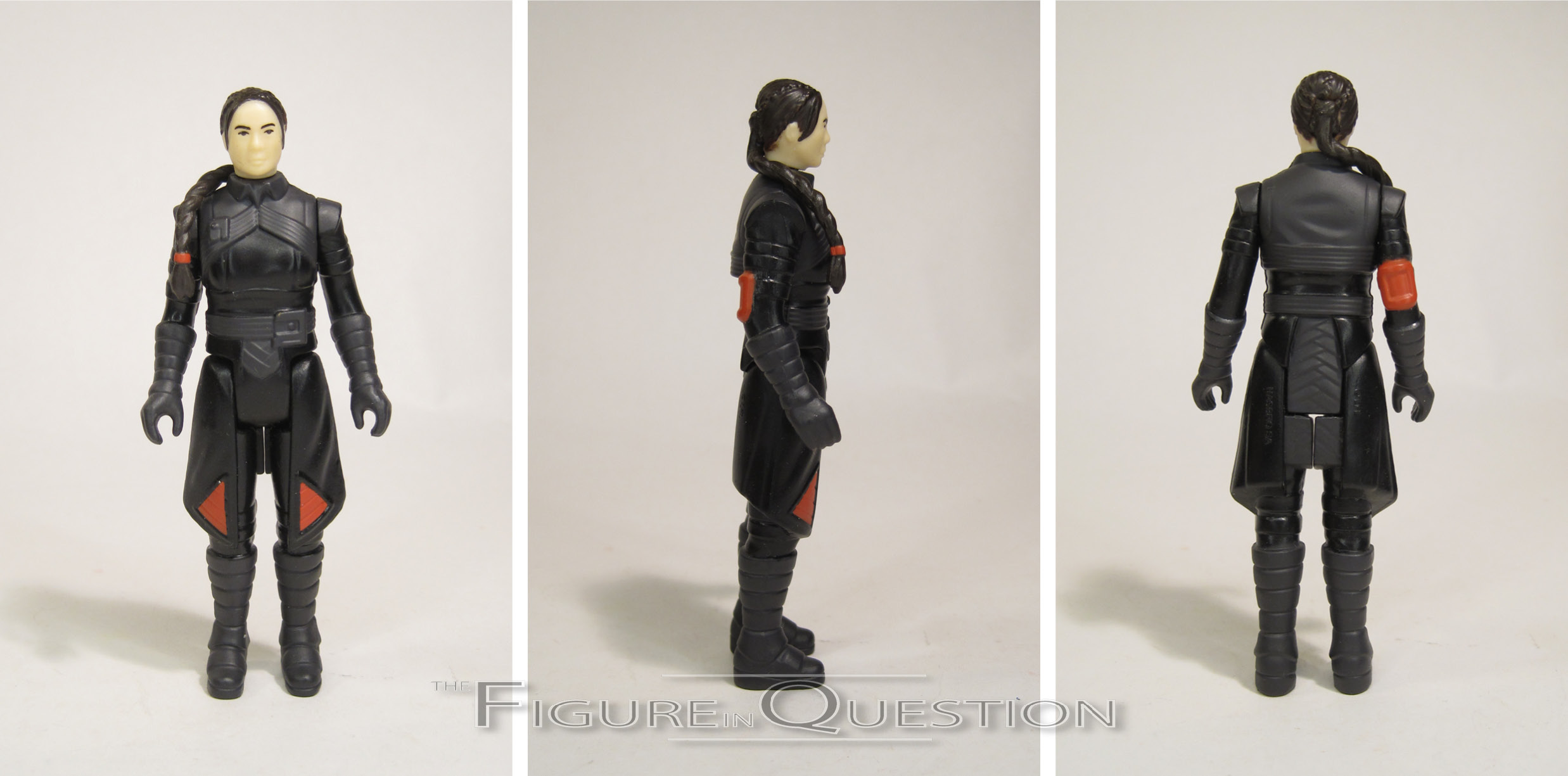
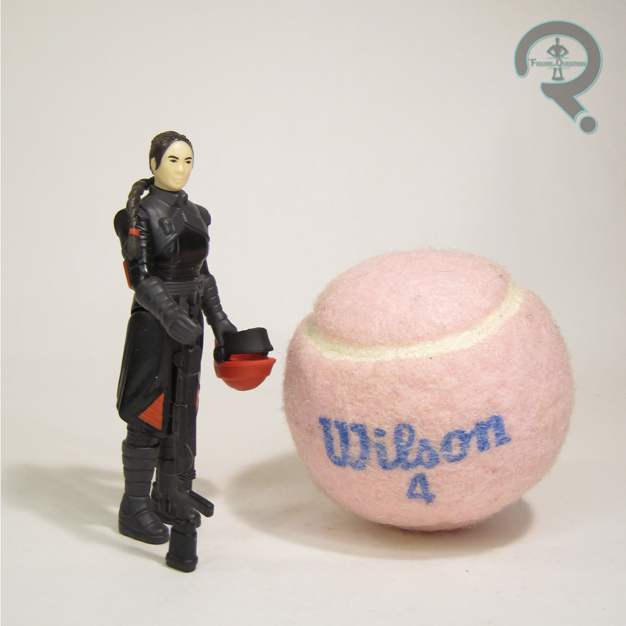
Fennec Shand is one of the seven figures in the Book of Boba Fett assortment of Star Wars: Retro Collection.  She kind of hammers home the set’s place as a Mandalorian continuation, since she’s had several appearances there, but hadn’t yet gotten a figure from the specifically Mando assortments.  Thankfully, she kept the same look in Book, so this figure can pull double duty, just like the Black Series and Vintage Collection.  The figure stands just over 3 1/2 inches tall and she has 5 points of articulation.  The movement on the neck is slightly limited by the ponytail, but the way it’s draped, it’s not entirely restricted, which is certainly a plus.  Her sculpt is unique to her, and it’s pretty nice.  It does a good job of threading the needle on keeping a lot of detailing, but also still dialing into the retro Kenner vibe.  She’s clearly meant to be aping one of Kenner’s later figures, especially given the removable helmet set-up.  The underlying head isn’t a perfect match for Ming-Na Wen, but it’s respectable enough to be obvious who it’s supposed to be, and it works well within the style.  Fennec’s paint work is actually pretty solid, with some subtle dark grey detailing mixed in with the molded black color, as well as the proper orange highlights seen in the show.  The application is pretty clean, and the whole thing looks very proper for the line.  Fennec is packed with a removable helmet (which sits very nicely on her head) and her blaster rifle.

THE ME REMAINDER OF THE EQUATION

I wanted Fennec when these figures were first shown off, but when they actually arrived, it was at the same time as the Ahsoka assortment, which I wanted more.  I’ve also been trying to scale my collection back where I can, so I didn’t want to buy just to buy.  That said, I gave it some thought and realized I still wanted the figure, so I wound up going back for her.  She’s pretty fun, just like the rest of the line.

Thanks to my sponsors over at All Time Toys for setting me up with this figure to review.  If you’re looking for cool toys both old and new, please check out their website and their eBay storefront.

#3584: Scarlett

SCARLETT

G.I. JOE: ULTIMATES (SUPER 7)

Fun FiQ Fact #0063: Scarlet is G.I. Joe’s First Lady, debuting as part of the 3 3/4 inch line’s Original 13 in 1982.

It’s been seven months since I’ve taken a look at Super 7’s G.I. Joe: Ultimates, largely because it’s been about eight months since there were new G.I. Joe: Ultimates to look at.  In general, Ultimates seem to be in a rocky spot, but I’m still invested in getting at least the line’s Joes…or most of them.  Scarlett’s one of my favorite characters, an essential counterpart to Snake Eyes in my collection, so I’ve been waiting for her addition to the line since the first series.  She’s here now, and I’m taking a look at her today!

THE FIGURE ITSELF

Scarlett is part of Series 3 of Super 7’s G.I. Joe: Ultimates.  She’s the first of the two Joes in the set, the other being Doc.  She continues the trend thus far of keeping the Joes pretty much on the heavy hitters side, especially in terms of the cartoon, where she’s one of the the four most recurrent Joes.  The figure stands about 7 inches tall and she has 33 points of articulation.  Scarlet’s articulation scheme matches pretty much with the slightly improved articulation from Series two, matching up pretty closely with the layout used by Lady Jaye.  Scarlett continues the line’s trend of basing the sculpts on the Sunbow animation models.  It’s an all-new mold (though one that’s already been slated for a re-use on a follow-up figure in her DiC colors), and it’s on par with the rest of the line.  It’s simple, clean, and very effective.  I really like the smaller details, like the folds and creases at the base of the boots.  She gets three different head sculpts, one with a neutral expression, one smiling, and one with a headset.  They continue the Sunbow likeness of the figure, and they’re really consistent internally.  They also swap out without much fuss, which I always like.  Once again, the headset wearing one is my favorite, but all three are equal quality.  Scarlett’s color work is handled pretty well.  It’s a lot of molded colors, but, in contrast to Flint and Lady Jaye from Series 2, she’s got painted skin-tone for the faces, which I admit, does help to better sell the animation angle.  Scarlett is packed with three pairs of hands (in fists, flat, and gripping), two styles of crossbow, 3 identical standard arrows, 3 different specialty arrows, a bag for holding the arrows, an assault rifle, and a radio.  The hands are cool enough, though it’s a bummer that she’s got one less set than prior figures.  I do like the crossbows, as well as the swappable arrows.  The arrows are a little delicate, but they swap into place alright.  The bag on mine had the strap come unglued right out of the box, which was definitely frustrating.

THE ME REMAINDER OF THE EQUATION

I loved the first series Snake Eyes, and since one of my earliest Joe pieces was the ToyFare exclusive Snake Eyes and Scarlett two-pack, I’ve been hoping to duplicate it in modern styling.  She’s not quite as strong as Snake Eyes, but he’s the high mark for the line, and she’s still a lot of fun.  They’re a really fun pair, and even if the line doesn’t have longevity, it got me these two, which is my big thing.

Thanks to my sponsors over at All Time Toys for setting me up with this figure to review.  If you’re looking for cool toys both old and new, please check out their website and their eBay storefront.

#3583: Lieutenant Commander Data

LIEUTENANT COMMANDER DATA

STAR TREK: FIRST CONTACT (EXO-6)

Fun FiQ Fact #0062:  I saw Star Trek: First Contact in the theatre on opening night as a guest of Star Trek writer Howard Weinstein.

Though I owe my very existence to the franchise, my personal relationship with Star Trek is a bit hit or miss.  I dig the original series, and some of the movies, but I find a lot of it to be rather unapproachable.  Of course, the flip side to that is that the things I like from Star Trek are things that I *really* like.  Case in point, Star Trek: First Contact is just genuinely one of my favorite movies, period.  Like, not even just under the “Star Trek” heading.  I just really love it, and I especially love Data’s role in the movie, to the point that he’s been cemented as one of my favorite parts of the franchise, despite me generally being iffy on Next Gen as a whole.  But Data?  That guy’s pretty darn cool.  Cool enough that I’ve got, like, so many figures of him, and yet it’s still not enough.  Well, you know what, here’s one more.

THE FIGURE ITSELF

Lieutenant Commander Data was the inaugural release in EXO-6’s Star Trek Series, hitting in 2021, just in time for the 25th anniversary of First Contact.  While it’s on one hand a bit surprising that they didn’t start with, say, Picard, it’s not a complete shock, I suppose, given Data’s popularity within the franchise.  I’m certainly not complaining.  The figure is a little under 12 inches tall and he’s got the usual “over 30 points of articulation” we see on the 1/6 scale figures that don’t have visible articulation.

Data gets two separate head sculpts for this release.  The one he comes wearing is the standard Data head.  It’s got a really strong likeness of Spiner, specifically Spiner in First Contact.  I found the likeness to be stronger when viewed from his right, but it’s not like it’s unrecognizable the other way.  The second head is the one that truly solidifies this as a First Contact figure, as it’s his appearance from the climax of the film, after he’s received a skin graft from the Borg in their attempt to turn him to their side.  It’s a great recreation of his patchwork design, maintaining consistency with the standard head, while also getting his adjusted look from the movie down pretty much on point.  While neither head is quite Hot Toys level in terms of sculpt or paint (especially on the paint, which is a little thicker), they’re still both very strong, and a truly impressive offering for a first try.  I’d have also loved a third head from after he gets the skin graft melted off, but I don’t want to be greedy.  The patchwork head will suit me just fine.

Data is sporting his uniform from First Contact, which is, of course, the redesigned uniform that he and the rest of the cast would wear for their final three films.  They’ve always been my favorite look for the cast, and I think they make for a good counterpart to the Wrath of Khan uniforms for the original series cast.  The uniform here is decently handled, if, again, not quite Hot Toys level.  The main suit is all one piece, which I’ll admit surprised me, especially with the follow-up Picard figure getting a two-piece set up.  However, I doublechecked, and that’s what it’s actually supposed to be, so it’s accurate.  The tailoring on the black part is good, but the grey section is a little bit bulky and not quite as sharp in its shaping as the full-scale uniform.  It’s far from terrible, though.  The gold collar is part of a full tunic under the suit, which is again accurate.  It’s a good fit, but you do have to take a little extra care in making sure it doesn’t slip too far under the jumpsuit when swapping the heads.

Data’s underlying base body is pretty respectable for a non-Hot Toys 1/6 offering.  It has good proportions, and handles posing well.  It doesn’t feel like the joints are too loose or he’s going to break, and the parts that are supposed to swap out are easy enough to do the swapping on.  The biggest issue for me is the skin tone just being completely wrong for Data, which is a real issue when you’re doing any posing that has his wrist joints visible.  Had they at least gotten a slightly closer color, it wouldn’t be as bad.  Also, this is again probably me being a bit greedy, but it’s a shame that the right forearm doesn’t have the skin graft detailing to complement the alternate head.

Data gets a nice little selection of extras, which includes four pairs of hands, his Mark II phaser, his tricorder, magnetic holsters for both of those, a larger phaser rifle, and a display stand.  The hands give us relaxed, fists, and a variety of differing grips to correspond with his accessories.  The phaser is basic, but nice, and the tricorder’s got magnets in it to keep its connections hingeless, which is fun.  The stand looks like a transporter pad, and also get’s an extra swap-out illustration for the combined set-up with the other figures.

THE ME REMAINDER OF THE EQUATION

As a kid, I loved First Contact, and I was particularly obsessed with Data’s looks from the end of the movie, for which there were no official toys.  I had to make do on both his patchwork and cybernetic appearances, usually resorting to sticking silly putty on figure’s faces.  I finally got the cybernetic look from DST, but the patchwork look was still absent, which just didn’t seem right.  I remember this figure going up for order, and I remember coming very close to ordering one, but it wasn’t the time for me to be ordering expensive figures.  When All Time got its very big recent collection in, I saw a number of the EXO-6 Trek figures, but I wasn’t sure Data would be among them.  What a fool I was.  He wound up being some sort of joint early birthday/father’s day gift from my parents.  Even they’re not entirely sure.  I think the main point was just getting me a First Contact Data I didn’t already have.  I won’t argue with that.

Thanks to my sponsors over at All Time Toys for setting me up with this figure to review.  If you’re looking for cool toys both old and new, please check out their website and their eBay storefront.

#3582: Soundwave

SOUNDWAVE

TRANSFORMERS ULTIMATES (SUPER7)

Fun FiQ Fact #0061: Soundwave is actually one of the earliest classic Transformers characters to get a non-transforming figure, having been part of Action Masters.

I don’t circle back to Transformers quite as often these days, so when I do, I gotta make it count, right? Yeah, go for the best of the franchise, the things that best represent the whole thing. And what best represents the Transformers? That’s right, it’s figures that don’t transform at all! Yeah! So, let’s look at this not-transforming Soundwave!

THE FIGURE ITSELF

Soundwave is part of the fourth wave of Super 7’s Transformers Ultimates, which also features Starscream (a particular favorite of Super 7’s for this line) and a dead Optimus Prime. The figure stands 8 inches tall and he has 29 points of articulation. Sizing wise, he’s in the general scale of the line established up to now…which isn’t really to scale with anything else. I’m not sure exactly what they’re aiming for, but they’re okay for a standalone set-up. The articulation set-up here is okay. Super 7 can have some troubles with range of motion. Given Soundwave’s blocky build, some restrictions are expected, and they’re definitely there. The elbows do at least get about 90 degrees, but other areas aren’t so great. The neck and shoulders in particular are pretty stiff, meaning, amongst other things, he can’t do his tape eject pose. That’s a real bummer, and my biggest knock against this figure. His sculpt is all new, and it’s very much G1-inspired. Since this is territory that Hasbro’s R.E.D. line already covered, there’s a bit more of a comparison going on. There’s definitely some common ground, since they both use some pretty heavily animation-based inspiration, but the approaches are a little different, with Hasbro prioritizing movement over aesthetic, resulting in some odd looking spots. Super 7’s priority is more on the aesthetic, so he looks a bit better in the sculpt department. The ankles especially look a lot better. He’s got three different heads in play, with standard being the usual animation-based one. He’s also got one based more directly on his original toy, which we don’t see as often, and, for the first time ever in toy form, a head based on his mouthed appearance from the Marvel Comics run. Sure, it’s not the right color scheme, since that wouldn’t match the rest of the figure, but it’s still cool. Soundwave’s paint work isn’t bad. It’s pretty flat and clean, which is what you want. I’m not sure how I feel about the opaque window on the chest. It’s obviously more accurate for animation and comics, but it throws the toy look off. Soundwave is packed with 5 pairs of hands (which are *very* hard to swap), plus his shoulder cannon, blaster, a clear cube (which I assume is something episode specific that I’m just not up on), and a miniature version of himself in tape deck mode. The two cannons can be stored in his back, in an homage to his vintage figure.

THE ME REMAINDER OF THE EQUATION

I don’t have an overwhelming attachment to non-transforming Transformers, I’m hard pressed to pass on a Soundwave. So, it’s hardly a surprise that I broke on this one, especially with the fun extras he gets. He’s kind of a lateral move from the R.E.D. figure, I guess, but he has the benefit of more distance from other Soundwaves.

Thanks to my sponsors over at All Time Toys for setting me up with this figure to review.  If you’re looking for cool toys both old and new, please check out their website and their eBay storefront.

#3581: Dr. Doom

DR. DOOM

MARVEL SUPER HEROES (TOY BIZ)

Fun FiQ Fact #0060: While the Fantastic Four jumped into the world of action figures during the Mego days, their longtime foe Dr. Doom wasn’t alongside them, and wouldn’t get his own figure treatment until Mattel’s Secret Wars, a line that, ironically, didn’t feature any of the FF.

I sure do like Dr. Doom. He’s the quintessential comic book villain, and he’s just great.  While he’s got his fair share of toys, they do have a tendency to be…hit or miss.  As a kid, I had the Fantastic Four line’s version, which wasn’t bad, and left me without a real need for other versions, prior to the switch to other scales.  Toy Biz themselves seemed pretty happy with that one as well, since they mostly took to just re-releasing that one a bunch.  That one wasn’t their first try, though, so let’s look at his predecessor.

THE FIGURE ITSELF

Dr. Doom was released as part of the first series of Toy Biz’s Marvel Super Heroes line in 1990.  He was then re-released in Series 4, three years later.  The figure stands just shy of 5 inches tall and has 7(ish) points of articulation.  His sculpt was a unique one and…well, it’s kind of…umm…stiff?  Scrawny?  Small?  Not real great?  Yeah, it’s a bit all of those things.  It’s also awkward, so let’s throw that one on the list, too, shall we?  It’s further removed from that Super Powers styling than most of the Series 1 figures, but I’m not sure that’s really a good thing, because he winds up as perhaps the weakest of the bunch.  There’s just not really a part of it that really works.  He’s got a cloth cape, in contrast to later figures, but it’s really short and wide, which again feels odd.  The color work on the figure is pretty basic.  I mean, I guess it’s better than the sculpt, but the green feels really bright for Doom.  Doom featured a rather odd action feature, where turning the wheel on his back spins his right hand.  Not really sure why.  Toy Biz liked to give Doom odd action features on his right hand, I guess, since they did it with the later figure’s spring-loaded hand as well.  This one just feels especially pointless.  He included a gun/drill thing, as well as a wheel/fan thing, which he could hold and spin in his hand.  Yay?

THE ME REMAINDER OF THE EQUATION

I don’t really recall this one as a kid.  I had the second, superior, one, so I wasn’t in the market for a Dr. Doom anyway, but this one didn’t seem to really be around as much.  I really only got this one in my move for completion.  Thankfully, I was able to snag a loose one through All Time a while back.  It’s not a good figure.  It’s not even a really fun figure.  But, it’s a Doom I didn’t have, so there’s that.

Thanks to my sponsors over at All Time Toys for setting me up with this figure to review.  If you’re looking for cool toys both old and new, please check out their website and their eBay storefront.

#3580: Ultimate X-Spanse

ULTIMATE X-SPANSE

X-MEN X TRANSFORMERS (HASBRO)

Fun FiQ Fact #0059: The X-Men’s primary mode of transportation, the Blackbird, was introduced by Chris Claremont and Dave Cockrum in X-Men #94, the first regular issue of X-Men following its major re-work in Giant-Size X-Men #1.

I’m still in a very X-Men mood.  Can’t imagine why that might be….certainly nothing to do with the launch of X-Men ’97 this week, right?  In an effort to keep things a little more diverse, however, I’m not *just* looking at strictly Marvel stuff, right?  No, I’m also going to look at a Transformer.  For variety.  So, um, here’s “Ultimate X-Spanse.”

THE FIGURE ITSELF

Ultimate X-Spanse was released under Hasbro’s Transformers: Collaborative banner.  He hit in early 2021, as a shared exclusive between Hasbro Pulse and Target.  As with a number of other exclusives, he was also offered up in limited quantities later through other Fan Channel outlets.  In his robot mode, he’s roughly 8 inches tall and he has 21 workable points of articulation.  X-Spanse uses the Leader Class Studio Series Jetfire as a starting point, largely for the purposes of his alt-mode.  The robot mode, on the other hand, is fairly unique.  Rather than dial in on one particular X-Man, X-Spanse’s design incorporates a number of different ones, for something more general purpose.  To my eyes, he still reads the heaviest as a Cyclops, but I’m more prone to seeing specifically the Cyclops elements, I feel.  I really like the flip-up visor on the head; it’s a lot of fun.  Beyond that, it’s a nifty design in general, and it certainly feels very X-Men-y.  X-Spanse is packed with three different effects pieces, all loosely patterned on Psylocke’s psychic weaponry.  One’s just a “blade” attachment, and another mimics Wolverine’s claws.  There’s also a version of her “psychic butterfly,” but it doesn’t actually go on his face at all, which makes its presence…odd.  Lastly, we get a small Wolverine and Sabretooth.  No Cyclops feels like a missed opportunity, right?

As with most of the Collaborative releases, the alt mode to this guy is an important selling point.  He turns into the Blackbird…or at least some approximation of it.  While the packaging plays up the ’90s angle, the actual vehicle looks more like the real world vehicle the Blackbird was based upon.  This is in part thanks to the re-used Jetfire pieces, since he was based on a real vehicle as well.  The transformation process is a bit tricky, and in full vehicle mode, the wings have a tendency to flap out of place very easily.  Still, it’s pretty cool.

THE ME REMAINDER OF THE EQUATION

I wanted one of these when he was new, but he was exclusive, and I had some other stuff going on in 2021.  I had the opportunity to get one later when he got the Fan Channel release, but the moment had passed, and I didn’t jump on it then either.  But, then a used one came into All Time, and it felt like the moment was now unavoidable, so now I have one.  He’s fun.  I don’t feel like I really missed anything by waiting, but I do like finally having one, and he ties into my general X-Men excitement nicely.

Thanks to my sponsors over at All Time Toys for setting me up with this figure to review.  If you’re looking for cool toys both old and new, please check out their website and their eBay storefront.

#3579: Cyclops

CYCLOPS

MARVEL LEGENDS (TOY BIZ)

Fun FiQ Fact #0058: On two separate occasions during Toy Biz’s run with Marvel, they released Cyclops’ classic ’70s costume and second X-Factor costume on the same mold, with ’70s as the variant to X-Factor the first time, and X-Factor as the variant the second time.

When Toy Biz’s Marvel Legends was running, I was, much like a lot of the fanbase, very invested in the line.  I was particularly invested in the X-Men, and strove to get as complete a line-up as possible.  You can’t have a good X-line-up without Cyclops, but Scott wasn’t given the official Legends treatment until the tenth assortment of the line (he did get a Classics figure, which wasn’t a bad offering on its own, but that’s still *technically* different).  And it was…well, it wasn’t great you guys.

THE FIGURE ITSELF

Cyclops was released in the Sentinel Series of Toy Biz’s Marvel Legends.  It was the tenth series of the line, and the second assortment to sport a Build-A-Figure.  As noted above, there were two versions of Cyclops available: a standard release in his Cockrum/Byrne costume, and a variant with his second X-Factor uniform.  The figure stands 6 1/2 inches tall and he has 32 points of articulation.  At his core, Cyclops is using a mold previously used for the line’s versions of Namor and Nick Fury.  I believe its original origins are in one of Toy Biz’s wrestling lines, but I don’t know enough about those to know for certain.  The torso, pelvis, arms, and upper legs are re-used, while the head, hands/gloves, and lower legs are new.  The end result is, simply put, a mess.  The torso is really stiff, and clearly not sculpted to be wearing a shirt.  The pelvis and legs make for an awkward working in of the articulation, and again don’t really match the suit he’s supposed to be wearing.  There’s not a proper belt, which looks weird for the standard release, but there’s still *sort of* a belt, which looks weird for the variant.  The new hands extend the arms, and are really huge, while the new boots are similarly huge, but are also squat, generally shortening the figure, resulting in a monkey-arm situation.  The head sculpt is the best work, and that’s really relative more than anything.  I do like the visor sculpt, but the face looks a bit odd, and the head’s really big, I guess to compensate for the rather buff body.  The paint is what differentiates these two, but the application isn’t terribly different in approach.  The bulk of the suit coloring on both is heavy on the drybrushing and accenting, which feels more right for the standard, but not so much for the variant.  The lighter colors on both wind up a bit muddied, with special note going to the mix of pure white and light grey on the variant.  The striping on the variant is a bit thin for the design, made more notable by the larger size of the body.  Both figures give him very pink lips, which makes it look like he’s wearing lipstick.  Both releases were packed without accessories for Cyclops, instead just giving a piece to the Sentinel.

THE ME REMAINDER OF THE EQUATION

I was excited for this figure when it was released, but wound up really disappointed by the final product.  So disappointed that I dragged my heels on even getting one.  I actually got the variant first.  My dad found him and the variant blue Angel from the same set, and gave them both to me for Christmas the year the came out.  I only added the standard to my collection very recently, when one was traded into All Time.  Neither of them is a particularly good figure, and that’s only been made more apparent by Hasbro giving us far better versions of both looks.  But, they’re a curious entry in the history of the line.

#3578: Cyclops

CYCLOPS

X-MEN ’97 EPIC HEROES (HASBRO)

Fun FiQ Fact #0057: Cyclops’ Jim Lee re-designed costume has appeared in figure form 19 times, before the arrival of the X-Men ’97 tie-ins.

Do you guys know what day it is?  It’s X-Men ’97 day!  After a 27 year hiatus, X-Men: The Animated Series is back in the form of X-Men ’97, which makes its debut to Disney+ today.  I might be just the slightest bit excited about this.  No biggie.  There’s a whole plethora of tie-in merch hitting for the show, so I figured the launch day might be a good one to review one of those.  And, you know me: I’m a sucker for a Cyclops figure.  So, I’m definitely gonna review one of those!

THE FIGURE ITSELF

Cyclops is part of the first series of Hasbro’s X-Men ’97 Epic Heroes line, which is both a tie-in for the show, and also falls under their new “Epic Heroes” banner, which is what they’re classifying all their basic price-point 1/18 scale lines under.  Cyclops was also re-released alongside the rest of Series 1, plus the vehicle pack-in Storm, and a thus far exclusive Gambit, in a five-pack for Target, which hit towards the end of last year.  The figure stands just shy of 4 inches tall and he has 15 points of articulation.  In terms of mobility, he’s about on par with the end of the Universe/Legends run.  It’s not a terrible set-up, and he’s honestly able to pull off most of the poses you’d need to get out of him.  Plus, he doesn’t feel as fiddly as some of the Universe figures, and he’s certainly more stable on his feet than the Universe ’90s Cyclops figure.  The sculpt on this figure is all-new, and it’s not bad.  It does appear that, in spite of him being specifically called out as a ’97 figure, he’s a little more in line with his design from the original show.  This is especially evident in the head, notably the way the hair sits.  Of course, it still works very much as an evergreen take on the character, which is far from a bad thing.  The actual detailing is all pretty sharp, and the proportions are nicely balanced.  Cyclops’ color work is decent enough.  Paint, especially the yellow sections, is a little sloppy.  I’m also not sure why they’ve neglected to paint his shorts yellow, but I assume there’s probably some sort of cost-saving element involved.  It’s a frustrating omission, but not the end of the world.  Cyclops is packed with an optic blast effect piece, which slips over his head.  It’s super goofy, but I unabashedly love it.

THE ME REMAINDER OF THE EQUATION

Last year, when these started to be sighted at retail, and their listings dropped on Amazon with no real info, I jumped on them, because, well, it’s ’90s X-Men, and how can I not.  Obviously, I’m not the main target audience for the line, which is part of the reason why I haven’t reviewed any of the four figures I’ve picked up until now.  But, like I said above, I can’t resist a good Cyclops, and, basic though he may be, this is a good Cyclops.  And now, if you don’t mind, I’m gonna watch a new episode of X-Men: The Animated Series for the first time in two decades.

#3577: Captain America

CAPTAIN AMERICA — CLASSIC

ONE:12 COLLECTIVE (MEZCO)

Fun FiQ Fact #0056:  Classic Captain America was the very first Marvel offering in the Mezco One:12 line.

For the second time in less than a week, I’m going back down a path I haven’t gone down in quite a while: Mezco’s One:12 Collective.  It’s okay, though, because I’m keeping it confined to my “core” character set-ups, which is to say the handful of characters that I like to have in most styles.  Of these core characters, perhaps the one glaring omission from my Mezco collection was Captain America.  I love a good Captain America, so it’s the sort of thing I was really hoping to fix.  And so I have!

THE FIGURE ITSELF

Captain America was a summer 2016 release for the One:12 Collective line.  He’s the classically-inspired variant to the more Now!-inspired standard release.  This particular version was an SDCC exclusive the year he was release, and he beat the main release to market by four months.  The figure stands 6 1/2 inches tall and, per his solicitation, he has over 32 points of articulation.

Perhaps the biggest selling point for this particular release was his main head sculpt.  While the standard version gave him a more modernized design, with his ears covered and the head wings adapted into printing on the sides of his “helmet,” this one goes for something more classically inspired.  It’s clearly a variation on the same core sculpt, and it retains some of the modernization, but the head wings are a three-dimensional element, and his ears are visible.  The helmet also sits a little tighter to the head, and the “A” is a touch larger.  It’s not a ton of changes, but they add-up, and they make for a pretty solid adaptation of Cap’s design from the comics, into the style that Mezco was building for the line early on.  Cap gets a second head, this one unmasked, which is shared with the standard release.  The two sculpts are internally consistent, but I myself am not quite as sold on this particular style of unmasked head as I was on the masked head.  Still, it’s nice to have the option.

The base body for this figure is a lot more bulked up than others I’ve looked at from the line, barring DKR Batman.  It’s perhaps a touch squat and wide for Cap’s usual depictions, but it’s really not far off, and it’s certainly more posable than I’d expected it to be at first glance.  His outfit is a mix of different mediums, with an underlying body suit, which is actually a few different parts stitched together.  There’s a rubberized scale mail print on the upper section, which works pretty well.  On my copy, the red and white mid-section have bled into each other, so the white’s a bit pink, which is a little frustrating.  For this release, the pants portion of the suit is tighter fitting, in contrast to the standard release.  Cap has sculpted cuffs for his gloves, a sculpted belt, and sculpted boots.  These are all shared with the modern version, and, much like the Cyclops I looked at last week, it’s not strictly accurate to the look they were going with.  However, there’s enough tweaking to the rest of the look that these parts don’t look totally out of place.  The only thing I’m not overly keen on is the knife sheath on the boot, but it’s a minor thing.

Cap is packed with a respectable selection of accessories, which, in addition to the two heads, includes 11 different hands (pairs of fists, gripping, relaxed, and flat grip, plus saluting and point for his right, and a thumbs up for the left), a shoulder harness, his shield, a knife, two grenades, and alternate pouch for his belt, and a display stand with the shield pattern printed on it.  The coolest thing here is definitely the shield, which has a magnet in it, allowing for easy mounting on either forearm (as the gloves have metal in them), or on the shoulder harness.  It makes swapping it around a lot easier than it might be otherwise.

THE ME REMAINDER OF THE EQUATION

Back in the early days of One:12, I was still kind of intrigued by it all, and trying to find my entry point.  It wound up being Space Ghost, of course, but it was almost Captain America.  I came very close to getting the standard release, but this one’s announcement, and how hard he wound up being to get, meant that I just gave up on the whole venture of getting a Cap from this line at all.  When All Time got in its recent epic collection of 1/6 and 1/12 figures, I was a little bummed that neither Cap appeared to be in the collection.  I was, of course, getting ahead of myself, as Max wound up pulling this one, as he’d found another batch of Mezco buried.  Since he was the version I’d wanted in the first place, I figured, why not?  He’s actually a lot nicer than I’d expected him to be.  I can be a little down on Mezco, but this is just a very fun figure.

Thanks to my sponsors over at All Time Toys for setting me up with this figure to review.  If you’re looking for cool toys both old and new, please check out their website and their eBay storefront.

#3576: Spider-Man

SPIDER-MAN — MULTI-JOINTED ACTION POSES

MARVEL SUPER HEROES (TOY BIZ)

Fun FiQ Fact #0055: Prior to Toy Biz taking the license, no Spider-Man figure had ever been more posable than the rest of his corresponding toy line.

As I was a child when I started collecting action figures (what can I say, I had no choice in this matter), a lot of my earliest entries in my collection were gifts from family members and the like.  My grandparents had a real tendency to bolster the ranks of the collection, and introduce me to characters I didn’t already have.  Since others were buying the figures for me, I didn’t always have a say in *which* version started things.  So, there are some cases where I perhaps *wanted* one version, but got another instead.  But I’m in charge of it all now, and there’s no one to stop me from going back to get the ones I wanted…so that I can discover that the one already had was honestly just as good.  I’m getting ahead of myself.  Anyway, here’s a Spider-Man.

THE FIGURE ITSELF

Spider-Man was released in the third series of Toy Biz’s Marvel Super Heroes line in 1992.  There were two Spider-Men in the assortment, and this one was the “Multi-Jointed Action Poses” version, which is to say he was extra posable.  The same figure was re-released in Series 5 of the line, two years later.  The figure stands about 5 inches tall and he has 15 points of articulation.  Up to this point in the line, all of the Spider-Men had used a body that was similar in construction to the rest of the line.  It was bulkier and more pre-posed, and looked more like Toy Biz’s Super Powers-inspired DC figures.  This time around, Spidey is far skinnier, and in fact has a much greater level of articulation.  While the mobility isn’t quite to the heights of later Marvel offerings, it was by far the best this specific line had to offer, and would remain some of the best to come out of Toy Biz’s 5-inch line.  The sculpt is still somewhat dated by modern standards, but showed a real jump forward in terms of how Toy Biz handled things.  There aren’t any major details or anything to worry about, but the proportions were generally much more balanced than others, and he certainly looked the part for the character.  Since the sculpting is on the lighter side, the paint does the heavier lifting here.  It does well enough.  The weblines aren’t terrible, though there are some slight inconsistencies in exact placement on some of the extremities.  This design opts for a smaller eyed version of the mask, which is unique, and also kind of fun.  The biggest issue I have with the coloring on the figure is the near universal issue of the figure’s upper legs discoloring over time.  This figure was packed with no accessories, with the extra posablity being his main selling point.

THE ME REMAINDER OF THE EQUATION

When I was a kid, my cousin Rusty got Spider-Man before me, and this was the one he got.  I wanted one too, but when our Nana went back to get me one, the closest match was the later Spider-Man Animated super-posable figure.  He was fine, but I always kinda wanted this one.  I had the chance to snag one loose from a collection that came into All Time a couple of years ago.  Ultimately, he’s fun, and a cool sign of Toy Biz’s progression with the brand.  I can’t really say it’s *better* than the Animated one, though, so I spent a lot of time chasing an equivalent, if perhaps not a little worse, figure.  It makes you think, I guess.

Thanks to my sponsors over at All Time Toys for setting me up with this figure to review.  If you’re looking for cool toys both old and new, please check out their website and their eBay storefront.