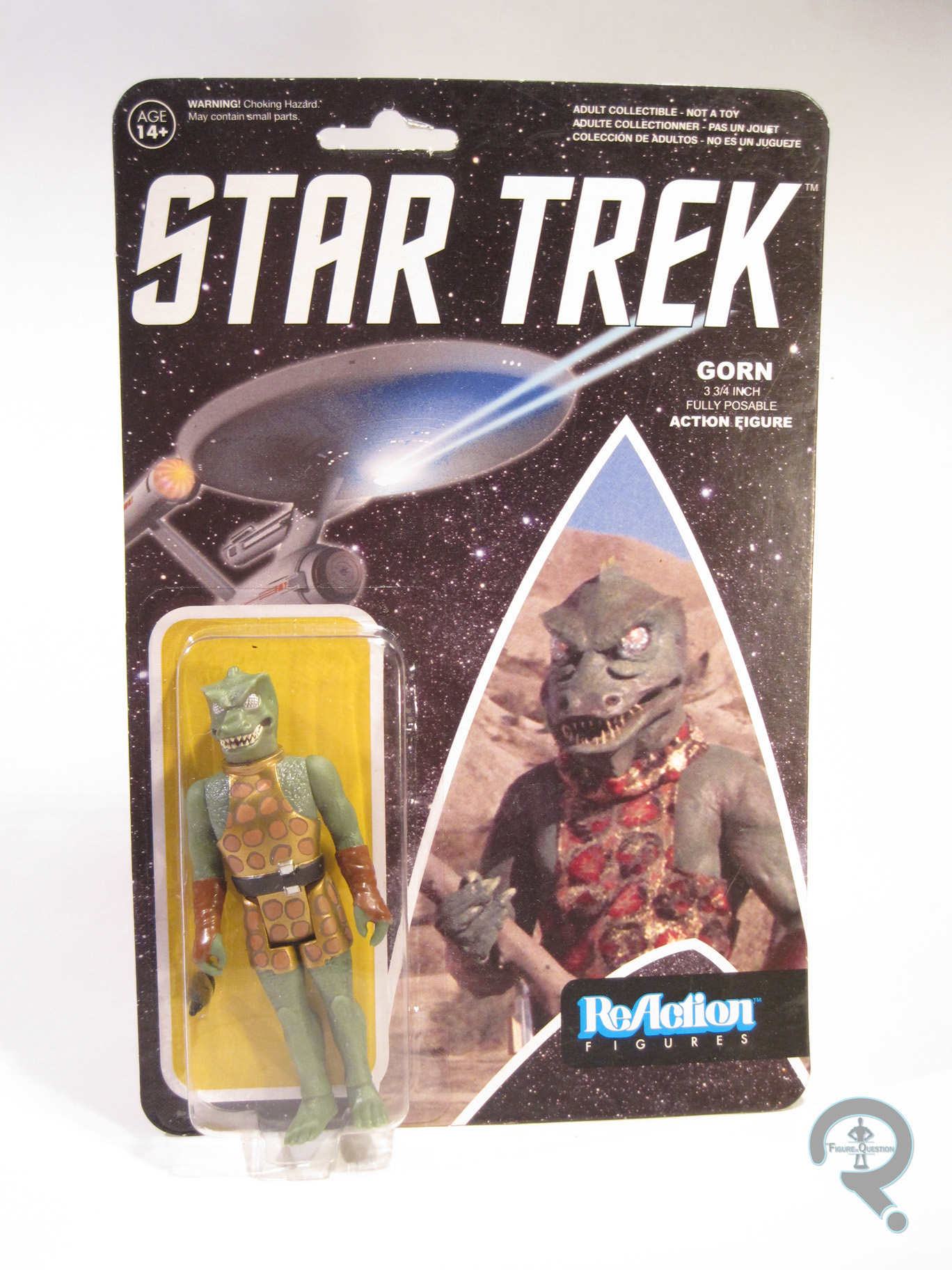
#0777: Combat Elite

COMBAT ELITE

HALO 3 (MCFARLANE)

EliteMags1

When I think Halo, my mind tends to immediately jump to the Spartans, who are the protagonists of <most> of the games in the series. The main character, Master Chief, is one of them, and the default settings for players in multiplayer games always have the player as a Spartan. They tend to get pushed to the forefront. With the exception of the three ODST reviews, all of my Halo reviews so far have looked at the Spartans. But, what good are a bunch of armored heroes without a foe to face off against? My personal favorites of those foes are the Covenant Elite, who make for the best direct parallel to the Spartans. So, let’s have a look at one of them, shall we?

THE FIGURE ITSELF

EliteMags2
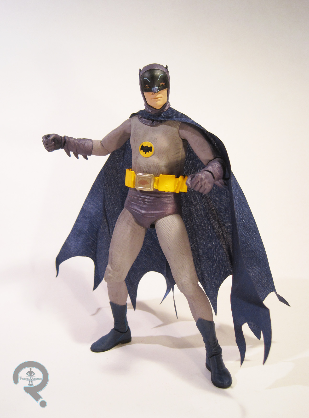
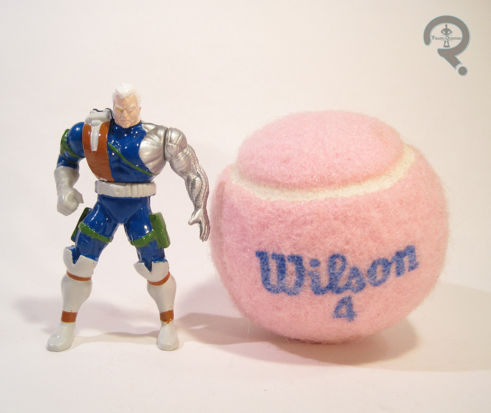
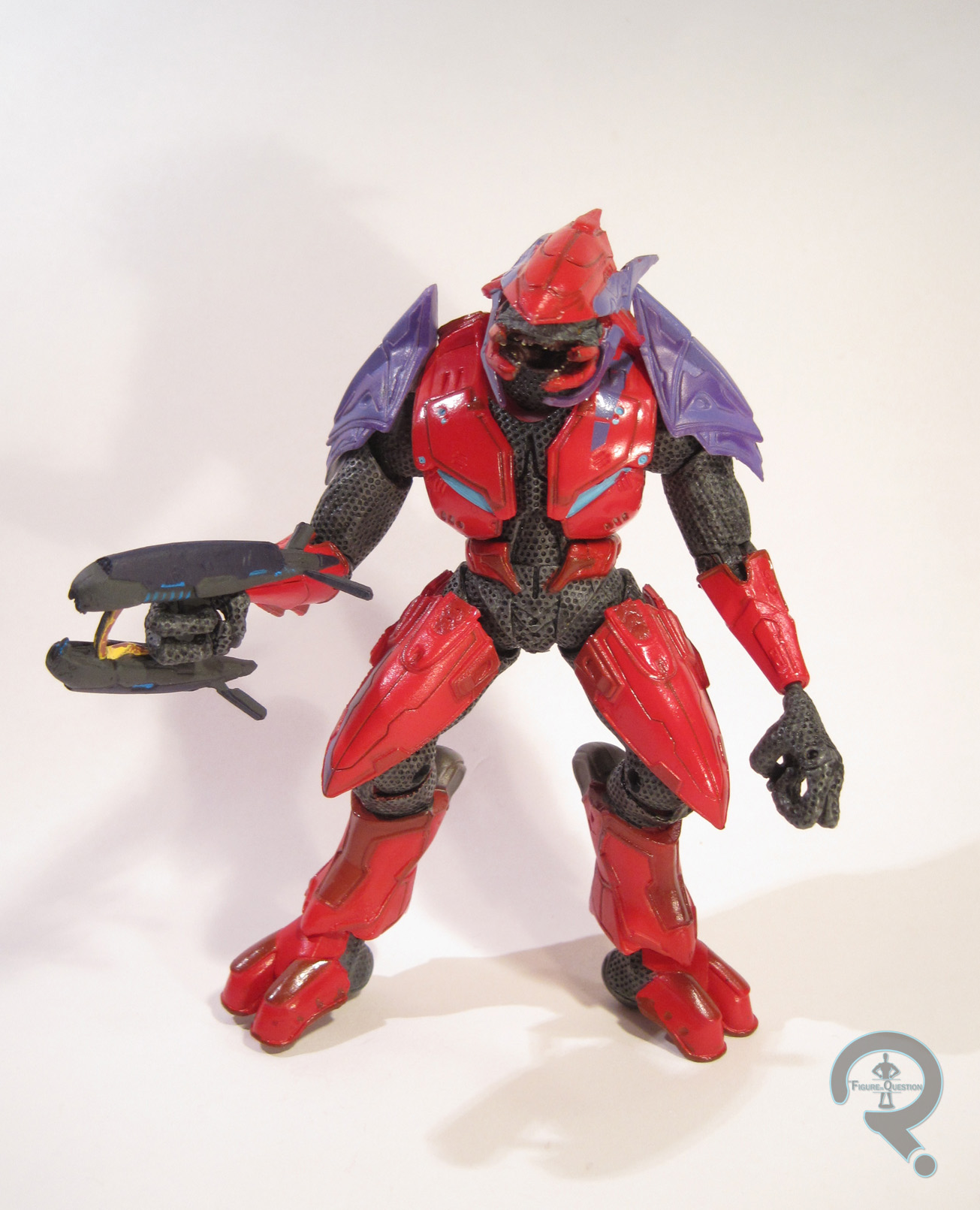
This particular Combat Elite was released as part of a Team Slayer two-pack in McFarlane Toys’ Halo 3 line. He was originally packed with a Blue Mk VI Spartan. The figure stands about 5 inches tall and has 25 points of articulation. In the games, the Elite are noticeably larger than the already massive Spartans, but that’s not quite the case with this particular figure, at least when compared to the Spartans I have from Reach, 4, and 5. To be fair to McFarlane, the scale is noticeably smaller on the Spartans from 3, so this figure would probably look a lot more menacing with them. As is, he’s not terrible, truth be told; he’s about the same height as the average newer Spartan, and he’s a bit bulkier, so it works. Just don’t put him next to, say, Jorge. He looks even better with the ODSTs! As far as sculpt goes, he’s got the same basic sculpt as all the Halo 3 Combat Elites. It’s perhaps not as fantastic as some of the more recent stuff, but it’s still no slouch. The armored parts are very clean, sharp, and mechanically detailed, and the underlying areas are covered with tons of fantastic texturing. I’d say he looks like he stepped right out of the game, but I think he might even be better than the game in terms of detail. I will say the wrists look really skinny, especially in comparison to the rest of him, but that’s my only real complaint. Paint is kind of important on a lot of these figures, since it’s the one thing that sets them apart. This Elite’s color scheme is a nice red/purple combo, which looks really sharp. And it’s not just solid red, solid purple either. No, there’s a lot of great variation in the color coded areas, which adds a nice level of depth to the figure. Plus, he’s got some great wash work to help accentuate the sculpt, which does its job well. I also love the glossy finish on the armored parts; it gives him some nice pop. The Elite’s one accessory is a standard plasma rifle, which is admirably sculpted, and sits well in his hands.

THE ME HALF OF THE EQUATION

The Combat Elite was the last piece of my Halo buying spree from this past summer. I actually got him at the same time as the recently reviewed Rookie figure. After getting that many Spartans and ODSTs, I figured I needed at least one of the Elite. So, I was looking at the various options, and this guy caught my eye. I like the color scheme, because it makes him look kinda like Magneto, so that’s kind of become his name, for me at least. I’m glad I picked this guy up, because he’s a lot of fun!

EliteMags3

#0776: Gorn

GORN

STAR TREK REACTION (FUNKO)

GornReAc3

Remember how Funko holds the license to literally everything you love? Well, you can add Star Trek to that list. Unlike a lot of the stuff Funko’s added to their various lines over the years, Trek is hardly new to the world of licensed toys. Seriously, they’ve been getting toys since the 70s! In fact, they aren’t new to 3 ¾ inch figures either. Mego did some for The Motion Picture, Ertl had a few for Star Trek III, and Galoob’s Next Generation line was that scale. Playmates’ 2009 figures were also in that scale, but the less said about them, the better. To be fair to Funko, we’ve never gotten the Classic Trek characters in the smaller scale, so their ReAction stuff is new on that count. Plus, Classic Trek is also one of the better fits for the style, especially today’s entry, the Gorn!

THE FIGURE ITSELF

GornReAc4

The Gorn is part of the second series of Funko’s Star Trek ReAction line, alongside Kirk, Scotty, and Vina. He’s based on the Gorn Captain’s appearance in the Star Trek: TOS episode “Arena.” The figure is 3 ¾ inches tall and he has the usual 5 points of articulation. He may not have a lot of articulation, but he can sit, which is something the las Gorn I looked at couldn’t. Unsurprisingly, the Gorn got an all-new sculpt. The Gorn’s somewhat goofy, guy in a rubber suit look is right up the ReAction line’s alley, and the sculpt ends up conveying the design quite nicely. He’ obviously more simplistic than the Playmates or Art Asylum versions of the character, but he’s actually got a lot of detailing for a ReAction figure. His skin has some great texture work, the crosshatch pattern on his eyes looks really great, and the detailing in his clothing is pretty sharp. I will say, the sculpt is a little odd when viewed straight on, especially the head. He ends up looking just a bit off. With a slight rotation, however, the sculpt looks pretty spot on to the design from the show. The Gorn exhibits the cleanest paintwork I’ve seen yet on a Funko figure. Pretty much all of the detail work is right where it’s supposed to be, and everything looks pretty sharp. There isn’t any slop or bleed over, or anything. Very solid work all around. ReAction figures tend to be light on accessories, and the Gorn is no exception. He’s got a stone spike, which he can hold reasonably well, and that’s it.

THE ME HALF OF THE EQUATION

When I reviewed the Playmates version of this guy, I mentioned how much I love the Gorn as a character. When Funko announced the Star Trek ReAction figures, I wasn’t overly anxious to pick them up, but as soon as I heard they were making the Gorn, I was on board. I ended up finding this guy at a Barnes and Noble on the way to North Carolina. I’m genuinely impressed by this guy. I’ve enjoyed all the ReAction figures I’ve gotten so far, but they all felt a bit behind the figures they were attempting to mimic. I think the Gorn fixes that. He’s definitely my favorite ReAction figure to date, and a pretty fun figure in general!

GornReAc1

#0775: The Punisher

PUNISHER

SPIDER-MAN (TOY BIZ)

Punisher1

The Punisher. This guy. He’s the quintessential anti-hero. He was the 90s stereotype fifteen years early. He was introduced as a Spider-Man foe in the late 70s, and he seemed to amass a fairly sizeable fan base overnight. Sure, he was never an A-lister, but people knew the guy. He’s had a whole three movies (though only two were actually released theatrically), and he’s set to play a pivotal role in the second season of Netflix’s Daredevil show. If you find Marvel related apparel, there’s like a 99% chance this guy (or his logo) will be there. Plus, he’s one of the few Marvel characters who has ever been allowed to age at a rate vaguely resembling real life. Also, I don’t really like the guy. Wait, what? Yeah, you read that right: I don’t like the Punisher. I mean, I don’t hate him, but I’ve just never seen the appeal. I did love the Punisher parody “Big Shot” for the 90s Tick cartoon, so there’s that. So, umm, let’s look at a Punisher figure?

THE FIGURE ITSELF

Punisher2The Punisher was released in Series 5 of Toy Biz’s Spider-Man line, which was based on the 90s cartoon. He’s actually the third Punisher figure they released, which doesn’t seem that odd until you realize that, at this point they had only released one single Captain America figure. Hey, it was the 90s. The figure is 5 ¼ inches tall and has 9 points of articulation. While he hails from an animated series-based toyline, he’s actually not based on the animated design (which removed a lot of the black from his costume in order to make animating him a bit easier), but rather his more standard comics look. His sculpt still takes a few key points from the anima aged look, especially the facial features, but also his general build as well. His proportions are fairly standard for the time, being rather exaggerated, though not as severely as other figures. The arms seem to get the worst of it. They’re pretty long, and those biceps are huge. Guess that’s what happens when you lug around a bunch of huge guns all the time! Beyond the proportions, the sculpt actually has some neat touches. The face definitely conveys Punisher’s less than pleasant disposition pretty well. He’s also got some cool straps and pouches, like proper 90s guy should. Punisher’s paint is the real Punisher3breaking point from the animated look; they’ve just gone for the classic black and white scheme. The paint is pretty sharply handled, and the black and white look really great together. One oddity is his five o’clock shadow, which is conveyed here as just a solid patch of grey on his lower face. To be fair, this is accurate to the cartoon, so there’s that. Punisher actually has a pretty neat assortment of accessories. While he doesn’t have a normal gun, he does have a giant missile launcher (and this was BEFORE Hasbro got the license!) with two different projectiles. He also has a headset, a shoulder holster, a knife (which fits into his leg sheath), and a pin with his logo on it.

THE ME HALF OF THE EQUATION

This is the one, single Punisher figure in my entire collection of over 3000 pieces. That’s a position that used to belong to the more cartoon-accurate repaint of this figure from one of the boxed sets, but I ended up giving that figure to a friend of mine who was a Punisher fan a few years back. I’m nice like that. I may not be a fan of the character, but I did like that figure. So, when I found this guy at a dealer’s table at this past Shoreleave, I went for it. I really love this guy. He’s kind of goofy, but in the best possible way.

#0774: Robin

ROBIN

BATMAN: ANIMATED (DCC)

TimDrake1

When Batman: The Animated Series returned as The New Batman Adventures, virtually every character was given a snazzy new design. Some were very minor updates (such as Harley Quinn), but some were pretty drastic. Robin’s new design was definitely a pretty big change from his old design, but he had a good reason: he was actually a whole new character. Yes, he was now Tim Drake, the current Robin of the comics at the time. So, how about taking a look at one his many action figures?

THE FIGURE ITSELF

TimDrake2Robin is figure #10 in DC Collectibles’ Batman: Animated line, and is technically part of the third series of the line. He’s based on Robin’s appearance in TNBA, specifically the episode “Old Wounds,” which is a little amusing, since that’s actually a Dick Grayson focused episode. I mean, Tim’s got a decent role in that one, but you’d think they’d go for something like “Sins of the Father” especially since that’s the episode Two-Face was based on. But, he doesn’t have much in the way of episode specific stuff, so it doesn’t really matter anyway. The figure is roughly 4 inches tall and he has 26 points of articulation. His sculpt is all new, and it’s a pretty great translation of his 2D show design. The sculpt is nice and cleanly handled, and the details are all pretty sharp. He does seem just a tad bit on the large side, at least compared to the Dick Grayson Robin from Series 2. He looks perfectly fine when placed next to the Series 1 Batman, which is the important thing. Also, there’s an odd, sculpt/paint combo issue. For some reason, the red from his torso continues onto his arms. It’s not noticeable TimDrake4in a straight standing pose, but when his shoulders are moved, it starts to look a bit odd. It feels like just leaving the shoulders straight black would have worked out a lot better. The rest of the paint is pretty decent. The colors are nice and bright, and the details are all nice and clean. Robin has a nice selection of accessories, including a pair of bat-cuffs, a batarang, a grappling hook, three pairs of hands (in batarang grip, loose grip, and…looser grip?), a hand with the grapple sculpted into it, and a display stand with his design sheet printed on it. Like the B:TAS Batman, he skips the extra cape, though it’s less of an issue with this guy.

THE ME HALF OF THE EQUATION

Like pretty much the entirety of this line, Robin was purchased from my local comic store, Cosmic Comix. Truth be told, I’ve always been more of a Grayson fan, but I did like a lot of what they did with Drake in the show. Plus, I’ve got both Batmen, I sort of need to have both Robins. This guy’s definitely well done, and a solid entry to the line. Definitely a step up after being somewhat let down by the second Batman!

TimDrake3

#0773: The Rookie

THE ROOKIE

HALO 3 (MCFARLANE TOYS)

RookieODST1

One of the more distinct things about Halo 3’s spin-off, Halo 3: ODST, was the diverse team of ODSTs that make up most of the game’s cast. Because of this, it can be easy to overlook the main player character from the game, simply named The Rookie. Of course, it could also be due to him being totally voiceless (aside from some heavy breathing). That might have had an effect. He was hardly overlooked in terms of toys, though, and he got three separate figures just from McFarlane alone. Today, I’ll be taking a look at the first of those.

THE FIGURE ITSELF

RookieODST2The Rookie was released as part of Series 6 of McFarlane’s Halo 3 line. He’s the second ODST soldier to see release in the line, but the first of the actual ODST characters to show up. The figure stands roughly 4 ½ inches tall and has 26 points of articulation. Unsurprisingly, this figure has more than a few parts in common with ODST Mickey. The base body on the two is pretty much identical, which is fine by me. The sculpt is still very well detailed, and the armor looks to be a pretty spot on recreation of the game armor. There are a few notable differences between the two figures, though. Where Mickey had asymmetrical shoulder pads, the Rookie has two that match. Nothing really special there, just the same shoulder pad used on both sides. He’s also got a more traditional pack on his back in place of the more tech-y thing Mickey was sporting. His right shin does not have the extra rounds seen on Mickey, but he does have a few extra pouches taped there. He’s also got another pair of pouches attached to his left thigh (seriously, what’s with all the pouches? Was Rob Liefeld involved?) and a spare grenade on the left of his belt. The Rookie is generally more balanced and symmetrical than Mickey. The most jarring change between the two figures, at least for me, is the head. The Rookie’s head isn’t simply Mickey’s with the camera removed, it’s a totally different sculpt. It’s a lot thinner, almost like it was squashed or something, and just generally doesn’t look as good. It’s passable, but could be better. The paint on the Rookie is kind of an issue, but not from a quality standpoint. The quality is fine; everything is pretty clean and the metallics look pretty awesome. However, there are a few inaccuracies with the colors chosen. Overall, he feels a little on the green side for the Rookie, who was a more subdued color in the game. In addition, he lacks the Rookie’s white helmet stripe, and the color of the chest plate is a bit too dark. The Rookie was packed with his signature suppressed SMG, as well as a piece of the build-an-insigna thing that McFaralne did.

THE ME HALF OF THE EQUATION

The Rookie was one of the last purchases in my grand Halo action figure splurge over the summer. He was bought from the same eBay seller from whom I got a lot of my other figures, for a surprisingly reasonable price given the aftermarket value on this figure. He’s not quite as strong a figure as Mickey, but I’m still happy to have him, and he looks pretty sweet with the rest of my Halo stuff!

RookieODST3

#0771: Glow in the Dark Alien

ALIEN – GLOW-IN-THE-DARK

ALIENS MINIMATES

BigChapGiD1

Long before Minimates, the frightening titular character of ALIEN found its way to toy shelves in the form of the legendary 18-inch Alien figure, courtesy of Kenner Toys. The figure was quickly pulled from shelves, no doubt due to the nightmares it caused for many an unsuspecting child, and has become one of the bigger grails of toy-collecting. Now, 35 years later, DST pays tribute to that figure with this San Diego Comic Con exclusive!

THE FIGURE ITSELF

BigChapGiD2As noted in the intro, the Alien was released at this year’s SDCC, as part of the greater Aliens Minimates line.  I don’t often talk packaging, but I will here.  For many figures, the package is just the way to transport the figure from the store to the costumer in a nice, flashy way. However, this figure’s packaging is actually a pretty important piece of the figure. The basic layout of the packaging is more or less the same as the single packaging for the Aliens vs Marines Army Dump case, but it’s been done up with graphics meant to replicate the original 18-inch Alien’s box. It features that bright ‘70s blue, the old Kenner ALIEN logo, and an assortment of screen shots from the film. The Big Chap’s a little crowed in there, but the box does a great job of giving a nod to that which came before.  While most of the Xenomorphs we’ve seen so far have taken inspiration from the second film’s design for the creature, this one, like the 35th Anniversary Boxed Set, takes influence from the creature’s very first appearance in 1979’s ALIEN. It’s not leaps and bounds of differences from the later design, but it’s enough that even moderate fans of the films could probably discern between the two.  Like his second film-based brethren, the Big Chap has sculpted add-ons for his head, hands, tail and feet. All of these parts but the head are the same ones used for all of the other aliens. Those parts were good on all of the others, and they continue to be good here. The only minor nit is that the hand should technically be different to be accurate to the Big Chap design, since these use the Aliens three-fingered design, rather than the ALIEN six-fingered design. However, at this scale, that’s a minor issue. The head was initially used on the 35th Anniversary set Alien, and it does a very nice job of replicating the movie’s domed look. While the 35th Anniversary version had the dome glued in place, this version leaves the part loose, so that you can remove it to better see the cool skull design below. It means that the dome doesn’t always stay in place the best, but that feels like a reasonable enough trade-off.  The figure’s paintwork is where his main draw comes into play. The BigChapGiDPack1main detailing of the body is similar to the previous aliens, but the silver is a bit brighter, which certainly sets him apart. The other main draw is the paint on the skull under the dome, which is glow-in-the-dark, as the name of the figure indicates. It requires a bit of “charging” under a light source, but once that’s done, it makes for a pretty eerie effect. The figure’s only accessory is a clear display stand. However, as with all of the prior aliens, the number of sculpted pieces more than makes up for the lack of extras.


THE ME HALF OF THE EQUATION

Frequent readers of the site will recall that I did not attend SDCC, so I clearly didn’t pick this guy up there.  No, I actually ordered him from Luke’s Toy Store after the event.  I was actually pretty excited for this figure; the Aliens Minimates in general are a pretty exciting thing, but I liked the whole tribute bit.  This figure isn’t exactly new or anything, but it’s a fun variant of an already great figure.

BigChapGiD7


#0770: Batman

BATMAN

BATMAN: CLASSIC TV SERIES (NECA)

Batman66a

So, can we just have it put down in writing that NECA are just the most successful bunch of miracle workers of all time? Because these dudes continue to do the seemingly impossible. Between Mattel and DC Collectibles, the DC license is pretty well tied up for most conventional scales. The best NECA could do was grab the ¼ scale license. That’s cool and their sculpts were always really well handled, but 18 inch figures can be a bit unwieldy for the average collector. NECA’s usual 7 inch scale works much better. Last year, through some crazy loopholery, they were able to get a Michael Keaton Batman released at the smaller scale, thanks to some help from Warner Brothers. This year, they’ve decided to top even themselves, offering three more DC figures, including today’s focus figure, Adam West as Batman.

THE FIGURE ITSELF

Batman66bBatman was released alongside Superman and Joker, but there isn’t really one overarching name for the line. He was produced by NECA and distributed as part of a DVD-based promotion by Warner Brothers. The figure stands just over 7 inches tall and has 28 points of articulation. He is, of course, based on Adam West’s performance as the character in the 1960s Batman show. The other 7-inch figures are all more or less just scaled down versions of the 18 inch figures, but Batman’s been tweaked ever so slightly. It’s really just been done to change the articulation scheme. The 18 inch West had a few extra joints, which may not have translated quite as well to the smaller scale. It’s not a huge loss, though, since he’s still on par with the average NECA release, so he’s plenty posable. As far as the actual sculpt goes,this guy’s just fantastic. The likeness on the head is definitely West, and the cowl piece over top is a near perfect replica of that from the show. The body sculpt captures West’s build really nicely (something I felt the Hot Toys version was unable to do), and the level of detail and texturing on the costume is great. The only real drawback to this figure is the cape, which is just a simple piece of shiny blue fabric. Still, it hangs decently enough and looks alright, so it hardly ruins the figure. It seems impossible to talk about this figure without at least mentioning the Mattel version. I’ve included a comparison shot, because the level of difference between these two Batman66dhas to be seen to be believed. Absolutely night and day. Topping off this fantastic sculpt is a pretty awesome paint job. It’s not perfect, mind you. There’s a little bit of slop here and there, and I had to choose the better of the two available paint jobs. However, the overall look of this guy is just spot on, and there are several bits that sport some really great detail work. The 18 inch version of this guy came pretty well packed with extras. This guy understandably notches that back a bit, but he still has a spare set of hands in gripping/relaxed poses, a batarang, and a bat-radio transmitter. That’s a pretty good selection.

THE ME HALF OF THE EQUATION

Somewhat unusually for someone my age, I love the 60s Batman show. I was really excited when Mattel announced their line of 6 inch figures, but was ultimately a bit let down by the final product. So, when word broke about NECA’s version hitting Toys R Us, I ran right out to get this guy, and lucked into one on my first stop. Little did I know he’d be such a hot commodity. It’s understandable, because this is easily the best figure of West as Batman available.

Batman66f

#0769: Cable & Stryfe

CABLE VS STRYFE

X-MEN: STEEL MUTANTS

CableStryfe1

The X-Men were so popular in the 90s that they not only had two books of their own, but also a whopping three spin-off titles. Two of those, Excalibur and X-Factor, had been launched in the 80s, and the other, X-Force, was a rebranding of the New Mutants in order to make them more “extreme.” This included adding Cable, a dude who’s mutant power was apparently being a big dude with a gun, aka being the personification of 90s comics. Cable had a twin/clone, called Stryfe. Let’s look at some figures of those two today!

THE FIGURES THEMSELVES

This pair was released in the second series of Toy Biz’s X-Men: Steel Mutants line, because apparently the X-Men just weren’t 90s enough.

CABLE

CableStryfe2Oh man, here’s Cable. Why’s he called Cable? God only knows. Maybe he used to work for Comcast. That would certainly explain his surly nature. The figure stands 2 ½ inches tall and he has 4 points of articulation. Cable had quite a few figures in the 5 inch X-Force line, and this one uses Series 2’s Rapid Rocket Firing Cable as sort of a reference point. I don’t know if it’s based on a specific look, but it does present a slightly more subdued look for the character than usual. He doesn’t even have shoulder pads! His sculpt is generally pretty well handled. He’s got a good amount of detail, and his build does set him apart from the other figures in the line. Plus, I do dig that assymetry. His pose is pretty straight forward, with no real outlandish poising or anything, and he’s decently balanced, so there are no issues with getting him to stand. Cable’s paint is pretty much on par with the rest of the Steel Mutants. There’s a fair degree of bleed over around the edges, but he doesn’t look atrocious. The colors are pretty well chosen, and he looks pretty sharp.

STRYFE

CableStryfe3Yes, you read that name right. He’s named Stryfe. And it’s spelled with a “y.” Because 90s. Strule also stands roughly 2 ½ inches tall and has those same 4 points of articulation. Stryfe is presented here in full 90s glory. Check out that head gear. Seriously, that helmet looks like Liefeld deliberately set out to out-Wolverine Wolverine. I suppose they succeeded in that effort. Doesn’t make it look any less stupid, but more power to him. He appears to be inspired by the Stryfe figure in the 5-inch line, though he’s lost most of that figure’s interesting armor detailing, which has the unintended side effect of drawing more attention to just how goofy the main design of the character is. It doesn’t help matters that his sculpt is just markedly inferior to that of his pack mate. Cable is nicely sized, full of detail, and not in a super goofy pose. Stryfe is the opposite of those things. The size is particularly egregious, since he’s a clone of Cable, and should therefore be about the same size. That coupled with the long monkey arms, the strange lunging pose of the legs, and the ill-fitting cape makes for a really rough looking figure. The paint doesn’t really do him any favors either. He’s mostly a somewhat drab silver, which only further highlights the blandness of the sculpt. It is, at the very least, clean, which I suppose is a plus.

THE ME HALF OF THE EQUATION

This pair was purchased for me from Yesterday’s Fun, alongside the previously reviewed Cyclops and Mr. Sinister set, courtesy of my Super Awesome Girlfriend. Unlike the other set, I never had either of these guys growing up. In fact, this set represents the first, and to date only, Stryfe figure in my collection. So, there’s that. Cable is a pretty solid figure, but Stryfe is easily one of the weakest figures this line had to offer, resulting in an oddly balanced set.

#0768: Captain Cold

CAPTAIN COLD

THE FLASH (DC COLLECTIBLES)

CapCold1

Well, CW’s The Flash successfully made its way all the way through its first season and is now halfway through its second. It’s not a perfect show (few shows are), but it’s been a lot of fun, just all throughout. The series’ cast of regular characters have a lot to do with that, but they don’t do it all on their own; they get by with a little help from their… guest stars, who, more often than not, are playing members of the Flash’s oh so awesome rogues gallery. One of the most prominent, most recurring of those rogues is Captain Cold, who’s proved to be quite the popular character. He’s even getting an expanded role on the upcoming Legends of Tomorrow spin-off. So, what better to celebrate that than an awesome action figure?

THE FIGURE ITSELF

CapCold2Captain Cold was released earlier this year as figure 02 in DC Collectibles’ The Flash line. He follows the Flash, and precedes his frequent partner in crime, Heatwave. The figures stands about 6 ¾ inches tall (he’s just a little taller than Flash) and has 30 points of articulation. The range of motion on the joints is a little restricted, but I found Cold to be easier to pose than Flash, so that’s good. Captain Cold is based on his most frequent appearance from the show, which is his fur-lined blue parka look. It’s a pretty nice callback to his comics design, while still being reasonably practical in a real world setting. This figure’s sculpt is all-new, and it’s pretty reasonably handled, though it isn’t without its drawbacks. The articulation is mostly worked in well, but the ankle joints are a little rough, and his feet almost look like they belong on another figure. Also, there’s no way that this guy can get his arms close enough to his chest for a two-handed hold on his gun, so you’ll just have to pick one side or another. The hood is probably my least favorite aspect of the figure. It’s permanently up, for one thing. You can sort of pull it back behind his head, but it’ll want to go back into place. I feel the figure might have been helped by a separate hood piece that could be swapped for one that was folded down. Plus, the fur lining looks more like a poor CGI rendering of a fur lining than the real thing. The rest of the sculpt is actually pretty good. The texturing on the clothing is very nicely handled, and there’s a fully detailed shirt under the coat. The head gives us a pretty spot-on likeness of Cold’s actor, Wentworth Miller. He doesn’t quite have Miller’s intense stare, but I think that’s more a result of the goggles. Cold’s paintwork isn’t the most exciting paint ever, but it’s quite nicely done. Everything’s pretty clean, and there’s lots of nice accent work for the sculpt’s finer details. Captain Cold is packed with his trusty cold gun, as well as two pairs of hands (gripping and fists).

THE ME HALF OF THE EQUATION

I actually wasn’t sure I was going to get Captain Cold when he was announced, and even less sure after not being wowed by The Flash figure DCC put out, but I really found myself liking the character on the show a whole lot. So, when he showed up at my local comic book store, I happily picked him up. I’m glad I stuck with the line. Cold still isn’t a perfect figure, but he’s a definite step up from Flash, and shows that the line is definitely going in the right direction. I can’t wait to see who else we get!

CapCold3

#0767: Batman Beyond

BATMAN BEYOND

DC COMICS MULTIVERSE (MATTEL)

BatBeyondDCM1

Uh oh. It’s a Mattel figure. This can’t be good. Okay, that’s not entirely true or fair. Mattel figures have the potential to be good, or even on the rare occasion great. In fact, most are at least passable, but some aren’t. And also, I don’t like Mattel as a company, for a whole slew of reasons, chief among them being that a whole lot of their products just feel so lazy. In fact, in the last year, I believe I’ve bought a whole four Mattel figures, mostly due to the vast majority of their output being rather dull. One of those four figures is today’s entry, Batman Beyond. Let’s see how he turned out.

THE FIGURE ITSELF

BatBeyondDCM2Batman Beyond is part of Mattel’s DC Comics Multiverse line. The line doesn’t really have traditional series to speak of, but BB was released in the last year of the line. He’s part of the Arkham City sub-set, and is based on one of the alt looks for Batman from the game, rather than being an actual Terry McGuinness Batman Beyond. The figure stands 3 ¾ inches tall and has 18 points of articulation. The layout of the articulation is the same as both the Christopher Reeve Superman and Arkham Knight Robin figures. It’s not the worst articulation ever, but it could really, really use some sort of upper arm swivel and a mid-torso joint. The current layout leaves him a little stiff looking. In general, the sculpt of this figure feels pretty stiff and somewhat oddly proportioned. Some of that, such as the small head and larger hands, are at least partly present in the game design, but some of it’s just weird sculpting. Like Robin and Superman before him, the figure’s waist just sits too low, which looks really odd. Also, it looks like BB’s got at least a few parts in common with several of the previous Batmen. Because of this, he still has the usual Batman boots, which aren’t accurate to the design, as well as a weird shoulder piece that looks like it should have a cape or something attached, but it doesn’t, which is reasonable, since BB’s not supposed to have a cape anyway. Since one of the draws of Batman Beyond is his sleek design, these issues with the re-used pieces jump out a lot more than they would otherwise. BB does get his own head, belt, and forearms, which all do a pretty great job of capturing those parts of his design, and blend pretty decently with the rest of the sculpt. BB’s paint is one of his stronger suits. Everything is pretty cleanly handled, and his emblem in particular is nice and crisp, and really stands out well from the rest of the figure. BB has no accessories, which isn’t out of the ordinary for a Multiverse figure, but remains annoying given the price of the figure and the fact that he re-uses quite a few pieces.

THE ME HALF OF THE EQUATION

Remember how I was done with DC Comics Multiverse? Yeah, that seems increasingly incorrect. When I was down in North Carolina visiting family, I ended up finding this guy on a grocery run. I’ve always had a soft spot for the Batman Beyond design, and Super Awesome Girlfriend was there with me, so there really wasn’t a chance I was saying no to this one. He’s a flawed figure to be sure, and definitely reminds me of why I don’t really do Mattel figures anymore, but he’s Batman Beyond, which does a lot to outweigh some of the cons.