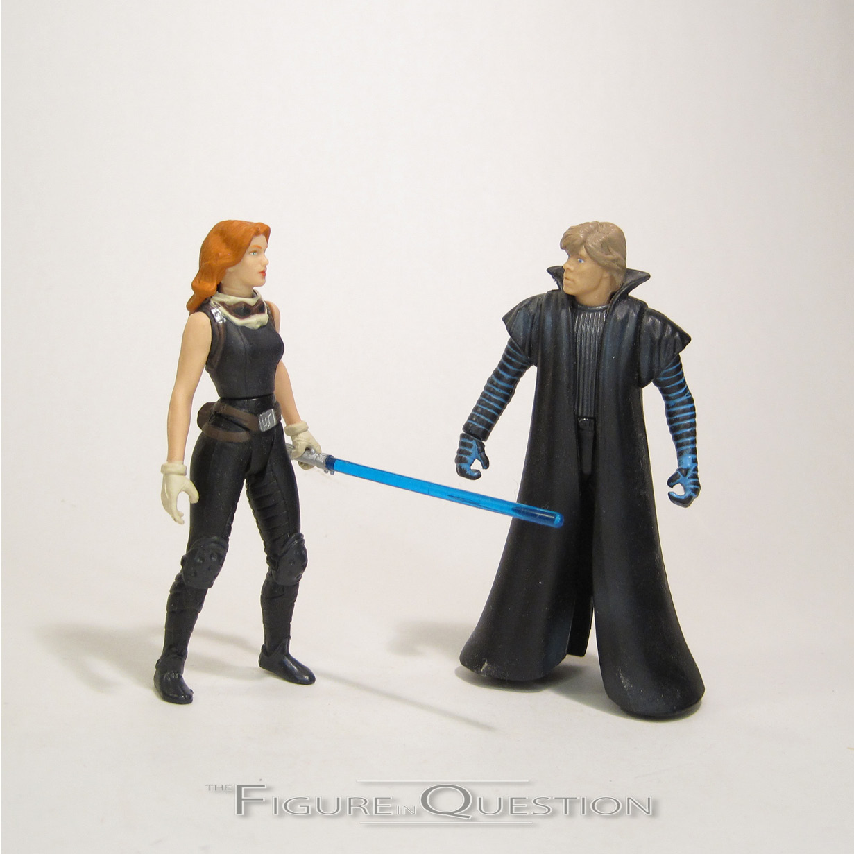
MAGNETO & PROFESSOR X
MARVEL LEGENDS (HASBRO)
“Magneto and Professor X clash in a struggle that will impact the future of all mankind.”
This year, the X-Men movie franchise turned 20. It may have been easy to miss, what with the world falling apart and time being an illusion for most of the year. Also, the movie franchise having died a kind of whimpering death in the last two years. That may have somewhat contributed. With Fox purchased by Disney, and all of the rights for the movies back under the main Marvel branding again, we’re finally getting to see proper merchandising (outside of Minimates) for the first time since…gosh…Origins? Yikes, that’s a sad one to leave off on. Hasbro’s got a whole sub-set of figures devoted to the films, picking and choosing a bit from the whole of the franchise. They’ve tried to stick with some of the broadest characters at the start, opting for characters who stuck it out the whole time, and really, whose broader than Magneto and Professor X, whose turbulent relationship has formed the back bone of most of the films?
THE FIGURES THEMSELVES
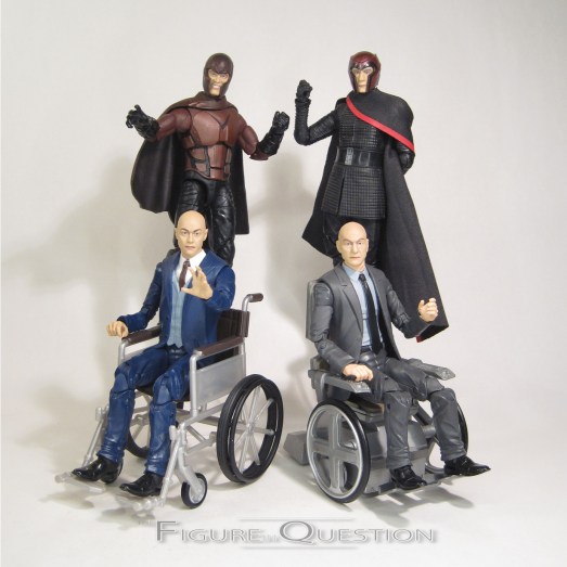
Magneto and Professor X are one of the pair of two-packs in the X-Men Movie sub-line of Marvel Legends. Unlike the rest of the stuff we’ve gotten, where there’s been a single movie focus, these two are meant to cover multiple films, and indeed multiple actors. It gets…well, it gets a little wonky, but it’s best to bring it up in the figure’s respective sections.
MAGNETO
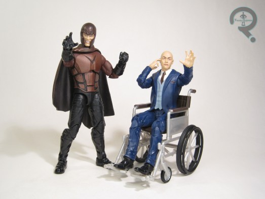
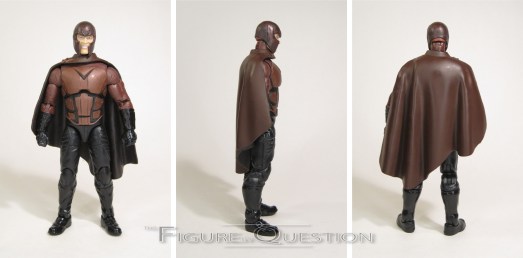
 As Ian McKellen, Magneto was decently served by prior X-Men movie toys, getting coverage from both the first film and X2, but as Michael Fassbender, he’s only gotten Minimates up until now. This figure is actually pretty targeted in terms of design, at least at his core, being based on Magneto’s fully geared up appearance from the ’70s portion of Days of Future Past. It’s not just a good look, it’s arguably Magneto’s best look in the movies, and one of my favorite designs spawned from the whole of the X-films. It’s also very toy friendly, so that’s always a good starting point. The figure is 6 1/4 inches tall and he has 31 points of articulation. The articulation on this guy is a little bit stiff compared to other recent Legends figures, notably in the shoulder and elbow area. It’s not terrible, but I did have a little difficulty getting him into some poses. The sculpt on this guy is all new, and makes use of the new “pinless” style joints for the elbows and knees, which certainly do make it look more cohesive. Generally, I quite like how this sculpt turned out. The costume is well-crafted, and replicates the various layers and textures of the costume from the movie, and translates them pretty well into plastic form. The actual build on the body under said costume isn’t quite as spot-on. The body’s generally just a bit bulkier than Fassbender in Days, which makes the arms look a little bit stubbier than they should. The head also sits a touch higher on the neck than it should, as well, which requires some more careful posing to not look goofy. All that’s pretty minor, though. My biggest issue with the figure lies with the primary, helmeted Fassbender head. The helmet’s great, and the Fassbender likeness on the head beneath it’s not bad either, but for some reason, they opted to give him a weird teeth baring expression, which doesn’t really feel right for Fassbender’s take on the character. It’s not terrible,
  but it’s not quite what I want. In terms of paint, the figure’s actually pretty solid. There’s not a ton going on, but what’s there is a good replication of the film design. Magneto includes two sets of hands in open in closed poses, as well as an alternate un-helmeted head. The second head is a nice piece, with a strong Fassbender likeness, and a much calmer expression. I kind of wish the helmeted head matched, and I’m tempted to try and find extras of the two heads to kitbash my own. This set’s big claim to fame when Hasbro showed it off at Toy Fair this year was its ability to double as multiple versions of the two characters, across their multiple actors. To facilitate this, there are also two Ian McKellen heads included, one helmeted and one not. And, would you look at that? They both have the same expression, unlike the Fassbender heads. Why couldn’t they just keep that consistency across the board? In general, the McKellen heads are a bit of a cheat, of course, since he never wore anything remotely like Fassbender’s costume in the movies. That said, what he did wear is rather easy to approximate on your own, so just getting the heads is still a nice touch.
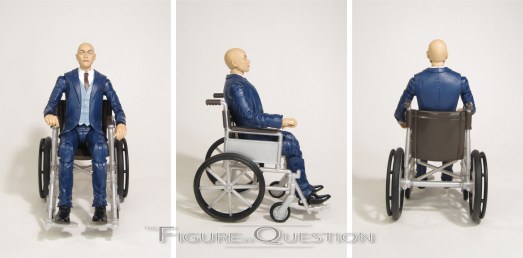
PROFESSOR X
 Much like the McKellen/Fassbender split on figures above, Patrick Stewart’s Xavier got some toy coverage early on in the X-Men movie run, but James McAvoy’s take wasn’t quite so lucky. Unlike Magneto, this figure’s a far less targeted offering when it comes to the design. In fact, it’s…well, it’s a bit of a mess. I’ll get into the “why” in a moment. The figure is 6 1/4 inches tall standing (obviously less sitting, of course) and he has 32 points of articulation. He’s built on the Coulson-style suit body, with a new jacket piece that’s got the vest underneath. There are also two heads included, one of McAvoy and one of Stewart. Both likenesses are pretty strong, so I’ve definitely got to give Hasbro credit on that. McAvoy’s is bald, indicating that this figure is supposed to be post Apocalypse version of him. The blue suit set up of the figure supports that, and is also sensible given that it’s the same style of suit that Stewart’s version of the character typically wore. It’s a little weird from the perspective of it meaning that he doesn’t at all match the Magneto he’s packed with, but if we’re going for iconic looks, I guess this makes more sense. The new jacket/vest piece is pretty nice, and is actually sculpted to allow a more proper seated position as well, which is a nice touch. In terms of paint work, he’s again pretty basic, but also pretty good. Both heads look pretty life like, and I can certainly get behind them. Okay, now
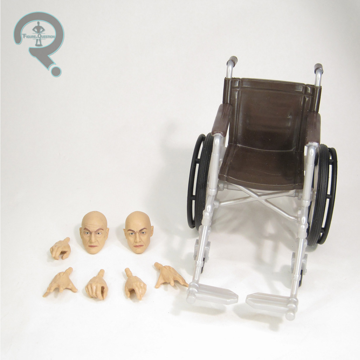
  let’s tackle the rough stuff: the accessories. So, remember how I mentioned the whole thing about this being a post-Apocalypse McAvoy? Or even a movies 1-3 Stewart? You know what completely wrecks that set-up? The chair. Stewart has the same chair in the first three movies, and the same chair is used by McAvoy in First Class and Days of Future Past, and then again at the tail end of Apocalypse when he’s got the fully classic Xavier look again. That’s not the chair included here. Instead, we get a more generic wheel chair, which is in fact shared with the Old Man version of Charles from the Logan two-pack. Logan is the only time that Stewart’s Xavier used such a chair, and he’s obviously not in the full suit and tie. McAvoy’s Xavier uses such a chair in the climax of Days, but he’s wearing a tweed jacket and sweater, and is also still sporting the hair and beard. So, this chair matches nothing about the figure. I also found it interesting that, while the Magneto gets four different heads, Xavier only gets the two. If we got a McAvoy head with the hair and beard, we could at least sort of approximate Xavier from the climax of Days (which would also help him match Magneto), thereby making the chair less inaccurate. Generally, the lack of McAvoy heads covering his evolving hair styles from the films kind of takes the wind out of the sails of this whole “cross movie” thing this set was sold on. At least the chair is a nice chair, I guess, even if it’s inaccurate. He also gets a selection of extra hands, which do make for some good posing options.
THE ME HALF OF THE EQUATION
This set is by far the piece I was most looking forward to out of all of the X-Men movie stuff. Days‘ take on Magneto is, as noted above, a favorite of mine, and I’ve been wanting a proper figure of it for a while. This one’s not without his flaws, and I’m definitely not big on that helmeted facial expression, but the overall figure is still pretty cool, and certainly better than not having him at all. The McKellen heads aren’t really meant for this body, but they do look really cool, and make for an easier time building your own. Xavier’s shakier than Magneto for sure. The core body’s fine, and both heads are pretty nice, but that chair’s just wrong, and the fact that he doesn’t line-up with the Magneto at all in terms of looks makes the whole two-pack aspect of this pair seem slightly forced. Still, it’s not a bad pair, and there’s certainly a lot more good than bad in this set. Overall, it’s still my favorite piece out of the bunch, so I can’t really complain.
Thanks to my sponsors at All Time Toys for setting me up with this set for review. If you’re looking for Marvel Legends, or other toys both old and new, please check out their website and their eBay storefront.


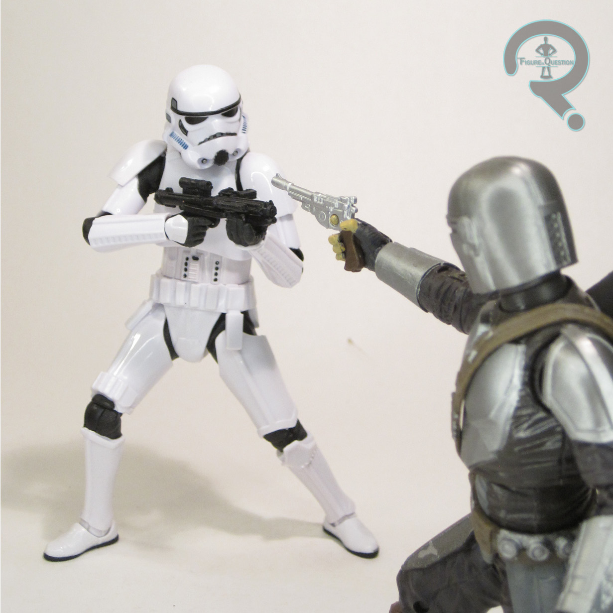
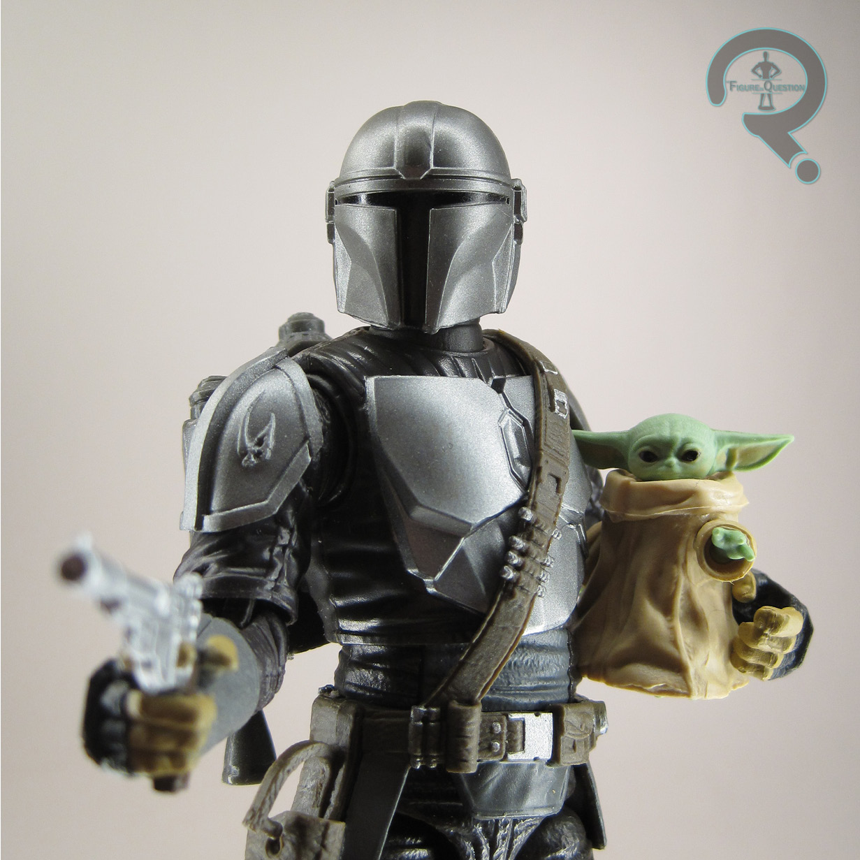
 The Imperial Stormtrooper is, much like yesterday’s Mando, part of the first wave of the relaunched Black Series. He too is from The Mandalorian sub-set of figures, where he’s figure #02. He’s officially based on the trooper design from the show (and Rogue One, since they use the same armor), but he works as a pretty basic OT-era Stormtrooper just in general. The figure stands 6 inches tall and he has 29 points of articulation. The original Stormtrooper was the most posable figure in the line at the time of his release, but that was at the sacrifice of appearance, as a good number of those joints really jumped out off of the figure. This one takes a page out of the recent Clone Trooper page and does a total overhaul on the movement scheme. The joints are granted a much larger range of motion, while also being a bit more cleverly hidden, though use of actual armor plates that are separate pieces, rather than just sculpting them
 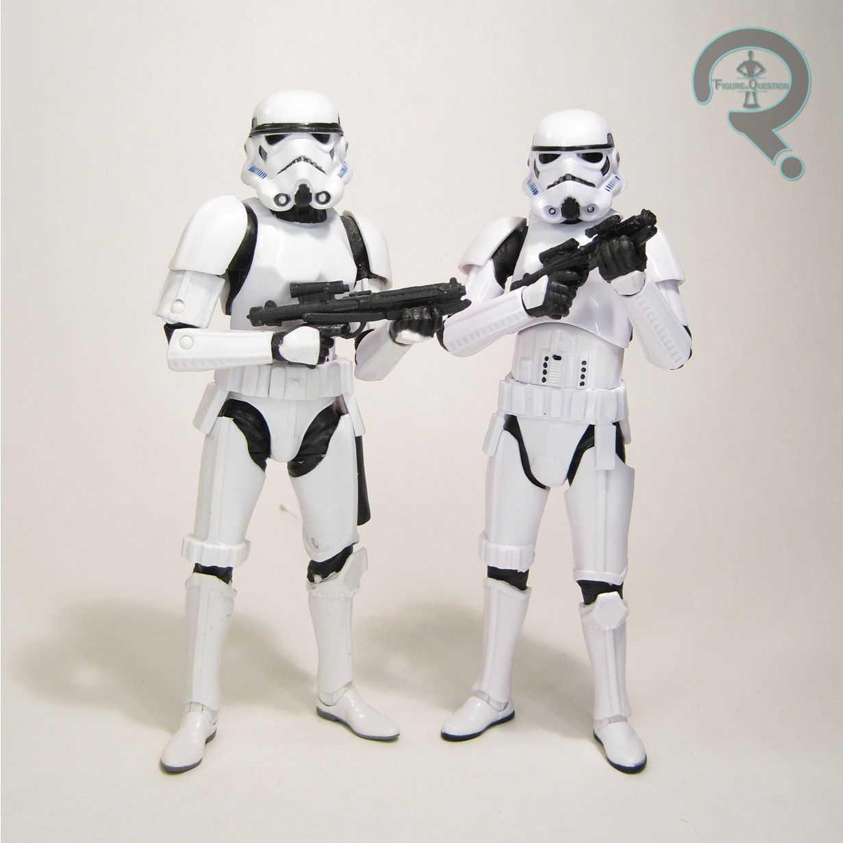 right onto the body. This results in there being much more depth to the sculpt, which helps the give it a more realistic quality. The helmet gets a re-work, so that now, instead of being a solid piece, it’s an actual helmet sitting on a head. The head’s the same as the Clone Trooper, but at least this way we know there’s some consistency in sizing and design, and we won’t be faced with the same issues the original body had when the repurposed it for Luke and Han. The helmet also seems to be just a touch more screen accurate than the original. In general, the armor on this guy is a little closer to the movies and a little bit sharper in terms of detailing. It’s just an overall slicker appearance. The Stormtrooper’s paint work is pretty decent. Fairly minimal, since the separate construction of the body and the armor allows for them to each be molded in the proper colors, but the accents look nice and sharp. The Stormtrooper is packed with a single blaster rifle. It’s a new piece, and certainly a nice one, though it’s kind of a shame that we’re down to just one accessory on these guys.