JEAN GREY
MARVEL UNIVERSE 10-INCH (TOY BIZ)

“When the X-Men investigate a rash of mutant disappearances, they find that crime fighter Daredevil is working on the same case. Tracking down clues connected to the crimes takes Daredevil and Wolverine to an abandoned chemical factory while Jean Grey and Professor X use their incredible psi-talents to locate the kidnapped mutants inside. Battling and defeating their captors, the X-Men and Daredevil are able to give the kidnapped mutants back their freedom.”
I know I just got through reviewing a ton of X-Men figures but I’m gonna review another one. Why? Because this is my site and I do what I want. Also because this figure was the next on the randomized list that tells me what figures to review. Don’t let that undermine my previous statement. Anyway, today I’ll be looking at founding X-Men member, Jean Grey!
THE FIGURE ITSELF
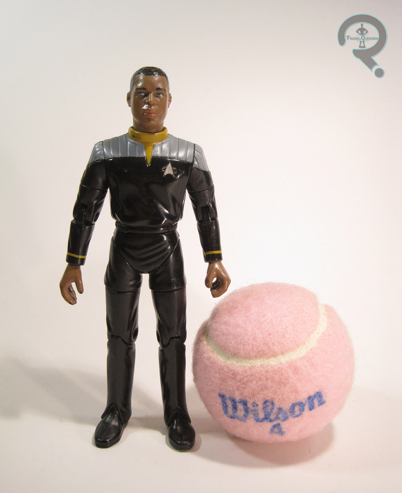
 Jean Grey was released in 1997 as part of Toy Biz’s 10-Inch-scaled Marvel Universe line. As the bio might have clued you in, she was released alongside Daredevil and Professor X (the both had matching bios). Wolverine is also mentioned, but I wasn’t able to find any reference to a specific Wolverine that had this matching bio, so it’s possible they were just counting on kids to already have a Wolverine. Jean is based on her Jim Lee-designed look from the ‘90s, which was an oddly rare design to see at the time. Not exactly her most attractive design, but it was the one on the cartoon (more or less). This figure stands about 9 1/2 inches tall and has 9 points of articulation. Jean, like all but one of the female figures from this line, is a repaint of the X-Men line’s Rogue figure (which was a larger scale version of the 5-inch figure I just reviewed). It wasn’t an ideal set-up, since Rogue and Jean aren’t *that* similar in design, especially in their Jim Lee costumes. That being said, I suppose it could have been worse. Jean’s aided by the fact that she ditches the belt and coat from Rogue (which is better than can be said for Polaris or Mystique), which at least gives her a different silhouette than Rogue. The proportions on this figure are passable. Obviously, they’re rather off, but in the context of the rest of the line, they don’t look too bad. The paint carries most of the weight of turing this figure into Jean Grey. It’s okay, I guess. They try to use the paint to make her costume look more appropriate. It’s not awful on the head, where the only real issue is the texture of the headband not matching the rest. The shoulders should technically be raised shoulder pads, but even that doesn’t look so bad. It really starts to fall apart with the wrist bands, which not only paint over the cuffs of the gloves as if they aren’t there, they also don’t even try to follow the shaping of the wrists from the comic design. There is similarly do nothing to hide the tops of Rogue’s boots; I get that new tooling was out of the option, but at least the other figures to use this body did some slight tweaking to try and include the boots organically. They look really weird totally unpainted. Jean’s one accessory was a….big…bazooka? You know, that bazooka thing that Jean always hauled around in the ‘90s!
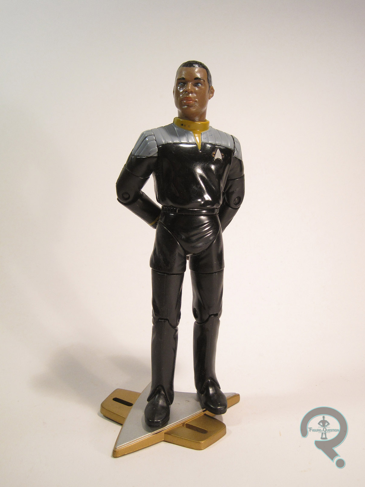
THE ME HALF OF THE EQUATION
When I was growing up, my Dad had his own small collection of 10-inch figures (in retrospect, three of them were Jean, Professor X, and Yellow Daredevil, all of whom were part of this same subset). Eventually, they were passed on to me. Even as a kid, I always found Jean to be one of the weaker 10-inch figures that Toy Biz released. Making an important character like Jean nothing more than a cheap repaint was seriously messed up. She’s alright, I guess, but really, really, really, really disappointing.