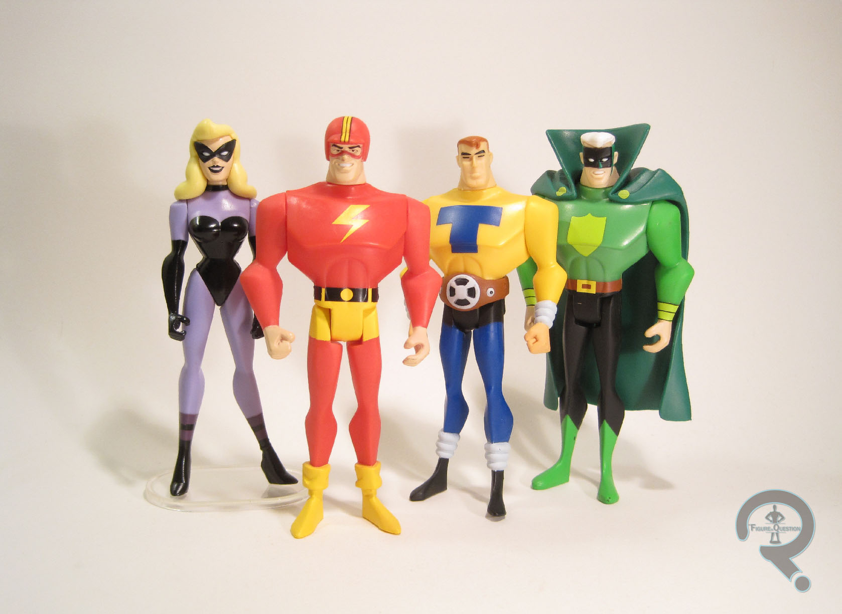
THE STREAK, TOM TURBINE, BLACK SIREN, & GREEN GUARDSMAN
JUSTICE LEAGUE UNLIMITED (MATTEL)

Some of the best characters are the ones that come about because creative teams aren’t allowed to use a pre-existing character. One of the most famous examples of this is Watchmen, which was originally meant to make use of DC’s recently acquired Charlton characters. DC seems to do this to their creators rather frequently, as this also cropped up a few times during the course of the DC Animated Universe. My particular favorite of these was The Justice Guild of America, from the Justice League episode “Legends.” The episode was originally drafted with the Justice Society in mind, but was ultimately changed when DC decided the direction of the story didn’t fit how they wanted the JSA portrayed. Fortunately, this worked out pretty well, as it gave the creators more free reign with the characters, and resulted in one of the most entertaining entries in Justice League.
THE FIGURES THEMSELVES
These four were released as one of Matty Collector-exclusive four-packs from Mattel’s Justice League Unlimited line. Now, it’s a Mattel review, so you’re probably already expecting a bit of Mattel hate. Well, here it is: Who in their right mind releases a four-pack based on a five member team? On top of that, one of the four members released here is Black Siren, who is part of a duo with the unreleased member Catman. The back of her box even has Catman in both of the screen shots of her! Were they just rubbing it in our faces? Seeing as the four-packs were actually just four single-carded figures packed together, and thus there wasn’t an issue of needing to redo the packaging, couldn’t they just have made this a five-pack? Or, if they really felt the need to go with arbitrary number schemes, couldn’t they have just made it a six-pack and just thrown in a Green Lantern figure to round the set out? No, that would be sensible. Can’t have that, especially not on a Matty Collector-exclusive. It wouldn’t be right! Okay, I vented, let’s actually look at the figures.
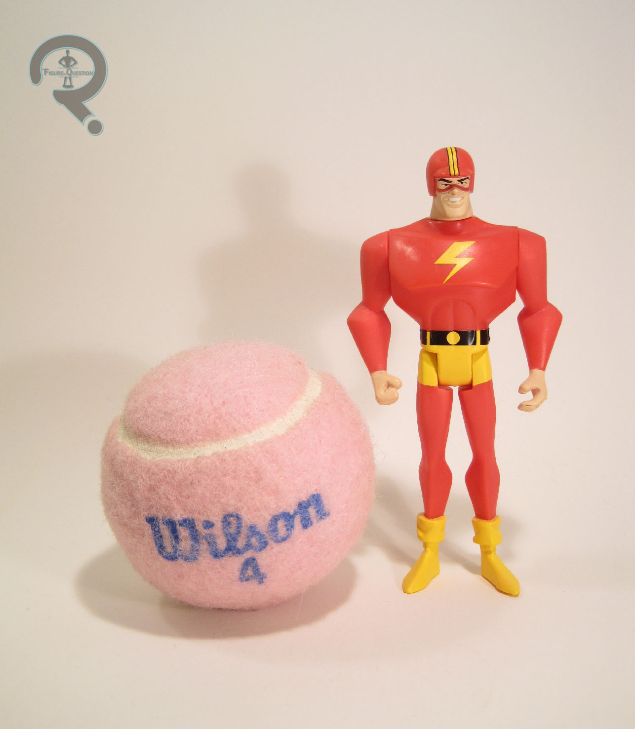
THE STREAK
 “The Streak possessed super speed and was the leader of the Justice Guild of America, a team of Super Heroes from a simpler time. Things got complicated when a group of strange heroes calling themselves the Justice League visited their home town of Seaboard City.” The Streak is the Guild’s answer to Jay Garrick, the Golden Age Flash. As such, he takes a lot of design cues from Garrick, but trades out Jay’s more unique helmet for an old-school racing helmet. The figure stands about 4 1/2 inches tall and has 5 points of articulation. He’s built on the mid-sized body (patterned on Green Lantern’s sculpt), which is a good fit for him. He has an all-new head, as well as new legs to add in his boot cuffs. The new pieces do a pretty good job of capturing his look on the show, and the head in particular is a very good rendition of the Streak’s look. The paint on the Streak is bright, clean, and bold, which are all good things. The red is noticeably brighter than the JLU version of the Flash (as it should be). As a whole, this is a design that looks really good as an action figure.
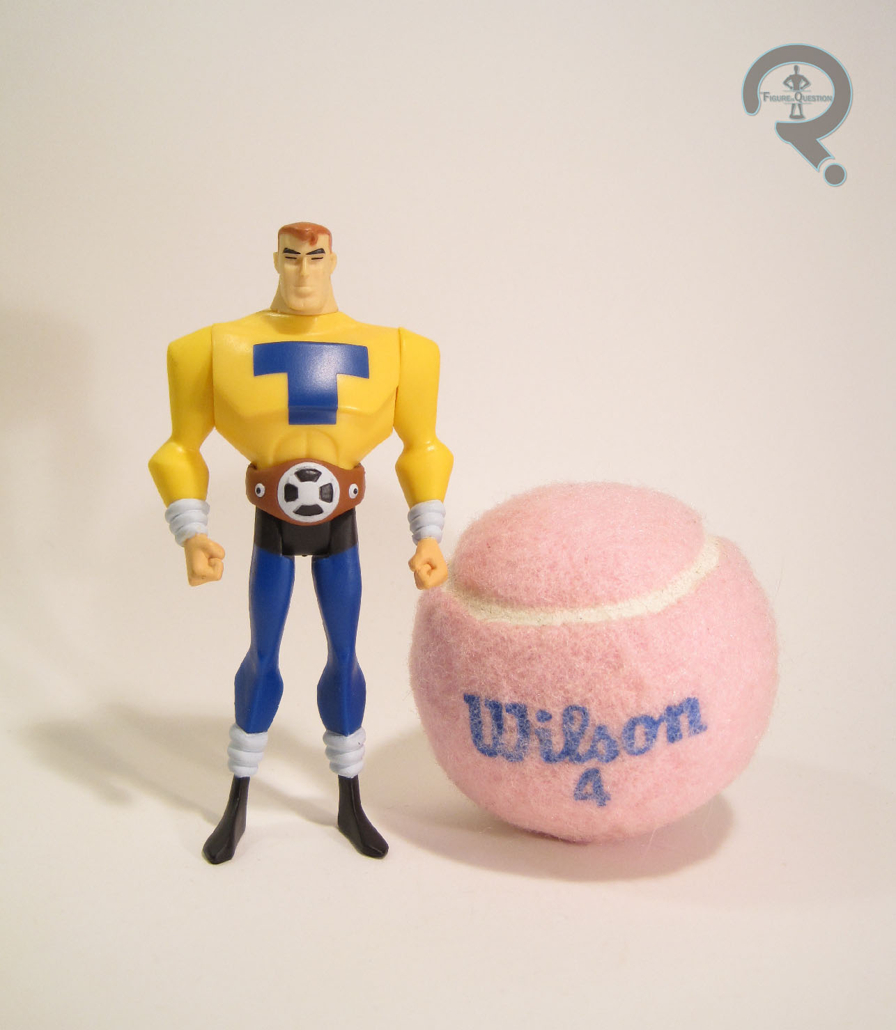
TOM TURBINE
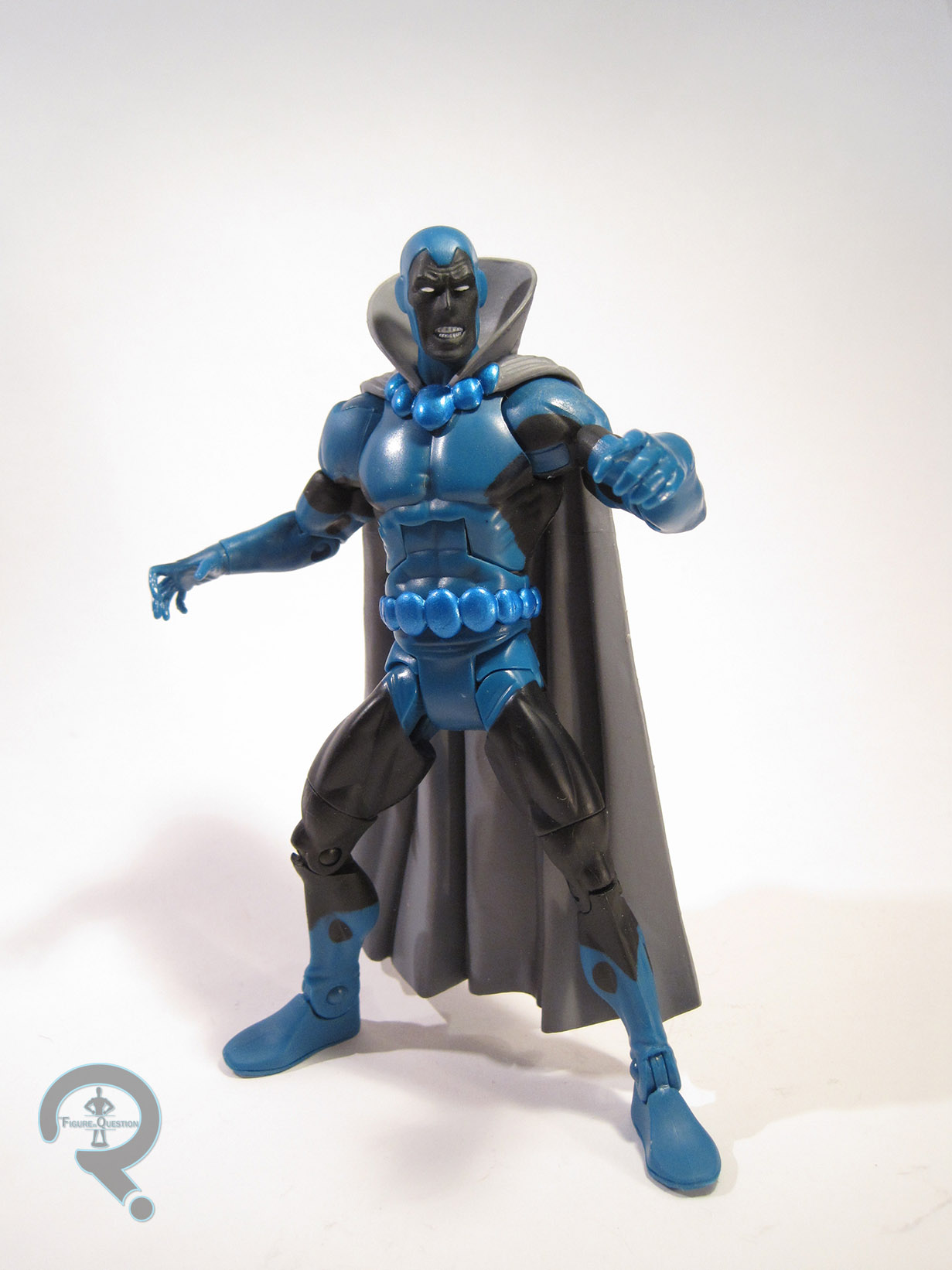
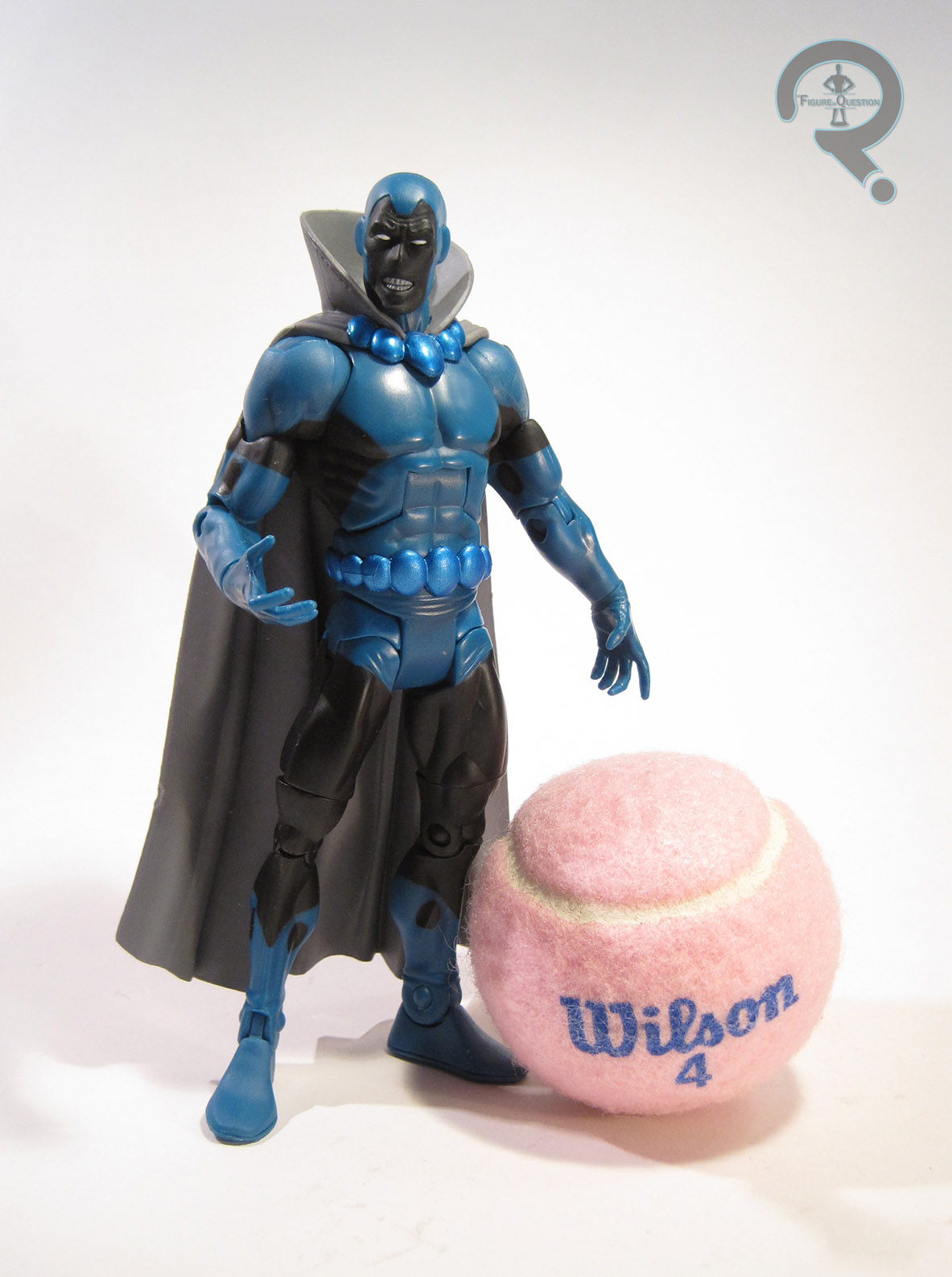
 “A power belt allowed Tom Turbine to generate energy as needed. He and The Justice Guild protected Seaboard City for years, though between missions he continued to work on his pet project: a gateway capable of piercing the dimensional barriers between multiple earths!” Tom Turbine actually has a couple of analogues in the JSA. While he actually replaced Al Pratt’s the Atom in “Legends,” and borrows from the Atom in a few areas of design, as well as stature, he also has a similar power set and limitations to Hourman, as well as the general demeanor of Mr. Terrific. This results in him being by far the most unique of the five Justice Guilders, as well as the most rounded. He’s built on the same medium body as the Streak, but the only piece that’s actually shared is the torso. The head, arms, and legs are all unique to this figure, and he’s also got an add-on for his belt. These new pieces are alright, though I can’t say any of them are as spot-on as the Streak. The legs make him a little shorter, but it’s not actually enough to be all that noticeable. I do like that the arms have two fists, since that’s sort of key to the character, but I can’t help but sort of wish they’d just sculpted them into the hands on the hips pose he sported a few times in the episode, since it’s not like the articulation’s good for anything anyway. The head’s really where the accuracy slips up a bit. It’s close, but just too squared off for Tom, who was slightly rounder in the face. Tom’s paintwork is pretty solid. The colors match up with those seen on the show, and everything’s pretty clean. The change between the neck and the yellow of his shirt isn’t quite as overt as I’d like, but it’s hard to say what they could have done to fix that.
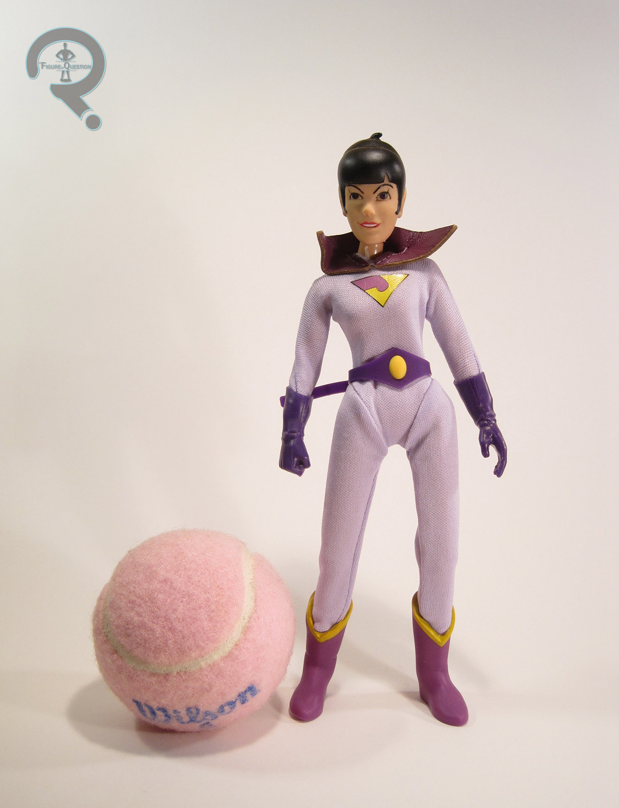
BLACK SIREN
 “A nuclear blast destroyed the world Black Siren fought to protect, along with the other members of the Justice Guild. Then the world and the Guild were back, returned to life by the mental powers of Ray Thompson. When the truth was revealed, the Guild has to destroy everything again – including themselves.” Okay, seriously? That’s Black Siren’s bio? It’s not even about Black Siren! It’s just a synopsis of “Legends” (and not even a particularly good one, at that). I’m guessing Siren got the short end of the stick on bios, since any actual bio for her would have to mention Catman, and we wouldn’t want to remind everyone we left him out. Of course, this bio mentions Ray, who was also never released, so zero points there. Second round of venting done. Okay, so Black Siren was based on Black Canary, who would eventually be properly brought into the show when the roster was expanded. Her partnership with Catman is patterned on Black Canary’s frequent partnering with Wildcat (another thing that would be properly brought into the show later down the line). Ultimately, Black Siren is kind of the shallowest character introduced in “Legends,” with her main purpose being to showcase the casual sexism of a bygone era. Anyway, her figure is built on the standard female body, which wasn’t really one of the stronger bases they had at their disposal. The legs are oddly spaced, causing the arms to bash into them, and pretty much all of the articulation is useless. For her part, Black Siren got a unique head sculpt, which is a reasonable enough piece, I suppose. The jawline seems a bit solid for Siren, but it’s not the worst. Now, she really should also have a unique set of legs to properly replicate the boots, since those bands should be three-dimensional, but she just get’s the normal legs. It seems odd that everyone else got all the pieces they needed and she didn’t. The paintwork on Siren is pretty good overall. The application is pretty solid and crisp. Most of the colors match, but the lavender sections should be a more straight grey to be totally show accurate. Siren is the only figure in the set to get an accessory: a display stand. It’s good, because she can’t stand without it. Of course, this is really the sort of thing that should have been standard for all of the figures.
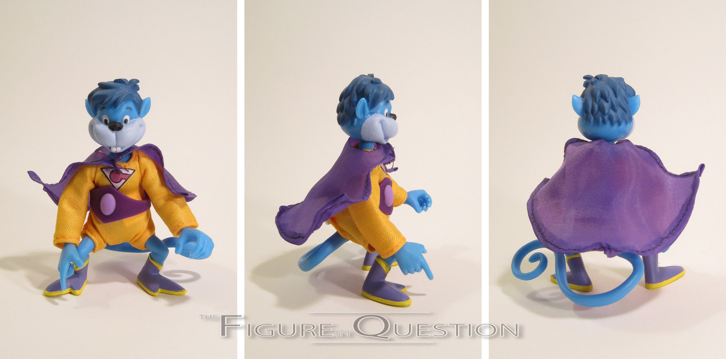
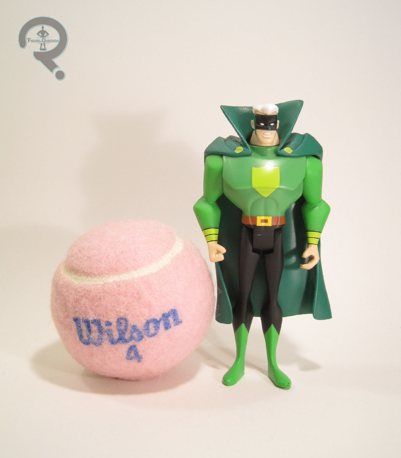
GREEN GUARDSMAN
 “Powerless against anything aluminum, the Green Guardsman used his power ring to protect Seaboard City as a member of the Justice Guild. A young John Stewart, who would grow up to become Green Lantern, read comic books of his adventures!” That’s a better bio, I suppose, but the bit about John seems really tacked on. John doesn’t really interact with Green Guardsman at all. So, in case it wasn’t obvious, Green Guardsman takes the place of Alan Scott, the Golden Age Green Lantern. Like the other male figures in the set, Guardsman is built on the medium male body, with a unique head and an add-on piece for the cape. The head’s okay, but probably the weakest of those included in the set. It’s looks a little smooshed at the front. The cape would actually go on to be shared with Alan Scott himself later on the line. It’s a decent enough piece, but it makes him really difficult to keep standing. The paintwork on Green Guardsman is about on par with the rest of the set. It’s bright and bold, and the lifework is all pretty clean. The only real nit is that the ring gets kind of lost on the hand. Maybe an outline or something would have made it stand out? Guardsman includes no accessories. While that’s somewhat more forgivable with the others, this guy would have really benefited from some constructs or something.
THE ME HALF OF THE EQUATION
When this set hit Matty Collector, I had pretty much completely checked out of the JLU line, and Matty Collector too. Turns out, a pretty large portion of the collector-base had done the same thing, which meant this, and a lot of the other sets from the same time period ended up being marked down on Matty Collector and later closed out and made available at a number of other retailers. I ended up finding these four at Power Comics on small business Saturday, for a rather good price. I’m still not happy about Catman being left out, especially since he’s never, ever going to get a figure at this point. That being said, the rest if the figures are pretty cool, and I guess some are better then none.

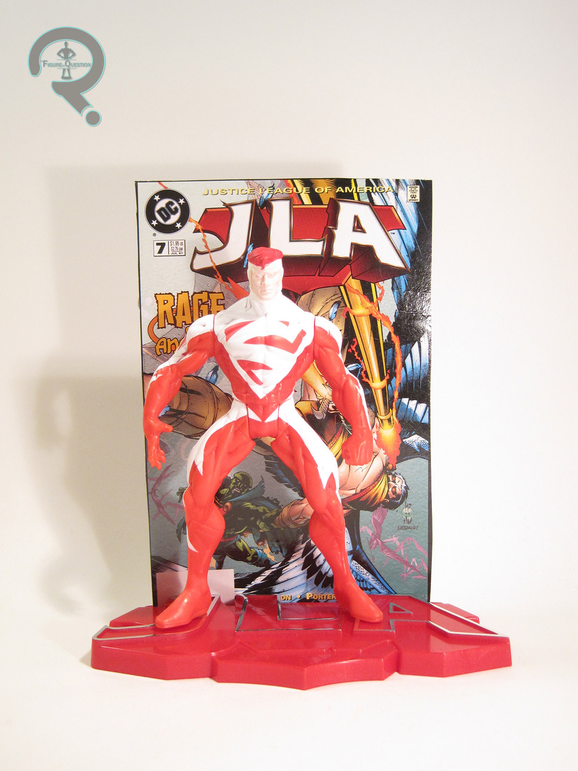
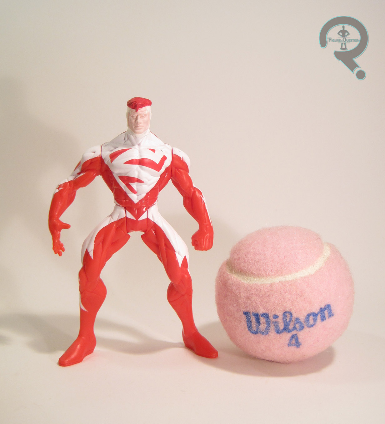 Both Superman Blue and Red were released in the first series of single-carded JLA figures. However, while Blue was also available in the first boxed set of figures, Red was exclusive to the singles (and is the only figure from Series 1 to be so). The figure stands about 5 inches tall and has the standard 5 points of articulation for the time. JLA was largely a way for Kenner to reuse their old Total Justice molds another time (though later assortments would steadily add more and more unique pieces to get a few more characters not released in Total Justice), so it’s not really a surprise that Superman Red was a total re-use. That being said, he was certainly a more uneventful re-use than some of the other figures. Most of the first series were just simple repaints of their TJ counterparts, but since Superman’s design had changed more than a little, they had to Frankenstein him a bit to get as close as possible. He (along with Superman Blue and the evil Hardlight Superman from the second boxed set) uses the torso, arms, and legs of the Total Justice Superman, with the head from Man of Steel’s Hunter Prey Superman (the one packed with Doomsday). The result is close enough…if you squint. The body still has the belt, shorts, and boots of the original figure, just painted over as if they aren’t there, which is certainly odd, but not too horribly distracting. What is distracting is the head’s painting over the clearly defined edges of the head gear, giving him these obvious lines running down his cheeks and across his forehead. Sure, the paint application’s clean for what it is, but what it is is a flagrant disregarding of the actual sculpted material. On the plus side, he’s a nice, bright red, which means he really pops on the shelf. So, that sorta makes up for it, right? JLA figures were usually pretty light on the accessories, but Superman, like the rest of them, includes a display stand. It’s even in red. There’s also a cover on the back of his box which can be cut out and placed on the back of his stand. It’s JLA #7, which is kind of an odd choice, since not only is Superman Red not on the cover, he’s not in the issue.