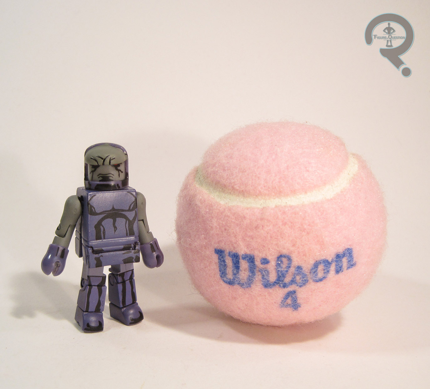
#1203: Vixen

VIXEN

JUSTICE LEAGUE OF AMERICA (DC DIRECT)

vixen1

Following the winding down of the well-regarded Satellite Era of the Justice League, DC tried to inject some new life into their flagship super team.  Marvel was having a great deal of success with the Avengers, who had, for about 15 years at that point, been made up predominately of a number of B and C list heroes who didn’t have books of their own (i.e. Hawkeye, Scarlet Witch, Vision, Wonder Man, Captain Marvel, etc).  Enter Justice League Detroit, a smaller scale team.  The only mainstays from the prior era were Aquaman, Martian Manhunter, and Elongated Man, all notably lower tier.  They were joined by a brand new cast of heroes: Steel (no, not the one from Superman), Vibe (no, not the one on The Flash), Gypsy, and Vixen.  The team was…less than successful, and after a short run, they killed two members and rebranded again.  Personally?  I kinda enjoyed the run.  Sure, it had its flaws (Vibe was little more than a walking stereotype), but there was a lot to like.  Perhaps the only new member to make it out of that run unscathed was Vixen, who happened to have one of the more interesting power sets.  She sort of hung around in the background for a while, before being brought in for a recurring role in Justice League Unlimited and subsequently being brought back onto the team in the comics for Brad Meltzer and Ed Benes’ post-Infinite Crisis relaunch of Justice League of America, which just so happened to get her a figure.

THE FIGURE ITSELF

vixen2
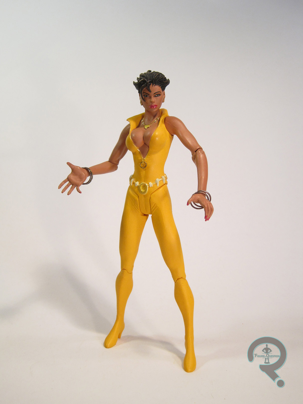
Vixen was released in 2007 as part of the first series of DC Direct’s Justice League of America line.  The figure stands about 6 1/2 inches tall and has 9 points of articulation.  That articulation’s pretty much good for having her stand there, and that’s about it.  Vixen is sporting her costume from the mid ‘00s which is really just a slight variation of the same basic design she’s been sporting since her first appearance.  I can’t say it’s my favorite design of hers, as it leans pretty heavily on the ‘00s obsession with putting every female character in a catsuit that was three sizes too small.  She, like all of the figures in the line is based on Ed Benes’ artwork.  At this point in their run, DC Direct was pretty much exclusively doing artist-based figures, which was rather a mixed bag, since not every artist’s work translates into three dimensions all that well.  Vixen is kind of weird and lanky for the most part, excepting of course for her breasts, which give an impression not unlike a pair of watermelons strapped to a tree.  It’s an odd look to say the least.  And, as far as posing goes, she looks like she just took a really deep breath and is trying not to let it out, resulting in her chest jutting forward and her shoulders being strangely raised.  She also seems to have had her hips removed at some point, which has had the effect of causing both of her legs to point off to the left in the way that no normal human legs ever would.  Her left foot also appears to have slipped out of place in her boot, since that’s about the only way it could end up that particular shape.  Her arms are probably the best parts of the figure, aside from their intended pose being a little vague; they’re actually shaped like arms, so that’s a plus.  The hands are actually a halfway decent sculpt, but end up being slightly on the large side (and the fingers are also prone to bending out of shape).  The head sculpt is…well, it’s something.  Not sure that something is *good* but it’s something.  The hair’s nice, I guess?  Just try not to look too closely at the face.  Vixen made use of some metal for her bracelets and the pull tag on her zipper.  It’s a nice touch, but the free-floating bracelets can get rather annoying when posing the figure.  Vixen’s paintwork is mostly pretty clean.  The jumpsuit seems a little on the drab side, but it’s not awful.  Once again, try not to look too closely at the face, especially not the lips or eyes.  And that’s not even addressing that super whacky hairline she’s sporting.  Vixen’s only accessory was a display stand with “Justice League of America” painted on it.

THE ME HALF OF THE EQUATION

I actually bought this figure from Cosmic Comix when it was brand new.  I was even excited for it.  At the time, I was really into Brad Meltzer’s run on Justice League of America, and I also really loved Vixen’s recurring role on JLU.  Time has been kinder to the latter of those things, but less so the former.  Also, I believe this was also about the time that I sat down and read the Detroit run, so that probably had something to do with it.  In hindsight, like Meltzer’s run on JLA, time has not been kind to this figure.  She’s rather indicative of this period at DC Direct, which wasn’t a very good one.  It was right about the time I stopped collecting their figures and moved over to DC Universe Classics.  I actually sold off a lot of the other figures from this period, but there hasn’t really been a better Vixen figure, so this one’s stuck around.

Wow, two “bleh” figures in a row.  I swear, I’ll try to review something better tomorrow!

Flashback Friday Figure Addendum #0002: Hydro Claw Robin

0002a

For my second Flashback Friday Figure Addendum, I’ll be following the lead of my actual reviews, and taking another look at my very first figure of the other half of the Dynamic Duo.  Let’s look back at Hydro Claw Robin!

So, yesterday’s post was about my very first action figure, Batman.  And, because a hero’s no good without his sidekick, here’s my very first figure of his old chum: Robin.

THE FIGURE ITSELF

Hydro Claw Robin is a Robin variant from the Batman Forever line.  He’s actually a fairly standard looking Robin, though he’s not THE standard looking Robin of the line.  His main feature, now lost to me, was a jetpack with wings, a rebreather, and the eponymous “Hydro Claw.”  It’s really unfortunate that I’ve lost this piece, as I recall that it was really quite cool, but alas, 4 year old me was not very good at keeping track of such things!  Even without the accessory, this is still a pretty stand up version of Robin, even if it is based on the utterly terrible Chris O’Donnell.

THE ME HALF OF THE EQUATION

This figure is a good deal less of a mystery than the Night Hunter Batman.  This guy was a gift from my dear Aunt Susan for Christmas 1995.  I had asked for a Robin figure to prevent my caped crusader from being too lonely, and she was more than happy to oblige.  Christmas morning I opened this guy up and joyfully danced around the room for a good 5 minutes, humming the Batman theme song.  I know, that story is so sweet it almost hurts, doesn’t it?

Man, I always forget how brief I used to be with these reviews.  I don’t know if my wordiness is a good thing or a bad thing.

Once again, I’ve left out a number of things I would now consider standard, namely that the figure is about 5 inches tall and he has 5 points of articulation. The main thing missing the first time I reviewed the figure was his wingpack, which has a rebreather and the titular Hydro Claw attached.  It’s actually one of my favorite parts of the figure, and I was quite bummed that it was missing, so discovering it was one of my biggest bits of excitement during “the Great Find.”  What’s pretty neat about this piece is how it sort of completes the classic Robin color scheme, with its large presence of yellow.

I love this figure no matter what, but he really feels so much more awesome now that he’s complete again!  Now he and Night Hunter Batman are proudly adorning one of the bookshelves in my living room, and I really couldn’t be happier about that.  Even if he’s still based on Chris O’Donnell….

#1192: Superman Red

SUPERMAN RED

JLA (KENNER)

supermanredjla1

A ways back, almost 600 reviews ago now, I tackled the wonderfully ‘90s concept of the electrically powered Superman Blue, DC’s second bid at re-inventing Superman in that particular decade.  Not long after that, I also tackled Superman Red, who was the end result of Superman Blue getting split into two different entities.  The whole thing was ultimately pretty short-lived, but it was timed just perfectly enough that both versions were still the official status quo take on Superman when Kenner launched their JLA line in the ‘90s, thus placing them in the line instead of the more conventional take on the character, and giving us the first of a handful of figures based on the designs.  Today, I’ll be looking at the hot-headed Superman Red!

THE FIGURE ITSELF

supermanredjla2Both Superman Blue and Red were released in the first series of single-carded JLA figures.  However, while Blue was also available in the first boxed set of figures, Red was exclusive to the singles (and is the only figure from Series 1 to be so).  The figure stands about 5 inches tall and has the standard 5 points of articulation for the time.  JLA was largely a way for Kenner to reuse their old Total Justice molds another time (though later assortments would steadily add more and more unique pieces to get a few more characters not released in Total Justice), so it’s not really a surprise that Superman Red was a total re-use.  That being said, he was certainly a more uneventful re-use than some of the other figures.  Most of the first series were just simple repaints of their TJ counterparts, but since Superman’s design had changed more than a little, they had to Frankenstein him a bit to get as close as possible.  He (along with Superman Blue and the evil Hardlight Superman from the second boxed set) uses the torso, arms, and legs of the Total Justice Superman, with the head from Man of Steel’s Hunter Prey Superman (the one packed with Doomsday).  The result is close enough…if you squint.  The body still has the belt, shorts, and boots of the original figure, just painted over as if they aren’t there, which is certainly odd, but not too horribly distracting.  What is distracting is the head’s painting over the clearly defined edges of the head gear, giving him these obvious lines running down his cheeks and across his forehead. Sure, the paint application’s clean for what it is, but what it is is a flagrant disregarding of the actual sculpted material.  On the plus side, he’s a nice, bright red, which means he really pops on the shelf.  So, that sorta makes up for it, right?  JLA figures were usually pretty light on the accessories, but Superman, like the rest of them, includes a display stand.  It’s even in red.   There’s also a cover on the back of his box which can be cut out and placed on the back of his stand.  It’s JLA #7, which is kind of an odd choice, since not only is Superman Red not on the cover, he’s not in the issue.

THE ME HALF OF THE EQUATION

I was never much of a fan of Superman Red or Blue growing up.  It was sort of a weird period of time, and all the Superman merchandise was one of these two, and it felt wrong to me.  So, I didn’t have this figure or his blue counterpart (I did have the Hardlight one, though), and instead waited for the proper classic Superman later on in the line.  As time as gone by, I’ve gotten lots of classic Supermen, and now I have this weird nostalgic twinge for these designs.  I found this guy in the bargain bin at this nearby comics and games store called Player’s Choice, and he called to me.  He’s sort of a goofy figure, but it was a goofy concept to begin with.

Flashback Friday Figure Addendum #0001: Night Hunter Batman

0001a

Hey everyone!  Back in October, I made mention of finding a bunch of missing figure accessories and doing a bunch of photo reshoots and how that would mean the occasional addendum here and there in order to make older reviews as complete as possible.  Well, I’m finally getting off my butt and actually doing something with it.  Every Friday from now until I run out of updates, I’ll be linking to an old post, updating the images contained therein, and adding a few new comments about the figure or my review.  Without further ado, I present my first Flashback Friday Figure Addendum!

For today’s FFFA, I’m going back to my very first review of my very first action figure, Night Hunter Batman!

The first post in my humble little blog is a review of the very first (well, technically second, but I’ll get to that in a minute) action figure in my not-so-small collection.  Yep, this is the one that started it all, and 2400 figures later, he does seem to be a bit of an odd choice.

THE FIGURE ITSELF

Night Hunter Batman is a Batman variant from the tie-in line to 1995’s Batman Forever.  He’s black with some bright yellow accents, the obvious choice for creatures of the night.  He once had a cape with a pretty nifty windswept look to it, but I’ve long since lost it.  He also used to have an actual bat symbol on his chest, but if I recall correctly, he lost that fairly shortly after I acquired him.  I feel the true highlight (aside from the actual yellow HIGHLIGHTS) of the figure is the pop-up goggle feature.  There’s a button on his back that, when pushed, extends and rotates the goggles in front of old Bruce’s eyes.  You know, for detective-stuff.  Or going by the name of the figure, hunting stuff.

THE ME HALF OF THE EQUATION

Why, of all the action figures out there, was this my very first action figure?  I honestly can’t say.  I know I liked Batman, though I watched the TV series and in fact didn’t see Batman Forever until I was almost 20.  Maybe I liked the colors.  Most likely, it was the goggles.  I like goggles, and the whole focus of this little guy was those really neat goggles he had.

Remember when I pointed out above that this was technically my second action figure?  Yeah, funny story:  this particular Night Hunter Batman is a replacement for the first Night Hunter Batman, that by all accounts I gave to a girl at a restaurant.  Yes, even at 3, I was quite the charmer.  So, my parents drove me over to Toys R Us (Side-Note: Remember when Toys R Us didn’t suck?  I miss those days…) and purchased me this lovely replacement (EDIT: I stand corrected.  It wasn’t Toys R Us, it was Service Merchandise.  Man, there’s a blast from the past!) .  While there, my dad happened to wander down the aisle and find the Iron Man animated series toys, leading him to a) start his own collection up again b)introduce me to the wonders of Marvel Comics and c) even more directly lead me to my current state of being.  And it’s all because I was trying to impress a girl!  Silly girls!”

Wow, that was surprisingly brief, and left out a lot of the details I would now consider “standard.” It’s so quaint! 

It’s worth noting that Night Hunter Batman is about 5 inches tall and has 5 points of articulation.  Also worth noting are his accessories, missing from the original review.  He had a removable cape, which has a nice windswept look to it, as well as this big…shield thing.  I don’t know.  It’s shaped like a bat. Sorta.  It’s a little hard to get him to hold it properly, and I’m not sure what purpose it would serve whist one hunts…at night…but it’s an entertaining enough piece.  There were also these claw attachments, which hooked onto those two bottom rungs of the shield, but those I truly have lost.

Since writing this review, discussing with my dad about why this was my first Batman, it came up that this was apparently the closest we could come to a standard Batman figure when I went to pick one out.  It would appear this guy got to be number one by sheer luck.  Good for him!

#1178: Robin

ROBIN

POP! HEROES

robinbtaspop1

On the twelfth day of post-Christmas reviews…I decided to review another Pop.  That’s a lyric from the slightly less popular version of the song.  Amazing how the songwriter predicted the Pop craze, though.  For today’s Pop-centric review, I’m taking a look at the first Pop line, Pop! Heroes, which began it’s life as a DC-themed line, but has expanded to include a few other heroes as it’s gone on.  I’m sticking to the DC side, though, and taking a look at the newest release of Batman’s old chum, Robin!

THE FIGURE ITSELF

robinbtaspop2Robin is figure #153 in the Pop! Heroes line.  He’s the second figure in the Batman: The Animated Series subset and the fourth version of Robin (not counting variants).  The figure stands about 4 inches tall and has an articulated neck (not being limited by the licensing restrictions that affect the Star Wars and Marvel lines).  Robin is sporting an all-new sculpt, which does its best to merge the stylings of B:TAS and the Pop! line.  It’s admittedly, not the easiest venture for Robin here, since the real differences between his comics and animated designs is one of simplicity.  Since all Pop! figures simplify the designs a bit, he has to rely more heavily on his other defining trait, his wacky hair, to make him notably different from the first Robin Pop!  Sadly, while the control art shown on the box gets the hair down perfectly, there’s something lost in translation on the final figure.  The hair ends up a lot rounder than it should be, and his spit curl is mashed into his forehead, giving it rather a different shape and eliminating his v-shaped hairline almost entirely.  It’s still a pretty solid Robin, but falls shy of being an Animated Robin.  On the plus side, the body fixes my major issue with the original Robin Pop!, which was the pose.  This one goes for a nice basic standing pose, full of heroic confidence, in contrast to the “argh, my back” pose of the original.  Paint on Robin is decent by Pop! standards, which is to say the colors are nice and bright, and the basic application is okay, but there are a lot of fuzzy lines and some slight bleed over here and there.  Nothing terrible or bad enough to ruin the figure, though. 

THE ME HALF OF THE EQUATION

Robin is the other of the two figures I got from my totally cool-tastic brother for Christmas.  It’s no secret that Loren Lester’s portrayal of Robin is my definitive take on the character and a large part of why I love Robin so much, and Christian’s no doubt heard me drone on about that more than once.  While this figure doesn’t quite live up to the control art on the box, I do still really like him, and I’m more than a little tempted to get the animated-style Batman to go with him!

#1168: Wonder Twins

ZAN, JAYNA, & GLEEK

SUPER FRIENDS (FIGURES TOY COMPANY)

wondertwins1

Wonder Twin powers activate!  Form of: an action figure review!

Hey guys, so here we are on day two of the post-Christmas reviews.  As I noted in the intro, this review is based around the Wonder Twins, that wacky duo (and their pet space monkey) who were sort of haphazardly shoved into the Justice League membership during the second season of Super Friends.  Of all the Super Friends-original characters, the Wonder Twins are probably the most enduring, likely due to being the only ones who didn’t feel like a pretty direct rip-off of something else (okay, yes, they were just Wendy & Marvin with powers, but lets not talk about that too much).  The duo were originally slated to get action figures during Kenner’s DC Super Powers line in the ‘80s, but the line ended before they could get past the drawing board.  They did eventually make it into plastic form as an exclusive two-pack in Mattel’s DC Universe Classics line, but, well, that was Mattel, so you can probably guess the whole thing didn’t go particularly smoothly.  Most recently, they’ve gotten another shot at action figure glory courtesy of Figures Toy Company.  I’ll be taking a look at those figures today!

THE FIGURES THEMSELVES

Zan, Jayna, and their pet monkey Gleek were released as a special three-pack in Figures Toy Company’s Super Friends line.  The line as a whole is patterned after Mego’s figures from the ‘70s, but with some of the more specific design elements coming straight from the Super Friends model sheets.

ZAN

wondertwins2Form of: Zan!  The male Wonder Twin is built on the standard Mego Type 2 style body.  Unlike the Dr. Mego bodies used by DST and Biff Bang Pow or the Big Jim-styled bodies from Mattel, Figures Toy Company’s version of the body doesn’t have any changes or improvements; the body is pretty much the same quality as the old ‘70s bodies.  This is okay from a consistency standpoint (since they’ll fit right in with the vintage figures), but means that the quality is that of a $4 action figure from the mid-70s, rather than a $20-30 figure from the last year, which can be slightly frustrating.  Moving past that, Zan stands about 8 inches tall and has 14 points of articulation.  As far as the body sculpt, he’s got a unique head and hands.  The head is a pretty decent summation of his animated design (certainly closer than Mattel’s attempt), and also fits pretty well with existing Mego figures.  The hands are a bit of a departure from the usual Mego style; they’re certainly nicely enough in terms of sculpt, but they’re made of a rather rubbery material, which makes they pop off the wrists at the slightest touch, and are rather difficult to get back in place.  In terms of costume, Zan has a jumpsuit with a pleather collar, a belt, and a pair of boots. The pieces mostly fit well enough; the collar could probably be a little better shaping wise, but it fits the style, and you can mess with it to make it look a little more presentable.  The one weird thing about the costume is the belt.  Clearly, they wanted Zan, Jayna, and Gleek to all be able to wear the same belt, so it’s sort of this one-size-fits-all thing, resulting in all three belts having an extra length running from the back, almost like an oddly placed tail.  One last thing: I feel I should note that the colors of the boots, gloves, and belt do all match in person, despite what it may look like on the photos.

JAYNA

wondertwins3Shape of: Jayna!  Jayne here is built on the standard female body, which seems rather oddly shaped if I’m honest.  It’s not awful, but not quite as solid as the male version.  It seems Jayna’s body is just a bit to tightly strung in the middle as well, which permanently leaves her with this sort of hunch.  It’s a bit odd.  Jayne is assembled pretty much exactly the same as her brother; sculpted head and hands, cloth costume with pleather collar, and rubber belt and boots.  The head is another pretty good piece, and looks well enough like Jayna.  The hands seem to be a slight improvement over Zan’s, as I had no issues with them falling off on her.  The issue with the belt, however, is even more noticeable with Jayna, thanks to her even smaller waist.  Her costume also seems to bunch up a bit more than Zan’s, but that’s an issue prevalent with Mego figures in general.  Not a whole lot more to say here, since she’s so similar to her brother.

GLEEK

wondertwins4Gleek doesn’t have a part of the catchphrase, so no witty intro there.  He does break from the trend in this set by not using one of the Mego bodies; instead, he gets an all-new body, designed to fit his more simian appearance.  The figure stands about 3 inches tall and he has 5 points of articulation and a bendable tail.  Glenn’s sculpt is pretty solid, and actually does a very good job of capturing his design from he show.  The head in particular is quite spot on.  His little booties are sculpted onto the body, but the rest of the costume is tailored, so as to match with the twins.  He’s got a jumpsuit, a cape, and the same belt as the other two (albeit slightly differently colored).  The costume is on the baggy side, but it doesn’t look terrible. On the plus side, the cape is good for hiding the excess length of belt, thus eliminating the main problem with the other two figures’ costumes.  None of the figures in this set include any extras, but I feel Gleek is hit the hardest by this, since the bucket he always had on hand to carry Zan in his water form seems like a pretty obvious missing piece.  Guess I’ll have to find my own.

THE ME HALF OF THE EQUATION

Like yesterday’s set, these guys were a Christmas gift from my Grandmother.  It’s actually quite fitting, since the whole reason I’m familiar with Megos at all is because I played with my dad’s old figures when I would stay at her house, frequently watching taped episodes of cartoons such as Super Friends.  Interestingly enough, while a lot of people hated the Wonder Twins, I actually always liked them and was quite frustrated by how the Mattel versions were handled.  I was quite happy to actually get the duo and Gleek in figure form.  I won’t lie, these figures aren’t without their sets of issues.  If you aren’t firmly a Mego fan, these won’t be for you.  That being said, this is a very prominent example of the whole being better than the sum of its parts.  These figures didn’t disappoint me.

#1156: Justice Guild

THE STREAK, TOM TURBINE, BLACK SIREN, & GREEN GUARDSMAN

JUSTICE LEAGUE UNLIMITED (MATTEL)

justiceguild1

Some of the best characters are the ones that come about because creative teams aren’t allowed to use a pre-existing character.  One of the most famous examples of this is Watchmen, which was originally meant to make use of DC’s recently acquired Charlton characters.  DC seems to do this to their creators rather frequently, as this also cropped up a few times during the course of the DC Animated Universe.  My particular favorite of these was The Justice Guild of America, from the Justice League episode “Legends.”  The episode was originally drafted with the Justice Society in mind, but was ultimately changed when DC decided the direction of the story didn’t fit how they wanted the JSA portrayed.  Fortunately, this worked out pretty well, as it gave the creators more free reign with the characters, and resulted in one of the most entertaining entries in Justice League.

THE FIGURES THEMSELVES

These four were released as one of Matty Collector-exclusive four-packs from Mattel’s Justice League Unlimited line.  Now, it’s a Mattel review, so you’re probably already expecting a bit of Mattel hate.  Well, here it is:  Who in their right mind releases a four-pack based on a five member team?  On top of that, one of the four members released here is Black Siren, who is part of a duo with the unreleased member Catman.  The back of her box even has Catman in both of the screen shots of her!  Were they just rubbing it in our faces?  Seeing as the four-packs were actually just four single-carded figures packed together, and thus there wasn’t an issue of needing to redo the packaging, couldn’t they just have made this a five-pack?  Or, if they really felt the need to go with arbitrary number schemes, couldn’t they have just made it a six-pack and just thrown in a Green Lantern figure to round the set out?  No, that would be sensible.  Can’t have that, especially not on a Matty Collector-exclusive.  It wouldn’t be right!  Okay, I vented, let’s actually look at the figures.

THE STREAK

justiceguild2The Streak possessed super speed and was the leader of the Justice Guild of America, a team of Super Heroes from a simpler time.  Things got complicated when a group of strange heroes calling themselves the Justice League visited their home town of Seaboard City.” The Streak is the Guild’s answer to Jay Garrick, the Golden Age Flash.  As such, he takes a lot of design cues from Garrick, but trades out Jay’s more unique helmet for an old-school racing helmet. The figure stands about 4 1/2 inches tall and has 5 points of articulation.  He’s built on the mid-sized body (patterned on Green Lantern’s sculpt), which is a good fit for him.  He has an all-new head, as well as new legs to add in his boot cuffs.  The new pieces do a pretty good job of capturing his look on the show, and the head in particular is a very good rendition of the Streak’s look.  The paint on the Streak is bright, clean, and bold, which are all good things.  The red is noticeably brighter than the JLU version of the Flash (as it should be).  As a whole, this is a design that looks really good as an action figure.

TOM TURBINE

justiceguild4A power belt allowed Tom Turbine to generate energy as needed.  He and The Justice Guild protected Seaboard City for years, though between missions he continued to work on his pet project: a gateway capable of piercing the dimensional barriers between multiple earths!” Tom Turbine actually has a couple of analogues in the JSA.  While he actually replaced Al Pratt’s the Atom in “Legends,” and borrows from the Atom in a few areas of design, as well as stature, he also has a similar power set and limitations to Hourman, as well as the general demeanor of Mr. Terrific.  This results in him being by far the most unique of the five Justice Guilders, as well as the most rounded.  He’s built on the same medium body as the Streak, but the only piece that’s actually shared is the torso.  The head, arms, and legs are all unique to this figure, and he’s also got an add-on for his belt.  These new pieces are alright, though I can’t say any of them are as spot-on as the Streak.  The legs make him a little shorter, but it’s not actually enough to be all that noticeable.  I do like that the arms have two fists, since that’s sort of key to the character, but I can’t help but sort of wish they’d just sculpted them into the hands on the hips pose he sported a few times in the episode, since it’s not like the articulation’s good for anything anyway.  The head’s really where the accuracy slips up a bit.  It’s close, but just too squared off for Tom, who was slightly rounder in the face.  Tom’s paintwork is pretty solid.  The colors match up with those seen on the show, and everything’s pretty clean.  The change between the neck and the yellow of his shirt isn’t quite as overt as I’d like, but it’s hard to say what they could have done to fix that.

BLACK SIREN

justiceguild5A nuclear blast destroyed the world Black Siren fought to protect, along with the other members of the Justice Guild.  Then the world and the Guild were back, returned to life by the mental powers of Ray Thompson.  When the truth was revealed, the Guild has to destroy everything again – including themselves.”  Okay, seriously?  That’s Black Siren’s bio?  It’s not even about Black Siren!  It’s just a synopsis of “Legends” (and not even a particularly good one, at that).  I’m guessing Siren got the short end of the stick on bios, since any actual bio for her would have to mention Catman, and we wouldn’t want to remind everyone we left him out.  Of course, this bio mentions Ray, who was also never released, so zero points there.  Second round of venting done.  Okay, so Black Siren was based on Black Canary, who would eventually be properly brought into the show when the roster was expanded.  Her partnership with Catman is patterned on Black Canary’s frequent partnering with Wildcat (another thing that would be properly brought into the show later down the line).  Ultimately, Black Siren is kind of the shallowest character introduced in “Legends,” with her main purpose being to showcase the casual sexism of a bygone era.  Anyway, her figure is built on the standard female body, which wasn’t really one of the stronger bases they had at their disposal.  The legs are oddly spaced, causing the arms to bash into them, and pretty much all of the articulation is useless.  For her part, Black Siren got a unique head sculpt, which is a reasonable enough piece, I suppose.  The jawline seems a bit solid for Siren, but it’s not the worst.  Now, she really should also have a unique set of legs to properly replicate the boots, since those bands should be three-dimensional, but she just get’s the normal legs.  It seems odd that everyone else got all the pieces they needed and she didn’t.  The paintwork on Siren is pretty good overall.  The application is pretty solid and crisp.  Most of the colors match, but the lavender sections should be a more straight grey to be totally show accurate.  Siren is the only figure in the set to get an accessory: a display stand.  It’s good, because she can’t stand without it.  Of course, this is really the sort of thing that should have been standard for all of the figures.

GREEN GUARDSMAN

justiceguild3Powerless against anything aluminum, the Green Guardsman used his power ring to protect Seaboard City as a member of the Justice Guild.  A young John Stewart, who would grow up to become Green Lantern, read comic books of his adventures!” That’s a better bio, I suppose, but the bit about John seems really tacked on.  John doesn’t really interact with Green Guardsman at all.  So, in case it wasn’t obvious, Green Guardsman takes the place of Alan Scott, the Golden Age Green Lantern.  Like the other male figures in the set, Guardsman is built on the medium male body, with a unique head and an add-on piece for the cape.  The head’s okay, but probably the weakest of those included in the set.  It’s looks a little smooshed at the front.  The cape would actually go on to be shared with Alan Scott himself later on the line.  It’s a decent enough piece, but it makes him really difficult to keep standing.  The paintwork on Green Guardsman is about on par with the rest of the set.  It’s bright and bold, and the lifework is all pretty clean.  The only real nit is that the ring gets kind of lost on the hand.  Maybe an outline or something would have made it stand out?  Guardsman includes no accessories.  While that’s somewhat more forgivable with the others, this guy would have really benefited from some constructs or something.

THE ME HALF OF THE EQUATION

When this set hit Matty Collector, I had pretty much completely checked out of the JLU line, and Matty Collector too.  Turns out, a pretty large portion of the collector-base had done the same thing, which meant this, and a lot of the other sets from the same time period ended up being marked down on Matty Collector and later closed out and made available at a number of other retailers.  I ended up finding these four at Power Comics on small business Saturday, for a rather good price.  I’m still not happy about Catman being left out, especially since he’s never, ever going to get a figure at this point.  That being said, the rest if the figures are pretty cool, and I guess some are better then none.

#1154: Firefly

FIREFLY

BATMAN: ANIMATED (DC COLLECTIBLES)

firefly1

Batman has perhaps the most memorable rogue’s gallery in comics.  It’s colorful, diverse, and has produced several of comics’ greatest villains.  But, when you’ve got a 75+ year old character with two to three appearances a month, you need a lot of villains, and they aren’t always going to be the most thrilling.  When it came to Batman: The Animated Series, the creators rather quickly realized that there were only so many top tier villains that could be used, so they started picking up some of the more minor foes and trying to inject a bit more life into them.  One of their less successful attempts was Firefly.  Oh, they gave it their best try, believe me.  He got a pretty sweet design and he was even voiced by Mark Rolston (Drake from Aliens), but he amounted to little more than a villain of the week.  He was also one of the characters totally left out of Kenner’s The New Batman Adventures line.  But, it seems DCC is determined to cover just about everyone they can, so he’s got a figure now!

THE FIGURE ITSELF

firefly2Firefly is part of DCC’s Batman: Animated line.  He’s figure 28, which places his in Series 7 of the line.  The figure stands about 6 1/2 inches tall and he has 24 points of articulation.  Firefly was a TNBA-exclusive character, so there’s just the one design to choose from.  This figure is listed as specifically being based on Firefly’s first appearance “Torchsong,” but he could just as easily be based on “Legends of the Dark Knight” or even his brief Justice League appearance.  As I noted in the intro, it’s a design I quite like.  It’s fairly simple, but that gives it a sort of sleekness, which makes it really fit with the rest of the animated series designs.  The sculpt on this figure does a pretty reasonable job of capturing the design and translating it into three dimensions.  There are some liberties here and there.  The most obvious is the antenna on the right side of his head, which is about ten times larger than it should be, presumably so it would be less likely to break.  Apart from that, he stays pretty close.  One area where he takes a bit of a hit accuracy wise is the paint.  In every appearance, Firefly’s suit was depicted as having a definite metallic sheen.  Here, it’s just flat grey.  It sort of robs him of any sort of pop, since grey isn’t the most exciting color.  Even if silver was too much, at leas a slightly shinier finish to the grey would have gone a long way, making him not only more visually interesting, but also much more accurate.  Also, in the show, his lenses were black with a red highlight, which they still are here, but the highlights aren’t angled the same way, which makes them look less like highlights and more like really askew pupils. It’s mostly the left sense; if it were just a smidgen to the right, the whole thing would look much better.  Firefly is packed with four sets of hands (fists, relaxed, gripping, and trigger finger), his flamethrower gun, and a display stand.  It would have been nice to also get his flame sword that he uses in both of his TNBA appearances, but I guess what we got here is nice.

THE ME HALF OF THE EQUATION

Firefly came from Cosmic Comix, specifically their Biggest Sale of the Year (TM).  I wasn’t actually able to be there in person this year, so he was picked up by proxy (i.e. my dad).  The figure is decent enough, but for a line that initially prided itself on remaining accurate to the source material, I’m finding more and more of the figures have had severe liberties taken, which can get a little frustrating.

firefly3

#1146: Todd Rice

TODD RICE

DC UNIVERSE CLASSICS (MATTEL)

obsidian1

It’s rare for something’s greatest strength to also be its greatest weakness, but that’s really the case with Mattel’s DC Universe Classics.  One of the most endearing and memorable things about the line was the sheer reach of character selection.  Not only did we get definitive versions of major characters, but we also got lots of characters that pretty much no one ever thought would get action figures.  Unfortunately, while is is great for hardcore fans, it doesn’t result in the greatest sales in a retail line.  Still, the line did give a lot of DC characters their very first action figures.  Interestingly enough, today’s focus Todd Rice, better known as Obsidian, is not an example of this.  Oh sure, he’s obscure, but he actually had already gotten a figure courtesy of the Justice League Unlimited toyline.  For those of you less familiar with Todd, he’s the son of the Golden Age Green Lantern Alan Scott.  He was a member of the JSA-spin-off team Infinity Inc in the ‘80s, and has been on-again-off-again affiliated with the Justice Society themselves.  Most recently, he was played by Lance Hendrickson in an episode of DC’s Legends of Tomorrow, which is easily the most coverage Obsidian’s ever gotten!

THE FIGURE ITSELF

obsidian2Todd Rice was released in Series 14 of DC Universe Classics, which was the third (and final) Walmart-exclusive series from the line.  Given the presence of both his father and fellow JSAer Hourman in the line-up, as well as frequent JSA foe Ultra Humanite being the CnC for this particular series, Todd was right at home.  It’s worth noting that Todd’s official codename is Obsidian, and has always been Obsidian, but for whatever reason (more than likely it’s the fact that Obsidian, as a rock, can’t be trademarked), he’s called “Todd Rice” on the box.  Whatever gets us the figures, I suppose.  The figure stands about 6 1/2 inches tall and has 23 points of articulation.  Todd was built on the mid-sized male buck, with unique head and hands, as well as add-ons for the cape and belt.  The base body is starting to show its age a bit more with every figure I review from this line, but it’s still a pretty solid piece.  The mid-sized body is actually a pretty perfect fit for Todd.  In fact, he’s the sort of character who really works in a line of this nature.  The new pieces all work pretty well with the established body.  The hands are nice and expressive, and certainly a nice change of pace compared to the basic gripping hands so many of the figures got stuck with.  The cape is one of the better capes from the line, and the belt does a decent job of capturing the design from the comics, as silly as it is.  The head is…well, I guess it’s okay, but I’m not sure it’s one of the better DCUC sculpts.  What’s weird is that is seems almost too detailed on the face.  Like, it’s as if no one told the Four Horsemen that Todd’s wearing a mask and that’s not just his face.  Usually, the black part of the mask was mostly featureless, with just the eyes and his open mouth showing, which makes him look pretty sleek.  Here, they clearly tried to replicate that, but they also tried to add this realistic touch to his face, which just seems…odd.  Also, he seems to have had his lips removed or something, because they appear to be absent.  Obsidian’s paintwork did a pretty decent job of replicating his color scheme from the comics.  It’s a good scheme, and it looks really nice on the figure.  Obsidian was packed with the left arm of Ultra Humanite.  Not really specific to him, but I guess it’s better than nothing.

THE ME HALF OF THE EQUATION

Obsidian was one of the last figures I found from this particular set (but not THE last; that was Gold).  I’m not insanely familiar with the character, but I’ve always liked his costume quite a bit, and I obviously have at least some appreciation for him due to being the son of a Green Lantern and all.  I was actually pretty excited to get this guy, and he’s really not a bad figure.  Sure, there are a few oddities, but the good definitely outweighs the bad.

#1124: Throne Room Battle (w/ Superman & Darkseid)

THRONE ROOM BATTLE (W/ SUPERMAN & DARKSEID)

DC C3 CONSTRUCTION

supermanvsdarkseid1

DC Minimates are kind of a tale of woe and misfortune.  Despite the best efforts of a good number of people, the concept has never really taken off the way other Minimates properties have.  There have been some strong attempts, but there always seems to be something a little off with the execution.  Back in 2004, thanks to some tricky legal mumbo-jumbo, DC Minimates couldn’t be released in a straight forward fashion.  The only way to get them made was to make them the included figures in a line of Lego-style construction sets, dubbed “C3” (for “Create, Construct, Customize”).  I’ve looked at a couple of the ‘mates from those sets, but haven’t looked at a whole set as of yet.  That changes today, with this here review of the Throne Room Battle and included ‘mates Superman & Darkseid.

THE SET ITSELF

The Throne Room Battle set was one of the first seven sets in the DC C3 Construction line.  It’s noteworthy for being the only of those seven sets not to be Batman-themed, and also for being one of the two sets in the first assortment to be based on the then running Justice League cartoon, albeit somewhat loosely.

THRONE ROOM

The main bulk of the box is taken up by the Throne Room for which this set is named.  While the Batman sets were themed around a number of his distinctive vehicles and the always popular Batcave, the Throne Room seems a little bit out of left field, since it’s hardly something that most people would consider a signature Superman locale.  I guess it’s a good way to give us Superman and Darkseid, and it’s certainly a better use of the building set theme than some of the later entries in this line, but this is probably the furthest stretch in the first series.  The Throne room is constructed from 41 pieces (the box lists 67, but that’s counting the parts used for Superman and Darkseid), and the final product is based on Darkseid’s throne room as seen in the Justice League episode “Twilight”.  It’s not an overly complicated set to build, nor is it anything particularly astonishing supermanvsdarkseid2once completed.  The bulk of the work goes into the actual throne, which is decent enough.  It’s designed to be removed from the base (on purpose, not just in the “well, they’re all Legos” sort of fashion), which makes for an interesting feature, I suppose.  The base is made from four smaller flats, and doesn’t really offer much in the way of sturdiness.  This isn’t something you can really pick up and carry around.  One of the cooler parts of the set is the tower behind the throne.  While the tower itself is just a simple two piece construction, on the other side of it there’s a little cell, with Kryptonite chains on the wall for holding Superman.  It’s a cool little touch, and it adds a lot to the set.  There’s also a flight stand for Superman included, which is certainly a welcome addition, even if it can be a little difficult to find a good spot for it on the base platform.

SUPERMAN

supermanvsdarkseid3Okay, let’s be honest, no one was really buying this set for the building blocks.  The main draw was this guy right here.  This was Superman’s first ‘mate, but he would later get a few more courtesy of DC Direct’s DC Minimates line.  This one’s more clearly based on his animated design, with an all-around sleeker style to the detail work and such, which was admittedly a good fit for the slightly less detailed Minimates of the time.  He’s built on the basic Minimate body (of note, he’s one of the first ‘mates to sport the C3 feet, but also one of the last to have a hair piece without a peg), so he’s about 2 1/4 inches tall and he has 14 points of articulation.  He has add-ons for his hair and cape.  Both pieces would later be used in the Marvel line.  They aren’t super detailed, but the work well enough, and are about standard for the time.  The cape is actually one of my favorite Minimate capes, just for its simplicity and the way it sits.  Superman’s paintwork may not be super detailed, but it is pretty solid work nonetheless.  The lines are all nice and sharp, and he looks very well put together as a whole.  I wouldn’t have minded the colors being a touch brighter, but late Supermen fixed that, so I can’t complain much.

DARKSEID

supermanvsdarkseid4In contrast to his pack mate Superman, this is the only Darkseid Minimate we ever got.  Like Superman, he’s patterned on his animated design, which is admittedly less noticeable on him, since Bruce Timm and Jack Kirby’s styles are pretty similar.  The figure is also built on the basic ‘mate body, so he has the same basic height.  He does get one extra point of articulation courtesy of his sculpted chestpiece, which has an articulated skirt so that he can sit a bit better.  He also gets sculpted add-ons for his headpiece and gloves.  In general, the pieces show their age a lot more than those seen on Superman, which is something of a shame.  Also, the use of the smaller body, without any real attempt to bulk him up (apart from the chest piece) robs him of a lot of the character’s presence, and ends up making him look rather goofy.  The paintwork on Darkseid is decent enough.  The line work is all pretty sharp, and makes use of the space well, and I quite like the slight metallic finish of the purple bits.  It doesn’t really line up with his animated design, of course, but whatever.

THE ME HALF OF THE EQUATION

Back in the day, this was the second C3 set I grabbed.  I’ve always liked Superman, so I certainly wasn’t going to miss out on a Minimate version of him.  Over the years, I managed to lose most of the pieces to this set (including the two ‘mates included with it).  This past summer, I found a replacement at Gidget’s Gadgets in Rehoboth Beach.  It’s a fun set, if a little out there.  It’s certainly not going to beat something like a true Lego set or anything, but it was a decent enough attempt, and I do really like the Superman included here.