#2186: Tron, Flynn, & Sark

TRON, FLYNN, & SARK

TRON (DST)

“When a brilliant video game maker named Flynn hacks the mainframe of his ex-employer, he is beamed inside an astonishing digital world and becomes part of the very game he is designing.  He must team up with the heroic Tron and evade the forces of the Master Control Program to find his way home and shut down the power-hungry MCP once and for all.”

Despite being at best a modest success when it hit theatres in 1982, Tron did get a little bit of toy coverage at the time of its release, courtesy of toy makers TOMY, who have us a handful of the film’s main characters.  Since then?  Well, neither the movie no its sequel, Tron: Legacy, has had a ton of luck with toys.  The original film’s titular character was fortunate enough to get a couple of figures earlier this year from DST as part of a tie-in with Kingdom Hearts, and to follow things up, they’re giving a Tron line proper a try.  Let’s have a look at those guys today!

THE FIGURES THEMSELVES

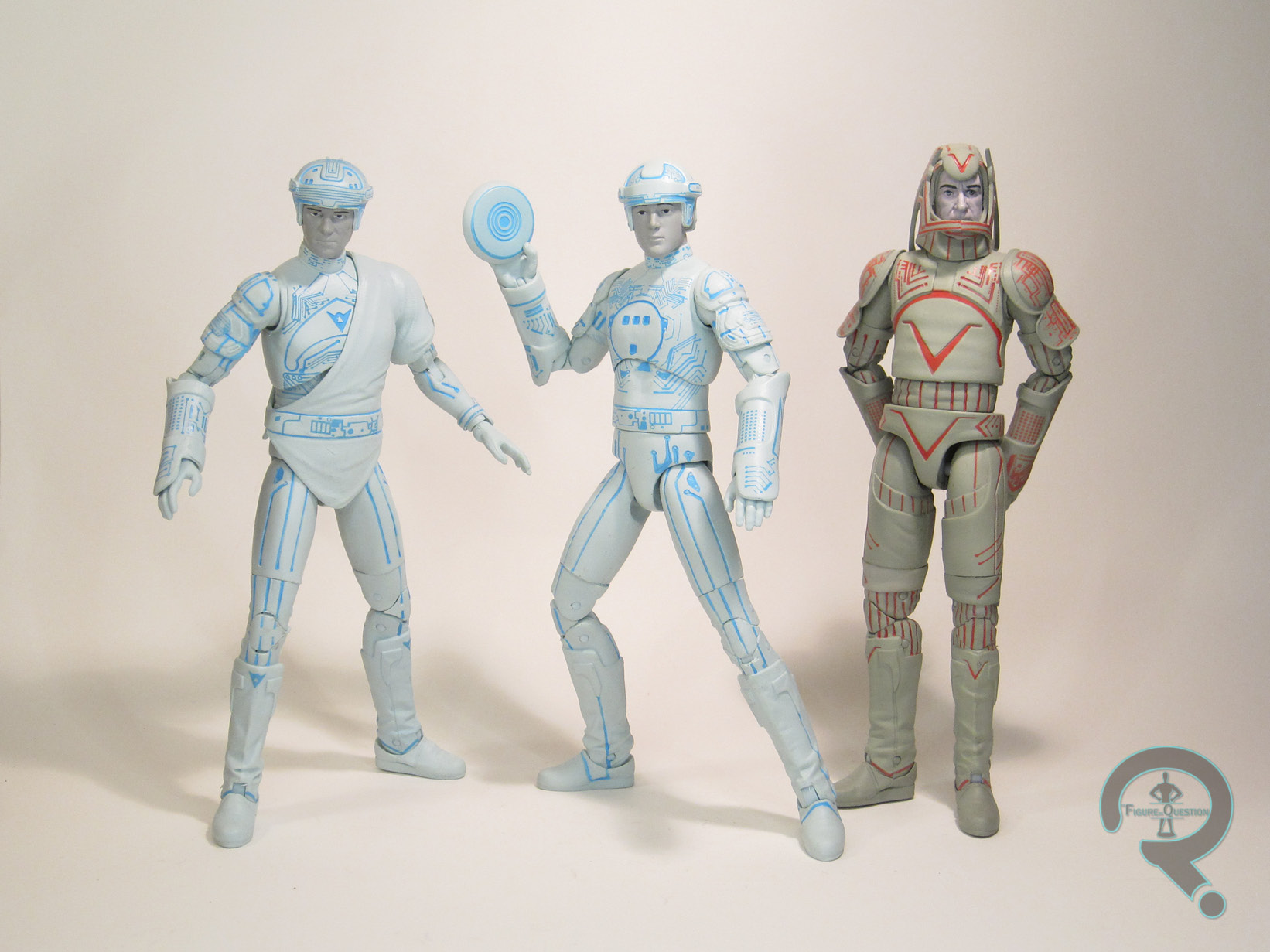
Tron, Flynn, and Sark make up the first series of Tron figures from DST.  The line-up seen here is specifically the Walgreens-exclusive, slightly paired down line-up; specialty stores will be getting the same Tron and Sark, as well as Flynn in a red color scheme (because why not, I guess), and all three will include parts to build a Recognizer.  The Walgreens set started hitting in early September, and the specialty line-up should be arriving in the coming weeks.

TRON

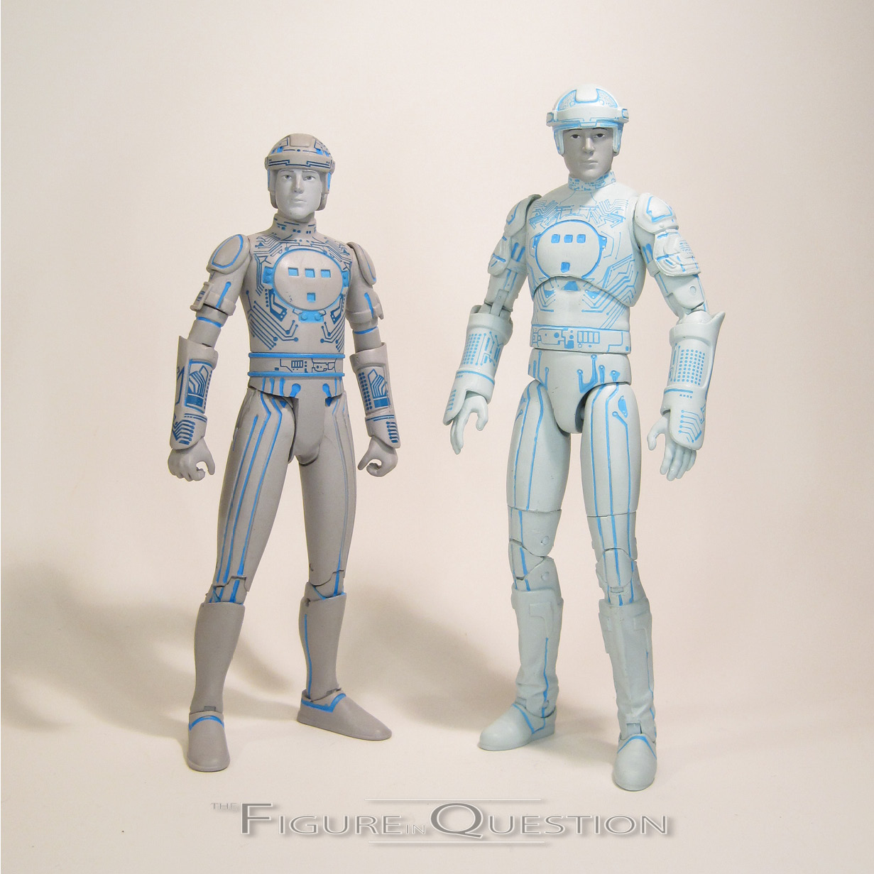
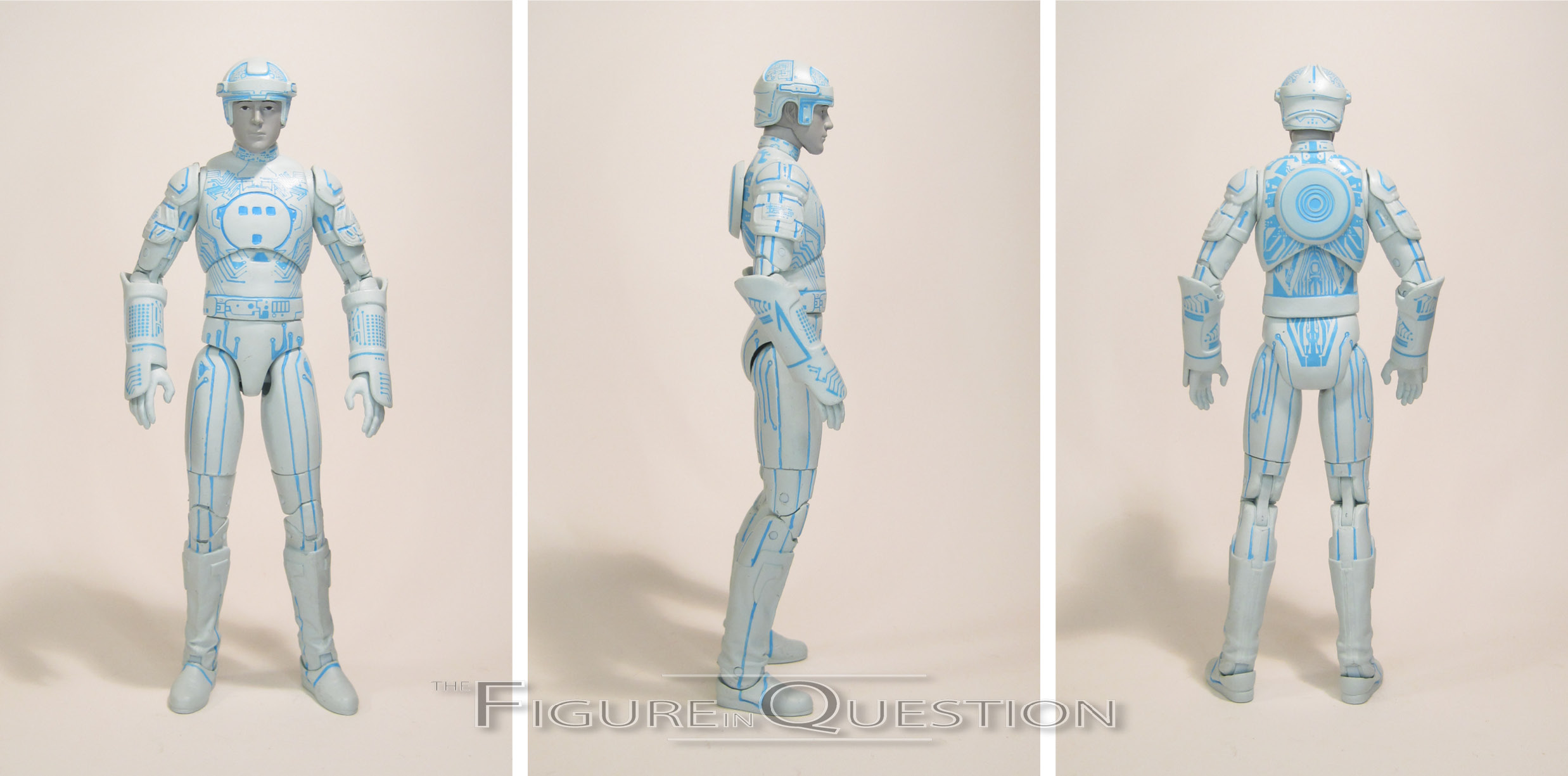
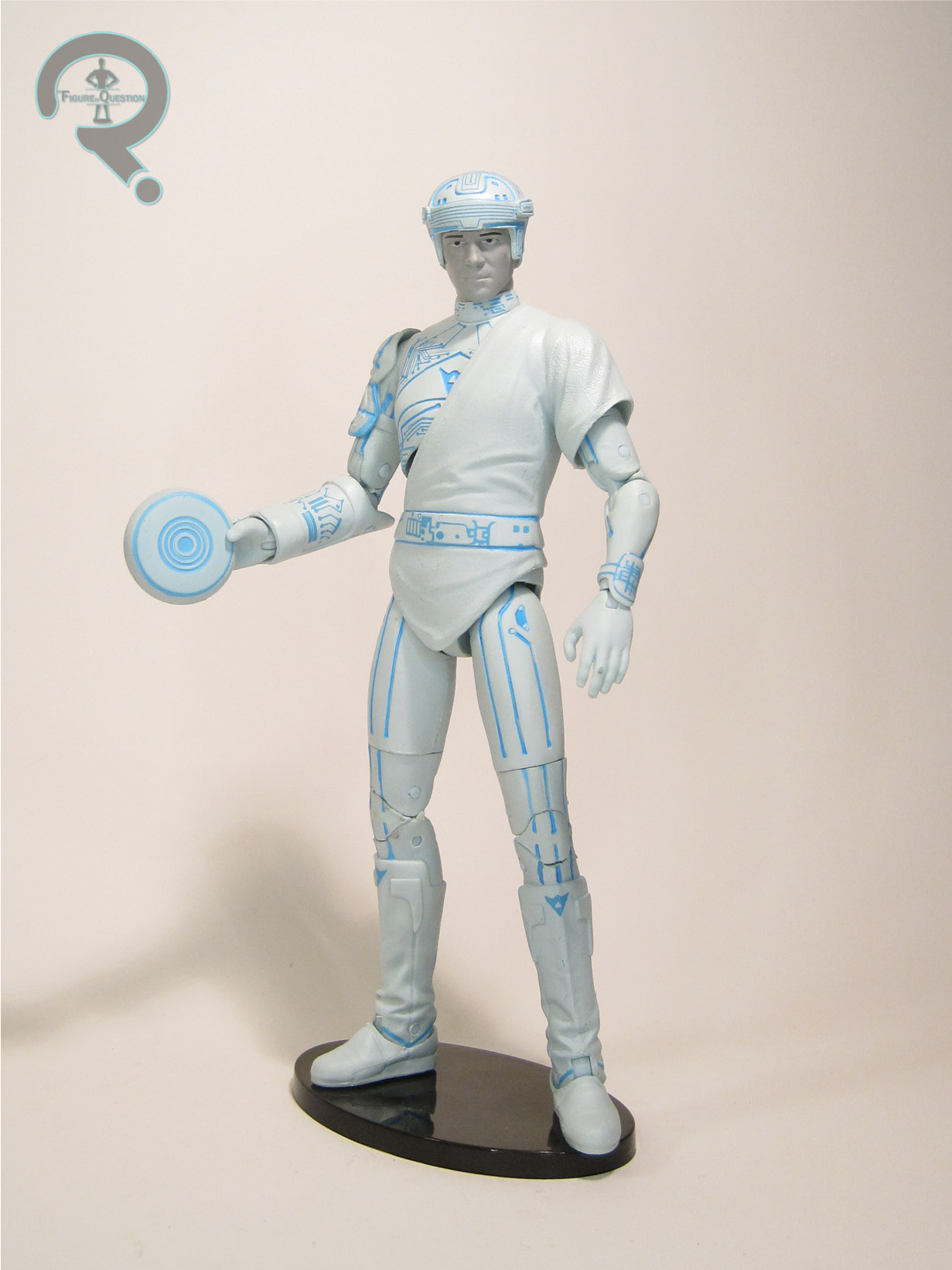
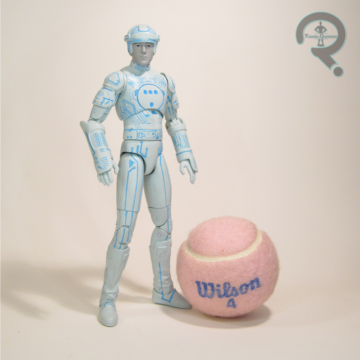
Both Tron and Sark were just released in DST’s Kingdom Hearts line.  I had initially thought that these figures would be slight retools of those releases, but that’s actually not the case.  Tron is seen here sporting an all-new, more movie inspired sculpt.  The figure stands 7 1/4 inches tall (giving him a 1/2 inch on his predecessor) and he has 29 points of articulation.  Comparing the two Tron figures, leads to the question “does more articulation mean more posability?” and in the case of these two figures, it’s kind of a toss-up.  The double joints on the elbows and the swivels on the thighs certainly are an improvement, but the hips just seem different for the sake of being different, and the added mid-torso joint doesn’t change his range in the slightest, meaning he’s got a break in his sculpt there for no practical reason.  Perhaps most frustratingly, the neck, which had a decent range on the KH figure is now greatly reduced.  That’s disappointing.  The overall sculpt is a bit less stylized, obviously, since it’s based on the movie, and not a game, so Tron has a slightly more realistic set of proportions, as well as greater detailing on a few areas of the sculpt.  The boots in particular are quite impressively handled.  That said, the head is different from the previous figure, but I can’t really say it’s any more accurate or closer to Boxleitner in appearance.  In general, while the sculpt goes for a more realistic look, I found that the sculpt made more compromises for the articulation this time, and the end result is a figure that just never looks quite as natural standing on the shelf as the previous figure.  Tron’s paintwork marks another change from the KH figure, and honestly another area of different for the sake of difference.  Rather than the grey with blue of the prior figure, this one is predominantly a light blue, with grey for the “skin” and darker blue for his tron-lines.  I suppose an argument can be made for this being more accurate to the film, but the very dynamic nature of how the characters look on screen means that either appearance reads more or less as accurate.  Tron is packed with his disk (a notable improvement over the KH figure) and a display stand.  The disk is nice to have, though it’s worth noting that his hand posing isn’t totally ideal for holding it and it has a little trouble staying in place on his back.

FLYNN

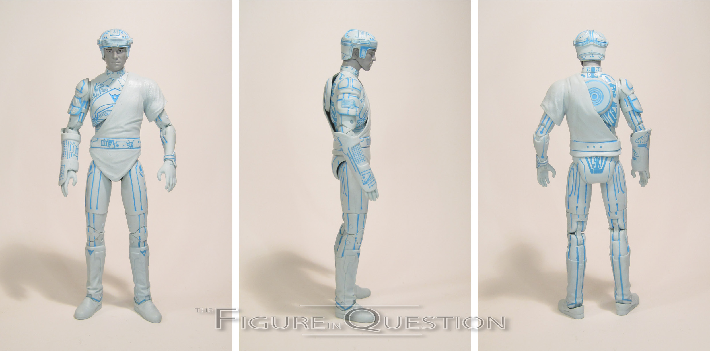
The movie may be named after Tron, but Jeff Bridges’ Kevin Flynn is the more clear-cut protagonist (and his son is undoubtedly the protagonist of Legacy).  Despite all that, he’s far less common as a figure, and was left out of the Kingdom Hearts stuff.  Also, for whatever reason, DST decided to make the wider release version of him in red, rather than his blue that is his default look, making this figure the most desirable of the Walgreens trio by a country mile.  Yay? Flynn’s construction is very similar to Tron’s, and the two of them share the same right arm, lower torso, pelvis, hands, and lower legs.  The articulation is the same here as above, for better or for worse, but on the plus side, Flynn’s got his little toga thing from the movie, which hides the non-functioning torso joint for the most part.  Of course, then it ends up restricting his left shoulder.  You win some, you lose some.  The head, though not a spot-on likeness of Bridges, is at least distinctly a different person, so there’s that leg up on the TOMY figures.  Flynn’s paintwork very much follows the model of Tron’s, swapping out the character-specific details of course.  He’s still predominantly that light blue color.  The specialty release will, of course, swap this out to match Sark’s colors.  Flynn is packed with a disk and display stand.  They’re the same as Tron’s, but the tunic at least keeps the disk more in-place when on his back.
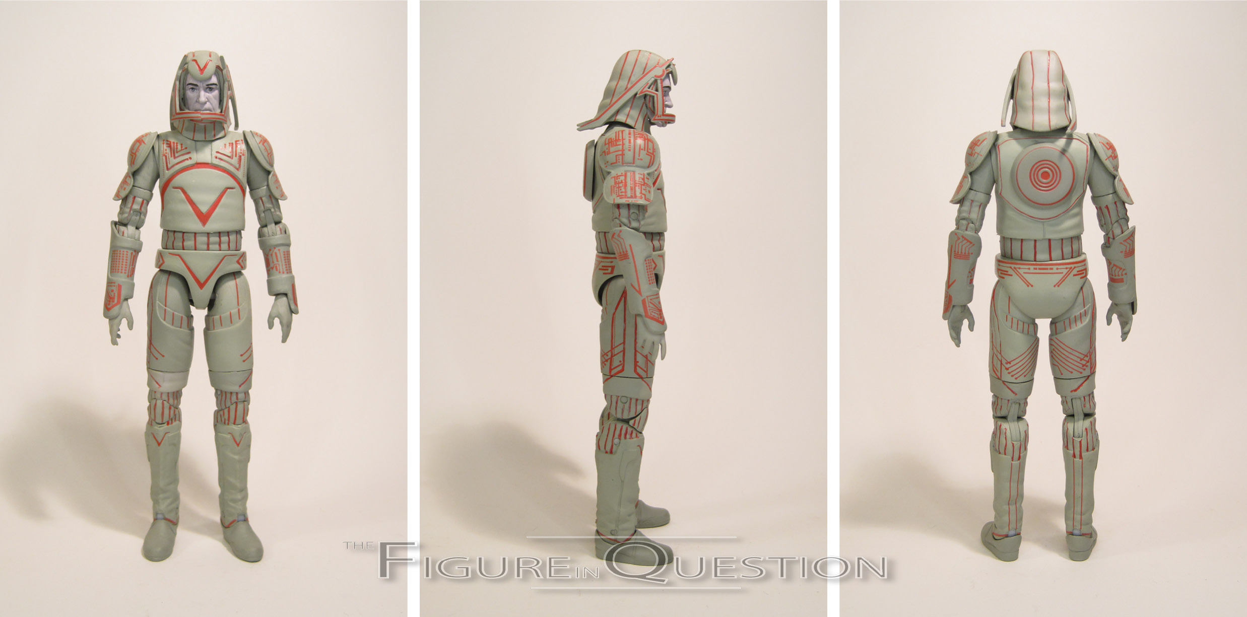
SARK

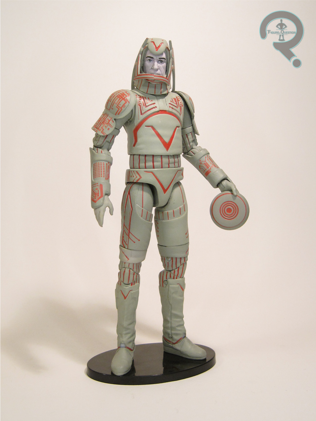
The legendary David Warner actually does triple-duty in the original Tron, with turns as corrupt exec Edward Dillanger, Big Brother stand-in Master Control, and dictator-esque program Sark.  Of the three, I guess Sark’s kind of the most toyetic, isn’t he?  Sark was offered in the Kingdom Hearts line, but like Tron, this figure is an all-new offering.  He shares no parts with the other two figures, and that’s probably for the best.  By and large, Sark’s articulation actually works a fair bit better than the other two.  The range on the shoulders was definitely better, and the mid torso joint is not only functional, it’s also pretty much hidden.  In general, the articulation and the sculpt mostly stay out of each other’s way on this guy.  Getting him into a basic standing pose is a lot easier here.  By far my favorite part of the sculpt is the head.  While the other two likenesses are so-so at best, Sark is pretty unmistakably Warner, even if he’s hiding behind all that goofy headgear.  Sark’s paintwork goes back to that KH styling, with the majority of things being grey, with the red highlights thrown in.  This confirms for me that I really just prefer the grey with accent color look, as it just works a lot better.  I don’t know why they opted to do it the other way for Tron and Flynn.  Sark is again packed with his disk and a display stand.  The disk is still tricky to hold, but is at least much more secure when plugged into his back.

THE ME HALF OF THE EQUATION

When these figures were shown, I had no idea if I’d be picking them up, because they honestly didn’t look all that different from the Kingdom Hearts releases, and I don’t believe Flynn was part of the initial line-up.  I happened across Tron and Sark while checking some Walgreenses in an out of my area location.  I almost just picked up Sark, but decided to grab the pair, and at the time had no clue about the Flynn figure.  Once discovering Flynn’s existence, I was able to get hold of him as well with an assist from Max.  I want to like these figures more than I do.  Tron is really hurt by following the KH figure.  While this one tries some new things, ultimately, the more standard faire of the previous figure is just more enjoyable to me.  Flynn is more unique, but still suffers from a lot of the same issues.  Sark is by far the best of the trio, and is the only one that really seems to succeed in what they’re trying to do with this line.  Ultimately, I’m not sure what DST’s aim was with these figures, but they’re something of a mixed bag, and a little hard to recommend.  They’re not terrible, and at least the Walgreens releases are pretty cheap, but I can’t see the specialty versions being worth $30 a piece.

#2185: Jokerz

JOKERZ

BATMAN BEYOND (HASBRO)

Batman Beyond marked something of a notable turning point for DC toys.  The license had been with Kenner for pretty much the entirety of the ’90s, and Kenner had handled the toys for both Batman: The Animated Series and Superman: The Animated Series.  By Beyond’s premiere in ’99, Hasbro, who had purchased Kenner in ’91, had closed down the Kenner offices and rolled everything in under their name, making Beyond‘s tie-in toyline one of their first proper DC offerings.  Their approach to it was…less than ideal.  The line was populated mostly with variants of the main character (and no actual straight standard version of him either), with practically no antagonists or supporting cast members.  The lone antagonist in the first assortment played further into Hasbro’s misunderstanding of what they were adapting…for reasons I’ll get to further into the review.

THE FIGURE ITSELF

This figure, dubbed “The Jokerz” on the package, was shipped in the initial assortment of Batman Beyond figures in early 1999.  In the show, “Jokerz” refers to the roaming gangs of Joker-inspired thugs that would serve as minor antagonists throughout the show’s run.  None of them are actually named “Jokerz.”  This particular figure is actually based on J-Man, the leader of the gang that receives a beat-down by Bruce in the show’s pilot (who, fun fact, was voiced in all of his recurring appearances by DCAU producer Bruce Timm).  Of the early Jokerz, he was the one with the most classically Joker appearance, which no doubt is why he was chosen for the spot here. The figure stands a little under 5 inches (thanks to the wide stance of his legs) and he has 5 points of articulation.  Though Kenner’s S:TAS figures had added a waist joint as a standard for most of the figures, the Beyond figures went back to the basic neck, shoulders, and hips set up.  Given the generally not-as-animation-accurate nature of this line, J-Man’s sculpt is actually fairly decent, and honestly pretty faithful to the design from the show.  The pose is kind of an issue, though; he was designed to ride a goofy bike thing for some reason, which ends up hampering the figure proper quite a bit.  Also hampering the figure?  The paint.  It’s fits within the classic “Joker” colorscheme, but doesn’t follow J-Man’s actual appearance from the show, which was far more subdued and also made it more abundantly clear that he was wearing makeup, rather than just having white skin like the original.  They’ve also put him in bright pink, in contrast to the darker purple he was sporting in the show.  J-Man was packed with an “Assault Hover-Cycle”, which was kind of a goofy looking thing that didn’t really match anything on the show.  But there it was, I guess.

THE ME HALF OF THE EQUATION

Future Knight Batman (the closest the line got to a standard Batman) was a hot commodity when these figures hit.  Hot enough that I didn’t get one at first and therefore he was on my birthday list for ’99.  I actually ended up getting two from different family members, so one of them went back to the store, and I got this guy in exchange.  J-Man was a character I had something of an affinity for the show (I’m a self-professed lover of background and side characters), so I enjoy the figure for what it is.  That said, given all of the far more unique and distinctive characters from the show’s first season who went without figures, his inclusion is certainly odd.

#2184: Ch’od

CH’OD

X-MEN (TOY BIZ)

“An alien from the Shi’ar galaxy, Ch’od’s monstrous, reptillian form belittles his keen intellect and heroic heart. Once a slave, he has regained his freedom, and now travels the spaceways in the company of the Starjammers, always on the lookout for other victims of tyranny in need of his aid!”

From Amphibian Man to lizard man!  Prior to hitting it big over at Marvel with his stint on X-Men, Dave Cockrum had tried to pitch some of characters he’d been holding onto for a while to Marvel Spotlight and Marvel Premiere.  Among those concepts was The Starjammers, a group of space pirates who would eventually find their way into the Marvel Universe through the pages of X-Men, where they became the crew of Cyclops and Havok’s father Christopher Summers, aka Corsair.  The line up has had its fluctuations over the years, but one of the mainstays has been Ch’od, big reptilian guy who would really prefer you stopped confusing him with Abomination.

THE FIGURE ITSELF

Ch’od was released in series 6 of the Toy Biz X-Men line.  He, alongside series and team-mate Raza, was the line’s first introduction of the Starjammers.  Their leader Corsair would follow shortly after in the assortment based on The Phoenix Saga.  To date, this remains Ch’od’s only action figure, but who knows, maybe he’ll get some Legends love sometime soon.  The figure stands just over 5 inches tall and has 6 points of articulation.  He loses out on elbow and knee articulation, I can only guess due to his relative size and build.  He does get a waist joint, though, as well as a neck joint, which was frequently one of the first joints to go for this line.  Despite his slightly less posable nature, or perhaps because of it, Ch’od actually has one of the best sculpts from early in the line, certainly the best of his particular assortment.  He captures Cockrum’s rendition of the character quite nicely, and his sculpt has a surprising level of detail and texture work for the time.  Ch’od’s paintwork is fairly basic, with minimal detailing on the face, shorts, and belt.  The rest of the figure is just molded in a bright green, which is perhaps a touch on the bright side for Ch’od, but hardly the worst choice ever.  Ch’od is packed with his white furry companion Cr’eee, who pegs onto his shoulder via a rather obtrusive peg that’s pretty much going to guarantee that you don’t ever display one without the other.  Ch’od also has an action feature, dubbed “Double Arm Hurling Action” which is pretty self explanatory, and actually works surprisingly well.

THE ME HALF OF THE EQUATION

Okay, so here’s an odd one for me: I have genuinely no idea where this guy came from.  I remember my dad having one when I was growing up.  I remember wanting to get one.  And I remember that I did *not* get one new.  A few years back, while prepping for a move, I found a box of 20-some X-Men figures I’d been missing, and Ch’od was in with them.  The timeline of when the box went missing means that he didn’t get bought during my big 5-inch buy in 2011, so I just don’t know what his deal was.  Whatever the case, I’m glad I have one because he’s a really nifty figure.  He just baffles me.

#2183: Amphibian Man

AMPHIBIAN MAN

GUILLERMO DEL TORO SIGNATURE SERIES (NECA)

“Unable to perceive the shape of you, I find you all around me. Your presence fills my eyes with your love, it humbles my heart, for you are everywhere.”

2017’s The Shape of Water was another critical success for director Guillermo del Toro, who likes to flip back and forth between fun action pieces and deeply personal, gothically-inspired fairy tales.  Shape of Water was a more personal piece, and in fact one that del Toro’s been working on in the background for several years now, originally beginning life as a pitch to Universal Studios for a reboot of their Creature from the Black Lagoon franchise, but this time through the eyes of the creature.  When Universal turned him down, he reworked it into something more distinctively his own, and ultimately passed up directing the second Pacific Rim in order to complete it.  The film’s central creature is clearly its most distinctive design, marrying the classic Gill-man with something a little more Abe Sapien-inspired (and since he was portrayed by del Toro mainstay Doug Jones, he also shares an actor with Abe).  Courtesy of NECA’s Guillermo del Toro Signature Series launched last year, the Amphibian Man has just made his way into articulated plastic form!

THE FIGURE ITSELF

The Amphibian Man is figure 5 in the Guillermo del Toro Signature Series line-up.  He’s the first, and likely to be only, figure from Shape of Water, and our third figure of Doug Jones in the line, following the Pale Man and the Faun.  The figure stands 7 inches tall and he has 32 points of articulation.  He’s one of NECA’s most articulated figures ever, which is really impressive, as is the range of motion you can get out of all those joints.  For a character like the Amphibian Man, it’s kind of key for him to be very flexible, so it’s nice that NECA kept this in mind when designing him.  Amphibian Man’s all-new sculpt is quite frankly one of NECA’s most impressive, and that’s saying something for them.  Not only is it screen accurate, but pretty much no detail has been overlooked on this figure, and no real sacrifices have been made in the name of all of that articulation.  Unlike the previous Signature Series figures I looked at, I don’t feel that there’s an obvious weak point to this sculpt.  Everything is really good.  Equally impressive is the paint and color work.  I feel the need to specify paint and color, because it’s not just the paint that sells things.  The figure is molded in a slightly translucent plastic, and the paint is applied on top of that, which makes this guy look like an actual aquatic creature, and keeps his fins and gills appropriately clear.  The paint is sharp and clean, and captures the vibrant patterning on the Amphibian Man’s head, arms, and legs very nicely.  The Amphibian Man is packed with a rather impressive, rather immense selection of extras.  He gets an extra screaming head (with articulated jaw), a spare set of forearms and hands (the purpose of which I’ll get to in a second), a plate of boiled eggs, and a chunk of the labroom floor he was chained to in the movie, complete with chains and clasps for his neck and wrists.  The head is a great inclusion given how expressive the character is in the film (and also addresses my only complaint with the Faun’s accessories), and the eggs are a fun moment-specific extra.  The arms end the fins about half an inch earlier than the standard ones, making them ideal for use with the base and the cuffs included, which was a sensible choice on NECA’s part.

THE ME HALF OF THE EQUATION

Contrary to what my Pan’s Labyrinth review might lead you to believe, I actually saw Shape of Water while it was in theaters, and it was the announcement of this figure that brought my attention to the Signature Series as a whole, ultimately leading to me picking up the Faun.  I loved the creature design from Shape, due in no small part to its Abe Sapien similarities, and I knew I wanted this figure as soon as it was shown off.  He makes for a really nice figure, and definitely is one of NECA’s finest.

Like the Faun and Ofelia, the Amphibian Man was purchased from my friends at All Time Toys.  If you’re looking for other toys both old and new, please check out their website and their eBay storefront.

#2182: Beast Morphers Gold Ranger

BEAST MORPHERS GOLD RANGER

POWER RANGERS: THE LIGHTNING COLLECTION (HASBRO)

So, the thing about Power Rangers is that the sixth rangers are always the coolest part of any given season of the show.  The other thing about Power Rangers is that the term “sixth rangers” refers to any of the additional rangers added after the start of the season…which means it might refer to the fourth or fifth ranger, in actuality.  Case in point?  Today’s “sixth” ranger, the Beast Morphers Gold Ranger!

THE FIGURE ITSELF

Beast Morphers Gold Ranger is part of the second series of Power Rangers: The Lightning Collection, one of two Beast Morphers in the line-up, as well as one of two Sixth Rangers in the line-up.  He’s also the most currently relevant figure in the set, being very recently introduced in the show and all.  The figure stands 6 inches tall and he has 34 points of articulation.  He’s sporting another all-new sculpt, which appears to be fairly faithful to the show.  I myself must admit to not having watched the show myself (I didn’t really keep up with things post Time Force), but he looks fairly accurate from what I’ve pulled up online.   The design is, in my opinion, one of the strongest of this particular iteration, and to my eye calls out a lot of similarities to Kamen Rider.  Similarities to Kamen Rider are never a bad thing, so that works for me. I’m not the biggest fan of the boots, but that’s just me being picky, I suppose.  The construction on the figure is mostly pretty solid, with just one overlay piece for his shoulder harness; it’s free-floating, which is better for the figure’s posability, so kudos to Hasbro for leaving it un-affixed.  The paintwork on this guy decent for the most part, though not completely without its issues.  The coverage on his visor is a bit inconsistent (and this was the better option of the two figures I had to chose from).  The other paintwork isn’t that bad, though, so the overall appearance is passable.  The Gold Ranger is packed with an unhelmeted Nate Silva head, his striker morpher in blaster mode, his striker saber, an effect piece for it, and two pairs of hands.

THE ME HALF OF THE EQUATION

The thing about this Gold Ranger is that he’s not the one I wanted.  Like, I mean him no offense, but my favorite sixth ranger is the original Gold Ranger, you know, the one from Zeo.  That one was an SDCC-exclusive this year, and I therefore didn’t get it.  This one was announced shortly after, and prior to seeing the pictures, I had a brief glimmer of hope that he might be a quickly turned around re-issue.  Then this guy showed up instead.  And no, he’s not technically what I wanted, but that’s admittedly not his fault, and it doesn’t stop him from being a good figure either.

I grabbed the Gold Ranger from All Time Toys.  If your looking for other toys both old and new, please check out their website and their eBay storefront.

#2181: Robin & Raphael

ROBIN & RAPHAEL

BATMAN VS. TEENAGE MUTANT NINJA TURTLES (DC COLLECTIBLES)

Obviously, no company in their right mind would release just *one* of the Teenage Mutant Ninja Turtles, so that means for the purposes of these here Batman Vs. Teenage Mutant Ninja Turtles packs there’s a necessity for a Batman-character to go with each of them.  Yay for the Bat-Family and their now needed inclusion!  Today’s pack is all about teenage rage and an appreciation of the color red!

THE FIGURES THEMSELVES

Robin and Raphael are set two of the GameStop-excluisve Batman Vs. Teenage Mutant Ninja Turtles line.  They actually ended up showing up at the same time as the Batman and Leo set, despite the initial plan being one set a month.

ROBIN

There have been six Robins in the mainstream DC universe, and the crossover opted for the most recent of them, Damian Wayne, Bruce’s teenage son.  For the purposes of unique builds and designs, he’s actually a pretty solid choice.  The figure stands 4 3/4 inches tall and he has 27 points of articulation.  Compared to the last animated-inspired Damian figure I reviewed, this one’s a far better articulated offering.  Additionally, his smaller stature means that his joints have a better range of motion than his father did, making him easier to get decent poses out of him.  Robin’s sculpt is a clean recreation of his animation design.  The build is conceivably accurate for a young teenager, going for a slightly cartoony interpretation without looking too goofy.  Unlike Batman and Mikey, Robin gets a sculpted cape rather than a cloth one.  Given the smaller size of the cape, it actually ends up working out alright.  He’s got a separate folded down hood piece which sits atop the shoulders of his cape.  It doesn’t stay in place amazingly well, but it’s easily removed if it bugs you.  Robin’s paint work is certainly the most colorful of the bunch we’ve gotten so far, which is a nice change of pace.  The application is still clean, and the line work still works very well.  Robin is packed with an even more impressive selection of accessories than his dad, with three sets of hands (fists, open grip, and closed grip), a batbomb, two batarangs, a grapple with two hooks, an extra head with the hood pulled up, a staff fully extended and collapsed, a Gotham City manhole cover, and a slice of pizza.

RAPHAEL

Raphael is something of a rage machine, which makes a degree of sense for pairing off against the usual ragey Damian.  Raph stands 6 inches tall and he has 28 points of articulation.  Raphael’s construction is much like the other two Turtles, and the articulation works much the same as with the others.  The range of motion’s pretty solid on all of them, and his joints are tighter like Leo’s.  Raphael’s sculpt goes for making him the largest of the four turtles, which is an approach I can certainly get behind.  It makes him a rather hefty figure, which pairs him off well with the quite small Robin figure.  It’s a strong sculpt, and I think it’s probably my favorite of the three Turtles I’ve looked at so far.  Raph’s paint does mix things up a bit, making his skin tone a duller shade of green than the other two turtles.  The lines here are also a bit bolder, adding to that overall chunky thing he’s got going.  Raphael includes three sets of hands (fists, open, and gripping), an extra head wearing a helmet, his sais, and a slice of pizza.

THE ME HALF OF THE EQUATION

I picked this pair up at the same time as the other two, and this was honestly the set I was slightly more interested in.  While Damian’s not my favorite Robin, I’ve developed a real appreciation for him.  This figure’s honestly the best one the character’s ever gotten, meaning he’ll pair off real well with Batman in that regard.  Raph is a pretty darn solid figure in his own right, though, and I don’t feel this set is quite as one-sided as yesterday’s.

#2180: Batman & Leonardo

BATMAN & LEONARDO

BATMAN VS. TEENAGE MUTANT NINJA TURTLES (DC COLLECTIBLES)

Just at the end of last month, I took my first look at the latest branch of TMNT figures, specifically the cross-over ones from Batman Vs. Teenage Mutant Ninja Turtles.  The debut figure was a single figure crossing over both concepts, but the rest of the line is doing the crossover via packs of two figures, one from each of the two franchises.  Today, I look at the unquestionable lead of one franchise, and the disputed lead of another, with Batman and Leonardo!

THE FIGURES THEMSELVES

Batman and Leonardo are the first of the five two-packs that make up DCC’s Batman Vs. Teenage Mutant Ninja Turtles line. The whole line is currently exclusive to Gamestop, but time will tell if that’s actually going to stick or not.  Whatever the case, these two started hitting Gamestop shelves last month.

BATMAN

Would you believe me if I said that the primary selling point of this set for me was another Batman figure?  I know, I’ve got hundreds of them at this point, why obsess over one more?  Well, if I’m being entirely honest, after the disappointment of DCC’s B:TAS Batman figure, I’ve been in the market for a decently handled vaguely animated Batman figure, and that’s what this one appeared to be.  Batman Vs. TMNT gives Bats a rather classic appearance, but with an interesting stylized flair, which translates well to this toy form.  The figure stands 6 1/2 inches tall and he has 27 points of articulation.  Articulation was perhaps the best part of the Mikey figure, and while Batman’s not *quite* as good, he’s still pretty darn good in his own right.  The range on the legs and the torso is solid, and I felt like the feet were quite good for keeping him flat-footed.  The neck does okay for a single ball-joint, but is a little restricted.  The worst restriction, though, is to the elbows, which just barely make it to 90 degrees.  It’s not ideal for a Batman figure.  His sculpt is another all-new affair, which makes sense, given the unique stylizing from the movie.  It’s another strong sculpt as well, capturing Batman’s usual chiseled nature quite nicely, and just generally building an aesthetically pleasing version of the character.  Like Mikey, Batman’s cape is cloth, and it’s a virtually identical piece.  That’s a good thing, because I loved the cape on Mikey, and I love the cape on Batman.  It definitely makes for some fun with posing him.  Batman’s paintwork is fairly strong.  The base colors are cleanly applied, and the extra line work really helps to sell the animated appearance.  As with all DCC paint, I worry a little about how it will hold up over time, but it looks good now.  Batman has a fairly sizable selection of accessories.  He includes four sets of hands (in fists, wide grip, tight grip, and split finger grip), a batarang, a bat-bomb, a grappling hook with two hook attachments, and a slice of pizza.  Because yes, Batman needs pizza.

LEONARDO

Leader of the Turtles, and fan of the color blue, Leonardo is a good pairing for Batman here.  Frequent readers will note that I generally don’t have a super high opinion of Leo, but this one has the benefit of being packed with the Batman figure I just reviewed and liked so much.  Leo stands 5 1/2 inches tall and has 28 points of articulation.  On the articulation front, if you read my review of Mikey, than you pretty much know what’s up here.  All of the Turtles appear to be using the exact same articulation layout, which honestly isn’t a bad choice.  It did seem that the joints were a little bit tighter on Leo, which is a slight improvement.  Leo is sporting an all-new sculpt, which appears to translate his design from the movie pretty well.  The mid-sized build definitely works for Leo when compared to the others.  It’s not all perfect, though.  This design moves Leo’s swords from their usual spot on his back to down on his left hip.  While I don’t hate this choice, it’s definitely something that works better in animation than in plastic.  Once in place, the sheaths prevent the left arm from sitting comfortably.  Additionally, they don’t really stay in place very securely, so posing will tend to knock them out of place a lot.  Getting them to stay on for the photos here was no small feat.  Leo’s paintwork is pretty much the same set up as everyone else, so it’s pretty clean, and the line work adds a nice dynamic sense to him.  Leo is, like Batman, decently accessorized.  He has three sets of hands (fists, gripping, and flat), his two katanas, the sheaths for them, and another slice of pizza.

THE ME HALF OF THE EQUATION

When these packs were announced, the only one I really knew I wanted was the Donatello/Batgirl pairing.  The rest I was a bit iffy on.  But then I picked up the Mikey as Batman figure, and I really liked him, which persuaded me to check these guys out.  Batman’s the star for me, and is easily the best Batman figure that DCC has released.  He’s got some minor flaws, but not enough to hold him back in my eyes.  Leo is…Leo.  I don’t have a tendency to get excited about him, and this figure didn’t change that.  If you like Leo, though, I’m sure he’s pretty cool.


#2179: Poe Dameron

POE DAMERON

DISNEY TOYBOX

So, hey, you know what Friday was?  Yeah, it was Triple Force Friday!  The third “Force Friday” event since the sequel trilogy launched.  It was uhh…it was…well, it happened.  On a Friday no less.  Despite much promotion, it was easily the most anticlimactic and underwhelming event of the three events so far.  So underwhelming in fact that today’s item isn’t from Triple Force Friday at all!  Instead it hit at the end of this summer.  And yes, it’s a Poe Dameron figure.  Contain your shock, please.

THE FIGURE ITSELF

Poe Dameron is figure 11 in the Star Wars branch of the Disney Store-exclusive Disney Toybox line.  This line started back in 2017 as a way for Disney to salvage some of the assets from their failed Disney Infinity game.  Seeing as Poe had a figure in that line, and they already had his render on file, it’s not a majorly huge surprise that he made his way in here. What’s ever so slightly surprising is that he made it into the line before Finn, who tends to get the secondary status of the new trilogy’s trio.  I mean, I’m not complaining about getting a Poe, or anything, so it’s not a big deal.  Poe’s Infinity figure was in his flight suit, and while some of the Toybox figures have changed up the character models a little bit, he did not, so flight suit it is.  Admittedly, not the worst choice, since it gives the figure some overlap appeal between movies.  The figure stands a little under 5 inches tall and he has 25 points of articulation.  Poe makes out quite well on the articulation front, especially if yoyr used to things like the Elite Series, which were pretty limited.  Apart from some slight stiffness on the torso, there’s not much he can’t do.  His sculpt is obviously quite stylized, just like the Infinity figure was.  It’d definitely a bit more on the goofy side, but it does have that sort of classic Disney appearance to it, and it means that all of the figures in the line will look pretty good together.  Despite the cartoony nature, Poe’s head actually sports an alright likeness of Oscar Isaac, albeit in a very cartoony fashion.  There’s some pretty decent detail work throughout the figure, and he looks nice and clean.  The paintwork is all rather basic, but it does its job well, and looks the part.  There’s not real slop or bleed over, which is an area that some of the Disney in-house stuff has had issues with in the past.  Poe includes three accessories.   The first is his helmet, which is honestly the least impressive.  It’s a bit oversized, and it has an opaque visor, meaning it’s not ideal for actually keeping on the figure, versus just having him hold it.  He also includes a small blaster pistol, which is decent.  His last, and by far most impressive extra, is BB-8.  It’s fairly standard fair for BB-8, but cool nevertheless.

THE ME HALF OF THE EQUATION

My keyboard on my laptop decided to spontaneously stop working, so I had to take it to the mall to get it fixed.  While there, I found out the warranty was going to cover the repair, meaning I didn’t have to drop the couple hundred dollars I thought I would.  To celebrate that, I swung by the Disney Store and found this guy, who I didn’t even know had been released.  I’d not yet given Toybox a try, so this figure seemed like a good starting point.  I can’t really see myself getting super invested in any other offerings, but as another Poe figure, it’s really not bad.

#2178: First Appearance Thor & Balder

FIRST APPEARANCE THOR & BALDER

MARVEL MINIMATES

Jack Kirby was a major piece of comics history, especially when it comes to Marvel.  However, his actual work hasn’t quite so much been touched by the world of action figures.  There’s something about his dynamic style that doesn’t always lend itself to toys.  Fortunately, Minimates are in a position to offer a more artist-specific figure, as is the case with today’s entry, First Appearance Thor and Balder the Brave!

THE FIGURES THEMSELVES

Thor and Balder were released in the twelfth TRU-exclusive series of Marvel Minimates, which was meant to compliment the Thor/Cap-themed Series 42 of the main line.  This set was the Thor component and Cap/Crossbones made up the Cap component.

FIRST APPEARANCE THOR

Series 42 offered up a couple of Thor variants, but the closest we would get to a classic Thor update would be this guy, inspired by his Jack Kirby-penciled first appearance in Journey into Mystery #83.  There were some minor details that changed between Thor’s initial appearance and those that followed, allowing for this figure to have a few more unique things going about it.  Built on the standard body, the figure is 2 1/2 inches tall and has 14 points of articulation.  Thor has seven add-on pieces, used for his hair/helmet, cape/shoulder pads, wrist bands, belt, and boots.  Like all of the “classic” Thors before him, he uses the Stargirl wrist bands, which are a solid fit for the character.  He also re-uses a standard nondescript belt piece, since the details on his early belt were just different enough that he couldn’t use the already existing belt.  His last bit of re-use is the cape, which is shared with the Eric Masterson Thor from Series 42.  It’s a good Thor cape.  His helmet and boots are new additions.  The boots are the best Thor boots to date, which is why they’ve remained the go-to Classic Thor boots since this figure’s release.  The helmet, or rather the hair beneath it, is a far more unique piece, capturing the distinctive whisp of hair that brushes out from under the helmet at the left side of his forehead.  That’s a very Kirby trait, and it really sells what this figure is meant to replicate.  More so than the sculpted parts, the paint is really key to selling the Kirby vibe on this figure.  They really got it down, from the distinctive Kirby yell on the face, to that signature shading style on the torso.  There are some minor complaints to be had, of course, like the torso detailing being slightly too high, and I know not everyone was in favor of the flat grey helmet, but by-and-large, this is a very snappy looking paint scheme.  Thor is packed with his hammer Mjolnir, which is a distinctly different shape than previous versions, following after its look in JiM #83.  The head is narrower, and the handle is longer.  As with the hair, it may not be standard issue, but it’s a nice attention to detail.  It’s even got the “whosoever holds this…” on the side.  Also included is Mjolnir’s alternate cane form.  Yeah, it’s just a glorified stick, and not super useful without a corresponding Donald Blake, but it’s a cool little extra nevertheless.

BALDER THE BRAVE

Prior to his film in 2011, Thor’s coverage in the world of Minimates included himself and Loki, twice over.  The movie and the increased exposure it granted got us a handful of other supporting players, including his *other* brother, Balder the Brave, a character whom has had exactly one action figure ever.  Like his brother Thor, this version of Balder is clearly based on Jack Kirby’s version, though he has been toned down ever so slightly so as to better fit in with the other Thor supporting players.  Balder has seven add-on pieces, for his helmet, cape, glove cuffs, boots, and skirt.  The helmet is a new piece, and its slightly smaller side denotes its Kirby influence.  While I’m kind of partial to the ridiculously large helmet from the Simonson-era, there’s no denying that this is a well-sculpted piece in its own right.  The rest of the pieces are all re-used.  He gets Superman’s cape, Invaders Captain America’s boots, Cap TTA’s gloves, and a classic BSG skirt.  It’s a well-chosen selection of pieces, and makes for quite an accurate looking Balder.  Balder’s paintwork is pretty solid work as well.  As noted above, he tones down the Kirby-styling a little bit, but it’s still definitely there, especially on the face.  Overall, he’s got an attractive color scheme, though perhaps one that’s not quite as exciting as Thor’s.  Included with Balder is his magical sword.  Don’t tell him, but it’s actually the same standard sword we’ve been seeing since Valkyrie.

THE ME HALF OF THE EQUATION

At the time of this set’s release, there were a few options for a classic Thor, but prior versions had always seemed to be lacking something.  The First Appearance look may be little more appearance-specific than others, but swap out the hammer for a more standard issue one and you’ve got a really solid take on the main God of Thunder.  And, while he may lack some of Thor’s flair, but Balder is undoubtedly a well-put together figure, and an essential piece of any proper Thor collection.  If he was only going to get one ‘mate, this one’s a pretty decent one to get.

#2177: Purchase of the Droids

UNCLE OWEN LARS, C-3PO, & LUKE SKYWALKER

STAR WARS: POWER OF THE FORCE II (KENNER)

“Under attack by an Imperial Star Destroyer, protocol droid C-3PO and his partner R2-D2 safely escaped a battered Rebel capital ship and landed on the desert planet of Tatooine. Soon after, the droids were abducted by scavenging Jawas and sold to Owen Lars for use on his desert moisture farm. Luke Skywalker, nephew of Owen and a Tatooine youth, remained unaware that his uncle’s purchase of C-3PO and R2-D2 was to help launch one of the most pivotal destinies the galaxy had ever known…his own.”

Alongside its cast of very colorful lead and background characters, Star Wars also has quite a selection of quite average, not particularly colorful or unique in the slightest characters.  For the most part, these characters are rather easily overlooked by merchandising, but there are a few of them who are a touch plot relevant, such as Luke Skywalker’s aunt and uncle.  This poses the question:  how do you handle toys of these figures?  Kids aren’t exactly going to be lining up to buy a sort of paunchy middle-aged guy in a robe.  What sells him?  Colorful main characters of course!

THE FIGURES THEMSELVES

Uncle Owen, C-3PO, and Luke made up the “Purchase of the Droids” set, part of the 1997 assortment of the Cinemascenes sub-line of Kenner’s Power of the Force II.  The set is based on, stay with me here, the scene where they purchase the droids.  I know, crazy.

UNCLE OWEN LARS

Man, where’s all the toy love for curmudgeonly uncles?  What’s that?  Nobody cares about them?  Well that’s…pretty accurate, I guess.  This isn’t the only time Owen’s seen action figure form, but it was the first, because there just wasn’t time to fit him into the vintage line.  I know, we were all very sad.  The figure stands 3 3/4 inches tall and he has 6 points of articulation.  Owen sports an all-new, all-average-looking sculpt.  Perfect for the character!  He’s a bit more pre-posed than other figures from the same period; his right arm in particular is bent and angled in a slightly strange fashion.  I’m not entirely sure what they were going for there, and there’s really no pose it looks natural in.  The likeness on the face is about as good as any of these likenesses were.  He’s identifiable as the character he’s meant to be, and that’s really the main point.  Owen’s paintwork was a little more experimental than others from the line.  It’s a bit murky, but I guess that’s sensible for a guy who lives on a desert planet.

C-3PO

And here begins the slight tweaks for the major players.  There are actually a surprising number of 3POs in the Power of the Force line, though this is only the second one I’ve personally reviewed.  It’s worth noting that this one is actually pretty different from the first one.  He’s been brought more in line with the proper proportions for the character from the film, rather than the more stylistic interpretation of the first figure.  They also sharpened up the detail work a bit, and even added the restraining bolt that the Jawas placed on him when he was captured.  3PO’s paint work starts out with the same vac metalizing as the predecessor, but this one also gets a bunch of dirt and grime, depicting him as he looks after wandering Tatooine for a bit.  It’s definitely a unique look for 3PO and helps him stand out a bit from the other takes on the character.

LUKE SKYWALKER

By 1997, Power of the Force was just beginning to be neck-deep in Luke Skywalker figures, specifically of the “Farmboy” variety.  This figure would be the first of a whole bunch of Luke figures that would draw from the same base figure with a handful of changes here and there.  He was our first instance of the majorly slimmed down version of Farmboy Luke, which would later be used for no less than five separate versions of the character.  It’s not bad for a standard Luke, especially if it was your first time picking up one of this style.  I don’t have much to say about in light of having all of the other five.  He’s the one that comes in this set.  That’s his unique selling point.

THE ME HALF OF THE EQUATION

Though I didn’t have this set growing up, I remember that my cousin did, and it was one of the things that was left at my grandparents’ house, meaning I would frequently get to play with it when he wasn’t around.  I don’t know what happened to them in particular, but I picked up this one from Yesterday’s Fun over the Christmas holiday last year.  It’s more part of my drive to complete the line than to own any one figure in the set, but it’s one of the few Uncle Owens, and I do have to admit I quite like the 3PO.