#1354: Mary Jane Watson

MARY JANE WATSON

MARVEL FAMOUS COUPLES (TOY BIZ)

Hey, so Spider-Man: Homecoming is out today.  That’s pretty cool.  I mean, it’s not a super rare occurrence in this day and age, what with this being the sixth Spider-Man flick in less than 20 years (and the second reboot in five years).  Still, this one looks like it should actually be pretty good, which puts it above the last two movies in my eyes.  Anyway, in honor of the film, I’ll be looking at long-time Spider-Man recurring character, who may be his funky and fun female friend, his girlfriend, his wife, or his awkward ex via deal with the actual devil.  Yes, it’s Mary Jane Watson!

THE FIGURE ITSELF

Mary Jane was released in a two-pack with a Spider-Man variant as part of Toy Biz’s Marvel Famous Couples line.  It’s not a huge shock, since the odds of getting a Mary Jane in plain clothes sold on her own would be far from a solid business plan.  The figure stands about 5 inches tall and she has 9 points of articulation (albeit with limited motion on the neck joint).  She’s patterned on her design from the ‘90s animated series, which is certainly a solid look, and more importantly, it’s a look that was fairly easy to pull off with completely re-used parts.  Yep, Mary Jane is head-to-toe a re-use of the Series 2 version of Fantastic Four’s Invisible Woman.  The sculpt works surprisingly well for this design, and it’s also more unique than a lot of re-paints, since the original figure was all clear.  The hair’s not right for MJ, but you take what you can get, I guess.  The heavy work here is being carried by the paint work, which does its very best to turn Sue’s spandex costume into a sweater and jeans combo.  It actually works out pretty well, since MJ’s outfit was usually depicted as rather formfitting both on the cartoon and in the comics.  The only really unconvincing part is the boots, which are just painted on, and therefore look a little goofy.  Still, the paint is very bright, pretty clean, and largely very convincing when it comes to making her look like MJ instead of Sue.  Mary Jane included no accessories, unless of course, you count the included Spider-Man.

THE ME HALF OF THE EQUATION

I saw this set a number of times growing up, but I wasn’t enough of a Spider-Man fan at the time to get the pair.  Since then, it’s never been super easy to find, so I just never got one.  Mary Jane was another figure from Pop Culture Exchange in Omaha.  She was loose and by herself, which is fine by me, since I have plenty of Spider-Men.  She’s not anything amazing or spectacular, or even sensational, but she’s decent enough, and she’s an important enough player that I feel my collection would be incomplete without her.

#1353: Wasabi No-Ginger – Stealth

WASABI NO-GINGER – STEALTH

BIG HERO 6 (BANDAI)

Hey, you guys, guess what?  It’s been two weeks since my last Big Hero 6 review.  I guess it’s time for another.  This one’s my final review from the series (at least for the time being), and so I figured I might as well go back to the very beginning.  My first BH6 review was a Wasabi figure, and so’s my last one.  Let’s have a look, shall we?

THE FIGURE ITSELF

Wasabi was released in the third series of Bandai’s Big Hero 6 line, which was the “stealth” series.  Big surprise, that means that Wasabi is a stealth variant.  Also big surprise, he’s the same mold as the standard Wasabi.  By extension, he too is about 3 1/2 inches tall and he has 13 points of articulation.  The sculpt’s the same, for better and for worse.  It has the same ups and downs, which means he’s still got one of the best sculpts of the line.  The main changes to the figure are the paint, which has been made more subdued…mostly.  The green’s a lot darker, and there’s more black interspersed (which, by the way, has the added side-bonus of making him look a bit like a Green Lantern, which I’m definitely okay with), but there are also a few more bright spots mixed in as well. Still, he’s definitely darker as a whole.  The work is clean, and seems to be even cleaner than the original Wasabi, which is certainly a plus.  Like his predecessor, this guy includes his energy blade attachments.  I still think translucent plastic would look cooler, but the neon green looks cool.  Wasabi doesn’t have the coat included with the original, but upon looking through the other Wasabi’s on hand when I got this guy, it would appear that later shipments of the original figure were missing the coat as well.  He didn’t have it in the movie, anyway, so it’s not a huge loss, I guess.

THE ME HALF OF THE EQUATION

Have you read all of my other Big Hero 6 reviews?  No?  Go read them.  Good, now you can probably guess where this guy came from.  Yep, he’s another Ollie’s purchase.  I wasn’t initially going to get him, but Super Awesome Girlfriend and I were collectively getting the rest of the team, and I felt weird not getting a Wasabi, especially since he’s my favorite and all.  There’s not a whole lot that’s different here, but he’s still a pretty entertaining figure, and I think he’s the best of the stealth figures, at least going by what I’ve seen.

#1352: Power Ring

POWER RING

DC COMICS SUPER VILLAINS (DC COLLECTIBLES)

“Fearful, doubting, and self-destructive.  A coward at his core, Power Ring is able to negate any Green Lantern rings with his Lantern.”

Oh hey, it’s a DC thing.  That’s cool and different, I guess.

So, I don’t actually know if I’ve discussed the DC Multiverse here on the site just yet.  Back when DC was doing things other than being the worst at everything, they decided that they wanted to have multiple versions of their characters in play, and thus introduced the multiverse concept.  It started with Earth 2, which housed the Golden Age versions of DC heroes, but Earth 2 was quickly followed by Earth 3, a world that was the exact opposite of the primary Earth.  Columbus was an American explorer who discovered Europe, President John Wilkes Booth was assassinated by actor Abraham Lincoln, and instead of the heroic Justice League, the world was patrolled by the villainous Crime Syndicate.  Even after the destruction of the Multiverse, the Crime Syndicate have cropped up a few times over the years, most recently in the big crossover event Forever Evil.  Today, I’ll be looking at the evil Green Lantern-equivalent, Power Ring!

THE FIGURE ITSELF

Power Ring was released as part of DC Collectibles’ post-New 52 DC Comics Super Villains line.  He was part of the first half of the two Crime Syndicate assortments, alongside Ultraman, Superwoman, and Owlman.  The figure stands about 6 3/4 inches tall and has 27 points of articulation.  All of the figures in the set were, of course, based on the versions of the characters from Forever Evil, and Power Ring was no exception.  That being said, Power Ring’s design was the one that was almost completely identical to his classic design, which is cool by me.  The sculpt was unique to this figure, and is a pretty solid recreation of David Finch’s depiction of Power Ring from the mini-series.  It’s largely pretty clean, it’s well proportioned, and the articulation is worked-in rather organically.  The head sculpt is a slight bit more heroic than Power Ring is usually depicted, but it’s still a little more sinister than the average Hal Jordan, and that’s what matters.  The one thing that really solidifies this as a modern Power Ring is the right arm, which is showing the weird spreading infection thing that he had in the mini-series.  It’s not my favorite concept, but the actual detail work on the figure is well-rendered, adds some extra oomph to the sculpt.  My one major issue with this figure is an issue of durability; he hails from the time before DCC stopped using clear plastic for all of the joints.  While taking the photos for the review, my Power Ring’s hand just sort of fell off.  I was able to fix it with some glue, and the mobility wasn’t lost, but it’s still not a very comforting thing to have happen to a figure, and it certainly made me more cautious when posing him.  The paintwork on this figure is solidly handled; the dark metallic green is quite clean, and sets him apart from other figures.  I also really dig the pearlescent white on the gloves and boots.  I do feel like the green on the raised veins of his right arm are a little too present; slightly more subtle would have been better, I think.  Still, pretty solid overall.  Power Ring was originally packaged with his power battery.  My figure, however, was picked up loose, so he came sans the battery.  I’m not much of a fan of the modern battery design, so I can’t say it’s a huge loss on my part.

THE ME HALF OF THE EQUATION

This is a figure I’ve almost picked up a ton of times, but always passed on for other things.  I ultimately ended up finding him at this place called Orbit DVD, just outside of Asheville, NC, just a few weeks ago.  Ultimately, despite his New 52-inspired origins, he’s probably the best version of Power Ring on the market.  He’s not perfect, but he’s pretty fun overall.  It’s a shame that he juuuuuust predates the switch to the new Icons scale, because it means he doesn’t fit with much in my collection.

#1351: Captain America

CAPTAIN AMERICA

MARVEL UNIVERSE 10-INCH (TOY BIZ)

“Transporting himself back to the present day, the Spider-Man of the year 2099 materializes right in Avengers Mansion. Facing Captain America and She-Hulk, Spider-Man uses his amazing powers to escape. Scouring his now unfamiliar surroundings, this futuristic Spider-Man searches for the one who possesses the information he needs before he can return home – Wolverine!”

Okay, I know I’m not supposed to critique the bios, but this one’s really odd for Cap.  Like, all of the 10-inch figures from this era did this whole odd scenario used to tie together a bunch of random characters thing, but the fact that the bio goes out of its way to single out Wolverine and Spider-Man 2099, but just gives a passing mention to Cap seems a little bit odd.  *sigh*  I’m getting distracted….

Hey everybody, and to my American readers, Happy Fourth of July!  To my non-American readers, happy Tuesday, I guess.  I’m honoring this Fourth of July the same way I honor it every year: by reviewing a Captain America figure.  Let’s get onto the figure!

THE FIGURE ITSELF

Captain America was released as part of Toy Biz’s Marvel Universe 10-Inch line in 1997, alongside the also mentioned She-Hulk, Spider-Man 2099, and a Wolverine of some sort.  Cap is seen here in his classic costume, more or less.  The figure stands about 10 inches tall and he has 9 points of articulation.  He’s built using the same body used for the un-flamed-on Johnny Storm figure from the Fantastic Four line, which is quite amusing nowadays, but was completely un-connected to anything back when this figure was new.  The body’s okay for him, I suppose, though it’s a little small for Cap.  It also lacks the buccaneer boots, though those weren’t going to happen without all-new tooling anyway.  There are some artifacts of the old sculpt’s costume, which look slightly out of place, but are generally not too obvious or distracting.  The head is an upscaling of the Electro Spark Captain America from the 5-inch Spider-Man line.  As I noted in my review of the smaller figure, it’s a bit angry for my taste, but it’s not terrible.  Honestly, I think it looks a bit better at a larger size, so that’s actually pretty cool.  The paint is generally pretty decent.  The colors are all pretty bright, and the application is rather clean.  I’m not sure why he’s missing his pupils, but worse things have happened.  Cap was packed with his mighty shield.  It was a cool piece, but sadly mine was lost somewhere along the way.

THE ME HALF OF THE EQUATION

This guy came from one of my family’s summer trips to the beach back in the ‘90s.  My parents always took me to get something from the KB Toys in the nearby outlets, and this was the figure I decided to get that year, no doubt purchased alongside a VHS with some episodes  of the Ruby-Spears Captain America cartoon.  He was one of the earlier Cap figures I owned, probably my second after the Electro Spark figure.  He was definitely one of my  favorites of the 10-inch figures, and I still like him quite a bit, even if he’s a bit goofy.

#1350: Cyclops

CYCLOPS

X-MEN (TOY BIZ)

“One of the most powerful forces on Earth, Apocalypse has become the greatest villain in the world of the X-Men. Activating the Apocalypse holo-droid, Cyclops helps the X-Men learn how to fight a foe who is as powerful as his is evil. Avoiding blasts from his gattling gun hand, Cyclops, along with Storm and Jubilee, take down the Robot Fighter with a perfectly timed series of attacks!”

Okay, so I’m gonna warn my readers up front: this month is going to be pretty Marvel-heavy.  That’s just what I’ve been picking up a lot of in the last few weeks.  I’ll mix in some other stuff where I can, but there’s a lot of figures to cover.  With that out of the way, I’ll be setting my sights on today’s focus, Cyclops, who hails from Toy Biz’s lengthy X-Men line from the ‘90s.  I know, from the bio, you might have guessed this was an Apocalypse review, but not so.

THE FIGURE ITSELF

Cyclops was part of the “Robot Fighters” series of X-Men.  This was the 19th Series Toy Biz put out in the X-Men line and it was after they’d run out of steam with the more “normal” figures and switched to more gimmicky sub-lines that allowed for more variants of the main team.  The figure stands about 4 1/2 inches tall (he’s less hunched than Gambit, but still loses some height to it) and he has 5 points of articulation.  He loses even more articulation than his series-mates, bringing him down to Total Justice levels.  In fact, in more way than one, this guy feels more at home with Kenner’s TJ line than he does with most of the stuff Toy Biz was producing.  Even the design of his costume (which was unique to the figure and had no basis in the comics, apart from being vaguely inspired by his Jim Lee toggs) feels a lot like one of Kenner’s Fractal Armor designs.  As with Gambit, I’m still not certain how the Danger Room-related bios attached to these figures translates to these new, over-designed costumes, but there it is.  While the costume’s not the greatest, the thing that really holds this guy back is the pre-posing.  While Gambit’s deep crouch was workable with the articulation and allowed for a few decent poses, I have no idea what you’re supposed to do with this guy.  What’s he doing?  Is he shouting “come at me, bro?”  That’s all I can figure with the outstretched arms and slightly cocked head.  But it also appears that he’s in mid-squat or something.  Whatever it is, he’s really pissed off by it.  So pissed off that he’s gritted his teeth to the point of his visor engulfing his nose.  Wait, I think I’ve got it!  The Apocalypse hologram must have played a game of “got your nose” while Scott was right in the middle of his daily squat routine, and now Scott’s all pissed because that’s his very favorite nose, and so he’s ready to start something.  It makes perfect sense now.  The paint work on this figure is actually pretty solid, truth be told.  I like the shade of blue they’ve used, and the application’s all pretty clean for the most part.  They’ve even managed to make all of the yellows match pretty well too!  Cyclops was packed with a robotic recreation of Apocalypse, which is super goofy and super gimmicky.  It fires missiles and when you press the “A” the right arm falls off.

THE ME HALF OF THE EQUATION

As I noted when I reviewed Gambit, I remember this series hitting retail, but for whatever reason I never got any of them.  I’m a dyed in the wool Cyclops fan, so I was gonna get this guy eventually.  He’s another item from Bobakhan Toys; I fished him out of one of their loose figure bins.  He’s really goofy.  There’s no getting around that.  And, unfortunately, I don’t find him to be as much fun to play with as the Gambit.  That being said, he’s a goofy, very ‘90s Cyclops, and that’s kind of right up my alley.  I’ll just stick him with my Total Justice figures, where he’s less likely to be judged.

#1349: Kat & Carter

KAT & CARTER

HALO MINIMATES

I own an amusingly small quantity of Halo Minimates.  How amusingly small?  Well, this will be my third and final Halo Minimates review.  More amusing?  I don’t actually like either of the characters in this set.  Why do I have them?  Read on to find out.  Onto the review!

THE FIGURES THEMSELVES

This pair was released in the second Toys R Us exclusive series of Halo Minimates, as the resident Halo: Reach pairing in the assortment.

KAT

“As second in command of Noble Team, Lieutenant Commander Kat was considered an exemplary soldier and brilliant cryptanalyst. Even during times of limited intel, her ability to read a situation and react accordingly was considered supernatural, making her invaluable to the team.”

Of the two figures in this set, Kat’s the one I loathe the most.  God does Kat suck.  Especially when she’s driving. She’s like the worst driving AI ever implemented in a video game.  But none of that has anything to do with the figure, I guess.  The figure stands about 2 1/4 inches tall and has 11 points of articulation (she loses one wrist joint and both ankle joints).  She uses the standard ‘mate body, with add-ons for her helmet, chest plate, left shoulder armor and glove, belt, and boots, as well as a unique right arm, which replicates her robotic replacement from the game.  The pieces are on par with the other Halo ‘mates I’ve looked at; not bad overall, but slightly soft around the edges, when it comes to the finer details.  Still, it’s pretty solid.  In terms of paint, Kat’s okay.  The colors seem to match up pretty well with her in-game counterpart, albeit much cleaner than her armor in the game.  Under the armor, there’s a fully detailed face, with hair and everything detailed.  For some reason, the hair has no actual color, but other than that, the detail work is pretty solid.  Kat comes packed with a Magnum handgun.

CARTER

“During the Fall of Reach, Carter was the Commander of an elite team of Spartans referred to as the Noble Team. Charismatic, reassuring, and also known to be cool under pressure, Carter was considered a born leader. He inspired confidence in all of those under his command.”

Okay, so, admittedly, I don’t dislike Carter quite as much as Kat.  Mostly, I just find him sort of “meh,” which isn’t so great when you’re leading a team of fun, colorful characters. I guess not everyone can be Jorge and Emile.  Like Kat, he’s built on the standard body, though he’s got movement on both wrists.  He has add-ons for his helmet, chest armor, gloves, and boots, as well as unique pieces for his upper arms and legs.  He’s a little on the chunky side, but the pieces are generally pretty  nicely sculpted. The paint on Carter is okay; a little on the drab side, and the blue and grey run together, but it’s decent enough.  As with Kat, there’s a fully detailed head under the helmet.  He actually gets hair color, so that’s a nice step up.  Carter includes a DRM battle rifle, which he can only hold with one hand.

THE ME HALF OF THE EQUATION

Okay, Ethan, you don’t like these two, so why do you own them?  Two reasons: 1) I hadn’t yet played the game when I got them, so I didn’t really know the characters, and 2) my local Toys R Us was closing down, and everything was 75% off.  I’m not crazy about the characters, but the figures are actually pretty cool.

#1348: Dash Rendar

DASH RENDAR

STAR WARS: SHADOWS OF THE EMPIRE (KENNER)

“In all the galaxy there are few who can fly and shoot like Dash Rendar. Many years ago, as a cadet at the Imperial Acadmey, he continually impressed his superiors with the ability to push vessels beyond their usual limits, executing maneuvers his ships were never meant to perform. He held great promise as a future Imperial officer until a freight vessel piloted by his brother malfunctioned and crashed on Coruscant, destroying a private museum that housed many of the Emperor’s treasures. Though the mishap was not the pilot’s fault, the Emperor banished Rendar’s family and had Dash expelled from the academy. Given his bold disregard for regulation and arrogant confidence, it is doubtful that Dash would have fit in well within the ranks of the Empire anyway. He never hesitates to boast of his skills as an expert pilot and gunner. After his dismissal from the academy, he began a career as a thief and gambler, but soon discovered that his exceptional flying skills were a great asset in the smuggling business. He quickly became very successful, making his services expensive but guaranteed for the right price.”

That is a lot of bio right there.  And it’s especially long for a character who could best be summed up as “Han Solo for that one story where they needed Han Solo, but he was all frozen and stuff.”  That’s my official bio for him, anyway.  Dash is one of the earliest examples of a wholly Expanded Universe character appearing in a Star Wars toyline (he and Prince Xizor, from the same story, appeared at the same time), which is actually pretty nifty.  Sadly, that’s the only time he’s ever gotten a figure, but at least he got the one, meaning that I can review it here today!

THE FIGURE ITSELF

Dash Rendar was released in the first and only series of Star Wars: Shadows of the Empire, a spin-off of Kenner’s Power of the Force II line.  The figure stands a little over 3 3/4 inches tall and he has 6 points of articulation.  Dash has a unique sculpt, which was based on a number of Dash’s various designs.  Yes, as a totally non-film character, Dash didn’t have one particular design, just more of a general set of generally consistent elements.  He’s got the armor and the padded jumpsuit, which showed up just about everywhere.  He’s also got long sleeves, which kind of look to be unique to this figure; most depictions of him were bare-armed.  To be fair, the sleeves make him fit in a little better with the rest of the Star Wars characters.  In general, Dash’s design really is Han Solo if Han Solo had been designed by a comic book artist in the ‘90s, which is to say he’s a little ridiculous and over-designed.  On the plus side, the slightly exaggerated proportions and pose that most of the PotF2 figures had is right at home with Dash’s uber ‘90s design, which does make him a little more consistent as a whole.  In general, there’s some pretty solid work on Dash’s sculpt.  There’s a lot of fine detail work that you didn’t usually see on figures of this vintage.  Dash’s paint work is pretty decent as well.  The colors are slightly garish, but that fits the character, and at the very least the application’s all really sharp.  The figure was packed with two blasters, one large and one small.  There’s also a back pack, with a little arm that can attach to the larger blaster.  You know, for….reasons.  I don’t know *what* reasons, but I’m sure there are some.

THE ME HALF OF THE EQUATION

I didn’t have this Dash figure growing up (though I *did* have his Micro Machine), but I always kind of wanted one.  Of course, since he was the only truly unique figure in the set, he was a little more scarce than the other figures.  I’ve been on the look out for him for a little while, and I ended up finding him at Pop Culture Exchange in Omaha, while on my way back home from Seattle.  Sure, he’s super, super ‘90s, but that’s kind of the best thing about him.  Guess I’m gonna have to get the Outrider for him to pilot now.  Oh darn.

#1347: Space Ghost

SPACE GHOST (w/ BLIP)

ONE:12 COLLECTIVE (MEZCO TOYZ)

SPAAAAAAAAAAAAAAAAAAAAACE GHOOOOOOOOOOOOOOOOOOOOOOOOOOOOOOOST!!!!!

Hey, can you guess what I like a lot?  If you guessed the incredibly obvious answer of “Space Ghost,” then good for you.  You might just yet have a career of solving the world’s most solvable mysteries.  As someone who loves both Space Ghost and action figures, it should be of no shock that I’m always intrigued by the possibility of more Space Ghost action figures.  The Toynami figure from almost two decades ago is still the gold standard for me, but when Mezco announced they’d be doing a new version of good old Tad Ghostal as part of their fancy One: 12 Collective line, I was definitely interested, especially since I’ve been looking for the right figure to give this line a trial run.  It’s taken quite a while for him to get here, but I finally have him!  Let’s see how he measures up to his predecessor, shall we?

THE FIGURE ITSELF

Space Ghost was released in late May/early June of 2017 as part of the One: 12 Collective line of figures.  Like Hot Toys’ Movie Masterpiece Series, the figures from all of Mezco’s various properties have been intermixed in this particular line.  Space Ghost is the first Hannah Barbera character we’ve seen released, though time will tell if there are any follow-ups.  I’d personally love to get a Blue Falcon or a Birdman.  Anyway, the figure stands a little over 6 inches tall and has…a bunch of articulation.  I don’t know how much exactly, because that you require removing the non-removable costume, and I’m not about that.  I’m gonna take a shot in the dark and say “more than 30.”

There are two heads included with Space Ghost: calm and “expressive.”  While Space Ghost is almost exclusively depicted in his original, Alex Toth-rendered animated style, this figure opts to add a more real world touch to him.  The heads do a pretty decent job of meeting in the middle; offering a realistic looking character, but still keeping the important hallmarks of the character.  It does definitely lean a little more to the cartoony side of things than prior figures in the line, though.  He comes wearing the more calm head, which is good for a lot of poses, and generally seems to be the “default” piece.  The more expressive head has his teeth showing, in something go a grimace.  Exactly what the expression is supposed to be is a little hard to tell, but it works for a number of different poses.  While general consensus seems to prefer the calmer head, I actually like the more expressive one just a bit more.  In the show, and especially in promotional images, Space Ghost rarely had his mouth completely closed the way it is on the basic head.  The nice thing is, though, that both heads are there, so no one has to settle for one over the other (well, unless you got the exclusive…)  The paint work on both heads is generally pretty clean, and I quite like the variance in finishes between the various different parts, especially the slightly metallic finish of the eyes.

Space Ghost is built on the basic mid-sized One: 12 body.  This is my first experience with it, but it seems pretty well designed.  The costume hangs well on it and it poses well, and those are really the most important things.  I do wish there were a little more side to side motion in the upper arms, so that he had less trouble pressing his power bands, but you can make it work.  Space Ghost’s outfit is made up of several different pieces and of varying materials.  He’s got a cloth bodysuit, which is fairly nicely tailored, and has a small enough weave so that it’s not too distracting.  It’s a little prone to snags, though, so you have to be really careful.  It’s held in place at the bottom of his feet by a pair of sculpted soles.  I gotta say, I’m not super into these; they just have too much detailing for my liking.  I think the tread is just too much.  At the top of the torso, the suit’s held in place by a neck piece that matches up with the head, and also features his communicator/emblem, which is very nicely sculpted.  Attached to that is a cloth cape.  I’m not always big on cloth capes, but this is a really nice one; it’s got a wire sewn into the lining, allowing for some really fantastic posing options, and the wire’s sturdy enough that it doesn’t feel like it’ll break at a moment’s notice.  The costume is topped off with sculpted pieces for his belt and power bands.  The belt can be a little tricky to get seated right, but the power bands fit perfectly, and look super awesome to boot.  I like the slight transparency to the buttons; that’s a cool touch!

This guy comes with a pretty amazing selection of accessories.  He’s got the previously mentioned extra head, as well as four pairs of hands (in fists, open gesture, flat, and button pressing), 6 different effects pieces, and a display stand that can be configured for basic standing or flight.  The most prominent extra, of course, is his sidekick Blip, who’s a whole separate figure in his own right. Blip’s about 3 1/2 inches tall and he has 28 points of articulation.  He’s a little on the tall side for Blip, but not horribly so.  Remember how they made Space Ghost a little more “real world?” Well, that goes double for Blip, who’s been made to resemble an actual, real-life monkey.  The end result is certainly well sculpted, but also a little bit frightening.  Still, it’s cool to have gotten him, I suppose.

THE ME HALF OF THE EQUATION

As I discussed in my last Space Ghost review, I’ve been a huge Space Ghost fan since I was four.  As soon as this figure was announced, I knew I was definitely getting him.  This guy was given to me by my parents.  He was *supposed* to be here for Christmas, but he missed it by about six months.  Story of my life.  So, after all that waiting, was he worth it?  That’s a very strong affirmative.  I still love my Toynami figure, but this guy’s definitely the new definitive Space Ghost figure.  He’s just a whole lot of fun, exactly like a Space Ghost figure should be.  Now I desperately want a Jan and Jace to go with him!

#1346: Ziv Zulander

ZIV ZULANDER

THE BOTS MASTER (TOY BIZ)

“Ziv Zulander – ZZ for short – created the CORP’s best selling bot, the 3A. But when he discovered the CORP was going to use his invention to enslave the world, he knew the only hope was to lead the BOYZZ – his own intelligent bots – in a war against the CORP! The struggle will be hard-fought, but armed with his quick-assembly laser cannon and laser-firing helmet, ZZ’s sure to show the CORP there’s only one BOTS MASTER!”

Bots Master?  What the heck is Bots Master? Well, The Bots Master is a 1993 cartoon series, produced by Jean Chalopin—Okay, sorry, sorry, that’s just the opening of the Wikipedia entry on the series.  I actually don’t really know what it is, beyond that Wikipedia page.  But, Toy Biz made the toys and I have one of them, so I guess I’m gonna be talking about The Bots Master today.  This should be amusing.  So, without further ado, let’s look at Ziv Zulander (no relation to Derek)!

THE FIGURE ITSELF

Ziv Zulander (or, as my brother likes to call him, Zed-iv Zed-ulander) was released in the basic assortment of Toy Biz’s The Bots Master line.  He is presumably based on Ziv’s look from the show, but I don’t really know for certain.  The figure stands about 5 inches tall and he has 9 points of articulation.  This guy’s sculpt is definitely dated, but shows the typical signs of a Toy Biz sculpt from this time period.  He is very much at home with the first few series of X-Men and X-Force figures.  In fact, he’s so at home that I spent a fair bit of time trying to determine if he shared any parts with those lines.  It appears that he’s a unique sculpt, though.  It’s not terrible; the basic proportions are all pretty well balanced, and he’s got some interesting details here and there.  He also uses some of the strange connectors like we saw on the Iron Man figures, which is a little odd looking when he doesn’t have all of his armor and such, but it’s not really that odd when next to the other figures.  The sculpt does definitely have some other oddities to it; he’s really rigid and uptight looking.  Also, the face looks…I’m not quite sure…like, what’s going on with his facial expression?  Is he happy?  Annoyed?  Gas-y?  I don’t really know.  It’s not the greatest.  I mean, it’s not the worst, either, so there’s that.  He’s definitely a bit awkward looking, though.  The paint on this guy is pretty solid for the time; it’s clean and bright and generally pretty solidly applied.  It hasn’t held up the best over the years, but it’s better than some other figures I’ve seen.  Ziv originally included a bunch of armor pieces, as well as an actual pair of 3D glasses meant to be worn during the cartoon’s “3D” sequences.  Mine didn’t have any of that stuff, though. 

THE ME HALF OF THE EQUATION

Okay, so if I don’t know anything about The Bots Master, then why do I have a figure of the show’s main character? Well, it’s very simple: I have a condition.  Okay, no, seriously, what happened was I found him at Bobakhan Toys, and he was packed with a Toy Biz Havok (a figure that I will buy literally every time I see it).  The pair of them were $2, and I was admittedly curious about what the heck this was, so I bought it.  He’s definitely an old Toy Biz figure, and minus the nostalgic twinge or being a character I actually care about, he’s not anything spectacular.  Still, for $1, he’s entertaining enough.

#1345: Star Trek Minimates

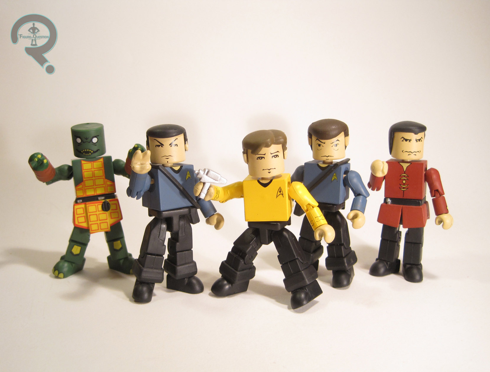
CAPTAIN KIRK, SPOCK, DR. McCOY, KHAN, & GORN

STAR TREK MINIMATES (ART ASYLUM)

I’ve spoken twice before about the original, larger-sized Minimates, the important stepping stone on the way to getting us the licensing behemoth that we now have.  Today, I’ll be touching on them yet again, this time looking at the one property to have graced both styles of Minimate: Star Trek.   After doing ‘mates from Crouching Tiger and some music ‘mates, and even some Bruce Lee ‘mates, Art Asylum turned their sights onto Trek mostly because they already had the license (they produced a Dark Angel Minimate for the same reason, but with less success).  Anyway, I’ve got a bunch of them, and I’ll be looking at them today.

THE FIGURES THEMSELVES

These five were released in the first (and only) series* of the larger-scale Star Trek Minimates from Art Asylum.  There was also a Mugato in the series, as well as an accompanying ToyFare-exclusive “Trouble With Tribbles” Kirk, but I don’t yet have those two.  Maybe some day.

All of the figures featured here are built on the 3-inch Minimate body, which is a little different from the smaller body in terms of construction, mostly around the elbows and knees.  The assembly can afford to be just a touch more complex at the larger scale, and that’s really the source of most of the changes.  Nevertheless, it works the same as the smaller body from a basic functioning stand-point, and it has the same 14 points of articulation.
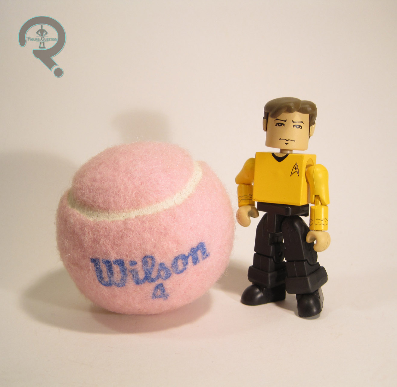
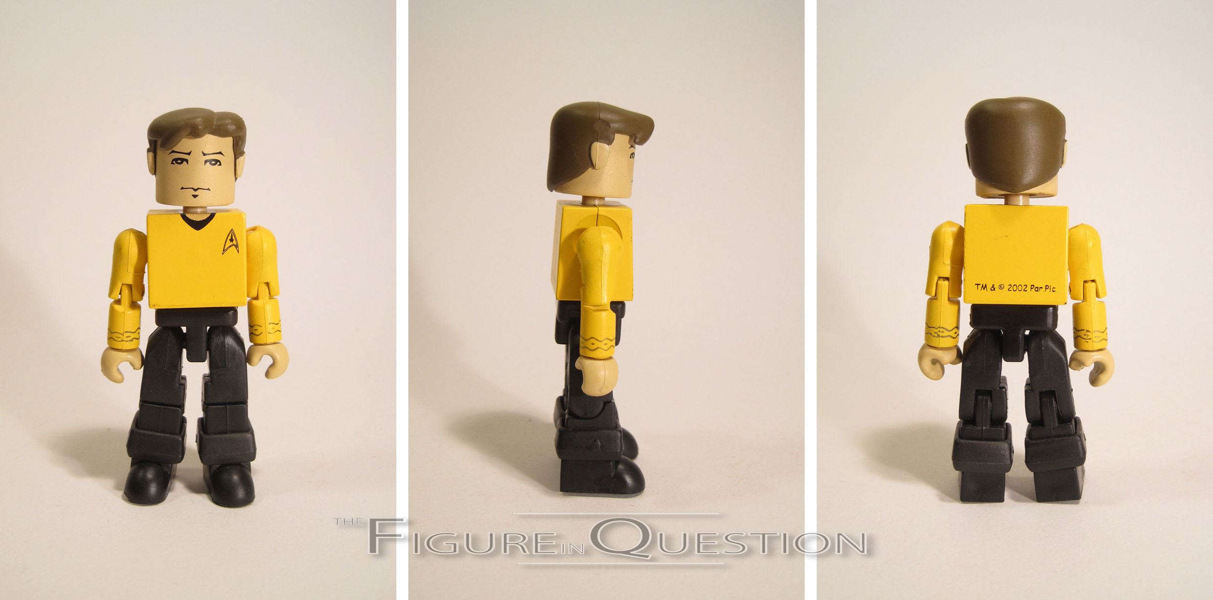
CAPTAIN KIRK

This was the first of the 14 MInimates of James T. Kirk.  He’s most prevalent of the Trek characters by far, though he’s got nothing on the likes of Spider-Man and Iron Man.  Anyway, this is the one that started it all.  This figure has three add-on pieces: hair, and both pants cuffs.  The hair was new to this guy (though it was also shared with the ToyFare variant, and would have presumably been used for the Mirror Universe version in Series 2).  I gotta say, I like this piece a lot more than the initial smaller Kirk ‘mates.  It’s still a bit more simplistic than more recent ‘mates, but that’s certainly not a point against it, and it’s definitely in keeping with the other ‘mates of this time period.  The paint work on Kirk is about on par with the rest of the earlier ‘mates.  It’s all pretty clean, but also rather on the simple side.  All of the important things, like the face and various uniform elements are there.  The face has a pretty decent likeness of Shatner (honestly, I think it was a bit better than later attempts), and the uniform details seem to be pretty accurate.  The colors are generally pretty decent, but once again, far more basic than later ‘mates would be.  Kirk was packed with a phaser (painted in all silver, rather than the proper silver and black), as well as one of the goofy puzzle pieces that they threw in with all of the early guys.

MR. SPOCK

Spock’s not too far behind Kirk on the variant front, with a whole 8 Minimates under his belt.  There does seem to be a little less variation to his, though.  Like Kirk, this figure has add-ons for his hair and pant cuffs.  Spock’s hair piece is fine, but I find his style of hair doesn’t translate quite as well to this sort of figure.  Later pieces worked a fair bit better, I feel.  I think his hair just needs more detail to it, otherwise it just ends up looking like a skullcap or something.  The paint on Spock is rather similar to Kirk’s, but once again, I don’t think it works quite as well.  The face definitely tries for a Nimoy likeness and, while it isn’t horribly off, I think the lack of any sort of line work for the cheekbones is really holding it back.  Most characters can get by alright without the cheekbones, but not those played by Leonard Nimoy.  In addition, the shade of blue chosen for the shirt is several shades too dark and far too greyed out for the blue shirts from Classic Trek.  This shade almost looks like something from the JJ Abrams films, which wouldn’t be released for 7 years after this.  Spock includes an extra right hand, doing the Vulcan salute, as well as a tricorder and the puzzle piece.

DR. McCOY

McCoy’s important because he finished out the show’s core trio.  Sadly, he always seems to be the one who gets overlooked.  It’s a shame, really.  But hey, he got this ‘mate and a few others, so that’s pretty good for him, right?  This guy is very similar to the other two, with the exact same cuffs on the legs and then a unique hair piece.  The hair falls somewhere between the other two, being not quite as strong as Kirk’s, but a fair bit more recognizable as hair than Spock’s.  It’s definitely not bad.  In terms of paint, he’s almost identical to Spock, overly dark blue and all.  On the plus side, the likeness on the face is the spitting image of DeForrest Kelly, surly country wisdom and all.  He includes the same tricorder and puzzle piece as Spock, but obviously loses the saluting hand.  It would have been nice to get one of his medical gadgets or something, but the tricorder’s enough, I suppose.

KHAN

Khan’s pretty popular for a guy who was only in a single episode of the show.  Oh, right, and there was that movie thing, I guess.  That might have helped.  Khan’s had a few Minimates, and not a single one of them has been in the same outfit.  This is one of his red outfits, likely chosen for it’s contrast with the rest of Series’ color schemes.  He’s got a hair piece and a skirt for the bottom of his tunic.  Both pieces are pretty solid, so that’s good.  Khan has one of the more complex paint schemes in the set (though not *the* most.  That comes later), and it’s generally pretty nicely handled.  My only real complaint is that his face is slightly off-center, which is a problem that occasionally cropped up with these early ‘mates, due to the hair peg being near the back of the head.  On the plus side, the likeness on the face is pretty decent.  Khan’s only accessory is the puzzle piece.
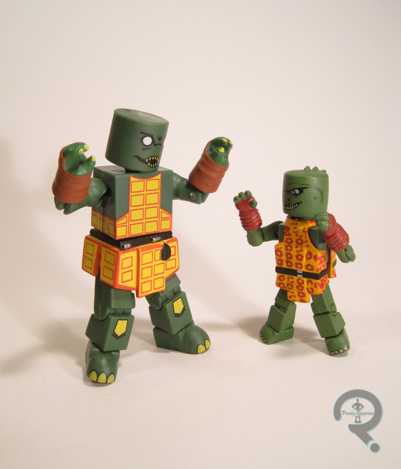
GORN

Okay, so I freaking love the Gorn, and this is like my whole reason for buying this set.  Because I desire to own every Gorn figure in existence.  I’m actually pretty close on that, so, yaaaaaay.  Gorn FTW!  This guy uses add-ons for his hands and his skirt.  There’s no piece for the head, which leaves the peg hole exposed, but it’s not huge issue, given the placement.  The add-ons are nicely sculpted and pretty cool looking overall.  The skirt piece is a little thick, so he splits at the middle a lot, but it’s a minor issue.  Gorn gets the most complicated of the paint jobs.  It’s still pretty simplified, but I actually really like it.  The face is pretty neat, and I like how they’ve translated his design onto the basic head block.  They’ve also done a nice job with the pattern on his tunic, so that’s cool.  He was packed with a spike, a translator, and that freaking puzzle piece.  Mine is lacking these, sadly.

THE ME HALF OF THE EQUATION

I always wanted to pick up a set of these back when they were still new, back when they would have been my first Minimates, but for whatever reason, I never got any of them.  I’m the reason the line failed, you guys.  I’m sorry about that.  I’ve been on the lookout for a set for a little while now, and I ended up finding these guys at Amazing Heroes, which was a cool toys, comics, and games store that my brother found just outside of Seattle.  I was actually pretty happy to find an almost complete set in one go.  I kinda dig these guys.  Kirk and the Gorn are the definite stars, and translate really well to the more simplistic style.  The others are pretty solid as well, if not quite as stand out.  Now, I gotta get that second Kirk and a Mugato….

*There was a proposed second series, which would have rounded out the main crew and given us a Klingon, but, like all of the 3-inch lines, Trek never made it past Series 1.
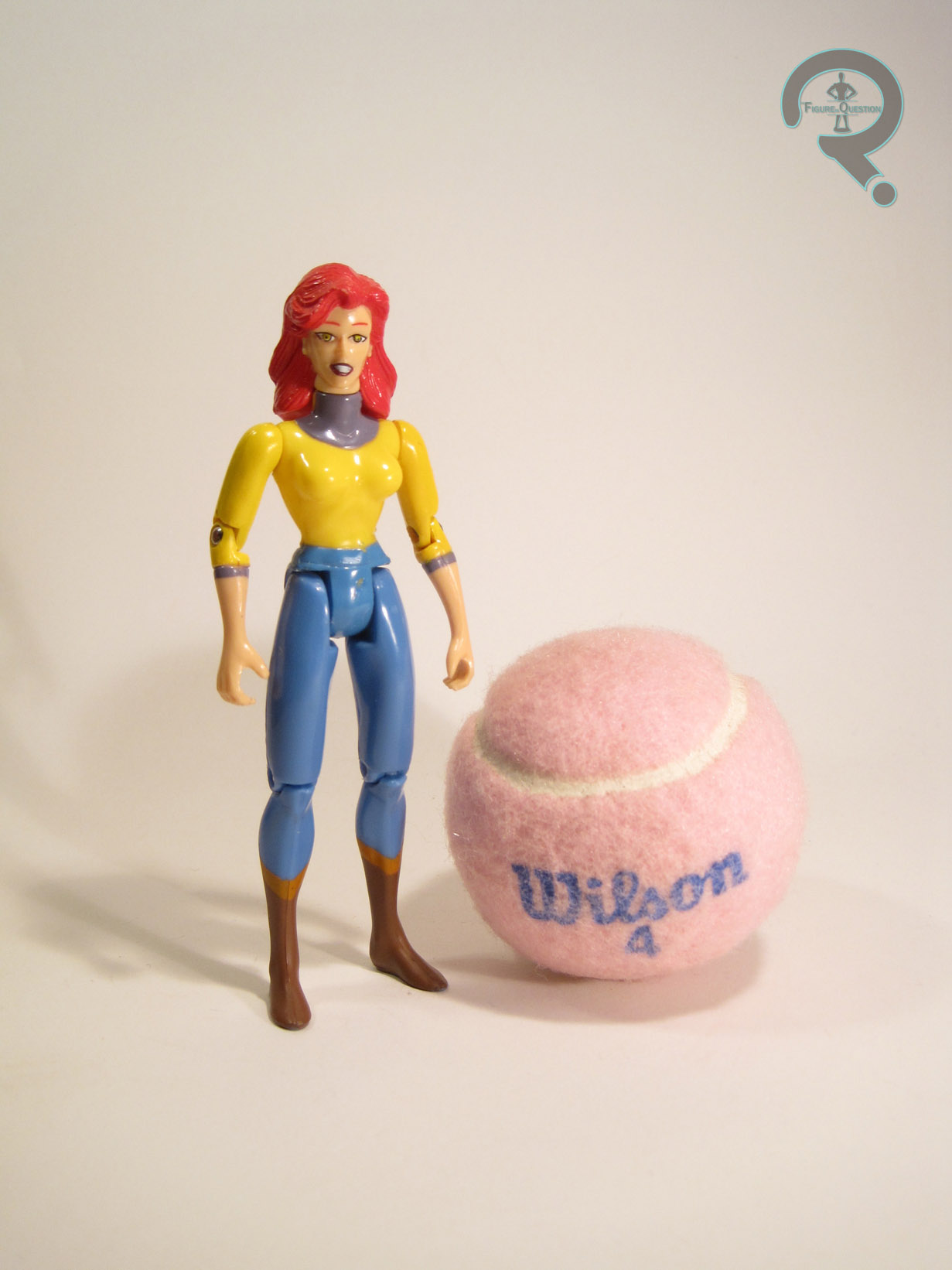